© COPYRIGHT GROW 2012
ICQ BRAND IDENTITY – RATIONALEPresentation by Grow9 JULY 2012

ICQ BRAND IDENTITY – RATIONALE
© COPYRIGHT GROW 2012
OVERVIEW - CHALLENGE
Decoding the right visual language for ICQ’s Vision, Mission, and Values
Grows’ proposed ICQ mark has evolved from our investigations into the nature
of Dr. Jehan Almeer’s enlightenment and the need for its effective visual expression.
Create a new kind of bank that:
• Will be the first private investment bank in the GCC focused on innovative technologies.
• Changes the way the banking industry operates and is perceived.
• Is founded on the principles of integrity, efficiency and openness.
• Is accessible to everyone on all levels.
• Does not masquerade as a venture capital business.
• Is driven by new ideas, passionate visionaries, scientists and engineers not traditional financiers
• Is founded on the principles of the Qatar National Vision 2030 to generate a knowledge-based
economy that is focused on delivering a long-term sustainable legacy for Qatar and the region.
• Intends to make the world a better environment for future generations while delivering attractive
returns to our shareholders.

ICQ BRAND IDENTITY – RATIONALE
© COPYRIGHT GROW 2012
OVERVIEW - RESOLUTION
The process of innovation involves the exploration and resolution of nature’s labyrinthine complexities.
To understand and decode these mysterious patinas requires investigation, endurance, intuition and vision.
Nature’s tapestries have unique and exotic languages that must be understood in order comprehend
how the universe speaks to us.
The visual language of the Middle Eastern culture is also a pattern of nature. Within the geometries, and
graphic architectures of Arabic calligraphy and motif, lies a constant visual signal that represents the
Arabian way of seeing and its enduring desire to understand the enigmatic language of the cosmos.
Spirals, Sine Waves, the depictions of celestial movement, labyrinths and vine-like typography, all serve
as complex representations of the Arabian appreciation of the virtues of elemental nature.
And so, it is these patterns both natural and man-made might come to play a central role in the visual
expression of the ICQ brand.
© COPYRIGHT GROW 2012
OVERVIEW - ICQ BRAND IDENTITY – BASIC ELEMENTS
ICQ BRAND IDENTITY – RATIONALE
ICQ BRAND IDENTITY – RATIONALE
© COPYRIGHT GROW 2012
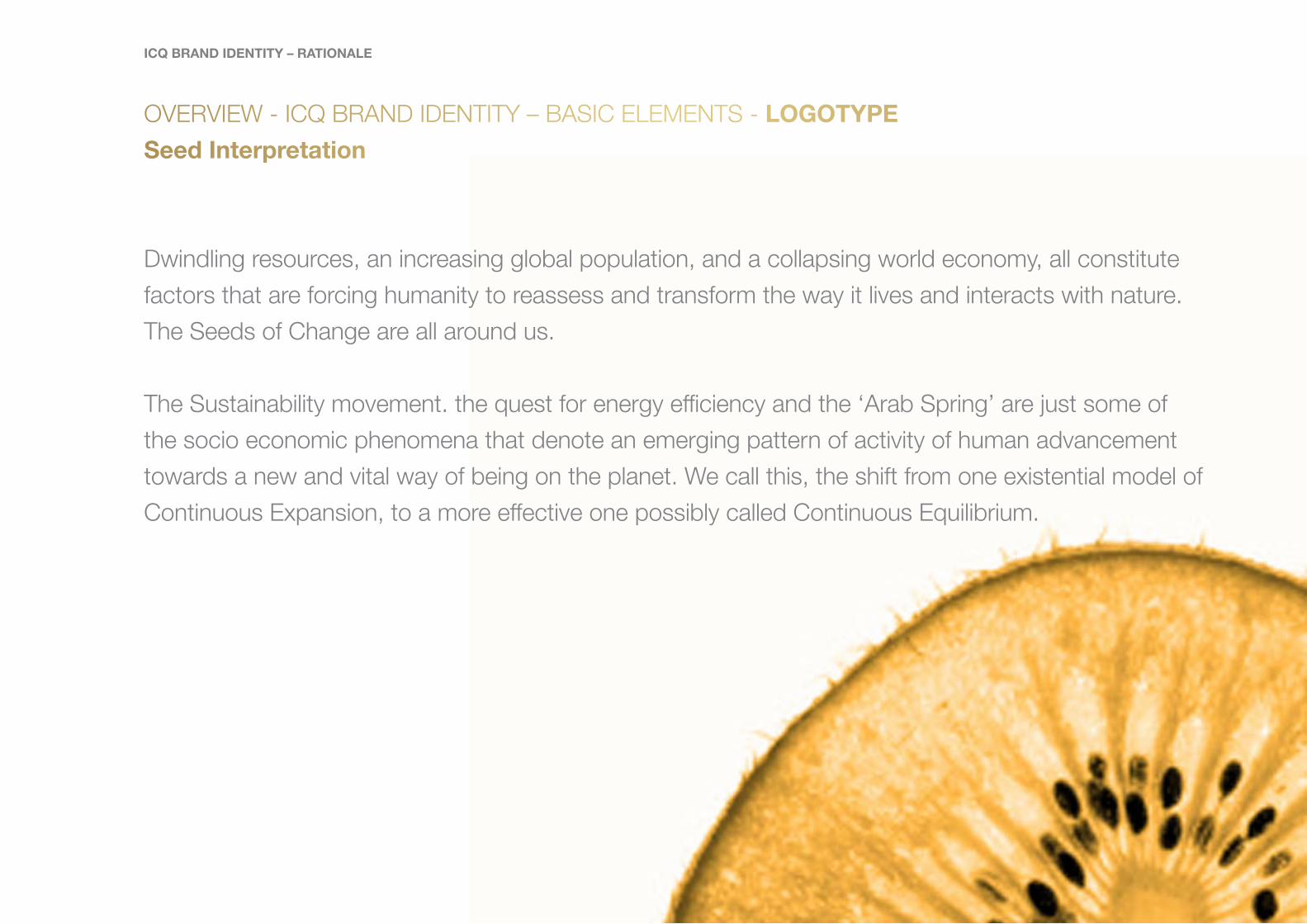
OVERVIEW - ICQ BRAND IDENTITY – BASIC ELEMENTS - LOGOTYPE
Seed Interpretation
Dwindling resources, an increasing global population, and a collapsing world economy, all constitute
factors that are forcing humanity to reassess and transform the way it lives and interacts with nature.
The Seeds of Change are all around us.
The Sustainability movement. the quest for energy efficiency and the ‘Arab Spring’ are just some of
the socio economic phenomena that denote an emerging pattern of activity of human advancement
towards a new and vital way of being on the planet. We call this, the shift from one existential model of
Continuous Expansion, to a more effective one possibly called Continuous Equilibrium.
ICQ BRAND IDENTITY – RATIONALE
© COPYRIGHT GROW 2012
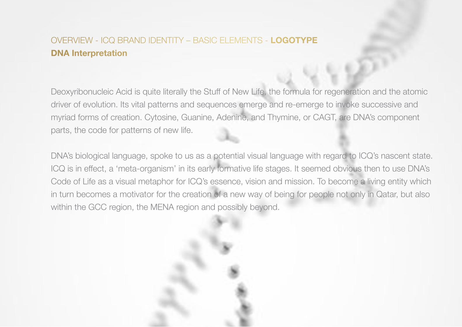
OVERVIEW - ICQ BRAND IDENTITY – BASIC ELEMENTS - LOGOTYPE
DNA Interpretation
Deoxyribonucleic Acid is quite literally the Stuff of New Life, the formula for regeneration and the atomic
driver of evolution. Its vital patterns and sequences emerge and re-emerge to invoke successive and
myriad forms of creation. Cytosine, Guanine, Adenine, and Thymine, or CAGT, are DNA’s component
parts, the code for patterns of new life.
DNA’s biological language, spoke to us as a potential visual language with regard to ICQ’s nascent state.
ICQ is in effect, a ‘meta-organism’ in its early formative life stages. It seemed obvious then to use DNA’s
Code of Life as a visual metaphor for ICQ’s essence, vision and mission. To become a living entity which
in turn becomes a motivator for the creation of a new way of being for people not only in Qatar, but also
within the GCC region, the MENA region and possibly beyond.

© COPYRIGHT GROW 2012
OVERVIEW - ICQ BRAND IDENTITY – BASIC ELEMENTS - LOGOTYPE
DNA Interpretation Cont’d
ICQ’s reason for existence is completely synergistic with the goals of the QNV 2030. To create a robust
and self-sufficient, knowledge-based economy with four eco-systemic principles at its core, namely the
effective interplay between optimized social, economic, environmental, and human conditions.
These principles when read as an acronym spell ‘SEEH’. Within this ‘SEEH’ code the word ‘SEE’
appears. And so a wonderful coincidence occurs. ‘SEE’ is consistent with the idea of ‘Vision.’ ICQ is an
organization founded on ‘Vision.’ The attendant acronym, ‘ICQ’ has, from an onomatopoeia perspective
a wonderful treasure to offer. The letters ‘IC’ sound like ‘I see.’
ICQ BRAND IDENTITY – RATIONALE
© COPYRIGHT GROW 2012
OVERVIEW - ICQ BRAND IDENTITY – BASIC ELEMENTS - LOGOTYPE
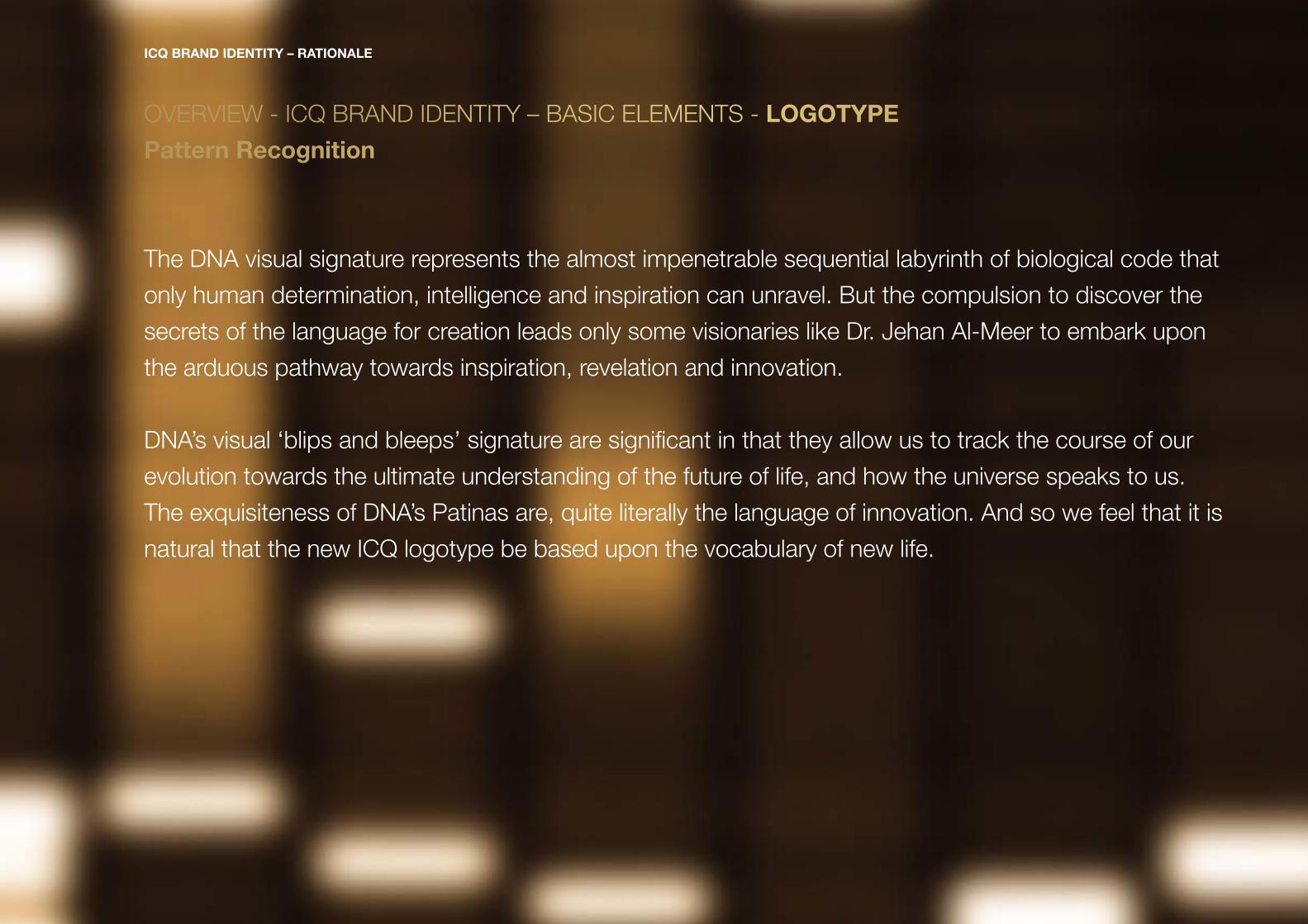
Pattern Recognition
The DNA visual signature represents the almost impenetrable sequential labyrinth of biological code that
only human determination, intelligence and inspiration can unravel. But the compulsion to discover the
secrets of the language for creation leads only some visionaries like Dr. Jehan Al-Meer to embark upon
the arduous pathway towards inspiration, revelation and innovation.
DNA’s visual ‘blips and bleeps’ signature are significant in that they allow us to track the course of our
evolution towards the ultimate understanding of the future of life, and how the universe speaks to us.
The exquisiteness of DNA’s Patinas are, quite literally the language of innovation. And so we feel that it is
natural that the new ICQ logotype be based upon the vocabulary of new life.
ICQ BRAND IDENTITY – RATIONALE
© COPYRIGHT GROW 2012
OVERVIEW - ICQ BRAND IDENTITY – BASIC ELEMENTS - LOGOTYPE
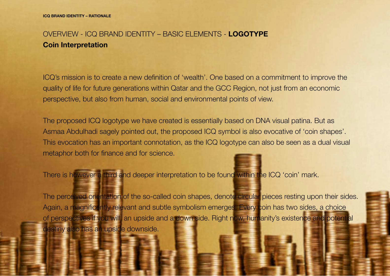
Coin Interpretation
ICQ’s mission is to create a new definition of ‘wealth’. One based on a commitment to improve the
quality of life for future generations within Qatar and the GCC Region, not just from an economic
perspective, but also from human, social and environmental points of view.
The proposed ICQ logotype we have created is essentially based on DNA visual patina. But as
Asmaa Abdulhadi sagely pointed out, the proposed ICQ symbol is also evocative of ‘coin shapes’.
This evocation has an important connotation, as the ICQ logotype can also be seen as a dual visual
metaphor both for finance and for science.
There is however a third and deeper interpretation to be found within the ICQ ‘coin’ mark.
The perceived orientation of the so-called coin shapes, denote circular pieces resting upon their sides.
Again, a magnificently relevant and subtle symbolism emerges. Every coin has two sides, a choice
of perspectives if you will, an upside and a down side. Right now, humanity’s existence and potential
destiny also has an upside downside.
ICQ BRAND IDENTITY – RATIONALE
ICQ BRAND IDENTITY – RATIONALE
© COPYRIGHT GROW 2012
OVERVIEW - ICQ BRAND IDENTITY – BASIC ELEMENTS - LOGOTYPE
Coin Interpretation Cont’d - The Upside of the Coin
Our advancement and prosperity as a species thus far, has been dependant on the existential thrust
of Continuous Expansion towards greater material wealth: an action reflective of the instinctive or
blind ‘side’ to human nature. The relative ‘positive’ effect of this enduring existential model has now
been eclipsed by its’ inevitable negative counter effects. Uncontrollable population growth, diminishing
resources, and a collapsing global economy, all now serve to reveal that we are on the edge of existence
and confronted with an apocalyptic choice. Do we pursue Continuous Expansion or do we try to find
another way of living that is sustainable?
ICQ BRAND IDENTITY – RATIONALE
© COPYRIGHT GROW 2012
OVERVIEW - ICQ BRAND IDENTITY – BASIC ELEMENTS - LOGOTYPE
Coin Interpretation Cont’d - The Downside of the Coin
The word ‘terminator’ in astronomical terms means the dividing line between the light and dark part
of a planetary body. The ‘terminator’ idea refers to the human instinct (blindness) to move towards
darkness by following the path of Continuous Expansion. It also refers to our newly realized opportunity
to move, driven by intelligence (vision) and awareness, towards the light of a new dawn in human
civilization. There are clearly now two sides to the coin in terms of our possible future. As a result, we
find ourselves on the edge of our destiny. ICQ is clearly an organization that is committed to moving
towards the light through the creation of, and investment in a new knowledge based society. The DNA
‘bytes and bleeps’ significance of the ICQ logotype is literally born of, and cast in the golden reflective
light of innovative thinking.
ICQ BRAND IDENTITY – RATIONALE
© COPYRIGHT GROW 2012
OVERVIEW - ICQ BRAND IDENTITY – BASIC ELEMENTS - LOGOTYPE
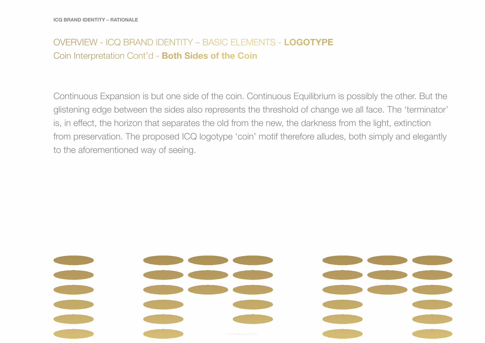
Coin Interpretation Cont’d - Both Sides of the Coin
Continuous Expansion is but one side of the coin. Continuous Equilibrium is possibly the other. But the
glistening edge between the sides also represents the threshold of change we all face. The ‘terminator’
is, in effect, the horizon that separates the old from the new, the darkness from the light, extinction
from preservation. The proposed ICQ logotype ‘coin’ motif therefore alludes, both simply and elegantly
to the aforementioned way of seeing.
ICQ BRAND IDENTITY – RATIONALE
© COPYRIGHT GROW 2012
OVERVIEW - ICQ BRAND IDENTITY – BASIC ELEMENTS - WORD
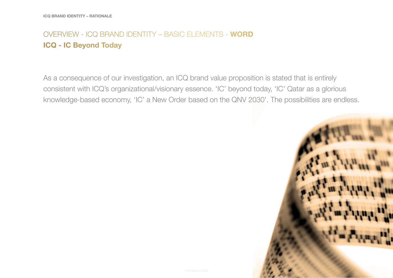
ICQ - IC Beyond Today
As a consequence of our investigation, an ICQ brand value proposition is stated that is entirely
consistent with ICQ’s organizational/visionary essence. ‘IC’ beyond today, ‘IC’ Qatar as a glorious
knowledge-based economy, ‘IC’ a New Order based on the QNV 2030’. The possibilities are endless.
© COPYRIGHT GROW 2012
OVERVIEW - ICQ BRAND IDENTITY – BASIC ELEMENTS - WORD
ICQ - Banking on Science
Humanity’s advancement depends utterly upon science and the visionary mavericks that devote their
lives to the pursuit of truth. We, all of us literally rely or ‘bank’ on scientific discovery to survive.
ICQ is destined to become a bank like no other bank. A bank, not only for fiscal investment in scientific
and technological innovation, but also a bank for knowledge. A bank driven by visionary scientists,
engineers, and builders of new ways of seeing how the future can become brighter for all humanity.
ICQ Bank will ‘Bank on Science’ for its future prosperity in the widest sense. People will also come to
‘bank’ on ICQ for their destinies.
ICQ BRAND IDENTITY – RATIONALE
© COPYRIGHT GROW 2012
OVERVIEW - ICQ BRAND IDENTITY – BASIC ELEMENTS - WORD
ICQ - Qatar. - Innovation Capital of the World
On the 4th of July, 2012, the Gulf Times reported that Qatar has been ranked highest in the Middle
East on the Global Innovation Index. It also reported that Qatar had secured 26th rank globally, ahead
of even China (29) and India (62), the world’s two largest emerging economies. Another striking feature
is that Qatar improved its world ranking by nine places compared to 2010. Last year, Qatar was placed
35th on the Global Innovation Index. And so an opportunity emerges to ‘play’ on the ICQ name in
order to re-enforce the organizations’ role in advancing Qatar’s status on the world stage as a lead
innovator in technology and science.
ICQ BRAND IDENTITY – RATIONALE

© COPYRIGHT GROW 2012
OVERVIEW - ICQ BRAND IDENTITY – BASIC ELEMENTS - COLOUR
ICQ - Gold
Gold is the color of ancient Arabic cultural exchange. It represents the exchange not only of material
goods but the interplay of ideas together with the incandescant sheen of enlightenment and wealth.
ICQ BRAND IDENTITY – RATIONALE

© COPYRIGHT GROW 2012
OVERVIEW - ICQ BRAND IDENTITY – BASIC ELEMENTS - COLOUR
ICQ - Black
ICQ’s proposed colour black represents the background of cosmic darkness out of which the golden
incandescence of life, energy and matter were created.
Black also alludes to the scene of modern humanity’s dark, chaotic condition and the imperative for
the institution of a new golden renaissance in thinking about the way we co-exist with one another and
nature and a new definition of wealth.
Black therefore creates a background for the ICQ logotypes’ golden light to shine, the emblem of
ICQ’s leadership and their vision as to how the organization will play a critical role in the way humanity
will advance in socio economic, political and eco-systemic terms, as envisioned through the forward
focused lens of scientific and technological innovation investment, and the ultimate creation of a
knowledge based economy.
ICQ BRAND IDENTITY – RATIONALE

ICQ BRAND IDENTITY – RATIONALE
© COPYRIGHT GROW 2012
OVERVIEW - ICQ BRAND IDENTITY – BASIC ELEMENTS - COLOUR
ICQ - White
White is a simple, neutral colour that indicates light, the mechanism by which vision is created.

ICQ BRAND IDENTITY – RATIONALE
© COPYRIGHT GROW 2012
Stationery Option 1

ICQ BRAND IDENTITY – RATIONALE
© COPYRIGHT GROW 2012
Letterhead

ICQ BRAND IDENTITY – RATIONALE
© COPYRIGHT GROW 2012
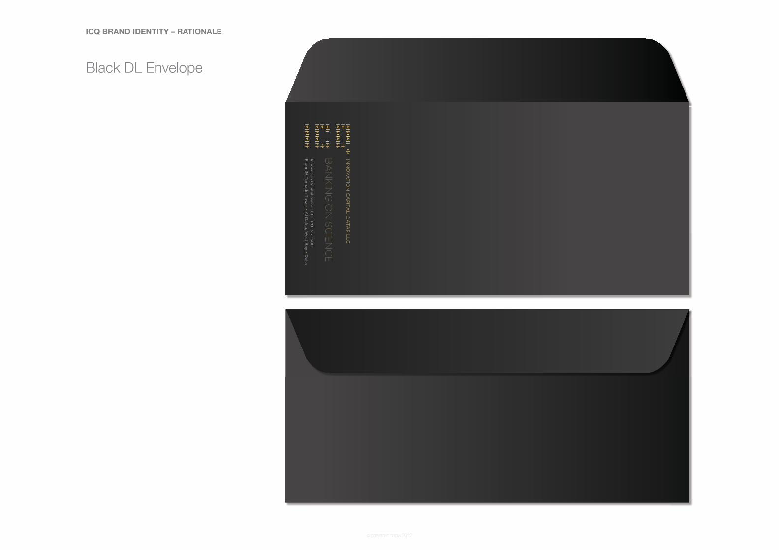
Black DL Envelope
ICQ BRAND IDENTITY – RATIONALE
© COPYRIGHT GROW 2012
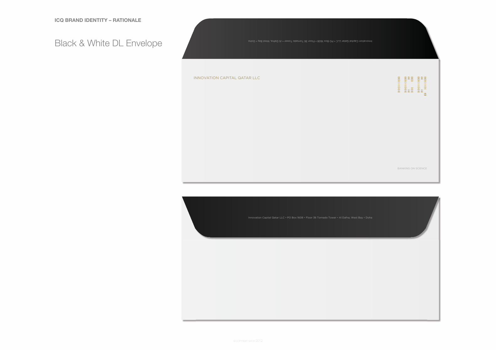
Black & White DL Envelope

ICQ BRAND IDENTITY – RATIONALE
© COPYRIGHT GROW 2012
White DL Envelope
ICQ BRAND IDENTITY – RATIONALE
© COPYRIGHT GROW 2012
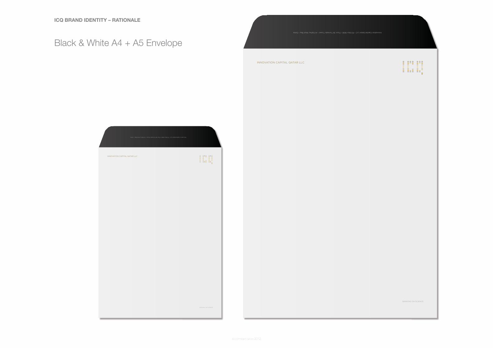
Black & White A4 + A5 Envelope
ICQ BRAND IDENTITY – RATIONALE
© COPYRIGHT GROW 2012
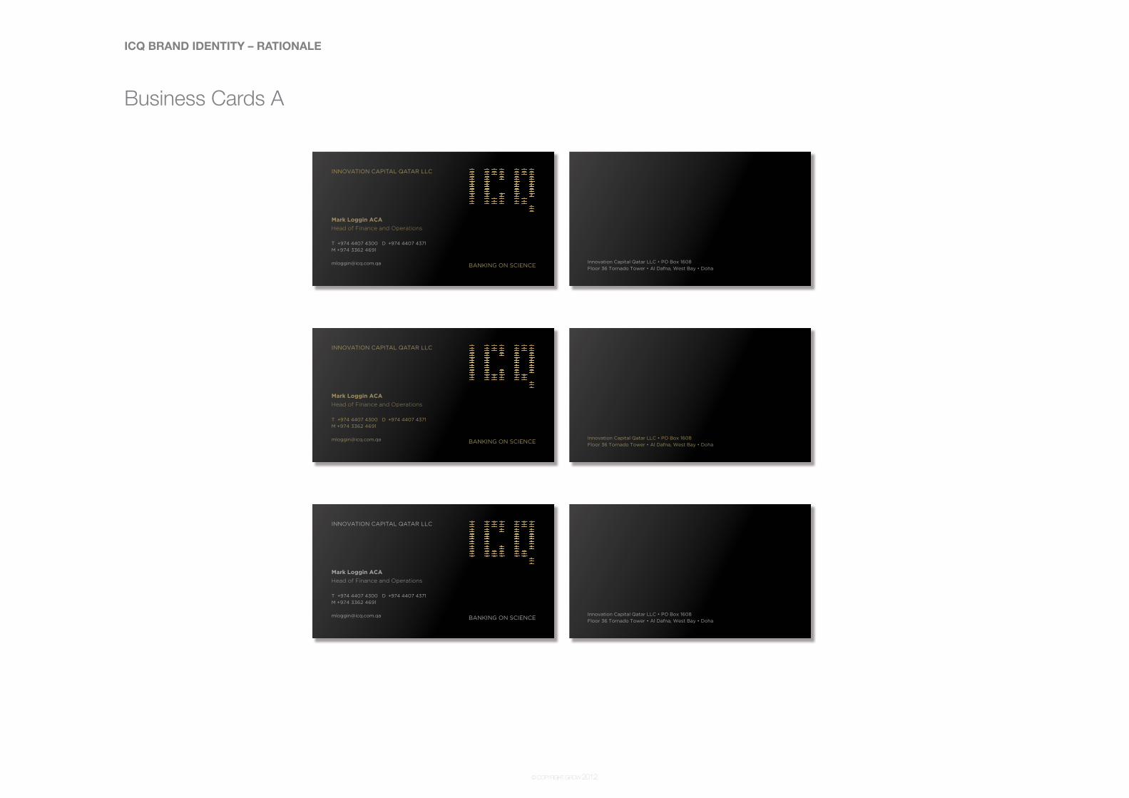
Business Cards A
ICQ BRAND IDENTITY – RATIONALE
© COPYRIGHT GROW 2012
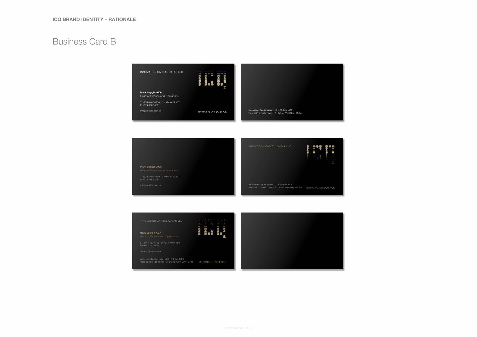
Business Card B

ICQ BRAND IDENTITY – RATIONALE
© COPYRIGHT GROW 2012
Stationey Option 2 Black

ICQ BRAND IDENTITY – RATIONALE
© COPYRIGHT GROW 2012
Stationey Option 2 White
ICQ BRAND IDENTITY – RATIONALE
© COPYRIGHT GROW 2012
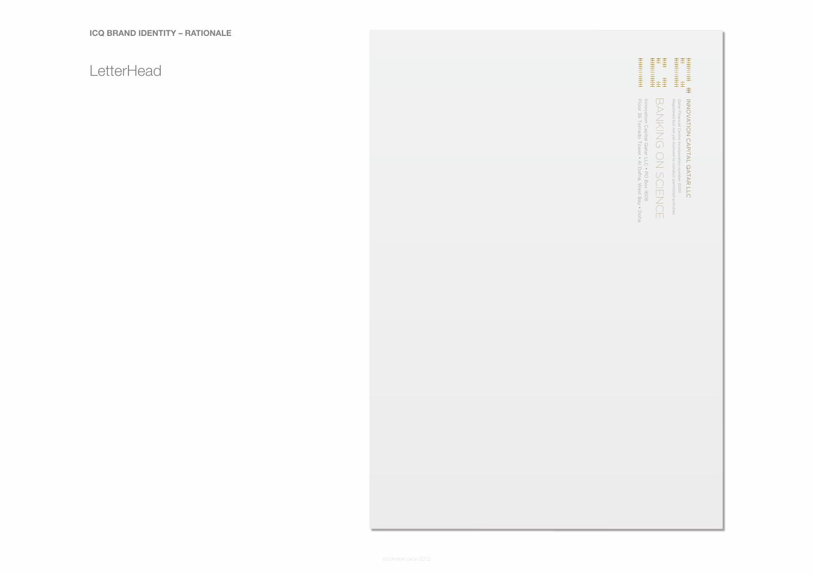
LetterHead

ICQ BRAND IDENTITY – RATIONALE
© COPYRIGHT GROW 2012
White DL Envelope
ICQ BRAND IDENTITY – RATIONALE
© COPYRIGHT GROW 2012
Black DL Envelope

ICQ BRAND IDENTITY – RATIONALE
© COPYRIGHT GROW 2012
Vertical White Business Card
ICQ BRAND IDENTITY – RATIONALE
© COPYRIGHT GROW 2012
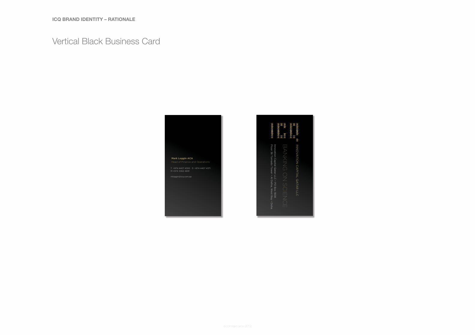
Vertical Black Business Card

ICQ BRAND IDENTITY – RATIONALE
© COPYRIGHT GROW 2012
White Folder

ICQ BRAND IDENTITY – RATIONALE
© COPYRIGHT GROW 2012
Black Folder

ICQ BRAND IDENTITY – RATIONALE
© COPYRIGHT GROW 2012
Thank you
grow3rd FloorThani Bin Abdullah ComplexIbn Seena Street, Doha, Qatar
T + 974 4444 6222 F + 974 4431 4982E [email protected] www.growqatar.com
© grow 2011. All rights reserved. No part of this publication may be reproduced without prior written permission of grow. The contents, layout and design are copyrighted and are protected by worldwide copyright laws and treaty provisions including Qatar Law No.9 of 2002 on the protection of copyrights and related rights.
Recommended