FTLO+P
FOR THE LOVE
OF POSTERS


FTLOP
FOR THE LOVE OF POSTERS
f t l o p ( f o r t h e l ov e o f p o s t e r s ) m ag a z i n e wa s m a d e b y m i k e pat t e r s o n a s a w s o c a s s i g n m e n t i n 2011. i wo u l d l i k e to t h a n k e v e ryo n e w h o pa rt i c i pat e d to m a k e t h i s h a p p e n.
pa p e r : s c a n d i a 2000 p r e m i u m 100g
f o r m at: 240 m m x 316 m m
t y p e fac e : g i l l s a n s s t d
t e x t : m i k e pat t e r s o n
p h oto: d e s i g n e r s
p e o p l e :m a r k b l a m i r e : p r i n t-p ro c e s s .c o m & b l a n k a.c o.u k
k r i s t i a n h a m m e r s ta d : k r i s t i a n h a m m e r s ta d.c o m
j a a r g e e r l i g s : p o s t e r s i n a m s t e r da m.c o m
e r i k s p i e k e r m a n n: s p i e k e r m a n n.c o m
pau l s a h r e : pau l s a h r e .c o m
f e l i x p fä f f i : f e i x e n.c h
c o p y r i g h t © 2011 b y m i k e pat t e r s o n.n o. a l l r i g h t s r e s e rv e d. n o pa rt o f t h i s p u b l i c at i o n m ay b e r e p ro d u c e d i n a n y f o r m o r b y a n y e l e c t ro n i c o r m e c h a n i c a l m e a n s , w i t h o u t
w r i t t e n p e r m i s s i o n f ro m t h e p u b l i s e r .i s s n : 1029 8848

09
25
4161
07
17
35
51
55
69
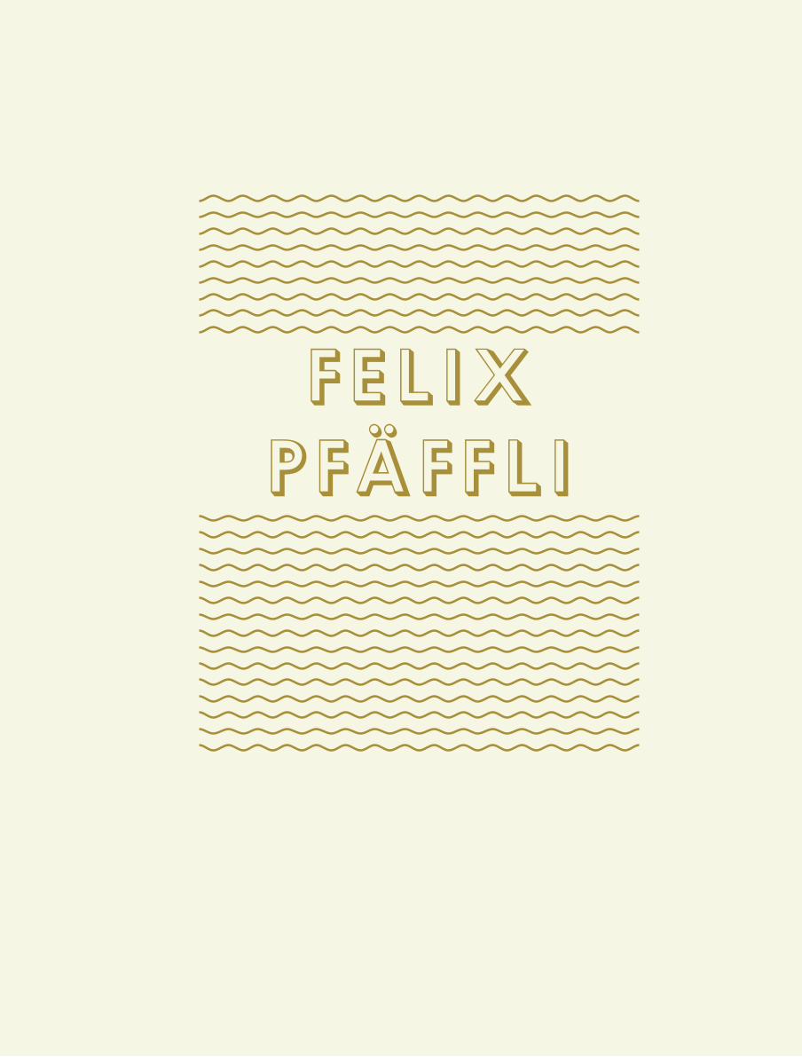
FELIX PFÄFFI
Poster design by a young and upcom-
ming designer from Switzerland.
POSTER BREAK
Get inspired.
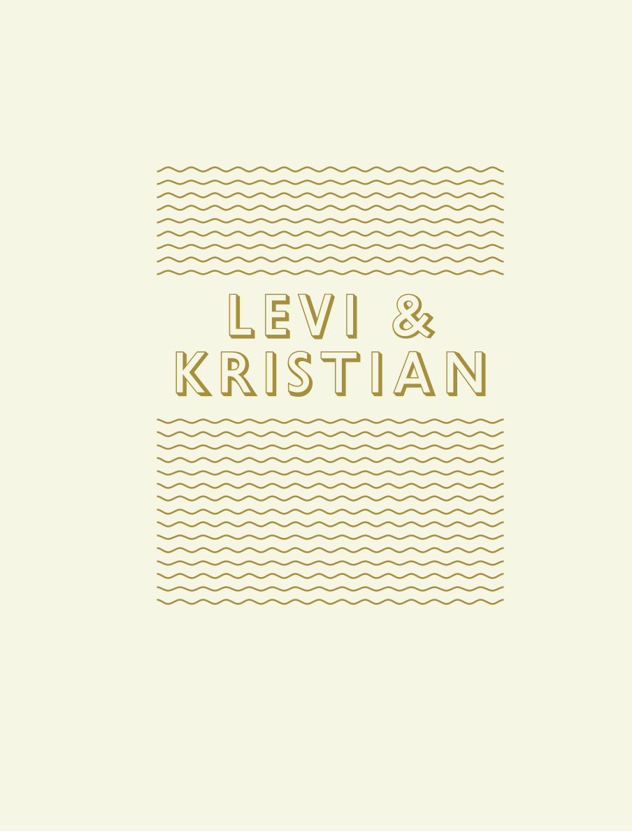
LEVI & KRISTIAN
60 minutes with the very talented
illustrator and designer.
JARR GEERLIGS
The art director that has a collection
of over 2700 posters online.
LETTER FROM THE EDITOR
What is FTLOP?
MARK BLAMIRE
Founder of Blanka.co.uk and Print-pro-
cess.com an unbelieveable collection of
both classics and exiting new ones.
ERIK SPIEKERMANN
A legendary type designers view on
the role of typography in posters.
POSTER BREAK
Get inspired even more.
PAUL SAHRE
The man who wants you to design the
things that you want.
POSTERMARK
Probably the biggest bookmark you’ve
ever seen.

FTLOP
for theloveof…
POSTERSTYPEBOOKS…
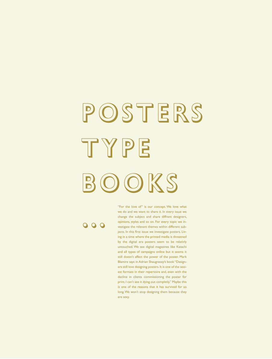
“For the love of” is our concept. We love what
we do and we want to share it. In every issue we
change the subject and share diffrent designers,
opinions, styles and so on. For every topic we in-
vestigate the relevant themes within different sub-
jects. In this first issue we investigate posters. Liv-
ing in a time where the printed media is threatned
by the digital era posters seem to be relativly
untouched. We see digital magazines like Katachi
and all types of campaigns online but it seems it
still doesn’t affect the power of the poster. Mark
Blamire says in Adrian Shaugnessy’s book “Design-
ers still love designing posters. It is one of the sexi-
est formats in their repertoire and, even with the
decline in clients commissioning the poster for
print, I can’t see it dying out completly.” Maybe this
is one of the reasons that it has survived for so
long. We won’t stop designing them because they
are sexy.

FELIX PFÄFFLI

10
FTLOP
Felix Pfäffli (feixen) was born in 1986. In 2010 he
graduated and started his own studio “Feixen”. He
was also awarded a lecturer position at the Lucerne
School of Graphic Design to teach in the fields of ty-
pography, narrative design, and poster design. He has
been a member of the “Detective Bureau” which is an
alliance of graphic designers, illustrators and politically
highly committed people, but also a psace for young
art, discussion, design and coffee.
WHAT IS A GOOD POSTER IN YOUR DEFINITION?
A good poster speaks the language of the content
that it carries.
how would you define real love for posters?
For me, this is clearly the process. I simply like to
design things.
do you think that posters might be a
springboard into graphic design?
Yes, I think so. The poster is a very simple, very
loud and focused medium. It’s probably the most
accessible medium in graphic design and therefore
it enjoys such great attention. So, as a young de-
signer it is perhaps also the desire for attention,
that leads you to the poster.
what do you think about the self initiated
poster scene? maybe you do some of these
yourself?
Basically it’s not really my thing to work without
content. For me it’s important that I have a par-
ticular reason that leads me to the design. What I
really like are self-initiated posters like the one Ni-
kulaus Troxler made in 1996. It is a political poster
about Switzerland and the European Community
which caused at this time quite big uproar. I think
it’s important that a self-initiated poster is not only
witty and beautiful, but also that there is a real
need for it.
please tell us about the posters for the
poster project:
“Posters for the Poster” was the theme of this
years student competition which was proclaimed
by the Weltformat Festival in Lucerne. The idea
behind this title was that once one focuses on
the poster itself. What is a poster? What are the
strengths of this medium? What position has the
poster in our everyday lives? That may be the fun-
damental issues with which the students were
confronted.
WHAT IS YOUR PROCESS LIKE WHEN YOU MAKE
POSTERS?
As I mentioned in the first question, it is impor-
tant to me that the design is consistent with the
content. In this sense, I have to start from scratch
each time to find out what design language fits in
the specific case. Basically, I think that you can start
from two design attitudes. A subjective and an ob-
jective attitude. For example, music is objectively
difficult to grasp. That is why I focus here primar-
ily on the feeling that I connect with the respec-
tive music. I ask myself simple questions like: What
landscape do I see when I hear the music? What
colors or shapes can I associate with it? If the mu-
sic is fast and spontaneous, then I’ll trying to de-
sign equally playful. If it sounds strict and reduced,
then I´ll work carefully and focused. In contrast
to the subjective attitude, there is as mentioned
the objective attitude. This one makes sense if the
content is clearly defined. Such as in a traditional
play or an exhibition. Here I focus mainly on the
content. I read the play and try to reduce the story
to an image or a simple scene. The imagery, the
choice of the font and the design elements are di-
rect results from the content. If for example, the
piece plays in the 18th Century, I search for fonts
and images that had been used at that time. Mean-
ing, I put together something like a fundus, a tool
kit of creative means that later results in the even-
tual design.
WHAT ARE YOUR TAKES ON COMMERCIALLY DE-
SIGNED POSTERS VERSUS SELF- INITIATED WHEN
WE ARE TALKING ABOUT POSTER LOVE.
I can imagine that for some designers, a self initi-
ated poster could be a way to work for once with-
out limitation. In that case, I guess it can be very
liberating to work without a client sometimes.
However, in my work I do not really see a big dif-
ference in terms of love to the poster. Maybe be-
cause I only accept jobs that offer me the neces-
sary freedom to bring in my opinion, to implement
my own ideas… yes, simply to operate without
boundaries. Of course, I also like the confrontation
with a customer. It is very inspiring and productive
to have a counterpart. Nevertheless, I think the
designer must always have the last word.
what do you think of the print process of
posters, the more hand made the more love?
No, I think that’s of no importance at all. In the
end it’s about wheter a poster is good or not.
How a poster is produced should never be pre-
determined. Sometimes it is necessary to produce
a poster enormously cheap and ugly to make the
message work. Sometimes it makes sense to make
a super clean ten color silkscreen. This is different
from case to case. The love of the poster should
depend on the quality of the idea plus the execu-
tion and not on the print process.
11
FTLOP
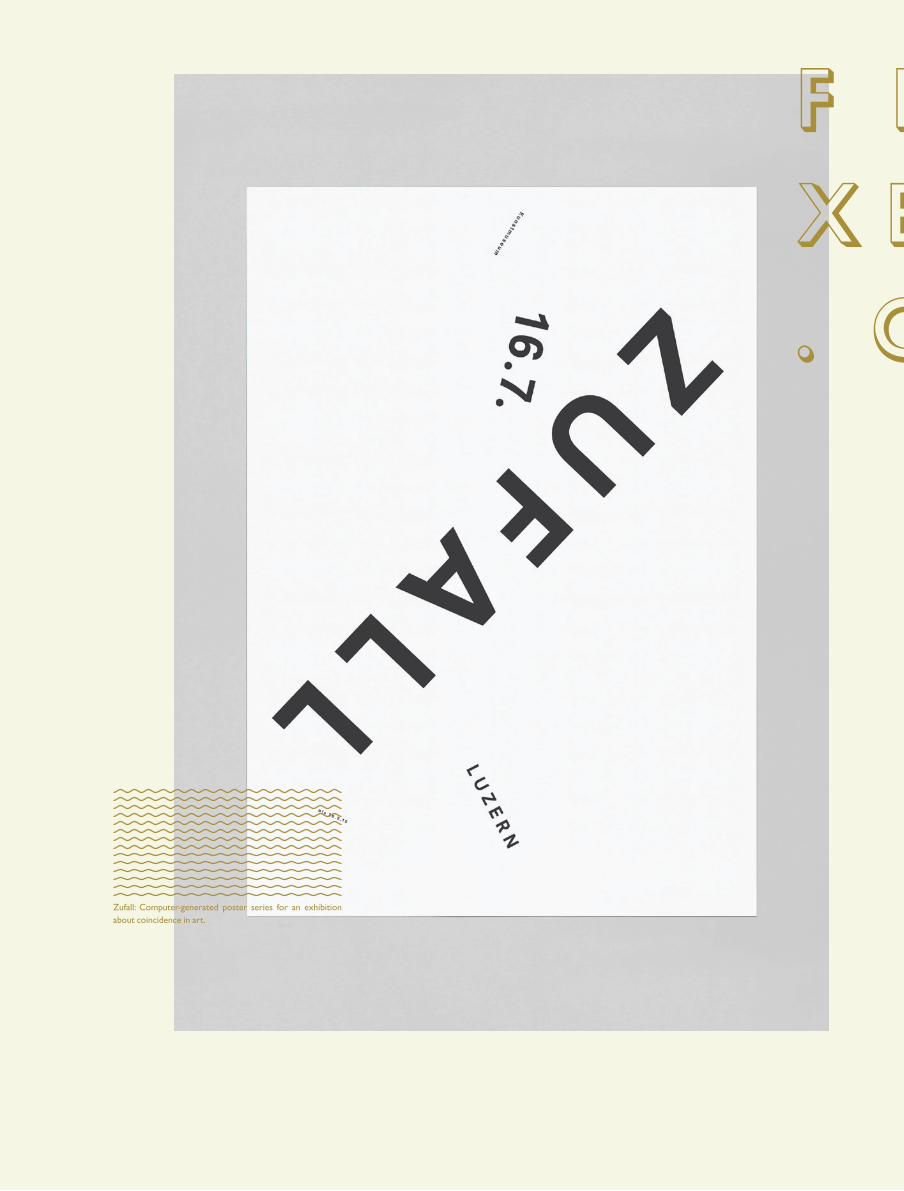
Zufall: Computer-generated poster series for an exhibition about coincidence in art.
f e ix e n. c h

12
FTLOP
f e ix e n. c h
Felix and Hi at Soirée Graphique 2011 which is an Exhibi-tion, an after show and auction at the same time. Nine stu-dios were asked to design a poster for the exhibition and also to present their works. The posters were later interpreted by different photographers and published in a large-format newspaper.
13
FTLOP

14
FTLOP
“Posters for the Poster” The idea behind this title was that once one focuses on the poster itself. What is a poster? What are the strengths of this medium? What position has the post-er in our everyday lives? That may be the fundamental issues with which the students were confronted.

15
FTLOP
Poster done for Funk am See Festival in 2010. Funk am See is a free open-air festival which takes place once every 2 years at the lake in front of the Transport Museum in Lucerne.


MARK BL AMIRE

18
FTLOP
Mark Blamire is the founder of Blanka.co.uk, Print-pro-
cess.com and also Neue Laboratories. The two first be-
ing excellent sites for poster distribution featuring some
of Brockmann’s best work, Experimental Jetset, Spin and
all the way down to Eivind Molvaer’s beautiful Italic post-
er. He is also known for his poster series for the 1995
action movie Trainspotting.
WHAT DOES POSTER LOVE MEAN TO YOU AND
HOW DO YOU PORTRAY YOUR POSTER LOVE?
For me to like a poster it has to be good design,
well crafted, clever idea, simple and effective or en-
gaging. I also lean towards modernism although it’s
a rule i sometimes ignore (I have a few film posters
from the 70’s in my house). I portray my love of de-
sign by collecting posters and running two shops
which promote poster design, and I do it to pro-
mote good designers and good design in a format
which is commercially in decline.
WHAT DO YOU THINK OF POSTERS BEEING A
SPRINGBOARD INTO GRAPHIC DESIGN, WAS THAT
THE CASE FOR YOU?
Not at all, I dont see poster design as a starting
off point. I think you have to learn your craft and
understand good design before you can even start
to take on creating a poster of merit. I designed
record covers for 3 years (and the ads and post-
ers that went with them) most of the posters I did
back then were appalling. It’s only through improv-
ing and setting yourself better standards or tighter
restrictions on what you are working towards as
a designer before you can start to grasp how to
make a poster and really push it somewhere inter-
esting, look at all the bloody awful film posters that
come out by untrained people working in film pro-
duction companies.
IN TODAYS TECHNOLOGY, WHAT DO YOU THINK
IS THE FUTURE OF THE POSTER? ARE THEY MAYBE
INTERACTIVE?
Not really, I think interactive posters are clever but
if they dont bring anything extra to the table then
it’s the tail wagging the dog. At the end of the day
the simplicity of ink on paper is a wonderful thing
and if it’s done well.You see less 60 x 40 inches
and 30 x 20 inch posters now since flyposting was
made illegal which I think is a shame, as the streets
were a prettier place to walk around.
I AM NOT FAMILIAR WITH THE TERM FLYPOSTING.
DOES IT MEAN THAT YOU CAN’T HANG POSTERS
WHERE YOU WANT ANYMORE?
Yeah, what used to happen is a load of lads (for
hard cash) used to go out in the middle of the
night with a bucket of wallpaper paste and rolled
up sheets of paper and decorate the streets. It
used to really annoy local councils so they changed
the law to prevent it. When you designed a poster
for a musical release (say a jamiroquai single) if it
was going in store it had the record company logo
on it. If it was being glued up on the street the re-
cord company logo was taken off so they couldnt
be sued. They changed the law so it became impos-
sible for flyposting companies to exist (it was all
illegal anyway even before the change in the law).
WHAT DO YOU THINK ABOUT SELF INITIATED
POSTERS?
If it’s self initiated it’s a print. If it’s commissioned by
a client it’s a poster. You can only design a poster to
a set brief supplied by a client. If it’s self initiated it
becomes a different format. One is design and the
other has stepped across into the art world.
BY THAT POSTERS LIKE “THE ITALIC POSTER” AND
“THIS POSTER IS HALF EMPTY/FULL” ARE ALSO
PRINTS, AND NOT POSTERS.
Yeah I would see both of them as prints (really
good prints all the same) although the italic poster
is cleverly titled as it’s supposed to challenge the
conventional poster format it’s technically in my
mind still a print rather than a poster.
WHAT ARE YOUR TAKES ON COMMERCIALLY DE-
SIGNED POSTERS VERSUS SELF- INITIATED WHEN
WE ARE TALKING ABOUT POSTER LOVE.
The best posters are commercial posters. You can’t
put self initiated poster in the same bracket, some of
the best self initiated work is when the designer has
sat down and worked out a brief and then created
the piece to their own restrictions they imposed on
themselves, but it still lacks the magic of answering a
commercial brief set by a client. To me a poster usu-
ally has a message and copy to convey, and with a self
initiated project you can say whatever you want to
so it’s a different direction and purpose and there-
fore you can’t really compare them with one another.
WHAT IS YOUR FAVORITE POSTER THAT YOU DE-
SIGNED YOURSELF?
Trainspotting I guess, although I did it 15 years ago,
so there are things on there that I wish I had spent
more time on. I found out last year that it was in
the V&A (Victoria and Albert Museum) in the 20th
Century wing (next to designers who I respect
and grew up on). I like this fact, that when it gets
exhibited it’s always alongside designers whom
I admire and it still flatters me that it’s alongside
other colleagues works and it still stands up as be-
ing a valid piece of work.
WHAT DO YOU THINK OF THE PRINT PROCESS OF
POSTERS, THE MORE HAND MADE THE MORE LOVE
OR?
Yeah absolutely, embossing, dye cutting, screen-
printing, thermal inks etc. It all makes it alot more
sexy, but you can still design something amazing
in black and white. I run a flickr poster archive via
blanka and Josef Müller-Brockmann’s Beethoven
poster on a daily basis for the last 5 years gets the
most amount of views, more than anything else. I
like the print-processes but I think some design-
ers get bogged down in it too much, they can’t wait
to get the foiled blocked silver type onto the post-
ers before they have even finalized making a good
poster, it’s one of the reasons why I run two busi-
nesses, blanka is for specialist editioned printed
work and print-process is for open ended archival
giclee printing, the difference being, blanka has to
buy all of the print up front and have it made be-
fore we can sell it and because Print-Process is all
made digitally, then we only have to make a print
when somebody orders one. It’s nice if a poster or
a piece of print has something additional or sexy
about it but at the end of the day I collect some-
thing personally because I like it if it’s not special
print techniques or not editioned then I can still
like it just the same. It all boils down to good or
clever design rather than fancy printing techniques.
19
FTLOP
B L AN K AC O .U K
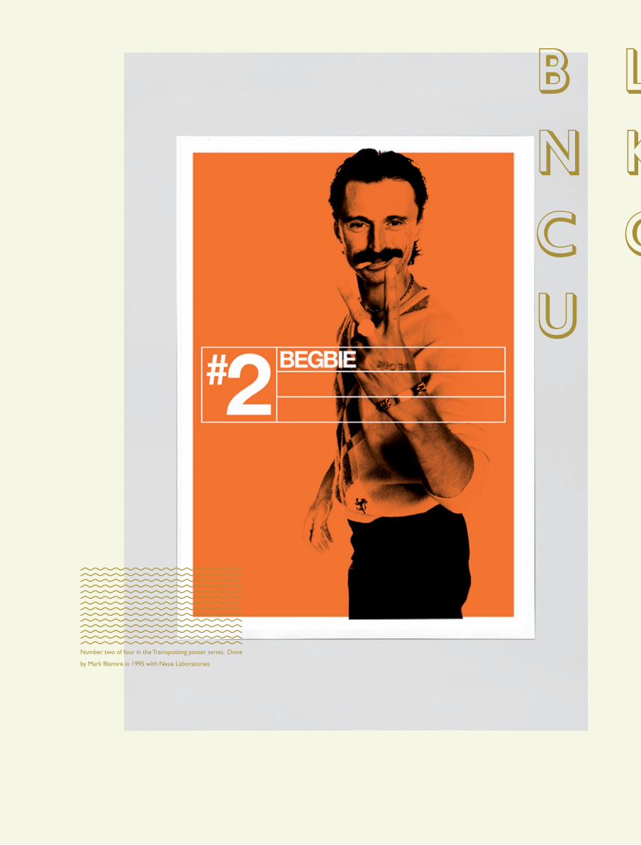
Number two of four in the Trainspotting poster series. Done
by Mark Blamire in 1995 with Neue Laboratories.
20
FTLOP
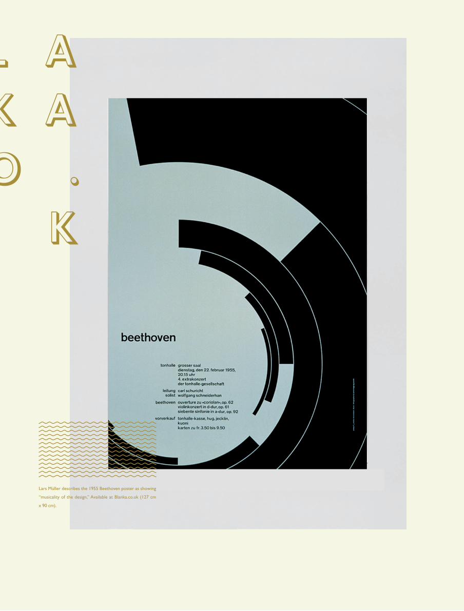
Lars Müller describes the 1955 Beethoven poster as showing
“musicality of the design,” Available at Blanka.co.uk (127 cm
x 90 cm).
B L AN K AC O .U K

21
FTLOP
Amsterdam film Night by Experimental Jetset. Amsterdam film
night 2004 is available at blanka.co.uk (594mm x 420mm).

22
FTLOP
Originally entitled The fastest poster alive inspired by the
graphics of Nascar he thought it would be funnier naming it
the italic poster, in spite he fact that the correct terminology
would be the oblique poster. Executed as a self-initiated pro-
ject by Eivind Molvaer. Available at Blanka.co.uk.
23
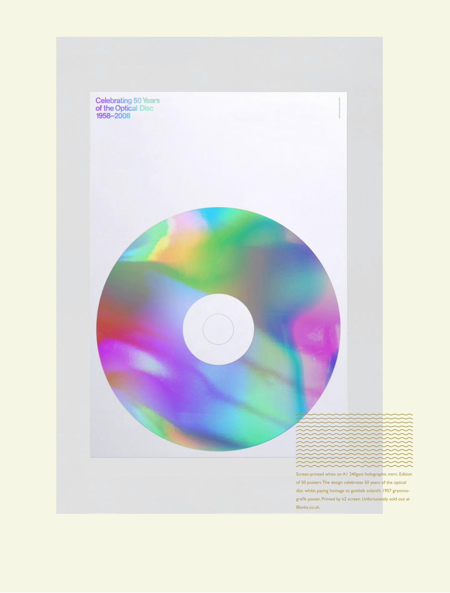
FTLOP
Screen-printed white on A1 240gsm holographic mirri. Edition
of 50 posters. The design celebrates 50 years of the optical
disc whilst paying homage to gottlieb soland’s 1957 grammo-
grafik poster. Printed by k2 screen. Unfortunately sold out at
Blanka.co.uk.


poster break
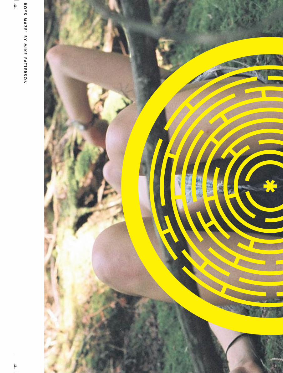
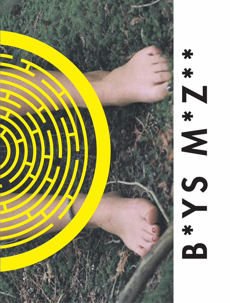
B*Y
S M
*Z**
BO
YS
MA
ZE
* B
Y M
IKE
PA
TT
ER
SO
N
C M Y CM
MY
CY
CMY K
MIKE.pdf 1 9/25/11 1:49 PM
B*Y
S M
*Z**
BO
YS
MA
ZE
* B
Y M
IKE
PA
TT
ER
SO
N
C M Y CM
MY
CY
CMY K
MIKE.pdf 1 9/25/11 1:49 PM
B*Y
S M
*Z**
BO
YS
MA
ZE
* B
Y M
IKE
PA
TT
ER
SO
N
C M Y CM
MY
CY
CMY K
MIKE.pdf 1 9/25/11 1:49 PM
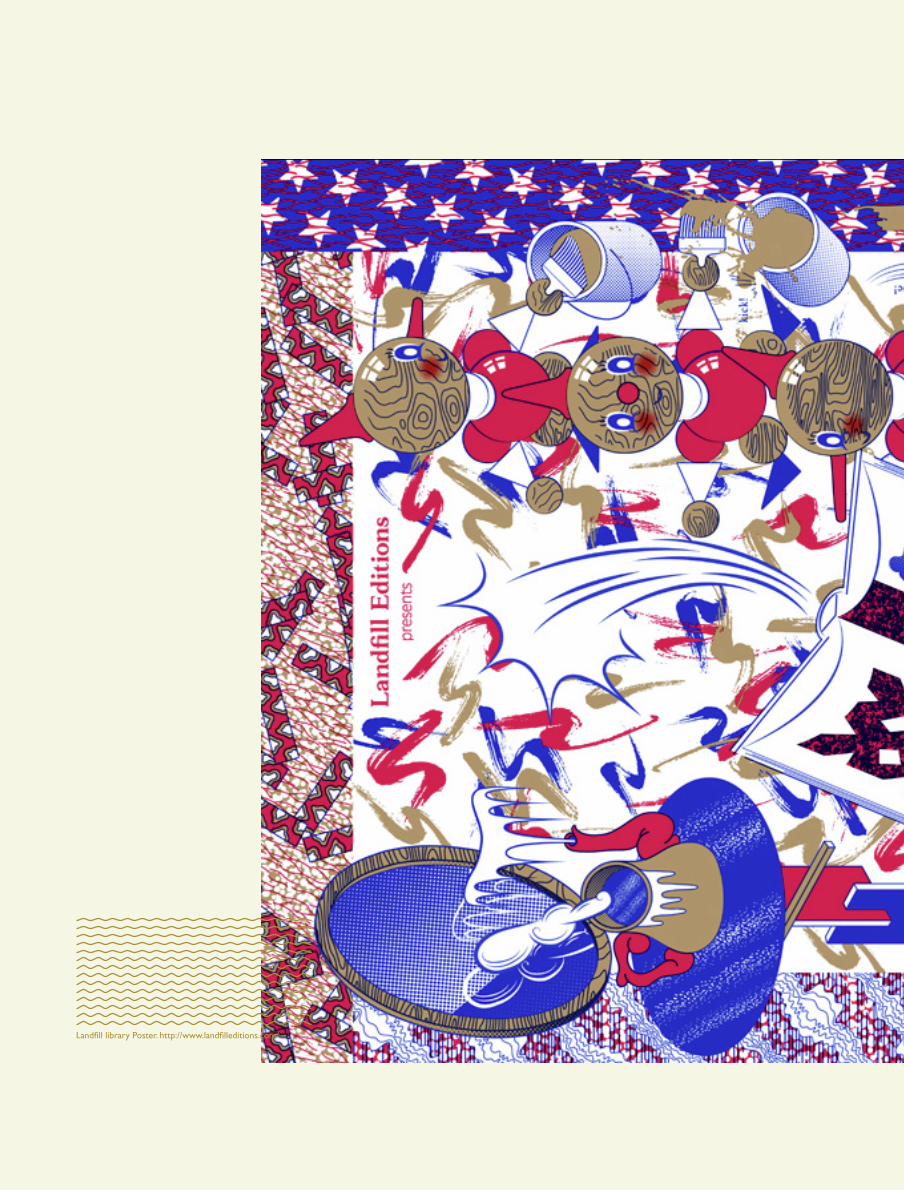
Landfill library Poster. http://www.landfilleditions.com/.


30
FTLOP
Cd cover and promo poster for Tropicool’s Gooch MixTape
#2. http://soundcloud.com/tropicool-official.


Scam* poster series done by Pam et Jenny.
www.pametjenny.be

erikspieker-
mann
36
FTLOP
Erik Spiekermann is a legendary type designer. Dis-
playing his love for type in movies such as the 2007
documentary Helvetica where he referes to type as his
friends or maybe even girlfriend. “They (the letters) are
my friends… Some people look at bottles of wine, or
whatever – girls’ bottoms – I get kicks out of looking at
type.” He has designed typefaces such as ITC Officina,
FF Meta, FF Info. He is also the founder of the german
mega-firm Meta Design and also FontShop which was
the first online font distributor.

37
FTLOP
WHAT ARE YOUR THOUHGTS ON THE ROLE OF
TYPOGRAPHY IN POSTERS?
I actually think that posters are dead as a relevant
medium, except for those big 18 sheet commer-
cial hoardings. Graphic designers still like to make
posters because they look good in reproduction
in the annuals and they’re a good opportunity to
show off as a designer.
Typography’s role is pretty obvious: as we live in
societies that are totally dominated by visual mes-
sages, type combines visual and verbal. As you
need to spell out your message, you spell it out
with type, giving it form. Type is visual language and
communication doesn’t exist without language.
– e

Levi & kristian

40
FTLOP
Levi Bergqvist is a graphic designer at Dinamo and has
done projects for major companies like The Norwe-
gian National Opera and Ballet and Norrøna. Kristian
Hammerstad a freelance illustrator who has done il-
lustrations for Penguin Books, AOL, The New York Times
Magazine and The New Yorker.
Both working at different places and doing very
different things they have spent much of their
youth together and going to school in London
together. One of their first projects together was
painting graffiti on a graduation buss. Levi doing
the type and Kristian making the illustrations much
like how it works today. Were you making charac-
ters? Yup, really Yo characters replies Kristian. Go-
ing to school together and also being the same age
has been an important role in their inspiration, hav-
ing the same references. Having the same refrences
makes it a lot easier for them, when discussing new
projects, on how to visually execute it. Starting of I
guess one of the biggest issues was not to make the
project bigger then yourself. Making the project so
big and so incredible that you were afraid of doing
anything at all says Kristian. Although we did that
anyway replies Levi, at least in hours. Kristian con-
tinues The first year was the worst, but when we
got rid of the nervousness on how our things were
going to work together things got a lot better.
Making alot of event posters together they
view it as a use and toss art. They don’t spend alot
of money on expensive printing, inks, paper and
so on. The poster usually has a life span of a cou-
ple of weeks max and then they are thrown away.
They don’t see the point in overdoing a poster with
expensive techniques or inks for a simple gig at a
local club. They believe in embracing the simplicity.
It’s nice to see that poster can do just fine by it-
self without a lot of fancy techniques says Levi. The
club scene is kind of a shitty place anyway (shitty
meaning dirty not as in the place sucks) so it’s ap-
propriate to make a poster that suits it. And living
in London during the rave and grime scene they’ve
experienced a lot of what a poster is and what it
does. Also the budget is a something you can’t ig-
nore. The budget is the budget says Levi.
Usually posters is a medium which the de-
signer is free to do whatever he or she pleases in
order to showcase him/herself. But with this duo
it’s different. With a lot of hours spent on feeling
each other out they have worked themselves into
a system where they both make place for each oth-
ers freedom and play. Also having a lot of the same
references as kids helps the process thoroughly. In
the beginning it was a little on top of each other.
Then we realized that it was just as good just to
give ourselves no limits in our fields and then talk
a lot during the making. We don’t work at the same
place so we send our sketches back and forth and
then we meet up for a cup of coffee or pint of beer
says Kristian.
They really enjoy graffiti as they both started
out in that field. They enjoy the freedom in graffiti,
that it’s not necessary to be the worlds best painter
to make something that is cool and interesting. They
enjoy the tagging or bombing part of it more then
the street art part. Although we were never tough
enough to actually do it ourselves says Kristian. Al-
most everyone they know having similar careers
derive from graffiti. Big and small agencies across
the country says Levi. It’s a great place to learn, I
probably learned the same amount if not more, do-
ing graffiti then attending school says Kristian.
They portray their love of poster by mak-
ing them together and also collecting a bit, or at
least Levi does. I think that for graphic designers
it’s much more satisfying to work with posters be-
cause of the freedom that they don’t possess in a
lot of their daily work. But for illustrators it’s draw-
ing, and that is basically what we do all the time.
But this is for something more specific something
that I enjoy more then other projects says Kristian.
I agree. I think that graphic designers aren’t used to
being as expressive in their daily work replies Levi.
They also think of Are Kleivan when mentioning
the love of posters.
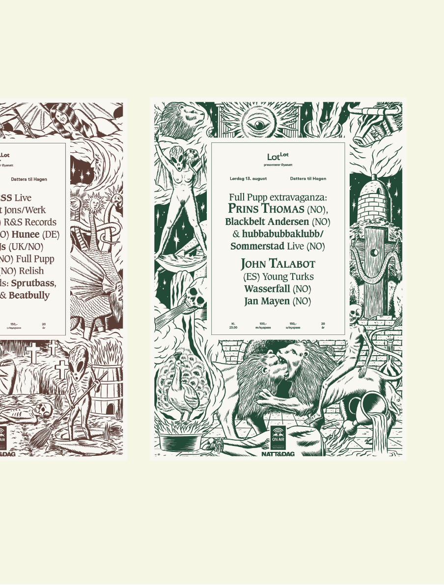
The LotLot project, which is one their most
known poster collections, started out with Levi
and Kristian’s previous work for Bitch Boys. Jonas,
who is one of the Bitch Boys, together with Mattis
runs LotLot, and the question about them doing
the design came quite naturally. We met up with
them and they had a lot of the same ambitions as
we had for this project. And it’s always fun to work
with friends says Levi. They both relate to the elec-
tronic genre which lotlot’s concept is based on.
The thing is that LotLot is a mashup of many dif-
ferent styles within the electronic genre says Levi.
Yeah, the first thing we did was really inspired by
scifi. I think that it was a result of our love for scifi,
and also because when we were about eighteen
we listened to aphex twin and warp music and that
this was our visualization of electronic music. Now
it’s more of a medieval type combined with some
aliens not really sure what that is supposed to be
says Krisitian.
They see the poster as a still strong medium
due to the over marketing on facebook. Every invite
is almost like spam nowadays, you don’t even look at
it anymore says Levi. Their clients still think it’s very
important to get their message out on the street.
They still see the walls as a necessary place to post
their message. Unless people stop looking at walls
and only on their mobiles replies Kristian. During
the LotLot project the posters were actually quite
important. After Øya (a norwegian music festival) it
was important to inform the crowd on where to go
after the festival. So we posted a lot of posters on
the route out of the festival area says Levi.

41
FTLOP
Poster for Bitch Boys feat. Martelo. Illustrated and designed by
Kristian Hammerstad.
42
FTLOP
UndergroundGarage Barbecue
Dattera til HagenSøndag 12. Juni
fra kl. 14.00
The Dahlmanns
The Beat Tornados
The Cocktail Slippers
DJ LittleSteven
Levi Bergqvist / Henrik Tandberg
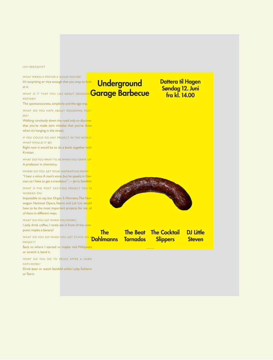
LEVI BERGQVIST
WHAT MAKES A POSTER A GOOD POSTER?
It’s surprising or nice enough that you stop to look
at it.
WHAT IS IT THAT YOU LIKE ABOUT DESIGNING
POSTERS?
The spontanousness, simplicity and the ego trip.
WHAT DO YOU HATE ABOUT DESIGNING POST-
ERS?
Walking carelessly down the road only to discover
that you’ve made som mistake that you’ve done
when it’s hanging in the street.
IF YOU COULD DO ANY PROJECT IN THE WORLD.
WHAT WOULD IT BE?
Right now it would be to do a book together with
Kristian.
WHAT DID YOU WANT TO BE WHEN YOU GREW UP?
A professor in chemistry.
WHERE DO YOU GET YOUR INSPIRATION FROM?
“I hear a voice. A man’s voice, but he speaks in Ger-
man so I have to get a translator.” — Jerry Seinfeld.
WHAT IS THE MOST EXCITING PROJECT YOU’VE
WORKED ON?
Impossible to say, but Organ 3, Norrøna, The Nor-
wegian National Opera, Vestre and Lot Lot would
have to be the most important projects for me, all
of them in different ways.
WHAT DO YOU EAT WHEN YOU WORK?
I only drink coffee, I rarely eat in front of the com-
puter, maybe a banana?
WHAT DO YOU DO WHEN YOU GET STUCK ON A
PROJECT?
Back to where I started or maybe visit Wikipedia
or stretch it, bend it.
WHAT DO YOU DO TO RELAX AFTER A HARD
DAYS WORK?
Drink beer or watch Seinfeld whilst I play Solitaire
or Tetris.

43
FTLOP
KRISTIAN HAMMERSTAD
WHAT MAKES A POSTER A GOOD POSTER?
Everything that gets notices in the jungle of infor-
mation.
WHAT IS IT THAT YOU LIKE ABOUT DESIGNING
POSTERS?
The freedom that follows. It’s rarely any money in-
volved, so the things you make posters for is usu-
ally something that you really want to do.
WHAT DO YOU HATE ABOUT DESIGNING POSTERS?
There is nothing I hate about it, but usually the
most difficult part is the typography.
IF YOU COULD DO ANY PROJECT IN THE WORLD.
WHAT WOULD IT BE?
That’s really hard to answer. I work with something
that I am so passionate about that I feel as if I am
doing it already.
WHAT DID YOU WANT TO BE WHEN YOU GREW UP?
I don’t remember, but I’ve always had the need to
make and draw things. So naturally I’ve become
what I had to become.
WHERE DO YOU GET YOUR INSPIRATION FROM?
All sorts of stuff, usually anything that doesn’t invo-
vle design and illustration. Movies, litterature, mu-
sic and that sort of things.
WHAT IS THE MOST EXCITING PROJECT YOU’VE
WORKED ON?
A project where I got to work with the comic
book writer Alan Moore something that’s still in
progress.
WHAT DO YOU EAT WHEN YOU WORK?
Sandwiches or something else that’s fast to make.
WHAT DO YOU DO WHEN YOU GET STUCK ON A
PROJECT?
Browse around the internett or watch news on
BBC 24.
WHAT DO YOU DO TO RELAX AFTER A HARD
DAYS WORK?
I watch a movie or a tv series, work out or maybe
even a beer.

44
FTLOP
45
FTLOP

Posters for Japan – 100 ting til ettertanke2011 (c) Levi Bergqvist


paul sahre

52
FTLOP
We sendt a mail to Paul Sahre after his brief at AGI
2011 were he was talking a lot about that you should
design what you want. We asked him what he thought
about the freedom in the poster as a medium and
what he thought about that in regards to his talk at AGI
this is what he replied.
Hello FTLOP
about posters.
s i z em atters

53
FTLOPs i z em atters


jarrgeerligs
56
FTLOP
An obsessive collector who turned his obsession
into something really inspiring and beautiful. Jarr
Geerligs is a creative beeing who lives and works in
Amsterdam. He is currently an art director and de-
signer for Selmore Creative Agency. He also runs the
beautiful webpage postersinamsterdam.com which is
a personal poster archive that he has been collecting
since 2002 and contains more then 2700 posters.
WHAT MAKES A GOOD POSTER FOR YOU?
Choices. It is all about hard choices. How is this
poster going to stand out? In colour. In shapes. In
its message. In its idea. A good poster has or cre-
ates contrast in its self or with its surroundings.
HOW WOULD YOU DEFINE REAL LOVE FOR POSTERS?
I am not sure if I can define it. But I can illustrate
it by a few examples. Like coming to late for meet-
ings, because I had to take a picture of a nice post-
er. Or letting my colleagues and family wait in the
cold and rain for me to take a picture. Mostly I take
pictures of posters while I am bicycling through
the city, but I even stop for them when I am by car.
I started in 2002 and I am still taking pictures of
posters. Yeah, you can call it love alright.
CAN YOU RELATE TO THE POSTER BEING A
SPRINGBOARD INTO GRAPHIC DESIGN, AND WAS
THAT THE CASE FOR YOU?
My springboard were flyers and websites. But be-
fore I started designing I noticed that I was a suck-
er for well designed stuff. From logo’s to products.
From flyers to books. So I started to collect nice
products and books. With everything I liked I asked
myself why I liked it. This way I found what worked.
But I didn’t get there right away. When I look back
at the first things I designed when I started they
were very hideous. I am getting a bit better now.
But you have to keep breaking out of your comfort
zone. What also really helped me was reading es-
says written by designers about design. Steve Hel-
ler initiated a whole lot of these books. (By that
I mean that many designers start out just making
posters for fun and then develop a big interest for
graphic design).
WHAT DO YOU THINK ABOUT THE SELF INITIATED
POSTER SCENE?
I like it. It is a self created opportunity for design-
ers to make some great work without the fuzz of
a client. It creates a lot of space for experimenting.
To come up with something new or interesting.
Maybe you do some of these yourself?
Yes, I did some self initiated posters, but they were
pure fictional to try out some of my own made
typefonts.
WHAT ARE YOUR TAKES ON COMMERCIALLY DE-
SIGNED POSTERS VERSUS SELF- INITIATED WHEN
WE ARE TALKING ABOUT POSTER LOVE. IS THERE
A DIFFERENCE BETWEEN THESE OR ARE THEY THE
SAME?
With self-initiated posters you can go very far in
stripping the design to its bare essentials. Making
the poster stronger. Unfortunately most clients
want to put in extra’s. More logo’s, a website, some
extra text and the clutter goes on. If there is to
much clutter the poster won’t stand out. It will go
unnoticed. With self-initiated posters you can be
your own worst and best client at the same time.
But there are as far as I know not many designers
who could live from self-initiated posters alone.
WHAT DO YOU THINK OF THE PRINT PROCESS OF
POSTERS, THE MORE HAND MADE THE MORE LOVE OR?
I love the printing process. My stepfather used
to work at a press factory. The print process is
a magical process. But I have to admit that I am
a very digital guy. And I don’t print that much. It
also has to do with time for me. I do my designing
mostly next to my day job. It makes it harder to do
my own printing or creating more tactile designs. I
think things made in on the computer can be hand
made as well. You can put your love for design in
every decision. Which ever brush you use to make
your designs.
WHAT IS YOUR PROCESS LIKE WHEN YOU MAKE
POSTERS?
It depends on the task at hand. But for the Sub-
Tone posters it mostly started with me coming up
with a theme or fraise for the clubnight. Than I try
to find the form in which I want to tell the theme.
I used to make a lot of designs with an illustrated
idea in for SubTone. After which I went for a more
typographic style. Using fonts I liked and creating
something different with them. The route I take
now is one of creating the fonts myself. For other
projects I first come up with an idea, and then I try
to find the best fitting style to work it out.
WHAT’S THE MOST EXCITING DESIGN PROJECT
YOU EVER WORKED ON?
The work I do for SubTone. I get a lot of freedom
to do what ever I like. As long as it is fresh and has
a link to the style of music they play.
TELL US ABOUT YOUR POSTERSINAMSTERDAM?
After going out to clubs and collecting flyers for
years. A printed medium I really love. I was looking
for other ways to collect graphic designs for my
personal archive. By biking through Amsterdam I
noticed the shortness of time for posters to be up
on the walls. And all the different design approach-
es by designers. This made me start to photograph
the ones I liked with my first digital camera in
2002. It is like I am giving the posters an afterlife.
Or giving the city a memory of their existence.
WHAT DESIGN PROJECT ARE YOU CURRENTLY
WORKING ON?
It is a poetry booklet about love in Dutch. I design
and illustrate it on the basis of a special font. Kim
Triesscheijn and I write the poems together. Hope-
fully it will come next year.

57
FTLOP
p o st e rs i na m st e rd a m c o m

58
FTLOP
p o st e rs i na m st e rd a m c o m
.
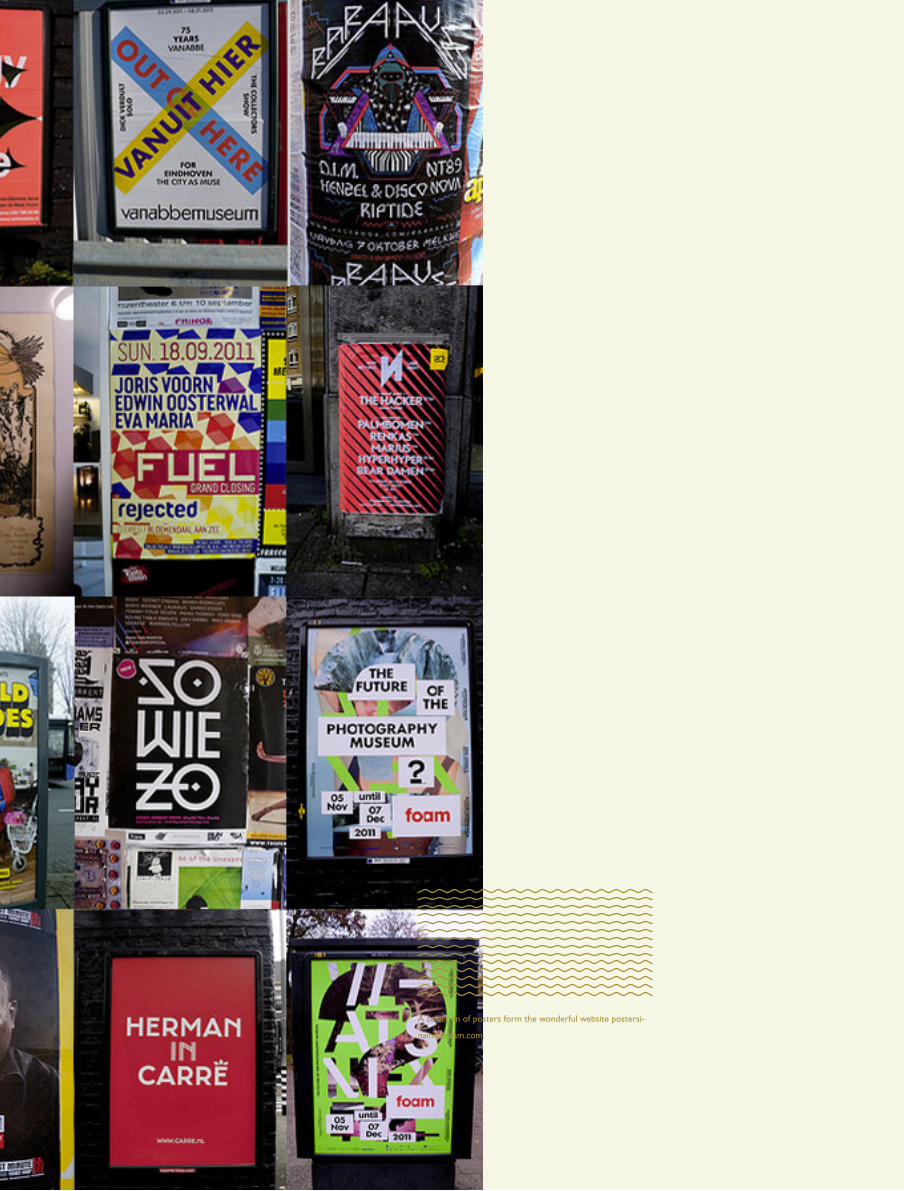
A selection of posters form the wonderful website postersi-
namsterdam.com.

poster break

AutorouteGenève-Lausanne
Ch.JoinvilleCh.de l'Avanchet C
ITÉ
DES
AVA
NC
HET
S
BALE
XERT
Cen
tre c
omm
erci
al
Av. L
ouis-
Casa
ï
Car
r.du
Bou
chet
Rout
e de
Mey
rinRo
ute
de M
eyrin
Ch. d
e l'É
tang
Ch. J-Ph De Sauvage
Av. du Pailly
Écol
e
Ve
na
nt
de
l’a
uto
rou
te L
au
san
ne
-Ge
nè
ve
: D
epui
s l’a
v. C
asaï
, tou
rner
à d
roite
pou
r l’a
v. d
u Pa
illy,
di-
rect
ion
Car
ouge
-Per
ly. A
près
100
m en
viro
n, to
urne
r à d
roite
di
rect
ion
Mey
rin-S
t-Den
is. C
ette
pho
to a
été
pris
e au
déb
ut
de l’
av. d
u Pa
illy.
A c
e m
omen
t, vo
us d
evez
impé
rativ
emen
t vo
us m
ettre
à d
roite
pou
r pou
voir
bifu
rque
r à d
roite
apr
ès le
pa
ssag
e pi
éton
s. R
até
ce p
assa
ge, v
ous n
e po
uvez
plu
s qui
t-te
r l’a
utor
oute
que
plu
sieu
rs k
ilom
ètre
s plu
s loi
n...
Ve
na
nt
de
Ge
nè
ve
-Vil
le :
Au
Car
refo
ur d
u B
ouch
et, p
rend
re la
Rou
te d
e M
eyrin
. Gar
-de
r bie
n la
pré
séle
ctio
n de
dro
ite d
irect
ion
Ann
ecy,
tour
ner
à dr
oite
just
e so
us le
pon
t, ap
rès
le c
entre
com
mer
cial
de
Bal
exer
t.
Ve
na
nt
de
pu
is M
eyr
in :
Entre
z da
ns le
par
king
Bal
exer
t pou
r en
ress
ortir
sur l
a ro
ute
de M
eyrin
en
face
, et p
rend
re to
ut d
e su
ite la
1èr
e à
droi
te.
Tra
m 1
4 e
t 16
:
arr
êt A
van
chet
s
Bu
s 9
, 10
, 5
1 e
t 5
3 :
arr
êt B
ale
xert
-Pa
illy
GP
S :
46°1
3’0
9.2
2’’ N
6°0
6’3
7.6
9’’
E
SALL
E D
ES A
VAN
CH
ETS
17 ru
e Fr
anço
is-D
uraf
our,
Vern
ier
ww
w.c
osun
am.c
h C
P 35
3, 1
211
Gen
ève
17
Nou
veau
par
king
de
Bale
xert
P3
- Ec
ole
Mig
ros
en fa
ce d
e la
Sal
le d
es F
êtes
les
3 pr
emiè
res
heur
es g
ratu
ites
4èm
e he
ure:
1.-
par
1/2 he
ure
—Y
BAN
TH
�Y-S
∏ VIš
T-N
AMCO
SUN
AM
Thie
rry
Opp
ikof
erH
o‡ng
ÒÏn
h T‹
©ng
Jean
-Mar
c Co
mte
Ngu
yÕn
ÒÊn
g Kh
‰i
Paul
Kei
ser
Ngu
yÕn
TÊng
L¤y
Ngu
yÕn
ThΠX
uan
Tran
gH
o‡ng
ThŒ
Th¯
y-C÷
´TÊ
T C
OSU
NA
M 2
010
´TÊ
TC
OSU
NA
M20
10
SAM
EDI 6
FÉV
RIER
201
0DÈ
S 18
H
NOUV
EL A
N VI
ETNA
MIE
NSA
LLE
DES
AVAN
CHET
S
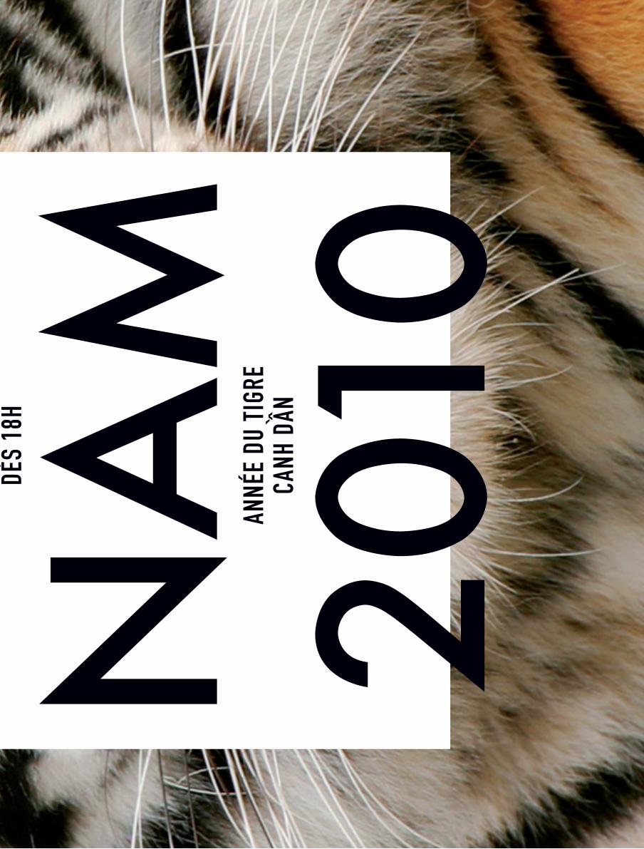
ANNÉ
E DU
TIG
RECA
NH D
ÂN`
AutorouteGenève-Lausanne
Ch.JoinvilleCh.de l'Avanchet C
ITÉ
DES
AVA
NC
HET
S
BALE
XERT
Cen
tre c
omm
erci
al
Av. L
ouis-
Casa
ï
Car
r.du
Bou
chet
Rout
e de
Mey
rinRo
ute
de M
eyrin
Ch. d
e l'É
tang
Ch. J-Ph De Sauvage
Av. du Pailly
Écol
e
Ve
na
nt
de
l’a
uto
rou
te L
au
san
ne
-Ge
nè
ve
: D
epui
s l’a
v. C
asaï
, tou
rner
à d
roite
pou
r l’a
v. d
u Pa
illy,
di-
rect
ion
Car
ouge
-Per
ly. A
près
100
m en
viro
n, to
urne
r à d
roite
di
rect
ion
Mey
rin-S
t-Den
is. C
ette
pho
to a
été
pris
e au
déb
ut
de l’
av. d
u Pa
illy.
A c
e m
omen
t, vo
us d
evez
impé
rativ
emen
t vo
us m
ettre
à d
roite
pou
r pou
voir
bifu
rque
r à d
roite
apr
ès le
pa
ssag
e pi
éton
s. R
até
ce p
assa
ge, v
ous n
e po
uvez
plu
s qui
t-te
r l’a
utor
oute
que
plu
sieu
rs k
ilom
ètre
s plu
s loi
n...
Ve
na
nt
de
Ge
nè
ve
-Vil
le :
Au
Car
refo
ur d
u B
ouch
et, p
rend
re la
Rou
te d
e M
eyrin
. Gar
-de
r bie
n la
pré
séle
ctio
n de
dro
ite d
irect
ion
Ann
ecy,
tour
ner
à dr
oite
just
e so
us le
pon
t, ap
rès
le c
entre
com
mer
cial
de
Bal
exer
t.
Ve
na
nt
de
pu
is M
eyr
in :
Entre
z da
ns le
par
king
Bal
exer
t pou
r en
ress
ortir
sur l
a ro
ute
de M
eyrin
en
face
, et p
rend
re to
ut d
e su
ite la
1èr
e à
droi
te.
Tra
m 1
4 e
t 16
:
arr
êt A
van
chet
s
Bu
s 9
, 10
, 5
1 e
t 5
3 :
arr
êt B
ale
xert
-Pa
illy
GP
S :
46°1
3’0
9.2
2’’ N
6°0
6’3
7.6
9’’
E
SALL
E D
ES A
VAN
CH
ETS
17 ru
e Fr
anço
is-D
uraf
our,
Vern
ier
ww
w.c
osun
am.c
h C
P 35
3, 1
211
Gen
ève
17
Nou
veau
par
king
de
Bale
xert
P3
- Ec
ole
Mig
ros
en fa
ce d
e la
Sal
le d
es F
êtes
les
3 pr
emiè
res
heur
es g
ratu
ites
4èm
e he
ure:
1.-
par
1/2 he
ure
—Y
BAN
TH
�Y-S
∏ VIš
T-N
AMCO
SUN
AM
Thie
rry
Opp
ikof
erH
o‡ng
ÒÏn
h T‹
©ng
Jean
-Mar
c Co
mte
Ngu
yÕn
ÒÊn
g Kh
‰i
Paul
Kei
ser
Ngu
yÕn
TÊng
L¤y
Ngu
yÕn
ThΠX
uan
Tran
gH
o‡ng
ThŒ
Th¯
y-C÷
´TÊ
T C
OSU
NA
M 2
010
´TÊ
TC
OSU
NA
M20
10
SAM
EDI 6
FÉV
RIER
201
0DÈ
S 18
H
NOUV
EL A
N VI
ETNA
MIE
NSA
LLE
DES
AVAN
CHET
S
ANNÉ
E DU
TIG
RECA
NH D
ÂN`

T H E N E X T I S S U E I S A L L A B O U T T P O G A P H Y. I F YO U WA N T T O S U B S C R I B E S E N D U S A M A I L AT S U B -AT- F T L O P

D OT C O M A N D W E W I L L B E S U R E TO M A I L YO U A C O P Y A S S O O N A S I T ’ S D O N E .
FTLOT


Recommended