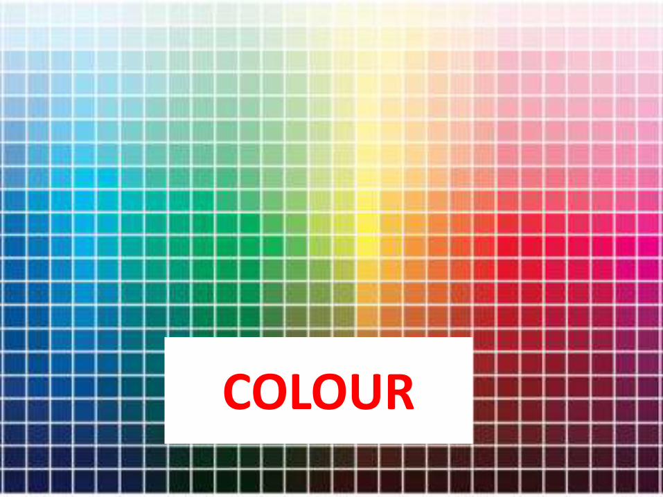
COLOUR
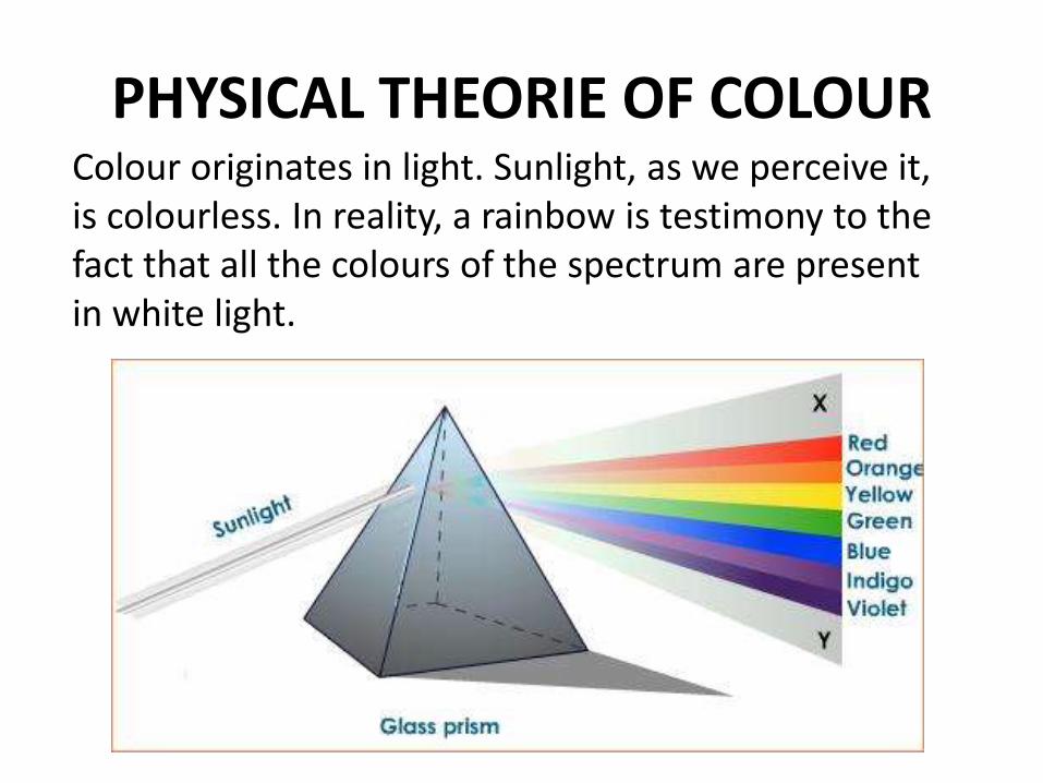
PHYSICAL THEORIE OF COLOURColour originates in light. Sunlight, as we perceive it, is colourless. In reality, a rainbow is testimony to the fact that all the colours of the spectrum are present in white light.
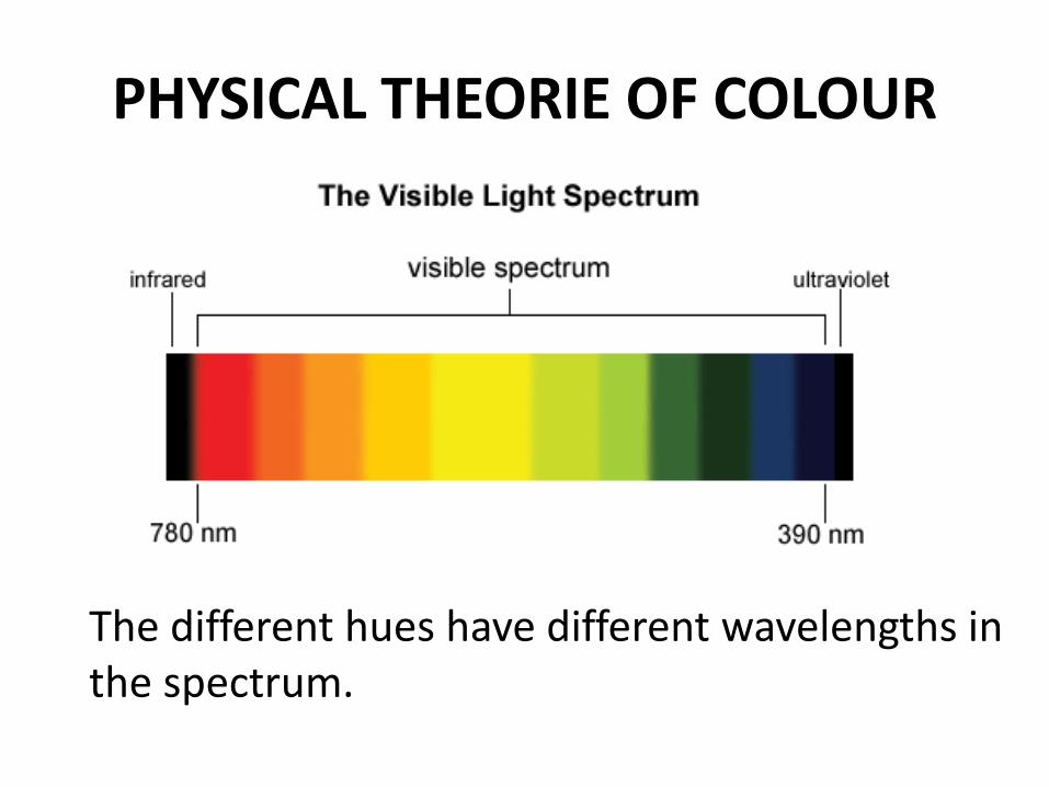
PHYSICAL THEORIE OF COLOUR
The different hues have different wavelengths in the spectrum.
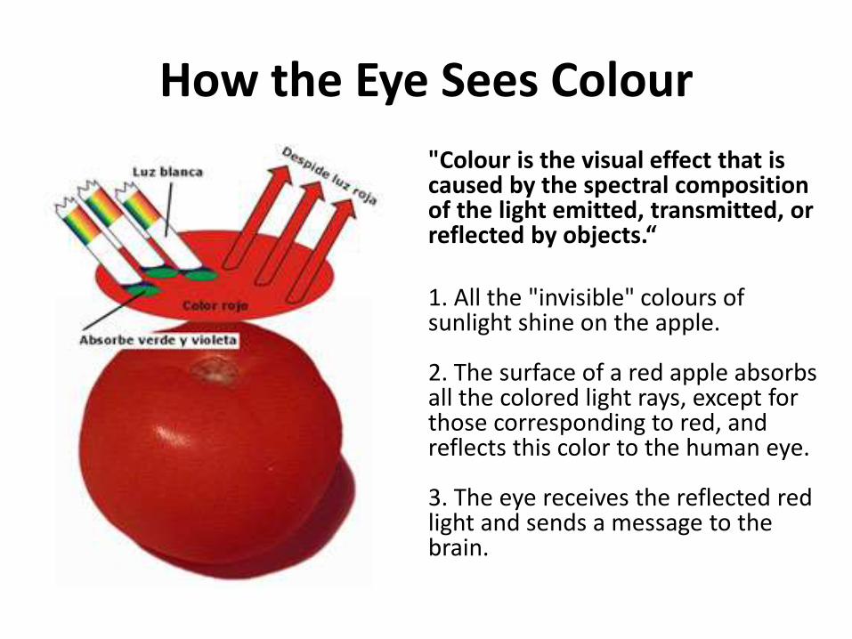
How the Eye Sees Colour
"Colour is the visual effect that is caused by the spectral composition of the light emitted, transmitted, or reflected by objects.“
1. All the "invisible" colours of sunlight shine on the apple.
2. The surface of a red apple absorbs all the colored light rays, except for those corresponding to red, and reflects this color to the human eye.
3. The eye receives the reflected red light and sends a message to the brain.
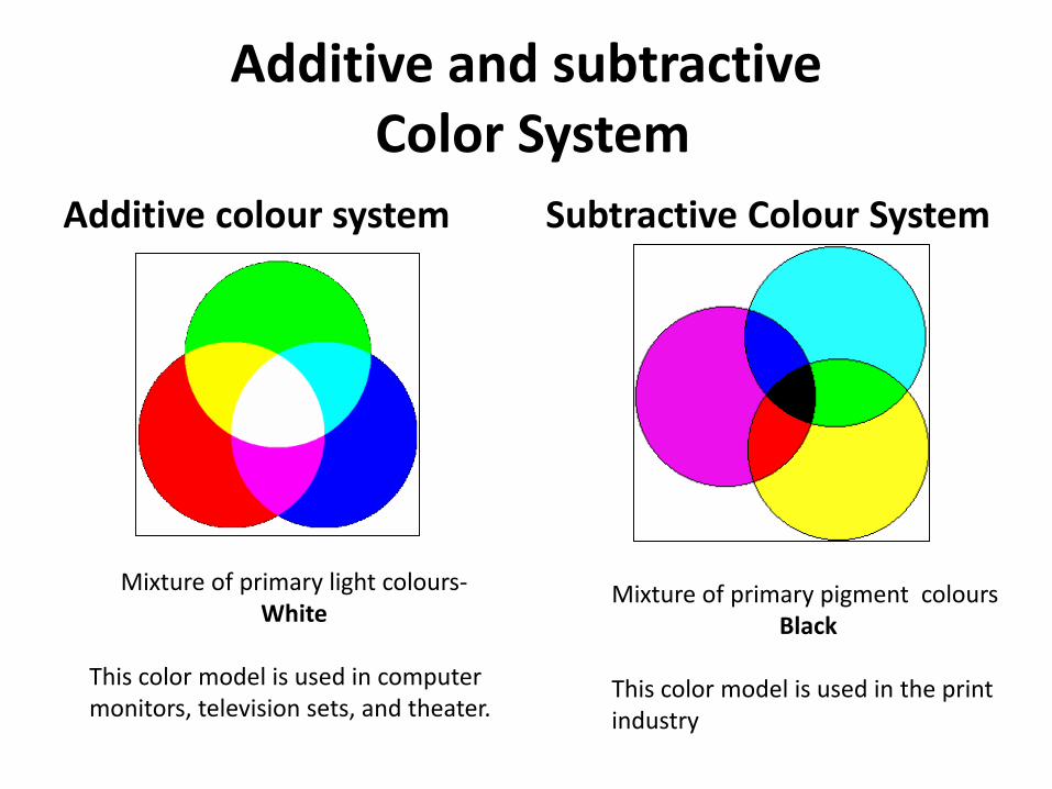
Additive and subtractiveColor System
Additive colour system Subtractive Colour System
Mixture of primary light colours-White
This color model is used in computer monitors, television sets, and theater.
Mixture of primary pigment coloursBlack
This color model is used in the printindustry
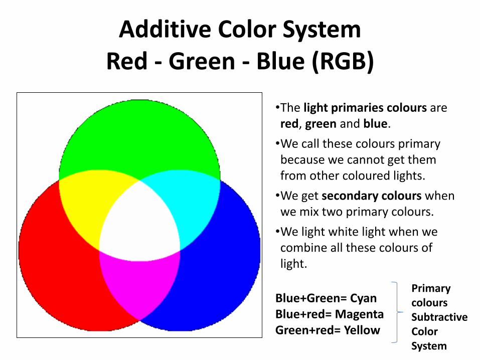
Additive Color SystemRed - Green - Blue (RGB)
•The light primaries colours are red, green and blue.
•We call these colours primary because we cannot get them from other coloured lights.
•We get secondary colours when we mix two primary colours.
•We light white light when we combine all these colours of light.
Blue+Green= CyanBlue+red= MagentaGreen+red= Yellow
PrimarycoloursSubtractiveColor System
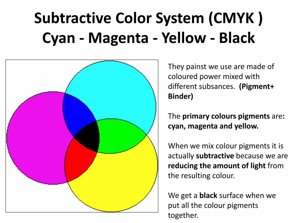
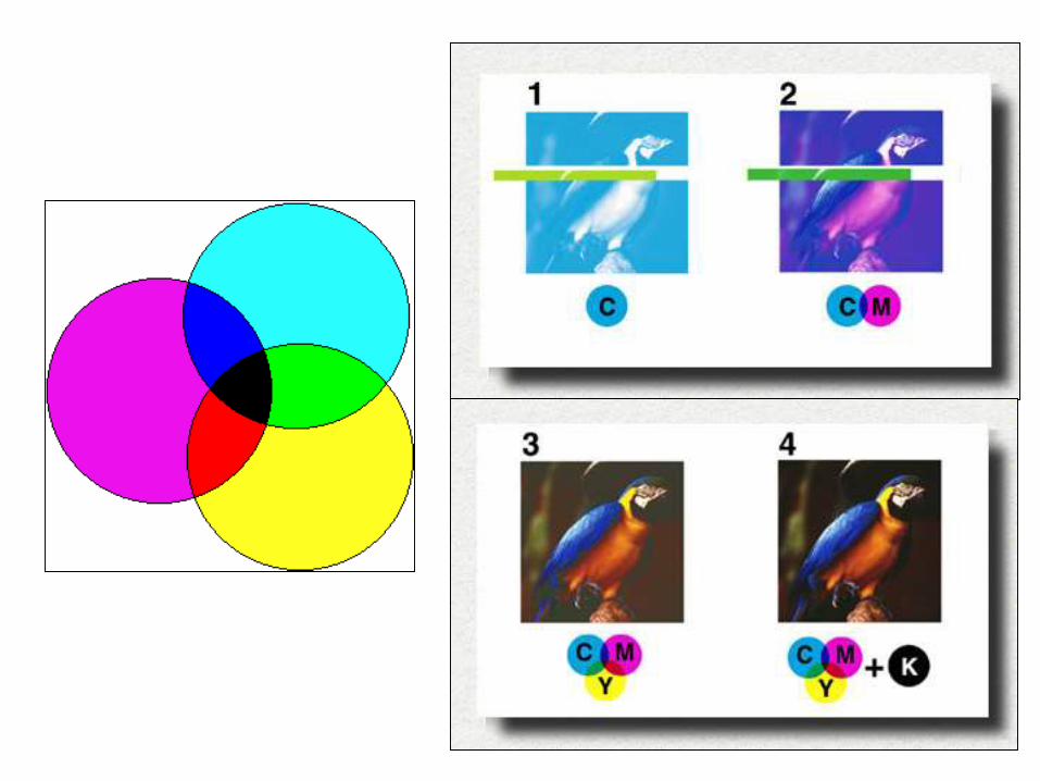
Subtractive Color System (CMYK )Cyan - Magenta - Yellow - Black
They painst we use are made of coloured power mixed withdifferent subsances. (Pigment+ Binder)
The primary colours pigments are: cyan, magenta and yellow.
When we mix colour pigments it isactually subtractive because we are reducing the amount of light fromthe resulting colour.
We get a black surface when weput all the colour pigments together.
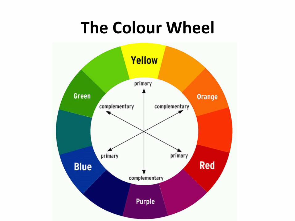
The Colour Wheel
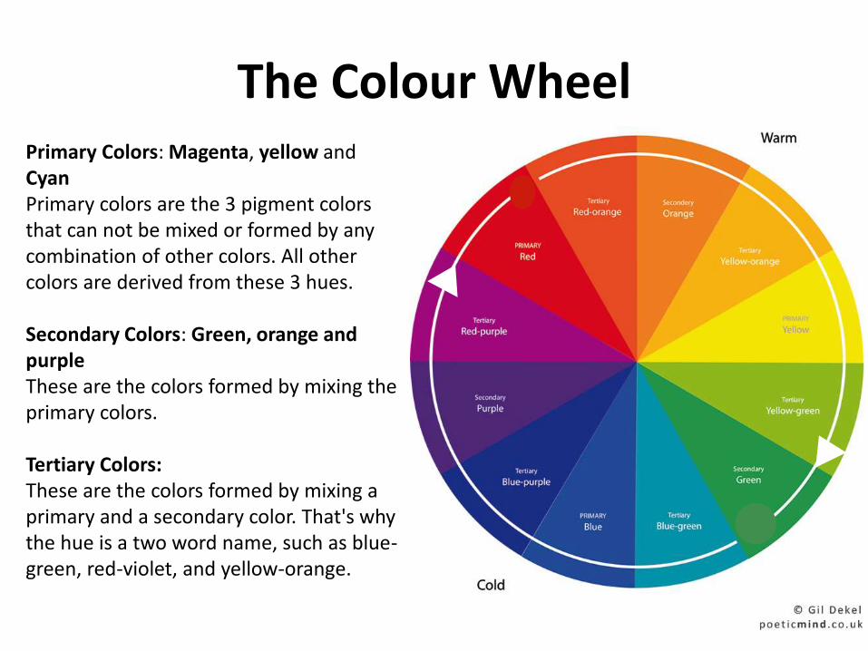
The Colour WheelPrimary Colors: Magenta, yellow and CyanPrimary colors are the 3 pigment colors that can not be mixed or formed by any combination of other colors. All other colors are derived from these 3 hues.
Secondary Colors: Green, orange and purpleThese are the colors formed by mixing the primary colors.
Tertiary Colors:These are the colors formed by mixing a primary and a secondary color. That's why the hue is a two word name, such as blue-green, red-violet, and yellow-orange.
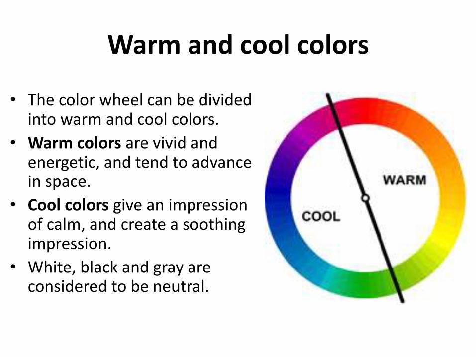
Warm and cool colors
• The color wheel can be divided into warm and cool colors.
• Warm colors are vivid and energetic, and tend to advance in space.
• Cool colors give an impression of calm, and create a soothing impression.
• White, black and gray are considered to be neutral.
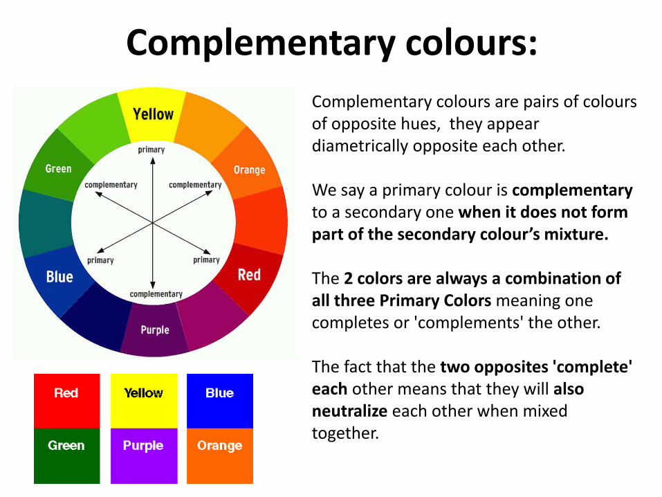
Complementary colours:
Complementary colours are pairs of colours of opposite hues, they appear diametrically opposite each other.
We say a primary colour is complementaryto a secondary one when it does not form part of the secondary colour’s mixture.
The 2 colors are always a combination of all three Primary Colors meaning one completes or 'complements' the other.
The fact that the two opposites 'complete' each other means that they will also neutralize each other when mixed together.
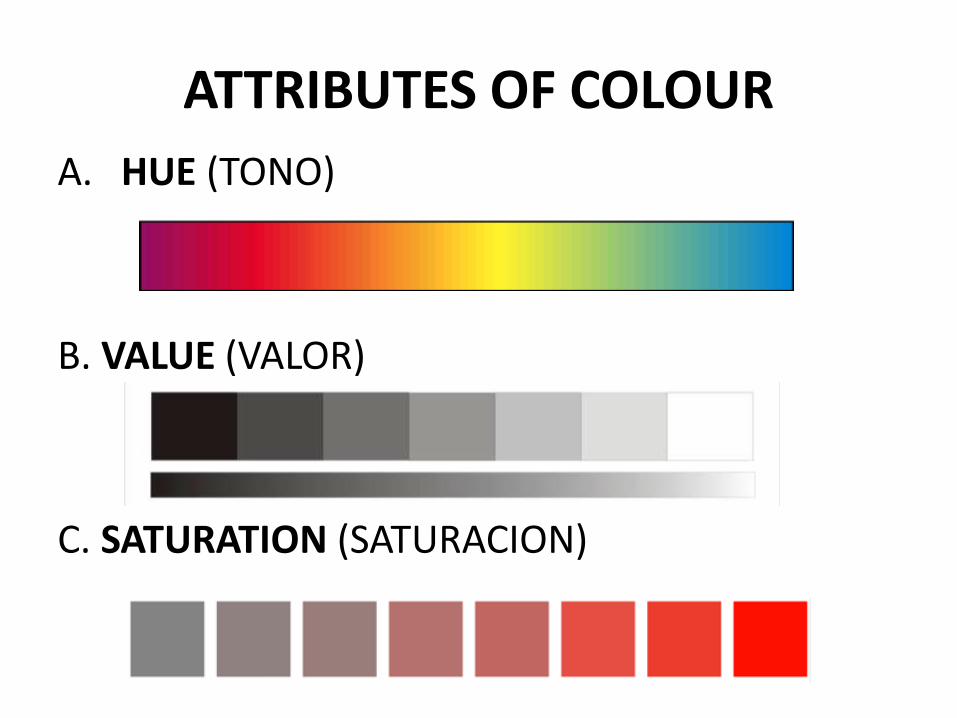
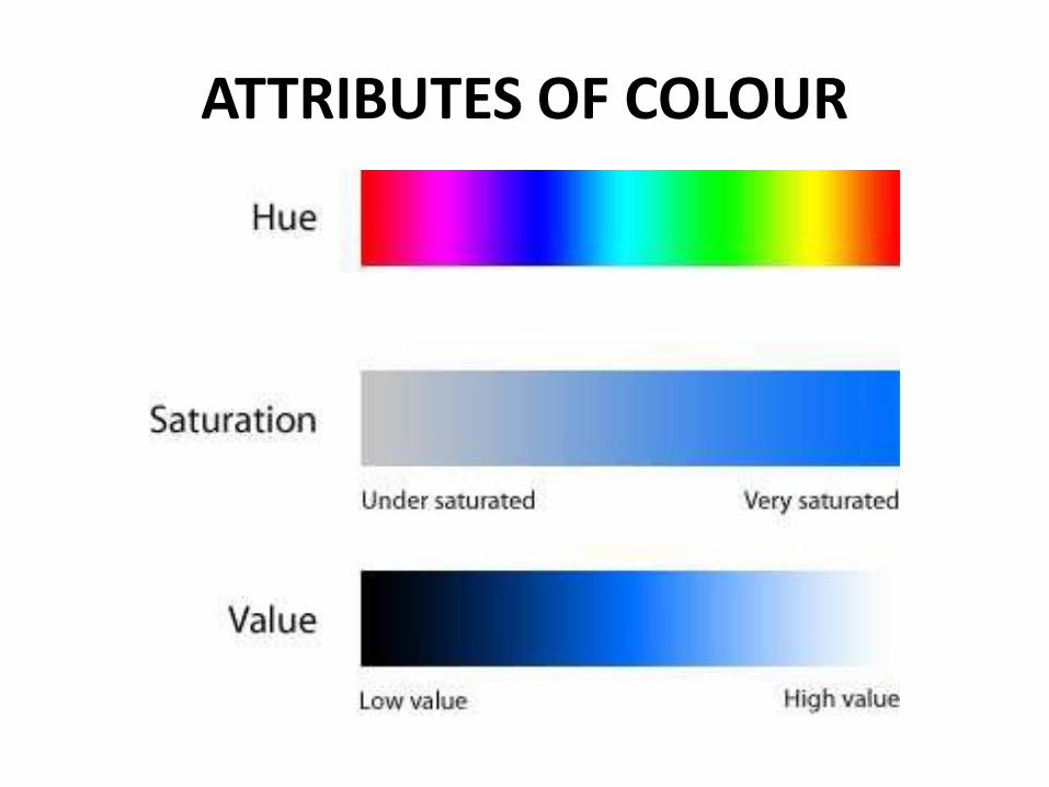
ATTRIBUTES OF COLOUR
A. HUE (TONO)
B. VALUE (VALOR)
C. SATURATION (SATURACION)
ATTRIBUTES OF COLOUR
ATTRIBUTES OF COLOUR
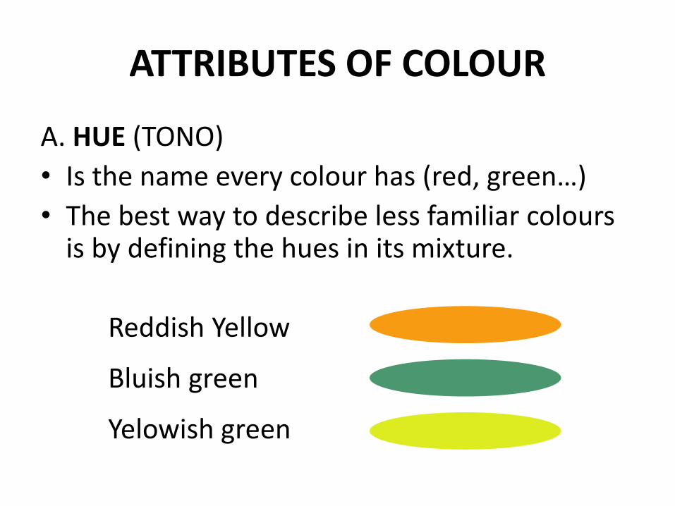
A. HUE (TONO)
• Is the name every colour has (red, green…)
• The best way to describe less familiar coloursis by defining the hues in its mixture.
Reddish Yellow
Bluish green
Yelowish green
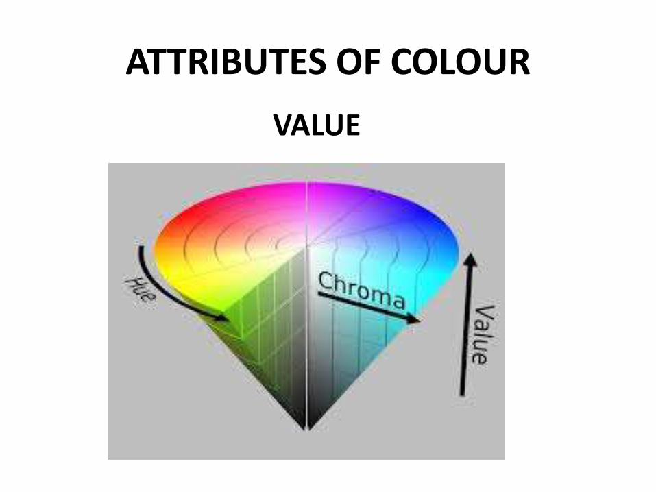
ATTRIBUTES OF COLOUR
VALUE
ATTRIBUTES OF COLOUR
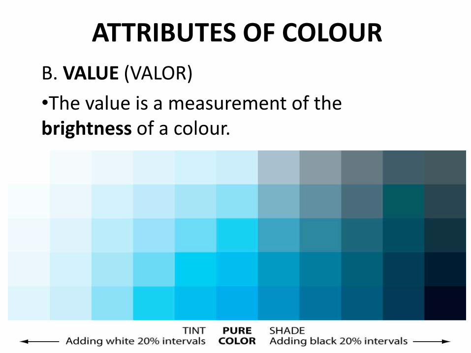
B. VALUE (VALOR)
•The value is a measurement of the brightness of a colour.
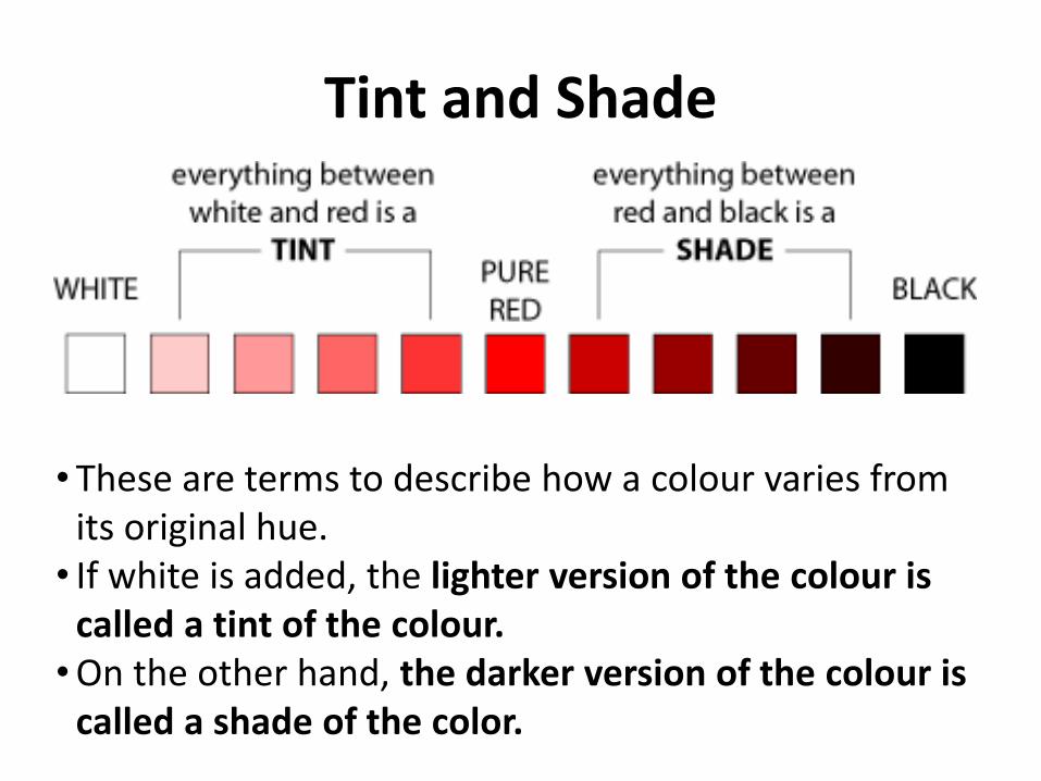
Tint and Shade
• These are terms to describe how a colour varies from its original hue. • If white is added, the lighter version of the colour is
called a tint of the colour.•On the other hand, the darker version of the colour is
called a shade of the color.
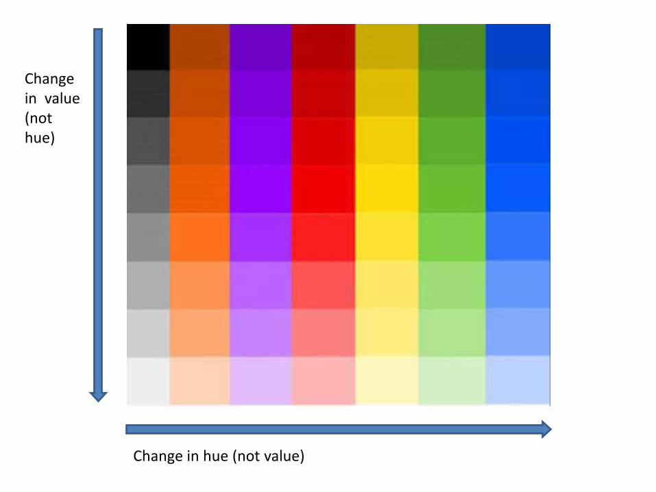
Change in value (not hue)
Change in hue (not value)
ATTRIBUTES OF COLOUR
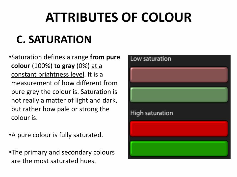
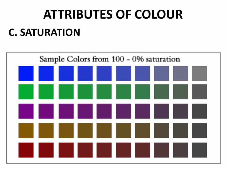
C. SATURATION
•Saturation defines a range from pure colour (100%) to gray (0%) at a constant brightness level. It is a measurement of how different from pure grey the colour is. Saturation is not really a matter of light and dark, but rather how pale or strong the colour is.
•A pure colour is fully saturated.
•The primary and secondary colours are the most saturated hues.
ATTRIBUTES OF COLOURC. SATURATION
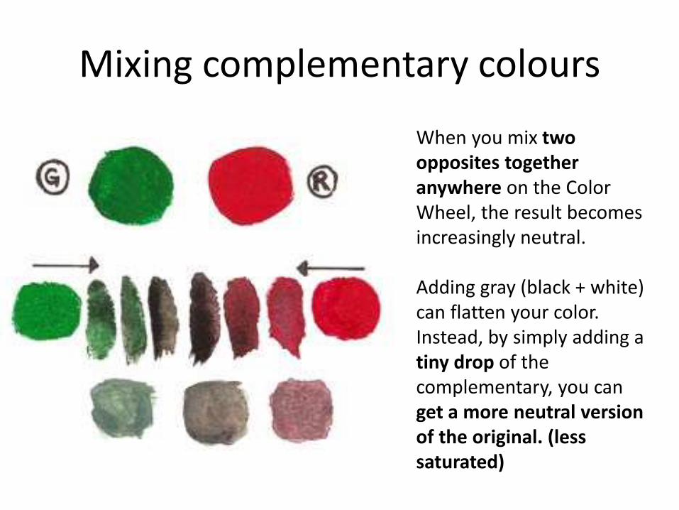
Mixing complementary colours
When you mix two opposites together anywhere on the Color Wheel, the result becomes increasingly neutral.
Adding gray (black + white) can flatten your color. Instead, by simply adding a tiny drop of the complementary, you can get a more neutral version of the original. (less saturated)
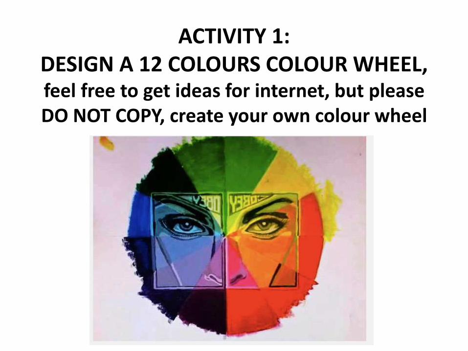
ACTIVITY 1:DESIGN A 12 COLOURS COLOUR WHEEL, feel free to get ideas for internet, but pleaseDO NOT COPY, create your own colour wheel
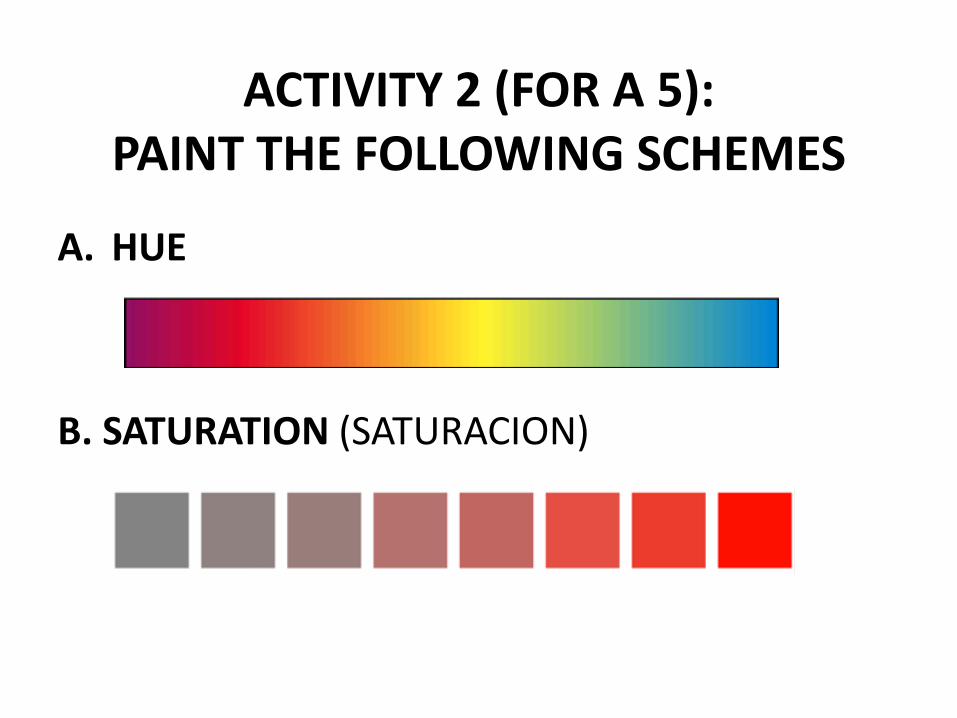
ACTIVITY 2 (FOR A 5):PAINT THE FOLLOWING SCHEMES
A. HUE
B. SATURATION (SATURACION)
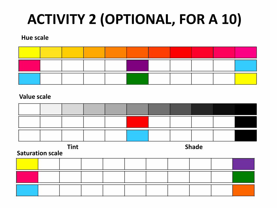
ACTIVITY 2 (OPTIONAL, FOR A 10)Hue scale
Value scale
Saturation scaleTint Shade
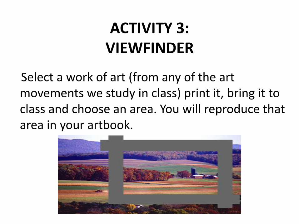
ACTIVITY 3:VIEWFINDER
Select a work of art (from any of the art movements we study in class) print it, bring it to class and choose an area. You will reproduce thatarea in your artbook.
ACTIVITY 4:INTERPRETATION OF A WORK OF ART
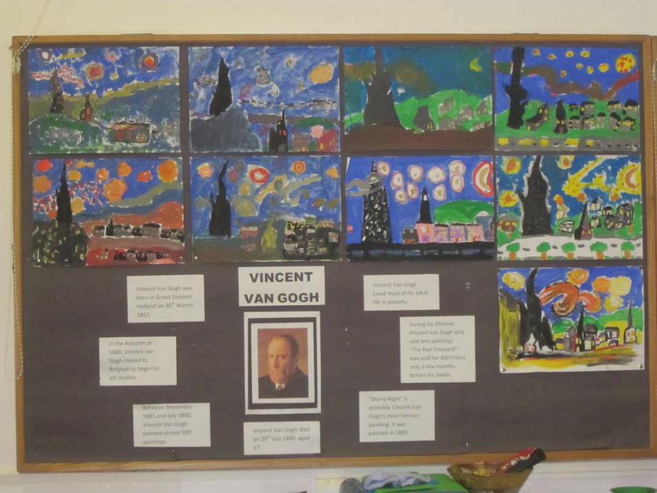
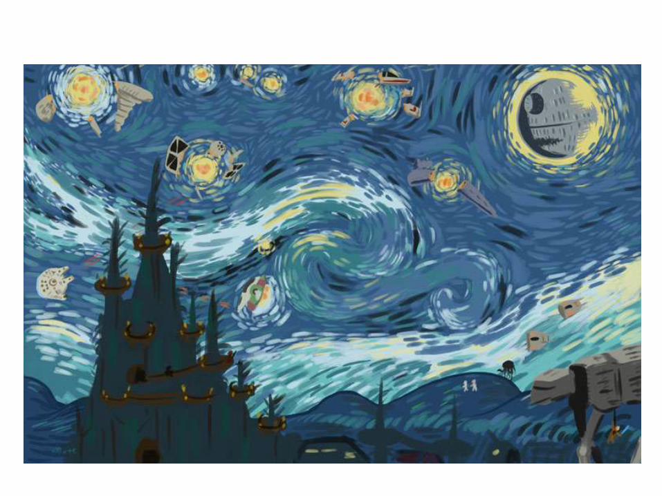
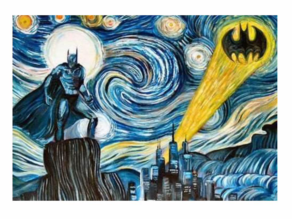
Select a work of art (from an art movement thatyou like, that you identify with) print it, bring it to class and DO AN ORIGINAL AND CREATIVE INTERPRETATION OF THAT WORK.
For example:
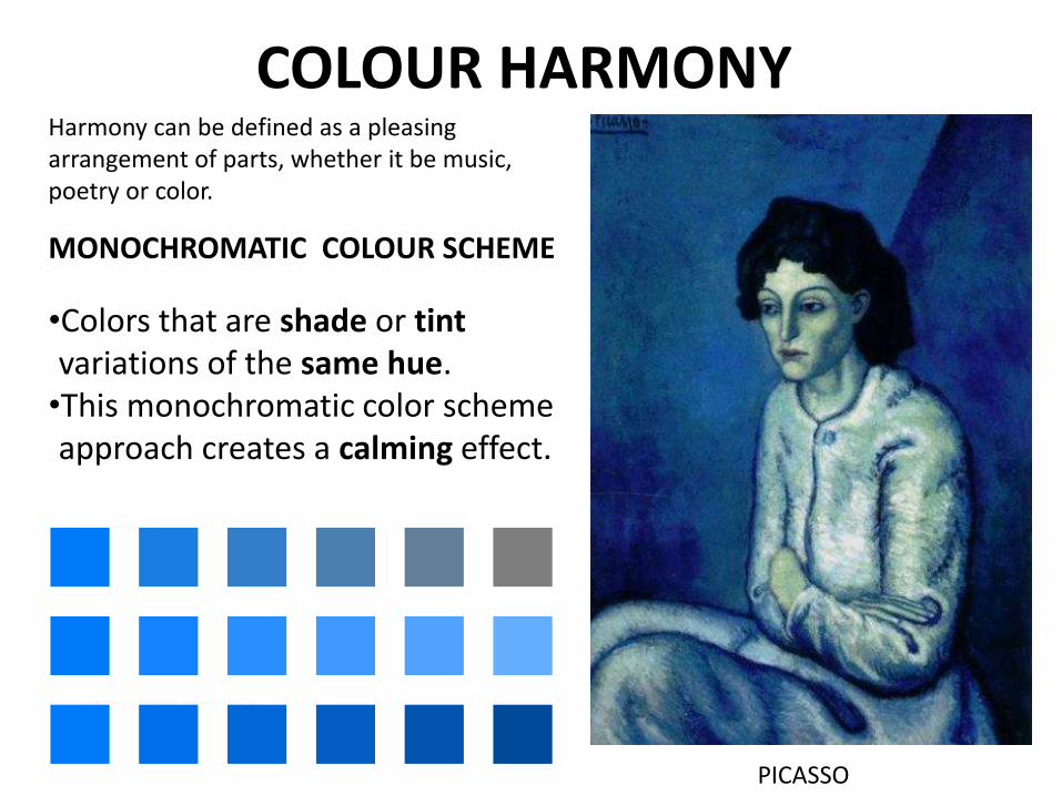
COLOUR HARMONY
MONOCHROMATIC COLOUR SCHEME
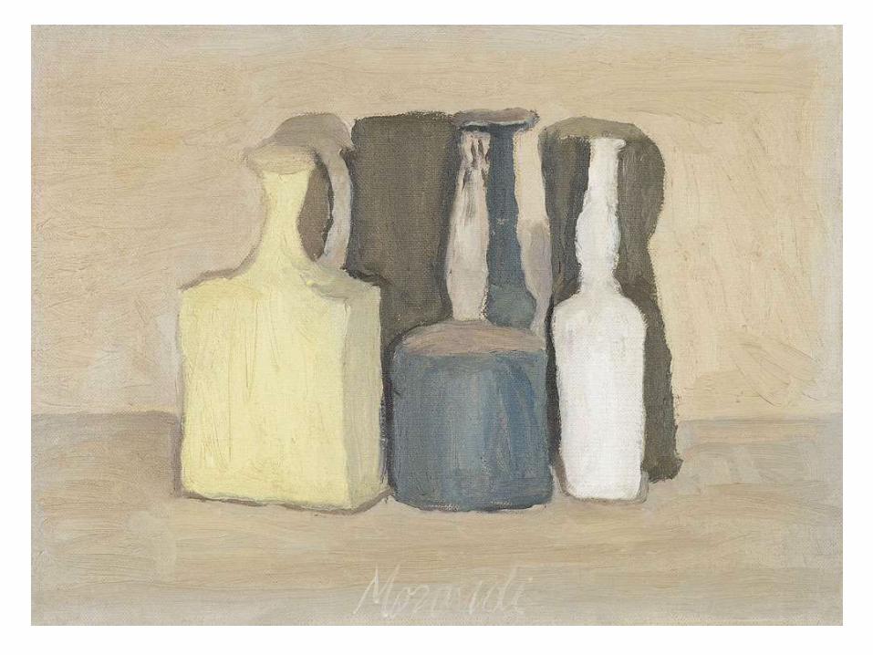
•Colors that are shade or tintvariations of the same hue.•This monochromatic color scheme approach creates a calming effect.
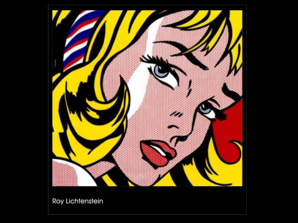
PICASSO
Harmony can be defined as a pleasing arrangement of parts, whether it be music, poetry or color.
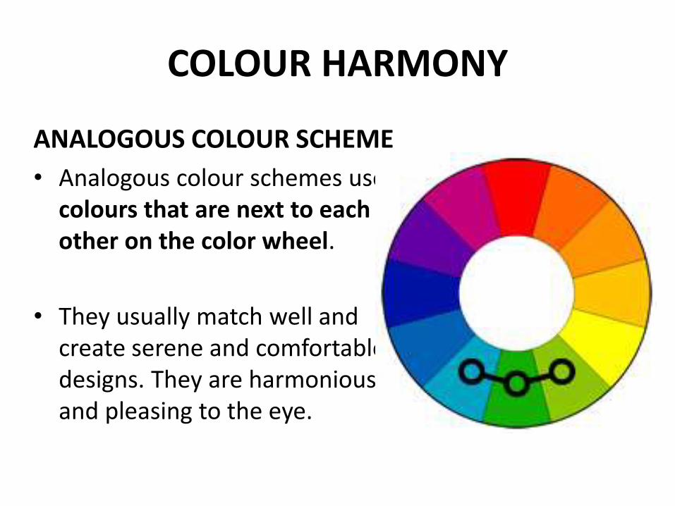
COLOUR HARMONY
ANALOGOUS COLOUR SCHEME
• Analogous colour schemes use colours that are next to each other on the color wheel.
• They usually match well and create serene and comfortable designs. They are harmonious and pleasing to the eye.
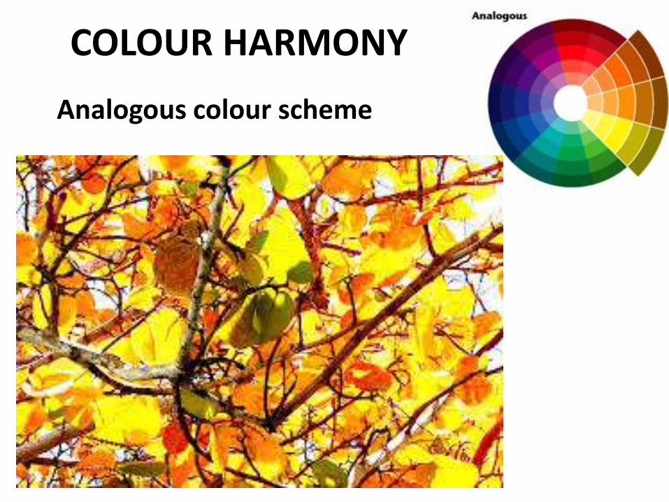
Analogous colour scheme
COLOUR HARMONY
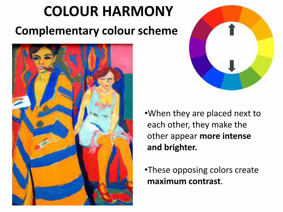
Complementary colour scheme
•When they are placed next to each other, they make the other appear more intense and brighter.
•These opposing colors create maximum contrast.
COLOUR HARMONY
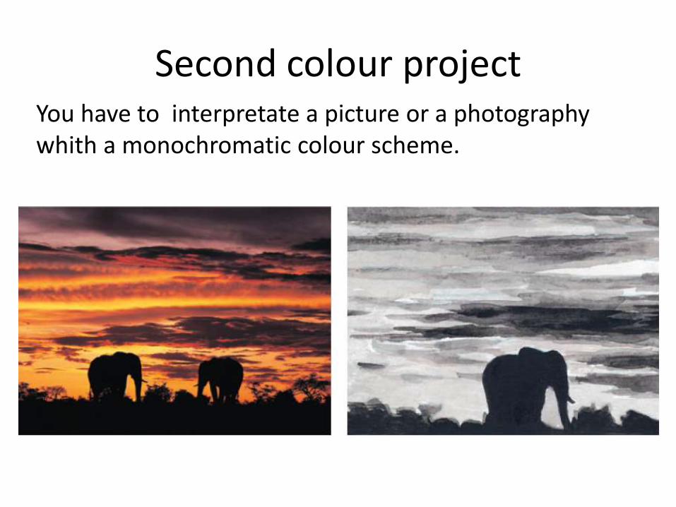
Second colour projectYou have to interpretate a picture or a photographywhith a monochromatic colour scheme.
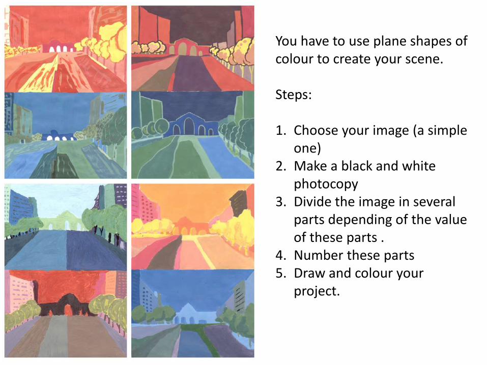
You have to use plane shapes of colour to create your scene.
Steps:
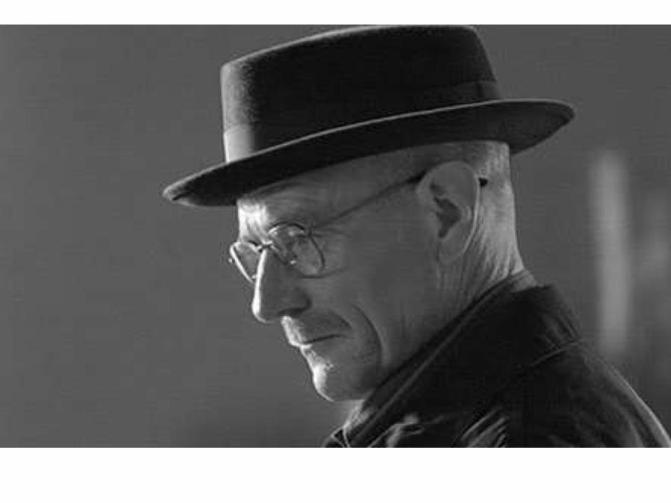
1. Choose your image (a simple one)
2. Make a black and white photocopy
3. Divide the image in several parts depending of the value of these parts .
4. Number these parts5. Draw and colour your
project.
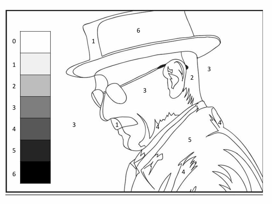
6
1
2
1
3
5
3
3
4
44
1
2
3
4
5
6
0
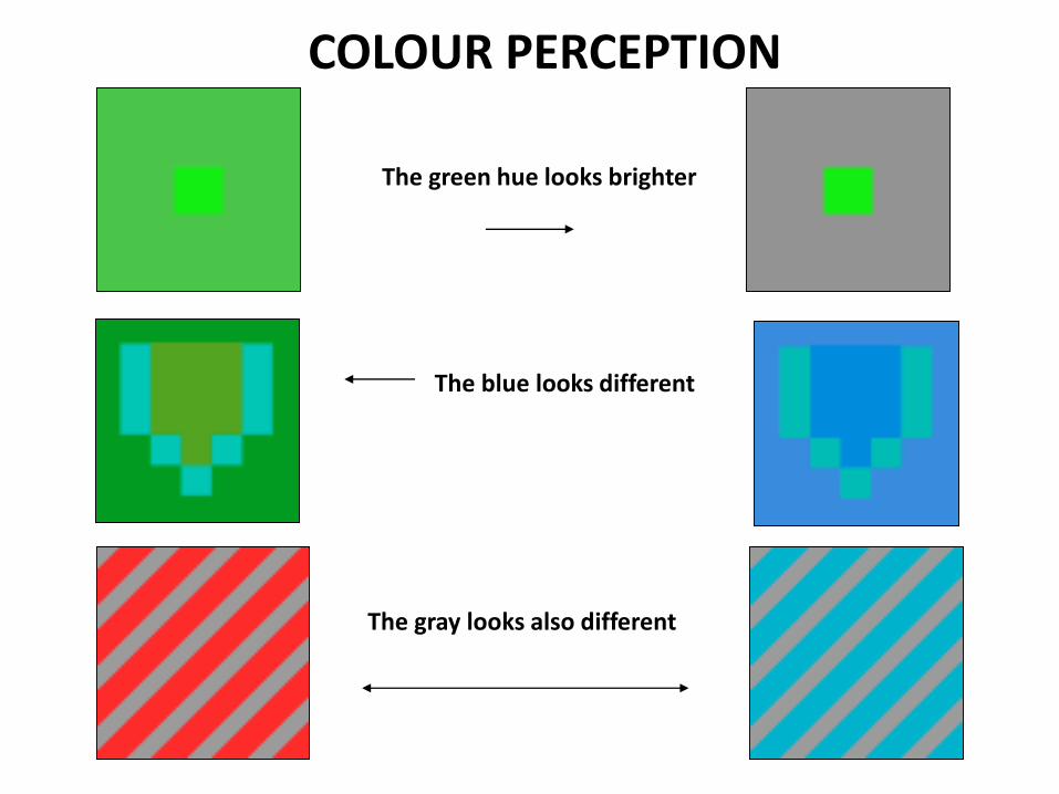
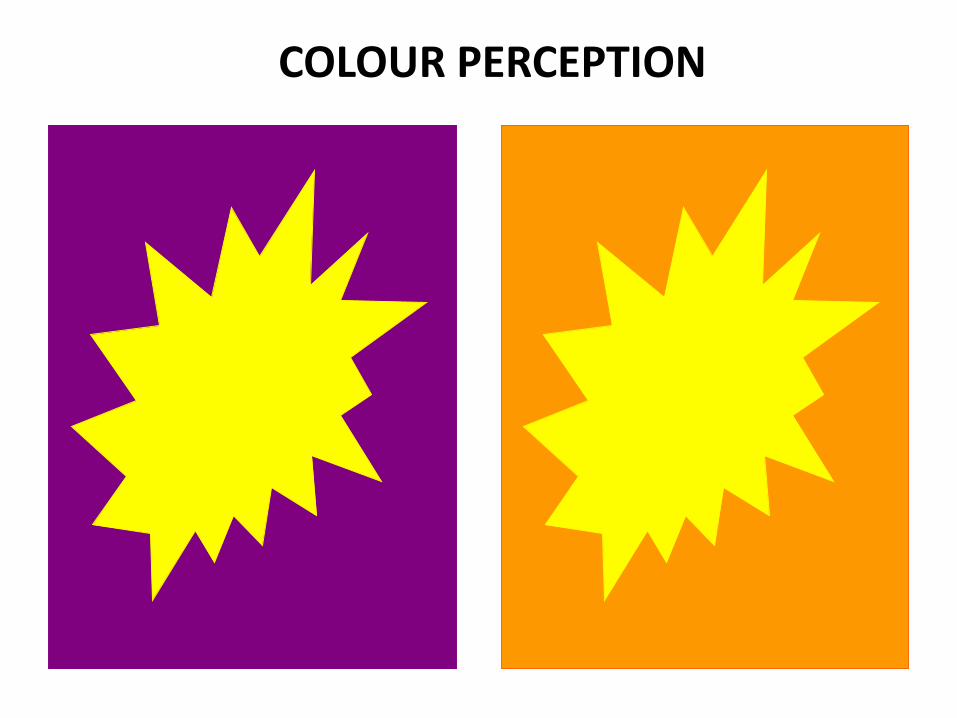
COLOUR PERCEPTION
The green hue looks brighter
The blue looks different
The gray looks also different
COLOUR PERCEPTION
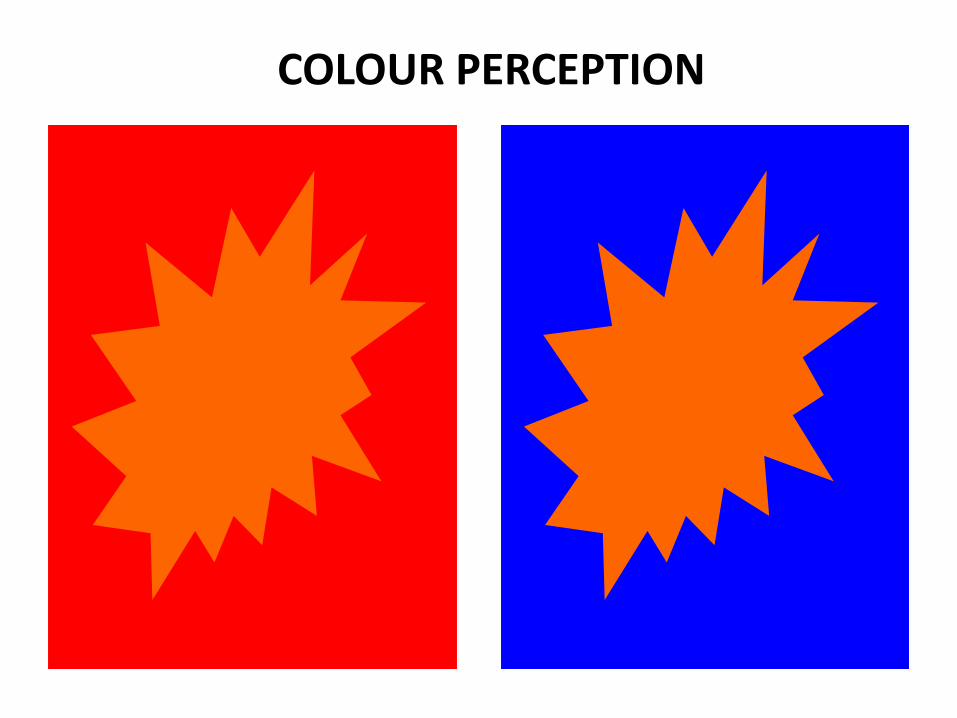
COLOUR PERCEPTION
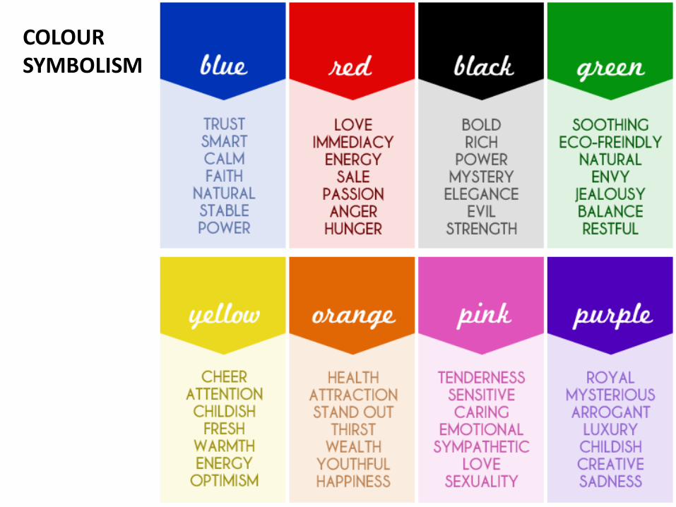
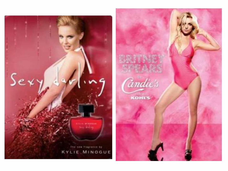
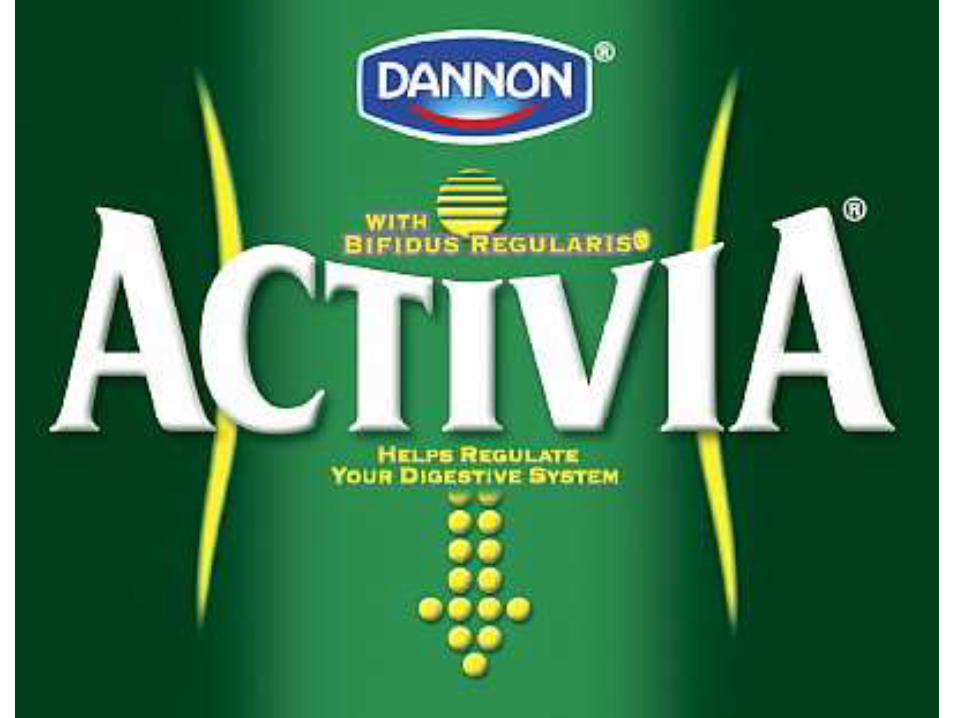
COLOUR SYMBOLISM


Recommended