History and Construction of Charts
l The advantages of presenting price information in a picture or chart format
l The construction of line charts
l The construction of bars charts
l The construction of point & figure charts
l The construction of candlestick charts
l The differences between arithmetic and logarithmic scales
Lecture 2Objectives
ReadingMaster Textbook
Technical Analysis: The Complete Resource for Financial Market TechniciansCharles D. Kirkpatrick and Julie R. Dahlquist
Part III - Pages 189-215
Additional ReadingTechncial Analysis of the Financial MarketsMurphy, John, pages 35-47, 265, 296-309
Technical Analysis of Stock Trends, 7th EditionEdwards, Robert & Magee, John
The Fourth Mega-MarketAcampora, Ralph, pp 30-49, 51-82
Study Helps in Point and Figure TechniquesWheelan, Alexander
Beyond CandlesticksNisson, Steve
Volume Cycles in the Stock Market: Market Timing Through Equivolume and ChartingArms, Richard
College level IntroduCtIon to teChnICal
analysIs
This lecture series is produced by the Market Technicians Association
Educational Foundationbased on the detailed class notes of
Charles D. Kirkpatrick II, CMT Copyright © 2010. All rights are reserved.
history and construction of charts
M a r k e t t e c h n i c i a n s a s s o c i at i o ne d u c at i o n a lf o u n d a t i o n
Identifying and funding educational programs in the field of Technical Analysis since 1993
Mta educational foundationPost Office Box 425127
Cambridge, MA 02142-5127617/253-8959
[email protected] • www.mtaef.org

history and construction of charts • Lecture 2, page 2College Level Introduction to Technical Analysis
Basics of Charting
•. Technical analysts believe that the market action discounts everything, prices
moves in trends and history repeats itself.
– Technical analysts base their outlooks on the belief that price action shows
the shifts in supply and demand. If demand exceeds supply, prices should
rise. If supply exceeds demand, prices should fall. This is called price
discovery.
– Prices move in trends. This simply means that a trend in motion is likely
to stay in that direction until it reverses. Contrast with Behavioral Finance
and Effecient Market Hypothesis.
– History repeats itself. Chart patterns which have been identified and
categorized over the last 100 years reflect pictures that appear in price
charts. These price patterns indicate psychology of the markets which
continues to repeat themselves. The saying is “The past is prologue.”
Types of Charts
• Line Charts [Chapter 11, pages 198-201]
This chart simply connects the closing prices to give us a solid line. Because
most technicians feel that the closing price is the most important bit of
information this type of chart has its place. The line chart sometimes can have
volume.
– daily line chart (Chart 1)
– weekly line chart (Chart 2)
– monthly line chart (Chart 3)
• Bar Charts [Chapter 11, pages 201-205]
The bar chart is the most common form of chart. Its call a bar chart because
each day’s range is represented by a vertical bar which represents the high, the
low, and the close (the close is shown by a horizontal tick to the right on the
bar). Some charts show opening tic by a horizontal tick to the left of the bar.
Volume is usually found at the bottom of the chart on the X axis. The level of
the volume is represented by a bar. The higher the bar the more the activity.
In the case of futures, it would measure the number of contracts traded that
day, week, month, etc.
– daily bar chart (Chart 4)
– weekly bar chart (Chart 5)
– monthly bar chart (Chart 6)
– arithmetic vs. log scales (Chart 7 - 8) [Chapter 11, pages 205-206]
Disney - Daily
StockCharts.com
Chart 1Line Chart of Daily Close for Walt Disney2003 - 2007
Disney - Weekly
StockCharts.com
Chart 2Line Chart of Weekly Close for Walt Disney2003 - 2007
Disney - Monthly
StockCharts.com
Chart 3Line Chart of Monthly Close for Walt Disney2003 - 2007
Krispy Kreme - Daily
StockCharts.com
Chart 4Daily Bar Chart for Krispy KremeJune 1 - August 22, 2007

history and construction of charts • Lecture 2, page 3College Level Introduction to Technical Analysis
• Candle Charts [Chapter 11, pages 203-205]
Candle charts are a Japanese version of bar charts and have become very
popular recently. You still have the same information (high, low, close and
open) but the visual presentation differs. On a candle, a thin line (called a
shadow) shows the days price range from high to the low. A wider portion
of the bar (called the real body) indicates the range between the open and the
close. If the close is higher than the open, the real body is white (clear). If the
close is lower than the open, the real body is black. (Charts 9 -11)
• Point & Figure Charts [Chapter 11, pages 207-212]
The third type of chart is the Point & Figure (P&F) chart. These charts are
a series of columns of X’s determined by price fluctuation without regard to
time. An alternative system is a series of alternating columns of X’s and O’s.
The X column show rising price and the O column show declining price.
– Wheelan’s chart
– Examples of P&F charts (Charts 12-15)
Samples of P&F charts with various increments, reversals and some with
moving averages (of columns). (Charts 16-28)
Comparing & Contrasting the Different Chart Styles
• Line chart
– Advantages. Shows closing prices is very simple to read and can simply
show the trend of the instrument your following. It is constructed very
easily and is easy to maintain. The fact is that for a directional answers, this
is the easiest tool to use.
– Disadvantages. Gives very little information. The lack of information can
lead to many mistakes.
• Bar chart
– Advantages. The information is more complete. High, low, close, open
are given which by itself can give you the sense of direction for the period
your following (daily, weekly, monthly etc.). Also is accompanied with
volume and a host of other indicators if so desired. The versatility is the
main advantage of this type of chart.
– Disadvantages. The bar chart is harder to maintain. It is more time
consuming then the line chart if done by hand. Also requires more space for
less information unlike the P&F charts that offer more time in less space.
Chart 8Monthly Bar Chart for Cisco Systems, Inc. (logarithmic scale)
Krispy Kreme - Weekly
StockCharts.com
Chart 5Weekly Bar Chart for Krispy KremeJune 1 - August 22, 2007
Krispy Kreme - Monthly
StockCharts.com
Chart 6Monthly Bar Chart for Krispy KremeJune 1 - August 22, 2007
Chart 7Monthly Bar Chart for Cisco Systems, Inc. (arithmetic scale)

history and construction of charts • Lecture 2, page 4College Level Introduction to Technical Analysis
• Candle Charts
– Advantages. The candle chart offers a much more visual format.
The information seems to jump off the pages at you. Because of the
dark and the clear shadings on the charts you can see the distributions and
accumulation patterns.
– Disadvantages. They are harder to calculate and maintain. There are many
patterns that must be studied, like the P&F charts.
• Point and Figure (P&F) Charts
– Advantages. It compresses information. Can give solid buy/sell signals and
they are easy to spot.
– Disadvantages. Like the line charts they have limited information. They do
not use volume or time as a consideration. Another negative is that there are
many patterns that must be studied.
Alternative Styles
1. Market Profile
2. Gann Charts
3. Equivolume
4. Kagi Charts
Drawing the Candle Line
Chart 9Definition of Candle Terms
Chart 11Daily Candle Chart for DIA (Diamonds)September 30, 2007 - January 16, 2008
Krispy Kreme - Daily
StockCharts.com
Chart 10Daily Candlestick Chart for Krispy KremeJune 1 - August 22, 2007
Chart 12Alleghany Technologies, Inc.One point ($1) box and 1 box reversal

history and construction of charts • Lecture 2, page 5College Level Introduction to Technical Analysis
Chart 13Alleghany Technologies, Inc.One point ($1) box and 3 box reversal
Chart 14Alleghany Technologies, Inc.Two point ($2) box and 1 box reversal
Chart 15Alleghany Technologies, Inc.Two point ($2) box and 3 box reversal
Chart 17S&P 500 SPDRs (SPY)2 pt/box; 1 box reversal chart - daily
Chart 16S&P 500 SPDRs (SPY)1 pt/box; 1 box reversal chart - daily
Chart 18S&P 500 SPDRs (SPY)3 pt/box; 1 box reversal chart - dailyly
Chart 19S&P 500 SPDRs (SPY)3 pt/box; 1 box reversal chart - daily
Chart 20S&P 500 SPDRs (SPY)P&F Pattern: Ascending Triple Top Breakout - Daily
3 pts/box, 1 box reversal chart
-- 10-column moving average-- 20-column moving average
Chart 21S&P 500 SPDRs (SPY)P&F Pattern: Ascending Triple Top Breakout - Daily
3 pts/box, 1 box reversal chart
-- 10-column moving average-- 20-column moving average-- 50-column moving average
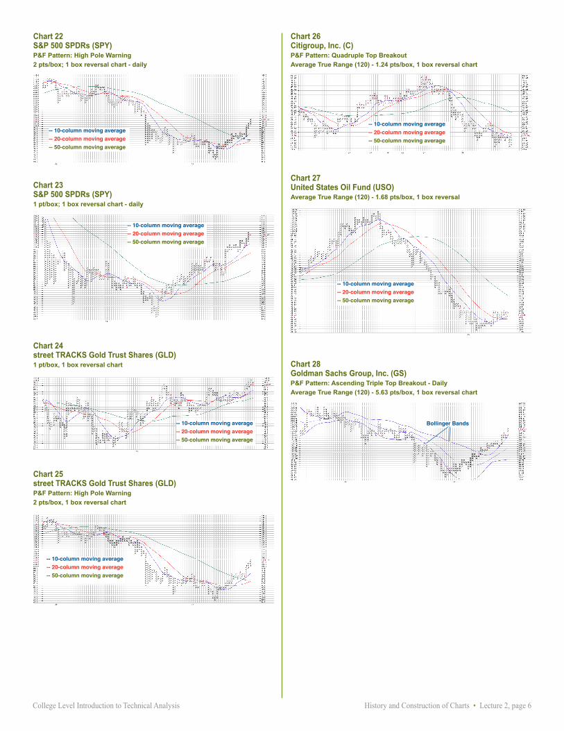
history and construction of charts • Lecture 2, page 6College Level Introduction to Technical Analysis
Chart 23S&P 500 SPDRs (SPY)1 pt/box; 1 box reversal chart - daily
Chart 24street TRACKS Gold Trust Shares (GLD)1 pt/box, 1 box reversal chart
Chart 25street TRACKS Gold Trust Shares (GLD)P&F Pattern: High Pole Warning
2 pts/box, 1 box reversal chart
Chart 26Citigroup, Inc. (C)P&F Pattern: Quadruple Top Breakout
Average True Range (120) - 1.24 pts/box, 1 box reversal chart
Chart 27United States Oil Fund (USO)Average True Range (120) - 1.68 pts/box, 1 box reversal
Chart 28Goldman Sachs Group, Inc. (GS)P&F Pattern: Ascending Triple Top Breakout - Daily
Average True Range (120) - 5.63 pts/box, 1 box reversal chart
-- 10-column moving average-- 20-column moving average-- 50-column moving average
Bollinger Bands
-- 10-column moving average-- 20-column moving average-- 50-column moving average
-- 10-column moving average-- 20-column moving average-- 50-column moving average
-- 10-column moving average-- 20-column moving average-- 50-column moving average
Chart 22S&P 500 SPDRs (SPY)P&F Pattern: High Pole Warning
2 pts/box; 1 box reversal chart - daily
-- 10-column moving average-- 20-column moving average-- 50-column moving average
-- 10-column moving average-- 20-column moving average-- 50-column moving average
Recommended