Embed Size (px)
Citation preview

XAML

XAML
i
About the Tutorial
Welcome to the XAML tutorial for beginners. This tutorial puts greater emphasis on real-
time implementation of the concept rather than discussing just the theory part.
The primary objective of this tutorial is to provide you a better understating of what you
can do with XAML development irrespective of the platform you are using.
Audience
This tutorial has been designed for all those readers who want to learn XAML and to apply
it instantaneously in different type of applications.
Prerequisites
Before proceeding with this tutorial, you should have a basic understanding of XML, Web
Technologies, and HTML.
Disclaimer & Copyright
Copyright 2015 by Tutorials Point (I) Pvt. Ltd.
All the content and graphics published in this e-book are the property of Tutorials Point (I)
Pvt. Ltd. The user of this e-book is prohibited to reuse, retain, copy, distribute, or republish
any contents or a part of contents of this e-book in any manner without written consent
of the publisher.
We strive to update the contents of our website and tutorials as timely and as precisely as
possible, however, the contents may contain inaccuracies or errors. Tutorials Point (I) Pvt.
Ltd. provides no guarantee regarding the accuracy, timeliness, or completeness of our
website or its contents including this tutorial. If you discover any errors on our website or
in this tutorial, please notify us at [email protected]

XAML
ii
Table of Contents
About the Tutorial .................................................................................................................................... i
Audience .................................................................................................................................................. i
Prerequisites ............................................................................................................................................ i
Table of Contents .................................................................................................................................... ii
1. XAML – OVERVIEW .............................................................................................................. 1
How XAML Works ................................................................................................................................... 1
Advantages of XAML ............................................................................................................................... 1
2. XAML – ENVIRONMENT SETUP ............................................................................................ 3
Installation .............................................................................................................................................. 3
First Step towards Implementation ......................................................................................................... 7
3. WRITING XAML APPLICATION ON MAC OS ........................................................................ 11
XAML – C# Syntax.................................................................................................................................. 11
Syntax Rules for Object Element ........................................................................................................... 12
4. XAML VS C# CODE ............................................................................................................. 13
5. XAML VS. VB.NET ............................................................................................................... 17
6. XAML – BUILDING BLOCKS ................................................................................................. 21
Objects .................................................................................................................................................. 21
Resources .............................................................................................................................................. 21
Styles .................................................................................................................................................... 21
Templates ............................................................................................................................................. 22
Animations and Transformations .......................................................................................................... 23
7. XAML – CONTROLS ............................................................................................................ 25
Button ................................................................................................................................................... 27
Calendar ................................................................................................................................................ 34

XAML
iii
CheckBox .............................................................................................................................................. 39
ComboBox ............................................................................................................................................. 45
ContextMenu ........................................................................................................................................ 50
DataGrid................................................................................................................................................ 57
DatePicker ............................................................................................................................................. 66
Dialog Box ............................................................................................................................................. 71
GridView ............................................................................................................................................... 74
Image .................................................................................................................................................... 80
ListBox .................................................................................................................................................. 84
Menu .................................................................................................................................................... 89
PasswordBox ......................................................................................................................................... 94
Popup .................................................................................................................................................... 98
ProgressBar ......................................................................................................................................... 101
ProgressRing ....................................................................................................................................... 105
RadioButton ........................................................................................................................................ 109
RichEditBox ......................................................................................................................................... 115
ScrollViewer ........................................................................................................................................ 123
SearchBox ........................................................................................................................................... 129
Slider ................................................................................................................................................... 133
TextBlock ............................................................................................................................................ 138
TimePicker .......................................................................................................................................... 141
ToggleButton....................................................................................................................................... 146
ToolTip ................................................................................................................................................ 149
Window .............................................................................................................................................. 152
8. XAML – LAYOUTS ............................................................................................................. 157
Stack Panel .......................................................................................................................................... 157
Wrap Panel ......................................................................................................................................... 160
XAML
iv
Dock Panel .......................................................................................................................................... 163
Canvas Panel ....................................................................................................................................... 167
Grid ..................................................................................................................................................... 170
Nesting of Layout ................................................................................................................................ 175
9. XAML – EVENT HANDLING ............................................................................................... 177
10. XAML – DATA BINDING .................................................................................................... 184
One-Way Data Binding ........................................................................................................................ 184
Two-Way Data Binding ........................................................................................................................ 187
11. XAML – MARKUP EXTENSIONS ........................................................................................ 189
12. XAML – DEPENDENCY PROPERTIES .................................................................................. 193
13. XAML – RESOURCES ........................................................................................................ 197
Resource Scope ................................................................................................................................... 198
Resource Dictionaries .......................................................................................................................... 199
14. XAML – TEMPLATES ......................................................................................................... 202
Control Template ................................................................................................................................ 202
Data Template .................................................................................................................................... 204
15. XAML – STYLES ................................................................................................................ 210
Control Level ....................................................................................................................................... 214
Layout Level ........................................................................................................................................ 215
Window Level ..................................................................................................................................... 216
Application Level ................................................................................................................................. 218
16. XAML – TRIGGERS ........................................................................................................... 221
Property Triggers ................................................................................................................................. 221
Data Triggers ....................................................................................................................................... 223

XAML
v
Event Triggers ..................................................................................................................................... 225
17. XAML – DEBUGGING ....................................................................................................... 228
UI Debugging Tools for XAML .............................................................................................................. 231
18. XAML – CUSTOM CONTROLS ........................................................................................... 234
User Control ........................................................................................................................................ 234
Custom Controls .................................................................................................................................. 238

XAML
1
XAML stands for Extensible Application Markup Language. It’s a simple and declarative
language based on XML.
In XAML, it very easy to create, initialize, and set properties of an object with
hierarchical relations.
It is mainly used for designing GUIs.
It can be used for other purposes as well, e.g., to declare workflow in Workflow
Foundation.
XAML can be used in different platforms such as WPF (Windows Presentation Foundation),
Silverlight, Mobile Development, and Windows Store App. It can be used across
different .Net framework and CLR (common language runtime) versions.
How XAML Works
XAML is a declarative language in the sense it defines the WHAT and HOW you want to
do. XAML processor is responsible for the HOW part to find out. Let's have a look at the
following schema. It sums up the XAML side of things:
The figure illustrates the following actions:
The XAML file is interpreted by a platform-specific XAML processor.
The XAML processor transforms the XAML to internal code that describes the UI
element.
The internal code and the C# code are linked together through partial classes
definitions and then the .NET compiler builds the app.
Advantages of XAML
One of the longstanding problems that all of us face with GUI design can be solved by
using XAML. It can be used to design UI elements in Windows Forms applications.
1. XAML – OVERVIEW
XAML
2
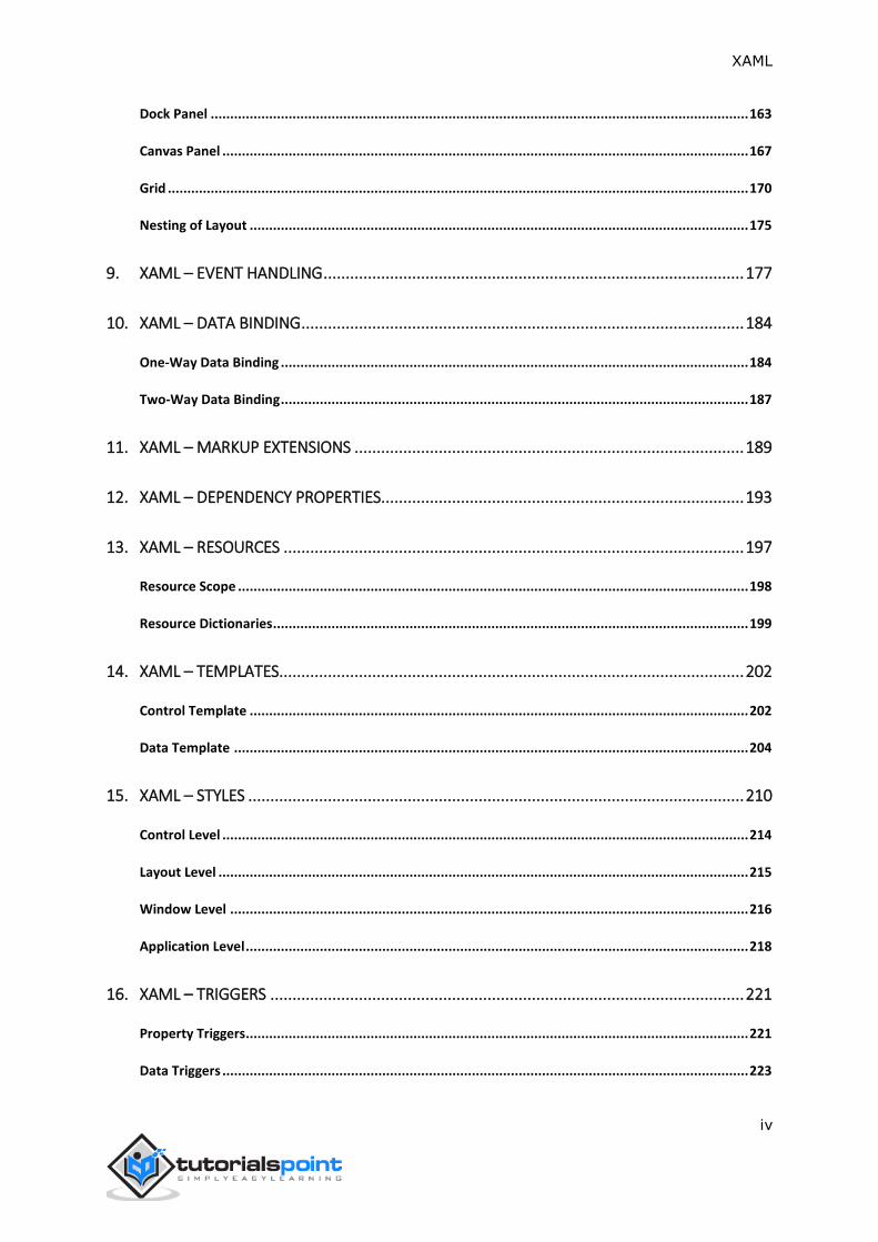
In the earlier GUI frameworks, there was no real separation between how an application
looks like and how it behaves. Both the GUI and its behavior were created in the same
language, e.g. C# or VB.net, which would require more effort from the developer to
implement both the UI and the behavior associated with it.
Figure: Earlier GUI Frameworks
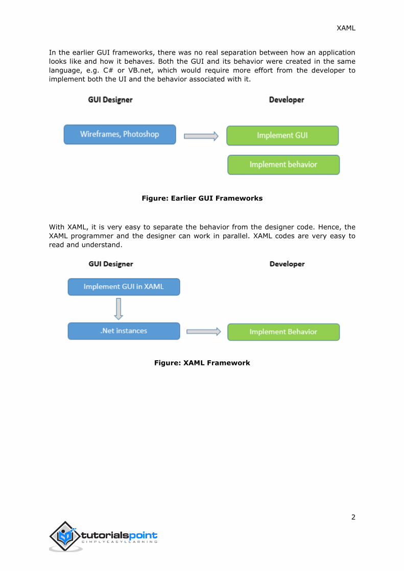
With XAML, it is very easy to separate the behavior from the designer code. Hence, the
XAML programmer and the designer can work in parallel. XAML codes are very easy to
read and understand.
Figure: XAML Framework

XAML
3
Microsoft provides two important tools for XAML:
Visual Studio
Expression Blend
Currently, both the tools can create XAML, but the fact is that Visual Studio is used more
by developers while Expression Blend is still used more often by designers.
Microsoft provides a free version of Visual Studio which can be downloaded from
https://www.visualstudio.com/en-us/downloads/download-visual-studio-vs.aspx
Note: For this tutorial, we will mostly be using WPF projects and Windows Store App. But
the free version of Visual Studio doesn’t support Windows Store App. So for that purpose,
you will need a licensed version of Visual Studio.
Installation
Follow the steps given below to install Visual Studio on your system:
1. After downloading the files, run the installer. The following dialog box will be
displayed.
2. XAML – ENVIRONMENT SETUP

XAML
4
2. Click on the Install button and it will start the installation process.
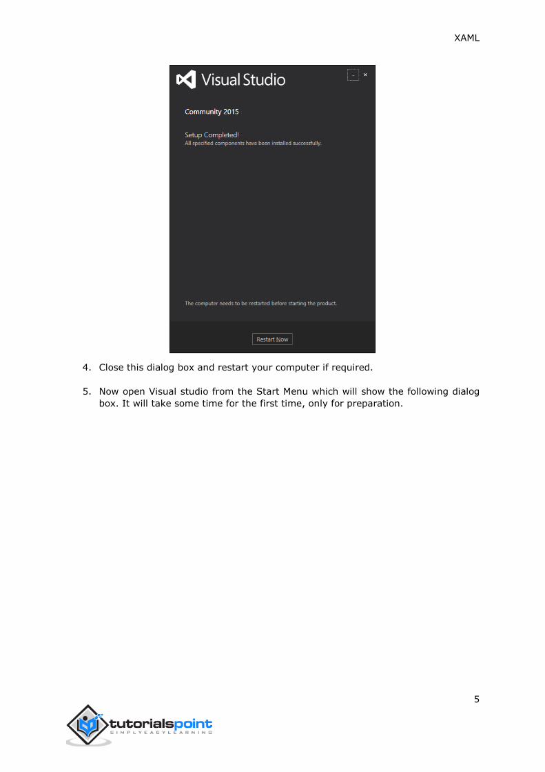
3. Once the installation process completes successfully, you will see the following
screen.
XAML
5
4. Close this dialog box and restart your computer if required.
5. Now open Visual studio from the Start Menu which will show the following dialog
box. It will take some time for the first time, only for preparation.

XAML
6
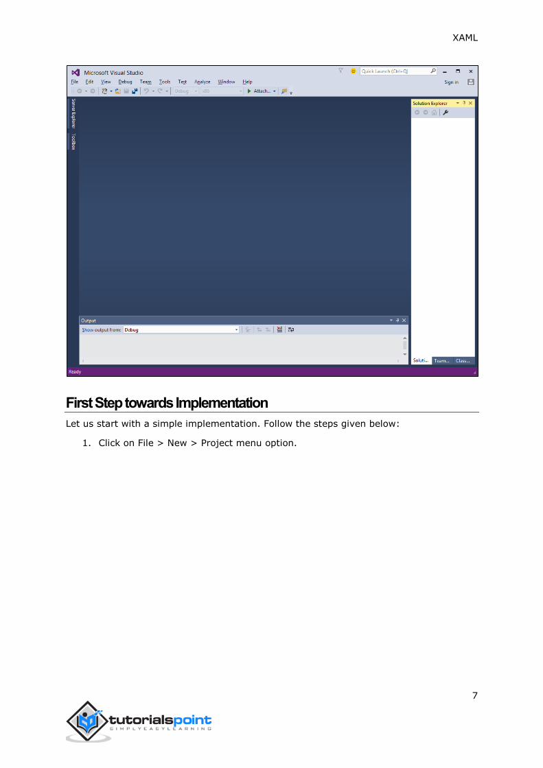
Once all is done, you will see the main window of Visual Studio.
XAML
7
First Step towards Implementation
Let us start with a simple implementation. Follow the steps given below:
1. Click on File > New > Project menu option.

XAML
8
2. The following dialog box will be displayed:
3. Under Templates, select Visual C# and select WPF Application. Give a name to the
project and click the OK button.
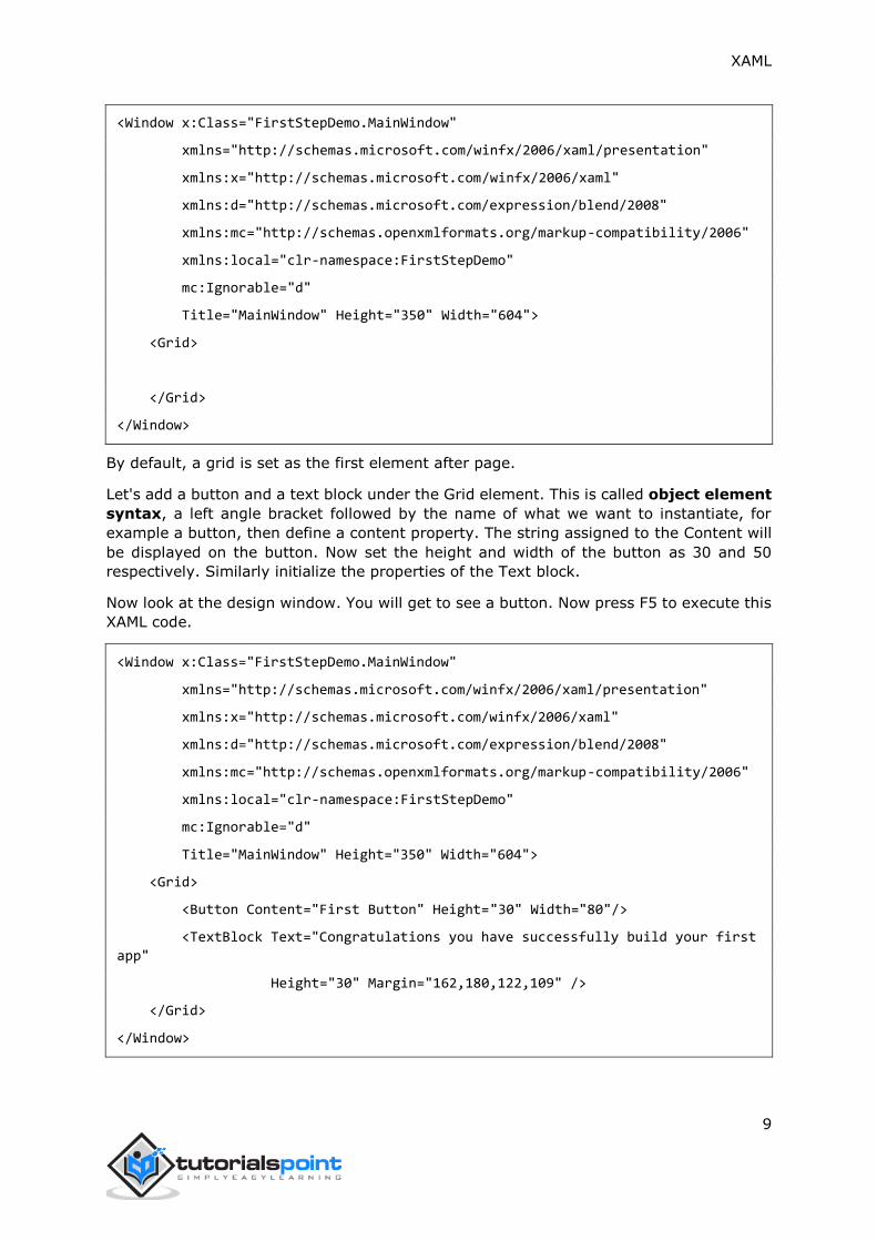
4. In the mainwindow.xaml file, the following XAML tags are written by default. You
will understand all these tags later in this tutorial.
XAML
9
<Window x:Class="FirstStepDemo.MainWindow"
xmlns="http://schemas.microsoft.com/winfx/2006/xaml/presentation"
xmlns:x="http://schemas.microsoft.com/winfx/2006/xaml"
xmlns:d="http://schemas.microsoft.com/expression/blend/2008"
xmlns:mc="http://schemas.openxmlformats.org/markup-compatibility/2006"
xmlns:local="clr-namespace:FirstStepDemo"
mc:Ignorable="d"
Title="MainWindow" Height="350" Width="604">
<Grid>
</Grid>
</Window>
By default, a grid is set as the first element after page.
Let's add a button and a text block under the Grid element. This is called object element
syntax, a left angle bracket followed by the name of what we want to instantiate, for
example a button, then define a content property. The string assigned to the Content will
be displayed on the button. Now set the height and width of the button as 30 and 50
respectively. Similarly initialize the properties of the Text block.
Now look at the design window. You will get to see a button. Now press F5 to execute this
XAML code.
<Window x:Class="FirstStepDemo.MainWindow"
xmlns="http://schemas.microsoft.com/winfx/2006/xaml/presentation"
xmlns:x="http://schemas.microsoft.com/winfx/2006/xaml"
xmlns:d="http://schemas.microsoft.com/expression/blend/2008"
xmlns:mc="http://schemas.openxmlformats.org/markup-compatibility/2006"
xmlns:local="clr-namespace:FirstStepDemo"
mc:Ignorable="d"
Title="MainWindow" Height="350" Width="604">
<Grid>
<Button Content="First Button" Height="30" Width="80"/>
<TextBlock Text="Congratulations you have successfully build your first
app"
Height="30" Margin="162,180,122,109" />
</Grid>
</Window>
XAML
10
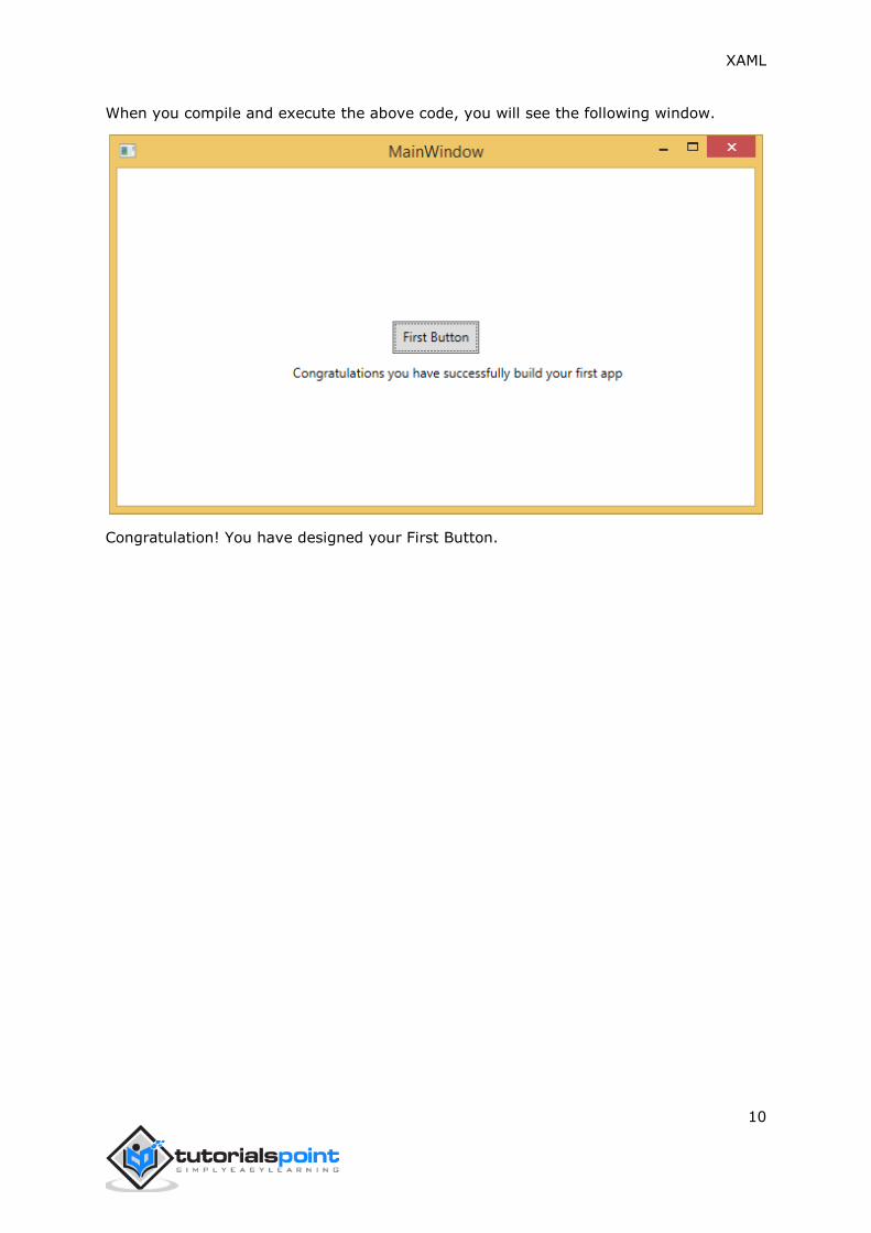
When you compile and execute the above code, you will see the following window.
Congratulation! You have designed your First Button.

XAML
11
XAML applications can be developed on Mac as well. On Mac, XAML can be used as iOS
and Android applications. To setup the environment on Mac, go to xamarin.com. Click on
Products and select the Xamarin Platform. Download Xamarin Studio and install it. It will
allow you to develop applications for the various platforms.
XAML – C# Syntax
In this chapter, you will learn the basic XAML syntax/rules to write XAML applications. Let’s
have a look at a simple XAML file.
<Window x:Class="Resources.MainWindow"
xmlns="http://schemas.microsoft.com/winfx/2006/xaml/presentation"
xmlns:x="http://schemas.microsoft.com/winfx/2006/xaml"
Title="MainWindow" Height="350" Width="525">
<Grid>
</Grid>
</Window>
As you can see in the above XAML file, there are different kinds of tags and elements. The
following table briefly describes all the elements.
<Window It is the opening object element or
container of the root.
x:Class="Resources.MainWindow" It is the partial class declaration which
connects the markup to the partial class
code behind defined in it.
xmlns="http://schemas.microsoft.com/win
fx/2006/xaml/presentation"
Maps the default XAML namespace for WPF
client/framework
xmlns:x="http://schemas.microsoft.com/w
infx/2006/xaml"
XAML namespace for XAML language which
maps it to x: prefix
> End of object element of the root.
<Grid> </Grid>
Starting and closing tags of an empty grid
object.
</Window> Closing the object element
3. WRITING XAML APPLICATION ON MAC OS

XAML
12
Syntax Rules for Object Element
Syntax rules for XAML is almost similar to XML. If you take a look at an XAML document,
then you will notice that actually it is a valid XML file. However, an XML file cannot be a
valid XAML file. It is because in XML, the value of the attributes must be a string, while in
XAML, it can be a different object which is known as Property element syntax.
The syntax of an Object element starts with a left angle bracket (<) followed by
the name of the object, e.g. Button
Define some Properties and attributes of that object element
The Object element must be closed by a forward slash (/) followed immediately by
a right angle bracket (>).
Example of simple object with no child element:
<Button/>
Example of object element with some attributes:
<Button Content="Click Me"
Height="30"
Width="60"/>
Example of an alternate syntax to define properties (Property element syntax):
<Button
<Button.Content>Click Me</Button.Content>
<Button.Height>30</Button.Height>
<Button.Width>60</Button.Width>
</Button>
Example of Object with Child Element: StackPanel contains Textblock as child element
<StackPanel Orientation="Horizontal">
<TextBlock Text="Hello"/>
</StackPanel>

XAML
13
You can use XAML to create, initialize, and set the properties of objects. The same activities
can also be performed using programming code.
XAML is just another simple and easy way to design UI elements. With XAML, it is up to
you to decide whether you want to declare objects in XAML or declare them using code.
Let’s take a simple example to demonstrate how to write in XAML:
<Window x:Class="XAMLVsCode.MainWindow"
xmlns="http://schemas.microsoft.com/winfx/2006/xaml/presentation"
xmlns:x="http://schemas.microsoft.com/winfx/2006/xaml"
Title="MainWindow" Height="350" Width="525">
<StackPanel>
<TextBlock Text="Welcome to XAML Tutorial" Height="20" Width="200"
Margin="5"/>
<Button Content="Ok" Height="20" Width="60" Margin="5"/>
</StackPanel>
</Window>
In this example, we have created a stack panel with a Button and a Text block and defined
some of the properties of button and text block such as Height, Width, and Margin. When
the above code is compiled and executed, it will produce the following output:
4. XAML VS C# CODE

XAML
14
Now look at the same code which is written in C#.
using System;
using System.Text;
using System.Windows;
using System.Windows.Controls;
namespace XAMLVsCode
{
/// <summary>
/// Interaction logic for MainWindow.xaml
/// </summary>
public partial class MainWindow : Window
{
public MainWindow()
{
InitializeComponent();
// Create the StackPanel
StackPanel stackPanel = new StackPanel();
this.Content = stackPanel;
XAML
15
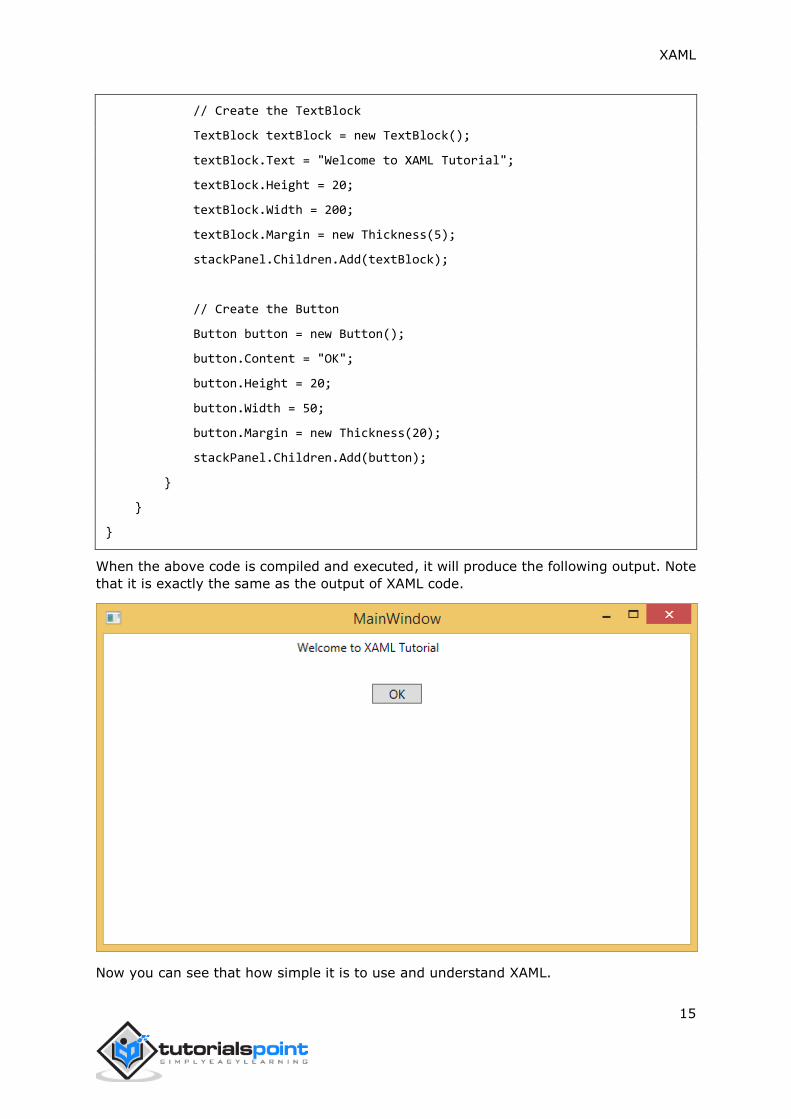
// Create the TextBlock
TextBlock textBlock = new TextBlock();
textBlock.Text = "Welcome to XAML Tutorial";
textBlock.Height = 20;
textBlock.Width = 200;
textBlock.Margin = new Thickness(5);
stackPanel.Children.Add(textBlock);
// Create the Button
Button button = new Button();
button.Content = "OK";
button.Height = 20;
button.Width = 50;
button.Margin = new Thickness(20);
stackPanel.Children.Add(button);
}
}
}
When the above code is compiled and executed, it will produce the following output. Note
that it is exactly the same as the output of XAML code.
Now you can see that how simple it is to use and understand XAML.

XAML
16

XAML
17
In this chapter, we will write the same example in VB.Net so that those who are familiar
with VB.Net can also understand the advantages of XAML.
Let’s take a look at the the same example again which is written in XAML:
<Window x:Class="XAMLVsCode.MainWindow"
xmlns="http://schemas.microsoft.com/winfx/2006/xaml/presentation"
xmlns:x="http://schemas.microsoft.com/winfx/2006/xaml"
Title="MainWindow" Height="350" Width="604">
<StackPanel>
<TextBlock Text="Welcome to XAML Tutorial with VB.net" Height="20"
Width="220"
Margin="5"/>
<Button Content="Ok" Height="20" Width="60" Margin="5"/>
</StackPanel>
</Window>
In this example, we have created a stack panel with a button and a Text block and defined
some of the properties of the button and the text block such as Height, Width, and Margin.
When the above code is compiled and executed, it will produce the following output:
5. XAML VS. VB.NET

XAML
18
Now look at the same code which is written in VB.Net:
Public Class MainWindow
Private Sub Window_Loaded(sender As Object, e As RoutedEventArgs)
Dim panel As New StackPanel()
panel.Orientation = Orientation.Vertical
Me.Content = panel
Dim txtInput As New TextBlock
txtInput.Text = "Welcome to XAML Tutorial with VB.net"
txtInput.Width = 220
txtInput.Height = 20
txtInput.Margin = New Thickness(5)
panel.Children.Add(txtInput)
Dim btn As New Button()
btn.Content = "Ok"
btn.Width = 60
btn.Height = 20
btn.Margin = New Thickness(5)
panel.Children.Add(btn)
End Sub
End Class
When the above code is compiled and executed the output is exactly the same as the
output of XAML code.

XAML
19
You can now visualize how simple it is to work with XAML as compared to VB.Net.
In the above example, we have seen that what we can do in XAML can also be done in
other procedural languages such as C# and VB.Net.
Let’s have a look at another example in which we will use both XAML and VB.Net. We will
design a GUI in XAML and the behavior will be implemented in VB.Net.
In this example, a button is added to the main window. When the user clicks this button,
it displays a message on the message box. Here is the code in XAML in which a Button
Object is declared with some properties.
<Window x:Class="MainWindow"
xmlns="http://schemas.microsoft.com/winfx/2006/xaml/presentation"
xmlns:x="http://schemas.microsoft.com/winfx/2006/xaml"
Title="MainWindow" Height="350" Width="604">
<Grid>
<Button Name="btn" HorizontalAlignment="Center" Width="60" Height="30"
Content="Click Me" />
</Grid>
</Window>

XAML
20
In VB.Net, the button click event (behavior) is implemented. This event displays the
message on the messagebox.
Public Class MainWindow
Private Sub btn_Click(sender As Object, e As RoutedEventArgs) Handles btn.Click
MessageBox.Show("Button is Clicked")
End Sub
End Class
When the above code is compiled and executed, it will display the following screen:
Now click on the above button that says "Click Me". It will display the following message:

XAML
21
This chapter will describe some of the basic and important building blocks of XAML
applications. It will explain how
to create and initialize an object,
an object can be modified easily by using resources, styles, and templates,
to make an object interactive by using transformations and animations.
Objects
XAML is a typically declarative language which can create and instantiate objects. It is
another way to describe objects based on XML, i.e., which objects need to be created and
how they should be initialized before the execution of a program. Objects can be
Containers (Stack Panel, Dock Panel)
UI Elements / Controls (Button, TextBox, etc.)
Resource Dictionaries
Resources
Resources are normally definitions connected with some object that you just anticipate to
use more often than once. It is the ability to store data locally for controls or for the current
window or globally for the entire applications.
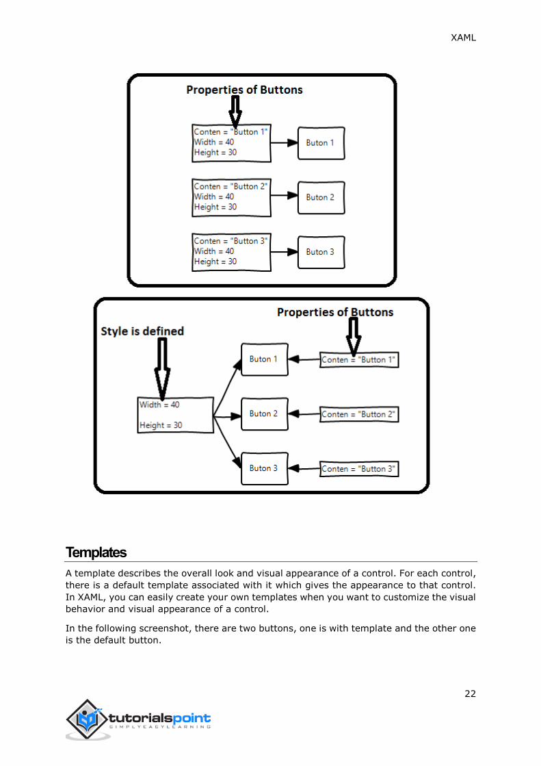
Styles
XAML framework provides several strategies to personalize and customize the appearance
of an application. Styles give us the flexibility to set some properties of an object and
reuse these specific settings across multiple objects for a consistent look.
In styles, you can set only the existing properties of an object such as Height,
Width, Font size, etc.
Only the default behavior of a control can be specified.
Multiple properties can be added into a style.
In the first diagram, you can see the same height and width properties are set for all the
three button separately; but in the second diagram, you can see that height and width
which are same for all the buttons are added to a style and then this style is associated
with all the buttons.
6. XAML – BUILDING BLOCKS
XAML
22
Templates
A template describes the overall look and visual appearance of a control. For each control,
there is a default template associated with it which gives the appearance to that control.
In XAML, you can easily create your own templates when you want to customize the visual
behavior and visual appearance of a control.
In the following screenshot, there are two buttons, one is with template and the other one
is the default button.

XAML
23
Now when you hover the mouse over the button, it also changes the color as shown below.
With templates, you can access more parts of a control than in styles. You can specify
both existing and new behavior of a control.
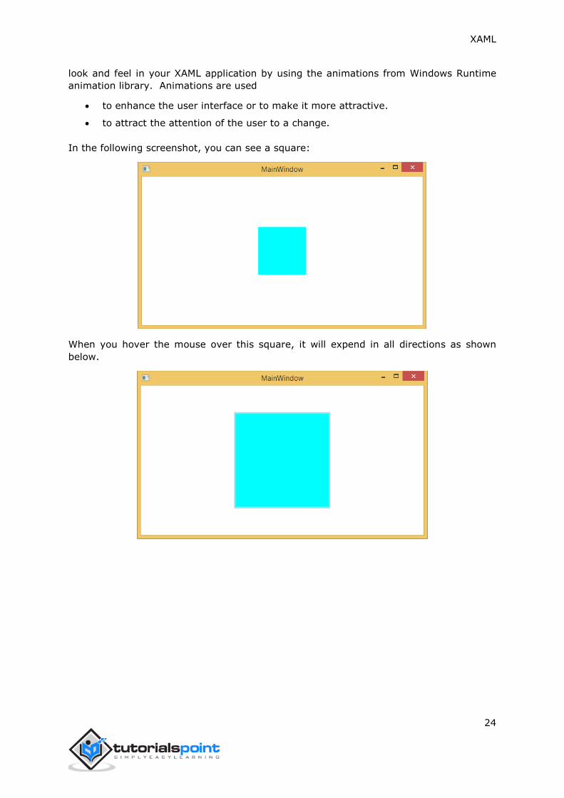
Animations and Transformations
Animations and transformations inside the Windows Runtime can improve your XAML
application by building interactivity and movement. You can easily integrate the interactive
XAML
24
look and feel in your XAML application by using the animations from Windows Runtime
animation library. Animations are used
to enhance the user interface or to make it more attractive.
to attract the attention of the user to a change.
In the following screenshot, you can see a square:
When you hover the mouse over this square, it will expend in all directions as shown
below.
XAML
25
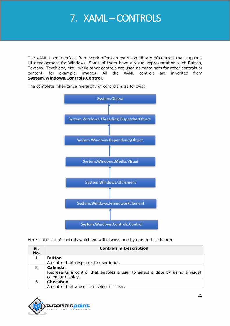
The XAML User Interface framework offers an extensive library of controls that supports
UI development for Windows. Some of them have a visual representation such Button,
Textbox, TextBlock, etc.; while other controls are used as containers for other controls or
content, for example, images. All the XAML controls are inherited from
System.Windows.Controls.Control.
The complete inheritance hierarchy of controls is as follows:
Here is the list of controls which we will discuss one by one in this chapter.
Sr.
No.
Controls & Description
1 Button
A control that responds to user input.
2 Calendar
Represents a control that enables a user to select a date by using a visual
calendar display.
3 CheckBox
A control that a user can select or clear.
7. XAML – CONTROLS

XAML
26
4 ComboBox
A drop-down list of items a user can select from.
5
ContextMenu
Gets or sets the context menu element that should appear whenever the
context menu is requested through a user interface (UI) from within this
element.
6 DataGrid
Represents a control that displays data in a customizable grid.
7 DatePicker
A control that lets a user select a date.
8 Dialogs
An application may also display additional windows to the user to gather or
display important information.
9 GridView
A control that presents a collection of items in rows and columns that can scroll
horizontally.
10 Image
A control that presents an image.
11 ListBox
A control that presents an inline list of items that the user can select from.
12 Menus
Represents a Windows menu control that enables you to hierarchically organize
elements associated with commands and event handlers.
13 PasswordBox
A control for entering passwords.
14 Popup
Displays content on top of existing content, within the bounds of the application
window.
15 ProgressBar
A control that indicates progress by displaying a bar.
16 ProgressRing
A control that indicates indeterminate progress by displaying a ring.
17 RadioButton
A control that allows a user to select a single option from a group of options.
18 RichEditBox
A control that lets a user edit rich text documents with content like formatted
text, hyperlinks, and images.
19 ScrollViewer
A container control that lets the user pan and zoom its content.
20 SearchBox
A control that lets a user enter search queries.
21 Slider
A control that lets the user select from a range of values by moving a Thumb
control along a track.
22 TextBlock
A control that displays text.
23 TimePicker
A control that lets a user set a time value.
24 ToggleButton
A button that can be toggled between 2 states.
25 ToolTip
A pop-up window that displays information for an element.
26 Window

XAML
27
The root window which provides minimize/maximize option, Title bar, border
and close button.
In this chapter we will discuss all these controls with implementation.
Button
The Button class represents the most basic type of button control. The hierarchical
inheritance of Button class is as follows:
Given below are the most commonly used properties of Button.
Sr.
No.
Property & Description
1
Background
Gets or sets a brush that provides the background of the control. (Inherited
from Control)
2
BorderBrush
Gets or sets a brush that describes the border fill of a control. (Inherited from
Control)

XAML
28
3 BorderThickness
Gets or sets the border thickness of a control. (Inherited from Control)
4 Content
Gets or sets the content of a ContentControl. (Inherited from ContentControl)
5 ClickMode
Gets or sets a value that indicates when the Click event occurs, in terms of
device behavior. (Inherited from ButtonBase)
6 ContentTemplate
Gets or sets the data template that is used to display the content of the
ContentControl. (Inherited from ContentControl)
7 FontFamily
Gets or sets the font used to display text in the control. (Inherited from
Control)
8 FontSize
Gets or sets the size of the text in this control. (Inherited from Control)
9 FontStyle
Gets or sets the style in which the text is rendered. (Inherited from Control)
10 FontWeight
Gets or sets the thickness of the specified font. (Inherited from Control)
11
Foreground
Gets or sets a brush that describes the foreground color. (Inherited from
Control)
12
Height
Gets or sets the suggested height of a FrameworkElement. (Inherited from
FrameworkElement)
13
HorizontalAlignment
Gets or sets the horizontal alignment characteristics that are applied to a
FrameworkElement when it is composed in a layout parent, such as a panel
or items control. (Inherited from FrameworkElement)
14
IsEnabled
Gets or sets a value indicating whether the user can interact with the control.
(Inherited from Control)
15
IsPressed
Gets a value that indicates whether a ButtonBase is currently in a pressed
state. (Inherited from ButtonBase)
16
Margin
Gets or sets the outer margin of a FrameworkElement. (Inherited from
FrameworkElement)
17
Name
Gets or sets the identifying name of the object. When a XAML processor
creates the object tree from XAML markup, run-time code can refer to the
XAML-declared object by this name. (Inherited from FrameworkElement)
18 Opacity
Gets or sets the degree of the object's opacity. (Inherited from UIElement)
19
Resources
Gets the locally defined resource dictionary. In XAML, you can establish
resource items as child object elements of a frameworkElement. Resources
property element, through XAML implicit collection syntax. (Inherited from
FrameworkElement)
20
Style
Gets or sets an instance Style that is applied for this object during layout and
rendering. (Inherited from FrameworkElement)
21
Template

XAML
29
Gets or sets a control template. The control template defines the visual
appearance of a control in UI, and is defined in XAML markup. (Inherited from
Control)
22
VerticalAlignment
Gets or sets the vertical alignment characteristics that are applied to a
FrameworkElement when it is composed in a parent object such as a panel or
items control. (Inherited from FrameworkElement)
23
Visibility
Gets or sets the visibility of a UIElement. A UIElement that is not visible is not
rendered and does not communicate its desired size to layout. (Inherited from
UIElement)
24
Width
Gets or sets the width of a FrameworkElement. (Inherited from
FrameworkElement)
Given below are the commonly used methods of Button.
Sr.
No.
Method & Description
1 ClearValue
Clears the local value of a dependency property. (Inherited from
DependencyObject)
2
FindName
Retrieves an object that has the specified identifier name. (Inherited from
FrameworkElement)
3
OnApplyTemplate
Invoked whenever application code or internal processes (such as a rebuilding
layout pass) call ApplyTemplate. In simplest terms, this means the method is
called just before a UI element displays in your app. Override this method to
influence the default post-template logic of a class. (Inherited from
FrameworkElement)
4
OnContentChanged
Invoked when the value of the Content property changes. (Inherited from
ContentControl)
5 OnDragEnter
Called before the DragEnter event occurs. (Inherited from Control)
6 OnDragLeave
Called before the DragLeave event occurs. (Inherited from Control)
7 OnDragOver
Called before the DragOver event occurs. (Inherited from Control)
8 OnDrop
Called before the Drop event occurs. (Inherited from Control)
9 OnGotFocus
Called before the GotFocus event occurs. (Inherited from Control)
10 OnKeyDown
Called before the KeyDown event occurs. (Inherited from Control)
11 OnKeyUp
Called before the KeyUp event occurs. (Inherited from Control)
12 OnLostFocus
Called before the LostFocus event occurs. (Inherited from Control)
13 SetBinding
Attaches a binding to a FrameworkElement, using the provided binding object.
(Inherited from FrameworkElement)

XAML
30
Given below are the commonly used events of Button.
Sr.
No.
Event & Description
1 Click
Occurs when a button control is clicked. (Inherited from ButtonBase)
2 DataContextChanged
Occurs when the value of the FrameworkElement.DataContext property
changes. (Inherited from FrameworkElement)
3 DragEnter
Occurs when the input system reports an underlying drag event with this
element as the target. (Inherited from UIElement)
4 DragLeave
Occurs when the input system reports an underlying drag event with this
element as the origin. (Inherited from UIElement)
5 DragOver
Occurs when the input system reports an underlying drag event with this
element as the potential drop target. (Inherited from UIElement)
6 DragStarting
Occurs when a drag operation is initiated. (Inherited from UIElement)
7 GotFocus
Occurs when a UIElement receives focus. (Inherited from UIElement)
8
Holding
Occurs when an otherwise unhandled Hold interaction occurs over the hit test
area of this element. (Inherited from UIElement)
9 IsEnabledChanged
Occurs when the IsEnabled property changes. (Inherited from Control)
10
KeyDown
Occurs when a keyboard key is pressed while the UIElement has focus.
(Inherited from UIElement)
11
KeyUp
Occurs when a keyboard key is released while the UIElement has focus.
(Inherited from UIElement)
12 LostFocus
Occurs when a UIElement loses focus. (Inherited from UIElement)
13
SizeChanged
Occurs when either the ActualHeight or the ActualWidth property changes
value on a FrameworkElement. (Inherited from FrameworkElement)
Example
The following example contains three buttons that respond differently based on their
ClickMode property value.
Here is the XAML code in which three buttons are created with some properties and a click
event.
<Window x:Class="XAMLButton.MainWindow"
xmlns="http://schemas.microsoft.com/winfx/2006/xaml/presentation"
xmlns:x="http://schemas.microsoft.com/winfx/2006/xaml"
Title="MainWindow" Height="350" Width="604">
<Grid>

XAML
31
<StackPanel Margin="10">
<Button x:Name="button1"
Content="Hover"
Click="OnClick1"
ClickMode="Hover"
Margin="10"
Width="150"
HorizontalAlignment="Center"
Foreground="Gray"/>
<Button x:Name="button2"
Content="Press to Click"
Click="OnClick2"
ClickMode="Press"
Margin="10"
Width="150"
HorizontalAlignment="Center"
Foreground="DarkBlue"/>
<Button x:Name="button3"
Content="Release"
Click="OnClick3"
ClickMode="Release"
Margin="10"
Width="150"
HorizontalAlignment="Center"/>
</StackPanel>
</Grid>
</Window>
Here is the click event implementation in C#.
using System;
using System.Windows;
using System.Windows.Controls;
using System.Windows.Media;
namespace XAMLButton
{
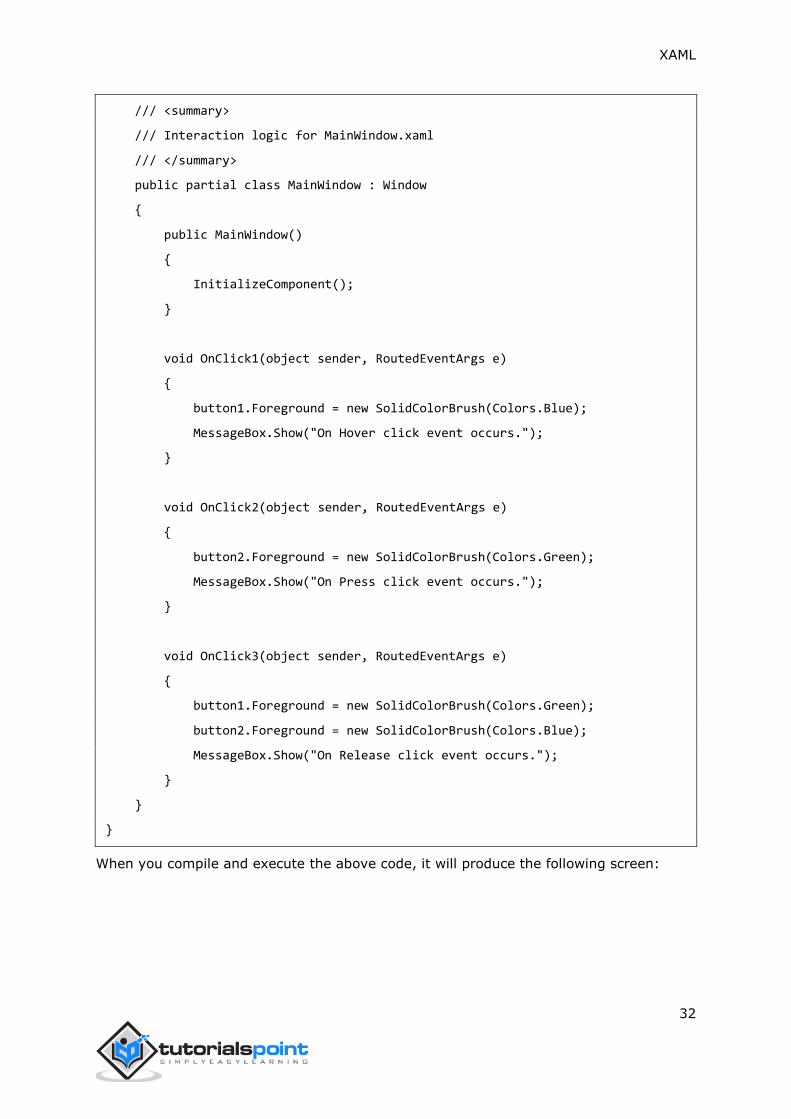
XAML
32
/// <summary>
/// Interaction logic for MainWindow.xaml
/// </summary>
public partial class MainWindow : Window
{
public MainWindow()
{
InitializeComponent();
}
void OnClick1(object sender, RoutedEventArgs e)
{
button1.Foreground = new SolidColorBrush(Colors.Blue);
MessageBox.Show("On Hover click event occurs.");
}
void OnClick2(object sender, RoutedEventArgs e)
{
button2.Foreground = new SolidColorBrush(Colors.Green);
MessageBox.Show("On Press click event occurs.");
}
void OnClick3(object sender, RoutedEventArgs e)
{
button1.Foreground = new SolidColorBrush(Colors.Green);
button2.Foreground = new SolidColorBrush(Colors.Blue);
MessageBox.Show("On Release click event occurs.");
}
}
}
When you compile and execute the above code, it will produce the following screen:

XAML
33
When the mouse enters in the region of the first button, it will display the following
message:
When you press the second button, it will display the following message:
When you release the last button after a click, it will display the following message:

XAML
34
We recommend you to execute the above example code and experiment with some other
properties and events.
Calendar
Calendar represents a control that enables a user to select a date by using a visual calendar
display. It provides some basic navigation facilities using either the mouse or the
keyboard. The hierarchical inheritance of Calendar class is as follows:
Given below are the most commonly used properties of Calendar class.
Sr.
No.
Properties & Description
1 BlackoutDates
Gets a collection of dates that are marked as not selectable.
2 CalendarButtonStyle
Gets or sets the Style associated with the control's internal CalendarButton
object.
3 CalendarDayButtonStyle
Gets or sets the Style associated with the control's internal CalendarDayButton
object.
4 CalendarItemStyle
Gets or sets the Style associated with the control's internal CalendarItem object.
5 DisplayDate
Gets or sets the date to display.
6 DisplayDateEnd
Gets or sets the last date in the date range that is available in the calendar.
7 DisplayDateStart
Gets or sets the first date that is available in the calendar.
8 DisplayMode

XAML
35
Gets or sets a value that indicates whether the calendar displays a month, year,
or decade.
9 FirstDayOfWeek
Gets or sets the day that is considered the beginning of the week.
10 IsTodayHighlighted
Gets or sets a value that indicates whether the current date is highlighted.
11 SelectedDate
Gets or sets the currently selected date.
12 SelectedDates
Gets a collection of selected dates.
13 SelectionMode
Gets or sets a value that indicates what kind of selections are allowed.
Given below are the commonly used methods of Calendar class.
Sr.
No.
Method & Description
1 OnApplyTemplate
Builds the visual tree for the Calendar control when a new template is applied.
(Overrides FrameworkElement.OnApplyTemplate())
2 ToString
Provides a text representation of the selected date. (Overrides
Control.ToString())
Given below are the commonly used events of Calendar class.
Sr.
No.
Events & Description
1 DisplayDateChanged
Occurs when the DisplayDate property is changed.
2 DisplayModeChanged
Occurs when the DisplayMode property is changed.
3 SelectedDatesChanged
Occurs when the collection returned by the SelectedDates property is changed.
4 SelectionModeChanged
Occurs when the SelectionMode changes.
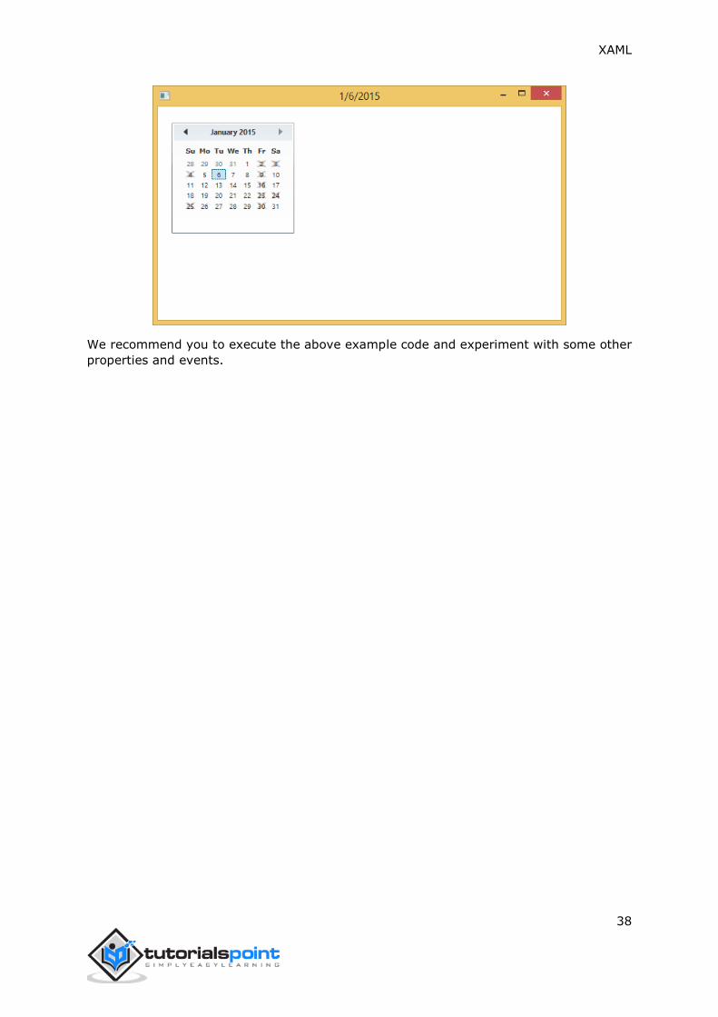
Example
The following example contains a Calendar control with selections and blackout dates.
When you click on any date except the blackout dates, the program will update the title
with that date.
Here is the XAML code in which a calendar is created with some properties and a click
event.
<Window x:Class="XAMLCalendar.MainWindow"
xmlns="http://schemas.microsoft.com/winfx/2006/xaml/presentation"
xmlns:x="http://schemas.microsoft.com/winfx/2006/xaml"
Title="MainWindow" Height="350" Width="604">

XAML
36
<Grid>
<StackPanel Orientation="Horizontal">
<!-- Create a Calendar that displays dates through
Januarary 31, 2015 and has dates that are not selectable. -->
<Calendar Margin="20" SelectionMode="MultipleRange"
IsTodayHighlighted="false"
DisplayDate="1/1/2015"
DisplayDateEnd="1/31/2015"
SelectedDatesChanged="Calendar_SelectedDatesChanged"
xmlns:sys="clr-namespace:System;assembly=mscorlib">
<Calendar.BlackoutDates>
<CalendarDateRange Start="1/2/2015" End="1/4/2015"/>
<CalendarDateRange Start="1/9/2015" End="1/9/2015"/>
<CalendarDateRange Start="1/16/2015" End="1/16/2015"/>
<CalendarDateRange Start="1/23/2015" End="1/25/2015"/>
<CalendarDateRange Start="1/30/2015" End="1/30/2015"/>
</Calendar.BlackoutDates>
<Calendar.SelectedDates>
<sys:DateTime>1/5/2015</sys:DateTime>
<sys:DateTime>1/12/2015</sys:DateTime>
<sys:DateTime>1/14/2015</sys:DateTime>
<sys:DateTime>1/13/2015</sys:DateTime>
<sys:DateTime>1/15/2015</sys:DateTime>
<sys:DateTime>1/27/2015</sys:DateTime>
<sys:DateTime>4/2/2015</sys:DateTime>
</Calendar.SelectedDates>
</Calendar>
</StackPanel>
</Grid>
</Window>
Here is the select event implementation in C#.
using System;

XAML
37
using System.Windows;
using System.Windows.Controls;
using System.Windows.Media;
namespace XAMLCalendar
{
/// <summary>
/// Interaction logic for MainWindow.xaml
/// </summary>
public partial class MainWindow : Window
{
public MainWindow()
{
InitializeComponent();
}
private void Calendar_SelectedDatesChanged(object sender,
SelectionChangedEventArgs e)
{
var calendar = sender as Calendar;
// ... See if a date is selected.
if (calendar.SelectedDate.HasValue)
{
// ... Display SelectedDate in Title.
DateTime date = calendar.SelectedDate.Value;
this.Title = date.ToShortDateString();
}
}
}
}
When you compile and execute the above code, it will display the following screen:
XAML
38
We recommend you to execute the above example code and experiment with some other
properties and events.

XAML
39
CheckBox
A CheckBox is a control that a user can select (check) or clear (uncheck). It provides a list
of options that a user can select, such as a list of settings to apply to an application. The
hierarchical inheritance of Checkbox class is as follows:
Given below are the most commonly used properties of CheckBox.
Sr.
No.
Property & Description
1 Background
Gets or sets a brush that provides the background of the control. (Inherited
from Control)
2 BorderBrush
Gets or sets a brush that describes the border fill of a control. (Inherited from
Control)
3 BorderThickness
Gets or sets the border thickness of a control. (Inherited from Control)
XAML
40
4 Content
Gets or sets the content of a ContentControl. (Inherited from ContentControl)
5 ClickMode
Gets or sets a value that indicates when the Click event occurs, in terms of
device behavior. (Inherited from ButtonBase)
6 ContentTemplate
Gets or sets the data template that is used to display the content of the
ContentControl. (Inherited from ContentControl)
7 FontFamily
Gets or sets the font used to display text in the control. (Inherited from
Control)
8 FontSize
Gets or sets the size of the text in this control. (Inherited from Control)
9 FontStyle
Gets or sets the style in which the text is rendered. (Inherited from Control)
10 FontWeight
Gets or sets the thickness of the specified font. (Inherited from Control)
11
Foreground
Gets or sets a brush that describes the foreground color. (Inherited from
Control)
12
Height
Gets or sets the suggested height of a FrameworkElement. (Inherited from
FrameworkElement)
13
HorizontalAlignment
Gets or sets the horizontal alignment characteristics that are applied to a
FrameworkElement when it is composed in a layout parent, such as a panel
or items control. (Inherited from FrameworkElement)
14
IsChecked
Gets or sets whether the ToggleButton is checked. (Inherited from
ToggleButton)
15
IsEnabled
Gets or sets a value indicating whether the user can interact with the control.
(Inherited from Control)
16
IsPressed
Gets a value that indicates whether a ButtonBase is currently in a pressed
state. (Inherited from ButtonBase)
17
IsThreeState
Gets or sets a value that indicates whether the control supports three states.
(Inherited from ToggleButton)
18
Margin
Gets or sets the outer margin of a FrameworkElement. (Inherited from
FrameworkElement)
19
Name
Gets or sets the identifying name of the object. When a XAML processor
creates the object tree from XAML markup, run-time code can refer to the
XAML-declared object by this name. (Inherited from FrameworkElement)
20 Opacity
Gets or sets the degree of the object's opacity. (Inherited from UIElement)
21
Resources
Gets the locally defined resource dictionary. In XAML, you can establish
resource items as child object elements of a frameworkElement.Resources
property element, through XAML implicit collection syntax. (Inherited from
FrameworkElement)
22
Style

XAML
41
Gets or sets an instance Style that is applied for this object during layout and
rendering. (Inherited from FrameworkElement)
23 Template
Gets or sets a control template. The control template defines the visual
appearance of a control in UI, and is defined in XAML markup. (Inherited from
Control)
24
VerticalAlignment
Gets or sets the vertical alignment characteristics that are applied to a
FrameworkElement when it is composed in a parent object such as a panel or
items control. (Inherited from FrameworkElement)
25
Visibility
Gets or sets the visibility of a UIElement. A UIElement that is not visible is not
rendered and does not communicate its desired size to layout. (Inherited from
UIElement)
26
Width
Gets or sets the width of a FrameworkElement. (Inherited from
FrameworkElement)
Given below are the commonly used methods of CheckBox.
Sr.
No.
Method & Description
1 ClearValue
Clears the local value of a dependency property. (Inherited from
DependencyObject)
2 FindName
Retrieves an object that has the specified identifier name. (Inherited from
FrameworkElement)
3 OnApplyTemplate
Invoked whenever application code or internal processes (such as a rebuilding
layout pass) call ApplyTemplate. In simplest terms, this means the method is
called just before a UI element displays in your app. Override this method to
influence the default post-template logic of a class. (Inherited from
FrameworkElement)
4 OnContentChanged
Invoked when the value of the Content property changes. (Inherited from
ContentControl)
5 OnDragEnter
Called before the DragEnter event occurs. (Inherited from Control)
6 OnDragLeave
Called before the DragLeave event occurs. (Inherited from Control)
7 OnDragOver
Called before the DragOver event occurs. (Inherited from Control)
8 OnDrop
Called before the Drop event occurs. (Inherited from Control)
9 OnGotFocus
Called before the GotFocus event occurs. (Inherited from Control)
10 OnKeyDown
Called before the KeyDown event occurs. (Inherited from Control)
11 OnKeyUp
Called before the KeyUp event occurs. (Inherited from Control)
12 OnLostFocus
Called before the LostFocus event occurs. (Inherited from Control)
OnToggle

XAML
42
13 Called when the ToggleButton receives toggle stimulus. (Inherited from
ToggleButton)
14
SetBinding
Attaches a binding to a FrameworkElement, using the provided binding object.
(Inherited from FrameworkElement)
Given below are the commonly used events of CheckBox.
Sr.
No.
Event & Description
1 Checked
Fires when a ToggleButton is checked. (Inherited from ToggleButton)
2 Click
Occurs when a button control is clicked. (Inherited from ButtonBase)
3
DataContextChanged
Occurs when the value of the FrameworkElement.DataContext property
changes. (Inherited from FrameworkElement)
4
DragEnter
Occurs when the input system reports an underlying drag event with this
element as the target. (Inherited from UIElement)
5
DragLeave
Occurs when the input system reports an underlying drag event with this
element as the origin. (Inherited from UIElement)
6
DragOver
Occurs when the input system reports an underlying drag event with this
element as the potential drop target. (Inherited from UIElement)
7 DragStarting
Occurs when a drag operation is initiated. (Inherited from UIElement)
8 GotFocus
Occurs when a UIElement receives focus. (Inherited from UIElement)
9
Holding
Occurs when an otherwise unhandled Hold interaction occurs over the hit test
area of this element. (Inherited from UIElement)
10
Intermediate
Fires when the state of a ToggleButton is switched to the indeterminate state.
(Inherited from ToggleButton)
11 IsEnabledChanged
Occurs when the IsEnabled property changes. (Inherited from Control)
12 KeyDown
Occurs when a keyboard key is pressed while the UIElement has focus.
(Inherited from UIElement)
13
KeyUp
Occurs when a keyboard key is released while the UIElement has focus.
(Inherited from UIElement)
14 LostFocus
Occurs when a UIElement loses focus. (Inherited from UIElement)
15
SizeChanged
Occurs when either the ActualHeight or the ActualWidth property changes
value on a FrameworkElement. (Inherited from FrameworkElement)
16 Unchecked
Occurs when a ToggleButton is unchecked. (Inherited from ToggleButton)
Example

XAML
43
The following example contains two checkboxes. The first checkbox has two states checked
or unchecked. The second checkbox has 3 states which are checked, unchecked, and
intermediate state. Both checkboxes display a message based on Checked, Unchecked,
and Intermediate events.
Here is the XAML code in which two checkboxes have been created with some properties
and events.
<Window x:Class="XAMLCheckBox.MainWindow"
xmlns="http://schemas.microsoft.com/winfx/2006/xaml/presentation"
xmlns:x="http://schemas.microsoft.com/winfx/2006/xaml"
Title="MainWindow" Height="350" Width="604">
<Grid>
<StackPanel Orientation="Vertical" >
<CheckBox x:Name="cb1"
Content="2 state CheckBox"
Checked="HandleCheck"
Unchecked="HandleUnchecked"
Margin="10" />
<TextBlock x:Name="text1"
Margin="10" />
<CheckBox x:Name="cb2"
Content="3 state CheckBox"
IsThreeState="True"
Indeterminate="HandleThirdState"
Checked="HandleCheck"
Unchecked="HandleUnchecked"
Margin="10" />
<TextBlock x:Name="text2"
Margin="10" />
</StackPanel>
</Grid>
</Window>
Here is the implementation in C# for different events:
using System;

XAML
44
using System.Windows;
using System.Windows.Controls;
using System.Windows.Media;
namespace XAMLCheckBox
{
/// <summary>
/// Interaction logic for MainWindow.xaml
/// </summary>
public partial class MainWindow : Window
{
public MainWindow()
{
InitializeComponent();
}
private void HandleCheck(object sender, RoutedEventArgs e)
{
CheckBox cb = sender as CheckBox;
if (cb.Name == "cb1") text1.Text = "2 state CheckBox is checked.";
else text2.Text = "3 state CheckBox is checked.";
}
private void HandleUnchecked(object sender, RoutedEventArgs e)
{
CheckBox cb = sender as CheckBox;
if (cb.Name == "cb1") text1.Text = "2 state CheckBox is unchecked.";
else text2.Text = "3 state CheckBox is unchecked.";
}
private void HandleThirdState(object sender, RoutedEventArgs e)
{
CheckBox cb = sender as CheckBox;
text2.Text = "3 state CheckBox is in indeterminate state.";
}
}

XAML
45
}
When you compile and execute the above code, it will produce the following output:
We recommend you to execute the above example code and experiment with some other
properties and events.
ComboBox
A ComboBox represents a selection control that combines a non-editable textbox and a
drop-down list box that allows users to select an item from a list. It either displays the
current selection or is empty if there is no selected item. The hierarchical inheritance of
ComboBox class is as follows:

XAML
46
Given below are the most commonly used properties of ComboBox:
Sr.
No.
Property & Description
1 Background
Gets or sets a brush that provides the background of the control. (Inherited
from Control)
2 BorderThickness
Gets or sets the border thickness of a control. (Inherited from Control)
3 FontFamily
Gets or sets the font used to display text in the control. (Inherited from Control)
4 FontSize
Gets or sets the size of the text in this control. (Inherited from Control)
5 FontStyle
Gets or sets the style in which the text is rendered. (Inherited from Control)
6 FontWeight
Gets or sets the thickness of the specified font. (Inherited from Control)
7 Foreground
Gets or sets a brush that describes the foreground color. (Inherited from
Control)
8
GroupStyle

XAML
47
Gets a collection of GroupStyle objects that define the appearance of each level
of groups. (Inherited from ItemsControl)
9 Header
Gets or sets the content for the control's header.
10
Height
Gets or sets the suggested height of a FrameworkElement. (Inherited from
FrameworkElement)
11
HorizontalAlignment
Gets or sets the horizontal alignment characteristics that are applied to a
FrameworkElement when it is composed in a layout parent, such as a panel or
items control. (Inherited from FrameworkElement)
12
IsDropDownOpen
Gets or sets a value that indicates whether the drop-down portion of the
ComboBox is currently open.
13
IsEditable
Gets a value that indicates whether the user can edit text in the text box portion
of the ComboBox. This property always returns false.
14
IsEnabled
Gets or sets a value indicating whether the user can interact with the control.
(Inherited from Control)
15
Margin
Gets or sets the outer margin of a FrameworkElement. (Inherited from
FrameworkElement)
16
Name
Gets or sets the identifying name of the object. When a XAML processor creates
the object tree from XAML markup, run-time code can refer to the XAML-
declared object by this name. (Inherited from FrameworkElement)
17 Opacity
Gets or sets the degree of the object's opacity. (Inherited from UIElement)
18 SelectedIndex
Gets or sets the index of the selected item. (Inherited from Selector)
19 SelectedItem
Gets or sets the selected item. (Inherited from Selector)
20
SelectedValue
Gets or sets the value of the selected item, obtained by using the
SelectedValuePath. (Inherited from Selector)
21
Style
Gets or sets an instance Style that is applied for this object during layout and
rendering. (Inherited from FrameworkElement)
22
VerticalAlignment
Gets or sets the vertical alignment characteristics that are applied to a
FrameworkElement when it is composed in a parent object such as a panel or
items control. (Inherited from FrameworkElement)
23
Width
Gets or sets the width of a FrameworkElement. (Inherited from
FrameworkElement)
24
ItemsSource
Gets or sets an object source used to generate the content of the ItemsControl.
(Inherited from ItemsControl)
Given below are the most commonly used methods of ComboBox:
Sr.
No.
Method & Description

XAML
48
1
Arrange
Positions child objects and determines a size for a UIElement. Parent objects
that implement custom layout for their child elements should call this method
from their layout override implementations to form a recursive layout update.
(Inherited from UIElement)
2
FindName
Retrieves an object that has the specified identifier name. (Inherited from
FrameworkElement)
3 Focus
Attempts to set the focus on the control. (Inherited from Control)
4
GetValue
Returns the current effective value of a dependency property from a
DependencyObject. (Inherited from DependencyObject)
5
IndexFromContainer
Returns the index to the item that has the specified, generated container.
(Inherited from ItemsControl)
6 OnDragEnter
Called before the DragEnter event occurs. (Inherited from Control)
7 OnDragLeave
Called before the DragLeave event occurs. (Inherited from Control)
8 OnDragOver
Called before the DragOver event occurs. (Inherited from Control)
9 OnDrop
Called before the Drop event occurs. (Inherited from Control)
10 OnKeyDown
Called before the KeyDown event occurs. (Inherited from Control)
11 OnKeyUp
Called before the KeyUp event occurs. (Inherited from Control)
12 OnLostFocus
Called before the LostFocus event occurs. (Inherited from Control)
13 ReadLocalValue
Returns the local value of a dependency property, if a local value is set.
(Inherited from DependencyObject)
14 SetBinding
Attaches a binding to a FrameworkElement, using the provided binding object.
(Inherited from FrameworkElement)
15 SetValue
Sets the local value of a dependency property on a DependencyObject.
(Inherited from DependencyObject)
Given below are the most commonly used events of ComboBox.
Sr.
No.
Event & Description
1
DragEnter
Occurs when the input system reports an underlying drag event with this
element as the target. (Inherited from UIElement)
2
DragLeave
Occurs when the input system reports an underlying drag event with this
element as the origin. (Inherited from UIElement)
3
DragOver
Occurs when the input system reports an underlying drag event with this
element as the potential drop target. (Inherited from UIElement)
4 DragStarting

XAML
49
Occurs when a drag operation is initiated. (Inherited from UIElement)
5
Drop
Occurs when the input system reports an underlying drop event with this
element as the drop target. (Inherited from UIElement)
6 DropCompleted
Occurs when a drag-and-drop operation is ended. (Inherited from UIElement)
7 DropDownClosed
Occurs when the drop-down portion of the ComboBox closes.
8 DropDownOpened
Occurs when the drop-down portion of the ComboBox opens.
9 GotFocus
Occurs when a UIElement receives focus. (Inherited from UIElement)
10 IsEnabledChanged
Occurs when the IsEnabled property changes. (Inherited from Control)
11
KeyDown
Occurs when a keyboard key is pressed while the UIElement has focus.
(Inherited from UIElement)
12 KeyUp
Occurs when a keyboard key is released while the UIElement has focus.
(Inherited from UIElement)
13 LostFocus
Occurs when a UIElement loses focus. (Inherited from UIElement)
14 SelectionChanged
Occurs when the currently selected item changes. (Inherited from Selector)
15
SizeChanged
Occurs when either the ActualHeight or the ActualWidth property changes value
on a FrameworkElement. (Inherited from FrameworkElement)
Example
The following example contains two comboboxes. The first combobox is a simple one and
the second one is editable.
Here is the XAML code in which two comboboxes have been created with some properties.
<Window x:Class="XAMLComboBox.MainWindow"
xmlns="http://schemas.microsoft.com/winfx/2006/xaml/presentation"
xmlns:x="http://schemas.microsoft.com/winfx/2006/xaml"
Title="MainWindow" Height="350" Width="604">
<Grid>
<ComboBox Height="20"
Width="100"
HorizontalAlignment="Left" Margin="116,77,0,212">
<ComboBoxItem Content="Item #1"/>
<ComboBoxItem Content="Item #2"/>
<ComboBoxItem Content="Item #3"/>
</ComboBox>
<ComboBox IsEditable="True"

XAML
50
Height="20"
Width="100"
HorizontalAlignment="Right" Margin="0,77,180,212">
<ComboBoxItem Content="Item #1"/>
<ComboBoxItem Content="Item #2"/>
<ComboBoxItem Content="Item #3"/>
</ComboBox>
</Grid>
</Window>
When you compile and execute the above code, it will produce the following output:
We recommend you to execute the above example code and experiment with some other
properties and events.
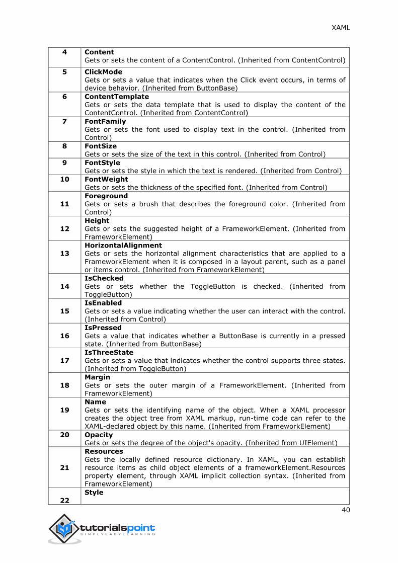
ContextMenu
A ContextMenu represents a pop-up menu that enables a control to expose a functionality
that is specific to the context of a control. It appears whenever the context menu is
requested through a user interface from within this element. The hierarchical inheritance
of ContextMenu class is as follows:

XAML
51
Given below are the most commonly used properties of ContextMenu:
Sr.
No.
Property & Description
1 Background
Gets or sets a brush that provides the background of the control. (Inherited
from Control)
2 BorderThickness
Gets or sets the border thickness of a control. (Inherited from Control)
3 ContextMenu
Gets or sets the context menu element that should appear whenever the
context menu is requested through user interface (UI) from within this
element. (Inherited from FrameworkElement.)
4 FontFamily
Gets or sets the font used to display text in the control. (Inherited from Control)
5 FontSize
Gets or sets the size of the text in this control. (Inherited from Control)
6 FontStyle
Gets or sets the style in which the text is rendered. (Inherited from Control)
7 FontWeight
Gets or sets the thickness of the specified font. (Inherited from Control)
8
Foreground
Gets or sets a brush that describes the foreground color. (Inherited from
Control)
9
GroupStyle

XAML
52
Gets a collection of GroupStyle objects that define the appearance of each level
of groups. (Inherited from ItemsControl)
10
HasItems
Gets a value that indicates whether the ItemsControl contains items. (Inherited
from ItemsControl.)
11
Height
Gets or sets the suggested height of a FrameworkElement. (Inherited from
FrameworkElement)
12
HorizontalAlignment
Gets or sets the horizontal alignment characteristics that are applied to a
FrameworkElement when it is composed in a layout parent, such as a panel or
items control. (Inherited from FrameworkElement)
13
IsFocused
Gets a value that determines whether this element has logical focus. This is a
dependency property. (Inherited from UIElement.)
14 IsOpen
Gets or sets a value that indicates whether the ContextMenu is visible.
15 IsEnabled
Gets or sets a value indicating whether the user can interact with the control.
(Inherited from Control)
16
ItemsSource
Gets or sets an object source used to generate the content of the ItemsControl.
(Inherited from ItemsControl)
17
Margin
Gets or sets the outer margin of a FrameworkElement. (Inherited from
FrameworkElement)
18
Name
Gets or sets the identifying name of the object. When a XAML processor creates
the object tree from XAML markup, run-time code can refer to the XAML-
declared object by this name. (Inherited from FrameworkElement)
19
Opacity
Gets or sets the degree of the object's opacity. (Inherited from UIElement)
20
Style
Gets or sets an instance Style that is applied for this object during layout and
rendering. (Inherited from FrameworkElement)
21
VerticalAlignment
Gets or sets the vertical alignment characteristics that are applied to a
FrameworkElement when it is composed in a parent object such as a panel or
items control. (Inherited from FrameworkElement)
22
Width
Gets or sets the width of a FrameworkElement. (Inherited from
FrameworkElement)
Given below are the most commonly used methods of ContextMenu.
Sr.
No.
Method & Description
1 AddChild
Adds the specified object as the child of the ItemsControl object. (Inherited
from ItemsControl.)
2
Arrange
Positions child objects and determines a size for a UIElement. Parent objects
that implement custom layout for their child elements should call this method
from their layout override implementations to form a recursive layout update.
(Inherited from UIElement)

XAML
53
3
FindName
Retrieves an object that has the specified identifier name. (Inherited from
FrameworkElement)
4 Focus
Attempts to set the focus on the control. (Inherited from Control)
5
GetValue
Returns the current effective value of a dependency property from a
DependencyObject. (Inherited from DependencyObject)
6
IsItemItsOwnContainer
Determines if the specified item is (or is eligible to be) its own container.
(Inherited from ItemsControl.)
7 OnDragEnter
Called before the DragEnter event occurs. (Inherited from Control)
8 OnDragLeave
Called before the DragLeave event occurs. (Inherited from Control)
9 OnDragOver
Called before the DragOver event occurs. (Inherited from Control)
10 OnDrop
Called before the Drop event occurs. (Inherited from Control)
11
OnContextMenuOpening
Invoked whenever an unhandled ContextMenuClosing routed event reaches
this class in its route. Implement this method to add class handling for this
event. (Inherited from FrameworkElement.)
12 OnItemsChanged
Invoked when the Items property changes. (Inherited from ItemsControl.)
13 OnLostFocus
Called before the LostFocus event occurs. (Inherited from Control)
14
ReadLocalValue
Returns the local value of a dependency property, if a local value is set.
(Inherited from DependencyObject)
15
SetBinding
Attaches a binding to a FrameworkElement, using the provided binding object.
(Inherited from FrameworkElement)
16
SetValue
Sets the local value of a dependency property on a DependencyObject.
(Inherited from DependencyObject)
Given below are the most commonly used events of ContextMenu.
Sr.
No.
Event & Description
1 Closed
Occurs when a particular instance of a ContextMenu closes.
2
ContextMenuClosing
Occurs just before any context menu on the element is closed. (Inherited from
FrameworkElement.)
3
ContextMenuOpening
Occurs when any context menu on the element is opened. (Inherited from
FrameworkElement.)
4
DataContextChanged
Occurs when the data context for this element changes. (Inherited from
FrameworkElement.)
5
DragEnter
XAML
54
Occurs when the input system reports an underlying drag event with this
element as the target. (Inherited from UIElement)
6
DragLeave
Occurs when the input system reports an underlying drag event with this
element as the origin. (Inherited from UIElement)
7 DragOver
Occurs when the input system reports an underlying drag event with this
element as the potential drop target. (Inherited from UIElement)
8 Drop
Occurs when the input system reports an underlying drop event with this
element as the drop target. (Inherited from UIElement)
9 GotFocus
Occurs when a UIElement receives focus. (Inherited from UIElement)
10 IsEnabledChanged
Occurs when the IsEnabled property changes. (Inherited from Control)
11
KeyDown
Occurs when a keyboard key is pressed while the UIElement has focus.
(Inherited from UIElement)
12
KeyUp
Occurs when a keyboard key is released while the UIElement has focus.
(Inherited from UIElement)
13 LostFocus
Occurs when a UIElement loses focus. (Inherited from UIElement)
Example
The following example contains a textbox with a ContextMenu which manipulates the text
inside the textbox.
Here is the XAML code in which a TextBox, a ContextMenu, and MenuItems have been
created with some properties and events.
<Window x:Class="XAMLContextMenu.MainWindow"
xmlns="http://schemas.microsoft.com/winfx/2006/xaml/presentation"
xmlns:x="http://schemas.microsoft.com/winfx/2006/xaml"
Title="MainWindow" Height="350" Width="604">
<Grid>
<TextBox Name="textBox1" TextWrapping="Wrap" Margin="10" Grid.Row="7">
Hi, this is XAML tutorial.
<TextBox.ContextMenu>
<ContextMenu>
<MenuItem Header="_Bold" IsCheckable="True"
Checked="Bold_Checked" Unchecked="Bold_Unchecked" />
<MenuItem Header="_Italic" IsCheckable="True"
Checked="Italic_Checked"
Unchecked="Italic_Unchecked" />
<Separator />

XAML
55
<MenuItem Header="Increase Font Size"
Click="IncreaseFont_Click" />
<MenuItem Header="_Decrease Font Size"
Click="DecreaseFont_Click" />
</ContextMenu>
</TextBox.ContextMenu>
</TextBox>
</Grid>
</Window>
Here is the implementation in C# for different events.
using System;
using System.Collections.Generic;
using System.Linq;
using System.Text;
using System.Threading.Tasks;
using System.Windows;
using System.Windows.Controls;
using System.Windows.Data;
namespace XAMLContextMenu
{
/// <summary>
/// Interaction logic for MainWindow.xaml
/// </summary>
public partial class MainWindow : Window
{
public MainWindow()
{
InitializeComponent();
}
private void Bold_Checked(object sender, RoutedEventArgs e)
{
textBox1.FontWeight = FontWeights.Bold;
}
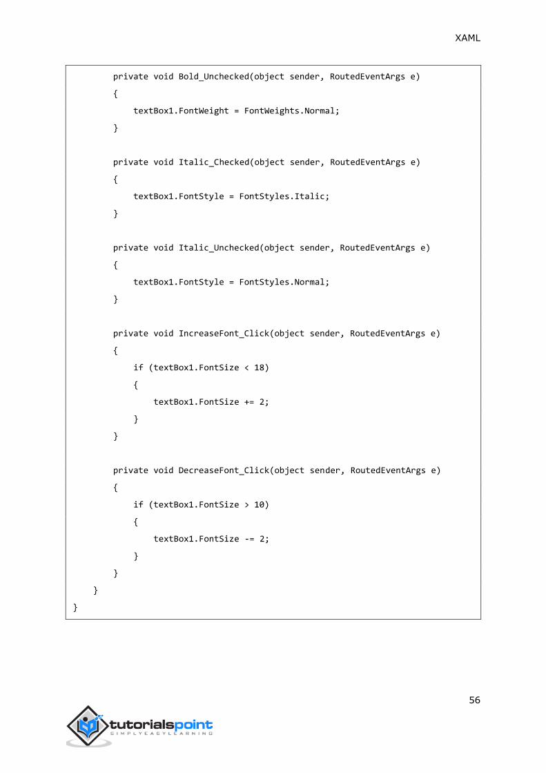
XAML
56
private void Bold_Unchecked(object sender, RoutedEventArgs e)
{
textBox1.FontWeight = FontWeights.Normal;
}
private void Italic_Checked(object sender, RoutedEventArgs e)
{
textBox1.FontStyle = FontStyles.Italic;
}
private void Italic_Unchecked(object sender, RoutedEventArgs e)
{
textBox1.FontStyle = FontStyles.Normal;
}
private void IncreaseFont_Click(object sender, RoutedEventArgs e)
{
if (textBox1.FontSize < 18)
{
textBox1.FontSize += 2;
}
}
private void DecreaseFont_Click(object sender, RoutedEventArgs e)
{
if (textBox1.FontSize > 10)
{
textBox1.FontSize -= 2;
}
}
}
}
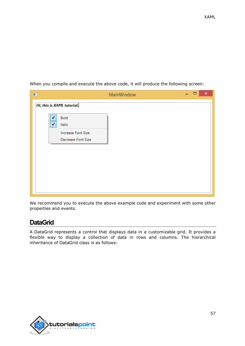
XAML
57
When you compile and execute the above code, it will produce the following screen:
We recommend you to execute the above example code and experiment with some other
properties and events.
DataGrid
A DataGrid represents a control that displays data in a customizable grid. It provides a
flexible way to display a collection of data in rows and columns. The hierarchical
inheritance of DataGrid class is as follows:

XAML
58
Given below are the commonly used properties of DataGrid:
Sr.
No.
Properties & Description
1 AlternatingRowBackground
Gets or sets the background brush for use on alternating rows.
2
AreRowDetailsFrozen
Gets or sets a value that indicates whether the row details can scroll
horizontally.
3 AutoGenerateColumns
Gets or sets a value that indicates whether the columns are created
automatically.
4
CanUserAddRows
Gets or sets a value that indicates whether the user can add new rows to the
DataGrid.
5
CanUserDeleteRows
Gets or sets a value that indicates whether the user can delete rows from the
DataGrid.
6
CanUserReorderColumns

XAML
59
Gets or sets a value that indicates whether the user can change the column
display order by dragging column headers with the mouse.
7
CanUserResizeColumns
Gets or sets a value that indicates whether the user can adjust the width of
columns by using the mouse.
8
CanUserResizeRows
Gets or sets a value that indicates whether the user can adjust the height of
rows by using the mouse.
9
CanUserSortColumns
Gets or sets a value that indicates whether the user can sort columns by
clicking the column header.
10 ColumnHeaderHeight
Gets or sets the height of the column headers row.
11 ColumnHeaderStyle
Gets or sets the style applied to all column headers in the DataGrid.
12 Columns
Gets a collection that contains all the columns in the DataGrid.
13 ColumnWidth
Gets or sets the standard width and sizing mode of columns and headers in the
DataGrid.
14 CurrentCell
Gets or sets the cell that has focus.
15 CurrentColumn
Gets or sets the column that contains the current cell.
16 CurrentItem
Gets the data item bound to the row that contains the current cell.
17 FrozenColumnCount
Gets or sets the number of non-scrolling columns.
18 HorizontalScrollBarVisibility
Gets or sets a value that indicates how horizontal scroll bars are displayed in
the DataGrid.
19 IsReadOnly
Gets or sets a value that indicates whether the user can edit values in the
DataGrid.
20 RowBackground
Gets or sets the default brush for the row background.
21 RowHeight
Gets or sets the suggested height for all rows.
22 SelectedCells
Gets the list of cells that are currently selected.
Given below are the commonly used methods of DataGrid:
Sr.
No. Methods & Description
1 BeginEdit
Invokes the BeginEdit command, which will place the current cell or row into
edit mode.
2 CancelEdit
Invokes the CancelEditCommand command for the cell or row currently in edit
mode.
3 ClearDetailsVisibilityForItem
Clears the DetailsVisibility property for the DataGridRow that represents the
specified data item.

XAML
60
4 ColumnFromDisplayIndex
Gets the DataGridColumn at the specified index.
5 CommitEdit
Invokes the CommitEditCommand command for the cell or row currently in
edit mode.
6 GenerateColumns
Generates columns for the specified properties of an object.
7
GetDetailsVisibilityForItem
Gets the DetailsVisibility property for the DataGridRow that represents the
specified data item.
8
OnApplyTemplate
When overridden in a derived class, is invoked whenever application code or
internal processes call ApplyTemplate. (Overrides
FrameworkElement.OnApplyTemplate())
9 ScrollIntoView
Scrolls the DataGrid vertically to display the row for the specified data item.
10 SelectAllCells
Selects all the cells in the DataGrid.
11
SetDetailsVisibilityForItem
Sets the value of the DetailsVisibility property for the DataGridRow that
contains the specified object.
12
UnselectAllCells Unselects all the cells in the DataGrid.
Given below are the most commonly used events of DataGrid.
Sr.
No. Events & Description
1 AddingNewItem
Occurs before a new item is added to the DataGrid.
2 AutoGeneratedColumns
Occurs when auto generation of all columns is completed.
3 AutoGeneratingColumn
Occurs when an individual column is auto-generated.
4 BeginningEdit
Occurs before a row or cell enters edit mode.
5 CellEditEnding
Occurs before a cell edit is committed or canceled.
6 ColumnDisplayIndexChanged
Occurs when the DisplayIndex property on one of the columns changes.
7 ColumnHeaderDragCompleted
Occurs when the user releases a column header after dragging it by using the
mouse.
8
ColumnHeaderDragDelta
Occurs every time the mouse position changes while the user drags a column
header.
9 ColumnHeaderDragStarted
Occurs when the user begins dragging a column header by using the mouse.
10 ColumnReordered
Occurs when a column moves to a new position in the display order.
11 ColumnReordering
Occurs before a column moves to a new position in the display order.
12 CopyingRowClipboardContent
Occurs after the default row content is prepared.

XAML
61
13 CurrentCellChanged
Occurs when the value of the CurrentCell property has changed.
14 InitializingNewItem
Occurs when a new item is created.
15
LoadingRow
Occurs after a DataGridRow is instantiated, so that you can customize it before
it is used.
16 LoadingRowDetails
Occurs when a new row details template is applied to a row.
17 PreparingCellForEdit
Occurs when a cell enters edit mode.
18 RowDetailsVisibilityChanged
Occurs when the visibility of a row details element changes.
19 RowEditEnding
Occurs before a row edit is committed or canceled.
20 SelectedCellsChanged
Occurs when the SelectedCells collection changes.
21 Sorting
Occurs when a column is being sorted.
22 UnloadingRow
Occurs when a DataGridRow object becomes available for reuse.
23 UnloadingRowDetails
Occurs when a row details element becomes available for reuse.
Example
The following example shows how to display data in a DataGrid. Here is the XAML code to
create two checkboxes with some properties and events.
<Window x:Class="DataGrid.MainWindow"
xmlns="http://schemas.microsoft.com/winfx/2006/xaml/presentation"
xmlns:x="http://schemas.microsoft.com/winfx/2006/xaml"
xmlns:core="clr-namespace:System;assembly=mscorlib"
xmlns:local="clr-namespace:DataGrid"
Title="MainWindow" Height="350" Width="525">
<Window.Resources>
<ObjectDataProvider x:Key="myEnum"
MethodName="GetValues"
ObjectType="{x:Type core:Enum}">
<ObjectDataProvider.MethodParameters>
<x:TypeExtension Type="local:Party" />
</ObjectDataProvider.MethodParameters>
</ObjectDataProvider>
</Window.Resources>
<Grid>
<DataGrid Name="dataGrid"

XAML
62
AlternatingRowBackground="LightBlue"
AlternationCount="2"
AutoGenerateColumns="False">
<DataGrid.Columns>
<DataGridTextColumn Header="Name"
Binding="{Binding Name}" />
<DataGridTextColumn Header="Title"
Binding="{Binding Title}" />
<DataGridCheckBoxColumn Header="ReElected?"
Binding="{Binding WasReElected}"/>
<DataGridComboBoxColumn Header="Party"
SelectedItemBinding="{Binding Affiliation}"
ItemsSource="{Binding
Source={StaticResource myEnum}}" />
</DataGrid.Columns>
</DataGrid>
</Grid>
</Window>
Here is the implementation in C# for two different classes.
using System;
using System.Collections.Generic;
using System.Linq;
using System.Text;
using System.Threading.Tasks;
using System.Windows;
using System.Windows.Controls;
using System.Windows.Data;
using System.Windows.Documents;
using System.Windows.Input;
using System.Windows.Media;
using System.Windows.Media.Imaging;
using System.Windows.Navigation;
using System.Windows.Shapes;
namespace DataGrid

XAML
63
{
/// <summary>
/// Interaction logic for MainWindow.xaml
/// </summary>
public partial class MainWindow : Window
{
public MainWindow()
{
InitializeComponent();
dataGrid.ItemsSource = Employee.GetEmployees();
}
}
public enum Party
{
Indepentent,
Federalist,
DemocratRepublican,
}
}
Here is another Employee class implementation in C#.
public class Employee : INotifyPropertyChanged
{
private string name;
public string Name
{
get { return name; }
set
{
name = value;
RaiseProperChanged();
}
}
private string title;
public string Title
{
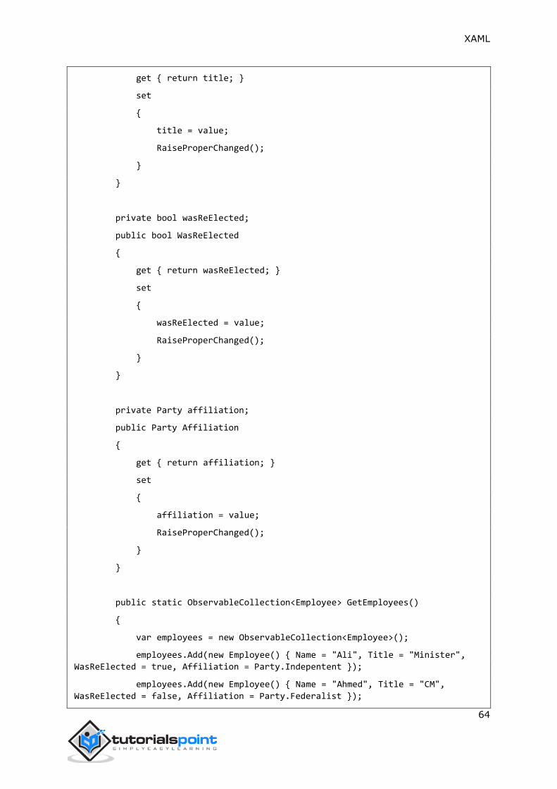
XAML
64
get { return title; }
set
{
title = value;
RaiseProperChanged();
}
}
private bool wasReElected;
public bool WasReElected
{
get { return wasReElected; }
set
{
wasReElected = value;
RaiseProperChanged();
}
}
private Party affiliation;
public Party Affiliation
{
get { return affiliation; }
set
{
affiliation = value;
RaiseProperChanged();
}
}
public static ObservableCollection<Employee> GetEmployees()
{
var employees = new ObservableCollection<Employee>();
employees.Add(new Employee() { Name = "Ali", Title = "Minister",
WasReElected = true, Affiliation = Party.Indepentent });
employees.Add(new Employee() { Name = "Ahmed", Title = "CM",
WasReElected = false, Affiliation = Party.Federalist });
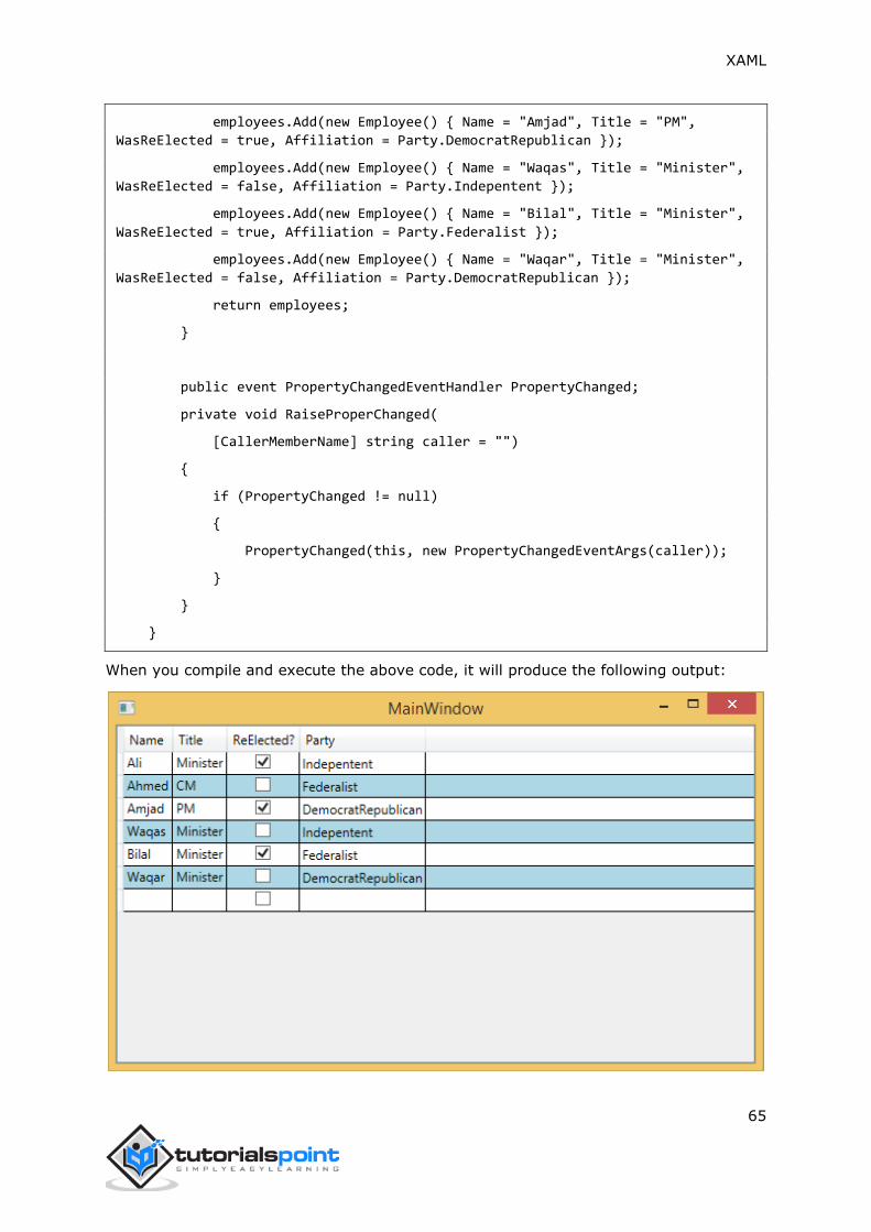
XAML
65
employees.Add(new Employee() { Name = "Amjad", Title = "PM",
WasReElected = true, Affiliation = Party.DemocratRepublican });
employees.Add(new Employee() { Name = "Waqas", Title = "Minister",
WasReElected = false, Affiliation = Party.Indepentent });
employees.Add(new Employee() { Name = "Bilal", Title = "Minister",
WasReElected = true, Affiliation = Party.Federalist });
employees.Add(new Employee() { Name = "Waqar", Title = "Minister",
WasReElected = false, Affiliation = Party.DemocratRepublican });
return employees;
}
public event PropertyChangedEventHandler PropertyChanged;
private void RaiseProperChanged(
[CallerMemberName] string caller = "")
{
if (PropertyChanged != null)
{
PropertyChanged(this, new PropertyChangedEventArgs(caller));
}
}
}
When you compile and execute the above code, it will produce the following output:

XAML
66
We recommend you to execute the above example code and experiment with some other
properties and events.
DatePicker
A DatePicker represents a control that allows a user to pick a date value. The user picks
the date by using ComboBox selection for month, day, and year values. The hierarchical
inheritance of DatePicker class is as follows:
Given below are some of the most commonly used properties of DatePicker:
Sr.
No.
Property & Description
1 CalendarIdentifier
Gets or sets the calendar system to use.
2 CalendarIdentifierProperty
Gets the identifier for the CalendarIdentifier dependency property.
3 Date
Gets or sets the date currently set in the date picker.
4 DateProperty
Gets the identifier for the Date dependency property.
5 DayFormat
Gets or sets the display format for the day value.
6 DayFormatProperty
Gets the identifier for the DayFormat dependency property.
7 DayVisible
Gets or sets a value that indicates whether the day selector is shown.

XAML
67
8 DayVisibleProperty
Gets the identifier for the DayVisible dependency property.
9 Header
Gets or sets the content for the control's header.
10 HeaderProperty
Identifies the Header dependency property.
11
HeaderTemplate
Gets or sets the DataTemplate used to display the content of the control's
header.
12 HeaderTemplateProperty
Identifies the HeaderTemplate dependency property.
13 MaxYear
Gets or sets the maximum Gregorian year available for picking.
14 MaxYearProperty
Gets the identifier for the MaxYear dependency property.
15 MinYear
Gets or sets the minimum Gregorian year available for picking.
16 MinYearProperty
Gets the identifier for the MinYear dependency property.
17 MonthFormat
Gets or sets the display format for the month value.
18 MonthFormatProperty
Gets the identifier for the MonthFormat dependency property.
19 MonthVisible
Gets or sets a value that indicates whether the month selector is shown.
20 MonthVisibleProperty
Gets the identifier for the MonthVisible dependency property.
21
Orientation
Gets or sets a value that indicates whether the day, month, and year selectors
are stacked horizontally or vertically.
22 OrientationProperty
Gets the identifier for the Orientation dependency property.
23 YearFormat
Gets or sets the display format for the year value.
24 YearFormatProperty
Gets the identifier for the YearFormat dependency property.
25 YearVisible
Gets or sets a value that indicates whether the year selector is shown.
26 YearVisibleProperty
Gets the identifier for the YearVisible dependency property.
Events in DatePicker class:
Sr.
No.
Event & Description
1 DateChanged
Occurs when the date value is changed.
2 DragEnter
Occurs when the input system reports an underlying drag event with this
element as the target. (Inherited from UIElement)
3 DragLeave
Occurs when the input system reports an underlying drag event with this
element as the origin. (Inherited from UIElement)
4 DragOver

XAML
68
Occurs when the input system reports an underlying drag event with this
element as the potential drop target. (Inherited from UIElement)
5 DragStarting
Occurs when a drag operation is initiated. (Inherited from UIElement)
6 GotFocus
Occurs when a UIElement receives focus. (Inherited from UIElement)
7 Holding
Occurs when an otherwise unhandled Hold interaction occurs over the hit test
area of this element. (Inherited from UIElement)
8 IsEnabledChanged
Occurs when the IsEnabled property changes. (Inherited from Control)
9
KeyDown
Occurs when a keyboard key is pressed while the UIElement has focus.
(Inherited from UIElement)
10
KeyUp
Occurs when a keyboard key is released while the UIElement has focus.
(Inherited from UIElement)
11 LostFocus
Occurs when a UIElement loses focus. (Inherited from UIElement)
Given below are the most commonly used methods in DatePicker class.
Sr.
No.
Method & Description
1
ClearValue
Clears the local value of a dependency property. (Inherited from
DependencyObject)
2
FindName
Retrieves an object that has the specified identifier name. (Inherited from
FrameworkElement)
3
OnApplyTemplate
Invoked whenever application code or internal processes (such as a rebuilding
layout pass) call ApplyTemplate. In simplest terms, this means the method is
called just before a UI element displays in your app. Override this method to
influence the default post-template logic of a class. (Inherited from
FrameworkElement)
4 OnDragEnter
Called before the DragEnter event occurs. (Inherited from Control)
5 OnDragLeave
Called before the DragLeave event occurs. (Inherited from Control)
6 OnDragOver
Called before the DragOver event occurs. (Inherited from Control)
7 OnDrop
Called before the Drop event occurs. (Inherited from Control)
8 OnGotFocus
Called before the GotFocus event occurs. (Inherited from Control)
9 OnKeyDown
Called before the KeyDown event occurs. (Inherited from Control)
10 OnKeyUp
Called before the KeyUp event occurs. (Inherited from Control)
11 OnLostFocus
Called before the LostFocus event occurs. (Inherited from Control)
12
SetBinding

XAML
69
Attaches a binding to a FrameworkElement, using the provided binding object.
(Inherited from FrameworkElement)
Example
The following example shows how to create a DatePicker control. When you click on any
date from the DatePicker control, the program will update the title with that date.
Here is the XAML code to create a DatePicker with some properties and a click event.
<Window x:Class="XAMLDatePicker.MainWindow"
xmlns="http://schemas.microsoft.com/winfx/2006/xaml/presentation"
xmlns:x="http://schemas.microsoft.com/winfx/2006/xaml"
Title="MainWindow" Height="350" Width="604">
<Grid>
<DatePicker HorizontalAlignment="Center"
Margin="10,10,0,0"
VerticalAlignment="Top"
SelectedDateChanged="DatePicker_SelectedDateChanged"/>
</Grid>
</Window>
Given below is the C# implementation for DatePicker_SelectedDateChanged event.
using System;
using System.Windows;
using System.Windows.Controls;
namespace XAMLDatePicker
{
/// <summary>
/// Interaction logic for MainWindow.xaml
/// </summary>
public partial class MainWindow : Window
{
public MainWindow()
{
InitializeComponent();
}
private void DatePicker_SelectedDateChanged(object sender,
SelectionChangedEventArgs e)

XAML
70
{
var picker = sender as DatePicker;
DateTime? date = picker.SelectedDate;
if (date == null)
{
this.Title = "No date";
}
else
{
this.Title = date.Value.ToShortDateString();
}
}
}
}
When you compile and execute the above code, it will display the following output:
We recommend you to execute the above example code and experiment with some other
properties and events.

XAML
71
Dialog Box
All standalone applications have a main window that exposes some functionality and
displays some data over which the application operates through its GUI. An application
may also display additional windows to do the following:
To display some specific information to users.
To gather useful information from users.
To both display and gather important information.
Example
Let’s have a look at the following example. On the main window, there is a button and a
textbox. When the user clicks this button, it opens another dialog box with Yes, No, and
Cancel buttons and displays a message on it that prompts the user to click a button.
When the user clicks a button, then the current dialog box gets closed and shows a textbox
with the information "which button has been clicked".
Here is the XAML code to create and initialize a button and a textbox with some properties:
<Window x:Class="XAMLDialog.MainWindow"
xmlns="http://schemas.microsoft.com/winfx/2006/xaml/presentation"
xmlns:x="http://schemas.microsoft.com/winfx/2006/xaml"
Title="MainWindow" Height="350" Width="604">
<Grid>
<Button Height="23"
Margin="100"
Name="ShowMessageBox"
VerticalAlignment="Top"
Click="ShowMessageBox_Click">Show Message Box</Button>
<TextBox Height="23"
HorizontalAlignment="Left"
Margin="181,167,0,0"
Name="textBox1"
VerticalAlignment="Top"
Width="120" />
</Grid>
</Window>
Given below is the C# code to implement a button click event.
using System;

XAML
72
using System.Windows;
using System.Windows.Controls;
namespace XAMLDialog
{
/// <summary>
/// Interaction logic for MainWindow.xaml
/// </summary>
public partial class MainWindow : Window
{
public MainWindow()
{
InitializeComponent();
}
private void ShowMessageBox_Click(object sender, RoutedEventArgs e)
{
string msgtext = "Click any button";
string txt = "My Title";
MessageBoxButton button = MessageBoxButton.YesNoCancel;
MessageBoxResult result = MessageBox.Show(msgtext, txt, button);
switch (result)
{
case MessageBoxResult.Yes:
textBox1.Text = "Yes";
break;
case MessageBoxResult.No:
textBox1.Text = "No";
break;
case MessageBoxResult.Cancel:
textBox1.Text = "Cancel";
break;
}
}
}
}

XAML
73
When you compile and execute the above code, it will produce the following output:
When you click on the button, it displays another dialog box as shown below that prompts
the user to click a button. Now, click the Yes button.
It updates the textbox with the button content.

XAML
74
GridView
A GridView represents a control that displays data items in rows and columns. Actually, a
ListView displays data. By default, it contains a GridView. The hierarchical inheritance of
GridView class is as follows:

XAML
75
Given below are the commonly used properties of GridView.
Sr.
No. Property & Description
1
Background
Gets or sets a brush that provides the background of the control. (Inherited
from Control)
2 BorderThickness
Gets or sets the border thickness of a control. (Inherited from Control)
3
DataContext
Gets or sets the data context for a FrameworkElement when it participates in
data binding. (Inherited from FrameworkElement)
4 FontFamily
Gets or sets the font used to display text in the control. (Inherited from Control)
5 FontSize
Gets or sets the size of the text in this control. (Inherited from Control)
6 FontStyle
Gets or sets the style in which the text is rendered. (Inherited from Control)
7 FontWeight
Gets or sets the thickness of the specified font. (Inherited from Control)

XAML
76
8 Foreground
Gets or sets a brush that describes the foreground color. (Inherited from
Control)
9
GroupStyle
Gets a collection of GroupStyle objects that define the appearance of each level
of groups. (Inherited from ItemsControl)
10 Header
Gets or sets the content for the list header. (Inherited from ListViewBase)
11
Height
Gets or sets the suggested height of a FrameworkElement. (Inherited from
FrameworkElement)
12
HorizontalAlignment
Gets or sets the horizontal alignment characteristics that are applied to a
FrameworkElement when it is composed in a layout parent, such as a panel or
items control. (Inherited from FrameworkElement)
13
HorizontalContentAlignment
Gets or sets the horizontal alignment of the control's content. (Inherited from
Control)
14
Items
Gets the collection used to generate the content of the control. (Inherited from
ItemsControl)
15
ItemsSource
Gets or sets an object source used to generate the content of the ItemsControl.
(Inherited from ItemsControl)
16
ItemTemplate
Gets or sets the DataTemplate used to display each item. (Inherited from
ItemsControl)
17
Margin
Gets or sets the outer margin of a FrameworkElement. (Inherited from
FrameworkElement)
18
Name
Gets or sets the identifying name of the object. When a XAML processor creates
the object tree from XAML markup, run-time code can refer to the XAML-
declared object by this name. (Inherited from FrameworkElement)
19 Opacity
Gets or sets the degree of the object's opacity. (Inherited from UIElement)
20
Resources
Gets the locally defined resource dictionary. In XAML, you can establish
resource items as child object elements of a frameworkElement.Resources
property element, through XAML implicit collection syntax. (Inherited from
FrameworkElement)
21 SelectedIndex
Gets or sets the index of the selected item. (Inherited from Selector)
22 SelectedItem
Gets or sets the selected item. (Inherited from Selector)
23 SelectedItems
Gets the currently selected items. (Inherited from ListViewBase)
24
SelectedRanges
Gets a collection of ItemIndexRange objects that describe the currently selected
items in the list. (Inherited from ListViewBase)
25
SelectedValue
Gets or sets the value of the selected item, obtained by using the
SelectedValuePath. (Inherited from Selector)
26
Style
XAML
77
Gets or sets an instance Style that is applied for this object during layout and
rendering. (Inherited from FrameworkElement)
27 VerticalAlignment
Gets or sets the vertical alignment characteristics that are applied to a
FrameworkElement when it is composed in a parent object such as a panel or
items control. (Inherited from FrameworkElement)
28
VerticalContentAlignment
Gets or sets the vertical alignment of the control's content. (Inherited from
Control)
29
Width
Gets or sets the width of a FrameworkElement. (Inherited from
FrameworkElement)
Given below are the commonly used events in GridView:
Sr.
No. Event & Description
1
DataContextChanged
Occurs when the value of the FrameworkElement.DataContext property
changes. (Inherited from FrameworkElement)
2
DragEnter
Occurs when the input system reports an underlying drag event with this
element as the target. (Inherited from UIElement)
3
DragLeave
Occurs when the input system reports an underlying drag event with this
element as the origin. (Inherited from UIElement)
4
DragOver
Occurs when the input system reports an underlying drag event with this
element as the potential drop target. (Inherited from UIElement)
5 DragStarting
Occurs when a drag operation is initiated. (Inherited from UIElement)
6
Drop
Occurs when the input system reports an underlying drop event with this
element as the drop target. (Inherited from UIElement)
7 ImageFailed
Occurs when there is an error associated with image retrieval or format.
8
ImageOpened
Occurs when the image source is downloaded and decoded with no failure. You
can use this event to determine the natural size of the image source.
9
KeyDown
Occurs when a keyboard key is pressed while the UIElement has focus.
(Inherited from UIElement)
10
KeyUp
when a keyboard key is released while the UIElement has focus. (Inherited from
UIElement)
Below are the commonly used Methods of GridView.
Sr.
No.
Method & Description
1 Arrange
Positions child objects and determines a size for a UIElement. Parent objects
that implement custom layout for their child elements should call this method

XAML
78
from their layout override implementations to form a recursive layout update.
(Inherited from UIElement)
2 ClearValue
Clears the local value of a dependency property. (Inherited from
DependencyObject)
3 FindName
Retrieves an object that has the specified identifier name. (Inherited from
FrameworkElement)
4 GetValue
Returns the current effective value of a dependency property from a
DependencyObject. (Inherited from DependencyObject)
5 ReadLocalValue
Returns the local value of a dependency property, if a local value is set.
(Inherited from DependencyObject)
6 SetBinding
Attaches a binding to a FrameworkElement, using the provided binding object.
(Inherited from FrameworkElement)
7 SetValue
Sets the local value of a dependency property on a DependencyObject.
(Inherited from DependencyObject)
Example
The following example shows the data (Name, ID, and Age) contained in a table. Here is
the XAML implementation to create and initialize a GridView.
<Window x:Class="XAMLGridView.MainWindow"
xmlns="http://schemas.microsoft.com/winfx/2006/xaml/presentation"
xmlns:x="http://schemas.microsoft.com/winfx/2006/xaml"
Title="MainWindow" Height="350" Width="525">
<Grid>
<ListView HorizontalAlignment="Left"
Height="299" Margin="10,10,0,0" VerticalAlignment="Top" Width="497"
Name="MenList">
<ListView.View>
<GridView>
<GridViewColumn Header="Name"
DisplayMemberBinding="{Binding Name}"
Width="100"/>
<GridViewColumn Header="ID"
DisplayMemberBinding="{Binding ID}"
Width="100"/>
<GridViewColumn Header="Age"
DisplayMemberBinding="{Binding Age}"
Width="100"/>
XAML
79
</GridView>
</ListView.View>
</ListView>
</Grid>
</Window>
Here is the C# implementation to implement a person class.
using System;
using System.Windows;
using System.Windows.Controls;
namespace XAMLGridView
{
/// <summary>
/// Interaction logic for MainWindow.xaml
/// </summary>
public partial class MainWindow : Window
{
public MainWindow()
{
InitializeComponent();
MenList.Items.Add(new Person() { Name = "Ali", ID = "123A", Age = 20 });
MenList.Items.Add(new Person() { Name = "Akram", ID = "456X", Age = 35 });
MenList.Items.Add(new Person() { Name = "Salman", ID = "333E", Age = 49 });
}
}
class Person
{
public string Name { get; set; }
public string ID { get; set; }
public int Age { get; set; }
}
}

XAML
80
When you compile and execute the above code, it will produce the following output:
We recommend you to execute the above example code and experiment with some other
properties and events.
Image
It is a control that displays an imag. You can use either the Image object or the
ImageBrush object. An Image object displays an image, while an ImageBrush object paints
another object with an image.
The image source is specified by referring to an image file using several supported formats.
It can display the following formats:
Bitmap (BMP)
Tagged Image File Format (TIFF)
Icons (ICO)
Joint Photographic Experts Group (JPEG)
Graphics Interchange Format (GIF)
Portable Network Graphics (PNG)
JPEG XR

XAML
81
The hierarchical inheritance of Image class is as follows:
Given below are some of the commonly used properties of an Image class:
Sr.
No. Property & Description
1
CanDrag
Gets or sets a value that indicates whether the element can be dragged as data
in a drag-and-drop operation. (Inherited from UIElement)
2
Height
Gets or sets the suggested height of a FrameworkElement. (Inherited from
FrameworkElement)
3
HorizontalAlignment
Gets or sets the horizontal alignment characteristics that are applied to a
FrameworkElement when it is composed in a layout parent, such as a panel or
items control. (Inherited from FrameworkElement)
4 Margin
Gets or sets the outer margin of a FrameworkElement. (Inherited from
FrameworkElement)
5
Name
Gets or sets the identifying name of the object. When a XAML processor creates
the object tree from XAML markup, run-time code can refer to the XAML-
declared object by this name. (Inherited from FrameworkElement)
6 Opacity
Gets or sets the degree of the object's opacity. (Inherited from UIElement)
XAML
82
7
PlayToSource
Gets the information that is transmitted if the Image is used for a Play To
scenario.
8
Resources
Gets the locally defined resource dictionary. In XAML, you can establish resource
items as child object elements of a frameworkElement.Resources property
element, through XAML implicit collection syntax. (Inherited from
FrameworkElement)
9 SourceProperty
Identifies the Source dependency property.
10
Stretch
Gets or sets a value that describes how an Image should be stretched to fill the
destination rectangle.
11 StretchProperty
Identifies the Stretch dependency property.
12
Style
Gets or sets an instance Style that is applied for this object during layout and
rendering. (Inherited from FrameworkElement)
13
VerticalAlignment
Gets or sets the vertical alignment characteristics that are applied to a
FrameworkElement when it is composed in a parent object such as a panel or
items control. (Inherited from FrameworkElement)
14
Width
Gets or sets the width of a FrameworkElement. (Inherited from
FrameworkElement)
15 wSource
Gets or sets the source for the image.
Given below are the commonly used events of an Image class:
Sr.
No. Event & Description
1
DataContextChanged
Occurs when the value of the FrameworkElement.DataContext property
changes. (Inherited from FrameworkElement)
2
DragEnter
Occurs when the input system reports an underlying drag event with this
element as the target. (Inherited from UIElement)
3
DragLeave
Occurs when the input system reports an underlying drag event with this
element as the origin. (Inherited from UIElement)
4
DragOver
Occurs when the input system reports an underlying drag event with this
element as the potential drop target. (Inherited from UIElement)
5 DragStarting
Occurs when a drag operation is initiated. (Inherited from UIElement)
6 Drop
Occurs when the input system reports an underlying drop event with this
element as the drop target. (Inherited from UIElement)
7 DropCompleted
Occurs when a drag-and-drop operation is ended. (Inherited from UIElement)
8 GotFocus
Occurs when a UIElement receives focus. (Inherited from UIElement)
9 ImageFailed

XAML
83
Occurs when there is an error associated with image retrieval or format.
10
ImageOpened
Occurs when the image source is downloaded and decoded with no failure. You
can use this event to determine the natural size of the image source.
11
KeyDown
Occurs when a keyboard key is pressed while the UIElement has focus.
(Inherited from UIElement)
12
KeyUp
Occurs when a keyboard key is released while the UIElement has focus.
(Inherited from UIElement)
13
SizeChanged
Occurs when either the ActualHeight or the ActualWidth property changes value
on a FrameworkElement. (Inherited from FrameworkElement)
Example
The following example shows three images. The first one is a simple image; in the second
image, the Opacity property is set; and in the third image, the eclipse is painted with an
ImageBrush. Here is the XAML code:
<Window x:Class="XAMLImage.MainWindow"
xmlns="http://schemas.microsoft.com/winfx/2006/xaml/presentation"
xmlns:x="http://schemas.microsoft.com/winfx/2006/xaml"
Title="MainWindow" Height="500" Width="604">
<Grid>
<Grid.RowDefinitions>
<RowDefinition Height="1*"/>
<RowDefinition Height="1*"/>
</Grid.RowDefinitions>
<StackPanel Orientation="Horizontal">
<Image Width="200"
Source="Images\red_rock_01.jpg"
VerticalAlignment="Top"
Margin="30"/>
<Image Width="200"
Source="Images\red_rock_01.jpg"
VerticalAlignment="Top"
Margin="30"
Opacity="0.5"/>
</StackPanel>
<StackPanel Grid.Row="1">
<Ellipse Height="100"
Width="200"
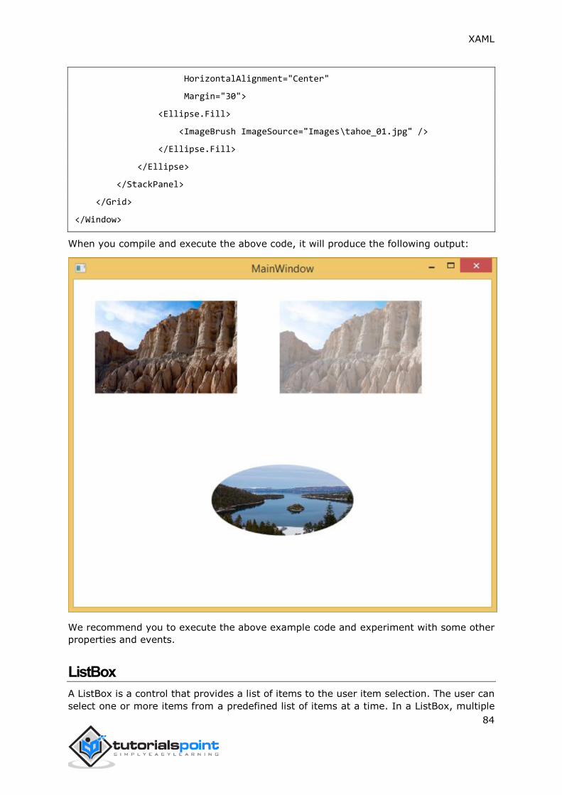
XAML
84
HorizontalAlignment="Center"
Margin="30">
<Ellipse.Fill>
<ImageBrush ImageSource="Images\tahoe_01.jpg" />
</Ellipse.Fill>
</Ellipse>
</StackPanel>
</Grid>
</Window>
When you compile and execute the above code, it will produce the following output:
We recommend you to execute the above example code and experiment with some other
properties and events.
ListBox
A ListBox is a control that provides a list of items to the user item selection. The user can
select one or more items from a predefined list of items at a time. In a ListBox, multiple
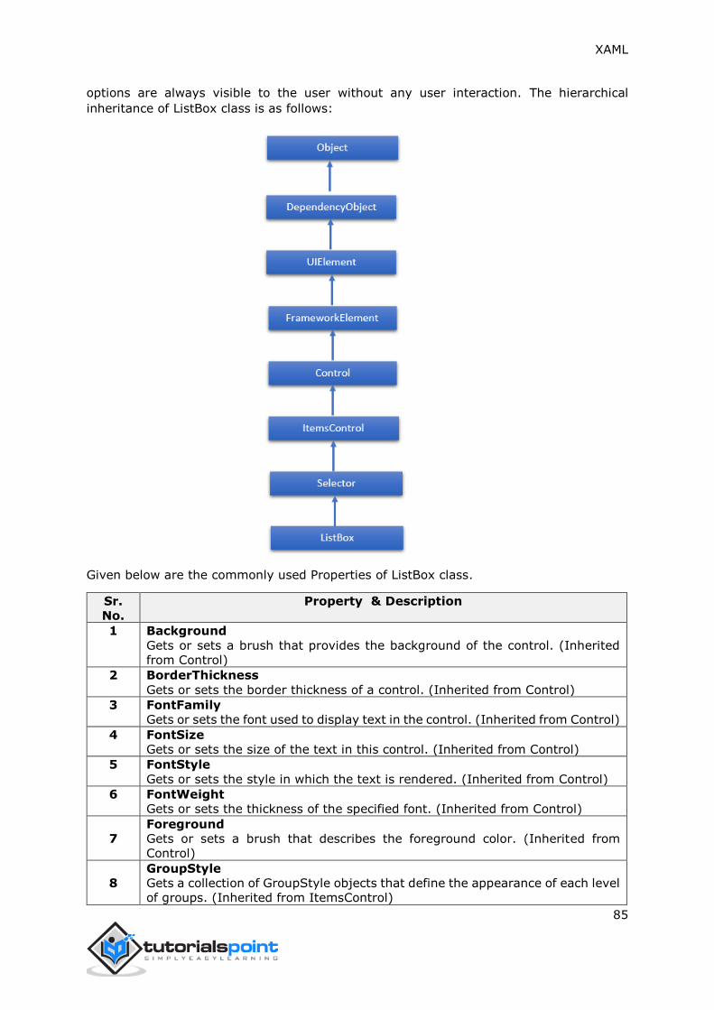
XAML
85
options are always visible to the user without any user interaction. The hierarchical
inheritance of ListBox class is as follows:
Given below are the commonly used Properties of ListBox class.
Sr.
No.
Property & Description
1 Background
Gets or sets a brush that provides the background of the control. (Inherited
from Control)
2 BorderThickness
Gets or sets the border thickness of a control. (Inherited from Control)
3 FontFamily
Gets or sets the font used to display text in the control. (Inherited from Control)
4 FontSize
Gets or sets the size of the text in this control. (Inherited from Control)
5 FontStyle
Gets or sets the style in which the text is rendered. (Inherited from Control)
6 FontWeight
Gets or sets the thickness of the specified font. (Inherited from Control)
7
Foreground
Gets or sets a brush that describes the foreground color. (Inherited from
Control)
8
GroupStyle
Gets a collection of GroupStyle objects that define the appearance of each level
of groups. (Inherited from ItemsControl)

XAML
86
9
Height
Gets or sets the suggested height of a FrameworkElement. (Inherited from
FrameworkElement)
10
HorizontalAlignment
Gets or sets the horizontal alignment characteristics that are applied to a
FrameworkElement when it is composed in a layout parent, such as a panel or
items control. (Inherited from FrameworkElement)
11
IsEnabled
Gets or sets a value indicating whether the user can interact with the control.
(Inherited from Control)
12
Item
Gets the collection used to generate the content of the control. (Inherited from
ItemsControl)
13
ItemsSource
Gets or sets an object source used to generate the content of the ItemsControl.
(Inherited from ItemsControl)
14
Margin
Gets or sets the outer margin of a FrameworkElement. (Inherited from
FrameworkElement)
15
Name
Gets or sets the identifying name of the object. When a XAML processor creates
the object tree from XAML markup, run-time code can refer to the XAML-
declared object by this name. (Inherited from FrameworkElement)
16
Opacity
Gets or sets the degree of the object's opacity. (Inherited from UIElement)
17 SelectedIndex
Gets or sets the index of the selected item. (Inherited from Selector)
18 SelectedItem
Gets or sets the selected item. (Inherited from Selector)
19
SelectedValue
Gets or sets the value of the selected item, obtained by using the
SelectedValuePath. (Inherited from Selector)
20
Style Gets or sets an instance Style that is applied for this object during layout
and rendering. (Inherited from FrameworkElement)
21
VerticalAlignment
Gets or sets the vertical alignment characteristics that are applied to a
FrameworkElement when it is composed in a parent object such as a panel or
items control. (Inherited from FrameworkElement)
22
Width
Gets or sets the width of a FrameworkElement. (Inherited from
FrameworkElement)
Given below are the most commonly used Events of ListBox:
Sr.
No.
Event & Description
1 DragEnter
Occurs when the input system reports an underlying drag event with this
element as the target. (Inherited from UIElement)
2 DragLeave
Occurs when the input system reports an underlying drag event with this
element as the origin. (Inherited from UIElement)
3 DragOver
XAML
87
Occurs when the input system reports an underlying drag event with this
element as the potential drop target. (Inherited from UIElement)
4 DragStarting
Occurs when a drag operation is initiated. (Inherited from UIElement)
5 Drop
Occurs when the input system reports an underlying drop event with this
element as the drop target. (Inherited from UIElement)
6 DropCompleted
Occurs when a drag-and-drop operation is ended. (Inherited from UIElement)
7 GotFocus
Occurs when a UIElement receives focus. (Inherited from UIElement)
8 IsEnabledChanged
Occurs when the IsEnabled property changes. (Inherited from Control)
9
KeyDown
Occurs when a keyboard key is pressed while the UIElement has focus.
(Inherited from UIElement)
10
KeyUp
Occurs when a keyboard key is released while the UIElement has focus.
(Inherited from UIElement)
11 LostFocus
Occurs when a UIElement loses focus. (Inherited from UIElement)
12
SelectionChanged
Occurs when the currently selected item changes. (Inherited from Selector)
13
SizeChanged
Occurs when either the ActualHeight or the ActualWidth property changes value
on a FrameworkElement. (Inherited from FrameworkElement)
Given below are the most commonly used methods of ListBox:
Sr.
No.
Method & Description
1
Arrange
Positions child objects and determines a size for a UIElement. Parent objects
that implement custom layout for their child elements should call this method
from their layout override implementations to form a recursive layout update.
(Inherited from UIElement)
2
FindName
Retrieves an object that has the specified identifier name. (Inherited from
FrameworkElement)
3 Focus
Attempts to set the focus on the control. (Inherited from Control)
4
GetValue
Returns the current effective value of a dependency property from a
DependencyObject. (Inherited from DependencyObject)
5
IndexFromContainer
Returns the index to the item that has the specified, generated container.
(Inherited from ItemsControl)
6 OnDragEnter
Called before the DragEnter event occurs. (Inherited from Control)
7 OnDragLeave
Called before the DragLeave event occurs. (Inherited from Control)
8 OnDragOver
Called before the DragOver event occurs. (Inherited from Control)
9 OnDrop

XAML
88
Called before the Drop event occurs. (Inherited from Control)
10 OnKeyDown
Called before the KeyDown event occurs. (Inherited from Control)
11 OnKeyUp
Called before the KeyUp event occurs. (Inherited from Control)
12 OnLostFocus
Called before the LostFocus event occurs. (Inherited from Control)
13
ReadLocalValue
Returns the local value of a dependency property, if a local value is set.
(Inherited from DependencyObject)
14
SetBinding
Attaches a binding to a FrameworkElement, using the provided binding object.
(Inherited from FrameworkElement)
15
SetValue
Sets the local value of a dependency property on a DependencyObject.
(Inherited from DependencyObject)
Example
The following example shows the ListBox control and a TextBox. When a user selects any
item from the ListBox, then it gets displayed on the TextBox as well.
Here is the XAML code to create and initialize a ListBox and a TextBox with some
properties.
<Window x:Class="XAMLListBox.MainWindow"
xmlns="http://schemas.microsoft.com/winfx/2006/xaml/presentation"
xmlns:x="http://schemas.microsoft.com/winfx/2006/xaml"
Title="MainWindow" Height="350" Width="604">
<Grid>
<StackPanel Orientation="Horizontal">
<ListBox Name="listbox" Margin="20,20,20,177" Width="103">
<ListBoxItem Content="Ali"/>
<ListBoxItem Content="Salman"/>
<ListBoxItem Content="Virat"/>
<ListBoxItem Content="Aamir"/>
</ListBox>
<TextBox Height="23"
Name="textBox1"
Width="120"
Margin="20"
HorizontalAlignment="Left"
VerticalAlignment="Top" >
<TextBox.Text>
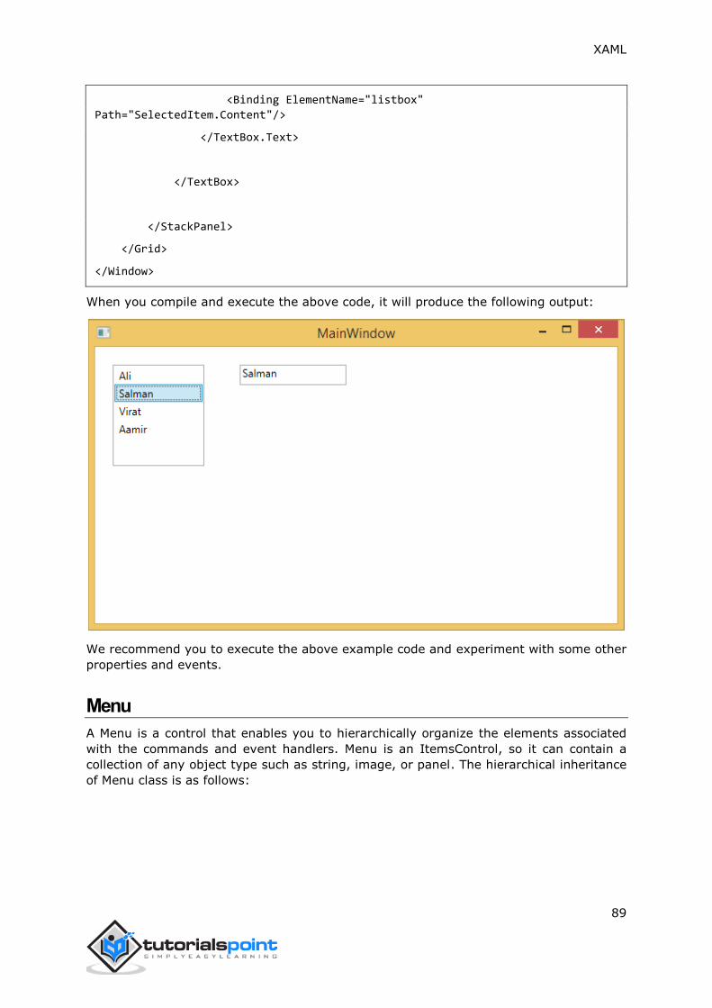
XAML
89
<Binding ElementName="listbox"
Path="SelectedItem.Content"/>
</TextBox.Text>
</TextBox>
</StackPanel>
</Grid>
</Window>
When you compile and execute the above code, it will produce the following output:
We recommend you to execute the above example code and experiment with some other
properties and events.
Menu
A Menu is a control that enables you to hierarchically organize the elements associated
with the commands and event handlers. Menu is an ItemsControl, so it can contain a
collection of any object type such as string, image, or panel. The hierarchical inheritance
of Menu class is as follows:

XAML
90
Given below are the commonly used properties of Menu class:
Sr.
No. Name & Description
1
Background
Gets or sets a brush that describes the background of a control. (Inherited
from Control.)
2
BindingGroup
Gets or sets the BindingGroup that is used for the element. (Inherited from
FrameworkElement.)
3
BitmapEffect
Obsolete. Gets or sets a bitmap effect that applies directly to the rendered
content for this element. This is a dependency property. (Inherited from
UIElement.)
4 BorderThickness
Gets or sets the border thickness of a control. (Inherited from Control.)
5
ContextMenu
Gets or sets the context menu element that should appear whenever the
context menu is requested through user interface (UI) from within this
element. (Inherited from FrameworkElement.)
6
Effect
Gets or sets the bitmap effect to apply to the UIElement. This is a dependency
property. (Inherited from UIElement.)

XAML
91
7 Height
Gets or sets the suggested height of the element. (Inherited from
FrameworkElement.)
8
IsMainMenu
Gets or sets a value that indicates whether this Menu receives a main menu
activation notification.
9
Items
Gets the collection used to generate the content of the ItemsControl. (Inherited
from ItemsControl.)
10
ItemsPanel
Gets or sets the template that defines the panel that controls the layout of
items. (Inherited from ItemsControl.)
11
ItemsSource
Gets or sets a collection used to generate the content of the ItemsControl.
(Inherited from ItemsControl.)
12
ItemStringFormat
Gets or sets a composite string that specifies how to format the items in the
ItemsControl if they are displayed as strings. (Inherited from ItemsControl.)
13
ItemTemplate
Gets or sets the DataTemplate used to display each item. (Inherited from
ItemsControl.)
14
ToolTip
Gets or sets the tool-tip object that is displayed for this element in the user
interface (UI). (Inherited from FrameworkElement.)
15
VerticalContentAlignment
Gets or sets the vertical alignment of the control's content. (Inherited from
Control.)
16 Width
Gets or sets the width of the element. (Inherited from FrameworkElement.)
Given below are the commonly used events in Menu class:
Sr.
No. Event & Description
1
ContextMenuClosing
Occurs just before any context menu on the element is closed. (Inherited from
FrameworkElement.)
2
ContextMenuOpening
Occurs when any context menu on the element is opened. (Inherited from
FrameworkElement.)
3
KeyDown
Occurs when a key is pressed while focus is on this element. (Inherited from
UIElement.)
4
KeyUp
Occurs when a key is released while focus is on this element. (Inherited from
UIElement.)
5
ToolTipClosing
Occurs just before any tooltip on the element is closed. (Inherited from
FrameworkElement.)
6 ToolTipOpening
Occurs when any tooltip on the element is opened. (Inherited from
FrameworkElement.)
7 TouchDown
Occurs when a finger touches the screen while the finger is over this element.
(Inherited from UIElement.)
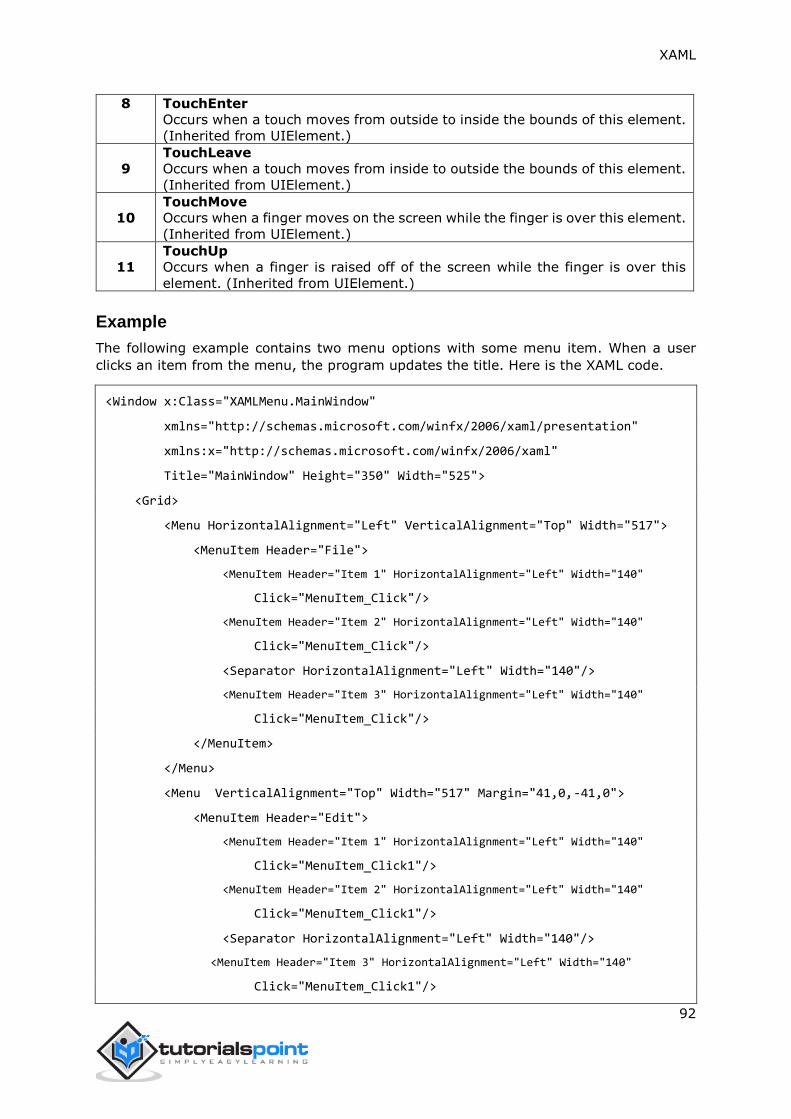
XAML
92
8 TouchEnter
Occurs when a touch moves from outside to inside the bounds of this element.
(Inherited from UIElement.)
9
TouchLeave
Occurs when a touch moves from inside to outside the bounds of this element.
(Inherited from UIElement.)
10
TouchMove
Occurs when a finger moves on the screen while the finger is over this element.
(Inherited from UIElement.)
11
TouchUp
Occurs when a finger is raised off of the screen while the finger is over this
element. (Inherited from UIElement.)
Example
The following example contains two menu options with some menu item. When a user
clicks an item from the menu, the program updates the title. Here is the XAML code.
<Window x:Class="XAMLMenu.MainWindow"
xmlns="http://schemas.microsoft.com/winfx/2006/xaml/presentation"
xmlns:x="http://schemas.microsoft.com/winfx/2006/xaml"
Title="MainWindow" Height="350" Width="525">
<Grid>
<Menu HorizontalAlignment="Left" VerticalAlignment="Top" Width="517">
<MenuItem Header="File">
<MenuItem Header="Item 1" HorizontalAlignment="Left" Width="140"
Click="MenuItem_Click"/>
<MenuItem Header="Item 2" HorizontalAlignment="Left" Width="140"
Click="MenuItem_Click"/>
<Separator HorizontalAlignment="Left" Width="140"/>
<MenuItem Header="Item 3" HorizontalAlignment="Left" Width="140"
Click="MenuItem_Click"/>
</MenuItem>
</Menu>
<Menu VerticalAlignment="Top" Width="517" Margin="41,0,-41,0">
<MenuItem Header="Edit">
<MenuItem Header="Item 1" HorizontalAlignment="Left" Width="140"
Click="MenuItem_Click1"/>
<MenuItem Header="Item 2" HorizontalAlignment="Left" Width="140"
Click="MenuItem_Click1"/>
<Separator HorizontalAlignment="Left" Width="140"/>
<MenuItem Header="Item 3" HorizontalAlignment="Left" Width="140"
Click="MenuItem_Click1"/>

XAML
93
</MenuItem>
</Menu>
</Grid>
</Window>
Here is the events implementation in C#:
using System.Linq;
using System.Windows;
using System.Windows.Controls;
namespace XAMLMenu
{
public partial class MainWindow : Window
{
public MainWindow()
{
InitializeComponent();
}
private void MenuItem_Click(object sender, RoutedEventArgs e)
{
MenuItem item = sender as MenuItem;
this.Title = "File: " + item.Header;
}
private void MenuItem_Click1(object sender, RoutedEventArgs e)
{
MenuItem item = sender as MenuItem;
this.Title = "Edit: " + item.Header;
}
}
}

XAML
94
When you compile and execute the above code, it will produce the following output:
We recommend you to execute the above example code and experiment with some other
properties and events.
PasswordBox
A PasswordBox is a control in which the user can enter a masked password. When the
user enters a password, the text is not displayed, only the password characters are shown.
The password character (usually shown as *) can be easily changed by the PasswordChar
property. The hierarchical inheritance of PasswordBox class is as follows:

XAML
95
Given below are the commonly used properties of PasswordBox class:
Sr.
No. Property & Description
1 InputScope
Gets or sets the context for input used by this PasswordBox.
2 InputScopeProperty
Identifies the InputScope dependency property.
3 IsPasswordRevealButtonEnabled
Gets or sets a value that specifies whether the visual UI of the PasswordBox
includes a button element that toggles showing or hiding the typed characters.
In Windows 10 and later, use PasswordRevealMode instead.
4 IsPasswordRevealButtonEnabledProperty
Identifies the IsPasswordRevealButtonEnabled dependency property.
5 MaxLength
Gets or sets the maximum length for passwords to be handled by this
PasswordBox.
6 MaxLengthProperty
Identifies the MaxLength dependency property.
7 Password
Gets or sets the password currently held by the PasswordBox.
8 PasswordChar
Gets or sets the masking character for the PasswordBox.
9 PasswordCharProperty
Identifies the PasswordChar dependency property.
10 PasswordProperty
Identifies the Password dependency property.
11
PasswordRevealMode
Gets or sets a value that specifies whether the password is always, never, or
optionally obscured.
12 PasswordRevealModeProperty
Identifies the PasswordRevealMode dependency property.
Resources

XAML
96
13
Gets the locally defined resource dictionary. In XAML, you can establish resource
items as child object elements of a frameworkElement.Resources property
element, through XAML implicit collection syntax. (Inherited from
FrameworkElement)
Given below are the commonly used events of PasswordBox class.
Sr.
No. Event & Description
1 ContextMenuOpening
Occurs when the system processes an interaction that displays a context menu.
2 GotFocus
Occurs when a UIElement receives focus. (Inherited from UIElement)
3 PasswordChanged
Occurs when the value of the Password property changes.
4 Paste
Occurs when text is pasted into the control.
Given below are the commonly used methods of PasswordBox class.
Sr.
No.
Method & Description
1 OnLostFocus
Called before the LostFocus event occurs. (Inherited from Control)
2 SelectAll
Selects all the characters in the PasswordBox.
3
SetBinding
Attaches a binding to a FrameworkElement, using the provided binding object.
(Inherited from FrameworkElement)
4
SetValue
Sets the local value of a dependency property on a DependencyObject.
(Inherited from DependencyObject)
Example
The following example shows the PasswordBox, labels, and a button. Here is the XAML
code to create and initialize all these controls.
<Window x:Class="PasswordBox.MainWindow"
xmlns="http://schemas.microsoft.com/winfx/2006/xaml/presentation"
xmlns:x="http://schemas.microsoft.com/winfx/2006/xaml"
Title="MainWindow" Height="350" Width="604">
<Grid >
<PasswordBox x:Name="pwBox"
Height="35"
Width="200"
MaxLength="8"
Margin="159,55,158,229" />
<Label Content="Password"

XAML
97
HorizontalAlignment="Left"
Margin="108,61,0,0"
VerticalAlignment="Top"
Width="70" />
<Button Content="Ok"
HorizontalAlignment="Left"
Margin="406,64,0,0"
VerticalAlignment="Top"
Width="75" Click="Button_Click"/>
<Label Name="statusText"
HorizontalAlignment="Left"
Margin="159,128,0,0"
VerticalAlignment="Top"
Width="200"
Height="38"/>
</Grid>
</Window>
Here is the button click event implementation in C# in which the program compares the
password. If the entered password is “xaml1234”, then it will display the message "correct
password" on the label.
using System.Linq;
using System.Windows;
using System.Windows.Controls;
namespace XAMLMenu
{
public partial class MainWindow : Window
{
public MainWindow()
{
InitializeComponent();
}
private void MenuItem_Click(object sender, RoutedEventArgs e)
{
MenuItem item = sender as MenuItem;

XAML
98
this.Title = "File: " + item.Header;
}
private void MenuItem_Click1(object sender, RoutedEventArgs e)
{
MenuItem item = sender as MenuItem;
this.Title = "Edit: " + item.Header;
}
}
}
When you compile and execute the above code, it will produce the following output:
We recommend you to execute the above example code and experiment with some other
properties and events.
Popup
A Popup displays content on top of existing content, within the bounds of the application
window. It is a temporarily display on other content. The hierarchical inheritance of Popup
class is as follows:

XAML
99
Given below are the commonly used properties of Popup class:
Sr.
No.
Property & Description
1 Child
Gets or sets the content to be hosted in the popup.
2 ChildProperty
Gets the identifier for the Child dependency property.
3
ChildTransitions
Gets or sets the collection of Transition style elements that apply to child
content of a Popup.
4 ChildTransitionsProperty
Identifies the ChildTransitions dependency property.
5
HorizontalOffset
Gets or sets the distance between the left side of the application window and
the left side of the popup.
6 HorizontalOffsetProperty
Gets the identifier for the HorizontalOffset dependency property.
7 IsLightDismissEnabled
Gets or sets a value that determines how the Popup can be dismissed.
8 IsLightDismissEnabledProperty
Identifies the IsLightDismissEnabled dependency property.
9 IsOpen
Gets or sets whether the popup is currently displayed on the screen.
10 IsOpenProperty
Gets the identifier for the IsOpen dependency property.
11
VerticalOffset
Gets or sets the distance between the top of the application window and the
top of the popup.
12 VerticalOffsetProperty
Gets the identifier for the VerticalOffset dependency property.

XAML
100
Popup class has the following events:
Sr.
No.
Event & Description
1 Closed
Fires when the IsOpen property is set to false.
2 Opened
Fires when the IsOpen property is set to true.
Example
The following example shows how to use Popup control. Given below is the XAML code to
create and iniliaze a Popup control and a CheckBox. When the user checks the CheckBox,
it displays a Popup.
<Window x:Class="XAMLPopup.MainWindow"
xmlns="http://schemas.microsoft.com/winfx/2006/xaml/presentation"
xmlns:x="http://schemas.microsoft.com/winfx/2006/xaml"
Title="MainWindow" Height="350" Width="604">
<Grid>
<StackPanel>
<CheckBox Name="PCheckBox" Margin="10,10,484,500"
Content="Checked Me" Height="18"/>
<Popup IsOpen="{Binding ElementName=PCheckBox,Path=IsChecked}"
PlacementTarget="{Binding ElementName=PCheckBox}"
AllowsTransparency="True"
PopupAnimation="Slide"
HorizontalOffset="150"
VerticalOffset="100">
<Canvas Width="100" Height="100" Background="LightGray" Margin="5">
<Canvas.RenderTransform>
<RotateTransform x:Name="theTransform" />
</Canvas.RenderTransform>
<TextBlock TextWrapping="Wrap"
Foreground="Blue"
Text="Hi, this is Popup"/>
</Canvas>
</Popup>
</StackPanel>
</Grid>
</Window>
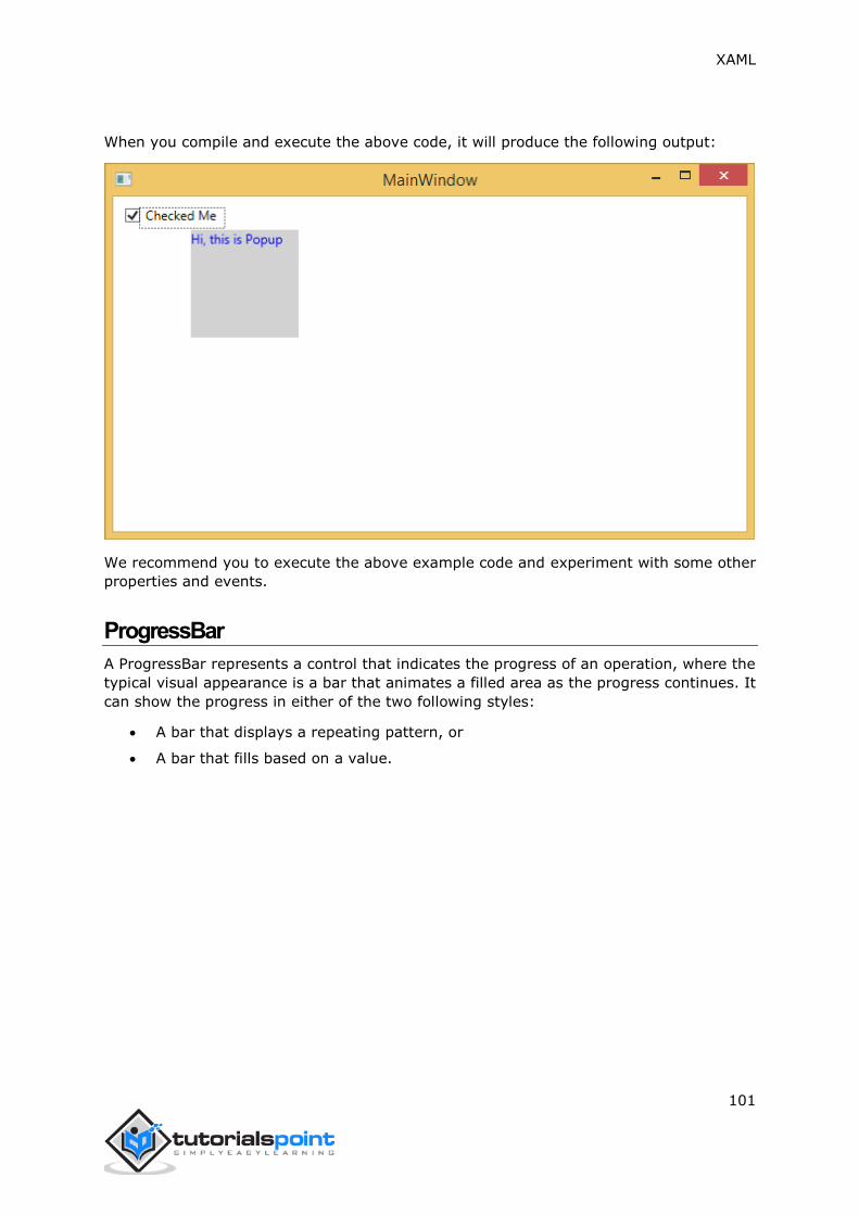
XAML
101
When you compile and execute the above code, it will produce the following output:
We recommend you to execute the above example code and experiment with some other
properties and events.
ProgressBar
A ProgressBar represents a control that indicates the progress of an operation, where the
typical visual appearance is a bar that animates a filled area as the progress continues. It
can show the progress in either of the two following styles:
A bar that displays a repeating pattern, or
A bar that fills based on a value.

XAML
102
The hierarchical inheritance of ProgressBar class is as follows:
Given below are the commonly used properties of ProgressBar:
Sr.
No.
Property & Description
1
IsIndeterminate
Gets or sets a value that indicates whether the progress bar reports generic
progress with a repeating pattern or reports progress based on the Value
property.
2 IsIndeterminateProperty
Identifies the IsIndeterminate dependency property.
3
ShowError
Gets or sets a value that indicates whether the progress bar should use visual
states that communicate an Error state to the user.
4 ShowErrorProperty
Identifies the ShowError dependency property.
5
ShowPaused
Gets or sets a value that indicates whether the progress bar should use visual
states that communicate a Paused state to the user.
6 ShowPausedProperty
Identifies the ShowPaused dependency property.
7
TemplateSettings
Gets an object that provides calculated values that can be referenced as
TemplateBinding sources when defining templates for a ProgressBar control.

XAML
103
Given below are the commonly used events in ProgressBar class:
Sr.
No.
Event & Description
1
ManipulationCompleted
Occurs when a manipulation on the UIElement is complete. (Inherited from
UIElement)
2
ManipulationDelta
Occurs when the input device changes position during a manipulation.
(Inherited from UIElement)
3
ManipulationInertiaStarting
Occurs when the input device loses contact with the UIElement object during
a manipulation and inertia begins. (Inherited from UIElement)
4
ManipulationStarted
Occurs when an input device begins a manipulation on the UIElement.
(Inherited from UIElement)
5
ManipulationStarting
Occurs when the manipulation processor is first created. (Inherited from
UIElement)
6 ValueChanged
Occurs when the range value changes. (Inherited from RangeBase)
Given below are the commonly used methods in ProgressBar class:
Sr.
No.
Method & Description
1
OnManipulationCompleted
Called before the ManipulationCompleted event occurs. (Inherited from
Control)
2 OnManipulationDelta
Called before the ManipulationDelta event occurs. (Inherited from Control)
3 OnManipulationInertiaStarting
Called before the ManipulationInertiaStarting event occurs. (Inherited from
Control)
4 OnManipulationStarted
Called before the ManipulationStarted event occurs. (Inherited from Control)
5 OnManipulationStarting
Called before the ManipulationStarting event occurs. (Inherited from Control)
6 OnMaximumChanged
Called when the Maximum property changes. (Inherited from RangeBase)
7 OnMinimumChanged
Called when the Minimum property changes. (Inherited from RangeBase)
8 OnValueChanged Fires the ValueChanged routed event. (Inherited from
RangeBase)
9
SetBinding
Attaches a binding to a FrameworkElement, using the provided binding object.
(Inherited from FrameworkElement)
10 SetValue
Sets the local value of a dependency property on a DependencyObject.
(Inherited from DependencyObject)
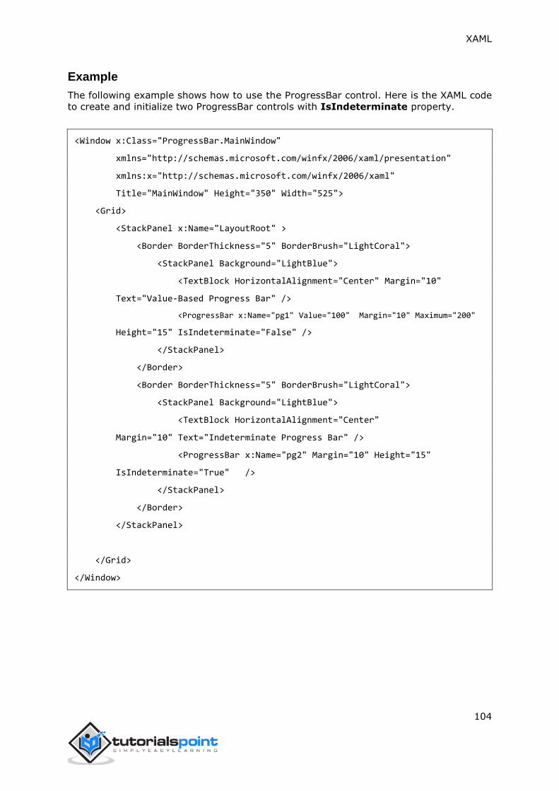
XAML
104
Example
The following example shows how to use the ProgressBar control. Here is the XAML code
to create and initialize two ProgressBar controls with IsIndeterminate property.
<Window x:Class="ProgressBar.MainWindow"
xmlns="http://schemas.microsoft.com/winfx/2006/xaml/presentation"
xmlns:x="http://schemas.microsoft.com/winfx/2006/xaml"
Title="MainWindow" Height="350" Width="525">
<Grid>
<StackPanel x:Name="LayoutRoot" >
<Border BorderThickness="5" BorderBrush="LightCoral">
<StackPanel Background="LightBlue">
<TextBlock HorizontalAlignment="Center" Margin="10"
Text="Value-Based Progress Bar" />
<ProgressBar x:Name="pg1" Value="100" Margin="10" Maximum="200"
Height="15" IsIndeterminate="False" />
</StackPanel>
</Border>
<Border BorderThickness="5" BorderBrush="LightCoral">
<StackPanel Background="LightBlue">
<TextBlock HorizontalAlignment="Center"
Margin="10" Text="Indeterminate Progress Bar" />
<ProgressBar x:Name="pg2" Margin="10" Height="15"
IsIndeterminate="True" />
</StackPanel>
</Border>
</StackPanel>
</Grid>
</Window>

XAML
105
When you compile and execute the above code, it will produce the following output:
We recommend you to execute the above example code and experiment with some other
properties and events.
ProgressRing
A ProgressRing is a control that indicates an ongoing operation. The typical visual
appearance is a ring-shaped "spinner" that cycles an animation as the progress continues.
An important point here is that WPF projects do not support ProgressRing. So for this
control, we will work on Windows Store App. The hierarchical inheritance of ProgressRing
class is as follows:

XAML
106
Given below are the commonly used properties of ProgressRing:
Sr.
No.
Description
1 IsActive
Gets or sets a value that indicates whether the ProgressRing is showing
progress.
2 IsActiveProperty
Identifies the IsActive dependency property.
3 TemplateSettings
Gets an object that provides calculated values that can be referenced as
TemplateBinding sources when defining templates for a ProgressRing control.
Given below are the commonly used events in ProgressRing class:
Sr.
No.
Event & Description
1
ManipulationCompleted
Occurs when a manipulation on the UIElement is complete. (Inherited from
UIElement)
2
ManipulationDelta
Occurs when the input device changes position during a manipulation.
(Inherited from UIElement)
3
ManipulationInertiaStarting
Occurs when the input device loses contact with the UIElement object during a
manipulation and inertia begins. (Inherited from UIElement)
4
ManipulationStarted
Occurs when an input device begins a manipulation on the UIElement.
(Inherited from UIElement)
5
ManipulationStarting
Occurs when the manipulation processor is first created. (Inherited from
UIElement)

XAML
107
6 ValueChanged
Occurs when the range value changes. (Inherited from RangeBase)
Given below are the commonly used methods in ProgressRing class:
Sr.
No.
Method & Description
1 OnManipulationCompleted
Called before the ManipulationCompleted event occurs. (Inherited from Control)
2 OnManipulationDelta
Called before the ManipulationDelta event occurs. (Inherited from Control)
3 OnManipulationInertiaStarting
Called before the ManipulationInertiaStarting event occurs. (Inherited from
Control)
4 OnManipulationStarted
Called before the ManipulationStarted event occurs. (Inherited from Control)
5 OnManipulationStarting
Called before the ManipulationStarting event occurs. (Inherited from Control)
6 OnMaximumChanged
Called when the Maximum property changes. (Inherited from RangeBase)
7 OnMinimumChanged
Called when the Minimum property changes. (Inherited from RangeBase)
Example
The following example shows how to use ProgressRing with ToggleSwitch. Here is the code
in XAML to create and initialize a ProgressRing and a ToggleSwitch:
<Page
x:Class="ProgressRing.MainPage"
xmlns="http://schemas.microsoft.com/winfx/2006/xaml/presentation"
xmlns:x="http://schemas.microsoft.com/winfx/2006/xaml"
xmlns:local="using:ProgressRing"
xmlns:d="http://schemas.microsoft.com/expression/blend/2008"
xmlns:mc="http://schemas.openxmlformats.org/markup-compatibility/2006"
mc:Ignorable="d">
<Grid Background="{ThemeResource ApplicationPageBackgroundThemeBrush}">
<StackPanel Orientation="Horizontal" Margin="342,0,-342,0">
<ProgressRing x:Name="progress1"/>
<ToggleSwitch Header="ProgressRing Example" OffContent="Do work"
OnContent="Working"
Toggled="ToggleSwitch_Toggled" Margin="0,348,0,347"/>
</StackPanel>
</Grid>
</Page>

XAML
108
Given below is the implementation in C# for Toggled event:
using System;
using System.Runtime.InteropServices.WindowsRuntime;
using Windows.Foundation;
using Windows.Foundation.Collections;
using Windows.UI.Xaml;
using Windows.UI.Xaml.Controls;
using Windows.UI.Xaml.Controls.Primitives;
namespace ProgressRing
{
public sealed partial class MainPage : Page
{
public MainPage()
{
this.InitializeComponent();
}
private void ToggleSwitch_Toggled(object sender, RoutedEventArgs e)
{
ToggleSwitch toggleSwitch = sender as ToggleSwitch;
if (toggleSwitch != null)
{
if (toggleSwitch.IsOn == true)
{
progress1.IsActive = true;
progress1.Visibility = Visibility.Visible;
}
else
{
progress1.IsActive = false;
progress1.Visibility = Visibility.Collapsed;
}
}
}
}
}

XAML
109
When you compile and execute the above code, it produces the following output:
We recommend you to execute the above example code and experiment with some other
properties and events in Windows App.
RadioButton
A RadioButton is a control that allows a user to select a single option from a group of
options. The user is limited to select a single option from a related list of options which
are mutually exclusive. It has only two options:
Selected
Cleared
The hierarchical inheritance of RadioButton class is as follows:
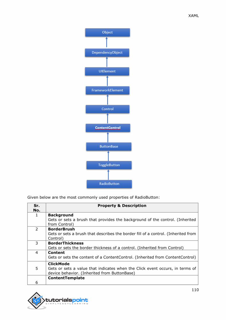
XAML
110
Given below are the most commonly used properties of RadioButton:
Sr.
No.
Property & Description
1 Background
Gets or sets a brush that provides the background of the control. (Inherited
from Control)
2 BorderBrush
Gets or sets a brush that describes the border fill of a control. (Inherited from
Control)
3 BorderThickness
Gets or sets the border thickness of a control. (Inherited from Control)
4 Content
Gets or sets the content of a ContentControl. (Inherited from ContentControl)
5
ClickMode
Gets or sets a value that indicates when the Click event occurs, in terms of
device behavior. (Inherited from ButtonBase)
6
ContentTemplate

XAML
111
Gets or sets the data template that is used to display the content of the
ContentControl. (Inherited from ContentControl)
7
FontFamily
Gets or sets the font used to display text in the control. (Inherited from
Control)
8 FontSize
Gets or sets the size of the text in this control. (Inherited from Control)
9 FontStyle
Gets or sets the style in which the text is rendered. (Inherited from Control)
10 FontWeight
Gets or sets the thickness of the specified font. (Inherited from Control)
11 Foreground
Gets or sets a brush that describes the foreground color. (Inherited from
Control)
12
Height
Gets or sets the suggested height of a FrameworkElement. (Inherited from
FrameworkElement)
13
HorizontalAlignment
Gets or sets the horizontal alignment characteristics that are applied to a
FrameworkElement when it is composed in a layout parent, such as a panel
or items control. (Inherited from FrameworkElement)
14
IsChecked
Gets or sets whether the ToggleButton is checked. (Inherited from
ToggleButton)
15
IsEnabled
Gets or sets a value indicating whether the user can interact with the control.
(Inherited from Control)
16
IsPressed
Gets a value that indicates whether a ButtonBase is currently in a pressed
state. (Inherited from ButtonBase)
17
IsThreeState
Gets or sets a value that indicates whether the control supports three states.
(Inherited from ToggleButton)
18
Margin
Gets or sets the outer margin of a FrameworkElement. (Inherited from
FrameworkElement)
19
Name
Gets or sets the identifying name of the object. When a XAML processor
creates the object tree from XAML markup, run-time code can refer to the
XAML-declared object by this name. (Inherited from FrameworkElement)
20 Opacity
Gets or sets the degree of the object's opacity. (Inherited from UIElement)
21
Resources
Gets the locally defined resource dictionary. In XAML, you can establish
resource items as child object elements of a frameworkElement.Resources
property element, through XAML implicit collection syntax. (Inherited from
FrameworkElement)
22
Style
Gets or sets an instance Style that is applied for this object during layout and
rendering. (Inherited from FrameworkElement)
23
Template
Gets or sets a control template. The control template defines the visual
appearance of a control in UI, and is defined in XAML markup. (Inherited from
Control)
VerticalAlignment

XAML
112
24 Gets or sets the vertical alignment characteristics that are applied to a
FrameworkElement when it is composed in a parent object such as a panel or
items control. (Inherited from FrameworkElement)
25
Visibility
Gets or sets the visibility of a UIElement. A UIElement that is not visible is not
rendered and does not communicate its desired size to layout. (Inherited from
UIElement)
26
Width
Gets or sets the width of a FrameworkElement. (Inherited from
FrameworkElement)
Given below are the commonly used methods of RadioButton:
Sr.
No.
Method & Description
1
ClearValue
Clears the local value of a dependency property. (Inherited from
DependencyObject)
2
FindName
Retrieves an object that has the specified identifier name. (Inherited from
FrameworkElement)
3
OnApplyTemplate
Invoked whenever application code or internal processes (such as a rebuilding
layout pass) call ApplyTemplate. In simplest terms, this means the method is
called just before a UI element displays in your app. Override this method to
influence the default post-template logic of a class. (Inherited from
FrameworkElement)
4
OnContentChanged
Invoked when the value of the Content property changes. (Inherited from
ContentControl)
5 OnDragEnter
Called before the DragEnter event occurs. (Inherited from Control)
6 OnDragLeave
Called before the DragLeave event occurs. (Inherited from Control)
7 OnDragOver
Called before the DragOver event occurs. (Inherited from Control)
8 OnDrop
Called before the Drop event occurs. (Inherited from Control)
9 OnGotFocus
Called before the GotFocus event occurs. (Inherited from Control)
10 OnKeyDown
Called before the KeyDown event occurs. (Inherited from Control)
11 OnKeyUp
Called before the KeyUp event occurs. (Inherited from Control)
12 OnLostFocus
Called before the LostFocus event occurs. (Inherited from Control)
13 OnToggle
Called when the ToggleButton receives toggle stimulus. (Inherited from
ToggleButton)
14 SetBinding
Attaches a binding to a FrameworkElement, using the provided binding object.
(Inherited from FrameworkElement)

XAML
113
Given below are the commonly used events of RadioButton:
Sr.
No.
Event & Description
1 Checked
Fires when a ToggleButton is checked. (Inherited from ToggleButton)
2 Click
Occurs when a button control is clicked. (Inherited from ButtonBase)
3
DataContextChanged
Occurs when the value of the FrameworkElement.DataContext property changes.
(Inherited from FrameworkElement)
4
DragEnter
Occurs when the input system reports an underlying drag event with this element
as the target. (Inherited from UIElement)
5
DragLeave
Occurs when the input system reports an underlying drag event with this element
as the origin. (Inherited from UIElement)
6
DragOver
Occurs when the input system reports an underlying drag event with this element
as the potential drop target. (Inherited from UIElement)
7 DragStarting
Occurs when a drag operation is initiated. (Inherited from UIElement)
8 GotFocus
Occurs when a UIElement receives focus. (Inherited from UIElement)
9
Holding
Occurs when an otherwise unhandled Hold interaction occurs over the hit test
area of this element. (Inherited from UIElement)
10
Intermediate
Fires when the state of a ToggleButton is switched to the indeterminate state.
(Inherited from ToggleButton)
11 IsEnabledChanged
Occurs when the IsEnabled property changes. (Inherited from Control)
12 KeyDown
Occurs when a keyboard key is pressed while the UIElement has focus. (Inherited
from UIElement)
13
KeyUp
Occurs when a keyboard key is released while the UIElement has focus.
(Inherited from UIElement)
14 LostFocus
Occurs when a UIElement loses focus. (Inherited from UIElement)
15
SizeChanged
Occurs when either the ActualHeight or the ActualWidth property changes value
on a FrameworkElement. (Inherited from FrameworkElement)
16 Unchecked
Occurs when a ToggleButton is unchecked. (Inherited from ToggleButton)
Example
The following example shows the usage of RadioButton in which two groups of RadioButton
is shown. When the user selects an option, the program displays the message on the
TextBlock.
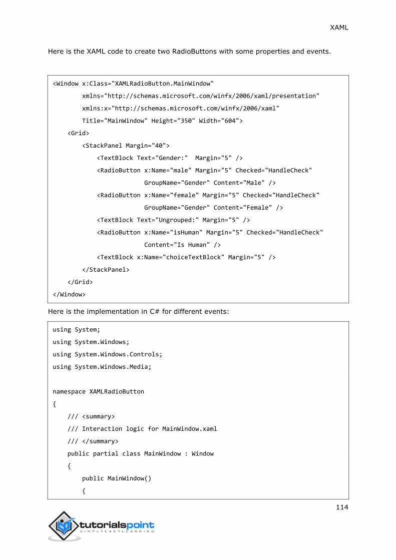
XAML
114
Here is the XAML code to create two RadioButtons with some properties and events.
<Window x:Class="XAMLRadioButton.MainWindow"
xmlns="http://schemas.microsoft.com/winfx/2006/xaml/presentation"
xmlns:x="http://schemas.microsoft.com/winfx/2006/xaml"
Title="MainWindow" Height="350" Width="604">
<Grid>
<StackPanel Margin="40">
<TextBlock Text="Gender:" Margin="5" />
<RadioButton x:Name="male" Margin="5" Checked="HandleCheck"
GroupName="Gender" Content="Male" />
<RadioButton x:Name="female" Margin="5" Checked="HandleCheck"
GroupName="Gender" Content="Female" />
<TextBlock Text="Ungrouped:" Margin="5" />
<RadioButton x:Name="isHuman" Margin="5" Checked="HandleCheck"
Content="Is Human" />
<TextBlock x:Name="choiceTextBlock" Margin="5" />
</StackPanel>
</Grid>
</Window>
Here is the implementation in C# for different events:
using System;
using System.Windows;
using System.Windows.Controls;
using System.Windows.Media;
namespace XAMLRadioButton
{
/// <summary>
/// Interaction logic for MainWindow.xaml
/// </summary>
public partial class MainWindow : Window
{
public MainWindow()
{

XAML
115
InitializeComponent();
}
private void HandleCheck(object sender, RoutedEventArgs e)
{
RadioButton rb = sender as RadioButton;
choiceTextBlock.Text = "You chose: " + rb.GroupName + ": " + rb.Name;
}
}
}
When you compile and execute the above code, it will produce the following output:
We recommend you to execute the above example code and experiment with some other
properties and events.
RichEditBox
A RichEditBox is a rich text editing control that supports formatted text, hyperlinks, and
other rich content. WPF projects do not support this control. So it will be implemented in
Windows App. The hierarchical inheritance of RichEditBox class is as follows:
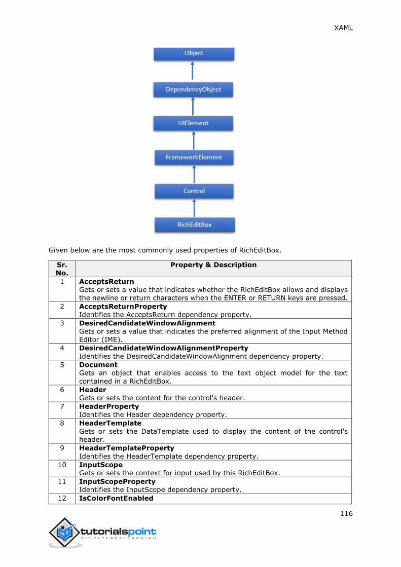
XAML
116
Given below are the most commonly used properties of RichEditBox.
Sr.
No.
Property & Description
1 AcceptsReturn
Gets or sets a value that indicates whether the RichEditBox allows and displays
the newline or return characters when the ENTER or RETURN keys are pressed.
2 AcceptsReturnProperty
Identifies the AcceptsReturn dependency property.
3 DesiredCandidateWindowAlignment
Gets or sets a value that indicates the preferred alignment of the Input Method
Editor (IME).
4 DesiredCandidateWindowAlignmentProperty
Identifies the DesiredCandidateWindowAlignment dependency property.
5 Document
Gets an object that enables access to the text object model for the text
contained in a RichEditBox.
6 Header
Gets or sets the content for the control's header.
7 HeaderProperty
Identifies the Header dependency property.
8 HeaderTemplate
Gets or sets the DataTemplate used to display the content of the control's
header.
9 HeaderTemplateProperty
Identifies the HeaderTemplate dependency property.
10 InputScope
Gets or sets the context for input used by this RichEditBox.
11 InputScopeProperty
Identifies the InputScope dependency property.
12 IsColorFontEnabled

XAML
117
Gets or sets a value that determines whether font glyphs that contain color
layers, such as Segoe UI Emoji, are rendered in color.
13 IsColorFontEnabledProperty
Identifies the IsColorFontEnabled dependency property.
14 IsReadOnly
Gets or sets a value that indicates whether the user can change the text in the
RichEditBox.
15 IsReadOnlyProperty
Identifies the IsReadOnly dependency property.
16 IsSpellCheckEnabled
Gets or sets a value that indicates whether the text input should interact with a
spell check engine.
17 IsSpellCheckEnabledProperty
Identifies the IsSpellCheckEnabled dependency property.
18
IsTextPredictionEnabled
Gets or sets a value that indicates whether text prediction features
("autocomplete") are enabled for this RichEditBox.
19 IsTextPredictionEnabledProperty
Identifies the IsTextPredictionEnabled dependency property.
20
PlaceholderText
Gets or sets the text that is displayed in the control until the value is changed
by a user action or some other operation.
21 PlaceholderTextProperty
Identifies the PlaceholderText dependency property.
22
PreventKeyboardDisplayOnProgrammaticFocus
Gets or sets a value that indicates whether the on-screen keyboard is shown
when the control receives focus programmatically.
23
PreventKeyboardDisplayOnProgrammaticFocusProperty
Identifies the PreventKeyboardDisplayOnProgrammaticFocus dependency
property.
24 SelectionHighlightColor
Gets or sets the brush used to highlight the selected text.
25 SelectionHighlightColorProperty
Identifies the SelectionHighlightColor dependency property.
26 TextAlignment
Gets or sets a value that indicates how text is aligned in the RichEditBox.
27 TextAlignmentProperty
Identifies the TextAlignment dependency property.
28 TextReadingOrder
Gets or sets a value that indicates how the reading order is determined for the
RichEditBox.
29 TextReadingOrderProperty
Identifies the TextReadingOrder dependency property.
30
TextWrapping
Gets or sets a value that indicates how text wrapping occurs if a line of text
extends beyond the available width of the RichEditBox.
31 TextWrappingProperty
Identifies the TextWrapping dependency property.
XAML
118
Given below are the most commonly used and important events of RichEditBox:
Sr.
No.
Event & Description
1 CandidateWindowBoundsChanged
Occurs when the Input Method Editor (IME) window open, updates, or closes.
2 ContextMenuOpening
Occurs when the system processes an interaction that displays a context menu.
3 Paste
Occurs when text is pasted into the control.
4 SelectionChanged
Occurs when the text selection has changed.
5 TextChanged
Occurs when content changes in the RichEditBox.
6 TextChanging
Occurs when the text in the RichEditBox starts to change.
7 TextCompositionChanged
Occurs when text being composed through an Input Method Editor (IME)
changes.
8 TextCompositionEnded
Occurs when a user stops composing text through an Input Method Editor (IME).
9
TextCompositionStarted
Occurs when a user starts composing text through an Input Method Editor
(IME).
Given below are the commonly used methods in RichEditBox class:
Sr.
No.
Method & Description
1 OnManipulationCompleted
Called before the ManipulationCompleted event occurs. (Inherited from Control)
2 OnManipulationDelta
Called before the ManipulationDelta event occurs. (Inherited from Control)
3 OnManipulationInertiaStarting
Called before the ManipulationInertiaStarting event occurs. (Inherited from
Control)
4 OnManipulationStarted
Called before the ManipulationStarted event occurs. (Inherited from Control)
5 OnManipulationStarting
Called before the ManipulationStarting event occurs. (Inherited from Control)
6 OnMaximumChanged
Called when the Maximum property changes. (Inherited from RangeBase)
7 OnMinimumChanged
Called when the Minimum property changes. (Inherited from RangeBase)
8 OnValueChanged Fires the ValueChanged routed event. (Inherited from
RangeBase)
9
SetBinding
Attaches a binding to a FrameworkElement, using the provided binding object.
(Inherited from FrameworkElement)
10
SetValue
Sets the local value of a dependency property on a DependencyObject.
(Inherited from DependencyObject)
11 StartDragAsync

XAML
119
Initiates a drag-and-drop operation. (Inherited from UIElement)
12
UnregisterPropertyChangedCallback Cancels a change notification that was
previously registered by calling RegisterPropertyChangedCallback. (Inherited
from DependencyObject)
Example
The following example shows how to open and save an RTF file in RichEditBox. Here is the
XAML code to create and initialize two buttons and a RichEditBox with some properties
and events.
<Page
x:Class="XAMLRichEditBox.MainPage"
xmlns="http://schemas.microsoft.com/winfx/2006/xaml/presentation"
xmlns:x="http://schemas.microsoft.com/winfx/2006/xaml"
xmlns:local="using:XAMLRichEditBox"
xmlns:d="http://schemas.microsoft.com/expression/blend/2008"
xmlns:mc="http://schemas.openxmlformats.org/markup-compatibility/2006"
mc:Ignorable="d">
<Grid Background="{ThemeResource ApplicationPageBackgroundThemeBrush}">
<Grid Margin="120">
<Grid.RowDefinitions>
<RowDefinition Height="50"/>
<RowDefinition/>
</Grid.RowDefinitions>
<StackPanel Orientation="Horizontal">
<Button Content="Open file" Click="OpenButton_Click"/>
<Button Content="Save file" Click="SaveButton_Click"/>
</StackPanel>
<RichEditBox x:Name="editor" Grid.Row="1"/>
</Grid>
</Grid>
</Page>
Here is the implementation in C# for different events and file handling:
using System;
using System.Collections.Generic;
using System.IO;

XAML
120
using System.Linq;
using System.Runtime.InteropServices.WindowsRuntime;
using Windows.Foundation;
using Windows.Foundation.Collections;
using Windows.Storage;
using Windows.Storage.Pickers;
using Windows.Storage.Provider;
using Windows.UI.ViewManagement;
using Windows.UI.Xaml;
using Windows.UI.Xaml.Controls;
using Windows.UI.Xaml.Controls.Primitives;
using Windows.UI.Xaml.Data;
using Windows.UI.Xaml.Input;
using Windows.UI.Xaml.Media;
using Windows.UI.Xaml.Navigation;
// The Blank Page item template is documented at
http://go.microsoft.com/fwlink/?LinkId=234238
namespace XAMLRichEditBox
{
/// <summary>
/// An empty page that can be used on its own or navigated to within a Frame.
/// </summary>
public sealed partial class MainPage : Page
{
public MainPage()
{
this.InitializeComponent();
}
private async void OpenButton_Click(object sender, RoutedEventArgs e)
{
// Open a text file.
Windows.Storage.Pickers.FileOpenPicker open =
new Windows.Storage.Pickers.FileOpenPicker();
open.SuggestedStartLocation =
Windows.Storage.Pickers.PickerLocationId.DocumentsLibrary;

XAML
121
open.FileTypeFilter.Add(".rtf");
Windows.Storage.StorageFile file = await open.PickSingleFileAsync();
if (file != null)
{
Windows.Storage.Streams.IRandomAccessStream randAccStream =
await file.OpenAsync(Windows.Storage.FileAccessMode.Read);
// Load the file into the Document property of the RichEditBox.
editor.Document.LoadFromStream(Windows.UI.Text.TextSetOptions.FormatRtf,
randAccStream);
}
}
private async void SaveButton_Click(object sender, RoutedEventArgs e)
{
if (((ApplicationView.Value != ApplicationViewState.Snapped) ||
ApplicationView.TryUnsnap()))
{
FileSavePicker savePicker = new FileSavePicker();
savePicker.SuggestedStartLocation =
PickerLocationId.DocumentsLibrary;
// Dropdown of file types the user can save the file as
savePicker.FileTypeChoices.Add("Rich Text", new List<string>()
{ ".rtf" });
// Default file name if the user does not type one in or select
a file to replace
savePicker.SuggestedFileName = "New Document";
StorageFile file = await savePicker.PickSaveFileAsync();
if (file != null)
{
// Prevent updates to the remote version of the file until we
// finish making changes and call CompleteUpdatesAsync.

XAML
122
CachedFileManager.DeferUpdates(file);
// write to file
Windows.Storage.Streams.IRandomAccessStream randAccStream =
await file.OpenAsync(Windows.Storage.FileAccessMode.ReadWrite);
editor.Document.SaveToStream(Windows.UI.Text.TextGetOptions.FormatRtf,
randAccStream);
// Let Windows know that we're finished changing the file so the
// other app can update the remote version of the file.
FileUpdateStatus status = await
CachedFileManager.CompleteUpdatesAsync(file);
if (status != FileUpdateStatus.Complete)
{
Windows.UI.Popups.MessageDialog errorBox =
new Windows.UI.Popups.MessageDialog("File " +
file.Name + " couldn't be saved.");
await errorBox.ShowAsync();
}
}
}
}
}
}
When you compile and execute the above code, it will produce the following output. You
can open, edit, and save any RTF file in this application.

XAML
123
We recommend you to execute the above example code and experiment with some other
properties and events.
ScrollViewer
This control provides a scrollable area that can contain other visible elements. The
hierarchical inheritance of ScrollViewer class is as follows:

XAML
124
Given below are the commonly used properties of ScrollViewer class:
Sr.
No.
Property & Description
1 ComputedHorizontalScrollBarVisibility
Gets a value that indicates whether the horizontal ScrollBar is visible.
2 ComputedHorizontalScrollBarVisibilityProperty
Identifies the ComputedHorizontalScrollBarVisibility dependency property.
3 HorizontalScrollBarVisibility
Gets or sets a value that indicates whether a horizontal ScrollBar should be
displayed.
4 HorizontalScrollBarVisibilityProperty
Identifies the HorizontalScrollBarVisibility dependency property.
5 HorizontalScrollMode
Gets or sets a value that determines how manipulation input influences scrolling
behavior on the horizontal axis.
6 HorizontalScrollModeProperty
Identifies the HorizontalScrollMode dependency property.
7 HorizontalSnapPointsAlignment
Gets or sets a value that indicates how the existing snap points are horizontally
aligned versus the initial viewport.
8 HorizontalSnapPointsAlignmentProperty
Identifies the HorizontalSnapPointsAlignment dependency property.
9 IsHorizontalScrollChainingEnabled
Gets or sets a value that indicates whether scroll chaining is enabled from this
child to its parent, for the horizontal axis.

XAML
125
10 IsHorizontalScrollChainingEnabledProperty
Identifies the IsHorizontalScrollChainingEnabled dependency property.
11 IsScrollInertiaEnabled
Gets or sets a value that indicates whether scroll actions should include inertia
in their behavior and value.
12 IsScrollInertiaEnabledProperty
Identifies the IsScrollInertiaEnabled dependency property.
13 IsVerticalScrollChainingEnabled
Gets or sets a value that indicates whether scroll chaining is enabled from this
child to its parent, for the vertical axis.
14 IsVerticalScrollChainingEnabledProperty
Identifies the IsVerticalScrollChainingEnabled dependency property.
15 ScrollableHeight
Gets a value that represents the vertical size of the area that can be scrolled;
the difference between the width of the extent and the width of the viewport.
16 ScrollableHeightProperty
Identifies the ScrollableHeight dependency property.
17 ScrollableWidth
Gets a value that represents the horizontal size of the area that can be scrolled;
the difference between the width of the extent and the width of the viewport.
18 ScrollableWidthProperty
Identifies the ScrollableWidth dependency property.
19 VerticalScrollBarVisibility
Gets or sets a value that indicates whether a vertical ScrollBar should be
displayed.
20 VerticalScrollBarVisibilityProperty
Identifies the VerticalScrollBarVisibility dependency property.
21 VerticalScrollMode
Gets or sets a value that determines how manipulation input influences scrolling
behavior on the vertical axis.
22 VerticalScrollModeProperty
Identifies the VerticalScrollMode dependency property.
Given below are the commonly used events of ScrollViewer class:
Sr.
No.
Event & Description
1 DirectManipulationCompleted
Occurs when any direct manipulation of the ScrollViewer finishes.
2 DirectManipulationStarted
Occurs when any direct manipulation of the ScrollViewer begins.
3
ViewChanged
Occurs when manipulations such as scrolling and zooming have caused the view
to change.
4
ViewChanging
Occurs when manipulations such as scrolling and zooming cause the view to
change.
Given below are the commonly used methods of ScrollViewer class:
Sr.
No.
Method & Description
1
GetHorizontalScrollBarVisibility

XAML
126
Gets the value of the HorizontalScrollBarVisibility dependency property /
ScrollViewer.HorizontalScrollBarVisibility XAML attached property from a
specified element.
2 GetHorizontalScrollMode
Gets the value of the HorizontalScrollMode dependency property /
ScrollViewer.HorizontalScrollMode XAML attached property from a specified
element.
3
GetIsDeferredScrollingEnabled
Gets the value of the IsDeferredScrollingEnabled dependency property /
ScrollViewer.IsDeferredScrollingInertiaEnabled XAML attached property from a
specified element.
4
GetIsHorizontalScrollChainingEnabled
Gets the value of the IsHorizontalScrollChainingEnabled dependency property /
ScrollViewer.IsHorizontalScrollChainingEnabled XAML attached property from a
specified element.
5
GetIsScrollInertiaEnabled
Gets the value of the IsScrollInertiaEnabled dependency property /
ScrollViewer.IsScrollInertiaEnabled XAML attached property from a specified
element.
6
GetIsVerticalScrollChainingEnabled
Gets the value of the IsVerticalScrollChainingEnabled dependency property /
ScrollViewer.IsVerticalScrollChainingEnabled XAML attached property from a
specified element.
7
GetVerticalScrollBarVisibility
Gets the value of the VerticalScrollBarVisibility dependency property /
ScrollViewer.VerticalScrollBarVisibility XAML attached property from a specified
element.
8
GetVerticalScrollMode
Gets the value of the VerticalScrollMode dependency property /
ScrollViewer.VerticalScrollMode XAML attached property from a specified
element.
9
InvalidateScrollInfo
Called when the value of properties that describe the size and location of the
scroll area change.
10
ScrollToHorizontalOffset
Scrolls the content that is within the ScrollViewer to the specified horizontal
offset position.
11
ScrollToVerticalOffset
Scrolls the content that is within the ScrollViewer to the specified vertical offset
position.
12
SetHorizontalScrollBarVisibility
Sets the value of the HorizontalScrollBarVisibility dependency property /
ScrollViewer.HorizontalScrollBarVisibility XAML attached property on a specified
element.
13
SetHorizontalScrollMode
Sets the value of the HorizontalScrollMode dependency property /
ScrollViewer.HorizontalScrollMode XAML attached property on a specified
element.
14
SetIsDeferredScrollingEnabled
Sets the value of the IsDeferredScrollingEnabled dependency property /
ScrollViewer.IsDeferredScrollingEnabled XAML attached property on a specified
element.
15
SetIsHorizontalScrollChainingEnabled

XAML
127
Sets the value of the IsHorizontalScrollChainingEnabled dependency property /
ScrollViewer.IsHorizontalScrollChainingEnabled XAML attached property on a
specified element.
16
SetIsScrollInertiaEnabled
Sets the value of the IsScrollInertiaEnabled dependency property /
ScrollViewer.IsScrollInertiaEnabled XAML attached property on a specified
element.
17
SetIsVerticalScrollChainingEnabled
Sets the value of the IsVerticalScrollChainingEnabled dependency property /
ScrollViewer.IsVerticalScrollChainingEnabled XAML attached property on a
specified element.
18
SetVerticalScrollBarVisibility
Sets the value of the VerticalScrollBarVisibility dependency property /
ScrollViewer.VerticalScrollBarVisibility XAML attached property on a specified
element.
19
SetVerticalScrollMode
Sets the value of the VerticalScrollMode dependency property /
ScrollViewer.VerticalScrollMode XAML attached property on a specified element.
Example
The following example shows how to add a ScrollViewer in your XAML application. Here is
the XAML code in which two TextBlocks are added and one with a ScrollViewer and
initialized with some properties and events.
<Window x:Class="XAMLScrollViewer.MainWindow"
xmlns="http://schemas.microsoft.com/winfx/2006/xaml/presentation"
xmlns:x="http://schemas.microsoft.com/winfx/2006/xaml"
Title="MainWindow" Height="550" Width="604">
<Grid>
<StackPanel>
<!-- A large TextBlock. -->
<TextBlock Width="300" TextWrapping="Wrap" Margin="0,0,0,30"
Text="Lorem ipsum dolor sit amet, consectetur adipiscing elit. Sed ac
mi ipsum. Phasellus vel malesuada mauris. Donec pharetra, enim sit amet mattis
tincidunt, felis nisi semper lectus, vel porta diam nisi in augue. Pellentesque
lacus tortor, aliquam et faucibus id, rhoncus ut justo. Sed id lectus odio,
eget pulvinar diam. Suspendisse eleifend ornare libero, in luctus purus aliquet
non. Sed interdum, sem vitae rutrum rhoncus, felis ligula ultrices sem, in
eleifend eros ante id neque." />
<!-- The same large TextBlock, wrapped in a ScrollViewer. -->
<ScrollViewer Height="200" Width="200"
HorizontalScrollBarVisibility="Auto"
VerticalScrollBarVisibility="Auto">
<TextBlock Width="300" TextWrapping="Wrap"
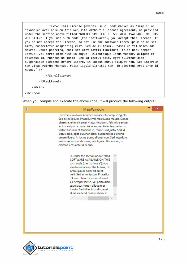
XAML
128
Text=" This license governs use of code marked as “sample” or
“example” available on this web site without a license agreement, as provided
under the section above titled “NOTICE SPECIFIC TO SOFTWARE AVAILABLE ON THIS
WEB SITE.” If you use such code (the “software”), you accept this license. If
you do not accept the license, do not use the software.Lorem ipsum dolor sit
amet, consectetur adipiscing elit. Sed ac mi ipsum. Phasellus vel malesuada
mauris. Donec pharetra, enim sit amet mattis tincidunt, felis nisi semper
lectus, vel porta diam nisi in augue. Pellentesque lacus tortor, aliquam et
faucibus id, rhoncus ut justo. Sed id lectus odio, eget pulvinar diam.
Suspendisse eleifend ornare libero, in luctus purus aliquet non. Sed interdum,
sem vitae rutrum rhoncus, felis ligula ultrices sem, in eleifend eros ante id
neque." />
</ScrollViewer>
</StackPanel>
</Grid>
</Window>
When you compile and execute the above code, it will produce the following output:
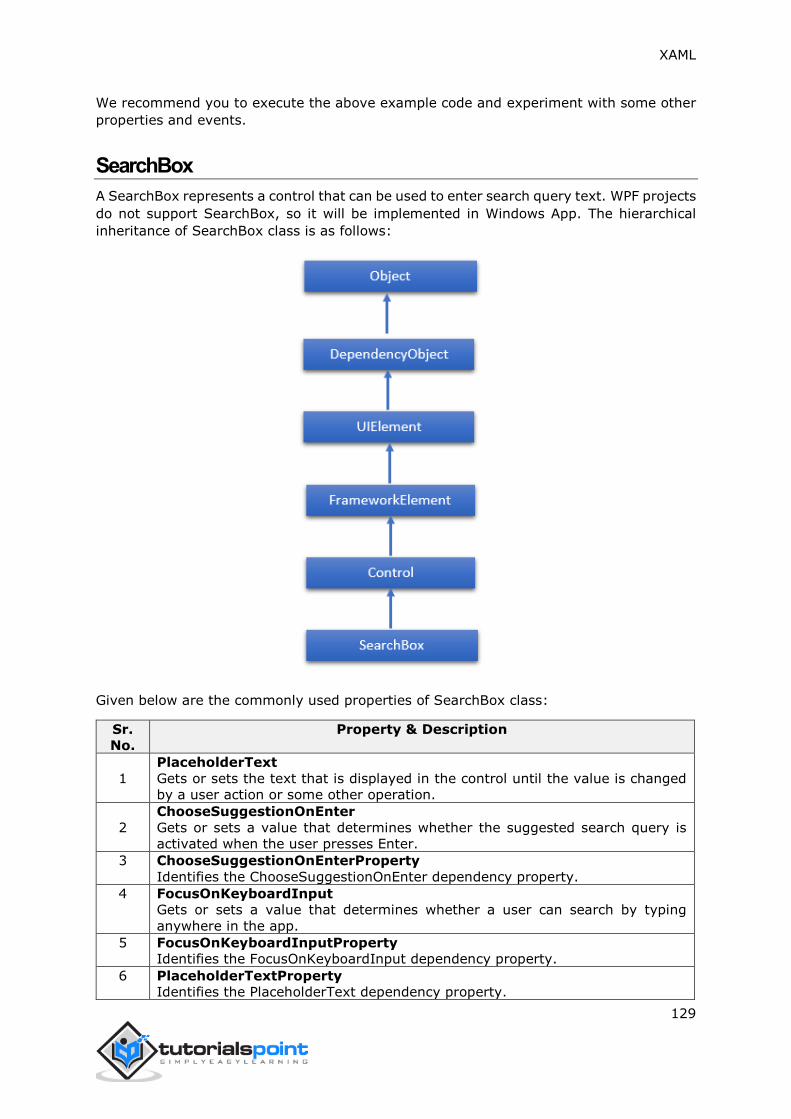
XAML
129
We recommend you to execute the above example code and experiment with some other
properties and events.
SearchBox
A SearchBox represents a control that can be used to enter search query text. WPF projects
do not support SearchBox, so it will be implemented in Windows App. The hierarchical
inheritance of SearchBox class is as follows:
Given below are the commonly used properties of SearchBox class:
Sr.
No.
Property & Description
1
PlaceholderText
Gets or sets the text that is displayed in the control until the value is changed
by a user action or some other operation.
2
ChooseSuggestionOnEnter
Gets or sets a value that determines whether the suggested search query is
activated when the user presses Enter.
3 ChooseSuggestionOnEnterProperty
Identifies the ChooseSuggestionOnEnter dependency property.
4 FocusOnKeyboardInput
Gets or sets a value that determines whether a user can search by typing
anywhere in the app.
5 FocusOnKeyboardInputProperty
Identifies the FocusOnKeyboardInput dependency property.
6 PlaceholderTextProperty
Identifies the PlaceholderText dependency property.

XAML
130
7 QueryText
Gets or sets the text contents of the search box.
8 QueryTextProperty
Identifies the QueryText dependency property.
9 SearchHistoryContext
Gets or sets a string that identifies the context of the search and is used to store
the user's search history with the app.
10 SearchHistoryContextProperty
Identifies the SearchHistoryContext dependency property.
11 SearchHistoryEnabled
Gets or sets a value that determines whether search suggestions are made from
the search history.
12 SearchHistoryEnabledProperty
Identifies the SearchHistoryEnabled dependency property.
Given below are the commonly used events of SearchBox:
Sr.
No.
Event & Description
1
PrepareForFocusOnKeyboardInput
Occurs when the FocusOnKeyboardInput property is true and the app receives
textual keyboard input.
2 QueryChanged
Occurs when the query text changes.
3 QuerySubmitted
Occurs when the user submits a search query.
4 ResultSuggestionChosen
Occurs when the user picks a suggested search result.
5
SuggestionsRequested
Occurs when the user's query text changes and the app needs to provide new
suggestions to display in the search pane.
Given below are the commonly used methods of SearchBox:
Sr.
No.
Method & Description
1 OnManipulationCompleted
Called before the ManipulationCompleted event occurs. (Inherited from Control)
2 OnManipulationDelta
Called before the ManipulationDelta event occurs. (Inherited from Control)
3 OnManipulationInertiaStarting
Called before the ManipulationInertiaStarting event occurs. (Inherited from
Control)
4 OnManipulationStarted
Called before the ManipulationStarted event occurs. (Inherited from Control)
5 OnManipulationStarting
Called before the ManipulationStarting event occurs. (Inherited from Control)
6 OnMaximumChanged
Called when the Maximum property changes. (Inherited from RangeBase)
7 OnMinimumChanged
Called when the Minimum property changes. (Inherited from RangeBase)
8 OnValueChanged Fires the ValueChanged routed event. (Inherited from
RangeBase)
9 SetBinding

XAML
131
Attaches a binding to a FrameworkElement, using the provided binding object.
(Inherited from FrameworkElement)
10 SetLocalContentSuggestionSettings
Specifies whether suggestions based on local files are automatically displayed in
the search box suggestions, and defines the criteria that Windows uses to locate
and filter these suggestions.
11 SetValue
Sets the local value of a dependency property on a DependencyObject. (Inherited
from DependencyObject)
12 StartDragAsync
Initiates a drag-and-drop operation. (Inherited from UIElement)
13 UnregisterPropertyChangedCallback Cancels a change notification that was
previously registered by calling RegisterPropertyChangedCallback. (Inherited
from DependencyObject)
Example
The following example shows the usage of SearchBox in an XAML application. Here is the
XAML code to create and initialize a SearchBox with some properties and events.
<Page
x:Class="XAML_SearchBox.MainPage"
xmlns="http://schemas.microsoft.com/winfx/2006/xaml/presentation"
xmlns:x="http://schemas.microsoft.com/winfx/2006/xaml"
xmlns:local="using:XAML_SearchBox"
xmlns:d="http://schemas.microsoft.com/expression/blend/2008"
xmlns:mc="http://schemas.openxmlformats.org/markup-compatibility/2006"
mc:Ignorable="d">
<Grid Background="{ThemeResource ApplicationPageBackgroundThemeBrush}">
<SearchBox x:Name="mySearchBox"
FocusOnKeyboardInput="False"
QuerySubmitted="mySearchBox_QuerySubmitted"
Height="35"
Width="400" Margin="234,132,732,601"/>
</Grid>
</Page>
Here is the implementation in C# for search query:
using System;
using System.Collections.Generic;
using System.IO;
using System.Linq;

XAML
132
using System.Runtime.InteropServices.WindowsRuntime;
using Windows.Foundation;
using Windows.Foundation.Collections;
using Windows.UI.Xaml;
using Windows.UI.Xaml.Controls;
using Windows.UI.Xaml.Controls.Primitives;
using Windows.UI.Xaml.Data;
using Windows.UI.Xaml.Input;
using Windows.UI.Xaml.Media;
using Windows.UI.Xaml.Navigation;
// The Blank Page item template is documented at
http://go.microsoft.com/fwlink/?LinkId=234238
namespace XAML_SearchBox
{
/// <summary>
/// An empty page that can be used on its own or navigated to within a
Frame.
/// </summary>
public sealed partial class MainPage : Page
{
public MainPage()
{
this.InitializeComponent();
}
private void mySearchBox_QuerySubmitted(SearchBox sender,
SearchBoxQuerySubmittedEventArgs args)
{
this.Frame.Navigate(typeof(SearchResultsPage1), args.QueryText);
}
}
}
In Windows App project for this example, add a Search Results Page with the name
SearchResultsPage1.xaml. The default implementation is sufficient to run this App.
When you compile and execute the above code, it will produce the following output:

XAML
133
We recommend you to execute the above example code and experiment with some other
properties and events.
Slider
A Slider is a control with the help of which a user can select from a range of values by
moving a Thumb control along a track. The hierarchical inheritance of the Slider class is
as follows:

XAML
134
Given below are the commonly used properties of Slider:
Sr.
No.
Property & Description
1 Header
Gets or sets the content for the control's header.
2 HeaderProperty
Identifies the Header dependency property.
3 HeaderTemplate
Gets or sets the DataTemplate used to display the content of the control's
header.
4 HeaderTemplateProperty
Identifies the HeaderTemplate dependency property.
5 IntermediateValue
Gets or sets the value of the Slider while the user is interacting with it, before
the value is snapped to either the tick or step value. The value the Slider snaps
to is specified by the SnapsTo property.
6 IntermediateValueProperty
Identifies the IntermediateValue dependency property.
7 IsDirectionReversed
Gets or sets a value that indicates the direction of increasing value.
8 IsDirectionReversedProperty
Identifies the IsDirectionReversed dependency property.
9 IsThumbToolTipEnabled
Gets or sets a value that determines whether the slider value is shown in a tool
tip for the Thumb component of the Slider.
10 IsThumbToolTipEnabledProperty
Identifies the IsThumbToolTipEnabled dependency property.
11 Orientation
Gets or sets the orientation of a Slider.
12 OrientationProperty

XAML
135
Identifies the Orientation dependency property.
13 StepFrequency
Gets or sets the value part of a value range that steps should be created for.
14 StepFrequencyProperty
Identifies the StepFrequency dependency property.
15 ThumbToolTipValueConverter
Gets or sets the converter logic that converts the range value of the Slider into
tool tip content.
16 ThumbToolTipValueConverterProperty
Identifies the ThumbToolTipValueConverter dependency property.
17 TickFrequency
Gets or sets the increment of the value range that ticks should be created for.
18 TickFrequencyProperty
Identifies the TickFrequency dependency property.
19 TickPlacement
Gets or sets a value that indicates where to draw tick marks in relation to the
track.
20 TickPlacementProperty
Identifies the TickPlacement dependency property.
Given below are the commonly used events in Slider class:
Sr.
No.
Event & Description
1
ManipulationCompleted
Occurs when a manipulation on the UIElement is complete. (Inherited from
UIElement)
2
ManipulationDelta
Occurs when the input device changes position during a manipulation. (Inherited
from UIElement)
3
ManipulationInertiaStarting
Occurs when the input device loses contact with the UIElement object during a
manipulation and inertia begins. (Inherited from UIElement)
4
ManipulationStarted
Occurs when an input device begins a manipulation on the UIElement. (Inherited
from UIElement)
5
ManipulationStarting
Occurs when the manipulation processor is first created. (Inherited from
UIElement)
6 ValueChanged
Occurs when the range value changes. (Inherited from RangeBase)
Given below are the commonly used methods in Slider class:
Sr.
No.
Method & Description
1 OnManipulationCompleted
Called before the ManipulationCompleted event occurs. (Inherited from Control)

XAML
136
2 OnManipulationDelta
Called before the ManipulationDelta event occurs. (Inherited from Control)
3 OnManipulationInertiaStarting
Called before the ManipulationInertiaStarting event occurs. (Inherited from
Control)
4 OnManipulationStarted
Called before the ManipulationStarted event occurs. (Inherited from Control)
5 OnManipulationStarting
Called before the ManipulationStarting event occurs. (Inherited from Control)
6 OnMaximumChanged
Called when the Maximum property changes. (Inherited from RangeBase)
7 OnMinimumChanged
Called when the Minimum property changes. (Inherited from RangeBase)
8 OnValueChanged Fires the ValueChanged routed event. (Inherited from
RangeBase)
9 SetBinding
Attaches a binding to a FrameworkElement, using the provided binding object.
(Inherited from FrameworkElement)
10 SetValue
Sets the local value of a dependency property on a DependencyObject. (Inherited
from DependencyObject)
Example
The following example shows the usage of Slider in an XAML application. Here is the XAML
code to create a Slider and text blocks with some properties and events.
<Window x:Class="XAMLSlider.MainWindow"
xmlns="http://schemas.microsoft.com/winfx/2006/xaml/presentation"
xmlns:x="http://schemas.microsoft.com/winfx/2006/xaml"
Title="MainWindow" Height="350" Width="525">
<Grid>
<StackPanel >
<TextBlock Text="Slider with ValueChanged event handler:" Margin="10"/>
<Slider x:Name="slider2"
Minimum="0"
Maximum="100"
TickFrequency="2"
TickPlacement="BottomRight"
ValueChanged="slider2_ValueChanged"
Margin="10"/>
XAML
137
<TextBlock x:Name="textBlock1"
Margin="10"
Text="Current value: 0" />
</StackPanel>
</Grid>
</Window>
Here is the implementation in C# for ValueChanged event:
using System;
using System.Windows;
using System.Windows.Controls;
namespace XAMLSlider
{
/// <summary>
/// Interaction logic for MainWindow.xaml
/// </summary>
public partial class MainWindow : Window
{
public MainWindow()
{
InitializeComponent();
}
//private void slider2_ValueChanged(object sender,
RangeBaseValueChangedEventArgs e)
//{
// string msg = String.Format("Current value: {0}", e.NewValue);
// this.textBlock1.Text = msg;
//}
private void slider2_ValueChanged(object sender,
RoutedPropertyChangedEventArgs<double> e)
{
int val = Convert.ToInt32(e.NewValue);
string msg = String.Format("Current value: {0}", val);
this.textBlock1.Text = msg;

XAML
138
}
}
}
When you compile and execute the above code, it will produce the following output:
We recommend you to execute the above example code and experiment with some other
properties and events.
TextBlock
A TextBlock provides a lightweight control for displaying small amounts of read-only text.
The hierarchical inheritance of TextBlock class is as follows:

XAML
139
Given below are the commonly used properties of TextBlock class:
Sr.
No.
Property & Description
1 ContentEnd
Gets a TextPointer object for the end of text content in the TextBlock.
2 ContentStart
Gets a TextPointer object for the start of text content in the TextBlock.
3 IsTextSelectionEnabled
Gets or sets a value that indicates whether text selection is enabled in the
TextBlock, either through user action or calling selection-related API.
4 IsTextSelectionEnabledProperty
Identifies the IsTextSelectionEnabled dependency property.
5 LineHeight
Gets or sets the height of each line of content.
6 MaxLines
Gets or sets the maximum lines of text shown in the TextBlock.
7 SelectedText
Gets a text range of selected text.
8 SelectionEnd
Gets the end position of the text selected in the TextBlock.
9 SelectionHighlightColor
Gets or sets the brush used to highlight the selected text.
10 SelectionStart
Gets the starting position of the text selected in the TextBlock.
11 Text
Gets or sets the text contents of a TextBlock.
12 TextAlignment
Gets or sets a value that indicates the horizontal alignment of text content.
13 TextTrimming
Gets or sets the text trimming behavior to employ when content overflows the
content area.
14 TextWrapping
Gets or sets how the TextBlock wraps text.

XAML
140
Given below are commonly used events of TextBlock class:
Sr.
No.
Event & Description
1 ContextMenuOpening
Occurs when the system processes an interaction that displays a context menu.
2 SelectionChanged
Occurs when the text selection has changed.
Given below are the commonly used methods in TextBlock class:
Sr.
No.
Method & Description
1 Focus
Focuses the TextBlock, as if it were a conventionally focusable control.
2 Select
Selects a range of text in the TextBlock.
3 SelectAll
Selects the entire contents in the TextBlock.
Example
The following example shows the usage of TextBlock in an XAML application. Here is the
XAML code to create and initialize a TextBlock with some properties.
<Window x:Class="XAMLTextBlock.MainWindow"
xmlns="http://schemas.microsoft.com/winfx/2006/xaml/presentation"
xmlns:x="http://schemas.microsoft.com/winfx/2006/xaml"
Title="MainWindow" Height="350" Width="604">
<Grid>
<StackPanel>
<TextBlock FontFamily="Verdana"
LineStackingStrategy="MaxHeight"
LineHeight="10"
Width="500"
TextWrapping="Wrap" >
Use the <Run FontSize="30">LineStackingStrategy</Run> property
to determine how a line box is
created for each line. A value of <Run
FontSize="20">MaxHeight</Run> specifies that the stack
height is the smallest value that contains all the inline
elements on that line when those
elements are properly aligned. A value of <Run
FontSize="20">BlockLineHeight</Run> specifies

XAML
141
that the stack height is determined by the block element
LineHeight property value.
</TextBlock>
</StackPanel>
</Grid>
</Window>
When you compile and execute the above code, it will produce the following output:
We recommend you to execute the above example code and experiment with some other
properties and events.
TimePicker
A TimePicker is a control that allows a user to pick a time value. The hierarchical
inheritance of TimePicker class is as follows:

XAML
142
Given below are the commonly used properties of TimePicker:
Sr.
No.
Property & Description
1 ClockIdentifier
Gets or sets the clock system to use.
2 ClockIdentifierProperty
Gets the identifier for the ClockIdentifier dependency property.
3 Header
Gets or sets the content for the control's header.
4 HeaderProperty
Identifies the Header dependency property.
5 HeaderTemplate
Gets or sets the DataTemplate used to display the content of the control's
header.
6 HeaderTemplateProperty
Identifies the HeaderTemplate dependency property.
7 MinuteIncrement
Gets or sets a value that indicates the time increments shown in the minute
picker. For example, 15 specifies that the TimePicker minute control displays
only the choices 00, 15, 30, 45.
8 MinuteIncrementProperty
Gets the identifier for the MinuteIncrement dependency property.
9 Time
Gets or sets the time currently set in the time picker.
10 TimeProperty
Gets the identifier for the Time dependency property.

XAML
143
Given below are the commonly used events in TimePicker class:
Sr.
No.
Event & Description
1
ManipulationCompleted
Occurs when a manipulation on the UIElement is complete. (Inherited from
UIElement)
2
ManipulationDelta
Occurs when the input device changes position during a manipulation. (Inherited
from UIElement)
3
ManipulationInertiaStarting
Occurs when the input device loses contact with the UIElement object during a
manipulation and inertia begins. (Inherited from UIElement)
4
ManipulationStarted
Occurs when an input device begins a manipulation on the UIElement. (Inherited
from UIElement)
5
ManipulationStarting
Occurs when the manipulation processor is first created. (Inherited from
UIElement)
6 TimeChanged
Occurs when the time value is changed.
Given below are the commonly used methods in TimePicker class:
Sr.
No.
Method & Description
1 OnManipulationCompleted
Called before the ManipulationCompleted event occurs. (Inherited from Control)
2 OnManipulationDelta
Called before the ManipulationDelta event occurs. (Inherited from Control)
3 OnManipulationInertiaStarting
Called before the ManipulationInertiaStarting event occurs. (Inherited from
Control)
4 OnManipulationStarted
Called before the ManipulationStarted event occurs. (Inherited from Control)
5 OnManipulationStarting
Called before the ManipulationStarting event occurs. (Inherited from Control)
Example
The following example shows the usage of TimePicker in an XAML application. Here is the
XAML code to create and initialize a TimePicker with some properties.
<Page
x:Class="XAMLTimePicker.MainPage"
xmlns="http://schemas.microsoft.com/winfx/2006/xaml/presentation"
xmlns:x="http://schemas.microsoft.com/winfx/2006/xaml"
xmlns:local="using:XAMLTimePicker"
xmlns:d="http://schemas.microsoft.com/expression/blend/2008"
xmlns:mc="http://schemas.openxmlformats.org/markup-compatibility/2006"

XAML
144
mc:Ignorable="d">
<Grid Background="{ThemeResource ApplicationPageBackgroundThemeBrush}">
<StackPanel Orientation="Horizontal" Height="60" Margin="46,67,-46,641">
<TimePicker x:Name="arrivalTimePicker" Header="Arrival Time"
Margin="0,1"/>
<Button Content="Submit" Click="SubmitButton_Click"
Margin="5,0,0,-2" VerticalAlignment="Bottom"/>
<TextBlock x:Name="Control1Output" FontSize="24"/>
</StackPanel>
</Grid>
</Page>
Here is the click event implementation in C#:
using System;
using Windows.UI.Xaml;
using Windows.UI.Xaml.Controls;
namespace XAMLTimePicker
{
public sealed partial class MainPage : Page
{
public MainPage()
{
this.InitializeComponent();
}
private void SubmitButton_Click(object sender, RoutedEventArgs e)
{
if (VerifyTimeIsAvailable(arrivalTimePicker.Time) == true)
{
Control1Output.Text = string.Format("Thank you. Your
appointment is set for {0}.",
arrivalTimePicker.Time.ToString());
}
else
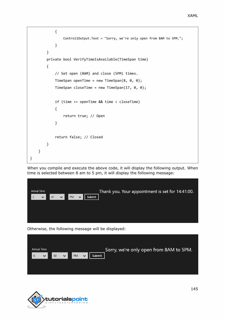
XAML
145
{
Control1Output.Text = "Sorry, we're only open from 8AM to 5PM.";
}
}
private bool VerifyTimeIsAvailable(TimeSpan time)
{
// Set open (8AM) and close (5PM) times.
TimeSpan openTime = new TimeSpan(8, 0, 0);
TimeSpan closeTime = new TimeSpan(17, 0, 0);
if (time >= openTime && time < closeTime)
{
return true; // Open
}
return false; // Closed
}
}
}
When you compile and execute the above code, it will display the following output. When
time is selected between 8 am to 5 pm, it will display the following message:
Otherwise, the following message will be displayed:

XAML
146
We recommend you to execute the above example code and experiment with some other
properties and events.
ToggleButton
A toggle button is a control that can switch states, such as CheckBox and RadioButton.
The hierarchical inheritance of ToggleButton class is as follows:
Given below are the commonly used properties in ToggleButton class:
Sr.
No.
Property & Description
1 IsChecked
Gets or sets whether the ToggleButton is checked.
2 IsCheckedProperty
Identifies the IsChecked dependency property.
3 IsThreeState
Gets or sets a value that indicates whether the control supports three states.
4 IsThreeStateProperty
Identifies the IsThreeState dependency property.
Given below are the commonly used Events in ToggleButton class:

XAML
147
Sr.
No.
Event & Description
1 Checked
Fires when a ToggleButton is checked.
2 Indeterminate
Fires when the state of a ToggleButton is switched to the indeterminate state.
3 Unchecked
Occurs when a ToggleButton is unchecked.
Example
The following example shows the usage of ToggleButton in an XAML application. Here is
the XAML code to create and initialize a ToggleButton with some properties.
<Page
x:Class="XAMLToggleButton.MainPage"
xmlns="http://schemas.microsoft.com/winfx/2006/xaml/presentation"
xmlns:x="http://schemas.microsoft.com/winfx/2006/xaml"
xmlns:local="using:XAMLToggleButton"
xmlns:d="http://schemas.microsoft.com/expression/blend/2008"
xmlns:mc="http://schemas.openxmlformats.org/markup-compatibility/2006"
mc:Ignorable="d">
<Grid Background="{ThemeResource ApplicationPageBackgroundThemeBrush}">
<StackPanel Orientation="Vertical">
<ToggleButton x:Name="cb2"
Content="Toggle"
Checked="HandleCheck"
Unchecked="HandleUnchecked"
Margin="100"
Width="100"
HorizontalAlignment="Center"/>
<TextBlock x:Name="text2"
Margin="10"
Width="300"
HorizontalAlignment="Center"
Height="50"
FontSize="24"/>
</StackPanel>
</Grid>

XAML
148
</Page>
Here is the C# implementation of Checked and Unchecked events:
using System;
using Windows.UI.Xaml;
using Windows.UI.Xaml.Controls;
// The Blank Page item template is documented at
http://go.microsoft.com/fwlink/?LinkId=234238
namespace XAMLToggleButton
{
/// <summary>
/// An empty page that can be used on its own or navigated to within a Frame.
/// </summary>
public sealed partial class MainPage : Page
{
public MainPage()
{
this.InitializeComponent();
}
private void HandleCheck(object sender, RoutedEventArgs e)
{
text2.Text = "Button is Checked";
}
private void HandleUnchecked(object sender, RoutedEventArgs e)
{
text2.Text = "Button is unchecked.";
}
}
}

XAML
149
When you compile and execute the above code, it will produce the following output:
We recommend you to execute the above example code and experiment with some other
properties and events.
ToolTip
A ToolTip is a control that creates a pop-up window that displays information for an
element in the GUI. The hierarchical inheritance of ToolTip class is as follows:
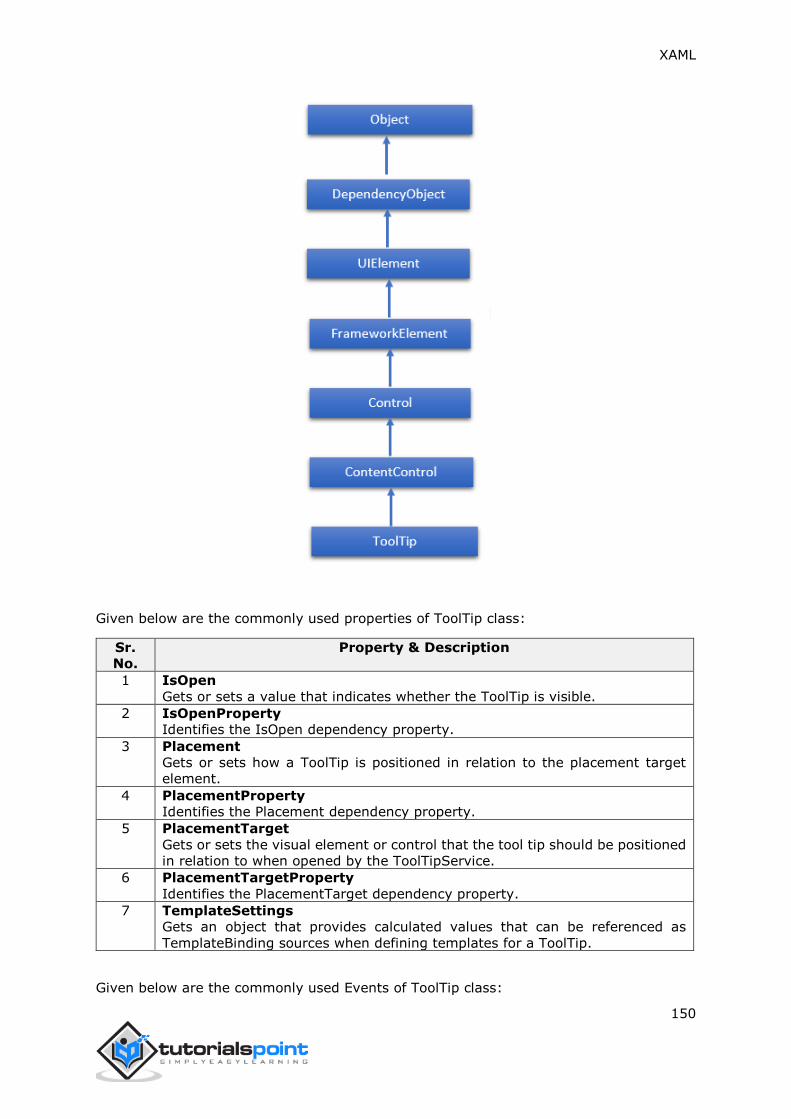
XAML
150
Given below are the commonly used properties of ToolTip class:
Sr.
No.
Property & Description
1 IsOpen
Gets or sets a value that indicates whether the ToolTip is visible.
2 IsOpenProperty
Identifies the IsOpen dependency property.
3 Placement
Gets or sets how a ToolTip is positioned in relation to the placement target
element.
4 PlacementProperty
Identifies the Placement dependency property.
5 PlacementTarget
Gets or sets the visual element or control that the tool tip should be positioned
in relation to when opened by the ToolTipService.
6 PlacementTargetProperty
Identifies the PlacementTarget dependency property.
7 TemplateSettings
Gets an object that provides calculated values that can be referenced as
TemplateBinding sources when defining templates for a ToolTip.
Given below are the commonly used Events of ToolTip class:
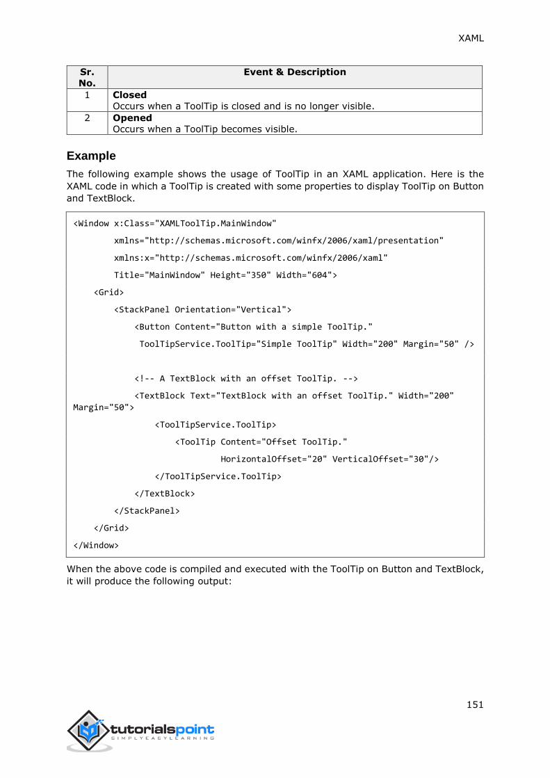
XAML
151
Sr.
No.
Event & Description
1 Closed
Occurs when a ToolTip is closed and is no longer visible.
2 Opened
Occurs when a ToolTip becomes visible.
Example
The following example shows the usage of ToolTip in an XAML application. Here is the
XAML code in which a ToolTip is created with some properties to display ToolTip on Button
and TextBlock.
<Window x:Class="XAMLToolTip.MainWindow"
xmlns="http://schemas.microsoft.com/winfx/2006/xaml/presentation"
xmlns:x="http://schemas.microsoft.com/winfx/2006/xaml"
Title="MainWindow" Height="350" Width="604">
<Grid>
<StackPanel Orientation="Vertical">
<Button Content="Button with a simple ToolTip."
ToolTipService.ToolTip="Simple ToolTip" Width="200" Margin="50" />
<!-- A TextBlock with an offset ToolTip. -->
<TextBlock Text="TextBlock with an offset ToolTip." Width="200"
Margin="50">
<ToolTipService.ToolTip>
<ToolTip Content="Offset ToolTip."
HorizontalOffset="20" VerticalOffset="30"/>
</ToolTipService.ToolTip>
</TextBlock>
</StackPanel>
</Grid>
</Window>
When the above code is compiled and executed with the ToolTip on Button and TextBlock,
it will produce the following output:
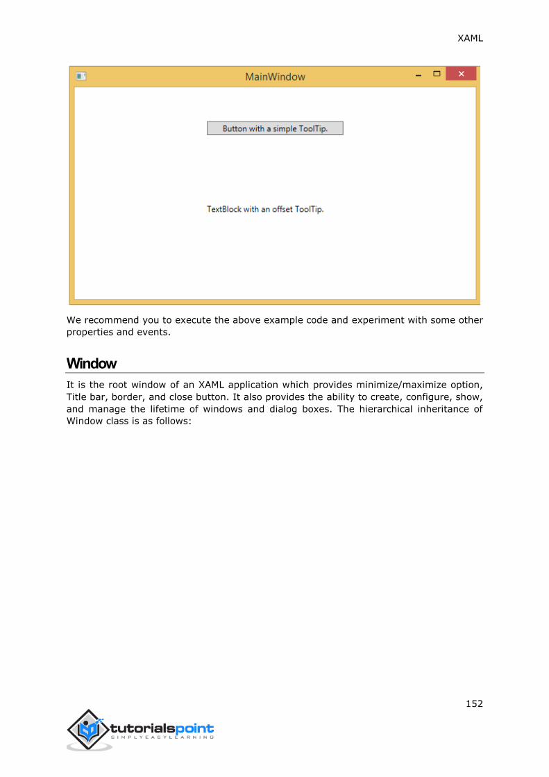
XAML
152
We recommend you to execute the above example code and experiment with some other
properties and events.
Window
It is the root window of an XAML application which provides minimize/maximize option,
Title bar, border, and close button. It also provides the ability to create, configure, show,
and manage the lifetime of windows and dialog boxes. The hierarchical inheritance of
Window class is as follows:

XAML
153
Given below are the commonly used properties of Window class:
Sr.
No.
Property & Description
1 AllowsTransparency
Gets or sets a value that indicates whether a window's client area supports
transparency.
2 DialogResult
Gets or sets the dialog result value, which is the value that is returned from the
ShowDialog method.
3 Icon
Gets or sets a window's icon.
4 IsActive
Gets a value that indicates whether the window is active.
5 Left
Gets or sets the position of the window's left edge, in relation to the desktop.
6 OwnedWindows
Gets a collection of windows for which this window is the owner.
7 Owner
Gets or sets the Window that owns this Window.
8 ResizeMode
Gets or sets the resize mode.
9
RestoreBounds
Gets the size and location of a window before being either minimized or
maximized.
10
ShowActivated

XAML
154
Gets or sets a value that indicates whether a window is activated when first
shown.
11 ShowInTaskbar
Gets or sets a value that indicates whether the window has a task bar button.
12 SizeToContent
Gets or sets a value that indicates whether a window will automatically size
itself to fit the size of its content.
13 TaskbarItemInfo
Gets or sets the Windows 7 taskbar thumbnail for the Window.
14 Title
Gets or sets a window's title.
15 Top
Gets or sets the position of the window's top edge, in relation to the desktop.
16 Topmost
Gets or sets a value that indicates whether a window appears in the topmost z-
order.
17 WindowStartupLocation
Gets or sets the position of the window when first shown.
18
WindowState
Gets or sets a value that indicates whether a window is restored, minimized, or
maximized.
19 WindowStyle
Gets or sets a window's border style.
Given below are the commonly used events of Window class:
Sr.
No.
Event & Description
1 Activated
Occurs when a window becomes the foreground window.
2 Closed
Occurs when the window is about to close.
3
Closing
Occurs directly after Close is called, and can be handled to cancel window
closure.
4 ContentRendered
Occurs after a window's content has been rendered.
5 Deactivated
Occurs when a window becomes a background window.
6 LocationChanged
Occurs when the window's location changes.
7 SourceInitialized
This event is raised to support interoperation with Win32. See HwndSource.
8 StateChanged
Occurs when the window's WindowState property changes.
Given below are the commonly used methods of Window class:
Sr.
No.
Method & Description
1 Activate
Attempts to bring the window to the foreground and activates it.
2 Close
Manually closes a Window.

XAML
155
3
DragMove
Allows a window to be dragged by a mouse with its left button down over an
exposed area of the window's client area.
4 GetWindow
Returns a reference to the Window object that hosts the content tree within
which the dependency object is located.
5 Hide
Makes a window invisible.
6 Show
Opens a window and returns without waiting for the newly opened window to
close.
7 ShowDialog
Opens a window and returns only when the newly opened window is closed.
Example
When you create a new WPF project, then by default, the Window control is present. Let’s
have a look at the following XAML code which starts from <Window Tag and ends with
</Window> tag. We have also defined some properties as well for the window.
<Window x:Class="XAMLToolTip.MainWindow"
xmlns="http://schemas.microsoft.com/winfx/2006/xaml/presentation"
xmlns:x="http://schemas.microsoft.com/winfx/2006/xaml"
Title="MainWindow" Height="350" Width="604">
<Grid>
<StackPanel Orientation="Vertical">
<Button Content="Button with a simple ToolTip."
ToolTipService.ToolTip="Simple ToolTip" Width="200" Margin="50" />
<!-- A TextBlock with an offset ToolTip. -->
<TextBlock Text="TextBlock with an offset ToolTip." Width="200"
Margin="50">
<ToolTipService.ToolTip>
<ToolTip Content="Offset ToolTip."
HorizontalOffset="20" VerticalOffset="30"/>
</ToolTipService.ToolTip>
</TextBlock>
</StackPanel>
</Grid>
</Window>

XAML
156
When you compile and execute the above code with the mouse entering the Window, it
will produce the following output:
We recommend you to execute the above example code and experiment with some other
properties and events.

XAML
157
The layout of controls is very important and critical for application usability. It is required
to arrange a group of GUI elements in your application. There are certain important points
to consider while selecting layout panels;
Positions of the child elements.
Sizes of the child elements.
Layering of overlapping child elements on top of each other.
Fixed pixel arrangement of controls doesn’t work when an application has been used on
different screen resolutions. XAML provides a rich set of built-in layout panels to arrange
GUI elements in an appropriate way. Some of the most commonly used and popular layout
panels are as follows:
Stack Panel
Wrap Panel
Dock Panel
Canvas Panel
Grid Panel
Stack Panel
Stack panel is a simple and useful layout panel in XAML. In a stack panel, child elements
can be arranged in a single line, either horizontally or vertically, based on the orientation
property.
It is often used whenever any kind of list needs to be created. Stack panels are used by
ItemsControls like Menu, ListBox, and ComboBox. The hierarchical inheritance of
StackPanel class is as follows:
8. XAML – LAYOUTS

XAML
158
Given below are the commonly used properties of StackPanel:
Sr.
No.
Property & Description
1 Background
Gets or sets a Brush that fills the panel content area. (Inherited from Panel)
2 Children
Gets a UIElementCollection of child elements of this Panel. (Inherited from
Panel.)
3 Height
Gets or sets the suggested height of the element. (Inherited from
FrameworkElement.)
4 ItemHeight
Gets or sets a value that specifies the height of all items that are contained
within a WrapPanel.
5 ItemWidth
Gets or sets a value that specifies the width of all items that are contained
within a WrapPanel.
6 LogicalChildren
Gets an enumerator that can iterate the logical child elements of this Panel
element. (Inherited from Panel.)
7 LogicalOrientation
The Orientation of the panel, if the panel supports layout in only a single
dimension. (Inherited from Panel.)
8 Margin
Gets or sets the outer margin of an element. (Inherited from
FrameworkElement.)
9 Name
Gets or sets the identifying name of the element. The name provides a
reference so that code-behind, such as event handler code, can refer to a
XAML
159
markup element after it is constructed during processing by a XAML processor.
(Inherited from FrameworkElement.)
10 Orientation
Gets or sets a value that specifies the dimension in which child content is
arranged.
11 Parent
Gets the logical parent element of this element. (Inherited from
FrameworkElement.)
12 Resources
Gets or sets the locally-defined resource dictionary. (Inherited from
FrameworkElement.)
13 Style
Gets or sets the style used by this element when it is rendered. (Inherited from
FrameworkElement.)
14 Width
Gets or sets the width of the element. (Inherited from FrameworkElement.)
Example
The following example shows how to add child elements into a StackPanel. Here is the
XAML implementation in which Ellipses are created inside a StackPanel which some
properties.
<Window x:Class="XAMLStackPanel.Window1"
xmlns="http://schemas.microsoft.com/winfx/2006/xaml/presentation"
xmlns:x="http://schemas.microsoft.com/winfx/2006/xaml"
Title="MainWindow" Height="400" Width="604">
<Grid>
<StackPanel x:Name="myPanel">
<Button Content="Button 1" Width="100" Height="40" Margin="10"/>
<Button Content="Button 2" Width="100" Height="40" Margin="10"/>
<RadioButton Content="Radio Button 1" Width="100" Margin="10" />
<RadioButton Content="Radio Button 2" Width="100" Margin="10" />
<RadioButton Content="Radio Button 3" Width="100" Margin="10" />
<CheckBox Content="Check Box 1" Width="100" Margin="10"/>
<CheckBox Content="Check Box 2" Width="100" Margin="10"/>
</StackPanel>
</Grid>
</Window>
When you compile and execute the above code, it will produce the following output. You
can see that, by default, the child elements are arranged in a Vertical order. You can
change the arrangement by setting the orientation property to Horizontal.
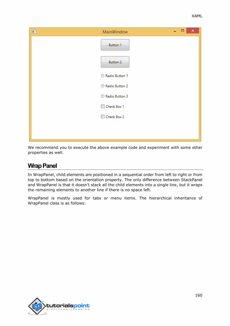
XAML
160
We recommend you to execute the above example code and experiment with some other
properties as well.
Wrap Panel
In WrapPanel, child elements are positioned in a sequential order from left to right or from
top to bottom based on the orientation property. The only difference between StackPanel
and WrapPanel is that it doesn’t stack all the child elements into a single line, but it wraps
the remaining elements to another line if there is no space left.
WrapPanel is mostly used for tabs or menu items. The hierarchical inheritance of
WrapPanel class is as follows:

XAML
161
Given below are the commonly used properties of WrapPanel:
Sr.
No.
Property & Description
1 Background
Gets or sets a Brush that fills the panel content area. (Inherited from Panel)
2 Children
Gets a UIElementCollection of child elements of this Panel. (Inherited from
Panel.)
3 Height
Gets or sets the suggested height of the element. (Inherited from
FrameworkElement.)
4 ItemHeight
Gets or sets a value that specifies the height of all items that are contained within
a WrapPanel.
5 ItemWidth
Gets or sets a value that specifies the width of all items that are contained within
a WrapPanel.
6 LogicalChildren
Gets an enumerator that can iterate the logical child elements of this Panel
element. (Inherited from Panel.)
7 LogicalOrientation
The Orientation of the panel, if the panel supports layout in only a single
dimension. (Inherited from Panel.)
8 Margin
Gets or sets the outer margin of an element. (Inherited from
FrameworkElement.)
9 Name
Gets or sets the identifying name of the element. The name provides a reference
so that code-behind, such as event handler code, can refer to a markup element

XAML
162
after it is constructed during processing by a XAML processor. (Inherited from
FrameworkElement.)
10 Orientation
Gets or sets a value that specifies the dimension in which child content is
arranged.
11 Parent
Gets the logical parent element of this element. (Inherited from
FrameworkElement.)
12 Resources
Gets or sets the locally-defined resource dictionary. (Inherited from
FrameworkElement.)
13 Style
Gets or sets the style used by this element when it is rendered. (Inherited from
FrameworkElement.)
14 Width
Gets or sets the width of the element. (Inherited from FrameworkElement.)
Example
The following example shows how to add child elements into a WrapPanel. Here is the
XAML implementation to create Text Blocks and Text Boxes inside a WrapPanel in
horizontal direction.
<Window x:Class="XAMLWrapPanel.Window1"
xmlns="http://schemas.microsoft.com/winfx/2006/xaml/presentation"
xmlns:x="http://schemas.microsoft.com/winfx/2006/xaml"
Title="MainWindow" Height="300" Width="604">
<Grid>
<WrapPanel Orientation="Horizontal">
<TextBlock Text="Fist Name" Width="60" Height="20" Margin="5"/>
<TextBox Width="200" Height="20" Margin="5"/>
<TextBlock Text="Last Name" Width="60" Height="20" Margin="5"/>
<TextBox Width="200" Height="20" Margin="5"/>
<TextBlock Text="Age" Width="60" Height="20" Margin="5"/>
<TextBox Width="60" Height="20" Margin="5"/>
<TextBlock Text="Title" Width="60" Height="20" Margin="5"/>
<TextBox Width="200" Height="20" Margin="5"/>
</WrapPanel>
</Grid>
</Window>
When the above code is compiled and executed, it will produce the following output. You
can change the arrangement from top to bottom by changing the orientation property to
Vertical.

XAML
163
We recommend you to execute the above example code and experiment with some other
properties as well.
Dock Panel
DockPanel defines an area to arrange child elements relative to each other, either
horizontally or vertically. With DockPanel, you can easily dock child elements to top,
bottom, right, left, and center with Dock property.
With LastChildFill property, the last child element fills the remaining space regardless of
any other dock value when set for that element. The hierarchical inheritance of DockPanel
class is as follows:

XAML
164
Given below are the commonly used properties of DockPanel:
Sr.
No.
Property & Description
1
Background
Gets or sets a Brush that fills the panel content area. (Inherited from Panel)
2
Children
Gets a UIElementCollection of child elements of this Panel. (Inherited from
Panel.)
3
Dock
Gets or sets a value that indicates the position of a child element within a parent
DockPanel.
4
Height
Gets or sets the suggested height of the element. (Inherited from
FrameworkElement.)
5
ItemHeight
Gets or sets a value that specifies the height of all items that are contained within
a WrapPanel.
6
ItemWidth
Gets or sets a value that specifies the width of all items that are contained within
a WrapPanel.
7
LastChildFill
Gets or sets a value that indicates whether the last child element within a
DockPanel stretches to fill the remaining available space.
8
LogicalChildren
Gets an enumerator that can iterate the logical child elements of this Panel
element. (Inherited from Panel.)
9
LogicalOrientation
The Orientation of the panel, if the panel supports layout in only a single
dimension. (Inherited from Panel.)
10
Margin
Gets or sets the outer margin of an element. (Inherited from
FrameworkElement.)
11
Name
Gets or sets the identifying name of the element. The name provides a reference
so that code-behind, such as event handler code, can refer to a markup element
after it is constructed during processing by a XAML processor. (Inherited from
FrameworkElement.)
12
Orientation
Gets or sets a value that specifies the dimension in which child content is
arranged.
13
Parent
Gets the logical parent element of this element. (Inherited from
FrameworkElement.)
14
Resources
Gets or sets the locally-defined resource dictionary. (Inherited from
FrameworkElement.)
15
Style
Gets or sets the style used by this element when it is rendered. (Inherited from
FrameworkElement.)
16 Width
Gets or sets the width of the element. (Inherited from FrameworkElement.)
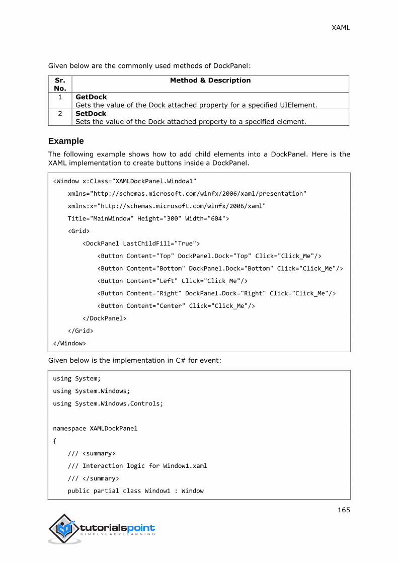
XAML
165
Given below are the commonly used methods of DockPanel:
Sr.
No.
Method & Description
1 GetDock
Gets the value of the Dock attached property for a specified UIElement.
2 SetDock
Sets the value of the Dock attached property to a specified element.
Example
The following example shows how to add child elements into a DockPanel. Here is the
XAML implementation to create buttons inside a DockPanel.
<Window x:Class="XAMLDockPanel.Window1"
xmlns="http://schemas.microsoft.com/winfx/2006/xaml/presentation"
xmlns:x="http://schemas.microsoft.com/winfx/2006/xaml"
Title="MainWindow" Height="300" Width="604">
<Grid>
<DockPanel LastChildFill="True">
<Button Content="Top" DockPanel.Dock="Top" Click="Click_Me"/>
<Button Content="Bottom" DockPanel.Dock="Bottom" Click="Click_Me"/>
<Button Content="Left" Click="Click_Me"/>
<Button Content="Right" DockPanel.Dock="Right" Click="Click_Me"/>
<Button Content="Center" Click="Click_Me"/>
</DockPanel>
</Grid>
</Window>
Given below is the implementation in C# for event:
using System;
using System.Windows;
using System.Windows.Controls;
namespace XAMLDockPanel
{
/// <summary>
/// Interaction logic for Window1.xaml
/// </summary>
public partial class Window1 : Window
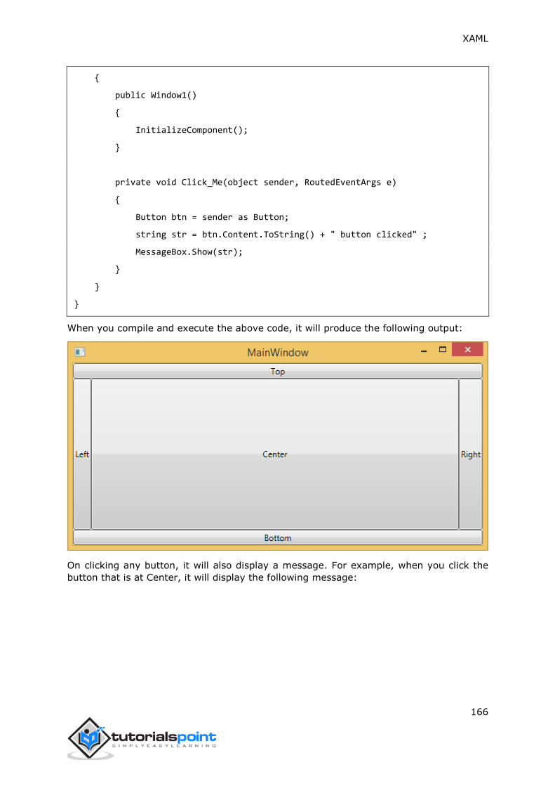
XAML
166
{
public Window1()
{
InitializeComponent();
}
private void Click_Me(object sender, RoutedEventArgs e)
{
Button btn = sender as Button;
string str = btn.Content.ToString() + " button clicked" ;
MessageBox.Show(str);
}
}
}
When you compile and execute the above code, it will produce the following output:
On clicking any button, it will also display a message. For example, when you click the
button that is at Center, it will display the following message:

XAML
167
We recommend you to execute the above example code and experiment with some other
properties as well.
Canvas Panel
Canvas panel is the basic layout panel in which child elements can be positioned explicitly
using coordinates that are relative to the Canvas any side such as left, right, top, and
bottom.
A Canvas is typically used for 2D graphic elements (such as Ellipse, Rectangle, etc.), but
not for UI elements because specifying absolute coordinates creates trouble while resizing,
localizing, or scaling the XAML application.
The hierarchical inheritance of Canvas class is as follows:
Given below are the commonly used properties of Canvas class:
Sr.
No.
Property & Description
1 Background
Gets or sets a Brush that fills the panel content area. (Inherited from Panel)

XAML
168
2 Children
Gets a UIElementCollection of child elements of this Panel. (Inherited from
Panel.)
3 Height
Gets or sets the suggested height of the element. (Inherited from
FrameworkElement.)
4 ItemHeight
Gets or sets a value that specifies the height of all items that are contained
within a WrapPanel.
5 ItemWidth
Gets or sets a value that specifies the width of all items that are contained within
a WrapPanel.
6 LogicalChildren
Gets an enumerator that can iterate the logical child elements of this Panel
element. (Inherited from Panel.)
7 LogicalOrientation
The Orientation of the panel, if the panel supports layout in only a single
dimension. (Inherited from Panel.)
8 LeftProperty
Identifies the Canvas.Left XAML attached property.
9 Margin
Gets or sets the outer margin of an element. (Inherited from
FrameworkElement.)
10 Name
Gets or sets the identifying name of the element. The name provides a reference
so that code-behind, such as event handler code, can refer to a markup element
after it is constructed during processing by a XAML processor. (Inherited from
FrameworkElement.)
11 Orientation
Gets or sets a value that specifies the dimension in which child content is
arranged.
12 Parent
Gets the logical parent element of this element. (Inherited from
FrameworkElement.)
13 Resources
Gets or sets the locally-defined resource dictionary. (Inherited from
FrameworkElement.)
14 Style
Gets or sets the style used by this element when it is rendered. (Inherited from
FrameworkElement.)
15 TopProperty
Identifies the Canvas.Top XAML attached property.
16 Width
Gets or sets the width of the element. (Inherited from FrameworkElement.)
17 ZIndexProperty
Identifies the Canvas.ZIndex XAML attached property.
Given below are the commonly used methods of Canvas:
Sr.
No.
Method & Description
1 GetLeft
Gets the value of the Canvas.Left XAML attached property for the target
element.

XAML
169
2 GetTop
Gets the value of the Canvas.Top XAML attached property for the target
element.
3 GetZIndex
Gets the value of the Canvas.ZIndex XAML attached property for the target
element.
4
SetLeft
Sets the value of the Canvas.Left XAML attached property for a target element.
5 SetTop
Sets the value of the Canvas.Top XAML attached property for a target element.
6 SetZIndex
Sets the value of the Canvas.ZIndex XAML attached property for a target
element.
Example
The following example shows how to add child elements into a Canvas. Here is the XAML
implementation in which Rectangles are created inside a Canvas with different offset
properties.
<Window x:Class="XAMLCanvas.Window1"
xmlns="http://schemas.microsoft.com/winfx/2006/xaml/presentation"
xmlns:x="http://schemas.microsoft.com/winfx/2006/xaml"
Title="MainWindow" Height="400" Width="604">
<Grid>
<Canvas Width="580" Height="360" >
<Rectangle Canvas.Left="30" Canvas.Top="30"
Fill="Red" Width="70" Height="40" />
<Rectangle Canvas.Right="30" Canvas.Top="30"
Fill="Blue" Width="70" Height="40" />
<Rectangle Canvas.Left="30" Canvas.Bottom="30"
Fill="Gainsboro" Width="70" Height="40" />
<Rectangle Canvas.Right="30" Canvas.Bottom="30"
Fill="SaddleBrown" Width="70" Height="40" />
</Canvas>
</Grid>
</Window>
When you compile and execute the above code, it will produce the following output:

XAML
170
We recommend you to execute the above example code and experiment with some other
properties as well.
Grid
A Grid panel provides a flexible area which consists of rows and columns. In a Grid, child
elements can be arranged in a tabular form. Elements can be added to any specific row
and column by using the Grid.Row and Grid.Column properties.
By default, a Grid panel is created with one row and one column. Multiple rows and columns
can be created by using the RowDefinitions and ColumnDefinitions properties. The
height of rows and the width of columns can be defined in the following three ways:
Fixed value: To assign a fixed size of logical units (1/96 inch)
Auto: It will take only as much space as is required for the controls in that specific
row/column.
Star (*): It will take the remaining space when Auto and fixed sized are filled.
The hierarchical inheritance of Canvas class is as follows:
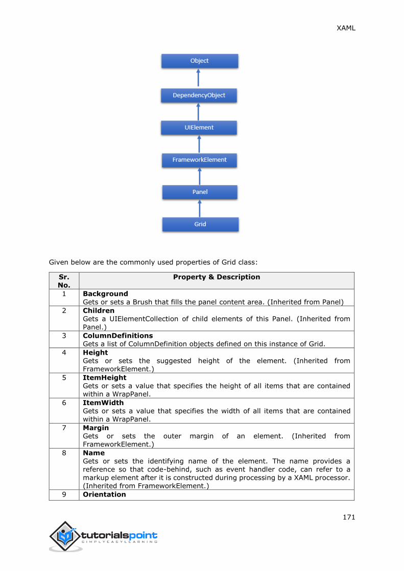
XAML
171
Given below are the commonly used properties of Grid class:
Sr.
No.
Property & Description
1 Background
Gets or sets a Brush that fills the panel content area. (Inherited from Panel)
2 Children
Gets a UIElementCollection of child elements of this Panel. (Inherited from
Panel.)
3 ColumnDefinitions
Gets a list of ColumnDefinition objects defined on this instance of Grid.
4 Height
Gets or sets the suggested height of the element. (Inherited from
FrameworkElement.)
5 ItemHeight
Gets or sets a value that specifies the height of all items that are contained
within a WrapPanel.
6 ItemWidth
Gets or sets a value that specifies the width of all items that are contained
within a WrapPanel.
7 Margin
Gets or sets the outer margin of an element. (Inherited from
FrameworkElement.)
8 Name
Gets or sets the identifying name of the element. The name provides a
reference so that code-behind, such as event handler code, can refer to a
markup element after it is constructed during processing by a XAML processor.
(Inherited from FrameworkElement.)
9 Orientation

XAML
172
Gets or sets a value that specifies the dimension in which child content is
arranged.
10
Parent
Gets the logical parent element of this element. (Inherited from
FrameworkElement.)
11
Resources
Gets or sets the locally-defined resource dictionary. (Inherited from
FrameworkElement.)
12 RowDefinitions
Gets a list of RowDefinition objects defined on this instance of Grid.
13
Style
Gets or sets the style used by this element when it is rendered. (Inherited from
FrameworkElement.)
14 Width
Gets or sets the width of the element. (Inherited from FrameworkElement.)
Given below are the commonly used properties of Grid class:
Sr.
No.
Method & Description
1
GetColumn
Gets the value of the Grid.Column XAML attached property from the specified
FrameworkElement.
2
GetColumnSpan
Gets the value of the Grid.ColumnSpan XAML attached property from the
specified FrameworkElement.
3
GetRow
Gets the value of the Grid.Row XAML attached property from the specified
FrameworkElement.
4
SetColumn
Sets the value of the Grid.Column XAML attached property on the specified
FrameworkElement.
5
SetRow
Sets the value of the Grid.Row XAML attached property on the specified
FrameworkElement.
6
SetRowSpan
Sets the value of the Grid.RowSpan XAML attached property on the specified
FrameworkElement.
Example
The following example shows how to add child elements into a Grid to specify it in a tabular
form. Here is the XAML implementation in which Text Blocks are added in the first column
and Text Boxes are added in the second column of a Grid.
<Window x:Class="XAMLGrid.Window1"
xmlns="http://schemas.microsoft.com/winfx/2006/xaml/presentation"
xmlns:x="http://schemas.microsoft.com/winfx/2006/xaml"
Title="Window1" Height="300" Width="604">
<Grid x:Name="FormLayoutGrid" Background="LightGray">
<Grid.ColumnDefinitions>

XAML
173
<ColumnDefinition Width="Auto" />
<ColumnDefinition />
</Grid.ColumnDefinitions>
<Grid.RowDefinitions>
<RowDefinition Height="*" />
<RowDefinition Height="*" />
<RowDefinition Height="*" />
</Grid.RowDefinitions>
<TextBlock Grid.Row="0" Grid.Column="0" Text="Name" Margin="10"
HorizontalAlignment="Left" VerticalAlignment="Center" Width="100"/>
<TextBox Grid.Row="0" Grid.Column="1" Margin="10" />
<TextBlock Grid.Row="1" Grid.Column="0" Text="ID" Margin="10"
HorizontalAlignment="Left" VerticalAlignment="Center" Width="100"/>
<TextBox Grid.Row="1" Grid.Column="1" Margin="10" />
<TextBlock Grid.Row="2" Grid.Column="0" Text="Age" Margin="10"
HorizontalAlignment="Left" VerticalAlignment="Center" Width="100"/>
<TextBox Grid.Row="2" Grid.Column="1" Margin="10" />
</Grid>
</Window>
When you compile and execute the above code, it will produce the following output:
We recommend you to execute the above example code and experiment with some other
properties as well.

XAML
174

XAML
175
Nesting of Layout
Nesting of layout means using a layout panel inside another layout, e.g., defining stack
panels inside a grid. This concept is widely used to take advantage of multiple layouts in
an application.
Example
In the following example, we will be using stack panels inside a grid. Let’s have a look at
the following XAML code:
<Window x:Class="XAMLNestingLayouts.Window1"
xmlns="http://schemas.microsoft.com/winfx/2006/xaml/presentation"
xmlns:x="http://schemas.microsoft.com/winfx/2006/xaml"
Title="Window1" Height="300" Width="604">
<Grid Background="LightGray">
<Grid.RowDefinitions>
<RowDefinition Height="*"/>
<RowDefinition Height="*"/>
<RowDefinition Height="*"/>
<RowDefinition Height="*"/>
<RowDefinition Height="*"/>
</Grid.RowDefinitions>
<Grid.ColumnDefinitions>
<ColumnDefinition Width="*"/>
</Grid.ColumnDefinitions>
<Label Content="Employee Info"
FontSize="15" FontWeight="Bold"
Grid.Column="0" Grid.Row="0"/>
<StackPanel Grid.Column="0" Grid.Row="1" Orientation="Horizontal">
<Label Content="Name" VerticalAlignment="Center" Width="70"/>
<TextBox Name="txtName" Text="Muhammad Ali"
VerticalAlignment="Center" Width="200"></TextBox>
</StackPanel>
<StackPanel Grid.Column="0" Grid.Row="2" Orientation="Horizontal">

XAML
176
<Label Content="ID" VerticalAlignment="Center" Width="70"/>
<TextBox Name="txtCity" Text="421" VerticalAlignment="Center"
Width="50"></TextBox>
</StackPanel>
<StackPanel Grid.Column="0" Grid.Row="3" Orientation="Horizontal">
<Label Content="Age" VerticalAlignment="Center" Width="70"/>
<TextBox Name="txtState" Text="32" VerticalAlignment="Center"
Width="50"></TextBox>
</StackPanel>
<StackPanel Grid.Column="0" Grid.Row="4" Orientation="Horizontal">
<Label Content="Title" VerticalAlignment="Center" Width="70"/>
<TextBox Name="txtCountry" Text="Programmer"
VerticalAlignment="Center" Width="200"></TextBox>
</StackPanel>
</Grid>
</Window>
When you compile and execute the above code, it will produce the following output:
We recommend you to execute the above example code and experiment with some other
nesting layouts.

XAML
177
The general concept of events in XAML is similar to events in other popular programming
languages such as .NET and C++. In XAML, all of the controls expose some events so that
they can be subscribed for specific purposes.
Whenever an event takes place, the application will be notified and the program can react
to them, e.g., close buttons are used to close a dialog.
There are many types of events that can be subscribed for different behaviors of an
application based on the requirement of that application, but the most commonly used
events are those which are related to mouse and keyboard such as,
Click
MouseDown
MouseEnter
MouseLeave
MouseUp
KeyDown
KeyUp
In this chapter, we will use some of the basic and most commonly used events to
understand how an event of a specific control can be linked to the code behind where the
behavior will be implemented depending on what the user wants to do when a specific
event occurs.
Let’s have a look at a simple example of a button click event. Given below is the XAML
implementation for Button control which is created and initialized with some properties
and a Click event (Click="OnClick").
<Window x:Class="XAMLEventHandling.MainWindow"
xmlns="http://schemas.microsoft.com/winfx/2006/xaml/presentation"
xmlns:x="http://schemas.microsoft.com/winfx/2006/xaml"
Title="MainWindow" Height="350" Width="604">
<Grid>
<Button x:Name="button1"
Content="Click"
Click="OnClick"
Width="150"
Height="30"
HorizontalAlignment="Center"/>
</Grid>
9. XAML – EVENT HANDLING

XAML
178
</Window>
Whenever this button is clicked, it will fire an OnClick event and you can add any type of
behavior as a response to the Click. Let’s have a look at the OnClick event implementation
which will show a message when this button is clicked.
using System;
using System.Windows;
using System.Windows.Controls;
namespace XAMLEventHandling
{
/// <summary>
/// Interaction logic for MainWindow.xaml
/// </summary>
public partial class MainWindow : Window
{
public MainWindow()
{
InitializeComponent();
}
private void OnClick(object sender, RoutedEventArgs e)
{
MessageBox.Show("Button is clicked!");
}
}
}
When you compile and execute the above code, it will produce the following output:

XAML
179
When you click on the button, the click (OnClick) event will be fired and the following
message will be displayed.
Now let’s have a look at a little bit complex example where multiple events are handled.
Example
The following example contains a textbox with ContextMenu which manipulates the text
within the textbox.
The following XAML code creates a TextBox, a ContextMenu, and MenuItems with some
properties and events such as Checked, Unchecked, and Click.
<Window x:Class="XAMLContextMenu.MainWindow"
xmlns="http://schemas.microsoft.com/winfx/2006/xaml/presentation"
xmlns:x="http://schemas.microsoft.com/winfx/2006/xaml"
Title="MainWindow" Height="350" Width="604">
<Grid>
<TextBox Name="textBox1" TextWrapping="Wrap" Margin="10" Grid.Row="7">
Hi, this is XAML tutorial.
<TextBox.ContextMenu>
<ContextMenu>

XAML
180
<MenuItem Header="_Bold" IsCheckable="True"
Checked="Bold_Checked" Unchecked="Bold_Unchecked" />
<MenuItem Header="_Italic" IsCheckable="True"
Checked="Italic_Checked"
Unchecked="Italic_Unchecked" />
<Separator />
<MenuItem Header="Increase Font Size"
Click="IncreaseFont_Click" />
<MenuItem Header="_Decrease Font Size"
Click="DecreaseFont_Click" />
</ContextMenu>
</TextBox.ContextMenu>
</TextBox>
</Grid>
</Window>
Here is the implementation in C# for the different events which will be fired whenever a
menu item is checked, unchecked, or clicked.
using System;
using System.Collections.Generic;
using System.Linq;
using System.Text;
using System.Threading.Tasks;
using System.Windows;
using System.Windows.Controls;
using System.Windows.Data;
namespace XAMLContextMenu
{
/// <summary>
/// Interaction logic for MainWindow.xaml
/// </summary>
public partial class MainWindow : Window
{
public MainWindow()
{
InitializeComponent();

XAML
181
}
private void Bold_Checked(object sender, RoutedEventArgs e)
{
textBox1.FontWeight = FontWeights.Bold;
}
private void Bold_Unchecked(object sender, RoutedEventArgs e)
{
textBox1.FontWeight = FontWeights.Normal;
}
private void Italic_Checked(object sender, RoutedEventArgs e)
{
textBox1.FontStyle = FontStyles.Italic;
}
private void Italic_Unchecked(object sender, RoutedEventArgs e)
{
textBox1.FontStyle = FontStyles.Normal;
}
private void IncreaseFont_Click(object sender, RoutedEventArgs e)
{
if (textBox1.FontSize < 18)
{
textBox1.FontSize += 2;
}
}
private void DecreaseFont_Click(object sender, RoutedEventArgs e)
{
if (textBox1.FontSize > 10)
{
textBox1.FontSize -= 2;
}
}

XAML
182
}
}
When you compile and execute the above code, it will produce the following output:
We recommend you to execute the above example code and experiment with some other
events.
Here are the commonly used events for different controls:
Sr.
No.
Event & Description
1 Checked
Fires when a ToggleButton is checked. (Inherited from ToggleButton)
2 Click
Occurs when a button control is clicked. (Inherited from ButtonBase)
3 ContextMenuClosing
Occurs just before any context menu on the element is closed. (Inherited from
FrameworkElement.)
4 ContextMenuOpening
Occurs when any context menu on the element is opened. (Inherited from
FrameworkElement.)
5 DataContextChanged
Occurs when the value of the FrameworkElement.DataContext property changes.
(Inherited from FrameworkElement)
6 DragEnter
Occurs when the input system reports an underlying drag event with this element
as the target. (Inherited from UIElement)
7 DragLeaveOccurs when the input system reports an underlying drag event with
this element as the origin. (Inherited from UIElement)
8 DragOver
Occurs when the input system reports an underlying drag event with this element
as the potential drop target. (Inherited from UIElement)

XAML
183
9 DragStarting
Occurs when a drag operation is initiated. (Inherited from UIElement)
10 DropCompleted
Occurs when a drag-and-drop operation is ended. (Inherited from UIElement)
11 DropDownClosed
Occurs when the drop-down portion of the ComboBox closes.
12 DropDownOpened
Occurs when the drop-down portion of the ComboBox opens.
13 GotFocus
Occurs when a UIElement receives focus. (Inherited from UIElement)
14 Holding
Occurs when an otherwise unhandled Hold interaction occurs over the hit test
area of this element. (Inherited from UIElement)
15 Intermediate
Fires when the state of a ToggleButton is switched to the indeterminate state.
(Inherited from ToggleButton)
16 IsEnabledChanged
Occurs when the IsEnabled property changes. (Inherited from Control)
17 KeyDown
Occurs when a keyboard key is pressed while the UIElement has focus. (Inherited
from UIElement)
18 KeyUp
Occurs when a keyboard key is released while the UIElement has focus. (Inherited
from UIElement)
19 LostFocus
Occurs when a UIElement loses focus. (Inherited from UIElement)
20 ManipulationCompleted
Occurs when a manipulation on the UIElement is complete. (Inherited from
UIElement)
21 ManipulationDelta
Occurs when the input device changes position during a manipulation. (Inherited
from UIElement)
22 ManipulationInertiaStarting
Occurs when the input device loses contact with the UIElement object during a
manipulation and inertia begins. (Inherited from UIElement)
23 ManipulationStarted
Occurs when an input device begins a manipulation on the UIElement. (Inherited
from UIElement)
24 ManipulationStarting
Occurs when the manipulation processor is first created. (Inherited from
UIElement)
25 SelectionChanged
Occurs when the text selection has changed.
26 SizeChanged
Occurs when either the ActualHeight or the ActualWidth property changes value
on a FrameworkElement. (Inherited from FrameworkElement)
27 Unchecked
Occurs when a ToggleButton is unchecked. (Inherited from ToggleButton)
28 ValueChanged
Occurs when the range value changes. (Inherited from RangeBase)

XAML
184
Data binding is a mechanism in XAML applications that provides a simple and easy way
for Windows Runtime Apps using partial classes to display and interact with data. The
management of data is entirely separated from the way the data is displayed in this
mechanism.
Data binding allows the flow of data between UI elements and data object on user
interface. When a binding is established and the data or your business model changes,
then it will reflect the updates automatically to the UI elements and vice versa. It is also
possible to bind, not to a standard data source, but rather to another element on the page.
Data binding can be of two types:
One-way data binding
Two-way data binding
One-Way Data Binding
In one-way binding, data is bound from its source (that is the object that holds the data)
to its target (that is the object that displays the data).
Let’s have a look at a simple example of one-way data binding. The following XAML code
creates four text blocks with some properties.
<Window x:Class="DataBindingOneWay.MainWindow"
xmlns="http://schemas.microsoft.com/winfx/2006/xaml/presentation"
xmlns:x="http://schemas.microsoft.com/winfx/2006/xaml"
Title="MainWindow" Height="350" Width="604">
<Grid>
<StackPanel Name="Display">
<StackPanel Orientation="Horizontal" Margin="50, 50, 0, 0">
<TextBlock Text="Name: " Margin="10" Width="100"/>
<TextBlock Margin="10" Width="100"
Text="{Binding Name}"/>
</StackPanel>
<StackPanel Orientation="Horizontal" Margin="50,0,50,0">
<TextBlock Text="Title: " Margin="10" Width="100"/>
<TextBlock Margin="10" Width="100"
Text="{Binding Title}" />
</StackPanel>
</StackPanel>
10. XAML – DATA BINDING
XAML
185
</Grid>
</Window>
Text properties of two text blocks are set to “Name” and “Title” statically, while the other
two text blocks Text properties are bound to “Name” and “Title” which are class variables
of Employee class which is shown below.
using System;
using System.Collections.Generic;
using System.Linq;
using System.Text;
using System.Threading.Tasks;
namespace DataBindingOneWay
{
public class Employee
{
public string Name { get; set; }
public string Title { get; set; }
public static Employee GetEmployee()
{
var emp = new Employee()
{
Name = "Ali Ahmed",
Title = "Developer"
};
return emp;
}
}
}
In this class, we have just two variables, Name and Title, and one static method in which
the Employee object is initialized which will return that employee object. So we are binding
to a property, Name and Title, but we have not selected what object that property belongs
to. The easiest way is to assign an object to DataContext whose properties we are binding
in the following C# code:
using System;

XAML
186
using System.Windows;
using System.Windows.Controls;
namespace DataBindingOneWay
{
/// <summary>
/// Interaction logic for MainWindow.xaml
/// </summary>
public partial class MainWindow : Window
{
public MainWindow()
{
InitializeComponent();
DataContext = Employee.GetEmployee();
}
}
}
Let's run this application and you can see immediately in our MainWindow that we have
successfully bound to the Name and Title of that Employee object.

XAML
187
Two-Way Data Binding
In two-way binding, the user can modify the data through the user interface and have that
data updated in the source. If the source changes while the user is looking at the view,
you would want to update the view.
Example
Let’s have a look at the following example in which one combobox with three combobox
items and one textbox are created with some properties. In this example, we don’t have
any standard data source, but the UI elements are bound to other UI elements.
<Window x:Class="XAMLTestBinding.MainWindow"
xmlns="http://schemas.microsoft.com/winfx/2006/xaml/presentation"
xmlns:x="http://schemas.microsoft.com/winfx/2006/xaml"
Title="MainWindow" Height="350" Width="604">
<StackPanel>
<ComboBox Name="comboBox" Margin="50" Width="100">
<ComboBoxItem Content="Green"/>
<ComboBoxItem Content="Yellow" IsSelected="True"/>
<ComboBoxItem Content="Orange" />
</ComboBox>
<TextBox Name="textBox" Margin="50" Width="100" Height="23"
VerticalAlignment="Top"
Text ="{Binding ElementName=comboBox,
Path=SelectedItem.Content,
Mode=TwoWay,
UpdateSourceTrigger=PropertyChanged}"
Background="{Binding ElementName=comboBox,
Path=SelectedItem.Content}">
</TextBox>
</StackPanel>
</Window>
When you compile and execute the above code, it will produce the following output. When
the user selects an item from the combobox, the textbox text and the background color will be updated accordingly.
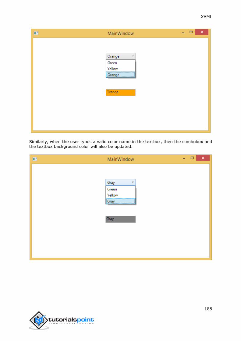
XAML
188
Similarly, when the user types a valid color name in the textbox, then the combobox and the textbox background color will also be updated.

XAML
189
In XAML applications, markup extensions are a method/technique to gain a value that is
neither a specific XAML object nor a primitive type. Markup extensions can be defined by
opening and closing curly braces and inside that curly braces, the scope of the markup
extension is defined.
Data binding and static resources are markup extensions. There are some predefined XAML
markup extensions in System.xaml which can be used.
Let’s have a look at a simple example where StaticResources markup extension is used
which is a predefined XAML markup extension.
The following XAML code creates two text blocks with some properties and their foreground
is defined in Window.Resources.
<Window x:Class="XAMLStaticResourcesMarkupExtension.MainWindow"
xmlns="http://schemas.microsoft.com/winfx/2006/xaml/presentation"
xmlns:x="http://schemas.microsoft.com/winfx/2006/xaml"
Title="MainWindow" Height="350" Width="525">
<Window.Resources>
<SolidColorBrush Color="Blue" x:Key="myBrush"></SolidColorBrush>
</Window.Resources>
<Grid>
<StackPanel Orientation="Vertical">
<TextBlock Foreground="{StaticResource myBrush}"
Text="First Name"
Width="100"
Margin="10"/>
<TextBlock Foreground="{StaticResource myBrush}"
Text="Last Name"
Width="100"
Margin="10"/>
</StackPanel>
</Grid>
</Window>
In Window.Resources, you can see x:Key is used which uniquely identifies the elements
that are created and referenced in an XAML defined dictionary to identify a resource in a
resource dictionary.
11. XAML – MARKUP EXTENSIONS

XAML
190
When you compile and execute the above code, it will produce the following MainWindow.
You can see the two text blocks with blue foreground color.
In XAML, custom markup extensions can also be defined by inheriting MarkupExtension
class and overriding the ProvideValue method which is an abstract method in the
MarkupExtension class.
Let’s have a look at a simple example of custom markup extension.
<Window x:Class="XAMLMarkupExtension.MainWindow"
xmlns="http://schemas.microsoft.com/winfx/2006/xaml/presentation"
xmlns:x="http://schemas.microsoft.com/winfx/2006/xaml"
xmlns:my="clr-namespace:XAMLMarkupExtension"
Title="MainWindow" Height="350" Width="525">
<Grid>
<Button Content="{my:MyMarkupExtension FirstStr=Markup,
SecondStr=Extension}"
Width="200"
Height="20"/>
</Grid>
</Window>
In the above XAML code, a button is created with some properties and for the content
value, a custom markup extension (my:MyMarkupExtension) has been used with two values
“Markup” and “Extension” which are assigned to FirstStr and SecondStr respectively.
Actually, MyMarkupExtension is a class which is derived from MarkupExtension as shown below
in the C# implementation. This class contains two string variables, FirstStr and SecondStr,

XAML
191
which are concatenated and return that string from the ProvideValue method to the
Content of a button.
using System;
using System.Collections.Generic;
using System.Linq;
using System.Text;
using System.Threading.Tasks;
using System.Windows;
using System.Windows.Controls;
using System.Windows.Data;
using System.Windows.Documents;
using System.Windows.Input;
using System.Windows.Markup;
using System.Windows.Media;
using System.Windows.Media.Imaging;
using System.Windows.Navigation;
using System.Windows.Shapes;
namespace XAMLMarkupExtension
{
/// <summary>
/// Interaction logic for MainWindow.xaml
/// </summary>
public partial class MainWindow : Window
{
public MainWindow()
{
InitializeComponent();
}
}
public class MyMarkupExtension : MarkupExtension
{
public MyMarkupExtension() { }
public String FirstStr { get; set; }
public String SecondStr { get; set; }

XAML
192
public override object ProvideValue(
IServiceProvider serviceProvider)
{
return FirstStr + " " + SecondStr;
}
}
}
Let's run this application and you can see immediately in our MainWindow that "markup
extension" has been successfully used as the content of the button.

XAML
193
A dependency property is a specific type of property where the value is followed by a keen
property system which is also a part of the Windows Runtime App. A class which defines
a dependency property must be inherited from the DependencyObject class.
Many of the UI control classes which are used in XAML are derived from the
DependencyObject class and support dependency properties. The following XAML code
creates a button with some properties.
<Window x:Class="XAMLDependencyProperty.MainWindow"
xmlns="http://schemas.microsoft.com/winfx/2006/xaml/presentation"
xmlns:x="http://schemas.microsoft.com/winfx/2006/xaml"
xmlns:local="clr-namespace:XAMLDependencyProperty"
Title="MainWindow" Height="350" Width="604">
<Grid>
<Button Height="40"
Width="175"
Margin="10"
Content="Dependency Property">
<Button.Style>
<Style TargetType="{x:Type Button}">
<Style.Triggers>
<Trigger Property="IsMouseOver" Value="True">
<Setter Property="Foreground" Value="Red"/>
</Trigger>
</Style.Triggers>
</Style>
</Button.Style>
</Button>
</Grid>
</Window>
The x:Type markup extension in XAML has a similar functionality like typeof() in C#. It is
used when attributes are specified that take the type of the object such as <Style
TargetType="{x:Type Button}">
When you compile and execute the above code, it will produce the following MainWindow.
When the mouse is over the button, it will change the foreground color of the button.
When the mouse leaves the button, it will change back to its original color.
12. XAML – DEPENDENCY PROPERTIES

XAML
194
The main difference between dependency properties and other CLR properties are:
CLR properties can directly read/write from the private member of a class by using
getter and setter. In case of dependency properties, it is not stored in a local
object.
Dependency properties are stored in a dictionary of key/value pairs which is
provided by the DependencyObject class.
It also saves a lot of memory because it stores the property when changed.
It can be bound in XAML as well.
In .NET framework, custom dependency properties can also be defined. Here are the steps
to define custom dependency property in C#.
Declare and register your dependency property with system call register.
Provide the setter and getter for the property.
Define a static handler to handle any changes that occur globally.
Define an instance handler to handle any changes that occur to that particular
instance.
Given below is the code in C# for dependency property which defined to set the SetText
property of the user control.
using System;
using System.Collections.Generic;
using System.Linq;
using System.Text;
using System.Threading.Tasks;

XAML
195
using System.Windows;
using System.Windows.Controls;
using System.Windows.Data;
using System.Windows.Documents;
using System.Windows.Input;
using System.Windows.Media;
using System.Windows.Media.Imaging;
using System.Windows.Navigation;
using System.Windows.Shapes;
namespace WpfApplication3
{
/// <summary>
/// Interaction logic for UserControl1.xaml
/// </summary>
public partial class UserControl1 : UserControl
{
public UserControl1()
{
InitializeComponent();
}
public static readonly DependencyProperty SetTextProperty =
DependencyProperty.Register("SetText", typeof(string), typeof(UserControl1),
new PropertyMetadata("", new PropertyChangedCallback(OnSetTextChanged)));
public string SetText
{
get { return (string)GetValue(SetTextProperty); }
set { SetValue(SetTextProperty, value); }
}
private static void OnSetTextChanged(DependencyObject d,
DependencyPropertyChangedEventArgs e)
{
UserControl1 UserControl1Control = d as UserControl1;
UserControl1Control.OnSetTextChanged(e);
}
private void OnSetTextChanged(DependencyPropertyChangedEventArgs e)

XAML
196
{
tbTest.Text = e.NewValue.ToString();
}
}
}
Here is the XAML file in which the TextBlock is defined as a user control and the Text
property will be assigned to it by the SetText dependency property.
The following XAML code creates a user control with initializing its SetText dependency
property and some other properties.
<Window x:Class="WpfApplication3.MainWindow"
xmlns="http://schemas.microsoft.com/winfx/2006/xaml/presentation"
xmlns:x="http://schemas.microsoft.com/winfx/2006/xaml"
xmlns:views="clr-namespace:WpfApplication3"
Title="MainWindow" Height="350" Width="604">
<Grid>
<views:UserControl1 SetText="Hellow World"/>
</Grid>
</Window>
Let's run this application and you can see immediately in our MainWindow that dependency
property for user control has been successfully used as a Text.

XAML
197
Resources are normally definitions connected with some object that you just anticipate to
use more often than once. It has the ability to store data locally for controls or for the
current window or globally for the entire applications.
Defining an object as a resource allows us to access it from another place. Hence, it allows
reusability. Resources are defined in resource dictionaries and any object can be defined
as a resource effectively making it a shareable asset. A unique key is specified to XAML
resource and with that key, it can be referenced by using a StaticResource markup
extension.
Let’s have a look at a simple example again in which two text blocks are created with some
properties and their foreground color is defined in Window.Resources.
<Window x:Class="XAMLResources.MainWindow"
xmlns="http://schemas.microsoft.com/winfx/2006/xaml/presentation"
xmlns:x="http://schemas.microsoft.com/winfx/2006/xaml"
Title="MainWindow" Height="350" Width="604">
<Window.Resources>
<SolidColorBrush Color="Blue" x:Key="myBrush"></SolidColorBrush>
</Window.Resources>
<StackPanel Orientation="Vertical">
<TextBlock Foreground="{StaticResource myBrush}"
Text="First Name"
Width="100"
Margin="10"/>
<TextBlock Foreground="{StaticResource myBrush}"
Text="Last Name"
Width="100"
Margin="10"/>
</StackPanel>
</Window>
When the above code is compiled and executed, it will produce the following MainWindow.
You can see two text blocks with blue foreground color. The advantage of the resource is
that if there are multiple text blocks and you want to change their background color, then
you will need just to change it in the resource dictionary.
13. XAML – RESOURCES

XAML
198
Resource Scope
Resources are defined in resource dictionaries, but there are numerous places where a
resource dictionary can be defined. In the above example, a resource dictionary is defined
on Window/page level. In what dictionary a resource is defined immediately limits the
scope of that resource. So the scope, i.e. where you can use the resource, depends on
where you've defined it.
Define the resource in the resource dictionary of a grid and it's accessible by that
grid and by its child elements only.
Define it on a window/page and it's accessible by all elements on that window/page.
The App root can be found in App.xaml resources dictionary. It's the root of our
application, so the resources defined here are scoped to the complete application.
As far as the scope of the resource is concerned, the most often are application level, page
level, and a specific element level like a Grid, StackPanel, etc.

XAML
199
Resource Dictionaries
Resource dictionaries in XAML apps imply resource dictionaries in separate files. It is
followed in almost all XAML apps. Defining resources in separate files can have the
following advantages:
Separation between defining resources in the resource dictionary and UI related
code.
Defining all the resources in a separate file such as App.xaml would make them
available across the App.
So, how we can define our resources in a resource dictionary in a separate file? Well, it is
very easy, just add a new resource dictionary through Visual Studio by the following steps:
In your solution, add a new folder and name it ResourceDictionaries.
Right-click on this folder and select Resource Dictionary from Add submenu item
and name it DictionaryWithBrush.xaml
Let’s have a look at the same application; just the resource dictionary is now defined in
App level.
Here is the XAML code for MainWindow.xaml.
<Window x:Class="XAMLResources.MainWindow"
xmlns="http://schemas.microsoft.com/winfx/2006/xaml/presentation"
xmlns:x="http://schemas.microsoft.com/winfx/2006/xaml"
Title="MainWindow" Height="350" Width="604">

XAML
200
<StackPanel Orientation="Vertical">
<TextBlock Foreground="{StaticResource myBrush}"
Text="First Name"
Width="100"
Margin="10"/>
<TextBlock Foreground="{StaticResource myBrush}"
Text="Last Name"
Width="100"
Margin="10"/>
</StackPanel>
</Window>
Here is the implementation in DictionaryWithBrush.xaml:
<ResourceDictionary
xmlns="http://schemas.microsoft.com/winfx/2006/xaml/presentation"
xmlns:x="http://schemas.microsoft.com/winfx/2006/xaml">
<SolidColorBrush Color="Blue" x:Key="myBrush"></SolidColorBrush>
</ResourceDictionary>
Here is the implementation in app.xaml:
<Application x:Class="XAMLResources.App"
xmlns="http://schemas.microsoft.com/winfx/2006/xaml/presentation"
xmlns:x="http://schemas.microsoft.com/winfx/2006/xaml"
StartupUri="MainWindow.xaml">
<Application.Resources>
<ResourceDictionary Source="
XAMLResources\ResourceDictionaries\DictionaryWithBrush.xaml"/>
</Application.Resources>
</Application>
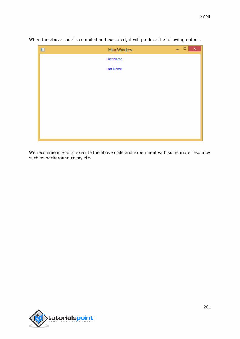
XAML
201
When the above code is compiled and executed, it will produce the following output:
We recommend you to execute the above code and experiment with some more resources
such as background color, etc.

XAML
202
A template describes the overall look and visual appearance of a control. For each control,
there is a default template associated with it which gives the appearance to that control.
In XAML, you can easily create your own templates when you want to customize the visual
behavior and visual appearance of a control. Connectivity between the logic and template
can be achieved by data binding.
The main difference between styles and templates are:
Styles can only change the appearance of your control with default properties of
that control.
With templates, you can access more parts of a control than in styles. You can also
specify both existing and new behavior of a control.
There are two types of templates which are most commonly used.
Control Template
Data Template
Control Template
The Control Template defines or specifies the visual appearance and structure of a control.
All of the UI elements have some kind of appearance as well as behavior, e.g., Button has
an appearance and behavior. Click event or mouse hover events are the behaviors which
are fired in response to a click and hover, and there is also a default appearance of button
which can be changed by the Control template.
Let’s have a look at a simple example again in which two buttons are created with some
properties. One is with template and the other one is with the default button.
<Window x:Class="TemplateDemo.MainWindow"
xmlns="http://schemas.microsoft.com/winfx/2006/xaml/presentation"
xmlns:x="http://schemas.microsoft.com/winfx/2006/xaml"
Title="MainWindow" Height="350" Width="604">
<Window.Resources>
<ControlTemplate x:Key="ButtonTemplate" TargetType="Button">
<Grid>
<Ellipse x:Name="ButtonEllipse" Height="100" Width="150" >
<Ellipse.Fill>
<LinearGradientBrush StartPoint="0,0.2"
EndPoint="0.2,1.4">
<GradientStop Offset="0" Color="Red"/>
14. XAML – TEMPLATES

XAML
203
<GradientStop Offset="1" Color="Orange"/>
</LinearGradientBrush>
</Ellipse.Fill>
</Ellipse>
<ContentPresenter Content="{TemplateBinding Content}"
HorizontalAlignment="Center"
VerticalAlignment="Center" />
</Grid>
<ControlTemplate.Triggers>
<Trigger Property="IsMouseOver" Value="True">
<Setter TargetName="ButtonEllipse" Property="Fill" >
<Setter.Value>
<LinearGradientBrush StartPoint="0,0.2"
EndPoint="0.2,1.4">
<GradientStop Offset="0" Color="YellowGreen"/>
<GradientStop Offset="1" Color="Gold"/>
</LinearGradientBrush>
</Setter.Value>
</Setter>
</Trigger>
<Trigger Property="IsPressed" Value="True">
<Setter Property="RenderTransform">
<Setter.Value>
<ScaleTransform ScaleX="0.8" ScaleY="0.8"
CenterX="0" CenterY="0" />
</Setter.Value>
</Setter>
<Setter Property="RenderTransformOrigin"
Value="0.5,0.5" />
</Trigger>
</ControlTemplate.Triggers>
</ControlTemplate>
</Window.Resources>
<StackPanel>
<Button Content="Round Button!"
Template="{StaticResource ButtonTemplate}"
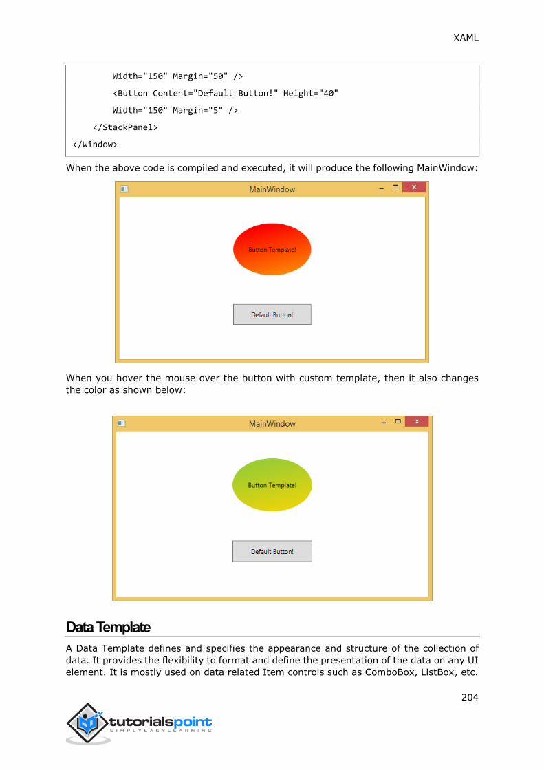
XAML
204
Width="150" Margin="50" />
<Button Content="Default Button!" Height="40"
Width="150" Margin="5" />
</StackPanel>
</Window>
When the above code is compiled and executed, it will produce the following MainWindow:
When you hover the mouse over the button with custom template, then it also changes
the color as shown below:
Data Template
A Data Template defines and specifies the appearance and structure of the collection of
data. It provides the flexibility to format and define the presentation of the data on any UI
element. It is mostly used on data related Item controls such as ComboBox, ListBox, etc.

XAML
205
Let’s have a look at a simple example of data template. The following XAML code creates
a combobox with Data Template and text blocks.
<Window x:Class="XAMLDataTemplate.MainWindow"
xmlns="http://schemas.microsoft.com/winfx/2006/xaml/presentation"
xmlns:x="http://schemas.microsoft.com/winfx/2006/xaml"
Title="MainWindow" Height="350" Width="604">
<Grid VerticalAlignment="Top">
<ComboBox Name="Presidents"
ItemsSource="{Binding}"
Height="30"
Width="400">
<ComboBox.ItemTemplate>
<DataTemplate>
<StackPanel Orientation="Horizontal"
Margin="2">
<TextBlock Text="Name: "
Width="95"
Background="Aqua"
Margin="2" />
<TextBlock Text="{Binding Name}"
Width="95"
Background="AliceBlue"
Margin="2" />
<TextBlock Text="Title: "
Width="95"
Background="Aqua"
Margin="10,2,0,2" />
<TextBlock Text="{Binding Title}"
Width="95"
Background="AliceBlue"
Margin="2" />
</StackPanel>
</DataTemplate>
</ComboBox.ItemTemplate>
</ComboBox>
</Grid>

XAML
206
</Window>
Here is the implementation in C# in which the employee object is assigned to DataContext:
using System;
using System.Windows;
using System.Windows.Controls;
namespace XAMLDataTemplate
{
/// <summary>
/// Interaction logic for MainWindow.xaml
/// </summary>
public partial class MainWindow : Window
{
public MainWindow()
{
InitializeComponent();
DataContext = Employee.GetEmployees();
}
}
}
Here is the implementation in C# for Employee class:
using System;
using System.Collections.Generic;
using System.Collections.ObjectModel;
using System.ComponentModel;
using System.Linq;
using System.Runtime.CompilerServices;
using System.Text;
using System.Threading.Tasks;
namespace XAMLDataTemplate
{
public class Employee : INotifyPropertyChanged

XAML
207
{
private string name;
public string Name
{
get { return name; }
set
{
name = value;
RaiseProperChanged();
}
}
private string title;
public string Title
{
get { return title; }
set
{
title = value;
RaiseProperChanged();
}
}
public static Employee GetEmployee()
{
var emp = new Employee()
{
Name = "Waqas",
Title = "Software Engineer"
};
return emp;
}
public event PropertyChangedEventHandler PropertyChanged;
private void RaiseProperChanged(
[CallerMemberName] string caller = "")
{

XAML
208
if (PropertyChanged != null)
{
PropertyChanged(this, new PropertyChangedEventArgs(caller));
}
}
public static ObservableCollection<Employee> GetEmployees()
{
var employees = new ObservableCollection<Employee>();
employees.Add(new Employee() { Name = "Ali", Title = "Developer" });
employees.Add(new Employee() { Name = "Ahmed", Title = "Programmer" });
employees.Add(new Employee() { Name = "Amjad", Title = "Desiner" });
employees.Add(new Employee() { Name = "Waqas", Title = "Programmer" });
employees.Add(new Employee() { Name = "Bilal", Title = "Engineer" });
employees.Add(new Employee() { Name = "Waqar", Title = "Manager" });
return employees;
}
}
}
When the above code is compiled and executed, it will produce the following output. It
contains a combobox and when you click on the combobox, you see that the collection of
data which are created in the Employee class is listed as the combobox items.
We recommend you to execute the above code and experiment with it.

XAML
209
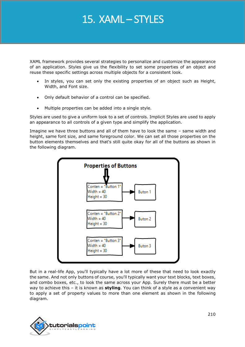
XAML
210
XAML framework provides several strategies to personalize and customize the appearance
of an application. Styles give us the flexibility to set some properties of an object and
reuse these specific settings across multiple objects for a consistent look.
In styles, you can set only the existing properties of an object such as Height,
Width, and Font size.
Only default behavior of a control can be specified.
Multiple properties can be added into a single style.
Styles are used to give a uniform look to a set of controls. Implicit Styles are used to apply
an appearance to all controls of a given type and simplify the application.
Imagine we have three buttons and all of them have to look the same – same width and
height, same font size, and same foreground color. We can set all those properties on the
button elements themselves and that's still quite okay for all of the buttons as shown in
the following diagram.
But in a real-life App, you'll typically have a lot more of these that need to look exactly
the same. And not only buttons of course, you'll typically want your text blocks, text boxes,
and combo boxes, etc., to look the same across your App. Surely there must be a better
way to achieve this – it is known as styling. You can think of a style as a convenient way
to apply a set of property values to more than one element as shown in the following
diagram.
15. XAML – STYLES
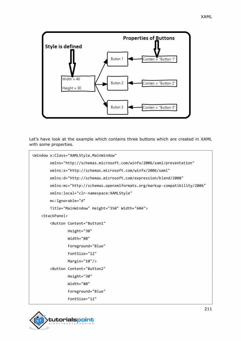
XAML
211
Let’s have look at the example which contains three buttons which are created in XAML
with some properties.
<Window x:Class="XAMLStyle.MainWindow"
xmlns="http://schemas.microsoft.com/winfx/2006/xaml/presentation"
xmlns:x="http://schemas.microsoft.com/winfx/2006/xaml"
xmlns:d="http://schemas.microsoft.com/expression/blend/2008"
xmlns:mc="http://schemas.openxmlformats.org/markup-compatibility/2006"
xmlns:local="clr-namespace:XAMLStyle"
mc:Ignorable="d"
Title="MainWindow" Height="350" Width="604">
<StackPanel>
<Button Content="Button1"
Height="30"
Width="80"
Foreground="Blue"
FontSize="12"
Margin="10"/>
<Button Content="Button2"
Height="30"
Width="80"
Foreground="Blue"
FontSize="12"

XAML
212
Margin="10"/>
<Button Content="Button3"
Height="30"
Width="80"
Foreground="Blue"
FontSize="12"
Margin="10"/>
</StackPanel>
</Window>
When you look at the above code, you will see that for all the buttons, height, width,
foreground color, font size, and margin properties remain same. When the above code is
compiled and executed, it will display the following output:
Now let’s have a look at the same example, but this time, we will be using style.
<Window x:Class="XAMLStyle.MainWindow"
xmlns="http://schemas.microsoft.com/winfx/2006/xaml/presentation"
xmlns:x="http://schemas.microsoft.com/winfx/2006/xaml"
xmlns:d="http://schemas.microsoft.com/expression/blend/2008"
xmlns:mc="http://schemas.openxmlformats.org/markup-compatibility/2006"
xmlns:local="clr-namespace:XAMLStyle"
mc:Ignorable="d"
Title="MainWindow" Height="350" Width="604">
<Window.Resources>

XAML
213
<Style x:Key="myButtonStyle" TargetType="Button">
<Setter Property="Height" Value="30"/>
<Setter Property="Width" Value="80"/>
<Setter Property="Foreground" Value="Blue"/>
<Setter Property="FontSize" Value="12"/>
<Setter Property="Margin" Value="10"/>
</Style>
</Window.Resources>
<StackPanel>
<Button Content="Button1" Style="{StaticResource myButtonStyle}"/>
<Button Content="Button2" Style="{StaticResource myButtonStyle}"/>
<Button Content="Button3" Style="{StaticResource myButtonStyle}"/>
</StackPanel>
</Window>
Styles are defined in the resource dictionary and each style has a unique key identifier and
a target type. Inside <style>, you can see that multiple setter tags are defined for each
property which will be included in the style.
In the above example, all of the common properties of each button are now defined in
style and then the style are assigned to each button with a unique key by setting the style
property through the StaticResource markup extension.
When the above code is compiled and executed, it will produce the following window which
is the same output.

XAML
214
The advantage of doing it like this is immediately obvious. We can reuse that style
anywhere in its scope, and if we need to change it, we simply change it once in the style
definition instead of on each element.
In what level a style is defined instantaneously limits the scope of that style. So the scope,
i.e. where you can use the style, depends on where you've defined it. Style can be defined
on the following levels:
Control level
Layout level
Window level
Application level
Control Level
Defining a style on control level can only be applied to that particular control. Given below
is the example of a control level where the button and TextBlock have their own styles.
<Window x:Class="XAMLControlLevelStyle.MainWindow"
xmlns="http://schemas.microsoft.com/winfx/2006/xaml/presentation"
xmlns:x="http://schemas.microsoft.com/winfx/2006/xaml"
Title="Control Level Styles" Height="350" Width="604">
<StackPanel Margin="10" VerticalAlignment="Top">
<TextBlock Text="TextBlock">
<TextBlock.Style>
<Style>
<Setter Property="TextBlock.FontSize" Value="24" />
<Setter Property="TextBlock.Width" Value="400" />
<Setter Property="TextBlock.Height" Value="40" />
<Setter Property="TextBlock.Background" Value="Gray" />
<Setter Property="TextBlock.Margin" Value="50" />
</Style>
</TextBlock.Style>
</TextBlock>
<Button Content="Button">
<Button.Style>
<Style>
<Setter Property="TextBlock.Width" Value="100" />
<Setter Property="TextBlock.Height" Value="40" />
<Setter Property="TextBlock.Margin" Value="50" />
</Style>

XAML
215
</Button.Style>
</Button>
</StackPanel>
</Window>
When the above code is compiled and executed, it will produce the following output:
Layout Level
Defining a style on any layout level can only be accessible by that layout and by its child
elements only. Given below is the example of a layout level where all the three buttons
have a common style.
<Window x:Class="XAMLLayoutLevelStyle.MainWindow"
xmlns="http://schemas.microsoft.com/winfx/2006/xaml/presentation"
xmlns:x="http://schemas.microsoft.com/winfx/2006/xaml"
Title="MainWindow" Height="350" Width="604">
<StackPanel Margin="10">
<StackPanel.Resources>
<Style TargetType="Button">
<Setter Property="Foreground" Value="Blue" />
<Setter Property="FontStyle" Value="Italic" />
<Setter Property="Width" Value="100" />
<Setter Property="Height" Value="40" />
<Setter Property="Margin" Value="10" />
</Style>
</StackPanel.Resources>

XAML
216
<Button>Button 1</Button>
<Button>Button 2</Button>
<Button Foreground="Blue">Button 3</Button>
</StackPanel>
</Window>
When the above code is compiled and executed, it will produce the following output:
Window Level
Defining a style on a window level can be accessible by all the elements on that window.
Given below is the example of a window level where all the three text blocks and the
textbox have a common style.
<Window x:Class="Styles.MainWindow"
xmlns="http://schemas.microsoft.com/winfx/2006/xaml/presentation"
xmlns:x="http://schemas.microsoft.com/winfx/2006/xaml"
Title="MainWindow" Height="350" Width="604">
<Window.Resources>
<Style TargetType="TextBlock">
<Setter Property="FontSize" Value="24" />
<Setter Property="Margin" Value="5" />
<Setter Property="FontWeight" Value="Bold" />
</Style>
<Style TargetType="TextBox">

XAML
217
<Setter Property="HorizontalAlignment" Value="Left" />
<Setter Property="FontSize" Value="24" />
<Setter Property="Margin" Value="5" />
<Setter Property="Width" Value="200" />
<Setter Property="Height" Value="40" />
</Style>
</Window.Resources>
<Grid>
<Grid.RowDefinitions>
<RowDefinition Height="Auto" />
<RowDefinition Height="Auto" />
<RowDefinition Height="Auto" />
<RowDefinition Height="*" />
</Grid.RowDefinitions>
<Grid.ColumnDefinitions>
<ColumnDefinition Width="*" />
<ColumnDefinition Width="2*" />
</Grid.ColumnDefinitions>
<TextBlock Text="First Name: "/>
<TextBox Name="FirstName" Grid.Column="1" />
<TextBlock Text="Last Name: " Grid.Row="1" />
<TextBox Name="LastName" Grid.Column="1" Grid.Row="1" />
<TextBlock Text="Email: " Grid.Row="2" />
<TextBox Name="Email" Grid.Column="1" Grid.Row="2"/>
</Grid>
</Window>
When the above code is compiled and executed, it will produce the following output:

XAML
218
Application Level
Defining a style on App level makes it accessible in entire application. Let’s have a look at
the same example; just put the styles in app.xaml file to make it accessible throughout
the application. Given below is the XAML code in app.xaml.
<Application x:Class="Styles.App"
xmlns="http://schemas.microsoft.com/winfx/2006/xaml/presentation"
xmlns:x="http://schemas.microsoft.com/winfx/2006/xaml"
StartupUri="MainWindow.xaml">
<Application.Resources>
<Style TargetType="TextBlock">
<Setter Property="FontSize" Value="24" />
<Setter Property="Margin" Value="5" />
<Setter Property="FontWeight" Value="Bold" />
</Style>
<Style TargetType="TextBox">
<Setter Property="HorizontalAlignment" Value="Left" />
<Setter Property="FontSize" Value="24" />
<Setter Property="Margin" Value="5" />
<Setter Property="Width" Value="200" />
<Setter Property="Height" Value="40" />
</Style>
</Application.Resources>

XAML
219
</Application>
Here is the XAML code in which the text blocks and text boxes are created.
<Window x:Class="Styles.MainWindow"
xmlns="http://schemas.microsoft.com/winfx/2006/xaml/presentation"
xmlns:x="http://schemas.microsoft.com/winfx/2006/xaml"
Title="MainWindow" Height="350" Width="604">
<Grid>
<Grid.RowDefinitions>
<RowDefinition Height="Auto" />
<RowDefinition Height="Auto" />
<RowDefinition Height="Auto" />
<RowDefinition Height="*" />
</Grid.RowDefinitions>
<Grid.ColumnDefinitions>
<ColumnDefinition Width="*" />
<ColumnDefinition Width="2*" />
</Grid.ColumnDefinitions>
<TextBlock Text="First Name: "/>
<TextBox Name="FirstName" Grid.Column="1" />
<TextBlock Text="Last Name: " Grid.Row="1" />
<TextBox Name="LastName" Grid.Column="1" Grid.Row="1" />
<TextBlock Text="Email: " Grid.Row="2" />
<TextBox Name="Email" Grid.Column="1" Grid.Row="2"/>
</Grid>
</Window>
When the above code is compiled and executed, it will produce the following output.
Observe that the output remains identical.

XAML
220

XAML
221
Basically, a trigger enables you to change property values or take actions based on the
value of a property. So, it basically allows you to dynamically change the appearance
and/or behavior of your control without having to create a new one.
Triggers are used to change the value of any given property, when certain conditions are
satisfied. Triggers are usually defined in a style or in the root of a document which are
applied to that specific control. There are three types of triggers:
Property Triggers
Data Triggers
Event Triggers
Property Triggers
In property triggers, when a change occurs in one property, it will bring either an
immediate or an animated change in another property. For example, you can use a
property trigger if you want to change the button appearance when the mouse is over the
button.
Example
The following example demonstrates how to change the foreground color of a button when
the mouse enters its region.
<Window x:Class="XAMLPropertyTriggers.MainWindow"
xmlns="http://schemas.microsoft.com/winfx/2006/xaml/presentation"
xmlns:x="http://schemas.microsoft.com/winfx/2006/xaml"
Title="MainWindow" Height="350" Width="604">
<Window.Resources>
<Style x:Key="TriggerStyle" TargetType="Button">
<Setter Property="Foreground" Value="Blue" />
<Style.Triggers>
<Trigger Property="IsMouseOver" Value="True">
<Setter Property="Foreground" Value="Green" />
</Trigger>
</Style.Triggers>
</Style>
</Window.Resources>
<Grid>
16. XAML – TRIGGERS

XAML
222
<Button Width="100"
Height="70"
Style="{StaticResource TriggerStyle}"
Content="Trigger"/>
</Grid>
</Window>
When you compile and execute the above code, it will produce the following output:
When the mouse enters the region of button, the foreground color will change to green.

XAML
223
Data Triggers
A data trigger performs some action when the bound data satisfies some condition. Let’s
have a look at the following XAML code in which a checkbox and a text block are created
with some properties. When the checkbox is checked, it will change the foreground color
to red.
<Window x:Class="XAMLDataTrigger.MainWindow"
xmlns="http://schemas.microsoft.com/winfx/2006/xaml/presentation"
xmlns:x="http://schemas.microsoft.com/winfx/2006/xaml"
Title="Data Trigger" Height="350" Width="604">
<StackPanel HorizontalAlignment="Center">
<CheckBox x:Name="redColorCheckBox"
Content="Set red as foreground color"
Margin="20"/>
<TextBlock Name="txtblock"
VerticalAlignment="Center"
Text="Event Trigger"
FontSize="24"
Margin="20">
<TextBlock.Style>
<Style>
<Style.Triggers>

XAML
224
<DataTrigger Binding="{Binding
ElementName=redColorCheckBox, Path=IsChecked}"
Value="true">
<Setter Property="TextBlock.Foreground" Value="Red"/>
<Setter Property="TextBlock.Cursor" Value="Hand" />
</DataTrigger>
</Style.Triggers>
</Style>
</TextBlock.Style>
</TextBlock>
</StackPanel>
</Window>
When you compile and execute the above code, it will produce the following output:
When the checkbox is checked, the foreground color of the text block will change to red.

XAML
225
Event Triggers
An event trigger performs some action when a specific event is fired. It is usually used to
accomplish some animation such DoubleAnimation, ColorAnimation, etc. The following
code block creates a simple button. When the click event is fired, it will expand the width
and height of the button.
<Window x:Class="XAMLEventTrigger.MainWindow"
xmlns="http://schemas.microsoft.com/winfx/2006/xaml/presentation"
xmlns:x="http://schemas.microsoft.com/winfx/2006/xaml"
Title="MainWindow" Height="350" Width="604">
<Grid>
<Button Content="Click Me"
Width="60"
Height="30">
<Button.Triggers>
<EventTrigger RoutedEvent="Button.Click">
<EventTrigger.Actions>
<BeginStoryboard>
<Storyboard>
<DoubleAnimationUsingKeyFrames
Storyboard.TargetProperty="Width"
Duration="0:0:4">

XAML
226
<LinearDoubleKeyFrame Value="60"
KeyTime="0:0:0"/>
<LinearDoubleKeyFrame Value="120"
KeyTime="0:0:1"/>
<LinearDoubleKeyFrame Value="200"
KeyTime="0:0:2"/>
<LinearDoubleKeyFrame Value="300"
KeyTime="0:0:3"/>
</DoubleAnimationUsingKeyFrames>
<DoubleAnimationUsingKeyFrames
Storyboard.TargetProperty="Height"
Duration="0:0:4">
<LinearDoubleKeyFrame Value="30"
KeyTime="0:0:0"/>
<LinearDoubleKeyFrame Value="40"
KeyTime="0:0:1"/>
<LinearDoubleKeyFrame Value="80"
KeyTime="0:0:2"/>
<LinearDoubleKeyFrame Value="150"
KeyTime="0:0:3"/>
</DoubleAnimationUsingKeyFrames>
</Storyboard>
</BeginStoryboard>
</EventTrigger.Actions>
</EventTrigger>
</Button.Triggers>
</Button>
</Grid>
</Window>
When you compile and execute the above code, it will produce the following output:

XAML
227
Now, click on the button and you will observe that it will start expanding in both
dimensions.

XAML
228
If you are familiar with debugging in any procedural language (such as C#, C/C++ etc.)
and you know the usage of break and are expecting the same kind of debugging in XAML,
then you will be surprised to know that it is not possible yet to debug an XAML code like
the way you used to debug any other procedural language code. Debugging an XAML app
means trying to find an error;
In data binding, your data doesn't show up on screen and you don't know why
Or an issue is related to complex layouts.
Or an alignment issue or issues in margin color, overlays, etc. with some extensive
templates like ListBox and combo box.
Debugging in XAML is something you typically do to check if your bindings work, and if it
is not working, then to check what's wrong. Unfortunately, setting breakpoints in XAML
bindings isn't possible except in Silverlight, but we can use the Output window to check
for data binding errors. Let's have a look at the following XAML code to find the error in
data binding.
<Window x:Class="DataBindingOneWay.MainWindow"
xmlns="http://schemas.microsoft.com/winfx/2006/xaml/presentation"
xmlns:x="http://schemas.microsoft.com/winfx/2006/xaml"
Title="MainWindow" Height="350" Width="604">
<Grid>
<StackPanel Name="Display">
<StackPanel Orientation="Horizontal" Margin="50, 50, 0, 0">
<TextBlock Text="Name: " Margin="10" Width="100"/>
<TextBlock Margin="10" Width="100"
Text="{Binding FirstName}"/>
</StackPanel>
<StackPanel Orientation="Horizontal" Margin="50,0,50,0">
<TextBlock Text="Title: " Margin="10" Width="100"/>
<TextBlock Margin="10" Width="100"
Text="{Binding Title}" />
</StackPanel>
</StackPanel>
</Grid>
</Window>
17. XAML – DEBUGGING
XAML
229
Text properties of the two text blocks are set to “Name” and “Title” statically, while the
other two text block’s Text properties are bound to “FirstName” and “Title”. But the class
variables are intentionally taken as Name and Title in the Employee class which are
incorrect variable names. Let us now try to understand where we can find this type of
mistake when the desired output is not shown.
using System;
using System.Collections.Generic;
using System.Linq;
using System.Text;
using System.Threading.Tasks;
namespace DataBindingOneWay
{
public class Employee
{
public string Name { get; set; }
public string Title { get; set; }
public static Employee GetEmployee()
{
var emp = new Employee()
{
Name = "Ali Ahmed",
Title = "Developer"
};
return emp;
}
}
}
Here is the implementation of MainWindow class in C# code:
using System;
using System.Windows;
using System.Windows.Controls;
namespace DataBindingOneWay

XAML
230
{
/// <summary>
/// Interaction logic for MainWindow.xaml
/// </summary>
public partial class MainWindow : Window
{
public MainWindow()
{
InitializeComponent();
DataContext = Employee.GetEmployee();
}
}
}
Let's run this application and you can see immediately in our MainWindow that we have
successfully bound to the Title of that Employee object but the name is not bound.
To check what happened with the name, let’s look at the output window where a lot of log
is generated.
The easiest way to find an error is to just search for error and you will find the below
mentioned error which says “BindingExpression path error: 'FirstName' property not found
on 'object' ''Employe”
System.Windows.Data Error: 40 : BindingExpression path error: 'FirstName'
property not found on 'object' ''Employee' (HashCode=11611730)'.

XAML
231
BindingExpression:Path=FirstName; DataItem='Employee' (HashCode=11611730);
target element is 'TextBlock' (Name=''); target property is 'Text' (type
'String')
Which clearly indicate that FirstName is not a member of Employee class, so it helps to fix
this type of issues in your application.
When you change the FirstName to Name again, you will see the desired output.
UI Debugging Tools for XAML
UI debugging tools for XAML are introduced with Visual Studio 2015 to inspect the XAML
code at runtime. With the help of these tools, XAML code is presented in the form of visual
tree of your running WPF application and also the different UI element properties in the
tree. To enable this tool, follow the steps given below.
1. Go to the Tools menu and select Options from the Tools menu.
2. You will get to see the following dialog box.
3. Go to the General Options under Debugging item on the left side.
4. Check the highlighted option, i.e, “Enable UI Debugging Tools for XAML”
5. Press the OK button.
Now run any XAML application or use the following XAML code:
<Window x:Class="XAMLTestBinding.MainWindow"
xmlns="http://schemas.microsoft.com/winfx/2006/xaml/presentation"
xmlns:x="http://schemas.microsoft.com/winfx/2006/xaml"

XAML
232
Title="MainWindow" Height="350" Width="604">
<StackPanel>
<ComboBox Name="comboBox" Margin="50" Width="100">
<ComboBoxItem Content="Green"/>
<ComboBoxItem Content="Yellow" IsSelected="True"/>
<ComboBoxItem Content="Orange" />
</ComboBox>
<TextBox Name="textBox" Margin="50" Width="100" Height="23"
VerticalAlignment="Top"
Text ="{Binding ElementName=comboBox,
Path=SelectedItem.Content,
Mode=TwoWay,
UpdateSourceTrigger=PropertyChanged}"
Background="{Binding ElementName=comboBox,
Path=SelectedItem.Content}">
</TextBox>
</StackPanel>
</Window>
When the application executes, it will show the Live Visual Tree where all the elements are
shown in a tree.

XAML
233
This Live Visual Tree shows the complete layout structure to understand where the UI
elements are placed. But this option is only available in Visual Studio 2015. If you are
using an older version of Visual studio, then you can’t use this tool; however there is
another tool which can be integrated with Visual Studio such as XAML Spy for Visual Studio.
You can download it from http://xamlspy.com/download. We recommend you to download
this tool if you are using an older version of Visual Studio.

XAML
234
XAML has one of the most powerful features provided to create custom controls which
make it very easy to create feature-rich and customizable controls. Custom controls are
used when all the built-in controls provided by Microsoft are not fulfilling your criteria or
you don’t want to pay for 3rd party controls.
In this chapter, you will learn how to create custom controls. Before we start taking a look
at Custom Controls, let's take a quick look at a User Control first.
User Control
User Controls provide a technique to collect and combine different built-in controls
together and package them into re-usable XAML. User controls are used in the following
scenarios:
If the control consists of existing controls, i.e., you can create a single control of
multiple, already existing controls.
If the control don't need support for theming. User Controls do not support complex
customization, control templates, and also difficult to style.
If a developer prefers to write controls using the code-behind model where a view
and then a direct code is written behind for event handlers.
You won't be sharing your control across applications.
Let’s take an example of User control and follow the steps given below:
1. Create a new WPF project and then right-click on your solution and select Add >
New Item...
18. XAML – CUSTOM CONTROLS

XAML
235
2. The following dialog will open, now select User Control (WPF) and name it
MyUserControl.

XAML
236
3. Click on the Add button and you will see that two new files (MyUserControl.xaml
and MyUserControl.cs) will be added in your solution.
Given below is the XAML code in which a button and a textbox is created with some
properties in MyUserControl.xaml file.
<UserControl x:Class="XAMLUserControl.MyUserControl"
xmlns="http://schemas.microsoft.com/winfx/2006/xaml/presentation"
xmlns:x="http://schemas.microsoft.com/winfx/2006/xaml"
xmlns:mc="http://schemas.openxmlformats.org/markup-compatibility/2006"
xmlns:d="http://schemas.microsoft.com/expression/blend/2008"
mc:Ignorable="d"
d:DesignHeight="300" d:DesignWidth="300">
<Grid>
<TextBox Height="23"
HorizontalAlignment="Left"
Margin="80,49,0,0" Name="txtBox"
VerticalAlignment="Top"
Width="200" />
<Button Content="Click Me"
Height="23"
HorizontalAlignment="Left"
Margin="96,88,0,0"
Name="button"
VerticalAlignment="Top"
Width="75"
Click="button_Click" />
</Grid>
</UserControl>
Given below is the C# code for button click event in MyUserControl.cs file which updates
the textbox.
using System;
using System.Windows;
using System.Windows.Controls;
namespace XAMLUserControl
{
/// <summary>
XAML
237
/// Interaction logic for MyUserControl.xaml
/// </summary>
public partial class MyUserControl : UserControl
{
public MyUserControl()
{
InitializeComponent();
}
private void button_Click(object sender, RoutedEventArgs e)
{
txtBox.Text = "You have just clicked the button";
}
}
}
Here is implementation in MainWindow.xaml to add the user control.
<Window x:Class="XAMLUserControl.MainWindow"
xmlns="http://schemas.microsoft.com/winfx/2006/xaml/presentation"
xmlns:x="http://schemas.microsoft.com/winfx/2006/xaml"
xmlns:control="clr-namespace:XAMLUserControl"
Title="MainWindow" Height="350" Width="525">
<Grid>
<control:MyUserControl/>
</Grid>
</Window>

XAML
238
When you compile and execute the above code, it will produce the following output:
Now click on the "Click Me" button and you will see that the textbox text is updated.
Custom Controls
A custom control is a class which offers its own style and template which are normally
defined in generic.xaml. Custom controls are used in following scenarios,
If the control doesn't exist and you have to create it from scratch.
If you want to extend or add functionality to a preexisting control by adding an
extra property or an extra functionality to fit your specific scenario.

XAML
239
If your controls need to support theming and styling.
If you want to share you control across applications.
Let’s take an example of custom control and follow the steps given below.
1. Create a new WPF project and then right-click on your solution and select Add >
New Item...

XAML
240
2. The following dialog box will open. Now select Custom Control (WPF) and name
it MyCustomControl.
3. Click on the Add button and you will see that two new files (Themes/Generic.xaml
and MyCustomControl.cs) will be added in your solution.
Given below is the XAML code in which style is set for the custom control in Generic.xaml
file.
<ResourceDictionary
xmlns="http://schemas.microsoft.com/winfx/2006/xaml/presentation"
xmlns:x="http://schemas.microsoft.com/winfx/2006/xaml"
xmlns:local="clr-namespace:XAMLCustomControls">
<Style TargetType="{x:Type local:MyCustomControl}" BasedOn="{StaticResource
{x:Type Button}}">
<Setter Property="Background" Value="LightSalmon" />
<Setter Property="Foreground" Value="Blue"/>
</Style>
</ResourceDictionary>
XAML
241
Given below is the C# code for MyCustomControl class which is inherited from the button
class and in the constructor, it overrides the metadata.
using System;
using System.Windows;
using System.Windows.Controls;
namespace XAMLCustomControls
{
public class MyCustomControl : Button
{
static MyCustomControl()
{
DefaultStyleKeyProperty.OverrideMetadata(typeof(MyCustomControl),
new FrameworkPropertyMetadata(typeof(MyCustomControl)));
}
}
}
Given below is the custom control click event implementation in C# which updates the
text of the text block.
using System;
using System.Windows;
using System.Windows.Controls;
namespace XAMLCustomControls
{
/// <summary>
/// Interaction logic for MainWindow.xaml
/// </summary>
public partial class MainWindow : Window
{
public MainWindow()
{
InitializeComponent();
}

XAML
242
private void customControl_Click(object sender, RoutedEventArgs e)
{
txtBlock.Text = "You have just click your custom control";
}
}
}
Here is the implementation in MainWindow.xaml to add the custom control and a
TextBlock.
<Window x:Class="XAMLCustomControls.MainWindow"
xmlns="http://schemas.microsoft.com/winfx/2006/xaml/presentation"
xmlns:x="http://schemas.microsoft.com/winfx/2006/xaml"
xmlns:control="clr-namespace:XAMLCustomControls"
Title="MainWindow" Height="350" Width="604">
<StackPanel>
<control:MyCustomControl x:Name="customControl"
Content="Click Me"
Width="70"
Margin="10"
Click="customControl_Click"/>
<TextBlock Name="txtBlock"
Width="250"
Height="30"/>
</StackPanel>
</Window>
When you compile and execute the above code, it will produce the following output.
Observe the output contains a custom control which is a customized button.

XAML
243
Now click on the customized button. You will see that the text block text is updated.


![[MS-XAML]: XAML Object Mapping Specification 2006](https://img.dokumen.tips/doc/110x75/577d39661a28ab3a6b99a7b4/ms-xaml-xaml-object-mapping-specification-2006.jpg)