Embed Size (px)
Citation preview

X-13-Graph: A SAS/GRAPH® Program for X-13ARIMA-SEATS Output
x13gbat.html[3/6/2015 3:32:32 PM]
X-13-Graph: A SAS/GRAPH® Program for X-13ARIMA-SEATS Output User's Guide for the Batch Program on the PC or Unix, Version 2.1
Demetra Lytras, U.S. Census Bureau
Primary Developer: Catherine C. Harvill Hood
March 5, 2015
This document explains how to use the Batch Version of the X-13-Graph application. It includes the following topics:
1: New Features in X-13-Graph2: Installing X-13-Graph
2.1: Requirements for the Program2.2: Installing X-13-Graph
3: Instructions for Running X-13-Graph in Batch Mode3.1: Running X-13ARIMA-SEATS in Graphics Mode3.2: Additional Files Needed
3.2.1: The Graph List (.gls) File 3.2.2: The Graphics Metafile List (.mls) File
3.3: Running the Batch Program3.4: Important Things to Remember3.5: Output Options3.6: Global Options in the Batch Program
3.6.1: Subspans3.6.2: Graph Colors3.6.3: Line Types and Widths3.6.4: Subtitles, Footnotes, and Labels3.6.5: Fonts3.6.6: Y-Axis Options3.6.7: Reference Gridlines3.6.8: Noting Trend Uncertainty3.6.9: Component Graph Formats3.6.10: Year on Year Graph Options
4: Details of Graphs Available in X-13-Graph Batch4.1: Overlay Graphs4.2: Spectrum Graphs4.3: Component Graphs4.4: Special Seasonal Factor Graphs4.5: Forecast Graphs4.6: History Graphs4.7: ACF/PACF Graphs4.8: Outlier T-Value Graphs4.9: First Difference Graphs4.10: Year on Year Graphs4.11: Sliding Spans Graphs
X-13-Graph: A SAS/GRAPH® Program for X-13ARIMA-SEATS Output
x13gbat.html[3/6/2015 3:32:32 PM]
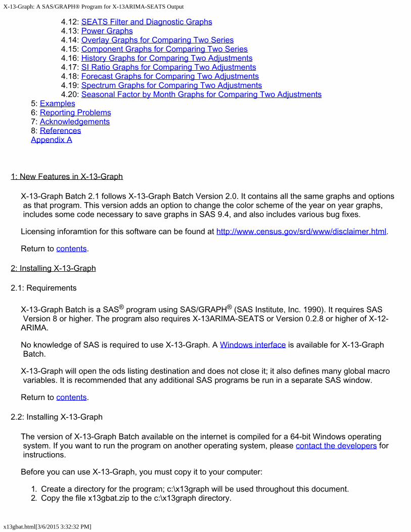
4.12: SEATS Filter and Diagnostic Graphs4.13: Power Graphs4.14: Overlay Graphs for Comparing Two Series4.15: Component Graphs for Comparing Two Series4.16: History Graphs for Comparing Two Adjustments4.17: SI Ratio Graphs for Comparing Two Adjustments4.18: Forecast Graphs for Comparing Two Adjustments4.19: Spectrum Graphs for Comparing Two Adjustments4.20: Seasonal Factor by Month Graphs for Comparing Two Adjustments
5: Examples6: Reporting Problems7: Acknowledgements8: ReferencesAppendix A
1: New Features in X-13-Graph
X-13-Graph Batch 2.1 follows X-13-Graph Batch Version 2.0. It contains all the same graphs and options as that program. This version adds an option to change the color scheme of the year on year graphs, includes some code necessary to save graphs in SAS 9.4, and also includes various bug fixes.
Licensing inforamtion for this software can be found at http://www.census.gov/srd/www/disclaimer.html.
Return to contents.
2: Installing X-13-Graph
2.1: Requirements
X-13-Graph Batch is a SAS® program using SAS/GRAPH® (SAS Institute, Inc. 1990). It requires SAS Version 8 or higher. The program also requires X-13ARIMA-SEATS or Version 0.2.8 or higher of X-12-ARIMA.
No knowledge of SAS is required to use X-13-Graph. A Windows interface is available for X-13-Graph Batch.
X-13-Graph will open the ods listing destination and does not close it; it also defines many global macro variables. It is recommended that any additional SAS programs be run in a separate SAS window.
Return to contents.
2.2: Installing X-13-Graph
The version of X-13-Graph Batch available on the internet is compiled for a 64-bit Windows operating system. If you want to run the program on another operating system, please contact the developers for instructions.
Before you can use X-13-Graph, you must copy it to your computer:
1. Create a directory for the program; c:\x13graph will be used throughout this document.2. Copy the file x13gbat.zip to the c:\x13graph directory.
X-13-Graph: A SAS/GRAPH® Program for X-13ARIMA-SEATS Output
x13gbat.html[3/6/2015 3:32:32 PM]
3. Double Click on x13gbat.zip in Windows® Explorer to uncompress the files.
X-13-Graph Batch consists of a SAS program, a subdirectory with three SAS files, and an images subdirectory, as well as this document. After uncompressing x13gbat.zip, the following files should be in the c:\x13graph directory:
x13gbat.sas x13gbat.html
The c:\x13graph\appl directory should contain the following files:
Namelist.sas7bdatSasmacr.sas7bcat Templt.sas7bcat
There should also be a directory c:\x13graph\images containing examples of the graphs that can be created.
The SAS files in the appl subdirectory must be in that directory for the program to run. The SAS program x13gbat.sas can be stored in any directory.
SAS and SAS/GRAPH software are registered trademarks of the SAS Institute Inc. in the USA and other countries. ® indicates USA registration.
Return to contents.
3: Instructions for Running X-13-Graph in Batch Mode
3.1: Running X-13ARIMA-SEATS in Graphics Mode
Before you can create any graphs with X-13-Graph, you must run X-13ARIMA-SEATS in graphics mode to produce the necessary output files. Running X-13ARIMA-SEATS in graphics mode creates graphics files corresponding to the X-13ARIMA-SEATS options you specified in the .spc file. X-13ARIMA-SEATS also creates a graphics metafile, identified by the extension .gmt, which contains a list of all the graphics output files produced during the X-13ARIMA-SEATS run.
If you run X-13ARIMA-SEATS from an interface like Win X-13, make sure the appropriate option to run in graphics mode is selected. If you run X-13ARIMA-SEATS from the command prompt, you must provide the name of an existing directory after the flag -g; X-13ARIMA-SEATS will store all graphics files in this specified directory. Because of output filename conflicts, this must be a different directory from where other output files are created. For example, when running X-13ARIMA-SEATS with the command
x13a bshors -g c:\x13a\graphics,
the graphics output files for the series bshors will be stored in the directory c:\x13a\graphics. (For more information, see Section 2.7 of the X-13ARIMA-SEATS Reference Manual (U.S. Census Bureau 2013).)
If you have an interface for X-13ARIMA-SEATS, make sure to select the option to run the program in graphics mode.
To obtain graphs for several different series from a single run of this batch program, you must run X-13ARIMA-SEATS in graphics mode with the same directory after the -g option for each series.

X-13-Graph: A SAS/GRAPH® Program for X-13ARIMA-SEATS Output
x13gbat.html[3/6/2015 3:32:32 PM]
Note: The SAS program uses the title statement from the X-13ARIMA-SEATS run to assign secondary titles to the graphs. This allows you to assign meaningful titles to the graphs within the X-13ARIMA-SEATS .spc file. If you are creating graphs for one series at a time, you can also use the subtitle option to assign a subtitle to the graph. Details are given in Section 3.6.4.
Return to contents.
3.2: Additional Files Needed
You will need two additional files to run X-13-Graph: a graph list file, identified by the extension .gls, and a graphics metafile list, identified by the extension .mls. Both files must have the same filename. (The default input filenames in the batch program are x13g.gls and x13g.mls, but these can be changed.)
The graph list file and the graphics metafile list file both must be in the directory specified after the -g option in the X-13ARIMA-SEATS runs.
3.2.1: The Graph List (.gls) File
The graph list file is a list of commands telling the program which graphs to produce.
The basic format of a command in the graph list file is
keyword: element1 <element2 <element3 <element4>>>
The keyword tells the program which type of graph to produce and the elements tell the program which graphical elements to include in the graph.
Important: The keyword must be followed by a colon.
The current version of the program can produce fourteen types of graphs for each series, and seven types of graphs to compare two different series or adjustments.
Graph Types and KeywordsGraph Type KeywordOverlay Graphs overlaySpectrum Graphs spectrumComponent Graphs cmpnentSpecial Seasonal Graphs seasForecast Graphs forecastHistory Graphs history1ACF/PACF graphs acfpacfSliding Spans Graphs sspansOutlier T-Value Graphs tvalue or abtvalueFirst Difference Graphs fstdiffYear-on-Year Graphs yronyrSEATS Filter, Time Shift, and Squared Gain Graphs filterSEATS Diagnostic Graphs seatsPower Graphs powerOverlay Graphs for Two Series overlay2Component Graphs for Two Series cmpnent2History Graphs for Two Adjustments history2

X-13-Graph: A SAS/GRAPH® Program for X-13ARIMA-SEATS Output
x13gbat.html[3/6/2015 3:32:32 PM]
SI Ratio Graphs for Two Adjustments rsi2Forecast Graphs for Two Adjustments fcast2Spectrum Graphs for Two Adjustments spect2Seasonal Overlay Graphs seas2
Examples of graphical elements are the original series, the trend components, the seasonal factors, etc. A list of all possible elements for each type of graph is given in the Details section. With a few exceptions, they have the same abbreviations used by X-13ARIMA-SEATS in the graphics metafile (.gmt). These exceptions are given in Appendix A.
You must give at least one element for each keyword specified, but no more than four elements for each line. The keywords and elements must be on the same line.
You can put many different commands in the graph list file, but each command must be on a separate line. You can ask for a certain type of graph more than once with different elements each time.
For example, to graph the original series by itself, the seasonally adjusted series superimposed with the trend, spectrum plots of both the original series and the seasonally adjusted series, the seasonal factors by month, a component plot for the seasonal factors and the irregular, and a forecast graph on the transformed scale, you would need the following seven commands in the graph list file.
overlay: ori overlay: sa trn spectrum: spcori spcsa seas: sf cmpnent: sf irr forecast: ftr
You can add comment lines, or comment out keywords and the associated options, by putting a # sign in the first column of the line.
The elements you choose should correspond to elements that are available for every series you want to graph. For example, if you ask for a graph of the outlier-adjusted series, there will be an error for every series that does not have an outlier-adjusted series.
The format of the command for overlay graphs for comparing two series and seasonal factor by month graphs for comparing two series is slightly different. See Section 4.14 or Section 4.20 for details.
3.2.2: The Graphics Metafile List (.mls) File
The graphics metafile list file is a list of the series you want to graph. Each series should be listed at the beginning of a separate line, except when comparing two models.
If you want to compare two models using the overlay, component, history, or rsi graphs for two adjustments, then you must enter the names of the two series on the same line in the .mls file. This will produce the comparison graphs you request in the .gls file; additionally, all the remaining graphs you request will be produced for each series as if they had been entered on separate lines. Again, you can add comment lines or comment out series by putting a # sign in the first column of the line.
Return to contents.
3.3: Running the Batch Program
Once X-13ARIMA-SEATS has been run in graphics mode and the .gls and .mls files have been created,
X-13-Graph: A SAS/GRAPH® Program for X-13ARIMA-SEATS Output
x13gbat.html[3/6/2015 3:32:32 PM]
you can run X-13-Graph:
1. Open the SAS system on your operating system. (For example, in Windows, double-click on the SAS icon.)
2. Open the X-13-Graphics Batch program, x13gbat.sas, either by clicking on the open file button or by using the File pull-down menu.
3. Change the SAS libname, default device name, default input filenames, the default graphics directory, and the number of graphs printed on a page, as needed.
Note: SAS uses semicolons to end commands. Each line must end with a semicolon.
a. SAS Libname
Enter the name of the directory where X-13-Graph is installed where the program reads:
%let x13gappl = c:\x13graph\appl;
Typically, the directory would be c:\x13graph\appl on a PC.
b. Device Name
Enter the device name of your printer where the program reads:
%let devname = WIN ;
Setting the device equal to WIN will send the graphs to the screen. Printer device names depend on the printer used. For example, the SAS device name for a LaserJet 5SI PostScript printer is LJ5SIPS. So to print the graphs on a LaserJet 5SI PostScript printer, this line 26 should read:
%let devname = LJ5SIPS ;
To see a list of available SAS devices:
1. Go to the command line. This is the text entry area on the tool bar, usually at the left side. Enter the command dir sashelp to bring up the Directory Window.
2. Double click on the catalog called DEVICES This brings up a list of all the SAS devices available for your version of SAS.
Note: If you are sending the output to a printer, you should disable banner pages before you begin if possible. SAS sends each graph to the printer separately.
c. Input Filenames
Enter the filename of the graph list file and the graphics metafile list file where the program reads:
%let inptfile = x13g ;
For example, if you have named the input files allx13g.gls and allx13g.mls then this line should read:
%let inptfile = allx13g ;
d. Graphics Directory

X-13-Graph: A SAS/GRAPH® Program for X-13ARIMA-SEATS Output
x13gbat.html[3/6/2015 3:32:32 PM]
Enter the name of the graphics directory where the program reads
%let inptdir = c:\x13a\graphics\ ;
The graphics directory is the directory that was specified after the -g option in the X-13ARIMA-SEATS runs.
e. Number of Graphs Per Page
Enter the number of graphs you want printed on each page where the program reads:
%let perpage=1;
The only values allowed are 1, 2, or 3.
Note: All the graphs for one series print, then all the graphs for the next, and so on. If you specify two graphs to print per page, but ask for three graphs for each series, then the third graph for the first series will be on the same page as the first graph for the second series.
4. Once you have made any necessary changes, run x13gbat.sas by clicking the Submit button (the person running) or selecting Submit from the Run pull-down menu.
Return to contents.
3.4: Important Things to Remember
The two input files (the graph list file and the graphics metafile list file) must have the same filename, specified in x13gbat.sas by the inptfile variable.
X-13ARIMA-SEATS must be run in graphics mode with the same directory specified by the -g option for each series listed in the graphics metafile list file. This directory is specified in x13gbat.sas by the inptdir variable. The two input files (the graph list file and the graphics metafile list file) must also be in this directory.
X-13-Graph can only create graphs if the required graphics file was produced by X-13ARIMA-SEATS. Make sure that you run X-13ARIMA-SEATS with the necessary spec or option to create the files you want.
Each keyword in the graph list file must be followed by a colon and then by at least one element. A keyword and its elements must be on the same line. Each command must be on a separate line.
When modifying the SAS program, remember to end each line with a semicolon.
Return to contents.
3.5: Output Options
To display graphs in SAS or to send them to a printer, see the discussion on Device Name in Section 3.3. This section describes to how save graphs. You can save each graph to its own file, or you can save all graphs in one file.
To save each graph individually:
1. Set the devname. SAS allows you to save a graph in many formats; this variable selects the file type. Options include pdf, gif, png, jpeg, bmp, or dib.

X-13-Graph: A SAS/GRAPH® Program for X-13ARIMA-SEATS Output
x13gbat.html[3/6/2015 3:32:32 PM]
2. Set graphoutdir as the directory to which the graphs should be saved.
3. Name the files using the graphfilename option. This sets a base name for the graphs; each new graph has a number appended to this base name. So %let graphfilename = X13Graphs; may create graphs X13Graphs1.png, X13Graphs2.png, etc. To let the base name be the name of the series, set %let graphfilename = series.
To save graphs in one file:
1. Set psappend to yes (to create one file for all the graphs) or to series (to create one file per series). Keep in mind that if the file you're writing to exists, the new graphs will be appended to the end.
2. Set devname to ps or pscolor for a PostScript file in black and white (ps) or in color (pscolor). This file extracts to a PDF. Set devname to html to save all graphs as .gif files and create an HTML file to view them all.
3. Set graphoutdir as the directory to which the graphs should be saved.
4. Name the file using the graphfilename option. This is ignored if psappend is set equal to series.
Return to contents.
3.6: Global Options in the Batch Program
There are many options available to customize the appearance of the graphs. This is done by changing the value of certain variables which appear at the top of the program. All these variables appear in the first hundred lines of the X-13-Graph Batch program, before the section "Instructions for setting macro variables." Many of these variables are case-sensitive, so follow the instructions for setting them carefully. Also, make certain that each variable definition is followed by a semicolon; the SAS program will not run correctly if there is a missing semicolon.
3.6.1: Subspans
By default, the batch program graphs all available years. To see a shorter span of the series, change the values of substart and subend in the x13gbat.sas program, which read:
%let substart = year.mon; %let subend = year.mon;
Substart is the year and month (or quarter) of the beginning of the desired subspan; subend denotes the end of the subspan. If the value entered is blank or outside the span of the series, the program will default back to the original dates. All dates are in X-13ARIMA-SEATS date format, yyyy.mon, yyyy.mm, or yyyy.q (that is, 2006.Feb, 2006.02, or 2006.1).
Return to contents.
3.6.2: Graph Colors
To change the colors of the graphs and the labels, use the color0 through color6 and colorg variables in the program, which read:

X-13-Graph: A SAS/GRAPH® Program for X-13ARIMA-SEATS Output
x13gbat.html[3/6/2015 3:32:32 PM]
%let color0 = black; %let color1 = blue; ... %let color6=red; %let colorg = black;
Color0 is the color of the graph text: that is, the titles, subtitles, labels, graph values, and footnotes. The default color is black. Color1 through color6 give the colors of the graphs. In graphs with more than one element superimposed, the first is assigned color1, the second color2, and so on. In some graphs, certain gridlines are also assigned these colors. The remainder of the gridlines are assigned the color specified in the variable colorg.
Some options for colors are black, blue, green, red, orange, yellow, pink, purple, magenta, gray, brown, or cyan.
Return to contents.
3.6.3: Line Types and Widths
The line types and widths of the graphs can be changed using the variables ltype1 through ltype6 and lw1 through lw6; the line type of most gridlines can be changed using ltypeg. In graphs with more than one element superimposed, the first is assigned line ltype1 with width lw1, the second ltype2 with width lw2, and so on.
Line types are assigned using a number between 1 and 46; each number requests a specific pattern. The X-13-Graph Batch program supports the following line types:
Other line types available in SAS can be used, but the footnotes in the overlay graphs will not show the correct line when they are used.
The width of the line is a number, usually 1 or 2. The line becomes thicker as the number increases.
The default setting for line types and widths is:
%let ltype1 = 1; %let ltype2 = 21; %let ltype3 = 41; %let ltype4 = 14; %let ltype5 = 20;

X-13-Graph: A SAS/GRAPH® Program for X-13ARIMA-SEATS Output
x13gbat.html[3/6/2015 3:32:32 PM]
%let ltype6 = 26; %let ltypeg = 35; %let lw1 = 2; ... %let lw6 = 2;
Return to contents.
3.6.4: Subtitles, Footnotes, and Labels
The main title of each graph denotes what is being plotted; the graph's subtitle tells which series is being plotted. By default, the subtitle is the title given in the series spec of the .spc file before it is run with the X-13ARIMA-SEATS program. If a title is not supplied, the default subtitle is the series name. However, the subtitle can be changed using the variables subtitle and subtitle2.
If these variables are left blank, the default subtitles will be used. Otherwise, the value of subtitle is used for the first series plotted and the value of subtitle2 is used for the second series for the overlay, component, and history graphs for two adjustments. The subtitle requested should be between the equal sign and the semicolon; quotation marks are not needed. The following is a valid assignment:
%let subtitle=Construction Starts Through 2005;
Use printfootnotes to instruct the program not to print footnotes for overlay, forecast, seasonal, spectrum, tvalue, and history graphs, and not to print axis labels for all graphs. When this variable is set to
%let printfootnotes=no;
the footnotes and graph labels are not printed; otherwise, they are. Setting %let printfootes = all will print ARIMA model information to certain SEATS diagnostic graphs in addition to other footnotes.
Return to contents.
3.6.5: Fonts
The font used for the title and subtitle can be changed using the variable font1, and that of the labels and footnotes can be changed with font2. There are not many fonts available in SAS; a complete list can be found in the catalog Sashelp.Fonts, or using the SAS Help. Some available fonts are:
The default font, used if no font is entered or if the font chosen is not valid, is 'Albany AMT'.
The size of the font can be changed using the fontsize argument. This changes the font as a percentage of the program default. A setting of %let fontsize = 120 will therefore make the font 120% of the default size. The spectrum graphs use the letters S and T printed within the graph to flag visually significant peaks. To change the size of these letters in the graph as a percentage of the default, use the spectsize argument. The size of these letters will change based on many factors, including the

X-13-Graph: A SAS/GRAPH® Program for X-13ARIMA-SEATS Output
x13gbat.html[3/6/2015 3:32:32 PM]
graph size and the output format, so some experimentation may be necessary.
Return to contents.
3.6.6: Y-Axis Options
The values on the y-axis can be changed in two ways: the range of values can be specified, and the values can be scaled by a requested divisor.
To change the range of the graph, a value must be supplied for both the variables yaxmin and yaxmax, the minimum and maximum y-value to be plotted. If desired, a value can also be provided for yaxby, which is used to increment the values. If this variable is left blank, the program will create the increment automatically. If these variables are set to:
%let yaxmin=2000; %let yaxmax=8000; %let yaxby=2000;
then the y-axis will have tick marks at values 2000, 4000, 6000, and 8000. Note that if no tick mark created with yaxby falls on yaxmax, then the maximum y-value will be the largest tick mark less than yaxmax. That is, if yaxmin is 2000, yaxmax is 8000, and yaxby is 2500, the y-axis will have tick marks at 2000, 4500, and 7000. The y-axis will not go all the way to 8000.
To scale the y-axis by a divisor, change the value of the variable ydivisor. For example, if the data ranges from two million to six million, then
%let ydivisor=1000000;
will divide the y-variable by one million, so the y-axis will range from two to six, and will also create the label 'In Millions' for that axis unless the ftnoteyn variable is set to 'N'. If the y-divisor is not a power of ten, then the label will read 'Units=ydivisor.' This label will be printed sideways along the y-axis unless the variable anglelabel is changed to no:
%let anglelabel=no;
In this case, the label will be printed at the top of the y-axis.
If both a change in the range and a change of scale are requested, then the values requested for the y-axis maximum and minimum should be in the original scale.
These options are available for most graphs. However, neither are available for component graphs, seasonal si graphs, or outlier t-value graphs, and the y-divisor option is not available for any element on the log scale, spectrum graphs, seasonal graphs, and seasonal factor history graphs.
Return to contents.
3.6.7: Reference Gridlines
By default, the program automatically creates a reference line at the first month or quarter of the graph. To move the reference lines to another month or quarter in order to highlight some particular month, change the variable gridlinemo. For example,
%let gridlinemo = 7;

X-13-Graph: A SAS/GRAPH® Program for X-13ARIMA-SEATS Output
x13gbat.html[3/6/2015 3:32:32 PM]
will put reference lines at July, if it is a monthly series. The color and style of this reference line can be changed with the variables colorg and ltypeg, as described in Sections 3.6.2 and 3.6.3. A label will automatically be added to the graph indicating which month or quarter the gridline represents unless the ftnoteyn variable is set to no. Note that if the variable gridlinemo is left blank, the reference line will be at the first month or quarter but no label will be included; if the variable gridlinemo is set to 1, then the label 'Gridlines at January' will be added to the graph.
Return to contents.
3.6.8: Noting Trend Uncertainty
When plotting the trend with overlay or overlay2 graphs, you can emphasize the uncertainty of the last few trend estimates by plotting an 'X' for a specified number of points using the variable numtrendx. For example, the assignment
%let numtrendx=3;
would result in the following trend graph:
Return to contents.
3.6.9: Component Graph Formats
When more than one element is requested for the component graphs, the program prints all the requested graphs on one page. If there are two elements, the graphs are printed with the second graph below the first. If there are four elements, the graphs are printed in two columns with two rows each. If there are three elements, the format used to print the graphs can be changed. By default, the program prints the graphs in two rows, with the first two graphs on top and the third below the first, as such:

X-13-Graph: A SAS/GRAPH® Program for X-13ARIMA-SEATS Output
x13gbat.html[3/6/2015 3:32:32 PM]
The variable threegraphformat can be used to change the format, printing the three graphs in one column with three rows, as such:
To print the graphs in two columns, use %let threegraphformat = 2. To print them in one column, use %let threegraphformat = 1.
Return to Component Graphs.
Return to contents.
3.6.10: Year on Year Graph Options
The color scheme of year on year graphs can either use the colors and line types chosen (as described in Section 3.6.2 and 3.6.3), or can use darkening shades of a single color.
To use the colors and line types chosen, use %let YYonecolor = no. Then the first six years will use color1-color6 with the line type and width of line 1; the second six years will use color1-color6 with the line type and width of line 2; and the last six years will use color1-color6 with the line type and width of line 3. If the series is longer than 18 years, only the last 18 years will be graphed.

X-13-Graph: A SAS/GRAPH® Program for X-13ARIMA-SEATS Output
x13gbat.html[3/6/2015 3:32:32 PM]
An alternate color scheme uses a single color; each successive year is a slightly darker shade of the same color. To set this, use the YYonecolor variable, and set it to gray, green, red, or blue. This color scheme helps detect patterns in the series which have changed over time, but can make it hard to identify each individual year. To help, use the dashevery argument. Setting it to 2 will put a dashed line every two years; setting it to 3 will put a dashed line every three years, and so on.
Return to contents.
4: Details of Graphs Available in X-13-Graph Batch
The current version of the program can produce the following types of graphs for each series: overlay graphs, spectrum graphs, component graphs, special seasonal factor graphs, forecast graphs, history graphs, ACF/PACF graphs, outlier t value graphs, first difference graphs, year on year graphs, power graphs. It can also produce overlay graphs, component graphs, history graphs, and rsi graphs for comparing two adjustments.
4.1: Overlay Graphs
You can select from one to three different graphical elements to plot above a single axis. The program superimposes the elements. The order in which the elements are listed determines the order of the names in the title and legend and also the color and line used for each element. The keyword for overlay graphs is overlay.
If any of the elements requested does not exist for a series, then that graph will not be created. For example, if the statement
overlay: oadori trn sa
is in the .gls file, and the series has no outliers, and thus no outlier-adjusted series, then the entire graph will not be created, even if the seasonally adjusted series and the trend component exist.
Note: For overlay graphs, choose series on the same scale, i.e., do not choose elements on the original scale and the log scale. If elements on the original scale and the log scale are requested, the graph will not be created.
X-13-Graph: A SAS/GRAPH® Program for X-13ARIMA-SEATS Output
x13gbat.html[3/6/2015 3:32:32 PM]
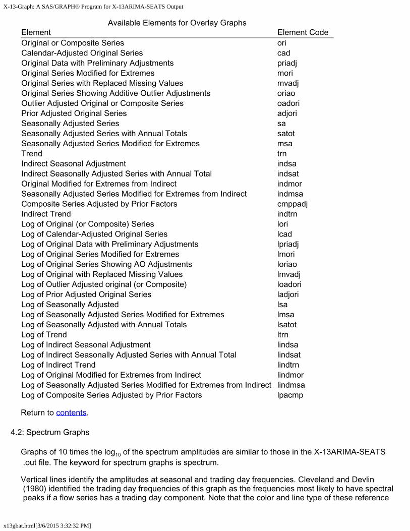
Available Elements for Overlay GraphsElement Element CodeOriginal or Composite Series oriCalendar-Adjusted Original Series cadOriginal Data with Preliminary Adjustments priadjOriginal Series Modified for Extremes moriOriginal Series with Replaced Missing Values mvadjOriginal Series Showing Additive Outlier Adjustments oriaoOutlier Adjusted Original or Composite Series oadoriPrior Adjusted Original Series adjoriSeasonally Adjusted Series saSeasonally Adjusted Series with Annual Totals satotSeasonally Adjusted Series Modified for Extremes msaTrend trnIndirect Seasonal Adjustment indsaIndirect Seasonally Adjusted Series with Annual Total indsatOriginal Modified for Extremes from Indirect indmorSeasonally Adjusted Series Modified for Extremes from Indirect indmsaComposite Series Adjusted by Prior Factors cmppadjIndirect Trend indtrnLog of Original (or Composite) Series loriLog of Calendar-Adjusted Original Series lcadLog of Original Data with Preliminary Adjustments lpriadjLog of Original Series Modified for Extremes lmoriLog of Original Series Showing AO Adjustments loriaoLog of Original with Replaced Missing Values lmvadjLog of Outlier Adjusted original (or Composite) loadoriLog of Prior Adjusted Original Series ladjoriLog of Seasonally Adjusted lsaLog of Seasonally Adjusted Series Modified for Extremes lmsaLog of Seasonally Adjusted with Annual Totals lsatotLog of Trend ltrnLog of Indirect Seasonal Adjustment lindsaLog of Indirect Seasonally Adjusted Series with Annual Total lindsatLog of Indirect Trend lindtrnLog of Original Modified for Extremes from Indirect lindmorLog of Seasonally Adjusted Series Modified for Extremes from Indirect lindmsaLog of Composite Series Adjusted by Prior Factors lpacmp
Return to contents.
4.2: Spectrum Graphs
Graphs of 10 times the log10 of the spectrum amplitudes are similar to those in the X-13ARIMA-SEATS .out file. The keyword for spectrum graphs is spectrum.
Vertical lines identify the amplitudes at seasonal and trading day frequencies. Cleveland and Devlin (1980) identified the trading day frequencies of this graph as the frequencies most likely to have spectral peaks if a flow series has a trading day component. Note that the color and line type of these reference

X-13-Graph: A SAS/GRAPH® Program for X-13ARIMA-SEATS Output
x13gbat.html[3/6/2015 3:32:32 PM]
lines are not controlled with the colorg and ltypeg options, but rather seasonal frequencies use the color2 and ltype2 variables, while trading day frequencies use the color3 and ltype3 variables.
Available Elements for Spectrum GraphsElement Element CodeSpectrum of the Original Series spcoriSpectrum of the Seasonally Adjusted Series spcsaSpectrum of the Modified Irregular spcirrSpectrum of the RegARIMA Residuals spcrsdSpectrum of the Original and Seasonally Adjusted Series (Overlaid) spcosaSpectrum of the Indirect Modified Irregular spciirSpectrum of Indirect Seasonally Adjusted Series spcisa
Return to contents.
4.3: Component Graphs
Component graphs allow you to select from one to four different seasonal decomposition component elements to plot. If you choose more than one, all components are graphed in reduced size on one page. See component graph formats for more information. You can scroll up to see the larger graphs of each component individually. If the selected graphs are of the same type- that is, outlier graphs, or factor graphs- then the graphs will have the same y-axis scale for easy comparisons. The keyword for component graphs is cmpnent.

X-13-Graph: A SAS/GRAPH® Program for X-13ARIMA-SEATS Output
x13gbat.html[3/6/2015 3:32:32 PM]
Available Elements for Factor Component GraphsElement Element CodeCombined Holiday and TD Factors calCombined Holiday and TD Factors (from X11regression) ccalCombined Adjustment Factors cafFinal Adjustment Ratios aratHoliday Factors holIndirect Adjustment Ratios indaratIndirect Combined Adjustment Factors indcafIndirect Irregular indirrIndirect Seasonal Factors indsfIrregular irrIrregular Component Modified for Extremes mirrIrregular Modifed for Extremes from Indirect indmirrPrior Adjustment Factors priorSeasonal Factors sfSeasonal Factors with User-Defined Regressors sfrTrading Day Factors tdTotal Adjustment Factors totadjUser-defined Regression Factors usrdefUser-defined Seasonal Regression Factors rgseasX-11 Easter Factors xeastr
Available Elements for Overlay Component GraphsElement Element
CodeOriginal (or Composite) Series oriCalendar-Adjusted Original Series cadComposite Series Adjusted by Prior Factors cmppadjOriginal Data with Preliminary Adjustments priadjOriginal Series Modified for Extremes mori
X-13-Graph: A SAS/GRAPH® Program for X-13ARIMA-SEATS Output
x13gbat.html[3/6/2015 3:32:32 PM]
Original Series with Replaced Missing Values mvadjOutlier Adjusted Original (or Composite) Series oadoriPrior Adjusted Original Series adjoriSeasonally Adjusted Series saSeasonally Adjusted Series with Annual Totals satotSeasonally Adjusted Series Modified for Extremes msaTrend trnIndirect Seasonal Adjustment indsaIndirect Seasonal Adjustment with Annual Total indsatIndirect Trend indtrnOriginal Modified for Extremes from Indirect indmorSeasonally Adjusted Series Modified for Extremes from Indirect indmsa
Available Elements for Overlay Logs Component GraphsElement Element CodeLog of Original (or Composite) Series loriLog of Original with Replaced Missing Values lmvadjLog of Outlier Adjusted Original (or Composite) loadoriLog of Prior Adjusted Original Series ladjoriLog of Seasonally Adjusted Series lsaLog of Trend ltrn
Available Elements for Outlier Component GraphsElement Element CodeAdditive Outlier Factors aoCombined Outliers otlLevel Shifts lsTemporary Change Outliers tcIndirect Additive Outlier Adjustment Factors indaoIndirect Level Shift Adjustment Factors indls
Available Elements for Outlier Logs Component GraphsElement Element CodeLog of Additive Outlier Factors laoLog of Combined Outliers lotlLog of Level Shifts llsLog of Temporary Change Outliers ltc
Available Elements for Weight Component GraphsElement Element CodeIrregular Weights irrwt
Return to contents.
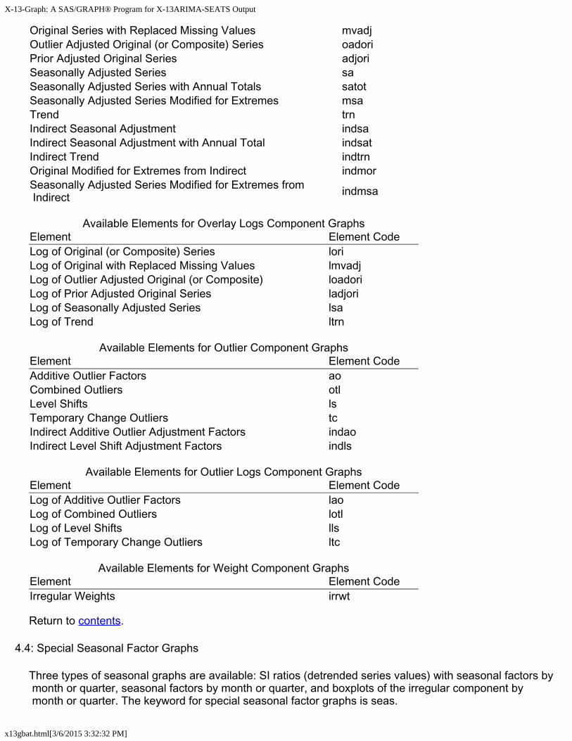
4.4: Special Seasonal Factor Graphs
Three types of seasonal graphs are available: SI ratios (detrended series values) with seasonal factors by month or quarter, seasonal factors by month or quarter, and boxplots of the irregular component by month or quarter. The keyword for special seasonal factor graphs is seas.

X-13-Graph: A SAS/GRAPH® Program for X-13ARIMA-SEATS Output
x13gbat.html[3/6/2015 3:32:32 PM]
Both SI ratio graphs and monthly seasonal factor graphs are due to Cleveland and Terpenning (1982).
SI Ratios with Seasonal Factors by Month or Quarter
When created with the element code si, the program produces as many as 16 graphs. There is one graph for each month or quarter, along with graphs with four months or quarters per page. With monthly series, there is also a graph of all 12 months on one page.
When the element code siall is used, the SI ratio plots for all twelve months or four quarters are graphed on one plot with the same scale.

X-13-Graph: A SAS/GRAPH® Program for X-13ARIMA-SEATS Output
x13gbat.html[3/6/2015 3:32:32 PM]
Seasonal Factors by Month or Quarter
The program graphs seasonal factors by calendar month or quarter. Each calendar period has a year axis drawn at the level of its factor mean. You can graph either the seasonal factors (X-13ARIMA-SEATS's D 10 table) or the combined factors, which are the seasonal, trading day, holiday, and user-defined factors combined (X-13ARIMA-SEATS's D 16 table).
Boxplots of the Irregular Component
You can create boxplots of the irregular component by month to compare the spread of the irregular component for each month.
X-13-Graph: A SAS/GRAPH® Program for X-13ARIMA-SEATS Output
x13gbat.html[3/6/2015 3:32:32 PM]
Available Elements for Special Seasonal Factor GraphsElement Element CodeSI Ratios (Graphed with Replacement Values and Seasonal Factors) siSI Ratios Plots on One Graph siallSeasonal Factors sfCombined Seasonal Factors cafIndirect Seasonal Factors indsfIndirect Combined Seasonal Factors indcafBoxplots of the Irregular Component irrBoxplots of the Indirect Irregular Component indirr
Return to contents.
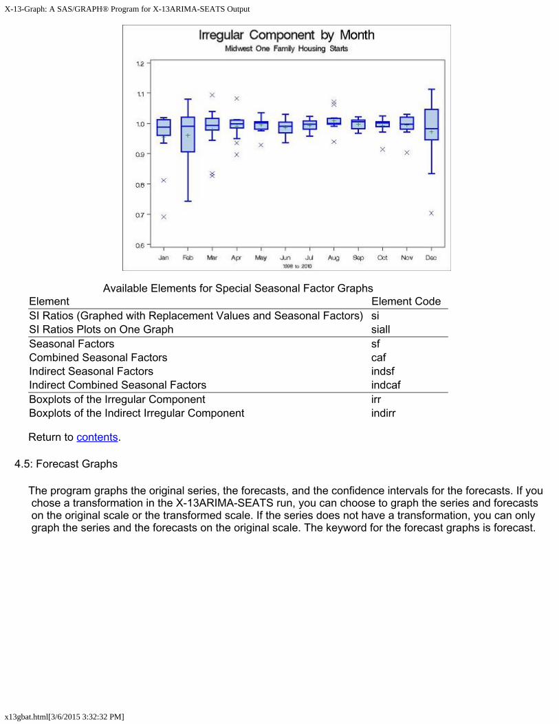
4.5: Forecast Graphs
The program graphs the original series, the forecasts, and the confidence intervals for the forecasts. If you chose a transformation in the X-13ARIMA-SEATS run, you can choose to graph the series and forecasts on the original scale or the transformed scale. If the series does not have a transformation, you can only graph the series and the forecasts on the original scale. The keyword for the forecast graphs is forecast.
X-13-Graph: A SAS/GRAPH® Program for X-13ARIMA-SEATS Output
x13gbat.html[3/6/2015 3:32:32 PM]
Available Elements for Forecast GraphsElement Element Code
Original Series and Forecasts on the Original Scale fctOriginal Series and Forecasts on the Transformed Scale ftr
Return to contents.
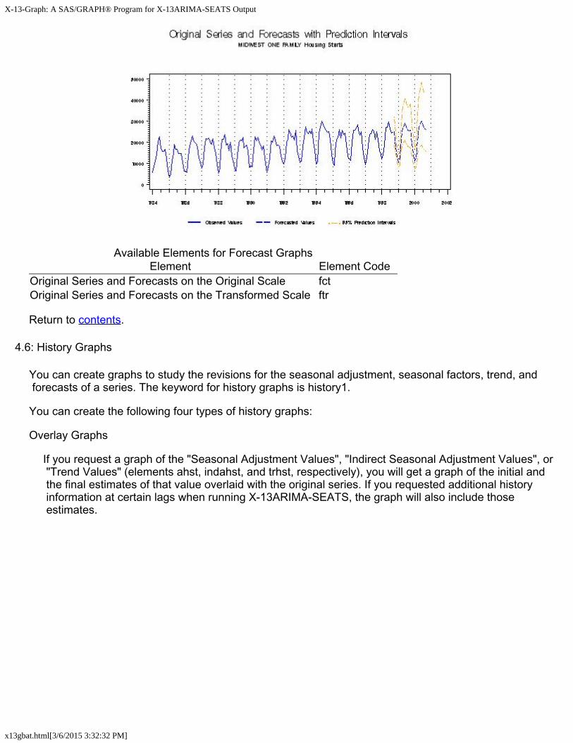
4.6: History Graphs
You can create graphs to study the revisions for the seasonal adjustment, seasonal factors, trend, and forecasts of a series. The keyword for history graphs is history1.
You can create the following four types of history graphs:
Overlay Graphs
If you request a graph of the "Seasonal Adjustment Values", "Indirect Seasonal Adjustment Values", or "Trend Values" (elements ahst, indahst, and trhst, respectively), you will get a graph of the initial and the final estimates of that value overlaid with the original series. If you requested additional history information at certain lags when running X-13ARIMA-SEATS, the graph will also include those estimates.

X-13-Graph: A SAS/GRAPH® Program for X-13ARIMA-SEATS Output
x13gbat.html[3/6/2015 3:32:32 PM]
Seasonal Factor Graphs
Graphs of the seasonal factor history plot the initial and the final seasonal factor estimates by calendar period. For each month or quarter, the final seasonal factors are plotted as a line and the initial seasonal factors as circles, and a year axis is drawn at the period's factor mean.
Percent Change Graphs
Three graphs are created when "Percent Changes in the Seasonal Adjustment Values" or "Percent Changes in the Trend Values" (elements csahst and ctrhst, respectively) are requested. Each graph plots two of the following for each observation: the percent change (from the previous observation) of the final estimate, the percent change of the initial estimate, and the percent change of the original series. Each is plotted as a circle or diamond, with a vertical line connecting them.
X-13-Graph: A SAS/GRAPH® Program for X-13ARIMA-SEATS Output
x13gbat.html[3/6/2015 3:32:32 PM]
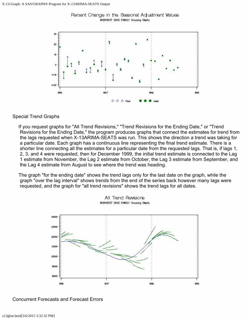
Special Trend Graphs
If you request graphs for "All Trend Revisions," "Trend Revisions for the Ending Date," or "Trend Revisions for the Ending Date," the program produces graphs that connect the estimates for trend from the lags requested when X-13ARIMA-SEATS was run. This shows the direction a trend was taking for a particular date. Each graph has a continuous line representing the final trend estimate. There is a shorter line connecting all the estimates for a particular date from the requested lags. That is, if lags 1, 2, 3, and 4 were requested, then for December 1999, the initial trend estimate is connected to the Lag 1 estimate from November, the Lag 2 estimate from October, the Lag 3 estimate from September, and the Lag 4 estimate from August to see where the trend was heading.
The graph "for the ending date" shows the trend lags only for the last date on the graph, while the graph "over the lag interval" shows trends from the end of the series back however many lags were requested, and the graph for "all trend revisions" shows the trend lags for all dates.
Concurrent Forecasts and Forecast Errors
X-13-Graph: A SAS/GRAPH® Program for X-13ARIMA-SEATS Output
x13gbat.html[3/6/2015 3:32:32 PM]
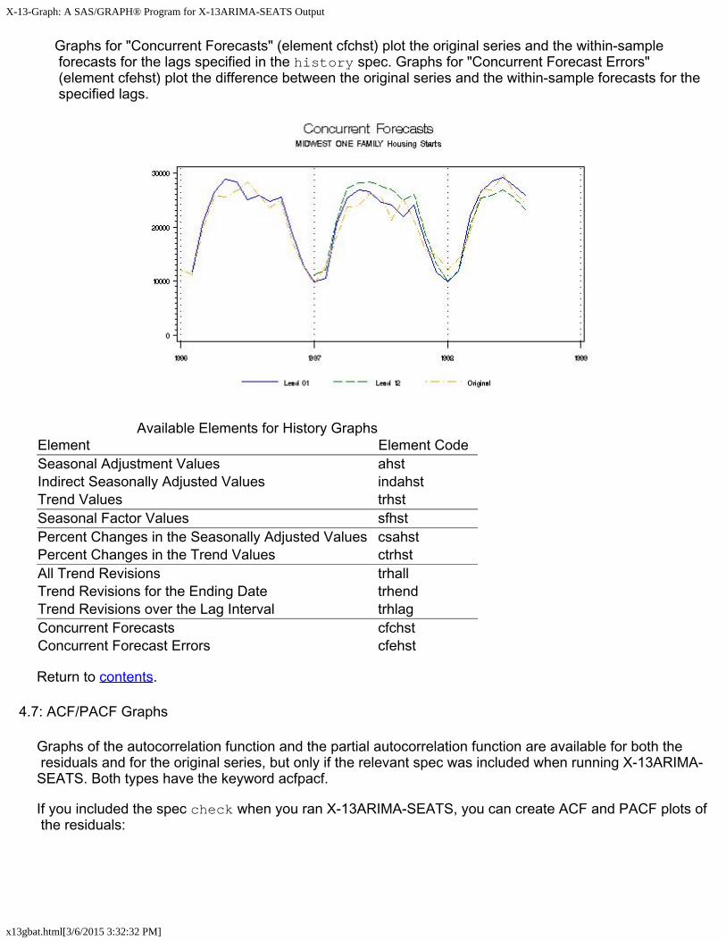
Graphs for "Concurrent Forecasts" (element cfchst) plot the original series and the within-sample forecasts for the lags specified in the history spec. Graphs for "Concurrent Forecast Errors" (element cfehst) plot the difference between the original series and the within-sample forecasts for the specified lags.
Available Elements for History GraphsElement Element CodeSeasonal Adjustment Values ahstIndirect Seasonally Adjusted Values indahstTrend Values trhstSeasonal Factor Values sfhstPercent Changes in the Seasonally Adjusted Values csahstPercent Changes in the Trend Values ctrhstAll Trend Revisions trhallTrend Revisions for the Ending Date trhendTrend Revisions over the Lag Interval trhlagConcurrent Forecasts cfchstConcurrent Forecast Errors cfehst
Return to contents.
4.7: ACF/PACF Graphs
Graphs of the autocorrelation function and the partial autocorrelation function are available for both the residuals and for the original series, but only if the relevant spec was included when running X-13ARIMA-SEATS. Both types have the keyword acfpacf.
If you included the spec check when you ran X-13ARIMA-SEATS, you can create ACF and PACF plots of the residuals:

X-13-Graph: A SAS/GRAPH® Program for X-13ARIMA-SEATS Output
x13gbat.html[3/6/2015 3:32:32 PM]
If you included the identify spec, you can create ACF and PACF plots from the original series. The program will create an ACF and a PACF graph for each combination of differencing and seasonal differencing that was given in the identify spec. That is, if you asked for nonseasonal differencing of 0 and 1 and seasonal differencing of 0 and 1 when you ran X-13ARIMA-SEATS, you will get eight graphs; the order of differencing is included in the subtitle:
Available Elements for ACF/PACF GraphsElement Element CodeACF Plot (from Check Spec) acfPACF Plot (from Check Spec) pacfACF of the Squared Residuals acf2ACF and PACF Plots (from Identity Spec) idacf
Return to contents.
4.8: Outlier T-Value Graphs
X-13-Graph: A SAS/GRAPH® Program for X-13ARIMA-SEATS Output
x13gbat.html[3/6/2015 3:32:32 PM]
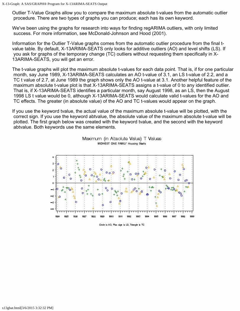
Outlier T-Value Graphs allow you to compare the maximum absolute t-values from the automatic outlier procedure. There are two types of graphs you can produce; each has its own keyword.
We've been using the graphs for research into ways for finding regARIMA outliers, with only limited success. For more information, see McDonald-Johnson and Hood (2001).
Information for the Outlier T-Value graphs comes from the automatic outlier procedure from the final t-value table. By default, X-13ARIMA-SEATS only looks for additive outliers (AO) and level shifts (LS). If you ask for graphs of the temporary change (TC) outliers without requesting them specifically in X-13ARIMA-SEATS, you will get an error.
The t-value graphs will plot the maximum absolute t-values for each data point. That is, if for one particular month, say June 1989, X-13ARIMA-SEATS calculates an AO t-value of 3.1, an LS t-value of 2.2, and a TC t value of 2.7, at June 1989 the graph shows only the AO t-value at 3.1. Another helpful feature of the maximum absolute t-value plot is that X-13ARIMA-SEATS assigns a t-value of 0 to any identified outlier. That is, if X-13ARIMA-SEATS identifies a particular month, say August 1998, as an LS, then the August 1998 LS t value would be 0, although X-13ARIMA-SEATS would calculate valid t-values for the AO and TC effects. The greater (in absolute value) of the AO and TC t-values would appear on the graph.
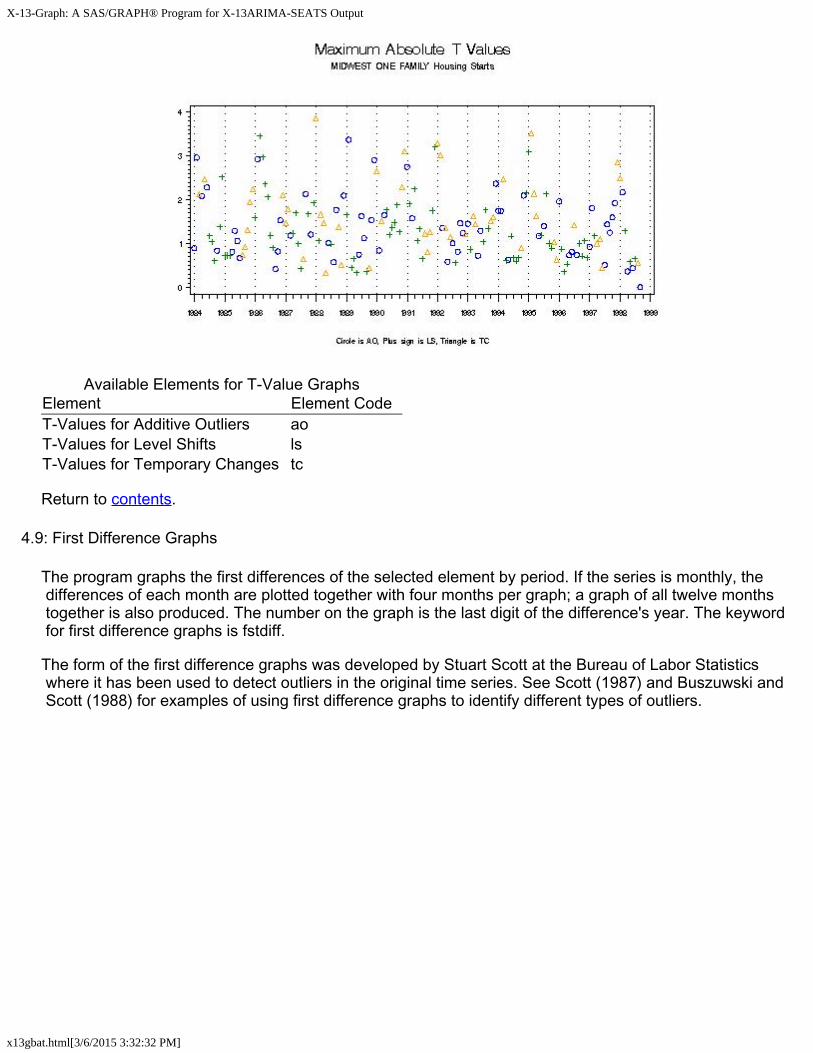
If you use the keyword tvalue, the actual value of the maximum absolute t-value will be plotted, with the correct sign. If you use the keyword abtvalue, the absolute value of the maximum absolute t-value will be plotted. The first graph below was created with the keyword tvalue, and the second with the keyword abtvalue. Both keywords use the same elements.
X-13-Graph: A SAS/GRAPH® Program for X-13ARIMA-SEATS Output
x13gbat.html[3/6/2015 3:32:32 PM]
Available Elements for T-Value GraphsElement Element CodeT-Values for Additive Outliers aoT-Values for Level Shifts lsT-Values for Temporary Changes tc
Return to contents.
4.9: First Difference Graphs
The program graphs the first differences of the selected element by period. If the series is monthly, the differences of each month are plotted together with four months per graph; a graph of all twelve months together is also produced. The number on the graph is the last digit of the difference's year. The keyword for first difference graphs is fstdiff.
The form of the first difference graphs was developed by Stuart Scott at the Bureau of Labor Statistics where it has been used to detect outliers in the original time series. See Scott (1987) and Buszuwski and Scott (1988) for examples of using first difference graphs to identify different types of outliers.

X-13-Graph: A SAS/GRAPH® Program for X-13ARIMA-SEATS Output
x13gbat.html[3/6/2015 3:32:32 PM]
Available Elements for First Difference GraphsElement Element CodeOriginal Series oriCalendar-Adjusted Original Series cadOriginal Series Adjusted by Prior Factors priadjOriginal Series Modified for Extremes moriOriginal Series with Missing Values Replaced mvadjPrior-Adjusted Original Series adjoriSeasonally Adjusted Series saSeasonally Adjusted Series Modified for Extremes msaTrend Cycle trnComposite Series Adjusted by Prior Factors pacmp

X-13-Graph: A SAS/GRAPH® Program for X-13ARIMA-SEATS Output
x13gbat.html[3/6/2015 3:32:32 PM]
Indirect Seasonally Adjusted Series indsaSeasonal Adjustment Modified for Extremes from Indirect indmsaIndirect Trend indtrnOriginal Series Modified for Extremes from Indirect indmori
Return to contents.
4.10: Year on Year Graphs
Year on Year graphs plot the requested element by year in order to look for seasonal patterns in the data. The keyword for these graphs is yronyr.
The program will graph only 18 years of data. If the series is longer then 18 years, then the last 18 will be graphed. To change this span, use the subspan option.
Available Elements for Year on Year GraphsElement Element CodeOriginal Series oriCalendar-Adjusted Original Series cadOriginal Series Adjusted by Prior Factors priadjOriginal Series Modified for Extremes moriOriginal Series with Missing Values Replaced mvadjPrior-Adjusted Original Series adjoriSeasonally Adjusted Series saSeasonally Adjusted Series Modified for Extremes msaTrend Cycle trnComposite Series Adjusted by Prior Factors pacmpIndirect Seasonally Adjusted Series indsaSeasonal Adjustment Modified for Extremes from Indirect indmsaIndirect Trend indtrnOriginal Series Modified for Extremes from Indirect indmori
Return to contents.

X-13-Graph: A SAS/GRAPH® Program for X-13ARIMA-SEATS Output
x13gbat.html[3/6/2015 3:32:32 PM]
4.11: Sliding Spans Graphs
The sliding spans diagnostic creates up to four overlapping subspans of your data, seasonally adjusts each subspan, and compares the resulting seasonally adjusted values. To create graphs for this diagnostic, use the keyword sspans.
You can create four types of sliding spans graphs. The first is an overlay graph of the seasonal factors of each span; if the percent difference between the largest and smallest value is greater than the cutoff value, usually 3, this graph will also show dots indicating the maximum and minimum value.

X-13-Graph: A SAS/GRAPH® Program for X-13ARIMA-SEATS Output
x13gbat.html[3/6/2015 3:32:32 PM]

X-13-Graph: A SAS/GRAPH® Program for X-13ARIMA-SEATS Output
x13gbat.html[3/6/2015 3:32:32 PM]
You can also create a graph of these maximum percent differences chronologically, by year, or by month or quarter. In each case, a horizontal line showing the cutoff value will also be graphed.
These four graphs can be created for the seasonal factors (or seasonally adjusted value, depending on your transformation type), the month-to-month or quarter-to-quarter percent changes of the seasonally adjusted series, the indirect seasonal factors, and the indirect month-to-month or quarter-to-quarter percent changes.
Available Elements for Sliding Spans GraphsElement Element CodeSeasonal Factors of Spans sfspanMaximum Percent Difference (MPD) of Seasonal Factors sfmpdMPD of Seasonal Factors by Year sfmpdyMPD of Seasonal Factors by Period sfmpdpPeriod-to-Period Seasonal Adjustment Changes of Spans chspanMPD of Period-to-Period Changes chmpdMPD of Period-to-Period Changes by Year chmpdyMPD of Period-to-Period Changes by Period chmpdpIndirect Seasonal Factors of Spans isfspanMPD of Indirect Seasonal Factors isfmpdMPD of Indirect Seasonal Factors by Year isfmpdyMPD of Indirect Seasonal Factors by Period isfmpdpIndirect Period-to-Period Seasonal Adjustment Changes of Spans ichspanMPD of Indirect Period-to-Period Changes ichmpdMPD of Indirect Period-to-Period Changes by Year ichmpdyMPD of Indirect Period-to-Period Changes by Period ichmpdp

X-13-Graph: A SAS/GRAPH® Program for X-13ARIMA-SEATS Output
x13gbat.html[3/6/2015 3:32:32 PM]
Return to contents.
4.12: SEATS Filter and Diagnostic Graphs
Four types of graphs using two keywords can be created for SEATS adjustments. Note that to create these graphs, X-13 must be run with out=0 or out=2 in the seats spec.
To graph filters used in SEATS adjustments and their time shifts and squared gains, use the keyword filter. You can list up to four elements on each line of the graph list file (.gls) for these filter graphs. Each filter will be plotted in its own graph; however, all the requested time shift graphs found on one line will be plotted together, as will all requested squared gain graphs.

X-13-Graph: A SAS/GRAPH® Program for X-13ARIMA-SEATS Output
x13gbat.html[3/6/2015 3:32:32 PM]
Available Elements for SEATS Filter GraphsElement Element CodeConcurrent Seasonal Adjustment Filter fltsacConcurrent Trend Filter flttrnc

X-13-Graph: A SAS/GRAPH® Program for X-13ARIMA-SEATS Output
x13gbat.html[3/6/2015 3:32:32 PM]
Symmetric Seasonal Adjustment Filter fltsafSymmetric Trend Filter flttrnfTime Shift of Concurrent Seasonal Adjustment Filter tssacTime Shift of Concurrent Trend Filter tstrncSquared Gain of Concurrent Seasonal Adjustment Filter sgsacSquared Gain of Concurrent Trend Filter sgtrncSquared Gain of Symmetric Seasonal Adjustment Filter sgsafSquared Gain of Symmetric Trend Filter sgtrnf
SEATS diagnostic graphs can be graphed using the keyword seats. These show the fully differenced SEATS seasonal adjustment or SEATS trend, and the seasonal period length sums of the SEATS seasonal factors. See the X-13ARIMA-SEATS manual (U.S. Census Bureau, 2012) for more information.

X-13-Graph: A SAS/GRAPH® Program for X-13ARIMA-SEATS Output
x13gbat.html[3/6/2015 3:32:32 PM]
Available Elements for SEATS Diagnostic GraphsElement Element CodeFully Differenced SEATS Seasonal Adjustment seatdsaFully Differenced SEATS Trend seatdtrSeasonal Period Length Sums of the SEATS Seasonal Factors seatssm
Return to contents.
4.13: Power Graphs
Power graphs are plots of the original series with a Box-Cox power transformation applied. The keyword for these graphs is power. The elements for these graphs is the Box-Cox power λ . Setting λ = 1 will produce a graph of the original series; λ = 0 produces a graph of the logged series.

X-13-Graph: A SAS/GRAPH® Program for X-13ARIMA-SEATS Output
x13gbat.html[3/6/2015 3:32:32 PM]
Return to contents.
4.14: Overlay Graphs for Comparing Two Series
Overlay graphs of two series can be produced to compare the adjustments. The keyword for these graphs is overlay2.
These overlay graphs need two different models to compare. Enter the names of the graphics metafiles for the two models on the same line in the graphics metafile list file (the .mls file). An example is given in the examples below.
Up to three elements can be chosen for each series. The elements do not have to be the same for each series. In the graphics list file (the .gls file), list the elements for the first series after the colon after overlay2. If the elements for the second series are the same as those for the first series, you do not need to enter anything else. If different elements are required for the second series, put another colon on the same line, and list the elements for the second series. So, to create a graph with the original series and the seasonally adjusted series of the first model and the seasonally adjusted series for the second series, put the line
overlay2: ori sa: sa
in the .gls file.

X-13-Graph: A SAS/GRAPH® Program for X-13ARIMA-SEATS Output
x13gbat.html[3/6/2015 3:32:32 PM]
The elements available for these graphs match those for overlay graphs.
Return to contents.
4.15: Component Graphs for Comparing Two Series
You can compare the components of two different adjustments using the keyword cmpnent2.
When you request a component graph to compare two series, the program creates two graphs: the plots of the component for each series on one page, and either the difference or the ratio between the values of that component for each series. The ratio is graphed when the element is either a factor or the irregular and the adjustment is multiplicative, and the difference is graphed otherwise.
As two models are being compared, the two series must both be named on the same line in the graphics metafile list (the .mls file). An example of this is in the examples below.

X-13-Graph: A SAS/GRAPH® Program for X-13ARIMA-SEATS Output
x13gbat.html[3/6/2015 3:32:32 PM]
The elements available for these graphs are the same as those for component graphs.
Return to contents.
4.16: History Graphs for Comparing Two Adjustments
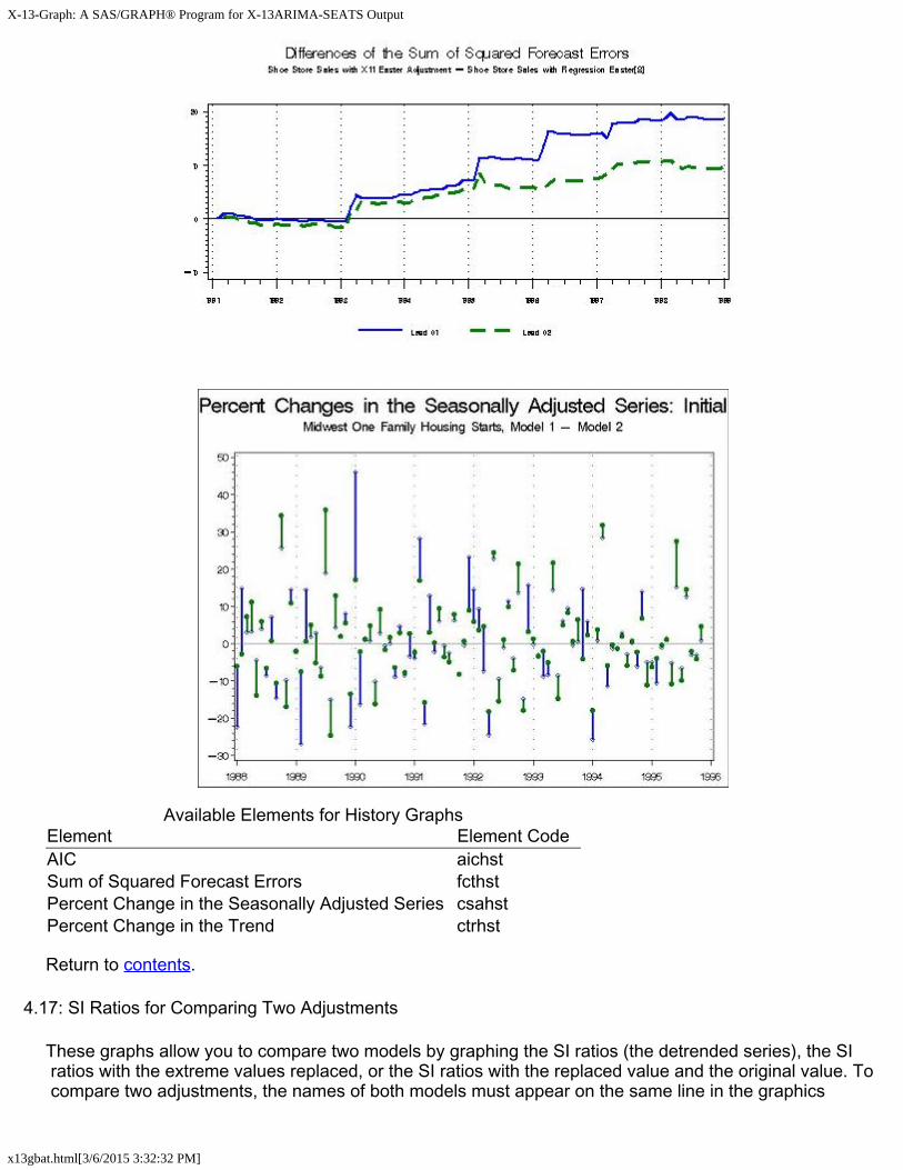
History graphs allow you to compare two models by looking at the AIC Differences History and the Sum of Squared Forecast Error Differences History. For the Sum of Squared Forecast Error Differences graph, the program superimposes all available forecast lags on a single graph. The keyword for history graphs is history2.
These history graphs are discussed in Findley, Monsell, Bell, Otto and Chen (1998) and are related to diagnostics presented in Findley (1990, 1991).
You can also create graphs of the Percent Changes in the Seasonally Adjusted Series or the Trend. Two graphs are created when these elements are requested. One plots the month-to-month change of the concurrent adjustment for both series, connected by a vertical line to highlight the difference. The second does the same for the final adjustment.
History graphs require graphics output from two different models to compare. You must enter the names of the graphics metafiles for the two different models for the history graph on the same line in the graphics metafile list file. An example graphics metafile list file (.mls) is given in the examples below.
X-13-Graph: A SAS/GRAPH® Program for X-13ARIMA-SEATS Output
x13gbat.html[3/6/2015 3:32:32 PM]
Available Elements for History GraphsElement Element CodeAIC aichstSum of Squared Forecast Errors fcthstPercent Change in the Seasonally Adjusted Series csahstPercent Change in the Trend ctrhst
Return to contents.
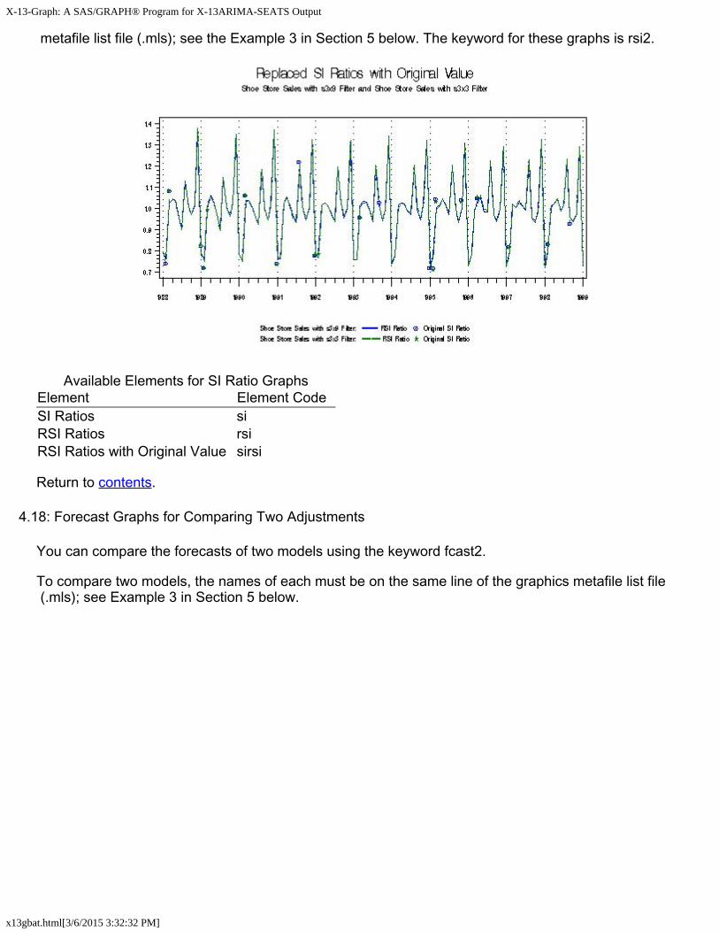
4.17: SI Ratios for Comparing Two Adjustments
These graphs allow you to compare two models by graphing the SI ratios (the detrended series), the SI ratios with the extreme values replaced, or the SI ratios with the replaced value and the original value. To compare two adjustments, the names of both models must appear on the same line in the graphics
X-13-Graph: A SAS/GRAPH® Program for X-13ARIMA-SEATS Output
x13gbat.html[3/6/2015 3:32:32 PM]
metafile list file (.mls); see the Example 3 in Section 5 below. The keyword for these graphs is rsi2.
Available Elements for SI Ratio GraphsElement Element CodeSI Ratios siRSI Ratios rsiRSI Ratios with Original Value sirsi
Return to contents.
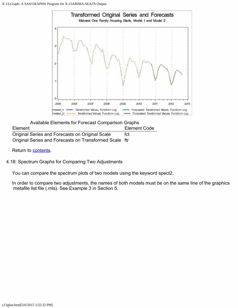
4.18: Forecast Graphs for Comparing Two Adjustments
You can compare the forecasts of two models using the keyword fcast2.
To compare two models, the names of each must be on the same line of the graphics metafile list file (.mls); see Example 3 in Section 5 below.
X-13-Graph: A SAS/GRAPH® Program for X-13ARIMA-SEATS Output
x13gbat.html[3/6/2015 3:32:32 PM]
Available Elements for Forecast Comparison GraphsElement Element CodeOriginal Series and Forecasts on Original Scale fctOriginal Series and Forecasts on Transformed Scale ftr
Return to contents.
4.18: Spectrum Graphs for Comparing Two Adjustments
You can compare the spectrum plots of two models using the keyword spect2.
In order to compare two adjustments, the names of both models must be on the same line of the graphics metafile list file (.mls). See Example 3 in Section 5.

X-13-Graph: A SAS/GRAPH® Program for X-13ARIMA-SEATS Output
x13gbat.html[3/6/2015 3:32:32 PM]
Available Elements for Spectrum Comparison GraphsElement Element CodeSpectrum of the Original Series spcoriSpectrum of the Seasonally Adjusted Series spcsaSpectrum of the Irregular spcirrSpectrum of the RegARIMA Residuals spcrsdSpectrum of the Indirect Modified Irregular spciirSpectrum of Indirect Seasonally Adjusted Series spcisa
Return to contents.
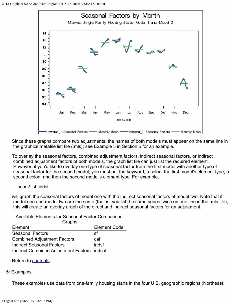
4.20: Seasonal Factor by Month Graphs for Comparing Two Adjustments
Use the keyword seas2 to plot the seasonal factors by month for two adjustments on one graph.
X-13-Graph: A SAS/GRAPH® Program for X-13ARIMA-SEATS Output
x13gbat.html[3/6/2015 3:32:32 PM]
Since these graphs compare two adjustments, the names of both models must appear on the same line in the graphics metafile list file (.mls); see Example 3 in Section 5 for an example.
To overlay the seasonal factors, combined adjustment factors, indirect seasonal factors, or indirect combined adjustment factors of both models, the graph list file can just list the required element. However, if you'd like to overlay one type of seasonal factor from the first model with another type of seasonal factor for the second model, you must put the keyword, a colon, the first model's element type, a second colon, and then the second model's element type. For example,
seas2: sf: indsf
will graph the seasonal factors of model one with the indirect seasonal factors of model two. Note that if model one and model two are the same (that is, you list the same series twice on one line in the .mls file), this will create an overlay graph of the direct and indirect seasonal factors for an adjustment.
Available Elements for Seasonal Factor Comparison Graphs
Element Element CodeSeasonal Factors sfCombined Adjustment Factors cafIndirect Seasonal Factors indsfIndirect Combined Adjustment Factors indcaf
Return to contents.
5: Examples
These examples use data from one-family housing starts in the four U.S. geographic regions (Northeast,
X-13-Graph: A SAS/GRAPH® Program for X-13ARIMA-SEATS Output
x13gbat.html[3/6/2015 3:32:32 PM]
South, Midwest, and West), as well as the U.S. total one family housing starts. The X-13ARIMA-SEATS spec files are called ne1.spc, mw1.spc, so1.spc, and we1.spc, with tot1F.spc containing the composite spec to create the U.S. total. To run this series, a metafile is needed. The contents of this file, called starts.mta, are:
ne1 mw1 so1 we1 tot1F
Before creating any graphs, X-13ARIMA-SEATS must run this metafile in graphics mode. To do this, enter x13a -m starts -g c:\x13a\graphics in DOS. The -m option informs the program that this is a metafile, the -g option instructs X-13ARIMA-SEATS to produce the graphics output files needed, and the directory after the -g is the destination for the output files.
After the graphics output files have been produced, you are ready to run the X-13-Graph Batch program.
Example 1
Goal: To learn to set up the files needed to run the X-13-Graph Batch program.
Suppose you wish to compare the original series with the seasonally adjusted series for all four regions and for the total, and the original series with the outlier-adjusted series in the case of those series with outliers.
The first step is to create the .mls and .gls files. These must have the same name; use the name starts. As you want graphs for all five series, the starts.mls file is
ne1 mw1 so1 we1 tot1F
Note that this looks just like the metafile used to run X-13ARIMA-SEATS. The starts.gls file is
overlay: ori sa overlay: ori indsa overlay: ori oadori
The first command produces the graph of the original series and the seasonally adjusted series superimposed. The second overlay statement compares the original series with the seasonally adjusted series from the indirect adjustment. As this element exists only for the composite series, tot1F, X-13-Graph produces this graph only for that one series. The third command creates a graph of the original series and the outlier-adjusted series. The series for the South and for the composite have no outliers, so overlay graphs from the third statement are not created for these series.
Next, in x13gbat.sas, set the value of the variable inptfile equal to starts and the value of inptdir equal to the directory specified after the -g option when X-13ARIMA-SEATS was run. Submit the program by pressing the submit button (the running man), or by selecting submit from the Run pull down menu.
Once the program has run, there will be nine graphs. Examples of them follow:

X-13-Graph: A SAS/GRAPH® Program for X-13ARIMA-SEATS Output
x13gbat.html[3/6/2015 3:32:32 PM]
This is the graph of the original and the seasonally adjusted series of the Northeast data. Similar graphs exist for the other three regions and for the U.S. total.
This graph is the original series for the U.S. totals, along with the seasonally adjusted series from the indirect adjustment. It is the only graph produced from the overlay: ori indsa statement in the .gls file.
X-13-Graph: A SAS/GRAPH® Program for X-13ARIMA-SEATS Output
x13gbat.html[3/6/2015 3:32:32 PM]
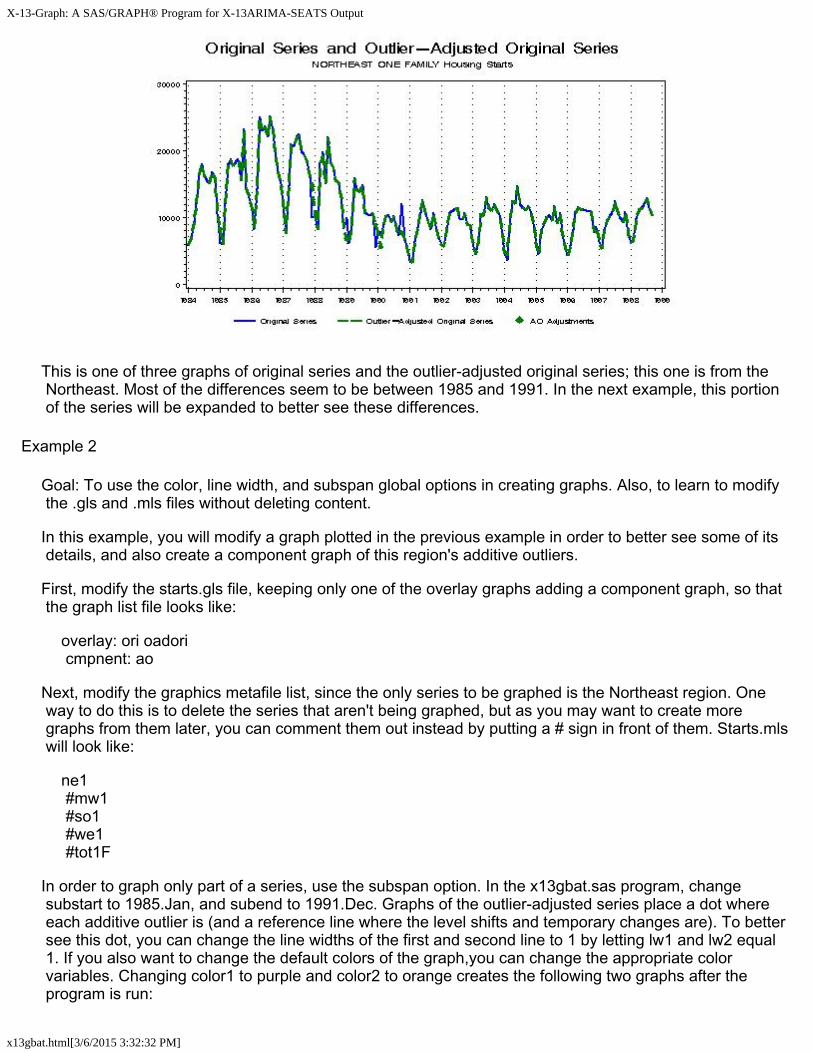
This is one of three graphs of original series and the outlier-adjusted original series; this one is from the Northeast. Most of the differences seem to be between 1985 and 1991. In the next example, this portion of the series will be expanded to better see these differences.
Example 2
Goal: To use the color, line width, and subspan global options in creating graphs. Also, to learn to modify the .gls and .mls files without deleting content.
In this example, you will modify a graph plotted in the previous example in order to better see some of its details, and also create a component graph of this region's additive outliers.
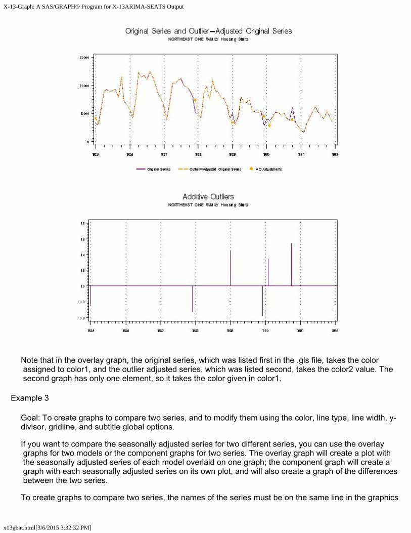
First, modify the starts.gls file, keeping only one of the overlay graphs adding a component graph, so that the graph list file looks like:
overlay: ori oadori cmpnent: ao
Next, modify the graphics metafile list, since the only series to be graphed is the Northeast region. One way to do this is to delete the series that aren't being graphed, but as you may want to create more graphs from them later, you can comment them out instead by putting a # sign in front of them. Starts.mls will look like:
ne1 #mw1 #so1 #we1 #tot1F
In order to graph only part of a series, use the subspan option. In the x13gbat.sas program, change substart to 1985.Jan, and subend to 1991.Dec. Graphs of the outlier-adjusted series place a dot where each additive outlier is (and a reference line where the level shifts and temporary changes are). To better see this dot, you can change the line widths of the first and second line to 1 by letting lw1 and lw2 equal 1. If you also want to change the default colors of the graph,you can change the appropriate color variables. Changing color1 to purple and color2 to orange creates the following two graphs after the program is run:
X-13-Graph: A SAS/GRAPH® Program for X-13ARIMA-SEATS Output
x13gbat.html[3/6/2015 3:32:32 PM]
Note that in the overlay graph, the original series, which was listed first in the .gls file, takes the color assigned to color1, and the outlier adjusted series, which was listed second, takes the color2 value. The second graph has only one element, so it takes the color given in color1.
Example 3
Goal: To create graphs to compare two series, and to modify them using the color, line type, line width, y-divisor, gridline, and subtitle global options.
If you want to compare the seasonally adjusted series for two different series, you can use the overlay graphs for two models or the component graphs for two series. The overlay graph will create a plot with the seasonally adjusted series of each model overlaid on one graph; the component graph will create a graph with each seasonally adjusted series on its own plot, and will also create a graph of the differences between the two series.
To create graphs to compare two series, the names of the series must be on the same line in the graphics
X-13-Graph: A SAS/GRAPH® Program for X-13ARIMA-SEATS Output
x13gbat.html[3/6/2015 3:32:32 PM]
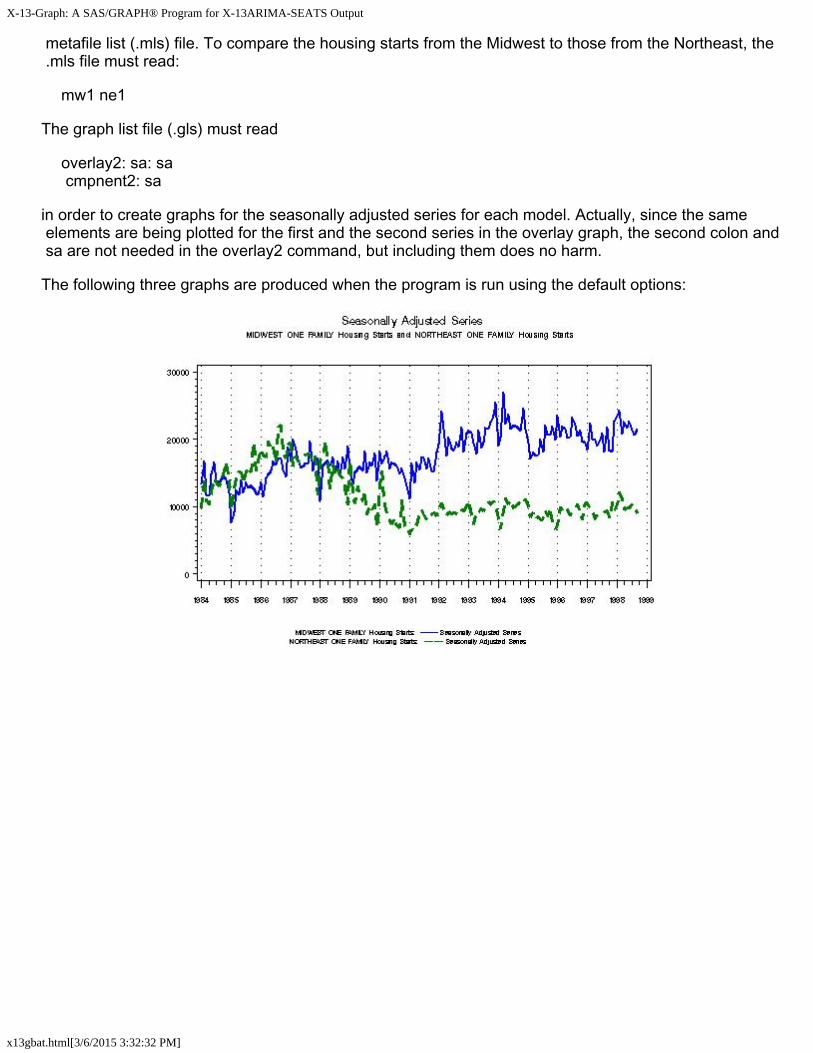
metafile list (.mls) file. To compare the housing starts from the Midwest to those from the Northeast, the .mls file must read:
mw1 ne1
The graph list file (.gls) must read
overlay2: sa: sa cmpnent2: sa
in order to create graphs for the seasonally adjusted series for each model. Actually, since the same elements are being plotted for the first and the second series in the overlay graph, the second colon and sa are not needed in the overlay2 command, but including them does no harm.
The following three graphs are produced when the program is run using the default options:
X-13-Graph: A SAS/GRAPH® Program for X-13ARIMA-SEATS Output
x13gbat.html[3/6/2015 3:32:32 PM]
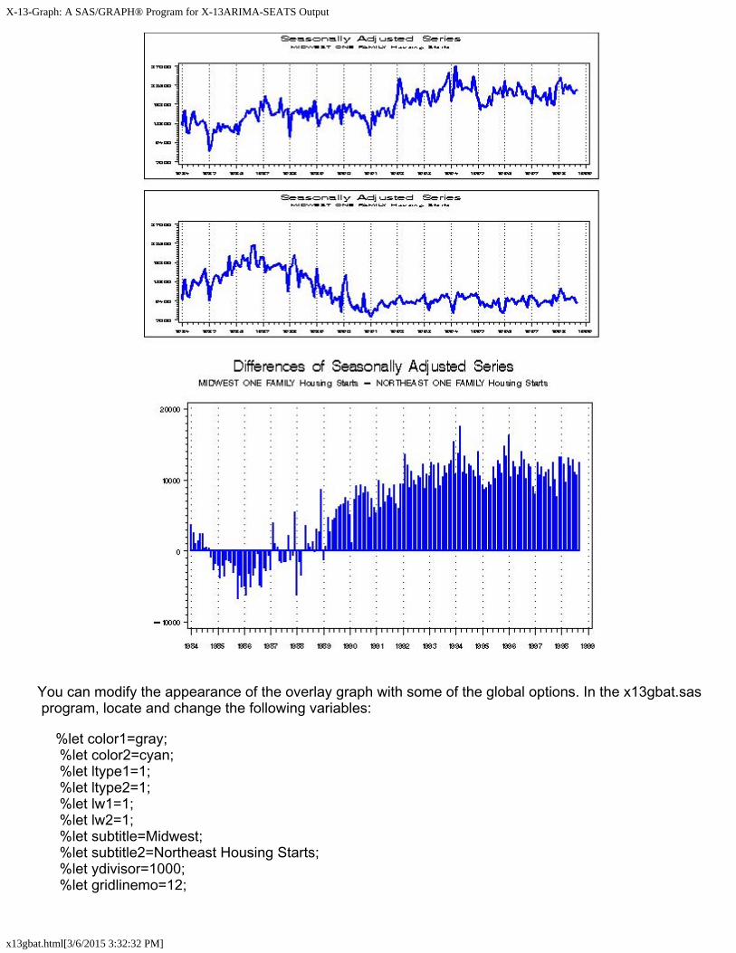
You can modify the appearance of the overlay graph with some of the global options. In the x13gbat.sas program, locate and change the following variables:
%let color1=gray; %let color2=cyan; %let ltype1=1; %let ltype2=1; %let lw1=1; %let lw2=1; %let subtitle=Midwest; %let subtitle2=Northeast Housing Starts; %let ydivisor=1000; %let gridlinemo=12;
X-13-Graph: A SAS/GRAPH® Program for X-13ARIMA-SEATS Output
x13gbat.html[3/6/2015 3:32:32 PM]
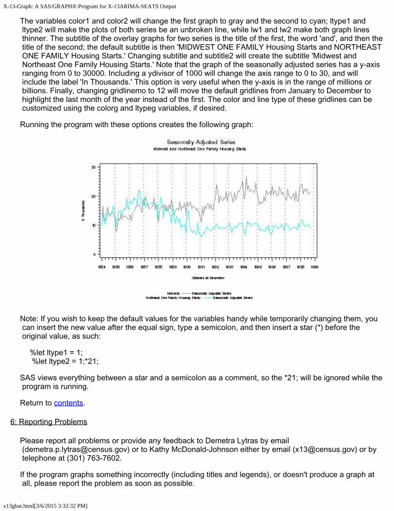
The variables color1 and color2 will change the first graph to gray and the second to cyan; ltype1 and ltype2 will make the plots of both series be an unbroken line, while lw1 and lw2 make both graph lines thinner. The subtitle of the overlay graphs for two series is the title of the first, the word 'and', and then the title of the second; the default subtitle is then 'MIDWEST ONE FAMILY Housing Starts and NORTHEAST ONE FAMILY Housing Starts.' Changing subtitle and subtitle2 will create the subtitle 'Midwest and Northeast One Family Housing Starts.' Note that the graph of the seasonally adjusted series has a y-axis ranging from 0 to 30000. Including a ydivisor of 1000 will change the axis range to 0 to 30, and will include the label 'In Thousands.' This option is very useful when the y-axis is in the range of millions or billions. Finally, changing gridlinemo to 12 will move the default gridlines from January to December to highlight the last month of the year instead of the first. The color and line type of these gridlines can be customized using the colorg and ltypeg variables, if desired.
Running the program with these options creates the following graph:
Note: If you wish to keep the default values for the variables handy while temporarily changing them, you can insert the new value after the equal sign, type a semicolon, and then insert a star (*) before the original value, as such:
%let ltype1 = 1; %let ltype2 = 1;*21;
SAS views everything between a star and a semicolon as a comment, so the *21; will be ignored while the program is running.
Return to contents.
6: Reporting Problems
Please report all problems or provide any feedback to Demetra Lytras by email ([email protected]) or to Kathy McDonald-Johnson either by email ([email protected]) or by telephone at (301) 763-7602.
If the program graphs something incorrectly (including titles and legends), or doesn't produce a graph at all, please report the problem as soon as possible.

X-13-Graph: A SAS/GRAPH® Program for X-13ARIMA-SEATS Output
x13gbat.html[3/6/2015 3:32:32 PM]
To help us diagnose the problem, it is helpful if we have
1. the X-13ARIMA-SEATS data file,2. the X-13ARIMA-SEATS .spc file,3. the .mls, .gmt and .gls files, and4. a copy of the SAS Log from that X-13-Graph run.
The SAS Log will be in the file x13GbatLog.sas, located in the directory in which the program is installed, typically c:\x13graph\appl.
Return to contents.
7: Acknowledgements
Brian Monsell wrote the basic SAS code for reading in the X-13ARIMA-SEATS files and for the SI ratio graphs. David Findley and Brian Monsell provided valuable suggestions for the design of the graphs and the documentation. Kellie C. Wills wrote the SAS code for many of the graphs. Many thanks to everyone who gave us suggestions.
Return to contents.
8: References
Buszuwski, J.S. and S. Scott (1988), "On the Use of Intervention Analysis in Seasonal Adjustment," Proceedings of the Business and Economic Statistics Section, American Statistical Association, Alexandria, VA, 337-342.
Cleveland, W.S. and I. Terpenning (1982), "Graphical Methods for Seasonal Adjustment," Journal of the American Statistical Association , 77, 52-72.
Findley, D.F. (1990), "Making Difficult Model Comparisons Graphically," Proceedings of the Section on Survey Research Methods, American Statistical Association, Alexandria, VA.
Findley, D.F. (1991), "Model Selection for Multi-Step-Ahead Forecasting," Proceedings of the Business and Economic Statistics Section, American Statistical Association, Alexandria, VA.
Findley, D.F., B.C. Monsell, W.R. Bell, M.C. Otto and B.-C. Chen (1998). "New Capabilities and Methods of the X-12-ARIMA Seasonal Adjustment Program," Journal of Business and Economic Statistics , 16, 127-177 (with discussion).
McDonald-Johnson, K. and C.C. Hood (2001), "Outlier Selection for RegARIMA Models," to appear in the Proceedings of the Business and Economic Statistics Section, American Statistical Association, Alexandria, VA.
SAS Institute, Inc. (1990), SAS/GRAPH® Software: Reference, Version 6, First Edition, Volumes 1 and 2, Cary, NC: SAS Institute, Inc.
Scott,S. (1987), "On the Impact of Outliers on Seasonal Adjustment," Proceedings of the Business and Economic Statistics Section, American Statistical Association, Alexandria, VA, 469-474.
U.S. Census Bureau (2012), X-13ARIMA-SEATS Reference Manual, Washington, DC.

X-13-Graph: A SAS/GRAPH® Program for X-13ARIMA-SEATS Output
x13gbat.html[3/6/2015 3:32:32 PM]
Return to contents.
Return to top.