Embed Size (px)
Citation preview

Writing for the Web
Hints and Tips for Good Web Content

The University’s Web Presence• To clearly inform prospective students, their
influencers, researchers, potential members of staff, and other stakeholders about the activities of the University of Bradford with the aim of them choosing to study, research, work or engage with the University.

• We don’t have one website – we have many, so need to make the journey as easy for users as possible as they won’t know how we are structured or where things ‘live’.
• The journey can start anywhere – external home, School home, random page etc.
• Should be user oriented not internally structured.• Must be useful and usable.
A University website?

How People ‘use’ Websites• People ‘scan’ web pages!• Aid ‘scannability’ by:
– Using headings.– Using meaningful links.– Using bulleted / numbered lists.– Using short paragraphs.– Using concise text.– Using good quality images.– Being credible.
• Studies show that teenagers have lower patience levels and poorer reading skills.
Source: Nielsen, Useit.com,www.useit.com/alertbox/reading_pattern.html

Why Users ‘Scan’ Web Pages• Computer screen reading 25% slower than
paper.• The web is a ‘user driven’ medium.• Information foraging – users want information
quickly.• Large, dense paragraphs off putting – too ‐
much work!

Define a Purpose for your Content1. What is the business goal?2. What action do you want from the user?3. What are you trying to communicate, and who with?4. How will you know when you’ve met the objectives?
• If you can’t define a clear purpose the content is ‐probably not needed.
• Demonstrate, don’t preach.

Your Content Should Be …

Could be Improved …

2 Good Examples

Before …
After …

The Best Place for the Content• Imagine you’re the user – think where you’d
look for the information.• Easy to find, navigable.• Information architecture.
Avoid Duplication• Bad for SEO, accessibility and content
management.• Put the content in the right place in the first
place.• Use links within content to refer back to pages
(50% of clicks normally within content area not navigation). Source: Nielsen www.useit.com.

Examples of Avoiding Duplication
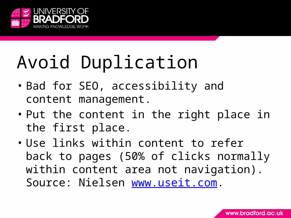
Headings• Important for:
– Accessibility (screen readers).– Search engine optimisation (SEO).
• Separate content.• Define the structure
of a webpage.• Separate content and
assist ‘scannability’.

Before …

After …

Images• Dimensions (nothing more than 800px wide).• Placement.• When uploading to Site Manager:
– include a good name and a full stop.
– use padding, margins and float.• See the Web Team’s Style Guide for help

Documents• Provide links to both a Word and pdf version
of the document.• All documents must be accessible. A course is
available: www.bradford.ac.uk/dev-prog/it/index.php?course=WD-A.
• When uploading to Site Manager, include a good name and the file type and size.

You Should …• Make the info you want to convey obvious.• Be clear and concise – don’t ramble.• Give the user what they have come for.• Include elements for presentation – images, bullets
etc.• Use as few words as possible, while being
conversational.• Avoid large blocks of information.
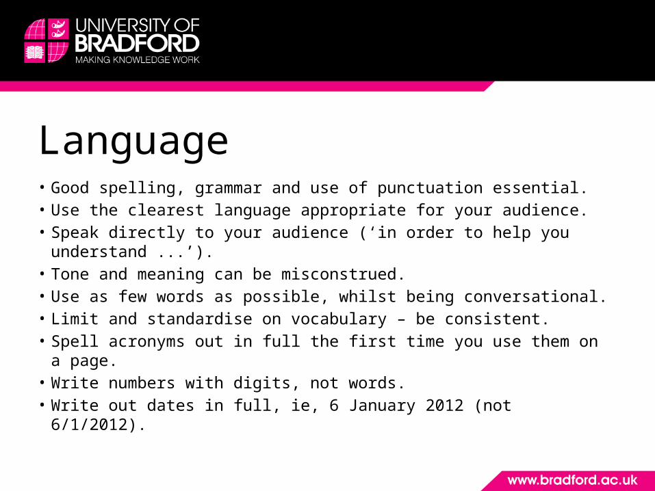
Language• Good spelling, grammar and use of punctuation essential.• Use the clearest language appropriate for your audience.• Speak directly to your audience (‘in order to help you
understand ...’).• Tone and meaning can be misconstrued.• Use as few words as possible, whilst being conversational.• Limit and standardise on vocabulary – be consistent.• Spell acronyms out in full the first time you use them on a page.• Write numbers with digits, not words.• Write out dates in full, ie, 6 January 2012 (not 6/1/2012).
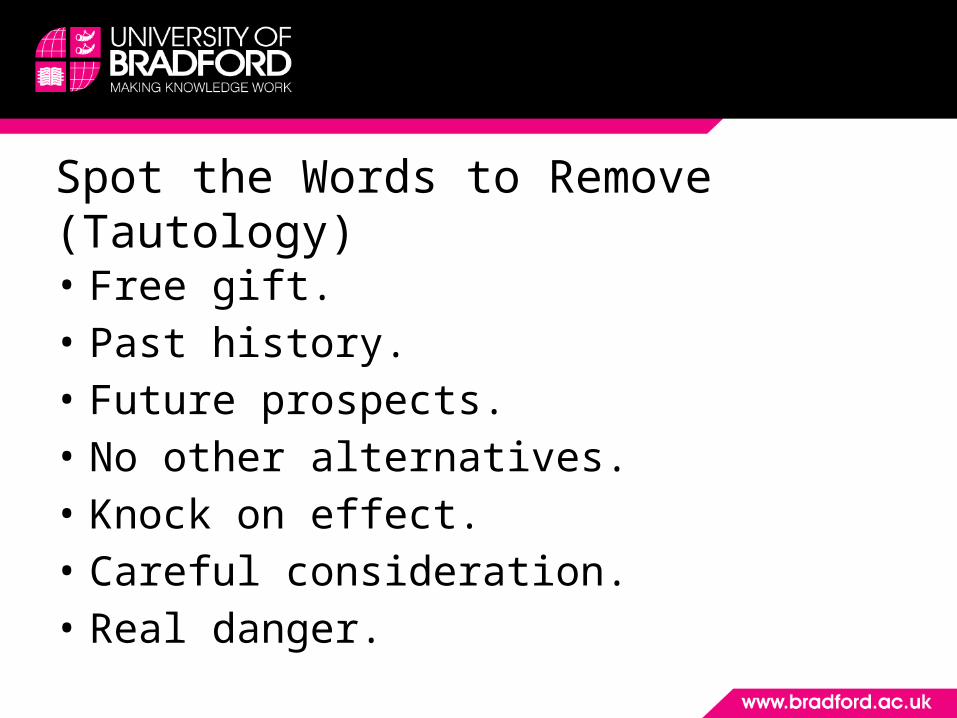
Spot the Words to Remove (Tautology)• Free gift.• Past history.• Future prospects.• No other alternatives.• Knock on effect.• Careful consideration.• Real danger.
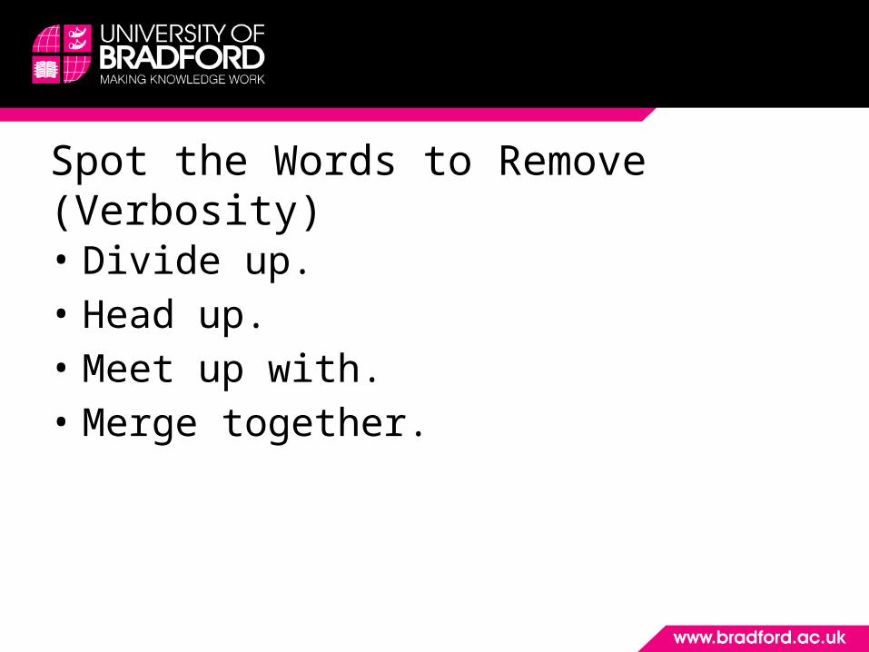
Spot the Words to Remove (Verbosity)• Divide up.• Head up.• Meet up with.• Merge together.
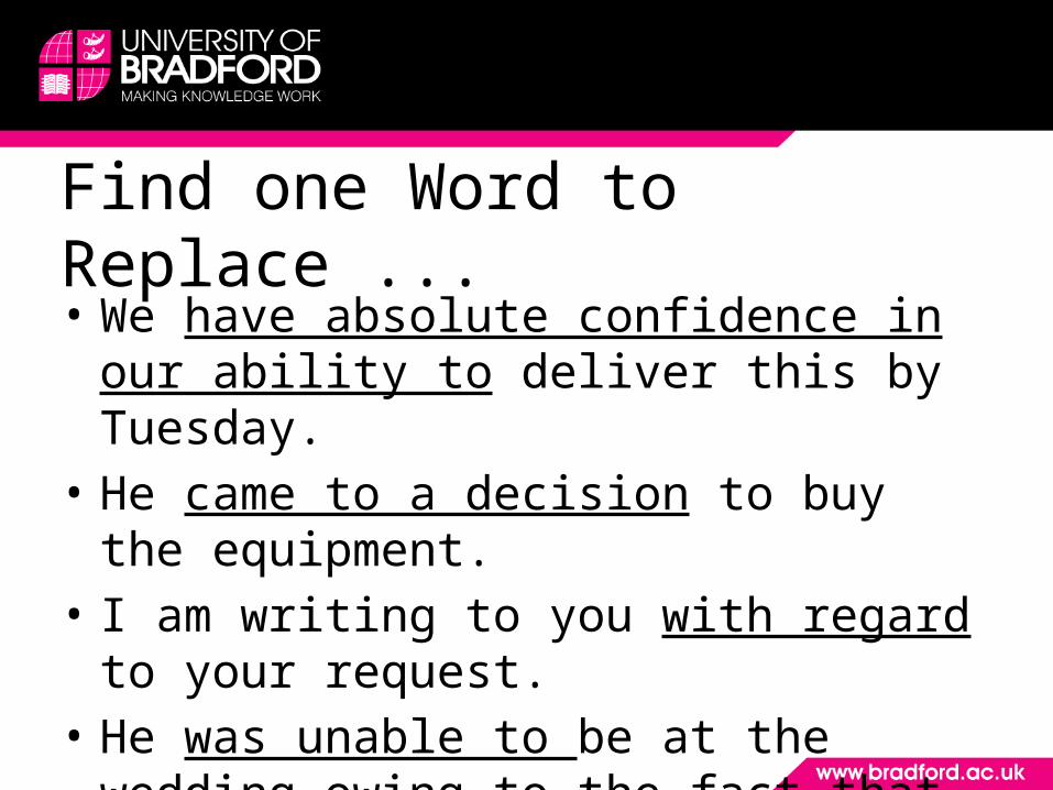
Find one Word to Replace ...• We have absolute confidence in our ability to
deliver this by Tuesday.• He came to a decision to buy the equipment.• I am writing to you with regard to your
request.• He was unable to be at the wedding owing to
the fact that he had broken his arm.

Use one Word ...• Make an application.• Make use of.• In the vicinity of.• In the event that.• Despite the fact that.
Avoid …• Jargon and slang (eg say ‘content management system’ rather than ‘cms’) .• Over use of italics, underlining, emphasis, punctuation and capitalisation.• Dialect.• Pompous words.• Cliches.• Justified text.• Negative expressions – say things in a positive way eg:
‘don’t use’ – say ‘avoid’.‘not many’ – say ‘few’.
• Anything that looks like an advert.• Exclamation marks.

10 Good Techniques1. Front loading
Most important information first.2. Using headings with proper structuring
Making content scannable – first 11 characters test.
3. Using keyword-rich headings and textHelping to achieve search engine rankings.

4. Be objectiveBe factual and avoid exaggeration. Avoid ‘marketing’ speak.
5. Be conciseKeep text to a minimum. Keep it simple.
6. Include a call to actionAsk your audience to act – “Call us on ...”, or “Complete this questionnaire”.
7. Keyword phrasesUse phrases rather than single keywords in your metadata.

8. Use passive voice for headingsAnother way to front load copy.
9. Links• Use links within content.• Link text must be clear and concise, should make sense
out of context – avoid “click here” or the full hyperlink.
10.Use a good page titleUsed by search engines, Favourites folder and window title.

Common mistakes on the UoB site1. Duplication• of content already on the top-level university site - link to it instead of
duplicating it.• of information within the same micro-site.
2. Content / writing• Copy that is written for print format - particularly long paragraphs and too
much information on one page, lack of clear call to action, most important information not appearing at the start.
• Content that is not always useful or appropriate for the user – or at least it isn’t coming across.
• Too many ‘Welcome to the xxx Site’ instances.

3. Links• Inappropriate link names eg “click here”.• Links that open in a new tab or window (accessibility).• Inappropriate hyperlink names - using the full web
address.
4. Formatting• Overuse of italics and bold (use sparingly).• Underlining text (never do this – it looks like a hyperlink).• Long paragraphs.

Proof Reading and Managing Content• Use the ‘Preview’ button in Site Manager - check pages are
clear and easy to read. Check that large blocks of text are not presented as capitals or italics.
• Think about the purpose of the content and the audience – does the page achieve it?
• Proof read – yourself and ask someone else.• Credible websites are up-to-date. Add expiry dates in Site
Manager to time sensitive content.• Add review dates in Site Manager to ensure your content is
checked periodically.
•Manually check that pages are clear and easy to read. Check that large blocks of text are not presented as capitals or italics.

Site Manager Reminders• Moderators must always add URIs when adding a
new section - important for search engines (SEO).• All lower case with hyphens between words, eg:
• what-we-do• access-and-widening-participation
www.bradford.ac.uk/sled/what-we-do

• Changing page names and URIs affects links. Any previous links to the page will be broken – so avoid changing page names and URIs unless absolutely necessary.
• Use the Review Date, Expiry Date and Publish date functions in the Options section when modifying content.
Resources• See
www.bradford.ac.uk/marketing-and-communications/web-team/ for:– Tutorials / guides for specific templates in Site
Manager.– Best practice.– Training courses.
•Manually check that pages are clear and easy to read. Check that large blocks of text are not presented as capitals or italics.