Embed Size (px)
Citation preview

Worth a Thousand Words: How to Display Health Data
February 2014

22
Introduction
California HealthCare Foundation l www.chcf.org
Organizations with access to health data face difficult decisions about how best to visualize these data for clarity, storytelling, and impact. This presentation serves as a guide to select the best visualization options for your data, and explains how to get started on the path to better data presentation.
The presentation will explore:
1. Case Study: Columbus County, NC
2. How to Present Data Visually: Toolkit
3. How to Get Started Visualizing Data
4. Strategies for Sharing Your Data
5. Resources & Inspiration
Note: Throughout this presentation, web links are embedded for more information on the examples given when available.

33
Spreadsheets Aren't the Answer
To better communicate findings and implications, take data out of its native spreadsheet or database to conduct analysis in a way not possible through simply reviewing a spreadsheet. The visual representation of the data must help you communicate it better.
Keep in mind that others may have good ideas for how to communicate the data, so it is also very valuable offer a data download or, even better, an API into the data.
California HealthCare Foundation l www.chcf.org
1. Case Study:Columbus County, NC

55
Columbus County, North Carolina
"Eat smart. Move more."This simple message is now shared in schools, churches, and county offices.
Even a call to the health department is greeted with a recording of Director Kimberly Smith reminding residents to take a brisk 30-minute walk every day and to eat more fruits and vegetables.
But it wasn’t always this way… So, why the change?
California HealthCare Foundation l www.chcf.org

6
.
Columbus County Ranked Last in
NC HealthThe County Health Rankings look at multiplefactors that affect health, including: Access to care Smoking and other unhealthy behaviors Air quality Socio-economic factors such as poverty
The results prompted the health department to initiate a public education campaign to call attention to the issue and improve community health by focusing on the basics.
Columbus County Ranks Last in North Carolina Health. Source: County Health Rankings, March 2010, University of Wisconsin Population Health Institute and the Robert Wood Johnson Foundation.
California HealthCare Foundation l www.chcf.org
CLICK TO VIEW

77
We're seeing more activity now...People are making an effort.”– Kimberly Smith,Columbus County Health Director
Smoking was banned in county buildings.
A van began bringing fruits and vegetables to residents in rural areas.
About 20 county employees joined a local version of “The Biggest Loser” weight-loss competition for eight weeks. County commissioners showed their support by weighing-in at each meeting.
Smith and her colleagues have relentlessly promoted the “Eat smart; Move more” message to schools, churches, hospital groups, civic clubs, and other county offices.
California HealthCare Foundation l www.chcf.org
CLICK TO VIEW

88
Data Visualize Action
Columbus County Uses Visually Engaging Data in New Campaign
It’s all part of the county’s plan to turn its ranking around by getting more people engaged inphysical activity and healthier eating habits.
California HealthCare Foundation l www.chcf.org

2. How to Present Data Visually: Toolkit

10
Speak with Numbers
“Keep it simple.”
Your role is to translate often incredibly complex data into simple messages. By selecting the right numbers that best tellyour story, and using appropriate typography techniques to highlight these figures, you'lljoin the ranks of simple data presentation leaders.
California HealthCare Foundation l www.chcf.org
Source: “Visualizing Alcohol Use” by Phlebotomist.net.
Highlight key facts and figures with style and brevity
CLICK TO VIEW

11
Tables & Rankings
Tables are useful when presenting data sliced by multiple variables (such as diabetes screenings by race and gender)
Tips: Leave plenty of white space between
figures and highlight major numbers and sections, as in this County Health Rankings example
Clearly label columns. Make sure they are "frozen" when users scroll vertically
Avoid using too many columns, which will force users to scroll horizontally
Provide links or tooltips to additional information about the measures
Source: Compare Counties in California, County Health Rankings, Robert Wood Johnson Foundation.
Present multiple data points in digestible way
California HealthCare Foundation l www.chcf.org
CLICK TO VIEW

12
Bar Charts
An excellent choice for highlighting disparities
Horizontal bars allow for the inclusion of more metrics
Bar charts play on humans’ inherent ability to draw quicker conclusions based on side-by-side lengths
AARP Chart: Why It Works
This stacked chart allows the eyes to easily compare state and national averages.
Bright orange dots showing federal targets offer another access point, clearly indicating the differences in usage rates and target goals.
Source: Use of Preventive Services Among People 50-64 years of age, California vs. US national average, AARP.
Highlight independent elements and compare values
California HealthCare Foundation l www.chcf.org
CLICK TO VIEW

13
Line Graphs
A simple line graph cleanly plotsspecific values
Demonstrates trends over time This line graph expertly uses dots and
colored lines to show that as womenage, fertility rates decrease
Avoid confusion by using less thanfive lines
Source: Fertility Rates Decline With Age, Shady Grove Fertility.
Connect time and trends
California HealthCare Foundation l www.chcf.org
CLICK TO VIEW

14
Pie Charts
This pie chart uses four slices and contrasting colors to highlight the percentage of visits various traveling workers made to clinics.
It can be difficult for readers to differentiate among similarly sized slices. So consider alternatives to pie charts, such as a stacked bar chart (see next page). If you use a pie chart, consider:
Tips: Use five or fewer slices (segments of
data) Pie charts work well when presenting
large differences among data Smaller slices are difficult to read and
slight differences are difficult to discern Don’t compare data sets with side-by-side
pie charts
Source: East African Health Clinic Visits by Traveling Worker, “East Africa Health Care That Moves,” North Star Alliance.
Display proportional segments ofa whole
California HealthCare Foundation l www.chcf.org
CLICK TO VIEW

15
Stacked Bar Charts
Stacked charts are optimal for comparing multiple instances and/or variations of the same part of the whole (e.g. over time)
For example, this stacked bar chart from the Kaiser Family Foundation displays multiple components of health spending
Three sets of colored bars show historical growth in health spending by year, that are then broken down further by GDP, inflation, and “excess” health spending growth
Source: Historical Growth in Health Spending,Kaiser Family Foundation.
Highlight variation; Another way to show
parts of a whole
California HealthCare Foundation l www.chcf.org
CLICK TO VIEW
16
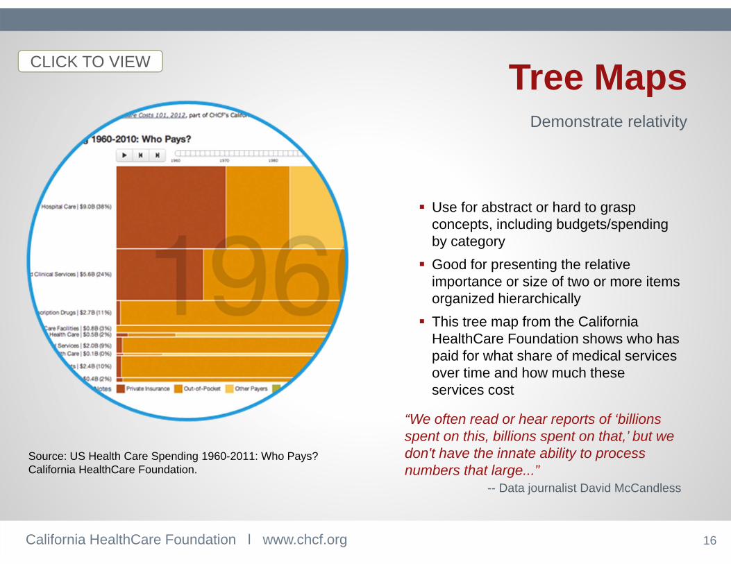
Tree Maps
Use for abstract or hard to grasp concepts, including budgets/spendingby category
Good for presenting the relative importance or size of two or more items organized hierarchically
This tree map from the California HealthCare Foundation shows who has paid for what share of medical services over time and how much theseservices cost
“We often read or hear reports of ‘billions spent on this, billions spent on that,’ but wedon't have the innate ability to process numbers that large...”
-- Data journalist David McCandless
Source: US Health Care Spending 1960-2011: Who Pays?California HealthCare Foundation.
Demonstrate relativity
California HealthCare Foundation l www.chcf.org
CLICK TO VIEW

17
Chloropleth Maps
Also known as “heat maps,” these allow quick comparison of data geographically to show relative performance
Color can divide areas into two or more categories
Instead of using different colors, more subtle gradients of the same color also can show key differences, as shown by this density map on varying rates of elective procedures in California
Source: All Over the Map: Elective Procedure Rates in California Vary Widely, California HealthCare Foundation.
Define and comparegeographic areas
California HealthCare Foundation l www.chcf.org
CLICK TO VIEW

18
Cartograms
Cartograms distort the area of a map based on data (in most cases, population data)
Redefine land mass as alternate data point
Data are all equally represented on the screen or page, but due to its unique design, the cartogram can make regionsunrecognizable
This world map distorts the size of thecountries to demonstrate total healthcare spending
Source: Total Spending on Health Care, Images of the Social and Economic World by M.E.J. Newman, University of Michigan.
Statistics displayed on maps
California HealthCare Foundation l www.chcf.org
CLICK TO VIEW

19
Pinpoint Maps
Pinpoint maps have become popular as more data sources include exact coordinates. Google maps and GPS devices commonly use this type of map to pinpoint exact locations. Geo-coded social content, such as tweets and Instagram photos, are also commonly mapped this way.
In health care, pinpoint maps work well to show clusters of disease, uncover food deserts, and find health service delivery locations
Consider layering a heat map with a pinpoint map to see where and how a health issue (such as obesity) relates to service locations (such as fast food outlets)
Source: Mapping Fast Food Clusters in San Francisco, FastFoodMaps.com.
Identify clusters or trends within a geographic region
California HealthCare Foundation l www.chcf.org
CLICK TO VIEW

20
ProportionalSymbol Maps
Similar to chloropleth maps, proportional symbol maps typically use bubbles or other iconography (such as the cars inthis map) plotted in the middle of each geographic region
Proportional symbols: The size of each shape is determined by the data, allowingusers to compare quantitative differences in geographic areas
Sometimes these maps are difficult to interpret because of overlapping symbols in smaller geographic regions. This canbe addressed by ensuring scale and appropriate size and translucence
Source: Motor Vehicle Deaths by California County, Pennsylvania State University Geography Department.
Compare statisticsthrough symbols on maps
California HealthCare Foundation l www.chcf.org
CLICK TO VIEW

21
Dashboards
Valuable in communicating quick snapshots of key figures on a single page
Contain tables, charts, graphs, and other data visualizations
Odometers are a popular dashboard style. For example, this dashboard uses an odometer with clear percentages to detail progress in ending childhood hunger in Maryland
Less is more: Create clean designs with limited data points
Use minimal visualizations to avoid confusion and force focus
Source: Maryland StateStat, Goals for Ending Childhood Hunger.
Summarize key data points onone page
California HealthCare Foundation l www.chcf.org
CLICK TO VIEW

22
Infographics
Infographics come in many forms: Static or interactive Long form Digital postcards Illustrations, photos or icons
Interactive example: Red t-shirts are used to highlight the growth of the obesity epidemic over several decades
Source: Infographic on the Obesity Epidemic, based on data from CDC’s Behavioral Risk Factor Surveillance System, by MIX Online.
Tell compelling stories with datausing unique design elements
California HealthCare Foundation l www.chcf.org
CLICK TO VIEW

23
Animated Visualizations
Can incorporate icons and other visualization options
This example shows obesity rates in a chloropleth map
The movement in animated graphics is more engaging to viewers
Users can roll the data back to 2000 and play the animation to view changes in the map and data through 2010
Source: Obesity Prevalence Among Adults, DataHub, Robert Wood Johnson Foundation.
Demonstrate changes over time
California HealthCare Foundation l www.chcf.org
CLICK TO VIEW

24
Static Visualizations
Static presentations of bar, line, and trend graphs, as well as maps, summarize and display data as interesting visuals in ways that are easy to share. Static visualizations can include numbers, charts, maps, and iconography.
Benefits:
Ease of use. With no moving parts or user interactions, static visualizations represent the least amount of effort and technical expertise.
Simple tools, including pencil and paper, Excel, Photoshop, and Google charts.
Here, the RWJF visualization uses numbers, iconography, a chloropleth map, and text to tell the story of uninsured veterans
Source: Uninsurance Rates Vary Widely Among US Veterans, Robert Wood Johnson Foundation.
Require the least effort and expertise to create
California HealthCare Foundation l www.chcf.org
CLICK TO VIEW

25
Interactive Visualizations
Interactive visualizations are attractivebecause they capture users’ attention. Thischloropleth map, for example, allows users to hover over states for detailed data on various quality of life indicators.
Here are some software tools to produce interactive visualizations: Without advanced programming
knowledge: Google Charts & Maps (Google Fusion Tables), Tableau Public, Mapbox, Datawrapper, Infogram, Many Eyes, iCharts
With advanced programming (coding frameworks, map tile producers, and Javascript libraries): High Charts, TileMill, D3.js, FLOT, Fusion Charts, OpenLayers, and JSMap
Source: Gallup-Healthways Well-Being Index Scores by state and congressional district, The New York Times.
Require a higher level of effort and expertise
California HealthCare Foundation l www.chcf.org
CLICK TO VIEW
3. How to Get Started Visualizing Data

27
Take Inventory
Create an inventory spreadsheet with the data source’s: Name, description, owner, frequency of updates, topics covered, geographic depth(city, county, country specific), format (API, CSV, XLS, PDF, widget, query tool)
Key questions to consider: What data do we have and where? What is the scope? What is the quality? What are constraints and limitations? Are the data statistically significant? Are the data private in any way? Does the dataset include test data?
What data are available?What is missing?
California HealthCare Foundation l www.chcf.org
CLICK TO VIEW

28
Consider Data Format
Some formats lend themselves to interactive tools better than others. For example, data ina PDF or a report is hard to extract, repurpose, and segment. Tip: Go back to the original source (like an Excel sheet if available) for easier extraction. Data that are packaged in an API or
spreadsheet are often easier todynamically update and incorporate into tools and displays
Look for ways to store data in flexible formats, such as Excel. Data should not “live” in the report only
What format is your data in?
California HealthCare Foundation l www.chcf.org
CLICK TO VIEW

29
Analyze the Data
Determine which data are the most useful information and central to this message
Determine conclusions users will make when they view the data visualization
Consider these characteristics of strong data visualizations: Personalization and storytelling Relevance and timeliness Connections and comparisons
What message are youtrying to convey?
California HealthCare Foundation l www.chcf.org
CLICK TO VIEW
Source: DashBurst.

30
Have a Maintenance Strategy
When data are updated regularly, people are much more likely to use the information.
Questions to consider: How often will the data be updated? Who will update it? How long will it take to update? Do you need to gather new data? How regularly? Where will you store your data? Is it easy to access? Do you have resources to do this?
Be sure to record your process for analyzing, creating a visualization, releasing, marketing, and updating your data.
How will you update and maintain the data and the visualization?
California HealthCare Foundation l www.chcf.org
31
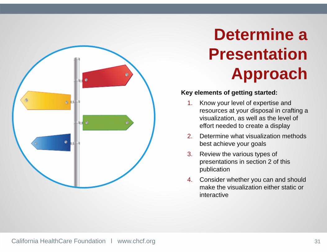
Determine aPresentation
ApproachKey elements of getting started:
1. Know your level of expertise and resources at your disposal in crafting a visualization, as well as the level of effort needed to create a display
2. Determine what visualization methods best achieve your goals
3. Review the various types of presentations in section 2 of this publication
4. Consider whether you can and should make the visualization either static or interactive
California HealthCare Foundation l www.chcf.org

4. Strategies forSharing Your Data
33
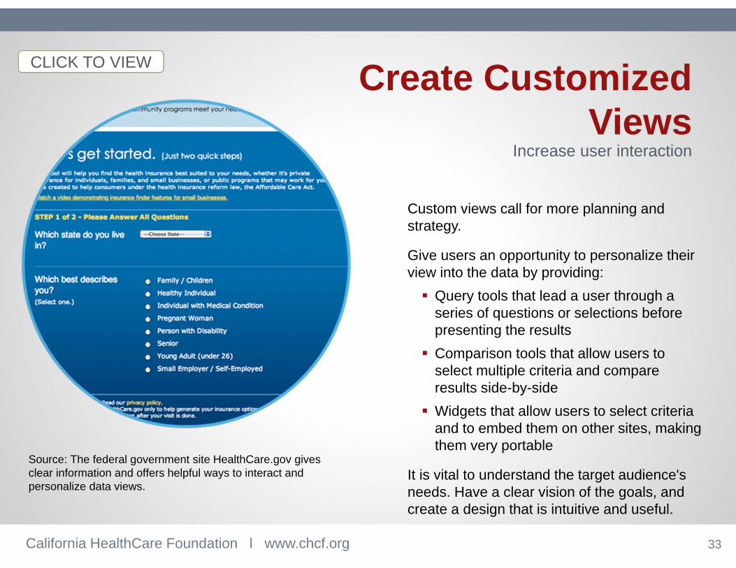
Create CustomizedViews
Custom views call for more planning and strategy.
Give users an opportunity to personalize their view into the data by providing: Query tools that lead a user through a
series of questions or selections before presenting the results
Comparison tools that allow users to select multiple criteria and compare results side-by-side
Widgets that allow users to select criteria and to embed them on other sites, making them very portable
It is vital to understand the target audience's needs. Have a clear vision of the goals, and create a design that is intuitive and useful.
California HealthCare Foundation l www.chcf.org
Source: The federal government site HealthCare.gov gives clear information and offers helpful ways to interact and personalize data views.
Increase user interaction
CLICK TO VIEW

34
Give the Raw Data
Sharing raw data will advance user interaction by making valuable dataavailable to others to create their owndata visualizations. Provide a machine readable download
option (such as an Excel spreadsheet) If possible, provide an API for web
developers
This chloropleth map shows geographic clusters of AIDS patients. It allows users to embed the map on another website.
California HealthCare Foundation l www.chcf.org
Source: US Geographic Distribution of AIDS by New Diagnoses and Prevalence Rates, AIDSVu.
Creating a stunning data query toolor visualization isn’t enough…
CLICK TO VIEW

35
Download Approaches
Researchers like Excel or CSV files, which allow them to grab the data for their own analysis
Break down large data sets into smaller files to enable people to select distinct data pieces, achieve a quicker download and avoid network disruptions
This chart on health insurance coverage estimates allows users to export tablesinto Excel and PDF formats.
California HealthCare Foundation l www.chcf.org
Source: Health Insurance Coverage Estimates, Shadac.org.
Offer machine-readable formats
CLICK TO VIEW

36
Provide Public APIs
Valuable Developer ToolAPIs – application programming interfaces -enable developers to easily and automatically "tap into” the data and create their own visualizations, mashups, or apps thatintegrate data.
Publish Data More EasilyAPIs allow data published in one location tobe dynamically updated and posted in multiple applications around the web.
The federal government site HealthData.gov offers a number of APIs and adds more regularly.
California HealthCare Foundation l www.chcf.org
Source: Programmableweb.com.
CLICK TO VIEW

37
Create aMarketing Plan
Before publishing the data, consider how you will alert critical stakeholders. This is a “must do” for reaching a wide audience.
How will you promote your new visualization, drive traffic to your site and encourage peopleto download and use the data? Post it on your home page and blog Send an email blast Share via social media Post it on popular industry blogs or sites If your data visualization is especially
beautiful, upload it to sites like Visual.ly.
If your product may be newsworthy, develop a robust marketing and public relations plan, including a written press release, embargoed/coordinated release timing, and placement with new outlets.
California HealthCare Foundation l www.chcf.org
Consider how will you drive traffic

5. Resources & Inspiration
3939
Creative IDEAS:Data Visualization Blogs
California HealthCare Foundation l www.chcf.org

4040
Data Visualization Tools
Tools for Everyone
Google Charts & Maps Tableau Public Mapbox Infogram Many Eyes iCharts Datawrapper
Tools for Developers
High Charts TileMill D3.js FLOT Fusion Charts OpenLayers JSMap
California HealthCare Foundation l www.chcf.org

So what will you do?
Conclusion

42
Eat smart. Move more.
That’s what they are doing today in Columbus County, NC
Health data visualization can be
quite powerful.
Remember Columbus County’s
story.
California HealthCare Foundation l www.chcf.org

43
Be data-smart.Visualize more.
Tell stories.
California HealthCare Foundation l www.chcf.org

4444
www.chcf.org@chcfnews
AboutThis presentation was developed by Forum One Communications under a grant from the California HealthCare Foundation under its Free the Data initiative.
Forum One is a web strategy, user experience and design, and development firm focused on helping clients make progress on health policy issues. For more information, visit www.forumone.com.
© 2014 California HealthCare Foundation.