Embed Size (px)
Citation preview
World Institute for Development Economics Research wider.unu.edu
WIDER Working Paper 2014/126
Incomes, inequality, and poverty in Kenya
A long-term perspective
Arne Bigsten,1 Damiano Kulundu Manda,2 Germano Mwabu,3 and Anthony Wambugu3
October 2014

1University of Gothenburg, Department of Economics and Gothenburg Centre of Globalisation and Development; 2African Economic Research Consortium and University of Nairobi, School of Economics; 3School of Economics, University of Nairobi; corresponding author: [email protected]
This study has been prepared within the UNU-WIDER project ‘Reconciling Africa’s Growth, Poverty and Inequality Trends: Growth and Poverty Project (GAPP)’, directed by Finn Tarp.
Copyright © UNU-WIDER 2014
ISSN 1798-7237 ISBN 978-92-9230-847-6
Typescript prepared by Judy Hartley for UNU-WIDER.
UNU-WIDER gratefully acknowledges the financial contributions to the research programme from the governments of Denmark, Finland, Sweden, and the United Kingdom.
The World Institute for Development Economics Research (WIDER) was established by the United Nations University (UNU) as its first research and training centre and started work in Helsinki, Finland in 1985. The Institute undertakes applied research and policy analysis on structural changes affecting the developing and transitional economies, provides a forum for the advocacy of policies leading to robust, equitable and environmentally sustainable growth, and promotes capacity strengthening and training in the field of economic and social policy-making. Work is carried out by staff researchers and visiting scholars in Helsinki and through networks of collaborating scholars and institutions around the world.
UNU-WIDER, Katajanokanlaituri 6 B, 00160 Helsinki, Finland, wider.unu.edu
The views expressed in this publication are those of the author(s). Publication does not imply endorsement by the Institute or the United Nations University, nor by the programme/project sponsors, of any of the views expressed.
Abstract: This paper seeks to measure and explain changes in incomes, inequality, and poverty in Kenya. It starts from a very long-term perspective covering the last century, but then focuses on a more detailed analysis of the recent period for which data from household surveys are available. We seek to provide consistent estimates of what has happened to national income, inequality and poverty over time, and to explain why they evolved in the way they did. We relate changes in inequality and poverty to changes in factor endowments and changes in economic and employment structures. We also provide some policy conclusions.
Keywords: endowments, employment, growth inequality, Kenya, poverty JEL classifications: I32, N37, O55

1
1 Introduction
This study aims to provide consistent estimates of what has happened to national income, inequality and poverty in Kenya over time, and to explain why they evolved in the way they did. The primary focus of our analysis is on the most recent period for which we have comprehensive household survey data, but first we review (in Section 2) the evidence on long-term changes in inequality and poverty in Kenya. In Section 3 we discuss the problems of measuring income changes, particularly with regard to national accounts estimates. We present evidence on changes in incomes, employment, and economic structure in Section 4, and on poverty and inequality in Section 5. In Section 6 we discuss policy challenges and in Section 7 we conclude.
2 The evolution of Kenyan incomes, inequality and poverty during the twentieth century
One can distinguish (at least) four types of determinants of change in the structure of production and incomes. These are, first, changes in the factor endowments of the economy. The key to growth of better-paid jobs is capital deepening, which will occur if there is a high rate of investment in people and machinery. Second, there are the effects of changes in the prices of goods and services. It should be noted here that the domestic prices of tradeable commodities are largely exogenous, but they are also affected by government interventions. Third, technical progress is very important for growth and leads to higher factor rewards. Finally, there may be changes in the level of distortions or government policies that affect factor prices and thus incomes.
During the twentieth century there were dramatic changes in the structure of Kenya’s economy and in the sectorial allocation of labour. Kenya started out with almost the whole of its labour force in agriculture and related activities; but a century later more than half of the labour force is in formal or informal non-agricultural activities. There has been an even more drastic shift in the structure of output. The share of agriculture in gross domestic product (GDP) has fallen from above three-quarters to about a quarter. This structural transformation has driven the changes in incomes, income distribution, and poverty.
2.1 The period up to the First World War
Until the arrival of the British colonialists at the end of the nineteenth century, the Kenyan inland was little integrated with the outside world, while there were long-distance trading activities along the coast. The inland households were pastoralists, settled farmers, small craftsmen, or traders, but generally there was limited specialization. Individuals had generally enough access to land to ensure a standard of living roughly comparable to that of the other members of the community; regional differences in welfare levels that are so conspicuous today did not exist then.
With the completion of the railway in 1901, the inland was opened up to trade and settlement. The railway construction was undertaken by Indian workers, and about 6,500 remained in the country. The majority set up small commercial stores, while some took up intermediate-level positions in private industry or the public sector. A rapid increase in the numbers of Asians and Europeans followed in the colony. By 1914 there had already been a considerable expansion of formal wage employment in Kenya (Bigsten 1984). Practically all of this employment was male. Another category of workers was engaged in settler agriculture either as squatters or as contract labour. Finally, a class of African traders and businessmen emerged. This group was engaged in stock trading, maize milling, butchering, the selling of food and drink, and some small-scale retail trade (Kitching 1980).
2
Despite increased male African involvement outside agriculture, the period before and during the First World War also saw an expansion of cash crop production on African farms and an increase in the cultivated area. The increasing differentiation in agricultural activities started to increase income inequality.
2.2 The inter-war period
By the First World War, pass laws had been introduced, and in the highlands the Africans could only work as contract or resident labour; else they were repatriated to rural areas. The measures were instituted to increase the supply of African labour, since the Europeans were unwilling to pay competitive wages. By restricting the scope for development on the African farms, the supply price of labour was reduced, and through various forms of coercion and through hut and poll taxes the Africans were made to work for still less. Asians were not allowed to own land, and Africans were not allowed to grow a number of cash crops.
By the mid-1920s, a three-class society had been established along racial lines,
with whites monopolising export crop agriculture, the higher administrative posts and the professions; the Asians trade, commerce and the middle reaches of the bureaucracy; and the Africans left with unskilled wage employment, smallholder farming, petty trade at the village level and the lower level clerical posts in the administration. (Collier and Lal 1986: 38)
Still, African cash crop agriculture expanded in spite of the restrictions imposed by the government, and there was a growing internal market for food crops.
Like other countries in the world, Kenya was hit hard by the Depression of 1929. Since most of the produce of the settlers went on export, the effect was profound. Several estates went bankrupt, although many were saved by loans from the colonial government. The squatters could supplement their income by production on their own plots, but their standard of living deteriorated for a few years. The level of employment fell to its lowest in 1932. When the effects of the Depression receded, employment started to increase again from about 1938. The economic decline during the Depression meant that the major market for African food crops was curtailed, but African agriculture acreage still expanded during the 1930s. The process of commercialization of African agriculture continued and it accelerated during the Second World War. The labour movements also gained in importance (Bigsten 1984).
Inequality among African smallholders increased, and the major differentiating factor was access to land. Those who had large landholdings in areas where cash crops could be produced improved their relative position. Rural-urban differences in living standards emerged; a rural elite was buying up land for commercial farming (Kitching 1980), and an African trade and business class was established. The most rapidly changing regions in the country were the former Central and Nyanza provinces. During the Second World War agriculturalists as well as traders made considerable profits. Obviously, Europeans and Asians still dominated commerce and industry, but African businessmen and traders were making noticeable progress.
2.3 The post-war period 1945-63
After the Second World War, wage employment was quite extensive, but much of it was still of a temporary nature. Labour migration was very common, and African wage employment increased rapidly between 1950 and 1955. Then African agricultural wage employment stagnated, and non-agricultural employment even declined until Independence. This decline was more severe in

3
the private than in the public sector. Collier and Lal (1986) argue that the decline was due to rapid increases in real wages, among other things due to government efforts to increase minimum wages, and there was also a lack of state support for African businesses.
In agriculture there was a rapid increase in employment during the first half of the 1950s. This reflected an increase in labour demand due to rising producer prices and switches to new crops such as tea and pyrethrum. During the second half of the decade the government changed its policy towards African small farmers, who were now allowed to grow coffee. This should have been reflected in a higher supply price of labour, but this was more than offset by rising demand for labour, so employment continued to increase. During the period 1960-67, however, employment in modern agriculture fell. One reason for this was the breaking up of some estates, which reduced demand for agricultural wage labour.
During the 1940s there was a considerable gap between agricultural and non-agricultural wages, but this was to some extent offset by higher costs of living and fewer opportunities in urban areas for supplementing wage incomes with farm incomes. The gap increased rapidly during the 1950s. Real wages in agriculture rose rapidly in the 1960s due to increasing commercialization of agriculture, but during the same period non-agricultural real wages increased even faster. Thus, during the 1950s and 1960s the gap between agricultural and non-agricultural wages increased dramatically.
2.4 The first post-Independence period, 1963-76
The coming of Independence in Kenya in 1963 implied a change in the interracial distribution of both political power and incomes. The income structure change was limited, but employment was no longer as systematically racially segregated. Although average income in the post-Independence period was still the highest for Europeans and the lowest for Africans, with the Asians in between, the overlap increased.
With the coming of Independence there was a great need for qualified manpower in the public sector. To satisfy this need the public sector increased its relative wages dramatically. Between 1963 and 1965 public sector real wages increased by 48 per cent, while they increased by a mere 6 per cent in the private sector (Collier and Lal 1986). In 1968 wages by skill were higher in the public sector than in the private sector, although private sector wages also started to increase rapidly from 1966. Another factor that continued to be of importance for income distribution during the first years of Independence was the increase in minimum wages.
During the first decade after Independence many smallholders experienced marked improvements, but there were significant differences among them. However, there remained a hard-core group of rural poor consisting of smallholders (a) with little land or with land of low potential; (b) with inadequate access to off-farm income or urban markets; or (c) who were reluctant to innovate. There were also landless workers and pastoralists with little or no education.
2.5 Economic inequality and poverty, 1914-76
There were large changes in national income accounts and national statistics in the mid-1970s; in particular, the racial breakdown of employment statistics was abandoned. Therefore we are forced to break the historical account of the Kenyan economy in 1976, and show how the income distribution in the country evolved between 1914 and 1976 (see Bigsten 1986, for a detailed

4
presentation of the approach.)1 The estimated growth rate for Kenya for the whole period, 1914 to 1976, was a respectable 5 per cent per year. This may be an overestimation, since the data for the pre-war period are very shaky. However, for the period between 1946 and 1976, for which the database is better, the recorded growth rate is even higher at 6.6 per cent per year (compared to 3.7 per cent per year for the 1914-46 period). It therefore seems fairly safe to conclude that income growth in Kenya was quite high during the first half of the twentieth century.
During this period the structure of incomes by source changed significantly (Figure 1). We see that smallholder agriculture declined in importance until 1950, but then its share in incomes remained practically constant. The shares of wage earnings and operating surplus stayed around the level of 1960 until 1976. Structural change was thus not as dramatic in the 1960s and 1970s as it had been previously.
Figure 1: Incomes by source (%)
Source: Based on Bigsten (1986) data.
The income shares of different income groups depend on the number of people engaged in different activities and their income levels. The incomes of African businessmen and own account workers grew very rapidly from Independence. Agricultural wage employees had a very uneven increase in their wages, while the wage rates of African private employees increased rapidly from the Second World War until 1970, but then they declined. There was a similar pattern for public employees, although their wages jumped immediately after Independence and their real wages were more resistant during the 1970s.
1 The basic principle was to start from the national income estimate and then to disaggregate this by income groups by sector and race. After estimating the number of persons in each group, one estimated the average income of each group within which the income distribution was assumed to be lognormal. Information from available sources was then used to estimate the variance of incomes in each group. It was used here to distribute income receivers around the mean income. Once this is done one could count the number of income receivers in each category with an annual income in a certain range. The Gini coefficients could then be derived for each group and any aggregation of groups. We should note that the Gini tends to become significantly higher by this approach than when estimated from household budget surveys. One reason is that capital income is more clearly accounted for and survey estimates use consumption instead of income, and the former tends to be more equally distributed.
0.00
10.00
20.00
30.00
40.00
50.00
60.00
70.00
1914
1921
1927
1936
1946
1950
1955
1960
1964
1967
1969
1971
1974
1976
Trad.agric.
Wages/sal.
Op. Surplus

5
The gap between African and Asian per capita incomes declined slowly until Independence, but then it increased to the same level as in the beginning of the period studied. The racial income gaps remained very large, although the relative European incomes were much higher in the colonial period. The level of the African per capita incomes increased with the most rapid increase during the 1950s and 1960s. During the period 1970-76 the economic situation deteriorated and African per capita incomes declined. Still, the overall effect of these changed factor returns and in particular changes in the relative sizes of the three groups meant that the African share of incomes increased (see Figure 2). It has certainly continued to do so after 1976, but we have no data to analyse this breakdown beyond this time.
Figure 2: Percentage distribution of income by race
Source: Based on Bigsten (1986) data.
Overall inequality according to these estimates increased until 1950, then fluctuated and finally declined slightly during the 1970s. Between 1950 and 1955 the Gini coefficient declined from 0.70 to 0.63, while the variance within the 13 income categories changed very little. The reason for the decline in inequality was that smallholder incomes increased at a higher rate than those of other groups. During the period 1955-60 overall inequality increased strongly again, while inequality both in the modern and the traditional sector changed very little. This was largely due to the fact that traditional (mainly smallholder agriculture) incomes fell to 17 per cent of modern incomes. Between 1960 and 1964 the modern-traditional gap again decreased and so did the Gini coefficient. The same pattern repeats itself for the whole period up to 1976. When the modern-traditional gap increases the Gini coefficient goes up and vice versa, although there was a steady increase in the Gini for the traditional sector and a decrease for the modern sector. Overall inequality increased between 1964 and 1971 and then fell between 1971 and 1976.
Looking at the sectors, we find a long-term increase in inequality in the traditional (largely agricultural) sector. This is consistent with increased diversification. When we consider the modern sector the opposite pattern emerges. Here inequality declined. This is consistent with the view of increasing integration and homogenization of the modern sector. The fact that we do not measure income by households here does, however, create a problem. Since many households have incomes from a variety of sources, the distribution over families might look somewhat different. The trends over time should, nevertheless, be reasonably well captured.
0
10
20
30
40
50
60
70
80
90
African
Asian
European

6
Overall inequality in Kenya thus increased until about 1950 and then stagnated at a high level. The result is similar, whether we use the modern versus traditional income gap or the Gini coefficient as our measure of inequality. The level of the African per capita incomes was increasing with the most rapid increase during the 1950s and 1960s. During the 1970s the economic situation deteriorated and in the last period African per capita incomes actually declined.
Figure 3: Gini coefficients, 1914-76
Source: Based on Bigsten (1986) data.
We can also look at the evolution of poverty. The regions with the highest poverty rates at the time are still the poorest today, suggesting that poverty can persist in a region or country for centuries. Figure 4 shows Sen’s Poverty Index for Kenya over the period 1914-76. This index is essentially the headcount ratio weighted by two parameters, (a) the Gini for the poor and (b) the normalized poverty gap. We see that the income poverty rates as measured by Sen’s Poverty Index are initially very high, but from 1950 income poverty declined for a short period before rising again and remaining nearly constant during the first decade of Independence.
Bigsten (1986) argues that the sectorial inequality in incomes is a good proxy for inequality in the overall distribution of income among workers or individuals. This conclusion is confirmed by the correlation coefficient between the sectorial inequality and the Gini, which is as high as 0.70. Accordingly, the Gini is strongly negatively correlated with the narrowing of the income gap between rural (traditional) and urban (modern) sectors. As this gap increases, that is, as the low, rural incomes increase faster than the urban incomes (see Bigsten 1986), the Gini coefficient falls significantly.
0
0.1
0.2
0.3
0.4
0.5
0.6
0.7
0.8
0.9
1914
1921
1927
1936
1946
1950
1955
1960
1964
1967
1969
1971
1974
1976
All
Trade sector
Modern sector
African
Asian
European

7
Figure 4: Income poverty in Kenya (Sen’s Index), 1914-76
Source: Based on Bigsten (1986) data.
2.6 Factor incomes 1964-2000
During the first years after Independence Kenya grew quite fast, but from the early 1970s, the country experienced increasing macroeconomic imbalances, which were not addressed effectively. In the beginning of the 1980s, the government embarked on a series of structural adjustment programmes. By 1993-94 it had achieved extensive trade liberalization, and the country became an open economy according to the criteria set up by Sachs and Warner (1995).
Bigsten and Durevall (2006, 2008) evaluated the role of endowments (capital, K; labour, L; and land, T) and openness for the evolution of relative factor prices from Independence until 2000. Their estimates of factor endowment ratios, K/L, T/L, and K/T, are shown in Figure 5. The K/L ratio is very important for the pattern of specialization, the factor price outcomes, and incomes. We see that the ratio increased until 1982, but that the trend then was reversed. The capital-land ratio grew and the land-labour ratio declined continuously.
Labour supply growth outstripped formal sector job creation and the use of minimum wages to push up real formal sector wages became increasingly ineffective, and private sector real wages fell. The period from 1968 onwards can be characterized as one of competition as far as the labour market is concerned, although various labour market controls remained until the 1990s. Trade-unions were allowed to seek full compensation for price increases from 1994, and the relaxation of wage guidelines made it possible for firms and employees to negotiate wages on the basis of productivity considerations rather than cost of living indices (Ikiara and Ndung’u 1997). It also became easier to shed labour.
0
10
20
30
40
50
60
70
80
1914 1921 1927 1936 1946 1950 1955 1960 1964 1967 1969 1971 1974 1976

8
Figure 5: Relative factor endowments in Kenya, 1964-2000
Note: K/L = _____; T/L =_ _ _ _; K/T = ..…….. The variables have been mean- and variance- adjusted to increase the readability of the graph.
Source: Bigsten and Durevall (2008). Figure reproduced with permission of Journal of Development Studies.
The evolution of real wages is shown in Figure 6 alongside estimates for returns to capital and land. Real wages are measured as labour earnings, including allowances, of employees in the private sector divided by the GDP deflator. Real wages increased by about 25 per cent from the mid-1960s until the beginning of the 1970s. This was followed by a slow decline until 1995, when real wages started to increase rapidly. The growth of private sector real earnings between 1994 and 2000 was 65 per cent. This may have been due to the lifting of labour market controls (IMF 2003). Real returns to land have increased sharply since Independence. Returns to capital declined continuously from 1964 to the mid-1970s; in total, a reduction of 50 per cent. Since 1975 it has fluctuated slightly.
The main empirical regularity for the period 1965-2000 is that factor price movements were driven by changes in factor endowments, while in this regard the removal of trade restrictions had a limited effect. Consequently, changes in income inequality have been strongly influenced by the long-term process of structural change, while changes in international economic policy have had only small effects. The rapid increase in real wages that started in the mid-1990s and lasted into the next decade could have been driven by labour policy reforms.
1965 1970 1975 1980 1985 1990 1995 2000 7500
10000
12500
15000
17500
20000
22500

9
Figure 6: Indexes of real returns to factors in Kenya, 1964-2000
Note: Real return to capital = _______; real return to labour = ○____○____○; real return to land =+___+___+. The GDP deflator was used to calculate the real values of earnings and land prices. The base year is 1982 = 1. The series for land prices is the moving average of the actual series.
Source: Bigsten and Durevall (2008). Figure reproduced with permission of Journal of Development Studies.
3 Measurement challenges
One of the challenges encountered when trying to measure growth and income distribution in African economies is that the data are weak and inconsistent. The first challenge for our more detailed analysis of recent development is to get measures of the growth of total income or GDP.
Kenya’s GDP is measured from both the production side and the expenditure side, and the accounts show some discrepancy (expenditure figures are typically up to 5 per cent larger). The Kenya National Bureau of Statistics (KNBS) relies mostly on the production approach. To get income shares, the KNBS measures labour incomes and then deducts these from GDP to get operating surplus, which includes capital and rental incomes.
There are two GDP time series (with different base years) that cover parts of the relevant time period. The first series is based on 1982 prices, while the other series is based on 2001 prices. KNBS also switched from the 1969 system of national accounts (SNA) to SNA 1993, which implied some definitional changes. KNBS re-estimated GDP back to 1996 using the 2001 weights. There are considerable differences between the two series both in terms of levels and growth rates.
The 2001 rebasing used information from the Household Budget Survey (HBS) of 1997 extensively. New rebased series should be better than the old ones, and they typically increase the level of GDP. We note that the rebasing in 2001 GDP estimates increased very significantly (at most 50 per cent for 2001; Muchiri and Audi n.d.), because of changes in definitions and methods, changes in data sources, and improved coverage. For example, output of construction is considerably higher in the new series, which also means that fixed capital formation becomes larger.
1965 1970 1975 1980 1985 1990 1995 2000
0.5
1.0
1.5
2.0
2.5
10
The estimating procedures are still of variable quality. For agriculture, the estimates are not based on KNBS surveys but on data from the Ministry of Agriculture, which relies on information from extension officers. Their estimates may be biased upwards, since the officers may over-report to show that they meet targets. Manufacturing production is estimated on the basis of proxies for the main economic activities. KNBS also considers the extent of development of complementary activities in doing its computations. Mining in particular is hard to estimate, since much of it is informal. KNBS relies on information from the Ministry of Mines. Similarly, construction activity estimates are weak. The informal sector estimates are based on a benchmark from 1999, when an informal sector base year survey was undertaken by the KNBS. This estimate is then increased on the basis of different indicators and weights, with public sector activities obviously being better covered, since data for them are much more easily available.
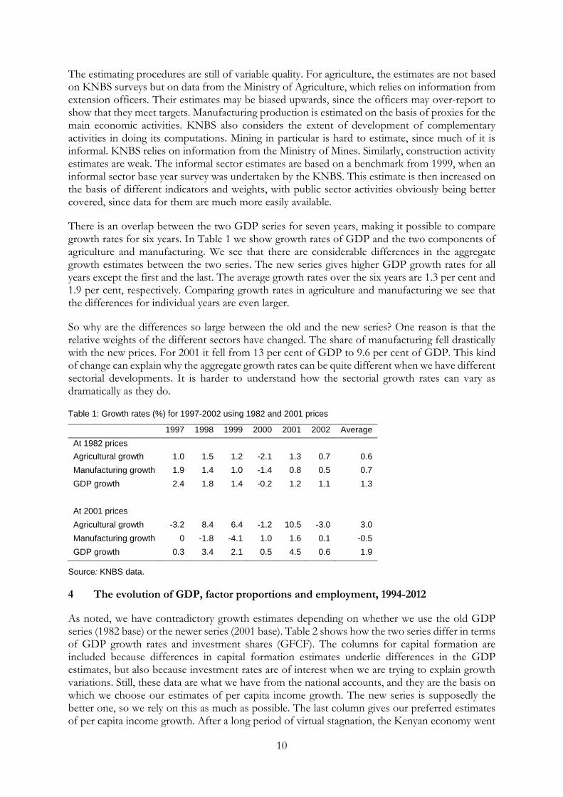
There is an overlap between the two GDP series for seven years, making it possible to compare growth rates for six years. In Table 1 we show growth rates of GDP and the two components of agriculture and manufacturing. We see that there are considerable differences in the aggregate growth estimates between the two series. The new series gives higher GDP growth rates for all years except the first and the last. The average growth rates over the six years are 1.3 per cent and 1.9 per cent, respectively. Comparing growth rates in agriculture and manufacturing we see that the differences for individual years are even larger.
So why are the differences so large between the old and the new series? One reason is that the relative weights of the different sectors have changed. The share of manufacturing fell drastically with the new prices. For 2001 it fell from 13 per cent of GDP to 9.6 per cent of GDP. This kind of change can explain why the aggregate growth rates can be quite different when we have different sectorial developments. It is harder to understand how the sectorial growth rates can vary as dramatically as they do.
Table 1: Growth rates (%) for 1997-2002 using 1982 and 2001 prices
1997 1998 1999 2000 2001 2002 Average
At 1982 prices
Agricultural growth 1.0 1.5 1.2 -2.1 1.3 0.7 0.6
Manufacturing growth 1.9 1.4 1.0 -1.4 0.8 0.5 0.7
GDP growth 2.4 1.8 1.4 -0.2 1.2 1.1 1.3
At 2001 prices
Agricultural growth -3.2 8.4 6.4 -1.2 10.5 -3.0 3.0
Manufacturing growth 0 -1.8 -4.1 1.0 1.6 0.1 -0.5
GDP growth 0.3 3.4 2.1 0.5 4.5 0.6 1.9
Source: KNBS data.
4 The evolution of GDP, factor proportions and employment, 1994-2012
As noted, we have contradictory growth estimates depending on whether we use the old GDP series (1982 base) or the newer series (2001 base). Table 2 shows how the two series differ in terms of GDP growth rates and investment shares (GFCF). The columns for capital formation are included because differences in capital formation estimates underlie differences in the GDP estimates, but also because investment rates are of interest when we are trying to explain growth variations. Still, these data are what we have from the national accounts, and they are the basis on which we choose our estimates of per capita income growth. The new series is supposedly the better one, so we rely on this as much as possible. The last column gives our preferred estimates of per capita income growth. After a long period of virtual stagnation, the Kenyan economy went

11
through a strong growth phase 2003-07, as the rate of economic growth accelerated up to 7 per cent. During the same period, total factor productivity in manufacturing increased by as much as 20 per cent (World Bank 2007). Aggregate capital formation increased to 19 per cent of GDP in 2006, and to over 20 per cent in 2010. This is high by Kenyan standards, but pales in comparison with that of its Asian competitors. Manufacturing growth followed more or less the same pattern as GDP, which meant that its share of GDP remained at slightly below 10 per cent of GDP. There has not been any take-off for manufacturing production in Kenya.
Our main concern is to understand what has happened to the incomes of individuals and households. We see that per capita income growth was weak and fluctuating between 1994 and 2002. Incomes fell in 2000, which was a drought year, and in 2002, which was an election year. Then growth stabilized, but we note a drop in 2008, because of the civil conflict following the December 2007 disputed election. Per capita incomes were virtually stagnant between 1994 and 1997, but between 1997 and 2006 there was a modest 4.8 per cent increase. Then there was the setback after the 2007 elections, but then growth picked up again.
We have compared the growth of GDP per capita from the national accounts, with the evolution of mean consumption spending according to household surveys. Between 1994 and 2005/06 GDP per capita grew by 3 per cent, while mean consumption (per adult equivalent) fell by 1.2 per cent. The two sets of estimates are fairly close, and we may note that there was approximately a four per cent increase in the share of GDP going to investment over the period. So we think we can say that the aggregate GDP estimates square well with the aggregate household estimates.
Table 2: GDP growth in new and old series 1994-2012
GDP growth (new series) (%)
GDP growth (old series) (%)
GFCF % of GDP current prices (new series)
GFCF % of GDP current prices (old series)
Per capita income growth (new series)
Per capita income growth (old series)
‛Best’ estimates of per capita income growth
1994 3.0 18.9 0.1 0.1
1995 4.8 21.4 1.9 1.9
1996 4.6 16.0 19.8 0.5 0.5
1997 0.3 2.4 15.5 17.6 -2.6 -0.6 -2.6
1998 3.4 1.8 15.6 16.4 0.5 -0.6 0.5
1999 2.1 1.4 15.5 15.2 -0.8 -0.8 -0.8
2000 0.5 -0.2 16.8 14.6 -2.4 -2.9 -2.4
2001 4.5 1.2 18.2 12.8 1.6 -0.8 1.6
2002 0.6 1.1 17.4 12.9 -2.3 -1.1 -2.3
2003 2.9 15.8 12.5 0.0 0.0
2004 5.1 16.3 2.0 2.0
2005 5.8 18.7 2.9 2.9
2006 6.4 19.1 3.5 3.5
2007 7.0 19.4 4.0 4.0
2008 1.5 19.4 -1.0 -1.0
2009 2.7 19.6 0.1 0.1
2010 5.8 20.3 3.7 3.7
2011 4.4 20.0 1.6 1.6
2012 4.6 20.4 1.7 1.7
Source: Republic of Kenya Statistical Abstract (annual), Republic of Kenya Economic Survey (annual).

12
Factor quantity series are of interest to us, since we know (Bigsten and Durevall 2008) that changes in factor abundance has been a crucial determinant of the pattern of specialization and factor prices (and thus inequality and poverty). The most noteworthy development is that labour force growth has outpaced the growth of capital from the 1980s onwards. The country has not been able to pursue a strategy that has led to capital deepening. This has had great implications for how the reallocation of labour in the economy has evolved. The labour pressure on land in agriculture increases, continuously pushing labour off the land. This labour could have been absorbed by capital-intensive agriculture or capital-intensive (formal) non-agriculture if capital had been accumulated at a sufficiently rapid rate. But since this has not happened, labour has had to move into activities that use little capital, that is, the informal sector and various forms of low-productivity self-employment. It is clear that it is mainly changes in factor endowments that drive strucutural change in the Kenyan economy.
To illustrate changes in factor endowments during the period under study we have extended the K/L, K/T and L/T estimates of Bigsten and Durevall (2006) to 2011 (Figure 7). Since the investment rate continued until 2004 at about the same rate as 1994-2000 we assume that the capital stock continued to grow at 1.7 per cent per year until 2004. We assume that the upward shift of the investment rate by 2 per cent of GDP from 2005 led to an increase of the capital stock by 2.2 per cent per year until 2011. The labour force growth estimates are taken from World Development Indicators (over 3 per cent growth annually), while the estimate of agirultural land is kept constant (possibly some new land came under cultivation, but this would not change our estimates substantially).
Figure 7: Factor proportions, 1994-2011
Note: K = capital; L = labour; T = land.
Source: Own estimates.
The capital/labour ratio has continued to shrink in the new millennium, meaning that it has been impossible for the formal sector to absorb a major part of the labour that enters the labour market. At the same time, the labour/land ratio is on the increase. The majority of labour market entrants have moved into the informal sector, which consequently has exploded in numbers. Part of the reported increase in the informal sector growth is certainly due to improved data coverage, but it is clear that the vast majority of labour outside agriculture is in the informal rather than the formal sector.
The government has had the ambition to try to attract more foreign direct investment (FDI), but so far it has not been very successful (less than 1 per cent of GDP). The oil and water discoveries
020406080
100120140160180
1994
1995
1996
1997
1998
1999
2000
2001
2002
2003
2004
2005
2006
2007
2008
2009
2010
2011
K/L
K/T
L/T

13
in northern Kenya might change this. So far, there has been FDI in relation to telecom privatization and investments in railways, whereas not much has happened in manufacturing.
Kenya’s share of world exports had fallen from 0.085 per cent in 1980 to 0.035 per cent by the year 2000; thus Kenya became increasingly marginalized in the world market during this period. Over the same period, its share of world GDP fell from 0.066 per cent to 0.040 per cent. However, Kenya’s share of world exports has increased since 2000. There has been some diversification in terms of export destinations, but there has not been any significant diversification of Kenyan exports in terms of products.
One important determinant of overall inequality is the factor income distribution. We have noted that the KNBS constructs estimates of labour income and GDP, where the income to capital and land is computed as the difference between the two. What we can check about factor distribution is thus whether the reported labour share has changed over time. In Table 3 we show the series from 1976 (when the initial story with the old data design ended). We see that there have been some changes over time, but there is no trend. The series starts at a 40 per cent share and ends there as well. This is a lower share than in richer countries, but if smallholder agriculture incomes are excluded the share should be at least 50 per cent. We can conclude that there is no long-term trend in the distribution of income between capital (and land) and labour.
Table 3: Labour income share in GDP, 1976-2012
Remuneration/total factor income 2000 45.9 1976 39.8 2001 46.9 1980 40.9 2002 48.3 1985 42.1 2003 41.6 1990 42.1 2004 37.2 1992 41.0 2005 41.5 1993 39.6 2006 42.4 1994 43.1 2007 42.1 1995 45.5 2008 38.6 1996 43.5 2009 39.6 1997 42.1 2010 42.3 1998 43.5 2011 40.0 1999 45.1 2012 39.6
Source: Republic of Kenya Economic Survey (ES) (annual until 2013).
The stability of the factorial distribution should contribute to keeping the overall distribution stable, but inequality can of course still increase if the distribution within the categories becomes more uneven. We have no information about the distribution of capital incomes, but we have some data on labour incomes. The Kenyan labour force has changed structure over recent decades. There has been a strong decline in the proportion of employees with no education and an increase in the proportion with primary education (Bigsten and Wambugu 2010). This reflects the near universal primary education in the country. Wages differ very much by levels of education (Bigsten 1984; Knight and Sabot 1990; Söderbom et al. 2006).
Table 4 shows the growth rates of formal and informal employment for 1994-2012. We see that very many of the new jobs were in the informal sector. This means that the share of formal employment has fallen to about a fifth of total employment outside smallholder agriculture. This is a really dramatic change in the employment structure, and it confirms the picture of a process of structural change that pushes labour out of agriculture into informal sector employment. There are no solid data indicating the trend in the unemployment rate, but the measured rate of open unemployment is nearly constant. In Kenya, as in other African countries, the unemployment rate is relatively small because the majority of the population must work to survive. The main labour

14
market problem in Kenya is not open unemployment but rather a large number of working poor—subsisting in the informal sector and smallholder agriculture.
Table 4 also shows the evolution of real earnings in the formal sector since 1994. What we see here is a remarkable growth of earnings during the period that is the focus of our study, followed by dramatic declines from 2008 onwards. The start of this drop coincided with the civil strife of 2007/08, but it continues until the end of our data period in 2012.
There are no systematic income data for the informal sector. The little data we have are from surveys for 1998/99 and 2005/06. Looking at the evolution of formal and informal median earnings it seems as if the gap between the two sectors has been fairly constant (Table 5). We do not have any clear picture as to why real wages in the formal sector suddenly started to fall from 2008 onwards. And we are unsure as to how this affected the gap between non-agriculture and agriculture, but there could well have been some urban-rural convergence. As we have noted this would typically be associated with a decline in the overall Gini coefficient.
Table 4: Growth of formal and informal employment and real earnings of formal labour, 1994-2012
Real average earnings growth(%)
Formal employment growth (%)
Informal employment growth (%)
1994 8.3 2.0 11.9
1995 19.8 3.4 25.0
1996 11.7 4.0 18.0
1997 8.5 1.8 13.0
1998 11.2 1.1 12.2
1999 8.0 0.6 11.5
2000 4.7 0.4 11.0
2001 8.7 -1.1 7.7
2002 12.7 1.3 10.0
2003 -2.7 1.5 8.6
2004 9.9 2.1 8.0
2005 2.4 2.9 6.7
2006 1.3 2.8 6.6
2007 4.5 2.6 6.1
2008 -10.2 1.8 5.3
2009 -4.7 2.8 7.9
2010 -0.4 2.9 7.6
2011 -8.1 3.4 6.3
2012 -4.8 3.1 6.0
Source: Republic of Kenya Economic Survey (annual until ES 2013).

15
Table 5: Labour earnings in the formal and informal sectors (KSH per month), 1998/99-2005/06
Integrated Labour Force Survey (1998/99)
Kenya Integrated Household Budget Survey (2005/06)
Sector Mean Median Mean Median
Formal 8152.868
(6212.182) 6105
(4651.783) 22813.12 (10263.88)
8000 (3599.231)
Informal 5147.414
(3922.138 ) 2800
(2133.497) 15402.75 (6929.872 )
4000 (1799.645)
Total 6208.897
(4730.949) 3000
(2285.888 ) 19696.76 (8871.796 )
6000 (2699.468)
Note: Real earnings in parentheses - deflated using Consumer Price Index (CPI) (1994 prices).
Source: Republic of Kenya (2003a, 2008a).
5 The evolution of poverty and inequality, 1980s-2000s
In this section, we look at changes in poverty and inequality over time. In line with the historical overview presented in the first part of the paper, we start with some evidence on trends in poverty in the country up to 1976 (Bigsten 1986). The inequality evidence is omitted because it fits better in Section 2 where it is reported. We analyse the evolution of inequality and poverty over the past two decades using a variety of datasets and methods. The aim is to provide evidence on changes in level and distribution of household welfare over a period for which nationally representative data sets are available (Republic of Kenya 1996, 1998a, 2007). Income and non-income indicators of welfare are also examined.
5.1 Monetary measures
Tables 6-12 show recent trends in and patterns of poverty and inequality in Kenya from the 1980s using a variety of methods and data sets (Mukui 1994; Republic of Kenya 1996, 1998a, 2007).
We see in Table 6 that national poverty has fluctuated, but the poverty levels in 2005 are similar to those for 1992. The Kenya economy was on a recovery path in 2005 after the poor performance it recorded in the 1990s, and poverty declined between 1997 and 2005/06. The region with the lowest poverty rates is Central, which got an early start in development as we pointed out in our historical review. We may also note that the capital city, Nairobi, has the lowest poverty rate in the country despite its large in-migration.
Table 6: Absolute poverty measures (%) for Kenya 1994-2005
Region Head-count ratio 1994
Poverty gap 1994
Severity of poverty 1994
Head-count ratio 1997
Poverty gap 1997
Severity of poverty 1997
Head-count ratio 2005/06
Poverty gap 2005/06
Severity of poverty 2005/06
National 40.25 14.93 10.0 52.32 18.74 9.2 45.9 16.3 8.1
Urban poverty
Overall 28.95 9.69 4.63 49.20 15.67 6.86 33.7 11.7 5.5
Nairobi 25.90 8.80 4.14 50.24 14.07 5.47 21.3 6.9 3.1
Mombasa 33.14 9.46 4.21 38.32 14.29 6.96 37.6 8.7 2.9
Kisumu 47.75 16.38 7.83 63.73 23.09 11.42 43.4 12.4 4.6
Nakuru 30.01 8.86 3.31 40.58 10.58 3.84 50.2 18.3 8.4

16
Other urban areas
28.73 10.21 5.25 52.38 19.20 9.22 42.3 15.9 8.3
Rural poverty
Overall 46.75 18.01 9.49 52.93 19.33 9.19 49.1 17.5 8.8
Central 31.93 9.78 4.38 31.39 9.25 3.94 30.4 9.5 4.5
Coast 55.63 23.79 13.10 62.10 24.40 11.87 69.7 26.6 13.2
Eastern 57.75 24.29 13.49 58.56 22.37 10.71 50.9 17.8 8.7
North Eastern
58.00 23.77 13.10 --- --- --- 73.9 32.9 17.8
Nyanza 42.21 14.39 7.06 63.05 23.43 11.43 47.6 16.8 8.0
Rift Valley
42.87 16.35 8.46 50.10 17.58 8.17 49.0 17.5 9.4
Western 53.83 22.05 12.11 58.75 22.81 11.16 52.2 18.3 8.6
Source: KNBS (2007); Republic of Kenya, Economic Survey (various years); Republic of Kenya (2000).
Still, the recovery up until 2005/06 was accompanied by rising inequality. We have computed income inequality (Gini coefficient) using per adult equivalent expenditures in the data and organized around region (province) and area (rural/urban) (Table 7). Inequality increased between 1994 and 2005/06, and was highest in Nairobi (which at the same time had the lowest poverty rate). The national Gini coefficient increased from 0.428 in 1994 to 0.516 in 2005.
There are noticeable differences in income inequality within regions. Overall inequality was higher in the urban areas, and the urban-rural gap in inequality increased between the two periods. In most cases, income inequality rose between 1994 and 2005. The poverty profiles for 1994 and 2005 indicate that poverty in Kenya is primarily a rural phenomenon.
Table 7: Regional welfare inequality (Gini coefficient) in Kenya, 1994-2005
Region/Area 1994 2005
Nairobi 0.526 0.581
Central rural 0.330 0.350
Central urban 0.350 0.390
Coast rural 0.417 0.355
Coast urban 0.339 0.390
Eastern rural 0.428 0.387
Eastern urban 0.396 0.422
North eastern rural 0.420 0.371
North eastern urban 0.411 0.368
Nyanza rural 0.385 0.359
Nyanza urban 0.380 0.374
Rift Valley rural 0.394 0.407
Rift Valley urban 0.343 0.431
Western rural 0.398 0.350
Western urban No data 0.382
National 0.428 0.516

17
Total rural 0.395 0.385
Total urban 0.426 0.497
Source: Authors’ computations from household survey data (Republic of Kenya 1996, 2007).
A special model was developed for this UNU-WIDER project, which would make it possible to adjust the poverty lines to account for relative price changes. We were able to get the required price data for 2005/06, and to run the full programme for this year. It is reassuring to find that the national poverty rate for 2005 estimated with the new toolkit (47 per cent), was not substantially different from the estimate (46 per cent) obtained with the official constant bundle, despite notable regional variations in the two sets of estimates. Relative price changes do not seem to be of first-order importance for the estimates of poverty change during this period.
5.2 Non-monetary poverty measures
Despite the improved growth performance in Africa for the last decade, poverty is still a major problem on the continent. The most common metric of poverty is some threshold level of income or consumption expenditure. However, poverty is multidimensional and goes beyond the conventional single index metrics, which ignore many wider aspects of poverty. Empirical studies have shown that using the monetary approach alone may be deceptive and needs to be complemented with the non-monetary measures. Poverty is associated not only with insufficient income or consumption but also with insufficient health, nutrition, and literacy, and with deficient social relations, insecurity, and low self-esteem and powerlessness (Hulme et al. 2001). In order to capture the multidimensional nature of poverty, we will consider some key non-monetary indicators of well-being such as education, health, or nutrition metrics.
The main objective of this section is to analyse the trends of the non-monetary indicators of poverty in Kenya using data from the various Demographic Health Surveys (DHS). We use DHS for 1989, 1993, 1998, 2003, and 2008 and other sources as necessary. The non-monetary indicators of welfare we use include measures of health, education environment and nutrition.
The indicators for health poverty presented in Table 8 include neonatal mortality, post-neonatal mortality, infant mortality, child mortality, under-five mortality and maternal mortality.
Table 8: Health poverty
Year and welfare indicators 1989 1993 1998 2003 2008 Neonatal mortality (per 1,000 births) 28.2 25.7 25 35 31
Post-neonatal mortality (per 1,000 births) 35.2 35.9 34 32 21
Infant mortality rate (per 1,000 live births) 62 63 71 75 59 Child mortality rate (per 1,000 children surviving to 12 months of age) 36.7 28.1 37 29 23
Under-five mortality (per 1,000 live births) 113 96.1 112 115 74
Maternal mortality ratio (per 100,000 births) 365 423 590 414 488
Life expectancy at birth in years 60 57 51 47 55 Vaccination coverage (% of children 12-23 months fully vaccinated)—proxy for access to medical services
44 79 65 57 77
Source: Republic of Kenya (1989, 1993, 1998b, 2003a, 2008a).
Health status in Kenya has been improving since 1989. In particular, all forms of mortality have declined since the 1980s. However, the trend in life expectancy is irregular, perhaps due to effects

18
of HIV/AIDS, the timing of anti-retroviral treatments and access to water and sanitation over the period analysed (State of World Population 2011). Access to medical services as proxied by the vaccination coverage improved from 44 per cent in 1989 to 79 per cent in 1993 then declined to 57 per cent in 2003. Between 2003 and 2008, it improved by 20 percentage points indicating that Kenya is on a good track to universal health care coverage. In general, the year 2003 saw bad performance in many of the indicators such as infant mortality rates, and life expectancy due to extreme weather conditions, including drought, landslides and floods that were widespread in that year, leading to food deficits in most parts of the country (Republic of Kenya 2004).
Table 9: Percentage of people without access to improved drinking water
Year and welfare indicators 1989 1994 2000 2002 2004 2005 2008 Access to safe/improved drinking water (% not using any improved source of drinking water )
55 47 51 38 39 44 41
Source: Constructed from www.worldwater.org/data.html.
Table 9 indicates that the fraction of people without access to safe drinking water in Kenya decreased from about 55 per cent in late 1980s and stabilized in 2002 and has remained more or less constant between 2004 and 2008. The general trend in access to water is not clear and this is probably due to unreliable data. However, the emerging picture is that there is a slight improvement in the access to safe drinking water in the country. As can be seen from Tables 9 and 10, data on mortality, life expectancy, and access to clean water do not yield the same trend in non-income poverty profiles. Thus, there is a need to combine these metrics in the measurement of population welfare.
The main nutritional indicators in Kenya and elsewhere are child anthropometrics. They include height-for-age stunting (percentage of children under five years classified as malnourished); weight-for-height wasting (percentage of children under five years classified as malnourished); weight-for-age underweight (percentage of children under five years classified as malnourished); children stunted (percentage overall); and children underweight (percentage overall). These are standard indices of physical growth that describe the nutritional status of children. Children falling below the cut-off point of minus two standard deviations (-2 SD) from the median of the reference population are classified as stunted (Republic of Kenya 2008). Table 10 shows the nutritional status of children under five for the DHS surveys.
Table 10: Percentage of children under five years classified as malnourished, 1993-2008
Year and welfare indicators 1993 1998 2003 2008
Height-for-age stunting 32.7 35.3 30.3 29.6
Weight-for-height stunting 5.9 6.0 5.6 5.8
Weight-for-age underweight 22.3 21.2 19.9 20.3
Children stunted (% overall) 31.2 30.9 30.1 29.8
Children underweight (% overall) 23.3 21.5 20.1 19.5
Source: Republic of Kenya (1989, 1993, 1998b, 2003a, 2008a).
The nutritional status of children under five has improved somewhat since the early 1990s. The height-for-age stunting declined from 32.7 per cent in 1993 to 29.6 per cent in 2008. The weight-for-height stunting has more or less remained constant during this period, while weight-for-age underweight declined from 22.3 per cent in 1993 to 20.3 per cent in 2008. This is a sign of improvement in nutritional status in the country.

19
Education level is a key measure of non-income poverty. School enrolment rate, dropout rates and literacy rates are good indicators of non-income poverty. School enrolment rates tend to be higher in rich households and lower in income-poor households. However, this enrolment-income gradient does not always hold. Tables 11 and 12 show enrolment and literacy rates for the period 2000 to 2009.
Table 11: Indicators of access to education
Year and welfare indicators 2000 2002 2004 2006 2009
Primary gross enrolment (%) 95.20 91.46 107.05 105.38 113.27
Primary net enrolment (%) 65.08 61.72 73.53 75.13 82.78
Secondary gross enrolment (%)
39.20 40.81 46.94 49.85 60.17
Secondary net enrolment (%) 33.23 34.51 38.97 42.07 50.03
Tertiary gross enrolment (%) 2.75 2.82 2.92 2.96 4.03
Source: UNESCO (2010).
The school enrolment rates for both primary and secondary schools improved between 2000 and 2009. Primary gross enrolment has been on the rise since the year 2000. However, between 2004 and 2009, the gross enrolment rate increased due to the introduction of free primary education. The net primary enrolment has also increased steadily in the last decade with the lowest being recorded in 2002, while the peak was in 2009. Both gross and net secondary enrolments have increased since the year 2000. This can be attributed to the subsidized secondary school education that was commenced in the year 2008.
Table 12: Literacy rates
Year/Indicators 1995 2003 2008 2009 2010
Literacy rate (% of population aged 15 and above who can read and write)
78.1 85.1 86.5 87.1 87.4
Source: www.worldbank.org.
Table 12 shows that the literacy rates have been improving for the last 15 years or so. The proportion of people who can read and write was 78.1 per cent in 1995 but steadied at an average of about 86 per cent between 2003 and 2010.
Overall, we would say that the social indicators show a moderate positive trend, which is consistent with the moderate increase in incomes and the reduced poverty rates after 1997.
5.3 Looking forward
We have now presented different measures of the level and distribution of the standard of living in Kenya for the period 1900-2012. The different data and methods used to generate different economic measures for Kenya have yielded a consistent story. Over the past century, low growth, limited transformation of the economy, high inequality, and poverty have been the dominant features of the Kenyan economy. What can be expected of the economy over the next 100 years? What policies can be pursued over that time horizon to accelerate growth, reduce poverty, improve equity and transform the economy’s informal and agrarian activities into high-productivity manufacturing enterprises?

20
6 Policy challenges
The main aim of current Kenyan economic policy is to reduce poverty. The success in this endeavour will depend on growth and changes in income distribution. The quality of economic and political governance is probably the main determinant of the extent to which Kenya will be able to create an inclusive growth process that would increase the incomes of the poor. Important governance indicators are democratic accountability, control of corruption, law and order, and policies towards private investment. To develop, any country needs a stable political system, rule of law, and peace.
One aspect of development that is important for income distribution is regional integration or the lack thereof. The Kenyan economy is characterized by large regional differences in welfare (Bigsten 1980) and in the case of Kenya this is also politically problematic since it more or less also reflects ethnic differences across regions. And a lot of the politics in Kenya is therefore played along ethnic lines, with detrimental effects on equity and economic efficiency. The regional inequality in Kenya is caused by agro-climatic conditions, weak institutional and infrastructural developments, fragmented domestic markets, and ethnic politics. Income inequality arising out of regional differences makes a substantial contribution to overall inequality.
To reduce inequality and poverty Kenya must continue the transformation of its economy from a dual economy to a more integrated and modern economy. This requires a continued shift of labour from agriculture into preferably well-paying formal sector jobs. In recent decades the investment rate has been too low to increase the amount of capital per worker. This has meant that the number of jobs in the formal and relatively capital-intensive sector has stagnated, while the labour force increase has had to be absorbed by the informal sector. This is where many of the new entrants to the labour market end up, and the income level is often modest. Still, this sector is probably an indispensable part of the process of structural transformation and the shift in the labour force out of agriculture. And the pace of this shift is crucially important for the sustained growth of the Kenyan economy and for the eventual integration of different sectors and thereby a more even distribution of income.
What does all this imply for policy-making? First, on the macro level there is a need to bring about a shift to a policy that is credible to domestic as well as foreign investors. Formal firms have been confronted with all kinds of problems in dealing with the governments such as regulatory red tape, corruption, and lack of security. Thus, part of a policy to bring about a shift of firms to the formal sector is to clean up the way the government deals with formal sector firms to reduce the incentives for firms to take shelter in the informal sector.
To bring about informal sector growth and absorption into the formal sector the government needs to design its general policies so that they are relevant also for informal firms, and design specific programmes targeting informal firms. The skill levels and policy environment of informal firms need to be improved to make it possible for them to graduate to the formal sector.
7 Concluding remarks
The paper has analysed incomes, poverty and inequality in Kenya over a period long enough to permit identification of key determinants of these welfare indicators. In contrast to previous studies in this area that have relied on single data sources and methods, the paper has used multiple datasets and different methods to assess the development process in Kenya over a period of 100 years. We find that irrespective of the data type and measurement method, poverty and inequality in Kenya are high, and have been persistently high for a long time. Moreover, and importantly, the

21
structure of the economy has not changed enough to make a real dent in poverty levels. At the turn of the 20th century, Kenya remained an agrarian economy, with a large and rapidly expanding informal sector. The capital/labour ratio is still declining, and the manufacturing sector is small and stagnant, which is why few good jobs are being created for the rapidly increasing labour force. The main labour market problem is that of the working poor, rather than that of the openly unemployed. Thus, there is a need to implement short-run policies to increase labour incomes in agriculture and the informal sector. However, high growth and poverty reduction can only be achieved through productivity-enhancing transformation of the economy.
References
Bigsten, A. (1980). Regional Inequality and Development. A Case Study of Kenya. Farnborough: Gower.
Bigsten, A. (1984). Education and Income Determination in Kenya. Aldershot: Gower.
Bigsten, A. (1986). ‘Welfare and Economic Growth in Kenya 1914-1976’. World Development, 14(9): 1151-60.
Bigsten, A., and D. Durevall (2006). ‘Openness and Wage Inequality in Kenya, 1964-2000’. World Development, 34(3): 465-80.
Bigsten, A., and D. Durevall (2008). ‘Factor Proportions, Openness and Factor Prices in Kenya, 1965-2000’. Journal of Development Studies, 44(2): 289-310.
Bigsten, A., and A. Wambugu (2010). ‘Kenyan Labour Market Challenges’. In C. Adam, P. Collier, and N.S. Ndung’u (eds), Kenya: Policies for Prosperity. Oxford: Oxford University Press.
Collier, P., and D. Lal (1986). Poverty and Labor in Kenya 1900-1980. Oxford: Oxford University Press.
Hulme, D., K. Moore, and A. Shepherd (2001). ‘Chronic Poverty: Meanings and Analytical Frameworks’. CPRC Working Paper 2. Manchester: Chronic Poverty Research Centre.
Ikiara, G.K., and N. Ndung’u (1997). Employment and Labor Market During Adjustment: The Case of Kenya. Geneva: International Labour Organization.
IMF (International Monetary Fund) (2003). ‘Kenya: Selected Issues and Statistical Appendix’. Country Report 03/200. Washington DC: IMF.
Kitching, G. (1980). Class and Economic Change in Kenya. The Making of an African Petite-Bourgeoisie. New Haven and London: Yale University Press.
KNBS (Kenya National Bureau of Statistics) (2007). Basic Report on Well-being in Kenya. Based on Kenya Integrated Household Budget Survey - 2005/06. Nairobi: Ministry of Planning and National Development.
Knight, J., and R. Sabot, (1990). Education, Productivity, and Inequality: The East African Natural Experiment. New York: Oxford University Press.
Muchiri, B., and P. Audi (n.d.). Statistical Measures of Growth and their Changes Over Time. Nairobi: Kenya National Bureau of Statistics.
Mukui, J.T. (1994). Kenya: Poverty Profiles, 1982-1992. Nairobi: Ministry of Planning and National Development.
Pacific Institute (n.d.). ‘Data’. Available at: www.worldwater.org/data.html (accessed on 14 November 2013).
Republic of Kenya (1989). Kenya Demographic and Health Survey. Nairobi: Government Printer.

22
Republic of Kenya (1993). Kenya Demographic and Health Survey. Nairobi: Government Printer.
Republic of Kenya (1996). Welfare Monitoring Survey II: Basic Report. Nairobi: Government Printer.
Republic of Kenya (1998a). Welfare Monitoring Survey III: The Second Report on Poverty in Kenya: Poverty and Social Indicators. Nairobi: Government Printer.
Republic of Kenya (1998b). Kenya Demographic and Health Survey. Nairobi: Government Printer.
Republic of Kenya (2000). Second Report on Poverty in Kenya: Incidence and Depth of Poverty, Volume I. Nairobi: Ministry of Finance and Planning.
Republic of Kenya (2003a). The 1998/9 Labor Force Survey Report. Nairobi: Central Bureau of Statistics.
Republic of Kenya (2003b). Kenya Demographic and Health Survey. Nairobi: Government Printer.
Republic of Kenya (2004). National Policy on Disaster Management (Revised Draft). Nairobi: Government Printer.
Republic of Kenya (2007). Kenya Integrated Household Budget Survey: Basic Report, Revised Edition. Nairobi: Government Printer.
Republic of Kenya (2008a). Labor Force Analytical Report. Based on the Kenya Integrated Household Budget Survey - 2005/06. Nairobi: Kenya National Bureau of Statistics.
Republic of Kenya (2008b). Kenya Demographic and Health Survey. Nairobi: Government Printer.
Republic of Kenya (various years). Economic Survey. Nairobi: Government Printer.
Republic of Kenya (various years). Statistical Abstract. Nairobi: Government Printer.
Sachs, J., and Warner A. (1995). ‘Economic Reform and the Process of Global Integration’. Brookings Papers on Economic Activity, 1: 1-118.
State of World Population (2011). People and Possibilities in a World of 7 Billion. New York: United Nations Population Fund.
Söderbom, M., F. Teal, A. Wambugu, and G. Kahyarara (2006). ‛The Dynamics of Returns to Education in Kenyan and Tanzanian Manufacturing’. Oxford Bulletin of Economics and Statistics, 68(3): 261-88.
UNESCO (United Nations Educational, Scientific, and Cultural Organization) (2010). Education for All Global Monitoring Report. Paris: Institute for Statistics.
World Bank (2007). Kenya Investment Climate Assessment, Draft. Washington DC: World Bank.
World Bank (various years). ‘World Development Indicators’. Washington DC: World Bank.
World Bank (various years). ‘Data’. Available at: www.worldbank.org/data-and-research (accessed on 14 November 2013).


