Embed Size (px)
Citation preview
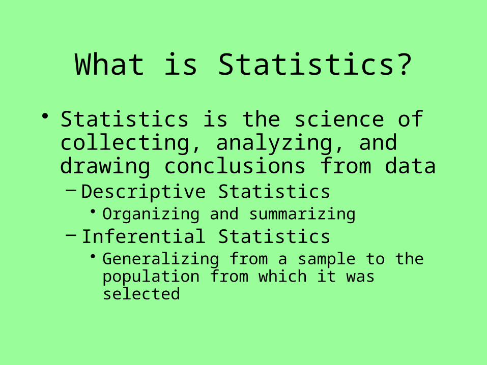
What is Statistics?
• Statistics is the science of collecting, analyzing, and drawing conclusions from data– Descriptive Statistics
• Organizing and summarizing– Inferential Statistics
• Generalizing from a sample to the population from which it was selected
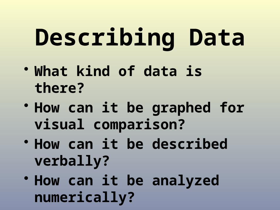
• What kind of data is there?• How can it be graphed for visual
comparison?• How can it be described verbally?• How can it be analyzed numerically?
Describing Data
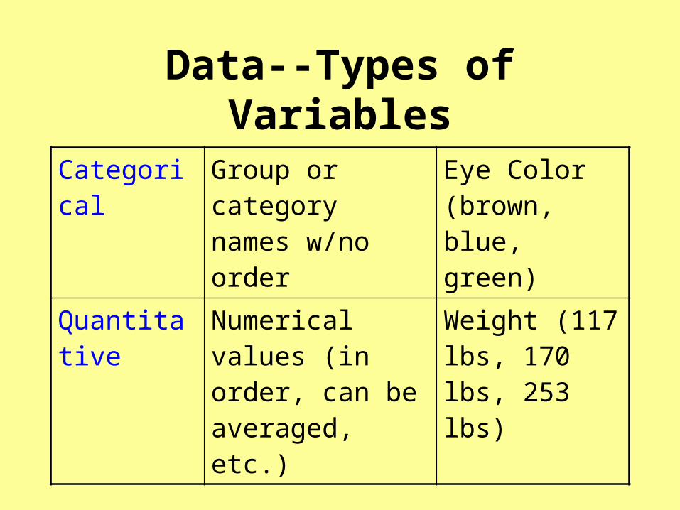
Data--Types of Variables
Categorical Group or category names w/no order
Eye Color (brown, blue, green)
Quantitative Numerical values (in order, can be averaged, etc.)
Weight (117 lbs, 170 lbs, 253 lbs)

Types of Quantitative (Numerical) Data
Discrete Takes on only certain values
Example: Number of siblings, number of pockets in a pair of jeans, number of free throws made in a season,…
ContinuousTakes on any of an infinite
number of values
Example: Time, Weight, Height, …because of our limitations of measurement accuracy we often round to the nearest second, ounce, inch,…

Describing Univariate DataThe distribution of a variable tells us what values the variable takes, how often it takes those values, and
shows the pattern of variation
• Categorical– Bar graph– Segmented Bar
Graph– Pie chart
• Quantitative– Dotplot– Stemplot (Stem & leaf)– Histogram (Frequency
distribution)– Ogive: Cumulative relative
frequency plot– Boxplot

Bar, Segmented Bar, & Pie Charts
0.52293580.7363184
0.1813665
0.47706420.2636816
0.8186335
0%
20%
40%
60%
80%
100%
Children Women Men
Lost
Saved
0
500
1000
1500
Men Women Children

What’s misleading about this graph?

Source: Marist Institute for Public Opinion
How is this graph misleading?

Describing Data using Summary Features of Quantitative Variables
Center—Location in middle of all data
Unusual features - Outliers, gaps, clustersSpread—Measure of variability, rangeShape—Distribution pattern: symmetric, skewed, uniform, bimodal, etc.
Always CUSS in context!

Dotplot for Univariate Quantitative Data

1.11 Stemplot Answer0 3991 13456778892 0001234556688883 256994 13455795 03596 17 08 3669 3
0 30 991 1341 56778892 00012342 556688883 23 56994 1344 55795 035 596 167 078 38 669 3
(c) The distribution is skewed to the right. The spread is approximately 90 (3 to 93). The center of the distribution is at approximately $28.There are several moderate outliers visible in the split-stem plot; specifically, the five amounts of $70 or more. While most shoppers spent small to moderateamounts of money around $30, a “cluster” of shoppers spent larger amounts ranging from $70 to $93.
a) 1| 9 represents $19 spent at storeb)
Stemplots: Stems & Leaves in order Leave stem blank if no leafSplit stems if too few stems

Back-to-back Stemplot
Babe Ruth Roger Maris
| 0 | 8
| 1 | 3, 4, 6
5, 2 | 2 | 3, 6, 8
5, 4 | 3 | 3, 9
9, 7, 6, 6, 6, 1, 1 | 4
9, 4, 4 | 5 |
0 | 6 | 1
Number of home runs in a season
When comparing data, use comparative language! (higher, more than, etc.)

Histogram of Discrete Data: Rolling a fair six-sided die 300 times
42
54
46 45
5954
0
10
20
30
40
50
60
70
1 2 3 4 5 6
Face of Fair Six-sided Die
Fre
qu
ency

1.14 AnswerHistogram of Continuous Data
• The center is located at 350 ($350,000).
• There appears to be one outlier of $1,103,000.
• The distribution is skewed to the right with a peak in the $200,000s.
• The spread is approximately $1,082,000 ($21,000 to $1,103,000)
• Which bars did the $200,000 and $300,000 salaries go?• Border values always go in the bar on the right!• (First bar is salaries of at least 0 to less than $100,000.)

Histograms on the calculator• Enter data into List1 by going to Stat, 1:Edit• Turn StatPlot on and choose histogram option. Set Xlist to
the list you used to enter in the data.• Choose 1 for Freq or a 2nd list if data is stored in two lists
(values in one, frequency in another)• Press Zoom 9:Statplot to set window to the data initially• Check the window and set reasonable, pretty values of min
& max for both x (values) and y (frequency count). The Xscl will set the width of the bins – make this is a “pretty” number also!
• Then press graph to see the adjusted graph• Press trace to see details of the graph

Histogram of People’s Weights

Data from Histogram
Weight Class Interval Frequency
Relative Frequency
Cumulative Relative Frequency
100 to <120 3 0.038 0.038
120 to < 140 21
140 to < 160 24
160 to < 180 19
180 to < 200 5
200 to < 220 3
220 to < 240 4
Total 79
0.304 0.608
0.241 0.849
0.063 0.912
0.038 0.95
0.051 1.001
1.001
0.266 0.304

Ogive: Cumulative Relative Frequency Graph
Weight (in pounds)
Cumulative Relative Frequency

5 Number Summary
Minimum
Q1 (lower quartile) is the 25th percentile of ordered data or median of lower half of ordered data
Median (Q2) is 50th percentile, or middle number of ordered data (average the two middle numbers if there is an even number of #s)
Q3 (upper quartile) is the 75th percentile of ordered data or median of upper half of ordered data
Maximum
Range = Maximum – minimum
IQR(Interquartile Range) = Q3 – Q1
Outlier Formula: Any point that falls below Q1- 1.5(IQR) or above Q3 + 1.5(IQR) is considered an outlier.

Boxplot – using the 5 # summarySalaries from 1.14 – Enter in calc and press stat, calc, 1-var stats
Min 21
Q1 250
Median 350
Q3 543
Max 1103Check for outliers:
• IQR = Q3 – Q1 = 543-250 =293
• Low boundary: Q1 - 1.5(IQR) = 250 – 1.5(293) = -389.5
no outliers on low end since no salaries are less than this
• High boundary: Q3 + 1.5(IQR) = 543 + 1.5(293) = 982.5
one outlier on high end (1103) since it is higher than 982.5
Max value that’s not an outlier


Scatterplot—Bivariate quantitative dataL
on
gJu
mp
_m
6.0
6.5
7.0
7.5
8.0
8.5
9.0
year1880 1900 1920 1940 1960 1980 2000
Olympics - Mens Field Trends Scatter Plot