Embed Size (px)
Citation preview

© The Author 2015. Published by Oxford University Press on behalf of The British Computer Society. All rights reserved.For Permissions, please email: [email protected]
Advance Access publication on 12 February 2015 doi:10.1093/iwc/iwv003
What is Intuitive Interaction? BalancingUsers’ Performance and Satisfaction
with Natural User Interfaces
Anna Macaranas, Alissa N. Antle∗
and Bernhard E. Riecke
Department of Interactive Arts and Technology, Simon Fraser University, Surrey, British Columbia, Canada∗Corresponding author: [email protected]
Designers of natural user interfaces are faced with several challenges when creating interactionmodels for controlling applications, including the wide range of possible input actions and the lack ofaffordances, which they can use to design controls. In order to contribute to the development of designguidelines in this design space, we conducted an exploratory, mixed methods study. We investigatedthree top-down approaches to designing intuitive interaction mappings for a whole body systemimplemented with camera vision. These were metaphoric, isomorphic and ‘everyday’or conventional.In order to identify some of the benefits and limitations of each approach, we compared the designsbased on measures of usability, intuitiveness and engagement with the material represented in thesystem. From our study, we found that while the metaphoric design enhanced users’ performance atcompleting tasks, the lack of discoverability of the interaction model left them feeling incompetent anddissatisfied. We found that the isomorphic design enabled users to focus on tasks rather than learninghow to use the system. Conversely, designs based on previous conventions had to be learned, had a timecost for the learning and negatively impacted users’ engagement with content. For tasks and controlsthat can be designed based on an image schematic input action, users performed most accurately withthe metaphoric design. There are benefits and limitations to each approach to designing to supportintuitive interaction. We conclude with preliminary design considerations, suggest ways to balanceperformance with high user satisfaction depending on contextual design goals and question a single
definition of intuitive intuition within whole body interface design.
RESEARCH HIGHLIGHTS
• We investigated three distinct strategies (metaphoric, isomorphic and ‘everyday’ or conventional) todesigning intuitive interactional mappings.
• We compared the three mapping strategies based on measures of usability, intuitiveness and engagement.• The metaphoric design enhanced users’ performance completing tasks, but the lack of discoverability of
the interaction model left them feeling incompetent and dissatisfied.• The isomorphic design enabled users to focus on tasks rather than learning how to use the system.• We provide preliminary guidelines on the benefits and limitations of each mapping strategy and when it
would be ideal to use each.• We provide the groundwork for future research that can do further comparisons on these mapping strategies.
Keywords: natural user interfaces; tangible computing; metaphor; image schema; intuitive interaction;design guidelines
Received 7 May 2014; Revised 17 December 2014; Accepted 2 January 2015
1. INTRODUCTION
Natural user interface (NUI) has become an umbrella termused to describe a variety of interfaces that use gesturesand/or other body movement as input to control the system
(O’Hara et al., 2013). NUIs present three challenging designproblems. First, there are very few standards or conventionsthat outline how certain controls for functions or tasks shouldbe designed. This is largely due to the novelty of these interfaces.
Interacting with Computers, Vol. 27 No. 3, 2015
Downloaded from https://academic.oup.com/iwc/article-abstract/27/3/357/2358470by Simon Fraser University useron 15 June 2018

358 Anna Macaranas et al.
Second, the supported interaction of NUIs is similar to actionspeople would do with physical environments, tools or devicesin their everyday activities. It is difficult to determine a priori ifusers will try to interact as they might with other interactivedevices or with ‘everyday’ mechanical or physical objectsand/or environments. Third, the lack of physical or perceptualaffordances in many whole body systems (in particular thosethat are based on camera vision) makes it difficult for usersto know what gestures and actions are supported unless theyare given very detailed instructions. In typical NUI systems,users can move in a variety of ways but a small subset ofthese actions are supported by the system. In a recent study byHornecker (2012), children attempted 3D actions and actionsbased on their naïve understandings of various laws of physicson a tangible interface only to find out they were not supported.While Hornecker (2012) states that it is difficult to know what auser will expect from a system, a lack of affordances can actuallyfoster learning and reflection—actions that are desirable incertain contexts.
These challenges not only make NUIs difficult to learn forusers but leave very little design guidance for designers onhow to make these interfaces usable and enjoyable. In anarticle that discusses the benefits and limitations of gesturalinteraction within human computer interaction (HCI), Norman(2010) states that interaction techniques such as gesture, touchand speech come with new problems and challenges thatcan potentially lead to mistakes and confusion in the userexperience.
In this paper, we report the findings of a comparative studybetween three different interaction models for the same wholebody system. Each model leverages a different approach tomapping body actions to system controls. We measure theusability and intuitiveness of each model as well as explorehow each model affects the users’ engagement with the contentdomain of the whole body system, which is social justice. Wedescribe the three design strategies in detail, for other designersto use and compare with their own practice. We provide amethodology for measuring intuitive interaction that is basedon previous research within HCI and Cognitive Science. Fromthe results of our study, we provide guidelines that begin toaddress the challenges of designing for NUIs, which bring uscloser to establishing set conventions on how to make theseinterfaces actually feel ‘natural’.
2. SUPPORTING INTUITIVE INTERACTION
One approach to compensate for the lack of affordances NUIspresent is to create control mappings that support intuitiveinteraction—interaction that is fast, unconscious and automatic.Bastick (1982) describes intuition as a cognitive process thatuses information previously perceived by the senses. Thissubconscious use of previous knowledge gives users the abilityto successfully use the interface almost instantly and withminimal conscious effort. Within the HCI and design literature,
there are various interpretations and mechanism cited for whatmakes interaction intuitive (Antle et al., 2009b; Blackler et al.,2002; Hurtienne et al., 2008; O’Brien et al., 2008), which wefurther discuss below. We focus on three distinct strategies, eachbased on a different cognitive mechanism that designers can useto design interactional mappings that are intuitive. We presentthe three strategies below and show how each supports intuitiveinteraction.
2.1. Metaphoric mappings
Metaphoric mappings base input actions on image schemas—mental models formed from repeated patterns in everydayexperiences—and system effects on related conceptualmetaphors. A simple example is the metaphorical associationof the image schema UP-DOWN with quantity. ‘Up’ isassociated with ‘more’ and ‘down’ with ‘less’. When we filla cup or add objects to a pile, we notice the substance orobject growing in height. The metaphor UP IS MORE is acognitive structure based on these everyday experiences andused—unconsciously—to understand a variety of more abstractconcepts. For example, we use this metaphor to make senseof system controls (e.g. raising the sound volume by movingthe slider up). Figure 1 illustrates the concept of a metaphoricmapping.
Various researchers in HCI have explored the use metaphoricmappings in various tangible and whole body systems(Antle et al., 2009a, b; Bakker et al., 2011; Holland, 2010;Hurtienne et al., 2010; Svanaes, 2001). Some were interestedin applying metaphoric mappings in abstract domains suchas sound manipulation (Antle et al., 2011; Bakker et al.,2011; Holland, 2010). Others explore the use of metaphoricmappings as a design tool that can help the usability of
Figure 1. The underlying theory behind metaphoric mappings.
Interacting with Computers, Vol. 27 No. 3, 2015
Downloaded from https://academic.oup.com/iwc/article-abstract/27/3/357/2358470by Simon Fraser University useron 15 June 2018

What is Intuitive Interaction? 359
an interface (Antle et al., 2009a, b; Hurtienne et al., 2010;Svanaes, 2001).
Metaphoric mappings support intuitive interaction becausethe conceptual metaphors that frame the mapping are under-stood below the level of conscious awareness. Because of this,we call this cognitive process ‘intuitive’ and interaction basedon it, ‘intuitive interaction’.
2.2. Isomorphic mappings
Isomorphic mappings are one-to-one literal spatial relationsbetween input actions and resulting system effects. The mostcommon form of isomorphic mapping is physical–physical. Anexample is a racing game for a whole body system where theplayer’s movement is mapped to a car’s movements. Playersturn their waist left to turn the car left. However, physical–physical mappings may not be possible in more complexsystems. Another form of an isomorphic mapping is physical–abstract. For example, to control quantity of sound volume,one could map the height or amplitude of a sound wave (i.e.volume, measured in Decibels) to a horizontal line of filled inticks. Each tick represents a set quantity or constant amount ofsound volume. The system’s sound volume is isomorphicallymapped to the amount of filled or selected ticks in the horizontalline. To increase the sound volume, the user selects moreticks. For both examples, the input and system response havethe same—isomorphic—structure. Figure 2 illustrates thesetwo examples.
Smith (1987) describes physical–physical isomorphic map-pings as literal and states that their key advantage is that theyare very easy to learn. Both types of isomorphic mappingscan be intuitive if the user understands the nature of the struc-ture being controlled by the interaction. For example, the arrayof ticks may not be intuitive for a user who does not thinkof volume as a parametric value that could be increased at aconstant rate.
Figure 2. Examples of the two types of isomorphic mappings.
Figure 3. The theory behind conventional mappings.
2.3. Conventional mappings
We define conventional mappings as those adapted fromprevious practice and commonly found in product interfaces.When conventional mappings are found across a variety ofinterfaces, they become familiar to users (Blackler et al., 2002).In order to differentiate conventional from metaphoric andisomorphic mappings, we limit them to those found in othersystems but NOT grounded on image schema-based metaphorsor one-to-one mappings. However, in most cases, their originsor structuring may be random. An example of such a mapping isthe arrangement of letters on a QWERTY keyboard. Typically,conventional mappings have to be learned and take time tobecome established in design practice (Norman, 2010). Anexample of a conventional mapping for sound control is aphysical dial that increases volume with a clockwise rotation.Associating clockwise movements with increased quantitiescomes from our experience with clocks, radio dials, screwsand jars—clockwise rotations increase time, numeric valuesand tension. Figure 3 illustrates the theory behind conventionalmappings.
Blackler et al. (2002) describe intuitive use as being based onour experiences with previous systems. In a comparative studybetween familiarity with features and functions used in technicalinterfaces and task completion, they found that people who hada higher familiarity with the interface features and functionshad higher task completion rates and showed more instancesof intuitive interaction (Blackler et al., 2002). Conventional
Interacting with Computers, Vol. 27 No. 3, 2015
Downloaded from https://academic.oup.com/iwc/article-abstract/27/3/357/2358470by Simon Fraser University useron 15 June 2018

360 Anna Macaranas et al.
Figure 4. The whole body system used in our study. Participant is using the isomorphic mapping design.
mappings can be intuitive when they are based on familiarexperiences with other systems. However, the structures of thesemappings may be arbitrary. Currently, very few conventionalmappings exist for NUIs (Norman, 2010).
Given these three strategies, we had one over-archingresearch question and three hypotheses:
Research question: How does each mapping strategycompare in usability, intuitive interaction, awareness andimpact?
Hypothesis 1: We hypothesized that the metaphoric mappingwould have better usability than the other two mappingstrategies due to previous work where systems using metaphoricmapping had high usability ratings (Hurtienne et al., 2008) andinstances of successful interaction (Antle et al., 2011).
Hypothesis 2: We hypothesized that there would be asignificant difference between the three strategies and how theysupport intuitive interaction. Although all strategies supportintuitive interaction differently, the degree in which they do sois unknown.
Hypothesis 3: We hypothesized that the metaphoric mappingwould have more significant effects on awareness and impactdue to previous work that had high post-task awareness andimpact ratings for a system using metaphoric mappings (Antleet al., 2011).
3. METHODOLOGY
We used an exploratory, comparative design with threeconditions: metaphoric, isomorphic and conventional. We useda between subjects design to avoid learning and carry-overeffects. Participants completed tasks on the same whole bodysystem, called Springboard. Controls for the system were
the same for each interaction model. Only the input actionsvaried between versions based on the three different interactionmodels (metaphoric, isomorphic, convention). We collectedquantitative data including task completion times and Likertvalues for responses to survey questions. We also collectedqualitative data including video, observational notes andresponses to open interview questions.
3.1. Research prototype: springboard
For replication purposes, we used a system, called Springboard,which has been used in other research on intuitive interaction(Antle et al., 2011). Springboard is a whole body installationbased on the abstract concept of balance in social justice. Socialjustice can be defined as the balanced or equitable distribution ofthe advantages and disadvantages within a society. Springboardsupports users to interactively explore and reason about digitalimages related to three social justice issues: the distributionof food; the resources used for shelter and community controland safety. Each issue involves consideration of many factors.We simplify each issue to the consideration of two main factorswhich when balanced result in an equitable or socially fairsolution. For details of the images used in Springboard and thegeneral system architecture, see Antle et al. (2011).
We used the three strategies to design three new anddistinct input-control mappings for Springboard. In general, thisiteration of Springboard is designed to take as input, a user’sposition in space and based on this, displays different imagepairs that represent different states of food management (Antleet al., 2011) (Fig. 4). This state could be balanced or imbalanced.For example, if a user is at the far edge of a permissible inputspace, then this triggers the display of images representing an
Interacting with Computers, Vol. 27 No. 3, 2015
Downloaded from https://academic.oup.com/iwc/article-abstract/27/3/357/2358470by Simon Fraser University useron 15 June 2018

What is Intuitive Interaction? 361
Figure 5. A top–down view of our metaphoric mapping with a user in an imbalanced state. The user is slightly left and sees images of higherenvironmental preservation and low food production. The pair of squares illustrates different states in food management. Pairs that have the sameshade represent a balanced state.
imbalanced situation related to the social justice issue. Movingback into the center of a space enables the user to trigger imagerythat depicts more balanced states related to that issue. Thesystem can be customized with different interaction models byvarying how the input space sensing is defined and mapped toimage display controls.
The metaphoric mapping redesign is informed by a spatialrepresentation of the twin-pan and point balance imageschemas. Both schemas use balance metaphorically to describethe relationship between two different factors. The input spaceis the rectangular floor marker. The user’s spatial position onthe marker can be balanced (centered) or imbalanced (off-center, as illustrated in Fig. 5). When the user stands in themiddle of the rectangle (i.e. the balance point), there is equalspace or emphasis on the left and right side of him withrespect to the rectangular space. That is, if the user moves toa spatially balanced position, the system displays images thatdepict metaphorical balance between the left and right images(i.e. twin-pan). Being more on the left or right side of the markerputs more emphasis to one side of the rectangle and creates animbalanced state between the left and right images.
The isomorphic mapping redesign relates the user’s positionwithin two triangles to the content displayed by the images(Fig. 6). Each triangle represents the construct illustrated by theleft or right image. The vertical height of the triangle sectionthat the user is standing on is directly mapped to that triangle’srespective construct amount. On the other triangle, the areaadjacent to the user’s position represents the other construct’samount. The area of the triangles is a direct representation ofthe conceptual relationship between the left and right image.Thus, the input and display space is isomorphic.
In both the metaphoric and isomorphic mappings, the centerof the input space represents a balanced state. However, theremaining parts of each interaction model and the use of theinterface are different according to a metaphoric or isomorphicmodel. During the experiment, we also asked participants todescribe their understanding of the system and inferred if theirmental model matched the system they were assigned to.
The conventional mapping redesign relates the user’s positionalong a circular path laid out on the floor to the differentstates of food management (Fig. 7). Different areas on thepath are mapped to different (im)balance states which increaseor decrease linearly. Due to the few conventions availablefor whole body systems, we are leveraging a conventionfrom another domain. This specific convention has transitionedsuccessfully from analog (i.e. physical dial on radios) to gesturaldevices (i.e. navigational wheel on old MP3 players) and maytransition well into a whole-body domain.
3.2. Participants
Thirty-two adults (13 males, 19 females) from the greaterVancouver area in Western Canada volunteered to participatein this study. Their age ranged from 18 to 55 years (M = 26.9,SD = 8.3). Seventy-two percent were university students(15 undergraduates, 8 graduates). Six percent were in theirlast year of high school. The remaining 22% had degrees andwere working in industry. Twenty-four of participants useda computer and a smart phone daily. Others simply used acomputer or a conventional cell phone daily. Twelve participantsused tablets (i.e. iPad) daily or weekly. Ten participants were
Interacting with Computers, Vol. 27 No. 3, 2015
Downloaded from https://academic.oup.com/iwc/article-abstract/27/3/357/2358470by Simon Fraser University useron 15 June 2018

362 Anna Macaranas et al.
Figure 6. A top–down view isomorphic mapping used in our study. The user is standing in the largest area of the top triangle and sees images withthe highest environmental and lowest food production.
Figure 7. A top–down view of the conventional mapping used in our study. The user is at 6 o’clock and sees equal environment and food production.
randomly assigned the metaphoric condition, 11 the isomorphiccondition and the remaining 11 the conventional condition.
3.3. Tasks
There were five task sets for the content set depicting the balancein the relationship between environmental preservation and foodproduction. Each task set is associated with a reference code(e.g. T1 for task set 1). The task sets increase in difficultyfrom easy (i.e. ‘Please explore how your movements affectthe images on the screen’) to hard (‘Please show a sequenceof moderately high food production, minimal environmental
preservation, balanced food management and moderately highfood production’). In total, participants completed a total of 10tasks (1 in the first task set, 1 in the second set, 3 in the thirdset, 3 in the fourth set and 2 in the fifth).
T1, Exploration, can be thought of as a low-risk explorationperiod where the participant can familiarize herself with thesystem. Participants were given 5 min to explore the interfaceand observe how their movements affected the images on thescreen. Questions regarding the interface were not answeredbecause it was important to see how the participant understoodthe system with the given affordances and no instructions.Once a participant felt comfortable completing tasks using
Interacting with Computers, Vol. 27 No. 3, 2015
Downloaded from https://academic.oup.com/iwc/article-abstract/27/3/357/2358470by Simon Fraser University useron 15 June 2018

What is Intuitive Interaction? 363
Table 1. Variables associated with the Usability construct and the approach taken to analyze them.
Variable Collection method Data type Analysis methodEffectiveness Task score Ratio ANOVAEfficiency Completion time Ratio ANOVAUser satisfaction SUS Ordinal Kruskal–Wallis testSelf-perception of competence PCS Ordinal Kruskal–Wallis test
Springboard, she could begin the next task. Otherwise, she wastold when 5 min was up. Participants did not have to explaintheir observations but show it in T2. Therefore, T1 did not havea success score.
In T2, Find Balance, participants were asked to make the leftimage and right image show equal states of food management.There was no time limit for this task. Participants had to tell theexperimenter when they thought they had completed the task.After this task, participants were asked how they would teacha friend to use Springboard as well as what they thought theimages represented. This task and the two interview questionsmeasured their initial mental model and understanding of thesystem.
In T3, Show States, participants were asked to show specificstates on the screen. An example task from this set is ‘Pleaseshow an above average amount of environmental preservationand below average food production’. They were told that morethan one image could represent a state and that they didnot need to look for a specific image. The experimenter alsoexplained what was meant by environmental preservation andfood production to avoid misinterpretations about the question.Participants were told to indicate when they had completed thetask. Participants were asked to show three different states intotal. The state and the order in which they had to display themwere randomized.
In T4, Relative Change, participants were asked to go to astarting location in the input space. Starting from this locationbut being able to move, participants were asked to increaseor decrease the amount of environmental preservation or foodproduction. An example task from this set is ‘From yourcurrent position, please increase the level of food production’.Participants did this a total of three times. Although thespecific location and order were randomized, each participanthad to start in a position of perfect balance, a positionwhere environment preservation dominated food productionand a position where food production dominated environmentalpreservation.
In T5, Sequences, participants were asked to show a four-partsequence of states. Participants were instructed to indicate whenthey achieved a part of the sequence before moving to the nextpart. To ensure that participants were more focused on showingthe sequence as opposed to memorizing it, they could ask theexperimenter to repeat the next part of the sequence if they forgotit. Since this was the most difficult set of tasks, participants onlyneeded to show two sequences. One sequence only included
different levels of either environmental preservation or foodproduction. An example of this type of sequence is ‘Pleaseshow us minimal environmental preservation, balanced foodmanagement, minimal environmental preservation, moderatelyhigh environmental preservation’. The other sequence includeddifferent levels of both. An example of this is ‘Pleaseshow moderately low environmental preservation, excess foodproduction, balanced food management and moderately lowenvironmental preservation’. This was done to see if they couldthink of the constructs independently and if sequences that onlyfocused on one construct were easier to do. Each sequenceincluded one repetition of a previous state as well as the perfectbalance state.
The whole study took ∼45–60 min to complete. Participantswere compensated for their time with $10 in the form of cashor a gift card from the local coffee shop.
3.4. Measures
3.4.1. UsabilityWe followed ISO 9241’s definition of usability (ISO 9241-11, 1998) and measured effectiveness, efficiency and usersatisfaction (Table 1). We measured effectiveness by the amountof tasks a participant did correctly and converted this numberinto a percentage. Efficiency was defined as the mean timetaken to complete each task and was measured in seconds.We measured user satisfaction with the system usability scale(SUS) (Brooke, 1996). The SUS is a 10-item Likert scalethat measures a user’s feelings toward a system. Along withthese three measures, we decided to also measure feelingsof competence using the perceived competence scale (PCS)(Deci and Ryan, 1985). The PCS is a six-item Likert scalethat measures the user’s feelings on how well they completedtasks using the interface. We added the fourth construct becauseprevious studies have shown a positive correlation betweenusers who feel confident in completing tasks and satisfactionwith using a system (Deci and Ryan, 1985).
3.4.2. Intuitive interactionWe measured intuitive interaction using four constructs:perceived intuitiveness, expectation, conscious attention andsubconscious actions (Table 2). Perceived intuitiveness andexpectation were included to account for Spool’s (2005)interpretation of intuitive use. He describes intuitive use asinstances when the interface behaves as we expect it to (Spool,
Interacting with Computers, Vol. 27 No. 3, 2015
Downloaded from https://academic.oup.com/iwc/article-abstract/27/3/357/2358470by Simon Fraser University useron 15 June 2018
364 Anna Macaranas et al.
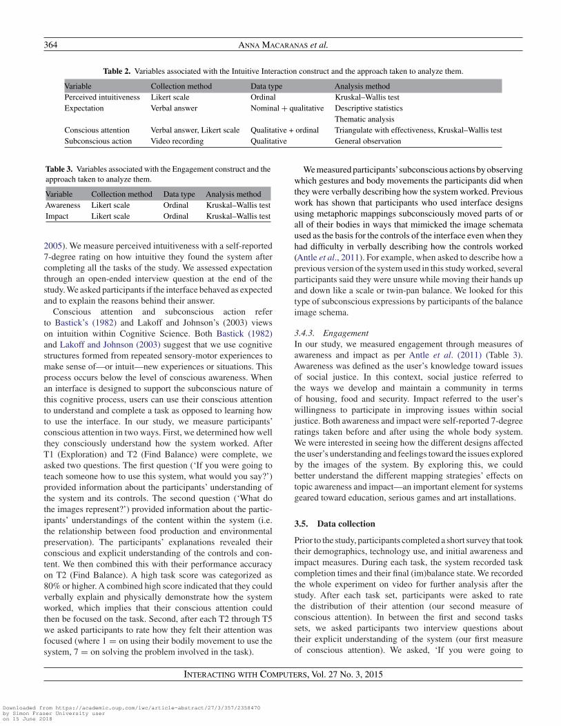
Table 2. Variables associated with the Intuitive Interaction construct and the approach taken to analyze them.
Variable Collection method Data type Analysis methodPerceived intuitiveness Likert scale Ordinal Kruskal–Wallis testExpectation Verbal answer Nominal + qualitative Descriptive statistics
Thematic analysisConscious attention Verbal answer, Likert scale Qualitative + ordinal Triangulate with effectiveness, Kruskal–Wallis testSubconscious action Video recording Qualitative General observation
Table 3. Variables associated with the Engagement construct and theapproach taken to analyze them.
Variable Collection method Data type Analysis methodAwareness Likert scale Ordinal Kruskal–Wallis testImpact Likert scale Ordinal Kruskal–Wallis test
2005). We measure perceived intuitiveness with a self-reported7-degree rating on how intuitive they found the system aftercompleting all the tasks of the study. We assessed expectationthrough an open-ended interview question at the end of thestudy. We asked participants if the interface behaved as expectedand to explain the reasons behind their answer.
Conscious attention and subconscious action referto Bastick’s (1982) and Lakoff and Johnson’s (2003) viewson intuition within Cognitive Science. Both Bastick (1982)and Lakoff and Johnson (2003) suggest that we use cognitivestructures formed from repeated sensory-motor experiences tomake sense of—or intuit—new experiences or situations. Thisprocess occurs below the level of conscious awareness. Whenan interface is designed to support the subconscious nature ofthis cognitive process, users can use their conscious attentionto understand and complete a task as opposed to learning howto use the interface. In our study, we measure participants’conscious attention in two ways. First, we determined how wellthey consciously understand how the system worked. AfterT1 (Exploration) and T2 (Find Balance) were complete, weasked two questions. The first question (‘If you were going toteach someone how to use this system, what would you say?’)provided information about the participants’ understanding ofthe system and its controls. The second question (‘What dothe images represent?’) provided information about the partic-ipants’ understandings of the content within the system (i.e.the relationship between food production and environmentalpreservation). The participants’ explanations revealed theirconscious and explicit understanding of the controls and con-tent. We then combined this with their performance accuracyon T2 (Find Balance). A high task score was categorized as80% or higher. A combined high score indicated that they couldverbally explain and physically demonstrate how the systemworked, which implies that their conscious attention couldthen be focused on the task. Second, after each T2 through T5we asked participants to rate how they felt their attention wasfocused (where 1 = on using their bodily movement to use thesystem, 7 = on solving the problem involved in the task).
We measured participants’subconscious actions by observingwhich gestures and body movements the participants did whenthey were verbally describing how the system worked. Previouswork has shown that participants who used interface designsusing metaphoric mappings subconsciously moved parts of orall of their bodies in ways that mimicked the image schemataused as the basis for the controls of the interface even when theyhad difficulty in verbally describing how the controls worked(Antle et al., 2011). For example, when asked to describe how aprevious version of the system used in this study worked, severalparticipants said they were unsure while moving their hands upand down like a scale or twin-pan balance. We looked for thistype of subconscious expressions by participants of the balanceimage schema.
3.4.3. EngagementIn our study, we measured engagement through measures ofawareness and impact as per Antle et al. (2011) (Table 3).Awareness was defined as the user’s knowledge toward issuesof social justice. In this context, social justice referred tothe ways we develop and maintain a community in termsof housing, food and security. Impact referred to the user’swillingness to participate in improving issues within socialjustice. Both awareness and impact were self-reported 7-degreeratings taken before and after using the whole body system.We were interested in seeing how the different designs affectedthe user’s understanding and feelings toward the issues exploredby the images of the system. By exploring this, we couldbetter understand the different mapping strategies’ effects ontopic awareness and impact—an important element for systemsgeared toward education, serious games and art installations.
3.5. Data collection
Prior to the study, participants completed a short survey that tooktheir demographics, technology use, and initial awareness andimpact measures. During each task, the system recorded taskcompletion times and their final (im)balance state. We recordedthe whole experiment on video for further analysis after thestudy. After each task set, participants were asked to ratethe distribution of their attention (our second measure ofconscious attention). In between the first and second taskssets, we asked participants two interview questions abouttheir explicit understanding of the system (our first measureof conscious attention). We asked, ‘If you were going to
Interacting with Computers, Vol. 27 No. 3, 2015
Downloaded from https://academic.oup.com/iwc/article-abstract/27/3/357/2358470by Simon Fraser University useron 15 June 2018

What is Intuitive Interaction? 365
teach someone how to use this interface, what would yousay?’ We analyzed responses to this question to identify andcompare participants’ explanations and descriptions of howthey thought the controls worked, with how they actuallyworked. We also asked, ‘What do the images represent?’We analyzed their responses to see if they understood howthe two images were related (i.e. that more environmentalpreservation was linked to less food production, and vice versa).These two interview questions were scored. Each questionwas scored out of two: zero for no understanding, one forpartial understanding and two for good understanding. Wesummed these two scores in order to represent each participant’soverall understanding of the system controls and abstractconcepts. A score of 4/4 represents strong understanding,three represents good understanding, two represents partialunderstanding, one represents poor understanding and zerorepresents no understanding of the system controls or content.This method of quantifying understanding from verbal datawas inspired by previous research from Antle et al. (2009b)that used similar questions and scoring system to measure auser’s understanding of Sound Maker. After the fourth taskset, participants participated in a final interview where theyexplained how well the system met their expectations. Forexample, we asked them, ‘Did the interface behave as youexpected it to? If not, what did you expect it do?’ We analyzedresponses to identify their expectations and if they systemworked as expected or not, and if not, in what ways theirexpectations were not met. After the study, participants filledout a questionnaire that measured perceived intuitiveness, usersatisfaction (SUS), perceived competence (PCS) and post-taskawareness and impact.
4. RESULTS
4.1. Usability
We ran inferential statistics on the four constructs of usabilityto see if mapping strategy had an effect on usability and ifmetaphoric mappings in particular had better usability than theother two mapping strategies (Hypothesis 1). Overall, we didnot find significant difference on usability between the map-ping strategies. However, we found significant differences onindividual constructs of usability and interesting relationshipsbetween the usability constructs themselves. In regards to ourhypothesis, metaphoric mappings did not have a significanteffect on usability but generally had better task accuracy scoresfor certain tasks and smaller task completion times. To oursurprise, metaphoric mappings also had generally lower satis-faction ratings in comparison with the other mapping strategies.We provide the detailed findings to each construct below.
4.1.1. Effectiveness and efficiencyWe calculated the mean task scores (Fig. 8a) and completiontimes (Fig. 8b) across the three conditions. A one-way between
Figure 8. Mean task completion scores (a) and times (b) across thedifferent mapping strategies. Whiskers represent standard error.
subjects ANOVA did not show any significant differencesbetween effectiveness or efficiency and the mapping strategy.However, further analysis and observational notes at anindividual task level (vs. aggregated), revealed some keydifferences relevant to the research questions. The most strikingwas that all users in the metaphoric group got T2 (Find Balance)correct. Statistically, this was reflected in the finding thatmetaphoric mappings had significantly higher T2 scores thanisomorphic mappings (F(2, 29) = 9.021, P = 0.011, η2 =0.451). Another interesting finding was that participants inthe conventional group, on average, took 10 more seconds tocomplete all of the tasks. Our interpretation of observationaldata was that users in the conventional group took longer dueto the time spent initially learning how to use the interface foreach task set. Lastly, all users quickly completed T4 (RelativeChange) and our interpretation of observational notes and openinterview question data was that this efficiency was madepossible by drawing the participant’s attention to their locationin the input space, which was done for all participants at thestarting point for this task.
4.1.2. User satisfaction and perceived competenceWe calculated the median SUS (Fig. 9a) and PCS (Fig. 9b)scores across the three mapping conditions. Kruskal–Wallistests showed no significant differences between user satisfaction(SUS) or perceived competence (PCS) and mapping strategies.However, further analysis revealed an interesting relationshipbetween the measurements themselves. First, correlationanalysis revealed that SUS and PC scores were stronglycorrelated, that is, users who felt competent using the systemalso felt satisfied (Spearman’s r = 0.802, P < 0.0001). Second,
Interacting with Computers, Vol. 27 No. 3, 2015
Downloaded from https://academic.oup.com/iwc/article-abstract/27/3/357/2358470by Simon Fraser University useron 15 June 2018

366 Anna Macaranas et al.
Figure 9. SUS (a) and PCS (b) scores across the different mappingstrategies. Whiskers represent percentage error.
we found that, on average, all the SUS scores werelow, not exceeding the 70% mark. Third, we found thatparticipants in the metaphoric group (Med = 37/70), onaverage, gave satisfaction scores that were 10% lower thanthe other groups (isomorphic Med = 47/70; conventionalMed = 46/70). This contrasts with their efficiency andeffectiveness scores. We also saw this contradiction in thequalitative interview data. For example, when asked if thesystem met their expectations, one participant said, ‘No itdid not, I expected left is more nature, right is more waste.’(U7, metaphoric condition). This quote is interesting becausethe user’s task scores indicated that they used the systemcorrectly. The quote also demonstrates the proper metaphoricmodel. U16 (metaphoric), who also had a high task score, wasdiscussing mismatched expectations while sidestepping, left,right and back to center position. Her body motion reflectedthe balance conceptual metaphor even though her expectationswere not met. Both U7 and U16 demonstrated high task scoresand some degree of subconscious understanding. However, theystated that the system did not meet their expectations. Wesuggest that perhaps users’ subconscious understanding of thesystem did not meet their conscious expectations and resultedin an unsatisfying experience.
4.2. Intuitive interaction
We ran descriptive and inferential statistics to see if mappingstrategy had a significant effect on intuitive interaction(Hypothesis 2). Overall, mapping strategy did not have asignificant effect on the instances of intuitive interaction. Wedid find a significant difference between mapping strategiesand a construct of intuitive interaction: conscious attention.We also describe instances of intuitive interaction based on
4.05.0 5.0
0.01.02.03.04.05.06.07.0
Metaphoric Isomorphic Conventional
Med
ian
intu
itiv
enes
s
Mapping strategy
Median perceived intuitiveness acrossmapping strategies
Figure 10. Median perceived intuitiveness ratings across the differentmapping strategies. Whiskers represent percentage error.
the relationship between a participant’s conscious attention andsubconscious actions. We provide the detailed findings for eachconstruct below.
4.2.1. Perceived intuitivenessWe calculated the median intuitiveness ratings across mappingconditions (Fig. 10). A Kruskal–Wallis test showed no signi-ficant difference between perceived intuitiveness and mappingstrategies. While the median intuitiveness ratings were notsignificantly different, our observational notes and analysis ofusers’ responses to open interview questions suggested thatparticipants acted and described their ‘intuitive interactions’in different ways. For example, while it took participants inthe conventional group slightly longer to complete tasks, oncethey consciously determined or learned the mapping, they easilyapplied it to related subtasks. This may be in part because thecircular design of the input space, combined with previous usageof dials in a variety of devices, provides strong cues about howto move to a new spatial location on the ring. We also foundthat over half of the participants in the metaphoric group whodemonstrated poor ability to verbally explain how the systemworked, had high accuracy on task scores.
4.2.2. ExpectationWe calculated the distribution between participants who feltthat the interface design met their expectations and thosewho did not (see Fig. 11) across groups. We found an evendistribution between participants who felt the interface met theirexpectations and participants who did not feel that the interfacemet their expectations with no clear pattern between groups.However, we find it interesting that half of participants did nothave their expectations met. We identified and grouped reasonsparticipants reported about why the system did not meet theirexpectations. Our analysis revealed three key themes to theirunmet expectations:
(i) Unhappiness with controls of the system (n = 4).(ii) A desire for more control (n = 6).
(iii) Difference between perceived and actual input-controlmapping (n = 6).
Interacting with Computers, Vol. 27 No. 3, 2015
Downloaded from https://academic.oup.com/iwc/article-abstract/27/3/357/2358470by Simon Fraser University useron 15 June 2018

What is Intuitive Interaction? 367
4
5
5
6
6
5
0% 50% 100%
Metaphoric
Isomorphic
Conventional
Expectation across mapping strategies
Yes No
Figure 11. Distribution of participants who (did not) feel that theinterface design met their expectations.
1
2
0
1
2
2
3
1
1
4
5
5
1
1
3
0% 50% 100%
Metaphoric
Isomorphic
Conventional
Level of understanding across mappingstrategies
Strong Good Partial Poor None
Figure 12. Distribution of participants who understood the systemcompletely, partially and not at all.
4.2.3. Conscious attentionWe calculated the distribution across mapping strategiesof our first measure of participants’ conscious attention.That is, how well participants could verbally explain andphysically demonstrate (through accurate performance) thatthey understood how the system worked. We had five categoriesbased on combining the verbal score (/4) and the accuracy score(%). Participants were classified as: strong, good, partial, poorand none, in terms of their understanding of the system afterT2. We assume participants that understand the system well candevote conscious attention to the task rather than learning how touse the system. We compare ‘understanding’ as an indicator ofconscious attention across mapping strategies (Fig. 12). Valuessuggest a fairly even distribution across mapping strategies.
For our second measure of conscious attention (self-ratings), we calculated the median score (1 = attention ontheir movement to use the system, 7 = attention on solvingthe task) across all mapping conditions (Fig. 13). We rana Kruskal–Wallis test to see if there were any significantdifferences between where a participant placed their attentionand the mapping condition. We found a significant differencebetween the groups (χ2(2, 29) = 9.327, P = 0.009). Post-hoccomparisons using a pairwise comparison Mann–Whitneytest with Bonferroni correction show a significant differencebetween the attentional ratings of metaphoric (Med = 3.75) andisomorphic (Med = 5.5) mappings (P = 0.015). No significant
Figure 13. Attentional focus ratings across the different mappingstrategies.
differences were found between conventional mappings(Med = 4.0) and the other two mapping strategies.
Detailed analysis comparing measures revealed that sixparticipants had partial, poor or no understanding, high tasksscores and attentional ratings focused on completing the task(i.e. 5.0 or greater) rather than on using movement to interactwith the system. We propose that these individuals may haveused intuitive interaction because their task scores were highand they reported focusing on the task but they were not ableto accurately explain how the system worked, suggesting asubconscious understanding of the system. A subconsciousunderstanding of the system (rather than conscious or explicit),enabled them to focus their conscious attention on completingthe tasks, not on learning to use or using the interface.
4.3. Engagement
We ran inferential statistics on the two constructs of enga-gement to see if there was a significant difference onengagement between the mapping strategies and if metaphoricmappings in particular had higher impact and awareness scores(Hypothesis 3). Overall, we did not find a significant differencebetween the mapping strategies and engagement. However, wedid find significant differences between the pre- and post-impactscores for the conventional mapping. We describe the exactfindings below.
We calculated the medians of the pre- and post-ratings ofawareness and impact for each mapping condition. Wilcoxontests showed no significant differences for the change betweenthe pre- and post-awareness or impact ratings for the metaphoricor isomorphic groups. However, there was a significant decreasebetween pre- and post-impact ratings for the conventionalcondition (W = 47.5, P = 0.044, η2 = 4.75). Kruskal–Wallistests showed no significant differences between post-awarenessor post-impact ratings and mapping strategies.
During the post-task interview, one participant stated thatthe embodied nature of the interaction made him feel moreengaged with the material. He continued to state that because hismovement matched the model of the concepts being explored,
Interacting with Computers, Vol. 27 No. 3, 2015
Downloaded from https://academic.oup.com/iwc/article-abstract/27/3/357/2358470by Simon Fraser University useron 15 June 2018

368 Anna Macaranas et al.
it was more effective in portraying a message than havingsomeone say it to him.
The connection between body movement and the themesmade a stronger impression […] If you consider politics orsomething, you get left/right associations with things. Havingan interface where your body is engaged to pre-set associationsto movement is more impressionable and memorable. (U9,conventional).
5. DISCUSSION
5.1. Usability
Metaphoric mappings had significantly higher T2 scores thanIsomorphic mappings. However, all mapping strategies hadsimilar effectiveness, satisfaction and perceived competenceresults. This contradicts our first hypothesis. These findings donot reflect the results from previous studies (Antle et al., 2011;Hurtienne et al., 2008). However, it is important to note thatprevious studies did not compare the same mapping strategiesas this study.
There was a significant positive correlation between usersatisfaction and perceived competence. Understanding therelationship between satisfaction and competence can provideinsight on designing systems that are easy and satisfyingto use. While metaphoric mappings resulted in highereffectiveness and good efficiency, users were feeling unsatisfiedwith their experience using the system. Furthermore, whileparticipants assigned to the conventional mapping conditiondemonstrated lower efficiency, they were still fairly satisfiedwith their performance. We believe this relates back to thenature of metaphoric and conventional mappings. Metaphoricmappings are perceived by the senses and represent previousknowledge subconsciously used. Conventional mappings onthe other hand are acquired through reflection and learningand represent previous knowledge that was consciously used.With metaphoric mappings, many who had high task scores stilllacked an explicit understanding of how the system worked.However, based on task time and observational notes, weinferred that those who used the conventional mapping designseemed to take longer in order to learn how the system workedas the study progressed, even if their task scores were poorthroughout.
These findings suggest two key concepts. The first is theimportance of discoverability of the interaction model. This isconsistent with previous work that suggests that discoverablemappings are needed to support intuitive interaction (Antleet al., 2009b; O’Brien et al., 2008). Furthermore, discoverablemappings help users understand what they can and cannot dowithin a system—which is especially important if the systemlacks affordances to give this type of information (Hornecker,2012). To make mappings more discoverable, designers shouldintegrate tight mappings between input and control (Antle et al.,2009b; Hornecker, 2012) as well as provide salient feedback
that hints at the possible system effects of input actions (O’Brienet al., 2008).
The second concept these findings suggest is the relationshipbetween understanding the interaction model of a systemexplicitly and having a satisfying user experience. Users whocan understand the interaction model will find the design behindthe system clear, the functions better integrated and feel morecompetent about being able to use the system successfully. Allthese traits refer back to high user satisfaction (Brooke, 1996)and perceived competence (Deci and Ryan, 1985). To ensurea satisfying user experience, designers should create mappingsthat are literal (Smith, 1987) or leverage the user’s knowledgeof previous systems that have similar functions (Norman andNielsen, 2010).
5.2. Intuitive interaction
The three mapping strategies were similar in how intuitivethey felt and in their ability to foster an explicit understandingof the system (Fig. 12). However, it is interesting to note aslightly higher number of participants who felt as if the interfacedid not meet their expectations in the metaphoric mappingcondition (Fig. 11). These findings suggest a difference betweenknowing how to use the system and knowing that you haveused it successfully. Participants who were unaware of theirsuccessful performance subconsciously knew how to use thesystem but were consciously unaware of it. This correlates toprevious work that had similar findings with a system usingmetaphoric mappings (Antle et al., 2011). Furthermore, in astudy by Hornecker (2012), participants tried many actionsthat did not map out to successful system effects. Theseinstances of unsuccessful interaction illustrate mismatchedexpectations and no knowledge of how the system works. Wesuggest that having knowledge of both the system and instancesof successful interaction are important when meeting userexpectations. Designers need to be make the interaction modeleasily understood by the user and provide clearer feedback onactions that are supported by the system.
Furthermore, participants who were assigned the isomorphicmapping condition placed more of their attention on performingthe task and less on their body movement in comparison withparticipants who were assigned the metaphoric or conventionalmapping condition (Fig. 10). However, since other constructswithin our intuitive interaction measure showed more equaldistributions across mapping conditions, we cannot confidentlyattribute these attentional ratings to intuitive interaction.Instead, we provide possible reasons behind the lower ratingsin the other two conditions. In the metaphoric and conventionalmapping conditions, participants were unclear on the interactionmodel and spent more time trying to relate their movementto the system effects. They spent a lot of time trying to learnthe input-control mappings and to reflect on their observationsfrom the previous tasks. These results suggest the importanceof straightforward mappings in maintaining the user’s attention
Interacting with Computers, Vol. 27 No. 3, 2015
Downloaded from https://academic.oup.com/iwc/article-abstract/27/3/357/2358470by Simon Fraser University useron 15 June 2018

What is Intuitive Interaction? 369
on completing the task. While there are times when bodyfocus is important (i.e. dance, surgery), the execution ofmovement should still fall in a semi-conscious state (i.e.automatic). Hornecker (2012) also discusses instances whenintuitive interaction may not be desired and that designers maywant users to reflect and learn the controls of the system.Knowing when systems should rely on automatic movement orwhen they should elicit reflection is an area that needs furtherresearch.
5.3. Limitations
Due to low sample size and a between-subjects design,we state our claims cautiously. Furthermore, to balancethe three mapping conditions, interface designs were verysimilar and may not leverage the best aspect of a certainmapping strategy. Had we focused on making the perfectconventional, isomorphic or metaphoric example, we wouldhave increased the differences between the interface designsand may have had more significant results. However, thiswould introduce confounds that could account for significantdifferences found in data analysis. In addition, our intuitiveinteraction construct relied on self-reports, which may notprovide accurate reflections of subconscious use. However, self-report is a measure that is often used to measure this construct.Lastly, our research prototype is of a very specific context andapplication. Similar studies that compare the different mappingstrategies in different contexts are needed.
6. DESIGN IMPLICATIONS
Based on our findings, we offer the following set of designconsiderations and preliminary guidelines (Table 4). These arepreliminary and will need further exploration in future studiesbefore they become established guidelines.
Here are two examples to illustrate how the above table couldbe used.A group of designers want to create an interactive color-mixing installation in a science museum. They understand thesystem will be in a walk-up-and-play environment and thatthe system may have a 5-min usage cycle. In this scenario,the designers want the children to focus on the task of colormixing rather than learning how to use the interactive system.They also want the children to reflect on the cause and effectof mixing different colors. Based on Table 4, they shouldconsider either using an isomorphic or conventional mapping.Another group of designers would like to create a game to teachattention deficit hyperactivity disorder (ADHD) children simplemeditation techniques. Based on this user group, the game mustbe mentally effortless as ADHD children may react negativelyto mentally stressful situations. In this scenario, the designersshould consider using a metaphoric mapping between user inputand system controls.
Table 4. Design considerations based on the desired goal of thesystem.
Desired goal Design recommendationDiscoverable input actions
and controlsCreate literal mappings between
input action and control whileproviding salient feedback
High usability Pair metaphoric mappings withsalient feedback to makeinstances of successfulinteraction explicit
High effectiveness andefficiency
Use metaphoric mappings
Automatic input, unconsciouseffort
Use metaphoric mappings
User attention focused ontask rather than interactionwith system
Use isomorphic mappings
System that matches userexpectations
Use isomorphic mappings
Explicit understanding ofsystem functions and highsatisfaction
Use isomorphic or conventionalmappings
User satisfaction Use isomorphic or conventionalmappings
Learning and reflection Use conventional mappings
7. CONCLUSIONS
We described an exploratory mixed-methods approach tocompare three mapping strategies in terms of usability, intuitiveinteraction and engagement. While mapping strategy had asignificant effect on usability and impact for certain tasks,overall there were no statistical differences between the differentmapping strategies and usability, intuitive interaction andengagement.
Despite this, there were other observations that providedinsights on the relationship between effectiveness and usersatisfaction, as well as the relationship between body movementand content engagement. From the quantitative analysis, therewas a significant difference between the mapping strategiesand where participants placed their attention during thewhole experiment. In particular, participants in the isomorphiccondition gave attentional ratings that indicated more attentionon completing the task then on using the system. The findingsfrom this study replicate those of previous work (Antle et al.,2009b, 2011; Hornecker, 2012; Norman and Nielsen, 2010;O’Brien et al., 2008; Smith, 1987) and show areas that needfurther research.
By triangulating the results from the different researchconstructs, we present potential benefits, setbacks and usesfor each mapping condition. Metaphoric mappings have thegreatest potential to support automated learning of movement
Interacting with Computers, Vol. 27 No. 3, 2015
Downloaded from https://academic.oup.com/iwc/article-abstract/27/3/357/2358470by Simon Fraser University useron 15 June 2018

370 Anna Macaranas et al.
and subconscious learning of controls. Isomorphic mappingsseem most suitable for walk up and play applications, whichdesire immediate use and minimal instruction. Conventionalmappings demonstrated the greatest potential for learningapplications, which have no literal mappings but can useanalogies to create an explicit understanding of the action-control or action-meaning mapping.
We provide soft guidelines on the benefits and limitationsof each mapping strategy and when it would be ideal to useeach. Most importantly, we provide the groundwork for futureresearch that can do further comparisons on these mappingstrategies, explore the importance of intuitive interaction withinHCI, and extend our methodology to other NUI contexts.
ACKNOWLEDGEMENTS
We would like to thank all the participants in this study. Wethank Gregory Corness and Martin Rittler for their technicalhelp implementing Springboard.
FUNDING
This work was made possible through funding by theNatural Sciences and Engineering Research Council of Canada(NSERC) and the Graphics, Animation and New MediaNetwork Centre of Excellence, Canada (GRAND NCE).
REFERENCES
Antle, A.N., Corness, G. and Droumeva, M. (2009a) What the bodyknows: exploring the benefits of embodied metaphors in hybridphysical environments. Interact. Comput., 21, 66–75.
Antle, A.N., Corness, G. and Droumeva, M. (2009b) Human-computerIntuition? Exploring the cognitive basis for intuition in embodiedinteraction. Int. J. Arts Technol., 2, 235–254.
Antle, A.N., Corness, G. and Bevans, A. (2011) Springboard:Designing Image Schema Based Embodied Interaction for anAbstract Domain. Human Computer Interaction Series. WholeBody Interaction, pp. 7–18. Springer.
Bakker, S., van den Hoven, E. and Antle, A.N. (2011) MoSo Tangibles:Embodied Metaphors in a Tangible System for Learning: A UserEvaluation. TEI 2011, Funchal, Portugal. ACM Press.
Bastick, T. (1982) Intuition: How We Think and Act. Chichester,Toronto.
Blackler, A., Popovic, V. and Mahar, D. (2002) Intuitive Use ofProducts. Common Ground Design Research Society Int. Conf.,London, UK. Staffordshire University Press.
Brooke, J. (1996) SUS: A Quick and Dirty Usability Scale. InJordan, P.W., Thomas, B.,Weerdmeester, B.A. and McClelland, I.L.(eds), Usability Evaluation in Industry. Taylor & Francis, London,pp. 189–194.
Deci, E.L. and Ryan, R.M. (1985) Intrinsic Motivation and Self-Determination in Human Behavior. Plenum, New York.
Holland, S. (2010) Asymmetrical Multi-User Co-operative WholeBody Interaction in Abstract Domains. CHI’10—Whole BodyInteraction Workshop, Atlanta, Georgia, USA. ACM Press.
Hornecker, E. (2012) Beyond Affordance: Tangible’s Hybrid Nature.TEI 2012, Kingston, Ontario, Canada, pp. 175–181. ACM Press.
Hurtienne, J., Weber, K. and Blessing, L. (2008) Prior Experienceand Intuitive Use: Image Schemas in User-Centered Design. InLangdon, P., Clarkson, J.P. and Robinson, P. (eds), DesigningInclusive Futures. Springer, Berlin, pp. 107–116.
Hurtienne, J., Stößel, C., Sturm, C., Maus, A., Rötting, M., Langdon,P. and Clarkson, J. (2010) Physical gestures for abstract concepts.Inclusive design with primary metaphors. Interact. Comput., 22,475–484.
International Organization for Standardization. (1998) ISO 9241-Part 11: Guidance on usability. ISO.
Lakoff, G. and Johnson, M. (2003) Metaphors We Live By. Universityof Chicago Press, Chicago.
Norman, D. (2010) Natural user interfaces are not natural. Interactions,17, 6–10.
Norman, D.A. and Nielsen, J. (2010) Gestural interfaces: a stepbackwards in usability. Interactions, 17, 46–49.
O’Brien, M.A., Rogers, W.A. and Fisk, A.D. (2008) Developinga Framework for Intuitive Human-Computer Interaction. 52ndAnnual Meeting of the Human Factors and Ergonomics Society,New York City, NY, USA.
O’Hara, K., Harper, R., Mentis, H., Sellen, A. and Taylor, A. (2013)On the naturalness of touchless: putting the “interaction” backinto NUI. ACM Trans. Comput.-Hum. Interact. Special issue onembodied interaction, 20, Article 5.
Smith, R. (1987) Experiences with the Alternate Reality Kit:An Example of the Tension Between Literalism and Magic.SIGCHI/GI, Toronto, Ontario, Canada, pp. 61–67. ACM Press.
Spool, J.M. (2005) What makes a design seem ‘intuitive’?User Interface Eng. http://www.uie.com/articles/design_intuitive/(accessed August 19, 2011).
Svanaes, D. (2001) Context-aware technology: a phenomenologicalperspective. Hum. Comput. Interact., 16, 379–400.
Interacting with Computers, Vol. 27 No. 3, 2015
Downloaded from https://academic.oup.com/iwc/article-abstract/27/3/357/2358470by Simon Fraser University useron 15 June 2018

![Welcome [tc18.tableau.com] · Intuitive Dashboard Design •Teaching Interactivity •Define the expected interaction workflow through sheet titles •Answer an example question to](https://img.dokumen.tips/doc/110x75/5eced7f90e2bd5210370c18c/welcome-tc18-intuitive-dashboard-design-ateaching-interactivity-adefine.jpg)