Embed Size (px)
Citation preview

Substrates – Paper
- Paper and plastics are the main substrates in the overall industry- Critical for communication in history
- Paper mills must be adjacent to a water source, very crucial- http://www.glatfelter.com/learning/tour_pop_up.aspx
- Paper terminology
o Fiber pine trees are soft woods with long, flexible fibers hard woods have short fibers that break easily with tension same relationship with the paper they produce Put a ratio of soft and hard woods to get a combo of those characteristics
desired High $$$ paper is made of cotton fibers – durability, soft sheet, smooth
o Grain the directions the fibers are after pulled matters when you must fold the paper for the product (EX greeting cards)
you want the fold to be parallel to the grain can use the tear test to figure out which way the fibers are it’s grain long if the grain is running parallel to the long dimension of the
paper very important for press machines the packaging of the paper will identify the grain by either underlining
the dimension parallel to the grain or it will say long or short graino Finish/calendaringo Felt sideo Wire sideo Caliper/bulko Coated/uncoated
Lacquer or varnish coating Fills in all the holes and recesses of the paper Will make the ink glossy when printed on coated paper Matte when printed on uncoated
o Whiteness Inks print different on different brightness’s of paper
o Texture At the end of the press, there’s a roller that presses the paper for the
specific type of texture while the print is still wet Velvet, book, textured, satin, etc.
o Types of paper

Grey for newspaper because it’s so cheap even if it looks dirtyo Basic size
Industry standard size for a certain type of paper, like book, newspaper, offset, etc
o Ream – 500 sheets of a type of paper cut to its sizeo Weight – the physical weight of 500 sheets of that paper cut to its standard sizeo Sheet size- for publications printing where the dimensions of paper are
standardized for printing so the machine manufacturers can make machines that can maximize the paper intake for production
Substrates – Polymers
- Petrochemical bases to the polymers- More and more plant based (corn, rice) packaging for polymers
o Does need to be mixed with some petroleum based polymers- PETE, PET (Polyester)
o Polyethylene Terephthalate o Very tougho Good barrier from air and moistureo Recycling 1
- HDPE (High Density Polyethylene)o Really good at stretchingo Good at chemical resistanceo Recycling 2
- PVC (Polyvinyl)o Impact strengtho Grease resistanceo Recycling 3
- LDPE (Low Density Polyethylene)o Flexibleo Resists chemicals and oilso Recycling 4
- PP (Polypropylene)o High melting pointo Recycling 5
- PS (Polystyrene)o Stiffo Moisture barriero Can be broken back down but not mixed back with anythingo Recycling 6
How it’s made plastic bottles and jars
- Laminating o Multiple layers glued together (sandwich analogy)o Flame treatment – runs open flame across the surface before printingo Corona treatment – this happens in line before the printing, if you wait too long
after treatment to print, the treatment will level back out and then the printing doesn’t work
o Printing will just scratch off if not treated righto Clear film can be back printed, the ink is on the inside of the surface because it
will still be seen but you don’t have to worry about treatment Everything is layered from the opposite direction FDA won’t allow inks to touch food so be aware of that
Printing Inks- Ink depends on amount of expected abrasion, friction, light, odor, cracking, heat, and
cold – end use- Conduct lots of tests on substrates to be sure that the substrate is suitable for end use
before moving on to what ink to use- Next ? What is the best printing process to get the ink to the substrate for optimal end
use- The difference between ink and dye is that the pigment in dye fades away. - Dye
o Creation – organic or inorganico Lightfastnesso Opacity – transparent or opaque
- Solvento The liquid that carries the pigmento Litho inks are really thick and drying linseed oil is the base for litho inks
Dries very slowing bc of the linseed oil- Resin
o The “glue” that holds the ink togethero Pelletized, synthetic, plasticizers
- The combo of the resin and solvent is called vehicleo Base mixture that carries and binds the pigment to the substrate
- Pantone matchingo 10 mixing colors = 500 hueso use a pantone book that gives you the mixing recipe for other colors
- mixing or processo any problems with ink will affect the mixing

Graphic Design- all the parts of a design must convey the message- Rule #1
o Everything contributes to the message- Share your design with other people for feedback
o Ask them what the message is to see if it has been conveyed correctly and quickly
- Rule #2 o It must fit the budget to be producedo The budget of your client or company must be respectedo May have to change some artwork if its copyrighted and you can’t afford to pay
to use it- Process
o Make sure your design can be applied to different substrates, sizes, platforms1. Thumbnails – tiny sketches, basic form and shape2. Rough & Comprehensives – (Rough) what your limitations are, minimal type
style size, colors, etc; done to size, get your ideas more solidified and homed in (Comprehensive) detailed out on computer, might be shown to customer or company employees, accurate to what it should look like if printed; if it is a product the mock up will be printed for a test run before making the final product
- Design Grid – in InDesign, organizes your pages- Contrasting color, shape, scale
o Good color contrasts – paired with black or white, two colors isn’t always effective if their saturation levels are similar
- Balance – justification, size, color- Unity – all parts of the design contribute to the message- Rhythm/repetition – our brain likes to follow paths and see rhythm
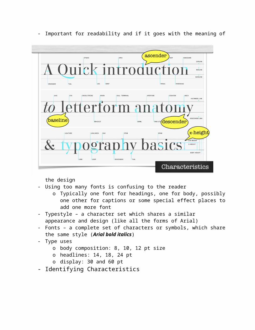
Typography, Design, and Measurement- The art or process of printing with type- Important for readability and if it goes with the meaning of the design- Using too many fonts is confusing to the reader
o Typically one font for headings, one for body, possibly one other for captions or some special effect places to add one more font
- Typestyle – a character set which shares a similar appearance and design (like all the forms of Arial)
- Fonts – a complete set of characters or symbols, which share the same style (Arial bold italics)
- Type uses
o body composition: 8, 10, 12 pt sizeo headlines: 14, 18, 24 pto display: 30 and 60 pt
- Identifying Characteristics
- Classificationso Serif –o San Serif – no serifs, uniform stroke, modern casual looko Roman- serifs, stroke variations, formal/structure easy to reado Slab/square serif – set in large pt size only, communicates strength and powero Novelty – decorative typefaces, anything that cannot be otherwise classifiedo Script – cursive, stylistic, joined characters, imitates handwriting, formal and
informalo Text – medieval scribe look, is never set in all caps, used for decorative or very
formal occasions
- Stroke contrast, thickness- Measurements
o Incheso Picas (breaking up 1 inch into 6 equal parts)o Points (72 pts to 1 in)
- Leading - distance between baselineso Standard is 2 points (12 pt type = 14 size leading)o “Auto” leading is 120% of type size (isn’t always the right thing)o May have to reset the leading when using body text
- Line length – 7-10 words per line (50-56 characters) preferred
Introduction to Photography & Composition
- Continuous-tone image – smooth, varying shades of gray or hues of color- Exposure – when the shutter opens, light strikes the image sensor to form the image
o E = Intensity x Timeo Good exposure – full tonal rangeo Over exposed – high contrast (too much light was allowed in)o Under exposed – low contrast
- Shutter – Mechanism that controls the passage of light through the camera lens by opening and closing in front of aperture
- Aperture – opening through which light passes in the lens of a camerao F-stop

o Ratio of the lens’s focal length to the diameter of the apertureo The higher the f value, the less light being let through, the smaller the opening
hole- Digital Cameras
o Photoelectric effect: the property by which some metals emit electrons when light shines on them
o CCD (charge-coupled device) Silicone chip covered with a grid of small electrodes called photosites When struck with light, the photosite releases electrons
More intense light… more electrons… higher voltage… less light… less electrons… lower voltage
Analog to digital conversion takes place and records the intensity of light- “Composition”
o The art of organizing an effective communication with a minimum of distortion and ambiguity
- Communicationo Photographs reason for beingo Facts, moods, ideas, emotions
- Qualities of Good Compositiono Depth
The illusion of 3rd dimension Self-containment - all elements reinforce image and its message Allows for viewer participation - creates an emotional reaction Simplicity - emphasize one subject or mood Leading line - leads you visually to an object Rhythm – objects repeat to give depth Framing – shooting subject through or past an object Horizontal object – serene, peaceful (not the layout of the image) Vertical object – strength Formal balance – symmetrical, structured Informal balance – asymmetrical, relaxed Low key – dark, low light, introspective mood High key – bright light, intense, active energy Illusion of 3D
overlapping figures Or linear perspective, converging lines Aerial perspective, change in tonal value Contrast in image sharpness

o Selective focus – eliminate unwanted background distractions
Scale Point of view Depicting time and movement
Space Lead the viewer’s eye on a deliberate path Location – make sure your subject has somewhere to go
Center of interest – support and clarify the content Rule of Thirds – visually, the center is the weakest point of a rectangle
Color Theory- Objects don’t “have” color- Color exists only in the mind of the beholder- Visual Perception
o Visible light is the portion of the electromagnetic spectrum which the human eye is sensitive to
o Visible spectrum = 700nm to 400 nm ROY G. BIV
- Color perception is subjectiveo The colors we see are a result of our brain’s interpretation of the stimulus
perceived by the rods and cones in our eyes- The Additive Color System
o As we mix different amount of rgb wave lengths of light, that adds up to the different colors as they bounce back from the object to your eyes
o Only dealing in light (not inks, nothing concrete)o Examples: television, stage lighting, a projection tv, color monitors
- Additive Color Mixingo Controlling what we see, trying to control the “purity” of wavelengths of light
that reach the eye
- Subtractive Color Mixingo Try to control the “purity” of wavelengths of light that reach the eyeo Assumptions:
While substrate (or paper) is used Paper reflects all red, green, and blue light
All the color therefore, is in the paper. The paper is the main component that determines the color gamut
Process inks (CMYK) are semi-transparent
Each ink absorbs ~1/3 of the visible spectrum o cyan subtracts red, transmits green and blueo magenta subtracts green, transmits red and blueo yellow subtracts blue, transmits red and green
Printing Color- perception – we all see colors a little different depending on the conditions of our eyes
and how your brain interpreters it; also your environmento to account for this, we try and manage the mixer of RDG light
- Munsell Color Chart- CIE L*a*b* - Commision Internationle d’Eclairage
o L a b values on this scale are universal- Ambient Lighting
o 5000 Kelvin – industry standard to view color ino 2800 kelvin = more yellow, warm; 7500 kelvins = more blue, cooler
- Color theoryo What three items must be present for color to exist? Light, object, subject viewero Primary colors of light? RGBo What are the primary and secondary colors of the additive color system? RBG,
CMY

o “” secondary colors of subtractive? CMY, RGBo What is the most important element in color reproduction that determines the
color gamut? White substrateo What is the surrounding and lighting specifications for proper color evaluation in
the graphic arts industry? 5000 Kelvin