Embed Size (px)
Citation preview
02 / 2014
Nikola Sander, Guy J. Abel, Ramon Bauer andJohannes Schmidt
VisualisingMigration FlowDatawith Circular Plots

Abstract
Effective visualisations of migration flows can substantially enhance our understandingof underlying patterns and trends. However, commonly used migration maps thatshow place-to-place flows as stroked lines drawn atop a geographic map fall short ofconveying the complexities of human movement in a clear and compelling manner.
We introduce circular migration plots, a new method for visualising and exploringmigration flow tables in an intuitively graspable way. Our approach aims to providedetailed quantitative information on the intensities and patterns of migration flowsaround the globe by using a visualization design that is effective and visually appealing.The key elements of the design are (a) the arrangement of origins and destinations ofmigration flows in a circular layout, (b) the scaling of individual flows to allow theentire system to be shown simultaneously, (c) the expression of the volume of movementthrough the width of the flow and its direction through the colour of the origin.
Drawing on new estimates of 5-year bilateral migration flows between 196 countries,we demonstrate how to create circular migration plots at regional and country levelsusing three alternative software packages: Circos, R, and the JavaScript library d3.js.
Circular migration plots considerably improve our ability to graphically evaluatecomplex patterns and trends in migration flow data, and for communicating migrationresearch to scientists in other disciplines and to the general public. Our visualisationmethod is applicable to other kinds of flow data, including trade and remittances flows.
Keywords
Migration, flow data, visualisation, D3
Authors
Nikola Sander, Research Scholar, Wittgenstein Centre (IIASA, VID/ÖAW, WU), Vi-enna Institute of Demography, Austria. Email: [email protected]
Guy J. Abel, Research Scholar, Wittgenstein Centre (IIASA, VID/ÖAW, WU), ViennaInstitute of Demography, Austria. Email: [email protected]
Ramon Bauer, Wittgenstein Centre (IIASA, VID/ÖAW, WU), Vienna Institute of De-mography & University of Vienna, Department of Geography and Regional Research,Austria. Email: [email protected]
Johannes Schmidt, Null2 GmbH, Berlin, Germany. Email: [email protected]
Acknowledgements
We thank Michael Holzapfel for helping with using Circos on Windows, Andi Pieperfor his help with the interactive visualization, Martin Krzywinski for Circos, MikeBostock for d3.js, and Zuguang Gu for the circlize package. We also thank Neil Bailey,Elin Charles-Edwards, Adam Dennett and Francisco Rowe Gonzales for testing thereplicability of our plots.

Visualising Migration Flow Data with Circular Plots
Nikola Sander, Guy J. Abel, Ramon Bauer and Johannes Schmidt
1 Introduction
The global flow of people is a complex and dynamic phenomenon. Discourses on migra-tion in science, politics, and the media typically focus on current volumes of migrationin a single country. However, flows to and from a given country can be much betterunderstood when placed within a global context. Using such a comparative perspectivehas been hindered by the lack of both adequate data and visualisation techniques. Dataon international migration flows measured over a specific time period suffer from in-completeness and incompatibility, mainly because national statistical agencies measureand/or define migration in different ways. In addition, migration flows are typicallyvisualised using migration maps, which show flows as stroked lines drawn atop a ge-ographic map. This visualisation clearly falls short of conveying the complexities ofhuman movement in an effective and visually appealing manner.
Abel & Sander (2014) introduced circular migration plots as a visualisation methodfor their estimates of the global flow of people between 196 countries for four timeperiods, 1990-95 to 2005-10. Circular migration plots are, as we argue, an effective andvisually appealing method for visualizing flow data that enables the reader to graspintuitively the key patterns of international migration. In addition, we have developedan interactive data visualisation "The Global Flow of People" 1 that enables us tocommunicate our findings to scientists in other disciplines and interested membersof the general public in an engaging way. Created using the open-source JavaScriptlibrary d3.js (Bostock et al. , 2011), this online tool invites the user to explore globalmigration flows for four time periods at region and country levels.
In the present paper, we provide a detailed step by step description of how toconstruct circular migration plots for print and online media, so as to facilitate itsuse in migration studies and beyond. Drawing on new estimates of bilateral flowsbetween 196 countries from 1990 through 2010 (see Abel, 2013; Abel & Sander, 2014,for details), we illustrate the method for producing circular plots using three alternativeopen-source software packages. While we mostly use Circos, software developed byMartin Krzywinski (Krzywinski et al. , 2009) for the visualisation of genetic data, we
1available at http://www.global-migration.info
3

also demonstrate how to draw circular plots using R and d3.js. The migration data andconfiguration files use in these examples are provided in the supplementary material.
The remainder of this paper is organised as follows. The next section summarisesexisting techniques for visualising migration flows including flow maps. Section 3 in-troduces the circular migration plot and discusses its key features. Section 4 describeshow to use Circos to create custom migration plots. Section 5 outlines the steps in-volved in creating circular plots in R via the circlize package (Gu, 2013), and Section6 shows how do develop interactive migration plots in d3.js. A last section offers someconcluding remarks on the pros and cons of each of the alternative software packagesand future avenues for visualising scientific data.
2 Existing Techniques for Visualising Migration Flows
The visualisation and communication of migration flow data is difficult because of thehigh degree of complexity that the data exhibit. Place-to-place flows are typically repre-sented by an origin-destination matrix with rows for outflows from origins and columnsfor inflows to destinations. The diagonal element of the matrix represents flows withinthe same region and is thus often set to missing in datasets on international migration.Each off-diagonal cell in the matrix contains information on the volume of movementbetween an origin-destination pair. These three aspects of the data that need to beencoded visually (origin, destination, volume) can be extended to also include changesover time in the volume of movements. The number of spatial interactions (i.e. mi-gration flows) contained in a dataset rapidly exceeds a size that can be analysed andvisualised using standard visualisation tools, including line and bar charts, scatter-plots, cartograms and choropleth maps. For instance, the dataset on global migrationflows between 196 countries across four time periods contains 196 ∗ 195 ∗ 4 = 152, 880
interactions.The complexity of migration flow data has led researchers to focus on net migration,
other aggregate measures of movement and specific origin-destination pairs that can beshown using standard visualisation tools. Examples include the recent works by Özdenet al. (2011) and Czaika & de Haas (2013) on global stock matrices, and variousanalyses of migration from Mexico to the United States (see for example Cerrutti &Massey, 2001). The static, two-dimensional representations of migration data used inthe literature clearly fall short of illuminating the complex spatio-temporal patternsand trends of country-to-country migration flows.
4

To address this deficiency, flow maps have been proposed as a visualisation tech-nique capable of depicting movement of people across regions and countries. Theconcept of creating flow maps by placing stroked lines on top of a geographic mapdates back more than 150 years to the seminal visualisations of Charles Joseph Mi-nard (Figure 1). The hand drawn map depicts the origins, destinations and volumesof migration flows in 1858, with one millimetre equalling 1,500 people. The colouredlines in this flow map represent information contained in a migration matrix on place,direction and volume. Minard’s flow map is relatively effective and visually appealingbecause it shows only a small number of flows.
Figure 1: The Emigrants of the World, 1858. By Charles Joseph Minard.2
One of the main drawbacks of flow maps is that they work well only for smalldatasets with limited complexity. The visualisation of a larger migration matrix shownin Figure 2 provides an example of a cluttered flow map with overlaying arrows indi-cating the size and direction of flows. The dominance of London as an origin of elderlymigration in England highlights the fallacy of using geographic maps for the encodingof spatial locations of migrant origins and destinations. Despite recent improvementsin geographic information systems, the graphical features of flow maps have changedlittle since the seminal works by Minard and Ravenstein (1885) in the 19th century,
2Retrieved from http://cartographia.wordpress.com/category/charles-joseph-minard;last accessed 25.11.2013
5

notwithstanding the contributions of Beddoe (1978), Dorling (2012), Geertman et al.(2003), Tobler (1987), Tufte & Graves-Morris (1983) and others.
This content downloaded from 131.130.109.146 on Tue, 12 Nov 2013 08:11:12 AMAll use subject to JSTOR Terms and Conditions
Figure 2: Net inter-Regional migration flows of those aged 60 or more, 1961-66. Source:Law & Warnes (1976, p. 464)
The challenge in the development of flow maps has been to create visualisationsthat are truly appropriate to the data. Migration flow data tend to be highly skewedwith many cells in the matrix being close to zero and a smaller number of flows of largesize. The skewed distribution of flows and the dominance of large cities as migranthubs make it difficult or even impossible to produce an effective and engaging flowmap of a migration system. Moreover, flow map tools are a surprisingly underdevel-oped segment of the proprietary GIS packages (e.g. ArcGIS, Mapinfo). Consequently,recent advances in visualising spatial interaction data have been made outside the GIScommunity. A range of alternative designs that aim at visualising flow data more ef-fectively have been proposed by geographers, computer scientists and demographers.Distributive flow maps, for example, display migration as flow trees that are drawnon a geographic map (see, for example, Fassmann & İçduygu, 2013; Verbeek et al. ,2011). The trunk of the flow tree denotes the origin of migrants and splits into as
6

many smaller branches as there are destinations. The hierarchical structure can falselygive the impression of key migration corridors. Using flow trees to visualize migrationposes an additional difficulty: scaling individual flows (i.e. branches) proportionallyto its volume, and ensuring that the width of the flows adds up to that of the trunkat the origin. Other layouts that have been proposed in the literature for represent-ing migration are corrgrams (Bryant, 2011), spatial clustering (Guo et al. , 2012) andraster/vector overlay (Rae, 2009). During the past few years, mobility and migrationhave become of increasing interest for non-scientific data visualization applications onthe web. PeopleMovin3 and MigrationsMap4 are two examples of existing interactivevisualisations of migration. To summarise the key points, PeopleMovin displays mi-grant stock data published by the World Bank using slopegraphs between two columns,the emigration countries on the left and the destination countries on the right. Whilevisually appealing, the need for extensive scrolling to find the destination country of aparticular flow prevents the user from obtaining a full picture of the global patterns.MigrationsMap is a somewhat old-fashioned version of a traditional flow map basedon the Migration DRC database of foreign-born populations. By select a country, theuser can explore the key origins of immigrants or the destinations of emigrants withoutgetting a comprehensive view of the overall global patterns.
3 Introducing circular migration plots
Circular migration plots are, as we argue, effective, engaging and beautiful visual-isations that are more appropriate to flow data than any of the existing graphicalrepresentations discussed earlier. Perhaps even more importantly, our detailed step bystep descriptions of how to construct the plot allow others who may wish to visualisetheir data in a circular layout to do this with relatively little additional effort or cost.This section discusses the key features of this plot.
As noted by Heer et al. (2010, p. 1), the creation of visualisations requires the se-lection of ”effective visual encodings” the data attributes can be linked to. For instance,time-series data are best represented as (indexed) line charts, whereas differences inGDP across European countries are best shown through a colour encoding of the geo-graphic areas in a choropleth map.
Visualisations of migration flows have to depict a large amount of information.The most important items are the locations of origin and destination, the volume of
3Retrieved from http://peoplemov.in; last accessed 25.11.20134Retrieved from http://migrationsmap.net; last accessed 25.11.2013
7
movement, and the direction of the flow. In addition, visualisations should highlightthe relations between individual place-to-place flows, the main corridors of movement,and the key senders and receivers of migration.
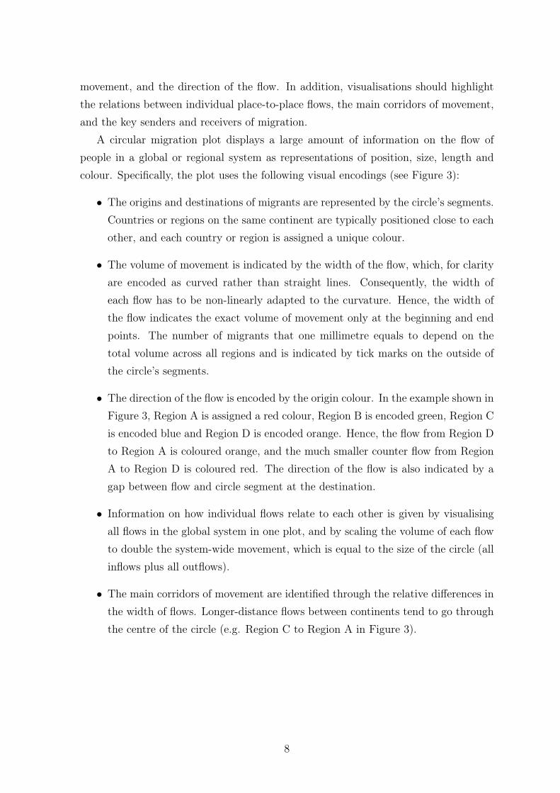
A circular migration plot displays a large amount of information on the flow ofpeople in a global or regional system as representations of position, size, length andcolour. Specifically, the plot uses the following visual encodings (see Figure 3):
• The origins and destinations of migrants are represented by the circle’s segments.Countries or regions on the same continent are typically positioned close to eachother, and each country or region is assigned a unique colour.
• The volume of movement is indicated by the width of the flow, which, for clarityare encoded as curved rather than straight lines. Consequently, the width ofeach flow has to be non-linearly adapted to the curvature. Hence, the width ofthe flow indicates the exact volume of movement only at the beginning and endpoints. The number of migrants that one millimetre equals to depend on thetotal volume across all regions and is indicated by tick marks on the outside ofthe circle’s segments.
• The direction of the flow is encoded by the origin colour. In the example shown inFigure 3, Region A is assigned a red colour, Region B is encoded green, Region Cis encoded blue and Region D is encoded orange. Hence, the flow from Region Dto Region A is coloured orange, and the much smaller counter flow from RegionA to Region D is coloured red. The direction of the flow is also indicated by agap between flow and circle segment at the destination.
• Information on how individual flows relate to each other is given by visualisingall flows in the global system in one plot, and by scaling the volume of each flowto double the system-wide movement, which is equal to the size of the circle (allinflows plus all outflows).
• The main corridors of movement are identified through the relative differences inthe width of flows. Longer-distance flows between continents tend to go throughthe centre of the circle (e.g. Region C to Region A in Figure 3).
8

Figure 3: A simple circular migration plot using hypothetical data. Ticks indicate thenumber of migrants in 100s.
• The longer the circle’s segments, the higher the number of migrants moving toand/or from this region. In Figure 3, Regions C sends and receives the mostmigrants, whereas Region B sends and receives the least number of migrants.
• The stacked bars on the outside of the circle provide additional information on thenet gain or loss. The inner bar shows the total volume of immigration, subdividedby origin colour. The outer bar shows emigration by destination colour. Placingthe two stacked bars on top of each other yields the total volume of migrationthat is encoded by the circle’s segments. In Figure 3, Region A receive moremigrants than it sends out, whereas Regions C and D send more migrants thanthey receive.
Creating an effective and visually appealing circular migration plot requires threeimportant additional judgements. First, because of the skewness of the distribution ofplace-to-place flows, it is not ideal to display all flows in the matrix. The smallest flowsare represented by very thin lines, making it difficult to identify origin, destination anddirection of flows. Moreover, the visual clutter that is created by showing each and
9

every flow distracts the reader from the key patterns and trends. The threshold, thatis the volume of movement below which a flow is not shown, has to be decided basedon the number of countries/regions that are shown in the plot and the distribution offlows. The higher the number of countries and the more skewed the distribution, thehigher tends to be the threshold. Based on our experience, we suggest to show thelargest 65 to 90% of flows.
Second, the ability of the reader to intuitively understand the plot is improvedby allowing gaps between the circle’s segments. The gaps need to be large enoughto ensure that the reader can easily distinguish between flows to and from individualcountries, but without unnecessarily limiting the lengths of the segments.
Third, the clarity and visual appeal of the circular plot is enhanced by showing acountry’s immigration and emigration flows separately, and by sorting flows by theirsize in descending order. This approach ensures that the largest migrant flows can beeasily identified, For example, in Figure 3, each region’s immigration flows are shownfirst, followed by emigration flows, and individual flows are sorted by their width indescending order.
Circular migration plots cannot be created using commercial off-the-shelf software.Instead, we use Circos, a software originally developed for the graphical representationof genomic data (Krzywinski et al. , 2009). Circos uses a special colour coding schemeto show similarities between chromosomes and genomes, which can be readily appliedto visualise migration flow data. The next section provides a detailed description ofhow to construct circular migration plots in Circos. Input data and configuration filesare provided in the supplementary material.
4 Creating circular plots using Circos
Circos consists of a suite of Perl scripts and configuration files with no user interface(Krzywinski et al. , 2009). Circular migration plots are created using the Circos toolsadd-on tableviewer.
4.1 Installing Perl, Circos and Cygwin
To run Circos on Windows 7, Perl, several Perl modules and Cygwin need to be in-stalled.5
5For details on how to install and run Circos on other platforms see http://circos.ca/tutorials/lessons/configuration/distribution_and_installation; last accessed 26.11.2013)and Schenk (2012)
10

1. Install Strawberry Perl on the C drive:
Open command prompt (cmd in the Windows run dialog) and typeperl -v
to check if Strawberry Perl is already installed on your computer.
If Perl has been installed properly you get a message similar to "This is perl 5,version 12, subversion 4 (v5.12.4) built for MSWin32-x64-multi-thread"
If the installed version is 4 or older, or if you get an error message, install Straw-berry Perl by first closing command prompt and then downloading the Perl In-staller from www.strawberryperl.com
Run the Strawberry Perl Installer (accept all default settings).
To check that Perl is now installed, re-open the command prompt and typeperl -v
2. Install Perl modules:
Perl modules can be installed either by using CPAN (requires internet access) orStrawberry’s "Build" process.
2.1. To install modules using CPAN:
In the command prompt, enter the CPAN shell by typingperl -MCPAN -e shell
You should get a message similar to "cpan shell - CPAN exploration and modulesinstallation v1.9600"
Install one by one the Perl modules listed below by typinginstall Color::Library
Note that "Color::Library" is the first module listed below.
You get a long message documenting the installation process. Repeat this stepuntil all modules are installed6.
6See http://circos.ca/tutorials/lessons/configuration/perl_and_modules for details.
11

• Color::Library
• Config::General
• Font::TTF
• GD
• Graphics::ColorObject
• List::MoreUtils
• Math::Bezier
• Math::Round
• Math::VecStat
• Params::Validate
• Pod::Readme
• Readonly
• Regexp::Common
• Set::IntSpan
• Statistics::Descriptive
• Test::Pod
• Test::Pod::Coverage
• Test::Portability::Files
• Text::Format
• Tie::Sub
Exit CPAN by typingexit
in the command prompt. Close the command prompt.
2.2. To install modules using Strawberry’s "Build" process:
Save the Perl modules provided in supplementary material to C:/Strawberry/cpan/build/
In the command prompt, move to the folder that contains the module "Color::Library"by typingcd C:/Strawberry/cpan/build/Color-Library-0.021/
To install the module, type:perl makefile.pl
dmake
dmake install
Repeat these commands to install the other modules listed above. Note thatcommands for the modules "Params::Validate" and "Readonly" differ!
To install these two modules, type:perl build.pl
Build
Build install
12

Close the command prompt.
3. Install Circos:
Download Version 0.64 of the Circos code distribution fromwww.circos.ca/software/download/circos.The file is called ”circos-0.64.tgz”. Do not use a later (bug) release!
Download Version 0.16 of the Circos utility add-on script ”tools” fromwww.circos.ca/software/download/tools.The file is called ”circos-tools-0.16.tgz”. Again, do not use a later (bug) release.
Unpack the archived Circos code distribution to a newly created folder calledcircos on the C drive. Within that folder, save the ”tools” add-on script in anew subfolder called tools. Only "tableviewer" is required for drawing circularmigration plots.
For drawing a new circular plot (see Section 4.2.4), make a copy of the entiretableviewer folder and re-name it to my_first_plot. Delete all example images inmy_first_plot/img/
The folder structure should look like this:
c:/circos/
tools/tableviewer/
bin/data/etc/img/lib/
my_first_plot/bin/data/etc/img/lib/
4. Install Cygwin:
13

Because Circos was developed for Unix systems, the Cygwin Terminal fromwww.cygwin.comneeds to be installed to create a unix-like environment for Windows.7
Install the basic Cygwin environment by running the setup.exe program (acceptall default settings).
Open the Cygwin Terminal and check that all Perl modules are installed correctly:cd "C:/circos/bin"
./test.modules
5. The installation is completed.
4.2 Creating a plot with Circos’ default settings
4.2.1 The data and configuration files to be used
To create a circular plot with Circos’ default settings (see Figure 4), we use the config-uration files you downloaded from the Circos website and saved in .../my_first_plot/together with the data input file region_default.txt provided in the supplementarymaterial. The data file contains global migration flow estimates aggregated to worldregions (source: Abel & Sander (2014)). Save region_default.txt in .../my_first_plot/.
Before creating the plot, you must change the "housekeeping" settings in the file "cir-cos.conf", which is saved in .../etc/. Open the file in a text editor (e.g. Notepad++)and change the following:
• add this code below «include etc/ticks.conf»
«include etc/housekeeping.conf»
• delete this code at the bottom of the file:anglestep = 0.5
minslicestep = 10
beziersamples = 40
debug = no
warnings = no
7Instead of using Cygwin, Circos call also be called through R. To run the examples given in thetutorials on http://circos.ca/documentation/tutorials/quick_guide/hello_world/ in R:setwd("./circos/helloworld")shell("perl C:/circos/bin/circos -conf circos.conf")
14

imagemap = no
units_ok = bupr
units_nounit = n
4.2.2 Parsing the data and drawing the plot
The input data file region_default.txt has to be parsed into an intermediate statebefore Circos can create the actual plot. The configuration file parse-table.conf (savedin .../etc/ ) and the Perl script "parse-table" (saved in .../bin/ ) are used to parse thedata file.
• In Cygwin, change the directory to .../my_first_plot/ :cd /cygdrive/c/circos/tools/my_first_plot/
• Enable edits to all files in this directory:chmod u+x bin/*
• Parse the input data file region_default.txt :cat region_default.txt | bin/parse-table | bin/make-conf -dir data
If the parsing works fine, Cygwin gives a long list of messages similar to:Use of uninitialized value within @_ in lc at C:/strawberry/perl/site/lib/
Graphics/ColorObject.pm line 1905, <STDIN> line 5.
The most common reason for an error message lies in the formatting of the datainput text file, such as not deleting all quotation marks if you use your own data.
• Once the data are parsed, draw the circular plot:../../bin/circos -conf etc/circos.confIf the drawing works fine, Cygwin gives a long list of messages similar to:Use of uninitialized value $key in split at C:/circos/bin/../lib/Circos/
Debug.pm line 246, <F> line 68.
and at the end it gives a summary like:debuggroup summary 0.18s welcome to circos v0.63 25 Jun 2012
debuggroup summary 0.18s loading configuration from file etc/circos.conf
If Circos encounters an error, the message quoted above will be followed by:*** CIRCOS ERROR ***
CONFIGURATION FILE ERROR
• Circos saves the newly created plot in SVG and PNG formats in the folder ../my_first_plot/img/.
We recommend importing the SVG vector into Inkscape, editing it for appearance, and
then saving it as a PDF.
15

Figure 4: Circular migration plot of migration flows between world regions in 2005-10,created using Circos with default settings.
4.2.3 More on data preparation for Circos
When using your own data later on, it is recommended to use our data files as atemplate. This is because Circos has specific formatting requirements, including:
• The input data file must be saved as a tab-delimited text file.
• The text file with the input data must be saved in .../my_first_plot/.
• The input data file must contain the migration flows in matrix format, with rowscorresponding to origins and columns to destinations.
• Each input data file must contain only one matrix.
16

• All zeros or missing values in the flow table have to be replaced with ones, becauseCircos cannot handle missing or zero values.
• The row and column headers (i.e. the region or country names) must be identicaland must have no spaces (e.g. change North America to North.America).
• IMPORTANT: Before running Circos via Cygwin, make sure the text file doesnot contain any quotation marks.
4.2.4 Design specifications
When using your own data, you may want to change the design of the plot by modifyingthe specifications included in the configuration files saved in .../etc/. By default, thisfolder contains six files: circos.conf is the main configuration file; colors.conf definescolours in RGB format; ideogram.conf defines the basic layout of the plot; make-table.conf creates a random dataset; parse-table.conf defines how the input data file isparsed into an intermediate state; ticks.conf defines the ticks and labels positioned onthe outside of the circle’s segments.
The commands for Cygwin given in Section 4.2.2 call only two configuration filesdirectly: parse-table.conf and circos.conf. The latter includes the colors, ideogram, andticks configuration files via an «include» function. The file make-table.conf is not usedat all since we use our own input data. The colors, ideogram and ticks configurationscan also be included directly into circos.conf.
4.3 Creating plots with custom settings
The effects that the nuanced judgements discussed in Section 3 have on the visualappearance of the circular migration plot are highlighted by comparing Figures 4 and5, which show the same dataset of migration between the worlds regions in 2005-10(source: Abel & Sander (2014)), but use different configurations. The plot in Figure4 uses default settings, whereas Figure 5 was created using our custom settings. Thissection also provides an example of a country-level plot (Figure 6.
4.3.1 Creating the plots
We provide two sets of custom configuration files and corresponding input data in thesupplementary material:
17

• region_custom: a circular plot of migration between the world’s regions usingour custom settings (see Figure 5)
• country_custom: a circular plot of migration between the world’s key sendingand receiving countries using our custom settings (see Figure 6)
To create the circular migration plot shown in Figure 5, make a copy of the en-tire tableviewer folder and re-name it to my_second_plot. Save the data input fileregion_custom.txt provided in the supplementary material in .../my_second_plot/.Parse the data and draw the plot following the same steps as for the first plot.
• In Cygwin, change the directory to .../my_second_plot/ :cd /cygdrive/c/circos/tools/my_second_plot/
• Enable edits to all files in this directory:chmod u+x bin/*
• Parse the input data file region_custom.txt :cat region_custom.txt | bin/parse-table | bin/make-conf -dir data
• Draw the plot:../../bin/circos -conf etc/circos.conf
• The plot is saved in ../my_second_plot/img/.
To create the circular migration plot shown in Figure 6, make another copy of thetableviewer folder and re-name it to my_third_plot. Save the data input file coun-try_custom.txt provided in the supplementary material in .../my_third_plot/. Parsethe data and draw the plot:
• In Cygwin, change the directory to .../my_third_plot/ :cd /cygdrive/c/circos/tools/my_third_plot/
• Enable edits to all files in this directory:chmod u+x bin/*
• Parse the input data file country_custom.txt :cat country_custom.txt | bin/parse-table | bin/make-conf -dir data
• Draw the plot:../../bin/circos -conf etc/circos.conf
• The plot is saved in ../my_third_plot/img/.
18

4.3.2 Summary of changes made to configuration files
Several changes to the input data and configuration files were necessary before drawingthe circular migration plot of flows within and between world regions shown in Figure5. (A) The world regions were arranged based on approximate geographic proximityand a column in the data input file was included to specify the order of regions. (B)Each world region was assigned a unique RGB colour, using different shadings of thesame colour for regions on the same continent (see Table 1). (C) The settings in parse-table.conf were modified to indicate that the input data file has a row that specifiesthe order of columns, a column that specifies the order of rows, and a column thatspecified the colour of each row. (D) Segments (i.e. regions) were ordered as specifiedin the extra column of the input data file, where column segments are placed beforerow segments and that ribbon bundles for each segment are sorted in descending order(i.e. immigration flows are plotted before emigration flows; each set of flows is sortedbased on flow size). (E) Large ribbons (i.e. flows) were set to be drawn first and smallribbons to be drawn on top. This ensures that small flows remain visible. (F) Becausethe custom RGB colours specified in the input data file are used, the colour_remapfunction in parse-table.conf was set to "no". (G) Only flows containing >140,000migrants are shown. (H) In circos.conf, the spacing between segments was enlargedin the ideogram settings; ticks and tick labels were turned on; stacked bars that arepositioned outside the circle and show total inflows and outflows were set to be shown;the position and size of the world region labels was altered; and the gap between flowsand region segments was changed.
Table 1: Region names and RGB colours used in regional-level circular migration plot.
Region RGB ColourNorth America 255,0,0Africa 210,150,12Europe 125,175,0Fmr Soviet Union 117,0,255West Asia 160,0,125South Asia 29,100,255East Asia 0,255,233South East Asia 73,255,100Oceania 100,146,125Latin America 255,219,0
19

Figure 5: Circular migration plot of migration flows between world regions in 2005-10,created using Circos with custom settings. Ticks indicate the volume of migration inmillions.
20
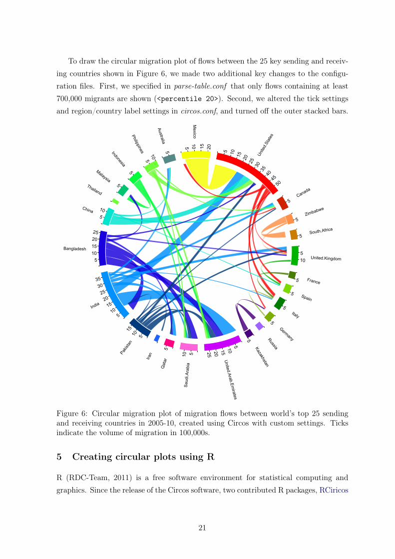
To draw the circular migration plot of flows between the 25 key sending and receiv-ing countries shown in Figure 6, we made two additional key changes to the configu-ration files. First, we specified in parse-table.conf that only flows containing at least700,000 migrants are shown (<percentile 20>). Second, we altered the tick settingsand region/country label settings in circos.conf, and turned off the outer stacked bars.
Figure 6: Circular migration plot of migration flows between world’s top 25 sendingand receiving countries in 2005-10, created using Circos with custom settings. Ticksindicate the volume of migration in 100,000s.
5 Creating circular plots using R
R (RDC-Team, 2011) is a free software environment for statistical computing andgraphics. Since the release of the Circos software, two contributed R packages, RCiricos
21

(Zhang et al. , 2013) and circlize (Gu, 2013), have become available on the open sourceCRAN repository. Both allow circular migration plots, similar to those in Figures 5and 6 to be produced with R. In this section, we focus on illustrating the reproductionof these figures using the circlize package, which we found marginally easier to workwith as many of the function names and arguments are more general terms related toplotting in comparison to some of the specialist Genomics terms used in the RCircospackage. In the remainder of this section, R scripts8 used to replicate the circularmigration plots of Figures 5 (without the outer stacked bars) and 6 are discussed, witha focus on the plotting functions within the circlize package.
5.1 Data preparation
In order to draw a circular migration plot using the circlize package, at least twoR objects must be created. First, a matrix containing the flow data, which weassign to object m is set up directly from the input data used in Section 4.3 (re-gion_custom.txt and country_custom.txt are provided in the supplementary mate-rial). Second a data.frame object, which we call df1 is set up to store information oneach segment of the circle to be plotted. For the regional data df1 is shown below.
> df1
order rgb region xmin xmax r g b rcol lcol
1 1 255,0,0 North America 0 10.095271 255 0 0 #FF0000 #FF0000C8
2 2 210,150,12 Africa 0 10.199718 210 150 12 #D2960C #D2960CC8
3 3 125,175,0 Europe 0 14.107659 125 175 0 #7DAF00 #7DAF00C8
4 4 117,0,255 Soviet Union 0 4.736899 117 0 255 #7500FF #7500FFC8
5 5 160,0,125 West Asia 0 9.492199 160 0 125 #A0007D #A0007DC8
6 6 29,100,255 South Asia 0 11.525938 29 100 255 #1D64FF #1D64FFC8
7 7 0,255,233 East Asia 0 7.256758 0 255 233 #00FFE9 #00FFE9C8
8 8 73,255,100 South East Asia 0 4.259029 73 255 100 #49FF64 #49FF64C8
9 9 100,146,125 Oceania 0 1.990567 100 146 125 #64927D #64927DC8
10 10 255,219,0 Latin America 0 7.737376 255 219 0 #FFDB00 #FFDB00C8
The first three rows of df1 are provided in the input file, where the data frame issorted using the arrange function in the plyr package (Wickham, 2011) based on the
8The R scripts are available in both the supplementary material and as demonstrationscripts in the migest package Abel (2012). The later can be run in R using the com-mands demo("cfplot_reg", package = "migest", ask=FALSE) or demo("cfplot_nat", package= "migest", ask=FALSE) once the migest, circlize and plyr packages are installed.
22

order column. The xmin and xmax columns are created in order for plotting functionsto determine the length of segments on the outside of the plot. The xmax values aredetermined by the sum of the inflows and outflows (column and row totals) of the flowtable. The separate numeric r, g and b columns are used to find the colour names inthe preceding two columns using the rgb function. The first column of colours, rcolis used for the circle’s segments. The second column of colours, lcol, lists transparentversions of rcol, used in the links (i.e. flows) between the circle’s segments.
5.2 Plotting circle segments
Using the circlize software, basic graphic parameters for circos plots can be set usingthe circos.par function. For our plots we found editing the track.margin argumentwas useful in controlling the amount of space for segment labels and the gap.degree
argument for spacing between segments. We also set the start.degree=90 to allowthe first region (North America) in the circos plot to be located around the 12 o’clockposition.
Before plotting the segments, users must define their names and lengths using thecircos.initialize function. The circos.trackPlotRegion function can then becalled to plot each segment (called sector in circlize), as such:
circos.trackPlotRegion(ylim = c(0, 1), factors = df1$region, track.height=0.1,
panel.fun = function(x, y) {
name = get.cell.meta.data("sector.index")
i = get.cell.meta.data("sector.numeric.index")
xlim = get.cell.meta.data("xlim")
ylim = get.cell.meta.data("ylim")
circos.text(x=mean(xlim), y=2.2, labels=name, direction = "arc")
circos.rect(xleft=xlim[1], ybottom=ylim[1], xright=xlim[2], ytop=ylim[2],
col = df1$rcol[i], border=df1$rcol[i])
circos.rect(xleft=xlim[1], ybottom=ylim[1], xright=xlim[2]-rowSums(m)[i],
ytop=ylim[1]+0.3, col = "white", border = "white")
circos.rect(xleft=xlim[1], ybottom=0.3, xright=xlim[2], ytop=0.32,
col = "white", border = "white")
circos.axis(labels.cex=0.8, direction = "outside",
major.at=seq(0,floor(df1$xmax)[i]), minor.ticks=1,
labels.away.percentage = 0.15)
}
23

)
In the first three arguments of this function call, the limits on the y-axis, names andthe height relative to the overall plot of the segments are given. Specifications forindividual segments are determined using the panel.fun argument. For each segment,the name, index, x and y limits are recorded in-turn from meta data within the user’sR environment. In order to display migration data, we suggest the use of five functionsto build the segments similar to that of Figures 5 and 6. First, circos.text addslabels for given x and y co-ordinates, relative to each segment, with specifications forthe label name and direction of the text. Second, circos.rect is used to plot the mainsegment given left, right (on the x-axis) top and bottom (on the y-axis) coordinates,alongside colour details taken from df1. Third, a white rectangle is plotted (usingcircos.rect) over part of the main segment to distinguish inflows from outflows. Itslength is determined by the row sums of the migration flow matrix m. Its height is setas 30% of the segment height (which is 1 unit tall). Fourth, a final thin white rectangleis plotted over the entire length of each segment. Fifth, the axis are plotted using thecircos.axis command.
5.3 Plotting links
In order to plot links between segments in order of the thickest first, we created asecond data.frame object, df2 containing the long form of the matrix m. This objectis first sorted to place the thickest flow in the first row and smallest in the last row,and then sub-setted to eliminate small flows that would clutter the plot. The first sixrows can be viewed in the R console:
> head(df2)
orig dest m
1 South Asia West Asia 4.902081
2 Latin America North America 3.627847
3 Africa Africa 3.142471
4 Europe Europe 2.401476
5 Africa Europe 2.107883
6 Soviet Union Soviet Union 1.870501
We also add two further columns to the df1 object, marking the initial x-positions ofeach segment for links representing outflows (sum1) and inflows (sum2).
24

Using a for loop, we consider each row of df2 in-turn. Within the loop, we firstassign the i and j index for each origin and destination under consideration.
for(k in 1:nrow(df2)){
i<-match(df2$orig[k],df1$region)
j<-match(df2$dest[k],df1$region)
circos.link(sector.index1=df1$region[i],
point1=c(df1$sum1[i], df1$sum1[i] + abs(m[i, j])),
sector.index2=df1$region[j],
point2=c(df1$sum2[j], df1$sum2[j] + abs(m[i, j])),
col = df1$lcol[i], top.ratio=0.66, top.ratio.low=0.67)
df1$sum1[i] = df1$sum1[i] + abs(m[i, j])
df1$sum2[j] = df1$sum2[j] + abs(m[i, j])
}
The links are then plotted using the circos.link command, connecting the originand destination segments. The size of the base of the link is determined by the point1argument at the origin segment and point2 argument at the destination segment. Weset the origin segment to start at the current sum of outflows (df1$sum1[i]) and endat the sum of outflows with the addition of the m[i,j] flow under consideration in theloop. A similar specification is also set for the x-axis of the destination segment usingthe inflow totals (df1$sum2[j]). The height and thickness of the link at its mid-pointis determined by the top.ratio and the top.ratio.low argument. We found settingthese values to 0.66 and 0.67 (on a scale of 0 to 1) gave links similar in style to thosecreated using Circos (see Section 4). Before ending the loop we update the sum1 andsum2 columns in df1 in order for the next plotted link in the corresponding region tobegin further along the x-axis of the origin and destination segments.
Plots in R graphics devices can sometimes appear skewed if the device is not per-fectly square. For easier viewing, readers can output the contents of their graphicsdevice to a PDF using:
dev.copy2pdf(file = "cfplot_reg.pdf", height=10, width=10)
The final plots of both the region- and country-level data are shown in Figure 7.A couple of adjustments were made in the code for the country-level plot. First thetrack.margin argument was increased to allow more space for country labels. Second,adjustments for the position and direction of the labels, dependent on the position ofthe segment in the circle were passed to the circos.text function.
25

North America0 1 2 3 4 5
67
89
10
Africa
0
12
34
56
78
910
Europe
01
23
45
67
89
1011
12
1314
Soviet Union
01
234
West Asia012345678
9
South
Asia
01
23
45
67
89
1011
Eas
t Asi
a
01
23
45
67
Sou
th E
ast A
sia
01
23
4Oce
ania
01
Latin America
01
23
4 5 6 7 Mex
ico
0 5 10 15 20
Unite
dSta
tes
05
1015
2025
30
3540
4550
Canada
05
Zimbabwe
05
SouthAfrica
05
UnitedKingdom
05
10
France
05
Spain
05
Italy
05
Germ
any
05
Russia
0
Kazakhstan
05
United
Arab
Em
irates
0510152025
Sau
diA
rabi
a
0510
Qat
ar
05
Iran
0
Pakist
an 05
1015
India
05
1015
2025
3035
Bangladesh
05
1015
2025
China
05
10
Thailand
0
Malaysia
05
Indonesia
05
Philippines
05 10
Australia
0 5
Figure 7: Circular migration plot of migration flows between regions (left) and world’stop 25 sending and receiving countries (right) in 2005-10, created using the circlize Rpackage.
6 Creating interactive circular plots using d3.js
D3 is a JavaScript library which empowers creating beautiful interactive visualisationsin HTML. Although not tied to the Web per se, it is predominantly used to do data-driven manipulations of Web content. D3 is the fourth iteration of a visualizationlibrary, its precursors are Prefuse (Java, 2005), Flare (Actionscript, 2007) and Protoviz(Javascript, 2009). D3 was developed by Mike Bostock9 and sponsored by his employer,The New York Times. Since its release in 2010, this JavaScript library has become thestate-of-the-art for interactive data visualisations and is frequently used in emergingfield of data journalism.
Using D3 to embedd Scalable Vector Graphics (SVGs) inside HTML documentsmakes it possible to dynamically create various shapes like circles, bézier curves andrectangles. We bind the migration flow estimates by (Abel & Sander, 2014) to SVGsto create a circular migration plot that can be shown on the web. Each SVG elementis assigned a special set of Cascading Style Sheets (CSS) properties that define colors,and thus ensure that the plot resembles closely the static image created using Circos(see Section 4).
The main strenght of D3 is that SVG shapes can be manipulated based on the data9https://github.com/mbostock/d3/commit/b2aa3c7355f46634738b46789c649c4e2da94e3e
26

they are bound to. This "data-driven"10 approach to Document Object Model (DOM;the programming interface for HTML documents) manipulation facilitates powerfulvisualization that is not tied to a proprietary framework. With the help of D3, wegenerate a circular plot with smooth transitions (a) between time periods, and (b)between region- and country-level views. User interaction is further enhanced throughtooltips that show the numbers of migrants for a given flow, country or region whenhovering over the plot with the mouse.
The functional style of D3 encouraged us to develop a library tailored at creatingcircular migration plots for the web. This library is available online on GitHub11 andmakes reusing our code for other visualisations of flow data extremely easy. In theremainder of this section, we discuss the main steps for creating interactive circularmigration plots using our customised D3 library.
6.1 Data preparation
To minimize computation needs on the client, raw data is preprocessed and transformedto a structure best suited for the JavaScript language which in turn generates the vis-ible circular plot. While the CSV format is a good fit for tabular data interchange,JSON (JavaScript Object Notation)12 has the ability to hold complex structured dataand is natively parseable in Javascript programs. The output of the transform step istherefore JSON-formatted.
Preprocessing involves two steps:
1. Filter out countries with too small migration flows
2. Transform into a D3-optimized JSON structure
The first step is to remove countries which have very small migration flows. Other-wise the graphic becomes too cluttered and unresponsive. Too many fine shapes alsomake it difficult to read the plot and distract from the key flows. The countries to beremoved are defined in a seperate CSV file.
10http://d3js.org/11https://github.com/null2/circular-migration-plot12http://json.org/
27
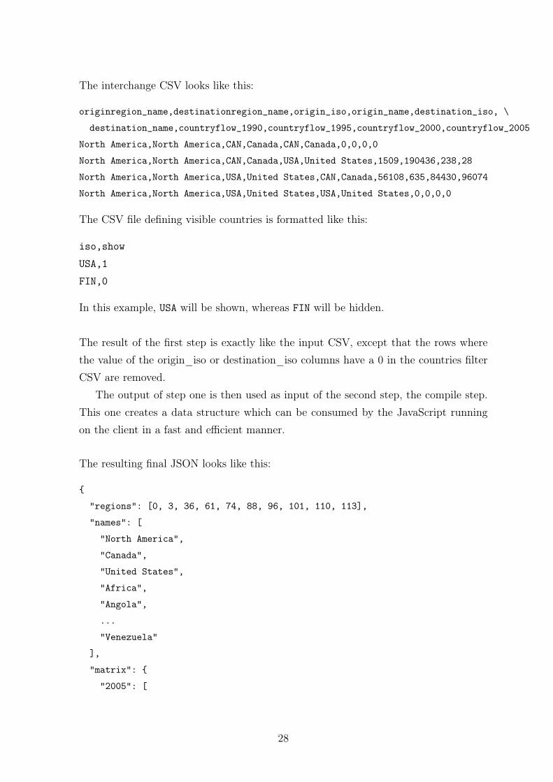
The interchange CSV looks like this:
originregion_name,destinationregion_name,origin_iso,origin_name,destination_iso, \
destination_name,countryflow_1990,countryflow_1995,countryflow_2000,countryflow_2005
North America,North America,CAN,Canada,CAN,Canada,0,0,0,0
North America,North America,CAN,Canada,USA,United States,1509,190436,238,28
North America,North America,USA,United States,CAN,Canada,56108,635,84430,96074
North America,North America,USA,United States,USA,United States,0,0,0,0
The CSV file defining visible countries is formatted like this:
iso,show
USA,1
FIN,0
In this example, USA will be shown, whereas FIN will be hidden.
The result of the first step is exactly like the input CSV, except that the rows wherethe value of the origin_iso or destination_iso columns have a 0 in the countries filterCSV are removed.
The output of step one is then used as input of the second step, the compile step.This one creates a data structure which can be consumed by the JavaScript runningon the client in a fast and efficient manner.
The resulting final JSON looks like this:
{
"regions": [0, 3, 36, 61, 74, 88, 96, 101, 110, 113],
"names": [
"North America",
"Canada",
"United States",
"Africa",
"Angola",
...
"Venezuela"
],
"matrix": {
"2005": [
28

[ 139950, ... 8621 ],
[ 51564, ... 458 ],
...
],
"1990": [
...
]
}
}
To reduce the amount of chords displayed at any time, data is accumulated in regionflows. Only Region flows are initially displayed in the plot. The user can expand aregion to see individual country flows by clicking on the region.
There are only two regions expanded to individual countries at any time, again forperfomance and focus reasons. When the user expands a third region, the first regioncollapses.
To achieve this, the region flows are stored in the flow matrix in the data structure,followed by the appropriate country flows. A regions index keeps track of the regionflows. Expanding a region is then done by displaying all flows in the matrix between thecurrent region index and the next region index. To display labels, region and countrynames are included. More on matrices and the data format can be found here13.
An implementation of these tasks as well as a description and usage instructionscan be found in the Circular Migration Plot Library14.
6.2 Extending D3
While D3 provides helpful layouts15 for generating chords, the original implementationshown in Figure 8 had to be extended to fit the requirements of circular migrationplots.
In contrast to the chord diagram provided by Mike Bostock, we visualise migrationflows as two directed chords, one for each directional flow between two countries/regions(see Figure 9). A chord is a shape which displays a single flow. It is a geometric shapewith two arcs connected with two bezier curves. The other difference to the originalexample is that the chord ends on a slightly smaller radius of the main circle. The gapbetween bezier and circle segment indicates the destination end of a migration flow.
13https://github.com/mbostock/d3/wiki/Chord-Layout14https://github.com/null2/circular-migration-plot15https://github.com/mbostock/d3/wiki/Layouts
29

Figure 8: Chord diagram by Mike Bostock showing directed relationships among agroup of entities (Source: http://bl.ocks.org/mbostock/4062006).
Figure 9: Interactive circular migration plot of migration flows between regions (left)and flows to and from North America (right) in 2005-10, created using D3.
30

The modified chord layout16 can be found along with the extended chord shape17
in the lib/ folder of the Circular Migration Plot Library18. Figure 10 illustratesthe interactive features of our visualisation, which allows the user to switch betweenregion and country-level views by clicking on the segment of the circle. For clarity andappearance, a maximum of two regions can be split into countries.
Figure 10: Interactive circular migration plot of migration flows to and from Europeancountries (left) and flows to and from South Asian and European countries (right) in2005-10, created using D3.
7 Conclusions
Making the wealth of information contained in migration flow data more accessible andunderstandable for researchers and the interested public is difficult because of the highdegree of complexity that the data exhibit. Migration maps that are typically used toshow the volume and direction of place-to-place flows struggle to visually convey thecomplexities of human movement.
The visualisation presented in this paper aimed to address this gap in the literature.We have shown in an earlier paper (Abel & Sander, 2014) that circular migration plotsallow us to meaningfully explore, relate, and communicate migration data to a wideraudience. In a nutshell, circular plots arrange the origins and destinations of migration
16https://github.com/null2/circular-migration-plot/blob/master/lib/layout.js17https://github.com/null2/circular-migration-plot/blob/master/lib/chord.js18https://github.com/null2/circular-migration-plot
31

flows in a circular layout, scale each flow to allow the entire system to be shownsimultaneously, relate the volume of movement to the width of the flow, and indicateits direction through colour coding.
To encourage the wider use of circular migration plots, we have discussed the rele-vant steps for creating the plot using three alternative software packages: Circos, R viathe circlize package, and the Java Script Library D3. The decision about which soft-ware to choose depends on the user’s preferences. Circos offers the greatest flexibilityin design and functionality, while R via the circlize package may be more appealing forthose who are already familiar with data visualisations in R. The JavaScript libraryD3 is becoming an increasingly popular tool for interactively visualising data on theweb. The script code can be easily embedded into any HTML5 website. The inputdata for the circular plots presented in this paper are available in the supplementarymaterial, which also provides the configuration files required for creating plots withCircos. Additional information on quantifying and visualizing the global flow of peoplecan be found at www.global-migration.info, where we also provide a link to the D3source code on Github.
We hope that our new visualisation opens up new avenues for understanding globalmigration, for telling the stories hidden behind large data sets, and for more effectivelycommunicating science to peers and the interested public. Circular migration plotsnot only enhance our ability to analyse, understand and communicate the complexpatterns and trends in migration flow data, they can also be used to visualise otherkinds of flow data, such as trade and remittances flows.
32

References
Abel, Guy J. 2012. migest: Useful R Code for the Estimation of Migration.
Abel, Guy J. 2013. Estimating global migration flow tables using place of birth data.Demographic Research, 28, 505–546.
Abel, Guy J., & Sander, Nikola. 2014. Quantifying Global International MigrationFlows. Science, 343(6178).
Beddoe, David Paul. 1978. An alternative cartographic method to portray Origin-Destination data. Ph.D. thesis, University of Washington.
Bostock, M., Ogievetsky, V., & Heer, J. 2011. D3 Data-Driven Documents. IEEETransactions on Visualization and Computer Graphics, 17(12), 2301–2309.
Bryant, John. 2011. Visualising Internal Migration Flows. Population Association ofNew Zealand, 37, 159–171.
Cerrutti, Marcela, & Massey, Douglas S. 2001. On the auspices of female migrationfrom Mexico to the United States. Demography, 38(2), 187–200.
Czaika, Mathias, & de Haas, Hein. 2013. The Globalisation of Migration. IMI WorkingPapers.
Dorling, Danny. 2012. The Visualisation of Spatial Social Structure. John Wiley &Sons.
Fassmann, Heinz, & İçduygu, Ahmet. 2013. Turks in Europe: Migration Flows, MigrantStocks and Demographic Structure. European Review, 21(03), 349–361.
Geertman, Stan, Jong, Tom de, & Wessels, Coen. 2003. Flowmap: A Support Toolfor Strategic Network Analysis. Pages 155–175 of: Geertman, Dr Stan, & Stillwell,Professor John (eds), Planning Support Systems in Practice. Advances in SpatialScience. Springer Berlin Heidelberg.
Gu, Zuguang. 2013. circlize: Circular layout in R.
Guo, Diansheng, Zhu, Xi, Jin, Hai, Gao, Peng, & Andris, Clio. 2012. DiscoveringSpatial Patterns in Origin-Destination Mobility Data. Transactions in GIS, 16(3),411–429.
33
Heer, Jeffrey, Bostock, Michael, & Ogievetsky, Vadim. 2010. A tour through the visu-alization zoo. Commun. ACM, 53(6), 59–67.
Krzywinski, Martin, Schein, Jacqueline, Birol, İnanç, Connors, Joseph, Gascoyne,Randy, Horsman, Doug, Jones, Steven J., & Marra, Marco A. 2009. Circos: Aninformation aesthetic for comparative genomics. Genome Research, 19(9), 1639–1645.
Law, C.M., & Warnes, A.M. 1976. The Changing Geography of the Elderly in Englandand Wales. Transactions of the Institute of British Geographers, 1(4), 453–471.
Özden, Caglar, Parsons, Christopher R., Schiff, Maurice, & Walmsley, Terrie L.2011. Where on Earth is Everybody? The Evolution of Global Bilateral Migra-tion 1960–2000. The World Bank Economic Review, 25(1), 12–56.
Rae, Alasdair. 2009. From spatial interaction data to spatial interaction information?Geovisualisation and spatial structures of migration from the 2001 UK census. Com-puters, Environment and Urban Systems, 33(3), 161–178.
Ravenstein, E. G. 1885. The Laws of Migration. Journal of the Statistical Society ofLondon, 48(2), 167–235.
RDC-Team. 2011. R: a language and environment for statistical computing. Vienna,Austria: R Foundation for Statistical Computing; 2012. Open access available at:http://cran. r-project. org.
Schenk, Tom. 2012. Circos Data Visualization How-to. Packt Publishing Ltd.
Tobler, Waldo R. 1987. Experiments In Migration Mapping By Computer. The Amer-ican Cartographer, 14(2), 155–163.
Tufte, Edward R., & Graves-Morris, P. R. 1983. The visual display of quantitativeinformation. Vol. 2. Graphics press Cheshire, CT.
Verbeek, Kevin, Buchin, Kevin, & Speckmann, Bettina. 2011. Flow map layout viaspiral trees. IEEE transactions on visualization and computer graphics, 17(12),2536–2544. PMID: 22034375.
Wickham, Hadley. 2011. The split-apply-combine strategy for data analysis. Journalof Statistical Software, 40(1), 1–29.
34

Zhang, Hongen, Meltzer, Paul, & Davis, Sean. 2013. RCircos: an R package for Circos2D track plots. BMC bioinformatics, 14(1), 1–5.
35

VIENNA INSTITUTE OF DEMOGRAPHY
Working Papers Barakat, Bilal, Revisiting the History of Fertility Concentration and its Measurement,
VID Working Paper 1/2014.
Buber-Ennser, Isabella, Attrition in the Austrian Generations and Gender Survey,
VID Working Paper 10/2013.
De Rose, Alessandra and Maria Rita Testa, Climate Change and Reproductive
Intentions in Europe, VID Working Paper 09/2013.
Di Giulio, Paola, Thomas Fent, Dimiter Philipov, Jana Vobecká and Maria Winkler-
Dworak, State of the Art: A Family-Related Foresight Approach, VID Working Paper
08/2013.
Sander, Nikola, Guy J. Abel and Fernando Riosmena, The Future of International
Migration: Developing Expert-Based Assumptions for Global Population Projections,
VID Working Paper 07/2013.
Caselli, Graziella, Sven Drefahl, Marc Luy and Christian Wegner-Siegmundt, Future
Mortality in Low-Mortality Countries, VID Working Paper 06/2013.
Basten, Stuart, Tomáš Sobotka and Kryštof Zeman, Future Fertility in Low Fertility
Countries, VID Working Paper 05/2013.
Sharygin, Ethan, The Carbon Cost of an Educated Future: A Consumer Lifestyle
Approach, VID Working Paper 04/2013.
Winkler-Dworak, Maria and Heiner Kaden, The Longevity of Academicians: Evidence
from the Saxonian Academy of Sciences and Humanities in Leipzig, VID Working
Paper 03/2013.
Feichtinger, Gustav, Alexia Prskawetz, Andrea Seidl, Christa Simon and Stefan
Wrzaczek, Do Egalitarian Societies Boost Fertility?, VID Working Paper 02/2013.
Muttarak, Raya, Is it (dis)Advantageous to Have Mixed Parentage? Exploring
Education & Work Characteristics of Children of Interethnic Unions in Britain?, VID
Working Paper 01/2013.
Testa, Maria Rita and Stuart Basten, Have Lifetime Fertility Intentions Declined
During the “Great Recession”?, VID Working Paper 09/2012.
Buber, Isabella, Ralina Panova, and Jürgen Dorbritz, Fertility Intentions of Highly
Educated Men and Women and the Rush Hour of Life, VID Working Paper 08/2012.
The Vienna Institute of Demography Working Paper Series receives only limited review.
Views or opinions expressed herein are entirely those of the authors.
36