Embed Size (px)
Citation preview

Memorandum To: Dr. Kenneth Price From: Halle Hatch Subject: Klaas-‐Jonas Community Pool Website Visual Edit Date: March 2, 2015 Introduction
In this memorandum, I visually critique the Klaas-‐Jonas Community Pool website, www.ellsworth.k12.wi.us/community/pool/Pages/default.aspx. The Klaas-‐Jonas Pool is a community pool owned and operated by the Ellsworth Community School District. They provide a swimming pool, fitness classes, and swimming lessons year-‐round. The Klaas-‐Jonas Pool also prices their admissions to break even, rather than gain a profit, acting as an asset to the community. The primary audience is existing customers. The secondary audience is potential customers interested in purchasing memberships, using the pool for open swim, or renting the pool facility. All audiences need concise information regarding prices, services offered, and contact information. I will cover the following topics in this critique:
• Readers • Project Objectives • Content • Visual Design • Editing Objectives
While I am impressed with the pool’s website, it could benefit from some changes. While the site does fulfill its purpose by providing the bare and necessary information to customers about the pool facility, it needs to be updated and redesigned to increase usability.
User Profiling The primary readers of the Klaas-‐Jonas Pool’s website live in the Ellsworth, Wisconsin area. They will read the website to learn the hours of the facility and the prices for various services offered. The secondary readers live in surrounding towns and show interest in attending the facility on a temporary basis, such as for a daily admission or for a pool rental. The tertiary audience is local, potential customers.

Dr. Kenneth Price 2 2 March 2015
Audience Composite/ Persona CAROL OLIVIA
GENERAL INFORMATION
Age 48 16 Pool Frequency Daily use Sporadic use
Gender Female Female
EXERCISE ACTIVITIES & POOL USE
Pool Use Water aerobics Open swim
Frequent sources of information
Online articles, flyers, fellow colleagues
Friends, school, school flyers/ announcements, social media
Web Competency Moderate competency High competency
LIFESTYLE
Ultimate Goals Get in shape through water
exercise Exercise with friends in fun and creative ways
Activities Water aerobics & lap swim Open swim & swimming lessons
Objectives The website’s objectives include providing the reader with an address to the pool facility, directions from surrounding towns, facility hours, and prices of various services provided.
Project Objectives The website attempts to focus on all audiences, but the site only appears to be appropriate for the primary audience and ineffective for the secondary or tertiary audiences.

Dr. Kenneth Price 3 2 March 2015
Purpose The purpose of this document is to inform the Klaas-‐Jonas Pool customers of the facilities hours and prices. As a result, the pool will make more money. The website currently fails to concisely inform its readers as the visual design does not support the rhetorical purpose. The purpose should be easily obtained information about the pool in a user-‐friendly format; instead, the reader must critically read the entire site, scrolling several lengths down the web page, to deduce a possible answer. Uses As a result of reading the website, readers should know the hours of the facility, the services offered at the pool, and the prices of each service. The audience already knows the Klaas-‐Jonas Pool is a pool offered year round. The customer will look to the website to find specific information, such as the address, hours of operation, or the prices. Customers are also able to join an email and call list.
Visual Design Critique The website lacks concise information that allows the reader to view the site with ease. While there appears to be a method to the site, its design is not user-‐friendly in the least. Access Aids The Klaas-‐Jonas Pool’s website uses navigation on the first, and only, page of the website only. There is only one access aid throughout the entire website, located in the body of the text rather than at the top of the page for easy use. The headings are buried within the body of the text, making it difficult to locate information and tabs throughout the page.
• Questions or action phrases—There are a total of three headings, which
just touch on the questions a reader may ask beyond the contact information.
• Parallel access aids—The aids that are available at the top of the page are not for the pool’s use, but rather for the entire school district. They state, “Home,” “Schools,” “Classroom,” “Community,” “District,” “Athletics,” “Activities,” “Academics,” and “Going Green.”

Dr. Kenneth Price 4 2 March 2015
• Terminology—The website uses terminology all customers readily
understand.
• Subheadings and run-‐in headings—The site uses subheadings, but they are buried within the body of the text, making them difficult to locate. However, there are not any run-‐in headings. Both could effectively highlight different types of information as well as be located at visually effective locations.
Navigation The tabs tell the users where to go in a vague way. Because they are located on the left-‐hand side of the screen, it makes them not easy to locate. The navigational elements located at the top of the screen are not relevant to the pool itself, making the website not accessible to what the readers are used to seeing within a website. The website does not need a breadcrumb trail because the website only has the basics of the pool information. However, they need to be relocated to a more beneficial and effective location on the site’s home page.
Labeling The website does not have an apparent or understandable labeling system. While there are headings within the website page, they do not stand out to look like headings or to serve the purpose of headings. Visual Queuing There seems to be a vague visual hierarchy; some headings are larger than the text that follows, but some are not. This does not create a consistency for the reader to follow throughout the website. While there is subtle spacing between the different sections of information but it does not employ alignment or appropriate placement to indicate importance. Filtering The website uses no consistent patterns of color, placement, alignment, or typography. Because of this, the reader could have a difficult time locating important information.
Dr. Kenneth Price 5 2 March 2015
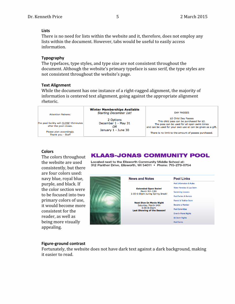
Lists There is no need for lists within the website and it, therefore, does not employ any lists within the document. However, tabs would be useful to easily access information. Typography The typefaces, type styles, and type size are not consistent throughout the document. Although the website’s primary typeface is sans serif, the type styles are not consistent throughout the website’s page. Text Alignment While the document has one instance of a right-‐ragged alignment, the majority of information is centered text alignment, going against the appropriate alignment rhetoric.
Colors The colors throughout the website are used consistently, but there are four colors used: navy blue, royal blue, purple, and black. If the color section were to be focused into two primary colors of use, it would become more consistent for the reader, as well as being more visually appealing.
Figure-‐ground contrast Fortunately, the website does not have dark text against a dark background, making it easier to read.

Dr. Kenneth Price 6 2 March 2015
Illustrations There are photographs, in the form of a slideshow, on the website. However, the photographs do not have the pixel quality one would expect for Internet use. Furthermore, the captions of these photographs are not consistent with the rest of the website’s typography and it does not follow appropriate capitalization and punctuation requirements. In addition, the website has no map to show the location of the store; a map could be easily linked to the website to support the rhetorical purpose of the pool’s site. Organization The content is disorganized:
• Title – The title of the website, as it appears at the top of the website’s page, states Ellsworth Community School District, while directly below it the site says, “Klaas-‐Jonas Community Pool.” The pool’s website is linked to the District’s website because it is run through the schools; however, community members looking for this site may not know or understand how to locate the pool’s website if they need to go through an additional site to find it. The website could be made into its own website to avoid confusion.
• Navigation – The navigation could be improved by making the existing tabs,
located on the far right side of the front page, run across the top of the website, as is what customers expect.
• Structure – Rather than having tabs direct readers to their desired information, the content is on one single page, causing the reader to have to scroll down to obtain their information. This could be easily fixed by using tabs to direct the readers, eliminating the scroll.

Dr. Kenneth Price 7 2 March 2015
Editing Objectives While I am impressed that the Klaas-‐Jonas pool has a website, considering they did not five years ago, it can be improved to better suit the customers. Below I discuss what is ineffective on the website and how the site can improve. Ineffective Elements The following elements are ineffective:
• Tabs – The tabs located within the website are not designed correctly for the pool’s website alone. The tabs a customer would likely expect to use are not located at the top of the page; rather the tabs located at the top of the page are for the entire district’s website rather than the pool’s site. The pool’s tabs are located on the far right side of the page, making the customer seek them out rather than being readily available.
• Scroll – The website does not use tabs correctly, forcing the reader to scroll down the page to seek information. Visual rhetoric suggests using tabs to keep the website to a single page.
• Contact Information – the contact information, while stated on the website, is only seen once on the entire page. There is not a tab to contact the pool or stating whom the director of the pool is. Adding a “Contact Us” tab would be beneficial.
Editing Goals The following are editing goals to create an easily navigable website:
• Create tabs – Tabs will assist the readers to obtain information quickly, rather than forcing the reader to search throughout the website.
• Create structure – Restructuring the website would put all information on a single page, while utilizing the tabs, eliminating the need to scroll down the website’s page.
• Increase contact information – A separate tab of contact information allows the reader to easily obtain information, such as location, maps, phone number, and more.
• Separate from District’s website – Creating a separate website, specifically for the pool’s use only will give the website more freedom to structure it accordingly based on the previously stated recommendations.
Redesign The following are specific ways I would redesign the website:

Dr. Kenneth Price 8 2 March 2015
• Reorganize – I would make the tabs of the website easily identifiable and accessible. The use of tabs would eliminate the need to scroll through down the website’s page.
• Establish a filtering methodology – I would add headings and subheadings under each of the tabs, as well as for the information located on the front page—this would organize the information to make it less crowded on the page, becoming pleasing to the readers.
• Remove the District’s information from the website – Eliminating the District’s information at the top of the page would reduce the amount of confusion from the readers, allowing them to locate the pool’s tabs in the place of the ones the District previously occupied.
Conclusion Editing the Klaas-‐Jonas Community Pool website in the manner I describe throughout this memorandum would significantly improve the website’s readability, organization, and overall ease of use for the readers’ benefits. These changes will allow the customers to easily and readily find the information they are seeking, fulfilling the purpose of the pool’s website. I look forward to continue working on this project. If you have any questions, please contact me by phone at (651) 399-‐1245 or by email at [email protected].


![[HATCH! PROGRAM] HATCH! FAIR Overview](https://img.dokumen.tips/doc/110x75/554bf5e9b4c9055a368b553f/hatch-program-hatch-fair-overview.jpg)