Embed Size (px)
Citation preview

Using Cartograms for Visualizing extended Floating Car Data
(xFCD)
Christian Röger*, Jukka M. Krisp
University of Augsburg, Institute of Geography, Applied Geoinformatics, Alter Postweg 118, 86159 Augsburg, Germany
* Corresponding author
Abstract: This study assesses the usefulness of cartograms when visualizing extended Floating Car Data (xFCD).
Cartograms deform regions in a map proportionally to assigned values. We apply this method for visualizing high-
resolution extended Floating Car Data (xFCD). Elaborating on this, we perform a case study in Mönchengladbach,
Germany using 1.8 Million record points containing information about carbon dioxide (CO2) emissions based on an
xFCD dataset. Utilizing a diffusion-based approach, we compute cartograms. Findings indicate a good suitability for
identifying areas with a higher (or lower) average emission of CO2. We provide a documented workflow to compute
cartograms based on parameters from an extended floating car dataset. The quality and spatial distribution of the basic
dataset turns out to be important. Choosing the correct spatial subdivision of the research area as a basis for deforming
areas is significant as it strongly influences the visual output.
Keywords: Cartograms, extended Floating Car Data (xFCD), floating car data (FCD), Visualization, spatial analysis
1. Cartograms as a possibility for visualizing
extended Floating Car Data (xFCD)
Cartograms visualize data by deforming polygons based
on their population value. Regions with a high values
increase their size while areas with low values shrink. The
popular website “worldmapper.org”1 for example offers a
number of cartograms. Figure 1 shows carbon dioxide
(CO2) emissions from various countries throughout the
world. Countries with high CO2 emissions are increased
in their size, while countries with lower emissions
decrease. This provides a map that distorts the way the
world is usually seen.
In this paper, we state that cartograms can help visualizing
high-resolution sensor data like extended Floating Car
Data (xFCD). In xFCD, individual vehicles act as floating
sensors recording information about the location of a car
combined with parameters like fuel consumption and
instantaneous carbon dioxide emission. By creating
1 https://worldmapper.org/ (Accessed 2018/11/27)
cartograms, we intend to explore extended Floating Car
Data visually. Therefore, we investigate questions
including:
Which cartogram algorithms are commonly
used? Which of them are applicable for our
purpose?
How can we pre-process our xFCD datasets in
order to use them for cartogram generation?
What are the benefits when visualizing xFCD
using cartograms?
1.1 Extended Floating Car Data (xFCD)
Floating Car Data (FCD) is a possibility of gathering
mobile traffic data for wide-area road networks. Therefore,
single vehicles act as floating sensors. Historically, there
have been other traffic data collection systems like
inductive loops or video cameras. However, their
characteristics as stationary systems with a need of
installing on-road instruments has been leading to higher
demands of FCD-based setups (Fabritiis et al. 2008).
Generally, Floating Car Data consists of position (latitude,
longitude, altitude) and timestamp information. Therefore,
a GPS module is mandatory. Depending on the use case,
Ranacher et al. (2016) propose an acquisition frequency of
1/2 Hz to 1/10 Hz. Within a defined interval, records are
acquired and transmitted to a central server.
Figure 1. Cartogram of world carbon dioxide emissions in 2015. Source: www.worldmapper.org
Proceedings of the International Cartographic Association, 2, 2019. 29th International Cartographic Conference (ICC 2019), 15–20 July 2019, Tokyo, Japan. This contribution underwent single-blind peer review based on submitted abstracts. https://doi.org/10.5194/ica-proc-2-107-2019 | © Authors 2019. CC BY 4.0 License.

2 of 7
Extended Floating Car Data (xFCD) is an extension to
common FCD. Therefore, original FCD records are
enriched with information about internal and external
phenomena of the vehicle or the environment. Extended
data can include, for example, torque, CO2 emissions, fuel
consumption, vehicle speed or driving direction. How can
we connect the data collected by the sensors inside a car to
a geographic position? The SAE J1962 specification
provide a standardized hardware interface for recording in-
car sensor data. Since 1993, every European vehicle has an
electronic system in order to control driving-specific
functions like fuel injection, temperatures or appearing
trouble codes. In 2001, this procedure has been
standardized in the course of the Euro III agreement. For
extracting data, an on-board diagnostic (OBD) connector
can be used. When enriching this output with
corresponding spatio-temporal data using an external
device, extended Floating Car Data is being produced
(Ortenzi et al. 2010).
Previous research has investigated the detection of critical
situations or bottlenecks within road networks (Keler et al.
2017a), calculating travel times (Pfoser 2008, Rahmani et
al. 2015), extracting traffic flow patterns (Jahnke et al.
2017, Keler et al. 2017b) and investigating environmental
effects like carbon dioxide concentration or particulate
matter emissions (Gühnemann et al. 2004, Röger et al.
2018).
In Germany, the enviroCar2 project has been initiated by a
number of research partners to collect floating car data via
a crowd-sourced approach. Individual drivers can
contribute to the dataset by using a mobile application
linked with an OBD Bluetooth adaptor. Resulting records
can be accessed via an API3. Data is provided in a
geoJSON format. There is a consistent data structure
giving information about car specifications, driving
velocities and board computer parameters. The enviroCar
platform has recently been featured in the ‘Grüne Welle’
project4.
The visualization of xFCD has been investigated by a
number of researchers. Approaches include colorizing data
points in various ways (Stanica et al. 2013). Andrienko and
Andrienko (2007) propose binned views like heat maps or
2D histograms. Another approach by Cheng et al. (2013)
focusses on visualizing data using road elements. Figure 2
illustrates these common visualization techniques for
(extended) Floating Car Data.
2 https://envirocar.org (Accessed 2018/12/02) 3 https://envirocar.org/api (Accessed 2018/11/09) 4 https://www.moenchengladbach.de/de/rathaus/buergerinfo-a-
z/planen-bauen-mobilitaet-umwelt-dezernat-
vi/fachbereich/strassenbau-und-verkehrstechnik-66/projekt-
gruene-welle/ (Accessed 2018/11/07)
Figure 2 shows an initial data set (a) on the upper left hand
side containing spatially distributed points attached with
extended driving information. These extended values
might contain information about the speed or the carbon
dioxide emission of a vehicle. Subfigure (b) visualizes that
additional information by colorizing the data points with a
color grade from green (low values) to red (high values).
The other two illustrations interpolate values by spatially
joining data records to road trajectories (c) and a regular
grid (d). Color grading gives information about the
quantity of the calculated value.
1.2 Cartograms
Cartograms can be classified into area cartograms and
distance based cartograms. The distance-based approach
elaborates mainly on travel times or travel costs within a
defined space. Deformation can be accomplished either
from a defined center to other locations of a map or
between each location of a region (Wang et al. 2017). Area
cartograms base on population values given to polygons
on a map. Common area based approaches simply scale
regions so that they are proportional to their attached
population areas. Additionally, continuous area
cartograms keep the topology of a map so that neighboring
regions stay neighbors (House and Kocmoud 1998). The
key of creating an area-based cartogram is finding a
transformation 𝑟 → 𝑇(𝑟) that converts space according to
specified population values (Gastner and Newman 2004).
Implementing an algorithm for finding a proper
transformation has been a key question in cartogram
related research. In an early approach, Tobler (1963)
worked on deforming rectangular cells so that their area
matches their population density value. The problem he
faced was that his approach did not keep the map topology.
In order to prevent overlapped or folded areas within a
map, there had to be some additional constraints that made
Figure 2. Visualization possibilities for extended Floating Car
Data: original data (a), colorized data points (b), colorized road
elements (c) and a binned visualization (d)
Proceedings of the International Cartographic Association, 2, 2019. 29th International Cartographic Conference (ICC 2019), 15–20 July 2019, Tokyo, Japan. This contribution underwent single-blind peer review based on submitted abstracts. https://doi.org/10.5194/ica-proc-2-107-2019 | © Authors 2019. CC BY 4.0 License.
3 of 7
the simple algorithm complex and slow (Gastner and
Newman 2004). Dougenik et al. (1985) or Gusein-Zade
and Tikunov (1993) elaborated on this problem. The key
was to not only taking into account the individual
population value of each cell but also computing
interactions between cells when deforming them.
Gastner and Newman (2004) propose a diffusion-based
approach. Their algorithm bases on the assumption that
after calculating a cartogram, the population values of each
cell get uniform. That is because population “flows away”
from high-density fields to low-density fields. This process
gets described by a density function 𝜌(𝑟). In this case, 𝑟 is
a geographic position that is displaced according to the
diffusion of the density. The displacement 𝑟(𝑡) of each
point on a map can be calculated using the following
formula (Gastner and Newman 2004):
𝑟(𝑡) = 𝑟(0) + ∫ 𝑣(𝑟, 𝑡′) 𝑑𝑡′𝑡
0 [1]
where 𝑣(𝑟, 𝑡′) is the flowing velocity for a position 𝑟 at the
time 𝑡′. One disadvantage of the diffusion-based approach
is that no-data fields get eliminated if their population is
treated as zero. Gastner and Newman (2004) propose to
use the mean population value instead in order to keep
those areas “neutral” (Gastner and Newman 2004).
2. A Case Study in Mönchengladbach, Germany
For extended Floating Car Data, the area-based approach
of computing a cartogram seems more applicable than the
distance-based way. Keeping the topology is very
important, to discover deformations in certain regions that
would be hardly associable if they fold or overlap.
Therefore, we apply the diffusion-based approach by
Gastner and Newman (2004).
For the case study, we use the enviroCar database. As a
study area, we choose the district of Mönchengladbach in
Germany. In 2016, the project ‘Grüne Welle’ encouraged
citizens of the town to contribute xFCD in order to
improve the traffic flow of the city5. Hence, there is a
disproportionately high count of record points within the
enviroCar dataset located in the district of
Mönchengladbach.
We use the enviroCar API for accessing the dataset. After
downloading, we spatially clip the data for selecting only
the points within the Mönchengladbach district. The
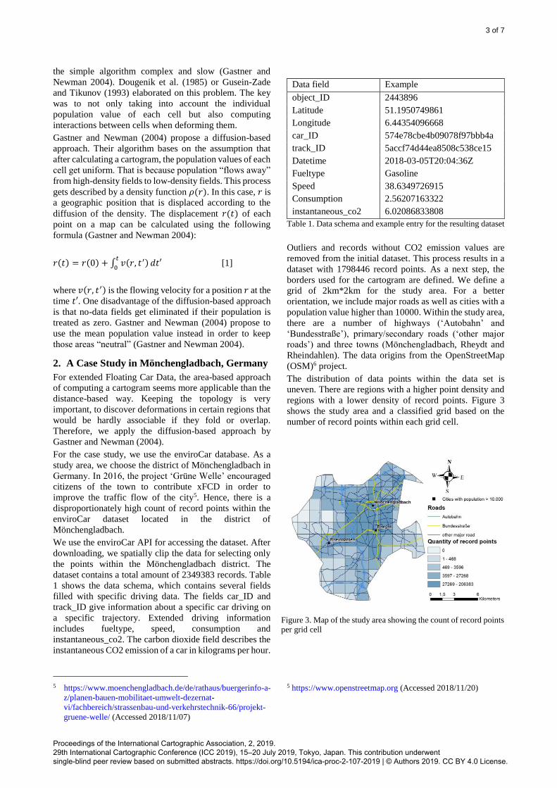
dataset contains a total amount of 2349383 records. Table
1 shows the data schema, which contains several fields
filled with specific driving data. The fields car_ID and
track_ID give information about a specific car driving on
a specific trajectory. Extended driving information
includes fueltype, speed, consumption and
instantaneous_co2. The carbon dioxide field describes the
instantaneous CO2 emission of a car in kilograms per hour.
5 https://www.moenchengladbach.de/de/rathaus/buergerinfo-a-
z/planen-bauen-mobilitaet-umwelt-dezernat-
vi/fachbereich/strassenbau-und-verkehrstechnik-66/projekt-
gruene-welle/ (Accessed 2018/11/07)
Data field Example
object_ID 2443896
Latitude 51.1950749861
Longitude 6.44354096668
car_ID 574e78cbe4b09078f97bbb4a
track_ID 5accf74d44ea8508c538ce15
Datetime 2018-03-05T20:04:36Z
Fueltype Gasoline
Speed 38.6349726915
Consumption 2.56207163322
instantaneous_co2 6.02086833808
Table 1. Data schema and example entry for the resulting dataset
Outliers and records without CO2 emission values are
removed from the initial dataset. This process results in a
dataset with 1798446 record points. As a next step, the
borders used for the cartogram are defined. We define a
grid of 2km*2km for the study area. For a better
orientation, we include major roads as well as cities with a
population value higher than 10000. Within the study area,
there are a number of highways (‘Autobahn’ and
‘Bundesstraße’), primary/secondary roads (‘other major
roads’) and three towns (Mönchengladbach, Rheydt and
Rheindahlen). The data origins from the OpenStreetMap
(OSM)6 project.
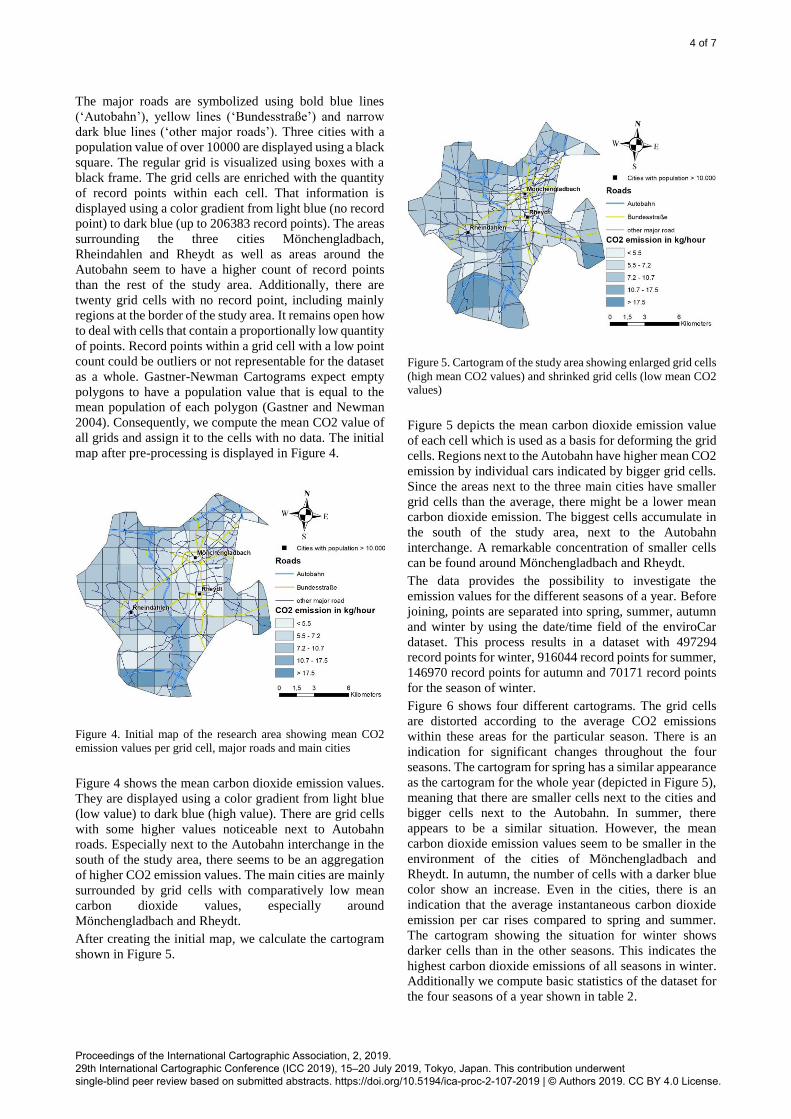
The distribution of data points within the data set is
uneven. There are regions with a higher point density and
regions with a lower density of record points. Figure 3
shows the study area and a classified grid based on the
number of record points within each grid cell.
5 https://www.openstreetmap.org (Accessed 2018/11/20)
Figure 3. Map of the study area showing the count of record points per grid cell
Proceedings of the International Cartographic Association, 2, 2019. 29th International Cartographic Conference (ICC 2019), 15–20 July 2019, Tokyo, Japan. This contribution underwent single-blind peer review based on submitted abstracts. https://doi.org/10.5194/ica-proc-2-107-2019 | © Authors 2019. CC BY 4.0 License.
4 of 7
The major roads are symbolized using bold blue lines
(‘Autobahn’), yellow lines (‘Bundesstraße’) and narrow
dark blue lines (‘other major roads’). Three cities with a
population value of over 10000 are displayed using a black
square. The regular grid is visualized using boxes with a
black frame. The grid cells are enriched with the quantity
of record points within each cell. That information is
displayed using a color gradient from light blue (no record
point) to dark blue (up to 206383 record points). The areas
surrounding the three cities Mönchengladbach,
Rheindahlen and Rheydt as well as areas around the
Autobahn seem to have a higher count of record points
than the rest of the study area. Additionally, there are
twenty grid cells with no record point, including mainly
regions at the border of the study area. It remains open how
to deal with cells that contain a proportionally low quantity
of points. Record points within a grid cell with a low point
count could be outliers or not representable for the dataset
as a whole. Gastner-Newman Cartograms expect empty
polygons to have a population value that is equal to the
mean population of each polygon (Gastner and Newman
2004). Consequently, we compute the mean CO2 value of
all grids and assign it to the cells with no data. The initial
map after pre-processing is displayed in Figure 4.
Figure 4. Initial map of the research area showing mean CO2
emission values per grid cell, major roads and main cities
Figure 4 shows the mean carbon dioxide emission values.
They are displayed using a color gradient from light blue
(low value) to dark blue (high value). There are grid cells
with some higher values noticeable next to Autobahn
roads. Especially next to the Autobahn interchange in the
south of the study area, there seems to be an aggregation
of higher CO2 emission values. The main cities are mainly
surrounded by grid cells with comparatively low mean
carbon dioxide values, especially around
Mönchengladbach and Rheydt.
After creating the initial map, we calculate the cartogram
shown in Figure 5.
Figure 5. Cartogram of the study area showing enlarged grid cells
(high mean CO2 values) and shrinked grid cells (low mean CO2 values)
Figure 5 depicts the mean carbon dioxide emission value
of each cell which is used as a basis for deforming the grid
cells. Regions next to the Autobahn have higher mean CO2
emission by individual cars indicated by bigger grid cells.
Since the areas next to the three main cities have smaller
grid cells than the average, there might be a lower mean
carbon dioxide emission. The biggest cells accumulate in
the south of the study area, next to the Autobahn
interchange. A remarkable concentration of smaller cells
can be found around Mönchengladbach and Rheydt.
The data provides the possibility to investigate the
emission values for the different seasons of a year. Before
joining, points are separated into spring, summer, autumn
and winter by using the date/time field of the enviroCar
dataset. This process results in a dataset with 497294
record points for winter, 916044 record points for summer,
146970 record points for autumn and 70171 record points
for the season of winter.
Figure 6 shows four different cartograms. The grid cells
are distorted according to the average CO2 emissions
within these areas for the particular season. There is an
indication for significant changes throughout the four
seasons. The cartogram for spring has a similar appearance
as the cartogram for the whole year (depicted in Figure 5),
meaning that there are smaller cells next to the cities and
bigger cells next to the Autobahn. In summer, there
appears to be a similar situation. However, the mean
carbon dioxide emission values seem to be smaller in the
environment of the cities of Mönchengladbach and
Rheydt. In autumn, the number of cells with a darker blue
color show an increase. Even in the cities, there is an
indication that the average instantaneous carbon dioxide
emission per car rises compared to spring and summer.
The cartogram showing the situation for winter shows
darker cells than in the other seasons. This indicates the
highest carbon dioxide emissions of all seasons in winter.
Additionally we compute basic statistics of the dataset for
the four seasons of a year shown in table 2.
Proceedings of the International Cartographic Association, 2, 2019. 29th International Cartographic Conference (ICC 2019), 15–20 July 2019, Tokyo, Japan. This contribution underwent single-blind peer review based on submitted abstracts. https://doi.org/10.5194/ica-proc-2-107-2019 | © Authors 2019. CC BY 4.0 License.

5 of 7
Table 2 lists selected statistical variables (mean, minimum,
maximum and standard deviation) for the dataset that
provides the basis for the cartograms in Figure 6. In spring
and summer seasons, there are similar mean and standard
deviation values, meaning the carbon dioxide emission is
analogical within the two seasons. This fact is also
noticeable looking at the cartograms. In addition, autumn
and winter seasons have the highest mean carbon dioxide
emission. There is also a strong indication for that when
comparing the cartograms in Figure 6. As stated, the
cartogram for the winter season seems to provide the
highest mean carbon dioxide emission values per vehicle.
3. Discussion and Conclusions
The case study shows that the diffusion-based approach by
Gastner and Newman (2004) is an applicable way of
producing cartograms. We also show that extended
Floating Car Data (xFCD) is a capable source for enriching
geographic regions with high-resolution sensor data.
The point density within individual grid cells matters. The
distribution of record points is uneven throughout the
study area. Dealing with empty grid cells needs to be
considered, as Gastner and Newman (2004) propose to
assign the mean value of all cells to them. This makes them
‘neutral’. However, it is questionable how to deal with
cells that include a disproportionally low count of record
points since there is the chance of outliers or
unrepresentative values to have an influence on the
resulting cartogram.
Apart of the quantity, the quality of each xFCD record
point is also a factor for calculating the population values
for a cartogram. Some of the enviroCar record points do
not have emission values attached, so they are not relevant
for the computation of the area population. Furthermore,
the calculation of the carbon dioxide emission directly
relies on parameters of the on-board computer of a car. It
is not documented how precise those values are depending
Table 2. Statistics for the cartograms shown in Figure 6 giving
information about mean, minimum, maximum and standard
deviation values for the average CO2 emission per vehicle
Spring Summer Autumn Winter
Mean 8.35 8.26 10.04 10.95
Min 4.71 3.27 4.40 3.90
Max 26.00 24.72 26.52 26.05
St. dev 3.53 3.64 4.11 4.46
Spring Summer Autumn Winter
Mean 8.35 8.26 10.04 10.95
Min 4.71 3.27 4.40 3.90
Max 26.00 24.72 26.52 26.05
St. dev 3.53 3.64 4.11 4.46
Figure 6. Cartograms of four seasons (spring, summer, autumn, winter) showing areas with higher CO2 emission values and regions
with lower CO2 emission values
Proceedings of the International Cartographic Association, 2, 2019. 29th International Cartographic Conference (ICC 2019), 15–20 July 2019, Tokyo, Japan. This contribution underwent single-blind peer review based on submitted abstracts. https://doi.org/10.5194/ica-proc-2-107-2019 | © Authors 2019. CC BY 4.0 License.

6 of 7
on the car manufacturer. How to treat cells with a varying
quality of record points stays an open research question.
Another discussable point is the choice of the subdivision
of a study area. We chose a regular grid of 2km*2km cells.
The size of the grid cells as well as the placement of them
within the study area directly affects the appearance of the
resulting cartogram. In our case study, dealing with several
grid sizes would possibly have been beneficial. In addition,
the factor of generalization increases as the size of the
individual cells within a grid expands. It is also possible to
use administrative borders instead of regular grid cells as
suggested by Gusein-Zade and Tikunov (1993) or Gastner
and Newman (2004).
Concluding this work, the quality of the results mainly
depends on three factors: (1) the quality and spatial
distribution of the basic dataset, (2) the choice of cell types
and cell sizes and (3) the choice of the cartogram
transformation algorithm.
Concerning the quality of the dataset, there have to be
enough data points in total for a heterogeneous result and
enough data points per cell so that there is a good
distribution throughout the study area. In addition, the data
source has to be reliable so that the quality of the dataset is
acceptable.
Choosing the right spatial division is an important factor
when creating cartograms. There is the possibility of
defining a regular grid or using administrative borders. The
choice of the grid size directly influences the resulting
cartogram. In the end, deformation within a map should be
clearly visible and explainable.
Selecting the correct cartogram algorithm is significant.
Since we work with spatially distributed data points, we
choose an area based cartogram approach. For the resulting
map, using an algorithm that keeps the topology is
important in order to keep the grid cells associable. The
diffusion-based algorithm of Gastner and Newman (2004)
is a good choice for creating cartograms based on high-
resolution sensor data.
An open research question is how to deal with cells that
deform based on a low count of record points compared to
other cells. In our case study, we discover that our data
produces areas with computed population values based on
a low quantity of record points. It has to be taken into
account that the influence of outliers or non-representative
points is higher in grid cells with a smaller amount of
record points as a data basis.
Concerning future research, we suggest to investigate pre-
processing extended Floating Car Data (xFCD) in order to
produce a higher precision for the population values as a
basis for calculating cartograms. Also considering the
density of record points on certain roads will be an
important task. Doing so, examining other datasets in
different study areas will be a challenge. Experimenting
with different cell sizes will also be part of the future work.
Another task will be to test more algorithms for creating
cartograms. Using distance-based approaches utilizing the
carbon dioxide value as cost seems to be promising.
4. References
Andrienko, N. and Andrienko, G. (2007). Designing visual
analytics methods for massive collections of movement
data. Cartographica: The International Journal for
Geographic Information and Geovisualization, 42(2),
117-138.
Cheng, T., Tanaksaranond, G., Brunsdon, C. and Haworth,
J. (2013). Exploratory visualisation of congestion
evolutions on urban transport networks. Transportation
Research Part C: Emerging Technologies, 36, 296-306.
Dougenik, J. A., Chrisman, N. R., & Niemeyer, D. R.
(1985). An algorithm to construct continuous area
cartograms. The Professional Geographer, 37(1), 75-81.
Fabritiis, C., Ragona, R. and Valenti, G. (2008). Traffic
estimation and prediction based on real time floating car
data. In: Intelligent Transportation Systems, 2008. ITSC
2008. 11th International IEEE Conference on. IEEE, S.
197–203.
Gastner, M. T. and Newman, M. E. (2004). Diffusion-
based method for producing density-equalizing maps.
Proceedings of the National Academy of Sciences,
101(20), 7499-7504.
Gühnemann, A., Schäfer, R. P., Thiessenhusen, K. U. and
Wagner, P. (2004). Monitoring traffic and emissions by
floating car data. Institute of Transport Studies Working
Paper, (ITS-WP-04-07).
Gusein-Zade, S. M., & Tikunov, V. S. (1993). A new
technique for constructing continuous cartograms.
Cartography and Geographic Information Systems,
20(3), 167-173.
House, D. H. and Kocmoud, C. J. (1998). Continuous
cartogram construction. In Proceedings of the conference
on Visualization'98 (pp. 197-204). IEEE Computer
Society Press.
Jahnke, M., Ding, L., Karja, K. and Wang, S. (2017).
Identifying origin/destination hotspots in floating car
data for visual analysis of traveling behavior. In: Progress
in Location-Based Services 2016: Springer, S. 253–269.
Keler, A., Krisp, J. M., Ding, L. (2017a). Detecting vehicle
traffic patterns in urban environments using taxi
trajectory intersection points. In: Geo-spatial Information
Science 20 (4), S. 333–344.
Keler, A., Krisp, J. M. and Ding, L. (2017b). Visualization
of Traffic Bottlenecks: Combining Traffic Congestion
with Complicated Crossings. In: International
Cartographic Conference. Springer, S. 493–505.
Ortenzi, F. and Costagliola, M. A. (2010). A new method
to calculate instantaneous vehicle emissions using OBD
data (No. 2010-01-1289). SAE Technical Paper.
Pfoser, D. (2008). Floating car data. In: Encyclopedia of
GIS: Springer, S. 321.
Rahmani, M., Jenelius, E. and Koutsopoulos, H. N. (2015).
Non-parametric estimation of route travel time
distributions from low-frequency floating car data. In:
Transportation Research Part C: Emerging Technologies
58, S. 343–362.
Proceedings of the International Cartographic Association, 2, 2019. 29th International Cartographic Conference (ICC 2019), 15–20 July 2019, Tokyo, Japan. This contribution underwent single-blind peer review based on submitted abstracts. https://doi.org/10.5194/ica-proc-2-107-2019 | © Authors 2019. CC BY 4.0 License.

7 of 7
Ranacher, P., Brunauer, R., van der Spek, S. and Reich, S.
(2016). What is an appropriate temporal sampling rate to
record floating car data with a GPS? In: ISPRS
International Journal of Geo-Information 5 (1), S. 1.
Röger, C., Keler, A. and Krisp, J. M. (2018). Examining
the Influence of Road Slope on Carbon Dioxide Emission
using Extended Floating Car Data. In: Adjunct
Proceedings of the 14th International Conference on
Location Based Services. ETH Zurich, S. 135–140.
Stanica, R., Fiore, M. and Malandrino, F. (2013).
Offloading floating car data. In World of Wireless,
Mobile and Multimedia Networks (WoWMoM), 2013
IEEE 14th International Symposium and Workshops on
a (pp. 1-9). IEEE.
Tobler, W. R. (1963). Geographic area and map
projections. Geographical review, 53(1), 59-78.
Wang L., Ding L., Krisp J.M. and Li X.: (2018) Design
and Implementation of Travel-time Cartograms. KN
Kartographische Nachrichten, Journal of Cartography
and Geographic Information (1), p. 13-20
Proceedings of the International Cartographic Association, 2, 2019. 29th International Cartographic Conference (ICC 2019), 15–20 July 2019, Tokyo, Japan. This contribution underwent single-blind peer review based on submitted abstracts. https://doi.org/10.5194/ica-proc-2-107-2019 | © Authors 2019. CC BY 4.0 License.


![arXiv:1908.07291v2 [cs.CG] 21 Aug 2019 · pute stable Demers cartograms, where each region is shown as a square and similar data yield similar cartograms. We enforce orthogonal separa-tion](https://img.dokumen.tips/doc/110x75/6024dbed50e7767aa4705292/arxiv190807291v2-cscg-21-aug-2019-pute-stable-demers-cartograms-where-each.jpg)