Embed Size (px)
Citation preview

Using BestDose
In this chapter we explain the structure and use of BestDose, with examples.
General description
The image below shows the view you get when you start BestDose. The actual view is called the Patient+data view and will be explained in detail later.
The arrows in the Toolbar can be used when stepping through a series of plots over time. Pressing the leftmost triangle button when a time- series is displayed will take you to the start of the series. The rightmost button takes you to the end. The two middle buttons take you one step forward or backward in the time series.
You will have several Menu options available at any time. Use the menus to load new patients, select drug population models, change plots, and so on. The different menu options are in general connected to the various views you will get, and they will be explained in detail later.

The views may have Fixed fields, giving you information about the patient or the population model. You will not be able to edit these fields directly.
The different views available are shown in the Tab panel. The name of the view Patient+data, Pop model data, Pop model plots, …, is shown on the tab. Pressing one of the tabs takes you to the corresponding view.
Some views may also have a Data grid. The grid is used to display time-dependent data, detailed information about the population model, and the suggested doses. Some data entry forms also use a Data grid. The grid can best be thought of as a spreadsheet. The fields in the Data grid can also easily be copied to the clipboard and into programs like Microsoft Excel. Simply select the desired fields and use Copy in the Edit menu.
The Patient+data view
The display
This view has two distinct parts, the fixed fields and a data grid. Go ahead and load a patient by selecting Patient and Load patient from the menu. The information displayed is either read directly from the file, or it is computed based on data read from the file. If you load the patient SANCH.MB, for example, the fixed fields of your patient view will look like this
The field label, to the left of each field, tells you what information is shown in each field. All dates will be shown in the format you have selected when installing your operating system. This means that if you selected the US locale dates will be given month/day/year, a European locale will show the dates as day/month/year.
Note that the Ethnicity field is not used at the moment. This field will be used when our model will take into account the ethnic group of the patient.
The data grid is filled with data if and only if the patient has a past history of drug doses and measured serum concentrations. The grid will be empty if the patient file contains no information. The patient we have loaded, SANCH.MB, has a past history.

The data shown in the grid consists of three sections: the doses given, the measured drug concentrations, and the serum creatinine. Use the scroll bar to the right to scroll up and down between the three sections.
The doses part consists of 11 columns
1 The dose number, starting at 1. 2 The route by which the dose was given, this can be one of PO, IM, or IV. 3 The date the dose was given, shown according to the selected locale. 4 The time the dose was given, shown hour:minutes:seconds 5 Time into the dosage regimen, starting at 0 hour for the start of the first dose 6 The weight of the patient at the time the dose was given 7 The creatinine clearance at the time the dose was given 8 The IV infusion time, the duration of the infusion if the dose was given IV. Doses
given by other routes will have a 0 in this column. 9 The dose interval between the start of this dose to the start of the next. 10 The IV infusion rate. Doses given by other routes will have a 0 in this column. 11 The drug amount given.
Scrolling down to the serum levels, you should see something like this if your patient file has a record of serum levels;

There are 7 columns displaying information about the serum levels. Most of them correspond to the fields used for displaying the dosage information.
1 The serum level number, starting at 1. 2 The date the sample was obtained, shown according to the selected locale. 3 The time the sample was obtained, shown hour:minutes:seconds. 4 The time into the regimen, starting when the first dose was given. 5 The dose number just before this serum sample. 6 The time after the previous dose number. 7 The measured concentration.
The controls
This section describes the menus and controls that can be used in combination with the patient view.
All options available for the patient view are accessible from the Patient menu option. By selecting this menu option the view will automatically switch to the Patient+data view. There are several options available for this menu selection, New patient, Load patient…. The options may be disabled based on your previous selections. You cannot save a patient’s data if you have no patient loaded and so on.
Selection of the New patient option. You will be presented here with a dialog box allowing you to enter the information about your new patient.
Some of the fields in this dialog box are optional. The ones you are required to fill in are the date of birth, the gender, the height, and weight. All of these values will be needed when analyzing data and/or computing a new dosage regimen. Click OK to use the patient data. The fixed field will now look like this. It even keeps the typo “FRank”, which should be “Frank”.

Any information previously present in the data grid will be removed. At this time a new patient file based on the information you entered in the dialog box has been created. Note that this patient only exists in the program. It has not yet been saved to a permanent file on disk.
The Load patient option allows you to load a patient from a file. The program recognizes three different patient types, the default file extensions are
1 .MB. This is an old format, and is a plain text file. It has been used in the
previous DOS version of BestDose (USC*PACK). 2 .MB2. This is an updated version of the old .MB format. The file is also a plain
text file, but with additional fields. 3 .USC. This is a completely new format. .USC files are binary files that can contain
information about multiple drugs given to the same patient. Note that even though this format is fully supported the current version of BestDose does not use the extended options provided by this format.
The Pop model data view
The display
The Pop model data view is very similar to the Patient+data view. They both have fixed fields and a data grid. This view will contain information about the selected drug population PK model. The top portion consists of a series of fixed fields.

The fixed fields consist of three groups. The left gives General information about the population model: The name of the drug, the name of the group that made the population model, the bioavailability, and the active (salt) fraction. The center block, Model information, provides information about the compartments used in the model and the allowable routes. The target Ranges block displays the common ranges for the peak and trough goals usually used with this drug.
The data grid portion of this view will contain statistical information about the population model and the matrix containing the parameter description support points and their corresponding probabilities.
The controls
Selecting Pop model on the menu bar will automatically switch the view to the Pop model data. The sub options for this menu are limited to one: Load population model. Select this option and you will get a dialog box asking you to select a drug population model.
Select the correct drug population model and press OK. If you selected Vancomycin, the Pop model data view should look like the one below. Take a look at the window frame at the top
It now contains both the Patient name, we entered “FRank Hansen”, and the name of the Population name “vanco 80kpts”. The names shown in this frame are always up to date, so you can always take a look at it if you are uncertain about which patient or population model you are working on.

As mentioned the data grid for the Pop model data can be separated into two parts, one for the Statistical information, and one for the Full matrix.
The Pop model plots view
This view is used to examine the data making up the population model in more detail. It will display the plots when you have selected a drug population model.
The display
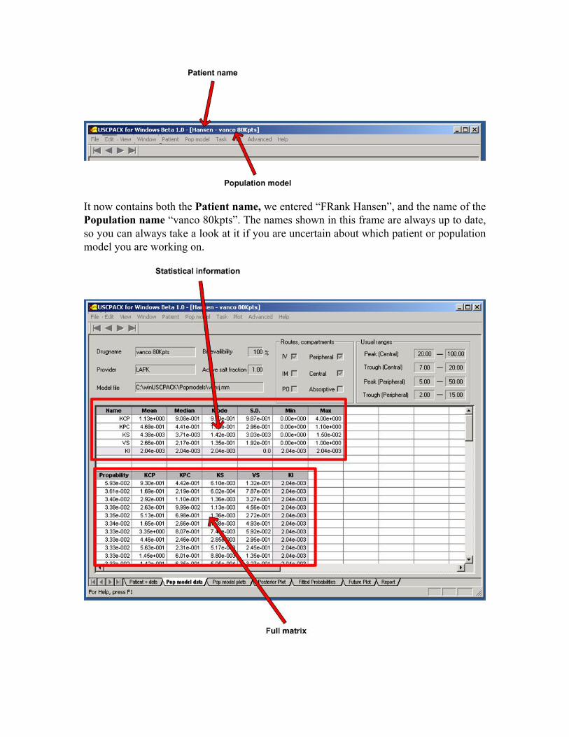
This is the first in a series of plots. When a population model is loaded and you switch to this tab, the default display is a 3D plot showing the parameters KS and VS if they are present in your population model. If they are not, the two first parameters will be selected and displayed.
The Plot view is the main window in this view, all the plots will be displayed in this window. The plotting routines used in BestDose are quite extensive giving you a
multiple options. You can export the plot or the data making up the plot to your clipboard or printer. You can add a grid, change axis, and lots more. A detailed explanation of your options is given in Appendix A.
Use the Parameter selector to select the parameters to be plotted. You must select two parameters if you want the 3D plot or the 2D scatter plot. If present, KS and VS will be selected by default.
The Plot selector allows you to switch between the different plots mode. A 2D plot showing all parameters and the 2D scatter plot showing KS and VS is shown below.
If you move the arrow over one of the points in the plot, the numerical values for that plot will be displayed in the Value display. In the 3D plot, the values for the two parameters and their probability will be displayed. In the 2D plot, the probability and the parameter value will be displayed. Moving the arrow over one of the points in the 2D scatter plot, parameter value will be displayed.
The controls
There are no menu options associated with this view.
The Posterior plots view
This view is will be shown when you have fitted a patient that has a past history, drug doses and serum concentrations measurements and a specific drug population model. To demonstrate this view we will load a patient and select the correct population model of the drug given to that patient. Pull down the Patient menu, select Load patient, and load

the “GENT2” file, for example. Pull down the Pop model menu, select Load population model, and select “Gentamicin”.
You will now fit the patient (provided by Alan Forrest) and a Gentamicin population model. This is simple. Pull down the Task menu and select Fit model. When the fitting has completed, you will be automatically transferred to the Posterior plots view.
The display
Fitting the Alan Forrest’s patient to the amikacin population model produces this plot.
This plot shows all the trajectories produced by the fitting process. There will be one trajectory for each of the parameter/probabilities sets. The Top 4 probability trajectories will be shown in color. All others will be shown by dotted black lines. The probabilities of the 4 most probable trajectories and their corresponding color are shown at the top of the plot. The Weighted average, computed by adding up all trajectories and multiplying them by their corresponding probability, is shown in solid black.

The red diamonds show the measured Serum concentrations. In this case the trajectories are close to the measured values, a good thing. There are also some short blue bars just above the time axis. These Dose tick lines show when a dose was given by any route.
The controls
This view can be altered using the Plot menu.
If you selected the amikacin population model your Plot menu will look like this. The “Peripheral compartment” will be dimmed because there is no peripheral compartment for this particular population model. The default plot for posterior fits is the central compartment, select the absorptive compartment and see what happens.
The plot now changed, showing the events in the absorptive compartment. If you selected Alan Forrest’s patient, you will see one spike at 18 hours (18.25 to be exact). This is the time when the IM dose was given. It might be a good time to spend some time looking at the patient, the population model, and the posterior fit views. Are the Dose ticks shown at the right times? Why are there no spikes in the absorptive compartment when doses are given IV? How many trajectories should there be in the plot?
In the above example the default posterior plot looks decent. This may not always be the case. If you have many diverse trajectories the plot may look cluttered, and the information shown may need to be reduced. If you want to only see the estimated Weighted average of all the trajectories, select the Extractions submenu, and select Weighted average only. You can also set a threshold level, showing you the trajectories making up a percent of the probabilities. Examine this by selecting Set subsets instead of Weighted average only. Enter 40 into the dialog that pops up, and you will get the two first trajectories (the first one has a probability of 24.97%, the second 12.63, making it a total of 37.6%), and the weighted average.
The subset selection will be active until you make a new selection or perform another fit. Selecting the absorptive compartment, the plot will show the two most probable trajectories. Return to the default display by selecting Show all subsets.
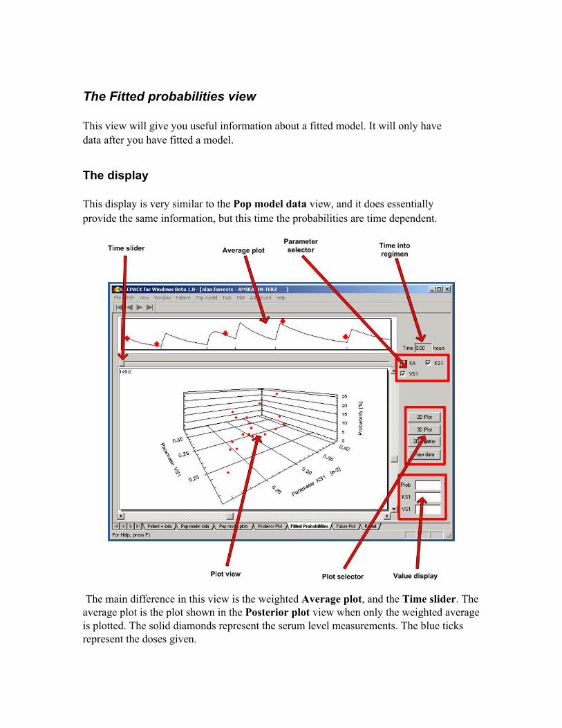
The Fitted probabilities view
This view will give you useful information about a fitted model. It will only have data after you have fitted a model.
The display
This display is very similar to the Pop model data view, and it does essentially provide the same information, but this time the probabilities are time dependent.
The main difference in this view is the weighted Average plot, and the Time slider. The average plot is the plot shown in the Posterior plot view when only the weighted average is plotted. The solid diamonds represent the serum level measurements. The blue ticks represent the doses given.

Select a time into the regimen, passing one or more of the serum level measurements. By dragging the Time slider to the right. See how the probabilities in the Plot view changes with each new sequential Bayesian posterior. New probabilities are computed each time there is a serum level measurements.
Select the Raw data button in the Plot selector, to see the most recent probabilities.
The controls
There are no menu options associated with this view.
The Report view
Moving from left to right, the next option should be the future plot, but we will do the Report view first. The reason for this will become apparent in a few lines.
If you have followed this from top to bottom you will now have a patient that has been fitted in your program. If not, please perform the steps lined out at the start of the Posterior plot section.
You will now compute a future regimen for your patient. Start off by selecting Future regimen via the Task menu option. A dialog box will pop up, asking you to select the route and sub-option. The process of computing a new or future regimen will be explained in detail later. Accept the default route (IV option 1: Control peak and trough) by clicking on the OK button.
Select Continue when asked to use your fitted data with this regimen, and select OK to accept the body weight and creatinine clearance. The values suggested for body weight and creatinine clearance are the last known values recorded for your patient.
You must now select the target level goals for your patient. Enter values so that your dialog box looks like the one below

Select OK. The program now starts to compute this dosage regimen for several dose intervals. When it completed you will see a dialog box with a plot. Accept the selected dose interval of 24 hours by clicking on OK.
The display
Voila, the doses for your patient have been computed, and the Report view is displayed.

This view consists of three sections. Patient information at the top, then Population model information, the route and the goals, and the New suggested dosage regimen.
You may switch to the Report view at any time. The information displayed will be based on your selected patient and population model. If you have no patient loaded, no patient information will be displayed, and so on.
The controls
You can print this report by selecting Print, from the File menu.
The Future plot view
Please complete the steps outlined for the Report view above, or develop your own future regimen.
The display

Computing a new regimen takes you to the Report view. Then select the Future plot tab to see more detailed information about your new regimen.
Because we have based this new regimen on the fitted data, this view will also show the results on the Old regimen. The Old regimen has the diamonds indicating serum level measurement, and both plots have the blue lines showing where a dose was or will be given.
The controls
The controls for this view are the same as with the Posterior plot, accessible from the Plot menu option. Note that you now have more options available for this menu selection.
You can remove the past plot by selecting Toggle past and future. Try it and watch the past disappear. Turn it back on using the same selection.
To get a completely different view, select the Concentration vs. probability. This will bring up the following display.

This is a scatter plot showing how well your new regimen is predicted to achieve your target goal values. Remember we selected to have a trough goal af 2.0. It seems like the values are a bit low at this time for this regimen. This plot is the situation after 24 hours. Use the Arrow buttons or the arrow keys on your keyboard to play forward in time to see if the new regimen improves. Note also how the Goal indicator changes back and forth between 2.0 and 20.0.
Extended plotting options
The plotting routine used in BestDose offers an extensive set of options. In this appendix we examine some of these options. All options are available by right-clicking inside a plot view. You will then get a menu providing the options.

As you can see there is also a Help option, offering detailed help for the various selections.
Zooming
All plots in the program have been configured to allow for zooming. The process of zooming is simple. Press and hold the left mouse button when inside a plot. Move the mouse and you will see the zooming rectangle. When you then release the left mouse button, the plot will expand the selected region inside the zoom rectangle.
To return the plot to the original status simply right-click inside the plot and select Undo zoom.
The customization dialog
The customization dialog gives you many options for customizing your plot. It does essentially give you an entry point to all other options. Select the tabs to perform one or more of the following options
� You can add a title and subtitle for your plot. � The plotting mode can be altered to show just the data points, to interpolate values
between the plots, or to show the plot as a bar graph. � Select the subsets to show. � Adjust the axis range, and switch to logarithmic axes, if desired. � Change the fonts used to display the axis labels and plot title. � Change the colors used for the background and foreground for the desk and graph.

� Display the different trajectories using different symbols.
Exporting plots
Several export options are provided for both data and plot images. Move the mouse pointer into a plot, right-click, and select the Export Dialog. You will then see the following dialog box.
The Export mode section allows you to export the plot image, or the data making up the plot. Selecting MetaFile, or BMP will export the plot, Text / Data Only will export the plot as floating point data.
If you export as an image or as data you have several options about where you would like to export the data to (BMP cannot be exported to a printer). This can be determined using the Export destination section.
To copy a plot into a Microsoft Word document, simply select MetaFile in the Export mode panel, ClipBoard as Export destination, and press or click Export. Go to the location in Word where your would like to have the plot and press Ctrl+v (Paste).
Exporting the actual data requires one more step. Select Text / Data Only in the Export mode, ClipBoard in the Export destination, and click on Export. At this point, a new dialog box pops up, giving you an option to select which subset to export.

You can make multiple selections in the Subsets to Export and Points to Export by the keeping the Ctrl key pressed while selecting subsets or individual points.
To export the whole dataset into Microsoft Excel, select Table in the Export Style frame, and press Export. Select the cell in Excel where you want the upper left element of the table and press Ctrl+v (Paste).
Removing the annotations
Annotations are used in three places, for the diamonds showing the serum concentration measurements, for the blue lines showing when the doses were or will be given, and for the red line separating the past and the future. You can toggle annotations on and off by selecting and deselecting the Show Annotations option.
The data points
You have two options to get more information about the data points. Selecting the Mark Data Points option and the trajectories will have small black dots showing the locations of the actual data computed points. To get even more information about these points, select the Include Data Labels option. The plot will now display the X and Y values of the data plots. This option is usually only useful when used in combination with the zoom feature, as it tends to make the plot cluttered.

Enabling gridlines
Gridlines can be enabled by selecting one of the options in the Grid Lines submenu. You can have gridlines in the X direction, Y direction, or both.
Maximize
Select this option, and the plot will expand to occupy the whole area of your desktop. You can close this window by hitting the Esc key or by left-clicking on the top frame of the window.

A Gentamicin case
In this chapter we give a detailed example on the use of BestDose using a gentamicin population model.
Initial preparations
Start BestDose and load the GENT2.MB patient data file, and the gentamicin population model. A description on how to load patient data files and population models can be found in the General usage chapter.
The initial view
After loading the patient and population model, the Patient+data display of BestDose will look like this

Note that the frame header displays the name of the patient and the name of the population model. The header display will be the same for all tabs making is easy to keep track of the current simulation.
Fitting without IMM
You will now fit the patient data to the population model, first without IMM. The settings controlling the use of IMM as well as other options can be found in the Advanced -> Compute options menu option.
Turn IMM off by setting the Alpha parameter to 1. In this mode, the parameters that best fit the patient’s data are assumed to be fixed and unchanging throughout the period of data analysis. This is a very conventional assumption. It underlies all our conventional practices of fitting data to find the best fit to it. In this case, the probabilities of the population parameter support points in the nonparametric joint density are recomputed, using Bayes’ theorem. Those support points that predict the patient’s measured serum concentrations well become more probable, and those that do not become less probable. In this way, the patient’s individual Bayesian posterior joint parameter density is found.
Note - in the present version, it is the numbers given that are used. The radio buttons have no effect.
Select OK to continue using the selected settings. These settings will be valid until they are changed or until BestDose is restarted.
Start the fitting process by selecting Fit model from the Task menu bar. After a few seconds, the new Posterior plot will be displayed, as shown below.

The Blue vertical bars along the horizontal time axis show when doses were given. The red diamonds show the measured serum levels and their times.
The information in these plots can be overwhelming due to the number of trajectories. If you wish to see only the central tendency of the Bayesian posterior fits, Select subsets - > Weighted average only from the Plot menu, as shown below.

As you can see there is a decent correlation between the weighted averagetrajectory and the serum level measurements.
You can get more information about the correlation between the trajectories and the serum levels by left-clicking on one of the red diamonds.

The dotted vertical line shows the value of the weighted average trajectory. The solid red line shows the value of the serum level at that time. The table to the right shows the concentrations and their corresponding probability. The concentrations that have a probability of more than 10% are show having a different background.
You can left-click on any plot point to see a similar display, but only the times that have a serum level measurement will have the red solid vertical line.
More information about the fit you just made can be found in the Fitted probabilities tab. The information accessible in this tab is similar to the Pop model data tab, and the default plot for this tab is a 3D scatter plot.
As with the Posterior plot tab you can left-click on the diamonds in the upper window to control the time slice shown in the lower window.
Select the Fit quality button to get a look at how good your fit was.

This plot show the correlation between the serum levels and the weighted average trajectory. The red dots are marked with numbers indicating the serum level number as shown in the Patient+data tab. The closer the red dots are to the diagonal line, the better the fit.
Again this show that the fit you just made was not too bad.
Fitting with IMM
Lets us see what happens when we enable IMM. Select Compute options under the Advanced menu, set the Alpha parameter to 0.999, and press OK.
Make a fit using the new value for the Alpha parameter by selecting Fit model under the Task menu. The Fit quality should now look like this

As you can see there is a slight improvement in the fit for serum level number 3, the rest is roughly the same as with no IMM.
Let us accept this fit and move on to developing a future regimen for this patient using the information we have obtained by making the fit.
Designing a future regimen
Using Minimized variance
First we design a future regimen using minimized variance. Select the Future regimen under the Task menu option.

You control the main route using one of the three radio buttons at the top, and the sub-route using one of the 7 vertical buttons. As you can see there the PO route is not allowed for this model, also there is no peripheral compartment for this population model.
Accept the default selection, IV option 1 – Control peak and trough, select dose interval, and press OK.
As we have performed a fit for the current patient and population model the program already has knowledge about the weight and creatinine clearance for this patient.
The latest recorded weight for this patient was 68 kg, and the most recent computed creatinine clearance was 27.09 mn/min/1.73msq. Accept these values by pressing OK.
Fill in the data for IV option 1 so that your dialog box looks like the one below.

Note that you can select a dose outside the usual ranges, and moving too far outside these ranges will result in a warning. For now, press OK to continue.
The program now computes the cost of using the different dose intervals. You control the ranges examined by altering the low and high bond options in the previous dialog box. After a few seconds this dialog box appears

The dots in the graph indicate that a cost has been computed for that dosage interval. The graph shows that the optimal dose interval is 24 hours. Select OK to continue.
The new regimen is now computed, an operation that will take a few seconds. When completed BestDose will switch to the Report tab.
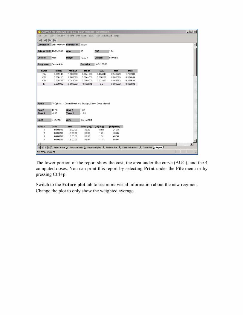
The lower portion of the report show the cost, the area under the curve (AUC), and the 4 computed doses. You can print this report by selecting Print under the File menu or by pressing Ctrl+p.
Switch to the Future plot tab to see more visual information about the new regimen. Change the plot to only show the weighted average.
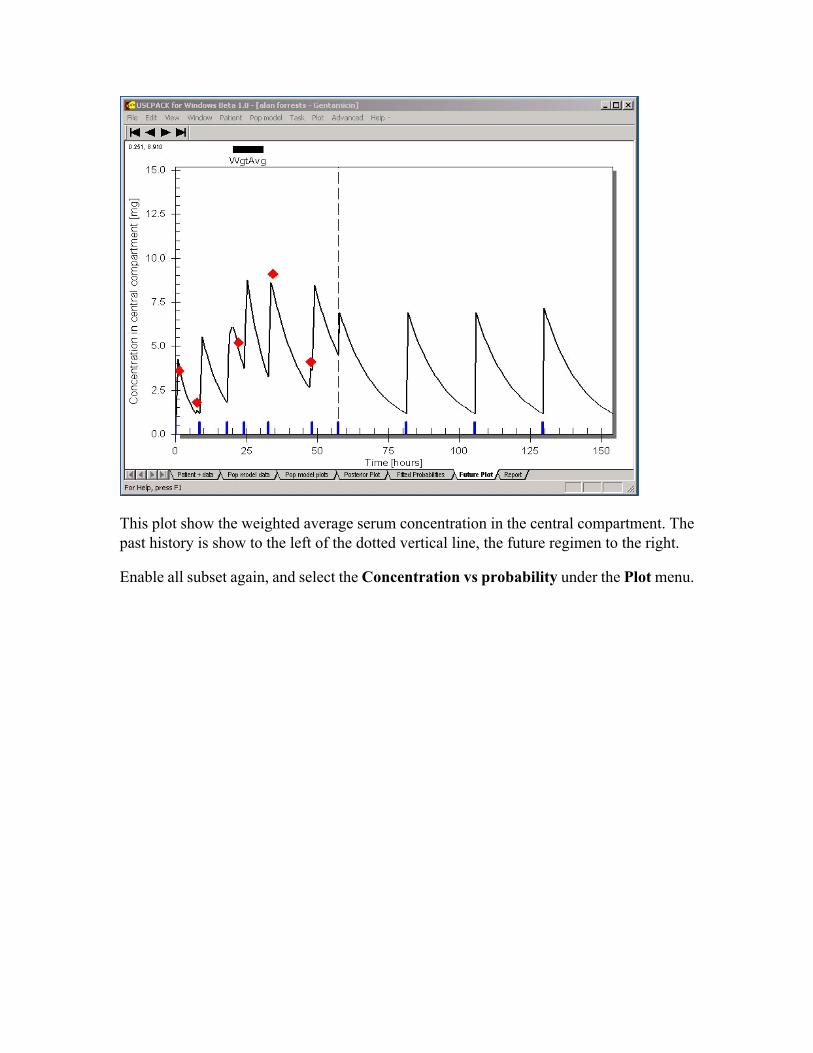
This plot show the weighted average serum concentration in the central compartment. The past history is show to the left of the dotted vertical line, the future regimen to the right.
Enable all subset again, and select the Concentration vs probability under the Plot menu.

This plot show the concentration along the x-axis and the probability along the y-axis for the first goal time, a goal of 12 0.5 hours into the regimen. The most probably set of support points, or trajectory, is again indicated by a solid red dot. It has a probability of 42.27% and this time it has a value of out 7. This is below your selected goal indicated by the solid vertical line. The black triangle show the weighted average.
Use the black arrows to move forward/backward in time to look at next/previous goals.
Using minimize bias
Select the Compute options under the Advanced menu option, change the lambda factor to 1 and the weighting factor to 0 (absolute error). Repeat the steps above to compute a new future regimen.
Select the Concentration vs probability under the Plot menu.

Note how the serum levels are much closer to the goal.


![Factors Influencing U.S. Charitable Giving during the ...€¦ · cause [14]. Using nonlinear decomposition techniques with data on U.S. giving collected between 1992 and 2001, the](https://img.dokumen.tips/doc/110x75/5ebd439db5bbc0604d4e40a5/factors-influencing-us-charitable-giving-during-the-cause-14-using-nonlinear.jpg)