Embed Size (px)
Citation preview

User Interface Standards and GuidelinesSAP Business One 9.1Document Version: 1.0 – 2014-05-21
PUBLIC
User Interface Standards and GuidelinesAll Countries

2PUBLIC© Copyright 2014 SAP AG. All rights reserved.
User Interface Standards and GuidelinesTypographic Conventions
Typographic Conventions
Type Style Description
Example Words or characters quoted from the screen. These include field names, screen titles,pushbuttons labels, menu names, menu paths, and menu options.
Textual cross-references to other documents.
Example Emphasized words or expressions.
EXAMPLE Technical names of system objects. These include report names, program names,transaction codes, table names, and key concepts of a programming language when theyare surrounded by body text, for example, SELECT and INCLUDE.
Example Output on the screen. This includes file and directory names and their paths, messages,names of variables and parameters, source text, and names of installation, upgrade anddatabase tools.
Example Exact user entry. These are words or characters that you enter in the system exactly as theyappear in the documentation.
<Example> Variable user entry. Angle brackets indicate that you replace these words and characterswith appropriate entries to make entries in the system.
EXAMPLE Keys on the keyboard, for example, F2 or ENTER .

User Interface Standard and Guidelines
User Interface Standards and GuidelinesTable of Contents
PUBLIC© Copyright 2014 SAP AG. All rights reserved. 3
Table of Contents
Overview ............................................................................................................................................................... 5
General Issues ...................................................................................................................................................... 6About This Document ...........................................................................................................................................................6Selecting Skin Style ..............................................................................................................................................................6
SAP Business One Structure .............................................................................................................................. 8The Main Window ..................................................................................................................................................................8Main Menu ............................................................................................................................................................................ 11
GUI Controls ....................................................................................................................................................... 14Control Overview................................................................................................................................................................. 14Basic Data Controls ............................................................................................................................................................ 15
Text Field ................................................................................................................................................................ 15Basic Selection Controls .................................................................................................................................................... 18
Checkbox ................................................................................................................................................................ 18Checkbox with Three States ................................................................................................................................ 20Radio Button ........................................................................................................................................................... 21List Box 23Pickers 27Choose from List (List of <list type>) ................................................................................................................. 30Choose from Tree ................................................................................................................................................. 33
Buttons ............................................................................................................................................................................... 36Command Button ................................................................................................................................................. 36List Box Button ...................................................................................................................................................... 38Back Arrow Icon ..................................................................................................................................................... 41Graph Icon ............................................................................................................................................................. 44Image Browse Icon ............................................................................................................................................... 46Link Arrow Icon ..................................................................................................................................................... 48
Complex Data Controls ...................................................................................................................................................... 51Table 51Hierarchical Table ................................................................................................................................................. 62Row Types ............................................................................................................................................................. 64Tree Control............................................................................................................................................................67Tree-Table Control ................................................................................................................................................ 69
Advanced Selection Controls.............................................................................................................................................72Account Selector ...................................................................................................................................................72Business Partner and Item Selectors................................................................................................................... 75Date Range Selector .............................................................................................................................................. 81Extended Checkbox .............................................................................................................................................. 82
View Controls ..................................................................................................................................................................... 84Tab Strip 84Nested Tab Strip ....................................................................................................................................................87Drawers 88

4PUBLIC© Copyright 2014 SAP AG. All rights reserved.
User Interface Standards and GuidelinesTable of Contents
Window Controls ................................................................................................................................................................ 91Window Title Bar .................................................................................................................................................... 91Menu Bar and Dropdown Menus ..........................................................................................................................94Context Menu (Right-Click Menu)...................................................................................................................... 100Toolbar 102Window Scroll Bar ............................................................................................................................................... 105Tooltip 106Status Bar ............................................................................................................................................................. 108
Graphic Design Guidelines .............................................................................................................................. 110Screen Resolution............................................................................................................................................................. 110Fonts 110Window Layout .................................................................................................................................................................. 111Terminology ....................................................................................................................................................................... 118Labeling Conventions ........................................................................................................................................................ 118Command Buttons ........................................................................................................................................................... 120Arranging the Information in a Window ........................................................................................................................... 121
Typical Screens ................................................................................................................................................ 125Add/Find Window ............................................................................................................................................................. 125List of Values Window ...................................................................................................................................................... 128Compound Text Field ....................................................................................................................................................... 132Choose from Tree Window .............................................................................................................................................. 133Date Selection Window .................................................................................................................................................... 136Calculator Window............................................................................................................................................................ 138Filter Table Window .......................................................................................................................................................... 139Sort Table Window ........................................................................................................................................................... 142Setup Window ................................................................................................................................................................... 143Form Settings.................................................................................................................................................................... 146Row Details ........................................................................................................................................................................ 148System Messages and Message Window....................................................................................................................... 150Print Options Messages ................................................................................................................................................... 156Report Window ................................................................................................................................................................. 157
Hierarchical Reports............................................................................................................................................ 159Selection Criteria Window................................................................................................................................................ 160Wizard 164
Adding a New Feature ...................................................................................................................................... 170

User Interface Standard and Guidelines
User Interface Standards and GuidelinesOverview
PUBLIC© Copyright 2014 SAP AG. All rights reserved. 5
Overview
The User Interface Standards and Guidelines document provides best practices for designing the SAP BusinessOne interface. This document describes the structure and look of the interface, and the rules used to perform theactions that affect the system.
By following these guidelines, developers, partners, and product managers can improve the quality andconsistency of the application.
The document offers the most updated and advanced GUI design rules and recommendations. It also includes ahost of relevant GUI information, including a glossary, case studies, reusable components, and internationalsupport standards.
To achieve the desired level of consistency, usability, and functionality, and to maintain a high level of quality inthe product, you must take into account all the relevant aspects described in this document.

6PUBLIC© Copyright 2014 SAP AG. All rights reserved.
User Interface Standards and GuidelinesGeneral Issues
General Issues
About This Document
· This document presents guidelines for achieving the desired interface.
· Position and direction guidelines in this document refer to Left-to-Right languages. If you are using a Right-to-Left language, invert the directions. Those guidelines are also valid for field alignment in SAP Business One.
· All font sizes and colors described in the document are the defaults for the SAP Signature Design skin style.
· All the graphics in this document are supported by the application. SAP Business One supports the followinggraphic file extensions: *.JPG, *.GIF, *.PNG.
Selecting Skin Style
· SAP Business One lets you choose between two different skin styles for the graphic interface of theapplication: Classic and SAP Signature Design.
NoteSAP Business one Classic does not support Cockpit
· To operate SAP Business One with the skin style used in releases prior to 8.8, proceed as follows:
1. From the SAP Business One Main Menu, choose Administration ® System Initialization ® General Settings ®Display tab.
2. From the Skin Style dropdown list, select Classic.
3. To apply your changes, choose the Update button.

User Interface Standard and Guidelines
User Interface Standards and GuidelinesGeneral Issues
PUBLIC© Copyright 2014 SAP AG. All rights reserved. 7
NoteFor information about the standards and guidelines for the Classic skin user interface, see the documentUser Interface 2007 A: User Interface Standards and Guidelines in the documentation area of SAPBusiness One Channel Partner Portal at http://channel.sap.com/sbo/documentation

8PUBLIC© Copyright 2014 SAP AG. All rights reserved.
User Interface Standards and GuidelinesSAP Business One Structure
SAP Business One Structure
SAP Business One is structured with three basic types of windows:
· The main window
· Primary and subordinate windows (forms)
· Message boxes
The SAP Business One main window contains all the major functions of the application and serves as the centralplace for initiating SAP Business One activity.
The primary windows are for entering additional data, making choices, or performing actions. The controlelements are placed in the work area of the various windows to perform specific tasks or functions. Someelements serve as basic window handling properties, such as the Minimize, Maximize and Close icons. Otherelements are specific to SAP Business One, such as the Back Arrow and Link Arrow icons, Tables, and differentadvanced selection controls.
Subordinate windows appear as a result of user actions or to supplement a primary window. There may besimultaneous subordinate windows open, but you can perform actions only in the active window or form at anygiven time. The Message boxes inform you of errors or consequences of actions.
The Main Window
SAP Business One opens with the main window displaying the following components:
· Main Menu
· Menu bar
· Toolbar
· Pull-down menus
Status bars
The following components appear in the SAP Business One main window when working with the application:

User Interface Standard and Guidelines
User Interface Standards and GuidelinesSAP Business One Structure
PUBLIC© Copyright 2014 SAP AG. All rights reserved. 9
· Main Menu
· Menu options
· Submenus
· Forms (sub windows )
The Cockpit Enablement is available when displaying the Main Window in SAP Business One. For CockpitEnablement go to SAP Business One Main Menu and select Toolsà Cockpit

10PUBLIC© Copyright 2014 SAP AG. All rights reserved.
User Interface Standards and GuidelinesSAP Business One Structure
NoteTo enable the Cockpit feature go to Administrationà system InitializationàGeneral SettingsàCockpit taband selects the Enable Cockpit at Company Level checkbox and the Enable Dashboard Widget checkbox
The following Image is the main window before Cockpit Enablement
The following image is the main window with Cockpit Enablement

User Interface Standard and Guidelines
User Interface Standards and GuidelinesSAP Business One Structure
PUBLIC© Copyright 2014 SAP AG. All rights reserved. 11
Main Menu
The Main Menu can also be accessed by the Window menu found in the menu bar and by choosing Main Menu, orusing the shortcut CTRL+O.
The Main Menu offers three principal modes for working with the application. Each mode is located on its own tab:
· Modules
· Drag & Relate
· My Menu
Visual Specifications – Main Menu

12PUBLIC© Copyright 2014 SAP AG. All rights reserved.
User Interface Standards and GuidelinesSAP Business One Structure
Main Module
· Module items are left aligned.
· Each module is framed by two border lines: border-top (#1B2C54) and border-bottom (#466BBB)
· The background color of the module is #3A5CAA
· Each module has a representative icon
· Icons are centered one above the other
· The maximum for icon height and width is 16 pixels
The look of each module depends on its state:
State Specification Example
Regular Font color – white
Font & size – Tahoma bold 8
·
Rollover Font color – white
Font & size – Tahoma bold 8
Strip Color – light blue
(#3C76C5)
·
Selected Module Font color – white
Font & size – Tahoma bold 8
Strip color –
·
The look of each submenu depends on its state:
State Specification Example
Regular Font color – white
Font & size – Tahoma regular 8
·
Opened Font color – white
Font & size – Tahoma regular 8
Icon changes to
·
Rollover Font color – white
Font & size – Tahoma regular 8
Frame color – dark blue
(#3E63B8)
·
The three types of menu items are: Window, Report and Query.
Each menu item's appearance depends on its state:
State Specification Example
Regular Window Font color – white
Font & size – Tahoma regular 8
·
Regular Report Font color – white
Font & size – Tahoma regular 8
·

User Interface Standard and Guidelines
User Interface Standards and GuidelinesSAP Business One Structure
PUBLIC© Copyright 2014 SAP AG. All rights reserved. 13
State Specification Example
Regular Query Font color – white
Font & size – Tahoma regular 8
·
Rollover Font color – white
Font & size – Tahoma regular 8
Frame color – dark blue
(#3E63B8)
·
Selected Item Font color – white
Font & size – Tahoma regular 8
Frame color – dark blue
(#3E63B8)
Guidelines for Adding Menu Items
· Place items according to the hierarchic structure within a respective module.
· Position the Menu Item after considering the following:
o How frequently is it used? frequently used items should be placed before less frequently used ones
o Where is it used in the work flow? items that are logically successive to other items should be placeddirectly below them
· Setup windows are located in the Administration module, in the Setup subfolder of each relevant module
· Every module contains its respective reports. In addition, all reports are also located in the Reports module
· Queries are located within the respective module, in the Reports section
· Note that the Main Menu appears in a closely related form in the Modules pull-down menu, the Authorizationswindow, the Drag & Relate menu, and the User-Defined Fields - Management window.
For details regarding the main window components, see: Toolbar, Status Bar andMenu Bar and Dropdown Menus.

14PUBLIC© Copyright 2014 SAP AG. All rights reserved.
User Interface Standards and GuidelinesGUI Controls
GUI Controls
Control Overview
Controls in SAP Business One have the following characteristics:
· You can access many controls via a keyboard shortcut (mnemonic). You implement the shortcut byunderlining one of the letters in a control label. Pressing Alt+<mnemonic> is equivalent to clicking thecontrol. The shortcut should be unique within the window. Since there are more functions that need shortcutsthan there are keys on the keyboard, some of the functions are not implemented in the application.
· You should assign each control with two information types:
o Tooltip: briefly informative text displayed in the Status-Bar when you hover over the control.
o System Information (formerly known as Debug Information): additional internal information displayed inthe Status-Bar if the View System Information option is enabled. This information may be used bydevelopers, QA, and SAP Support.
The controls in this section are organized by type:
Control Type UI Element
Basic Data Controls Text Field
Basic Selection Controls Checkbox
Checkbox with Three States
Radio Button
List Box
Pickers
Choose from List (List of <list type>)
Choose from Tree
Buttons Command Button
List Box Button
Back Arrow Icon
Graph Icon
Image Browse Button
Link Arrow Icon
Complex Data Controls Table
Hierarchical Table
Row Types
Tree Control
Tree-Table Control
Advanced Selection Controls Account Selector
Business Partner and Item Selectors

User Interface Standard and Guidelines
User Interface Standards and GuidelinesGUI Controls
PUBLIC© Copyright 2014 SAP AG. All rights reserved. 15
Control Type UI Element
Date Range Selector
Extended Checkbox
View Controls Tab Strip
Nested Tab Strip
Drawers
Window Controls Window Title Bar
Menu Bar and Dropdown Menus
Context Menu (Right-Click Menu)
Toolbar
Window Scroll Bar
Tooltip
Status Bar
Basic Data Controls
Text Field
Usage Example: Business Partners ® Business Partners ®Master Data.
When to use?
Text fields are used for displaying or entering a single data value.
General Description
· The format of the data to be entered may be textual, numeric, a currency and so on.
· A text field may be in one of two modes:
o Enabled: Allows the user to specify a value
o Disabled: Displays a value, but does not allow user entry
· When the user moves to the next field, the application performs validity checks. The entered value is checkedagainst the required format of the field, in addition to any other specific constraints that may exist for thisfield.
16PUBLIC© Copyright 2014 SAP AG. All rights reserved.
User Interface Standards and GuidelinesGUI Controls
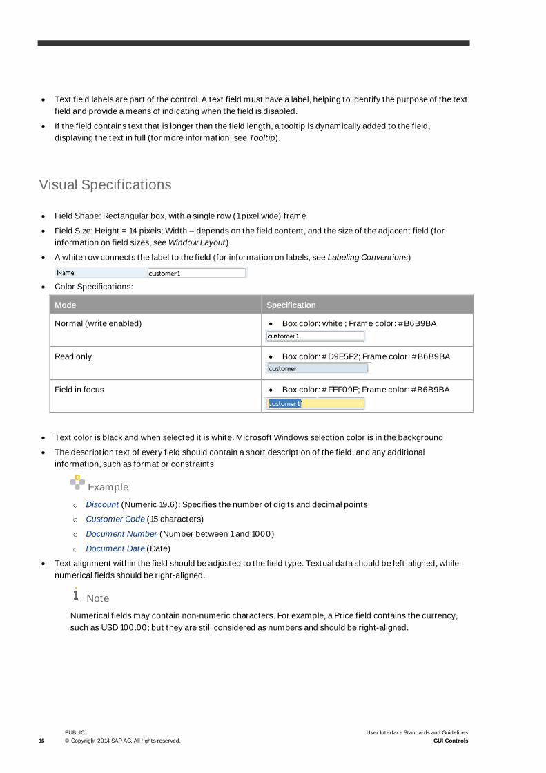
· Text field labels are part of the control. A text field must have a label, helping to identify the purpose of the textfield and provide a means of indicating when the field is disabled.
· If the field contains text that is longer than the field length, a tooltip is dynamically added to the field,displaying the text in full (for more information, see Tooltip).
Visual Specifications
· Field Shape: Rectangular box, with a single row (1 pixel wide) frame
· Field Size: Height = 14 pixels; Width – depends on the field content, and the size of the adjacent field (forinformation on field sizes, see Window Layout)
· A white row connects the label to the field (for information on labels, see Labeling Conventions)
· Color Specifications:
Mode Specification
Normal (write enabled) · Box color: white ; Frame color: #B6B9BA
Read only · Box color: #D9E5F2; Frame color: #B6B9BA
Field in focus · Box color: #FEF09E; Frame color: #B6B9BA
· Text color is black and when selected it is white. Microsoft Windows selection color is in the background
· The description text of every field should contain a short description of the field, and any additionalinformation, such as format or constraints
Exampleo Discount (Numeric 19.6): Specifies the number of digits and decimal points
o Customer Code (15 characters)
o Document Number (Number between 1 and 1000)
o Document Date (Date)
· Text alignment within the field should be adjusted to the field type. Textual data should be left-aligned, whilenumerical fields should be right-aligned.
NoteNumerical fields may contain non-numeric characters. For example, a Price field contains the currency,such as USD 100.00; but they are still considered as numbers and should be right-aligned.

User Interface Standard and Guidelines
User Interface Standards and GuidelinesGUI Controls
PUBLIC© Copyright 2014 SAP AG. All rights reserved. 17
GUI Attributes
Consider the following attributes when creating a text field:
· Label
· Data format: text, numeric, date, currency, and so on
· Alignment: left or right
· Functionality: read, or read + write
· Constraints (optional, for example: numeric, alpha-numeric)
· Maximal input length
· Default value (optional)
· Description text
· System information
· Tooltip (added dynamically): A tooltip provides a small pop-up window with descriptive text, for a control orgraphic object.
Functional Specifications
Operation Procedure
User Action System Response
Rollover Rollover refers to the effect created in the appearanceof a graphical element when the mouse hovers over it.
The field’s Description Text is displayed in the StatusBar. If the field is shorter than the text it contains, atooltip is displayed to show the full text.
Click in field The field color changes to yellow. The Description Textis displayed in the status bar.
If the field is empty, the text cursor is placed at thebeginning of the field.
If the field already contains text, the text is selected(displayed as white text over a dark-blue background).
Double-click in field Selects the word located under the mouse position
Type in field Typing replaces any selected text. If no text isselected, typed characters are inserted at the cursorposition.
If the typed-in text is longer than the visual field, thefield’s text is scrolled to the left, so that the currententry point is visible. In case of a long text, a tooltip isdynamically added to the field, displaying the full text

18PUBLIC© Copyright 2014 SAP AG. All rights reserved.
User Interface Standards and GuidelinesGUI Controls
User Action System Response
of the field.
If the text length reaches the maximal input length, notyping is allowed (no response to typed-in keys), andan error message is displayed in the status bar.
Exit field A validity check is performed, comparing the field datawith the required format and constraints.
If errors are found, a message is displayed in thestatus bar. The cursor remains in the field.
If no errors are found, the field color goes back tonormal.
Keyboard Shortcuts
The field conforms to standard Microsoft Windows text entry conventions:
· Backspace and Delete erase one character to the left or to the right of the cursor position
· Left/Right arrow keys move the cursor one position to the left/right. If the text length is longer than thevisual field, clicking the left/right arrow at the left/right edge of the field scrolls the text to the requireddirection.
· Shift + Left/Right arrow selects the text along the cursor movement
· Home/End moves the cursor to the beginning or to the end of the text, respectively.
Basic Selection Controls
Checkbox
Usage Example: Business Partners®Activity.
When to use?
· The options are either ON or OFF
· Both states of the selection are opposite to each other
· When multiple selections are required, use one checkbox option

User Interface Standard and Guidelines
User Interface Standards and GuidelinesGUI Controls
PUBLIC© Copyright 2014 SAP AG. All rights reserved. 19
General Description
· Checkboxes support options that are either ON or OFF.
· A checkbox supports two modes:
o Selected (ON): allows the user to select a value or operation.
o Deselected (OFF): Displays a value or operation, but with no User selection.
· When the checkbox is selected, the box displays a check mark; otherwise, the checkbox remains empty.
· A checkbox appears as a square box with an accompanying label.
· A group of checkboxes, unlike radio buttons, enables multiple selections.
Visual Specifications
· Use this shape: - Selected - Deselected
· Size: 14x14 pixels
· The label is placed 4 pixels to the right of the box. For information about labels, see Labeling Conventions
· One of the letters in the label might be underlined. This letter is used as a mnemonic for the checkbox. TypingAlt+<mnemonic> is equivalent to clicking the checkbox. The mnemonic should be unique within the window.
· Colors:
State Specification
Enabled · Text color – black
Disabled · Text color – #999999
GUI Attributes
Consider the following attributes when creating a checkbox:
· Label
· Mnemonic
· Functionality: read, or read + write
· Default value (optional)
· Description text
· System information

20PUBLIC© Copyright 2014 SAP AG. All rights reserved.
User Interface Standards and GuidelinesGUI Controls
Functional Specifications
Operation Procedure
User Action System Response
Rollover The Description Text checkbox is displayed in thestatus bar
Click the checkbox The checkbox toggles its state
Click the checkbox label The checkbox toggles its state
Keyboard Shortcuts
Alt+<underlined letter> toggles the checkbox state.
Checkbox with Three States
Usage Example: In the Print Layout Designer, when you select multiple fields, the Properties window shows thethird (ambiguous) state, in case not all selected fields have the same value for a specific checkbox.
When to use?
Checkboxes with three-state support are ON, OFF, or AMBIGUOUS. Use this control to support the ambiguousstate.
General Description
· When a checkbox represents the state of several objects, some of which are ON, while others are OFF, thethird state to use is the AMBIGUOUS state.
· When a checkbox in the ambiguous state is selected, it toggles between two states: ON and OFF. In thissituation, it is recommended that the checkbox alternate between the three states: ON, OFF and then back toAMBIGUOUS.

User Interface Standard and Guidelines
User Interface Standards and GuidelinesGUI Controls
PUBLIC© Copyright 2014 SAP AG. All rights reserved. 21
Visual Specifications
· Use this shape - Selected Deselected Ambiguous
· For all other visual specifications, see Checkbox
Functional Specifications
Operation Procedure
User Action System Response
Rollover The Description Text checkbox is displayed in thestatus bar
Click the checkbox in the ON or OFF state The checkbox toggles its state from ON to OFF andvice versa.
Click the checkbox in the Ambiguous state The checkbox toggles its state from ON to OFF andvice versa.
(The checkbox should rotate among the three states:ON, OFF and AMBGUOUS).
Click the checkbox label The checkbox toggles its state from ON to OFF andvice versa.
Keyboard Shortcuts
Alt+<underlined letter> toggles the checkbox state
Radio Button
Usage Example: Sales A/R ® Sales Reports ®Sales Analysis.
When to use?
Use radio buttons to represent a set of mutually exclusive choices for a particular property or action.

22PUBLIC© Copyright 2014 SAP AG. All rights reserved.
User Interface Standards and GuidelinesGUI Controls
NoteTo allow selection of multiple options, use a checkbox instead.
General Description
· A radio button represents a single choice within a group of at least two radio buttons.
· Only one option can be set
· A radio button appears as a small circle. When selected, it displays a dot in the middle of the circle; otherwise,the circle is empty
· The user clicks one of the radio buttons to select it, which deselects the others in the group
· A radio button may be in one of two modes:
o Selected: Shows the selected value or operation.
o Deselected: Used only to display the deselected value or operation
NoteA list box may be used as an alternative to radio buttons, especially when the space is limited.
Visual Specifications
Use this shape: Selected Deselected
Button size: 14x14 pixels
Place the label 5 pixels to the right of the box. For more information about labels, see Labeling Conventions
· One of the letters in the label might be underlined. This letter is used as a mnemonic for this radio button.Typing Alt+<mnemonic> is equivalent to clicking the radio button. The mnemonic should be unique withinthe window.
· Group Label: You may add a group label to the left of the uppermost radio button as a general explanation oftheir purpose
· Arrange the radio buttons vertically (one below the other) or horizontally (one next to the other). Use thehorizontal arrangement only when there is no room for the preferred vertical arrangement, and when thegroup comprises of all relevant radio buttons.

User Interface Standard and Guidelines
User Interface Standards and GuidelinesGUI Controls
PUBLIC© Copyright 2014 SAP AG. All rights reserved. 23
GUI Attributes
Consider the following attributes when creating a radio button group:
· Label for each button
· Mnemonic for each button
· Group label
· Default value. Note that one of the buttons in the group should be selected by default.
· Description text for each button
· System information for each button
Functional Specifications
Operation Procedure
User Action System Response
Rollover The radio button description text is displayed in thestatus bar
Click the radio button The radio button is selected. All other radio buttons inthe group are deselected.
A dot appears in the circle. The label is displayed in thestatus bar (see Status Bar).
Click the radio button label The radio button is selected. All other radio buttons inthe group are deselected.
A dot appears in the circle. The label is displayed in thestatus bar (see Status Bar).
Keyboard Shortcuts
Alt+<underlined letter> selects the radio button and deselects all other radio buttons in its group.
List Box
Usage Example: Inventory ® Item Master Data.

24PUBLIC© Copyright 2014 SAP AG. All rights reserved.
User Interface Standards and GuidelinesGUI Controls
When to use?
· When the user needs to select one value from the list
· When the potential value list is short, usually up to 20 values
· When the user selection can be based on the value name alone
For more information see: Choose from List (List of <list type>)
General Description
· A list box displays a relatively small number of choices that vary in number or content
· It allows the user to click an enabled field and retrieve a value for it from the displayed list
· Lists that may be extended contain a Define New option, allowing the user to define additional values
· Manual data entry is not supported in this field
· If the field contains text that is longer than the field length, a tooltip is dynamically added to the field,displaying the full text.
Visual Specifications
· Field Shape: Same as text field, along with the symbol on the right hand side of the field
· Field Size: Height = 14 pixels; Width – depends on the field content, and the size of the adjacent field (forinformation about field sizes, see Window Layout)
· A white row connects the label to the field (For information about labels, see Labeling Conventions)
· Field color:
Mode Specification
Normal (enabled) Box color: white; Frame color: #B6B9BA
Read only Box color: #D9E5F2; Frame color: #B6B9BA
The list symbol does not appear when the field
is disabled.
Field in focus Box color: #FEF09E; Frame color: #B6B9BA

User Interface Standard and Guidelines
User Interface Standards and GuidelinesGUI Controls
PUBLIC© Copyright 2014 SAP AG. All rights reserved. 25
Mode Specification
List is open The value list is displayedunder the field.
The list background coloris white.
The list border is black, 1-pixel wide.
Each value in the listoccupies a strip 16 pixelshigh.
The strip of a highlightedvalue is dark yellow(#FCDD82).
If the list is longer than 10values, a scrollbar isadded at the right side ofthe list.
· Text color is black and when selected it is white. Microsoft Windows selection color is in the background
· If the field does not have a default value, the first value in the list is an empty row
· Selecting Define New in the list opens a window for adding list values
GUI Attributes
Consider the following attributes when creating a list box:
· Label
· List of values
· Alignment (Left/Right)
· Functionality: read, or read + write
· Can the list be defined by the user: Yes/No
· Default value (optional)
· Description text
· System information
· Tooltip text (added dynamically)

26PUBLIC© Copyright 2014 SAP AG. All rights reserved.
User Interface Standards and GuidelinesGUI Controls
Functional Specifications
Operation Procedure
User Action System Response
Rollover The list box description text is displayed in the statusbar. If the list box is shorter than the text it contains, atooltip is displayed to show the full text.
Click the field The field color changes to yellow.
The list is displayed. If the field already contains avalue, this value is highlighted; otherwise, the first listvalue is highlighted.
Click the field when the list is displayed The list is closed.
Select an value in the list The list is closed.
The selected value appears in the field.
Select an empty row in the list. The list is closed.
The field is cleared.
Type a letter when the list is open The list is scrolled to the first value starting with thisletter
Select Define New in the list The list is closed.
A setup window is displayed. After the new value isadded, it appears in the field.
Exit field The field returns to its usual color
Keyboard Shortcuts
· Down arrow: opens the list
· Up/Down arrows: when the list is open, highlights the next or previous value in the list
· Enter: closes the list and copies the highlighted value to the field

User Interface Standard and Guidelines
User Interface Standards and GuidelinesGUI Controls
PUBLIC© Copyright 2014 SAP AG. All rights reserved. 27
Pickers
Usage Example: Sales A/R ® Sales Quotation.
When to use?
When the user wants to select a value from a list or date selection window, or calculate a number:
· Date Picker – to select a date
· List of Values Picker – to select from a list
· User-Defined Fields List Picker – to select from a list defined by the user
· Calculator Picker – to calculate and enter the value
· Translation Picker – to select from several translation options (as long as the company is defined as a Multi-Language company)
NoteWhen more than one Picker is defined for the same field, the List of User-Defined Values is the one that ispresented.
General Description
A Picker is an icon located inside a field or a table cell. It becomes visible when the cursor is located within thefield. It enables the user to pick a value and return it to the field.
· Only one Picker per cell
· When more than one picker is required, only the List of User-Defined Fields picker is shown.
· When a list of values is defined for a specific field, the Picker operates in the same way the Tab key does.
· A user can Enable/Disable the Pickers in the View ® Pickers Display upper menu entry.
· Each picker has an indicator.
An indicator is an icon located inside a field/cell that signals when a picker is available for that field/cell.
· The, List of User-Defined Values, and Translation Pickers have an indicator. The date and calculator Pickers donot have an indicator.
· Users can Enable/Disable indicators in the View ® Indicators Display upper menu entry.
· In a grid, indicators appear on the title and not in each cell.
· When there is more than one indicator to present in a specific cell, all indicators appear one after the other.
· The Translation indicator also indicates when a value has already been entered.

28PUBLIC© Copyright 2014 SAP AG. All rights reserved.
User Interface Standards and GuidelinesGUI Controls
NoteTo see the translation Pickers, you need to select the Multi-Language Support checkbox in the CompanyDetails window.
Visual Specifications
· Pickers: a picker has two states, each represented by a different icon: Regular and Selected.
· Indicators: each indicator has an icon. The indicator appears in fields and on table headers.
Pickers
Mode Icon
Date Picker regular
Date Picker selected
List of Values Picker regular
List of Values Picker selected
User Defined Values List Picker regular
User Defined Values List Picker selected
Calculator Picker regular
Calculator Picker selected
Translation Picker regular (with value)
Translation Picker selected (with value)
Translation Picker regular (without value)
Translation Picker selected (without value)
Indicators
Mode Icon
System Indicator
User Defined Values List Indicator
Translation Indicator (with value)
Translation Indicator (without value)

User Interface Standard and Guidelines
User Interface Standards and GuidelinesGUI Controls
PUBLIC© Copyright 2014 SAP AG. All rights reserved. 29
GUI Attributes
Consider the following attributes when creating a picker:
· Alignment (Left/Right)
· Is the field editable: Yes/No (if not - no picker can be available)
· Default value (for translation - if the value was translated, Yes/No)
· Static tooltip text
· Target tooltip text
· Consider the following attributes when creating an indicator:
· Alignment (Left/Right)
· Is the field editable: Yes/No (if not- no indicator can be available)
· Default value (for translation - if the value was translated, Yes/No)
· Static tooltip text
· Target tooltip text
Functional Specifications
Operation Procedure
User Action System Response
Click the Picker The icon changes to ‘selected’ and its window opens.
Keyboard Shortcuts
· Date Picker: Ctrl+Shift+D
· Calculator: Ctrl+Shift+C
· User Defined Values: Shift+F2
· List of Values: Tab/Ctrl+Tab
NoteThe List of Values picker behaves exactly like the Tab/Ctrl+Tab option except for one differentiation: Ifthe user enters a valid value in the field and then clicks the picker, the Choose from list opens with allvalues. The Tab key brings the curser to the next field.

30PUBLIC© Copyright 2014 SAP AG. All rights reserved.
User Interface Standards and GuidelinesGUI Controls
Choose from List (List of <list type>)
Usage Example: Sales A/R ® Sales Quotation. This control is built from multiple controls.
When to use?
· When the user must select one value from a list
· When the potential value list is long, more than 20 values. For a potentially short value list, it is recommendedto use a list box (see List Box)
· When the user selection requires additional information (other than the item name)
NoteIf in certain situations it is preferable to create a combination of a list box and a List of Values field, a list ofvalues icon is attached to the field:
Use this combination when the potential number of items in the list may change. For example, a listdefined by the user may be small at first, but grows significantly over time.
General Description
· The control allows the user to select a value from a list of values that appear in the List of Values window
· This control is a combination of a text field and the List of Values Picker / Indicator
· The user may type a value in the field
· The caption of the window is ‘List of <list type>‘, according to the chosen list type (Business Partners, Item,and so on)
· To prevent free text input by the user, disable the field and provide only the List of Values picker
· Some lists can be defined or extended by the user. For such a list, the user is allowed to add items to the listfrom the List of Values window.

User Interface Standard and Guidelines
User Interface Standards and GuidelinesGUI Controls
PUBLIC© Copyright 2014 SAP AG. All rights reserved. 31
Visual Specifications
· Field Shape: same as text field, plus the icon attached to the right side of the field
· Field size: height = 14 pixels. Width varies, depending on the field content and the size of adjacent fields (forinformation about field sizes, see, Window Layout)
· A white line connects the label to the field (for information about labels, see Labeling Conventions)
· Colors:
Mode Specification
Normal (enabled) Box color - white, Frame color – #B6B9BA
Indicator can be visible/not visible.
Select Only Box color – #D9E5F2, Frame color – #B6B9BA
Field in focus Box color – #FEF09E, Frame color – #B6B9BA
Picker is shown
List button is selected The picker graphic changes to look selected
· Text color is black. When selected, it is white, with Microsoft Windows selection color in the background
· A tooltip is attached to the icon (for information about tooltip content, see Tooltip). The tooltip shoulddisplay:
o Row 1 – Static tooltip: Choose from List
o Row 2 – Target tooltip: Name of a list form that this button opens by (Dynamic Name)
GUI Attributes
Consider the following attributes when creating a Choose from List control:
· Label
· List of values
· Alignment (left/right)
· Functionality: read, or read + write
· Is the field editable: Yes/No
· Can the list be defined by the user: Yes/No
· Default value (optional)
· Description text
· System information
32PUBLIC© Copyright 2014 SAP AG. All rights reserved.
User Interface Standards and GuidelinesGUI Controls
· Static tooltip text
· Target tooltip text
Functional Specifications
Operation Procedure
User Action System Response
Rollover The description text is displayed in the status bar
Icon Rollover A tooltip is displayed
Click the field The field color changes to yellow. A picker is displayedin the
Field
Click the List of Values picker The picker changes to the chosen display.
The List of Values window opens.
After the user selects a value, the window closes andthe selected value is displayed in the field.
Move to the next field when the field is empty (and wasdefined as mandatory)
The List of Values window is displayed.
After the user selects a value, the window closes andthe selected value is displayed in the field.
Move to the next field when the field is being typed in A validity check is performed to verify that the value inthe field is one of the values in the list.
Yes: The field reverts to its usual appearance and thefocus moves to another field.
No: The Select from List window is displayed.
NoteThe Tab key is interpreted as an attempt tomove to another field. A quick way to displaythe list is to place the cursor in the field, thenpress Tab to display the list.
User Interface Standard and Guidelines
User Interface Standards and GuidelinesGUI Controls
PUBLIC© Copyright 2014 SAP AG. All rights reserved. 33
Keyboard Shortcuts
· All keys used to edit a Text field are valid here too
· When Tab is selected in an empty field, the List of Values window is displayed
· It is possible to connect two List of Values windows to a field. In such a case one of them is opened with Tabwhile the other is opened with Ctrl+Tab
Choose from Tree
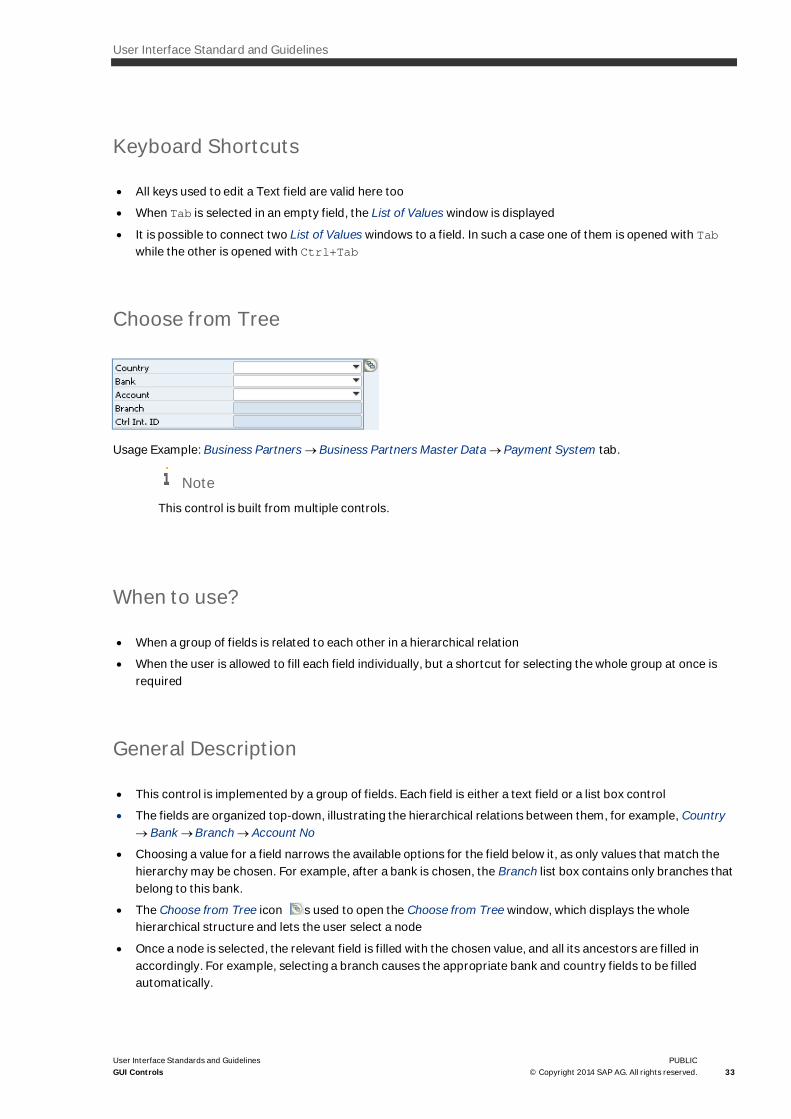
Usage Example: Business Partners ® Business Partners Master Data ® Payment System tab.
NoteThis control is built from multiple controls.
When to use?
· When a group of fields is related to each other in a hierarchical relation
· When the user is allowed to fill each field individually, but a shortcut for selecting the whole group at once isrequired
General Description
· This control is implemented by a group of fields. Each field is either a text field or a list box control
· The fields are organized top-down, illustrating the hierarchical relations between them, for example, Country® Bank ®Branch ® Account No
· Choosing a value for a field narrows the available options for the field below it, as only values that match thehierarchy may be chosen. For example, after a bank is chosen, the Branch list box contains only branches thatbelong to this bank.
· The Choose from Tree icon is used to open the Choose from Tree window, which displays the wholehierarchical structure and lets the user select a node
· Once a node is selected, the relevant field is filled with the chosen value, and all its ancestors are filled inaccordingly. For example, selecting a branch causes the appropriate bank and country fields to be filledautomatically.

34PUBLIC© Copyright 2014 SAP AG. All rights reserved.
User Interface Standards and GuidelinesGUI Controls
Visual Specifications
· Each field, depending on its type, has the attributes of a text field or a list box control
· In addition, the Choose from Tree icon is located to the right of the uppermost field:
· A tooltip appears together with the icon (for more information, see Tooltip).
· The tooltip should display:
o Row 1 – Static Tooltip: Choose From Tree
o Row 2 – Target Tooltip: Name of form that opens when you click the icon (dynamic name)
GUI Attributes
Depending on the field type, it has the attributes of a text field or a list box control. Text field
attributes include:
· Label
· Data format (text, numeric, date, currency, and so on)
· Alignment: left/right
· Functionality: read, or read + write
· Constraints (optional, for example: numeric, alpha-numeric)
· Maximal input length
· Default value (optional)
· Description text
· System information
· Tooltip (added dynamically)
List box attributes include:
· Label
· List of values
· Alignment (left/right)
· Functionality: read, or read + write
· Can the list be defined by the user: Yes/No
· Default value (optional)
· Description text
· System information
· Tooltip text (added dynamically)
Additional Attributes:
· Tooltip text on the Choose from Tree icon

User Interface Standard and Guidelines
User Interface Standards and GuidelinesGUI Controls
PUBLIC© Copyright 2014 SAP AG. All rights reserved. 35
Functional Specifications
Operation Procedure
In addition to the operational procedure of each individual field (see Text Field or List Box):
User Action System Response
Selection of a value in a field The list of potential values in lower fields is narroweddown to conform to the hierarchical relations.
Rollover A tooltip is displayed
Click the Choose from Tree icon While the left mouse button is pressed, the buttonchanges to the following shape:
The Choose from Tree window is displayed. The valuechosen in the window defines a path of values, startingfrom the root of the tree down to the leaf. These valuesare displayed in the corresponding fields.
Keyboard Shortcuts
None

36PUBLIC© Copyright 2014 SAP AG. All rights reserved.
User Interface Standards and GuidelinesGUI Controls
Buttons
Command Button
When to use?
To perform user actions, such as Open or Close a window, save data, display additional information, perform acalculation, and more.
General Description
· A command button is a rectangular control with a label that represents the action the button triggers
· The user chooses the button to perform the action
· When the user chooses the button, the input focus moves to the command button, the button displaychanges to its selected appearance. If the user moves the mouse pointer off the command button while themouse button remains pressed, the command button returns to its original display.
· A command button supports two modes:
o Enabled: Allows the user to choose the button
o Disabled: Displays a non-selected action, with no option to perform it
· A command button is disabled until an action in the same screen activates it, for example, the Next button in awizard is disabled until all the actions in the screen are completed
For more information about command button usage and placement, see Graphic Design Guidelines
Visual Specifications
Shape
· The button shape is rectangular. The inside of the rectangle is in the shape of a three-dimensional raisedcylinder
· Button Width: depends on the length of its label. For more information, see: Graphic Design Guidelines. One ofthe buttons in the window may be defined as the default button. This button is activated by pressing Enter.The default button is surrounded by a 1-pixel black frame
· When chosen, the button looks selected

User Interface Standard and Guidelines
User Interface Standards and GuidelinesGUI Controls
PUBLIC© Copyright 2014 SAP AG. All rights reserved. 37
Label
· The button should have a short, meaningful label, preferably one word written in black and centrally aligned
· The underlined letter in the label serves as a mnemonic for this button. Typing Alt+<mnemonic> is equivalentto choosing the button. The mnemonic should be unique within the window.
NoteNot all buttons have mnemonics, for example the main window buttons, such as OK and Cancel do not.
Tooltip
Usually, a command button would not have a tooltip. When it does, it may be one or both of the following:
· Static tooltip (optional): full button name: If the button label is very long (potentially after translation), thebutton label is truncated and appended with an ellipsis. The full button label is dynamically added as a tooltip.
· Description (optional): a button may have, in addition to the label, a Description Attribute: If the buttonoperation is very complex and is not clarified in a short label, the planner can create a shorter label and add adescription of the button’s function.
When a button’s tooltip contains both the full name and a description, the tooltip spans two lines.

38PUBLIC© Copyright 2014 SAP AG. All rights reserved.
User Interface Standards and GuidelinesGUI Controls
GUI Attributes
Consider the following attributes when creating a command button:
· Label
· Mnemonic
· Is it a default button: Yes/No
· Tooltip text (optional)
· Tooltip Description text (optional)
· System Information
Functional Specifications
Operation Procedure
User Action System Response
Rollover The button’s label or description is displayed in thestatus bar.
Choose the button While the mouse is pressed, the button looks selected.It then reverts to its usual state. The designated actionis performed.
Keyboard Shortcuts
· Alt + <underlined letter> activates the appropriate button
· Enter activates the default button, if one is present
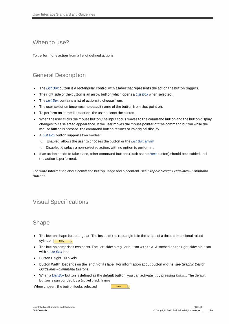
List Box Button
Usage Example: Administration ®Choose Company.
User Interface Standard and Guidelines
User Interface Standards and GuidelinesGUI Controls
PUBLIC© Copyright 2014 SAP AG. All rights reserved. 39
When to use?
To perform one action from a list of defined actions.
General Description
· The List Box button is a rectangular control with a label that represents the action the button triggers.
· The right side of the button is an arrow button which opens a List Box when selected.
· The List Box contains a list of actions to choose from.
· The user selection becomes the default name of the button from that point on.
· To perform an immediate action, the user selects the button.
· When the user clicks the mouse button, the input focus moves to the command button and the button displaychanges to its selected appearance. If the user moves the mouse pointer off the command button while themouse button is pressed, the command button returns to its original display.
· A List Box button supports two modes:
o Enabled: allows the user to chooses the button or the List Box arrow
o Disabled: displays a non-selected action, with no option to perform it
· If an action needs to take place, other command buttons (such as the Next button) should be disabled untilthe action is performed.
For more information about command button usage and placement, see Graphic Design Guidelines –CommandButtons.
Visual Specifications
Shape
· The button shape is rectangular. The inside of the rectangle is in the shape of a three-dimensional raisedcylinder
· The button comprises two parts. The Left side: a regular button with text. Attached on the right side: a buttonwith a List Box icon
· Button Height: 19 pixels
· Button Width: Depends on the length of its label. For information about button widths, see Graphic DesignGuidelines –Command Buttons
· When a List Box button is defined as the default button, you can activate it by pressing Enter. The defaultbutton is surrounded by a 1-pixel black frame
When chosen, the button looks selected

40PUBLIC© Copyright 2014 SAP AG. All rights reserved.
User Interface Standards and GuidelinesGUI Controls
Label
· The button should have a short, meaningful label, preferably written in black and centrally aligned.
· One of the letters in the label might be underlined. This letter is used as a mnemonic for the button. TypingAlt+<mnemonic> is equivalent to choosing the button. The mnemonic should be unique within the window.
Tooltip
Usually, a list box button would not have a tooltip (see Tooltip).
When it does, it may be one or both of the following:
· Static Tooltip (optional) - Full button name: If the button label is very long (potentially after translation), thebutton label is truncated and appended with an ellipsis. The full button label is dynamically added as tooltip.
· Description (optional): A button may have, in addition to the label, a Description attribute: If the buttonoperation is very complex and not obvious in a short label, the planner can create a shorter label and add adescription of the button’s function.
When a button’s tooltip contains both the full name and a description, the tooltip spans two lines.
GUI Attributes
· Consider the following attributes when creating a List Box button:
· Label
· List of values
· Mnemonic
· Is it a default button (Yes/No)
· Tooltip text (optional)
· Tooltip description text (optional)
· System Information

User Interface Standard and Guidelines
User Interface Standards and GuidelinesGUI Controls
PUBLIC© Copyright 2014 SAP AG. All rights reserved. 41
Functional Specifications
Operation Procedure
User Action System Response
Rollover The button’s label or description is displayed in theStatus Bar.
Choose the button While the mouse is pressed, the button looks selected.It then reverts to its usual state. The designated actionis performed.
Choose the arrow button The button changes its look to ‘selected’. While themouse is pressed, a list of actions is opened. Thedefault action is signed in yellow.
Click the action when the list is displayed The selected action is highlighted in yellow andupdates the button.
Keyboard Shortcuts
· Alt + <underlined letter> activates the appropriate button
· Enter activates the default button, if one is present
Back Arrow Icon
Usage Example: Reports ® Inventory ® Items List.

42PUBLIC© Copyright 2014 SAP AG. All rights reserved.
User Interface Standards and GuidelinesGUI Controls
When to use?
The back arrow lets you return from a subordinate window to the parent window. For example, a selection criteriawindow is the parent window in which the user defines the filters that create a specific report. The results windowcontains the back arrow that lets you return to the selection criteria window and redefine the filters.
General Description
A button located on a subordinate window is used to navigate back to the primary parent window.
Usage Example: Inventory ® Inventory Reports ® Items List.

User Interface Standard and Guidelines
User Interface Standards and GuidelinesGUI Controls
PUBLIC© Copyright 2014 SAP AG. All rights reserved. 43
Visual Specifications
· Use this icon
· Icon Size: 22x20 pixels
· Locate the icon on the lower-left corner of the subordinate window:
· The Back Arrow icon is accompanied by an OK button, which closes the report and the selection criteriawindow, and saves any changes to the report
· On editable forms, the Back Arrow icon and the OK button could be accompanied by a Cancel button. TheCancel button removes any changes in the results window, closes the window and puts the selection criteriawindow in focus.
The following tooltips are attached to the button: ‘Back to Selection Criteria’ (see Tooltip).
GUI Attributes
Consider the following attributes when creating the Back Arrow icon:
· Tooltip text
· System information
Functional Specifications
Operation Procedure
User Action System Response
Rollover A tooltip is displayed: ‘Back to Selection Criteria’
Click the Back Arrow icon The Back Arrow moves down, closes the window, andputs the parent selection criteria window in focus.
Choose the OK button Closes both the report and the selection criteriawindow. Any changes made to the report are saved.
Choose the Cancel button Closes the window and puts the parent selectioncriteria window in focus. Any changes made to theform are discarded.

44PUBLIC© Copyright 2014 SAP AG. All rights reserved.
User Interface Standards and GuidelinesGUI Controls
Keyboard Shortcuts
None
Graph Icon
Usage Example: Business Partners ® Business Partner Master Data.
When to use?
Displays detailed field, field group or window-related data in a graph format.
General Description
· A Graph icon related to a specific field (or field group) is placed next to that field.
· A Graph icon related to the whole window is located in the lower-right corner of the window.
· Clicking the Graph icon opens a separate window containing additional information and a graph related.
specific field or to the whole window.

User Interface Standard and Guidelines
User Interface Standards and GuidelinesGUI Controls
PUBLIC© Copyright 2014 SAP AG. All rights reserved. 45
Visual Specifications
· Use this icon:
· Icon size: 12x12 pixels
· Icon position:
o To the right of the field or field group to which the graph relates:
o In the bottom-right corner of the window to which the graph relates, 8 pixels from the window’s edges:
· A tooltip is attached to the icon (see Tooltip). The tooltip should say:
o Row 1 – Static Tooltip: Show Graph
o Row 2 – Target Tooltip: Name of Graph (Dynamic Name)
46PUBLIC© Copyright 2014 SAP AG. All rights reserved.
User Interface Standards and GuidelinesGUI Controls
GUI Attributes
· Static Tooltip text
· Target Tooltip text
· System Information
Functional Specifications
Operation Procedure
User Action System Response
Rollover A tooltip is displayed
Click the icon When the mouse button is pressed, the graph colorchanges to and a graph window is displayed.
Keyboard Shortcuts
None
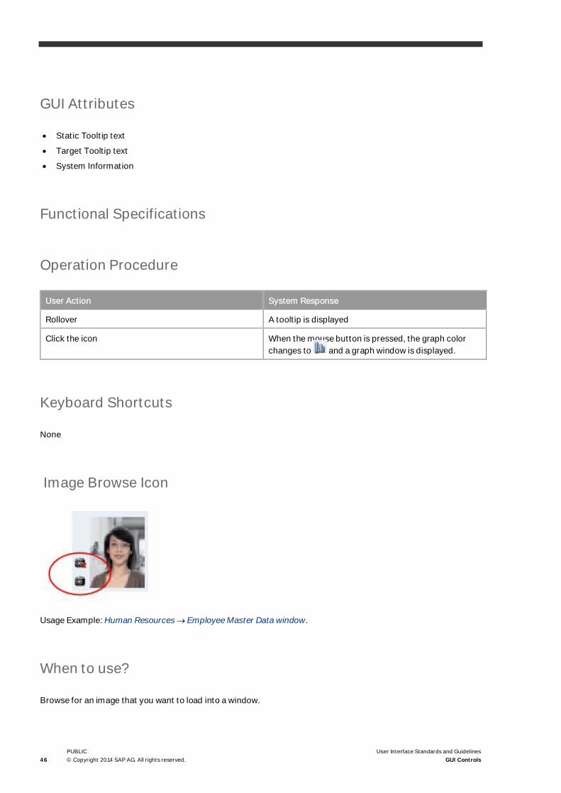
Image Browse Icon
Usage Example: Human Resources ® Employee Master Data window.
When to use?
Browse for an image that you want to load into a window.

User Interface Standard and Guidelines
User Interface Standards and GuidelinesGUI Controls
PUBLIC© Copyright 2014 SAP AG. All rights reserved. 47
General Description
· The Image Browse icon opens an Browse File Open window used to find and load an image into a designatedarea in a form
· The images to be loaded must be placed under a predefined folder (defined by the Picture Folder in GeneralSettings ® Path tab)
· A selected image is loaded and displayed in the designated area
· A Clear Image icon enables the user to delete the image.
Visual Specifications
· To load an image: (Image Browse)
· To remove a loaded image: (Clear Image). This icon does not appear until an image is loaded
· Icon size: 16x16 pixels
· Icon position:
· A tooltip is attached to each icon (see Tooltip). The tooltip of the Insert Image icon should say Browse forImage. The tooltip of the Clear Image icon should say Clear Image.
GUI Attributes
· Tooltip text
· System information
Functional Specifications
Operation Procedure
User Action System Response
Rollover A tooltip is displayed
Click Image Browse icon A Browse window is displayed and located in the folder

48PUBLIC© Copyright 2014 SAP AG. All rights reserved.
User Interface Standards and GuidelinesGUI Controls
User Action System Response
defined for pictures in General Settings ® Path tab.
If no picture folder was defined, an error message isissued.
Image selected in the Browse window The image is displayed in the designated area.
A Clear Image icon is displayed above the ImageBrowse icon.
Click Clear Image icon Image is removed from the window
Keyboard Shortcuts
None
Link Arrow Icon
Usage Example: Sales – A/R ® Sales Quotation.
When to use?
Drill down for more information.

User Interface Standard and Guidelines
User Interface Standards and GuidelinesGUI Controls
PUBLIC© Copyright 2014 SAP AG. All rights reserved. 49
General Description
· The Link Arrow icon accompanies a field containing an object reference
The field can be a text field, a list box, a cell within a table, and so on
· The link opens a subordinate window containing additional information relevant to the text in thecorresponding field
Example
In the Business Partner Master Data window, clicking the Link Arrow icon attached to the Deliveries fieldopens the Delivery Balance window.

50PUBLIC© Copyright 2014 SAP AG. All rights reserved.
User Interface Standards and GuidelinesGUI Controls
Visual Specifications
· Use this icon:
· Icon size: 12x9 pixels
· When the Link Arrow icon is attached to a field:
· A tooltip is attached to the Link Arrow icon (see Tooltip).The tooltip should say:
o Row 1 – Static Tooltip: “Link to”
o Row 2 – Target Tooltip: Name of Object to be displayed (Dynamic Name)
· Example:
· When the Link Arrow icon is attached to a cell in a table:
· When the Link Arrow icon is selected, its shape changes to selected arrow:
GUI Attributes
· Static Tooltip text
· Target Tooltip text
· System information

User Interface Standard and Guidelines
User Interface Standards and GuidelinesGUI Controls
PUBLIC© Copyright 2014 SAP AG. All rights reserved. 51
Functional Specifications
Operation Procedure
User Action System Response
Rollover A tooltip is displayed
Click the link arrow icon While mouse button is pressed, the Link Arrow iconshape looks selected:
An additional window is displayed, showing moreinformation about the object referenced in the field.
Keyboard Shortcuts
None
Complex Data Controls
Table
When to use?
· To display a limited number of records simultaneously
· To display details of records, or to select one of them for further investigation or operation
· When item details are to be displayed
· To display a large amount of data in an organized manner in a relatively small space

52PUBLIC© Copyright 2014 SAP AG. All rights reserved.
User Interface Standards and GuidelinesGUI Controls
General Description
· Tables are used to enter large amounts of data
· A table has a layout similar to a spreadsheet, such as Excel
· A table is made of columns and rows. All cells in a column contain data of the same type, and each row is adata structure of the same type. For example, a row may represent a warehouse stock item, and the columnsrepresent information fields about the items.
· Each table has the following elements:
o The Header – contains the table name
o The column headers – define the content of each column; used for sorting as well
o A selection button column – selects a whole row. The selection column, if it exists, is always the first oneto the left. This column can also be used as a row numbering column. Row numbers usually correspond toone of the following:
o IDs in the database
o Sequential row numbers in the table (1 – N)
o The actual "table" or data area
o Scroll bars – vertical or horizontal (if necessary)
NoteIt is highly recommend that the initial width of the table be such that all columns are visible without ahorizontal scroll bar. Therefore, you may ignore the requirement to leave an extra 30% for each columntitle.
Sorting
A table can be sorted by one of its columns.
· An arrow sign ( or ) appears on the corner of the sorting column, to indicate an ascending or descendingsort order
· The user can sort the table by double-clicking any of the column headers.
When the table is initially displayed, it should have a default sorting order.
Row numbers are necessary for any table where the sort order can be changed. If users sort by Name, or someother column, then they can restore the original sort order by sorting a row number.

User Interface Standard and Guidelines
User Interface Standards and GuidelinesGUI Controls
PUBLIC© Copyright 2014 SAP AG. All rights reserved. 53
Table Cells
· Cells in a table may be editable or in Read-Only mode.
· Rows can be added, deleted or duplicated. The commands to perform these actions are located in the Dataand the Context menus
· Typically, table cells contain numeric or alphanumeric text. Other available cell types include:
o Text: text cell in an input table - the text can be edited. In an output table or lists the text is in a Read-Onlymode and the user can only sort or filter it
o Image: displays an icon or image
o Link: contains a link
o Button: contains a button
o Input: can be edited
o Dropdown list box: contains a drop-down list box
o Checkbox: cell contains a checkbox
· A table can be associated with the Row Details window, which contains detailed information on a row in a tableand allows editing of row fields in a form
· The user can customize the structure of each table using the Form Settings function associated with thewindow that contains the table
· There are several menu commands related to table handling:
o The Data menu contains row manipulation commands
o The Data ® Advanced submenu contains commands for specific windows (not all windows havecommands in this submenu)
o The Goto menu contains the Row Details command.
Cursor Position
The cursor position always reflects the place that the user activated.
Context Menu
You can perform specific actions on a cell by right-clicking the cell. All row actions appear in the cell context menu(right-click), but not vice versa.

54PUBLIC© Copyright 2014 SAP AG. All rights reserved.
User Interface Standards and GuidelinesGUI Controls
Resizing a Table
· Tables may contain large amounts of information, and the user may want to resize the table to see moreinformation.
· When you build a window that contains a table, make sure the window is resizable and contains a maximizebutton on its title bar.
Scroll Bars
· A scroll bar is used to scroll the contents of a table
· A vertical scroll bar is always attached to the right side of a table. If the table does not require scrolling, thescroll bar is not active, and the scroll thumb (the rectangle inside the scroll bar) is not shown.
· A horizontal scroll bar appears only in tables that are too wide. Note that horizontal scroll bars reduce theusability of a table, and should be avoided.

User Interface Standard and Guidelines
User Interface Standards and GuidelinesGUI Controls
PUBLIC© Copyright 2014 SAP AG. All rights reserved. 55
Visual Specifications
NoteIndicator and Picker images appear according to user customization settings in the View menu.
Item Specification Example
Header
Column Header Each column header is shaped likea button. The header label is leftaligned.
If the column is too narrow to fit thecolumn title, the title is truncatedand appended with an ellipsis.
A tooltip should show the fullcolumn name.
Row header (optional) The row header looks like a grayrectangular button and contains arow number, left aligned.
Grid Lines Horizontal and vertical lines: 1-pixel#C6C6BD
Row header - selected The row header looks pushed in.
The selected row’s backgroundcolor changes to dark yellow(#FCDD82)
Empty space on the side of thetable
If the table columns do not coverthe full width of the table, an emptyspace remains on the right side.
This space is colored in #D9E5F2.
To prevent empty margins, werecommend that the defaultcolumn width fill the whole tablearea.
Cells
Table Field (general) Height: 15 pixels
Distance between text and border:2 pixels
Separation line (#C6C6BD)
Separation line (width: 1 pixel )
Text in tables The text in tables is black.
Use colors sparingly and only foremphasis of special cases.
56PUBLIC© Copyright 2014 SAP AG. All rights reserved.
User Interface Standards and GuidelinesGUI Controls
Item Specification Example
Choose colors that are welldistinguished and are readable.
Tooltip If the cell is smaller than the text itcontains, a tooltip is dynamicallyadded to the cell, showing the fulltext of the cell.
Read-only field in the table Background: #D9E5F2
Read/Write field in the table Background: white
Read/Write field in focus Background: #FCDD82
Dropdown menu in a table Icon location: 2 pixels from theright edge of the cell.
Link to object Icon location (inside field): 1 pixelfrom left edge, 4 pixels from text
Checkbox in a table Location: centered
Sorting
Sorting indicator - down Image at the top right corner of thecolumn header button; appearswhen column is sorted.
Sorting indicator - up Image at the top right corner of thecolumn header button; appearswhen column is sorted.
Filtering
Filter Indicator on Image at the top right corner of thecolumn header button; appearswhen column is filtered.
Indicators
List of values indicator Image at the top right corner of thecolumn header button.
User Defined List Indicator Image at the top right corner of thecolumn header button
Translator Indicator Image at the top right corner of thecolumn header button
Pickers
List of values Picker Image on the right side of the table

User Interface Standard and Guidelines
User Interface Standards and GuidelinesGUI Controls
PUBLIC© Copyright 2014 SAP AG. All rights reserved. 57
Item Specification Example
cell
User Defined List Picker Image on the right side of the tablecell
Translator Picker Image on the right side of atranslatable cell
Calculator Picker Image in the table’s numeric cell
Date Picker Image on the right side of a datecell
Scroll Bars
Scroll Bars A table has a vertical scroll bar onits right side.
If the table is too wide, it has ahorizontal scrollbar at the bottom.
Tooltip Appears when the table is scrolledusing the scroll thumb andindicates the current row.
Text – Tahoma, 7, black
Background color – light yellow(#FFFFE0)
Frame Color: #666666
Summary Fields
Sum field labels The labels for summary fieldsappear at the bottom of the table,on the left side of the sum field onthe very left side.
The labels resemble button labelsand have a 3D look.
Sum fields Each summary field appears at thebottom of the table, under therelevant column.
The fields resemble buttons andhave a 3D look.

58PUBLIC© Copyright 2014 SAP AG. All rights reserved.
User Interface Standards and GuidelinesGUI Controls
GUI Attributes
A table is usually constructed of the following elements:
· Header: Names the table; not necessarily the header of the window
· Column headers: Define the content of each column
· Column Definition:
o Label
o Field type
o GUI Attributes according to field type
o Alignment (Left/Right/Center)
o Default width
o Functionality: read, or read + write
o Sorting: Yes/No
o Tooltip (added dynamically)
· Field (Cell) Definition:
o Default value (optional)
o Tooltip (added dynamically)
Functional Specifications
Operation Procedure
Action Type User Action System Response
Sort Operation
Sort Table Double-click table header Sorts table by the column (ifsorting function exists).
Ascending / Descending Sort Double-click a table header again Double-click a table header againSorts table in ascending /descending order by the column (ifsorting function exists).
Resize Columns and Table
Mouse over the table border Rollover the table header betweencolumns
Mouse cursor changes to theResize shape:
Resize column Click and drag the mouse when thecursor is in the resize position.
Resizes column.
When resizing the last column andmaking it smaller than the tablesize, a gray area appears on the

User Interface Standard and Guidelines
User Interface Standards and GuidelinesGUI Controls
PUBLIC© Copyright 2014 SAP AG. All rights reserved. 59
Action Type User Action System Response
right side of the table:
Resize column Double-click the mouse when thecursor is in the resize position.
Auto fits the column widthaccording to the largest text width.
Resize table Resize a window containing a table. When the window is resized, thetable and its columns are resizedproportionally.
Selection
Cell selection Click a cell/read-only field The color of the selected cellchanges to light yellow.
Any previous selection isdeselected.
Text selection Click a cell/read/write field Focus on the field and textselection
within a cell
Row selection Click a row number in the left num.(#) column
The button looks selected.
The row is selected.
The color of the selected rowchanges to yellow.
Clicking the same row numberagain deselects the row.
Clicking a different row or a cell of adifferent row, deselects theprevious row
Row information Double-click a row number in theleft number (#) column
Opens the Row Details window forviewing/editing the row (optional,currently implemented inmarketing documents).
In some cases, the DetailedInformation window is openedinstead of the Row Details window.
Multiple row selection Click the left number (#) column
+ SHIFT to select a range of
rows
+ CTRL to select separated rows
Menu/Context Menu

60PUBLIC© Copyright 2014 SAP AG. All rights reserved.
User Interface Standards and GuidelinesGUI Controls
Action Type User Action System Response
Manipulate cell values Select Cut/Copy/Paste/Deletefrom the cell’s context menu
The cell value is cut, copied, pastedor deleted accordingly.
Delete row Select Delete Row from the contextmenu
The selected row is deleted
Add row Select Add Row from the contextmenu
An empty row is added below theselected row.
Duplicate row Select Duplicate Row from thecontext menu
The selected row is duplicatedbelow itself
Keyboard Shortcuts
· Ctrl+I: adds a row below the selected row.
· Tab: navigates through cells in a table. The cursor jumps to the first column of the selected row.
· Shift + Tab: navigates backwards through a row.
· Ctrl+K: deletes the row in which the cursor is located.
· Ctrl+M: duplicates the row in which the cursor is located.
· Ctrl+L: displays the Row Details of the selected row.
· Ctrl+X: cuts the selected cell’s value to the clipboard.
· Ctrl+C: copies the selected cell’s value to the clipboard.
· Ctrl+V: pastes the last value added to the clipboard into the selected cell.
· DEL: deletes the selected cell’s value.
· UP/DOWN arrows: moves the cursor to the previous/next row.
· Left/Right arrows: moves the cursor to the previous/next cell.
Sorting and Filtering a Table
· Filtering and Sorting are two means by which a user can more efficiently manage a large number of records.Filtering decreases the amount of information displayed in a table, while Sorting rearranges the information ina more useful way.
· Two icons are available on the main toolbar when a window containing a table is active:
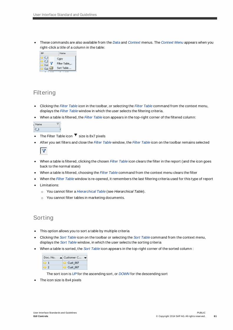
User Interface Standard and Guidelines
User Interface Standards and GuidelinesGUI Controls
PUBLIC© Copyright 2014 SAP AG. All rights reserved. 61
· These commands are also available from the Data and Context menus. The Context Menu appears when youright-click a title of a column in the table:
Filtering
· Clicking the Filter Table icon in the toolbar, or selecting the Filter Table command from the context menu,displays the Filter Table window in which the user selects the filtering criteria.
· When a table is filtered, the Filter Table icon appears in the top-right corner of the filtered column:
· The Filter Table icon size is 8x7 pixels
· After you set filters and close the Filter Table window, the Filter Table icon on the toolbar remains selected
· When a table is filtered, clicking the chosen Filter Table icon clears the filter in the report (and the icon goesback to the normal state)
· When a table is filtered, choosing the Filter Table command from the context menu clears the filter
· When the Filter Table window is re-opened, it remembers the last filtering criteria used for this type of report
· Limitations:
o You cannot filter a Hierarchical Table (see Hierarchical Table).
o You cannot filter tables in marketing documents.
Sorting
· This option allows you to sort a table by multiple criteria
· Clicking the Sort Table icon on the toolbar or selecting the Sort Table command from the context menu,displays the Sort Table window, in which the user selects the sorting criteria
· When a table is sorted, the Sort Table icon appears in the top-right corner of the sorted column :
The sort icon is UP for the ascending sort, or DOWN for the descending sort
· The icon size is 8x4 pixels

62PUBLIC© Copyright 2014 SAP AG. All rights reserved.
User Interface Standards and GuidelinesGUI Controls
· Limitations:
o You cannot sort a Hierarchical Table
o You cannot sort tables in marketing documents
Combination of Sorting and Filtering
· You can filter a table after it has been sorted, and vice versa
· When a table is filtered and sorted, both marks appear next to the appropriate column titles. If the same fieldis used for both sorting and filtering, they appear next to the same title.
Hierarchical Table
Usage Example: Reports ® Inventory ® Inventory Audit Report
When to use?
When records in a table are part of a hierarchical structure.
General Description
· A hierarchical table contains records nested within their logical parents
· The hierarchy may include two or more levels

User Interface Standard and Guidelines
User Interface Standards and GuidelinesGUI Controls
PUBLIC© Copyright 2014 SAP AG. All rights reserved. 63
· Typically, there is a parent column, followed by a child column:
· The parent cell contains an Expand ( ) / Collapse ( ) icon to show/hide the rows of descendant recordsbelow the parent record
· Two buttons, Expand All and Collapse All, should be placed below the table to expand or collapse all rows atonce.
· The hierarchy of records in the table is indicated by a color scheme: each row displays a different backgroundcolor based on its level in the hierarchy. The color scheme uses light blue colors for an editable table and graycolors for a read-only table.
· In mixed tables, where part of the table is editable and part is read-only, each cell is colored accordingly:
Visual Specifications
Visual specifications for Hierarchical Table are similar to Table (see Table), with some additions:
Item Specification Example
Hierarchy in read-only tables Background color of the first level:#D2E1F0
Background color of the secondlevel: #E2ECF8
Background color of inner rows:#EEF4FB
Hierarchy in editable tables Background color of the first level:white
Background color of the secondlevel: #F7F7F7
Background color of inner rows:#EEEEEE
Expand icon Indicates a hidden detailed view ofrelated items.
Collapse icon Indicates a full view of relateditems

64PUBLIC© Copyright 2014 SAP AG. All rights reserved.
User Interface Standards and GuidelinesGUI Controls
GUI Attributes
For information, see Table
Functional Specifications
Operation Procedure
Action Type User Action System Response
Expand item Clicks the Expand icon Rows of immediate descendantsare exposed below the parent row.
The icon changes to Collapse.
Collapse item Clicks the Collapse icon Rows of all descendants arehidden. The icon changes toExpand.
Expand all User chooses the Expand All button All rows are exposed
Collapse all User chooses the Collapse Allbutton
All rows, except for the top(highest) level are hidden
Row Types
Usage Example: Sales – A/R ® Sales Quotation.
NoteThis control is built from multiple controls.

User Interface Standard and Guidelines
User Interface Standards and GuidelinesGUI Controls
PUBLIC© Copyright 2014 SAP AG. All rights reserved. 65
When to use?
To allow different types of rows in a table.
NoteThe Type column is not displayed in all tables by default. In order to display and activate it in a specific form, click(Form Settings) and set the Type field to Visible and Active.
General Description
· The Type column typically appears in item tables of sales documents
· The Type column contains a list box that allows the user to create several row types:
o Regular row (item)
o Alternative item: A potential replacement for the regular item preceding it.
o Text: a row containing free text. Free text may be used to describe the content of the rows following it.Editing a text type row is performed in a separate window.
o Subtotal: a subtotal row sums up all the regular rows preceding it. A second level subtotal row sums up allthe preceding first-level subtotals, and so on. Each level of a subtotal has a different color.
Visual Specifications
Visual specifications for Hierarchical Table are similar to Table (see, Table with some additions:
Item Specification Example
Type field Contains a drop-down menu withoptions for the row type.
Regular row The Type field is empty
Alternative item row The symbol appears in the Typefield.

66PUBLIC© Copyright 2014 SAP AG. All rights reserved.
User Interface Standards and GuidelinesGUI Controls
Item Specification Example
Text row The symbol appears in theType field.
All cells in the row are merged andcontain free text.
Text rows must be edited usingthe text editor as they are noteditable directly in the table.
Subtotal row The symbol appears in theType field. After a row is added,the color of that row changes inrelation to the status of the otherrows.
The last row added has thedarkest row and is filled with thesame color used for read onlyfields.
Background – light blue
(#D9E5F2)
Text – black
Black line above the row gives therow a “selected" look
GUI Attributes
For information, see Table
Functional Specifications
Operation Procedure
User Action System Response
Select Text A window is displayed that allows the user to enter freetext.
All cells in the row (except for the Type cell) aremerged into one cell, showing the text row.
Select Alternative The row changes to an alternative item.

User Interface Standard and Guidelines
User Interface Standards and GuidelinesGUI Controls
PUBLIC© Copyright 2014 SAP AG. All rights reserved. 67
User Action System Response
An alternative item is not calculated in the subtotalsand totals.
Select Subtotal The row color changes to the appropriate color;subtotal is calculated in all relevant cells.
Tree Control
Usage Example: Business Partners ® Business Partner Master Data ® Payment System – Choose Bank field
When to use?
· When the data objects are arranged in a hierarchical structure
· When the user needs to access these data items according to their hierarchy.
General Description
· A Tree Control supports the representation of hierarchical data items, displayed in a "Tree“ structure.
· The (Expand) and (Collapse) controls display or hide nested levels of the tree.
· The lower level of the tree contains "Leaf“ nodes which users select to display data.
Visual Specifications

68PUBLIC© Copyright 2014 SAP AG. All rights reserved.
User Interface Standards and GuidelinesGUI Controls
· Each level is indented 15 pixels to the right, in relation to its parent
· Each root node and intermediate node is comprised of the node name and an Expand or Collapse icon, whichis located 5 pixels to the left of the node name. The button supports two modes:
o Expand: Click to display the next level of the tree, that is, the immediate children of the node.
o Collapse: Click to hide all the sub-tree nested under the node.
· Triangle size: 9 x 6 pixels.
· Text color: black by default. You may add other colors to highlight special nodes, as in the example above. Addcolors only if they help the user understands the data in the tree. Limit the number of colors to a maximum oftwo or three.
· Node height: 16 pixels. The node name and icon are centered in this 16-pixel strip.
· The strip of a highlighted leaf node is dark yellow (#FCDD82).
GUI Attributes
· Consider the following when creating a Tree Control:
· For each node:
· Node type: Root, Intermediate, Leaf
· Node name
· Sub-nodes
· Description text
· Tooltip(added dynamically)
· System information
Functional Specifications
Operation Procedure
User Action System Response
Rollover The node’s description text is displayed in the StatusBar
Click (Expand) While the mouse is pressed, the icon changes its shapeto the selected look.
Any nodes nested under the clicked node aredisplayed. The icon changes to Collapse mode.
Click (Collapse) While the mouse is down, the icon changes its shape tothe selected look.
The icon changes to Expand mode. Any nodes nested

User Interface Standard and Guidelines
User Interface Standards and GuidelinesGUI Controls
PUBLIC© Copyright 2014 SAP AG. All rights reserved. 69
User Action System Response
under the node (all the way down to the leaves) arehidden.
Click a non-leaf node Optionally, selects the node and the node ishighlighted
Click a leaf node The node is highlighted
Keyboard Shortcuts
None
Tree-Table Control
Usage Example: List of Items window (select (Form Settings) and select Grouping by Item No.).
When to use?
· When the data records in a table are grouped by one (or more) of the fields, thus creating a hierarchicalstructure
· Typical usages:
o In List of <objects> windows, when the user selects to arrange the objects by groups
o In Report windows, when it adds value to display data records by hierarchical groups

70PUBLIC© Copyright 2014 SAP AG. All rights reserved.
User Interface Standards and GuidelinesGUI Controls
General Description
· The Tree-Table Control is based on a table
· The records displayed in the table are grouped by one of the fields (columns). Each value in this field becomesa node in the tree. The leaf nodes are all the data records that share this field value, and these data recordsare displayed as regular table rows.
· The tree uses the standard mechanism of an Expand/Collapse (Plus/Minus) button next to the groupingvalue, used to Display/Hide the branch
· A tree-table may be grouped by several values, thus creating a multi-level tree:
· The tree-table is always sorted by the grouping fields. In addition, the user can sort the leaf records by double-clicking the column headers.
· It is currently not possible to use advanced sort and filters in a tree-table.
Visual Specifications
· The tree nodes are displayed inside the first column of the table. The nodes share the column with the firstfield of the leaf record. The title of the column is that of the first field. (In the figure above, the column title isItem Description which is the first field in the leaf record). The grouping fields do not get a title in the table.
· Each level is indented 9 pixels to the right, relative to its parent
· Each root node and intermediate node is comprised of the node name and an Expand/Collapse icon located 5pixels to the left of the node name. The icon supports two modes:
o Expand (Plus): click to display the next level of the tree, that is, the immediate children of the node
o Collapse (Minus): click to hide all the sub-tree nested under the node

User Interface Standard and Guidelines
User Interface Standards and GuidelinesGUI Controls
PUBLIC© Copyright 2014 SAP AG. All rights reserved. 71
· Button size: 9 x 9 pixels
· A dotted black line connects the tree nodes
· The strip of a highlighted leaf node is dark yellow (#FCDD82)
· Two buttons Expand All and Collapse All should be placed below the tree-table to expand/collapse all nodes
GUI Attributes
For each node, consider the following:
· •Node type: Root, Intermediate, Leaf
· Node name
· Node information (data displayed in columns)
· Sub-nodes
· Description text
· System information
Functional Specifications
Operation Procedure
User Action System Response
Rollover The node’s description text is displayed in the StatusBar
Click (Expand) All nested nodes are displayed. The icon changes to(Collapse)
Click (Collapse) All nested nodes (all the way down to the leaves) arehidden. The icon changes to (Expand)
Click a leaf record The row is highlighted
Keyboard Shortcuts
None

72PUBLIC© Copyright 2014 SAP AG. All rights reserved.
User Interface Standards and GuidelinesGUI Controls
Advanced Selection Controls
Account Selector
Usage Example: Financials ® Financial Reports ® Accounting ®Document Journal
When to use?
This control is used in selection criteria windows, where the user selects accounts or a group of accounts for areport.
General Description
· The Account Selector is built from multiple controls
· It is usually located in the upper-right corner of the window
· The control is built as a table containing all the accounts in hierarchical groups. To select an account or groupof accounts, the user selects the x column; the sign “x” is displayed near the selection.
Visual Specifications
· The control is built as a table containing hierarchical groups of accounts
· Table columns:
o # - row number
o x – selection column (“x” in this column means the account/group is selected)
o Account – Account/Group name + Link Arrow icon
· Text color: red – Level 1, blue – level 2 and 3, black - level 4 and on
· Column height: 10 pixels (less than regular tables)
· The table is serviced by 3 controls:

User Interface Standard and Guidelines
User Interface Standards and GuidelinesGUI Controls
PUBLIC© Copyright 2014 SAP AG. All rights reserved. 73
o Levels list box above the table (top-right): Originally, when the control is displayed, only one level isdisplayed:
o Find button: Opens a Find window
o Accounts checkbox: Displays the table and enables account selection.
GUI Attributes
For each account, consider the following:
· Account Name
· Account Number
· Account Level
· Default selection: Yes / No
· Description Text
· Tooltip (added dynamically)
· System Information

74PUBLIC© Copyright 2014 SAP AG. All rights reserved.
User Interface Standards and GuidelinesGUI Controls
Functional Specifications
User Action System Response
Rollover Displays account’s description text in the status bar
Select a value from the Levels list box The corresponding levels are displayed in the tables.All levels lower than the selected one are notdisplayed.
Note that the Account Serial Number (# column)reflects the actual number of the account; therefore, ifsome levels are not displayed, the serial numbers willnot be successive.
Deselect the Accounts checkbox. The Accounts table is hidden
Click a cell in the “x” column If you click in an account row, this account is selected(“x” is displayed in the cell).
If you click in a group row, this group and all accountsbelow it are selected (marked by an “x”)
Click the “x” column header All accounts are selected / deselected (all “x” signsappear/are removed)
Choose the Find button Displays the Find window to locate a specific account:

User Interface Standard and Guidelines
User Interface Standards and GuidelinesGUI Controls
PUBLIC© Copyright 2014 SAP AG. All rights reserved. 75
Business Partner and Item Selectors
Usage Examples:
· Financials ® Financial Reports ® Accounting ® G/L Accounts and Business Partners
· Inventory ® Inventory Reports ® Inventory Posting List by Item.
NoteThis control is built from multiple controls.
When to use?
This control is used in selection criteria windows, where the user selects business partners or Items for a report.
General Description
The Business Partner and the Item selectors are a collection of controls (fields, list boxes, and so on).
The combination of controls may change, depending on the needs of the specific report.
Visual Specifications
· The control is usually the main selector in a report; therefore, it is located at the upper-left corner of theselection criteria window
· The control is built from the following fields:
o Business Partners / Item code range - From/To fields
o Customer Group (optional) / Group – List Box containing customer groups / item groups. The default is’All’. Ignore this field if you want to select only vendors
o Vendor Group (optional) – List Box containing vendor groups. The default is ‘All’. Ignore this field if youwant to select only customers.
o Properties – Property selection control, showing properties of a business partner / item.

76PUBLIC© Copyright 2014 SAP AG. All rights reserved.
User Interface Standards and GuidelinesGUI Controls
· Additional selection fields may be added, if required, for example, the Handled by and Contact Person fields:
Properties Selection Field
Usage Example: Reports ® Sales and Purchasing ® Sales Analysis
NoteThis control is built from multiple controls.
When to use?
· In selection criteria windows, to select items or business partners based on their properties
· The query selects objects that have the properties defined by this control.
General Description
· This control is composed of the Properties button, which displays a window when you click it.
· It lets you select multiple object properties, using checkboxes, and define an AND or an OR relationshipbetween the options.
· The field does not support data entry; it merely reflects the selected properties.
The text field contains one of the following:
When Text Field Shows
No properties are selected, or Ignore Properties ischecked in the properties window
Ignore
All properties are selected All Properties [<relation>]
Example
All properties [OR]

User Interface Standard and Guidelines
User Interface Standards and GuidelinesGUI Controls
PUBLIC© Copyright 2014 SAP AG. All rights reserved. 77
When Text Field Shows
Options are selected (Closed Properties Rangecheckbox is deselected)
The text is:
<n> Properties ]<relation>[
Example4 Properties ]AND[
Options are selected (Closed Properties Rangecheckbox is selected)
The text is:
<n> Properties [<relation>]
Example4 Properties [AND]
Visual Specifications
· The Properties button has the usual specifications of a button (see Buttons).
· The field has the usual specifications of a text field, when disabled (see Text Field).
· The Properties button is attached to the left corner of the text field.
GUI Attributes
· Default value (optional)
· Description text
· System information
Functional Specifications
Operation Procedure
User Action System Response
Rollover The status bar displays description text.
Choose the Properties button The Properties Selection window appears. Forinformation, see
Properties Selection Window.
The window is displayed as modal.

78PUBLIC© Copyright 2014 SAP AG. All rights reserved.
User Interface Standards and GuidelinesGUI Controls
User Action System Response
When the window is closed, the text field is updated toreflect the selections made in the window. Forinformation, see Properties Selection Field.
Click the field No response (the field is disabled)
Keyboard Shortcuts
None
Properties Selection Window
Purpose
This window goes with the Properties field. It enables the user to select a group of object properties to be used asselection criteria in a query.
When to use?
In queries based on the existence of object properties
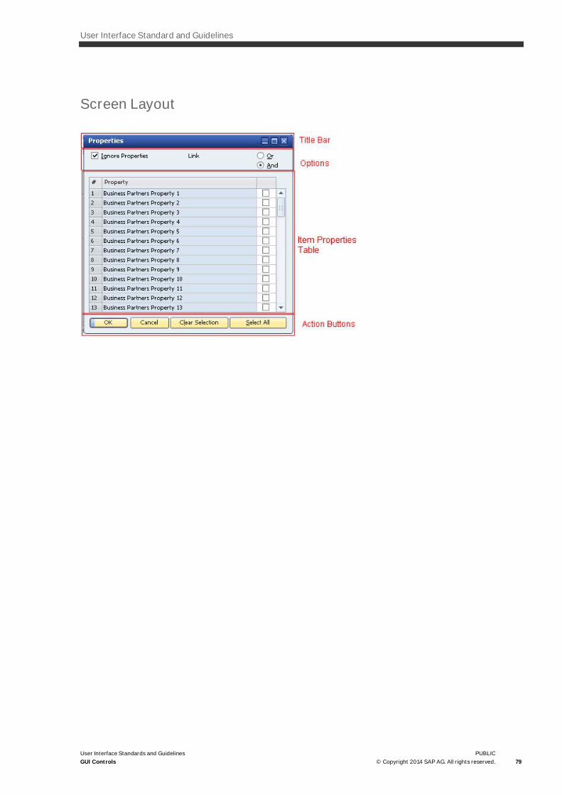
User Interface Standard and Guidelines
User Interface Standards and GuidelinesGUI Controls
PUBLIC© Copyright 2014 SAP AG. All rights reserved. 79
Screen Layout

80PUBLIC© Copyright 2014 SAP AG. All rights reserved.
User Interface Standards and GuidelinesGUI Controls
Title Bar
This is a standard window title bar. The caption is: Properties.
Options
In the options area, the user selects how the properties affect the query:
· Ignore Properties checkbox: If this checkbox is selected, the query does not consider the object Properties atall.
· Closed Properties Range: This checkbox is shown only when Ignore Properties is deactivated. If this checkboxis selected, the query ignores objects that have any property that is not selected in this window.
· Link radio buttons: offer a choice of an AND or an OR relationship between the selected properties.
Visual Specifications
· The Ignore Properties checkbox appears in the top-left corner of the window.
· The Closed Properties Range is just below it.
· The link radio buttons are in the top-right corner of the window.
Operational Procedures
Selecting the Ignore Properties checkbox makes the rest of the window irrelevant. It also hides the ClosedProperties Range checkbox.
Item Properties Table
Displays a list of all properties of the queried object, enabling the user to select the required properties.
Visual Specifications
This is a standard table (see Table).
The table contains 3 columns:
· # : property number
· Property: Name of the property
· Selection: Contains a checkbox next to each property
Operational Procedures
The user selects the checkboxes of the required properties.

User Interface Standard and Guidelines
User Interface Standards and GuidelinesGUI Controls
PUBLIC© Copyright 2014 SAP AG. All rights reserved. 81
Action Buttons
The window contains 4 buttons:
· OK: closes the window and approves the selected properties. The selection is marked in the Properties field.
· Cancel: closes the window without checking the properties selection
· Clear Selection: deselects all the checkboxes in the Items table
· Choose All: selects all the checkboxes in the Items table
Visual Specifications
· For visual specifications of each button, see Buttons.
· For specifications on button positioning, see Command Button
Operational Procedure
· Choosing each button performs the operation described in the Purpose section, above.
· Pressing Enter performs the default action, OK.
Date Range Selector
General Description
The control allows the user to select a month, several months, or a whole year. The date range selection options
are changed according to a specific business case
Two typical date range selectors:
· One that allows selection of any month range within a year. The control is a supplement of two test fieldsspecifying the From/To dates
· One that selects one month and defines the range from the beginning of the year until the selected month.The control is a supplement of the To field.
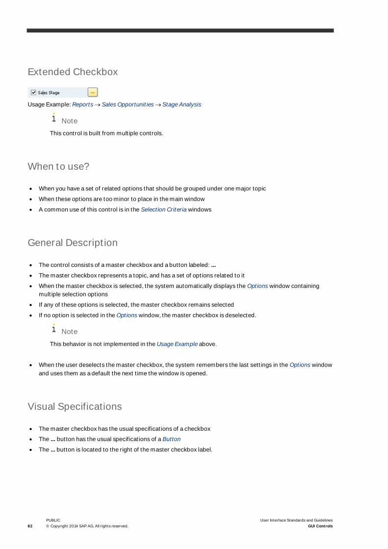
82PUBLIC© Copyright 2014 SAP AG. All rights reserved.
User Interface Standards and GuidelinesGUI Controls
Extended Checkbox
Usage Example: Reports ® Sales Opportunities ® Stage Analysis
NoteThis control is built from multiple controls.
When to use?
· When you have a set of related options that should be grouped under one major topic
· When these options are too minor to place in the main window
· A common use of this control is in the Selection Criteria windows
General Description
· The control consists of a master checkbox and a button labeled: ...
· The master checkbox represents a topic, and has a set of options related to it
· When the master checkbox is selected, the system automatically displays the Options window containingmultiple selection options
· If any of these options is selected, the master checkbox remains selected
· If no option is selected in the Options window, the master checkbox is deselected.
Note
This behavior is not implemented in the Usage Example above.
· When the user deselects the master checkbox, the system remembers the last settings in the Options windowand uses them as a default the next time the window is opened.
Visual Specifications
· The master checkbox has the usual specifications of a checkbox
· The ... button has the usual specifications of a Button
· The ... button is located to the right of the master checkbox label.

User Interface Standard and Guidelines
User Interface Standards and GuidelinesGUI Controls
PUBLIC© Copyright 2014 SAP AG. All rights reserved. 83
GUI Attributes
Same as Checkbox and Button (for more information see Checkbox, Buttons).
Checkbox attributes:
· Label
· Mnemonic
· Functionality: read or read + write
· Default value (optional)
· Description text
· System information
Button Attributes:
· Label
· Mnemonic
· Is it a default button (yes/no)
· Tooltip text (optional)
· Tooltip description text (optional)
· System information
Functional Specifications
Operation Procedure
User Action System Response
Rollover Displays account’s description text in the status bar
Choose the ‘…’ button A window is displayed, in which the user can selectseveral options related to the master checkbox.
A typical usage of this control is to group a set ofcheckboxes in this window:
When the window is closed and an option is chosen,the master checkbox is selected.

84PUBLIC© Copyright 2014 SAP AG. All rights reserved.
User Interface Standards and GuidelinesGUI Controls
User Action System Response
If no option was selected in the window, the mastercheckbox is deselected.
Select the master checkbox while it is deselected The master checkbox is selected. It opens the samewindow.
Deselect the master checkbox while it is selected The master checkbox is deselected.
The options in the options window remain checked,and are used as a default the next time the window isopened.
Close the Options window without any selection The master checkbox is deselected
Close the Options window with at least one selection The master checkbox is selected
Keyboard Shortcuts
None
View Controls
Tab Strip
When to use?
· When the window cannot accommodate all required information
User Interface Standard and Guidelines
User Interface Standards and GuidelinesGUI Controls
PUBLIC© Copyright 2014 SAP AG. All rights reserved. 85
· When information can be logically divided into several views
· When the views can be accessed in random order (if a specific order is required, use a wizard)
· Do not use tabs to select between mutually exclusive alternatives. If selecting one view disables other views,use a different control to select the view, such as a list box.
General Description
· A tab strip control resembles an index card. It consists of two or more tab elements (tabs)
· Tabs appear as subordinate windows
· One tab is always active and its information is displayed in the page below the tab strip
· Users navigate between the tabs by choosing a tab
· Each tab has a unique label. It is essential that this label be short, preferably one word, and meaningful
· Each tab label has a mnemonic, which is a unique letter used as a shortcut to navigate to this tab. Theshortcut letter is underlined. For example, letter ‘N’ in is used as a shortcut to the General tab. TypingAlt+<mnemonic> is equal to choosing the tab.

86PUBLIC© Copyright 2014 SAP AG. All rights reserved.
User Interface Standards and GuidelinesGUI Controls
Visual Specifications
· Active tab:
· Inactive tab:
· The tab has a 1-pixel white border
NoteThis border is NOT created automatically for a tab strip control. When adding this border manually, makesure the border is accurately aligned to the edge of the tab and the tab strip.
· Tab strip height: 19 pixels
· The label is centered on the tab
· The mnemonic in the label is underlined
· The tabs do not all need to be the same width. Each tab should be wide enough to accommodate the label,including translations. However, if the widths are similar, we recommend making them equal.
· Do not use scrolling functions inside a tab
· The number of tabs is limited by the space available in the window, and should not exceed six. If theinformation does not fit on six tabs, consider another screen design, such as dividing the window into severalwindows.
· Do not widen the tabs just to fill the width of the tab; instead, leave space at the right side of the tab strip:
GUI Attributes
For each tab in the tab strip:
· Tab label
· Mnemonic
· Description text
· System information

User Interface Standard and Guidelines
User Interface Standards and GuidelinesGUI Controls
PUBLIC© Copyright 2014 SAP AG. All rights reserved. 87
Functional Specifications
Operation Procedure
User Action System Response
Rollover Description Text is displayed in the status bar
Choose a tab The chosen tab is activated.
The page content is replaced by the content of theactive tab.
Keyboard Shortcuts
Pressing Alt+<letter> switches to the tab represented by this mnemonic.
Nested Tab Strip
Usage Example: Sales – A/R ® Sales Order ® Form Settings window
When to use?
· When a page in a tab strip has too much information to be displayed on one tab, or it contains several sets ofinformation which are not related.
· We do not recommend a nested tab strip design. Use it sparingly, with no more than one nesting level. Nevernest a tab strip within another nested tab strip.
General Description
A tab strip control that is nested within a tab of another tab strip.

88PUBLIC© Copyright 2014 SAP AG. All rights reserved.
User Interface Standards and GuidelinesGUI Controls
Visual Specifications
· Just like the tab strip, except for the shape of nested tabs (see Tab Strip)
· Active tab:
· Inactive tab:
GUI Attributes
Same as for tab strip. For each tab:
· Tab label
· Mnemonic
· Description text
· System information
Functional Specifications
Same as for a tab strip.
Keyboard Shortcuts
Same as for a tab strip.
Drawers
Usage Example: Financials ® Chart of Accounts

User Interface Standard and Guidelines
User Interface Standards and GuidelinesGUI Controls
PUBLIC© Copyright 2014 SAP AG. All rights reserved. 89
When to use?
· When the information in a window is divided into several subjects.
· We do not recommend using this control. It is preferable to divide a window with a tab strip.
General Description
· The control resembles a set of drawers. Each drawer represents a set of information. The informationcontained in an open drawer is displayed in the window
· Users navigate between the drawers by selecting the drawer they want to open
· Each drawer has a unique label. It is essential that this name be short and meaningful, ideally one word.
Visual Specifications
· Only one drawer is open at any given time:
· Open Closed:
· Drawers can be stacked vertically (recommended) or placed horizontally beside each other.
· Vertical drawers should be placed on the left hand side of the window.
· Horizontal drawers should be placed in the top-left corner of the window.
· The drawer label is centered
· Font: Tahoma 7
· Text color: black
GUI Attributes
· For each drawer:
· Label
· Description text
· System information

90PUBLIC© Copyright 2014 SAP AG. All rights reserved.
User Interface Standards and GuidelinesGUI Controls
Functional Specifications
Operation Procedure
User Action System Response
Rollover Drawer description text is displayed in the status bar
Choose a drawer The drawer is opened and all other drawers are closed.The information contained in the open drawer isdisplayed in the window.
Keyboard Shortcuts
None

User Interface Standard and Guidelines
User Interface Standards and GuidelinesGUI Controls
PUBLIC© Copyright 2014 SAP AG. All rights reserved. 91
Window Controls
Window Title Bar
When to use?
As a title bar, it appears at the top of each window.
General Description
· A bar at the top of each window; displays the window name and provides standard window managementoptions.
· The window title bar contains the following elements:
· Window Name: states the function of the window
· Minimize button: minimizes the window. A minimized window appears in the lower-left corner of the mainwindow, with only the caption visible
When a window is minimized, the Minimize icon in its caption is replaced by a Restore icon. Selecting theRestore icon restores the window’s original size.
· Maximize icon: maximizes the window. The window is enlarged to occupy the whole work area of the mainwindow. When the window is maximized, the Maximize icon in its caption is replaced by a Restore icon.Select the Restore icon restores the window’s original size. The maximize icon is optional, and does notappear in all windows.
Use the Maximize icon for windows that benefit from enlargement. Windows that contain data tables musthave a Maximize icon, because maximizing such windows lets the user see more data.
· Close icon: closes the window. If any data was modified in the window, the application issues the message,“Do you want to save?”

92PUBLIC© Copyright 2014 SAP AG. All rights reserved.
User Interface Standards and GuidelinesGUI Controls
Visual Specifications
Window Mode Specifications
Active
Text color: white
Inactive Text color: white
Minimized
Text color: white
NoteThe visual specifications of the title bar may vary on different operating systems. The samples below weretaken on Microsoft Windows 2000.
· Font: The font style and size of the title is taken from Microsoft Windows settings (the user may select a fontin Windows – Control Panel ® Display ® Appearance ® Item=Active Title Bar).
· Caption height: 23 pixels, by default. Selecting a larger font adjusts the window title accordingly.
· Caption width: For regular windows, the caption takes the full width of the window. For a Minimized window,the caption width is 160 pixels.
· The name is located 8 pixels to the right of the left border of the window.
· When the window is minimized, the name is truncated to the size available on the smaller caption.
· If the window width is too narrow to show the full name, the caption automatically gets a Tooltip.
GUI Attributes
· Window name
· Tooltip (added dynamically)
· Can be maximized: (Yes/No)
· Window state (Normal/Minimized/Maximized)
Functional Specifications
Operation Procedure
User Action System Response
Rollover The button color changes to white

User Interface Standard and Guidelines
User Interface Standards and GuidelinesGUI Controls
PUBLIC© Copyright 2014 SAP AG. All rights reserved. 93
User Action System Response
Select an icon The button performs its function as described inGeneral Description, above.
Select window caption and drag Moves the window to another location
Select anywhere on the window caption Makes the window active
Select anywhere on a caption of a minimized window Displays the Windows menu
Keyboard Shortcuts
· Esc: Closes the window
· Alt and - (minus sign): Displays the Windows system menu. Commands in the menu can be accessed by thedown/up arrow keys

94PUBLIC© Copyright 2014 SAP AG. All rights reserved.
User Interface Standards and GuidelinesGUI Controls
Menu Bar and Dropdown Menus
When to use?
A menu bar always appears on the Main Application window. It does not appear in any sub window.
General Description
· A menu bar includes a set of entries called Menu Titles. Each menu title provides access to a dropdown menucomposed of a collection of menu items, or choices.
· Clicking a menu title displays its dropdown menu.
NoteOnly the SAP Business One main window has a menu bar
Guidelines for Adding a New Command to a Menu
· Decide which menu is most appropriate for the command, based on the content of the existing menus listedbelow
· When positioning the menu item, consider:
o How often is it used? frequently used items should be placed before less frequently used items
o Where is it used in the workflow? Items that are logically successive to other items should be placeddirectly below them
Menu Content
The SAP Business One menu bar contains the following horizontal Pull-Down menus.
· File: Lists primary operations, such as Close, Save, Page Setup, Print Preview, Print, Send, Export to, LaunchApplication, Lock Screen, and Exit
· Edit: Lists general editing commands, such as Undo, Paste, Cut, Copy, Delete, and Choose All

User Interface Standard and Guidelines
User Interface Standards and GuidelinesGUI Controls
PUBLIC© Copyright 2014 SAP AG. All rights reserved. 95
· View: Lists commands that change the view of data in the window, such as User-Defined Fields, SystemInformation, Restore Column Width, and Legend
· Data: These menu options are used to manipulate system data. They include Add Data and Find Data, as wellas common editing commands pertinent for system data. Add commands to this menu that change data inthe system.
In particular, the Data menu has an Advanced Submenu, which contains commands that are related to aspecific window (form). We recommend that you first consider other alternatives for placing your command,and only if you fail to find a “standard” location, use the Advanced Submenu.
· Goto: Lists all the links for the active window. This is a dynamic menu and changes according to the currentlyselected window. Menu options that do not apply to the current window are disabled. The Goto menucomprises the following sections:
o Base document and Target document (where applicable)
o Row operations
o Other windows that are related to the active one; user operation may require a link between them
o Reports that are related to the active window
o Jumps within the window itself
· Modules: Lists the same items as the main menu; however, the menu in the Modules menu is complete andcannot be customized. (Items in the main menu itself may not be displayed to all users, depending uponcustomization).
· Tools: Lists general system tools, and also specific tools and parameters per window or field.
· Window: Lists commands associated with managing the windows, such as Cascade, Close All, Color, MainMenu, Messages Alert Overview, and Calendar. In addition, this menu contains a list of all open windows.
· Help: Lists commands that enable access to help information, such as Context Help, Help Settings, and AboutSAP Business One.
Menu Operation
By clicking one of the SAP Business One menus in the menu bar, you display a list of menu options.
Menu options are designed with a strip containing icons next to the relevant commands.
The list has related commands that are grouped together. The user can select any enabled menu option fromthe list to perform a specific task or function. An enabled/active menu option has black text, whiledisabled/unauthorized menu options have gray text.
Submenus
A submenu is designed to be accessed from a parent menu option, and remains hidden until the cursorhovers over the parent. Submenus are arranged vertically and may be cascaded hierarchically into evensmaller divisions.

96PUBLIC© Copyright 2014 SAP AG. All rights reserved.
User Interface Standards and GuidelinesGUI Controls
NoteAll system functions must be included in the pull-down menus and/or submenus. Add-ons should belisted within existing pull-down menus.
The following guidelines apply to pull-down menus, submenus and menu options:
· Menu options: both Pull-Down menus and submenus contain menu options. They should appear whether theyare enabled or disabled. A menu option can be displayed in the menu, even though it is not applicable when aspecific function is active.
· Pull-Down menus: Pull-Down menus should be in a fixed position, and not be altered per window. This assiststhe user in navigating and finding menu functions easily.
· Submenus: we recommend that the maximum nesting depth for submenus not exceed three levels, since it israther difficult to find a command if there are too many hierarchic, cascading levels. Submenus should notcontain often used functions that belong in the first pull-down menu.
· Grouping: groups should not contain more than seven menu options. Separate groups using submenus orseparator lines.
· Separator lines: used for clustering the menu options into distinct groups.
· Text: menu options can consist of several words. In English, they should be displayed in upper case. In otherlanguages, they should appear according to the linguistic rules for upper or lowercase.
· Icons: Place icons for menu options, when available, to the left of the menu options:
A “Check” ( ) icon pertains to every enabled function, for example: the Main Menu command on the
Window menu is also used to show/hide the Main Menu.
\
The icon may also replace the Check mark. A selected icon indicates that a function is ON:

User Interface Standard and Guidelines
User Interface Standards and GuidelinesGUI Controls
PUBLIC© Copyright 2014 SAP AG. All rights reserved. 97
· Shortcut Keys: Shortcut keys (“accelerator” keys) refer to a combination of keys on the keyboard (such asCtrl + R) that activate a particular function. A menu option can also have a shortcut key assigned to it.
· Mnemonics: menu options should have mnemonics. Mnemonics contain one letter can be underlined thatcorresponds to a key on the keyboard for each menu option.
· Enabled/Disabled Status: Enabled menu options and submenus have black text. Disabled/Unauthorized menuoptions and submenus have gray text.
· Submenu Arrows: following a menu option, an arrow symbol indicates a submenu. The cascading submenulevel is displayed if the menu option is selected.
· Ellipses: use an ellipsis (three dots attached to a menu option) to indicate that clicking the option opens asubordinate window. Do not use blank spaces between the menu option and the first dot. In addition, do notuse ellipses in the Modules menu.

98PUBLIC© Copyright 2014 SAP AG. All rights reserved.
User Interface Standards and GuidelinesGUI Controls
Visual Specifications – Menu Bar
· The SAP Business One Menu Bar, located at the top of the SAP Business One main window, shares the samespace with the Title Bar and the standard Windows buttons (Maximize, Restore down, Minimize, Close).
· The following object is used to create the background of the menu bar strip
· Font: The font used for the menu is taken from the Advanced Appearance window. Open Control Panel ®Display ® Appearance tab, choose Advanced button and change definitions for Item=Menu
· Font Color:
State Color Example
Regular Grey (#233866) ·
Rollover Light blue (#3D76C5) ·
· One of the letters in each menu title is underlined and used as a mnemonic for this menu title.
Visual Specifications – Dropdown Menu
· Menu items are left aligned
· Separator lines are used for clustering menu options into distinct groups
· The Separator strip is used for related icons:
o Background color: #EAF1F6
o Strip width: 22 pixels
· A submenu is accessed with an arrow to the right of its parent menu item.
o The arrow is indented 5 pixels to the right
o Arrow size: 5 x 8 pixels
· Background color of the drop-down menu: #EAF1F6

User Interface Standard and Guidelines
User Interface Standards and GuidelinesGUI Controls
PUBLIC© Copyright 2014 SAP AG. All rights reserved. 99
· The height of each drop-down menu is not fixed; it depends on the number of menu items:
o Each item occupies a strip, the height of which is 20 pixels
o All the items are indented 12 pixels to the left
· The look of the drop-down menu depends on its state:
State Color Example
Enabled Font color – black
Arrow color – black
·
Disabled Font color – #8B8F96
Arrow color - black
·
Rollover Font color – black
Arrow color - white
The strip is colored in dark yellow(#FCDD82)
·
· One of the letters in each menu item is used as a mnemonic to this item.
Functional Specifications
Operation Procedure - Menu Bar
User Action System Response
Rollover (no menu is open) The menu title changes to light blue (#3D76C5)
Rollover when a drop-down menu is opened (mousecursor is over a title menu)
The associated drop-down menu is displayed
Click a title menu (no menu is open) Displays the drop-down menu related to this title
Click a title menu (when its drop-down menu is open) Closes the drop-down menu

100PUBLIC© Copyright 2014 SAP AG. All rights reserved.
User Interface Standards and GuidelinesGUI Controls
Operation Procedure – Drop-Down Menu
User Action System Response
Rollover on an item The item background changes to dark yellow.
If the item has a submenu, its arrow color changes towhite and the submenu is displayed.
Choose an item The menu is closed. The operation associated with theitem is activated
Keyboard Shortcuts
· Pressing Alt+<mnemonic> of the menu title displays a drop-down menu
While a drop-down menu is displayed:
· Down Arrow / Up Arrow: selects the next/previous item in the drop-down menu
· Left Arrow: opens the drop-down menu to the left of the currently open menu
· Right Arrow: If the currently selected menu item has a submenu, clicking the right arrow opens thesubmenu. Otherwise, clicking the right arrow opens the drop-down menu to the right of the currently openone.
· Pressing Alt+<mnemonic> of an item in the open menu activates this item
· If a menu item has a keyboard shortcut, clicking this shortcut activates the menu item. The dropdown menudoes not have to be open in this case.
Context Menu (Right-Click Menu)

User Interface Standard and Guidelines
User Interface Standards and GuidelinesGUI Controls
PUBLIC© Copyright 2014 SAP AG. All rights reserved. 101
When to use?
· Use the context menu in any window to provide access to the most commonly used functions in the window
· Use the context menu in any field to provide functions related to this field.
General Description
A context menu is:
· A shortcut to frequently used functions
· Structured like a pull-down menu, and may contain submenus
· Valid in every point in a window or table
· Built automatically, according to commands in the main menu, as follows:
o Edit menu: all active entries
o Data menu: all active entries, except: Copy from Cell Above, Copy from Cell Below, and all functions thatappear in the toolbar (Find, Add, Next Record, Previous Record, First Data Record, Last Data Record).
o Goto menu: all active entries, except for commands that take you within the active form itself (BP Code,First Row, Last Row, Remarks).
o Help Menu: What’s This
o A separator line is added between groups taken from different menus
Visual Specifications
· Background color: #EAF1F6
· Fonts: The font style and size is taken from the Advanced Appearance window. Open Control Panel ® Display® Appearance tab, choose Advanced button and change definitions for Item=Menu
· Font color: black
· Icons: Display the same icons that appear in the toolbar
· Separator Lines: Use 2 horizontal lines next to each other (1 pixel height for each line). The upper line is#D6DFE8 and the lower line is white, as seen in the example below:

102PUBLIC© Copyright 2014 SAP AG. All rights reserved.
User Interface Standards and GuidelinesGUI Controls
Noteo The context menu is built automatically, according to items in the Main Menu. Do not add other items
to the context menu. For information, see General Description.
o Context menus must contain items that are also present in other system locations; therefore, afunction must not appear in a context menu exclusively.
Functional Specifications
User Action System Response
Right-click a window or field Displays the context menu attached to this window orfield
Click a menu item Hides menu and performs the required action
Keyboard Shortcuts
· Each menu command has a mnemonic. Clicking the mnemonic while the menu is open activates thiscommand
· Menu commands may have keyboard shortcuts associated with them
Toolbar
When to use?
Use toolbar icons only for the most important functions. Each icon is also located in a Pull-Down menu.
NoteThe toolbar is used only in the SAP Business One main window.

User Interface Standard and Guidelines
User Interface Standards and GuidelinesGUI Controls
PUBLIC© Copyright 2014 SAP AG. All rights reserved. 103
General Description
· The toolbar consists of the following button groups: File, View, Data, Goto, Tools, Window and Help
· Each group contains a set of buttons
· The groups are separated by a space
· The user can configure the toolbar by hiding/showing button groups
· Some of the icons, such as the calendar, have a selected view when active
· When the Print Layout Designer is active, its toolbar is shown instead of the main toolbar, to the right of theContext Help icon.
Visual Specifications
· Toolbar height: 31 pixels
· Background is:
· Icon size: 16x16 pixels
· Icon frame: 23 x 22 pixels
· Horizontal space between two icons: 7 pixels. Horizontal space between two icon groups: 16 pixels:
· The icon graphic styles should be consistent with the icons currently used in SAP Business One. Use simple,clear images and colors, preferably soft colors.
· Each icon should have two color versions: full-color, and 16-color (standard MS colors). Each version shouldhave two icons: Enabled and Disabled.
When an icon is disabled the fills are variations of gray.
Example:
GUI Attributes
For each button:
· Icon
· Tooltip text
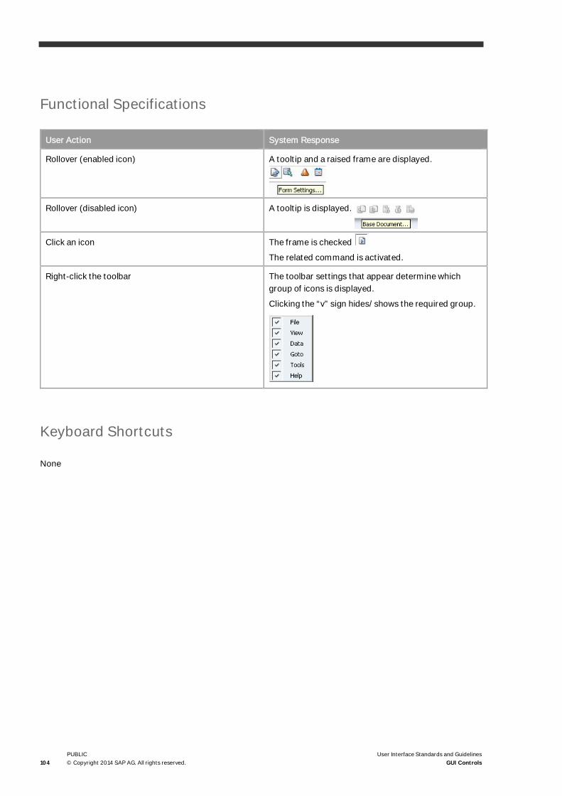
104PUBLIC© Copyright 2014 SAP AG. All rights reserved.
User Interface Standards and GuidelinesGUI Controls
Functional Specifications
User Action System Response
Rollover (enabled icon) A tooltip and a raised frame are displayed.
Rollover (disabled icon) A tooltip is displayed.
Click an icon The frame is checked
The related command is activated.
Right-click the toolbar The toolbar settings that appear determine whichgroup of icons is displayed.
Clicking the “v” sign hides/shows the required group.
Keyboard Shortcuts
None

User Interface Standard and Guidelines
User Interface Standards and GuidelinesGUI Controls
PUBLIC© Copyright 2014 SAP AG. All rights reserved. 105
Window Scroll Bar
When to use?
For scrolling the contents of a window.
General Description
Windows scroll bars are automatically added to a window, when the window is too small to show all its contents.This may happen when the user:
· Manually resizes the window
· Selects a large font. The window is resized accordingly, and is then too large to fully fit on the screen.
Visual Specifications
Width of vertical scroll bar / height of horizontal scroll-bar: 18 pixels.

106PUBLIC© Copyright 2014 SAP AG. All rights reserved.
User Interface Standards and GuidelinesGUI Controls
Functional Specifications
Operation Procedure
User Action System Response
Resize the window, making it smaller than its content Vertical and/or horizontal scroll bars areautomatically added to the window
Enlarge the window The scroll bars disappear
Keyboard Shortcuts
None
Tooltip
When to Use?
A tooltip is added in the following cases:
· As a general rule, all icons that appear in the application should get a tooltip, and specifically, then following:
o All buttons that have no text (see Choose from List (List of <list type>), Choose from Tree , Back ArrowIcon, Graph Icon, Insert Image and Clear Image Icons, Link Arrow Icon, Extended Checkbox).
o All Toolbar icons
· When a control is too short to display its full name (or context), a tooltip is dynamically added to show the fulltext. Controls that get a dynamic tooltip include: text field, list box, table column headers and cells andwindow title bar.
Command Buttons may get a tooltip if they are too short to show the full button label, or if the planner added adescription to the button.

User Interface Standard and Guidelines
User Interface Standards and GuidelinesGUI Controls
PUBLIC© Copyright 2014 SAP AG. All rights reserved. 107
General Description
Whenever the user rolls over an icon (or button or column header), the tooltip is activated and displayed next to
the icon. The four types of tooltip are:
· Normal (static) tooltip– a row of text explaining the function of an icon
· Dynamically added tooltip– a tooltip displaying the full text of an object that is too small to include long text
· Target Tooltip: a dynamic name added to buttons, to indicate which object or form is targeted by this button.The Target tooltip is displayed as a second line, after the static tooltip of the button.
For Example: Choose from List Button:
· Description: planners add descriptions to command buttons to further clarify the function of each button. Abutton description accompanies a standard tooltip showing the full button name, when the button is tooshort. In the latter case, the dynamic tooltip enters the first line, while the description takes the second line.
Visual Specifications
· Background color: Light yellow (#FFFFE0)
· Frame: 1 pixel wide, black
· Margin around text: Horizontal: 4 pixels; Vertical: 4 pixels
· Text font: Tahoma 7
· Text color: black
Functional Specifications
User Action System Response
Rollover (enabled icon) After ~ 1.5 seconds, a tooltip is displayed.
Mouse cursor leaves the icon The tooltip disappears

108PUBLIC© Copyright 2014 SAP AG. All rights reserved.
User Interface Standards and GuidelinesGUI Controls
Status Bar
When to use?
The status bar is used by many controls to display description text and system information. For details, see thespecific behavior of each control.
The Status Bar also displays system messages.
General Description
· The Status Bar, which extends the bottom of the SAP Business One main window, contains various text fields.
· The top-left field displays the description text of a control during a mouse rollover. The description text shouldbriefly describe the purpose of the control. For input fields, the description text should also includeinformation regarding the input format and length.
· The bottom-left area displays the system information (formerly known as Debug Information) of the control.This is detailed internal information that is displayed only if the user enables the System Information option inthe View menu.
Example: Description Text and System Information:
· The bottom-left field is also used to display the following three types of system messages: Error, Information,and Confirmation. For more information, see System Messages and Message Window.
· The middle of a Status Bar contains an area for the date and time
· You can display user-specific information on the right side of the status bar by dragging up to 4 different inputfields. For example, while processing transactions for a certain vendor, place the name and the telephonenumber of the contact person in the Status Bar. The next time you open that window, the relevant fieldsappear in the status bar.
· To drag information to the Status Bar, use the following method:
1. Open a window that contains fields you want to display in the status bar, for example, Business PartnerMaster Data.
2. Position the cursor on the required field, and drag it to the right-hand corner of the Status Bar.

User Interface Standard and Guidelines
User Interface Standards and GuidelinesGUI Controls
PUBLIC© Copyright 2014 SAP AG. All rights reserved. 109
Visual Specifications
· Minimal height: 44 pixels
· The following object is used to create the background:
· Field color: See the specification of read-only fields in Text Field
· Text color: black

110PUBLIC© Copyright 2014 SAP AG. All rights reserved.
User Interface Standards and GuidelinesGraphic Design Guidelines
Graphic Design Guidelines
Screen Resolution
When you build windows, use a screen resolution of 1024x768. Users can work with this resolution and higher.When you define forms, make sure the window size is not more than 1024x628 pixels, so that it fits within a1024x768 screen.
Fonts
The SAP Business One application has a default font. If a user selects another font size and style, all text, includingtext on controls, changes automatically to the new font. If the selected font is larger than the default font, the sizeof the controls changes accordingly.
The default font in SAP Business One is Tahoma. There are several usages of font style and color for differentelements.
Typical font usage:
Element Font Style and Color Sample
Text in fields Font: Tahoma, 7, Regular
Color: black
Labels (fields, buttons) Font: Tahoma, 7, Regular
Color: #FEF09E
Group Label Font: Tahoma, 7, underlined
Color: black
Main Menu category Font: Tahoma, 9, Bold
Color: white
Main Menu item Font: Tahoma, 7, Regular
Color: white
Window Title Font: Tahoma, 9, Regular
Color: white
The user may choose another font style and size in: Administration ® System Initialization ® General Settings ®Fonts & Bkgd tab.
After changing the font size, the whole window is resized automatically to fit the new font.

User Interface Standard and Guidelines
User Interface Standards and GuidelinesGraphic Design Guidelines
PUBLIC© Copyright 2014 SAP AG. All rights reserved. 111
NoteThe result of selecting a larger font is an enlarged window. In extreme cases, the resulting window may betoo large to fit screen; therefore, window scroll bars are added.
The only exceptions are the Main Menu, the dropdown menus, and the window titles, for which the system(Windows) font is used. For information, see Menu Bar and Dropdown Menus and Window Title Bar.
.
Window Layout
Definition
Forms, usually referred to as windows in SAP Business One, are used to view and manipulate data using GUIcontrols such as fields, tables, command buttons, and so on.
NoteOther window types, such as the Main Window and Message Windows, are discussed elsewhere in thisdocument.
Window Shell
Every window consists of the following basic elements:
· Title Bar
· Display Area (with the optional default placement of the OK and Cancel buttons)
The figure below shows a window shell with the default values for its width and height. The gray display area isprovided for the insertion of additional control elements.

112PUBLIC© Copyright 2014 SAP AG. All rights reserved.
User Interface Standards and GuidelinesGraphic Design Guidelines
The background color of the display area: #EAF1F6
Title Bar
The Title Bar contains the title of the window, and standard window buttons and icons for:
· Minimizing the window
· Maximizing the window
· Closing the window
NoteRegular SAP Business One windows do not contain a menu bar. Only the main window has a menu bar,from which all application functions can be accessed. In addition, only the main window contains a toolbar.
Scroll Bars
For information, see Window Scroll Bar.
Window Size
· Default horizontal value for a window: 518 pixels
· Default vertical value for a window: 373 pixels
· Window proportions: The recommended window proportion is 4 X 3. The height measurement is threequarters of the width measurement.
· Maximum window sizing parameters: 1024x628 pixels
o We recommend that windows be resizable. Allow resizing when the user will benefit from a larger size.When the window contains a data table, resizing is essential, in order to let the user see more information.If the window contains only simple controls, resizing is less important.
o If the user resizes a window and closes the application, upon subsequent opening, the former sizingparameters and former placement on the main window display automatically as the default.

User Interface Standard and Guidelines
User Interface Standards and GuidelinesGraphic Design Guidelines
PUBLIC© Copyright 2014 SAP AG. All rights reserved. 113
Window Margins
· Within the display area, place buttons and other elements positioned near the border, at least 5 pixels fromthe edge
Create equal margins on all 4 edges of the window
Positioning of Fields in the Window
· Place fields in a window in a consistent way
· Align fields (or labels) to a single reference line, whenever possible, and minimize the number of referencelines.
Example
Rearranging the elements by slightly moving or resizing them can significantly reduce the number ofreference lines, resulting in a much “cleaner” window:
The number of fields within a window must be limited. There is no “golden number” of fields, but considerationshould be given to maintaining the spacing rules defined above. If the window is full, divide it into tabs, or sub-windows.

114PUBLIC© Copyright 2014 SAP AG. All rights reserved.
User Interface Standards and GuidelinesGraphic Design Guidelines
Tab Order
· The field order in the window is from left to right and from top to bottom
· The user should be able to move between fields using the Tab key (or Shift+Tab to move in the oppositeorder)
· If the fields are organized in two columns, the Tab order is first from top-down in the left column, then fromtop-down in the second column.
Grouping Multiple Fields
Related fields should be grouped together. The following figure shows an example of related fields describing thefollowing properties: Code, Name, Foreign Name, Group, Currency and Federal Tax ID.
All fields in a group must have the same width, and the width has to show the total length of the field value.
NoteA field must be long enough to display the pertinent value in any language. Fields, Checkboxes, Buttons,and other elements can be placed in groups.
To emphasize the relationship between fields, the vertical distance between them should be small. For fieldswithin a group use a vertical spacing of 1 pixel.

User Interface Standard and Guidelines
User Interface Standards and GuidelinesGraphic Design Guidelines
PUBLIC© Copyright 2014 SAP AG. All rights reserved. 115
For fields without any logical association, the vertical spacing must be larger. For these fields, define a verticalspacing of at least 3 pixels.
Each input field should have a label (static text field) on its left side to describe the corresponding field. This labelshould be placed as close as possible to the input field.
NoteThe label must be far enough to leave room for labels in other languages. The label must be long enoughto display the pertinent text in any language.
If there are more labels below, they have to be aligned at the left border.
Separating Field Groups
Field groups should be clearly separated. There are two ways to create field groups:
Leave Space between Groups
The horizontal space between field groups should be at least 12 pixels.
The vertical space between field groups should be at least 16 pixels.

116PUBLIC© Copyright 2014 SAP AG. All rights reserved.
User Interface Standards and GuidelinesGraphic Design Guidelines
. Dividing Line
A divider is a horizontal or vertical line used to divide the window into logical groups of fields.
NoteA dividing line is not recommended. Select other grouping methods.
Visual specifications
· White line, 1-pixel wide
· A horizontal divider goes throughout the width of the window, leaving a space of 6 pixels on each side of thewindow.
Labeling a Group
Adding a label above a group of fields ties them into one logical unit. The label adds an explanation to the purposeof these groups.

User Interface Standard and Guidelines
User Interface Standards and GuidelinesGraphic Design Guidelines
PUBLIC© Copyright 2014 SAP AG. All rights reserved. 117
Visual Specifications
· The label is written above the fields aligned to the field labels
· The label is underlined
Group Box
A group box is a rectangle drawn around a group of fields, providing a visual indication that these fields
are strongly related.
In addition, a group box has a label that explains the general meaning of the fields in the group.
Visual Specifications
· The group box is a rectangle, bordered by 1-pixel white lines
· The group label is located inside the box, above the fields, left aligned with the labels of the fields
· The group label is underlined
· The horizontal spacing between the box and the edge of the fields is 5 pixels
· The vertical spacing between the box and the edge of the fields is 5 pixels

118PUBLIC© Copyright 2014 SAP AG. All rights reserved.
User Interface Standards and GuidelinesGraphic Design Guidelines
NoteDo not place a single group box alone in a window or tab page. Do not place a single table by itself within agroup box.
Terminology
The following are general recommendations in choosing terminology throughout SAP Business One:.
· Use the same term consistently, so that the same item is always referred to in the same manner. For example,a sales employee is not a sales rep, even though sales rep is an accepted term.
· Buttons and the Goto menu can have verbs. Window names are descriptive and contain nouns and adjectives.For example, a button can be "Add" but a window title should not include "Add."
· When abbreviations are required, ensure that the abbreviation is correct and that the same abbreviation isused consistently.
· Titles should be correct and contain as few words as possible. Since it is often difficult to shorten a title,ensure that the key words are present.
· Terms used should be consistent with SAP terminology wherever possible.
RecommendationWe recommend that you refer to the SAP Business One Glossary to familiarize yourself with SAPterminology. You can download this document from the SAP Business One documentation resourcecenter of SAP Channel Partner Portal (http://channel.sap.com/sbo/documentation).
Labeling Conventions
Labeling refers to text names, titles, headings, descriptions, questions, and prompts employed in all SAP
Business One windows and elements. This section outlines labeling guidelines that should be observed.
· Each control should have a label that describes concisely the purpose of the control.
· Some controls (such as Buttons, Checkboxes, or Radio Buttons) contain the label within the control itself.
· Other controls (such as Field and List Box) have a label placed on the left side of the control. In this case, awhite line is drawn under the label and connects it to the control:
NoteIf the window is to be translated, the label length should be extended by 30% beyond the English textlength.
· All field labels are written in #EAF1F6.

User Interface Standard and Guidelines
User Interface Standards and GuidelinesGraphic Design Guidelines
PUBLIC© Copyright 2014 SAP AG. All rights reserved. 119
Capitalization
The following capitalization guidelines apply for labeling in EnglishSAP Business One windows and elements utilize either Title Case or Sentence Case styles of capitalization.
Title Case
Title Case means that the first letter of each word is capitalized, except for certain words. The chart belowprovides specific grammatical guidelines for capitalization usage for title case.
Example
Use Title Case for the following:
· Toolbar tooltips
· Menu option labels
· Field labels
· Radio button labels
· Table column/row headings
· Window area (without frame) headings
· Window labels
· Pull-down menu labels
· Button labels
· Checkbox labels
· Tab strip labels
· Group box (framed) headings
· Titles of reports and lists
· List box/drop-down list box labels
The following English labeling guidelines apply to windows and elements utilizing Title Case:
· Do not use punctuation at the end of a label.
· Use short, precise, clear wording and terms that can be easily understood by the user. For pull-down menus,use a minimal number of words.
· As translated text may require more space than the original language, provide extra space (30%) per label
· With certain elements, such as menu options and buttons, disabled or unauthorized text has a different fontcolor.
· Never formulate a label as a question.
120PUBLIC© Copyright 2014 SAP AG. All rights reserved.
User Interface Standards and GuidelinesGraphic Design Guidelines
· Use verbs to state actions and nouns to state the object on which the action is performed
· Labels should be as self-explanatory as possible, but short. If a heading or title is too long to fit the space, editit to include only the most important information.
Sentence Case
When using sentence case, only the first letter of the sentence or phrase is capitalized. All other words are written
in lower case, except for proper nouns.
Example
Use sentence case for the following types of labeling:
· Messages and prompts (on windows and on the Status Bar)
· Short descriptions and instructions on a window
The following English labeling guidelines apply to windows and elements utilizing sentence case:
· Use punctuation at the end of a label only if the instruction/description is long, for example, more than onesentence.
· Do not use punctuation at the end of an incomplete sentence
· Use short, precise, clear wording and terms that can be easily understood by the user
· As translated text may require more space than the original language, provide extra space (30%) per label
· Never formulate a label as a question, unless it is a prompt on a Question Message Window (such as, “Do youwant to save the changes?”)
· Labels should be as self-explanatory as possible, but short. If a heading or title is too long to fit, edit it toinclude only the most important information.
Command Buttons
Button Positioning
· The main action buttons of a window are placed near the lower-left corner of the screen. This button groupusually includes: OK/Cancel/Update/Add, and so on.
· Additional action buttons are located next to the bottom-right corner of the screen.
· The buttons should be placed 5 pixels away from the edges of the window.
· The distance between two buttons: 5 pixels.

User Interface Standard and Guidelines
User Interface Standards and GuidelinesGraphic Design Guidelines
PUBLIC© Copyright 2014 SAP AG. All rights reserved. 121
Button Size
· All buttons throughout the system should have the height of 20 pixels
· The length of the button should be long enough to leave space around the text. At least 10 pixels should be lefton each side of the text. When calculating the button width, calculate an additional 30% above the Englishtext size, to leave room for translations.
· Button sizes should be consistent within a window. If two buttons are similar in size, make them equal.
Inactive buttons
When a button is not available, due to a specific situation, this button should be disabled. For example, the Editbutton is not available until an object is selected. However, if a button is never available because the user is notauthorized to use it, the button should be removed from the window.
Arranging the Information in a Window
Windows may contain many field controls. These elements should be arranged so that they:
· Are clear
· Are understandable to the user
· Conform to the typical workflow
To achieve these goals:
· Divide the information into logical groups
· Arrange the groups and the fields within the group in a clear manner
· Arrange the groups and the fields within the group in an order that matches the workflow. A typical work orderin a window is top-down and left to right. Check whether this order matches the way the user works.
When the window must contain a lot of information, it is preferable to divide this information into several views, inthe following manner:
· Divide the window (or part of the window) into several tab strips.
· Move some of the information into sub-windows.

122PUBLIC© Copyright 2014 SAP AG. All rights reserved.
User Interface Standards and GuidelinesGraphic Design Guidelines
Tab Strip Views:
· Useful for random access, but not for sequential access
· Easy to handle, the user remains within the scope of one window
· Allows quick access of all views; therefore, suitable for situations where the user needs to move frequentlybetween the views
Usage Example: Administration ® System Initialization ® General Settings.
· Other mechanisms, although less recommended, such as radio buttons or list box may be used as asubstitute instead of tab strips.
Sub-Windows:
· Move secondary information into a sub-window
· Accessed via a command button that opens the secondary window
· Ensure that all the basic data is kept in the main window. Move the more advanced data into the secondarysub-window(s).

User Interface Standard and Guidelines
User Interface Standards and GuidelinesGraphic Design Guidelines
PUBLIC© Copyright 2014 SAP AG. All rights reserved. 123
Usage Example: Sales Opportunities ® Sales Opportunity.

124PUBLIC© Copyright 2014 SAP AG. All rights reserved.
User Interface Standards and GuidelinesGraphic Design Guidelines
· Sub-windows may be used to elaborate a row in a table:
Usage example: Administration ® Setup ® Financials ® 1099 Table.
Each row in this table is expanded into multiple lines in the sub-window. Expanding the row can be performed asfollows:
· By double-clicking a row
· By choosing a command (1099 Boxes in the above example) from the context menu· By clicking the elaboration button (1099 Boxes in the above example) at the bottom of the screen

User Interface Standard and Guidelines
User Interface Standards and GuidelinesTypical Screens
PUBLIC© Copyright 2014 SAP AG. All rights reserved. 125
Typical Screens
Add/Find Window
Purpose
This type of window is commonly used for viewing, finding and adding records of data.
When to use?
To search for data records, edit records, or add new records.
Screen Layout
The following image is of the Add Mode screen layout:

126PUBLIC© Copyright 2014 SAP AG. All rights reserved.
User Interface Standards and GuidelinesTypical Screens
The following image is of the Find Mode screen layout:
The Add/Find window contains the following elements:
· Title bar
· Fields of various types
· One of the top fields is the identifier of the object displayed in the window. In marketing documents theidentifier always appears in the upper-right corner of the window:
Usage example: Sales A/R ® Sales Quotation.
In other windows, the identifier is not necessarily in that corner, but it should be located in the top row:
Usage example: Business Partners ® Business Partner Master Data.

User Interface Standard and Guidelines
User Interface Standards and GuidelinesTypical Screens
PUBLIC© Copyright 2014 SAP AG. All rights reserved. 127
· Buttons at the bottom of the Add/Find window start with the Add/Find/OK/Update button followed by theCancel button on the same line, right justified.
· There is a different visualization for the Find mode. In order to differentiate and prevent user mistakes thesearch field in Find mode is yellow (#FAF9C3).
The Add/Find Window Modes
The window has four working or operation modes:
· Add for adding a new record
· Find for searching data items records
· View for Viewing an existing record
· Edit for Modifying data of an existing record
Operational Procedure
· The Add/Find window appears with the identifying field (item no., code.) in focus
· The Add/Find window does not have a fixed default opening state. It can be opened either in Find mode or inAdd mode. The decision regarding the opening state depends on the specific scenario or business case.
· Changing between the Find, Add and View modes is possible by doing one of the following:
o Use the relevant action found in the toolbar:
o Find mode
o Add mode
o Use the relevant command from the menu
o Use the following keyboard shortcuts:
o Ctrl+A: change to Add mode
o Ctrl+F: change to Find mode
· Changing to Update (Edit mode) is done from View mode, by changing a data item in any of the fields of theAdd/Find window.
Mode Main Button Caption Can Change to Modes… Remark
Find Find Add, View
Add Add Find, View
View OK Edit, Find, Add
Edit Update Edit, Find, Add Changes are lost if notupdated.
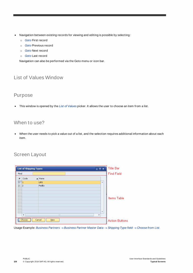
128PUBLIC© Copyright 2014 SAP AG. All rights reserved.
User Interface Standards and GuidelinesTypical Screens
· Navigation between existing records for viewing and editing is possible by selecting :
o Goto First record
o Goto Previous record
o Goto Next record
o Goto Last record
Navigation can also be performed via the Goto menu or icon bar.
List of Values Window
Purpose
· This window is opened by the List of Values picker. It allows the user to choose an item from a list.
When to use?
· When the user needs to pick a value out of a list, and the selection requires additional information about eachitem.
Screen Layout
Usage Example: Business Partners ® Business Partner Master Data ® Shipping Type field ® Choose from List.

User Interface Standard and Guidelines
User Interface Standards and GuidelinesTypical Screens
PUBLIC© Copyright 2014 SAP AG. All rights reserved. 129
Title Bar
This is a standard window title bar. The caption is “List of <list name>”, for example: “List of Shipping
Types”
Find Field
Purpose
The Find field helps the user locate a value in the table.
Visual Specifications
This is a standard text field. It is the only editable field in the window; therefore it is always in focus (that is, thefield is yellow and the insertion cursor is placed at the beginning of the field).
Operational Procedures
User Action System Response
User types in text in the field After each character is typed in, the system checks ifthe content of the field matches the beginning of anyitem in the list.
If a match is found, the first item in the table that hasbeen matched is highlighted.
Items Table
Purpose
The table displays the items from which the user can choose one or more items.
Visual Specifications
· For visual specifications, see Table
· The first column of the table contains the object ID (or key). The table is initially sorted by this ID

130PUBLIC© Copyright 2014 SAP AG. All rights reserved.
User Interface Standards and GuidelinesTypical Screens
· The other columns vary according to the type of selected object. The table should contain between 0 to 4additional columns. The columns should provide information that helps the user decide which item should bechosen.
Operational Procedure
· Standard operational procedure of a table
· Double-clicking a row performs a Choose operation. The highlighted item is chosen and the window is closed· The Ctrl and Shift keys are used for selection of multiple items, if relevant.
Items in Tree-Table
Purpose
The user may choose to view the items in a hierarchical format, by defining a group in the Form Settings window.
Visual Specifications
For visual specifications, see Tree-Table Control.
Operational Procedure
· Standard operational procedure of a Tree-Table
· Double-clicking a row performs a Choose operation. The highlighted item is chosen and the window is closed.

User Interface Standard and Guidelines
User Interface Standards and GuidelinesTypical Screens
PUBLIC© Copyright 2014 SAP AG. All rights reserved. 131
Action Buttons
Purpose
The window contains two to three buttons:
· Choose: chooses the highlighted item in the table and closes the window. This button is the default button ofthe screen, meaning that pressing Enter activates it.
· Cancel: closes the window, without saving any selection.
· New: appears only when the list can be edited by the user. Selecting the New button opens an Add Itemwindow, allowing the user to add additional item(s) to the list.
When this table view is hierarchical, two buttons are added:
· Expand All: Fully expands the table hierarchy
· Collapse All: Collapses all levels, so that only the upper level is visible.
Visual Specifications
· For visual specifications of each button, see Command Button.
· For specifications of the button positioning, see Command Button

132PUBLIC© Copyright 2014 SAP AG. All rights reserved.
User Interface Standards and GuidelinesTypical Screens
Operational Procedure
Choosing each button performs the operation as described in the Purpose section
Compound Text Field
Usage Example: Sales - A/R ® Delivery ® Logistics tab ® Bill to Compound Text Field.
When to use?
· When it is necessary to store each information section separately.
· This control should be used only if there is not enough space to accommodate all the fields.
Example
The address is comprised of different elements (street, city, and so on.) but it is displayed as one text field. Whenthe user wants to edit the information, he does so in the detailed window.
General Description
· The edit field looks like a regular field, but when clicked, it opens a new window with the separate elements.

User Interface Standard and Guidelines
User Interface Standards and GuidelinesTypical Screens
PUBLIC© Copyright 2014 SAP AG. All rights reserved. 133
Visual Specifications
· The field looks like any other field.
· The detailed window is built from simple fields.
Functional Specifications
Operation Procedure
User Action System Response
Clicking a field Opens the detailed window
Choosing the OK button in detailed window Enters the separate text as one piece of text
Choose from Tree Window
Purpose
This window is used with the Choose from Tree field group. It allows the user to choose an item from a TreeStructure.
When to use?
To enable the user to insert into a related group of fields information that is built in a hierarchical structure.

134PUBLIC© Copyright 2014 SAP AG. All rights reserved.
User Interface Standards and GuidelinesTypical Screens
Screen Layout
Usage Example: Business Partners ® Business Partner Master Data ® Payment Terms ® House Bank.
Title Bar
This is a standard window Title Bar. The caption is: Choose Object Type.
Items Tree
Purpose
The tree displays the items from which the user chooses one.
Visual Specifications
· For visual specifications of the tree control, see Tree Control
· The tree is displayed in a box colored # D2E1F0
· A scroll bar is attached to the right, if required
· When the window is displayed, the tree is all collapsed, that is, only the root node is visible.
User Interface Standard and Guidelines
User Interface Standards and GuidelinesTypical Screens
PUBLIC© Copyright 2014 SAP AG. All rights reserved. 135
Operational Procedure
· Standard operational procedure of a Tree, see Tree Control
· Double-clicking a Leaf node performs a Choose operation. The node is chosen and the window is closed.
Action Buttons
Purpose
The window contains 4 buttons:
· OK: selects the highlighted leaf node in the tree and closes the window. If no leaf node is currently selected,the window is closed without choosing a node. This button is the default button of the screen, meaning thatpressing Enter activates it.
· Cancel: Closes the window without saving a selection.
· Expand: Expands the whole tree.
· Collapse: Collapses the whole tree; only the root node remains visible.
Visual Specifications
· For visual specifications of each button, see Buttons
· For specification of the button positioning, see Command Button
Operational Procedure
Choosing each button performs the operation as described in the Purpose section.

136PUBLIC© Copyright 2014 SAP AG. All rights reserved.
User Interface Standards and GuidelinesTypical Screens
Date Selection Window
Purpose
This window is opened when the user selects the Date Picker. It allows the user to choose a date from a calendarand return it to the field. For more information on Date picker, see Pickers
When to use?
To enable the user to pick a date and enter it in the field or cell.
Screen Layout
Usage Example: Sales A/R ® Sales Quotation /Document Date field.
Calendar
Purpose
The calendar displays the current month and/or the field’s default month.
Operational Procedure
· Every enabled Date field in the application is accompanied by a Date Picker icon that is located inside the rightside of the cell and is visible whenever the curser is inside the cell.
· When user clicks this icon or uses the shortcut Ctrl+Shift+D while standing in the Date field, the Dateselection window is opened.

User Interface Standard and Guidelines
User Interface Standards and GuidelinesTypical Screens
PUBLIC© Copyright 2014 SAP AG. All rights reserved. 137
· This form opens like a list box, beneath the Date field, graphically connected to the field. When there is nooption to open the Date selection window below the field, it opens towards the top.
· By default, the first day of the week is Sunday or Monday, based on the localization.
· When selecting the holidays, the value in the "First day of the week" would be set according to the weekenddefined in the holiday table.
· Weekends and Holidays, as defined in the Holiday Dates in Company Level (link from the Accounting Data tabin the Company Details window), are signed in the Date Selection window.
· In cases where the date should be reflected by the customer holidays (Due Date), SAP Business One choosesthe correct dates, although those dates will not be highlighted in the Date Selection window.
· The user can change the month and/or the year and select a date.
· Changing the month or year is possible by using the list boxes of Month and Year and by pressing the arrowsicons. Clicking the arrow button moves the current month backwards or forwards. Clicking the arrow whenmonth is on January/ December also changes the year accordingly.
· Clicking on the date or using the Enter key closes the form, and the specific date updates the Date field.
· Font Size – Date Picker is reflected by the application's font size as selected by the user.
· Note that some manual enhancements may be required to adjust the Date field in cases where it becomes toonarrow and hides the actual date.
Action Buttons
Purpose
Each date functions as an action button: When the user clicks on a date it becomes selected and the value isdisplayed in the field/cell.
Visual Specifications
· Current date is highlighted by a blue frame
· Default date is highlighted by a yellow background
· Font Size – Date Picker will be reflected by the application's font size selected by the user.
Operational Procedure
Clicking each date performs the operation described in Purpose, above.

138PUBLIC© Copyright 2014 SAP AG. All rights reserved.
User Interface Standards and GuidelinesTypical Screens
Calculator Window
Purpose
This window is opened after the user clicks the Calculator Picker. It allows the user to calculate values and enterthem into the field/cell. For more information on Calculator Picker, see Pickers.
When to use?
To provide the user with the ability to calculate on every numeric field without using an external tool.
Screen Layout
Usage Example: Sales A/R ® Sales Quotation / Quantity Cell.
Display Field
Displays the result.
Numbers and Functions
Each number and function is an action button.

User Interface Standard and Guidelines
User Interface Standards and GuidelinesTypical Screens
PUBLIC© Copyright 2014 SAP AG. All rights reserved. 139
Filter Table Window
Purpose
This window is displayed by the Filter Table command available in the menu of most tables. It allows the user todefine the filtering criteria of a table, that is, to filter the rows of the table by any combination of the table fields.
When to use?
· Use the Filter Table command (and window) for any table the user may need to filter
· Limitations:
o You cannot filter a hierarchical table (see Hierarchical Table)
o You cannot filter tables in marketing documents.
Screen Layout
Usage Example: Reports ® Business Partners ® My Activities ® Filter Table.
NoteThe table currently used in the Filter Table window does not match the SAP Business One standards fortables.

140PUBLIC© Copyright 2014 SAP AG. All rights reserved.
User Interface Standards and GuidelinesTypical Screens
Position
The Filter Table window is displayed on top of the original window.
Title Bar
The title of the window is Filter Table.
The Filtering Criteria
· The window contains a table of filtering criteria, in which each row represents a field in the filtered table.
· The first column, Field, contains the name of a field (column) in the table.
· The second column, Rule, contains a list box, from which the user selects how to filter this column. The listbox contains (all or some of) the following 11 filtering rules:
1
2
3
4
5
6
7
8
9
10
11
Equal <value>
Not Equal <value>
In Range <value> to <value>
Out of Range <value> to <value>
Greater Than <value>
Greater or Equal <value>
Smaller Than <value>
Smaller of equal <value>
Is Empty
Is Not Empty
No filter or Combo Box
· The last two columns, Value and To Value become enabled depending on the selected rule. If the rule requiresa value (as in “Greater Than”), the Value field becomes enabled. If the rule requires two values (as in “InRange”), both the Value and the To Value fields become enabled. The user types in the value(s) by which hewishes to filter.
· The Value and To Value
· Fields contain a special control: It is a List Box but it can also be editable. You need to select an empty row andtype in a value, and the control functions as a list box. The list contains all values that exist in the relevantcolumn.
· Here are the rules that should be active for each type of column:
Column Type Active Rules List Box Type
Number Equal
Not Equal
Select or Edit

User Interface Standard and Guidelines
User Interface Standards and GuidelinesTypical Screens
PUBLIC© Copyright 2014 SAP AG. All rights reserved. 141
Column Type Active Rules List Box Type
In Range
Out of Range
Greater Than
Greater or Equal
Is Empty
Is Not Empty
String All Select or Edit
Money / Quantity Equal
Not Equal
In Range
Out of Range
Greater Than
Greater or Equal
Is Empty
Is Not Empty
Select or Edit
Date/Time Equal
Not Equal
In Range
Out of Range
Greater Than
Greater or Equal
Is Empty
Is Not Empty
Select or Edit
User type (such as Duration fieldin Activity form)
Equal
Not Equal
In Range
Out of Range
Greater Than
Greater or Equal
Is Empty
Is Not Empty
Select or Edit
Valid Values (such as Activity fieldin Activity form)
Equal
Not Equal
Select
Checkbox Equal
Not Equal
Select (Yes/No)
Icon Equal
Not Equal
Select (Yes/No)

142PUBLIC© Copyright 2014 SAP AG. All rights reserved.
User Interface Standards and GuidelinesTypical Screens
Action Buttons
· Filter – filters the table according to the specified filtering criteria
o After filtering, the Filter button changes to OK. Choosing the OK button closes the Filter Table window.
o If the user changes any of the filtering criteria, the OK button reverts to Filter.
· Clear – clears all filtering criteria
· Cancel – closes the Filter Table window, and cancels the filtering in the table.
When the Filter Table window is re-opened, it remembers the last filtering criteria used for this type of table.
Sort Table Window
Purpose
This window is displayed by the Sort Table command available in the menu of many tables. It allows the user todefine multiple sorting criteria of a table.
When to use?
· Use the Sort Table command (and window) for any table the user may need to sort by multiple fields
· Limitations:
o You cannot sort a hierarchical table
o You cannot sort tables in marketing documents
Screen Layout

User Interface Standard and Guidelines
User Interface Standards and GuidelinesTypical Screens
PUBLIC© Copyright 2014 SAP AG. All rights reserved. 143
Position
The Sort Table window is displayed on top of the original window.
Title Bar
The title of the window is Sort Table.
Sort Criteria
· The window contains a table of sorting criteria.
· The first column, Column, contains a list box. The list box contains the names of all fields (columns) in thetable to be sorted, allowing the user to choose a field to sort by.
· The second column, Order, contains a list box with two options: Ascending or Descending.
· The user selects a field in the first column, and then selects its sort order in the second column. In each row adifferent field can be chosen; there is no limitation on the number of sorting fields. The table is first sorted bythe field in the first row, then the second, and so on.
Action Buttons
· Sort Table – sort the table according to the specified sorting criteria
· After sorting, the Sort Table button changes to OK. Choosing OK closes the Sort Table window
· If the user changes any of the sorting criteria, the OK button reverts to Sort Table.
· Cancel – closes the Sort Table window
· Restore Default – Restores the default sorting of the table
Setup Window
Purpose
This window is used to define lists of values, typically used in the Setup folder of the Administration module, aswell as with list box and Choose from List controls.

144PUBLIC© Copyright 2014 SAP AG. All rights reserved.
User Interface Standards and GuidelinesTypical Screens
When to use?
Create a Setup window for each list of values that can be defined by the user.
Screen Layout
Usage Example: Administration ® Setup ® Business Partners ® Countries.
Title Bar
This is a standard Window Title Bar. The caption is: “<Object Type> - Setup”.
Setup Table
The table contains at least one column, listing the name of the defined object. Additional columns may be addedaccording to the need for the defined objects.
In the example above there column headers: include Code, Name and so on.
Operational Procedure
The user:
· Clicks in a row (either an existing row or the first empty row)
· Enters value(s), and then chooses the Update button
· Chooses the OK button to close the window

User Interface Standard and Guidelines
User Interface Standards and GuidelinesTypical Screens
PUBLIC© Copyright 2014 SAP AG. All rights reserved. 145
Action Buttons
The window contains two buttons:
· OK/Update: when the window is displayed the button label is OK. After the user types in a value in a row, thisbutton is labeled Update. Selecting it saves the newly added value, and the button reverts to OK.
· Choosing OK saves the table and closes the window
· Cancel: Closes the window without saving the data
· Elaboration button (optional) – see below
Elaborating a row in a setup table:
· In some Setup forms, a row may be expanded into a multi-row table. In this case, sub-windows are used:
Usage example: Administration ® Setup ® Financials ® 1099 table.
In this case, an additional button is added at the bottom-right corner of the window:
· This button is used to open a sub-window containing the elaboration of the selected row
· The name of the button should clearly state what data it elaborates (1099 Boxes in the above example)
· The button is enabled when a row is selected in the table, and disabled when no row is selected
Expanding a row can be performed by:
· Double-clicking the row
· Choosing a command (1099 Boxes in the above example) from the context menu
· Choosing the elaboration button (1099 Boxes in the above example) at the bottom of the screen

146PUBLIC© Copyright 2014 SAP AG. All rights reserved.
User Interface Standards and GuidelinesTypical Screens
Form Settings
Purpose
This window is used to customize the content and behavior of windows in the system. Each window may beassociated with a Form Settings window.
The Form Settings window is accessed via the Form Settings icon in the toolbar (while the customized windowis open). It can also be accessed from the Tools menu.
When to use?
Create the Form Settings window for each window that can be customized by the user.
Screen Layout
Title Bar
This is a standard Window Title Bar. The caption is: “Form Settings - <Name of window>”.

User Interface Standard and Guidelines
User Interface Standards and GuidelinesTypical Screens
PUBLIC© Copyright 2014 SAP AG. All rights reserved. 147
Definition Area
The definition area may vary, depending on the content of the customized window.
A typical Form Settings window is divided into three tabs:
Table Format (seen in the figure above)
In this tab, the user defines which columns will appear in the table (for a window that contains a table).
The Form Settings table contains all the available fields. Selecting the Visible checkbox makes the field appear inthe table. Selecting the Active checkbox makes the field editable. The Active checkbox is enabled only if the Visiblecheckbox is selected for this field.
To change the order of columns, the user clicks and drags a row up or down in the table. During dragging, thecursor changes to a rectangular shape. Only visible fields can be dragged.
Row Format
In this tab, the user defines which fields appear in the Row Details window associated with the table in thecustomized window.
The Form Settings table shows all available fields. Selecting the Visible checkbox makes the field appear in theRow Details. Selecting the Active checkbox makes the field editable. The Active checkbox is enabled only if theVisible checkbox is selected for this field.
To change the order of fields, the user selects and drags a row up or down in the table. During dragging, the cursorchanges to a rectangular shape. Only visible fields can be dragged.

148PUBLIC© Copyright 2014 SAP AG. All rights reserved.
User Interface Standards and GuidelinesTypical Screens
Document
This tab is used for general settings in the customized window. It typically comprises two nested tab strips:
· General: For general window settings
· Table: For general settings related to the table in the customized window.
NoteThe settings in the Document tab affect only the current document, and not all documents of this type.
Action Buttons
The window contains three buttons:
· OK: saves the changes and closes the window
· Cancel: closes the window without saving the changes
· Restore Default: restores the original window settings and discards all user customization.
Row Details
Purpose
A window used to view/edit details of a row in a table.
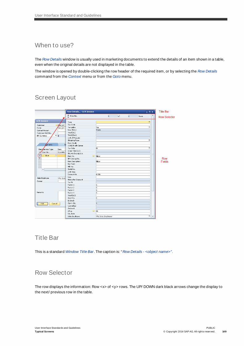
User Interface Standard and Guidelines
User Interface Standards and GuidelinesTypical Screens
PUBLIC© Copyright 2014 SAP AG. All rights reserved. 149
When to use?
The Row Details window is usually used in marketing documents to extend the details of an item shown in a table,even when the original details are not displayed in the table.
The window is opened by double-clicking the row header of the required item, or by selecting the Row Detailscommand from the Context menu or from the Goto menu.
Screen Layout
Title Bar
This is a standard Window Title Bar. The caption is: “Row Details - <object name>”.
Row Selector
The row displays the information: Row <x> of <y> rows. The UP/DOWN dark black arrows change the display tothe next/previous row in the table.

150PUBLIC© Copyright 2014 SAP AG. All rights reserved.
User Interface Standards and GuidelinesTypical Screens
Row Fields
All fields related to the item are displayed on top of each other. The fields may be editable or in Read-Only mode. Ifthe fields are editable, the user may change their value. Once you exit the field, the new value is reflected in thetable.All fields are of the same size.
NoteThere is no OK/Update button in this window. The new data is automatically uploaded.
System Messages and Message Window
Purpose
When the system detects an error or information that generates a message to the user, or when the systemrequires a user decision in order to proceed, it displays a message. The message is displayed either in the StatusBar or in a window, depending on the type of error or information. The message states the problem and may offera solution, so that the user can proceed without external assistance.
When to use?
Use a Message Box (rather than the Status Bar) when:
· The message is critical and you want to ensure that the user sees it
· The action cannot proceed without user intervention or decision. In this case a Question Message is displayed.
Screen Layout
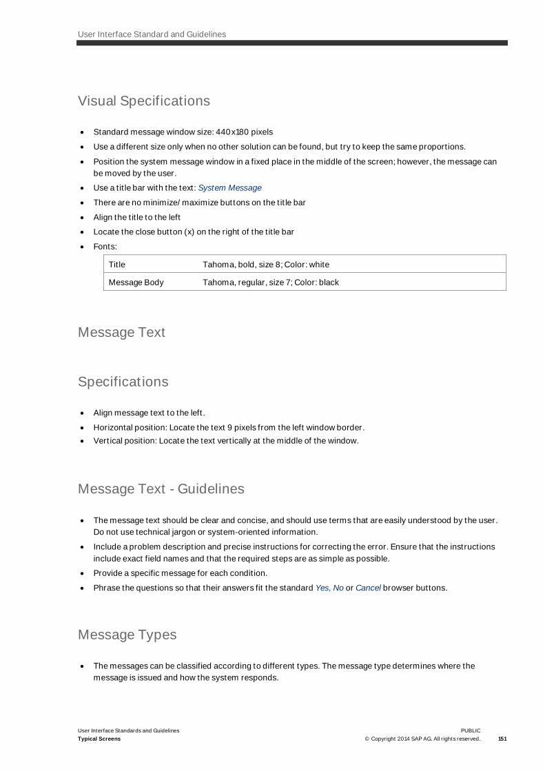
User Interface Standard and Guidelines
User Interface Standards and GuidelinesTypical Screens
PUBLIC© Copyright 2014 SAP AG. All rights reserved. 151
Visual Specifications
· Standard message window size: 440x180 pixels
· Use a different size only when no other solution can be found, but try to keep the same proportions.
· Position the system message window in a fixed place in the middle of the screen; however, the message canbe moved by the user.
· Use a title bar with the text: System Message
· There are no minimize/maximize buttons on the title bar
· Align the title to the left
· Locate the close button (x) on the right of the title bar
· Fonts:
Title Tahoma, bold, size 8; Color: white
Message Body Tahoma, regular, size 7; Color: black
Message Text
Specifications
· Align message text to the left.
· Horizontal position: Locate the text 9 pixels from the left window border.· Vertical position: Locate the text vertically at the middle of the window.
Message Text - Guidelines
· The message text should be clear and concise, and should use terms that are easily understood by the user.Do not use technical jargon or system-oriented information.
· Include a problem description and precise instructions for correcting the error. Ensure that the instructionsinclude exact field names and that the required steps are as simple as possible.
· Provide a specific message for each condition.
· Phrase the questions so that their answers fit the standard Yes, No or Cancel browser buttons.
Message Types
· The messages can be classified according to different types. The message type determines where themessage is issued and how the system responds.
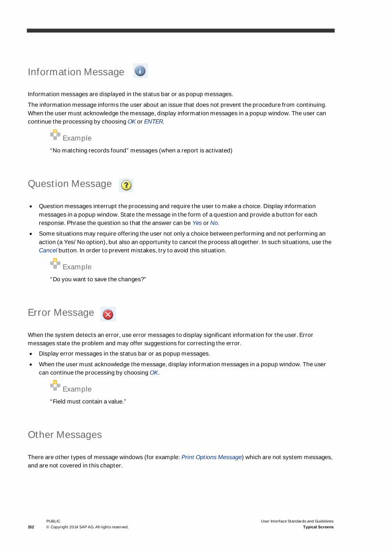
152PUBLIC© Copyright 2014 SAP AG. All rights reserved.
User Interface Standards and GuidelinesTypical Screens
Information Message
Information messages are displayed in the status bar or as popup messages.
The information message informs the user about an issue that does not prevent the procedure from continuing.When the user must acknowledge the message, display information messages in a popup window. The user cancontinue the processing by choosing OK or ENTER.
Example“No matching records found” messages (when a report is activated)
Question Message
· Question messages interrupt the processing and require the user to make a choice. Display informationmessages in a popup window. State the message in the form of a question and provide a button for eachresponse. Phrase the question so that the answer can be Yes or No.
· Some situations may require offering the user not only a choice between performing and not performing anaction (a Yes/No option), but also an opportunity to cancel the process altogether. In such situations, use theCancel button. In order to prevent mistakes, try to avoid this situation.
Example“Do you want to save the changes?”
Error Message
When the system detects an error, use error messages to display significant information for the user. Errormessages state the problem and may offer suggestions for correcting the error.
· Display error messages in the status bar or as popup messages.
· When the user must acknowledge the message, display information messages in a popup window. The usercan continue the processing by choosing OK.
Example“Field must contain a value.”
Other Messages
There are other types of message windows (for example: Print Options Message) which are not system messages,and are not covered in this chapter.

User Interface Standard and Guidelines
User Interface Standards and GuidelinesTypical Screens
PUBLIC© Copyright 2014 SAP AG. All rights reserved. 153
Status Bar Messages
Three types of messages are displayed in the status bar:
· Error Message: displayed when a procedure cannot continue until a specific action occurs
· Information Message: displayed for information purposes. It informs the user about an issue that does notprevent the procedure from continuing.
· Confirmation Message: the message has no influence on the user's work. It only informs about the successfulexecution of system functions.
Visual Specifications
Error Message:
· White text over red background + icon
· Background color: red (# FF0000)
Information Message:
· White text over blue background + icon
· Background color: light blue (#9FB1CB)
Confirmation Message:
· White text over green background + icon
· Background color: light green (#7FB67B)
Popup Messages
· Use a popup message (as opposed to Status Bar) when the message is critical and you want to ensure thatthe user sees it, or when the action cannot proceed without the user’s intervention or decision.
· Popup message windows should be modal, meaning the user cannot access any other window until the popupmessage is closed.
For more information, see the specifications for System Messages and Message Window.
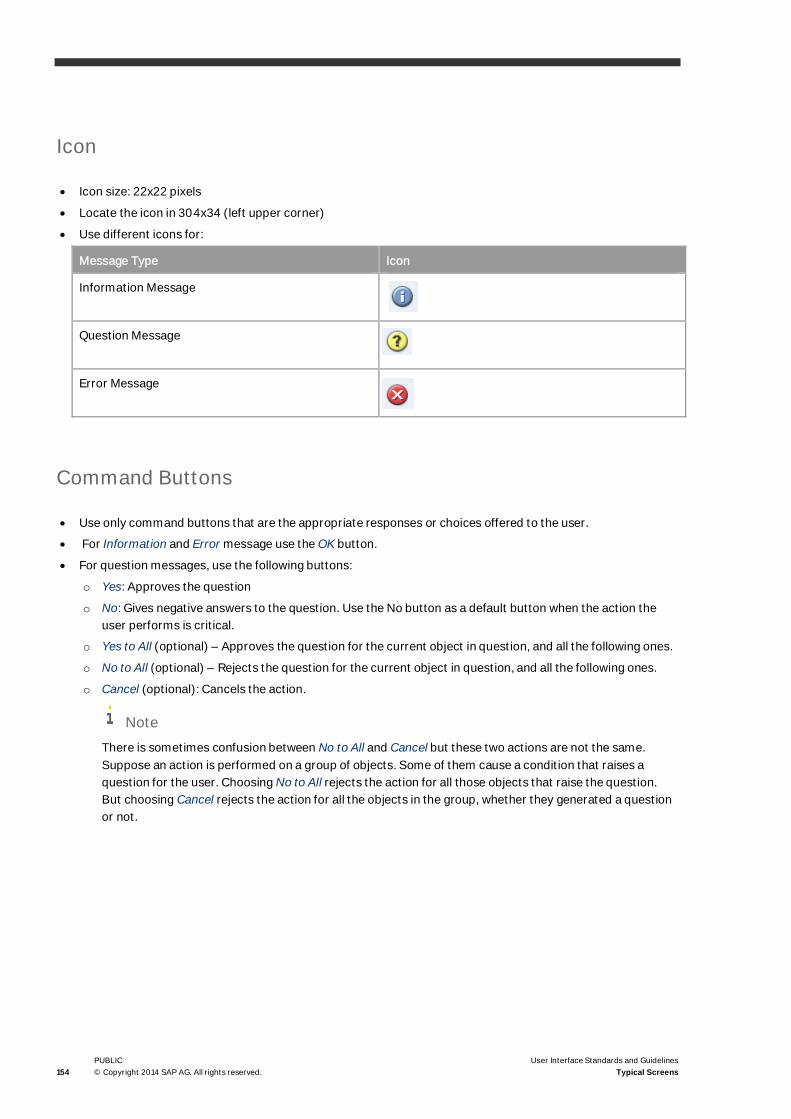
154PUBLIC© Copyright 2014 SAP AG. All rights reserved.
User Interface Standards and GuidelinesTypical Screens
Icon
· Icon size: 22x22 pixels
· Locate the icon in 304x34 (left upper corner)
· Use different icons for:
Message Type Icon
Information Message
Question Message
Error Message
Command Buttons
· Use only command buttons that are the appropriate responses or choices offered to the user.
· For Information and Error message use the OK button.
· For question messages, use the following buttons:
o Yes: Approves the question
o No: Gives negative answers to the question. Use the No button as a default button when the action theuser performs is critical.
o Yes to All (optional) – Approves the question for the current object in question, and all the following ones.
o No to All (optional) – Rejects the question for the current object in question, and all the following ones.
o Cancel (optional): Cancels the action.
NoteThere is sometimes confusion between No to All and Cancel but these two actions are not the same.Suppose an action is performed on a group of objects. Some of them cause a condition that raises aquestion for the user. Choosing No to All rejects the action for all those objects that raise the question.But choosing Cancel rejects the action for all the objects in the group, whether they generated a questionor not.

User Interface Standard and Guidelines
User Interface Standards and GuidelinesTypical Screens
PUBLIC© Copyright 2014 SAP AG. All rights reserved. 155
Examples
General Guide – Ask Yourself
When creating a message, consider the following:
· Is the message needed?
· Is the message of the right type?
· Is the icon correct for the message type?
· Does the message appear in the correct place (Status Bar/ Popup Window?)
· Is the message terminology correct and written in plain English?
· Can the user understand what is required?
· Are the buttons referred to correctly for the options, as written in the message?

156PUBLIC© Copyright 2014 SAP AG. All rights reserved.
User Interface Standards and GuidelinesTypical Screens
Print Options Messages
Purpose
To offer the user additional print options for specific documents.
When to Use?
The popup Print Options window opens when the user presses the Print button (or Print… in the upper menu) andthere are variations of the documents that can be printed.
Screen Layout
Visual Specifications
Size
· Print Options message window can appear in different sizes according to the number and complexity of theuser tasks.
· Optimal proportions are – 2 X 3
Title
· Use the title: Print Options

User Interface Standard and Guidelines
User Interface Standards and GuidelinesTypical Screens
PUBLIC© Copyright 2014 SAP AG. All rights reserved. 157
· Align the title to the left
· Locate the close button (x) on the right of the title bar
· There are no minimize/maximize buttons in the title bar.
Command Buttons
Use the Print and Cancel buttons:
· Print: approves the options and sends the document to print.
· Cancel: cancels the print options, closes the Print Options window and returns to the state before themessage popped up.
Report Window
Purpose
A window used to display a report.
When to use?
For each report, use this window to display the report results. This window is typically opened from the selectioncriteria window.
General Description
· A report window consists of a table displaying a collection of records
· Usually the report Window is preceded by a Selection Criteria window, in which the user specifies how to filterthe data. Only records that match the selection criteria are displayed in the report.
· Within the report window, the user can further filter and sort the data (see Table).
· The Go Back button allows the user to go back and redefine the selection criteria for the report.

158PUBLIC© Copyright 2014 SAP AG. All rights reserved.
User Interface Standards and GuidelinesTypical Screens
Screen Layout
Title Bar
This is a standard Window Title Bar. The caption is <name of the report>.
Data Area
Contains a table with all records retrieved, based on the selection criteria.
Action Buttons
The window has the following action buttons:
· Go Back: closes the window and returns to the selection criteria window.
· OK: Closes the report and the selection criteria window.
· Cancel: This button is optional. It appears in reports that can be edited. Cancel closes the report withoutsaving any changes.
Choosing the window’s “X” button closes the report and the selection criteria window
NoteReports can be filtered and sorted. For more information, see Table
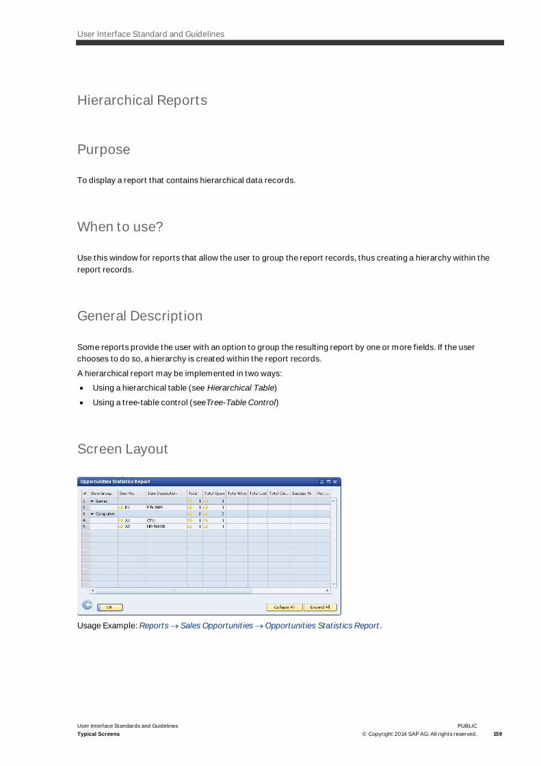
User Interface Standard and Guidelines
User Interface Standards and GuidelinesTypical Screens
PUBLIC© Copyright 2014 SAP AG. All rights reserved. 159
Hierarchical Reports
Purpose
To display a report that contains hierarchical data records.
When to use?
Use this window for reports that allow the user to group the report records, thus creating a hierarchy within thereport records.
General Description
Some reports provide the user with an option to group the resulting report by one or more fields. If the userchooses to do so, a hierarchy is created within the report records.
A hierarchical report may be implemented in two ways:
· Using a hierarchical table (see Hierarchical Table)
· Using a tree-table control (seeTree-Table Control)
Screen Layout
Usage Example: Reports ® Sales Opportunities ® Opportunities Statistics Report.

160PUBLIC© Copyright 2014 SAP AG. All rights reserved.
User Interface Standards and GuidelinesTypical Screens
The Hierarchical Report window is basically identical to a normal report window, except for the following:
· The Expand ( ) / Collapse ( ) buttons appear within the cell of the parent record
· If there are several hierarchy levels, each level has its own expand/collapse button in its own cell:
· If the cell containing the Expand/Collapse button also contains a link arrow, the Expand/Collapse buttonappears first:
· Two external buttons, Expand All and Collapse All, should be placed at the lower-right corner of the reportwindow, to expand/collapse all rows at once.
Selection Criteria Window
Purpose
This window lets the user select the criteria for a report. In this window the user defines:
· Data filtering criteria
· Display options
· Print options
When to use?
For each report, start with the Selection Criteria window, in which the user defines the objects to be included in thereport.
General Description
· When the user selects a report from the menu, the Section Criteria window is displayed. The Selection Criteriawindow contains fields and controls that enable the user to filter the data displayed in the report.
· The OK button in the selection criteria window brings up the report window.
· The report will contain only those records that match the selection criteria: If the user filled a value in a field inthe selection criteria window, this field becomes a filtering field, and only records that match its value will bedisplayed. If, however, a field is left empty – this field has no effect on filtering the report.
· Note that after the report is displayed, the user can filter it further, using the Filter Table command.

User Interface Standard and Guidelines
User Interface Standards and GuidelinesTypical Screens
PUBLIC© Copyright 2014 SAP AG. All rights reserved. 161
Screen Layout
Usage Example: Reports ® Financial ® Accounting ® General Ledger.
Title Bar
This is a standard Window Title Bar. The caption is of the window: <Report Name> - Selection Criteria.
Object Selection
Some reports allow the user to select one of several objects for the report.
There are currently reports that offer this option by using a tab strip control to choose the desired object type:
This method is not recommended. A tab strip is the wrong control for this purpose, as it may mislead users intothinking that they can select criteria from multiple tabs.
An appropriate control to select between objects may be a List Box or a Radio Button.
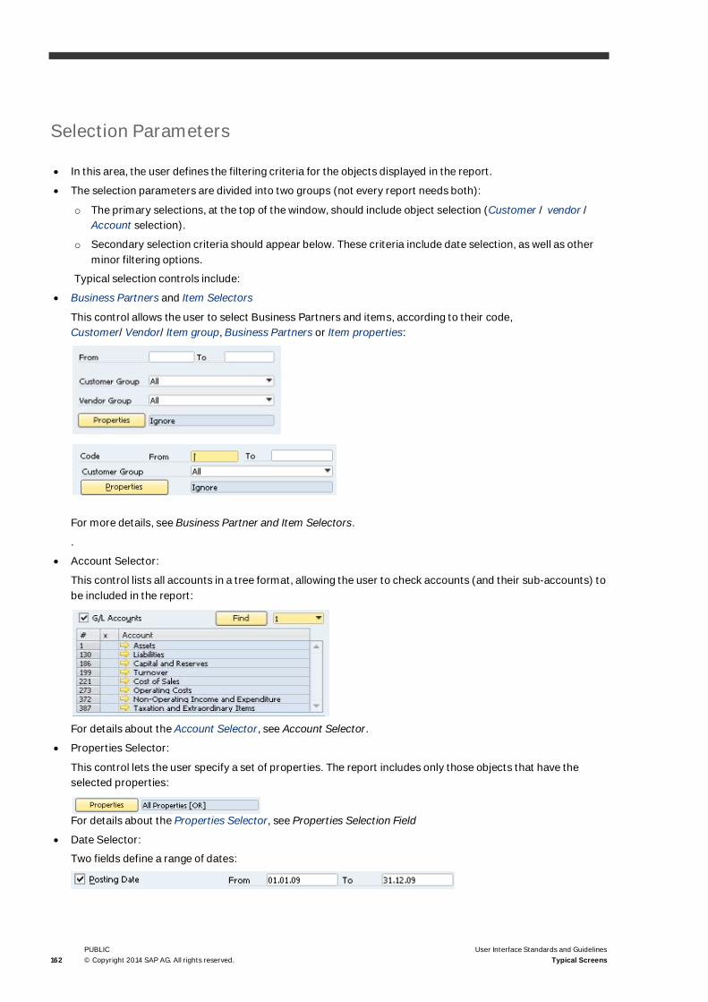
162PUBLIC© Copyright 2014 SAP AG. All rights reserved.
User Interface Standards and GuidelinesTypical Screens
Selection Parameters
· In this area, the user defines the filtering criteria for the objects displayed in the report.
· The selection parameters are divided into two groups (not every report needs both):
o The primary selections, at the top of the window, should include object selection (Customer / vendor /Account selection).
o Secondary selection criteria should appear below. These criteria include date selection, as well as otherminor filtering options.
Typical selection controls include:
· Business Partners and Item Selectors
This control allows the user to select Business Partners and items, according to their code,Customer/Vendor/Item group, Business Partners or Item properties:
For more details, see Business Partner and Item Selectors.
.
· Account Selector:
This control lists all accounts in a tree format, allowing the user to check accounts (and their sub-accounts) tobe included in the report:
For details about the Account Selector, see Account Selector.
· Properties Selector:
This control lets the user specify a set of properties. The report includes only those objects that have theselected properties:
For details about the Properties Selector, see Properties Selection Field
· Date Selector:
Two fields define a range of dates:
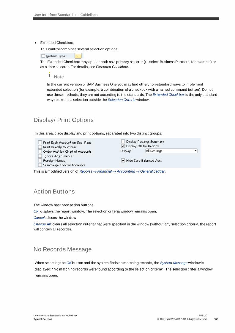
User Interface Standard and Guidelines
User Interface Standards and GuidelinesTypical Screens
PUBLIC© Copyright 2014 SAP AG. All rights reserved. 163
· Extended Checkbox:
This control combines several selection options:
The Extended Checkbox may appear both as a primary selector (to select Business Partners, for example) oras a date selector. For details, see Extended Checkbox.
NoteIn the current version of SAP Business One you may find other, non-standard ways to implementextended selection (for example, a combination of a checkbox with a named command button). Do notuse these methods; they are not according to the standards. The Extended Checkbox is the only standardway to extend a selection outside the Selection Criteria window.
Display/Print Options
In this area, place display and print options, separated into two distinct groups:
This is a modified version of Reports ® Financial ® Accounting ® General Ledger.
Action Buttons
The window has three action buttons:
OK: displays the report window. The selection criteria window remains open.
Cancel: closes the window
Choose All: clears all selection criteria that were specified in the window (without any selection criteria, the reportwill contain all records).
No Records Message
When selecting the OK button and the system finds no matching records, the System Message window is
displayed: “No matching records were found according to the selection criteria”. The selection criteria window
remains open.

164PUBLIC© Copyright 2014 SAP AG. All rights reserved.
User Interface Standards and GuidelinesTypical Screens
Wizard
Purpose
The wizard assists the user in complex tasks, by breaking it into several successive steps.
When to use?
· Use the Wizard when a task is too complex to be contained in one window.
· The task involves several steps to be performed in a specific order.
· The task is infrequent and difficult for users to learn.
NoteWizards operate slowly and are to be used only for infrequent and complex tasks.
· Not suited for teaching a user how to do something
· Use the wizard as an additional explanation for performing tasks. It is recommended that a regularexplanation be available as well.
Window Title Bar
· Use a standard Window Title Bar with the specific Wizard name
· Align the title to the left
· Locate the close button (x) on the right hand side of the title bar
· The following object is used to create the background:

User Interface Standard and Guidelines
User Interface Standards and GuidelinesTypical Screens
PUBLIC© Copyright 2014 SAP AG. All rights reserved. 165
Main Step Indicator
· Keep the number of main steps below seven
· Main steps are recommended to be fixed
· Display the main step number with its header, such as ‘1 Company Detail ’
· There are three types of main step indicators:
o Current main step (for the first step)
o Completed main step
o For remaining steps (It is available as access to some completed main step)
o Not start main step
Header
The header contains:
· Name of the main step
· A dash between main step and sub-step
· Name of the sub-step (if sub-step exits)
· Explanatory text for the current step
Sub-step Indicator
· Sub-step indicators are located between the name and the explanatory text
· Use for group steps and dynamic steps
· There are four types of sub-step indicators:
o Completed:
o Current :
It is available in the completed sub-steps, and in some no dependency sub-steps
o Inactive :
o Unknown :
· Use broken link to connect these sub-steps
Content Area
· Background color: white
· The data area contains text, fields, controls, tables, and other elements, relevant to the current step
· The data area may contain Action Buttons relevant to the current stage.

166PUBLIC© Copyright 2014 SAP AG. All rights reserved.
User Interface Standards and GuidelinesTypical Screens
NoteThese Action buttons are separate from the navigation buttons in the wizard footer
Footer
· Footer height (including border line): 55pixels
o colored: R:235 G:243 B:255
o Navigation buttons on the right side:
o Buttons include: Cancel, Back, Next, Finish
o The Back button does not appear on the first page
o The Next button does not appear on the last page
o Use the Next and Back buttons as the controller navigating between the two steps sequenced in thewizard
ExampleIf a current step is the first sub-step of the following main step, selecting the Back button directs to theprevious main step or to the last sub-step of the main step.
o The Finish button only appears on the page where it is possible for the user to finish the process
o If the Wizard cannot be cancelled, there is no need to show the Cancel button along with the Close (X)button on the window Title Bar
The navigation buttons are active when navigation is possible, according to the data entry and business case.
Start / Finish Screen
· The Start screen and finish screen take the same UI layout
· The basic UI structure is as follows:
· The first page includes a welcoming paragraph providing an introduction and explanation regarding thewizards purpose
· The Finish screen indicates that the wizard is complete.
RecommendationA Summary or Conclusion are recommended to be the last of the main steps.

User Interface Standard and Guidelines
User Interface Standards and GuidelinesTypical Screens
PUBLIC© Copyright 2014 SAP AG. All rights reserved. 167
Usage Example: Sales ®Dunning Wizard.
Subsequent screen
The Subsequent screen contains five areas: Main step, Header, Sub-step, Contents and Navigation Button
Usage Example: Administration- Setup ® Express Configuration Wizard
Fonts
Number : Tahoma, 24, Color: R: 127 G: 153 B: 184
Text Field: Tahoma, 11px, Color: R: 40 G: 90 B: 122
Number : Tahoma, 24, Bold, Color: White
Text Field: Tahoma, 11px, Bold, Color: White
Number : Tahoma, 24, Color: R:190 G:190 B:192
Text Field: Tahoma, 11px, Color: R:190 G:190 B:192

168PUBLIC© Copyright 2014 SAP AG. All rights reserved.
User Interface Standards and GuidelinesTypical Screens
Main Step: Tahoma, 14px, Bold, Color: R:137 G:137 B:137
Sub-Step and Explanation: Tahoma, 11px, Color: R:137 G:137 B:137
Content Text: Tahoma, 11px, Color: Black (Emphasized text takes bold style.)
Navigation Rule
· Users can navigate between the connected steps, moving from one step to the next.
· The completed main step can be clicked to be re-selected.
· If the completed main step is selected, the first sub-steps are displayed as the default.
· If the completed main step is re-edited, the steps remaining become inactive.
General Guidelines
· Highlight the current step for users.
· All Wizard screens must be of the same size and position.
· Start page is mandatory for all Wizards and is used as an introduction to the Wizard.
· The Finish page is displayed after the last step is completed or as a last main step in the wizard.
· Do not require the user to leave the Wizard to complete a task.
· Include a Finish button at the point where the task can be completed.
· The Next and Back buttons should be enabled only when the user is permitted to move forward or backward
· Make sure to clarify what further action is needed and how a user should proceed after the Wizard hascompleted its process.
· Present a single window at one given time.
· Do not advance to new pages automatically.
· Keep the same order of buttons throughout the Wizard.
Terminology
The following are general recommendations for choosing terminology in wizards:
· Do not use technical terms or system-oriented information.
· Write simply, concisely, and clearly, following all previously presented guidelines.
· Do not exceed three rows for explanations.
· Use simple instructions. Wizards are not suited for teaching users how to do something.
· Clearly identify the wizard's purpose in the Title Bar.

User Interface Standard and Guidelines
User Interface Standards and Guidelines PUBLIC© Copyright 2014 SAP AG. All rights reserved. 169
· Use a conversational, rather than instructional style.
· Use words such as "You" and “Your”.
· Start most questions with phrases such as “Which option do you want…” or “Would you like…”
· Include proper welcome and closing text on the first/last page to make the start and end process stepsobvious

170PUBLIC© Copyright 2014 SAP AG. All rights reserved.
User Interface Standards and GuidelinesAdding a New Feature
Adding a New Feature
This chapter lists the issues you should consider when developing a new feature.
Before adding a new feature to the application, clarify the following parameters:
· Importance of the feature
· Expected frequency of usage
· Type and number of potential users
If you decide to add a new feature, locate it according to the above parameters.
Example f the feature will be less frequently used, and not by all users, position it in a sensible but hidden place, soas not to complicate the application for other users.
Form Design
Consider the purpose of the form, and decide on the appropriate window type.
· To add/edit data records, use an Add/Find window (see Add/Find Window).
· To define a process, consider a wizard (see Wizard).
· To create a report, design Selection Criteria and Report windows (see Selection Criteria Window).
· To define a value list, use a Setup Window (NOE = New Object Entry).
Choose a name for the form:
· The name should reflect the type of data record that the form will handle.
· Do not use verbs for form names, only nouns and adjectives.
Design the content of the form:
· Workflow: field and control placement should reflect the user’s workflow. Start with the most important itemsat the top-left corner and advance towards the lower-right. Refer to the Graphic Design Guidelines, for generalguidelines of window design (see Graphic Design Guidelines).
· Grouping: arrange the fields and controls in groups that create a logical connection between the fields. Placegroups to create a more pleasant visual arrangement (see Arranging the Information in a Window).
· Visual Arrangement: ensure that fields and controls are spaced and aligned according to defined standards(see Window Layout.
· Consider what default values should be assigned to fields.
· Terminology: use clear and short terms, be consistent with similar terms used in other forms, and avoidabbreviations whenever possible (see Terminology).
· Tables: If the form contains a table, consider the following:
o Select the appropriate table type (simple table, hierarchical, table with row types).
o Select the column order, so that the most important columns appear first.
User Interface Standard and Guidelines
User Interface Standards and GuidelinesAdding a New Feature
PUBLIC© Copyright 2014 SAP AG. All rights reserved. 171
o Is each column really required? too many columns may reduce table usability.
o Row Details: If the items shown in the table contain more data than appears in the table, add a RowDetails form.
o Ensure that Filtering and Sorting is enabled (see Table).
Extensions to the Form
In addition to the form design, consider how the form is connected to the rest of the application:
· Menu Location:
o Select whether the form should be accessed from the Main Menu
o Select the appropriate location in the top menu
o Position the new entry close to other relevant forms. The order within the selected menu should reflectthe importance/frequency of use. See guidelines in Menu Bar and Dropdown Menus.
· Other links to the form:
o Consider whether the feature should be accessed from other forms. If so – add the new feature as abutton on the other form, and add a command in that form’s Goto menu.
o Make sure the command (control) that leads to the form is labeled the same as the form name.
· Links from the form:
o When fields refer to other objects – add a link arrow icon that links to that object.
o Consider if there are other windows relevant to the current form. Add them into the Goto menu. See MenuBar and Dropdown Menus Consider if any reports are relevant to the current form. Add them into the Gotomenu. See the Menu Bar and Dropdown Menus
· Form Settings:
If you want to let the user customize the window – add a Form Settings window.
· Print Layout Design:
You may plan the print layout.
· Print Options Messages:
Determine the different printing options See Print Options Messages
· System Messages:
Consider if any messages are relevant to the current form. Add them either in the status bar or in a pop upwindow, depending on the type of the message. See System Messages and Message Window
NoteTo create standard procedures and add-ons, meet the following general usability standards:
o UI Branding: The product shall use only the registered UI branding items.
o Navigation: The product shall support consistent navigation within the product.
o UI Elements: The product's UI elements shall be used consistently.
o Keyboard Input: The product shall support efficient keyboard navigation and interaction.
o Information Retrieval: The product's UI design shall support efficient information retrieval.
o User Expectation: Information, structural and functional elements shall be designed in a way the user
172PUBLIC© Copyright 2014 SAP AG. All rights reserved.
User Interface Standards and GuidelinesAdding a New Feature
expects and understands them.
o Self Descriptiveness: the product shall provide self-descriptive information.
o System Feedback: the product shall give relevant system feedback to the user.
o Error Prevention: the product shall actively prevent or tolerate errors.
o Individualization: the product shall be adjustable to individual needs.
o Content Output: the product shall provide content output in suitable formats.
o Task Support: the product shall support the user's task.
o Display Adjustment: the product's content shall be adjusted to the specified media display.
o Interoperability: the product shall support interoperability with its environment (operating system, UIclients)
For more information See Requirements’ Details Document
RTL Languages
The SAP Business One application supports RTL (Right to Left) languages for users requiring Hebrew and Arabic.All RTL texts are aligned to the right hand side of the screen along with numbers and screen elements.
For Language selection go to SAP Business One Main Menu and selectà Administrationà system InitializationàGeneral Settingsà Language
The RTL scripts are the following:
· Arabic alphabet used for Arabic, Persian, Urdu and many other languages.
· Hebrew alphabet used for Hebrew
RTL Text
RTL languages begin on the right hand side of the screen and end on the Left hand side. When RTL and LTRlanguages are used simultaneously, each language remains on the side it originated from
To display text in RTL languages, set all fields as language dependent with the exception of numbers.
NoteIf this option is unavailable, select the Right Justify option as default.

User Interface Standard and Guidelines
User Interface Standards and GuidelinesAdding a New Feature
PUBLIC© Copyright 2014 SAP AG. All rights reserved. 173
RTL Numbers:
Set as Right Justify to display numbers such as prices, amounts and quantities.
RTL Screen Elements
The following elements are to be aligned on the Right
Element RTL/LTR ALIGNMENT
Tool Bar Icons RTL
Progress Bar RTL
Linked Button RTL
Default Button RTL
Min-Max-Close RTL
Ellipsis RTL
Check-box RTL
Edit pop-up RTL
Extended Edit RTL
Folder RTL
Graph RTL
Icon RTL
Link button RTL
Grid RTL
Pane pop-up RTL
Picture RTL
Pipe RTL
Pop-up RTL
Radio button RTL
Select pop-up RTL
Static Text RTL
ActiveX RTL
User Item RTL
Media LTR
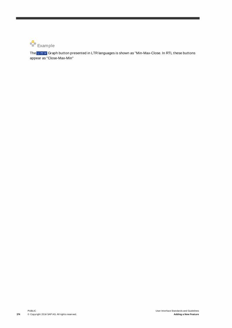
174PUBLIC© Copyright 2014 SAP AG. All rights reserved.
User Interface Standards and GuidelinesAdding a New Feature
ExampleThe Graph button presented in LTR languages is shown as "Min-Max-Close. In RTL these buttonsappear as "Close-Max-Min"


www.sap.com/contactsap
Copyrights, Trademarks, and Disclaimers
© Copyright 2014 SAP AG. All rights reserved.
The current version of the copyrights,trademarks, and disclaimers at
http://service.sap.com/smb/sbocustomer/documentation is valid for this document.