Embed Size (px)
Citation preview

University of Southampton Research Repository
ePrints Soton
Copyright © and Moral Rights for this thesis are retained by the author and/or other copyright owners. A copy can be downloaded for personal non-commercial research or study, without prior permission or charge. This thesis cannot be reproduced or quoted extensively from without first obtaining permission in writing from the copyright holder/s. The content must not be changed in any way or sold commercially in any format or medium without the formal permission of the copyright holders.
When referring to this work, full bibliographic details including the author, title, awarding institution and date of the thesis must be given e.g.
AUTHOR (year of submission) "Full thesis title", University of Southampton, name of the University School or Department, PhD Thesis, pagination
http://eprints.soton.ac.uk

UNIVERSITY OF SOUTHAMPTON
FACULTY OF ENGINEERING AND THE ENVIRONMENT
Transportation Research Group
Investigating the environmental sustainability of rail travel in
comparison with other modes
by
James A. Pritchard
Thesis for the degree of Doctor of Engineering
June 2015


UNIVERSITY OF SOUTHAMPTON
ABSTRACT
FACULTY OF ENGINEERING AND THE ENVIRONMENT
Transportation Research Group
Doctor of Engineering
INVESTIGATING THE ENVIRONMENTAL SUSTAINABILITY OF RAIL TRAVEL
IN COMPARISON WITH OTHER MODES
by James A. Pritchard

iv
Sustainability is a broad concept which embodies social, economic and environmental
concerns, including the possible consequences of greenhouse gas (GHG) emissions and
climate change, and related means of mitigation and adaptation. The reduction of energy
consumption and emissions are key objectives which need to be achieved if some of these
concerns are to be addressed. As well as being an important component of sustainability
in other sectors, a good transport system needs to be sustainable in its own right. Energy
consumption and GHG emissions are important issues within the transport sector; in the
European Union (EU), for example, transport is directly responsible for between 25 and 30
percent of all carbon dioxide (CO2) emissions, and the inclusion of indirect (Scope 2 and
Scope 3) GHG emissions may increase this proportion further. If reduction targets are to
be met, it may be necessary to encourage behavioural change, including modal shift from
those modes of transport which are comparatively highly polluting, towards those modes
which pollute less. Rail is potentially a suitable target for such modal shift from road
transport (notably the private car for passenger travel) and, in some case, from short-haul
and domestic aviation. However, modal comparisons are often based on average data,
and are reliant on a number of assumptions. There are likely to be some circumstances
where modal shift towards rail makes more sense than others, but the use of average data
does not enable policy makers to be discerning. It should also be noted that many modal
comparisons are also based purely on operational energy consumption and emissions, and
neglect to take the whole life-cycle in to account. Embedded energy and emissions from
the construction of vehicles and infrastructure can be quite significant, as can the energy
consumption and emissions from vehicle idling in the case of public transport modes.
After considering the concept of environmental sustainability, this research begins by
reviewing existing energy consumption and emissions data for vehicle operation, where it
is noted that data for cars in Europe are quite comprehensive. Manufacturers are obliged
to publish fuel consumption and emissions data for each model of car they sell, although
the type approval tests do not reflect real-world performance. Studies are reviewed which
suggest that the gap between the tests and the real-world has been widening in recent
years. The gap appears to be independent of the size of vehicle, but is larger for hybrid
vehicles than it is for those powered solely by a petrol or diesel internal combustion
engine. Data for trains are less comprehensive, and that data which are available are
often based on a limited empirical sample, or simulated data for which a number of
assumptions have been made. Sometimes, the details of the measurements taken or
simulation parameters used are unclear. As a result, published data for a particular type
of train in the literature are sometimes found to vary significantly. In order to make
more informed comparisons between rail and other modes, two large empirical datasets
have been analysed. Two UK Train Operating Companies (TOCs) have also made
data from energy metering systems on-board their electric trains available, which have
been used to analyse the actual energy consumption of different trains over a number
of different routes. The sample size is far larger than that found in literature to date,
and it has been possible to consider variation between routes and service types. The

v
basic principles of simulating the energy consumption (and related emissions) of a train
have also been illustrated, and a software tool has been developed for Arup so that it
can now make some estimate of operational energy consumption and emissions for a
given train over a given route. The aforementioned empirical data have also been used
to validate the tool and suggest some appropriate simulation parameters. A review of
existing literature concerning whole life-cycle analysis has been undertaken. It is clear
that life-cycle costs vary significantly but in general, the overall life-cycle costs of rail
appear to be higher than those for any other mode. The biggest additional factors appear
to be the embedded carbon and energy in the infrastructure, particularly for a system
comprising a lot of bridges, tunnels and large underground stations. For the vehicles
themselves, trains typically have a longer lifespan than cars, which reduces the embedded
carbon and energy as functions of time. When comparisons are made between modes,
passenger-km is a metric which is often chosen, because it helps account for some of
the fundamental differences between modes, including the fact that public transport
modes usually use vehicles which are much bigger than the private car. In order to make
comparisons on this basis, however, something about the load factor must be known. The
sensitivity to load factor is demonstrated, and the earlier empirical data analysis is used
to illustrate the benefits of longer trains. A discussion then follows about the potential
pitfalls of making comparisons purely on a per passenger-km basis. This thesis ends by
summarising some of the findings. Some consideration is given towards the future and
the fact that technological developments are being made in both the motor and the rail
industries.

vi

Contents
Declaration of Authorship xxi
Acknowledgements xxiii
Glossary xxvii
Acronyms xxix
1 Setting the scene 1
1.1 Introduction . . . . . . . . . . . . . . . . . . . . . . . . . . . . . . . . . . . 1
1.2 The concept of sustainability . . . . . . . . . . . . . . . . . . . . . . . . . 2
1.3 Sustainable transport . . . . . . . . . . . . . . . . . . . . . . . . . . . . . 2
1.4 Sustainability objectives . . . . . . . . . . . . . . . . . . . . . . . . . . . . 5
1.5 A focus on greenhouse gas emissions & energy efficiency . . . . . . . . . . 7
1.6 Greenhouse gas emissions & the contribution of the transport sector . . . 8
1.7 Different emissions scopes . . . . . . . . . . . . . . . . . . . . . . . . . . . 11
1.8 Trends within the UK’s transport sector . . . . . . . . . . . . . . . . . . . 12
1.9 Basic modal comparisons . . . . . . . . . . . . . . . . . . . . . . . . . . . 15
1.9.1 Appropriate metrics for making comparisons . . . . . . . . . . . . 16
1.10 The potential benefits of rail . . . . . . . . . . . . . . . . . . . . . . . . . 18
1.11 Other aspects of sustainability . . . . . . . . . . . . . . . . . . . . . . . . 21
1.11.1 Other relative advantages of different modes . . . . . . . . . . . . . 22
1.11.2 The use of travel time . . . . . . . . . . . . . . . . . . . . . . . . . 23
1.12 Initial conclusions and the basis for research . . . . . . . . . . . . . . . . . 25
1.13 Aims and objectives of this thesis . . . . . . . . . . . . . . . . . . . . . . . 25
2 The use of carbon calculator tools and a review of existing data 27
2.1 Introduction . . . . . . . . . . . . . . . . . . . . . . . . . . . . . . . . . . . 27
2.2 An overview of three carbon calculators . . . . . . . . . . . . . . . . . . . 29
2.2.1 Transport Direct . . . . . . . . . . . . . . . . . . . . . . . . . . . . 29
2.2.2 Travel Footprint . . . . . . . . . . . . . . . . . . . . . . . . . . . . 30
2.2.3 EcoPassenger . . . . . . . . . . . . . . . . . . . . . . . . . . . . . . 31
2.3 Comparing sample carbon calculator outputs . . . . . . . . . . . . . . . . 32
2.4 An overview of car emissions data . . . . . . . . . . . . . . . . . . . . . . 40
2.4.1 The overall picture . . . . . . . . . . . . . . . . . . . . . . . . . . . 40
2.4.2 Issues with official test-cycle data . . . . . . . . . . . . . . . . . . . 42
2.5 An introduction to rail energy and emissions data . . . . . . . . . . . . . . 44
2.5.1 The AEA Rail Emission Model . . . . . . . . . . . . . . . . . . . . 45
vii

viii CONTENTS
2.5.2 The RSSB “Traction Energy Metrics” Report . . . . . . . . . . . . 47
2.5.3 Network Rail Data . . . . . . . . . . . . . . . . . . . . . . . . . . . 49
2.5.4 Some brief comparisons . . . . . . . . . . . . . . . . . . . . . . . . 50
2.5.5 Factors which may affect the energy consumption of and emissionsfrom a train . . . . . . . . . . . . . . . . . . . . . . . . . . . . . . . 51
2.6 Conclusions . . . . . . . . . . . . . . . . . . . . . . . . . . . . . . . . . . . 52
3 Empirical energy consumption data 55
3.1 Train borne energy measurement . . . . . . . . . . . . . . . . . . . . . . . 55
3.1.1 Background . . . . . . . . . . . . . . . . . . . . . . . . . . . . . . . 55
3.1.2 Data obtained for the purposes of research . . . . . . . . . . . . . 57
3.1.3 A comparison of energy measurement systems . . . . . . . . . . . . 57
3.1.4 System accuracy & potential problems . . . . . . . . . . . . . . . . 59
3.1.5 A breakdown of energy consumption data . . . . . . . . . . . . . . 61
3.2 Defining the UK railway network . . . . . . . . . . . . . . . . . . . . . . . 62
3.2.1 Traingraph . . . . . . . . . . . . . . . . . . . . . . . . . . . . . . . 62
3.2.2 ShareGeo . . . . . . . . . . . . . . . . . . . . . . . . . . . . . . . . 63
3.2.3 Network Rail . . . . . . . . . . . . . . . . . . . . . . . . . . . . . . 63
3.2.4 Additional location data . . . . . . . . . . . . . . . . . . . . . . . . 64
3.2.5 Defining the network as a set of points . . . . . . . . . . . . . . . . 64
3.3 Train schedules . . . . . . . . . . . . . . . . . . . . . . . . . . . . . . . . . 67
3.3.1 Calculating schedule distances . . . . . . . . . . . . . . . . . . . . 68
3.4 Summary & next steps . . . . . . . . . . . . . . . . . . . . . . . . . . . . . 69
4 Filtering and classification of supplied energy data 71
4.1 Introduction . . . . . . . . . . . . . . . . . . . . . . . . . . . . . . . . . . . 71
4.2 Main stages of analysis . . . . . . . . . . . . . . . . . . . . . . . . . . . . . 71
4.3 Matching GPS data to the UK railway network . . . . . . . . . . . . . . . 73
4.3.1 Use of the Traingraph database and toolset . . . . . . . . . . . . . 73
4.3.2 Use of ArcGIS . . . . . . . . . . . . . . . . . . . . . . . . . . . . . 74
4.3.3 Point matching algorithms . . . . . . . . . . . . . . . . . . . . . . . 74
4.4 London Midland data . . . . . . . . . . . . . . . . . . . . . . . . . . . . . 76
4.4.1 Identification of relevant & reliable energy data . . . . . . . . . . . 76
4.4.2 Matching the GPS data to the railway network . . . . . . . . . . . 78
4.4.3 Categorisation of energy readings by time period . . . . . . . . . . 79
4.4.4 Identification of maintenance periods . . . . . . . . . . . . . . . . . 81
4.4.5 Matching the energy data to a known service . . . . . . . . . . . . 81
4.5 Virgin Trains data . . . . . . . . . . . . . . . . . . . . . . . . . . . . . . . 84
4.5.1 Identification of relevant & reliable energy data . . . . . . . . . . . 84
4.5.2 Matching the GPS data to the railway network . . . . . . . . . . . 85
4.5.3 Identification of train length . . . . . . . . . . . . . . . . . . . . . . 85
4.5.4 Identification of maintenance periods . . . . . . . . . . . . . . . . . 86
4.5.5 Categorisation of energy readings by time period . . . . . . . . . . 87
4.5.6 Matching the energy data to a known service . . . . . . . . . . . . 87
4.6 Summary & next steps . . . . . . . . . . . . . . . . . . . . . . . . . . . . . 88
5 The empirical energy consumption of a train— explanatory variables and analysis of variance 91

CONTENTS ix
5.1 Introduction . . . . . . . . . . . . . . . . . . . . . . . . . . . . . . . . . . . 91
5.2 A summary of the data analysed . . . . . . . . . . . . . . . . . . . . . . . 91
5.3 Energy consumption — net kWh per train-km . . . . . . . . . . . . . . . 92
5.3.1 Class 321 (operated by London Midland) . . . . . . . . . . . . . . 92
5.3.2 Class 323 (operated by London Midland) . . . . . . . . . . . . . . 93
5.3.3 Class 350 (operated by London Midland) . . . . . . . . . . . . . . 95
5.3.4 Pendolino (operated by Virgin Trains) . . . . . . . . . . . . . . . . 97
5.4 Factors which affect the energy consumption of a train . . . . . . . . . . . 100
5.4.1 The type of rolling stock . . . . . . . . . . . . . . . . . . . . . . . . 101
5.4.2 Features of the route and service pattern . . . . . . . . . . . . . . 102
5.4.3 Driving style . . . . . . . . . . . . . . . . . . . . . . . . . . . . . . 111
5.4.4 Temporal factors . . . . . . . . . . . . . . . . . . . . . . . . . . . . 112
5.5 Single variable linear regression . . . . . . . . . . . . . . . . . . . . . . . . 114
5.5.1 A summary of possible explanatory variables . . . . . . . . . . . . 114
5.5.2 Adjusted R2 Values created by single explanatory variable models 115
5.5.3 Ranking the explanatory variables in order of importance . . . . . 116
5.6 An intial multiple explanatory variable General Linear Model for thenine-carriage Pendolino . . . . . . . . . . . . . . . . . . . . . . . . . . . . 117
5.6.1 Limitations of the model . . . . . . . . . . . . . . . . . . . . . . . . 119
5.7 A simplified model . . . . . . . . . . . . . . . . . . . . . . . . . . . . . . . 120
5.7.1 Sample parameters . . . . . . . . . . . . . . . . . . . . . . . . . . . 122
5.7.2 Further testing of the model . . . . . . . . . . . . . . . . . . . . . . 125
5.8 Conclusions . . . . . . . . . . . . . . . . . . . . . . . . . . . . . . . . . . . 128
6 Regenerative braking, the hotel load and non-revenue operation 131
6.1 Introduction . . . . . . . . . . . . . . . . . . . . . . . . . . . . . . . . . . . 131
6.2 The effect of regenerative braking . . . . . . . . . . . . . . . . . . . . . . . 132
6.3 Single variable linear regression modelling to test the significance andimportance of the different possible explanatory variables . . . . . . . . . 136
6.4 Estimating the hotel load . . . . . . . . . . . . . . . . . . . . . . . . . . . 138
6.4.1 Energy consumption when the train is stationary . . . . . . . . . . 139
6.4.2 Use of the Median Absolute Deviation to filter the data . . . . . . 143
6.4.3 Investigating the variation of the hotel load with temperature . . . 144
6.5 Use of temperature data to enhance the estimations of the hotel load forspecific journeys . . . . . . . . . . . . . . . . . . . . . . . . . . . . . . . . 146
6.6 A breakdown of the gross energy consumption of the trains when operatingpassenger journeys . . . . . . . . . . . . . . . . . . . . . . . . . . . . . . . 147
6.7 The impact of non-revenue running and idling . . . . . . . . . . . . . . . . 147
6.8 Conclusions . . . . . . . . . . . . . . . . . . . . . . . . . . . . . . . . . . . 150
7 Modelling the energy consumption of a train 151
7.1 Introduction . . . . . . . . . . . . . . . . . . . . . . . . . . . . . . . . . . . 151
7.2 An overview of the energy consumption of a train . . . . . . . . . . . . . . 151
7.3 Modelling the traction energy of a train . . . . . . . . . . . . . . . . . . . 153
7.3.1 The Davis Equation . . . . . . . . . . . . . . . . . . . . . . . . . . 154
7.3.2 Other resistance forces . . . . . . . . . . . . . . . . . . . . . . . . . 155
7.3.3 Work done and energy consumption . . . . . . . . . . . . . . . . . 155
x CONTENTS
7.3.4 An alternative equation for energy consumption . . . . . . . . . . 156
7.4 Introduction to the Arup RouteMaster tool . . . . . . . . . . . . . . . . . 157
7.5 Validation of the Arup RouteMaster tool . . . . . . . . . . . . . . . . . . . 158
7.5.1 London Euston to Wolverhampton . . . . . . . . . . . . . . . . . . 159
7.5.2 London Euston to Manchester Piccadilly (via Stoke-on-Trent) . . . 160
7.5.3 Empirical energy data for the selected services . . . . . . . . . . . 162
7.5.4 Finding the input parameters which best match the timetabledperformance . . . . . . . . . . . . . . . . . . . . . . . . . . . . . . . 164
7.5.5 Using RouteMaster to predict energy consumption . . . . . . . . . 167
7.5.6 The importance of modelling gradient . . . . . . . . . . . . . . . . 169
7.6 Comparisons with other simulation work & plans for future development . 170
7.7 Conclusions . . . . . . . . . . . . . . . . . . . . . . . . . . . . . . . . . . . 170
8 Taking into account driving style and refining simulation parameters 173
8.1 Introduction . . . . . . . . . . . . . . . . . . . . . . . . . . . . . . . . . . . 173
8.2 Variations between individual drivers . . . . . . . . . . . . . . . . . . . . . 174
8.2.1 Overall comparisons . . . . . . . . . . . . . . . . . . . . . . . . . . 175
8.2.2 A comparison of two specific journeys . . . . . . . . . . . . . . . . 177
8.3 Variations in driving style across the four services . . . . . . . . . . . . . . 179
8.4 Learning from the findings . . . . . . . . . . . . . . . . . . . . . . . . . . . 182
8.5 Conclusions . . . . . . . . . . . . . . . . . . . . . . . . . . . . . . . . . . . 183
9 The importance of life-cycle analysis 185
9.1 Introduction . . . . . . . . . . . . . . . . . . . . . . . . . . . . . . . . . . . 185
9.2 Categorising the different life-cycle components . . . . . . . . . . . . . . . 186
9.3 Vehicle operation . . . . . . . . . . . . . . . . . . . . . . . . . . . . . . . . 186
9.4 Non-operational energy & emissions from vehicles . . . . . . . . . . . . . . 190
9.4.1 Non-operational energy & emissions from trains . . . . . . . . . . . 190
9.4.2 Non-operational energy & emissions from cars . . . . . . . . . . . . 192
9.5 Energy & emissions related to infrastructure . . . . . . . . . . . . . . . . . 193
9.5.1 Infrastructure operation . . . . . . . . . . . . . . . . . . . . . . . . 193
9.5.2 Infrastructure construction . . . . . . . . . . . . . . . . . . . . . . 195
9.5.3 Infrastructure Maintenance . . . . . . . . . . . . . . . . . . . . . . 199
9.6 Life-cycle emissions from fuels . . . . . . . . . . . . . . . . . . . . . . . . . 200
9.7 Making modal comparisons . . . . . . . . . . . . . . . . . . . . . . . . . . 201
9.8 Conclusions . . . . . . . . . . . . . . . . . . . . . . . . . . . . . . . . . . . 204
10 The use of passenger-km as a metric & the importance of load factor207
10.1 Introduction . . . . . . . . . . . . . . . . . . . . . . . . . . . . . . . . . . . 207
10.2 Typical load factor data . . . . . . . . . . . . . . . . . . . . . . . . . . . . 208
10.2.1 Private cars . . . . . . . . . . . . . . . . . . . . . . . . . . . . . . . 208
10.2.2 Buses and coaches . . . . . . . . . . . . . . . . . . . . . . . . . . . 208
10.2.3 Domestic aviation . . . . . . . . . . . . . . . . . . . . . . . . . . . 209
10.2.4 Rail . . . . . . . . . . . . . . . . . . . . . . . . . . . . . . . . . . . 209
10.3 The sensitivity of emissions data to load factor . . . . . . . . . . . . . . . 213
10.4 The implications of vehicle design . . . . . . . . . . . . . . . . . . . . . . . 217
10.4.1 The number of seats . . . . . . . . . . . . . . . . . . . . . . . . . . 217

CONTENTS xi
10.4.2 Vehicle design — the onboard environment . . . . . . . . . . . . . 218
10.5 Train length . . . . . . . . . . . . . . . . . . . . . . . . . . . . . . . . . . . 219
10.5.1 Longer trains: the case of the Pendolino . . . . . . . . . . . . . . . 219
10.5.2 Multiple working: the case of the Class 323 . . . . . . . . . . . . . 220
10.5.3 Comments about train length . . . . . . . . . . . . . . . . . . . . . 221
10.6 The use of passenger-km as a metric for modal comparison . . . . . . . . 222
10.6.1 The dangers of an over-inflated load factor . . . . . . . . . . . . . 223
10.7 Conclusions . . . . . . . . . . . . . . . . . . . . . . . . . . . . . . . . . . . 224
11 Discussing the findings— making more detailed modal comparisons in the context of thisresearch 225
11.1 Introduction . . . . . . . . . . . . . . . . . . . . . . . . . . . . . . . . . . . 225
11.2 Operational emissions from passenger rail — making estimates for specificjourneys, based on empirical data analysis . . . . . . . . . . . . . . . . . . 226
11.2.1 London Waterloo to Southampton Airport Parkway . . . . . . . . 226
11.2.2 Swansea to Fishguard Harbour . . . . . . . . . . . . . . . . . . . . 230
11.2.3 London Euston to Glasgow Central . . . . . . . . . . . . . . . . . . 232
11.3 Life-cycle considerations . . . . . . . . . . . . . . . . . . . . . . . . . . . . 235
11.3.1 Assumptions about lifespan . . . . . . . . . . . . . . . . . . . . . . 235
11.3.2 Utilisation of the infrastructure . . . . . . . . . . . . . . . . . . . . 236
11.3.3 Utilisation of the rolling stock . . . . . . . . . . . . . . . . . . . . . 238
11.3.4 Passenger numbers . . . . . . . . . . . . . . . . . . . . . . . . . . . 239
11.3.5 Infrastructure design . . . . . . . . . . . . . . . . . . . . . . . . . . 239
11.3.6 Train design . . . . . . . . . . . . . . . . . . . . . . . . . . . . . . . 240
11.3.7 Accounting for well-to-tank emissions from fuel . . . . . . . . . . . 240
11.3.8 Life-cycle estimates from Travel Footprint . . . . . . . . . . . . . . 240
11.4 Further consideration of the route between Euston and Glasgow . . . . . 241
11.4.1 Quantifying the life-cycle emissions for the train journey . . . . . . 241
11.4.2 Estimating the life-cycle emissions from road and air transport . . 243
11.4.3 Comparing road, rail and air . . . . . . . . . . . . . . . . . . . . . 244
11.4.4 Comparing road, rail and air with 100% load factors . . . . . . . . 246
11.5 The future . . . . . . . . . . . . . . . . . . . . . . . . . . . . . . . . . . . . 248
11.5.1 New vehicle design . . . . . . . . . . . . . . . . . . . . . . . . . . . 248
11.6 Decarbonisation of the electricity grid . . . . . . . . . . . . . . . . . . . . 250
11.7 Interpreting the modal comparisons — implications for policy . . . . . . . 252
11.7.1 Assumptions about travel demand . . . . . . . . . . . . . . . . . . 252
11.7.2 Vehicle trip cancellation . . . . . . . . . . . . . . . . . . . . . . . . 253
11.7.3 Assumptions about trip distance . . . . . . . . . . . . . . . . . . . 254
11.7.4 A summary of other aspects of sustainability . . . . . . . . . . . . 255
11.8 Conclusions . . . . . . . . . . . . . . . . . . . . . . . . . . . . . . . . . . . 257
12 Concluding remarks & future work 259
A Energy consumption data provided for the research 267
A.1 Virgin Trains data . . . . . . . . . . . . . . . . . . . . . . . . . . . . . . . 267
A.2 London Midland data . . . . . . . . . . . . . . . . . . . . . . . . . . . . . 269

xii CONTENTS
B A synopsis of the data tables built for analysing London Midland data273
C A synopsis of the data tables built for analysing Virgin Trains data 279
D Additional rail network and train schedule details 285
D.1 Key depots and sidings used by London Midland and Virgin Trains . . . . 285
D.2 The format of train schedule data . . . . . . . . . . . . . . . . . . . . . . . 287
E Mathematical Formulae 289
E.1 The Haversine Formula . . . . . . . . . . . . . . . . . . . . . . . . . . . . 289
E.2 The Median Absolute Deviation (MAD) . . . . . . . . . . . . . . . . . . . 289
Bibliography 291

List of Figures
1.1 A breakdown of the sources of global GHG emissions (Data Source: IPCC,2007b) . . . . . . . . . . . . . . . . . . . . . . . . . . . . . . . . . . . . . . 9
1.2 A breakdown of the sources of the UK’s GHG emissions in 2005 (DataSource: National Audit Office, 2008) . . . . . . . . . . . . . . . . . . . . . 10
1.3 A breakdown of the UK’s sources of energy related CO2 emissions in 2005(Data Source: National Audit Office, 2008) . . . . . . . . . . . . . . . . . . 10
1.4 A breakdown of CO2 emissions from UK transport by source (Data Source:DfT, 2013b) . . . . . . . . . . . . . . . . . . . . . . . . . . . . . . . . . . . 13
1.5 Trends in car emissions compared with overall transport emissions (DataSources: DfT, 2013b; SMMT, 2013) . . . . . . . . . . . . . . . . . . . . . . 14
1.6 A detailed breakdown of CO2 emissions by mode in 2011 (Data Source:DfT, 2013b) . . . . . . . . . . . . . . . . . . . . . . . . . . . . . . . . . . . 15
1.7 A comparison of different freight modes (Data Source: DfT, 2011) . . . . 17
1.8 A comparison of land-based passenger transport modes in the UK (DataSources: DfT, 2013a; European Commission, 2013) . . . . . . . . . . . . . 18
1.9 A comparison of emissions from different passenger modes (Data Sources:DEFRA, 2012; RSSB, 2007) . . . . . . . . . . . . . . . . . . . . . . . . . . 20
1.10 (Taken from Lyons and Urry, 2005) . . . . . . . . . . . . . . . . . . . . . . 23
2.1 Comparison of total CO2 emissions for different modes in the UK from2012 (Data Source: DEFRA, 2014) . . . . . . . . . . . . . . . . . . . . . . 28
2.2 A comparison of estimated CO2 emissions for a journey between LondonWaterloo and Southampton Airport Parkway . . . . . . . . . . . . . . . . 37
2.3 A comparison of estimated CO2 emissions for a journey between Swanseaand Fishguard Harbour . . . . . . . . . . . . . . . . . . . . . . . . . . . . 37
2.4 A comparison of estimated CO2 emissions for a journey between LondonEuston and Glasgow Central . . . . . . . . . . . . . . . . . . . . . . . . . 38
2.5 Average new car emissions data, grouped by sector (Data Sources: Carpages.co.uk,2013; DEFRA, 2012) . . . . . . . . . . . . . . . . . . . . . . . . . . . . . . 41
3.1 Energy Flow Diagram for an electric passenger train (Taken from: UIC,2003, Figure 3) . . . . . . . . . . . . . . . . . . . . . . . . . . . . . . . . . 61
5.1 Frequency plot for mean net energy consumption [per train-km] for theClass 321 trains . . . . . . . . . . . . . . . . . . . . . . . . . . . . . . . . . 93
5.2 Frequency plot for mean net energy consumption [kWh per train-km] forthe Class 323 trains . . . . . . . . . . . . . . . . . . . . . . . . . . . . . . 94
5.3 Frequency plot for mean net energy consumption [kWh per train-km] forthe Class 350/1 trains . . . . . . . . . . . . . . . . . . . . . . . . . . . . . 96
xiii

xiv LIST OF FIGURES
5.4 Frequency plot for mean net energy consumption [kWh per train-km] forthe Class 350/2 trains . . . . . . . . . . . . . . . . . . . . . . . . . . . . . 96
5.5 Frequency plot for mean net energy consumption [kWh per train-km] forthe Class 350 trains (both sub-classes) . . . . . . . . . . . . . . . . . . . . 97
5.6 Frequency plot for mean net energy consumption [kWh per train-km] forthe nine-carriage Pendolino trains . . . . . . . . . . . . . . . . . . . . . . . 99
5.7 Frequency plot for mean net energy consumption [kWh per train-km] forthe 11-carriage Pendolino trains . . . . . . . . . . . . . . . . . . . . . . . . 99
5.8 The interquartile range of net energy consumption for selected servicesoperated by Class 323 trains . . . . . . . . . . . . . . . . . . . . . . . . . . 105
5.9 The interquartile range of net energy consumption for selected servicesoperated by nine-carriage Pendolino trains . . . . . . . . . . . . . . . . . . 105
5.10 Variation in energy consumption with distance between stops for a varietyof off-peak services . . . . . . . . . . . . . . . . . . . . . . . . . . . . . . . 106
5.11 Journeys operated by Class 321 trains . . . . . . . . . . . . . . . . . . . . 108
5.12 Journeys operated by Class 323 trains . . . . . . . . . . . . . . . . . . . . 108
5.13 Journeys operated by Class 350 trains . . . . . . . . . . . . . . . . . . . . 109
5.14 Journeys operated by nine-carriage Pendolino trains . . . . . . . . . . . . 109
5.15 Journeys operated by 11-carriage Pendolino trains . . . . . . . . . . . . . 110
5.16 Frequency distribution of mean net energy consumption per train-km perdriver . . . . . . . . . . . . . . . . . . . . . . . . . . . . . . . . . . . . . . 111
5.17 Variation in net energy consumption with time of day for Class 323 trains 112
5.18 Variation in the mean net energy consumption of the nine-carriage Pendolinoby month . . . . . . . . . . . . . . . . . . . . . . . . . . . . . . . . . . . . 113
5.19 Variation in the mean net energy consumption of the nine-carriage Pendolinoby year . . . . . . . . . . . . . . . . . . . . . . . . . . . . . . . . . . . . . 114
6.1 Frequency distribution of the energy regenerated on journeys operated byClass 323 trains . . . . . . . . . . . . . . . . . . . . . . . . . . . . . . . . . 133
6.2 Frequency distribution of the energy regenerated on journeys operated byClass 350 trains . . . . . . . . . . . . . . . . . . . . . . . . . . . . . . . . . 134
6.3 Frequency distribution of the energy regenerated on journeys operated bynine-carriage Pendolino trains . . . . . . . . . . . . . . . . . . . . . . . . . 134
6.4 Frequency distribution of the energy regenerated on journeys operated by11-carriage Pendolino trains . . . . . . . . . . . . . . . . . . . . . . . . . . 135
6.5 Frequency distribution for the stationary energy consumption of the Class323 trains . . . . . . . . . . . . . . . . . . . . . . . . . . . . . . . . . . . . 141
6.6 Frequency distribution for the stationary energy consumption of thePendolino (9-car) trains . . . . . . . . . . . . . . . . . . . . . . . . . . . . 141
6.7 Frequency distribution for the stationary energy consumption of the Class323 trains whilst allocated to a service . . . . . . . . . . . . . . . . . . . . 143
6.8 The variation in stationary energy consumption with temperature . . . . 144
6.9 A breakdown of the gross energy consumption of the trains when operatingpassenger journeys . . . . . . . . . . . . . . . . . . . . . . . . . . . . . . . 148
7.1 Typical composition of energy demand for different operation/tractionclasses (Taken from: UIC, 2003, Figure 8) . . . . . . . . . . . . . . . . . . 153
7.2 Davis Resistance curves for three types of train . . . . . . . . . . . . . . . 155
7.3 Line speed and gradient profiles for the service from Euston to Wolverhampton160

LIST OF FIGURES xv
7.4 Line speed and gradient profiles for the service from Euston to Manchester162
7.5 Distance time plots for the Euston — Wolverhampton service, comparingthe timetable with the output of the RouteMaster tool . . . . . . . . . . . 166
7.6 Output from RouteMaster for the Euston — Wolverhampton service witha tractive effort cap of 50% and a braking cap of 70% . . . . . . . . . . . 166
8.1 Variation in mean net energy consumption of the drivers operating thefour services under consideration . . . . . . . . . . . . . . . . . . . . . . . 174
8.2 Variation in applied braking and traction between the most efficient andthe least efficient drivers . . . . . . . . . . . . . . . . . . . . . . . . . . . . 176
8.3 Speed distance charts for two individual journeys between Euston andManchester . . . . . . . . . . . . . . . . . . . . . . . . . . . . . . . . . . . 178
8.4 Variation in applied braking and traction between the drivers of the twoindividual journeys studied . . . . . . . . . . . . . . . . . . . . . . . . . . 179
8.5 Mean proportions of applied traction, braking and coasting for each service180
8.6 Variation in level of applied tractive effort with speed for the route betweenEuston and Wolverhampton . . . . . . . . . . . . . . . . . . . . . . . . . . 181
8.7 Variation in level of applied tractive effort with speed for the route betweenEuston and Manchester . . . . . . . . . . . . . . . . . . . . . . . . . . . . 182
9.1 An overview of the life-cycle components of a transport system . . . . . . 186
9.2 Life-cycle energy consumption and GHG emissions for selected modes(Taken from Chester and Horvath, 2009) . . . . . . . . . . . . . . . . . . . 189
9.3 Life-cycle emissions of different modes (Data Source: Baron, Martinetti,and Pepion, 2011) . . . . . . . . . . . . . . . . . . . . . . . . . . . . . . . 201
10.1 Variation in load factor for trains arriving/departing Birmingham (Basedon data from ORR, 2011) . . . . . . . . . . . . . . . . . . . . . . . . . . . 212
10.2 Variation in load factor for trains arriving/departing London (Based ondata from ORR, 2011) . . . . . . . . . . . . . . . . . . . . . . . . . . . . . 212
10.3 Emissions data for selected modes . . . . . . . . . . . . . . . . . . . . . . 216
11.1 A comparison of the calculated emissions estimates with the carboncalculator estimates from Chapter 2 for the rail journey between LondonWaterloo and Southampton Airport Parkway . . . . . . . . . . . . . . . . 229
11.2 A comparison of the calculated emissions estimates with the carboncalculator estimates from Chapter 2 for the rail journey between Swanseaand Fishguard Harbour . . . . . . . . . . . . . . . . . . . . . . . . . . . . 232
11.3 A comparison of the calculated emissions estimates with the carboncalculator estimates from Chapter 2 for the rail journey between LondonEuston and Glasgow Central . . . . . . . . . . . . . . . . . . . . . . . . . 234
11.4 A comparison of life-cycle emissions by mode for the journey betweenLondon Euston and Glasgow Central . . . . . . . . . . . . . . . . . . . . . 246
11.5 A comparison of life-cycle emissions by mode for the journey betweenLondon Euston and Glasgow Central, assuming 100% passenger occupancylevels . . . . . . . . . . . . . . . . . . . . . . . . . . . . . . . . . . . . . . . 248
11.6 Trends in new car emissions (Based on data from: European Commission,2014a; SMMT, 2013) . . . . . . . . . . . . . . . . . . . . . . . . . . . . . . 249

xvi LIST OF FIGURES
11.7 CO2 emissions from electricity generation (Data Source: InternationalEnergy Agency, 2012, p. 111) . . . . . . . . . . . . . . . . . . . . . . . . . 250
A.1 A Pendolino train (Scott, 2004) . . . . . . . . . . . . . . . . . . . . . . . . 267
A.2 A Class 321 train (Skuce, 2009a) . . . . . . . . . . . . . . . . . . . . . . . 270
A.3 A Class 323 train (Wikimedia Commons, 2008) . . . . . . . . . . . . . . . 270
A.4 A Class 350 train (Skuce, 2009b) . . . . . . . . . . . . . . . . . . . . . . . 270

List of Tables
1.1 Suggested sustainability objectives and their relationship to the triplebottom line (Source: Pantelidou, Nicholson, and Gaba, 2012) . . . . . . . 5
2.1 Carbon calculator outputs for a journey between London Waterloo andSouthampton Airport Parkway . . . . . . . . . . . . . . . . . . . . . . . . 34
2.2 Carbon calculator outputs for a journey between Swansea and FishguardHarbour . . . . . . . . . . . . . . . . . . . . . . . . . . . . . . . . . . . . . 35
2.3 Carbon calculator outputs for a journey between London Euston andGlasgow Central . . . . . . . . . . . . . . . . . . . . . . . . . . . . . . . . 36
2.4 Trends in electricity emissions factors (Sources: DEFRA, 2012; Hobsonand Smith, 2001) . . . . . . . . . . . . . . . . . . . . . . . . . . . . . . . . 46
2.5 A summary of the data available in the ’traction Energy Metrics’ report(RSSB, 2007) . . . . . . . . . . . . . . . . . . . . . . . . . . . . . . . . . . 48
2.6 A comparison of operational energy consumption data . . . . . . . . . . . 51
3.1 A comparison of the different energy measurement systems (Source: VirginTrains Ltd. 2010) . . . . . . . . . . . . . . . . . . . . . . . . . . . . . . . . 58
3.2 A summary of the point based data representing the UK railway networkgenerated from each of two datasets . . . . . . . . . . . . . . . . . . . . . 65
3.3 The relative advantages of two different railway network datasets . . . . . 66
4.1 A summary of the data tables produced by the Python module GPSPointsMatching.py 76
4.2 A breakdown of the supplied energy data by train type (Unit Class) andquality indicators . . . . . . . . . . . . . . . . . . . . . . . . . . . . . . . . 77
4.3 A breakdown of the supplied location data by train type (Unit Class) andquality indicators . . . . . . . . . . . . . . . . . . . . . . . . . . . . . . . . 78
4.4 A summary of the GPS data supplied by London Midland . . . . . . . . . 79
4.5 A breakdown of the London Midland energy data by time period . . . . . 80
4.6 A description of the Service Allocation data table provided by LondonMidland . . . . . . . . . . . . . . . . . . . . . . . . . . . . . . . . . . . . . 81
4.7 A summary of the data in the service allocation table provided by LondonMidland . . . . . . . . . . . . . . . . . . . . . . . . . . . . . . . . . . . . . 81
4.8 A summary of the validity of the energy records provided by Virgin Trains 84
4.9 A summary of the GPS data supplied by Virgin Trains . . . . . . . . . . . 85
4.10 A breakdown of the Virgin Trains data by train length . . . . . . . . . . . 86
4.11 A breakdown of the Virgin Trains energy data by time period . . . . . . . 87
5.1 A summary of the net energy consumed by Class 321 trains . . . . . . . . 92
5.2 A summary of the net energy consumed by Class 323 trains . . . . . . . . 94
xvii

xviii LIST OF TABLES
5.3 A summary of the net energy consumed by Class 350 trains . . . . . . . . 95
5.4 A summary of the net energy consumed by Pendolino trains . . . . . . . . 98
5.5 Summary data for selected services operated by Class 323 trains . . . . . 103
5.6 Summary data for selected services operated by nine-carriage Pendolinotrains . . . . . . . . . . . . . . . . . . . . . . . . . . . . . . . . . . . . . . 104
5.7 Possible explanatory variables for the variation in net energy consumptionfor a given train . . . . . . . . . . . . . . . . . . . . . . . . . . . . . . . . 115
5.8 Adjusted R2 values created by single explanatory variable models . . . . 116
5.9 Ranking of explanatory variables by adjusted R2 value . . . . . . . . . . . 116
5.10 Variables and interactions used in the model and their significances . . . . 118
5.11 Driver efficiency ratings . . . . . . . . . . . . . . . . . . . . . . . . . . . . 120
5.12 Variables and their significance in the simplified explanatory model . . . . 121
5.13 Parameters generated by SPSS for the Simplified Model, where the FleetNumber is 1 and the Route is Euston to Wolverhampton (EUS WVH) . . 123
5.14 Estimated values of E using the Simplified Model for off-peak journeysbetween Euston and Wolverhampton . . . . . . . . . . . . . . . . . . . . . 125
5.15 Parameters generated by SPSS for the Simplified Model on a reduceddataset, where the Fleet Number is 1 and the Route is Euston to Birmingham(EUS BHM) . . . . . . . . . . . . . . . . . . . . . . . . . . . . . . . . . . . 126
5.16 Estimated values of E using the Simplified Model for off-peak journeysbetween Euston and Birmingham . . . . . . . . . . . . . . . . . . . . . . . 127
6.1 Descriptive statistics for the percentage of gross energy recovered byregenerative braking . . . . . . . . . . . . . . . . . . . . . . . . . . . . . . 132
6.2 Adjusted R2 values created by single explanatory variable models . . . . 136
6.3 Ranking of explanatory variables by adjusted R2 value . . . . . . . . . . . 137
6.4 A summary of the stationary energy consumption for two different typesof train . . . . . . . . . . . . . . . . . . . . . . . . . . . . . . . . . . . . . 140
6.5 Estimated mean hotel load for each class of train . . . . . . . . . . . . . . 146
6.6 A comparison of total energy consumption with that during passengerservice for the Pendolino . . . . . . . . . . . . . . . . . . . . . . . . . . . . 149
6.7 Summary energy data for non-revenue journeys operated by Class 323 trains149
7.1 Sample Davis coefficients for different types of train . . . . . . . . . . . . 154
7.2 A summary of the station calls on the chosen service pattern betweenEuston and Wolverhampton . . . . . . . . . . . . . . . . . . . . . . . . . . 159
7.3 A summary of the station calls on the chosen service pattern betweenWolverhampton and Euston . . . . . . . . . . . . . . . . . . . . . . . . . . 160
7.4 A summary of the station calls on the chosen service pattern betweenEuston and Manchester . . . . . . . . . . . . . . . . . . . . . . . . . . . . 161
7.5 A summary of the station calls on the chosen service pattern betweenManchester and Euston . . . . . . . . . . . . . . . . . . . . . . . . . . . . 161
7.6 Summary of available energy data for selected journeys operated by thenine-carriage Pendolino . . . . . . . . . . . . . . . . . . . . . . . . . . . . 163
7.7 Comparison of mean net energy consumption across all four services . . . 164
7.8 The RouteMaster tractive effort and braking parameters which bestmatched the overall timings for the services . . . . . . . . . . . . . . . . . 165

LIST OF TABLES xix
7.9 Net energy consumption data from RouteMaster assuming parametersgiven in Table 7.8 . . . . . . . . . . . . . . . . . . . . . . . . . . . . . . . . 167
7.10 Comparison of mean net energy consumption across all four services usingRouteMaster data assuming parameters given in Table 7.8 . . . . . . . . . 168
7.11 Comparison of mean net energy consumption across all four servicesusing RouteMaster data assuming maximum tractive effort and brakingperformance . . . . . . . . . . . . . . . . . . . . . . . . . . . . . . . . . . . 168
7.12 Comparison of mean net energy consumption across all four services usingRouteMaster data assuming parameters given in Table 7.8 and assumingno gradients . . . . . . . . . . . . . . . . . . . . . . . . . . . . . . . . . . . 169
8.1 Driver efficiency ratings defined for the services studied . . . . . . . . . . 175
8.2 Mean percentage of gross energy regenerated on each route for each driverefficiency ranking . . . . . . . . . . . . . . . . . . . . . . . . . . . . . . . . 177
8.3 Service details for two individual journeys operated by a nine-carriagePendolino between London Euston and Manchester Piccadilly . . . . . . . 177
8.4 Mean applied tractive effort and braking force for each service . . . . . . . 180
9.1 Range of values suggested for vehicle operation as a % of total life-cycleenergy . . . . . . . . . . . . . . . . . . . . . . . . . . . . . . . . . . . . . . 187
9.2 Estimated proportions of vehicle operations attributable to inactive operation,based on data from Chester and Horvath (2009) . . . . . . . . . . . . . . 188
9.3 Non-operational energy and emissions from Shinkansen trains (Data Source:Ueda, Miyauchi, and Tsujimura, 2003) . . . . . . . . . . . . . . . . . . . . 190
9.4 A summary of the carbon-dioxide emissions from the construction of arailway (Data Source: Baron, Martinetti, and Pepion, 2011) . . . . . . . . 198
9.5 Estimated embedded emissions for two high-speed lines (Data Source:Baron, Martinetti, and Pepion, 2011) . . . . . . . . . . . . . . . . . . . . . 198
9.6 Scope 3 emissions for fuels (Data Source: DEFRA, 2013a) . . . . . . . . . 200
9.7 Scope 3 emissions for electricity (Data Source: DEFRA, 2013a) . . . . . . 200
9.8 A comparison of data for different life-cycle components . . . . . . . . . . 202
9.9 Life-cycle emissions as an additional percentage of active operationalemissions . . . . . . . . . . . . . . . . . . . . . . . . . . . . . . . . . . . . 204
10.1 Estimates of train occupancy levels for a selection of UK TOCs . . . . . . 211
10.2 CO2 emissions data for selected road and rail transport . . . . . . . . . . 214
10.3 A summary of net energy consumption data for the Pendolino . . . . . . . 220
10.4 The marginal energy consumption per seat of the additional seats whenan 11-carriage Pendolino is compared with a nine-carriage Pendolino . . . 220
10.5 Energy consumption data for the Class 323 train running as part of a paircompared with running as a single train . . . . . . . . . . . . . . . . . . . 221
10.6 The marginal energy consumption per seat of the additional seats whentwo Class 323s are run as a pair, compared with a single train . . . . . . . 221
11.1 Empirical estimations of the energy consumption of a Class 350/2 “Desiro”train . . . . . . . . . . . . . . . . . . . . . . . . . . . . . . . . . . . . . . . 227
11.2 Estimated energy and emissions data for the rail journey between LondonWaterloo and Southampton Airport Parkway . . . . . . . . . . . . . . . . 228

xx LIST OF TABLES
11.3 Seating capacity and emissions data of selected diesel multiple unitsoperated by Arriva Trains Wales . . . . . . . . . . . . . . . . . . . . . . . 230
11.4 Estimated energy and emissions data for the rail journey between Swanseaand Fishguard Harbour . . . . . . . . . . . . . . . . . . . . . . . . . . . . 231
11.5 Estimated energy and emissions data for the rail journey between LondonEuston and Glasgow Central . . . . . . . . . . . . . . . . . . . . . . . . . 233
11.6 Estimated infrastructure utilisation for the three main train operatorsconsidered here (Data Source: ORR, 2011) . . . . . . . . . . . . . . . . . . 236
11.7 Estimated rolling stock utilisation for the three TOCs under consideration 238
11.8 A summary of embedded carbon estimates (Data Source: Tuchschmid, 2009)241
11.9 Estimated life-cycle emissions per passenger-km for the Pendolino operatingon the West Coast Main Line (WCML), assuming 160 passengers per train242
11.10A breakdown of the estimated total carbon emissions per passenger forthe journey between London and Glasgow . . . . . . . . . . . . . . . . . . 243
11.11A breakdown of estimated life-cycle emissions for cars (Data Source: Baron,Martinetti, and Pepion, 2011) . . . . . . . . . . . . . . . . . . . . . . . . . 243
11.12A breakdown of estimated life-cycle emissions for domestic aviation (DataSource: Baron, Martinetti, and Pepion, 2011) . . . . . . . . . . . . . . . . 244
11.13A breakdown of life-cycle emissions by mode for the journey betweenLondon Euston and Glasgow Central . . . . . . . . . . . . . . . . . . . . . 245
11.14Assumptions made about passenger occupancy levels . . . . . . . . . . . . 247
11.15Reduction targets for GHG emissions from electricity generation (DataSource: Hewicker, Hogan, and Mogren, 2011) . . . . . . . . . . . . . . . . 251
11.16A summary of other sustainability concerns, besides energy consumptionand GHG emissions . . . . . . . . . . . . . . . . . . . . . . . . . . . . . . 256
A.1 Details of Virgin Trains’ Pendolino fleet . . . . . . . . . . . . . . . . . . . 268
A.2 A summary of the data supplied by Virgin Trains . . . . . . . . . . . . . . 269
A.3 Details of London Midland’s electric train fleet . . . . . . . . . . . . . . . 271
A.4 A summary of the data supplied by London Midland . . . . . . . . . . . . 272
B.1 A summary of the data contained in the “EnergyReadings” data table . . 274
B.2 A summary of selected fields in the “EnergyReadingStatus” data table . . 274
B.3 A summary of the data contained in the “AllocationID” data table . . . . 275
B.4 A summary of the data contained in the “AllocationDetails” data table . 276
B.5 A summary of the data contained in the “MatchedScheduleAllocation’data table . . . . . . . . . . . . . . . . . . . . . . . . . . . . . . . . . . . . 277
C.1 A summary of the data contained in the “ValidEnergyReadings” table . . 279
C.2 A summary of the data contained in the “ElevenCarUpgrades” table . . . 280
C.3 A summary of the data contained in the “StopDays” data table . . . . . . 280
C.4 A summary of the data contained in the “VTEnergyReadingStatus” datatable . . . . . . . . . . . . . . . . . . . . . . . . . . . . . . . . . . . . . . . 281
C.5 A summary of the data contained in the “RunAllocations” data table . . 282
C.6 A summary of the data contained in the “MatchedRunSchedule” data table283
D.1 Key depots and sidings used by London Midland and Virgin Trains . . . . 286

Declaration of Authorship
I, James A. Pritchard , declare that the thesis entitled Investigating the environmental
sustainability of rail travel in comparison with other modes and the work presented in
the thesis are both my own, and have been generated by me as the result of my own
original research. I confirm that:
• this work was done wholly or mainly while in candidature for a research degree at
this University;
• where any part of this thesis has previously been submitted for a degree or any
other qualification at this University or any other institution, this has been clearly
stated;
• where I have consulted the published work of others, this is always clearly attributed;
• where I have quoted from the work of others, the source is always given. With the
exception of such quotations, this thesis is entirely my own work;
• I have acknowledged all main sources of help;
• where the thesis is based on work done by myself jointly with others, I have made
clear exactly what was done by others and what I have contributed myself;
• parts of this work have been published as: (Pritchard, 2011), (Pritchard, 2012),
(Pritchard, 2013a), (Pritchard, 2013b) and (Pritchard, Preston, and Armstrong,
2015).
Signed:.......................................................................................................................
Date:..........................................................................................................................
xxi


Acknowledgements
Thank you to Prof. John Preston and Dr. John Armstrong for supervising this project.
Thank you to Arup (especially Jeremy Palmer) for allowing me to get involved in your
rail research and for allowing me to work with the RouteMaster and CO2ST tools. Thank
you to London Midland (especially Kathryn Jacques and Colin Musisi) and Virgin Trains
(especially Michael Jacks) for providing data for the research. Thank you to all those
who have supported me during this doctoral programme, especially for your patience
when the going got tough.
xxiii


A dirty mystery
Snaking along the tracks, secretly venomous,
To our pockets and to our skies
Whilst the rats chug along one behind the other
through smog they spew, spray and stream.
An army of rats would slay a snake,
chew on through it
or so it would seem.
The cost of creation is high, rotting the above from hidden bunkers that
no one sees.
Scales are forged and tunnels mined,
Dyed blotches open up and the snakes hidden wrath
grows tremendous as it burrows into the earth.
Out of sight it slogs through the dark heat, fuel burns fiercely
And though green hills and valleys stay clear and clean
silent death glugs out of the dark.
Meanwhile the rats learn to lick their wounds,
They run wild without much strain,
bred better engineered, they evolve greener brains
while the ancient snakes still move unchecked in the darkness.
Still nothing is known.
Age of metal and flame must wain
And among bricks and glass and rows of screens
A truth is chased in a blue room.
In that tiny space
non-descript,
questioned will be asked.
And the answers may change all that occurs
outside those plastered walls.
Names are kept secret, no one will take the blame,
For we all ride, need places to gain and life to attain.
Keys will be pushed,
simulations will speak half-truths
until one day
all
is revealed.
(Mate Jarai, Faculty of Humanities, written about this research in 2012 for The Litmus Project at the
University of Southampton)
“The Lord God put the man in the Garden of Eden to take care of it and to look after it.”
(Genesis 2:15 - Contemporary English Version of the Bible)
“Society grows great when old men plant trees whose shade they know they shall never sit in.”
(Anonymous Greek Proverb)
xxv


Glossary
hotel load the energy consumed by a train for onboard auxiliary services and comfort
functions (such as heating and lighting) rather than tractive effort. xviii, 47, 62,
72, 89, 112, 119, 121, 128, 131, 138, 139, 142–147, 149–152, 167, 169, 170, 188, 189,
242, 262
load factor is the level of passenger occupancy. It may typically be expressed as an
absolute number (the number of passengers) or as a percentage or fraction of the
capacity of the vehicle in question. v, xv, 20, 21, 23, 26, 31, 32, 34–36, 39, 42, 49,
50, 54, 164, 205, 207–210, 212–218, 222–224, 228, 229, 231, 233, 234, 239, 244–246,
257, 260, 261, 263, 265
Pendolino Intercity electric tilting trains. The term is used in this document to refer
exclusively to the Class 390 variant operated in Great Britain by Virgin Trains.
xiv, xvi, xviii–xx, 33, 48, 50, 56–59, 66, 67, 84, 85, 87, 91, 92, 97–100, 102, 104,
105, 109–115, 117, 128, 132–135, 138–141, 145, 148–150, 154, 158, 162, 163, 167,
174, 177, 188, 192, 210, 211, 214, 215, 219–222, 227, 232, 240–242, 247, 267–269
Python general purpose, high-level programming language. xvii, 62, 64–66, 68, 69,
73–76, 78, 85, 287, 288
Static Speed Profile the maximum permitted running speed on a given stretch of line.
xxx, 157
Working Timetable The working timetable is a more detailed version of the public
timetable, used by the rail industry. It shows all movements on the rail network
including freight trains, empty trains and those coming in and out of depots. It
also includes unique identification codes for each train, and intermediate times for
journeys, including which stations a train is not scheduled to stop at.. xxxi, 170
xxvii


Acronyms
a.c. alternating current. 59, 226
ANPR Automatic Numberplate Recognition. 41
ATOC the Association of Train Operating Companies. 49, 210
CAA Civil Aviation Authority. 20
CCS Carbon Capture & Storage. 251
CFC chlorofluorocarbon. 12
CFD computational fluid dynamics. 153
CH4 methane. 7, 200
CIF Common Interface File. 67, 287, 288
CO carbon monoxide. 6, 45
CO2 carbon dioxide. iv, xiii, xvi, xix, 7–16, 19, 20, 25, 27–29, 34–38, 40, 42–46, 54,
190, 191, 193, 198–201, 203, 213–216, 219, 222, 228–231, 233, 234, 241–243, 245,
249–252, 260, 272
CO2e carbon dioxide equivalent. 7–9, 25, 44, 199–201
CT current transducer. 58, 268
d.c. direct current. 59, 226
DEFRA the Department for Environment, Food and Rural Affairs. 19–21, 30, 41, 42,
45, 200, 204, 208, 209, 213, 229
DfT Department for Transport. 2, 42, 49
DMU Diesel Multiple Unit. 33, 45, 46
DTI Department for Trade & Industry. 45, 46
xxix

xxx Acronyms
ELR Engineers’ Line Reference. 63, 65, 66
EMU Electric Multiple Unit. 47, 154
EU European Union. iv, 11–14
EV electric vehicle. 41, 193
GHG greenhouse gas. iv, xiii, xv, xx, 1, 2, 6–13, 16–19, 21, 22, 25, 27, 29, 38, 39, 41,
44, 45, 151, 189–191, 196, 200, 204, 209, 225, 250, 251, 253, 256, 259, 260, 263
HEV hybrid electric vehicle. 193
HVAC heating, ventilation and air-conditioning. 61, 119, 137, 138, 143, 144, 150, 262
IPCC Intergovernmental Panel on Climate Change. 8
kml Keyhole Markup Language. 63–65
kWh kilowatt-hour. xiii, xiv, 45, 46, 71, 84, 88, 91–94, 96, 99, 111, 112, 115, 120, 125,
127, 142–144, 146, 149, 156, 162, 167–169, 177, 188, 191, 192, 194, 200, 201, 213,
227–229, 232, 233, 250, 251, 261, 268, 272
MAD Median Absolute Deviation. xii, 143, 146, 289
N2O nitrous oxide. 7
NEDC New European Drive Cycle. 13, 40, 42, 43
NOx nitrogen oxides. 6, 12, 45
OECD Organisation for Economic Cooperation and Development. 3, 4
OHLE overhead line equipment. 57
ORR Office of Rail Regulation. 56, 60
OTMR On Train Monitoring Recorder. 87–89, 171, 173, 174, 262, 268, 269, 282
PM10 particulate matter. 45
RSSB the Rail Safety & Standards Board. 19, 45, 47, 49, 50, 52, 159, 170
SO2 sulphur dioxide. 45
SRA Strategic Rail Authority. 44
SSP Static Speed Profile. 157
Acronyms xxxi
TIPLOC Timing Point Location. 64, 66–69, 75, 76, 83, 89, 276, 282, 283, 286
TMS Train Management System. 57–59, 268
TOC Train Operating Company. iv, xix, xx, 55–57, 60, 61, 67, 69, 71, 73, 89, 91, 131,
210, 211, 238, 261, 262, 264, 267, 288
TRG the Transportation Research Group at the University of Southampton. 64, 67
TSDB Train Service Database. 67–69, 72, 82, 83, 88, 89, 158, 171, 287
UI User Interface. 157
UIC Union Internationale des Chemins de fer, or International Union of Railways. 31,
146, 152, 155
VOCs volatile organic compounds. 6, 45
VT voltage transducer. 268
WBCSD World Business Council for Sustainable Development. 6
WCML West Coast Main Line. xx, 56, 63, 65, 75, 167, 237, 239, 242
WTT Working Timetable. 170


Chapter 1
Setting the scene
1.1 Introduction
Sustainability is an important concept; indeed, it has been suggested that “sustainability
is undoubtedly the biggest challenge facing engineering in the 21st century” (Pantelidou,
Nicholson, and Gaba, 2012). Amongst other things, it is concerned with worldwide
economic and political stability, climate change, energy security and transport. Many of
these issues are interlinked, although some of them may be seen to be more important
than others.
In this chapter, concepts of sustainability are briefly discussed, where it is noted that
environmental concerns form a key tenet. Sustainability is a challenge for the transport
sector in its own right, and also something which transportation systems can influence in
other sectors. Different ideas of what a sustainable transport system might look like are
considered. If sustainability (or at least some measure thereof) is viewed as an important
goal then it can help to define more specific objectives which should be considered as part
of planning and policy-making processes. Key objectives within the area of environmental
sustainability are introduced, including the reduction of emissions, energy and resource
consumption, the minimisation of noise and visual intrusion and effective management
of land usage. In light of concerns about climate change, the need for a reduction in
greenhouse gas (GHG) emissions has come to the fore and will be the main focus of this
thesis, along with energy consumption which, to some degree, is directly related.
This chapter presents data about GHG emissions levels both globally and from the UK,
considering the contribution of the transport sector and highlighting recent trends. For
meeting the ambitious targets for reducing GHG emissions, the transport sector has
a key role to play, and progress has not initially been encouraging. It is shown that
road transport is currently the dominant mode of transport in the UK, both in terms of
passengers and freight carried and in terms of overall distances covered. This is reflected
in the breakdown of GHG emissions from the transport sector.
1

2 Chapter 1 Setting the scene
Although there have been, and will continue to be, many technological advances,
behavioural change will also be required if the reduction targets are to be met. Appropriate
behavioural change may include modal shift to forms of transport producing fewer GHG
emissions. Focussing particularly on passenger transport, the potential of rail to be
a suitable target for modal shift from more polluting modes is considered. Before
considering the viability of any policies to encourage this modal shift, it is necessary to
assess rail’s potential in terms of emissions per passenger. Although it is clear that, on
average, travel by train is less polluting than travel by car or domestic aviation, there are
a number of variables and assumptions made which mean that the situation for a given
journey could vary considerably, and more detailed research is required before blanket
modal shift policies could be recommended. The key questions are the extent to which
the railway really does offer a more efficient and less polluting alternative to other modes,
and in which context(s) it has the greatest advantage.
1.2 The concept of sustainability
The Brundtland Commission succinctly defined sustainable development as “development
that meets the needs of the present without compromising the ability of future generations
to meet their own needs” (Brundtland, 1987). This well-known definition encompasses
three key elements — economic, environmental and social — also known as the triple
bottom line (Pantelidou, Nicholson, and Gaba, 2012). When striving for sustainability,
whether in new development or by making changes to existing developments or lifestyle
habits, all three areas should be considered.
1.3 Sustainable transport
Transport is an issue which affects us all. The Department for Transport (DfT) (1998)
notes that most of us travel every day, even if only locally, and that we depend on
transport to meet our wider needs. The DfT also indicates that our quality of life is
dependent on transport, and that an efficient transport system is necessary for a strong
and prosperous economy. In other words, transport has a role to play in the sustainability
of other sectors and is not just a concern in its own right.
Because of this, and because decisions tend to be made in the context of larger policy
goals, transport is difficult to view in isolation. The transport sector has been described
as a complex social and economic system which is difficult to address comprehensively
(Goldman and Gorham, 2006).
Nonetheless, there have been various attempts to develop and clarify the notion of
“sustainable transport.” Some envision sustainability as a pathway, whilst others envision

Chapter 1 Setting the scene 3
sustainability as an end-state. In the latter case, attempts have been made to define what
a sustainable transport system might look like, or a particular outcome which would
mark the attainment of sustainability.
A report for Transport Canada (The Centre for Sustainable Transportation, 2005)
suggests that three types of definition of “sustainable transport” exist in literature —
economic, environmental and comprehensive. A definition proposed by Schipper is cited
by way of an example of a literal economist’s definition:
“Transportation where the beneficiaries pay their full social costs, including
those paid by future generations, is sustainable.”
(Schipper, 1996, cited by The Centre for Sustainable Transportation, 2005)
Although the term “social costs” is broad enough to encompass environmental and social
concerns, the way in which these are valued economically is left open to interpretation.
As a result, an extreme example is given where a transport system which kills people
could still be viewed as meeting this definition of sustainability if the value of human life
is low enough (The Centre for Sustainable Transportation, 2005). Even in the UK, the
road network is perhaps a case in point, with relatively little attention apparently paid
to the fact that there are around 2000 fatalities a year (in sharp contrast to the reaction
usually seen when there are fatalities on other modes of transport). The report is also
justifiably critical of the fact that such a definition is only concerned with the costs of a
transport system, not the services it provides, and the fact that an estimation of future
costs is often impractical.
Focussing on environmental sustainability, both Goldman and Gorham (2006) and The
Centre for Sustainable Transportation (2005) cite the definition of sustainable transport
proposed by the Organisation for Economic Cooperation and Development (OECD) in
the course of its Environmentally Sustainable Transport project:
“An environmentally sustainable transport system is one that does not
endanger public health or ecosystems and meets needs for access consistent
with (a) use of renewable resources at below their rates of regeneration, and
(b) use of non-renewable resources at below the rates of development of
renewable substitutes.” (OECD, 1996)
The problem with being concerned purely with environmental sustainability is that it
could be easy to lose focus on the triple bottom line encompassed by the Brundtland
definition of sustainability. Such an environmentally sustainable transport system could
theoretically be achieved using policies which involve great economic cost and this would
not be desirable. In this particular definition, some social concepts are embodied by the

4 Chapter 1 Setting the scene
concerns for public health, eco-systems and the needs for access; however there remains
a danger when focussing purely on the environment that some social aspects — such as
affordable mobility — could easily be neglected.
Additionally, both Goldman and Gorham and The Centre for Sustainable Transportation
make the same observation that the OECD definition is rather negative, defining more
what a sustainable transport system is not, than what it is or should be.
By contrast, the comprehensive definition of sustainable transport developed by The
Centre for Sustainable Transportation and adapted by the European Union is seen as
much more positive, defining a sustainable transport system as one which:
• Allows the basic access and development needs of individuals
• Supports safety and human health
• Promotes equity within and between successive generations
• Is affordable, fair and efficient
• Offers choice of transport mode
• Supports a competitive economy & balanced regional development
• Limits emissions & waste within the planet’s ability to absorb them
• Uses resources at rates which permit renewal or substitution
• Minimises impacts on the use of land and the generation of noise
(The Centre for Sustainable Transportation, 2005)
On the positive side, this definition has been described as concrete, comprehensive and as
having received general political acceptance (The Centre for Sustainable Transportation,
2005). On the other hand, it is still arguably unclear how it would look in practice, and
has been criticised for being too ambitious in its breadth, with no guidance for balancing
competing objectives (Goldman and Gorham, 2006).
Although it can be helpful to have notions of what a sustainable transport system might
look like, the fact that it remains difficult to visualise in practice is perhaps why others
have chosen to see sustainability as a pathway rather than as an end-state. Rather than
having a fixed outcome, the focus is on being “more sustainable” than the present, as
measured by a defined set of indicators. Such indicators are said to have the advantage
of being relatively easily understood by policy makers and the general public, and of
being easy to conceptualise as specific policy initiatives (Goldman and Gorham, 2006).
The disadvantages may include the fact that a desired end-state may not be reached
within an acceptable timescale.

Chapter 1 Setting the scene 5
Whether or not the choice is made to focus on an end-state definition of “sustainable
transport,” the formulation of specific policy initiatives is vital if sustainability is to
become anything more than wishful thinking. Hence, having considered some concepts
of sustainability, and the idea of the triple bottom line of economic, environmental
and social concerns, the next step is to consider how this might translate into a set of
meaningful objectives.
1.4 Sustainability objectives
Within the context of the triple bottom line, Pantelidou, Nicholson, and Gaba (2012)
have identified seven key sustainability objectives, which are given in Table 1.1.
Table 1.1: Suggested sustainability objectives and their relationship to the triplebottom line (Source: Pantelidou, Nicholson, and Gaba, 2012)
Objective Environmental Social Economic
Energy Efficiency &Carbon Reduction
! ! !
Materials & WasteReduction
! ! !
Maintained NaturalWater Cycle &Enhanced AquaticEnvironment
! ! !
Climate ChangeAdaptation &Resilience
! !
Effective Land Use &Management
! ! !
Economic Viability& Whole-Life Cost
! !
Positive Contributionto Society
!
Despite the fact that the focus of these objectives is specifically in the area of civil
engineering and geotechnics, they are a useful starting point when moving from sustainability
as a concept to something which can be put into practice. Table 1.1 usefully shows which
aspects of the triple bottom line (environmental, social and economic concerns) each of
the objectives may help address, although some of them are better defined than others.
For example, whereas energy efficiency is a clear objective, a “positive contribution to
society” is vague and open to interpretation.

6 Chapter 1 Setting the scene
It could also be argued that this list of objectives is not sufficiently comprehensive,
especially for fulfilling some of the visions of sustainable transport. A notable omission
is the promotion of health and wellbeing, which, although mentioned by Pantelidou,
Nicholson, and Gaba. in their discussion about societal contribution, should arguably be
an explicit objective.
Whereas all of the objectives in Table 1.1 arguably apply to the transport sector, it might
be useful to consider a more specific set of objectives. As part of a project on sustainable
mobility, the World Business Council for Sustainable Development (WBCSD) identified
seven goals for a sustainable transport system:
• Reduce transport-related conventional emissions (carbon monoxide (CO), nitrogen
oxides (NOx), volatile organic compounds (VOCs), particulates, and lead) to levels
such that they cannot be considered a serious public health concern anywhere in
the world.
• Limit transport-related GHG emissions to sustainable levels.
• Significantly reduce the worldwide number of deaths and serious injuries from
road crashes. Efforts to do this are particularly needed in the rapidly motorizing
countries of the developing world.
• Reduce transport-related noise.
• Mitigate transport-related congestion.
• Narrow the mobility “divides” that exist today (a) between the average citizen
of the world’s poorest and the average citizen of the wealthier countries, and (b)
between disadvantaged groups and the average citizen within most countries.
• Preserve and enhance mobility opportunities available to the general population.
(WBCSD, 2004)
It could be argued that, in contrast to the objectives in Table 1.1, this list concentrates
too much on health and wellbeing, at the expense of other economic, environmental and
social concerns. Nothing is said about land or resource usage, and although mitigating
congestion and preserving and enhancing mobility opportunities may have economic
benefits, it would be possible to fulfil these aims without them (or worse, in ways which
incur an economic cost). Goldman and Gorham (2006) also argue that by focussing on
mobility, the WBCSD have ignored the systems in which transport sits and from which
it derives its economic value.
These potential shortcomings highlight the importance of keeping the bigger picture
in mind when focussing on achievable objectives. Inevitably, there will be conflicts

Chapter 1 Setting the scene 7
and a need to compromise, and no goal or objective should be viewed in isolation.
At the same time, no single transport policy can be expected to achieve the “holy
grail” of sustainability overall. For the purposes of this thesis, it is necessary to be
selective, because it is not feasible to thoroughly consider every potential objective and
resulting policy initiatives, and the industrial context of the work is an important priority.
Nonetheless, the intention is to remain mindful of the fact that sustainable transport is
a complex issue in a complex world and that what may seem beneficial in one context
could have other adverse consequences which need to be considered.
1.5 A focus on greenhouse gas emissions & energy efficiency
Even when considering the slightly narrower concept of “environmental sustainability”
(as opposed to sustainability in general), it remained necessary to focus this research
on specific objectives. A common theme amongst sustainability objectives and policy
initiatives is the reduction of GHG emissions, and this — along with energy efficiency —
is the main focus here.
A key reason for this is that, in contrast to some environmental objectives, GHG reduction
is a global issue. Noise from a transport system, for example, only affects those in the
vicinity, whereas the possible effects of high levels of GHGs in the earth’s atmosphere
have potential consequences for us all (albeit with some uncertainty and with varying
degrees of impact). GHGs are responsible for global warming, and warming of the climate
system is now said to be unequivocal (IPCC, 2007b). The effects of continued global
warming and climate change could be catastrophic, and are likely to include sea-level
rises and extreme weather patterns; to put it another way, climate change is a serious
global threat, and it demands an urgent global response (Stern, 2006).
In terms of quantity, carbon dioxide (CO2) is the main GHG (DECC, 2012b), although
it is common to consider carbon dioxide equivalent (CO2e), which takes into account the
effects of other (potentially more potent) GHGs, such as methane (CH4) and nitrous
oxide (N2O). Different GHGs have different warming influences (radiative forcing) due
to their different radiative properties and lifetimes in the atmosphere, and CO2e is a
common metric used to express the impact of these GHGs relative to the radiative forcing
of CO2 (IPCC, 2007b).
In October 2006 Sir Nicholas Stern, Head of the Government Economic Service, presented
a report to the British Prime Minister and the Chancellor of the Exchequer about the
Economics of Climate Change. Stern stated that “the risks of the worst impacts of climate
change can be substantially reduced if greenhouse gas levels in the atmosphere can be
stabilised between 450 and 550ppm CO2e” (Stern, 2006). To achieve such stabilisation,
annual emissions need to be reduced significantly; the UK Climate Change Act of

8 Chapter 1 Setting the scene
November 2008 states that by 2050, GHG emissions must be reduced by 80% relative to
1990 levels (DfT, 2009a).
Although reducing GHG emissions is mainly perceived to be an environmental concern,
the long term social and economic benefits are significant when compared with the
alternative. The Stern Review suggests that reducing GHG emissions to avoid the worst
impacts of climate change could cost around 1% of global GDP per annum, significantly
less than the costs of adapting to and dealing with the impacts later (estimated to be
equivalent to losing at least 5% of GDP per annum).
Energy efficiency is directly linked to the reduction of GHG emissions, because a lot of
energy is provided by the burning of fuels which release GHGs. The transport sector
relies heavily on the internal combustion engine, and increasingly on electricity. Between
April 2011 and March 2012, the generation processes for over 70% of the electricity
generated in the UK directly resulted in CO2 emissions (DECC, 2012a) and in 2011 an
estimated 40% of UK CO2 emissions were from the energy supply sector (DECC, 2012b).
Although a shift to alternative energy sources will help reduce GHG emissions, reducing
the amount of energy consumed in the first place has the potential to make a big impact.
Energy efficiency is also a worthy sustainability goal in its own right, with both social
and economic concerns in addition to the environmental issues (which include resource
depletion and damage to natural habitat as well as emissions). A continuity of energy
supply is necessary for a functioning society, and the cost of energy is likely to rise as
resources become depleted (Pantelidou, Nicholson, and Gaba, 2012).
1.6 Greenhouse gas emissions & the contribution of the
transport sector
In 2004, according to the Intergovernmental Panel on Climate Change (IPCC) (2007),
global GHG emissions from anthropogenic sources amounted to 49Gt of CO2e, of which
the transport sector was responsible for 6.4Gt (13%). Figure 1.1 shows the breakdown of
global GHG emissions (in terms of CO2e) for that year, by source.
Most of these emissions are a direct result of energy consumption, with the remainder
being from some industrial processes and other anthropogenic interventions such as
land-use changes. Some datasets focus purely on the emissions arising directly from
energy consumption, and the relative contribution of each sector may not match that
in Figure 1.1. Similarly, the choice of metric (be that CO2e as a way of considering all
GHGs, or just CO2) is also important. For example, in 2004 (the year represented in
Figure 1.1), global carbon dioxide emissions from energy consumption amounted to 27.1
Gt of CO2 (U.S. Energy Information Administration, 2014) of which the transport sector
was responsible for 23% (IPCC, 2007a).

Chapter 1 Setting the scene 9
Figure 1.1: A breakdown of the sources of global GHG emissions (Data Source:IPCC, 2007b)
The National Audit Office has published a breakdown of the UK’s GHG emissions for
2005 (National Audit Office, 2008) which is shown graphically in Figure 1.2. Total GHG
emissions for the year were 0.66 Gt of CO2e, of which 0.56 Gt was from energy usage.
The remainder includes a small reduction (0.02 Gt of CO2e) due to land use changes and
forestry. It is noted that the uncertainty in estimating GHG emissions is relatively high;
the 95% confidence interval for the UK’s total GHG emissions in 2005 ranges between
0.62 and 0.72 Gt of CO2e.
Of the emissions resulting from energy usage, the vast majority (96%) were CO2 emissions
from fuel combustion activities. A breakdown of these CO2 emissions by source is shown
in Figure 1.3.

10 Chapter 1 Setting the scene
Figure 1.2: A breakdown of the sources of the UK’s GHG emissions in 2005(Data Source: National Audit Office, 2008)
Figure 1.3: A breakdown of the UK’s sources of energy related CO2 emissionsin 2005 (Data Source: National Audit Office, 2008)

Chapter 1 Setting the scene 11
Data for the transport sector do not generally take into account international aviation
and shipping, because there is no internationally agreed way of reporting them (although
some estimates have been made elsewhere). Despite the uncertainties in emissions data,
the data in Figure 1.3 tally well with the data given for the same year in a later Statistical
Release (DECC, 2013b), in which it is noted that the breakdown by sector is based on
the source of the emissions and not the point of use. Hence the transport sector will
also have contributed to emissions attributed to the energy sector in Figure 1.3. Simple
analysis of some data published by the Department for Transport about CO2 emissions
(DfT, 2013a) would suggest that when considering the point of use rather than the
source, the transport sector is responsible for an additional 3% of CO2 emissions. It is
assumed, although it is not explicit, that these data only relate to emissions from vehicle
operation, and that if infrastructure and life-cycle costs (such as vehicle manufacture
and maintenance) were taken into account then the contribution of transport to overall
emissions levels would be greater still.
The contribution of transport (by source) to domestic CO2 emissions in the UK compares
well with the bigger picture for Europe; in 2006, the transport sector produced 24.7% of
domestic CO2 emissions from the European Union (EU)-15 area countries as a whole
(DfT, 2009a). Within the EU-15 countries, some variation is observed. In 2006, Germany
produced the most CO2 emissions overall, of which transport only accounted for 18.2%.
At the other end of the scale, Luxembourg produced the fewest CO2 emissions, but
transport made up 57.6%. With the exception of Luxembourg, the UK’s GHG emissions
from domestic transport are comparable on a per-person basis to those of the other EU-15
countries. It is thought that the emissions for Luxembourg are disproportionately high,
because transport emissions are calculated from the amount of fuel sold; comparatively
low prices for road transport fuels mean that a lot of fuel in Luxembourg is sold to
non-residents (DfT, 2011).
1.7 Different emissions scopes
It has been seen that the allocation of emissions to a particular activity, company or
sector is not always clear cut, and decisions need to be made on whether emissions are
allocated at source, or at a point of use. The most widely accepted approach is to identify
and categorise emissions-releasing activities into three groups (DEFRA, 2009), known as
“scopes”. According to Ranganathan et al. (2004), the three scopes are defined as follows:
• Scope 1: Direct GHG emissions
• Scope 2: Electricity indirect GHG emissions
• Scope 3: Other indirect GHG emissions

12 Chapter 1 Setting the scene
Scope 1 includes those emissions directly released into the atmosphere by a particular
activity. This might include the combustion of fuels (for example, in engines, boilers,
turbines or furnaces), “process emissions” such as those from cement or waste processing,
and “fugitive emissions” such as leaks from pipelines or air-conditioning (DEFRA, 2009).
Direct CO2 emissions from the consumption of biomass and GHG emissions not covered
by the Kyoto Protocol (such as chlorofluorocarbons (CFCs) and NOx) are not included
in Scope 1, but should instead be reported separately (Ranganathan et al., 2004).
The Scope 2 emissions of an activity, company, or sector are those arising from the
generation of any electricity consumed. Scope 2 emissions physically occur at the facility
where the electricity is generated (Ranganathan et al., 2004). Scope 3 is an optional
reporting category for all other indirect emissions (Ranganathan et al., 2004). Examples
of Scope 3 activities include extraction and production of purchased materials, and
transportation of purchased fuels.
1.8 Trends within the UK’s transport sector
In 1990, the transport sector in the UK was the direct source of 120Mt of CO2 (DECC,
2013b). Assuming that all sectors have an equal role to play in meeting the reduction
targets set out by the Climate Change Act 2008, the annual emissions from the transport
sector in 2050 should not exceed 20% of this value. In absolute terms, this means that
by 2050 the UK’s transport sector should be responsible for no more than 24Mt of CO2
emissions annually.
Between 1990 and 2007, however, CO2 emissions from the transport sector rose further,
peaking at 131.1Mt (Department for Transport, 2013b). Since 2007, CO2 emissions from
transport have fallen; they fell below 1990 levels for the first time in 2010. In 2011, the
transport sector in the UK was reported to be the direct source of 117.4Mt of CO2, and
although the recent downward trend is encouraging, it is clear that there is a long way
to go if the reduction targets are to be met. In fact, it is suggested that GHG emissions
from the transport sector are still rising across the EU, and may have risen yet further
were it not for the economic downturn (European Commission, 2014b). A key reason for
this is the continued development of EU member states, and an increase in the demand
for passenger travel and the transportation of freight.
For some years, road transport has been by far and away the most dominant source of
transport’s CO2 emissions, as illustrated in Figure 1.4. In 2011, road transport was the
source of 92% of CO2 emissions from the transport sector in the UK, and cars and taxis
alone accounted for 55%. It would therefore be reasonable to expect steps to reduce road
vehicle emissions to have a sizeable impact on overall emissions levels from the transport
sector. To this end, the EU has put in place a comprehensive legal framework to reduce
CO2 emissions from new light duty vehicles (cars and vans), as part of efforts to ensure
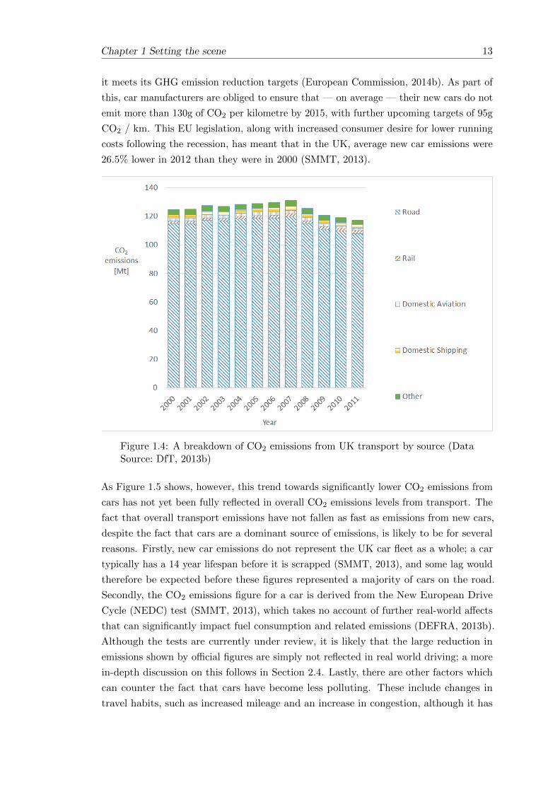
Chapter 1 Setting the scene 13
it meets its GHG emission reduction targets (European Commission, 2014b). As part of
this, car manufacturers are obliged to ensure that — on average — their new cars do not
emit more than 130g of CO2 per kilometre by 2015, with further upcoming targets of 95g
CO2 / km. This EU legislation, along with increased consumer desire for lower running
costs following the recession, has meant that in the UK, average new car emissions were
26.5% lower in 2012 than they were in 2000 (SMMT, 2013).
Figure 1.4: A breakdown of CO2 emissions from UK transport by source (DataSource: DfT, 2013b)
As Figure 1.5 shows, however, this trend towards significantly lower CO2 emissions from
cars has not yet been fully reflected in overall CO2 emissions levels from transport. The
fact that overall transport emissions have not fallen as fast as emissions from new cars,
despite the fact that cars are a dominant source of emissions, is likely to be for several
reasons. Firstly, new car emissions do not represent the UK car fleet as a whole; a car
typically has a 14 year lifespan before it is scrapped (SMMT, 2013), and some lag would
therefore be expected before these figures represented a majority of cars on the road.
Secondly, the CO2 emissions figure for a car is derived from the New European Drive
Cycle (NEDC) test (SMMT, 2013), which takes no account of further real-world affects
that can significantly impact fuel consumption and related emissions (DEFRA, 2013b).
Although the tests are currently under review, it is likely that the large reduction in
emissions shown by official figures are simply not reflected in real world driving; a more
in-depth discussion on this follows in Section 2.4. Lastly, there are other factors which
can counter the fact that cars have become less polluting. These include changes in
travel habits, such as increased mileage and an increase in congestion, although it has

14 Chapter 1 Setting the scene
been shown that recent trends in the UK do not indicate an increase in the number of
trips or the trip distances (DfT, 2013c).
Figure 1.5: Trends in car emissions compared with overall transport emissions(Data Sources: DfT, 2013b; SMMT, 2013)
Banister (2010) asserts that although technological innovation could help towards
achieving a reduction in emissions, it will not on its own be able to help meet the
targets set. Indeed, he claims that “significant reductions of CO2 emissions in transport
in the EU can only be achieved through behavioural change.” Potential behavioural
change strategies to help reduce transport’s share of CO2 emissions are many and varied.
They may include an overall reduction in demand for travel and the transportation
of freight, or changes to reduce distances covered. They may also include modal shift
towards those modes of transport which pollute less, which is why it is important to
consider the contribution of the different modes in more detail. The particular focus of
this thesis is rail, and whether it would make a suitable target for modal shift as part of
a strategy to reduce overall emissions.
However, it is noted that the evidence for the potential of public transport to reduce
emissions presents a complex and somewhat contradictory picture (Gross et al., 2009).
In the short term, this potential is likely to be limited by the fact that the capacity of
public transport would need to be greatly increased. In the longer term, the potential
for modal shift towards a public transport mode such as rail is dependent on the relative
viability, attractiveness and affordability of that mode for any given journey. Gross
et al. also go onto note that there is a strong link between the availability of convenient
and affordable public transport and patterns of land use that are conducive to lower
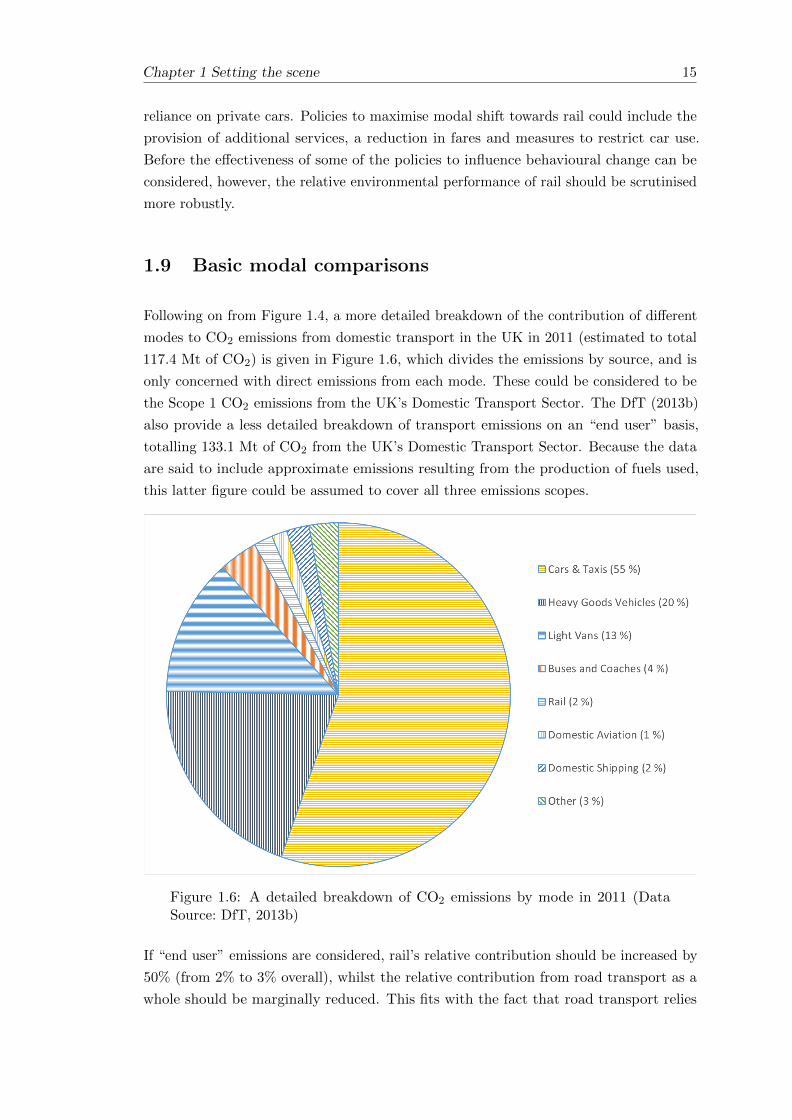
Chapter 1 Setting the scene 15
reliance on private cars. Policies to maximise modal shift towards rail could include the
provision of additional services, a reduction in fares and measures to restrict car use.
Before the effectiveness of some of the policies to influence behavioural change can be
considered, however, the relative environmental performance of rail should be scrutinised
more robustly.
1.9 Basic modal comparisons
Following on from Figure 1.4, a more detailed breakdown of the contribution of different
modes to CO2 emissions from domestic transport in the UK in 2011 (estimated to total
117.4 Mt of CO2) is given in Figure 1.6, which divides the emissions by source, and is
only concerned with direct emissions from each mode. These could be considered to be
the Scope 1 CO2 emissions from the UK’s Domestic Transport Sector. The DfT (2013b)
also provide a less detailed breakdown of transport emissions on an “end user” basis,
totalling 133.1 Mt of CO2 from the UK’s Domestic Transport Sector. Because the data
are said to include approximate emissions resulting from the production of fuels used,
this latter figure could be assumed to cover all three emissions scopes.
Figure 1.6: A detailed breakdown of CO2 emissions by mode in 2011 (DataSource: DfT, 2013b)
If “end user” emissions are considered, rail’s relative contribution should be increased by
50% (from 2% to 3% overall), whilst the relative contribution from road transport as a
whole should be marginally reduced. This fits with the fact that road transport relies

16 Chapter 1 Setting the scene
heavily on the internal combustion engine, whilst a significant proportion of the railway
network in the UK is electrified; about 40% of the track is electrified, on which about
half (by distance) of all passenger services are operated (Network Rail, 2009b). Because
electric rail produces no direct emissions at the point of use, they are not included in
Figure 1.6. As more of the railway network is electrified, and as electric vehicles become
more common on the roads, it will become more important to include Scope 2 emissions
and consider “end user” emissions rather than just direct emissions.
Emissions from international transport have been increasing in recent years, with
international aviation and international shipping attributable to the UK estimated
to have emitted 32.9 Mt CO2 and 9.6 Mt CO2 respectively in 2011 (DfT, 2013b). In total,
this is equivalent to an additional 36% of the total emissions from domestic transport
considered in Figure 1.6.
According to the Department for Transport, freight transport within the UK (excluding
that transported by pipeline) is estimated to account for 21% of transport’s GHG
emissions (DfT, 2011). On the face of it, this does not quite appear to reconcile with
the data presented in Figure 1.6, in which light vans and heavy goods vehicles alone
account for 33% of transport’s CO2 emissions. The discrepancy is unlikely to be down
to the fact that Figure 1.6 only considers CO2 rather than GHG emissions as a whole,
because the modal data for GHG emissions as a whole (DfT, 2013a) is almost identical;
in fact, CO2 makes up over 98% of UK GHG emissions from transport (DfT, 2011). In
any case, it can be concluded from the data available that passenger transport makes up
the majority of CO2 emissions from domestic transport within the UK.
1.9.1 Appropriate metrics for making comparisons
When drawing conclusions about the environmental performance of the different modes,
emissions data on their own can be fairly meaningless because they do not reflect the
relative popularity or usage patterns of each mode. There are different ways of measuring
the popularity of a mode over a period of time, including number of journeys made,
total distance travelled, average journey distance and amount of passengers or freight
carried. Each metric has its individual merits for understanding travel demand and travel
patterns. When comparing emissions, it is helpful to consider both some measure of
distance and of amount of passengers or freight carried — hence a common metric used
for passenger transport is the passenger-kilometre (passenger-km), which is derived from
the total number of passengers carried multiplied by the total distance covered. Similarly,
when considering freight transport, the tonne-kilometre (tonne-km) is a common metric.
A disadvantage of these metrics is that they infer nothing about the individual journeys
made — for example, a figure of 10 passenger-km could equally imply that one passenger
travelled 10km or that 10 passengers travelled 1km.

Chapter 1 Setting the scene 17
The DfT (2011) have published some data for freight transport, comparing relative
GHG emissions with tonne-km for different modes. The comparisons (included here in
Figure 1.7) clearly illustrate the superior performance of both rail and shipping compared
with road in this regard.
Figure 1.7: A comparison of different freight modes (Data Source: DfT, 2011)
Passenger figures for public transport are comparatively easy to calculate if ticket sales
data are available, because it can be assumed that, in most cases, if a ticket is purchased
then a journey is made. It can be harder to estimate figures for car journeys, and data
are often based on survey results. The modal split of land-based passenger transport,
in terms of a percentage of total passenger-km travelled, is given for the year 2011
by the European Commission (2013), and it is possible to estimate the relative GHG
emissions for each of the three different modes (cars, passenger rail, buses & coaches)
from Department for Transport data (DfT, 2013a). It can be inferred from the suggested
split between passenger and freight emissions (DfT, 2011) and the data in Figure 1.7
that 80% of rail’s GHG emissions can be attributed to passenger rail.
The relative GHG emissions are shown with the relative usage levels (in terms of
passenger-km) in Figure 1.8.

18 Chapter 1 Setting the scene
Figure 1.8: A comparison of land-based passenger transport modes in the UK(Data Sources: DfT, 2013a; European Commission, 2013)
It is clear from Figure 1.7 and Figure 1.8 that although rail is a minority mode in terms
of the transport of both passengers and freight, its contributions to emissions levels on
a per passenger-km or per tonne-km basis are much less than those for road transport.
Increasing the relative proportion of freight and passenger traffic carried on the railway
should help achieve the goal of a significant reduction in GHG emissions. The next
section begins to investigate the potential benefits of rail in more detail.
1.10 The potential benefits of rail
The railway is one of the oldest mechanised modes of transport. Railways exist in a
variety of different forms, ranging from urban light rail through to long distance networks,
and are used to transport both passengers and freight. Passenger transport will be the
main focus here, because it is responsible for the majority of transport’s GHG emissions
in the UK. The different types of train service offered mean that rail can theoretically
provide a reasonable alternative to many of the trips people might make by car. For some
long-distance intercity journeys, rail can also compete with domestic aviation. Although
rail was once the dominant form of transport in many parts of the world, it has since
given way to road and air transport; in the UK, for example, rail’s modal share in 2009
was just 3% of all passenger trips (DfT, 2009b). For passenger journeys of 50 miles and

Chapter 1 Setting the scene 19
above, where rail is a main competitor to road and domestic air transport, its share of
passenger journeys was 12%.
It has been seen that as part of a suite of measures to reduce GHG emissions from
transport, encouraging modal shift towards the railway is a potentially attractive option.
As Armstrong and Preston (2010, p.3) put it, “rail’s specific strengths in the context of
climate change include its general environmental friendliness relative to competing modes.”
The basis for this includes the fact that for steel wheels running on steel rails there is
comparatively little rolling resistance, which results in greater energy efficiency and thus
reduced emissions. The Rail Safety & Standards Board (RSSB) (2007) concluded that
there is a strong environmental case for transferring passengers from road and air to
electric railways which meet current “good practice” guidelines for energy consumption.
In principle, this is in line with the data displayed in Figure 1.8, but the fact that
“electric railways which meet good practice guidelines” are specified instead of “rail” more
generally indicates that perhaps modal shift towards rail cannot be advocated as a
blanket policy. The continued progress of the motor industry to reduce emissions from
cars should not be ignored, and it would be interesting to see how Figure 1.8 could be
updated in years to come once some of the recent technological advances have become
more widespread throughout the car fleet. Technological advances are also to be expected
across all modes, although the rate of change in the rail industry is likely to be slower in
the short term than it is for cars. This is because the lifespan of a train is longer than
that of a car (trains are typically designed for an operating life of about 30 years) (RSSB,
2007, p.5).
Current data concerning average CO2 emissions per passenger-km are shown in Figure 1.9
for cars, buses, domestic aviation and passenger rail. The data used are presented by the
Department for Environment, Food and Rural Affairs (DEFRA) as being “direct” CO2
emissions, but actually consider all three scopes. The accompanying notes for rail make
explicit mention of electric trains and the indirect emissions from electricity associated
with them have been included. Figure 1.9 suggests that the gap between cars and trains
is large and that even with major technological developments in the motor industry, it
could be a while before it gets closed. However, some of the underlying assumptions are
worth exploring further.
Although, on average, the emissions per passenger appear much lower for a rail journey
than they are for a car journey or a domestic flight, the reality may not always be so
clear cut. The RSSB (2007) note that the disadvantage of average data is that mixing
data for unspecified services or journeys with very different characteristics make the final
figure of limited value and open to challenge. The data shown here includes all types of
journeys, from short commutes to long distance trips, and all types of vehicle, from small
diesel cars to large petrol ones and from new electric commuter trains to older diesels.

20 Chapter 1 Setting the scene
Figure 1.9: A comparison of emissions from different passenger modes (DataSources: DEFRA, 2012; RSSB, 2007)
The situation is particularly complex, because in order to make comparisons on a
per-passenger basis, as has been done here, some knowledge of the number of passengers
in a vehicle has to be included. Making comparisons between modes on a per-vehicle
basis could typically be considered meaningless, because a train can transport many more
people than a car. The load factor can be quite variable, particularly on public transport
modes where the load factor of a vehicle can vary considerably, not just between whole
journeys but also en route if there are opportunities for passengers to get on and off.
For rail, the data in Figure 1.9 are based on National Rail trends, which gave the total
number of passenger-kilometres travelled. This was used in conjunction with total energy
consumption data for the same period to estimate energy consumption per passenger-km,
and the associated levels of CO2 emissions (DEFRA, 2012).
For domestic aviation, the data from DEFRA are based on figures provided by the Civil
Aviation Authority (CAA) for average aircraft seating capacity, load factors, annual
passenger-km and annual aircraft-km. They include uplift factors to ensure that aviation
emissions are reported in line with the UN Framework on Climate Change, and that
the effects of non-direct routeing and circling are taken into account. The estimates for
domestic flights given here are based on a flight length of 463km, although clearly actual
flight lengths will vary considerably, impacting the relative lengths of the different phases
of the flight (take-off, cruise and descent/landing).

Chapter 1 Setting the scene 21
Data provided by DEFRA for buses and coaches are from actual fuel consumption data
supplied by bus operators. Local buses in London have lower emissions per passenger-km
than those elsewhere in the country, due to higher passenger loadings. Data for coaches
were provided for DEFRA solely by National Express, who are responsible for the
majority of long-distance coach services in the UK.
For passenger cars, the data given by DEFRA (2012) are presented in terms of vehicle-km
rather than passenger-km. In order to convert this into data on a passenger-km basis
for comparison with other modes, an average load factor of 1.6 people, including the
driver, (RSSB, 2007) was assumed for all car journeys. DEFRA’s average data on a per
vehicle-km basis is based on manufacturers’ data and estimates of the make-up of the
UK car fleet and vehicle mileage. An uplift factor of 15% is included to take further
real-world driving effects relative to the test-cycle data into account.
It is clear that for a given journey the relative emissions levels for each mode may not
reflect the average data presented in Figure 1.9. On the strength of the data shown
here, coaches may have greater potential than rail for reducing emissions from passenger
transport, but the range of journeys for which the coach would be a suitable mode is
narrower than that for rail. Furthermore, as discussed further in Section 1.11, rail may
offer additional benefits over coach travel. It should also be noted that as a single private
operator, National Express have the flexibility to concentrate only on the routes for
which there is enough demand to remain profitable — provision of a more comprehensive
long-distance coach network may not be rewarded with similarly high load factors.
Although there is also clearly potential for rail to be an attractive mode of transport
as part of a system which promotes reduced emissions, blanket policies to promote rail
in all circumstances may not bring about the most benefits overall. In the short term,
attempting to reduce car journeys by increasing the patronage of existing public transport
(bus, coach and rail) services would appear to be a sensible policy. If the assumption is
made that such services will be operated in any case, then maximising the load factors
(thereby reducing the emissions per passenger-km) and simultaneously curtailing car
journeys will have some benefit for the reduction of GHG emissions. In the longer term,
however, the viability of some public transport services is perhaps open to question,
whilst increased capacity may be needed in other cases. As these things are addressed,
an understanding of the particular types of rail journey which have the most benefit will
be important.
1.11 Other aspects of sustainability
Sections 1.2 to 1.4 described the fact that there are a number of objectives which
help define a sustainable transport system, and although GHG emissions and energy
consumption have been chosen as the focus of this thesis, the findings should not be

22 Chapter 1 Setting the scene
considered in isolation. For policy makers, this is particularly important for two reasons.
Firstly, a course of action whose sole aim is to reduce energy consumption and GHG
emissions may affect progress — both positively and negatively — towards meeting other
sustainability goals. Secondly, it has been noted (Section 1.10) that rail is not the only
mode of passenger transport with scope to help reduce energy consumption and GHG
emissions, and effective policies to encourage modal shift should take in to account other
potential benefits. Section 1.11.1 briefly considers other relative advantages of different
modes, and Section 1.11.2 explores the importance of the use of travel time, which can
be an important driver of modal shift, as well as contributing to other sustainability
goals in its own right.
1.11.1 Other relative advantages of different modes
Even where rail travel appears not to offer significant benefits over alternative road
transport in terms of energy consumption and emissions, it does have other advantages
which not only help it to remain an attractive target for modal shift but may also help it
to fulfil other sustainability goals. Electric rail does not produce emissions at the point
of use, reducing local air quality problems, and electric trains may produce less noise
than either diesel trains or other modes (although at higher speeds, wind noise becomes
the dominant factor in any case). At the moment, whilst the internal combustion engine
is still dominant in cars, buses and coaches, electric rail is also the only mode which
will benefit significantly from decarbonisation of the electricity grid (discussed later in
Chapter 11, Section 11.6). Rail also has the advantage of being better suited to mass
transit, thereby helping to reduce congestion.
For longer distance travel, rail also has the advantage of speed and reduced travel times
over both private cars and coaches — in the UK, intercity trains run at up to 201 km/h
(125mph) whereas coaches are limited to half that on the motorway, and the speed
limit for cars is a maximum of 112 km/h (70mph). Once the journey distance is above
250km, domestic aviation becomes a competitor, although high-speed rail could remain
competitive, especially when the additional time-overheads associated with flying, such
as queuing for security, are taken into account.
Car travel can be more flexible than public transport modes and offers a “door-to-door”
service. Although car-sharing schemes can be unpopular, for reasons including the fact
that scheduling and routeing are usually rigid, compared with public transport where a
traveller may be expected to have a range of trains and buses to choose from (Morency,
2006), there are occasions where they remain a preferable or more practical option.

Chapter 1 Setting the scene 23
1.11.2 The use of travel time
It can be argued that travel time has an intrinsic value to an individual traveller, and that
shaping travel time to have a positive utility can benefit others in addition to the traveller
themselves (Jain and Lyons, 2008). Hence the ability of each mode to create such benefits
from travel time should be explored before policy decisions are made which favour one
over another. Additionally, the ability to gain something positive from the travel time
may be an important factor in increasing the load factor of a particular mode. Lyons
and Urry (2005) have produced illustrative frequency distributions of “productivity” of
travel time by mode, which are included here in Figure 1.10.
Figure 1.10: (Taken from Lyons and Urry, 2005)
“Productivity” is defined by Lyons and Urry as something which is judged to be of
benefit either to the individual traveller, or economically overall. Activities which may
be considered to have some productive value include working, playing, socialising and
sleeping. Lyons and Urry note that a number of factors will be at work in determining
the shape of the distributions in Figure 1.10, relating both to the individual and the
journey itself.
Changes in technology have influenced the way in which a positive use can be made of
travel time, with Jain and Lyons (2008, p.87) noting that “the printed word, portable
music, and mobile communications have become central to the art of equipping travel
time and managing the public space of rail and bus travel.” Furthermore, it is noted
that the mobile phone has become ubiquitous, with a quarter of the participants in a
focus group now using travel time as time to make contact with other people. It is noted
that rail travellers in particular may use the time to work (Lyons and Urry, 2005) and
that in any case, some public transport operators are now modifying attributes of the

24 Chapter 1 Setting the scene
journey that benefit the journey experience (e.g. entertainment systems, WiFi, business
class) (Jain and Lyons, 2008). Even bus operators, such as Bluestar and UniLink in
Southampton, are investing in WiFi in order to improve the attractiveness of public
transport as an alternative to the private car (Go Ahead, 2012).
It is not just technology which is important, and vehicle design more generally has
a crucial role to play. The mention of “business class” as something which is worth
investing in to benefit the journey experience is consistent with the observation that first
class rail passengers are twice as likely as standard class passengers to spend most of
the journey working (Lyons et al., 2012). The travel environment can vary significantly,
particularly on public transport, and it is likely that an appropriate internal layout and
seating-density (discussed in Section 10.4) could have a big influence on the attractiveness
of the mode to passengers and the resulting occupancy levels. There is perhaps a balance
to be struck, because increasing passenger occupancy levels can result in crowding and a
less suitable environment for “productive” use of the time. It could even be argued that
if there already exists sufficient demand for a train or bus to be “crush-loaded” then the
impetus to improve the attractiveness of the travelling environment wanes somewhat.
Figure 1.10 suggests that bus travel provides the least benefit in terms of travel time
usage, but the benefits from coach travel would be higher; journey times on local buses
are often very short and involve standing, whereas passengers on a coach would be
expected to be seated for a long period of time and to be able to make more use of the
time to sleep, read or use technology such as a mobile phone or portable media player.
Lyons and Urry are also keen to dispel the notion that a car journey cannot yield any
benefits for the motorist concerned. They note that a car can become a “mobile office” —
the space in the car can be used for storage of files and papers, whilst the use of a mobile
phone enables business to be conducted whilst en route. Additionally, they note that the
car can become a domestic mode of dwelling or a sanctuary, and the term “carcooning”
is used to reflect this. Car drivers can enjoy being immersed in the spoken word or
music from the audio system, and may use the time to mentally prepare for their next
appointment.
Many of the benefits a car offers, however, do not fit well with the idea of increasing
passenger occupancy levels, perhaps through a car sharing scheme. Indeed, some
individuals indicate a preference for travelling alone so as to more effectively appropriate
their time (Lyons and Urry, 2005). In other ways, though, a car sharing scheme could
provide benefits. One member of the focus group selected by Jain and Lyons (2008)
actually relies on travelling in a car with work colleagues in order to prepare for a
meeting. The increased provision of “airline style” seats on trains, along with the fact
that public transport cannot generally provide an environment suited to confidential
discussion means that in cases like this, car sharing schemes are a much more attractive
alternative to train or coach travel.

Chapter 1 Setting the scene 25
1.12 Initial conclusions and the basis for research
This chapter has introduced sustainability, and explained why the focus here is on GHG
emissions and energy consumption. Estimating GHG emissions accurately is difficult,
and there is a degree of uncertainty in the published data as a result. In any case,
it is clear that direct GHG emissions from transport form a significant proportion of
overall GHG emissions, both globally and at the UK domestic level. The vast majority
of these emissions are from road transport, which currently relies heavily on the internal
combustion engine. Overall, CO2 is the most abundant GHG emitted; this is especially
true of the transport sector. For this reason, along with the fact that much of the data
published by the transport industry (such as official European car vehicle emissions data)
are in terms of CO2 rather than CO2e, CO2 emissions will be the main focus here.
Since 2007, CO2 emissions from the UK’s domestic transport sector have begun to fall,
and are now below the 1990 levels used as a benchmark for emissions reduction targets.
Driven largely by recent legislation, improvements in vehicle technology have meant that
official CO2 emissions figures from new cars today are less than 75% of those from new
cars in 2000. In reality, technological improvements alone are unlikely to ensure that the
stringent emissions reductions targets are met, and policies to encourage behavioural
change are likely to be necessary. As well as affecting the overall demand for travel, this
could involve changing the current modal split.
Although rail currently only carries a comparatively small proportion of domestic freight
and passenger traffic, it produces on average less emissions per passenger or per tonne of
freight carried than road journeys or domestic flights over the same distance. As part
of a strategy to meet emissions targets, therefore, encouraging modal shift to rail has
potential benefits.
Making modal comparisons is not straightforward, and although the average data for rail
seem relatively good, there are many variables which mean that for some journeys rail
may offer no benefit. A key aim of this research is therefore to further investigate how
rail emissions vary and to understand the circumstances in which modal shift should be
encouraged. The prime focus will be on passenger rail, partially because of the scope
of the available data, and partially because of the fact that the majority of transport’s
GHG emissions come from passenger traffic.
1.13 Aims and objectives of this thesis
Having introduced the concept of sustainability, explored the need to reduce energy
consumption and GHG emissions and considered the potential for rail to play a role
within a sustainable transport system, the aims and objectives of this thesis are as
follows:

26 Chapter 1 Setting the scene
1. Investigate existing carbon calculator tools used to compare the carbon
emissions from different modes of transport. Chapter 2 compares and
contrasts three different carbon calculator tools, with the aim of understanding
how different modes are compared and what the limitations are.
2. Compare existing energy consumption data for rail with empirical data
which have been obtained for this research. Empirical energy consumption
data from trains have been made available, and are analysed in Chapters 3 to 6.
3. Investigate the relative importance of the different factors which may
influence operational energy consumption and emissions. As well as simply
comparing the findings from the empirical data with existing data, the analysis in
Chapters 3 to 6 seeks to understand the factors which lead to variation in energy
consumption (and hence emissions).
4. Investigate techniques for modelling the operational energy consumption
of a train. Chapter 7 and Chapter 8 consider how the operational energy
consumption of a train may be modelled and explore the development of a simulation
tool for Arup. A key aim is to investigate whether simple modelling techniques
can be used to make reasonable comparisons between different routes and services.
5. Consider the effects of life-cycle analysis on modal comparisons. The
energy consumption of and emissions from a transport system are not confined to
vehicle operations alone. Chapter 9 considers life-cycle analysis, and the impact of
including non-operational aspects, such as the construction and maintenance of
necessary infrastructure. This enables some of the specific modal comparisons in
Chapter 2 to be revisited, and for rail to be compared more holistically with other
modes.
6. Understand passenger loadings and the limitations of passenger-km as
a metric. Chapter 10 reviews passenger load factor data and considers the impact
it has on modal comparisons.
These individual aims form part of the overall objective of understanding more about how
rail performs in terms of energy consumption and emissions relative to other modes. By
making use of empirical data, this thesis aims to make more detailed modal comparisons
than those which are typically undertaken on an aggregate basis, and to develop an
understanding of the circumstances under which rail should be promoted as part of a
sustainable transport system. The findings are summarised in Chapter 11.

Chapter 2
The use of carbon calculator tools
and a review of existing data
2.1 Introduction
When considering the contribution of transport to overall greenhouse gas (GHG) emissions,
different modes can potentially be viewed as “less polluting” than others. In order to
ascertain their relative impacts, various methods can be used to compare and contrast
each mode. One method is to take an inventory based approach, considering overall
energy consumption and GHG emissions data for each different mode. These could then
be scaled according to usage data; Section 1.9 introduced the concept of comparing
emissions on a per passenger-km basis (for passenger transport) and a per tonne-km
basis (for freight transport). It was shown that, on average, rail produces fewer emissions
than alternative modes, including road transport and domestic aviation. On this basis,
modal shift towards rail could be advocated as a way of helping to meet GHG reduction
targets.
A major limitation of this approach is that it doesn’t account for the fact that transport
systems are diverse. For example, a trip made on the motorway in a diesel car is unlikely
to consume the same amount of energy as a trip of similar length in a petrol car through a
congested town. Similarly, a rail journey could involve a trip at comparatively high-speed
on an electric train or a slow stopping service on a diesel train. When considering how
best to reduce energy consumption and emissions, it may not make sense to prioritise a
single mode for all trip types.
The National Atmospheric Emissions Inventory (DEFRA, 2014) does provide some
segmented data for different transport modes, allowing the impacts of different trip types
to be considered. Figure 2.1 illustrates overall CO2 data for passenger road and rail in
27

28 Chapter 2 The use of carbon calculator tools and a review of existing data
the UK from 2012, showing the split between different types of driving and different
types of rail journey.
Figure 2.1: Comparison of total CO2 emissions for different modes in the UKfrom 2012 (Data Source: DEFRA, 2014)
Using such data to make meaningful comparisons between modes is not easy, however,
especially because it is difficult to accurately apportion passenger usage figures to the
breakdown given in the National Atmospheric Emissions Inventory. Many road journeys
involve a combination of urban and extra-urban driving, whilst the difference between
regional and intercity rail is not always well defined, and a rail journey may also involve
a combination of the two. In this case, the National Atmospheric Emissions Inventory
data are based on direct (Scope 1) CO2 emissions and therefore do not include electric
rail, or electric road vehicles.
An alternative technique for comparing modes is to analyse specific journeys that are
broadly representative of how competing transport systems might be used (RSSB, 2007),
offering greater granularity. The main focus of this research is on passenger transport,
and many online journey planners now offer the ability to compare the CO2 emissions
for different modes for a specified journey. These tools are known as carbon calculators
and three of them are reviewed in Section 2.2. Considering the different methodologies
reveals something about the existing data and identifies the opportunities for further
research.
Despite taking into account some of the characteristics of individual journeys, the carbon
calculator tools still rely heavily on average data for the emissions per passenger-km of

Chapter 2 The use of carbon calculator tools and a review of existing data 29
a particular mode. Even where more specific data are available, they are often limited
and are not necessarily applicable for calculating the emissions of a particular journey
accurately. The review of the carbon calculators is followed by a review of some of the data
which are available for cars and passenger trains. Data available from the motor industry
are generally more comprehensive than data from the rail industry, largely because fuel
consumption and emissions data are published by the car manufacturers, making it easy
to obtain data for a particular model. Nonetheless, three reports containing a set of train
energy consumption and emissions data have been identified and are reviewed here.
It is noted that when comparing trains, it can be better to start by considering energy
consumption rather than emissions. Whereas the motor industry has standard procedures
for quantifying emissions from the majority of the car fleet (by measuring them at the
tailpipe), the situation is more complicated for trains. A key reason for this is that
electric trains, which make up a large part of the rolling stock on the UK network, do not
produce tailpipe emissions, and hence a focus on direct emissions is meaningless. It is,
however, possible to measure energy consumption (by considering the fuel consumption
of diesel trains and the electricity consumption of electric trains), from which GHG
emissions can be estimated. It was found that much of the energy consumption data
presented in the reports are based on simulations (and associated assumptions) or on
limited empirical evidence — hence there is considerable scope for further research.
2.2 An overview of three carbon calculators
2.2.1 Transport Direct
The UK based Transport Direct1 (www.transportdirect.info) offers comprehensive door-to-door
journey planning within the UK. Journeys can be planned between postcodes, stations
and airports or simply between districts as a whole. The results can include options for
travelling by car, and by public transport, including, where applicable, train, light rail,
underground rail, bus/coach, ferry and plane.
Journeys made by public transport can often involve travel by more than one mode
(especially in the case of rail journeys, where travel to and from the station can
be significant). When estimating the CO2 emissions for a given journey, all the
different modes of public transport which may be taken on the one trip are included
in the calculations (Transport Direct, 2012a). However, the output also includes basic
comparisons with other modes, which assume a single mode for the entire journey.
Although clearly labelled, this may be misleading.
1The Transport Direct website was closed down on 30th September 2014, after this research had beenundertaken

30 Chapter 2 The use of carbon calculator tools and a review of existing data
For car journeys, the calculations are quite sophisticated and are based on the amount
of fuel used. The fuel type (petrol or diesel) can be specified in the journey planning
stage, and if the user has fuel economy data for their particular car this can be entered.
Otherwise, the user is able to categorise their car by size. According to the published
methodology, the calculations take into account the predicted congestion and the amount
of urban driving (Transport Direct, 2012a).
For the public transport options, however, there are some weaknesses in the methodology
which mean that the results displayed may not accurately reflect the particular journey.
The first is that the emissions data for public transport modes are based on average
data provided by DEFRA (Transport Direct, 2010a). The second issue is that the exact
journey distance by public transport is not always known, and a number of assumptions
are made.
2.2.2 Travel Footprint
The online tool at www.travelfootprint.org2 was funded by Transport for London and
DEFRA (Travelfootprint.org, 2012a). In contrast to Transport Direct, some international
journeys (for example, to/from Paris) are permitted, and it does not rely entirely on
average data for public transport modes.
However, it is not as user-friendly as Transport Direct, and is in some ways more restrictive.
For example, the mode choice has to be made before the origin and destination are
chosen. Not only does this limit public transport journeys to a single mode but it also
limits the choice of origin and destination to stations (for rail), stops (for buses) and
airports (for flights).
Once a user has selected a particular mode of transport, Travel Footprint.org asks for
more detail about the mode itself, and the number of passengers. For rail, the options
include several specific types of train and an average UK figure for intercity electric rail.
Data are taken from a report by the AEA and some work by DEFRA (Travelfootprint.org,
2012b). The AEA report (Hobson and Smith, 2001) is reviewed in Section 2.5.1.
Although this alleviates some of the concerns about using average data, it is questionable
whether it would be easy for a user without detailed knowledge of the railway network
to make an appropriate selection (although some information about the choice made is
given once the emissions have been calculated). Furthermore, many rail journeys involve
a change of train and selecting one of the limited options for the entire journey may give
misleading results.
Similar caveats apply to journeys made by bus. Although the options are categorised
primarily by journey type (urban, rural or motorway), the user still needs to know
2The Travel Footprint website was closed down at the end of August 2014, after this research hadbeen undertaken

Chapter 2 The use of carbon calculator tools and a review of existing data 31
whether the bus they will be travelling on was built between 2001 and 2006 or outside
those dates. Another concern for all types of public transport is that the user needs to
make an estimate of the load factor, something which may not be practical for an entire
journey, especially if it is not one which has been undertaken before. Whereas asking for
detail about the mode choice does help improve the emissions results, it is questionable
whether relying on the user to provide such information is realistic or sensible.
On the other hand, when considering a car journey, the range of categories is more
detailed than that offered by Transport Direct, whilst still avoiding the need to specify
an exact make and model. The downside is that there is no option for the user to enter
more specific data, such as known fuel economy, if they wish to. It is not clear whether
emissions calculations consider the journey type and levels of predicted congestion.
For most modes, the calculations consider some life-cycle emissions including fuel
production and vehicle manufacture (Travelfootprint.org, 2012b). This is useful for
giving a true comparison between modes, although it could be assumed that, for example,
the user already has a car and that some of these life-cycle emissions apply whether or
not a particular journey is made.
2.2.3 EcoPassenger
The tool at www.EcoPassenger.com is provided by the Union Internationale des Chemins
de fer, or International Union of Railways (UIC), and is clearly orientated towards rail
journeys. All journeys must be between railway stations, and although there is much
better European coverage than offered by either Transport Direct or Travel Footprint,
this is still fairly restrictive. For example, Abingdon in the UK has a population of
over 30,000 but — because it does not have a railway station — is not an acceptable
origin or destination. Another disadvantage compared with other two carbon calculators
considered here is that the only public transport information is for rail and, where
possible, air travel. In the latter case, the outputs are still rail-orientated; for example,
the suggested flight option between London Heathrow and Paris Charles-de-Gaulle
involves initially getting the train to London City Airport, and flying from there instead
of from Heathrow.
Like Transport Direct, the EcoPassenger tool only requires an origin, destination and
preferred time of travel to produce a journey plan and emissions data, and presents the
different mode choices together. For car journeys, energy consumption and emissions
data are dependent on the type of road (highway, rural or urban) and includes factors
such as cold-starting (UIC, 2010). As with Travel Footprint, it is not possible to enter
known fuel economy, and the car type must be selected from a range of categories. In
this case, however, the categories are not as intuitive and the EURO emissions standard
of the engine must be known.

32 Chapter 2 The use of carbon calculator tools and a review of existing data
Unlike Transport Direct, both the EcoPassenger tool and Travel Footprint break flights up
into different flight phases. The EcoPassenger tool appears to be the most comprehensive,
considering four separate flight phases — Taxi, Take-off/Climb, Cruise, and Dive/Landing
(UIC, 2010). To estimate average emissions factors, data for aircraft from the Airbus
a320 and Boeing 737 families are used, on the basis that these are typical aircraft for
short– and medium– distance flights within Europe.
Trains are categorised into three service types — Highspeed, Intercity and Regional/Urban
(UIC, 2010) and where a change of train is necessary, each leg is considered separately.
It is assumed that all Highspeed services are electric, whilst the others could be either
diesel or electric. Electric traction is assumed, unless the train passes through a station
which can only be reached by diesel traction. A specific value per passenger-km for each
service type has been used for seven countries, whilst a weighted average is used for all
other countries considered. The specific energy consumption values are derived from the
UIC Energy Database, but are not publicly available.
If the correct assumptions are made about train and journey type, then it seems that
the EcoPassenger tool is likely to return better results for a rail journey than the other
carbon calculators considered, due to the use of more specific data. Unlike Transport
Direct, EcoPassenger does not rely on overall average data, nor does it require the user
to determine the train type or make assumptions that the whole journey is done on one
train.
For both rail and air, average load factors are assumed, although it is possible to re-run
the calculations for a maximum load factor, equivalent to having all seats occupied. For
car journeys, the number of passengers can be specified, although the default is the
European Average Utilisation, given as 1.5. The entire energy chain, from fuel extraction
and processing through to final energy consumption is considered, but no other life-cycle
components (for example, the construction of the vehicle) are taken into account.
2.3 Comparing sample carbon calculator outputs
For the purposes of making some simple comparisons, three UK journeys were entered into
the carbon calculators considered here. The first journey is between London Waterloo and
Southampton Airport Parkway (the most accessible main station for the Transportation
Research Group at the University of Southampton). This is a popular commuter journey,
with regular electric trains. There is also a frequent coach service between London and
Southampton, and — for car journeys — the route has a mix of motorway and urban
roads.
The second journey is between Swansea and Fishguard Harbour. Depending on the route
taken, it is of similar distance to the journey between Waterloo and Southampton but

Chapter 2 The use of carbon calculator tools and a review of existing data 33
in a much more rural context. There is little motorway or urban driving, and the rail
service is provided by Diesel Multiple Units (DMUs). Comparisons between these first
two journeys were made to provide some insight into the differences between rural and
commuter journey types and how the different carbon calculators deal with them.
The third journey is between London and Glasgow chosen because this is a route over
which domestic aviation is a serious competitor to the road and rail alternatives, and
because empirical data for the trains which typically operate the direct route (the
Pendolino) have been made available and will be discussed in later chapters.
The time of travel chosen in each case was a Monday morning in March; the departure
time was chosen to be 10am. This was so that journey options were unaffected by
weekend perturbations (perhaps due to maintenance work) and enough time was allowed
to complete a long road or rail journey within the day. It was assumed that the journey
was being made by one person, and so the number of passengers in the car was set to one
(the driver only). The results are shown in Table 2.1 to Table 2.3 and some graphical
comparisons are made in Figure 2.2 to Figure 2.4. The same journeys are compared
again in Chapter 11, following the analysis of some empirical data in Chapters 3 to 6,
and a discussion of life-cycle analysis in Chapter 9.

34 Chapter 2 The use of carbon calculator tools and a review of existing data
Table 2.1: Carbon calculator outputs for a journey between London Waterlooand Southampton Airport Parkway
Calculator TransportDirect
TravelFootprint
EcoPassenger
Length ofjourney [km]
Car 128 127.2 128
Train 118.2 120.3
Bus 141.1 127.2
CO2
emissions [kg]
Car 24.2 28.6 21.3
Train 6.3 4.2 6.9
Bus 4.7 5.9
Journey time[min]
Car 114 88
Train 68 68
Bus 188
Notes
Car Medium sizeddiesel. Oneoccupant
Avg. smallfamily diesel.Driver only
Middle DieselEURO 3. Onepassenger
Train IntercityElectric(50% loadfactor)
Normallycrowded
Bus NationalExpress
Post 2006Motorway (50%load factor)

Chapter 2 The use of carbon calculator tools and a review of existing data 35
Table 2.2: Carbon calculator outputs for a journey between Swansea andFishguard Harbour
Calculator TransportDirect
TravelFootprint
EcoPassenger
Length ofjourney [km]
Car 115 115.7 117
Train 85.7 117.7
Bus 124.7 113.8
CO2
emissions [kg]
Car 22.3 26 19.4
Train 4.6 7.5 5.7
Bus 16.5 4.8
Plane
Journey time[min]
Car 113 74
Train 111 106
Bus 337
Notes
Car Medium SizedDiesel OneOccupant
Avg. smallfamily diesel
Middle DieselEURO 3
Train Diesel Sprinter(50% loadfactor)
Rail distanceestimated
Bus NationalExpress

36 Chapter 2 The use of carbon calculator tools and a review of existing data
Table 2.3: Carbon calculator outputs for a journey between London Euston andGlasgow Central
Calculator TransportDirect
TravelFootprint
EcoPassenger
Length ofjourney [km]
Car 646 645.4 647
Train 588.5 645
Bus 701 645.4
Plane 556
CO2
emissions [kg]
Car 118.5 144.9 106.9
Train 31.4 22.7 36.4
Bus 21.3 29.9
Plane 194.7 132.8
Journey time[min]
Car 410 354
Train 271 269
Bus 539
Plane 198
Notes
Car Medium SizedDiesel OneOccupant
Avg. smallfamily diesel
Middle DieselEURO 3
Train IC Electric(50% loadfactor)
Bus Megabus
Plane No dataavailable; planeonly a validmode forjourneys “withinScotland only”
B737-400(65% loadfactor)

Chapter 2 The use of carbon calculator tools and a review of existing data 37
Figure 2.2: A comparison of estimated CO2 emissions for a journey betweenLondon Waterloo and Southampton Airport Parkway
Figure 2.3: A comparison of estimated CO2 emissions for a journey betweenSwansea and Fishguard Harbour

38 Chapter 2 The use of carbon calculator tools and a review of existing data
Figure 2.4: A comparison of estimated CO2 emissions for a journey betweenLondon Euston and Glasgow Central
Examination of the results from these initial case-studies shows that there are some
interesting things to consider. Firstly, there is considerable variation in the distance
given for each journey. To some extent, this is inevitable, particularly for journeys
made by road, because there are many different route permutations. Unlike the other
two calculators, Transport Direct offers the user some choice for the driving route with
options including “Quickest”, “Shortest” and “Most Economical”, and it is unfortunate
that a comparison of the different options is not easily available when viewing the CO2
emissions results; the default setting, used here, is the “Quickest” journey option. In
the case of public transport, both Transport Direct and EcoPassenger start with “line of
sight” or “as the crow flies” distances between stops as a basis for estimating the distance
travelled (Transport Direct, 2012a; UIC, 2010). It is not clear how Travel Footprint
produces distance data, but a similar methodology is presumed, and the lack of complete
accuracy in this area needs to be taken into account.
Secondly, there is the potential of the bus to rival the train in terms of low GHG emissions.
Not only does this need to be considered further in its own right, but the results here
highlight the importance of having accurate scenario-specific data. For the first journey,
where an electric train is specified, the results from Travel Footprint suggest that the
train is better in terms of GHG emissions than the bus. For the second journey, where
a diesel train and a rural bus are specified, Travel Footprint could be used to argue
that the bus is the better option. On the other hand, the results from Transport Direct
could be used to recommend the opposite in each case, although the outputs need to be

Chapter 2 The use of carbon calculator tools and a review of existing data 39
treated with particular caution, for two main reasons. The first reason is that Transport
Direct did not specify the journey distance when travelling by bus and the assumption
was made that it followed the same road route as the car. As noted above, however, the
distance was probably calculated in a more arbitrary manner such that the projected
emissions per passenger-km are likely to be skewed. The second reason is the fact that
Transport Direct relies on average data for public transport and its applicability to each
of the specific scenarios considered is questionable.
All three carbon calculators reviewed here suggest that in terms of operational GHG
emissions, the car remains more polluting than the bus or the train. However, because the
modes are compared on a per-passenger basis, this is very dependent on load factor. Any
car journey made with more than just the driver on board would have lower emissions
per passenger, whilst it is worth bearing in mind that the load factors used for the public
transport modes may not be representative of the scenarios in question. The issue of
load factor is explored in more detail in Chapter 10. Furthermore, although the choice of
car for the initial comparisons (a medium sized-diesel) may be more representative of the
current car fleet, it cannot be assumed that it is applicable to a specific journey being
planned by someone using such a tool, or that it will be representative of the future car
fleet as car design evolves. It is therefore possible that for some journeys, the difference
in emissions between driving and taking the train may be much less, and the need for
more accurate data to help differentiate the options is once again brought to the fore.
Although the gap between the car and the bus and train is consistently large, there is
some variation in the estimated car emissions from each of the carbon calculators. There
are a variety of plausible reasons for this, including the interpretation of “medium” or
“small-family” sized diesel, route choice and methods for predicting levels of congestion and
driving style. It is notable that Travel Footprint, the only one of the three to explicitly
include life-cycle impacts (arising from “fuel and vehicle production”), produces the
highest estimations of car emissions for each of the three scenarios. Life-cycle emissions
are considered in more detail in Chapter 9.
In spite of the fact that EcoPassenger makes some estimation of the emissions associated
with travel to the airport, the aviation emissions estimated by Travel Footprint for the
journey between London and Glasgow are much higher. There are two main reasons
for this. The first is that for domestic flights, Travel Footprint’s calculations are based
on the Boeing 737-400 (Travelfootprint.org, 2012b), whereas the others rely on some
sort of average figure. The 737-400 is an older aircraft, and the fact that the overall
average used by Transport Direct is lower could be indicative of the fact that the aviation
fleet is becoming less polluting. The second reason is that Travel Footprint includes the
use of a radiative forcing factor of 2.7 to represent the increased impact of emissions
at altitude, whereas the EcoPassenger methodology states that such additional global
warming occurs at altitudes above 9km, and that flights shorter than 500km are not
assumed to reach this altitude during the cruise (UIC, 2010).

40 Chapter 2 The use of carbon calculator tools and a review of existing data
2.4 An overview of car emissions data
For car journeys, the choice of vehicle allowed by the carbon calculators is typically fairly
generic, although they are often based on more specific data. Despite the fact that in
reality a myriad of makes and models of car are available, specific emissions data are
readily available, especially for newer cars. In Europe, every car bought to market needs
to pass a Type-Approval (TA) test, in which fuel consumption and CO2 emissions levels
are determined (Mock et al., 2012). All tests follow procedures that are regulated in
the European Union, and an advantage of a standardised test procedure is that it is
easy to compare different makes and models. The current metric for measuring and
comparing CO2 emissions from new passenger cars in Europe is grams of CO2 emitted
per (vehicle) km (gCO2/km). Emissions are measured at the tailpipe during test-cycles
known as the NEDC (Patterson, Alexander, and Gurr, 2011). The tests are undertaken in
a controlled laboratory environment, using rolling road dynamometers for repeatability.
A key downside of laboratory based tests is that they may not be representative of
real-world driving. Following a look at the overall picture, this section goes onto discuss
some of the problems with these tests in more detail.
2.4.1 The overall picture
Weighted by sales data, the average emissions figure for new cars in the UK in 2012 is
given to be 133.1 gCO2/km (SMMT, 2013), but there is significant variation amongst the
models currently on sale. Figure 2.5 uses data provided by DEFRA (2012) to show how
emissions from petrol and diesel cars varies between different categories of vehicle. One of
the most efficient internal-combustion powered cars at the time of writing is the Kia Rio
CRDi diesel (Carpages.co.uk, 2013), which officially emits just 85g of CO2 per vehicle-km.
This is also shown in Figure 2.5, to illustrate the fact that specific models differ from
the average in each category and to highlight how much of an overall improvement such
comparatively newer and more efficient models can provide. Similarly, at the other end
of the scale, the Lamborghini Aventador officially emits 398g of CO2 per vehicle-km,
which is over 200% more than the overall average for 2012 (Carpages.co.uk, 2013).
It can be seen from Figure 2.5 that diesel cars generally produce less CO2 emissions
than their petrol equivalents. What Figure 2.5 does not show is that moving away from
the internal combustion engine can result in even fewer CO2 emissions. For example,
General Motors’ petrol-electric hybrid, marketed as both the Chevrolet Volt and the
Vauxhall Ampera officially emits just 27g of CO2 per vehicle-km (Carpages.co.uk, 2013).
Furthermore, there are an increasing number of battery-electric vehicles coming to market,
which officially have zero CO2 emissions at the point of use.
Data are available for CO2 emissions for new cars, and the number of registrations, from
1997 onward (DEFRA, 2013b). In 1997, the emissions dataset covered about 70% of total

Chapter 2 The use of carbon calculator tools and a review of existing data 41
Figure 2.5: Average new car emissions data, grouped by sector (Data Sources:Carpages.co.uk, 2013; DEFRA, 2012)
registrations. By 2000 it covered 99% of total registrations, and has essentially covered
all vehicles since then. As well as meaning that modal comparisons aren’t restricted to
new cars, it enables a detailed picture of the car fleet as a whole to be built, which is
how DEFRA (2013b) calculate their average data. DEFRA have also used data collected
from Automatic Numberplate Recognition (ANPR) cameras over 256 different sites in
the UK (covering different road types) to weight the emission factors for the age and
activity distribution of the UK vehicle fleet.
Vehicle emissions data are detailed and comprehensive. This is due in part to the
dominance of the internal combustion engine, from which it is possible to measure
emissions at the point of use, whilst sales of fuel are also comparatively easy to quantify.
This could change as electric vehicles (EVs) become more popular, because they officially
have zero tailpipe emissions, which makes monitoring and accounting for emissions much
more complicated. With no emissions at the point of use, EVs could be considered to have
no Scope 1 GHG emissions. Scope 2 GHG emissions (those arising from the generation
and supply of the electricity consumed), are comparatively hard to calculate, because
vehicles are often charged at home or at the workplace, and the electricity consumed is
likely to be difficult to isolate from other domestic or commercial consumption.
Whilst vehicle emissions data are currently quite easy to estimate, it can be more difficult
to convert this into data on a per-passenger basis for private cars. Whereas occupancy
data can be inferred from ticket sales data for public transport, no such records exist for
42 Chapter 2 The use of carbon calculator tools and a review of existing data
private transport. Survey data, such as that obtained by the National Travel Survey, can
be used to estimate average car occupancy levels. Current occupancy levels, including
the driver, are thought to be in the region of 1.6 (RSSB, 2007), although this varies, with
business and commuting journeys typically being lower. Care must be taken with load
factor data presented in percentage terms, because the assumption is often made that
the average car has five seats, which may not be accurate. Although there are cars on
the market with more than five seats, a number — typically sports cars or small city
cars — also have less. Furthermore, many cars which nominally have five seats would
not be suited to carrying five adults for any distance. Assuming that the average vehicle
occupancy rate is still 1.6 passengers, the load factor in percentage terms may therefore
be slightly higher. Chapter 10 contains a more detailed discussion about passenger
loadings.
2.4.2 Issues with official test-cycle data
Although the standard test-cycles provide a useful benchmark for assessing all models
equally, the current NEDC tests are not representative of real-life driving conditions
(Mock et al., 2012); the low rates of acceleration, constant speed cruising and periods
of idling are unrealistic. Additionally, despite the fact that the test does account
for “cold-start” emissions by covering the warm-up period of the vehicle, the ambient
temperature of the test-site is typically higher than the average ambient temperature
across Europe (Patterson, Alexander, and Gurr, 2011). This could potentially be quite
significant, because even within the regulated range of 20 to 30oC, studies have shown
that the CO2 emissions could increase with temperature by at least 4% (Mock et al.,
2012). The test does not include the effect of the loading on the engine of ancillaries,
such as air-conditioning or power-steering, the effect of the weight of passengers and
luggage or the effect of gradients. Because it only applies to new cars, it also does not
consider the effects of (poor) maintenance or wear and tear.
To account for these combined real-world effects, an uplift of +15% over the official NEDC
values was agreed with the DfT in 2007, and has been included in the data published in
recent years by DEFRA (2010; 2013). However, DEFRA (2013b) suggest that this should
be reviewed in light of the fact that the differential between the NEDC values and the
actual CO2 emissions of cars on the road appears to be increasing. This is corroborated
by several studies, including that undertaken by Mock et al. (2012), who compared
NEDC data with two alternative German data sources. The first is spritmonitor.de — an
online database with more than 200,000 registered users who log their own fuel economy
for the type of car which they drive. The users input the amount of fuel purchased (in
litres) and the odometer reading (in km), from which the website calculates the fuel
economy; it is suggested that this is more accurate than asking users to estimate their
fuel economy directly. It is assumed that Mock et al. perform the conversion from fuel

Chapter 2 The use of carbon calculator tools and a review of existing data 43
economy to CO2 emissions themselves, but no detail is given. The second data source
comes from ADAC — Europe’s largest automobile club. ADAC started an “EcoTest”
programme in 2002, with the aim of “providing a fair, reliable and objective assessment
of the environmental performance of cars.” (Mock et al., 2012). The EcoTest is based
on the European vehicle emission test procedures, but has additional procedures and
parameters to take some real-world effects into account. The results of the study suggest
that the typical discrepancy between official NEDC data and real-world CO2 emissions
as grown from around +8% in 2001 to +21% in 2011. The discrepancies observed in the
data from spritmonitor.de, which is based on actual real-world performance, are bigger
than those from the EcoTest data, although the data collected by spritmonitor.de is
likely to be much more variable. A large sample size will help mitigate the variations in
driving style and journey type, and the problem of false entries, but driving style and
journey type will nonetheless be significant factors.
A later report (Mock, German, and Icct, 2013) suggests that the discrepancy between
spritmonitor.de data and official NEDC data for new cars in 2011 ranged between +20%
and +25% for petrol cars and +25% and +30% for diesel cars. There appears to be little
variation between low CO2 and higher CO2 models. This later report also reviews other
data sources, including that collected in the UK for honestjohn.co.uk. The principle is
not dissimilar to that employed by spritmonitor.de, except that the user enters their
estimated fuel economy figure (in miles per gallon) directly. The honestjohn.co.uk dataset
comprises fewer users than the spritmonitor.de dataset, but the results are similar —
namely that the discrepancy between official data and real-world emissions increased
from +3% to +27% between 2000 and 2011.
Patterson, Alexander, and Gurr (2011) have also conducted some analysis which suggests
that the standard uplift factor of +15% now needs to be revised. They compared official
fuel consumption data with that gathered by AutoCar when they test-drove and reviewed
the vehicle, and used this to calculate the difference between real-world CO2 emissions
and the test data. They found that for the selected examples, real-world CO2 emissions
appear to be about 20% higher than the certified figures, although there was quite a lot
of variation. The Nissan 370Z, for example, was only found to produce about 5% more
CO2 than the official figure, whilst the diesel Mazda 5 produced as much as 36% more.
The discrepancy between official test data and real-world emissions is likely to arise
not just because some of the real-world effects are excluded from the test-cycles or are
otherwise hard to quantify. It is additionally thought that the fixed speeds, gear shift
points and rates of acceleration make it possible to optimise emissions levels for the test
in a way which is not borne out in real-world driving (Mock et al., 2012), although it is
important to note that taking advantage of some of the flexibilities in the test does not
necessarily imply anything illegal on the part of the manufacturers (Mock, German, and
Icct, 2013).

44 Chapter 2 The use of carbon calculator tools and a review of existing data
The inclusion of whole life-cycle data may be significant when making modal comparisons,
and Patterson, Alexander, and Gurr (2011) have considered life-cycle emissions and not
just tailpipe emissions from operation. This will be considered further in Chapter 9.
2.5 An introduction to rail energy and emissions data
In contrast to the car industry, the rail industry does not typically publish vehicle
emissions data. In part, this is because there are limits to the empirical data available.
Rochard and Schmid (2000) explain that extensive testing on operational railways is
no longer a particularly viable option. Testing takes up valuable train paths and is
quite resource intensive; even where test-track facilities are available they are not always
suitable for high-speed testing. Furthermore, where data are available, Arup (2009)
outlined a number of typical problems and ambiguities including:
• The GHG emissions of electric trains are crucially dependent upon the carbon
intensity of the electricity grid to which the railway is connected.
• Energy used for electric traction can be measured at the pantograph (or collector
shoe), at the substation, or in terms of the primary energy consumed at the
power station. Even if the assessment extends to the power station, it is often
unclear whether the data takes into account supply chain energy usage, such as
the extraction and delivery of coal or uranium.
• For diesel traction, it is often similarly unclear whether the energy and emissions
associated with the extraction, refinement and transport of the fuel have been
considered.
• In many cases it is not clear whether GHG emissions figures refer only to CO2 or
to CO2e (which takes into account the contribution of other gases).
Many of these issues are concerned with the conversion of energy consumption data into
GHG emissions data, which is why it can be preferable to start with energy consumption
as a basis for comparison. For electric rail, energy consumption can be comparatively
easy to measure and allocate correctly to the railway sector; unlike electric cars, electric
trains are powered from dedicated infrastructure.
Three existing datasets are reviewed here. The first was published in 2001 by AEA
Technology on behalf of the Strategic Rail Authority (SRA) (Hobson and Smith, 2001),
and is still widely referenced over a decade later (for example, it is used by the Travel
Footprint carbon calculator (Travelfootprint.org, 2012b) reviewed in Section 2.2.2). The
second was published by RSSB (2007), and finally, Network Rail included some energy
consumption data in their comparison of the environmental impact of conventional and

Chapter 2 The use of carbon calculator tools and a review of existing data 45
high-speed rail (Network Rail, 2009a). Some brief comparisons are made, and factors
which may affect the energy consumption of and the emissions from a train are highlighted.
2.5.1 The AEA Rail Emission Model
In contrast to the RSSB report and the data collated by Network Rail, which focus
more on energy, the main focus of the AEA study is emissions. The emissions from the
rail industry are divided into three types — those from diesel trains, those produced
indirectly from electric trains and those from stationary sources, such as stations (Hobson
and Smith, 2001). Of most interest in this context are the operational energy and GHG
emissions data from the trains (both diesel and electric). The data for diesel trains come
from three main sources:
• For seven types of locomotive and the Intercity 125 passenger train, emissions data
were taken from an earlier study by the London Research Centre. In addition to
CO2 data, emissions factors for sulphur dioxide (SO2), particulate matter (PM10),
NOx, VOCs and CO are provided.
• For 19 classes and sub-classes of DMU, calculated data supplied by AEA Technology
are used. The data supplied represent fuel consumption for a given station spacing
on a level gradient, and emissions from fuel use have been estimated.
• For the Class 221 Super Voyager and a train design proposed by Siemens, emissions
data are supplied directly by the manufacturer.
For electric trains, the estimated fuel consumption is given in terms of kilowatt-hours
(kWh) per mile for 36 types of train. The data for some classes are derived for flat
(level-gradient) journeys, assuming a given station spacing. For others, estimates are
derived from measured electricity consumption over several different journeys in the
UK. Emission factors for the average UK electricity mix are provided for the purpose
of converting energy consumption data into emissions data. The emissions factors are
predicted from the year 2000 (known at the time) through to 2020 in five year intervals,
for scenarios based on modelling of future energy use by the Department for Trade &
Industry (DTI) and targets set by the Performance Innovation Unit (PIU). It is not clear
if they include transmission losses or not.
The factors for CO2 predicted by the report are compared with known emissions factors
from DEFRA (2012) in Table 2.4.
It can be seen that the carbon-intensity of the grid has not decreased significantly between
2000 and 2010, let alone by as much as predicted by the AEA report. However, because
energy consumption data are also supplied by Hobson and Smith (2001) it would be

46 Chapter 2 The use of carbon calculator tools and a review of existing data
Table 2.4: Trends in electricity emissions factors (Sources: DEFRA, 2012; Hobsonand Smith, 2001)
Year
Emission Factors Predicted by AEA[g CO2 per kWh]
ActualElectricityEmissionFactors
[g CO2 per kWhconsumed]
DTI CentralHigh Scenario
DTI CentralLow Scenario
PIU HighRenewables
Scenario
2000 523.3 523.3 523.3 509.6
2005 415.74 369.58 369.58 517.7
2010 401.57 351.69 351.69 490.7
possible to extrapolate more accurate emissions data if so desired. Decarbonisation of
the electricity grid is discussed further in Chapter 11 (Section 11.6).
The operational energy and emissions data published in the AEA report have several
limitations, many of which are outlined in the report itself. These include:
• The number of vehicles in a given type of train can vary (e.g. the Class 377 comes
in 3, 4 or 5 carriage variants), and some services are often operated by more than
one train connected in multiple. AEA emissions data are only provided for one
specific configuration.
• For newer trains, estimates of fuel consumption have been obtained directly from
the manufacturers and may not be on a comparable basis to the estimates for older
trains.
• Emissions are highly dependent on the type of journey being undertaken, including
gradients, speed and distance between stops. Although appropriate station spacing
has been assumed for different classes of trains, the theoretical data is unlikely to
match real-world scenarios.
• Where actual electricity consumption data has been used, it has been generated
from a small sample of journeys.
Additionally, many of the trains for which there are data are no longer in regular passenger
service, including six of the 19 DMUs, whilst many of the newer trains in the UK fleet
are not covered by the report.

Chapter 2 The use of carbon calculator tools and a review of existing data 47
2.5.2 The RSSB “Traction Energy Metrics” Report
The main focus of the RSSB “Traction Energy Metrics” report (RSSB, 2007) is rail
traction energy consumption. It notes that there are a number of factors that can
influence energy use, and at least three different methods of calculating it. Such methods
include computer simulation, measurement of fuel delivered to a depot or electricity
supplied from a substation and data from a train’s on-board computer. Each method
has its limitations — on-board computers or consumption measured at the depot cannot
distinguish between the hotel load and traction energy, whilst simulations necessarily
make assumptions about driving style.
The report explicitly aimed to gather as many different sets of data as possible for each
train and compare them accordingly. In terms of the quality of data, therefore, the scope
is wider than that for the AEA report which tended to rely on a single source for each
train. However, in terms of the number of trains considered, the scope is much narrower,
with data given for only five diesel trains and seven electric trains in the UK. To some
extent, however, this is mitigated by the fact that the trains reviewed by the RSSB are
generally more modern and — at the time of writing — are all still in revenue earning
service.
Table 2.5 shows the level of data available for each train, which varies considerably. Some
of the data given are nestled within the text, which can make it hard to pick out. At
one end of the spectrum, the data for the Class 357 Electric Multiple Unit (EMU) are
particularly comprehensive, comprising data from on-board recorders from a sub-fleet of
10 units, data from the power-supply for the whole fleet, and detailed simulation results
for services over the same route. Data given about the trains themselves include the tare
mass and the number of seats. Having data from both the on-board computer and the
power-supply makes it easy to see how the different sources vary, and what the scale
of the losses might be, whilst the fact that simulations have been undertaken over the
same route, and to the same timetable means that it is easy to verify the accuracy of the
results. At the other end of the scale, a single figure for energy consumption is given for
the Class 90 and a rake of Mark 3 coaches, with no explanation of how this came about.

48 Chapter 2 The use of carbon calculator tools and a review of existing data
Table 2.5: A summary of the data available in the ’traction Energy Metrics’report (RSSB, 2007)
TrainData Available
AverageEnergy or
FuelConsumption
EmpiricalData
Details ofEmpiricalSample
SimulatedData
Diesel
Class 170(Turbostar)
! For 2- and 3-car units
!
Class 180(Adelante)
!
Class 220/221(Voyager/Super
Voyager)
! Twosimulations
used
Class 222(Meridian)
! !
Class 43 + Coaches(HST)
! For 2+8formation
only
For 2+8formation
only
For 2+7formation
only
Electric
Class 357(Electrostar)
! For bothon-board
measurements(10 units)
andpower-supplymeasurements(whole fleet)
! Comprehensivedataset
Class 373(Eurostar)
!
Pendolino ! For 9-caronly
More datafor 9-car
than 11 car
Class 458 (Juniper) ! !
Class 460 (Juniper) ! !
Class 90 + Mk 3Coaches
Shown ongraph only
Class 91 + Mk 4Coaches (IC225)
! ! Severalsimulation
results,including
with coasting

Chapter 2 The use of carbon calculator tools and a review of existing data 49
Even where there is a comprehensive amount of data, care needs to be taken regarding
the wider applicability. For example, where the scope of the empirical studies is given in
terms of number of units and overall distance travelled, little is known about the type of
routes (including speed limits and gradients) and the service pattern. The report hints
that such things may be significant, noting for example that the differences between
the 2- and 3-car Class 170 results may be due to different stopping patterns, but does
not quantify them. Some trains, such as the Class 357, currently only run on a limited
part of the national network in Great Britain; this means that associated results will
probably be quite accurate for the current service patterns, but less useful in a more
general context. Other trains, such as the aforementioned Class 170, can be found across
the country on a variety of different routes and it may not be possible to apply the RSSB
data to a specific scenario without knowing more about the effects of factors including
gradients and stopping patterns.
As with the AEA report, the RSSB report is largely focussed on the UK, but there is a
section which makes comparisons with some trains in other countries. It is noted that
many railways are not directly comparable with the UK network, and the report has
aimed to choose relevant examples for comparison. In any case, most of the differences
are to do with load factor; at one end of the scale, long-distance services in North America
have facilities such as sleeping and dining cars, whilst other parts of the world tolerate
very high levels of crowding. For the services chosen for comparison, RSSB suggests that
the difference in energy consumption compared to similar UK services may be due to the
fact that the UK loading gauge is smaller, or — in the case of the Japanese Shinkansen —
the fact that proportionally less space on the train is inaccessible to passengers for safety
reasons (RSSB, 2007, p.30). These are again reasons related to passenger loadings and
affect the energy data on a per-passenger basis. Other factors which affect the energy
consumption of the train as a whole, such as stopping patterns and gradients, are likely
to have a more consistent effect the world over.
2.5.3 Network Rail Data
The Network Rail report comparing the environmental impact of conventional and
high-speed rail contains a summary table of some energy consumption data, provided
by the Association of Train Operating Companies (ATOC) and the DfT (Network Rail,
2009a, Table 2.5). The original data were given directly to Network Rail for the purposes
of the project and do not appear to have otherwise been made publicly available.
The report makes it clear that the data are approximate, based on a combination of
in-service measurements and modelled data. The inevitable caveat is given that the
actual achieved energy consumption will vary significantly depending on the particular
characteristics of a given service. Attention is drawn to factors including service distance,
number of stops, line gradients and running speeds, but — as with the other two reports

50 Chapter 2 The use of carbon calculator tools and a review of existing data
reviewed here — no attempt at quantifying these factors is made. The energy consumption
figures are stated to be based on the service speed of the train, the implication being that
the train is assumed to be running constantly at this speed. Because the service speed is
given, it is easier to understand the circumstances to which the data are most relevant,
unlike some of the average data given in the other reports. The data may still not be
particularly true to reality, but some long distance services may broadly fit this model.
The purpose behind the table is to compare conventional electric intercity trains with
high-speed alternatives. Hence the scope is quite limited, especially compared with the
other two reports here, and data are only given for a select set of trains. However, the
data are well presented for easy comparison between the different trains, and include
details about seating capacity, train length and mass.
2.5.4 Some brief comparisons
It is difficult to make many direct comparisons between the data contained in the
three reports reviewed here, largely because there is little overlap in the types of train
considered. Only two trains feature in each case — the Class 390 Pendolino and the
Class 373 Eurostar. It is also worth noting that the AEA report gives data on a per train
basis, whilst the others give data on a per seat basis. The advantage of using a per seat
basis is that it is easy to visualise the data on a per passenger basis, particularly if the
load factor is known or can be reasonably estimated, and hence it is easier to make modal
comparisons. The disadvantage is that the data can sometimes be presented in a way
which is arguably misleading, because the whole train will run regardless of how many
seats are occupied. In the case of the Network Rail data, the high-speed trains appear
to compare well in terms of energy consumption with their conventional counterparts;
however, this is because they have more seats, which offsets the impact of higher speed
running on a per-seat basis. Ultimately, the comparison on this basis assumes that any
high-speed service will carry more passengers than any conventional service.
Table 2.6 compares the data from each of the reports for the Pendolino and Eurostar. It
is presented on a per-train basis; although RSSB and Network Rail data are given on
a per seat basis, the provision of data about the number of seats makes the conversion
straightforward.
In the case of the Pendolino, the AEA and RSSB data are consistent, and the lower
value given by Network Rail could be attributed to the fact that it is based on running
at service speed, with no acceleration or gradients being considered, whilst the others
involve some data from or modelling of actual journeys. The scale of variation in the
Eurostar data is surprising, with none of the reports agreeing, and varying by more
than 100% of the lowest quoted value. Possible factors include the stretch of line used
for analysis and the fact that before 2007, when the high-speed link was opened, the

Chapter 2 The use of carbon calculator tools and a review of existing data 51
Table 2.6: A comparison of operational energy consumption data
Train Pendolino(9-car)
Eurostar
Energy Consumption[kWh per train km]
AEA Data 18.02 20.07
RSSB Data 17.56 41.25
Network Rail Data 14.49 30.25
Mean Value [kWh per train km] 16.69 30.52
Standard Deviation 1.92 10.59
Difference between highest & lowest [kWh per train km] 3.53 21.18
(% of lowest value) (24) (105)
UK section of the Eurostar route from London ran at slower speeds on conventional
third-rail tracks. Whatever the reasons, this further underlines the need for research into
the factors alluded to, but not quantified by, any of the reports such as stopping patterns
and service type.
2.5.5 Factors which may affect the energy consumption of and emissions
from a train
A number of factors which may affect the energy consumption of and emissions from
a given train have been highlighted. They can be broadly grouped into three separate
categories, which are considered further in Section 5.4:
• Features of the infrastructure and the line itself
• Features of the type of service
• Driving style
Features of the infrastructure include gradients and tunnels — a train going uphill could
be expected to consume more energy than a train going downhill, and a train in a tunnel
experiences more air-resistance than a train in the open air. Some of these things could
be expected to balance out over a return journey—in theory, a train going from A to B
uphill and returning from B to A downhill will use the same amount of energy overall
as if the route was flat, because the uphill and downhill runs balance out. In practice,
there are likely to be differences; for example if there is a stop on the hill, or if the
train is equipped with regenerative braking capabilities. A particularly interesting thing
about features of the infrastructure is that they may have been designed to reduce the

52 Chapter 2 The use of carbon calculator tools and a review of existing data
environmental impact in other ways, and in some cases there could be some real trade-offs
which need to be understood.
Features of the type of service which affect energy consumption include stopping patterns
and line speed profiles. As well as suggesting that the type of service was responsible for
the differences between the data for the 2- and 3-car Class 170, RSSB also suggested that
the more significant difference between the Class 221 Super Voyager and the mechanically
similar Class 222 Meridian is “probably related to the route characteristics and the
number of station stops and signal checks on the Cross Country service, in comparison
with the relatively straightforward route on the Midland Main Line” (RSSB, 2007,
p.25). Finally, driving style includes the level of acceleration and braking as well as the
amount of coasting. Some train operating companies both in the UK and abroad are
already trialling driver advisory systems, because making improvements can have big
consequences for overall energy consumption. Driving style is discussed in Chapter 8.
Further work needs to be put into understanding what the optimum driving style might
be, and in quantifying some of the effects.
2.6 Conclusions
It was noted that using an inventory-based approach to comparing different modes can
have limitations, particularly given that the relative advantages of a given mode may not
be the same for all journey types. An alternative approach involves making comparisons
for specific journeys, and three different carbon calculator tools which estimate emissions
for a given journey were investigated.
By choosing three different journeys and using the three different carbon calculators
reviewed here to make appropriate modal comparisons, it would appear that rail
consistently produces lower emissions per passenger than driving or flying. Whether
it is better than the bus or coach needs further investigation, because the two carbon
calculators which allow the bus to be chosen as a mode of transport yielded different
results.
The validity of some of these results, however, is open to question, because all three
of the carbon calculators reviewed make assumptions which may mean that a specific
journey is not accurately represented. There is a continued reliance on average data
to some extent in all cases, with Transport Direct not taking into account the type of
train, bus or plane which might be typical for the journey at all. On the other hand, for
car journeys, Transport Direct is the only one which allows the user to input the fuel
economy of their car if they know it, and it offers a greater level of route planning than
the other carbon calculators. Where more specific data are available, the onus is all too
often on the user to make the most appropriate choices for the journey they are making,
and the language used often assumes a detailed understanding of different vehicle types.

Chapter 2 The use of carbon calculator tools and a review of existing data 53
This means that the tools may not be that suitable as an accessible way of encouraging
anyone to make informed journey choices. For research purposes, this is less of a problem,
and the ability to make specific choices about the different modes is theoretically quite
useful; however, the options are often limited and too little is known about some of the
underlying data and assumptions made.
This review of carbon calculators has also highlighted some further issues with making
modal comparisons on a per-journey basis. The first is that it cannot be assumed that the
actual distance travelled will be the same for each mode for a given journey. This means
that the mode which produces less emissions per passenger-km won’t automatically be
the mode which produces less emissions per passenger for the journey overall. The fact
that some of the carbon calculators reviewed here make fairly sweeping assumptions
about distances (assuming, for example, that public transport modes always go as the
crow flies) is another reason that the validity of the results shown here are open to
question.
The second issue, linked with this, is that public transport modes are rarely door-to-door
in the same way driving can be. In fact, a journey made by public transport may even
be multi-modal. Transport Direct offers the most flexible journey planning options, and
allows for point-to-point journeys which may require several modes — although only
the dominant mode is included when comparing carbon emissions. Travel Footprint
and EcoPassenger are more limited, and only allow public transport journeys to be
made between public transport hubs, which can make overall journey comparisons more
difficult. Lastly, Travel Footprint’s explicit inclusion of some life-cycle impacts serves
as a reminder that operational emissions alone do not reflect the whole picture, and
that there is more to be considered beyond the operational emissions arising directly
from making a journey between two points. This is where an inventory-based approach
which includes life-cycle impacts may offer an advantage. Some of the issues encountered
when making modal comparisons are explored further in Chapter 10, whilst Chapter 9
discusses life-cycle analysis in more detail. At this juncture, however, it was appropriate
to first investigate the operational emissions themselves in more detail, and the second
half of this chapter included a review of existing data for road and rail.
Operational emissions data for cars are comparatively comprehensive, helped by requirements
for manufacturers to publish data, and the fact that it is straightforward for an individual
driver to calculate their own fuel economy, which can then be converted into an estimate
of emissions. The official test data published for new vehicles in Europe may not reflect
real-world driving and if the goal is to accurately understand the emissions from one
particular journey, then it would seem that the best option is to start with actual fuel
consumption records where possible. If the journey has not been made before, it should
still be possible to make estimations based on known fuel consumption data — indeed, this
is what some carbon calculator tools, such as that provided at www.transportdirect.info,
allow for. Websites which collect fuel consumption data, such as spritmonitor.de or

54 Chapter 2 The use of carbon calculator tools and a review of existing data
honestjohn.co.uk, can be helpful resources, although the aggregated data may not reflect
the driving style or typical journey pattern of an individual user. If the goal is to make
more general comparisons, it is clear that official test data alone could be misleading,
and real-world effects need to be accounted for. It is likely that for some journeys and
for some vehicles the variation in actual CO2 emissions from the test data will be larger
than for others, and further research in this area could be useful.
Data for trains are less comprehensive, and rely heavily on simulated data or limited
empirical data collection. Although the empirical data may reflect real-world scenarios,
the limited data collected may not be universally applicable. In any case, it is clear that
differing simulation parameters, data collection methods and assumptions made have led
to very different results for the same class of train.
It is potentially easier to estimate passenger load factors for trains than for cars, but in
both cases care must be taken when presenting data on a per-passenger basis. Assumptions
are often made about the number of seats in a car, and it has been found that data
for trains are not always presented with consistent assumptions about load factor when
making direct comparisons.
Having identified some of the limitations in the existing rail data, and some potential
factors which may affect the operational energy consumption of and emissions from
a train, some more comprehensive empirical data have been obtained from on-train
energy metering systems, which are explored and analysed in Chapters 3 to 6. Chapter 7
describes how the empirical energy consumption of a train may be modelled, and uses
the aforementioned empirical data to help validate a basic simulation tool, developed as
part of the industrial context of this work.

Chapter 3
Empirical energy consumption
data
In order to improve the understanding of the energy consumption of a train, some
empirical data were obtained. The first part of this chapter introduces the principles of
train-borne energy measurement, and the data which were provided. The metrics used by
the existing data sources discussed in Chapter 2 include distance, and so if the empirical
data obtained are to be considered on a similar basis, knowledge of the distance travelled
by the trains is required. It was also postulated in Section 2.5.5 that features of the
infrastructure and of the type of service are factors which affect the energy consumption
of a train. For these reasons, the second part of the chapter describes ways of defining
physical railway network in the UK, and the final part introduces train schedule data
and describes how it may be used to calculate distances.
3.1 Train borne energy measurement
In recent years, some train operators have fitted equipment to their electric trains in
order to monitor electricity consumption. The data gathered as a result is useful for
gaining an insight into the energy consumption of a train and how it varies according to
service type, driving style and other key factors. This section introduces the concepts
behind on-board energy metering, describes the data which have been made available
and outlines the stages of analysis undertaken for this research.
3.1.1 Background
Traditionally, Network Rail have billed UK Train Operating Companies (TOCs) for the
electricity consumed by trains based on modelled rates per train mile for each class
55

56 Chapter 3 Empirical energy consumption data
of train (Virgin Trains Ltd. 2010). Electricity consumption has been determined from
the meters in sub-stations, rather than being measured on-board the trains themselves,
with an end of year “wash-up” to address differences, unmetered usage, losses and price
variations.
In April 2010, with permission from the Office of Rail Regulation (ORR), Virgin Trains
transferred to a train-borne energy measurement system for its fleet of 52 Pendolino
electric trains, which are used for intercity services along the West Coast Main Line
(WCML). The new system makes it much easier to accurately apportion electricity
consumption, and has the added advantage of making it easier to investigate and
understand the actual operational energy consumption of a train. The stated aims of the
new system include helping users and suppliers to justify business cases to reduce energy
usage (Virgin Trains Ltd. 2010).
Similarly, London Midland, who operate suburban and semi-fast services around Birmingham
and along the WCML, completed installation of on-train energy meters across its electric
fleet of trains in 2011 (London Midland, 2011). As well as enabling London Midland to
pay only for the electricity they use, it is hoped that over time they can use the data to
reduce energy consumption. London Midland have been using the information gained
from use of energy meters to understand the most efficient driving style and to encourage
“greener driving” (London Midland, 2012).
As of May 2013, around 20% of rail traction electricity consumption in the UK was billed
on the basis of actual measured data. As well as Virgin Trains and London Midland,
other TOCs including First Capital Connect, First Scotrail and Southern have converted
at least some of their electric fleets to metered billing (Network Rail, 2013d).
The requirements for a train-borne energy measurement system which can be used for
billing purposes are set out in the Railway Group Standard GM/RT2132. Such an energy
measuring system must provide the following (RSSB, 2010c):
1. An energy measurement function that includes
(a) Voltage and current measurement.
(b) Calculation of energy consumed (and, where applicable, regenerated).
2. A data handling system that compiles data from the energy measuring function
with time data and geographical position, producing and storing the complete
series of data with true energy values ready to be sent by a communication service.
3. An on-board location function that gives the geographical position of the traction
unit.
4. An on-board to ground communications service that supports the transfer of
compiled data suitable for billing purposes.

Chapter 3 Empirical energy consumption data 57
The energy measuring function (EMF) must measure all the energy consumed from the
contact line (third rail, or overhead line equipment (OHLE)) and, where applicable, the
energy returned to the contact line during regeneration.
3.1.2 Data obtained for the purposes of research
Virgin Trains and London Midland have made some of their data available for the purposes
of this research. Virgin Trains supplied two years’ worth of energy measurements and
associated train data for their Pendolino fleet. London Midland supplied one month’s
worth of data for their fleet of suburban trains, which comprises three distinct train
types. The scope and format of the data provided by each TOC are different, but regular
energy readings, each with a timestamp and GPS location data are available in each
case. Energy readings on each of the Virgin Trains Pendolino fleet were taken every five
minutes, whilst the frequency of readings taken for each of London Midland’s trains was
higher, with one taken every minute. Further details of the data provided by each TOC
are given in Appendix A.
The energy measurement system used by the Virgin Trains Pendolinos is integrated with
the Train Management System (TMS). The TMS monitors the performance of train
subsystems and equipment and provides information to the driver and maintenance staff.
It does not provide primary control of safety systems, but does offer defect reporting
and energy measurement (Virgin Trains Ltd. 2010). London Midland have opted for
standalone metering systems, in which the electricity meters and measuring equipment
are separate from any of the train’s other monitoring and control systems. The relative
merits of each system are outlined in the next section.
3.1.3 A comparison of energy measurement systems
Although Virgin Trains have settled for a TMS based system, they did fit one train in
their Pendolino fleet with a separate energy metering system for comparison purposes. A
comparison of the two systems, showing the advantages and disadvantages of using either
the TMS or separate meters to measure energy consumption was provided by Virgin
Trains (Virgin Trains Ltd. 2010) and is included here in Table 3.1.

58 Chapter 3 Empirical energy consumption data
Table 3.1: A comparison of the different energy measurement systems (Source:Virgin Trains Ltd. 2010)
Advantages of Train ManagementSystem (TMS) based monitoring
Advantages of separate meters
TMS cannot be moved from train to train;the TMS records changes in the tractionconverter register. The Pendolino applicationis a fixed rake.
Can be fitted to any electric traction.
Uses multiple current transducers (CTs) withmedian value selection. In the event of a CTfailure an accurate value should still bereturned.
A standard meter can be used on multiplefleets.
No additional hardware is required, therebyavoiding a potential reduction in trainreliability.
Continuous counter for audit purposes.
The train cannot be operated with a majorTMS failure except to clear the line and thistherefore minimises time in a failed state.
Sealed unit providing a higher degree of datasecurity.
Pendolino TMS has built-in resilience withkey components duplicated for each 2 or 3car section.
Meters are likely to be fully compliant withthe required standards (EN50463) withoutthe need for modifying other systems.
GPS loss identified quickly as it is used forother train borne systems. Loss of GPS canbe reconstructed from other data.
A meter maintains a cumulative register.
Data consistent with other business systemsand errors and missing data easily identified.
Disadvantages of TMS Disadvantages of meters
The TMS is unique to the fleet, but could beadapted to similar traction systems.
Additional equipment required and limitedspace to fit on some trains.
The continuous counter is not readilyaccessible as it is within the tractionconverter
Uses a single CT.
An additional data transfer/processing stageis required.
A meter would need to be EN50121/510155compliant and measurement may not betolerant of other train systems
The system is not mechanically sealed, andintegrity is by processes and not hardware.However, the system is resistant tocomponent changes.
Retro fit costs may be high on multipletransformer/current collection systems.
Distributed system with a risk that severallow significance failures distributed aroundthe train could accumulate to fail.
Failures less apparent and repair times couldbe increased.

Chapter 3 Empirical energy consumption data 59
3.1.4 System accuracy & potential problems
Traction equipment is subject to normal engineering tolerances and consequently the
measured energy is subject to the effects of these tolerances (Virgin Trains Ltd. 2010).
Railway Group Standard GM/RT2132 (RSSB, 2010c) states that the energy measuring
function should have a total accuracy of at least 1.5% for alternating current (a.c.) trains
and 2.0% for direct current (d.c.) trains.
The technical report for the Pendolino, published before the relevant standards became
law, states that the trains have been calculated to have a total measurement system
accuracy of 1.68% (Virgin Trains Ltd. 2010). The report, which details the accuracy
calculations, also notes that there are additional factors which might affect the overall
accuracy of the energy measurements. For example, the accuracy of the current transducer
is specified at a nominal current of 200A, and at low loads the energy measurement could
be adversely affected.
The report also details eight possible causes of anomalies in the energy data (Virgin
Trains Ltd. 2010):
1. The TMS full scale value (255) sometimes appears to be erroneously entered into
the recorded energy fields for a given timeslot. This fault appears to be related to
train start up events and the data is marked as erroneous (the quality factor is set
to “N”) if 255 is present in the different gross- and regenerated energy fields in the
same five-minute time period. At the time of writing, further filtering based on
speed and the tractive effort profile was being considered. The impact of ignoring
such erroneous results is expected to be negligible as the actual energy usage when
they occur is typically low; if they remain undetected, however, they could lead to
over-recording.
2. Five-minute rounding errors can occur when the train is switched on or off and
part of a five-minute energy segment is lost. For example, if the train is switched
on in the middle of a five-minute segment, energy consumed during the first part
of the segment will not be recorded by the TMS. Similarly, if the train is switched
off during a five-minute segment, the energy consumed during the last part of the
segment will not be recorded. The impact of this error is expected to be negligible,
because a train is typically only switched off and on once per day, and such events
can be easily identified. If necessary, an appropriate estimated value can be inserted
to reflect the usage at start-up.
3. An identical dataset can appear more than once in the database — known as a
Double Record. Where all fields are identical, selecting only the distinct records
during the import process will account for this. Where Double Records occur with
different values and cannot be so filtered, the quality factor is set to “N.” The
impact of ignoring such erroneous records is expected to be negligible.

60 Chapter 3 Empirical energy consumption data
4. It is possible for the recorded values to exceed the possible energy consumption
for the train. Such gross over-recording can be dealt with by setting the quality
factor appropriately for records containing values grossly in excess of the nominal
maximum energy consumption and regeneration in a five-minute period. This is
deemed to be a rare occurrence with a negligible impact.
5. It is possible for data to be downloaded or uploaded multiple times at the depot;
to protect against this, only the distinct records should be selected.
6. An offset of one second can occur leading to the possibility of data existing both for
an exact five-minute sample and for that five-minute sample time plus one second.
This can be identified and marked accordingly with negligible impact.
7. Data can be manually downloaded from the train in the depot just before it is
turned off, and there is a risk that data can be cleared or not uploaded to the server.
Although any data lost typically relates to energy usage within the depot when
the consumption is typically low, missing data can be identified and substituted by
estimates in accordance with the business rules.
8. GPS errors can occur, particularly when the train is in a depot, heavily covered
station or a tunnel. The quality factor for the location field can be marked
accordingly, but this does not necessitate discarding the energy measurement.
No such detailed data have been provided by other TOCs, but it is assumed that the
measurement systems currently in operation meet the accuracy requirements set out in
the relevant standards and that many of the anomalies and potential sources of error
identified by Virgin Trains are universally applicable.
It should also be noted that the tolerances of the on-train measurement systems have
the potential to vary throughout their usable lives. To this end, provision has been
made within the Electric Current for Traction (EC4T) Metering Rules for Network Rail,
TOCs and the ORR to carry out periodic audits of metering systems. Network Rail also
plan on considering the extent to which such systems do remain within their prescribed
tolerances throughout their lifetime (Network Rail, 2013d).
In any case, Network Rail assume the existence of the “portfolio effect” whereby large
metered fleets operating within prescribed tolerance limits remain, as a portfolio, within
their collective tolerances over time (provided that there are no systemic inaccuracies).
However, the standards set for train-borne energy measurement are primarily concerned
with data for billing, and there remain further pitfalls when the data are used for more
in-depth analysis of energy consumption. Firstly, the fact that the resolution of the data
recorded is so high, being in terms of minutes rather than anything more regular, means
that the energy data alone cannot easily be used to draw meaningful conclusions about
energy consumption. A lot can happen in a minute, let alone five — for example, the

Chapter 3 Empirical energy consumption data 61
train could conceivably make a station stop. Secondly, although inaccuracies in the GPS
data do not cause too many problems for billing, care needs to be taken when using it as
the prime source of data for ascertaining how energy consumption may vary with both
speed and location along a rail route.
If the aim were to make direct comparisons between different types of train, it would
be possible to aggregate the London Midland energy readings and generate data on a
five-minute basis in line with that provided by Virgin Trains. This would ensure that
trains from both TOCs were subject to similar rounding errors and would therefore be
more directly comparable. However, such comparisons are not the principle aim of this
thesis, and retaining the higher resolution of the London Midland data is beneficial for
some of the following analysis, in which the variation in energy consumption and the
factors which may cause it are investigated.
3.1.5 A breakdown of energy consumption data
An energy flow diagram for an electric passenger train is shown in Figure 3.1.
Figure 3.1: Energy Flow Diagram for an electric passenger train (Taken from:UIC, 2003, Figure 3)
“Comfort functions” will include onboard heating, ventilation and air-conditioning (HVAC)
systems, interior lighting and other onboard amenities such as powered doors and power

62 Chapter 3 Empirical energy consumption data
sockets for laptops and mobile phones. This is typically also referred to as the hotel
load. There may be other auxiliary systems which are not directly part of the passenger
environment, but for simplicity the term “hotel load” will be used to refer to all energy
consumption not directly related to train motion.
For a train with regenerative braking, the braking force comprises two components
— a friction braking force and a motor braking force. Only the motor braking force
can be used to produce electricity (Jong and Chang, 2005). The friction braking force
results in the dissipation of energy, as illustrated in Figure 3.1. For a train without
regenerative braking, all of the energy is dissipated. Experience with regenerative braking
systems in the UK has shown that they typically return about 15 to 20% of the gross
energy consumed to the grid, with some inner suburban services showing higher savings
(Railwaygazette.com, 2012).
The energy consumption data provided by on-board metering systems are for the train as
a whole. Because energy consumed and energy returned to the grid (via the regenerative
braking system) are metered separately, the effects of the regenerative braking system
can be accounted for. However, no distinction is made between energy consumed by
the traction systems, and the hotel load. An attempt is made in Chapter 6 to estimate
the hotel load by considering the energy readings taken when the train is stationary. In
published literature, estimates of the typical size of the hotel load range from 5% of the
traction energy (RSSB, 2011) to more than 30% of the energy consumed (assumed to be
net consumption, taking into account any regenerative braking) (UIC, 2003).
3.2 Defining the UK railway network
This section briefly describes some of the datasets and tools which are available for
mapping the UK railway network and identifying the routes taken by trains running
on it. The Traingraph project (https://github.com/trainhack/traingraph) and the
ShareGeo repository (http://www.sharegeo.ac.uk/) are both open-source. Network Rail,
the infrastructure manager responsible for Britain’s heavy railway network, have also
provided data specifically for use in this research.
3.2.1 Traingraph
Traingraph is an open-source set of tools for processing OpenStreetMap (OSM) rail data
(Westcott, 2013). The repository also contains a link to a database of mapping data for
the entire European railway network. The Python script graph to kml.py in the toolset
allows the railway lines and stations contained within the database to be output in
Keyhole Markup Language (kml) format, which can then be loaded by mapping software
or three-dimensional Earth browsers such as Google Earth. Use of Google Earth to

Chapter 3 Empirical energy consumption data 63
visualise the data showed that the network defined by the Traingraph database matches
the Google Earth base-map and is comprehensive in its coverage.
Several limitations of both the dataset and the associated toolset are given (Westcott,
2013). For example, it is noted that the shortest path calculated along the railway network
is not necessarily the most sensible one over which to operate a train. This is a generic
concern, and not one which only applies to the Traingraph toolset.
Westcott (2013) also suggests that the inclusion of depots and sidings in the dataset is
unlikely to be helpful in route analysis, although in this case knowledge of their location
could be beneficial. This is because it could help separate the energy data recorded from
a train when it is in a siding or depot from that recorded from a train when it is in
service.
3.2.2 ShareGeo
It was possible to download data for the transportation network in Great Britain for use
in a Geographic Information System (GIS) package, such as ArcGIS, from the ShareGeo
repository (ShareGeo, 2010). This includes a polyline representation of the entire UK
railway network, and locations of all the stations.
The representation of the railway network is not as detailed as that from the Traingraph
repository and does not distinguish between individual tracks along a route. It does not
explicitly include depots and sidings, and when exported in Keyhole Markup Language
(kml) format it does not always accurately overlay the Google Earth basemap, although
this could be due to the way in which the kml data was generated in this case rather
than because of weaknesses in the underlying data.
3.2.3 Network Rail
Network Rail provided datasets for the area of the network used by London Midland
and Virgin Trains. The area covered includes the lines around Birmingham, the WCML
between London Euston and Birmingham New Street and further north to Crewe,
Manchester and Liverpool. The supplied data include station locations, line speed limits,
junction data and depot locations (Network Rail, 2013b; Network Rail, 2013c)
The data are labelled in terms of Engineers’ Line References (ELRs) which are unique
three or four character alphanumeric codes to referring to a particular section of track
on the UK national railway network. Publicly available details of each ELR (Deaves,
2013b), including a description of the location, were downloaded and imported into the
UK Locations SQL database for future reference.

64 Chapter 3 Empirical energy consumption data
The most useful aspect of the Network Rail data was the line speed data, which is useful
for defining real-world route profiles for use in a simulation package such as the Arup
RouteMaster tool (Section 7.4) and for categorising service schedules according to average
line speed.
3.2.4 Additional location data
The UK railway network is also defined in terms of Timing Point Locations (TIPLOCs),
which are used for train schedules (Hicks, 2011). TIPLOCs represent key points on the
network, including stations (in some cases, even parts of a station), sidings, signals,
depots and junctions. In train scheduling (Section 3.3), they are used to define the path
a given train will take.
A TIPLOC is defined by a unique alphanumeric code of up to eight characters, loosely
based on the name of the corresponding location. For example, “EUSTON” is the
TIPLOC for London Euston Station and “MNCRPIC” is the TIPLOC for Manchester
Piccadilly Station. Data are publicly available online listing the TIPLOCs and the name
of the location they are assigned to, and matching them to other location codes used
within the railway industry such as CRS (Computer Reservation System) codes (Deaves,
2013a). Geographical co-ordinates (Easting and Northing) for the TIPLOCs at stations
are available in the National Public Transport Access Node (NaPTAN) database (DfT,
2007). An enhanced set of geographical co-ordinates featuring non-station TIPLOCs (such
as junctions) was already held by the Transportation Research Group at the University
of Southampton (TRG), having been manually created using OS Open Data (Ordnance
Survey, 2013). The exact location of some TIPLOCs was unknown. Google Maps was
used to check the location of key sidings and depots (listed in Appendix D.1) and to
enhance the dataset where necessary.
swlines Ltd., the company behind www.realtimetrains.co.uk, provided a set of mileage
data giving known mileages between pairs of TIPLOCs (swlines Ltd. 2012b).
3.2.5 Defining the network as a set of points
ArcGIS was used to export the railway network data provided by Network Rail (Section 3.2.3)
and ShareGeo (Section 3.2.2) into kml format. In this format, lines are represented as a
series of points, defined by Latitude and Longitude co-ordinates. ArcGIS 10.1 generates
compressed kmz files, and so Google Earth was used to decompress the output and
generate standard kml files.
Python modules were written to process the kml output, producing a set of points each
with a unique integer ID, Latitude and Longitude co-ordinates and references to the
individual line (“section”) of the network the point was found on. For generic network

Chapter 3 Empirical energy consumption data 65
data, such as the ShareGeo data, Python numbered the sections. For the ELR data
provided by Network Rail, each ELR was already labelled in the data and the Python
module was adapted to take account of this. The ArcGIS function which allows polyline
data to be exported in kml format in this manner does not permit the frequency or spacing
of the points to be specified; however, the Python modules made use of the haversine
formula (Appendix E.1) to estimate the straight-line distance between successive points
in each section.
A summary of the data generated is given in Table 3.2.
Table 3.2: A summary of the point based data representing the UK railwaynetwork generated from each of two datasets
Dataset ShareGeo Network Rail
Scope of data Whole of the railway networkin Great Britain
The WCML between LondonEuston & Glasgow Central,lines around Birmingham asfar West as Shrewsbury andas far South as CheltenhamSpa, and the loop includingNorthampton and LongBuckby.
Length of network covered[km]
16,000 2,345
Number of points 253,393 32,086
Mean haversine spacingbetween points [km]
0.063 0.061
The Python script also enabled a second set of points to be generated from the kml
data with a minimum point spacing as specified by the user. The network length in
Table 3.2 refers to route-km rather than track-km, which does not account for parallel
tracks (track-km cover each individual track, such that a section of double track would
cover twice as many track-km as it would route-km). The number of points and the
mean haversine spacing refer to the full set generated by ArcGIS when exported to kml
format; this is the highest resolution of the data, and specifying a minimum point spacing
would decrease the number of points and increase the mean spacing. The mean spacing
may not exactly reflect the actual spacing on the track because the haversine distance
is a straight line distance which does not exactly follow the course of the railway line.
The relative advantages of the Network Rail and ShareGeo datasets are summarised in
Table 3.3.

66 Chapter 3 Empirical energy consumption data
Table 3.3: The relative advantages of two different railway network datasets
The whole network (ShareGeo data) A subset of the network (Network Raildata)
Guaranteed to contain the section of track onwhich a train was running when the GPSdata was recorded.
Does not contain all the routes covered bythe trains studied in this research; hencesome of the on-train data must be discarded.
The inclusion of data for parts of the networknot covered by the trains in questionincreases the risk of failing to identifypositioning errors. If the GPS data is locatedclose to any point on the network, thematching error will be small, even if thatpoint on the network is some distance fromwhere the train actually was.
By only covering a select subset of thenetwork, the matching error for any readingnot within that area will be large. Thismeans that any reading not within the areaof interest can be discarded and/or markedas erroneous.
Distances between any two GPS readings canbe difficult to calculate without additionalknowledge of the network.
Any matched GPS points can be assigned thecorrect Engineers Line Reference (ELR) andlinked in with other Network Rail data.
Although the Network Rail data had some advantages, it was decided to use the ShareGeo
data for the whole UK railway network, with a key driver being the fact that those
trains outside the area covered by the Network Rail data would not have to be discarded.
Additionally, matching a point to an ELR proved to be a complex and difficult process,
making it impractical to capitalise on some of the advantages of the Network Rail data.
However, it was decided that the default resolution of the ShareGeo data, with a point
spacing of about 63m (Table 3.2), was too great for a number of reasons:
1. 63m is comparable with the length of the shortest train analysed here (the three
carriage Class 323) and significantly less than the length of the 11-carriage Pendolino
(about 265m long). Not only is it meaningless to try and pinpoint the whole train
to an accuracy of 63m, but it greatly increases the risk that subsequent readings
from a stationary train are not matched to the same point, making it much harder
to identify stationary readings.
2. A high resolution of points increases the risk that the train is mapped to the wrong
line where lines join or cross.
3. The decision to use TIPLOC and schedule data to estimate distances travelled
meant that the accuracy of the distance measured between each reading became
unimportant, and therefore the advantages of a lower resolution (additionally
including faster matching with the GPS data) outweighed the disadvantages.
To overcome this, a minimum point spacing of 0.3km (300m) was specified, and a Python
module was written to produce a selected set of points from the ShareGeo data with

Chapter 3 Empirical energy consumption data 67
a mean haversine spacing of 0.352km. There were 35904 points in this set. The point
spacing was chosen because it was bigger than the longest single train analysed (the
11-carriage Pendolino) whilst still being dense enough to locate the train reasonably
accurately.
3.3 Train schedules
Each train on the UK railway network is run according to a defined schedule, giving the
times at which it is expected to pass or stop at given locations en route. TIPLOCs are
used as the standard set of locations for scheduling the movement of a train over the UK
network. Train schedules can be planned at short-notice, which is not uncommon for
freight trains, but the vast majority of passenger services are planned so that a regular
timetable can be produced and published in good time. Extracts from Network Rail’s
Train Service Database (TSDB), containing relevant timetabling and scheduling data
were available in TRG. The format of this data is described in Appendix D.2.
In this case, the most useful of the fields used to identify a particular schedule in the
TSDB is the Train Identity, because it is used by the train operators in their train
allocation tables. Elsewhere it is referred to as a “Headcode,” but it should not be
confused with the Headcode field found in TSDB Common Interface File (CIF) records.
The latter refers to four numerics which form part of the eight digit retail service number
used in the New Reservation System, whereas the Train Identity “Headcode” is a four
digit alphanumeric code allocated to a given schedule. It can be used to identify the type
of service (for example, trains in passenger service usually have Headcodes starting with
“1” or “2” and trains running empty to/from a depot or siding have Headcodes starting
with “5”). For the avoidance of ambiguity, and for consistency with the language used
by train operators, “Headcode” is used hereafter to refer only to the alphanumeric Train
Identity.
Train operators are responsible for allocating the individual trains in their fleets to the
scheduled services. In some cases, a given service must be operated by one particular
type of train. There are many reasons for this, including the fact that some types of
train are much better suited to a given schedule than others (for example, intercity
services can require a higher running speed) and the expected number of passengers on a
particular service may require a certain level of capacity. Within a fleet of trains of the
same type, the allocation of individual trains to individual services is dependent on a
number of factors, including the need for trains to visit the depot regularly for cleaning
and maintenance, and a desire to use the available trains efficiently. It is unusual for
an individual train to be tied to a regular service. Because the two TOCs who supplied
energy data also provided allocation data, it was possible to link the energy readings
with the operation of a particular service.

68 Chapter 3 Empirical energy consumption data
The process of matching train allocation data to a particular schedule is described in
detail for the London Midland data in Section 4.4.5 and for the Virgin Trains data in
Section 4.5.6. Matching a train to a schedule is not as straightforward as simply finding
the Headcode in the schedule data which matches the train allocation, mainly because a
Headcode does not uniquely identify a particular service within the TSDB. For example,
a weekend service may have the same Headcode as a weekday service on the same route,
even though the timings and stopping patterns may differ. The TSDB also allows for
temporary amendments to services and routes, to allow for engineering work or other
necessary alterations, but the Headcode usually remains the same. Similarly, the regular
passenger timetable is updated twice a year, in May and December, and headcodes are
typically re-used, irrespective of any major changes. For this reason, care must be taken
when the time periods covered by the train allocation data and the train schedule data
do not completely overlap.
3.3.1 Calculating schedule distances
A key reason for considering rail schedule data is that it can be useful when calculating
energy consumption on a per-distance basis. For this to be the case, the distance covered
by each service needs to be known.
A data table provided by (swlines Ltd. 2012b) gives the distance, in miles, along the
railway between pairs of adjacent TIPLOCs. Comparing schedule data directly with the
mileage table did not give a complete picture, because train schedules do not necessarily
include every TIPLOC en route. Hence there were many examples where adjacent
TIPLOCs in the schedule data were not physically adjacent on the railway network
and did not match any of the known pairs in the mileage table. To overcome this, a
route-finding algorithm was developed in Python, which was then used to process the
pairs of TIPLOCs in the schedule which were not physically adjacent.
The data in the TIPLOC mileage table was used to generate a set of nodes (represented
by the TIPLOCs) connected by links (according to the mileage data) — known as a
graph. Dijkstra’s Algorithm (Dijkstra, 1959) was then implemented so that the shortest
distance between any two TIPLOCs could be found. The distance from one TIPLOC
to the next in a given schedule could then be estimated and, by extension, the distance
covered by a train operating the service could be found.
Because the implementation of Dijkstra’s Algorithm was found to be quite slow, an
attempt was made at implementing the A* Algorithm (Hart, Nilsson, and Raphael,
1968) instead. This is based on Dijkstra’s Algorithm but uses heuristics to offer better
performance and relies on an initial estimate of the shortest distance between nodes. In
this case, such an estimate was made by using the geographical location of each TIPLOC
to calculate the haversine distance (Appendix E.1). In practice, because the geographical

Chapter 3 Empirical energy consumption data 69
co-ordinates were not known for every single TIPLOC, it was not possible to use the A*
Algorithm universally.
The final Python module, TIPLOCDistances.py, applied the A*Algorithm where possible,
reverting to Dijkstra’s Algorithm when the geographic location of either or both of the
TIPLOCs in a given pair were was unknown. To accelerate the processing of the whole
set of schedule data, the distance found between a given pair of TIPLOCs was stored, so
that subsequent requests for the same pair did not have to invoke either algorithm again.
The assumption was made that the route given for a train schedule is unambiguous —
i.e. there is only one possible route between each subsequent TIPLOC — and that it
would be the shortest route found by the algorithm.
3.4 Summary & next steps
Several TOCs have invested in on-board electricity metering systems to record and
monitor the energy consumption of their electric train fleets. Section 3.1 introduced
the basic principles of such energy monitoring. London Midland and Virgin Trains
are two such TOCs who have made some of their data available for this research, and
although they have taken slightly different approaches to on-board energy monitoring
(Section 3.1.3), the data provided are similar — namely both datasets contain regular
energy readings which are labelled with identifiers for the particular train, a time-stamp,
and GPS location data.
Because the energy data were recorded at no more than one-minute intervals, the supplied
GPS location data alone are not sufficient to infer the distance travelled accurately. It is
therefore necessary to understand something of the railway network on which the trains
were running, and the services they were operating. Section 3.2 described data available
for defining the UK railway network, and Section 3.3 described available train scheduling
data and how distance travelled could be calculated from it.
Chapter 4 describes in more detail the energy data provided by the TOCs, how it was
filtered and categorised, and how it was matched to the UK railway network and schedules
from the TSDB. The resulting dataset comprises empirical energy consumption data for
a far greater number of train journeys than has previously been seen in the literature.
Chapter 5 and Chapter 6 go on to analyse some of the variation observed in this dataset
— the large sample size enables the importance of different factors, such as the route, the
driving style and the time of day to be investigated in a way which has not been possible
with very limited empirical data.


Chapter 4
Filtering and classification of
supplied energy data
4.1 Introduction
Chapter 3 introduced the concept of train-borne energy measurement and the fact that
two UK TOCs have made such energy consumption data available for this research.
This chapter explains how the raw energy data were matched to train service and rail
network data. Energy consumption was calculated in terms of kWh per train-km, a
distance-based metric which can be used as a basis for investigation of the factors which
may affect operational energy consumption (Chapter 5) and to make comparisons with
other modes (Chapter 11).
4.2 Main stages of analysis
Although there were differences in the format of the energy data supplied by each of
the TOCs, the stages of the analysis were similar in each case. The main stages were as
follows:
1. Identification of unreliable energy readings and initial categorisation of
the data. The data supplied by each TOC contained some indication of the
reliability of each energy reading. This information was used in data queries to
mark any erroneous records and exclude them accordingly; in the case of the Virgin
Trains data, around 21% of the data were marked as erroneous (Section 4.5.1). In
the case of the London Midland data, less than 2% of the energy data had a less
than perfect “Quality Reference” score (Section 4.4.1)1. Some initial categorisation
1It should be noted that the reliability information provided by each TOC was very different andthese figures should not be compared directly.
71

72 Chapter 4 Filtering and classification of supplied energy data
of the data were undertaken at this stage — namely the division of the readings
by time of day. For the data supplied by Virgin Trains, some work had to be
undertaken at this stage to separate the data for the nine-carriage trains from the
data for the 11-carriage trains in the fleet, and the supplied data were sufficiently
comprehensive to identify and exclude periods of train maintenance.
2. Matching of GPS data to known locations on the railway network. It
can be assumed that a train is always located on the railway line. Mapping the
GPS data supplied with the energy readings to the railway network helped to link
energy data with schedule and route data. It also helped to identify energy readings
which corresponded to periods when the train was stationary and to separate those
taken when the train was stabled in a depot or siding.
3. Matching of energy data to a route schedule. The fleet allocation records
supplied by the train operators allowed the energy data to be linked with train
schedule data from Network Rail’s TSDB. When matching the energy data to a
schedule, the train allocation data itself cannot be assumed to be 100% reliable. For
example, mechanical problems, operating incidents or other last minute changes
to the schedule may mean that a train did not complete its planned allocation.
Furthermore, any operating delays could have an impact on the energy consumption
of the train, which might run much slower than usual, have long periods of idling or
run faster than usual in order to make up time. This must be accounted for when
attempting to calculate the mean energy consumption in normal circumstances
over a given route.
4. Calculation of energy per train-km. Having linked the energy data with train
schedule data, the total energy consumed by a given service could be estimated.
The distance covered by each schedule had also been estimated (Section 3.3.1), such
that consumption on a per train-km basis could be calculated. Because the energy
meters also monitor energy returned to the grid via regenerative braking systems,
it was possible to include the effects of regenerative braking where applicable.
Stationary readings were used to estimate the size of the non-traction energy
consumption; that is, energy which was consumed to power on-board and auxiliary
systems rather than to move the train. This includes heating, lighting and other
on-board power consumption and is sometimes referred to as the hotel load.
As well as considering energy consumption on a service by service basis, estimates
were also made of the overall energy consumed per train-km when periods of idling
and empty running to and from the depot were taken into account. Although this
energy consumption is not always directly attributable to the operation of a single
service, periods of idling and empty running still form part of the overall service
provision.

Chapter 4 Filtering and classification of supplied energy data 73
Because of the fact that both the scope and the format of the data provided by London
Midland differ from that provided by Virgin Trains, the analysis is described separately
for each TOC, in Section 4.4 and Section 4.5 respectively. Prior to that, the process
of matching the energy data to the UK railway network is described in more detail in
Section 4.3, because it is common to both data sets.
4.3 Matching GPS data to the UK railway network
With the various datasets and tools available, different ways were explored of matching
the GPS readings provided by the train operators to the UK railway network. The
amount of data involved posed a particular challenge — with a combined total of over
20 million readings from the two train operators, computational efficiency was a high
priority. Trials were conducted with the Traingraph database and toolset introduced in
Section 3.2.1 and with the Route Analyst functions in ArcGIS 10.1. Ultimately, neither of
these approaches proved satisfactory, and a new point-matching algorithm was developed
in Python (Section 4.3.3).
4.3.1 Use of the Traingraph database and toolset
The Traingraph repository (Section 3.2.1) contained the most comprehensive available
representation of the UK railway network, including a function which will match a point
(described by latitude and longitude co-ordinates) to the nearest known stretch of railway
track (within a given radius — the default value is 80m).
Although it is possible to adapt the Python script to batch process a whole set of
co-ordinate pairs in this manner, it was not found to be a practical solution in this case,
for two key reasons. The first is that querying the database and searching for matching
stretches of railway track is a slow process which makes it unsuitable for processing a
large number of readings. The second is that the database used is actually too detailed;
multiple tracks are represented as distinct edges, when it would be far better to condense
them into a single path (Westcott, 2013). This is a real issue in this case because there
is a risk that when mapping the GPS data from a train onto the network, successive
readings may be incorrectly assigned to adjacent tracks because of the small spacing
between them and the imprecision of the GPS data. If this happens, any route finding
algorithm may return erroneous results because the path between two points on adjacent
tracks involves travelling via a junction between them.
Experiments with the route finding algorithm also revealed that the inclusion of depots
and sidings in the dataset could indeed be problematic. The algorithm considered all
possible paths from each junction traversed, including individual sidings and branches. If

74 Chapter 4 Filtering and classification of supplied energy data
the route between two points passed the entrance to a large depot or yard, the run-time
of the algorithm was found to increase significantly as a result.
4.3.2 Use of ArcGIS
ArcGIS has a “Network Analyst” toolset which can be used for finding routes, and
associated distances across a network. The ShareGeo dataset (Section 3.2.2) was imported
into ArcMap 10.1, and the polyline representation of the railway network was converted
to a Network Dataset. It was then possible to make use of the Route Analyst function
to calculate the route along the railway network between pairs of points.
The London Midland GPS data were loaded into ArcMap and mapped as “Stops” on
the network. It was found that this process of matching points onto the network in this
way was a computationally intensive and slow process and a number of points were not
successfully located.
Use of the Route Analyst function revealed further problems with the ShareGeo dataset.
The dataset did not appear to contain explicit information about junctions, which meant
that when ArcGIS converted the polylines to a Network Dataset, junctions were placed
on the resulting network wherever a section came to an end, or two lines crossed. This
meant that the network used for route finding was not entirely representative of reality;
for example, it assumed the existence of a junction where one line crosses a bridge over
another. As a result, the Route Analyst function could not always be relied upon to
calculate a realistic route between two points on the network.
4.3.3 Point matching algorithms
Having defined the UK railway network as a set of points (Section 3.2.5), this section
describes how a Python module was developed to identify the nearest point on the
network to a given GPS reading.
A set of spatial algorithms and data structures is included in the SciPy package of
open-source software for the Python language (The Scipy Community, 2013b). The
cKDTree class was found to be an efficient means of matching GPS points to points on
the railway network. It is designed to provide an index into a set of k-dimensional points
which can be used to rapidly look up the nearest neighbours of any given point (The
Scipy Community, 2013a). In this case, the points on the railway network form a set of
two-dimensional points and the ckDTree algorithm was used to index them accordingly
and output the closest one to each given GPS data point.
Boundaries were defined on the network within which the London Midland and Virgin
Trains services could be expected to be found, and points lying outside that area were

Chapter 4 Filtering and classification of supplied energy data 75
excluded. Although this was a fairly crude approach and still left a large number of
railway lines within the boundaries on which these two companies do not operate services,
it still served to reduce the amount of the network onto which trains could be mapped
incorrectly. The north western extremity of the network served by Virgin Trains is
Glasgow Central, and so a point north west of Glasgow (Loch Lomond) was chosen to be
the north west corner of the rectangular network boundary. Similarly, the south eastern
extremity of the area served by both operators is London Euston, and so a point south
east of this (London Bridge) was chosen to be the south eastern corner of the rectangular
network boundary. An SQL query was used to enhance the selected set of points from
the ShareGeo dataset to ensure that key TIPLOCs and Depots were included. This left
a set of 26,936 points representing the UK network, onto which the GPS data from the
operators could be matched.
ckDTrees were also built in the same way for those TIPLOCs and Depots for which
Latitude and Longitude data were known.
Historical weather data were obtained from Weather Underground (Weather Underground
Inc. 2013), providing temperature data and basic information about precipitation and
other weather conditions. Data were obtained for five weather stations close to the route
of the WCML — Birmingham International Airport, Cranfield, Glasgow International
Airport, Manchester International Airport and Northolt RAF Station. The ckDTree
algorithm was also used to build a two dimensional tree from the location of each of the
Weather Stations and to match the GPS data accordingly.
The Python module GPSPointsMatching.py was written for the purposes of matching
the GPS data from the two train operators to the set of points defining the UK Network,
the nearest Depot and TIPLOC and the nearest weather station. All point data was
passed to the cKDTree algorithms in Cartesian (x,y) form — to convert the geographic
co-ordinates (latitude, longitude) to Universal Transverse Mercator (UTM) co-ordinates
an appropriate Python module (Purvis, 2013) was downloaded. GPSPointsMatching.py
filtered the input data and excluded any GPS readings outside the rectangular boundary
defined by Loch Lomond in the north west and London Bridge in the south east. Table 4.1
summarises the format of the output tables produced by GPSPointsMatching.py, which
were then imported into the appropriate SQL database for the train operator.

76 Chapter 4 Filtering and classification of supplied energy data
Table 4.1: A summary of the data tables produced by the Python moduleGPSPointsMatching.py
Field Name Field Contents
ReadingID The unique integer ID of each energy reading
Train The train for which the energy readingapplies
Date The timestamp of the energy reading
NearestNetworkPoint The nearest point on the railway network tothe train
NetworkError The straight-line distance between the GPSreading and the matched point on thenetwork (in km)
NearestDepot The nearest of the key depots and sidingsgiven in Table D.1 to the GPS reading
NearestDepotError The straight-line distance between the GPSreading and the nearest Depot (in km)
NearestTIPLOCPoint The nearest TIPLOC to the train
TIPLOCError The straight-line distance between the GPSreading and the nearest TIPLOC (in km)
NearestWeatherPoint The nearest weather station (for which dataare held) to the train
WeatherError The straight-line distance between the GPSreading and the nearest weather station (inkm)
With a mean point spacing of approximately 350m, and the fact that the length of the
train is significant, it could be expected that if the GPS data were accurate then the
train would be located within 175m of a network point.
4.4 London Midland data
In order to facilitate the analysis, and to ensure that the supplied data remained intact,
a new database was created. Synopses of the key data tables created are given in
Appendix B.
4.4.1 Identification of relevant & reliable energy data
Each energy reading supplied by London Midland comprises 36 data fields. These includes
a unique identifier, a time-stamp, position data, data about the train from which the

Chapter 4 Filtering and classification of supplied energy data 77
reading was taken and electricity meter readings. They also include “Quality Reference”
fields, containing integer values (between 0 and 127 inclusive) to indicate the quality of
the meter readings and associated location data. Not all of the data fields were relevant
for this research. Irrelevant fields include references and file names for internal use,
and voltage and current data. Furthermore, the original data comprises two sets of
electricity meter data; “Channel A” data apply to Class 350 trains, and “Channel B”
data applies to Class 321 and 323 trains. Relevant data were selected from the original
source accordingly, and copied to a new table in the analysis database (Table B.1).
Although the quality reference fields could theoretically take any integer value between 0
and 127 inclusive (where 127 represents total confidence in the supplied data), it was
found that the dataset only contained three distinct values: 46, 61 and 127. Table 4.2
shows the breakdown of the supplied energy readings, by train type (Unit Class) and by
the supplied quality indicator for the energy data.
Table 4.2: A breakdown of the supplied energy data by train type (Unit Class)and quality indicators
Unit Class EnergyQuality Ref.
Number ofReadings
% of readingsby Unit Class
% of allenergy
readings
321
46 0 0 0
61 6,294 2 0
127 269,770 98 7
(All) 276,064 100 7
323
46 0 0 0
61 2,746 0 0
127 1,037,730 100 26
(All) 1,040,476 100 26
350/1
46 23,593 2 1
61 0 0 0
127 1,168,303 98 30
(All) 1,191,896 100 30
350/2
46 25,302 2 1
61 0 0 0
127 1,400,065 98 36
(All) 1,425,367 100 36

78 Chapter 4 Filtering and classification of supplied energy data
The proportion of readings with a quality indicator below the maximum (127) is small
and excluding them is unlikely to have a significant bearing on the overall analysis.
A similar breakdown of the supplied energy readings by Unit Class and by the quality
indicator for the GPS data is shown in Table 4.3. It can be seen that the quality of the
GPS data is much more variable than the quality of the energy data. This reflects the
fact that the ability to obtain an accurate GPS position can be affected by a number of
factors, including the obscuring effect of trees, tunnels or station buildings.
Table 4.3: A breakdown of the supplied location data by train type (Unit Class)and quality indicators
Unit Class LocationQuality Ref.
Number ofReadings
% of readingsby Unit Class
% of allenergy
readings
321
46 0 0 0
61 105,745 38 3
127 170,319 62 4
(All) 276,064 100 7
323
46 0 0 0
61 463,435 45 12
127 577,041 55 15
(All) 1,040,476 100 26
350/1
46 213,491 18 5
61 11 0 0
127 978,394 82 25
(All) 1,191,896 100 30
350/2
46 233,510 16 6
61 26 0 0
127 1,191,831 84 30
(All) 1,425,367 100 36
4.4.2 Matching the GPS data to the railway network
Using the Python point matching module described in Section 4.3.3, the energy readings
deemed to be valid (Section 4.4.1) were matched to a position on the UK railway network.
The results of the process are summarised in Table 4.4. The number of readings being

Chapter 4 Filtering and classification of supplied energy data 79
reported outside the defined boundary is likely to be because a key station, Birmingham
New Street, is covered and therefore trains there may not record sensible GPS data.
Table 4.4: A summary of the GPS data supplied by London Midland
Total Number of Readings 3,933,803 100%
Number of readings matchedwithin 175m or less
3,251,260 83%
Number of readings matchedwith an error between 176mand 500m
222,295 6%
Number of readings matchedwith an error exceeding 500m
5,454 0%
Number of readings notmatched due to being outsidethe defined boundary
454,794 12%
Although it seems that the majority of GPS data located the train on the UK railway
network, there is no way of telling from this alone whether the GPS data has been
correctly matched to the point on the network where the train actually was. The process
of matching the trains to known schedules (described below in Section 4.4.5) helps to
alleviate this concern, because it relies on the reported location of the train throughout
the course of its journey and not solely on individual points.
4.4.3 Categorisation of energy readings by time period
Time Periods were defined as follows:
Weekend: Saturday and Sunday between 6am and 11pm
Morning Peak: Weekdays between 7am and 10am
Evening Peak: Weekdays between 4pm and 7pm
Off Peak: Weekdays between 6am and 11pm but outside the peak periods
Night: Between 11pm and 6am
Table 4.5 shows that the spread of energy readings for each class of train is as expected
given that the trains are typically drawing power, even when stabled.

80 Chapter 4 Filtering and classification of supplied energy data
Table 4.5: A breakdown of the London Midland energy data by time period
Time Period % of hours inweek
Unit Class Number ofenergy
readings
% of totalenergy
readings (byUnit Class)
Weekend 20.20
321 51,731 18.70
323 213,416 20.50
350/1 225,695 18.90
350/2 262,190 18.40
MorningPeak 8.90
321 26,531 9.60
323 92,858 8.90
350/1 113,319 9.50
350/2 135,722 9.50
EveningPeak 8.90
321 27,133 9.80
323 93,856 9.00
350/1 114,341 9.60
350/2 135,809 9.50
OffPeak 32.70
321 97,905 35.50
323 340,857 32.80
350/1 416,038 34.90
350/2 494,827 34.70
Night 29.20
321 72,764 26.40
323 299,489 28.80
350/1 322,503 27.10
350/2 396,819 27.80

Chapter 4 Filtering and classification of supplied energy data 81
4.4.4 Identification of maintenance periods
No maintenance records were supplied with the London Midland data and so it was not
possible to isolate those readings taken when the train was unavailable for service.
4.4.5 Matching the energy data to a known service
London Midland provided a Service Allocation data table, linking each energy reading
to a known service. A description of the data fields is given in Table 4.6 and a summary
of the data is given in Table 4.7.
Table 4.6: A description of the Service Allocation data table provided by LondonMidland
Field Name Field Contents
IDtblRawEnergyUsage The unique integer to identify a particularenergy reading (can be matched with thesupplied energy data).
ServiceHeadCode The alphanumeric code used to identify aparticular train service. The first four digitscan be matched with Network Rail’sscheduling data. The first digit indicates thetype of service with “5” being a non-revenuerun.
ServiceCode An integer used to identify a particular trainservice
ServiceStartDateTime The date and time at which the servicestarted
ServiceEndDateTime The date and time at which the servicestopped
Table 4.7: A summary of the data in the service allocation table provided byLondon Midland
Total number of service allocation records 1,739,744
Number of service allocation records with acorresponding match in the supplied energydata
1,524,262
% of service allocation records with a matchin the supplied energy data
87
Total number of energy readings 3,933,803
% of energy readings with a matched serviceallocation record
39

82 Chapter 4 Filtering and classification of supplied energy data
Not every service allocation record has a matching record in the supplied energy data,
because the time periods covered by the two datasets do not completely overlap. The fact
that a significant number of energy records do not have a matched service allocation record
is due to the fact that the energy records cover the whole day and include large periods
when the train is inactive between services or stabled overnight in sidings. The energy
consumption for these periods will be significantly less than the energy consumption
when the train is travelling in service, but the data still serve to highlight the fact that the
calculations of operational energy consumption of a train should consider the non-service
aspects.
The trains in London Midland’s fleet can be operated in multiple — on some services,
two or three individual trains are coupled together in order to provide greater passenger
capacity. The initial analysis undertaken did not consider this, but it was subsequently
found to be important to account for it at an early stage. Hence it was deemed necessary to
make a distinction between services (defined as a unique combination of ServiceHeadCode,
ServiceStartDateTime and ServiceEndDateTime in the service allocation table) and
allocations (the assignment of a train or trains in the fleet to a particular service).
The service start and end times given in the allocation table do not necessarily match
train schedule data, because energy readings from a period either side of the operation
of a schedule may have been included, especially if the train waited in the station before
departure and after arrival. To help identify the correct service in the train schedule
data, location data, including the origin and destination of the service, is helpful. Such
data were not included in the London Midland service allocation table, but could be
inferred by considering the associated energy data and mapped locations (Table B.3) for
the readings.
In order to link the energy data supplied by London Midland to the train scheduling
data, unique integers were generated for each service and for each allocation of a train
to a service (Table B.3). An allocation was defined by the matching of an individual
fleet number to a service. There were 23,605 unique services in the data, and 29,347
unique allocations of trains to services. This indicates that 20% of the allocations were
for services operated in multiple.
Each unique service was then matched, where possible, to a known schedule in the
extracts held from Network Rail’s TSDB, according to the following method:
1. The allocated Headcode for a given service was linked with all matching Headcodes
in the TSDB extracts, generating a set of potential schedules for each service. By
virtue of the fact that the schedule data held was for passenger runs only, any
non-revenue services were excluded at this point.
2. The day of the week on which the service was run was matched with the DaysRun
field in the Network Rail data, which describes which days of the week a given

Chapter 4 Filtering and classification of supplied energy data 83
schedule was valid for. Any potentially matching schedules which did not match
the day of the week on which the service was run were discarded.
3. The location data attached to each energy reading was mapped to the nearest
TIPLOC on the UK railway network (Section 4.3). If the origin TIPLOC for a
potentially matching schedule had not been visited by the service, the schedule was
discarded. The process was then repeated for the destinations of the potentially
matching services.
4. The remaining potentially matching schedules for a given service were then ranked
by differences between the scheduled arrival/departure times and those reported in
the allocation table. The top schedule was identified as the best match.
5. The services for which the arrival and departure times are not within 10 minutes
of the best matching schedule were not included in the output table. This was to
ensure that erroneous matches were excluded and that the output initially only
contained services which could, more or less, be defined as punctual.
The resulting data table (Table B.5) comprises 9,079 records, which means that only
about 31% of the 29,347 unique allocations were successfully matched to a schedule in
the TSDB. Reasons for this discrepancy may include the following:
• Non-punctual services were excluded.
• Poor location data may mean that services were not correctly linked to an origin
or destination. This would be expected to be particularly true of services to/from
stations such as London Euston, Birmingham New Street and Liverpool Lime Street
which are covered, making it more difficult to obtain an accurate GPS signal.
• It is not known whether the TSDB extracts from Network Rail were comprehensive
for the time in question.
• The allocation records supplied by London Midland may not have been completely
accurate.
Despite the fact that a large number of allocations remained unmatched, the number of
matched journeys still provided a much larger dataset than anything found in published
literature (it was noted in Section 2.5 that empirical data are often taken from a very
small number of journeys).
For each of the matched allocations, the energy consumption was calculated by summing
the meter readings between the last energy reading taken at the origin (OriginEnergyReadingID)
and the first energy reading taken at the destination (DestEnergyReadingID). The metered
data allows calculation of gross energy consumed, energy recovered via the regenerative

84 Chapter 4 Filtering and classification of supplied energy data
braking system and the resulting net energy consumption. These data are given in kWh
and by dividing by the length of the journey, data in terms of kWh per train-km were
obtained.
4.5 Virgin Trains data
In order to facilitate the analysis, and to ensure that the supplied data remained intact,
a new database was created. Synopses of the key data tables created are given in
Appendix C.
4.5.1 Identification of relevant & reliable energy data
The energy data table supplied by Virgin Trains contains 14 fields for each record. These
include a time-stamp, a reference to the train from which the reading was taken, position
data and energy consumption data. The Pendolino trains are divided in to two or three
segments (Appendix A.1) and each record contains energy consumption data for each
section separately. Each record also contains fields for flagging up potential anomalies in
the data, according to the criteria outlined in Section 3.1.4. There are three such fields,
RecordState 695, RecordState 698 and RecordState 653, corresponding to the energy
monitoring points in each segment of the train. Only 11-carriage trains have a third
segment (“653”), but the relevant field exists in all records. If the corresponding energy
data is thought to contain anomalies then the appropriate state fields are populated
with “N.” If the corresponding energy data is thought to be correct, then the appropriate
state fields are populated with “OK.” The exception to this is that “653” field in some
early records, before a software upgrade as part of the programme to lengthen some
nine-carriage trains, is empty (NULL). Table 4.8 summarises the total number of energy
records.
Table 4.8: A summary of the validity of the energy records provided by VirginTrains
Total number of energy readings 20,470,550
Readings where all RecordState fields are “OK” (or, in the case ofthe ‘653’ RecordState, NULL)
16,165,198
“OK” readings as % of total 79
There are no indicators in this dataset about the quality of the GPS-based location
data. However, not all of the supplied GPS readings are consistent with the standard
format which was adopted (Latitude/Longitude co-ordinates are mainly given in the form
N##.#### W##.####). It was decided to exclude these non-standard records

Chapter 4 Filtering and classification of supplied energy data 85
principally because they could cause practical problems when matching the data to the
UK railway network. About 28% of records have location data which do not fit this
format, but there is significant overlap with those records where one or more of the
record states is not “OK”; less than 1% of readings with “OK” “RecordStates” do not
contain location data in the standard format.
Those records for which the “RecordStates” were not “OK,” or for which the GPS data
were deemed invalid were excluded from further analysis, as were a number of duplicates
which had been identified. Data from each of the remaining records (16,016,159 records,
amounting to 78% of the original dataset) were copied to the ValidEnergyReadings table
in the analysis database (Table C.1).
4.5.2 Matching the GPS data to the railway network
Using the Python point matching module described in Section 4.3.3, the energy readings
deemed to be valid (Section 4.5.1) were matched to a position on the UK railway network.
The results of the process are summarised in Table 4.9.
Table 4.9: A summary of the GPS data supplied by Virgin Trains
Total Number of Readings 16,016,159 100%
Number of readings matchedwithin 175m or less
14,307,378 89%
Number of readings matchedwith an error between 176mand 500m
1,484,802 9%
Number of readings outsidethe defined boundary or witha matching error >500m
223,979 1%
4.5.3 Identification of train length
The numbering of the trains in the Pendolino fleet follows the six digit convention 390xxx
where the first three digits denote the class of train (390), the fourth digit denotes the
length of the train (0 for nine carriages and 1 for eleven) and the last two digits uniquely
identify each train in the fleet. Although separating the data should theoretically have
been straightforward, it was found that the supplied table in which the energy data
are contained does not use the 390 1xx and 390 0xx convention at all — all trains are
numbered 390 0xx. It was also noted that whilst the fields containing data about the
third segment of the train (labelled “653”) should only be populated for 11-carriage
trains, all fields in later records are non-null. This is presumed to be as a result of a

86 Chapter 4 Filtering and classification of supplied energy data
software upgrade affecting all units, not just those which were extended. Whereas this
does not imply that there are useful data in these fields (many of them are populated
with whitespace or zeroes), isolating eleven car trains on the basis of data in these fields
could not be guaranteed to be 100% reliable.
The maintenance records included in the data supplied by Virgin Trains include references
in the notes field to “11 Car Integration”, but further analysis of the dataset gave rise
to the conclusion that this was not a reliable indication that the train was actually
extended at that point. Evidence for this included the discovery of more than one “11
Car Integration” maintenance record for the same train, several days apart, a lack of
reasonable energy data from the third (“653”) segment of the train after an “integration”
date, and a lack of consistency with the service allocation data, which does maintain the
390 0xx and 390 1xx numbering convention.
To help segregate the data, the table “ElevenCarUpgrades” was created (Table C.2).
Those readings for a given train on or before the “NineCarExService” date were taken
to refer to a nine-carriage train. Those readings for a given train on or after the
“ElevenCarInService” date were taken to refer to an 11-carriage train. The remaining
readings were assumed to refer to a period of maintenance for the integration of the
extra carriages.
A breakdown of the valid energy reading data by train length is given in Table 4.10. The
number of readings from 11-carriage trains is comparatively small, because these trains
were only introduced towards the very end of the period covered by the dataset provided
by Virgin Trains.
Table 4.10: A breakdown of the Virgin Trains data by train length
Train Length [Carriages] Number of energyreadings
% of total energyreadings
9 15,531,931 97.0
11 449,502 2.8
(Unallocated) 34,726 0.2
(All) 16,016,159 100
4.5.4 Identification of maintenance periods
The maintenance records were used to identify those days when the train was marked
as being out of service for repairs or maintenance. This information was stored in
the “StopDays” table (Table C.3). Those energy readings for a given train which fell
between a “Stop Date” and an “OK Date” (inclusive) were assumed to have been taken

Chapter 4 Filtering and classification of supplied energy data 87
during a maintenance period; implicit in this assumption is that the maintenance records
are accurate and that the trains were out of service for whole days. On this basis,
approximately 14% of the valid energy reading data were deemed to have been recorded
during a maintenance period.
4.5.5 Categorisation of energy readings by time period
Time Periods were defined in the same way as for the London Midland data (Section 4.4.3)
and the breakdown of energy readings by Time Period is given in Table 4.11.
Table 4.11: A breakdown of the Virgin Trains energy data by time period
Time Period % of hours inweek
Number of energyreadings
% of total energyreadings
Weekend 20.2 3,306,292 20.6
Morning Peak 8.9 1,448,204 9.0
Evening Peak 8.9 1,463,893 9.1
Off Peak 32.7 5,301,322 33.1
Night 29.2 4,496,448 28.1
(All) 100 16,016,159 100
It can be seen that the spread of energy readings is as expected, given that the trains
are very rarely completely powered down.
4.5.6 Matching the energy data to a known service
Unlike the data provided by London Midland, the Virgin Trains allocation data did not
explicitly match each energy reading to a service. However, in addition to the energy and
allocation data, Virgin Trains also provided a comprehensive set of On Train Monitoring
Recorder (OTMR) data. This meant that there was more information which could be
used to match a train to a schedule. The OTMR data are broken up into train runs, each
with a unique integer ID (RunID). The RunID is typically incremented when the train
is made ready to operate a route or when the onboard systems are otherwise restarted.
The OTMR systems on-board each Pendolino are duplicated to some extent (each train
effectively comprises two half-trains, with each half having its own systems (Virgin Trains
Ltd. 2010)). Hence when a train operates a route, two sets of OTMR data, each with its
own RunID are recorded. For each RunID, the Headcode corresponding to the service to
which the train was allocated was recorded in the supplied data.

88 Chapter 4 Filtering and classification of supplied energy data
The first step was to match the Headcode with both the data held on train allocations
and the punctuality records. This allowed each RunID to be linked with data about the
origin and destination of the run, along with the distance travelled (Table C.5). Each run
was then matched — where possible — to a known schedule in the extracts held from
Network Rail’s TSDB. Unlike the London Midland data, the allocation data supplied by
Virgin Trains included details about the origin, destination and departure and arrival
times. Hence there was no need to analyse the location of the energy readings in the
same manner; instead the Headcode, origin, destination, departure and arrival times
were checked against the schedule data and matched accordingly. If there was not an
exact match, the closest arrival and departure times were chosen — anything where the
arrival or departure times did not match within 10 minutes was excluded to ensure that
perturbed or unpunctual services were excluded and the risk of an erroneous match was
minimised. 53,874 runs were matched to a schedule in this way.
By knowing the timings of a run, and the identity of the train (the Fleet Number)
(Table C.5), it was possible to identify the relevant energy readings, and the total energy
for each run (in terms of kWh) was calculated accordingly. For each run, the OTMR
timeslot when traction was applied for the first time, and the OTMR timeslot when the
train had come to a complete stop for the final time were identified. This enabled any
data whilst the train was stationary immediately before or after a run to be discarded
when calculating the energy consumption of a particular run. If the run did not have
at least 90% of the expected number of valid energy readings (on the basis that there
should be a reading taken every five minutes), it was discarded, leaving 37,733 journeys
made by nine-carriage trains and 1,699 journeys made by 11-carriage trains for analysis.
This is a much broader dataset than was found to date in published literature.
The energy consumption in terms of kWh per train-km was found by dividing the energy
per run by the known distance travelled. In this case, Virgin Trains had provided distance
data with the allocation data, and the OTMR data contained odometer readings which
could be used to validate it.
4.6 Summary & next steps
This chapter explained how the supplied energy data were filtered, categorised and
matched to a train schedule.
Both datasets contain some indication of the quality of the energy data, but there
are differences between them. The London Midland data was supplied with “quality
references” for the metered data. It is not clear how these numbers were generated, but
it is thought that they are based mainly on the quality of the signal from the meters
themselves rather than on any other criteria. Rather than labelling the readings as
definitely “OK” or erroneous, these “quality references” contained integer values. It was

Chapter 4 Filtering and classification of supplied energy data 89
found that only a very small proportion (∼2%) of the energy readings did not contain
the maximum value in these fields and hence only those with maximum values were
labelled “OK” in the new analysis database.
Virgin Trains has opted to mark each reading as either erroneous or non-erroneous,
according to the criteria given in Section 3.1.4. The criteria are quite comprehensive,
and consider not just the signal from the electricity meters but also the validity of the
values written to the database. It was found that 21% of all supplied energy readings
were marked as erroneous in this manner, but excluding them still left a sizeable dataset
comprising more than 16 million energy readings.
Although it was possible to infer something of the quality of the location data from
both datasets, only a limited amount of data were initially filtered or labelled explicitly
on this basis. This is because GPS data can be unreliable for a number of reasons,
but it does not necessarily mean that the energy data should be discarded. That data
which were excluded were the Virgin Trains readings whose location fields did not match
the standard format, which was largely for practical reasons in relation to subsequent
analysis. Most of these readings had already been marked as erroneous anyway.
It has been possible to categorise the supplied data according to the type (or length)
of the trains and according to the time period. For all types of train, the proportion
of energy readings allocated to each time period are broadly as expected, in line with
the fact that the trains are rarely completely switched off. This instils confidence that
the datasets are comprehensive and representative of the whole spectrum of operation,
especially in the case of the Virgin Trains data where this analysis took place after the
exclusion of those readings marked as erroneous.
Matching the energy data to train schedules was complex, and required a different
approach for each of the TOCs. It could not be assumed that the allocation data were
100% accurate, whilst the Headcodes in the allocation table often matched more than
one schedule in the TSDB extracts. Use of a point matching algorithm to map the GPS
data associated with each energy reading to a TIPLOC on the UK railway network
(Section 4.3.3) enabled the London Midland data to be matched and filtered on the basis
of whether or not each train had been linked with the origin and destination of a service.
Virgin Trains supplied more detailed OTMR data, which aided the matching process
and avoided the need to rely on schedule data for distance estimations.
Having estimated the distance travelled for a number of known services, energy consumption
per train-km was calculated. The results are explored in Chapter 5. It was also possible to
calculate the energy recuperated via the regenerative braking system (where applicable),
to estimate the hotel load and to consider the impact of non-revenue running and idling.
These are explored in Chapter 6. The data have also been used in the initial validation
of a computer model Chapter 7, following which the Virgin Trains OTMR data were
used to investigate driving style in more depth (Chapter 8).


Chapter 5
The empirical energy
consumption of a train
— explanatory variables and
analysis of variance
5.1 Introduction
From energy metering data supplied by two UK TOCs, it was possible to estimate the net
energy consumed (in terms of kWh per train-km) for a particular train on a particular
journey. Chapter 4 explained how the raw energy metering data were matched with
location and train scheduling data.
This chapter describes the use of simple single variable regression analysis to investigate
the relationship between the net energy consumption and each individual variable likely
to affect it. It then describes the development of a general linear model to predict the
net energy consumption of the Pendolino.
5.2 A summary of the data analysed
Estimates of total net electricity consumption on a per train-km basis were made by
summing the energy readings associated with a given schedule and dividing by the
distance travelled by the train whilst operating the schedule.
The number of expected energy readings for a given service was estimated from the
schedule data. A service was only included in the analysis if the number of valid energy
readings allocated to the service exceeded 90% of the expected number. It was decided
91

92Chapter 5 The empirical energy consumption of a train
— explanatory variables and analysis of variance
not to match services on the basis of 100% of valid energy readings to allow for the fact
that trains were considered as “on time” if they arrived and departed within 10 minutes
of the scheduled time, and there may therefore be some variation in the actual number
of readings recorded for a journey.
For the London Midland data, schedule distances (including distances between stops)
were estimated from the associated timetable data Section 3.3.1. For the Pendolino trains
operated by Virgin Trains, distances were supplied with the data.
5.3 Energy consumption — net kWh per train-km
5.3.1 Class 321 (operated by London Midland)
The relatively small sample size of 157 passenger journeys reflects the fact that there are
only four Class 321 trains in the London Midland fleet. All journeys were operated by
two trains running in multiple. Table 5.1 gives some of the descriptive statistics for the
net energy consumption and the frequency distribution of the data is shown in Figure 5.1.
Table 5.1: A summary of the net energy consumed by Class 321 trains
Number of passenger services analysed 157
Mean Net Energy Consumption[kWh per train-km]
6.7
Standard Deviation 0.71
Median Net Energy Consumption[kWh per train-km]
6.68
1st Quartile 6.26
3rd Quartile 7.3
Interquartile range 1.04
Observed Minimum [kWh per train-km] 5.03
Observed Maximum [kWh per train-km] 8.37
Range 3.34

Chapter 5 The empirical energy consumption of a train— explanatory variables and analysis of variance 93
Figure 5.1: Frequency plot for mean net energy consumption [per train-km] forthe Class 321 trains
It can be seen from Figure 5.1 that the data are unimodal. Although the theoretical
normal distribution has been included in Figure 5.1, the analysis of variance (ANOVA)
conducted later in this chapter does not require the data to be normally distributed.
The mean energy consumption observed is 15% higher than the simulated 5.84 kWh
per train-km suggested in the 2001 AEA Report reviewed in Section 2.5.1 (Hobson and
Smith, 2001). This AEA figure lies outside the observed interquartile range, but is within
two standard deviations of the mean. Key reasons for the observed difference between
the data here and the AEA report are likely to include the fact that the AEA data is
based on level track with uniform stop spacing.
5.3.2 Class 323 (operated by London Midland)
Although the Class 323 is not the most numerous train in the London Midland fleet,
the number of journeys analysed is the greatest. This is because they are used on inner
suburban services, which are typically of relatively short duration. They work as single
units on some services and in pairs on others. Table 5.2 gives some of the descriptive
statistics for the net energy consumption and the frequency distribution of the data is
shown in Figure 5.2.

94Chapter 5 The empirical energy consumption of a train
— explanatory variables and analysis of variance
Table 5.2: A summary of the net energy consumed by Class 323 trains
Number of passenger services analysed 3,793
Mean Net Energy Consumption[kWh per train-km]
6.49
Standard Deviation 0.79
Median Net Energy Consumption[kWh per train-km]
6.48
1st Quartile 6.04
3rd Quartile 6.94
Interquartile range 0.90
Observed Minimum [kWh per train-km] 2.68
Observed Maximum [kWh per train-km] 10.58
Range 7.90
Figure 5.2: Frequency plot for mean net energy consumption [kWh per train-km]for the Class 323 trains
The Interquartile Range is 14% of the median, which suggests a similar level of variation
to that observed in the Class 321 trains. The observed mean is very close to the simulated
value of 6.52 kWh per train-km per train-km suggested in the 2001 AEA Report reviewed
in Section 2.5.1 (Hobson and Smith, 2001). As with the data for the Class 321, the
AEA report assumes level track with uniform stop spacing. The fact that the difference

Chapter 5 The empirical energy consumption of a train— explanatory variables and analysis of variance 95
between the AEA data and the data presented here is less pronounced may be because
the Class 323 trains have been fitted with regenerative braking systems that were not
considered by AEA.
5.3.3 Class 350 (operated by London Midland)
There are 30 Class 350/1 and 37 Class 350/2 trains in the London Midland fleet
(Appendix A). They operate a number of routes in multiples of up to three units. The
main difference between the sub-classes (/1 and /2) is the seating density, which is not
thought to have a significant direct effect on the operational energy consumption of the
train, but is an important consideration when making comparisons with other modes
on a per-seat and per-passenger basis. Table 5.3 summarises the data for each of the
sub-classes separately. The distribution of the data is shown graphically for the Class
350/1 and Class 350/2 separately (Figure 5.3 and Figure 5.4 respectively) and then for
all Class 350 data combined (Figure 5.5).
Table 5.3: A summary of the net energy consumed by Class 350 trains
Sub-class 350/1 350/2
Number of passenger servicesanalysed
1,641 1,884
Mean Net EnergyConsumption[kWh per train-km]
6.59 6.71
Standard Deviation 0.87 0.94
Median Net EnergyConsumption[kWh per train-km]
6.46 6.67
1st Quartile 5.97 6.03
3rd Quartile 7.06 7.35
Interquartile range 1.09 1.32
Observed Minimum[kWh per train-km]
4.09 4.40
Observed Maximum[kWh per train-km]
10.68 10.07
Range 6.59 5.67

96Chapter 5 The empirical energy consumption of a train
— explanatory variables and analysis of variance
Figure 5.3: Frequency plot for mean net energy consumption [kWh per train-km]for the Class 350/1 trains
Figure 5.4: Frequency plot for mean net energy consumption [kWh per train-km]for the Class 350/2 trains

Chapter 5 The empirical energy consumption of a train— explanatory variables and analysis of variance 97
Figure 5.5: Frequency plot for mean net energy consumption [kWh per train-km]for the Class 350 trains (both sub-classes)
On initial inspection, there does not seem to be much difference between the two
subclasses, and what difference there is could be due to the fact that the routes operated
may differ. The range of different routes operated by the Class 350 trains is much greater
than the range of different routes operated by the Class 323 trains, and it is thought that
the fact that more journeys were observed on some routes than others is a contributing
factor to the observed skew in the data. As with the Class 323 (Section 5.3.2), there are
also thought to be a few potential outliers in the data.
5.3.4 Pendolino (operated by Virgin Trains)
The nine- and 11-carriage Pendolino trains were analysed separately. The extra two
carriages of the 11-carriage trains provide a significant increase in the number of seats,
but also add to the overall length and mass of the whole train. They also include
extra traction motors and energy metering systems. Table 5.4 summarises the data and
frequency plots of the net energy consumption are given in Figure 5.6 and Figure 5.7. It
is clear from Figure 5.7 that the standard deviation is affected by potential outliers in the
data. This is less significant for the nine-carriage trains Figure 5.6 because the number
of sample journeys is so much greater, although some level of skew and leptokurtosis
can be seen. It is postulated that this is a result of the fact that more energy data are
available for some routes than others.

98Chapter 5 The empirical energy consumption of a train
— explanatory variables and analysis of variance
Table 5.4: A summary of the net energy consumed by Pendolino trains
Train Length 9 carriages 11 carriages
Number of passenger servicesanalysed
37,733 1,699
Mean Net EnergyConsumption[kWh per train-km]
12.93 14.75
Standard Deviation 1.11 1.27
Median Net EnergyConsumption[kWh per train-km]
12.94 14.79
1st Quartile 12.24 13.94
3rd Quartile 13.63 15.62
Interquartile range 1.39 1.68
Observed Minimum[kWh per train-km]
5.74 9.75
Observed Maximum[kWh per train-km]
18.85 18.77
Range 13.11 9.02
The mean energy consumption for the Pendolino is around double that of any of the
individual trains in the London Midland fleet. This reflects the fact that the Pendolino
is significantly longer than any of the individual trains in the London Midland fleet, and
operates at a higher speed.
The level of variation observed is less than that for the trains in the London Midland
fleet; the interquartile range is 11% of the median for the nine-carriage trains and 12%
of the median for 11-carriage trains. The large sample size, especially in the case of the
nine-carriage trains, will have reduced the influence of abnormal data, but the variation
is also likely to be less because the services operated are more consistent in terms of
running speed and stopping patterns than those operated by some of the London Midland
fleet. These explanatory factors are introduced in more detail in Section 5.4.

Chapter 5 The empirical energy consumption of a train— explanatory variables and analysis of variance 99
Figure 5.6: Frequency plot for mean net energy consumption [kWh per train-km]for the nine-carriage Pendolino trains
Figure 5.7: Frequency plot for mean net energy consumption [kWh per train-km]for the 11-carriage Pendolino trains

100Chapter 5 The empirical energy consumption of a train
— explanatory variables and analysis of variance
5.4 Factors which affect the energy consumption of a train
It has been suggested that the factors which affect the energy consumption of a train
can be categorised as follows (Section 2.5.5; see also Pritchard (2013a)):
• The type of rolling stock. Some trains will be more energy-efficient than others.
• The type of service. In the same way that urban driving uses more fuel than
driving on an open road, it is thought that the type of service, including the
stopping frequency, may impact the energy consumption of a rail journey.
• Features of the infrastructure. It is likely that gradients, and other features
of the infrastructure such as tunnels, may have a notable impact.
• Driving style. Train drivers are not always consistent in their driving style,
particularly for rates of acceleration and braking.
The type of service and features of the infrastructure can, to some extent, be categorised
together as features of the route and service pattern — for example, stop spacing may
be dictated as much by the location of the stations as it is by the calling pattern of the
service. It is additionally thought that temporal factors may be important — including
the time of day, the month and even the year. There are also other factors which could
plausibly influence the operational energy consumption of a train, but are not explicitly
considered here. The first of these is train punctuality; late running could impact the
energy consumption of a train in a variety of different ways depending on the situation.
For example, a train running at a lower average speed than normal may be expected to
consume less energy, whilst a train running faster to make up lost time may be expected
to consume more energy. Analysis of the impact of train delays would make for an
interesting further research project but, as stated in Chapter 4, trains which were not
classed as punctual were filtered out of the dataset in this case in order to reduce the
complexity.
Passenger loadings are another factor which may influence operational energy consumption;
it has been shown that overall passenger mass can have an impact (RSSB, 2010b). A
nine-carriage Pendolino weighs 466t (Table A.1), and a full compliment of 439 passengers
would increase this by more than 6% (assuming that the average person weighs around
70kg). Passenger loading data have not been obtained and cannot therefore be included
explicitly in this analysis — however, it is implicit to some extent when considering
temporal factors because peak-time services may be assumed to be more heavily laden
than off-peak services.
This section considers each of the main categories in more detail and defines explanatory
variables which will then be used in some initial regression analysis (Section 5.5) and a
Chapter 5 The empirical energy consumption of a train— explanatory variables and analysis of variance 101
general univariate linear model (Section 5.6 and Section 5.7). In line with the aims of this
thesis (Section 1.13), the main aim of such Analysis of Variance (ANOVA) techniques is
to understand the relative importance of the different factors which influence operational
energy consumption and emissions.
5.4.1 The type of rolling stock
It was shown in Section 5.3 that the mean energy consumption could vary significantly
between different types of train — particularly between London Midland’s three- and
four- carriage suburban trains and Virgin Trains’ nine- and 11- carriage intercity trains.
Although it is important to remember that the comparison is not just between different
types of train but between different types of service (considered in Section 5.4.2), variation
between types of train is to be expected. Factors which affect energy consumption include
mass (RSSB, 2010a), train length, and streamlining. Chapter 7 shows how the parameters
of the Davis equation for resistance to motion — a key factor in determining energy
consumption — might be expected to vary between different trains. It is also presumed
that some traction systems and on-board auxiliary systems will be more efficient than
others. In this case, the data for each distinct class of train are already separate and,
given the differences in sample size and scope of the data, it is appropriate to continue
to treat them as such.
It is likely that there may also be some variation between individual trains in a fleet.
Reasons for this include the possibility of minor variations in specification, and the
fact that different trains will have been at different points in the maintenance cycle
during the period from which data were collected. One possible explanatory variable
for a general linear model is therefore the train’s fleet number — the last two digits of
the train’s number which uniquely identifies it within a class. In the case of the Class
350 (Section 5.3.3), the sub-class (/1 or /2) is investigated as a possible explanatory
variable, to see whether the minor variations between sub-classes make a significant
difference. Although these explanatory variables are initially considered individually,
with some simple regression modelling (Section 5.5), not every train operated every
route, and so the possibility of interaction between variables characterising the train and
variables characterising the route is included in the more general model (Section 5.6 and
Section 5.7).
Finally, some of the London Midland services are operated by trains coupled together in
multiple. This is different from lengthening a train with additional carriages, because
each train in the consist remains fully powered and the mass per seat remains the same.
However, aerodynamic effects could still mean that the energy consumption of each
individual train in the consist is reduced. Hence Unit Count (the number of trains in the
consist) is considered where appropriate as an explanatory variable. There is likely to

102Chapter 5 The empirical energy consumption of a train
— explanatory variables and analysis of variance
be some interaction between the Unit Count and the route and the temporal variables,
because trains are typically operated in multiple on more heavily patronised services.
5.4.2 Features of the route and service pattern
By grouping the data by route, it can be seen that the mean net energy consumption for
a particular route differs from the mean net energy consumption overall (for a particular
train type). To illustrate this, a summary of the mean net energy consumption for selected
suburban routes operated by the Class 323 is given in Table 5.5 and the variation is
shown graphically in Figure 5.8 (where the interquartile range of the energy consumption
for each route is labelled). Similarly, the data for selected intercity routes operated by
the Pendolino (nine-carriage) are summarised in Table 5.6 and shown graphically in
Figure 5.9. Although it is possible for the mean stop spacing to vary on a given route
depending on the calling pattern of the service, a single stopping pattern was chosen for
each route in this case.

Chapter 5 The empirical energy consumption of a train— explanatory variables and analysis of variance 103
Table 5.5: Summary data for selected services operated by Class 323 trains
Route SampleSize
StopSpacing
[km]
RouteLength
[km]
Mean netenergy
consumption[kWh pertrain-km]
Median netenergy
consumption[kWh pertrain-km]
StandardDeviation
Birminghamto
Longbridge
106 1.7 12.7 8.23 8.28 0.44
Birminghamto
Longbridge[Rtn]
154 1.7 12.7 6.02 6.02 0.45
Longbridgeto Lichfield
City
316 2 39.1 6.17 6.14 0.41
Longbridgeto LichfieldCity [Rtn]
187 2.1 39.1 7.19 7.16 0.38
Birminghamto Redditch
31 2.4 24.9 6.42 6.32 0.58
Birminghamto Redditch
[Rtn]
50 2.4 24.9 6.63 6.61 0.42
Birminghamto
Wolverhampton
259 2.9 20.7 6.8 6.76 0.44
Birminghamto
Wolverhampton[Rtn]
104 2.9 20.7 5.8 5.75 0.4
BirminghamNew Street
toBirminghamInternational
209 3.2 13.2 5.96 5.92 0.63
BirminghamNew Street
toBirminghamInternational
[Rtn]
106 3.2 13.2 6.61 6.57 0.62

104Chapter 5 The empirical energy consumption of a train
— explanatory variables and analysis of variance
Table 5.6: Summary data for selected services operated by nine-carriagePendolino trains
Route SampleSize
StopSpacing
[km]
RouteLength
[km]
Mean netenergy
consumption[kWh pertrain-km]
Median netenergy
consumption[kWh pertrain-km]
StandardDeviation
Euston toWolverhampton
977 33.7 205.9 13.62 13.62 1.24
Euston toWolverhampton
[Rtn]
597 33.7 206.1 11.96 11.97 1.25
Euston toBirmingham
2,501 45.3 181.7 13.94 13.98 1.03
Euston toBirmingham
[Rtn]
2,626 45.3 181.7 12.39 12.38 1.01
Euston toLiverpool
791 62.2 311.6 12.63 12.67 1.02
Euston toLiverpool
[Rtn]
114 62.2 311.6 12.83 12.88 1.24
Euston toManchester(via Stoke)
7,370 73.7 295.3 13.29 13.31 0.94
Euston toManchester(via Stoke)
[Rtn]
3,090 73.7 295.3 12.7 12.69 0.93
Euston toManchester(via Crewe)
3,291 75.8 303.5 12.99 13 0.91
Euston toManchester(via Crewe)
[Rtn]
2,196 75.8 303.5 12.7 12.67 1.11

Chapter 5 The empirical energy consumption of a train— explanatory variables and analysis of variance 105
Figure 5.8: The interquartile range of net energy consumption for selectedservices operated by Class 323 trains
Figure 5.9: The interquartile range of net energy consumption for selectedservices operated by nine-carriage Pendolino trains

106Chapter 5 The empirical energy consumption of a train
— explanatory variables and analysis of variance
A key reason for the variation in energy consumption between routes and services is
thought to be the mean spacing between stops. Figure 5.10 shows the observed empirical
variation of energy consumption with mean stop spacing for a variety of off-peak services.
It is difficult to conclude that there are definite trends, especially for intercity services, but
use of the Arup RouteMaster simulation tool (which will be introduced in Chapter 7) to
investigate the theoretical variation in energy consumption with stop spacing showed that
energy consumption could be expected to increase with increasing stop density (Pritchard,
2012; Pritchard, 2013a). Although this is dependent on the simulation parameters and
assumptions made, mean stop spacing (in km) will therefore be considered as a key
explanatory variable.
Figure 5.10: Variation in energy consumption with distance between stops for avariety of off-peak services
Mean stop-spacing is unlikely to be the only reason for the variation in energy consumption
between routes and services. This is clear from the fact that the outbound and return
services detailed in Table 5.6 have the same stopping pattern but show some variation
in energy consumption. Features of the infrastructure are also assumed to play some
role. These include the gradient of the line, and the data in Table 5.6 broadly fit
with the fact that the line out of Euston is predominantly uphill (Allan, 1966). Other
features of the infrastructure which may have an impact include tunnels, which in theory
have a significant impact on the air resistance experienced by, and the related energy
consumption of, a train running through them (Pritchard, 2013a), although the limited
number of tunnels on the routes considered here mean that it is difficult to conclude
anything from the empirical data in this instance. To account for the physical variation in

Chapter 5 The empirical energy consumption of a train— explanatory variables and analysis of variance 107
the infrastructure, “Route Name” as defined by an origin-destination pair and a direction
(“Rtn” where applicable) is considered as an explanatory variable.
Finally, the mean running speed is also likely to be a factor — the Davis equation
(Section 7.3.1) indicates that resistance (and hence energy consumption) increases
quadratically with speed. The mean running speed can vary between route (different
lines may have different speed limits) and between service patterns on the same route
(more stops are likely to result in a lower mean running speed, but it is also possible to
schedule the same calling pattern with some variation in timings and speed). Hence,
mean running speed is also considered as an explanatory variable. It is noted that the
three explanatory variables chosen to describe the route and service (mean stop spacing,
route name and mean running speed) are likely to be inter-dependent to some degree.
Figures 5.11 to 5.15 show the proportions of different journey-types for which data were
available (after initial filtering) for each of the trains. The services were categorised
by stop spacing and grouped in line with the RSSB’s “Route Categorisation” (RSSB,
2010a):
• Inner Suburban Services with less than 10km between stops
• Outer Suburban Services with between 10 and 20km between stops
• Inter Urban Services with between 20 and 50km between stops
• Inter City Services with more than 50km between stops

108Chapter 5 The empirical energy consumption of a train
— explanatory variables and analysis of variance
Figure 5.11: Journeys operated by Class 321 trains
Figure 5.12: Journeys operated by Class 323 trains

Chapter 5 The empirical energy consumption of a train— explanatory variables and analysis of variance 109
Figure 5.13: Journeys operated by Class 350 trains
Figure 5.14: Journeys operated by nine-carriage Pendolino trains

110Chapter 5 The empirical energy consumption of a train
— explanatory variables and analysis of variance
Figure 5.15: Journeys operated by 11-carriage Pendolino trains
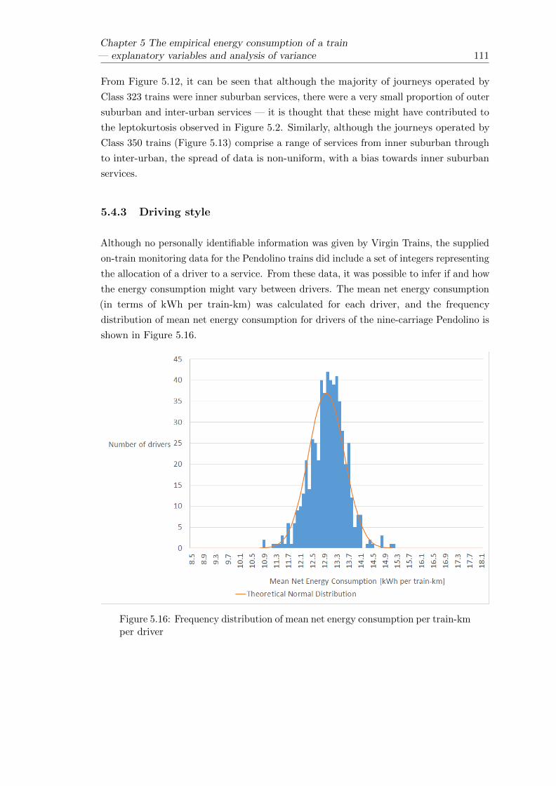
Chapter 5 The empirical energy consumption of a train— explanatory variables and analysis of variance 111
From Figure 5.12, it can be seen that although the majority of journeys operated by
Class 323 trains were inner suburban services, there were a very small proportion of outer
suburban and inter-urban services — it is thought that these might have contributed to
the leptokurtosis observed in Figure 5.2. Similarly, although the journeys operated by
Class 350 trains (Figure 5.13) comprise a range of services from inner suburban through
to inter-urban, the spread of data is non-uniform, with a bias towards inner suburban
services.
5.4.3 Driving style
Although no personally identifiable information was given by Virgin Trains, the supplied
on-train monitoring data for the Pendolino trains did include a set of integers representing
the allocation of a driver to a service. From these data, it was possible to infer if and how
the energy consumption might vary between drivers. The mean net energy consumption
(in terms of kWh per train-km) was calculated for each driver, and the frequency
distribution of mean net energy consumption for drivers of the nine-carriage Pendolino is
shown in Figure 5.16.
Figure 5.16: Frequency distribution of mean net energy consumption per train-kmper driver
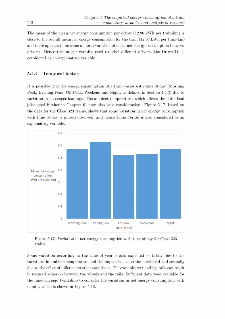
112Chapter 5 The empirical energy consumption of a train
— explanatory variables and analysis of variance
The mean of the mean net energy consumption per driver (12.96 kWh per train-km) is
close to the overall mean net energy consumption for the train (12.93 kWh per train-km)
and there appears to be some uniform variation of mean net energy consumption between
drivers. Hence the integer variable used to label different drivers (the DriverID) is
considered as an explanatory variable.
5.4.4 Temporal factors
It is possible that the energy consumption of a train varies with time of day (Morning
Peak, Evening Peak, Off-Peak, Weekend and Night, as defined in Section 4.4.3) due to
variation in passenger loadings. The ambient temperature, which affects the hotel load
(discussed further in Chapter 6) may also be a consideration. Figure 5.17, based on
the data for the Class 323 trains, shows that some variation in net energy consumption
with time of day is indeed observed, and hence Time Period is also considered as an
explanatory variable.
Figure 5.17: Variation in net energy consumption with time of day for Class 323trains
Some variation according to the time of year is also expected — firstly due to the
variations in ambient temperature and the impact it has on the hotel load and secondly
due to the effect of different weather conditions. For example, wet and icy rails can result
in reduced adhesion between the wheels and the rails. Sufficient data were available for
the nine-carriage Pendolino to consider the variation in net energy consumption with
month, which is shown in Figure 5.18.

Chapter 5 The empirical energy consumption of a train— explanatory variables and analysis of variance 113
Figure 5.18: Variation in the mean net energy consumption of the nine-carriagePendolino by month
Some variation in net energy consumption on a monthly basis is evident and so the
month is considered as an explanatory variable. A small amount of variation in energy
consumption on a yearly basis is evident (Figure 5.19), which is plausible due to changes
in scheduling, annual variations in weather and efforts to encourage energy efficient
driving. The data for 2009 and 2012 are limited, but the year is also explored as an
explanatory variable.

114Chapter 5 The empirical energy consumption of a train
— explanatory variables and analysis of variance
Figure 5.19: Variation in the mean net energy consumption of the nine-carriagePendolino by year
5.5 Single variable linear regression
It was shown in Section 5.3 that the empirical net energy consumption of the different
trains studied can be quite variable. Section 5.4 discussed some of the factors which
might lead to this variation and suggested some possible explanatory variables for use
in a linear model. This section summarises the possible explanatory variables and uses
single variable linear regression modelling to estimate the significance of each one and
rank them by importance according to the adjusted R2 value of the model.
5.5.1 A summary of possible explanatory variables
Table 5.7 summarises the proposed explanatory variables. Factors are discrete nominal
variables, whereas co-variates are continuous.

Chapter 5 The empirical energy consumption of a train— explanatory variables and analysis of variance 115
Table 5.7: Possible explanatory variables for the variation in net energyconsumption for a given train
ExplanatoryVariable
Category Variable Type Notes
Fleet Number
Train
Factor
Sub Class Factor Only applicable forClass 350 trains
Unit Count Co-variate Only applicable forLondon Midlandtrains
Route
Route and service
Factor Defined by origin,destination anddirection
Mean Stop Spacing[km]
Co-variate
Mean Running Speed[km/h]
Co-variate
DriverID Driver Factor Data only availablefor Pendolino trains
Time Period
Temporal
Factor
Month Factor Data only availablefor nine-carriagePendolino trains
Year Factor Data only availablefor nine-carriagePendolino trains
5.5.2 Adjusted R2 Values created by single explanatory variable models
SPSS was used to test the importance of each of the explanatory variables in turn by
assessing the fit of a single explanatory variable linear regression model for the net energy
consumption (in terms of kWh per train-km). A Univariate General Linear Model was
used in each case to estimate the statistical significance of the relationship between each
explanatory variable and the net energy consumption and to rank each variable by its
explanatory power (measured by the adjusted R2 value). Table 5.8 summarises the
adjusted R2 values created by each of the models.

116Chapter 5 The empirical energy consumption of a train
— explanatory variables and analysis of variance
Table 5.8: Adjusted R2 values created by single explanatory variable models
Factor 321 323 350 390(9-carriage)
390(11-carriage)
Route 0.554 0.237 0.559 0.159 0.165
Mean Speed 0.298 0.002 0.162 0.007 0.008
Mean StopSpacing
0.443 0.034 0.345 0.008 0.012
Sub Class 0.004
Unit Count 0.080 0.019
FleetNumber
0.022 0.082 0.017 0.010 0.048
Time Period 0.020 0.002 0.011 0.007 0.020
Month 0.087 0.035
Year 0.006
Driver ID 0.200 0.313
5.5.3 Ranking the explanatory variables in order of importance
Using the adjusted R2 values created by single explanatory variable models (Table 5.8)
as a measure of how much of the observed variation in net energy consumption can be
explained by each variable, the explanatory variables were ranked in order of importance,
with the highest adjusted R2 values deemed to be the most important. Table 5.9 lists
the top five explanatory variables for each train type.
Table 5.9: Ranking of explanatory variables by adjusted R2 value
VariableRanking
321 323 350 390(9-carriage)
390(11-carriage)
1 Route Route Route Driver ID Driver ID
2 Mean StopSpacing
FleetNumber
Mean StopSpacing
Route Route
3 Mean Speed Mean StopSpacing
Mean Speed Month FleetNumber
4 Time Period Unit Count Unit Count FleetNumber
Month
5 FleetNumber
Mean Speed FleetNumber
Mean StopSpacing
Time Period

Chapter 5 The empirical energy consumption of a train— explanatory variables and analysis of variance 117
Care should be taken when comparing the different trains in Table 5.9 because not all
explanatory variables applied to all trains (Table 5.8). For example, the Pendolinos never
work in multiple, and so Unit Count does not apply, and no driver data were provided
by London Midland. Where driver data were provided (for the Pendolino trains) it can
be seen that it is the most important explanatory variable, and the differences between
drivers is explored in more detail in Chapter 8. Features of the route and service are
otherwise the most important factors. It is likely that the apparent importance of Fleet
Number in most cases is at least partially due to the fact that some trains operated
some routes more frequently than others, and the interactions between these variables is
considered in Section 5.6. The fact that the mean stop spacing appears more important
for suburban trains rather than the intercity Pendolino fits with Figure 5.10, which shows
that the variation in energy consumption with increasing stopping density appears more
prominent for the Class 323 on inner suburban services. Although apparently significant,
the mean running speed does not appear to offer any real explanation for the variation in
energy consumption for the Pendolino — this is probably because the intercity services
they operate have similar speed characteristics, with long periods of running at 125mph.
For the Class 323 and Class 350, which operate in different groupings of up to three
trains in multiple, the Unit Count appears to be important, but the difference between
the Class 350 sub-classes (/1 and /2) appears to be less so. Some temporal factors are
important for the Pendolino. It is difficult to verify the importance of them for the
London Midland fleet due to the limited data available. However, it is noted that Time
Period is more significant for the trains which operate services in and out of London
than it is for the Class 323 which only operates local services in the Birmingham area.
This may reflect the fact that routes in and out of London are particularly subject to
significant variations in passenger demand throughout the day (discussed further in
Chapter 10).
5.6 An intial multiple explanatory variable General Linear
Model for the nine-carriage Pendolino
Having considered the proposed explanatory variables individually, SPSS was then used
to develop a multiple explanatory variable General Linear Model for the nine-carriage
Pendolino. The aim was to understand whether the majority of the variation in the net
energy consumption could be described by the chosen variables, and to ascertain whether
some of the interactions between them could be deemed significant. After considering
the overall fit of an initial model, the limitations of the model are discussed. A simpler
model which might have more practical use is then proposed and discussed in Section 5.7.
The size of the dataset (37,733 individual journeys and 550 individual drivers) meant
that it was not possible to compute a comprehensive model for the entire sample (there

118Chapter 5 The empirical energy consumption of a train
— explanatory variables and analysis of variance
was not enough memory for SPSS to compute the model). Hence a random subset of
10% of the data was chosen and the model only included those two-way interactions
thought to be significant. Furthermore, the mean speed and the year were excluded
on the basis that the adjusted R2 values were very small when they were considered
individually (Table 5.8). Also, understanding the variation with year is of little practical
use unless further study were to be undertaken of the impacts of changes in scheduling
and driver training — for which more data would be required. Table 5.10 summarises
the variables used in the model and their significances (p-values). The null hypothesis
is that the coefficients (β) of the explanatory variables are zero (i.e. the explanatory
variable has no impact in the model). If the significance is given to be less than 0.05,
then the explanatory variable is said to be significant at the 5% level and the null
hypothesis should be rejected. In other words, if the significance is less than 0.05 for a
given explanatory variable, said variable is deemed to have an impact.
Table 5.10: Variables and interactions used in the model and their significances
Variable Significance
Route 0.351
Fleet Number 0.002
Time Period 0.051
Month 0.000
DriverID 0.000
Mean Stop Spacing [km] 0.586
Route * Fleet Number 0.000
Route * DriverID 0.000
Route * Mean Stop Spacing 0.270
Route * Time Period 0.050
The model fitted the 3,763 journeys selected at random by SPSS with an adjusted R2
value of 0.519 Given the large p-value (significance) for Mean Stop Spacing, and its
interaction with the Route variable, it was concluded that Mean Stop Spacing may not
be an important explanatory variable. To verify this, the model was re-run excluding
the Mean Stop Spacing, and the adjusted R2 value of the revised model fitted to the
same 3,763 journeys was also 0.519. This fits with the observations in Section 5.4.2, but
the fact that the model were only run for a random subset of 10% of the data should be
borne in mind.

Chapter 5 The empirical energy consumption of a train— explanatory variables and analysis of variance 119
5.6.1 Limitations of the model
The adjusted R2 value of 0.519 indicates that the explanatory variables proposed in
Section 5.5.1 are helpful in explaining the observed variation in the energy consumption
data, but do not explain everything. Furthermore, it is not clear whether the random 10%
of the data selected could be classed as a fair sample. In any case, there are potentially
three main sources of additional variation:
• Errors in the data. It is possible that some data were incorrectly matched to a
schedule and are not a true reflection of the actual energy consumption.
• Passenger loadings and behaviour. Although considering the time of day
might account for some of the overall trends in passenger loading, passenger
numbers will have varied from journey to journey. Variation in passenger numbers
not only leads to a variation in overall train mass, but can also have an impact
on the hotel load and auxiliary systems — for example, some HVAC systems
adjust themselves automatically with passenger numbers, airflow and on-board
temperature. Additionally, the use of power doors and charging points for phones
and laptops (where provided) will vary between journeys.
• Train reliability and schedule perturbations. The data were filtered so that
incomplete and significantly delayed journeys were not included in the analysis
(Chapter 4). However, there was still some scope for deviation from the overall
schedule and it is therefore possible for journeys to have been affected by signal
checks and other sources of delay (it is noted that, particularly on long-distance
journeys, a train can be delayed significantly near the beginning of the journey and
still make up enough time to be within the set punctuality limits at the destination).
It is also noted that short term maintenance issues and problems with auxiliary
equipment are not accounted for but could also impact the energy consumption.
In its current form, the model is of limited practical use. The first reason for this is that,
with 19 distinct routes and 550 drivers, the number of dummy variables and associated
co-efficients is large, making it unwieldy to implement. The second reason for this is
that it only applies to existing trains, drivers and routes and cannot be extrapolated for
new drivers or additions to the train fleet. To address these issues, a simplified model is
proposed — this is discussed in the next section.

120Chapter 5 The empirical energy consumption of a train
— explanatory variables and analysis of variance
5.7 A simplified model
In order to reduce the number of variables and make the General Linear Model more
applicable to the real-world, two key changes were made. Firstly, the DriverIDs were
assigned an efficiency rating which was used as an explanatory variable in place of the ID
itself. The efficiency ratings were assigned according to the mean net energy consumption
of the driver, using the 25th, 50th and 75th percentile points. The criteria are summarised
in Table 5.11. Although the introduction of a new driver could alter the statistics, this is
a useful starting point for broadly grouping the drivers.
Table 5.11: Driver efficiency ratings
Efficiency Rating Criteria Range of Mean EnergyConsumption
[kWh per train-km]
1 Mean energy consumptionbelow the first quartile for alldrivers
E < 12.62
2 Mean energy consumptionbetween the first quartile andthe median for all drivers
12.62 ≤ E < 13.00
3 Mean energy consumptionbetween the median and thethird quartile for all drivers
13.00 ≤ E < 13.32
4 Mean energy consumptionabove the third quartile forall drivers
E ≥ 13.32
Secondly, the months were replaced with broader seasonal groupings: Spring (March
to May), Summer (June to August), Autumn (September to November) and Winter
(December to February).
Finally, although it did not appear to be important explanatory variables in the initial
General Linear Model when applied to a random 10% subset of the data, Mean Stop
Spacing was included in the simplified model. This was primarily because of concerns
that the random 10% subset may not have been representative of the whole dataset;
although it would have been possible to investigate it further by running the model on a
number of small random samples, the reduced complexity of the new model meant that
it was no longer necessary to use a small sample of the data.
Table 5.12 summarises the variables used in the model and the significances calculated
by SPSS, both when it was run for the same 10% sample as before and when it was run
for the whole dataset.

Chapter 5 The empirical energy consumption of a train— explanatory variables and analysis of variance 121
Table 5.12: Variables and their significance in the simplified explanatory model
Variable Significance
When applied to 10% sample When applied to wholedataset
Route 0.003 0.000
Efficiency Rating 0.000 0.000
Time Period 0.004 0.188
Fleet Number 0.003 0.003
Season 0.000 0.000
Mean Stop Spacing [km] 0.019 0.035
Route * Efficiency Rating 0.120 0.000
Route * Time Period 0.000 0.000
Route * Fleet Number 0.004 0.000
Route * Season 0.005 0.000
Route * Mean Stop Spacing 0.000 0.000
The adjusted R2 value of the model was 0.436 when applied to the random 10% sample,
falling to 0.423 when applied to the whole dataset. This is lower than the adjusted R2
values from the original general linear model. It may be that the driver efficiency groupings
are too broad, whilst the seasonal groupings may not accurately reflect the variations
in temperature and weather which are thought to have an impact. There is therefore
a balance to be struck between detail and keeping a manageable number of variables.
Driver behaviour is investigated further in Chapter 8, whilst regenerative braking and the
hotel load (which are thought to be dependent on weather and temperature accordingly)
are considered in Chapter 6.

122Chapter 5 The empirical energy consumption of a train
— explanatory variables and analysis of variance
5.7.1 Sample parameters
The simplified model to describe the mean net energy consumption E can be written in
the following form:
E = A+B1 +B2 +B3 +B4 +B5 +B6x (5.1)
where:
• A is a constant.
• B1 is determined by the Route.
• B2 is determined by the driver Efficiency Rating and its interaction with the Route.
• B3 is determined by the Time Period and its interaction with the Route.
• B4 is determined by the Fleet Number and its interaction with the Route.
• B5 is determined by the Season and its interaction with the Route.
• B6 is determined by the Mean Stop Spacing and its interaction with the Route.
• x is the Mean Stop Spacing (in km).
The large fleet size (53) and number of routes (19) mean that the model has 800 different
parameters in total. In order to investigate whether the predicted effects of the model
seem sensible, one route (Euston to Wolverhampton) and one train in the Fleet (390
001) were selected. Having fixed the Route and Fleet Number, the number of remaining
parameters — summarised in Table 5.13 — was greatly reduced. The parameters given
in Table 5.13 were generated by SPSS when the model was applied to the whole dataset.

Chapter 5 The empirical energy consumption of a train— explanatory variables and analysis of variance 123
Table 5.13: Parameters generated by SPSS for the Simplified Model, where theFleet Number is 1 and the Route is Euston to Wolverhampton (EUS WVH)
ModelTerm
Explanatory Variable IndividualParameter
InteractionParameter1
TotalParameter
Value
A (Intercept) 13.794 n/a 13.794
B1 Route = EUS WVH 0.764 n/a 0.764
B2
Driver Efficiency = 1 -1.419 0.139 -1.280
Driver Efficiency = 2 -0.936 0.033 -0.903
Driver Efficiency = 3 -0.596 0.092 -0.504
Driver Efficiency = 4 0.000 0.000 0.000
B3
TimePeriod = EveningPeak -0.215 - -
TimePeriod = MorningPeak 2.227 - -
TimePeriod = Night 0.074 -0.435 -0.361
TimePeriod = OffPeak 0.860 -0.806 0.054
TimePeriod = Weekend 0.000 0.000 0.000
B4 FleetNumber = 1 0.257 -0.115 0.142
B5
Season = Autumn -0.386 -0.269 -0.655
Season = Spring -0.553 -0.006 -0.559
Season = Summer -0.792 -0.234 -1.026
Season = Winter 0.000 0.000 0.000
B6 MeanStopSpacingKm -0.036 0.025 -0.011
1These are the parameters for the interaction terms between the explanatoryvariables and the Route = EUS WVH

124Chapter 5 The empirical energy consumption of a train
— explanatory variables and analysis of variance
Using the parameters in Table 5.13, Equation (5.1) can be re-written as follows for the
first train in the fleet (390 001) running between Euston and Wolverhampton, for a mean
stop spacing of x km:
E = 14.7 +
Efficiency = 1
Efficiency = 2
Efficiency = 3
Efficiency = 4
+
EveningPeak
MorningPeak
Night
OffPeak
Weekend
+
Autumn
Spring
Summer
Winter
− 0.011x
(5.2)
From Table 5.13, the different values for the Driver Efficiency ratings are as follows:Efficiency = 1
Efficiency = 2
Efficiency = 3
Efficiency = 4
=
−1.280
−0.903
−0.504
0
It can be seen that, as would be expected, the change from the least efficient drivers
(Efficiency Rating 4) through to the most efficient drivers (Efficiency Rating 1) reduces
the energy consumption E. Similarly, the different values for the seasons are as follows:Season = Autumn
Season = Spring
Season = Summer
Season = Winter
=
−0.655
−0.559
−1.026
0
This leads to E being lowest in the summer months and highest in winter, in line with
what can be observed in Figure 5.18. Finally, the different values for the Time Period
are as follows:EveningPeak
MorningPeak
Night
OffPeak
Weekend
=
−−
−0.361
0.054
0.000
The observed relationship, in which journeys at night consume less energy than weekend
journeys, and weekday off-peak journeys consume a little more does not seem unreasonable
(although it is at odds with the pattern observed for the Class 323 trains in Figure 5.17).
In this case, it is likely that weekend and night-time journeys have more slack in the
timetable (perhaps to allow for Engineering Work) and therefore have a lower running
speed. The problem, however, is that there are no data for peak journeys on this route.
Hence it is likely overall that the model is affected by a lack of data.

Chapter 5 The empirical energy consumption of a train— explanatory variables and analysis of variance 125
Choosing off-peak journeys with a mean stop spacing of x = 33.7km, the estimates of
net energy consumption, E, in terms of kWh per train-km, are given in Table 5.14 for
the different seasons and driver efficiencies.
Table 5.14: Estimated values of E using the Simplified Model for off-peakjourneys between Euston and Wolverhampton
Season =Autumn
Season =Spring
Season =Summer
Season =Winter
DriverEfficiency = 1
12.4483 12.5443 12.0773 13.1033
DriverEfficiency = 2
12.8253 12.9213 12.4543 13.4803
DriverEfficiency = 3
13.2243 13.3203 12.8533 13.8793
DriverEfficiency = 4
13.7283 13.8243 13.3573 14.3833
Considering Figure 5.9, the estimates for net energy consumption in Table 5.14 seem
plausible. Furthermore, the mean of all the values in Table 5.14 is 13.15 kWh per
train-km, which is about 3% less than the mean value for the route given in Table 5.6,
and well within one standard deviation.
5.7.2 Further testing of the model
Having shown that the mean net energy consumption can be reasonably described by the
model, taking the form given in Equation (5.1), it was decided to test whether the model
could in future be used to predict the energy consumption for new routes. In order to
do this, the 2,222 journeys corresponding to Euston to Wolverhampton, considered in
Section 5.7.1, were removed from the dataset, and SPSS was used to recreate the model
on the remaining 35,511 journeys. The recreated model was checked and then used to
predict the energy consumption for journeys between Euston and Wolverhampton; the
results were compared with those in Section 5.7.1.
Of the remaining routes, the one between Euston and Birmingham was taken to be
most similar to the route between Euston and Wolverhampton, because it is of similar
length and initially covers the same sections of track. Table 5.15 summarises the model
parameters for this route, where the Fleet Number is 1.

126Chapter 5 The empirical energy consumption of a train
— explanatory variables and analysis of variance
Table 5.15: Parameters generated by SPSS for the Simplified Model on a reduceddataset, where the Fleet Number is 1 and the Route is Euston to Birmingham(EUS BHM)
ModelTerm
Explanatory Variable IndividualParameter
InteractionParamater1
TotalParameter
Value
A (Intercept) 13.794 n/a 13.794
B1 Route = EUS BHM 3.146 n/a 0.764
B2
Driver Efficiency = 1 -1.419 0.169 -1.250
Driver Efficiency = 2 -0.936 0.308 -0.628
Driver Efficiency = 3 -0.596 0.203 -0.393
Driver Efficiency = 4 0.000 0.000 0.000
B3
TimePeriod =EveningPeak
-0.215 0.323 0.108
TimePeriod = MorningPeak
2.227 - -
TimePeriod = Night 0.074 -0.667 -0.593
TimePeriod = OffPeak 0.860 -0.775 0.085
TimePeriod = Weekend 0.000 0.000 0.000
B4 FleetNumber = 1 0.257 -0.496 -0.239
B5
Season = Autumn -0.386 -0.157 -0.543
Season = Spring -0.553 -0.015 -0.568
Season = Summer -0.792 -0.094 -0.886
Season = Winter 0.000 0.000 0.000
B6 MeanStopSpacingKm -0.036 -0.009 -0.045
1These are the parameters for the interaction terms between the explanatoryvariables and the Route = EUS BHM

Chapter 5 The empirical energy consumption of a train— explanatory variables and analysis of variance 127
It can be seen from Table 5.15 that the parameter values continue to follow expected
patterns for Driver Efficiency and Season. Following the same methodology used in
Section 5.7.1 the estimates of net energy consumption, E, in terms of kWh per train-km,
are given in Table 5.16 for the different seasons and driver efficiencies on the route
between Euston and Birmingham. As before, off-peak journeys were chosen, but a
stop-spacing of 45.3km was used, as it is more typical of services on this route.
Table 5.16: Estimated values of E using the Simplified Model for off-peakjourneys between Euston and Birmingham
Season =Autumn
Season =Spring
Season =Summer
Season =Winter
DriverEfficiency = 1
12.9545 12.9295 12.6115 13.4975
DriverEfficiency = 2
13.5765 13.5515 13.2335 14.1195
DriverEfficiency = 3
13.8115 13.7865 13.4685 14.3545
DriverEfficiency = 4
14.2045 14.1795 13.8615 14.7475
The values in Table 5.16 compare favourably with Figure 5.9, and the overall mean of
13.68 kWh per train-km is within one standard deviation of the mean for the route
between Euston and Birmingham given in Table 5.6.
Using this data to estimate values of energy consumption for the route between Euston
and Wolverhampton is more problematic, however. Although they are ostensibly similar
routes, the value of B1 in Table 5.15 differs considerably from that in Table 5.13. Using
the values in Table 5.15 for off-peak journeys and a mean stop-spacing of 33.7km,
which is more appropriate for the Euston to Wolverhampton route, a mean net energy
consumption of 14.20 kWh per train-km was predicted — significantly higher than that
predicted in Section 5.7.1 and that observed in Section 5.4.2.
It can therefore be concluded that although the model can be used to predict energy
consumption where data about a given route already exists, it can not currently be used
to predict absolute values of energy consumption for routes not in the dataset (although
it may be useful for predicting some general trends in terms of driving style and time of
year). In order to make the model more generally applicable, more generic explanatory
variables to describe the different characteristics of a route would need to be found. This
would require the acquisition of more detailed route data, including gradients and line
speed limits.

128Chapter 5 The empirical energy consumption of a train
— explanatory variables and analysis of variance
5.8 Conclusions
Significant variation in net energy consumption for different trains over different journeys
has been observed. There is a big difference between the suburban trains operated by
London Midland and the intercity services operated by Virgin Trains. Train design is an
important factor, with the intercity trains being longer, faster and heavier overall, and
there are differences between the routes operated.
It was postulated that much of the variation for a given train was caused by driving
style, aspects of the route and service, other aspects of the train (such as variations
within a particular class of train) and temporal factors such as time of day and time of
year. Some initial observations were made and some explanatory variables for use in
general linear modelling were defined. It was indeed found that much of the variation
could be explained by the suggested factors, with driving style and route being the most
important. It was not possible to ascertain the impacts of driving style for the London
Midland fleet, due to a lack of data. Despite the fact that it cannot therefore be stated
that driving style would continue to be a dominant factor, it is noted that suburban
services have greater potential for driving style to make an impact, due to the higher
frequency of stops. It is, however, interesting to note that variations between routes
are apparently much more important for suburban journeys, with mean stop spacing
becoming less important for intercity services than it is for inner suburban services. This
is thought to be because the stops are more dominant on suburban services — intercity
services tend to feature long periods of higher speed running.
SPSS was used to fit a multiple explanatory variable General Linear Model to the data
for the nine-carriage Pendolino, which had the most comprehensive dataset. For the
random sample of data chosen there was a good fit, but there are clearly other reasons for
the variation in energy consumption, which were briefly put forward. The General Linear
Model was found to be too complex — the large numbers of dummy variables needed for
all the drivers made it quite unwieldy. Hence some simpler explanatory variables were
suggested, including the use of an “efficiency rating” in place of an individual DriverID.
Although the simpler models did not explain so much of the variation, similar trends
were observed in terms of the significance of the different factors.
It was found that the parameters generated by SPSS for the simpler models were plausible,
and could be used to predict the mean net energy consumption of a train. However,
without better data to describe and differentiate the various routes, such models have
limited applicability to new routes for which data are not already available.
Clearly, driving style, aspects of the route and service and temporal factors do have an
impact on the net energy consumption of a train. Chapter 6 considers the importance
hotel load and the impact of regenerative braking, both of which may be affected by route

Chapter 5 The empirical energy consumption of a train— explanatory variables and analysis of variance 129
and temporal factors. Features of the route are explored further when modelling energy
consumption in Chapter 7 and driving style is investigated in more detail in Chapter 8.


Chapter 6
Regenerative braking, the hotel
load and non-revenue operation
6.1 Introduction
The benefits of regenerative braking were quantified from the energy metering data
supplied by the two TOCs, since the meters and monitoring systems recorded how much
energy was recovered via the regenerative braking system in each monitoring period. This
chapter summarises the findings and performs some basic analysis of variance (using the
same linear modelling techniques performed for the net energy consumption in Chapter 5)
to examine how the performance of a regenerative braking system might be affected by
different factors.
It was not possible to measure the hotel load directly, because the metering and monitoring
systems made no distinction between energy consumed by the auxiliary systems and
energy consumed by the traction systems. Instead, attempts were made at inferring the
probable size of the hotel load by considering the energy consumption when the trains
were stationary, on the basis that the energy consumed by the traction systems should
be zero.
Finally, this chapter considers the impact of non-revenue running and idling — the
analysis in Chapter 5 was for energy data recorded during passenger journeys, whilst it
is arguable that all energy consumption needs to be considered as a necessary part of
providing a train service.
131

132 Chapter 6 Regenerative braking, the hotel load and non-revenue operation
6.2 The effect of regenerative braking
With the exception of the Class 321, all of the trains analysed are fitted with regenerative
braking systems. For each journey analysed, the mean fraction of the gross energy
recovered by the regenerative braking system was calculated. Table 6.1 summarises the
resulting data.
Table 6.1: Descriptive statistics for the percentage of gross energy recovered byregenerative braking
323 350 390(9-carriage)
390(11-carriage)
Mean fraction ofgross energyregenerated [%]
23.08 16.80 15.49 15.56
StandardDeviation
4.32 4.38 3.44 3.23
Median fractionof gross energyregenerated [%]
23.00 16.00 15.00 15.00
1st Quartile 20.00 14.00 13.00 13.00
3rd Quartile 26.00 19.00 18.00 18.00
InterquartileRange
6.00 5.00 5.00 5.00
Minimumrecordedfraction of grossenergyregenerated [%]
6.00 5.00 0.00 6.00
Maximumrecordedfraction of grossenergyregenerated [%]
35.00 31.00 34.00 29.00
The fraction of energy saved through regenerative braking is in line with other observations
which suggests that 15 to 20% is typical, rising further for some inner suburban
services (Railwaygazette.com, 2012). It was noted in Chapter 5 that the Class 323
trains predominantly operate inner-suburban services (defined as having a mean stopping
spacing of less than 10 km), whilst the Class 350s operate a range of inner-suburban,
outer-suburban (mean stopping spacing of 10 – 20 km) and inter-urban services (mean
stopping spacing of 20 – 50 km). The Pendolinos operate a mix of inter-urban and
inter-city services (mean stopping spacing of more than 50 km). It can thus be concluded
from Table 6.1 that the proportion of energy regenerated varies with stopping density;

Chapter 6 Regenerative braking, the hotel load and non-revenue operation 133
this is intuitively correct, because stopping services will involve more periods of braking.
It is also noted that for some Pendolino services no energy was recovered from the
regenerative braking system. This is probably because the sample size was big enough to
include rare cases when the regenerative braking system was inoperative, and adds weight
to the suggestion put forward in Chapter 5 that the reliability of some on-train systems is
a factor in the variation of the net energy consumption. Figure 6.1 and Figure 6.2 show
the distribution of the data for the Class 323 trains and the Class 350 trains respectively,
whilst Figure 6.3 shows the distribution of the data for the nine-carriage Pendolino trains
and Figure 6.4 shows the distribution for the 11-carriage Pendolino trains.
Figure 6.1: Frequency distribution of the energy regenerated on journeys operatedby Class 323 trains

134 Chapter 6 Regenerative braking, the hotel load and non-revenue operation
Figure 6.2: Frequency distribution of the energy regenerated on journeys operatedby Class 350 trains
Figure 6.3: Frequency distribution of the energy regenerated on journeys operatedby nine-carriage Pendolino trains

Chapter 6 Regenerative braking, the hotel load and non-revenue operation 135
Figure 6.4: Frequency distribution of the energy regenerated on journeys operatedby 11-carriage Pendolino trains
As with the distribution of values for the net energy consumption (Chapter 5) some
skewness is evident in Figures 6.1 to 6.4. This is probably because some services and
routes are more prevalent in the data than others — it has already been noted that
stopping patterns are likely to be an important factor in the amount of energy which is
recovered.
It seems, generally, that the variation in energy recovered can be explained by the
same key factors describing the variation in net energy consumption overall. As well
as stopping patterns, it is also likely that some aspects of the route infrastructure have
an impact — gradients are likely to affect the amount of braking force required, whilst
variations in line speed limits could also dictate the amount and severity of braking
required. The severity of the braking will affect how much of the braking force can
be provided by motor braking (through which energy can be regenerated) and how
much friction braking force (through which energy is dissipated rather than recovered)
is required. Hence it is also likely that individual driving style is a factor. Because
adhesion levels can affect braking performance, the weather is expected to be a factor
(with wet and icy rails reducing adhesion), and some of the monthly variation observed
in Chapter 5 (Figure 5.18) may be attributable to variations in the weather and the
resulting regenerative braking performance. Other temporal factors, such as time of day,
are likely to be less significant in this case, but are considered nonetheless, because rail
conditions may vary throughout the day, especially in winter, when ice is more prevalent
in the morning and the evening. The variations in train mass caused by the variations

136 Chapter 6 Regenerative braking, the hotel load and non-revenue operation
in passenger loading may also be a factor. Finally, although they are probably less
significant for regenerative braking performance than they are for overall variations in
net energy consumption, the variations between different sub-classes of train (for the
Class 350) and the operation of trains in multiple is considered.
6.3 Single variable linear regression modelling to test the
significance and importance of the different possible
explanatory variables
Following the same methodology as that in Chapter 5, a single variable linear regression
model was developed in SPSS to investigate the explanatory power of the chosen variables.
Having noted above that the performance of the regenerative braking system is likely
to be affected by similar factors to those which affect the net energy consumption as
a whole, although perhaps not to the same extent, the explanatory variables chosen
for investigation were the same as those set out in Chapter 5 (Table 5.7). Table 6.2
summarises the adjusted R2 values generated by single explanatory variable models in
SPSS. All of the variables were found to have significance values (p-values) of less than
1%, meaning that they are indeed likely to have an impact on the fraction of energy
regenerated.
Table 6.2: Adjusted R2 values created by single explanatory variable models
Factor 323 350 390 (9-carriage)
Route 0.248 0.675 0.192
Mean Speed 0.018 0.126 0.138
Mean Stop Spacing 0.004 0.471 0.072
Sub Class 0.015
Unit Count 0.049 0.018
Fleet Number 0.071 0.047 0.009
Time Period 0.007 0.004 0.025
Month 0.025
Year 0.030
Driver ID 0.170
Using the adjusted R2 values in Table 6.2, Table 6.3 ranks the variables by explanatory
power, with the highest adjusted R2 values deemed to be the most important.

Chapter 6 Regenerative braking, the hotel load and non-revenue operation 137
Table 6.3: Ranking of explanatory variables by adjusted R2 value
Variable Ranking 323 350 390 (9-carriage)
1 Route Route Route
2 Fleet Number Mean Stop Spacing Driver ID
3 Unit Count Mean Speed Mean Speed
4 Mean Speed Fleet Number Mean Stop Spacing
5 Time Period Unit Count Year
Table 6.2 and Table 6.3 can be compared with Table 5.8 and Table 5.9 in Chapter 5
respectively. It is noted that, in general, the adjusted R2 values which explain the
variation in amount of energy regenerated are higher than those in Chapter 5 which
explain the variation in total net energy consumed. This is assumed to be because some
of the additional sources of variation suggested in Chapter 5 are less applicable for the
regenerative braking system. Whereas the regenerative braking system is thought to be
as susceptible as any other component to reliability issues and performance fluctuations;
the regenerative braking system is unaffected by varying demands on the HVAC systems,
for example.
The dominant factor appears to be the route, for which it is postulated that gradients, line
speed limits and the position of stops are important. In the case of the inner-suburban
services operated by Class 323 trains, the mean stop spacing was not ranked as important.
It is suggested that this might be because, once a certain stopping density is reached, the
addition of extra stops does not significantly add to the overall braking time and other
factors begin to dominate. In contrast, on less suburban services, the addition of stops
can make a big difference to the number of braking periods on the service overall. It is
interesting to note, however, that the correlation between mean stop spacing and the
amount of energy regenerated was positive in each case, which seems counter-intuitive.
Similarly, when considering the mean running speed, the coefficient of correlation with
the regenerated energy was positive in each case. It is possible that this could be because
when finally bringing a train to a halt some friction braking is needed, whilst at higher
speed an application of the brakes could involve purely relying on the motor braking force
from which energy is regenerated. Furthermore, whereas the addition of a stop increases
the number of braking periods in which energy can be recovered, it also increases the
number of acceleration periods, which can lead to increased energy consumption overall.
There may therefore come a point where although the amount of energy regenerated
increases, the energy regenerated as a proportion of gross energy consumption does not
similarly increase.
It is therefore suggested that there is an optimum stop spacing below which the train
does not reach higher running speeds, and although the number of braking periods is

138 Chapter 6 Regenerative braking, the hotel load and non-revenue operation
higher, the regenerative efficiency of each one is lower. Similarly, above such an optimum
stop spacing, periods of running at constant speed become the dominant aspect of a
service and there is less opportunity for energy to be recovered through braking. There
is scope for further research in this area.
The apparent importance of Fleet Number might hint at the impact of equipment
reliability and maintenance schedules, especially in the case of the Class 323 and Class
350, where the time period covered by the data is not sufficient enough to include complete
maintenance cycles. However, it is thought that the Fleet Number might appear more
significant than it is because different trains may have operated different services more
frequently; this could similarly be the case for Unit Count given that some services are
operated in multiple more than others.
No driver data were available for the Class 323 and Class 350 trains, but it is clear from
the results for the Pendolino that driving style could well be a factor. This is intuitive for
two main reasons. Firstly, the gross energy consumed is dependent on the driving style,
and in relative (percentage) terms, the energy regenerated will be influenced accordingly.
Secondly, it has already been noted that the severity of the braking affects how much
of the braking force can be provided by the motor braking component, through which
energy is regenerated. If a driver has a tendency to brake severely enough to rely more
heavily on the friction braking force then less energy may be recovered than otherwise.
Driving style is explored in more detail in Chapter 8.
6.4 Estimating the hotel load
The hotel load is defined in this case as all energy consumption not directly related to
the train motion (Section 3.1.5) — including HVAC systems, lighting and other auxiliary
power. HVAC equipment is generally responsible for the most significant part of this
consumption, with a clear dependence on climate conditions (Powell, Gonzalez-Gil, and
Palacin, 2014). Existing estimates of the typical size of the hotel load range from 5% of
the traction energy (RSSB, 2011) to more than 30% of the energy consumed (assumed
to be net consumption, taking into account any regenerative braking) (UIC, 2003).
Attempts were made to estimate the hotel load from the empirical datasets used here, by
considering the energy consumption of the trains when they were stationary.

Chapter 6 Regenerative braking, the hotel load and non-revenue operation 139
6.4.1 Energy consumption when the train is stationary
Stationary energy consumption was calculated by considering those energy readings
where the train remained in the same location as the previous reading. These were
identified using the following criteria:
• The GPS data for the reading was mapped to the same point on the UK railway
network as the previous reading (see Chapter 4 for details of how the GPS data
were matched to the network).
• The mapping error for the reading was within 10m of the mapping error of the
previous reading; this is because it is possible for a train to have moved and still be
mapped to the same point. Keeping the difference in mapping errors small helps
exclude such cases.
• The recorded energy returned to the grid via the regenerative braking system
was zero; a non-zero reading implies that the train is slowing down rather than
stationary.
In order to estimate the hotel load, further criteria were used to filter the set of stationary
energy consumption data obtained:
• Readings identified as being taken whilst the train was mapped to a depot or siding
were ignored, on the basis that energy consumption monitored in a depot is unlikely
to be representative of the hotel load whilst in passenger service.
• Readings taken overnight (between 11pm and 6am) were ignored, on the basis that
if not in a depot the train is still likely to be parked out of service.
• Readings for which the energy consumption was recorded as zero were ignored.
A summary of the filtered stationary energy consumption data for the London Midland
Class 323 and the Virgin Trains Pendolino (nine-carriage) is given in Table 6.4. For the
Pendolino, data were also filtered by year, and only data for 2010 and 2011 (the whole
years in the dataset) are included in Table 6.4. The reason for this is that the number of
stationary points in the whole dataset was too big to be processed by Microsoft Excel.

140 Chapter 6 Regenerative braking, the hotel load and non-revenue operation
Table 6.4: A summary of the stationary energy consumption for two differenttypes of train
Train Class 323 Class 390 (9-carriage)
Number of stationaryreadings
101,711 700,108
Mean energy consumption[kWh per minute]
1.07 3.37
Standard Deviation 1.14 2.17
Median energy consumption[kWh per minute]
0.84 3.2
1st Quartile 0.67 2.8
3rd Quartile 1.04 3.8
Interquartile range 0.37 1
Observed Minimum[kWh per minute]
0.01 0.2
Observed Maximum[kWh per minute]
22.3 84.2
The distribution of the data is shown graphically in Figure 6.5 and Figure 6.6 for the
Class 323 and Pendolino respectively, where it can be seen that the overall mean and
standard deviation are influenced by a the presence of relatively large values in the
dataset. Although there may be some erroneous readings in the data, it is assumed
that most of these large values arise from cases where the train has not remained idling
throughout the time period corresponding to the energy measurement in question. The
time between readings is one minute for all London Midland trains and five-minutes for
the Virgin Trains Pendolino, and during such times a train’s operational status can vary
significantly.

Chapter 6 Regenerative braking, the hotel load and non-revenue operation 141
Figure 6.5: Frequency distribution for the stationary energy consumption of theClass 323 trains
Figure 6.6: Frequency distribution for the stationary energy consumption of thePendolino (9-car) trains

142 Chapter 6 Regenerative braking, the hotel load and non-revenue operation
The smaller peak observed in the Class 323 data (Figure 6.5) is assumed to arise from
the fact that not all data from when the trains were stabled have been excluded. This
will be because if the train has been shut down in a station platform it won’t have
been identified as being in a siding or depot. Additionally, at some stations, it is hard
to distinguish between the location of the platforms and the location of the stabling
sidings. Although the hotel load during passenger operation would be expected to be
higher (corresponding to the larger peak in Figure 6.5), on-board auxiliary systems
are rarely shut down completely when a train is stabled. This is to facilitate cleaning
operations, to prevent damage to vulnerable components due to freezing temperatures
and to ensure that the conditions in the on-board environment (such as the temperature)
are appropriate when the train is returned to service (Powell, Gonzalez-Gil, and Palacin,
2014).
The higher resolution of energy readings for the London Midland data means that it is
possible to identify potentially stationary readings whilst the train has been allocated to
a service — if the train is stationary for more than a minute prior to departure, after
arrival or even at intermediate station calls, it is likely that there will be associated
energy readings which are flagged as stationary (the five-minute intervals of the Virgin
Trains data mean that the energy consumption associated with stationary periods en
route are generally impossible to isolate, but it is possible to capture data immediately
prior to departure and after arrival). The distribution of stationary energy consumption
where the train was allocated to a service is shown in Figure 6.7 for the Class 323,
where it can be seen that the smaller peak observed in Figure 6.5 is no longer present.
Considering only the data for the Class 323 when allocated to a service, the mean and
median stationary energy consumption values are slightly higher than those given for
all stationary readings in Table 6.4 (1.07 kWh per minute and 0.89 kWh per minute
respectively).

Chapter 6 Regenerative braking, the hotel load and non-revenue operation 143
Figure 6.7: Frequency distribution for the stationary energy consumption of theClass 323 trains whilst allocated to a service
It is possible to estimate the hotel load for a given service by finding the average stationary
energy consumption in terms of kWh per min and multiplying it by the duration of the
service. This could then be stated as a fraction of the net energy consumed for the service.
However, it was found that this appeared to significantly overestimate the hotel load —
in some cases it was calculated to equate to more than 100% of the net energy consumed.
One reason for this is that the number of stationary readings for a given service could be
quite small, and even using the median rather than the mean to calculate the average
stationary energy consumption did not eliminate the impact of excessively large readings.
It is also likely that the stationary energy consumption recorded whilst the train is in a
station is higher than the hotel load whilst the train is moving — this will be due to the
opening and closing of powered doors, and the influx of air through open doors affecting
the performance of thermostatically controlled HVAC systems.
6.4.2 Use of the Median Absolute Deviation to filter the data
To eliminate the problem of outliers, the Median Absolute Deviation (MAD) (Appendix E.2)
was used to filter the data. Any reading more than one MAD away from the median was
excluded.
One result of this was that some services were left with no stationary energy consumption
data, and hence the hotel load could not be estimated in this manner. To get around

144 Chapter 6 Regenerative braking, the hotel load and non-revenue operation
this, it was possible to use an average value of stationary energy consumption (in terms
of kWh per minute) for the type of train to estimate the hotel load. This was also
considered for the Virgin Trains data, for which it was almost impossible to allocate
stationary readings to a particular service.
A key limitation of the use of single average values in this manner is that it doesn’t
allow for any variation to be accounted for. On the basis that HVAC systems are a key
component of the hotel load, the variation in temperature was investigated.
6.4.3 Investigating the variation of the hotel load with temperature
Using the median as a more robust measure of the average stationary energy consumption
in this case (because it is less susceptible to the excessively large readings), the variation
in stationary energy consumption with estimated temperature (found by linking the
position of the train with historical weather data — Chapter 4) is shown in Figure 6.8.
For the London Midland data, this is based on all stationary energy readings, not just
those which are linked with a service.
Figure 6.8: The variation in stationary energy consumption with temperature
Powell, Gonzalez-Gil, and Palacin (2014), who did some empirical analysis of the Newcastle
Metro trains when stabled, suggest that the variation of the hotel load with temperature
could be split into three sections. Below a certain point (about 0oC in the case of the
Metro study), the energy consumption was independent of temperature, as a result of
the fact that the fact that the heating system operates at its maximum power rating

Chapter 6 Regenerative braking, the hotel load and non-revenue operation 145
regardless. At the other end of the scale, above about 15oC, the energy consumption was
also found to be independent of temperature, corresponding to the fact that the heating
is always off. In between, the energy consumption was found to decrease linearly with
temperature.
Figure 6.8 shows a general trend of decreasing stationary energy consumption between
about -4oC and 10oC for the London Midland fleet, although there are some fluctuations,
which may have arisen for several reasons. Firstly, the available data are not spread
uniformly across the temperature range, and there may be some temperatures for which
the sample size isn’t large enough to be truly representative. Secondly, the estimation of
temperature is very crude, based on a single figure recorded at a weather station some
distance away from the train itself. Thirdly, it has not been possible to account for other
factors which may affect the hotel load, such as the number of people on board (which
will affect the internal temperature and the use of other on-board auxiliaries such as
power sockets and powered internal doors), the time of day (which may affect the level
of interior lighting) and whether the external doors are open. It should also be noted
that the range of temperatures observed for the London Midland fleet is limited by the
fact that the data were only taken from one month (January 2012). Of the trains in
the London Midland fleet, the Class 350s have a higher stationary energy consumption
than the others. They are of a newer design, and the implication is that any benefits
of better insulation and a more efficient heating system are offset by the presence of
air-conditioning and additional on-board electronics.
The energy consumption for the Pendolino appears to be lowest when the temperature is
approximately 15oC. This reflects the fact that more heating will be required at lower
temperatures, whilst the air-conditioning (not fitted on the Newcastle Metro) has to
work harder at higher temperatures — if data were available for the London Midland
fleet for the summer months, a similar trend would presumably be observed for the
classes of train also fitted with air-conditioning. The stationary energy consumption is
much higher for the Pendolino than it is for the London Midland trains; this will be
due to the fact that it is a much longer train with more carriages and more on-board
amenities (such as a buffet/shop and power sockets for laptops). It is also noticeable
that the relative change with temperature is smaller for the Pendolino trains; this will
partly be due the extra on-board amenities which are not temperature sensitive and
partly because the passenger saloon is much better insulated from the outside (there are
no opening windows and the external doors are set away from the seating area behind a
set of internal doors).
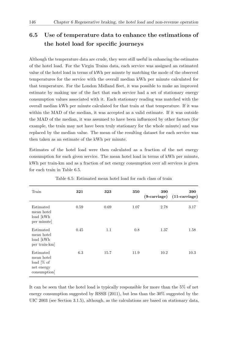
146 Chapter 6 Regenerative braking, the hotel load and non-revenue operation
6.5 Use of temperature data to enhance the estimations of
the hotel load for specific journeys
Although the temperature data are crude, they were still useful in enhancing the estimates
of the hotel load. For the Virgin Trains data, each service was assigned an estimated
value of the hotel load in terms of kWh per minute by matching the mode of the observed
temperatures for the service with the overall median kWh per minute calculated for
that temperature. For the London Midland fleet, it was possible to make an improved
estimate by making use of the fact that each service had a set of stationary energy
consumption values associated with it. Each stationary reading was matched with the
overall median kWh per minute calculated for that train at that temperature. If it was
within the MAD of the median, it was accepted as a valid estimate. If it was outside
the MAD of the median, it was assumed to have been influenced by other factors (for
example, the train may not have been truly stationary for the whole minute) and was
replaced by the median value. The mean of the resulting dataset for each service was
then taken as an estimate of the kWh per minute.
Estimates of the hotel load were then calculated as a fraction of the net energy
consumption for each given service. The mean hotel load in terms of kWh per minute,
kWh per train-km and as a fraction of net energy consumption over all services is given
for each train in Table 6.5.
Table 6.5: Estimated mean hotel load for each class of train
Train 321 323 350 390(9-carriage)
390(11-carriage)
Estimatedmean hotelload [kWhper minute]
0.59 0.69 1.07 2.78 3.17
Estimatedmean hotelload [kWhper train-km]
0.45 1.1 0.8 1.37 1.58
Estimatedmean hotelload [% ofnet energyconsumption]
6.3 15.7 11.9 10.2 10.3
It can be seen that the hotel load is typically responsible for more than the 5% of net
energy consumption suggested by RSSB (2011), but less than the 30% suggested by the
UIC 2003 (see Section 3.1.5), although, as the calculations are based on stationary data,

Chapter 6 Regenerative braking, the hotel load and non-revenue operation 147
they should only be taken as a guide for the non-traction energy consumption when the
train is moving.
Chapter 7 considers how the energy of a train may be modelled, and notes that resistance
forces, and hence required traction energy, increase significantly with speed. On the
other hand, the hotel load should not be affected as such. Hence it is postulated that
the lower running speed of the Class 323 trains is a key reason for the fact that the
hotel load makes up a higher proportion of the net energy consumption. The frequent
stops, leading to increased use of powered doors and increased changes in airflow and
internal temperature, may also be a contributing factor, although it should be noted that
no difference is observed between the service types operated by Class 350 trains. It is
thought that the relative lack of on-board amenities on the older Class 321, which has
a higher running speed than the Class 323, is a reason for the comparatively low size
of the hotel load, although the comparatively small number of journeys considered may
mean that some of the assumptions made in the calculations aren’t appropriate.
6.6 A breakdown of the gross energy consumption of the
trains when operating passenger journeys
Having calculated the mean energy recovered by the regenerative braking system
(Section 6.2) and estimated the hotel load (Section 6.4), it is possible to consider how the
gross energy consumption of a train is broken down across the three main components —
the energy used by the traction motors, the energy consumed by auxiliary equipment (the
hotel load), and the energy returned to the grid. It is assumed that any braking losses
are included in the traction energy component. The mean breakdown of the gross energy
consumed by each of the classes of train studied whilst operating passenger services is
shown in Figure 6.9.
6.7 The impact of non-revenue running and idling
The operational energy consumption of a train extends beyond that when the train is
conveying passengers between stations; it has already been noted (Section 6.4.1) that
trains are often left powered-up when stabled to provide cleaning and maintenance staff
with heat and light, and to ensure that the carriages are kept at a comfortable internal
temperature. Furthermore, trains are often left switched on in stations between services
and run empty to/from depots, sometimes over a considerable distance. Because these
are necessary aspects of providing a train service, it is argued that they should be taken
into account when making comparisons with other modes.
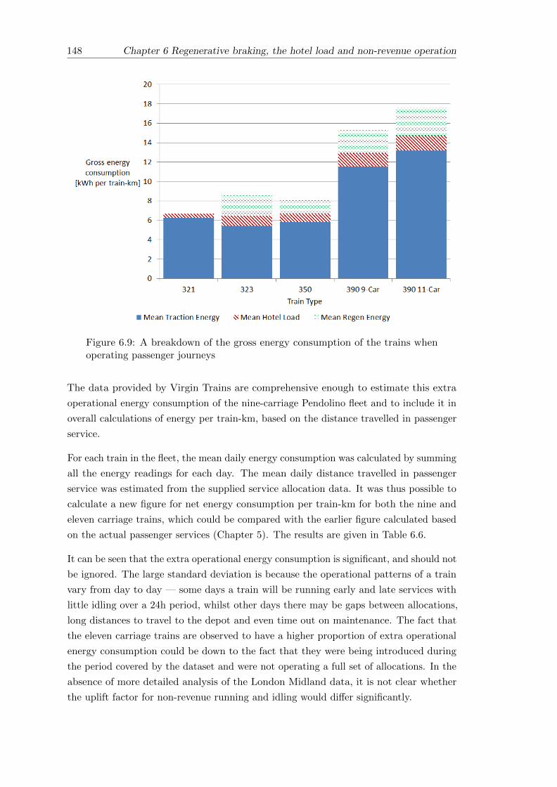
148 Chapter 6 Regenerative braking, the hotel load and non-revenue operation
Figure 6.9: A breakdown of the gross energy consumption of the trains whenoperating passenger journeys
The data provided by Virgin Trains are comprehensive enough to estimate this extra
operational energy consumption of the nine-carriage Pendolino fleet and to include it in
overall calculations of energy per train-km, based on the distance travelled in passenger
service.
For each train in the fleet, the mean daily energy consumption was calculated by summing
all the energy readings for each day. The mean daily distance travelled in passenger
service was estimated from the supplied service allocation data. It was thus possible to
calculate a new figure for net energy consumption per train-km for both the nine and
eleven carriage trains, which could be compared with the earlier figure calculated based
on the actual passenger services (Chapter 5). The results are given in Table 6.6.
It can be seen that the extra operational energy consumption is significant, and should not
be ignored. The large standard deviation is because the operational patterns of a train
vary from day to day — some days a train will be running early and late services with
little idling over a 24h period, whilst other days there may be gaps between allocations,
long distances to travel to the depot and even time out on maintenance. The fact that
the eleven carriage trains are observed to have a higher proportion of extra operational
energy consumption could be down to the fact that they were being introduced during
the period covered by the dataset and were not operating a full set of allocations. In the
absence of more detailed analysis of the London Midland data, it is not clear whether
the uplift factor for non-revenue running and idling would differ significantly.

Chapter 6 Regenerative braking, the hotel load and non-revenue operation 149
Table 6.6: A comparison of total energy consumption with that during passengerservice for the Pendolino
Train Length 9 carriages 11 carriages
Total energy consumption[kWh per train-km]
14.33 16.92
Standard deviation 9.25 11.9
Mean net energyconsumption when inpassenger service[kWh per train-km]
12.93 14.75
% difference between totalenergy consumption and thatwhen in passenger service
11% 15%
When matching trains to known schedules (Chapter 4), non-revenue journeys (those with
a headcode beginning with a “5”) were not easily matched with scheduling data for a
variety of reasons. These include the fact that when locating the train to a point on the
network it wasn’t always easy to distinguish between the stations and the sidings, and
the fact that these journeys can be highly variable and subject to last minute scheduling
changes. Nonetheless, it was possible to analyse a small number of non-revenue journeys
made by Class 323 units, the results of which are given in Table 6.7.
Table 6.7: Summary energy data for non-revenue journeys operated by Class323 trains
Estimated mean hotel load [kWh per minute] 0.72
Mean net energy consumption[kWh per train-km]
4.4
Standard deviation 1.02
It can be seen that the mean net energy consumption for these non-revenue runs is over
30% less than the mean net energy consumption for the Class 323 when in passenger
service (calculated as 6.49 kWh per train-km in Chapter 5). This will be because there
are no intermediate stops en route, leading to a much higher stopping density of 22.5km,
and may also be a reflection of lower running speeds. The hotel load appears lower on
non-revenue runs (Table 6.7) than that given in Table 6.5, which could be explained by
a lack of demand for heating and use of power-doors.

150 Chapter 6 Regenerative braking, the hotel load and non-revenue operation
6.8 Conclusions
Having quantified the energy recovered by regenerative braking systems (where fitted),
it was found that the empirical data studied here are broadly in line with observations
made in published literature. It is clear that regenerative braking systems have significant
potential to reduce the net energy consumption, with the systems typically saving 15%
of the gross energy on intercity services operated by the Pendolino, rising to over 23%
on inner-suburban services operated by the Class 323, where regular periods of braking
form a dominant aspect of the service. It was postulated that the observed variation
in the energy recovered by the regenerative braking systems on each train could be
explained by a similar set of explanatory factors used to explain the variation in net
energy consumption overall (Chapter 5), and each factor was explored in turn with a
basic linear regression model. It was found that aspects of the route and the driving
style dominated, and these are considered in more detail in Chapter 8.
It was more difficult to quantify the hotel load, because traction energy and auxiliary
energy are not metered separately. Stationary energy readings were used to make some
estimation, but it was found that this was quite prone to error. Distinctions were made
between the stationary energy when stabled (i.e. not part of a service) and when running
a service. Some of the hotel load estimates were considered to be unrepresentative of the
journey as a whole because they were taken whilst the train was stationary at a platform
and subject to use of powered external doors and increased airflow. Some variation in
hotel load with temperature was observed as a result of the fact that HVAC systems
typically make up a large part of the auxiliary systems, but the data were subject to
inaccuracies.
Trains can be left partially powered overnight and between services, whilst idling in
stations and running empty to/from the depot can all add to the energy consumption,
even though these aspects are not directly attributable to a single passenger service.
The additional energy costs of non-revenue running and idling were calculated for the
Pendolino, where it was found that on average they add a further 11% to the net energy
consumption for each passenger service. Chapter 9 considers not just such “inactive”
operation but also the other life-cycle energy costs associated with the provision of a
transport system.

Chapter 7
Modelling the energy
consumption of a train
7.1 Introduction
Because empirical data are sometimes difficult to obtain, simulations are often used
to estimate the operational energy consumption of and — by extension — the GHG
emissions from a train. This chapter introduces some basic principles of estimating the
energy consumption of a train and goes onto describe the RouteMaster tool developed
with Arup, which can estimate the traction energy consumed by a train. This was a
key aspect of the work for industry which formed part of this research. The tool was
validated against some of the empirical data obtained from Virgin Trains, where it was
found that the simplistic modelling of the driving style limits its usefulness for accurately
predicting variations in energy consumption between routes.
7.2 An overview of the energy consumption of a train
Jong and Chang (2005) suggest that a complete energy estimation model for electric
trains includes at least three parts — the energy used by the traction motors, the
energy consumed by auxiliary equipment (the hotel load), and the energy produced by
regenerative braking systems (and subsequently returned to the grid). Not all trains are
fitted with regenerative braking systems, but this broad breakdown seems sensible.
Mathematically, the UIC (2003) suggest the following formula for the net energy
consumption of a train:
Enet =1
χ(Ekin+pot + Erun + Ecomfort)− χβEkin+pot (7.1)
151

152 Chapter 7 Modelling the energy consumption of a train
Where:
Enet is the net energy intake.
Ekin+pot is the sum of the energy required at the wheels to accelerate the train or
climb a slope.
Erun is the energy required at the wheels to overcome running resistance (mechanical
friction and air resistance).
Ecomfort is the hotel load.
χ is a measure of the energy efficiency of the whole system, and is used to account
for losses. It is defined by the UIC as the “energy output divided by the energy
intake for a certain period of time.” In this case, the “energy output” includes the
hotel load and the total energy required at the wheels.
β is a measure of the share of the braking effort attributed to the motor braking
force which in a regenerative braking system converts the kinetic and potential
energy of the train back into electricity. It also takes into account the efficiency
of the regenerative braking system. If the train is not fitted with a regenerative
braking system, β is zero.
This formula can be broken into the three separate components suggested by Jong and
Chang (2005) as follows:
Enet =1
χ(Ekin+pot + Erun) +
1
χ(Ecomfort)− χβEkin+pot (7.2)
Where:
Enet = Total net energy consumption.
1χ (Ekin+pot + Erun) = Traction energy.
1χ (Ecomfort) = Hotel load.
χ β Ekin+pot = Energy recovered from regenerative braking
The relative contribution of each of these three components could be expected to vary
with the type of train and the type of route, as illustrated in Figure 7.1. In line with the
findings in Chapter 6, the total traction energy (required to overcome running resistance,
gravitational resistance on a slope and to provide acceleration) appears to be universally
dominant compared with the hotel load.

Chapter 7 Modelling the energy consumption of a train 153
Figure 7.1: Typical composition of energy demand for different operation/tractionclasses (Taken from: UIC, 2003, Figure 8)
7.3 Modelling the traction energy of a train
It has been seen that a key component of the traction energy of a train is the energy
required to overcome resistance due to friction and aerodynamic drag. Modelling this can
be challenging. Although it can be calculated theoretically, with the help of computational
fluid dynamics (CFD) “the approaches are complex, require knowledge of very many
parameters and do not necessarily lead to useable train resistance data” (Rochard and
Schmid, 2000, p.186). Rochard and Schmid go onto suggest that the resistance of a train
can be “estimated by the application of a sufficiently accurate empirical calculation tool,”
several of which are subsequently reviewed in their paper.
One such method of calculating the resistance encountered by a moving train is the
widely-used Davis Equation. This is briefly introduced here, followed by a brief discussion
of some of the resistance forces it does not model. The concept of calculating the “work
done” by the applied tractive forces, leading to overall estimates of traction energy
consumption, is then explained.

154 Chapter 7 Modelling the energy consumption of a train
7.3.1 The Davis Equation
The resistance force experienced by a moving train, R, can be approximated by the Davis
Formula (Rochard and Schmid, 2000) — an empirical quadratic function of the train’s
velocity v, written as:
R = A+Bv + Cv2 (7.3)
If R is in Newtons (N) and v is in meters per second (ms−1), then the coefficients A,
B and C have units N, Nsm−1 and Ns2m−2 respectively, although in this thesis the
values are scaled for velocities in terms of km/h. A and B include the mechanical
resistances (and are mass related), whilst the third term accounts for the aerodynamic
resistance (Rochard and Schmid, 2000). Numerous methods are available for calculating
these coefficients (RSSB, 2010b); these may include full-scale empirical testing, results
from a wind-tunnel (full-scale or otherwise) or use of other empirical relationships. For
example, Armstrong and Swift (cited by Rochard and Schmid, 2000), created empirical
relationships to calculate the Davis coefficients for a British Rail EMU. These are used
to estimate A, B and C from other known measurements of the train, including the total
mass of the power cars, the total mass of the trailer cars, a drag coefficient, the length
and cross-sectional area and the intervehicle gap.
Sample values for the Davis coefficients for three different types of train are given in
Table 7.1. The standard coefficients for the Suburban and Intercity trains are taken from
RSSB (2010b) and are based on the UK Class 357 Electrostar (RSSB Train A) and the
Pendolino (RSSB Train D) respectively. The values for the High-Speed train are taken
from those attributed to the AGV-11 (SYSTRA, 2011).
Table 7.1: Sample Davis coefficients for different types of train
Train SuburbanElectric
IntercityElectric
High-SpeedElectric
DavisCoefficients
A 2158 5311 2500
B 5.384 21.696 29
C 0.4158 0.9097 0.45
The resistance curves for each of these trains were generated using the Davis Equation
(Equation 7.3) and are plotted in Figure 7.2.
It is well documented — for example by RSSB (2010b) and by Raghunathan, Kim, and
Setoguchi (2002) — that the value of C is proportional to both the length of the train
and the head and tail drag coefficients. It is therefore likely that train length is a key
reason for the fact that the High Speed and Intercity trains (comprising 10 and 9 vehicles
respectively) experience a greater resistance force than the Suburban train (comprising

Chapter 7 Modelling the energy consumption of a train 155
Figure 7.2: Davis Resistance curves for three types of train
just 4 vehicles). The fact that the High-Speed train experiences less resistance than the
Intercity train may well be down to reduced head and tail drag coefficients.
7.3.2 Other resistance forces
The Davis Formula (Equation 7.3) only covers inertia and running resistance. Other
forces include grade resistance (the additional force required to overcome gradient)
and curve resistance (the added resistance experienced by a train operating through
a horizontal curve) (AREMA, 2003). The energy required to overcome a gradient is
explicitly mentioned in Figure 7.1 and separated from other running resistances in the
UIC equation for modelling energy consumption (Equation 7.1), but curve resistance
is not explicitly treated in either case. Curve resistance and grade resistance can be
neglected if the additional assumption is made that the track is straight and level.
7.3.3 Work done and energy consumption
The work done by a moving train can be calculated by multiplying the applied force by
the distance moved. The work done, E, by the train exerting tractive effort T over a
distance d is thus estimated by:
E = Td (7.4)

156 Chapter 7 Modelling the energy consumption of a train
If T is given in Newtons (N) and d is given in meters (m) then this gives work done
in terms of joules (J). One kWh is 3.6 megajoules (MJ). The assumption is that T is
constant over the given distance; which is reasonable if d is chosen to be small enough or
the velocity and resistance forces both remain constant. On this basis, the work done
over a whole route can be estimated by dividing the route into appropriate segments and
summing the work done for each one.
In any case, something must be known about the tractive effort, T, in order to model the
work done, E. If the train is moving at constant velocity, then T is equal and opposite to
the total resistance force, R; hence the importance of knowing the resistance to motion.
If the train is accelerating, and both the mass of the train m and the rate of acceleration
a are known at a given point, then according to Newton’s second law:
T = ma (7.5)
If the rate of acceleration also needs to be determined, further data about the tractive
performance of the specific train need to be obtained. When a train is decelerating, no
forward force is applied and T is zero on level track.
The actual energy required to move the train will be greater, due to the fact that the
traction and transmission systems are not 100% efficient (in one example, RSSB (2007,
p.23) assume that the efficiency of the traction system is 85%).
7.3.4 An alternative equation for energy consumption
An alternative equation for energy consumption per vehicle kilometre is given by Schafer
et al. (2009, page 105), assuming movement on a horizontal surface:
E =1
η(A+D +R) (7.6)
Where:
• η is the efficiency of the propulsion system
• A is the acceleration resistance or vehicle inertia
• D is the aerodynamic drag
• R is the rolling resistance

Chapter 7 Modelling the energy consumption of a train 157
A is defined as A = ma where m is the vehicle mass and a is acceleration.
D is defined as D = cDS(ρ2v2) where CD is the vehicle’s aerodynamic drag coefficient, S
is its cross-sectional area, v is its speed and ρ is the density of air.
R is defined as R = cRmg where cR is the rolling resistance coefficient and g is the
acceleration due to gravity.
Although Schafer et al. (2009) describe this equation in the context of road vehicles, it is
equally applicable to rail vehicles. The quadratic dependence on vehicle speed, and the
similarities with the Davis Equation (Equation (7.3)) are evident.
7.4 Introduction to the Arup RouteMaster tool
Arup’s RouteMaster tool is a Microsoft Excel Addin, written originally to model predicted
running speed and running times for a train over a given route. Work for this thesis
included development of the tool so that the outputs now include an estimation of the
tractive effort expended and work done by the train. The basic principle follows the
concept introduced in Section 7.3.3, of breaking the route down into segments, calculating
the work done along each one (Equation 7.4) and summing the results along the whole
route. Arup provided some existing train resistance and tractive effort data for a range
of UK rolling stock. The data were originally in a standard format used by proprietary
software such as RailSys and Dynamis, so they were converted into a more suitable
format and the rolling stock library used by RouteMaster was updated accordingly.
As well as the additional functionality to calculate and output tractive effort and work
done, enhancements made to the tool include improvements to the User Interface (UI)
and the design of the output worksheets. The underlying code was re-written and broken
down into modules to aid further development. These developments were necessary to
fulfil the aim of making sure that Arup could make good use of the tool.
The model’s main input is a route profile, which provides information about a section
of railway — including the Static Speed Profile (SSP), gradients and the location of
stops. Once the train type has been selected, the model uses resistance and braking
performance data to determine a maximum speed profile for the train over the route,
taking into account the SSP and braking distances for speed reductions and stops. It
then uses tractive effort data to ascertain the actual attainable performance of the train
within the limits of the speed profile.
An important aspect of the RouteMaster tool is that it is quite simple, requiring little
customisation or specialist knowledge, but it is possible to change various parameters
in order to incorporate some aspects of driving style into the model. For example, it is
unlikely in reality that a driver will always apply maximum tractive effort or braking

158 Chapter 7 Modelling the energy consumption of a train
force, so the option is available to cap each of the maximum applied tractive effort and
braking force (in percentage terms).
7.5 Validation of the Arup RouteMaster tool
From the empirical energy data provided by Virgin Trains, data for four specific service
patterns (outbound and return journeys over each of two routes) were chosen as a basis
for validation of the RouteMaster tool. The first route chosen is between London Euston
and Wolverhampton, with five stops and a mean distance between them of approximately
35km. It was chosen for its relatively high stopping density (which could lead it to be
classified as an “inter-urban” rather than an “intercity” route) and its similarity to a
service already studied in some detail by RSSB (2010b). The second is between London
Euston and Manchester Piccadilly, with three stops and a much higher mean stop spacing
of 73km. The stop spacing is less uniform than that on the chosen Wolverhampton
service, and the very long first section, amounting to 235km of non-stop running, makes
it an interesting choice for more in-depth study. Both outbound and return journeys
were considered in each case. The use of different routes and service patterns also allows
some understanding to be gained of why different aspects of the route and service were
found to be important explanatory variables in Chapter 5.
Service timings were obtained extracts from the Network Rail TSDB (Network Rail, 2012)
and distances were obtained from the RailMiles mileage engine (swlines Ltd. 2012a) as
described in Section 3.3.1. Gradient profiles were measured from “British Rail Mainline
Gradient Profiles” (Allan, 1966). Line speed data were obtained from Network Rail
(2013b) and supplemented by study of the supplied on-train monitoring data from Virgin
Trains where data were missing or subject to ambiguity; the Network Rail data showed
that there were some differences between the fast and slow lines and did not always
appear to contain the higher speed limits, designated Enhanced Permissible Speed (EPS),
which are applicable to the Pendolino fleet (they are fitted with tilting technology). For
the London Euston to Wolverhampton route, it was possible to compare the gradient and
line speed profiles with those given by RSSB (2010b), and a good match was observed.
The majority of services considered departed between 11am and 7pm on a Sunday. This
was because it was desirable to ensure that the comparisons made between each route
were as fair as possible and most of the matching energy data — especially for the
Manchester services with a long non-stop section — corresponded to weekend departures.
Although it is acknowledged that Sunday services are more susceptible to delays and
alterations due to Engineering Work, care was taken to ensure that only those services
matching a particular total journey time and stopping pattern were considered.

Chapter 7 Modelling the energy consumption of a train 159
7.5.1 London Euston to Wolverhampton
The first route chosen for comparison was the route between London Euston and
Wolverhampton, which was included in the studies undertaken by RSSB (2010b).
RSSB considered an off-peak service departing from London Euston at 10.23, with
five intermediate stops and a total journey time of 106 minutes (Headcode 1G14).
Subsequent timetable changes have meant that the number of matching journeys in the
energy data supplied by Virgin Trains were limited, and the schedules chosen for analysis
here have a total journey time of 108 minutes. The return services (not considered by
the RSSB) have a total journey time of 110 minutes.
Summaries of the chosen service patterns are given in Table 7.2 (outbound journey) and
Table 7.3 (inbound journey). The route profile, showing the gradient and line speed,
limit is illustrated in Figure 7.3.
Table 7.2: A summary of the station calls on the chosen service pattern betweenEuston and Wolverhampton
Stop Distance fromorigin [km]
Typical journeytime from origin
[min]
Typical dwelltime [s]
Watford Junction 28 13 90
Coventry 151.2 61 120
BirminghamInternational
168.5 72 120
Birmingham NewStreet
181.7 84 240
Sandwell & Dudley 190.3 96 90
Wolverhampton 202.6 108 (terminates)

160 Chapter 7 Modelling the energy consumption of a train
Table 7.3: A summary of the station calls on the chosen service pattern betweenWolverhampton and Euston
Stop Distance fromorigin [km]
Typical journeytime from origin
[min]
Typical dwelltime [sec]
Sandwell & Dudley 12.2 9 90
Birmingham NewStreet
20.9 20 240
BirminghamInternational
34.2 32 120
Coventry 51.4 44 120
Watford Junction 174.6 90 90
London Euston 202.6 110 (terminates)
Figure 7.3: Line speed and gradient profiles for the service from Euston toWolverhampton
7.5.2 London Euston to Manchester Piccadilly (via Stoke-on-Trent)
The second route chosen for analysis was that between London Euston and Manchester
Piccadilly, via Stoke-on-Trent. This is a longer journey than the one to Wolverhampton,
and the services chosen for analysis ran non-stop between London Euston and Stoke-on-Trent
— a distance of 235km.

Chapter 7 Modelling the energy consumption of a train 161
Summaries of the chosen service patterns are given in Table 7.4 (outbound journey) and
Table 7.5 (inbound journey). The route profile, showing the gradient and line speed limit,
is illustrated in Figure 7.4.
Table 7.4: A summary of the station calls on the chosen service pattern betweenEuston and Manchester
Stop Distance fromorigin [km]
Typical journeytime from origin
[min]
Typical dwelltime [sec]
Stoke-On-Trent 235 89 120
Macclesfield 267 106 90
Stockport 286 120 90
ManchesterPiccadilly
296 131 (terminates)
Table 7.5: A summary of the station calls on the chosen service pattern betweenManchester and Euston
Stop Distance fromorigin [km]
Typical journeytime from origin
[min]
Typical dwelltime [sec]
Stockport 9 7 120
Macclesfield 28 19 90
Stoke-On-Trent 60 36 90
London Euston 296 131 (terminates)

162 Chapter 7 Modelling the energy consumption of a train
Figure 7.4: Line speed and gradient profiles for the service from Euston toManchester
7.5.3 Empirical energy data for the selected services
The journeys corresponding to these service patterns were identified in the energy data
supplied by Virgin Trains. A summary of the observed energy consumption data for
nine-carriage Pendolino trains for each of the four services selected for analysis is given
in Table 7.6.
The mean net energy consumption for all four services together is 12.89 kWh per train-km.
Table 7.7 compares the mean net energy consumption for each service individually with
this overall value, to give some idea of the relative performance of each service. Table 7.7
also defines the relative energy consumption of each service, taking the service with
the lowest mean net energy consumption (Wolverhampton to Euston) as 1. This is a
useful measure when assessing simulation parameters, because a key aim is to be able to
predict how the energy consumption may vary between different types of route even if
assumptions made by the simulation preclude the calculation of a completely accurate
figure for the net energy consumption.
It can be seen from Table 7.7 that — as was noted in Section 5.4.2 - Down services (away
from Euston)1 use more energy than the mean, and Up services (towards Euston) use
less energy than the mean. The gradient is likely to be an important factor here — the
route is initially uphill out of Euston in both cases and remains predominantly uphill
1In line with British practice, services towards London are referred to as “Up” and services away fromLondon are referred to as “Down”.

Chapter 7 Modelling the energy consumption of a train 163
Table 7.6: Summary of available energy data for selected journeys operated bythe nine-carriage Pendolino
Service Euston toWolverhampton
Wolverhamptonto Euston
Euston toManchester
Manchesterto Euston
Number ofjourneyssampled
511 523 2804 1161
Mean net energyconsumption[kWh per train-km]
13.75 11.98 13.21 12.63
Standarddeviation ofmean net energyconsumption
1.14 1.23 0.92 0.94
Mean fraction ofgross energyregenerated [%]
15% 19% 15% 16%
Mean total grossenergyconsumed perjourney [kWh]
3346 3025 4627 4486
Mean totalenergyregenerated perjourney [kWh]
561 596 726 753
Mean total netenergyconsumed perjourney [kWh]
2427 2783 3901 37 30
Estimated hotelload per journeybased onobservation[kWh]
418 303 381 389
Estimated hotelload per journeyat 10% of netkWh consumed
243 278 390 373

164 Chapter 7 Modelling the energy consumption of a train
Table 7.7: Comparison of mean net energy consumption across all four services
Service Euston -Wolverhampton
Wolverhampton- Euston
Euston -Manchester
Manchester -Euston
Mean net energyconsumption[kWh per train-km]
13.75 11.98 13.21 12.63
Difference fromoverall mean [%]
6.7% -7.1% 2.5% -2.0%
Mean net energyconsumptionrelative toWolverhampton- Euston = 1
1.15 1.00 1.10 1.05
for the service to Wolverhampton (Figure 7.3). The variation either side of the mean is
greater for the Wolverhampton services than it is for the Manchester services, and one
reason for this could be that the station calls are all on an upward gradient for the Down
Wolverhampton services (Figure 7.3) whereas the Manchester services are more balanced;
some of the station calls on the Down Manchester services are on a downward gradient
(Figure 7.4), reducing the tractive effort required when accelerating from a stop.
It is also noted that the mean energy consumption for the Up and Down Wolverhampton
services is marginally higher than the mean energy consumption for the Up and Down
Manchester services; the difference in stopping density is likely to be a reason for this.
Timetabling is likely to be another factor — it is noted that the Up Wolverhampton
service has an extra two minutes over the Down service, which would allow for a slightly
lower running speed and/or more opportunities for coasting. In its current incarnation,
RouteMaster does not take these things in to account, but the observed variation in
driving style on these services is explored further in Chapter 8.
7.5.4 Finding the input parameters which best match the timetabled
performance
Varying the tractive effort and braking force has an impact on the simulated journey
timings. For each of the routes studied here, the tractive effort and braking parameters
were varied in order to find the combination which best matched the actual service
timetable. A load factor of 40%, in accordance with typical observations about intercity
services (See Section 10.2.4) was assumed in all cases. Table 7.8 shows the tractive effort
and braking combinations which led to the best simulated match in terms of overall
journey time. In each case, the discrepancy in terms of total journey time between the
service timetable and the RouteMaster simulation was less than 30 seconds.

Chapter 7 Modelling the energy consumption of a train 165
Table 7.8: The RouteMaster tractive effort and braking parameters which bestmatched the overall timings for the services
Service Maximum TractiveEffort [%]
Maximum Braking Force[%]
Euston - Wolverhampton 50 70
Wolverhampton - Euston 50 40
Euston - Manchester 40 40
Manchester - Euston 40 80
Given that more tractive effort is required to accelerate a train than to maintain a
constant speed, it is intuitive that the Wolverhampton services require a higher level
of tractive effort to maintain the overall timings than the Manchester services, which
have fewer stops. The Down Wolverhampton and Up Manchester services require more
braking effort than the others. This is likely to be because of the locations of stops and of
line speed restrictions, where the need to accelerate and decelerate over a short distance
downhill will require a greater braking force.
Figure 7.5 compares the distance-time profile simulated by RouteMaster for the Euston to
Wolverhampton service with the actual service timetable. The RouteMaster parameters
were the same as those in Table 7.8, and it can be seen that although there is a good
match with overall journey time, there is some discrepancy with the intermediate timings
en route. The speed-distance profile simulated by RouteMaster is given in Figure 7.6,
where the reasons for the discrepancy become apparent — by limiting the maximum
tractive effort, the train does not always reach the maximum line speed, and cannot
maintain speed on some gradients.
Increasing the maximum applied tractive effort to enable the train to maintain speed on
the gradients meant that the overall journey time was reduced and no longer compared
favourably with the timetable. This is because RouteMaster assumes that the train will
maintain the maximum permitted line speed as far as possible, which may not be the
case in reality.

166 Chapter 7 Modelling the energy consumption of a train
Figure 7.5: Distance time plots for the Euston — Wolverhampton service,comparing the timetable with the output of the RouteMaster tool
Figure 7.6: Output from RouteMaster for the Euston — Wolverhampton servicewith a tractive effort cap of 50% and a braking cap of 70%

Chapter 7 Modelling the energy consumption of a train 167
7.5.5 Using RouteMaster to predict energy consumption
The net traction energy per train-km (taking into account regenerative braking) was
calculated for each route according to the parameters in Table 7.8. A powertrain efficiency
of 0.85 (RSSB, 2007) was assumed, and the outputs increased accordingly. Similarly, a
hotel load equivalent to 10% of the net energy consumption was assumed, and the data
were increased again accordingly. These estimations are detailed in Table 7.9.
Table 7.9: Net energy consumption data from RouteMaster assuming parametersgiven in Table 7.8
Service Net tractionenergy
consumptionestimated byRouteMaster
[kWh per train-km]
Traction energyconsumption
accounting forpower train
efficiency[kWh per train-km]
Net energyconsumption
accountingadditionally for
hotel load[kWh per train-km]
Euston -Wolverhampton
11.07 13.02 14.47
Wolverhampton -Euston
8.77 10.32 11.46
Euston - Manchester 8.9 10.47 11.63
Manchester - Euston 10.03 11.8 13.11
The mean net energy consumption, including powertrain inefficiencies and hotel load,
was therefore estimated to be 12.67 kWh per train-km for the four routes considered.
This is just 2% less than the observed mean net energy consumption, but it should be
acknowledged that assumptions have been made about passenger loading and the hotel
load. Furthermore, RouteMaster does not consider some resistance forces, such as those
due to track curvature, and it is not clear whether they would have a significant impact
(it is, however, noted, that the WCML is highly curved and the Pendolino trains are
tilt-enabled as a result).
Table 7.10 compares the estimated energy consumption for each route with this calculated
overall mean. It is a direct parallel of the data contained in Table 7.7, which is based on
empirical findings — comparing the two tables, it can be seen that RouteMaster does
not accurately predict the relative variation between routes with these parameters.
The exercise was repeated assuming a 100% application of tractive effort and braking
force in all cases (known as “all out running”), in order to assess whether it had
been beneficial to make any assumptions about driving style. The mean net energy
consumption, including powertrain inefficiencies and hotel load, was therefore estimated
to be 16.23 kWh per train-km for the four routes considered, and the data for each route
are summarised in Table 7.11.

168 Chapter 7 Modelling the energy consumption of a train
Table 7.10: Comparison of mean net energy consumption across all four servicesusing RouteMaster data assuming parameters given in Table 7.8
Service Euston -Wolverhampton
Wolverhampton- Euston
Euston -Manchester
Manchester -Euston
Mean net energyconsumption[kWh per train-km]
14.47 11.46 11.63 13.11
Difference fromoverall mean [%]
14 -10 -8 3
Mean net energyconsumptionrelative toWolverhampton- Euston = 1(RouteMaster)
1.26 1 1.01 1.14
Mean net energyconsumptionrelative toWolverhampton- Euston = 1(EmpiricalValue)
1.15 1 1.1 1.06
Table 7.11: Comparison of mean net energy consumption across all fourservices using RouteMaster data assuming maximum tractive effort and brakingperformance
Service Euston -Wolverhampton
Wolverhampton- Euston
Euston -Manchester
Manchester -Euston
Mean net energyconsumption[kWh per train-km]
16.52 15.05 16.8 16.54
Difference fromoverall mean [%]
2 -7 4 2
Mean net energyconsumptionrelative toWolverhampton- Euston = 1(RouteMaster)
1.1 1 1.12 1.1
Mean net energyconsumptionrelative toWolverhampton- Euston = 1(EmpiricalValue)
1.15 1 1.1 1.06

Chapter 7 Modelling the energy consumption of a train 169
It can be seen that the relative variation between routes becomes less pronounced
if maximum braking and tractive effort are assumed. Furthermore, the estimates of
regenerative braking were found to be reduced as a result of the increased tractive effort
and braking force, and the overall mean for the data in Table 7.11 exceeds the empirical
mean by 25%.
7.5.6 The importance of modelling gradient
Although gradient data have been obtained in this instance, it cannot be assumed that
it will always be readily available. To assess the importance of including such data,
the simulations were re-run with the parameters in Table 7.8 and with the assumption
that each route is completely flat. The results are given in Table 7.12. The mean net
energy consumption, including power train inefficiencies and hotel load, was estimated
to be 12.79 kWh per train-km for the four routes considered, which is within 1% of the
empirical mean.
Table 7.12: Comparison of mean net energy consumption across all four servicesusing RouteMaster data assuming parameters given in Table 7.8 and assumingno gradients
Service Euston -Wolverhampton
Wolverhampton- Euston
Euston -Manchester
Manchester -Euston
Mean net energyconsumption[kWh per train-km]
14.08 12.14 13.32 11.62
Difference fromoverall mean [%]
10 -5 4 -9
Mean net energyconsumptionrelative toWolverhampton- Euston = 1(RouteMaster)
1.16 1 1.1 0.96
Mean net energyconsumptionrelative toWolverhampton- Euston = 1(EmpiricalValue)
1.15 1 1.1 1.06
It can be seen that excluding gradient made no significant difference to the overall
estimated mean energy consumption, or to the estimated energy recovered by the
regenerative braking system. Table 7.12 shows that when gradient data are excluded,
the estimated energy consumption relative to the Up Wolverhampton to Euston service

170 Chapter 7 Modelling the energy consumption of a train
reflects the empirical data for the Down Wolverhampton service and Down Manchester
service. This indicates that the locations of stops and of line speed limits may be a key
reason for the observed variation, although it would be unwise to conclude much from
this table.
In any case, RouteMaster should to be able to make good relative comparisons between
routes when gradient data are known, and it is clear from Table 7.10 that the use of
constant parameters for tractive effort and braking is not adequate.
7.6 Comparisons with other simulation work & plans for
future development
Care should be taken when comparing RouteMaster with other simulation work, because
different tools have different aims. The aim of the RouteMaster tool is not to accurately
model a particular scenario in detail, but to be able to make simple comparisons between
different scenarios. On that basis, work by RSSB (2010b) seems the most relevant for
comparison. The RSSB simulation is based on similar principles to RouteMaster, but
accounts for coasting and makes different assumptions about the traction and braking
performance. The “average power level” is given to be 2/3 of the maximum available,
which exceeds the parameters chosen for RouteMaster (Table 7.8). However, it is not
clear whether, as with RouteMaster, this is applied constantly. It is assumed that the
maximum refers to the maximum for a given speed, given the fact that the maximum
tractive effort a train produces decreases with increasing speed. The published results
from the RSSB simulation tend to indicate a higher energy consumption than the results
from RouteMaster, and from the empirical data collected. This may be as a result of the
higher maximum tractive effort assumed.
It is also interesting to note that the RSSB simulation follows industry practice, and
rounds up the timings at each station. Furthermore, timing comparisons are made with
the Working Timetable (WTT) and consider intermediate timing points and stations
rather than just end-to-end journey time.
7.7 Conclusions
This chapter has introduced the principles of modelling the energy consumption of a
train, which is typically broken down in to traction energy, hotel load and — where
applicable — the energy recuperated via a regenerative braking system. Traction energy
is the dominant component, and can be estimated by considering the work done to
overcome resistance forces encountered by the train. The Davis Equation is widely used
to model the resistance forces, although it does not consider everything.

Chapter 7 Modelling the energy consumption of a train 171
The Arup RouteMaster tool is a simple model used to estimate the performance of a
given train over a given route, whose outputs have been expanded to include estimated
work done and tractive effort. Four service patterns, comprising return journeys over
two routes, were analysed and used to validate the tool. Schedule data from Network
Rail’s TSDB were used to compare the outputs from RouteMaster with the timetable
and adjust the limited input parameters accordingly. It was found that a relatively low
tractive effort cap (about 40% of the maximum available) was typically required for the
end-to-end journey times from RouteMaster to match the schedule, but it was noted that
the use of constant tractive effort and braking caps meant that the predicted performance
of the train at intermediate points did not match the schedule.
Having made assumptions about the efficiency of the traction system and the size of the
hotel load, the estimated energy consumption output by RouteMaster was compared with
empirical energy data from Virgin Trains, which had been matched to known schedules
in Chapter 4. When it came to the overall mean, the RouteMaster figure was within
2% of the empirical data. However, RouteMaster did not correctly predict the relative
variation in energy consumption between routes. As with the observed discrepancies in
timing between RouteMaster and the empirical data, a key reason for this is the use of
constant tractive effort and braking caps, and the fact that coasting is not modelled at
all. Following consideration of the route profiles, it was postulated that gradient is a key
reason for variation in energy consumption. By not allowing for increased tractive effort
to keep time uphill or coasting to save energy downhill, RouteMaster cannot model these
effects properly. When gradient was not included in the RouteMaster profile, the relative
variations between routes were predicted better, suggesting that other factors such as
stopping density are indeed important. When “all out running” (maximum tractive effort
and braking force) was modelled, the RouteMaster mean net energy consumption was
more than 25% above the observed empirical mean — this emphasises the effect which
simulation parameters can have and goes some way towards explaining the variation
observed in the literature in Section 2.5.
Overall, although RouteMaster can be useful for basic estimations, it must be concluded
that driving style needs to be better understood and modelled. For this reason, OTMR
data for the four services considered here are analysed in more depth in Chapter 8.


Chapter 8
Taking into account driving style
and refining simulation
parameters
8.1 Introduction
Analysis of empirical data has shown that there may be significant variation in the net
energy consumed (on a per train-km basis) between individual journeys. In Chapter 5,
Analysis of Variance was undertaken using simple general linear models, and the dominant
causes of variation were found to be driving behaviour (where data were available to
identify the fact that different services were operated by different drivers) and aspects
of the route and service. Chapter 7 introduced the concepts of modelling the energy
consumption of a train, and the Arup RouteMaster model was described and validated
against the empirical data. The RouteMaster model makes very simplistic assumptions
about the driving style, and it was found that this makes it inadequate for estimating the
relative variation in energy consumption between different routes. This chapter explores
the observed variation in driving style and makes use of OTMR data to understand how
tractive and braking effort might be expected to vary.
Because of the size of the dataset, it was not possible to consider the OTMR data for all
journeys. The four services described in Section 7.5 — Up and Down services between
Euston and Manchester, and between Euston and Wolverhampton — were therefore
chosen for detailed investigation.
173

174 Chapter 8 Taking into account driving style and refining simulation parameters
8.2 Variations between individual drivers
It has been seen that DriverID is one of the most important explanatory variables for net
energy consumption (Chapter 5) and for regenerative braking performance (Chapter 6).
Chapter 5 considered the observed variation in mean net energy consumption for different
drivers for all the nine-carriage Pendolino journeys which were analysed. Figure 8.1
shows the variation in mean net energy consumption for different drivers when operating
the four services under detailed consideration here. To minimise the impact of anomalous
journeys, those DriverIDs which appeared fewer than five times in the database for this
subset of services were excluded.
Figure 8.1: Variation in mean net energy consumption of the drivers operatingthe four services under consideration
Following the pattern in Chapter 5, each DriverID was allocated an efficiency rating
based on the mean net energy consumption whilst operating these four services. These
efficiency ratings are summarised in Table 8.1.
OTMR data were used to analyse the driving controls for each journey, with the aim of
understanding what makes some drivers more efficient than others. In simple terms, the
train driver can apply traction (to move the train), apply the brakes (to stop the train)
and adjust the amount of tractive effort or braking force used. The OTMR data logged
every instance of the traction being enabled or disabled, every instance of the brakes
being applied or disengaged and every change in the percentage of power applied.

Chapter 8 Taking into account driving style and refining simulation parameters 175
Table 8.1: Driver efficiency ratings defined for the services studied
Efficiency Rating Criteria Range of Mean EnergyConsumption
[kWh per train-km]
1 Mean energy consumptionbelow the first quartile for alldrivers when operating theservices studied here.
E < 12.70
2 Mean energy consumptionbetween the first quartile andthe median for all driverswhen operating the servicesstudied here.
12.70 ≤ E < 13.08
3 Mean energy consumptionbetween the median and thethird quartile for all driverswhen operating the servicesstudied here.
13.08 ≤ E < 13.46
4 Mean energy consumptionabove the third quartile forall drivers when operatingthe services studied here.
E ≥ 13.46
8.2.1 Overall comparisons
When considering the overall mean application of tractive effort or braking force for a
given service, there did not seem to be any variation with the efficiency ranking of the
driver. However, when the tractive effort and braking force were considered in more
detail, differences could be seen. Each journey was broken down into time segments,
with each segment being assigned a value from -90 (braking with 90% of maximum force)
through to +90 (90% of maximum tractive effort applied). Zero represents coasting.
Figure 8.2 illustrates the mean levels of traction and braking over time for the four
services, and compares the drivers who were ranked as being most efficient (a rating of 1;
Table 8.1) with those who were ranked as being least efficient (a rating of 4).
Figure 8.2 shows that the most efficient drivers spend more time coasting than the
least efficient drivers. Typically, the applied tractive effort also appears to be lower
for the more efficient drivers, although it is noticeable that they spend more time at
near maximum tractive effort than the least efficient drivers. This corroborates findings
in existing literature (for example, Dongen and Schuit, 1989) which suggests that the
optimum running strategy (as far as improving energy efficiency is concerned) involves
accelerating the train at as high a rate as possible. Higher rates of acceleration may be
correlated with the amount of coasting, as there would be more scope for coasting if the

176 Chapter 8 Taking into account driving style and refining simulation parameters
Figure 8.2: Variation in applied braking and traction between the most efficientand the least efficient drivers
line speed were reached more quickly. The least efficient drivers appear to spend more
time braking, which would again fit with the relative lack of coasting.
Figure 8.2 shows how the braking patterns differ between the most efficient drivers and
the least efficient drivers. As well as being related to the amount of coasting, the braking
technique also has a bearing on the amount of energy which may be recovered by the
regenerative braking system, as noted in Section 6.3. For braking, Table 8.2 shows how
the energy recovered via regenerative braking (in terms of % of gross energy regenerated)
varies for each route with driver efficiency. It shows that — in the main — the more
efficient drivers make better use of the regenerative braking system. The braking system
of a train fitted with regenerative braking has two components — a friction braking force,
and a motor braking force. Energy dissipated through the friction braking system is not
recoverable. It is therefore likely that the higher levels of regenerative braking arise from
the fact that less use needs to be made of the friction component.
In line with the observations in Section 7.5.3 (Table 7.6), the Up services (towards London
Euston) have a higher proportion of energy recovery through the regenerative braking
system than the Down services (away from Euston). This is partly thought to be because
a predominantly downhill gradient allows for a higher level of regenerative braking, and
partly thought to be because the Down timetable allows more time for coasting and a
lower mean rate of braking, if the train is running to schedule.

Chapter 8 Taking into account driving style and refining simulation parameters 177
Table 8.2: Mean percentage of gross energy regenerated on each route for eachdriver efficiency ranking
DriverEfficiencyRanking
Euston -Wolverhampton
Wolverhampton- Euston
Euston -Manchester
Manchester -Euston
1 16 20 16 17
2 17 20 16 16
3 16 19 15 16
4 16 18 14 16
Although the range of services considered here in detail is comparatively narrow, some
of the variations in route characteristics (discussed in Section 7.5.3) are likely to have an
impact on the driving style. This is considered further in Section 8.3, but it is first helpful
to consider detailed comparisons between two specific instances of the same service.
8.2.2 A comparison of two specific journeys
Two instances of the same service between London Euston and Manchester Piccadilly
were identified in the data as having similar characteristics in terms of punctuality and
timing, one of which had a DriverID with an efficiency rating (Table 8.1) of 1 and the
other had a DriverID with an efficiency rating of 4. Both journeys correspond to a service
which departed London Euston at 15:00 in May 2011, and the data for each journey are
summarised in Table 8.3.
Table 8.3: Service details for two individual journeys operated by a nine-carriagePendolino between London Euston and Manchester Piccadilly
RunID 428342 420150
Headcode 1H32 1H32
Driver Efficiency Ranking 1 4
Punctuality at Origin[minutes]
-1 -1
Punctuality at Destination[minutes]
-1 -1
Net energy consumption[kWh per train-km]
12.39 13.8
Net energy consumptionrelative to mean for service[%]
-6% 4%

178 Chapter 8 Taking into account driving style and refining simulation parameters
The speed-distance profiles for each of the journeys are shown graphically in Figure 8.3,
which can be directly compared with the route profile shown in Figure 7.4. It should
be noted that the on-board odometer has a tolerance of +/- 10%, which is why there is
some discrepancy between the distances at which the trains are recorded as coming to a
stop for the stations towards the end of the journey.
Figure 8.3: Speed distance charts for two individual journeys between Eustonand Manchester
It can be seen that on the journey with a poor efficiency rating (of 4), the train was
typically driven to maintain the maximum line speed for as much time as possible. In
contrast, on the more energy efficient journey, evidence of coasting and gentler rates of
braking can be seen — this is particularly evident at Point B on the chart. At Point
A, the journey with a poor efficiency rating had a significant reduction in speed below
normal line speed. This may have been because of a signal check — perhaps due to a
slow moving train or other obstruction ahead — or because of a temporary line speed
restriction. In any case, it serves to illustrate the fact that a train journey is subject to
external factors beyond the immediate control of the driver.
Figure 8.4 shows the variation in applied braking and traction between the two journeys.
It can be compared directly with Figure 8.2, where similar patterns can be seen. The more
efficient driver has a higher proportion of coasting (in accordance with the observations
above) and typically lower rates of braking and applied traction. The higher proportion
of time spent by the more efficient driver at near-maximum tractive effort is particularly
pronounced in Figure 8.4. It is postulated that one reason for this is the repeated
re-acceleration to line speed after a period of deceleration (assumed to be coasting) seen

Chapter 8 Taking into account driving style and refining simulation parameters 179
in Figure 8.3 — particularly around Point C. In contrast, the more constant maintaining
of line speed observed on the relatively inefficient journey (Figure 8.3) may explain the
high proportion of time spent with about 30% applied tractive effort shown in Figure 8.4.
Unlike the overall observations shown in Figure 8.2, the individual driver with a high
efficiency rating is shown in Figure 8.4 to spend a comparatively high proportion of time
at near-maximum braking rates. It is not clear whether this is due to a feature of the
route or a perturbation on the particular service, or whether it reflects the fact that more
time is made for coasting by short periods of hard braking as the train is brought to a
stop.
Figure 8.4: Variation in applied braking and traction between the drivers of thetwo individual journeys studied
8.3 Variations in driving style across the four services
It was noted in Section 8.2 that some of the apparent variations between drivers may be
due to variations between the different services (some drivers operate some services more
than others). Figure 8.5 shows the mean split (in terms of time) for applied traction,
braking, and coasting for each of the routes considered.

180 Chapter 8 Taking into account driving style and refining simulation parameters
Figure 8.5: Mean proportions of applied traction, braking and coasting for eachservice
It can be seen that the Wolverhampton route has a higher proportion of braking, in
keeping with the fact that the stopping density is much higher. In both cases, the
proportion of coasting is higher on the Up journey (to Euston), probably as a combined
result of a predominantly downhill gradient and more slack in the timetable, in keeping
with the proposition in Section 7.5.3.
The mean percentage of tractive effort applied, and the mean percentage of braking force
applied, were calculated for each journey. The mean was then calculated for each of the
routes considered, and the results are shown in Table 8.4.
Table 8.4: Mean applied tractive effort and braking force for each service
Service Mean Tractive EffortApplied [% of maximum]
Mean Brake ForceApplied [% of maximum]
Euston - Wolverhampton 42 42
Wolverhampton - Euston 42 42
Euston - Manchester 42 42
Manchester - Euston 42 41
One of the problems with taking single values for tractive effort and braking force is that
it ignores the fact that there will necessarily be some variability throughout a journey, as
evident from Figure 8.2 and Figure 8.4. This is particularly true in the case of tractive

Chapter 8 Taking into account driving style and refining simulation parameters 181
effort, where accelerating the train takes more effort than maintaining a constant speed.
It could be expected that the applied tractive effort is greater at lower speeds, when the
train would typically be accelerating towards line speed, and the variation in applied
tractive effort with speed was considered. For these reasons, the mean observed values in
Table 8.4 do not always compare favourably with the traction and braking caps used in
the RouteMaster model (Table 7.8). The variation of mean tractive effort against speed
is plotted in Figure 8.6 for the route between London Euston and Wolverhampton and
in Figure 8.7 for the route between London Euston and Manchester Piccadilly. It can be
seen that applied tractive effort is indeed typically greater at lower speeds.
Figure 8.6: Variation in level of applied tractive effort with speed for the routebetween Euston and Wolverhampton
It can also be seen from Figure 8.6 and Figure 8.7 that the Down services show slightly
more variation, and a greater application of tractive effort between 30 and 50 km/h
than the Up services in both cases. This is likely to be because the Down services have
more acceleration uphill. The services between Euston and Manchester (and return)
also appear to have a greater application of tractive effort at lower speeds than those
between Euston and Wolverhampton (and return). Consideration of the route profiles
(Figure 7.3 and Figure 7.4) suggests that this might be because the line speed limits are
lower around the stops on the Wolverhampton route than they are on the Manchester
route and therefore a lower rate of acceleration is needed away from each stop to bring
the train up to running speed.

182 Chapter 8 Taking into account driving style and refining simulation parameters
Figure 8.7: Variation in level of applied tractive effort with speed for the routebetween Euston and Manchester
8.4 Learning from the findings
Despite the claim that “it is debatable whether [driving style] can ever be realistically
simulated” (RSSB, 2010b), it is clear from Chapter 7 that the use of constant traction
and braking parameters limit the potential usefulness of a simulation tool. RSSB note
that it is hard to simulate driving style because “a driver will make numerous choices
between power level, braking rate and coasting throughout a journey based on operating
conditions and personal preferences,” but it is thought that something could nonetheless
be learned from the overall trends observed in this chapter.
A key point is that coasting is an important aspect of the driving profile on all of the
routes considered here; Figure 8.5 suggests that a train will be coasting with no applied
power or braking for at least 20% of the time on any given journey. One strategy for
accounting for coasting in similar simulation tools is to fix coasting points in the route
profile; RSSB (2010b) are currently developing an iteration routine for their simulation to
decide where coasting points should be placed on the route, based on timetable data. A
disadvantage of this is that this leads to an added layer of complexity when loading a new
route profile, which should be considered when taking in to account the requirement for
RouteMaster to remain relatively simple. It is also not clear whether the fixed coasting
points generated in this way would match the general coasting patterns adopted by some
drivers, or whether this would make a significant difference to the estimation of energy
consumption, and further investigation is recommended.

Chapter 8 Taking into account driving style and refining simulation parameters 183
It is clear that simulations should account for some variation in the applied tractive effort
and braking forces, according to features of the route (such as gradient) and features
of the service (the timetable may dictate the level of acceleration and braking required
at some points). Modelling this may not be straightforward, because it can be seen
that different services have different tractive effort characteristics, but Figure 8.6 and
Figure 8.7 show that in general that applied tractive effort is higher at lower speeds,
and as the speed increases, the variation in applied tractive effort stabilises. Further
investigation into the usefulness of a generic tractive effort profile based on those observed
here is recommended, although it is noted that its usefulness is likely to be limited if
gradient is not taken into account.
As with the modelling of coasting, it is likely that introducing timing points into a
simulation could help with the modelling of traction and braking — the applied traction
and braking could be adjusted according to whether or not the train is “on time” at a
given point. This would be an iterative process, so there would be a trade-off between
accuracy of results and simulation performance. There is clearly some variation in
real-world driving profiles, as discussed in Section 8.2, but it would be desirable to ensure
that the resulting traction and braking profiles were not totally unrealistic.
8.5 Conclusions
The empirical analysis shows that driving style can have a significant effect on the
operational energy consumption — and related emissions — of a train journey. It is
no surprise, therefore, that Driver Advisory Systems are becoming more commonplace,
and are standard fitment on some new trains with a stated aim of reducing energy
consumption (Siemens, 2010).
From the four different services studied here, some general conclusions can be drawn.
Firstly, analysis of different journeys has shown that a more efficient driving style tends
to involve a higher proportion of coasting. Secondly, although more efficient drivers
typically apply less tractive effort, they do make more use of (near) maximum tractive
effort, which verifies findings in the literature that, during the acceleration phase, the
most energy efficient techniques involve accelerating the train as fast as possible. Thirdly,
it is clear that the more efficient drivers recuperate more energy via the regenerative
braking system, and it is thought that this is due to a combination of overall driving
strategy (with more coasting) and more careful application of the brakes to avoid wasting
energy through the friction components of the system.
However, the analysis has also shown that aspects of different driving strategies, especially
the proportion of coasting, can vary between different routes, probably as a result of the
gradient profile and timetabling constraints. Furthermore, the application of tractive
effort with speed is not uniform, and the relationship was found to vary between routes

184 Chapter 8 Taking into account driving style and refining simulation parameters
(Figure 8.6 and Figure 8.7). This is why the use of a simplistic tractive effort parameter
means that RouteMaster simulation results do not reflect reality, especially for the relative
difference between different routes.
This means that care should be taken when considering simulated performance data,
such as that published by Network Rail Network Rail (2009a), which assumes maximum
“all out running.” If comparisons are being made between different types of train in the
same scenario then it might yield useful results, but comparing different service types on
this basis may not lead to accurate conclusions. In order to overcome these problems,
RouteMaster should be developed to include both coasting and a level of variation in
tractive effort applied. Given that the relationship between tractive effort and speed
appears to vary between routes, there may be a trade-off between keeping the model
simple and easily applicable to any new scenario, and ensuring that the results are
accurate for a particular route.

Chapter 9
The importance of life-cycle
analysis
9.1 Introduction
The energy consumption of and emissions from the transport sector are not confined to
the actual movement of passengers and freight, although this is a significant component.
Other sources of energy consumption and emissions which are attributable to the transport
sector include the manufacturing, maintenance and disposal of vehicles, and the building,
operation, and maintenance of the infrastructure. The study of these wider contributions
is known as life-cycle analysis, or life-cycle assessment (both abbreviated to LCA).
The relative size of the additional life-cycle components compared with the operational
energy consumption and emissions is dependent on a number of factors, and varies
between modes. When making modal comparisons, therefore, it is important that the
whole life-cycle has been considered. This is particularly true if changes in transport
policy and the encouragement of modal shift to help meet energy and emissions reduction
targets require the construction of new infrastructure.
Although Arup (2009) suggested that the available literature concerning the carbon
footprint of the rail industry was “very much concerned with operational energy use and
emissions, to the almost total neglect of other areas” there is evidence that there has
been increased interest in life-cycle analysis in recent years, with Chester and Horvath
at the University of California, Berkeley, undertaking some of the more detailed work.
This chapter considers the different life-cycle components of a transport system, presents
some of the data available and discusses some of the issues involved in making modal
comparisons.
185

186 Chapter 9 The importance of life-cycle analysis
9.2 Categorising the different life-cycle components
There are various ways of categorising the many different components of a transport
system which consume energy and produce emissions. For example, there are operational
components, directly associated with the movement of vehicles, passengers and freight.
There are non-operational components such as infrastructure construction and vehicle
maintenance. Some components are directly related to the vehicles themselves, whilst
others are directly related to the infrastructure. Based on work by Chester and Horvath
(2009; 2010), Figure 9.1 illustrates the main categories which will be discussed here.
Figure 9.1: An overview of the life-cycle components of a transport system
9.3 Vehicle operation
Vehicle operation has been the main focus of this research, and is concerned with the
energy consumption (and related emissions) at the point of use. The operational energy
consumption of any given vehicle is directly related to its usage, and is thus typically
expressed in terms of vehicle-km.
Although much of the literature considers vehicle operation as a single category, Chester
and Horvath (2009) make the distinction between active operation and inactive operation.
Active operation covers everything directly related to vehicle running, and inactive
operation covers additional energy consumption and emissions from idling and auxiliaries.
The distinction is not always clear cut — for example, the start-up phase seems to be
allocated to active operation for road transport and inactive operation for aviation. It is
also interesting to note that Chester and Horvath explicitly include cold starting as a

Chapter 9 The importance of life-cycle analysis 187
significant component of active operation for road vehicles (presumably based on the
dominance of the internal combustion engine) but do not mention it for rail vehicles.
This is assumed to be because it is not a concern for trains; electric trains do not have an
internal combustion engine, whilst diesel trains are often left running between services.
In the case of public transport, in-service running can be treated separately from
out-of-service running (for example, buses and trains running empty to/from the depot).
This could be desirable, firstly because out-of-service running may exhibit different
characteristics from in-service running, and secondly because to some extent out-of-service
running could be expected to be a fixed cost, irrespective of further usage of the vehicle.
For example, a bus will have to run empty from the depot whether it is then used
for a single service from the bus station or a series of services throughout the day.
Chester and Horvath do not appear to make this distinction, and this may be because
actual out-of-service running (as opposed to idling, which is accounted for) is generally
insignificant compared with the distances covered in service.
Based on their analysis of specific systems in the USA, Chester and Horvath suggest
a range of values for the relative contribution of vehicle operations to overall life-cycle
energy consumption (Chester and Horvath, 2009). These are given in Table 9.1.
Table 9.1: Range of values suggested for vehicle operation as a % of total life-cycleenergy
Mode Car Bus Rail Aviation
% of totallife-cycle energyattributable toactive vehicle
operation
65 - 74(figure quoted for “on road” transport)
24 - 39 69 - 79
% of totallife-cycle energyattributable toinactive vehicle
operation
- 3 7 - 21 2 - 14
It can be seen that the relative size of the energy consumption of the operational phases
compared with the overall life-cycle is quite variable, especially for rail and air. For
rail, this is a reflection of the different services studied by Chester and Horvath — the
Caltrain commuter line is diesel powered and has higher emissions at the point of use
than the two electric rail systems studied, whilst the relative size of the embedded
energy in the infrastructure varies between different systems. For air travel, many of the
inactive operational components, which are given to include start-up and taxiing, are
fixed regardless of the length of the flight. Hence they will be much more dominant on
short-haul flights than they will on long-haul flights. In all cases, the data are subject to
assumptions made about usage cycles. The relative contribution of inactive operation

188 Chapter 9 The importance of life-cycle analysis
to vehicle operations overall was estimated from the data in Table 9.1 and is shown in
Table 9.2, making the assumption that the relative size of the inactive operational energy
consumption will be at the lower end of its range when the relative size of the active
operational energy consumption is at the upper end of its range, and vice versa.
Table 9.2: Estimated proportions of vehicle operations attributable to inactiveoperation, based on data from Chester and Horvath (2009)
Mode Car Bus Rail Aviation
Estimatedproportion of
vehicleoperations
attributable toinactive
operation [%]
0 4 12 - 68 2 - 20
The ranges shown in Table 9.2 may be broader than the reality, because the calculations
did not consider the contributions of the rest of the life-cycle. To some extent, the relative
proportions of the operational components would be expected to vary together according
to the relative size of the non-operational components. Considering a more detailed
breakdown of the different modes studied by Chester and Horvath (shown graphically in
Figure 9.2), it can be seen that there is little variation in the relative sizes of the active
and inactive operational components.
In Chapter 6, the effects of non-revenue running and idling, and the size of the hotel load
(the non-traction energy used to power auxiliaries) for the Pendolino intercity electric
train were studied. Excluding non-revenue running and idling, the mean net energy
consumption was found to be 12.93 kWh per train-km. Overall, including non-revenue
running and idling, the mean net energy consumption was found to be 14.33 kWh per
train-km, an increase of about 11%. These figures include the hotel load, which was
estimated to be approximately 1.37 kWh per train-km. It can therefore be surmised
that “inactive operation” comprising the hotel load and non-revenue running and idling
accounted for approximatel 19% of the total mean net operational energy consumption.
This is towards the lower end of the range implied by Table 9.2, whereas it can be seen
from Figure 9.2 that inactive and active operational components are more evenly split for
the rail systems studied by Chester and Horvath. One reason for this is that it is dependent
on rolling stock utilisation (if a train is less well utilised, the inactive components of idling
and empty running will be much larger relative to the active operation components).
Another reason for this is that Chester and Horvath have focussed on light rail and
commuter rail, which is not directly comparable to the Intercity services operated by the
Pendolino. The (active) operational energy consumption would be expected to increase
with running speed (Section 7.3.1), as evidenced in Chapter 6, where it was seen that
the relative size of the hotel load was higher for suburban trains, which are slower.

Chapter 9 The importance of life-cycle analysis 189
For cars, Chester and Horvath appear to assert that “inactive” operation is negligible. This
is arguably untrue as cars could be deemed to have a hotel load (heating, air-conditioning
and comfort systems) and may be expected to spend time idling either when held in
traffic or whilst waiting for someone or something. It has already been noted that the
distinction between “active” and “inactive” operations is not that clear cut, but a greater
level of consistency would be useful.
Figure 9.2: Life-cycle energy consumption and GHG emissions for selected modes(Taken from Chester and Horvath, 2009)
It can be seen from Figure 9.2 that, on the whole, the relative contributions of the
different life-cycle components are the same for both energy consumption and GHG
emissions. However, it should be noted that the GHG emissions from vehicle operation
are highly dependent on the fuel or source of electricity used; the positive correlation
observed between energy consumption and GHG emissions is because the energy inputs
in the scenarios considered are heavily dominated by fossil fuels. The effect of varying
the energy source can be seen in Figure 9.2, by comparing the light rail system in Boston
with the one in San Francisco (SF). The San Francisco area only generates 49% of its
electricity from fossil fuels, and the proportion of GHGs from vehicle operation is less
than the proportion of energy consumption attributable to it. In contrast, the Boston
area generates 82% of its electricity from fossil fuels and it can be seen that the proportion
of GHGs from vehicle operation is accordingly larger.

190 Chapter 9 The importance of life-cycle analysis
9.4 Non-operational energy & emissions from vehicles
The construction, maintenance and disposal of vehicles all consume energy and produce
GHG emissions, which should be attributed to the transport sector. Rather than focusing
on the overall impact of including these activities in the transport sector as a whole,
existing literature tends to break it down and consider it on a per vehicle basis. In order
for the data to be meaningful it is typically divided over the lifespan of the vehicle to
estimate the contribution of these non-operational activities on a per vehicle-km or even
a per passenger-km basis. The downside of this is that assumptions about the lifespan
and usage cycle of the vehicle in question have to be made.
9.4.1 Non-operational energy & emissions from trains
Ueda, Miyauchi, and Tsujimura (2003) conducted some life-cycle analysis of the Japanese
Shinkansen trains. Table 9.3 presents their data for the construction, maintenance and
disposal of a Shinkansen carriage.
Table 9.3: Non-operational energy and emissions from Shinkansen trains (DataSource: Ueda, Miyauchi, and Tsujimura, 2003)
Per carriage Per 16 carriagetrain
As a proportion oftotal
non-operationalcomponents
Life-cycleComponent
Energy[GJ]
CO2 [t] Energy[GJ]
CO2 [t] Energy CO2
Construction 155 5.8 2,480 92.8 5.30% 5.70%
Maintenance(total;assumingannualmaintenanceover 20yrs)
2,777 95 44,432 1,520 94.10% 93.70%
Disposal 18 0.62 288 9.92 0.60% 0.60%
Totalnon-operationalcomponents
2,950 101.42 47,200 1,622.72
Allocated over a lifespan of 20 years and 8,000,000 km, Ueda, Miyauchi, and Tsujimura
(2003) suggest that the non-operational components make up about 5% of the total vehicle
energy consumption and CO2 emissions. It is suggested that the operational component
was even more dominant for older trains, with the higher speeds of newer designs being
more than compensated for by improvements in operational energy efficiency.

Chapter 9 The importance of life-cycle analysis 191
Figures for the German ICE published by Tuchschmid (2009, Section 3.2.2) are allocated
over a longer lifespan of 30 years and 12,000,000 km. An operational carbon footprint
of 9.83kg of CO2 per train-km is given, whilst the total material input of the rolling
stock is given as 0.263kg of CO2 (assumed to be per train-km). Taking this material
input as the total non-operational component of the train, it represents about 2.5% of
the carbon footprint of the train as a whole (operational + non-operational components).
This is less than the estimate for the Shinkansen trains, but the following points should
be noted.
• The assumed lifespan of the ICE trains is 50% longer than that of the Shinkansen
trains, and hence the impact of the fixed costs of manufacture and disposal are
going to be less on a per train-km basis.
• The operational energy consumption of the ICE is assumed to be different to that
of the Shinkansen, although no data are explicitly given for the latter.
• The emissions from electricity production used in the ICE calculations are assumed
to be 0.422kg of CO2 per kWh (Tuchschmid, 2009), compared with 0.392kg of CO2
used in the Shinkansen calculations (Ueda, Miyauchi, and Tsujimura, 2003).
• It is not clear exactly what has been included when calculating annual emissions
from train maintenance. For example, the annual maintenance regime is estimated
to produce 76t of CO2 per train per year for the Shinkansen trains (based on data
in Table 1 4), but it is not clear whether this includes “revision” and refurbishment;
the “revision” of an ICE train (every four years) is estimated to produce the
equivalent of 43t of CO2 per train per year (Tuchschmid, 2009). Similarly, although
Tuchschmid (2009, Figure 3.1) explicitly includes cleaning and maintenance as a
separate item, no detailed data are presented.
Whereas it is clear in any case that, for the high-speed trains considered, the operational
aspects are by far the most dominant component of a train’s life-cycle, it is also clear that
they will vary between specific scenarios and depend on assumptions made about lifespan,
usage cycles, maintenance regimes and the carbon intensity of the electricity grid. How
the boundaries of the system are defined will also have an impact; for example, the
operation of the factory producing the train may be included, but the construction of the
factory is typically excluded. This could prove to be quite a significant point. Similarly,
for GHG emissions from fuels and electricity, it is not clear which of the different scopes
(Section 1.7) have been taken into account.
It should be noted that for “classic” (non high-speed) rail, the non-operational components
may represent a slightly higher proportion of the train’s overall life-cycle. It is estimated
that the operational energy consumption of an ICE is around 22.5 kWh per train-km
(Rozycki, Koeser, and Schwarz, 2003), which is higher than that calculated in Chapter 5

192 Chapter 9 The importance of life-cycle analysis
for the Pendolino running on intercity routes in the UK, and significantly higher than
that calculated for the suburban trains operated by London Midland. Even when
including “inactive” and non-revenue operation, the operational energy consumption of
an 11-carriage Pendolino train was calculated to be around 17 kWh per train-km, whilst
the suburban trains only consume around 7 kWh per train-km — about a third of the
consumption of the ICE. This thought to reflect both the running speed and the the size
of the train. It is clear that speed is a big factor in the running resistance experienced
by a moving train (Chapter 7), and the corresponding energy consumption, so it stands
to reason that high-speed trains have higher energy and emissions costs associated with
operation. However, the intercity and suburban trains considered in Chapters 3 to 6 are
smaller than the 12 carriage ICE and 16 carriage Shinkansen trains (the suburban trains
only have three or four carriages). This means that the non-operational components
would be expected to vary accordingly, and also highlights the flaw in using train-km
as a suitable metric when making comparisons. Longer trains have more seats, and so
comparisons should really be made on a per seat-km basis (or, accepting the fact that
the number of seats is not always indicative of passenger capacity, some other suitable
capacity metric could be used).
In terms of overall split between the operational and non-operational components
of a vehicle, Chester & Horvath’s results displayed in Figure 9.2 suggest that the
non-operational component might be greater than that for the trains considered here.
It is noted, however, that in contrast to the data presented for the Shinkansen trains,
maintenance is not such a significant component in their analysis.
9.4.2 Non-operational energy & emissions from cars
The lifespan of a car is typically estimated to be around 14 years (SMMT, 2013), which
is much shorter than the 20 to 30 years usually assumed for trains. The usage cycle
is also much less intense for cars than for trains, with a lifetime travel distance of
between 150,000km to 300,000km typically assumed (Patterson, Alexander, and Gurr,
2011), compared with 400,000km annually for the trains discussed in Section 9.4.1.
This means that the non-operational costs overall for a car would be expected to be
proportionally higher than those for a train, although the maintenance activities (the
highest non-operational component for the Shinkansen trains discussed in Section 9.4.1)
would not be expected to be so important.
This is reflected in the data collected by Patterson, Alexander, and Gurr (2011). The data
directly from manufacturers suggests that for a car covering 150,000km in its lifespan,
the production of a conventional internal combustion engine car would contribute about
20% of overall life-cycle emissions, and disposal about 1%. Maintenance, if considered, is
presumed to be included in the “in-use” component of life-cycle emissions, which totals
about 80%. Other data collected by Patterson, Alexander, and Gurr varies, with the

Chapter 9 The importance of life-cycle analysis 193
operational component of the life-cycle analysis for a conventional car estimated to range
between 73% and 87%.
For newer technologies, including EVs and hybrid electric vehicles (HEVs), the data shows
a relative decrease in emissions from the operational phase relative to the production
phase. As well as producing fewer emissions at the point of use, some of the production
costs are thought to be higher; data included from Toyota also suggests that disposal of
the Prius Hybrid could account for as much as 3% of life-cycle emissions. This is because
the introduction of battery packs, electric motors and power electronics increases the
embedded CO2 emissions associated with production of a vehicle, whilst significantly
reducing the tailpipe CO2 emissions from vehicle operation (Patterson, Alexander, and
Gurr, 2011).
It is assumed that the energy consumed during vehicle operation is similar for electric
vehicles, and that the reduction in emissions arises from the fact that electricity is
assumed to be less carbon intensive than petrol or diesel; Hawkins et al. (2012) concludes
that “it is counter productive to promote EVs in regions where electricity is produced
from oil, coal and lignite combustion.”
As with the data for trains, the breakdown of the total life-cycle energy consumption
of a car is dependent on various assumptions made, including those concerning vehicle
lifespan and usage patterns. It is also noted that geographical location (affecting both the
transport of materials and the carbon intensity of the electricity grid) and the processes
used (especially when recycling or disposing of vehicles) will be a factor.
9.5 Energy & emissions related to infrastructure
9.5.1 Infrastructure operation
The infrastructure of a transport system consumes energy (and produces associated
emissions) in day to day operation. On the railway, energy may be consumed by station
heating, station lighting, escalators, train control systems and components of the track
itself such as points heating (Chester and Horvath, 2009; Network Rail, 2009a). On
the roads, street lighting and traffic lights consume electricity, and the fuel consumed
by service vehicles, such as gritters, could be counted towards the operational energy
consumption of the infrastructure. Terminal buildings, airport lighting (runways and
taxiways) and the operation of ground support equipment should be included when
assessing the energy consumption and emissions associated with aviation.
Calculating the energy consumption of and emissions from infrastructure operation is
fraught with difficulty. In some cases, it can be difficult to know where to assign the
boundaries — for example, should a large retail complex in a station or airport be
194 Chapter 9 The importance of life-cycle analysis
considered in the transport sector or as part of the retail sector? It is noted that airport
terminals themselves do not feature in the list of activities compiled by Chester and
Horvath (2009, Table 1), which is arguably a serious omission as they form a significant
part of an airport’s infrastructure, particularly for operating energy consumption and
emissions.
Data for infrastructure operation are generally rare in existing literature. Network
Rail (2009a) suggest that infrastructure operation is insignificant compared to the total
embedded infrastructure emissions, which does not seem to be reflected in Chester &
Horvath’s analysis of some rail systems in the USA (Figure 9.2); although they do not
publish actual figures in their work (Chester and Horvath, 2009). This might be because
the systems analysed in the US are urban systems with a high density of stations. Baron,
Martinetti, and Pepion (2011) also contradict Network Rail, suggesting that, for station
buildings at least, the emissions from heating and lighting are 10 or 20 times those from
the construction phase. However, they do not consider this in their overall analysis and
exclude infrastructure operation across all modes.
Transport systems vary considerably and, particularly in the case of railway stations,
it can be very difficult to make generalisations. Chester (2008) notes that there are
extreme variations in stations from large underground stations with no natural lighting
through to small “bus shelter” type stations at street level with only a few lamps on
at night. This is reflected in the estimated energy consumption, with lighting at an
underground rapid-transit station measured at 2.3 million kWh per year, compared with
a small street-level station in Boston having an estimated energy consumption of 2,600
kWh per year. Additionally, there are other station facilities to consider; where present,
escalators are estimated to account for 24% of station energy consumption (Chester,
2008).
Another major problem is finding an appropriate metric over which to allocate the energy
and emissions associated with infrastructure operation, and there appears to be little
consistency in the literature. For example, Chester (2008) considers the energy and
emissions from railway stations on a per station per year basis. This is useful when
considering the overall energy consumption and emissions from the transport sector, but
is less so when making modal comparisons on a per passenger basis. On the other hand,
Network Rail (2009a) supplies data for station lighting and heating on a per passenger
basis, but it is not clear how that relates to the journeys made and the distance travelled.
It also masks the fact that the contribution of infrastructure operation to the overall
energy consumption and emissions would be expected to be much lower for journeys
made between small rural stations than it would be for journeys made between large
urban stations.
Other aspects of rail infrastructure, such as points heating and train control systems are
considered in the literature on a per route-km or per route-mileage basis (for example, this

Chapter 9 The importance of life-cycle analysis 195
is the way that some train control systems are dealt with by Chester (2008)). This makes
sense given that the energy consumption and related emissions will vary with the size of
the network, but again it is only useful when considering overall energy and emissions
from the transport sector, and is less useful when making modal comparisons. The use
of different metrics also means that it is impossible to assess the relative importance
of the various different non-operational aspects, although Chester (2008) does at least
appear to have quantified the energy consumption of train control systems relative to
total station electricity consumption; a figure of up to 17% relative to station electricity
consumption is cited, although this will be heavily dependent on the type of system.
Urban rail systems tend to have a high density of stations, and it could be assumed
that those which are underground have high energy costs due to a constant need for
ventilation control, lighting and escalators.
9.5.2 Infrastructure construction
The energy and carbon associated with infrastructure construction is known as the
embedded energy and carbon of the infrastructure. It is clear that there are two
distinct aspects of estimating embedded energy and carbon in infrastructure; the first is
quantifying the materials themselves, and the second concerns the construction processes.
Data are available for the embedded carbon and energy in construction materials, for
example in a database compiled at the University of Bath (Hammond and Jones, 2011).
This means that it is theoretically possible to estimate the embedded carbon and energy
in the materials of a particular infrastructure project, although a detailed knowledge
of the quantities and of the types of material are required. In the case of concrete, for
example, the embedded energy and carbon can vary significantly, and Hammond and
Jones strongly advise against simply using the “general” value they provide.
Some aspects of transport infrastructure, such as the track itself in the case of the railway,
are already well documented; for example, details of the most popular track designs are
given in an Arup report (Ceney, n.d.) and can be supplemented by details from the
manufacturer themselves (for example in the case of the Rheda 2000 Slab Track System
(Rail.One GmbH, 2011)). Other aspects of the infrastructure are currently more difficult
to quantify — for example, tunnels and bridges tend to be more bespoke — although
estimations are available in current literature (Baron, Martinetti, and Pepion, 2011).
It is also worth noting that much of the available data for materials are subject to
various assumptions. Stimpson (2011) outlines some of the pitfalls associated with carbon
footprint data and cites a recent project which concludes that the University of Bath
data for embedded carbon in concrete is inaccurate. In this case, the estimates used by
the University of Bath were likely to be overstating reality, which is arguably better than
underestimating embedded carbon but is still not ideal.

196 Chapter 9 The importance of life-cycle analysis
The construction processes are more difficult to quantify. Some details of construction
techniques, plant and labour hours have been documented, and could be expected to vary
little from project to project; for example, some details for the different types of track are
given in a report by Dunne and Ceney (2005), and some work has been done to gather
data for some standard types of machinery. On the other hand, some aspects of a project
will be more variable, such as the landscaping required at a particular location and
the transport distances of materials to and waste from the construction site. Materials
transport can vary significantly, and earthworks for the railway are an example of an
area where typical practices have changed and trade-offs may occur. Historically good
practice has involved keeping embankment fill areas as close as practicable to the cut
locations (Soga et al., 2011), which has the advantage of minimising the distance over
which materials need to be transported, and alignments were usually designed with this
in mind. There is now a current trend towards lowering road and rail alignments to
reduce noise and visual impacts, making it more difficult to balance cut-and-fill volumes
and potentially increasing transport costs. Additionally, in some cases, soils cannot
be re-used as earthworks fill because they are too wet, which gives rise to the need to
balance another trade-off within the context of trying to reduce GHG emissions and
energy consumption. Some such soils can be dried out using quicklime (a process called
lime modification), which enables them to be used after all, thus reducing transport
requirements. However, the embodied energy of the lime, which is produced in a kiln, is
comparatively high.
In the literature, embedded carbon and energy are typically allocated per network
distance per year, but this again requires assumptions about lifespan to be made.
Different components of a transport system have different lifespans; (Baron, Martinetti,
and Pepion, 2011) suggest that railway tracks and roads typically have a lifespan of 30
years, whilst bridges, tunnels and buildings typically have a lifespan of 100 years. The
choice of lifespan can have a significant impact. Baron, Martinetti, and Pepion compare
calculations for the construction of particular lines where the lifespan of tunnels and
bridges is 100 years with calculations made for the same lines on the assumption that
bridges and tunnels only have a 60 year lifespan. The relative size of the embedded energy
and emissions in these components means that the effect on the life-cycle calculations for
the whole project was significant in each case.
For new infrastructure, there are several ways in which the lifespan may be estimated. One
option is to consider the “payback period” over which operations over the infrastructure
are expected to recoup the initial (financial) costs of construction, which may be shorter
than the actual life-expectancy of the infrastructure. There may be a “design lifespan”
over which the infrastructure is expected to sustain operations (which may differ from
the “payback period”), and it is also worth considering historical precedent and looking
at the age of existing infrastructure. One advantage of choosing a shorter-time horizon

Chapter 9 The importance of life-cycle analysis 197
(as Ademe, SNCF, and RFF (2009) have done) is that it reduces the need to predict long
term operational trends and costs when considering the whole picture.
There are also questions about how to account for existing infrastructure. At one end of
the scale, it could be argued that when assessing the provision of new transport services
over existing infrastructure, the carbon and energy cost of the infrastructure has already
been accounted for and has no bearing on the new services. At the other end of the
scale, Baron, Martinetti, and Pepion note that construction methods and processes have
changed such that using modern standards to assess a tunnel built 20 or 30 years ago
could serve to underestimate the embedded energy and carbon. Additionally, transport
systems rarely exist in complete isolation, which means that there may be cases where the
allocation of infrastructure costs are potentially ambiguous. For example, if construction
of a new railway requires construction of a new road bridge, a case could be made to
allocate the costs of the bridge to either the railway or the road. Similarly, many large
stations include multi-modal interchanges and retail and leisure facilities which may
not be wholly attributable to the transport sector. The simplest approach is to rely on
historical precedence; in the case of the aforementioned road bridge, if the road existed
before the railway, then the new bridge should be attributed entirely to the new railway.
A summary of the carbon dioxide emissions from the construction of a railway are given
in Table 9.4. It is assumed that each kilometre of route is double tracked.
The total embedded emissions for a given railway line depends heavily on the design
of the line and the number of bridges, tunnels and viaducts. Table 9.5 summarises the
estimates made by Baron, Martinetti, and Pepion for two different high-speed projects;
the LGV Mediterranee in France and the line between Taipei and Kaohsiung in Taiwan.
The latter has an extremely high proportion of tunnels and viaducts, with only 9% of
the line being on “normal” track.

198 Chapter 9 The importance of life-cycle analysis
Table 9.4: A summary of the carbon-dioxide emissions from the construction ofa railway (Data Source: Baron, Martinetti, and Pepion, 2011)
Aspect Estimated CO2 emissions[t/km/year]
Notes
Conception Phase 0.45 Includes office works forplanning a high-speed lineprior to construction. Basedon data for the LGVMediterranee line
Earthworks 5 to 22 Estimates based on differentTGV lines
Track 22.8 (ballasted track) The biggest source ofemissions is the steel for therails
31.6 (slab track)
Bridges/Viaducts 68 (small bridges) to 183(large and high viaducts over
valleys)
Tunnels 172 to 243
Railway Equipment 3.5
Stations 33 to 82
Table 9.5: Estimated embedded emissions for two high-speed lines (Data Source:Baron, Martinetti, and Pepion, 2011)
Line LGV Mediterranee Taipei - Kaohsiung
Length [km] 250 345
Estimated CO2 per year [t] 17,055.5 60,900.75
CO2 per year per km [t] 68 176.5

Chapter 9 The importance of life-cycle analysis 199
In order to make comparisons, data are typically presented in terms of passenger-km.
This requires estimates to be made about the usage of the line, which can introduce
further variability. Baron, Martinetti, and Pepion estimate the embedded emissions of
the LGV Mediterranee line to equate to 5.7g of CO2 per passenger-km over its lifetime.
In contrast, they estimate the embedded emissions of the Taipei — Kaohsiung line to be
as high as 42.7g of CO2 per passenger-km.
Baron, Martinetti, and Pepion also present similar calculations for the construction of the
A7 motorway in France and conclude that the embedded emissions are about 73t of CO2
per km per year. This is higher than the embedded emissions in the LGV Mediterranee
railway line, but the number of passenger journeys made by car along the motorway
is estimated to be higher than the number of passenger journeys made by high-speed
train; consequently the embedded emissions per passenger-km are given as being just
0.73g of CO2 (just 13% of those for the LGV Mediterranee line). It should be noted,
however, that all of the calculations are based on specific projects and may not be easily
generalised.
9.5.3 Infrastructure Maintenance
Infrastructure maintenance is not always considered in detail in the literature, with
Network Rail (2009a) citing a lack of information. Baron, Martinetti, and Pepion note
that to some extent maintenance can is accounted for by considering the reduced lifespan
of some of the key components (such as rails or ballast) compared with others — assuming
that the major maintenance of these components entails replacement when they are
life-expired, this can be absorbed into the cost of construction. However, a report by
Ademe, SNCF, and RFF (2009) suggest that maintenance costs include the transport
needed to conduct track inspections (which may include helicopters or cars as well
as inspection trains), the energy used by ballasting, tamping, grinding and weeding
machinery, and the embedded energy of the various materials (including not just the
components of the track which need replacement but other sundries such as weed killer).
The emissions from the maintenance of 140 route-km (double track) of the European
Eastern LGV line are estimated to amount to 19,900t of CO2e over a 30 year operating
period. This amounts to 4.7t of CO2e per km per year. Considering the data in Table 9.4,
this amounts to an additional 21% of the embedded emissions from the construction of
ballasted track, although the potential discrepancy between CO2 (Table 9.4) and CO2e
(Ademe, SNCF, and RFF, 2009) is noted.

200 Chapter 9 The importance of life-cycle analysis
9.6 Life-cycle emissions from fuels
There are a number of activities associated with the supply of fuel and electricity which
consume energy and produce GHG emissions. These should be accounted for when
considering the whole life-cycle. These activities include the mining or extraction of the
raw material, the refining process (in the case of oil and gas) and the transport of the
fuel to the point of use. In addition, electricity transmission involves losses which need
to be considered.
When considering GHG emissions, life-cycle emissions are classed as Scope 3 emissions
(Section 1.7). DEFRA publish estimations of Scope 3 emissions for fuels in the UK,
which are summarised for electricity generation in Table 9.6 and for petrol, diesel and
aviation fuel in Table 9.7.
Table 9.6: Scope 3 emissions for fuels (Data Source: DEFRA, 2013a)
Fuel Petrol(avg. biofuel blend)
Diesel(avg. biofuel blend)
Aviation TurbineFuel
Emissions at point ofuse[kg CO2e per kWh]
0.23 0.25 0.25
Scope 3 (“Well toTank”) emissions[kg CO2e per kWh]
0.05 0.05 0.05
Scope 3 emissions asa % of those at use
22 22 22
Table 9.7: Scope 3 emissions for electricity (Data Source: DEFRA, 2013a)
Emissions at point of generation[kg CO2e per kWh]
0.45
Emissions at point of use (including losses)[kg CO2e per kWh]
0.49
Scope 3 emissions 0.07
Scope 3 emissions as a % of those at use 16
It is important to note that the data are for all GHG emissions (CO2e), with no separate
figure for CO2 alone. It is thought that although CO2 is by far and away the most
prevalent GHG from the transport sector when considering only Scope 1 emissions (the
point of use), CO2 emissions such as CH4 become more significant when considering the
whole life-cycle.
The data do not appear to include other indirect emissions arising from other aspects
of the life-cycle of power stations and energy generation systems, such as construction
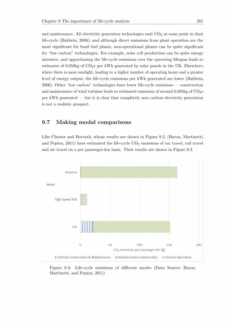
Chapter 9 The importance of life-cycle analysis 201
and maintenance. All electricity generation technologies emit CO2 at some point in their
life-cycle (Baldwin, 2006), and although direct emissions from plant operation are the
most significant for fossil fuel plants, non-operational phases can be quite significant
for “low carbon” technologies. For example, solar cell production can be quite energy
intensive, and apportioning the life-cycle emissions over the operating lifespan leads to
estimates of 0.058kg of CO2e per kWh generated by solar panels in the UK. Elsewhere,
where there is more sunlight, leading to a higher number of operating hours and a greater
level of energy output, the life-cycle emissions per kWh generated are lower (Baldwin,
2006). Other “low carbon” technologies have lower life-cycle emissions — construction
and maintenance of wind turbines leads to estimated emissions of around 0.005kg of CO2e
per kWh generated — but it is clear that completely zero carbon electricity generation
is not a realistic prospect.
9.7 Making modal comparisons
Like Chester and Horvath, whose results are shown in Figure 9.2, (Baron, Martinetti,
and Pepion, 2011) have estimated the life-cycle CO2 emissions of car travel, rail travel
and air travel on a per passenger-km basis. Their results are shown in Figure 9.3.
Figure 9.3: Life-cycle emissions of different modes (Data Source: Baron,Martinetti, and Pepion, 2011)

202 Chapter 9 The importance of life-cycle analysis
Because of the potential for variation, Chester and Horvath have expressed their findings
in terms of ranges. The data presented by Baron, Martinetti, and Pepion are re-cast in
percentage terms and presented alongside these ranges in Table 9.8.
Table 9.8: A comparison of data for different life-cycle components
Mode Road Rail Air
DataSource
Chesterand
Horvath(2009)
Baron,Martinetti,
andPepion(2011)
Chesterand
Horvath(2009)
Baron,Martinetti,
andPepion(2011)
Chesterand
Horvath(2009)
Baron,Martinetti,
andPepion(2011)
Vehicleoperations[%]
63 - 71 86 40 - 56 52 77 - 83 0
Vehicleconstructionandmaintenance[%]
29 - 37 14 44 - 60 9 17 - 23 100
Infrastructureconstructionandmaintenance
0 39 0
Otherlife-cyclecomponents(fuelproduction,infrastructureoperation,inactivevehicleoperation
Notconsidered
Notconsidered
Notconsidered
There are some general trends which are common to the work done by both Chester and
Horvath and Baron, Martinetti, and Pepion For example, the shorter lifespan of a car
results in the vehicle construction being proportionally more important than it is for the
other modes, whilst infrastructure is a much more significant life-cycle component for
rail.
However, for various reasons, caution must be exercised when directly comparing the
two datasets. Firstly, the analysis undertaken by Chester and Horvath is more thorough
— for example, data about station operations are explicitly included, as are a number
of additional operational and maintenance activities, such as road salting or herbicide
spraying. Secondly, it is very clear that both the specific scenario selected for analysis and
the assumptions made can affect the results. In terms of operational emissions, Chester

Chapter 9 The importance of life-cycle analysis 203
and Horvath use a value of 367g of CO2 per vehicle-km for the saloon car considered
(Chester, 2008), whereas Baron, Martinetti, and Pepion use a value of 208g of CO2 per
vehicle-km (130g of CO2 per passenger-km with an assumed occupancy of 1.6 people).
This may be appropriate for the context in each case (Chester & Horvath’s analysis is
based in America whilst Baron, Martinetti, and Pepion focus on Europe), but it serves
to show just how much of a difference there can be. Furthermore, new targets for car
emissions mean that operational emissions can be expected to fall significantly further
relative to the data in current literature. Similarly, mention has already been made of
the importance of the carbon intensity of the electricity grid. It is also worth noting that
for rail, Chester and Horvath have considered light rail, which is likely to have a higher
density of stations, more underground infrastructure and lower running speeds than the
high-speed rail considered elsewhere.
Because the data are given on a per passenger-km basis, the usage patterns and passenger
loadings are important variables. Chester and Horvath discuss the sensitivity of their
findings to passenger loadings, and this is explored further in Chapter 10.
Table 9.9 presents the life-cycle components not as a proportion of the overall energy
consumption and emissions, but as an additional proportion of the operational energy
consumption and emissions. This is useful for two reasons — firstly, data for different
modes are often confined to the operational phase, and it is helpful to have some idea
of what the uplift might be when including some of the other components. Secondly,
there are some cases where it might be appropriate to add some life-cycle components to
the operational data, but not others. The operation of new rail services over existing
infrastructure would be a good example of where some life-cycle data may not need
to be added. However, care must be taken — firstly, if the data for existing services
include infrastructure construction, it would be inappropriate not to recalculate this
fixed component over all services. Secondly, in any case, an increase in passenger traffic
will affect how the fixed components are allocated, as well as influencing maintenance
and renewal regimes, and this should be considered accordingly.

204 Chapter 9 The importance of life-cycle analysis
Table 9.9: Life-cycle emissions as an additional percentage of active operationalemissions
Mode Road Rail Air Notes
InactiveOperation
0 12-68 2-20 See Section 9.4
Scope 3emissions fromfuels
22 16(electric rail)
22 See Table 9.6 and Table 9.7;
22(diesel rail)
Based on DEFRA data for theUK
VehicleConstruction&Maintenance
20 2.5 - 5 4-9 Car data are European. Raildata are based on high-speedsystems (Section 9.4; based onspecific studies). Air data aretaken from Chester &Horvath’s results (Figure 9.2)
InfrastructureConstruction&Maintenance(Baron,Martinetti,and Pepion,2011)
1 75 0 Chester & Horvath’s analysisis more comprehensive and thelight rail systems studied arepotentially more infrastructureintensive than the High Speedlines considered by Baron,Martinetti, and Pepion
InfrastructureConstruction&Maintenance(Chester andHorvath, 2009)
11 to 20 81 to 190 3.5 to 4.7
Total 43 to 62 105.5 to285
28 to 56
9.8 Conclusions
It can be seen that when making modal comparisons, additional life-cycle components
which consume energy and produce GHG emissions need to be taken into account. This is
particularly true for rail, where the infrastructure can contain more embedded energy and
carbon than it does for road, especially for routes with many stations, tunnels and bridges.
Any operational advantage rail may have in terms of reducing energy consumption and
emissions may be reduced once these life-cycle effects are taken into account, although it
is questionable whether the construction of existing infrastructure should be included
when assessing the impact of new services which rely on it. Estimating the life-cycle
components can be difficult due to a lack of data, whilst they can vary significantly
between specific transport systems. The lifespan of the vehicles and the infrastructure

Chapter 9 The importance of life-cycle analysis 205
components and the assumptions made about vehicle usage and passenger loadings all
make a big difference to the appropriate allocation of the fixed costs.
Table 9.9 gives some indication of how the operational energy and emissions data discussed
in Chapters 3 to 6 should be modified to take into account life-cycle emissions. It is
clear that when considering data on a per passenger-km basis, the data for all life-cycle
components are very sensitive to assumptions made about load factor. Such assumptions
will be discussed further in Chapter 10.


Chapter 10
The use of passenger-km as a
metric & the importance of load
factor
10.1 Introduction
As was noted in Section 1.9, comparisons between the energy and emissions of different
modes of passenger transport are often made in terms of passenger-km. A key advantage
of this as a metric is that it accounts for some of the fundamental differences between
modes, such as the fact that public transport vehicles are often much bigger than the
private car. A disadvantage of this as a metric is the fact that some knowledge of the
load factor is required, which can be highly variable and difficult to estimate accurately.
Use of the carbon calculator tools compared in Chapter 2 assumed average load factors
for the public transport modes and an occupancy of one (the driver) for journeys made
by car. The data reviewed later in Chapter 2 was typically in terms of vehicle-km,
avoiding the issue of load factor completely but making it impossible to make direct
modal comparisons. Similarly, the analysis of the operational energy consumption of a
train in Chapters 3 to 6 presented the data on a per train-km basis.
This chapter presents some estimates of typical load factor data for the different modes,
and illustrates the sensitivity of emissions on a per passenger-km basis to the load factor.
Emissions data for electric trains are based on the analysis of the net energy consumption
undertaken in Chapters 3 to 6, using data about emissions from electricity generation to
make appropriate estimations. Emissions data for other modes, including diesel trains,
are gathered from other published sources for comparative purposes.
207

208 Chapter 10 The use of passenger-km as a metric & the importance of load factor
The importance of train design and train length, including some further analysis of
empirical energy data, is considered, followed by a discussion on the suitability of
passenger-km as a metric on which to base policy and decisions.
10.2 Typical load factor data
10.2.1 Private cars
Occupancy levels of private cars are estimated from travel survey data, and in the UK
are found to be in the region of 1.6 people (DfT, 2013c; RSSB, 2007). For a car with five
seats, this equates to a load factor of 32%. This has fluctuated slightly from a high of
1.62 in 1990 to a low of 1.57 in 2004 and is slightly higher than the average car occupancy
level for Western European countries (1.54) and lower than the average for Eastern
European countries (1.74), which has declined in recent years (European Environment
Agency, 2010). Data for the USA are similar, with an average car occupancy level of 1.67
in 2009, down from 1.9 in 1977 (Santos et al., 2011)
Car occupancy levels vary according to the purpose of the trip made, with an average
occupancy level of 1.12 in the UK in 2012 for business trips and commuting, rising
to an average of 2.0 for leisure trips and education (DfT, 2013c). Again, the trends in
the USA are observed to be similar (Santos et al., 2011). In keeping with the variation
observed according to the purpose of the trip, average car occupancy levels in California
were observed to be higher at weekends (1.7) than during the week (1.4) (Metropolitan
Transport Commission, 2005, Table 2.2.4).
10.2.2 Buses and coaches
Estimating typical load factors for buses and coaches is more complicated than it is
for private cars. The occupancy levels are much more variable for a given journey due
to passengers boarding and alighting en route, and average occupancy overall varies
between regions and service types as much as it does between countries. For example, in
the UK, the average passenger occupancy given for a local bus in London is significantly
higher than that of a local bus outside London (DEFRA, 2013b). It is assumed that
the data given by DEFRA refers to numbers of passengers rather than load factor in
percentage terms. Calculating the load factor in percentage terms is not straightforward
because buses can vary significantly in terms of seating capacity, and there is the issue of
standing passengers (who might be expected to exceed the number of seated passengers
on some urban buses, but are generally not allowed on long-distance coaches).
The European Environment Agency (2010) makes some attempt at comparing load
factors in percentage terms across different European countries, but it is difficult to
Chapter 10 The use of passenger-km as a metric & the importance of load factor 209
draw conclusions because urban buses in one country are compared with long distance
buses and coaches in another. This may be because in some cases it is difficult to make
distinctions between different services; DEFRA, for example, note that their data for
coaches are likely to underestimate actual occupancy levels because non-local buses have
been included in the calculations.
Coach travel is of most interest in this research because in most cases they provide a
more directly comparable alternative to rail services than local buses, and were shown in
Chapter 2 to be comparable to rail in terms of GHG emissions. In the UK, load factors
for coaches leaving Victoria Coach Station in London have been estimated to be in the
region of 60% (RSSB, 2007). Given that this is for services leaving the capital’s main
coach station this may be higher than the national average, although it does appear to
be in the same region as the figures for coaches in Germany (60%) and national buses in
Poland (47%) (European Environment Agency, 2010). International bus travel to/from
Poland is stated as having a particularly high load factor of 72%. Overall, the European
Environment Agency suggest that on long distance buses and coaches, an average of 33%
of the seats are occupied.
10.2.3 Domestic aviation
Aviation appears to maintain higher load factors than other modes of transport. This
will partly be because airlines have more flexibility to operate single routes according
to passenger demand than bus or train operators. As well as the fact that the route an
aeroplane takes is not restricted by transport infrastructure in the same way that buses
and trains are, it is more common for bus and train operators than it is for airlines to be
required to operate particular services, with subsidies provided where passenger demand
is otherwise insufficient to make them economically viable.
Across Europe, aviation load factors have risen steadily, from 57% in 1991 to 77% in 2007
(European Environment Agency, 2010). They are thought to be similarly high within the
USA; in their analysis of sensitivity to load factor, Chester and Horvath (2009), 50% was
taken as the “low” load factor for a domestic flight. In the UK, the average load factor of
a domestic flight is currently given as 69.3% (DEFRA, 2013b, Table 24), which is in line
with the observation that “aircraft load factors fluctuate around 70%” (RSSB, 2007).
10.2.4 Rail
As with buses and coaches, passenger occupancy levels of trains are quite variable.
Factors include the type of service and the time of day. In the UK in 2005/6, the average
domestic load factor was found to vary between 25% to 47% (RSSB, 2007). As with
buses and coaches, significant variation can also be observed throughout an individual

210 Chapter 10 The use of passenger-km as a metric & the importance of load factor
journey. The example of London (Euston) to Glasgow is cited by RSSB, who claim that
it is normal for the train to be standing room only for the first 100km and virtually
empty by the end.
Using data from the Office of Rail Regulation for timetabled train-km and passenger-km
for each TOC for the year 2010-2011 (ORR, 2011), some estimates of typical train
occupancy levels were made. These are summarised in Table 10.1 for a selection of
UK train operating companies, whose operations include London commuter services,
non-London suburban services and a range of inter-urban and intercity services.
For those operators with a very varied fleet of trains, such as London Midland and
Southern, it is difficult to convert the estimated average train occupancy levels into an
estimated load factor. For example, 110 passengers on a Southern service operated by
a single four-car Class 377 is equivalent to a load factor of 49%. If the service were
operated by a 12-carriage train then the load factor would be nearer 15%. The number
of trains working in multiple will reflect to the expected passenger demand for the service
in many cases, but extremes of passenger load factor may still be borne out in reality
on occasion. The long distance operators have a more uniform fleet. The average load
factor for Virgin Trains based on the data in Table 10.1 would appear less than that
given elsewhere; RSSB (2010b) cite the results of a study by the ATOC suggesting an
average load factor of 46.5%, whilst for a nine-carriage Pendolino the data in Table 10.1
equates to an average load factor of 36%.
High-speed rail in Europe has been observed to have higher load factors than intercity rail
in the UK, with the TGV from Paris to Strasbourg operating with a typical load factor of
88% in standard class (Network Rail, 2009a). The ICE in Germany has lower load factors
of between 40% and 50% (is similar to intercity rail in the UK). This perhaps reflects
the fact that the comparatively high service frequencies and shorter distances are similar
to the intercity routes in the UK, even though the line speeds are higher. The data
gathered by Network Rail (2009a) suggest that load factors on high-speed rail services
are generally higher on longer-distance services, perhaps because at such distances the
private car is less competitive, and aviation is the main alternative. Network Rail also
suggest that there may be a degree of over capacity provided by ICE services compared
with high-speed services in other countries.
The nature of railway operations mean that passenger occupancy levels fluctuate
significantly around the overall average. This is particularly true for commuter services;
Figure 10.1 and Figure 10.2 show how the average load factor (ascertained by dividing
the number of passengers by the number of available seats on trains) varies throughout
the day for arriving and departing passengers in Birmingham and London.

Chapter 10 The use of passenger-km as a metric & the importance of load factor 211
Table 10.1: Estimates of train occupancy levels for a selection of UK TOCs
TOC Southern LondonMidland
East Coast VirginTrains
CrossCountry
Type ofoperator
Suburbanwith a largesection of theLondoncommutermarket
Suburbanandinter-urbanwith someLondoncommuterservices
Intercity,serving theLondontoScotlandmarket
Intercity,serving theLondontoScotlandmarket
Intercity andinter-urban.Do not serveLondon
Annualtimetabledtrain-km(ORR, 2011)
37.5 24.4 19.9 35.6 32
Annualpassenger-km(ORR, 2011)
4,132.8 1,852.3 4,771.5 5,698.8 3,078.5
Meanpassengersper train
110 76 240 160 96
Typical train Class 377’Electrostar’
Class 350“Desiro”
British RailMark 4 set
Pendolino Class 220“Voyager”
Typicalseatingcapacity
223 (single4-carriagetrain) to 669(three trainsin multiple —12 carriages)(Govia, 2014)
183 (single4-carriageClass 350/1)to 840(three Class350/2 unitsin multiple)(The RailwayCentre.Com,2006)
535 439(nine-carriagetrain) to 589(11-carriagetrain)
208(4-carriagetrain)
Notes SomeLondon“Metro”services areoperatedwith Class455 trainswith 316seats pertrain.
Virgin Trainsalso operatesome Class221 Voyagertrains whichhave 262seats.

212 Chapter 10 The use of passenger-km as a metric & the importance of load factor
Figure 10.1: Variation in load factor for trains arriving/departing Birmingham(Based on data from ORR, 2011)
Figure 10.2: Variation in load factor for trains arriving/departing London (Basedon data from ORR, 2011)

Chapter 10 The use of passenger-km as a metric & the importance of load factor 213
It can be seen that despite high passenger loadings on trains arriving in urban centres
during the morning peak and departing during the evening peak, average load factors are
reduced by comparatively low loadings on trains in the opposite direction. The morning
peak period is particularly intense, with average arrivals in London having load factors
in excess of 100% due to the number of standing passengers. These figures are based on
average data over a time period and hide the fact that specific trains can be particularly
crowded. Such high load factors are only likely to occur towards one end of a journey,
however, and the average load factor for the whole journey will be lower. Variation of load
factor with time and day is very much dependent on the type of service — Figure 10.1 and
Figure 10.2 are affected by the fact that urban centres such as London and Birmingham
attract commuters. RSSB (2007) note that long distance operators typically maintain
a more constant load factor than those serving predominantly commuter markets, but
in any case, care must be taken when considering the extremes; comparatively empty
services may still be a necessary component of the overall service provision, if only to
facilitate the trains being in the right place to meet demand later on. On this basis,
although the average load factor may not be representative of an individual service, it is
still a useful figure when considering the whole picture.
10.3 The sensitivity of emissions data to load factor
Table 10.2 contains emissions data in terms of CO2 per passenger-km for road and rail
transport.
The average UK new car emissions for 2007 and 2011 are taken from the Society of Motor
Manufacturers and Traders (SMMT, 2013), and the suggested uplift of 20% to account
for real-world effects is in line with the literature reviewed in Section 2.4. The figure for
the Chevrolet Volt is the manufacturer’s figure, taken from an online “Green Guide to
Car CO2 Emissions” (carpages.co.uk, 2013), where at the time of writing it produces the
least emissions of any hybrid car. In line with the literature reviewed in Section 2.4, this
is uplifted by 35% to account for real-world effects.
The data for coach travel are based on the calculations for the Megabus undertaken by
the RSSB (2007).
The average data for UK rail are provided by DEFRA (2013). Additionally, a number of
specific train types are included. The data for electric trains come from the empirical
data analysis undertaken in Chapters 3 to 6, assuming a figure of 490g CO2 per kWh of
electricity consumed (DEFRA, 2013a) and include an uplift of 11% to take into account
non-revenue running and idling (Section 6.7). The data for diesel trains come from actual
fuel consumption data presented by RSSB (2007), using a figure of 26.5g of CO2 emitted
per litre of diesel per 100km. Because the data for diesel rail are based on overall fuel

214 Chapter 10 The use of passenger-km as a metric & the importance of load factor
Table 10.2: CO2 emissions data for selected road and rail transport
Mode CO2
emissionsper seat-km [g]
Typicalload factor
CO2
emissionsper
passenger-kmat typicalload factor
[g]
Minimumload factor
Maximumload factor
ChevroletVolt
9.11 40% 22.78 25% 100%
Coach(’Megabus’)
16.7 60% 27.83 10% 100%
IntercityElectric Rail(Pendolino’Pendolino’)
15.84 40% 39.6 10% 110%
SuburbanElectric Rail(Class 321)
12.1 30% 40.33 10% 110%
SuburbanElectric Rail(Class 323)
12.54 30% 41.8 10% 110%
DEFRAAverage Rail
48.8
SuburbanElectric Rail(Class 350/1)
19.69 30% 65.63 10% 110%
SuburbanDiesel Rail(Class 170’Turbostar’)
20.88 30% 69.61 10% 110%
IntercityDiesel Rail(Class 221’Voyager’)
31.8 40% 79.5 10% 110%
Average NewCar (2011)
33.14 32% 103.58 20% 100%
Average NewCar (2007)
39.58 32% 123.68 20% 100%

Chapter 10 The use of passenger-km as a metric & the importance of load factor 215
consumption data, the assumption is made that they take into account the effects of
non-revenue running and idling.
Following on from the data reviewed in Section 10.2, the average car occupancy is
assumed to be 1.6 people. The average new car is assumed to have five seats and the
Chevrolet Volt has 4, so the typical load factors are taken to be 32% and 40% respectively.
The minimum car occupancy is 1 (the driver) and the maximum is governed by the
number of seats (100% load factor) because (in Europe, at least), it is illegal to carry
more passengers than there are seats. It should be noted that the emissions per seat-km
for the average car are calculated on the basis of five seats in a car, but some cars on the
market have fewer, and a few family cars have more.
For the specific trains, an average load factor of 30% is assumed for suburban rail, rising
to 40% for intercity rail. A load factor of 60% is assumed for the coach, accepting the
caveat that this may be on the high side. For public transport (coaches and trains), a
load factor of 10% is assumed as a typical minimum, although services may run with
fewer passengers. For coaches, it is assumed that standing passengers are not allowed,
leading to a maximum load factor of 100%. It is typically permissible for trains to carry
more passengers than there are seats, and a typical maximum load factor of 110% is
assumed (although some crush-laden commuter services may exceed that, as discussed in
Section 10.2).
Figure 10.3 compares the average CO2 emissions per passenger-km for the different modes
on the basis of typical load factors. The error bars give some indication of how that
might change if the load factor was varied between the minimum and maximum given in
Table 10.2; a lower load factor leads to increased emissions per passenger-km, and vice
versa.
It can be seen from Figure 10.3 that if the typical load factors suggested in Table 10.2
are indeed representative of the real-world then rail travel typically emits less CO2 per
passenger-km than travelling by private car, and coach travel emits less still. However,
particularly as far as the coach is concerned, the assumptions made about typical
passenger loadings are crucial; the coach only emits less CO2 per passenger-km than
the Pendolino intercity train if higher load factors are maintained. The variation in
CO2 emissions per passenger-km with load factor shows that, overall, coach travel and
intercity rail travel are similar.

216 Chapter 10 The use of passenger-km as a metric & the importance of load factor
Figure 10.3: Emissions data for selected modes
It can also be seen that if the average car carries more than 1.6 people then it may
not actually produce more CO2 per passenger-km than the train, particularly as far as
diesel trains are concerned. The Chevrolet Volt is not (yet) typical of the car fleet in
the UK, and even increasing the manufacturer’s official emissions figures by 35% may
still be optimistic — no account has been taken of any additional emissions arising from
electricity consumed to charge the battery, and the benefits of the hybrid system may
not be sustained throughout a longer journey. Its inclusion here, however, does serve to
illustrate that as cars become more efficient then even a crush-laden train may struggle
to compete in terms of lower CO2 emissions per passenger-km.
Emissions per passenger-km from cars are much more sensitive to changes in passenger
numbers than they are from public transport modes because the number of seats in a
typical car is much less. Increasing the number of people in a car to four brings the load
factor up to 80%, whereas the number of passengers which would be required to increase
the load factor of a train to 80% is significantly greater. The importance of the number
of seats in a vehicle is explored further in the next section (Section 10.4), whilst the true
value of an increased load factor is discussed in Section 10.5.

Chapter 10 The use of passenger-km as a metric & the importance of load factor 217
10.4 The implications of vehicle design
10.4.1 The number of seats
The load factor is typically expressed as a percentage of the number of seats which
are occupied, and hence the number of seats is a crucial factor. It has already been
highlighted that the relatively small number of seats in a private car means that even a
single person can have a significant impact on the load factor. A load factor in percentage
terms may not, therefore, tell the full story. For example, some cars on the market —
typically sports cars or small city cars — only have two seats. In this case, it only takes
one passenger (in addition to the driver) to achieve a load factor of 100%, but the vehicle
emissions can only be apportioned across two people. A load factor of 80% in a typical
five-seat family car may sound less impressive, but the vehicle emissions would be divided
between four people, leading to a much more significant reduction in emissions on a per
passenger basis.
Similarly, London Midland operate Class 350 “Desiro” trains with two different seating
configurations. The Class 350/1 has two seats either side of the main aisle throughout
(a 2+2 layout), giving a total of 183 seats (The Railway Centre.Com, 2006). The Class
350/2 has a 3+2 layout, increasing the total number of seats to around 280. Externally,
both trains are the same, with the same number of carriages. The Class 350/1 fleet are
generally scheduled to work the longer-distance services, but it is clear from the empirical
data analysed in Chapters 3 to 6 that there are some services which are operated by both
sub-classes. The upshot of this is that a typical passenger load of 76 people (Table 10.1)
equates to a load factor of 42% on a Class 350/1 and just 27% on a Class 350/2, but
since the energy consumption was found to be similar for each sub-class, the variation in
load factor as a percentage makes no difference to the emissions per passenger overall.
Some metro trains have been designed around standing capacity rather than seating
capacity — for example, the Class 378 trains recently introduced on London Overground
services have longitudinal seats and wide gangways, giving an estimated passenger capacity
(including standing passengers) of 700 per four-carriage train (Railwaygazette.com, 2009).
The number of seats is far less than this, such that even a load factor of 110% of the
seating capacity would be on the low side. On such Metro services, “crush-loading” is
much more acceptable.
The House of Commons Transport Committee (2003) report that there are different
ways of calculating the capacity of a train, depending on the type of train and the type
of service. Citing the Rail Passenger Council, they suggest that for journeys of more
than 20 minutes, the capacity of the train could be defined by the number of Standard
Class seats, whilst for journeys of less than 20 minutes the capacity could be defined for
“slam-door” trains as the total number of seats plus 10%. For trains with sliding doors,
capacity could be defined not in terms of number of seats, but in terms of floor-area; the

218 Chapter 10 The use of passenger-km as a metric & the importance of load factor
report suggests that the capacity threshold is one passenger per 0.45m2 of floor area,
whether there is a seat there or not. It would be fair to raise some questions about these
definitions — for example, on outer-suburban and inter-urban services, some passengers
will be making journeys of more than 20 minutes, whilst some passengers may only be
on the train for a very short time. This means that the capacity of the same train on the
same service could be legitimately defined in two separate ways. It is also not clear why
first class seating is excluded from the calculations. The age of the report means that
the distinction between “slam-door” and “sliding-door” trains is no longer particularly
appropriate because most of the “slam-door” trains in the UK have been phased out
since the report was written.
The key point, perhaps, is that defining load factor in terms of the number of seats is
not necessarily sufficient. For long-distance intercity services, where having a seat is a
reasonable expectation, it remains a useful measure, but adoption of an alternative metric
(perhaps based on floor area per passenger) would be better for other services. A similar
point could be made about buses; whereas long-distance coaches do not allow standing
passengers, local buses do to the extent that a load factor of 100% of the number of seats
does not reflect the overall passenger capacity at all.
10.4.2 Vehicle design — the onboard environment
Although it may be legally possible for as many passengers to be carried in a vehicle
as there are seats (if not more, in the case of some buses and trains), high occupancy
levels are not always practical or desirable. The middle seat in the back of a five seat car,
for example, is often not comfortable for an adult and hence, although the maximum
occupancy level might be achievable for a family outing, it would be reasonable to suggest
that car sharing schemes might struggle more to achieve it.
For trains, the type of service plays a role when it comes to the design of the onboard
environment and the suitability of a particular seating-density. A dense layout, such
as the 3+2 layout in the Class 350/2 may be suitable for short journeys, but there is
some evidence to suggest that such high density seating may not always lead to higher
passenger occupancy levels. On the direct route between Portsmouth and London, trains
with 2+2 seating were replaced with very similar trains to the Class 350/2, with a
3+2 layout, a move which proved unpopular with passengers (Portsmouth City Council,
n.d.). The report by Portsmouth City Council claims that some passengers have “started
driving instead” whilst others prefer to stand or in the aisle whilst leaving the middle
seat of the three unoccupied. The implication is that if the seating density is too high
then the maximum load factor may be harder to achieve, except in situations where
demand is very high and passengers would be prepared to put up with crowded conditions.
This may depend partially on how passengers expect to utilise their travelling time (see
Section 1.11.2). It was noted in Section 10.4.1 that it may be better to define the capacity
Chapter 10 The use of passenger-km as a metric & the importance of load factor 219
in terms of floor area rather than the number of seats, and that the suggested capacity
(one passenger per 0.45m2 of floor area) is independent of the number of seats (House of
Commons Transport Committee, 2003). It is thought that perceived capacity may vary
with seating density — for example, the observed reluctance to occupy the middle of
three seats may lead to the train appearing more crowded than it really is in terms of
passengers per floor area. If it were possible to directly compare passenger loadings on
the same journeys between similar trains with different seating densities (such as the
Class 350/1 and Class 350/2) the results could be interesting.
10.5 Train length
A unique feature of trains is that it is possible to lengthen them to provide greater
capacity without increasing the seating density and without the need to run additional
services. This can either be done by adding extra carriages to a train, as Virgin Trains
did with their Pendolino trains or by joining two or more trains together, known as
multiple working, which is commonplace on the London Midland network. The extra
length and increased mass will have some detrimental effect on energy consumption and
the resulting emissions, but it is still preferable overall to running additional trains in
isolation. ATOC (2007) suggest that adding carriages to an existing train might be
expected to have a carbon impact of about 60% of the un-lengthened train. Although it
is not entirely clear what they mean by “carbon impact”, the benefits both for Virgin
Trains and London Midland have been quantified, as described below.
10.5.1 Longer trains: the case of the Pendolino
In 2012, Virgin Trains introduced some new 11-carriage Pendolino trains into service, to
supplement their existing fleet of nine-carriage trains. Some of the nine-carriage trains
were also lengthened to 11-carriages. The two lengths of train were treated separately in
the analysis conducted in Chapters 3 to 6, and a summary of the energy consumption
data is given in Table 10.3. It can be assumed that CO2 emissions are directly related to
energy consumption.
From this data, it is possible to estimate the marginal net energy consumption of each
additional seat in the 11-carriage train. This is given in Table 10.4.
On a per-seat basis, it can be calculated from Table 10.4 that the energy consumption
per additional seat in the lengthened (11-carriage) train is only 41% of that of the energy
consumption per seat in the un-lengthened (nine-carriage) train.

220 Chapter 10 The use of passenger-km as a metric & the importance of load factor
Table 10.3: A summary of net energy consumption data for the Pendolino
Train Length [carriages] 9 11
Mean net energyconsumption per train-km[kWh]
12.93 14.75
Number of seats 439 589
Mean net energyconsumption per seat-km[kWh]
0.029 0.025
Table 10.4: The marginal energy consumption per seat of the additional seatswhen an 11-carriage Pendolino is compared with a nine-carriage Pendolino
Increase in seating capacity 150
Increase in energy consumption[kWh per train-km]
1.82
Additional energy consumption peradditional seat-km [kWh]
0.012
10.5.2 Multiple working: the case of the Class 323
In the analysis conducted in Chapters 3 to 6, it was possible to separate the trains
running in multiple from the trains running as single units. It was found that care needs
to be taken when making direct comparisons, because services operated by trains in
multiple can be different from those operated by single units (in contrast, both nine and
11 carriage Pendolino trains operate similar services).
Table 10.5 summarises the energy consumption data for the Class 323 train running as a
single four-carriage train and in a pair.
From this data, it is possible to estimate the marginal cost of each additional seat when
a second train is added to create a pair. This is given in Table 10.6.
On a per seat basis, the energy consumption per additional seat added when two trains
are put together is about 97% of that of a train running on its own, so comparatively
little is to be gained by multiple operation in this case. The fact that the mean stop
spacing of services operated by trains in multiple is less than that of services operated
by individual trains may have inflated the marginal cost of each additional seat slightly,
but there is nothing to suggest it should be much lower.

Chapter 10 The use of passenger-km as a metric & the importance of load factor 221
Table 10.5: Energy consumption data for the Class 323 train running as part ofa pair compared with running as a single train
Trains operatingtogether
1 2
Number of seats 284 568
Mean stop spacing of servicesoperated [km]
2.57 2.23
Mean energy consumptionper whole train-km [kWh]
6.52 12.64
Mean energy consumptionper seat-km [kWh]
0.023 0.022
Table 10.6: The marginal energy consumption per seat of the additional seatswhen two Class 323s are run as a pair, compared with a single train
Increase in seating capacity 284
Increase in energy consumption[kWh per train-km]
6.12
Additional energy consumption peradditional seat-km [kWh]
0.022
The marginal cost of the additional seats when two Class 323s are run in multiple appears
to be significantly more than the marginal cost of the additional seats when a Pendolino
train is lengthened from nine to 11 carriages. The main reason for this is likely to be
the fact that when two trains are run together in multiple, both remain powered and
everything — including driving cabs, toilets and on-board systems — is duplicated,
adding to the mass. In a lengthened (11-carriage) Pendolino, only one of the extra
carriages is powered and, although there are some additional on-board systems, the
additional mass per seat is considerably less.
10.5.3 Comments about train length
It cannot be assumed that a reduction in energy consumption and emissions on a per
seat-km basis brought about by lengthening a train translates into an improvement
on a per passenger-km basis, unless the passenger occupancy levels are also increased
accordingly. If the net result of lengthening a train is just that the existing passengers
have more space, or no longer have to stand then there are no appreciable benefits in
terms of energy consumption or emissions, and the extra comfort of the passengers has
come at a cost. Despite this, it is clear that crowding can be a real issue. Not only does
it limit scope for promoting modal shift to rail, but over-crowding (or the perception

222 Chapter 10 The use of passenger-km as a metric & the importance of load factor
thereof) can lead to increased stress levels amongst passengers; indeed, Cox, Houdmont,
and Griffiths (2006) conclude that “crowding should be accepted as a possible threat
both to the healthiness of the rail industry and passengers.” It has been shown above
that lengthening a train — either by adding additional carriages or by joining trains
together — can reduce the energy consumption and, by extension, the emissions per
seat-km, and that this approach to increasing capacity is preferable to running extra
trains
One of the problems with running a train service which has to cope with fluctuations
in demand (Figure 10.1 and Figure 10.2) is that providing enough capacity where it
is needed may also mean that the additional overheads of longer trains still apply to
less popular services. The advantage of running trains in multiple is that they can be
joined and split as required, whereas lengthening trains such as the Pendolino is a more
permanent change to make. Theoretically, trains comprising a locomotive and a rake of
coaches, as used to be prevalent in the UK, are easier to lengthen or shorten on demand,
and have the added advantage that the extra coaches won’t have the mass of extra
traction systems if these are all already contained within the locomotive. The downside
is that such trains have other practical concerns to contend with, such as the extra time
and space needed to run the locomotive round the train every time a change of direction
is required, and it is for these reasons that integrated “multiple unit” trains or push-pull
formations have become dominant.
10.6 The use of passenger-km as a metric for modal comparison
Mention has been made of the fact that the use of passenger-km as a metric for modal
comparison allows some of the fundamental differences between modes to be taken into
account. Despite that, making modal comparisons purely on the basis of CO2 emissions
per passenger-km means that some of the other fundamental differences between modes,
which lead to other advantages and disadvantages in each case, can be easily overlooked.
Such differences can include actual journey distance (flying may be expected to be
generally more direct than road or rail), whilst other sustainability goals should also not
be ignored. Furthermore, having shown just how sensitive the metric is to passenger
occupancy levels, it could be tempting to wrongly conclude that increasing the load
factor is always a good thing. This section discusses some of these issues in more detail.

Chapter 10 The use of passenger-km as a metric & the importance of load factor 223
10.6.1 The dangers of an over-inflated load factor
If a particular journey is looked at in isolation then it has been shown that increasing the
passenger occupancy levels will reduce the energy consumption and emissions on a per
passenger basis. However, if the occupancy levels are increased due to increased demand
for travel then there is no net benefit. In many cases, there may even be a negative
effect on overall energy consumption and emissions; in the case of a car journey, the mass
of an additional passenger (and luggage) can be significant compared with the overall
mass of the vehicle, especially as cars become lighter, and this can lead to increased fuel
consumption. This is slightly less of a consideration for public transport modes when
considering individual passengers, because the vehicle mass is typically much higher than
that of a person, although it has been shown that overall passenger mass can have an
impact (RSSB, 2010b). The other issue with public transport is that creating demand for
an existing service may also lead to journey creation and associated additional emissions
elsewhere — for example driving or getting a taxi to/from the station.
Low fares, particularly those booked in advance, are often used to entice people onto
public transport and there is a real risk that this leads to demand creation rather than
modal shift. For example, RSSB (2007) note that the low cost airline easyJet has seen
load factors rising above 80%, but raise the question of whether demand induced by very
low fares makes such a high load factor valid for comparison with other modes.
Even if increased load factor comes from modal shift rather than new demand for travel,
this may still produce no net benefit — for example, if someone decides to travel by
coach rather than by train, it is likely that both the coach and the train journey will still
be made anyway, leading to no noticeable change in energy consumption and emissions.
This is discussed further in Section 11.7.2.
Unlike public transport modes, where the driver is there for provision of the service and
therefore not counted as one of the passengers making the trip, it is usually presumed
that the driver of a private car is only doing so in order to make the trip themselves,
and should therefore be included in the passenger occupancy count. This assumption is
open to question in some cases, however. For example, surveys conducted in the Greater
Montreal Area found that 15% of car trips made by more than one person from the same
household are made exclusively for one of the passengers and not the driver themselves.
Morency (2006) uses the term “family taxi” for such trips, and gives the example of
a mother driving her child to/from school; the high average passenger occupancy for
education related trips may therefore be misleading. Data for business and commuting
trips are unlikely to be skewed in the same way.

224 Chapter 10 The use of passenger-km as a metric & the importance of load factor
10.7 Conclusions
Comparing energy consumption and emissions on a per passenger-km basis can be useful,
and for typical passenger occupancy levels, electric rail and intercity coach travel would
seem to be the preferred modes if reducing energy consumption and emissions was the
main goal. However, many assumptions are made about passenger-loadings, and on
public transport modes in particular there may be no such thing as a “typical” load
factor. Commuter rail in particular is affected by peaks and troughs in demand, and
providing capacity to relieve peak-time crowding can lead to reduced performance overall
if the same train then has to run almost empty on off-peak services.
It cannot be assumed that a high load factor is always a good thing because although it
may reduce the emissions per passenger for a given journey, it could still be detrimental
if high passenger occupancy is as a result of the creation of additional demand for travel.
Vehicle design is important, not just in terms of the number of seats (and the resulting
load factor in percentage terms) but in terms of how suitable the passenger environment
is for the journey and how attractive it can be if modal shift and improved passenger
occupancy levels are to be achieved.

Chapter 11
Discussing the findings
— making more detailed modal
comparisons in the context of this
research
11.1 Introduction
Chapter 2 compared three different carbon calculator tools for estimating the carbon
emissions produced by different modes for a specified journey. Each of the different tools
relied on different assumptions for the emissions per passenger and the distance covered
by each mode, leading to varying results for each of the sample journeys considered. In
some cases, this gave rise to a level of ambiguity about which mode is the least polluting
per passenger (in terms of GHG emissions) for a particular journey. A key aim of this
research has been to investigate the factors which affect the calculations of emissions per
passenger, particularly for rail travel, in order to validate some of the assumptions made
by the carbon calculator tools and to be able to make more informed modal comparisons.
Chapters 3 to 6 contained in-depth analysis of empirical data collected by energy
metering systems on electric trains, providing a better understanding of the operational
energy consumption and related GHG emissions, including an estimate of the energy
consumption from idling and running empty to/from the depot, not directly associated
with carrying passengers. Chapter 9 considered some life-cycle analysis of transport
systems, showing how taking into account construction and maintenance of the vehicles
and infrastructure, and extraction and transportation of fuels can add to overall emissions.
Finally, Chapter 10 looked at passenger loadings.
225

226Chapter 11 Discussing the findings
— making more detailed modal comparisons in the context of this research
This chapter brings some of the findings together and applies them to the sample journeys
considered in Chapter 2. Section 11.2 provides more informed estimates of the operational
energy consumption and emissions of a train on each of the journeys and compares them
with the estimates made by the carbon calculator tools. Section 11.3 reviews how the
modal comparisons might be expected to change if the whole life-cycle were considered.
Section 11.4 looks in more detail at the London to Glasgow route, applying some of the
findings about life-cycle emissions. Section 11.5 considers how future developments might
influence modal comparisons and Section 11.7 considers how such comparisons between
modes (in terms of emissions) should be used to influence travel choice and policy.
11.2 Operational emissions from passenger rail — making
estimates for specific journeys, based on empirical
data analysis
In Chapter 2, three specific journeys were selected for comparing the different carbon
calculator tools. The first was the journey between London and Southampton, where
the direct rail service has competition from a direct coach service and there are good
motorway links. The second journey was that between Swansea and Fishguard Harbour,
chosen because it is a journey of similar length but in a much more rural context. The final
journey chosen was between London and Glasgow, chosen because it is a longer intercity
route, over which domestic aviation is a key competitor. This section reconsiders each
journey and uses the earlier empirical analysis of rail’s operational energy consumption
and emissions to make estimates of the emissions per passenger, which can be compared
with the outputs from the carbon calculator tools.
11.2.1 London Waterloo to Southampton Airport Parkway
The route between London Waterloo and Southampton Airport Parkway is typically
operated by Class 444 and Class 450 “Desiro” trains. These are very similar to the Class
350 trains operated by London Midland, for which data were analysed in Chapter 5; the
Class 450 is almost identical, with four carriages and a predominantly 3+2 seating layout
like that on the Class 350/2. The Class 444 is a five-carriage train, with an intercity
style layout. Class 444 trains have longer carriages (23m as opposed to 20m) with doors
at the end of the carriages rather than at the 1/3 and 2/3 points. The seating layout is
less dense than on the 450, with a 2+2 seating layout in standard class and a 2+1 layout
in first class. Although electric power along the route to Southampton is provided by a
750V d.c. third rail, as opposed to a 25kV a.c. overhead catenary, all “Desiro” trains
are designed to be compatible with either system with minimal modification; some of
London Midland’s Class 350s are already fully equipped as dual-voltage trains. For these

Chapter 11 Discussing the findings— making more detailed modal comparisons in the context of this research 227
reasons, it is considered appropriate to use the data for the Class 350 trains as a basis for
estimating rail’s operational energy consumption and emissions on this route. Table 11.1
summarises the empirical data for the Class 350/2 for outer suburban services (defined
as having a mean stop-spacing between 10km and 20km) and for inter-urban services
(defined as having a mean stop-spacing of between 20km and 50km). The data for are for
all journeys in the dataset for Class 350/2 trains analysed in Chapters 3 to 6, and will
be used as the basis for the calculations here. The length of the route between London
Waterloo and Southampton Airport Parkway is 120.4km (swlines Ltd. 2012a). Timetable
data (Network Rail, 2012) suggests that a typical stopping service may have up to 10
intermediate stops with a mean stop-spacing of about 11km, whilst some fast peak-time
services only have one intermediate stop.
Table 11.1: Empirical estimations of the energy consumption of a Class 350/2“Desiro” train
Mean net energy consumption of Class 350/2outer suburban services (mean stop spacingbetween 10 and 20 km) [kWh per train-km]
6.13
Standard deviation of mean net energyconsumption for outer suburban services
0.63
Mean net energy consumption of Class 350/2inter-uban services (mean stop spacingbetween 20 and 50 km) [kWh per train-km]
5.40
Standard deviation of mean net energyconsumption for inter-urban services
0.58
Section 10.5 compared two different lengths of Pendolino train, and found the mean
net energy consumption with nine-carriages to be 12.93 kWh per train-km, rising to
14.75 kWh per train-km for the 11-carriage Pendolino. This is an increase in energy
consumption of 14% for an increase in train length of about 22%. It is therefore postulated
that the net energy consumption for the 5-carriage Class 444 “Desiro” would be expected
to be in the region of 15 to 20% greater than that for the 4-carriage Class 450 “Desiro’.
Taking all of this into account, the mean (6.13 kWh) +/- two standard deviations would
seem to be a sensible range for the estimated net energy consumption per train. Factors
which may affect this include the proportion of services operated by each class of train
and the proportion of services run by trains in pairs, and if non-revenue running and
idling are to be accounted for then Section 6.7 suggests that these figures should be
increased by 11%.
Direct trains on the route are operated exclusively by South West Trains. In 2010-11,
they ran services totalling 5,524 million train-km with 39.5 million passenger-km (ORR,
2011). This equates to an average of 140 passengers per train. Although South West
Trains run a number of different services, the typical loadings on the line from Waterloo
to Southampton are assumed to fall somewhere between the heavily used London “metro”

228Chapter 11 Discussing the findings
— making more detailed modal comparisons in the context of this research
services and lower passenger occupancies towards the edge of the network (for example,
between Southampton and Weymouth). However, this figure may still be on the high
side because it is for the whole train, which may actually comprise two or more units
running in multiple. A single Class 450 unit has 273 seats and a single Class 444 unit has
234 (The Railway Centre.Com, 2006). On a single unit, 140 passengers would correspond
to a load factor of 51% on a Class 450 and 60% on a Class 444 — which is much higher
than the average load factors suggested by RSSB (2007). It was therefore decided to use
a figure of 100 passengers per single unit, which corresponds to a load factors of 37%
and 43% for the Class 450 and Class 444 respectively. This is higher than the median of
31% suggested by RSSB, but is justifiable when comparisons are made with the data for
other operators given by the ORR (2011). Other operators of similar “Desiro” trains,
such as First Transpennine Express and London Midland had, on average, fewer than
100 people per train, and so the assumption that South West Trains has higher load
factors than the national average is not unreasonable, especially since the majority of
their services serve London.
Throughout this research, a figure of 0.49 kg of CO2 emitted per kWh of electricity
consumed has been used — this is based on the UK generation mix for 2010 (DEFRA,
2012), and includes transmission losses. Table 11.2 estimates the total estimated CO2
emissions per passenger over the whole 120.4km journey, and summarises the figures
used in the calculations.
Table 11.2: Estimated energy and emissions data for the rail journey betweenLondon Waterloo and Southampton Airport Parkway
Estimated net energy consumption pertrain-km [kWh]
4.87 to 7.40 (mean 6.13)
Estimated net energy consumption including“inactive operation” of non-passenger running& idling [kWh per train-km]
5.4 to 8.2 (mean 6.81)
Estimated CO2 emissions [kg per train-km] 2.6 to 4.0 (mean 3.34)
Assumed number of passengers on the train 100
Estimated CO2 emissions per passenger-km[kg]
0.026 to 0.040 (mean 0.033)
Estimated CO2 emissions perpassenger-journey (120.4 km) [kg]
3.19 to 4.85 (mean 4.02)
Figure 11.1 compares the estimated CO2 emissions for the journey based on the empirical
data and calculations here with the estimates given by each of the three carbon calculator
tools in Chapter 2 — Transport Direct, EcoPassenger and Travel Footprint.

Chapter 11 Discussing the findings— making more detailed modal comparisons in the context of this research 229
Figure 11.1: A comparison of the calculated emissions estimates with the carboncalculator estimates from Chapter 2 for the rail journey between London Waterlooand Southampton Airport Parkway
The calculations undertaken here match the output from the Travel Footprint tool most
closely. This is perhaps unsurprising given that this is the only one of the three tools
to allow the user to specify the type of train, and to estimate the distance correctly.
Transport Direct (2010b) uses average data from DEFRA which is based on the whole UK
network and includes diesel rail. It also marginally underestimates the distance travelled.
According to the published methodology (UIC, 2010), EcoPassenger should assume that
the train on this route is electric, because it only assumes the use of diesel traction if the
route includes a station which can only be reached by diesel trains; however, the details
are unclear and it is not obvious whether the assumptions about the train reflect the
reality. Exact distance data for EcoPassenger are not provided, but the methodology is
based on increasing the straight-line distance between consecutive stations by a fixed
percentage to account for curvature, so the accuracy is questionable. The emissions
factor for electricity is also subject to variation — for example, EcoPassenger uses a
figure of 0.576kg of CO2 per kWh of electricity supplied for the UK (in 2007), which is
significantly higher than the DEFRA figure used in the calculations here.
An electric train was specified for Travel Footprint, although the only option was an
“Intercity Electric” based on an “average UK mix.” The options for passenger load factor
were limited and the 50% occupancy level chosen might be on the high side, but the
results remain comfortably within the range calculated here. It is worth noting that
the calculations in this section assume a direct train between London Waterloo and
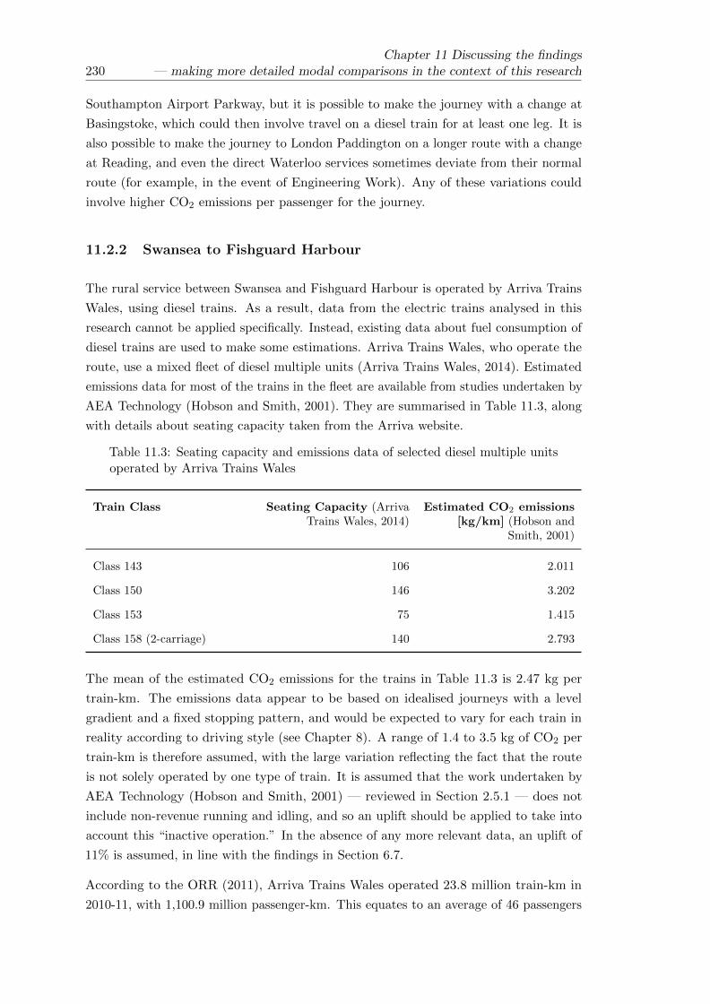
230Chapter 11 Discussing the findings
— making more detailed modal comparisons in the context of this research
Southampton Airport Parkway, but it is possible to make the journey with a change at
Basingstoke, which could then involve travel on a diesel train for at least one leg. It is
also possible to make the journey to London Paddington on a longer route with a change
at Reading, and even the direct Waterloo services sometimes deviate from their normal
route (for example, in the event of Engineering Work). Any of these variations could
involve higher CO2 emissions per passenger for the journey.
11.2.2 Swansea to Fishguard Harbour
The rural service between Swansea and Fishguard Harbour is operated by Arriva Trains
Wales, using diesel trains. As a result, data from the electric trains analysed in this
research cannot be applied specifically. Instead, existing data about fuel consumption of
diesel trains are used to make some estimations. Arriva Trains Wales, who operate the
route, use a mixed fleet of diesel multiple units (Arriva Trains Wales, 2014). Estimated
emissions data for most of the trains in the fleet are available from studies undertaken by
AEA Technology (Hobson and Smith, 2001). They are summarised in Table 11.3, along
with details about seating capacity taken from the Arriva website.
Table 11.3: Seating capacity and emissions data of selected diesel multiple unitsoperated by Arriva Trains Wales
Train Class Seating Capacity (ArrivaTrains Wales, 2014)
Estimated CO2 emissions[kg/km] (Hobson and
Smith, 2001)
Class 143 106 2.011
Class 150 146 3.202
Class 153 75 1.415
Class 158 (2-carriage) 140 2.793
The mean of the estimated CO2 emissions for the trains in Table 11.3 is 2.47 kg per
train-km. The emissions data appear to be based on idealised journeys with a level
gradient and a fixed stopping pattern, and would be expected to vary for each train in
reality according to driving style (see Chapter 8). A range of 1.4 to 3.5 kg of CO2 per
train-km is therefore assumed, with the large variation reflecting the fact that the route
is not solely operated by one type of train. It is assumed that the work undertaken by
AEA Technology (Hobson and Smith, 2001) — reviewed in Section 2.5.1 — does not
include non-revenue running and idling, and so an uplift should be applied to take into
account this “inactive operation.” In the absence of any more relevant data, an uplift of
11% is assumed, in line with the findings in Section 6.7.
According to the ORR (2011), Arriva Trains Wales operated 23.8 million train-km in
2010-11, with 1,100.9 million passenger-km. This equates to an average of 46 passengers

Chapter 11 Discussing the findings— making more detailed modal comparisons in the context of this research 231
per train. In percentage terms, this equates to a load factor of 32% for a Class 150, and
61% for a Class 153. This figure is based on the whole Arriva Trains Wales network, and
includes services in and around Cardiff, so may be an overestimate of the rural services to
Fishguard. On the other hand, some Fishguard services will be bolstered by connections
with the ferry to Ireland, and so in the absence of more detailed information, the figure
of 46 passengers per train is used.
The journey distance was found to be 116.1 km (swlines Ltd. 2012a). Table 11.4 estimates
the total estimated CO2 emissions per passenger for the whole journey, and summarises
the figures used in the calculations. Figure 11.2 compares the result graphically with the
output from the three carbon calculator tools.
Table 11.4: Estimated energy and emissions data for the rail journey betweenSwansea and Fishguard Harbour
Estimated CO2 emissions [kg per train-km] 1.4 to 3.5 (mean taken as 2.47)
Estimated net energy consumption includinginactive operation of non-passenger running& idling [kWh per train-km]
1.55 to 3.89 (mean 2.7)
Assumed number of passengers on the train 46
Estimated CO2 emissions per passenger-km[kg]
0.03 to 0.08 (mean 0.06)
Estimated CO2 emissions perpassenger-journey (116.1 km) [kg]
3.9 to 9.8 (mean 6.9)
It can be seen that the estimated CO2 emissions per passenger for this journey are higher
than those for the journey between London Waterloo and Southampton, in spite of the
fact that the journey length is similar. This reflects the fact that the route is operated
by diesel, as opposed to electric, trains, and that passenger loadings are expected to be
lower. Again, the Travel Footprint tool is the one whose outputs most closely match the
calculations undertaken here, reflecting the fact the distance was correctly estimated,
and the choice of train (Diesel Sprinter) was appropriate. Travel Footprint is also the
only one of the tools to have explicitly considered the life-cycle emissions of the fuel.
The Transport Direct figure is based on an incorrect assumption about the journey
length (101.8 km) and should be increased by approximately 20% as a result. The use
of average data, including electric trains, means that the Transport Direct figure would
still be expected to be lower than the calculations undertaken here. It is assumed that
EcoPassenger correctly selected a diesel train, but no details about emissions data or
actual distance assumed are given.

232Chapter 11 Discussing the findings
— making more detailed modal comparisons in the context of this research
Figure 11.2: A comparison of the calculated emissions estimates with the carboncalculator estimates from Chapter 2 for the rail journey between Swansea andFishguard Harbour
11.2.3 London Euston to Glasgow Central
The intercity service between London Euston and Glasgow Central is operated by Virgin
Trains, using Pendolino trains of the type analysed in Chapters 4 to 6. Specific data for
some of Euston to Glasgow services were available for nine-carriage trains, for which
the mean net energy consumption was calculated to be 12.25 kWh per train-km (5%
below the overall mean for the nine-carriage train of 12.93 kWh per train-km). There
were no matching data for 11-carriage trains. Data for nine-carriage trains on the return
journey from Glasgow to Euston showed the mean net energy consumption to be 13.42
kWh per train-km, which is 4% above the overall mean. In light of this, and the fact
that the number of intermediate stops for typical Glasgow services varies from six to
twelve (Network Rail, 2012), it was decided to base the calculations in this section on
the overall mean for the train.
For nine-carriage trains, the overall mean net energy consumption was found to be
12.93 kWh per train-km, with a standard deviation of 1.11. For 11-carriage trains, the
overall mean net energy consumption was found to be 14.75 kWh per train-km, with a
standard deviation of 1.27. Assuming that the route is now operated equally regularly
by 11-carriage trains and nine-carriage trains, an average of 13.84 kWh per train-km can
be taken. To account for variation, from factors including driving style (Chapter 8) a
standard deviation similar to that observed for 11-carriage trains is assumed. Assuming
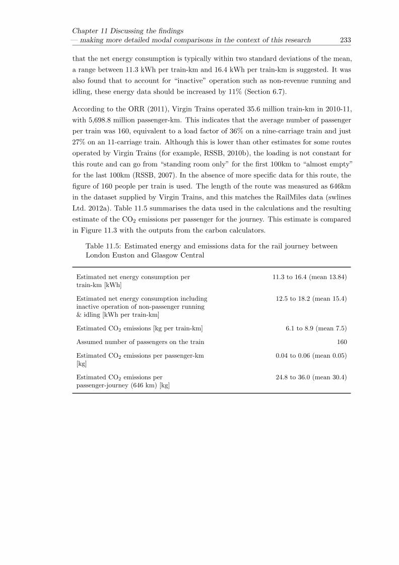
Chapter 11 Discussing the findings— making more detailed modal comparisons in the context of this research 233
that the net energy consumption is typically within two standard deviations of the mean,
a range between 11.3 kWh per train-km and 16.4 kWh per train-km is suggested. It was
also found that to account for “inactive” operation such as non-revenue running and
idling, these energy data should be increased by 11% (Section 6.7).
According to the ORR (2011), Virgin Trains operated 35.6 million train-km in 2010-11,
with 5,698.8 million passenger-km. This indicates that the average number of passenger
per train was 160, equivalent to a load factor of 36% on a nine-carriage train and just
27% on an 11-carriage train. Although this is lower than other estimates for some routes
operated by Virgin Trains (for example, RSSB, 2010b), the loading is not constant for
this route and can go from “standing room only” for the first 100km to “almost empty”
for the last 100km (RSSB, 2007). In the absence of more specific data for this route, the
figure of 160 people per train is used. The length of the route was measured as 646km
in the dataset supplied by Virgin Trains, and this matches the RailMiles data (swlines
Ltd. 2012a). Table 11.5 summarises the data used in the calculations and the resulting
estimate of the CO2 emissions per passenger for the journey. This estimate is compared
in Figure 11.3 with the outputs from the carbon calculators.
Table 11.5: Estimated energy and emissions data for the rail journey betweenLondon Euston and Glasgow Central
Estimated net energy consumption pertrain-km [kWh]
11.3 to 16.4 (mean 13.84)
Estimated net energy consumption includinginactive operation of non-passenger running& idling [kWh per train-km]
12.5 to 18.2 (mean 15.4)
Estimated CO2 emissions [kg per train-km] 6.1 to 8.9 (mean 7.5)
Assumed number of passengers on the train 160
Estimated CO2 emissions per passenger-km[kg]
0.04 to 0.06 (mean 0.05)
Estimated CO2 emissions perpassenger-journey (646 km) [kg]
24.8 to 36.0 (mean 30.4)

234Chapter 11 Discussing the findings
— making more detailed modal comparisons in the context of this research
Figure 11.3: A comparison of the calculated emissions estimates with the carboncalculator estimates from Chapter 2 for the rail journey between London Eustonand Glasgow Central
In this case, Travel Footprint is not the best match for the calculations made here. The
reason for this is probably the assumptions made about passenger load factors — at
50%, it is significantly greater than the figure used in the calculations here. Transport
Direct underestimates the distance by about 8% in this case, and so the estimated CO2
emissions would be expected to be higher still. Again, little is known about the exact
data used by EcoPassenger, but the assumption is made that it is based on data for
electric rail on this route.
As with the London Waterloo to Southampton Airport Parkway route, there are some
plausible alternatives to the direct train, and the route may be subject to variation in
the event of maintenance and engineering work. These are not taken into account here.

Chapter 11 Discussing the findings— making more detailed modal comparisons in the context of this research 235
11.3 Life-cycle considerations
It has been seen (Chapter 9) that considering the whole life-cycle of a transport system,
including construction and maintenance of the vehicles and infrastructure, can add a
significant amount to the overall greenhouse gas emissions, and may reduce the perceived
benefits of one mode over another. Life-cycle analysis is complex and relies on a number
of assumptions; Chapter 9 showed how the results from different studies can vary. Key
assumptions which have to be made when assigning life-cycle emissions to a particular
train journey include:
• The lifespan of the different assets
• The utilisation of the infrastructure
• The utilisation of the rolling stock
• Passenger numbers
• The make-up of the infrastructure in terms of type of track, amount of bridges and
tunnels, and the extent of earthworks required.
• The type of train
This section reviews the assumptions made for some of the specific rail projects considered
in the literature discussed in Chapter 9 and suggest how they might need to be varied
for each of the journeys considered in this chapter.
11.3.1 Assumptions about lifespan
The general consensus in the literature reviewed in Chapter 9 is that railway tracks
have a lifespan of around 30 years, although ballast may need replacing more often. In
the absence of more specific data, it is reasonable to make the same assumptions about
the UK railway network for each of the three journeys considered here; indeed, some
track components were recently replaced at London Waterloo, after they “completed
their lifespan of three decades” (technology.com, 2013). The lifespan of ballast will vary
according to factors including usage of the line and exposure to wind and water, and it
is desirable from a sustainability perspective to reduce the quantities of new ballast used
(Franklin, 2006).
Although some literature (for example, Ademe, SNCF, and RFF, 2009) assumes a lifespan
of 30 years for the whole railway project, the general consensus is that other aspects
of the infrastructure have a much greater lifespan, with tunnels and bridges perhaps

236Chapter 11 Discussing the findings
— making more detailed modal comparisons in the context of this research
having a lifespan of 100 years or more. Again, it seems reasonable to make the same
assumptions about the UK railway network.
The assumed lifespan of the high-speed trains reviewed in the literature ranges from
20 years (Ueda, Miyauchi, and Tsujimura, 2003) to 30 years (Baron, Martinetti, and
Pepion, 2011). Some of the rolling stock operated by Arriva Trains Wales is already older
than this and at the time of writing (Arriva Trains Wales, 2014), 24% of trains on the
UK network date from the 1980s and 13% date from the 1970s (ATOC, 2013, Figure 1).
Hence a longer lifespan of perhaps 35 years could be assumed for the trains in this case.
11.3.2 Utilisation of the infrastructure
The allocation of the embedded carbon in the infrastructure to a particular journey is
dependent on how intensively the infrastructure is used. One such measure of usage
is the number of trains per day. The high-speed lines considered in the literature are
typically assumed to have between 70 and 90 trains per day over double track (Baron,
Martinetti, and Pepion, 2011; Tuchschmid, 2009). Table 11.6 uses data from the ORR
(2011) to make an initial estimate of the level of infrastructure utilisation which might
be expected for each of the three journeys considered here.
Table 11.6: Estimated infrastructure utilisation for the three main train operatorsconsidered here (Data Source: ORR, 2011)
Train Operator Route-kmoperated in 2010 -
11
Train-kmoperated in 2010— 11 (millions)
Mean number oftrains per day
over the routesoperated
Arriva Trains Wales(Operator of Swansea— Fishguard Harbourservices)
1,840.8 23.8 35
South West Trains(Operator of LondonWaterloo —SouthamptonAirport Parkwayservices)
944.7 39.5 115
Virgin Trains(Operator of LondonEuston — GlasgowCentral services)
1,190.9 35.6 82
The data contained in Table 11.6 have limitations. Firstly, the routes operated by each
operator overlap with other passenger operators — for example, the line between London
Waterloo and Southampton Airport Parkway also carries services operated by Cross

Chapter 11 Discussing the findings— making more detailed modal comparisons in the context of this research 237
Country, First Great Western and Southern. Secondly, freight services also use the lines.
Thirdly, the assumption has been made that each stretch of track is used evenly. Finally,
it cannot be assumed that each route-km corresponds to a kilometre of double track,
because some of the network has single track (including much of the line between Swansea
and Fishguard Harbour) and some of the network has quadruple track (including much of
the WCML between London Euston and Glasgow Central, and the South West Mainline
between London Waterloo and Basingstoke).
The data in Table 11.6 are consistent with the level of detail used by existing carbon
calculators to estimate the amount of passenger traffic on each route. In the same way
that other operators provide services on lines predominantly used by the operators listed
here, so some of the route-km attributed to each operator will be on lines predominantly
run by someone else, and some degree of balance could be assumed. In the case of the
WCML, in locations where there is quadruple track, Virgin Trains could be assumed to
be the main user of the two fast lines, and other operators (such as London Midland)
could be assumed to be the main passenger users of the two slow lines.
Network Rail provide some data about route utilisation which includes freight traffic as
well as passenger traffic. Although freight traffic is relatively insignificant in terms of
train-km, freight trains are typically longer and heavier than passenger trains, and make
a more significant contribution in terms of train-tonne-km. This is a more useful metric,
because train mass influences the amount of wear and tear on the infrastructure, and, by
extension, may affect the lifespan and level of maintenance. In the Wessex Region, which
includes the London Waterloo to Southampton route, the total annual train-tonne-km
was given to be 13,585 million in 2010 (Network Rail, 2010a, Figure 3), of which 91%
is attributable to passenger traffic, and the remaining 9% to freight traffic. In Wales,
it can be surmised that only 56% of the total annual-train-tonne-km is attributable to
passenger traffic (Network Rail, 2010b, Figure 3), although this is almost certainly not
the case on the route west of Swansea to Fishguard, as Network Rail note that railfreight
is mostly concentrated upon the corridor in south-east Wales. On the WCML between
London and Glasgow, the proportion of freight traffic is similarly high (Network Rail,
2010c). However, continuing to consider the quadruple track as two sets of double track
(fast and slow), it is assumed that the freight traffic is mainly carried on the slow lines,
and that the proportion of freight traffic on the same tracks as the Virgin Trains services
to Glasgow would be much smaller.
Taking all of this into account, the allocation of embedded carbon in the infrastructure to
a number of passenger trains is likely to be of a similar order to the data already found
in existing literature for both the route between London Waterloo and Southampton and
the route between London Euston and Glasgow. For the route between Swansea and
Fishguard, the infrastructure would appear to be less intensively utilised, resulting in a
higher proportion of the embedded carbon being allocated to each passenger train.

238Chapter 11 Discussing the findings
— making more detailed modal comparisons in the context of this research
11.3.3 Utilisation of the rolling stock
The relative importance of the embedded carbon in the rolling stock (arising from
construction, maintenance and disposal) is dependent not just on the lifespan of the
trains (Section 11.3.1) but on the intensity of operations. From the literature reviewed
in Chapter 9, the high-speed trains are assumed to typically travel around 400,000km
per year.
By dividing the total number of trains operated by each TOC by the number of train-km
operated annually given by the ORR (2011), an estimate of the annual distance covered
by each train can be obtained. The data are summarised in Table 11.7.
Table 11.7: Estimated rolling stock utilisation for the three TOCs underconsideration
Train Operator Number of trainsin fleet
Train-kmoperated in 2010
— 11 (millions)(ORR, 2011)
Estimated annualdistance covered
by each train [km]
Arriva Trains Wales(Operator of Swansea— Fishguard Harbourservices)
128 23.8 185,900
South West Trains(Operator of LondonWaterloo —SouthamptonAirport Parkwayservices)
337 39.5 117,200
Virgin Trains(Operator of LondonEuston — GlasgowCentral services)
77 35.6 462,300
The data in Table 11.7 do not take into account the fact that some services, particularly
those operated by South West Trains, are operated in multiple, and hence the annual
distance covered by an individual train would be expected to be higher. Trains operated
by Arriva Trains Wales and South West Trains cover significantly less distance annually
than the high-speed trains in the literature because they operate shorter services at
a significantly lower running speed. Although the running speed of the Virgin Trains
fleet is lower than most high-speed services, the scheduling of services is perhaps more
intensive.

Chapter 11 Discussing the findings— making more detailed modal comparisons in the context of this research 239
11.3.4 Passenger numbers
High-speed services, such as those most prevalent in the literature reviewed in Chapter 9,
often have high capacity trains and high passenger load factors. On the routes studied
by Baron, Martinetti, and Pepion, the number of passengers per train varies from 385
to 526 (2011, Section 2.3). Even at the lower end, this is more than double the typical
number of passengers on the routes studied in Section 11.2. This means that even if the
intensity of the train service provided (Section 11.3.2) is comparable, the fixed costs of
the infrastructure must be spread over far fewer passengers, meaning that the allocation
of these costs to a particular passenger journey is far greater. Similarly, the fixed costs
of building, maintaining and disposing of the trains must also be spread over far fewer
passengers, even if the usage cycle (Section 11.3.3) is comparable.
11.3.5 Infrastructure design
Baron, Martinetti, and Pepion (2011) show that bridges and viaducts, tunnels and
earthworks can significantly add to the embedded carbon in the infrastructure of a given
route. Compared with some high-speed routes, the three routes studied in Section 11.2
do not have a significant number of tunnels — for example, using data provided by
Network Rail (2013a), it was estimated that less than 1% of the WCML is in tunnels.
It could also be argued that even if much of the infrastructure requires renewal as it
becomes life-expired, the alignment of the route is already in place (and has been for
many years) such that the impact of earthworks on these existing routes can — to some
extent — be ignored. Some exceptions to this have been observed in recent years — for
example, some junctions have been re-modelled, the alignment in some tunnels has been
modified (to cater for bigger containers on freight trains) and landslips have necessitated
some rebuilding work. In the main, however, it is suggested that the carbon intensity of
the infrastructure for the three routes considered here is at the lower end of the range
observed in the literature. This is thought to be particularly true of the infrastructure
on the route between Swansea and Fishguard, which does not have electricity supply
systems and is not built to carry heavy trains at high-speed. However, it is worth noting
that the benefits of less carbon intensive infrastructure are reduced by the relatively low
utilisation.

240Chapter 11 Discussing the findings
— making more detailed modal comparisons in the context of this research
11.3.6 Train design
With the possible exception of the 11-carriage Pendolino, or three “Desiros” in multiple,
none of the trains operating the routes considered in Section 11.2 are as long as the
high-speed trains reviewed in the literature. Broadly speaking, some of the costs of
construction, maintenance and disposal — such as the amount of material — would be
expected to fall with decreasing train length, whilst others (such as the operation of
maintenance facilities) would be expected to remain broadly fixed. The variation in age
and purpose of the trains considered in Section 11.2 means that the mass per seat is also
quite variable, but it might be possible to make an estimate of the embedded carbon in
the rolling stock by converting values from the literature from a per train or per vehicle
basis to a per tonne basis.
11.3.7 Accounting for well-to-tank emissions from fuel
It was noted in Chapter 1 (Section 1.7) and Chapter 9 (Section 9.6) that the supply
of fuel and electricity can also result in carbon emissions which should be allocated at
the point of use. Based on available data, it was suggested that operational emissions
from electric trains should be increased by 16% to account for this, whilst operational
emissions from diesel trains, cars (petrol or diesel) and aircraft (aviation fuel) should be
increased by 22%.
11.3.8 Life-cycle estimates from Travel Footprint
The only carbon calculator tool reviewed which explicitly includes any life-cycle data is
Travel Footprint, whose output is broken down into “tailpipe emissions” and “fuel/vehicle
production.” For cars, the “fuel/vehicle production” emissions equated to an additional
37% of the tailpipe emissions. For buses, it was about 23%, and for aircraft it was about
6%. No life-cycle data were given for electric rail, but for diesel rail on the Swansea
to Fishguard route, “fuel/vehicle production” emissions equated to about 21% of the
tailpipe emissions.

Chapter 11 Discussing the findings— making more detailed modal comparisons in the context of this research 241
11.4 Further consideration of the route between Euston
and Glasgow
Of the sample routes studied, the route between London Euston and Glasgow is the one
for which the most detailed data are available. It is operated by the Pendolino, for which
comprehensive empirical data about operational energy consumption were provided for
analysis, and — of the rolling stock used on the different routes — is the most comparable
to the high-speed and intercity trains typically considered in the literature on life-cycle
analysis. It is also the one route of the three over which four modes (train, domestic
aviation, car and coach) are competitive. For these reasons, it is the most suitable for
further consideration in light of the research which has been undertaken.
11.4.1 Quantifying the life-cycle emissions for the train journey
In light of the discussions in Section 11.3, the calculation of life-cycle costs for a German
ICE train undertaken by Tuchschmid (2009) is the most suitable for making a quantitative
estimate of the additional life-cycle carbon emissions for a train journey between London
Euston and Glasgow Central. It is noted that the assumptions about the infrastructure
made by Tuchschmid fit the profile of the route operated by Virgin Trains between
London and Glasgow, namely the fact that the ICE uses ballasted track (as opposed to
slab track) and has a typical utilisation of 80 trains per day (over double track). Like the
Pendolino used between London and Glasgow, the ICE is a long-distance intercity train,
with a relatively large number of carriages and passenger accommodation over a single
deck (as opposed to the double-deck layout on some other high-speed trains). Table 11.8
summarises the figures used in the calculations by Tuchschmid (2009, Section 3.3).
Table 11.8: A summary of embedded carbon estimates (Data Source: Tuchschmid,2009)
Component Embedded carbon[kg CO2 per train-km]
Ballast 0.034
Track systems 2.3
Rolling stock 0.263
Carbon emissions from rolling stock revisionand maintenance
0.108
The embedded carbon in the rolling stock is based on the mass of the ICE train being
782t. An 11-carriage Pendolino has a mass of 567t (Wikipedia, 2014) and so it would
be appropriate to scale the carbon estimates accordingly (Section 11.3.6). A revised

242Chapter 11 Discussing the findings
— making more detailed modal comparisons in the context of this research
estimate for the embedded carbon in the rolling stock on this basis is 0.190 kg of CO2
per train-km. Similarly, a revised estimate for the carbon emissions from rolling stock
maintenance is 0.078 kg of CO2 per train-km, based on the fact that materials and use
of resources (such as water) form the bulk of the emissions, and assuming that any fixed
costs can also be scaled. Table 11.9 shows the estimates of the life-cycle emissions for
the journey from London to Glasgow on a per passenger-km basis, assuming that there
are 160 passengers on a typical train (Section 11.2.3). The total life-cycle emissions for
the journey from London to Glasgow (646km) are estimated to be 10.5 kg of CO2 per
passenger.
Table 11.9: Estimated life-cycle emissions per passenger-km for the Pendolinooperating on the WCML, assuming 160 passengers per train
Component Carbon emissions[kg CO2 per passenger-km]
Embedded carbon in ballast 0.0002
Embedded carbon in track systems 0.0144
Embedded carbon in rolling stock, adjustedfor mass of Pendolino
0.0012
Carbon emissions from rolling stock revisionand maintenance, adjusted for mass ofPendolino
0.0005
Total life-cycle emissions from trackand rolling stock
0.0163
Table 11.10 shows a breakdown of the estimated total carbon emissions per passenger
for the journey between London and Glasgow, which can be compared with the typical
ranges estimated from the literature (Chapter 9, Table 10). It should be noted that some
literature does not separate active and inactive operation, whilst Chester and Horvath
(2009) include the “hotel load” of heating, lighting and other onboard auxiliaries as
inactive operation. The estimate for the embedded carbon in the rolling stock is consistent
with the ranges suggested in Chapter 9, but higher than the estimated proportion for
the ICE (2.5% of the operational energy) on which the calculations are based. This is
due to the fact that the Pendolino trains are smaller and have a lower running speed
than the ICE trains, such that the energy consumption and related emissions from
the operation are also lower. The estimated contribution of the infrastructure is lower
than might be expected from the data reviewed in Chapter 9 — this is because tunnels,
bridges, earthworks, stations and the preliminary planning phases have not been taken
into account. This is arguably a fair assumption in this case (Section 11.3.5), but it
remains that the data in Table 11.9 and Table 11.10 are likely to underestimate reality.

Chapter 11 Discussing the findings— making more detailed modal comparisons in the context of this research 243
Table 11.10: A breakdown of the estimated total carbon emissions per passengerfor the journey between London and Glasgow
Emissions Source CO2 per passenger [kg] Emissions as aproportion of active
operational emissions [%]
Active Operation 27.4 -
Inactive Operation 3 11
Infrastructure 10.5 38
Rolling Stock 1.1 4
11.4.2 Estimating the life-cycle emissions from road and air transport
Chapter 9 suggested that the life-cycle emissions from road transport would, overall,
be expected to be less than those for rail. The sample calculations done by Baron,
Martinetti, and Pepion (2011) are based on a motorway route, and are used as a basis
for estimating the life-cycle emissions from the motorway route between London and
Glasgow. Table 11.11 summarises the data used by Baron, Martinetti, and Pepion (2011,
Section 3.1.2).
Table 11.11: A breakdown of estimated life-cycle emissions for cars (Data Source:Baron, Martinetti, and Pepion, 2011)
Element Carbon emissionsper passenger-km
[g]
Emissions as aproportion of
active operationalemissions [%]
Notes
Operation 130 - Assumes a petrol car
Vehicle Construction 20.9 16 Vehicle mass 1310kg.Assumes 150,000kmcovered in vehiclelife-time
InfrastructureConstruction
0.7 1 Assumes a three-lanemotorway with65.5% of the usagebeing attributable tofreight transport
Baron, Martinetti, and Pepion have assumed a medium-sized petrol car with 1.6
passengers; the outputs from the carbon calculator tools (Chapter 2) assumed a medium-sized
diesel car with only one passenger (the driver). However, the percentages in Table 11.11
are generally deemed to be suitable figures pending more detailed analysis. The one
exception is perhaps the assumption that nearly two-thirds of the motorway traffic is

244Chapter 11 Discussing the findings
— making more detailed modal comparisons in the context of this research
freight-based; this seems on the high side (for the UK at least) although it may be that
the data have been scaled according to potential wear and tear on the infrastructure
(heavy lorries are much more damaging than cars).
Similarly, Table 11.12 summarises the data provided by Baron, Martinetti, and Pepion
for an Airbus a320 with a passenger load factor of 65%, which is representative of flights
between London and Glasgow. It is noted that the life-cycle proportions are lower than
those suggested by other sources (for example, Chester and Horvath, 2009).
Table 11.12: A breakdown of estimated life-cycle emissions for domestic aviation(Data Source: Baron, Martinetti, and Pepion, 2011)
Element Carbon emissions perpassenger-km [g]
Emissions as aproportion of active
operational emissions [%]
Operation 163.2 -
Vehicle Construction 0.5 0.3
Infrastructure Construction 0.3 0.2
11.4.3 Comparing road, rail and air
Having considered more detailed data for the trains used on the route between London and
Glasgow (Section 11.2.3) and estimated the possible contribution of life-cycle components
(Section 11.4.1), comparisons are now made with other modes. For cars, to take into
account some variation in route choice and vehicle specification, an average of the outputs
from the three carbon calculators for the route (Section 2.3) was used to estimate
the operational emissions; the emissions from fuel/vehicle production given by Travel
Footprint were excluded. Instead, estimates of the life-cycle emissions for the vehicles
and the infrastructure were added, according to the proportions in Table 11.11. For
coach travel, operational emissions data for a typical Megabus service (RSSB, 2007) were
used, and the life-cycle emissions were estimated using the same proportions as for a
car (the basis for this is that the increased number of passengers in a bus compared
with a car will be offset to some degree by the fact that the larger size of the bus will
also increase the embedded emissions of the vehicle and the wear and tear on the road
infrastructure). This may not be entirely fair, given the difference in the proportion of
life-cycle emissions suggested by Travel Footprint (Section 11.3.8) but the aim at this
stage is to make broad comparisons rather than provide detailed calculations.
For domestic aviation, an average of the values provided by Travel Footprint and
EcoPassenger was used, to reflect the fact that different aircraft and different London
airports can be used to make the journey. Table 11.12 was used to make some estimation
of life-cycle emissions from the vehicles and infrastructure.

Chapter 11 Discussing the findings— making more detailed modal comparisons in the context of this research 245
For all modes, an estimate of the emissions from the supply of electricity or fuel were
made according to the figures discussed in Section 11.3.7. The data are summarised in
Table 11.13 and shown graphically in Figure 11.4.
Table 11.13: A breakdown of life-cycle emissions by mode for the journey betweenLondon Euston and Glasgow Central
Emissions [kg CO2 per passenger]
Mode Train Car Coach Aircraft
OperationalEmissions,including“inactive”operation forrail
30.4 110.4 17.97 163.75
EmbeddedVehicleEmissions
1.1 17.7 2.9 0.5
EmbeddedInfrastructureEmissions
9.4 1.1 0.18 0.3
Emissions fromsupply of fuel
4.9 24.3 4 36
TotalEmissions
45.8 153.5 25.1 200.6
It can be seen that the comparisons in Figure 11.4, which include a more detailed
examination of data for rail, and some estimates of life-cycle emissions, follow a similar
pattern to the outputs from the carbon calculator tools given in Chapter 2 for the same
route. Domestic aviation and car travel appear significantly more polluting per passenger
than the land-based public transport options of rail and coach travel, and the difference
is such that the inherent uncertainties in the calculations are unlikely to affect the overall
picture. The exception to this may be when different assumptions are made about
passenger load factor; this is briefly considered in the next section.

246Chapter 11 Discussing the findings
— making more detailed modal comparisons in the context of this research
Figure 11.4: A comparison of life-cycle emissions by mode for the journey betweenLondon Euston and Glasgow Central
11.4.4 Comparing road, rail and air with 100% load factors
The calculations in this chapter so far have been based around passenger loadings which
are deemed to be typical for each mode of transport, with the exception of car travel
where single occupancy has been assumed. The rationale for this is that if a user were
using the carbon calculator tools as part of planning a journey then it is likely that if
they wanted to take the car they would have to plan on driving themselves, whereas
all other modes will continue to run whether or not someone chooses to travel. The
implications of this are discussed further in Section 11.7.1.
It has been seen (Chapter 10) that emissions data calculated on a per-passenger basis
are very sensitive to assumptions made about passenger occupancy levels, and so in some
cases it might be more instructive to compare the potential performance of each mode,
based on 100% passenger load factors. Table 11.14 summarises the assumptions made
about passenger occupancy levels.
The data in Table 11.13 were scaled according to the data in Table 11.14 in order to
produce an estimate of emissions per passenger for the journey from London to Glasgow,
assuming 100% passenger occupancy levels. The results are shown in Figure 11.5.
For those modes for which a relatively high load factor was already assumed, the difference
is not so great. For the passenger car, however, the significant increase in load factor (in
percentage terms) is reflected in the fact that that the emissions per passenger are now

Chapter 11 Discussing the findings— making more detailed modal comparisons in the context of this research 247
Table 11.14: Assumptions made about passenger occupancy levels
Mode Typical passengeroccupancy levelsassumed
Maximumpassengeroccupancy levelnow assumed
Notes
Train 160 people 514 people (averageseating capacity ofnine- and 11-carriagePendolino trains)
Average seatingcapacity chosenbecause energycalculations assumean even mix of 9-and 11- carriagetrains on the route(Section 11.2.3).Standing passengersnot considered asthis would beunacceptable for thewhole journey.
Car One person Four people Fifth seat in mostfamily cars notsuitable for adultsover long distancessuch as this.
Coach 60% of availableseats
100% of availableseats
Exact number ofseats depends onvehicle type.
Aircraft 65% of availableseats
100% of availableseats
Exact number ofseats depends onaircraft type, whichfor some airlines willbe varied accordingto demand.
significantly reduced. A more efficient car than the medium-sized diesel considered here
could conceivably be comparable to the bus and train (as demonstrated by consideration
of the Chevrolet Volt in Chapter 10). Equally, if one of the other journeys had been
considered, such as the one between Swansea and Fishguard Harbour, on which the
operational emissions from the diesel trains used are likely to be higher, the gap between
road and rail might also be seen to close.
Figure 11.5 also reflects the findings in Chapter 10 about the relative performance of the
Megabus and the Pendolino intercity train — namely that they are very comparable in
terms of emissions. It is likely that re-assessment of some of the life-cycle analysis — for
example, the inclusion of stations and other aspects of the infrastructure for rail could
ultimately give a small advantage to the coach.

248Chapter 11 Discussing the findings
— making more detailed modal comparisons in the context of this research
Figure 11.5: A comparison of life-cycle emissions by mode for the journey betweenLondon Euston and Glasgow Central, assuming 100% passenger occupancy levels
11.5 The future
The modal comparisons made here are based on current vehicle design and technology,
and — in the case of electric rail — assume that electricity is supplied via the current UK
generational mix. Improvements in vehicle design and decarbonisation of the electricity
grid are likely to lead to a reduction in operational emissions for both road and rail.
Improvements in construction, maintenance and other industrial processes may also lead
to a reduction in life-cycle emissions. This section focuses on key factors which may
reduce operational emissions — the biggest contributor to overall emissions levels — and
discusses what impact that might have on comparisons between modes in the future.
11.5.1 New vehicle design
A reduction in energy consumption and emissions has become a key part of vehicle
design, driven in part by new legislation and a desire to reduce operating costs. For
example, the new Siemens “Desiro City” trains, which will be introduced on the London
Thameslink route, have been designed with a number of features to improve energy
efficiency. These include a 25% mass reduction compared with existing UK train fleets,
intelligent heating, air-conditioning and lighting systems to minimize the auxiliary load,
improved aerodynamics and an energy storage system which can use braking energy for
re-acceleration (Siemens, 2010). Similarly, car manufacturers have been investing in new

Chapter 11 Discussing the findings— making more detailed modal comparisons in the context of this research 249
technologies to improve fuel economy and emissions, including stop/start technology (to
minimise idling at traffic lights), hybrid technology and mass reduction strategies. The
number of electric and alternative-fuel vehicles being bought to market is also increasing.
A result of this is that average new car emissions in the UK fell by 26.5% between 2000
and 2012 (SMMT, 2013) and are expected to continue to fall as EU Targets come into
force. The fleet average to be achieved by all new cars is 130g of CO2 per vehicle-km by
2015, according to current EU legislation, and a law setting a target of 95g of CO2 per
vehicle-km by 2021 is awaiting formal publication (European Commission, 2014a). This
is shown in Figure 11.6. It is worth bearing in mind that average new vehicle emissions
do not reflect the current car fleet, and may be measured from a test-cycle which does
not reflect realistic operating conditions (Section 2.4.2).
Figure 11.6: Trends in new car emissions (Based on data from: EuropeanCommission, 2014a; SMMT, 2013)
In the railway industry in the UK, there is a move towards more widespread electrification,
and the total requirement for new trains in coming years will be met entirely by electric,
rather than diesel, trains (ATOC, 2012). This is likely to have a significant effect on
reducing the overall average operational emissions from rail in the UK, something which
will be helped further if the carbon intensity of electricity generation is also reduced.

250Chapter 11 Discussing the findings
— making more detailed modal comparisons in the context of this research
11.6 Decarbonisation of the electricity grid
A change in the electricity generation mix, including a move towards cleaner technologies,
has meant that the carbon intensity of the electricity grid has — on the whole — shown
some level of decline in recent years. This is illustrated in Figure 11.7.
Figure 11.7: CO2 emissions from electricity generation (Data Source:International Energy Agency, 2012, p. 111)
There has been some fluctuation in the UK in recent years because higher oil and gas
prices have encouraged increased use of coal (RSSB, 2007), although the overall trend
is still towards reduced emissions. The electricity supply sector is not exempt from the
stringent GHG emissions reduction targets set for 2050 and this should drive continued
decarbonisation of the electricity grid. In fact, it is suggested that the electricity supply
sector should make the biggest proportional reductions, aiming for as much as a 99%
reduction in emissions, relative to 1990 levels, by 2050 (Hewicker, Hogan, and Mogren,
2011). The suggested targets for 2005, 2030 and 2050 are given in Table 11.15, along with
an estimate of what they should look like in absolute terms of CO2 per kWh generated.
The IEA figure of 0.585kg CO2 per kWh generated for the EU-27 countries in 1990 is
taken as the baseline figure.
Assuming a steady rate of reduction, these targets are broadly similar to others suggested
for the UK by 2020 (0.3kg, The Committee on Climate Change, n.d.) and 2022 (0.32kg
RSSB, 2007). The target proposed by The Committee on Climate Change for 2030 is a
more stringent 0.05kg.
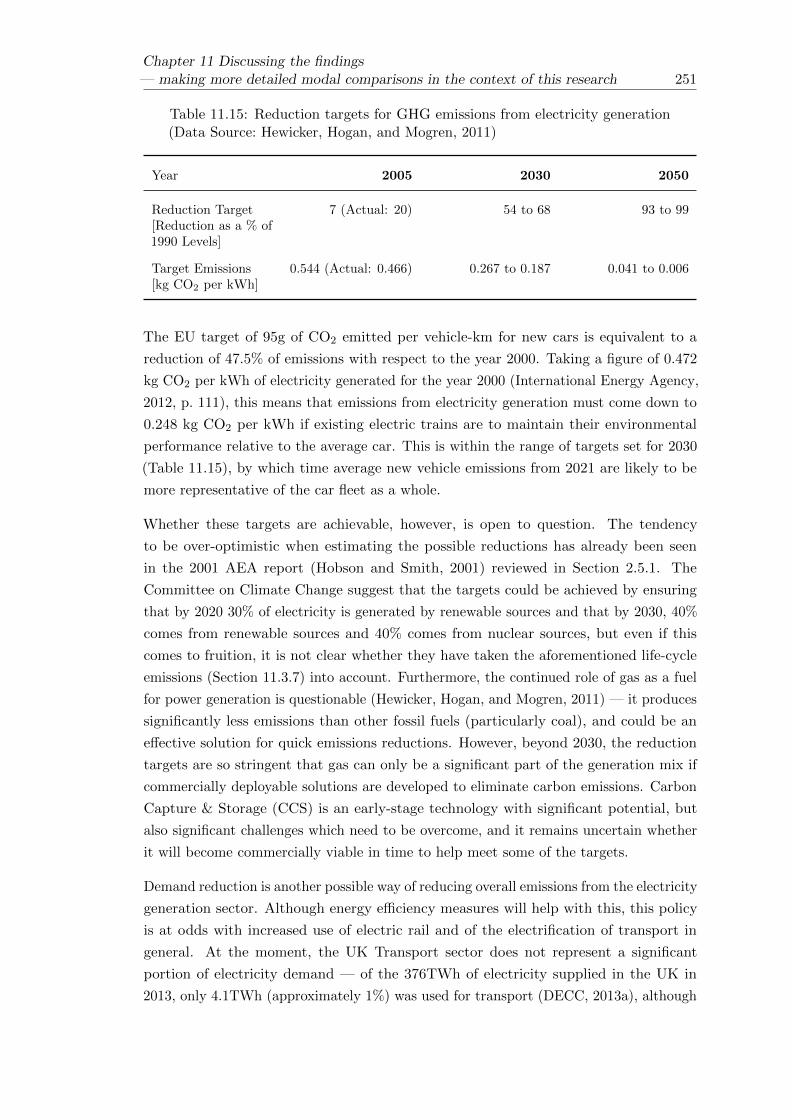
Chapter 11 Discussing the findings— making more detailed modal comparisons in the context of this research 251
Table 11.15: Reduction targets for GHG emissions from electricity generation(Data Source: Hewicker, Hogan, and Mogren, 2011)
Year 2005 2030 2050
Reduction Target[Reduction as a % of1990 Levels]
7 (Actual: 20) 54 to 68 93 to 99
Target Emissions[kg CO2 per kWh]
0.544 (Actual: 0.466) 0.267 to 0.187 0.041 to 0.006
The EU target of 95g of CO2 emitted per vehicle-km for new cars is equivalent to a
reduction of 47.5% of emissions with respect to the year 2000. Taking a figure of 0.472
kg CO2 per kWh of electricity generated for the year 2000 (International Energy Agency,
2012, p. 111), this means that emissions from electricity generation must come down to
0.248 kg CO2 per kWh if existing electric trains are to maintain their environmental
performance relative to the average car. This is within the range of targets set for 2030
(Table 11.15), by which time average new vehicle emissions from 2021 are likely to be
more representative of the car fleet as a whole.
Whether these targets are achievable, however, is open to question. The tendency
to be over-optimistic when estimating the possible reductions has already been seen
in the 2001 AEA report (Hobson and Smith, 2001) reviewed in Section 2.5.1. The
Committee on Climate Change suggest that the targets could be achieved by ensuring
that by 2020 30% of electricity is generated by renewable sources and that by 2030, 40%
comes from renewable sources and 40% comes from nuclear sources, but even if this
comes to fruition, it is not clear whether they have taken the aforementioned life-cycle
emissions (Section 11.3.7) into account. Furthermore, the continued role of gas as a fuel
for power generation is questionable (Hewicker, Hogan, and Mogren, 2011) — it produces
significantly less emissions than other fossil fuels (particularly coal), and could be an
effective solution for quick emissions reductions. However, beyond 2030, the reduction
targets are so stringent that gas can only be a significant part of the generation mix if
commercially deployable solutions are developed to eliminate carbon emissions. Carbon
Capture & Storage (CCS) is an early-stage technology with significant potential, but
also significant challenges which need to be overcome, and it remains uncertain whether
it will become commercially viable in time to help meet some of the targets.
Demand reduction is another possible way of reducing overall emissions from the electricity
generation sector. Although energy efficiency measures will help with this, this policy
is at odds with increased use of electric rail and of the electrification of transport in
general. At the moment, the UK Transport sector does not represent a significant
portion of electricity demand — of the 376TWh of electricity supplied in the UK in
2013, only 4.1TWh (approximately 1%) was used for transport (DECC, 2013a), although

252Chapter 11 Discussing the findings
— making more detailed modal comparisons in the context of this research
that represents an increase on previous years. It is important to note that, even if the
transport sector could be powered entirely by low carbon or renewable sources, it cannot
be separated out from the electricity generation mix as a whole. As RSSB (2007) put
it, “were the railway to be closed tomorrow, the [low carbon sources] would continue to
operate at their normal power, and some fossil fuelled power stations would be instructed
to operate at reduced load.” On the other hand, demand reduction in other sectors could
help to reduce reliance on more polluting power stations.
11.7 Interpreting the modal comparisons — implications
for policy
As it stands, assuming typical passenger loadings, intercity electric rail and intercity
coach travel appear to produce significantly less CO2 emissions per passenger than car
travel or domestic aviation. Section 11.4 focussed particularly on the long-distance route
between London and Glasgow, but the use of electric trains and intensive use of the
infrastructure on the route between London and Southampton means that rail could be
expected to perform similarly well along that corridor. The use of diesel trains, poor
passenger loadings and low utilisation of the infrastructure means that the rail route
between Swansea and Fishguard (and others like it) may not offer such benefits in terms
of emissions, although it is still likely to be preferable to driving. However, there are
other things to consider before promoting a policy of modal shift towards rail and/or
coach travel. Firstly, the journeys considered here are largely comparable in terms of
distance for each mode, but this cannot always be assumed to be the case. Section 11.7.3
explores this further, and also considers the fact that journeys made by public transport
are not always point-to-point in the same way that car journeys can be. Section 11.7.4
discusses the fact that minimising CO2 emissions may not be the only reason to choose a
particular mode, even within a remit of promoting “sustainability.”
Finally, although carbon calculator tools are typically geared around helping individuals
to make particular travel choices, benefits of modal shift are rarely realised at the
individual level. In fact, somewhat counter-intuitively, promoting driving in cases where
it would purport to produce the least emissions per passenger can still end up increasing
overall emissions if the alternative public transport modes continue to run in addition.
11.7.1 Assumptions about travel demand
An implicit assumption when using carbon calculator tools in the planning of a journey
is that the journey will be made regardless, and it is just the choice of mode which might
change. This assumption that travel demand is fixed, however, cannot be made when
considering policies to encourage modal shift. It was noted in Chapter 10 that policy

Chapter 11 Discussing the findings— making more detailed modal comparisons in the context of this research 253
instruments such as low fares might artificially enhance passenger occupancy levels by
encouraging people to make trips they wouldn’t otherwise have made. For these reasons,
an illustrative model to consider the overall change in emissions (∆X) resulting from a
new High Speed (HS) railway line was defined as follows (Pritchard, 2011):
∆X = PGenerated ×XHSR −∑
(PModalShift × (XHSR −XOtherModes)) (11.1)
where
• PGenerated is the number of new passenger trips on the High Speed railway which
wouldn’t otherwise have taken place.
• XHSR is the emissions per passenger of the High Speed railway.
• PModalShift is the number of passenger trips on the High Speed railway resulting
from modal shift.
• (XHSR −XOtherModes) is the reduction in emissions per passenger as a result of
travelling on the High Speed railway rather than an alternative mode.
Similar principles should be followed when considering the benefits of any new transport
system or policy intervention. Care should also be taken when assuming that any modal
shift automatically results in a reduction in emissions; the next section Section 11.7.2
elaborates on the idea of vehicle trip cancellation, noting that an overall change in
emissions may not result from an individual passenger switching modes. It is also
worth noting that an increase in demand for one mode (and a corresponding reduction
in emissions per passenger) can result in a reduction in demand for another (and a
corresponding increase in emissions per remaining passenger).
11.7.2 Vehicle trip cancellation
It may sometimes be assumed that a passenger switching from a more polluting mode
(such as driving or flying) to a less polluting mode (such as rail) will directly result in a
reduction in emissions. Unfortunately, the reality is somewhat different. Any potential
emissions savings tend not to occur at the point one passenger switches modes, but at
the point when enough passengers switch to warrant the cancellation of the trip. This
is summarised in a 2006 report entitled “High Speed Rail and GHG Emissions in the
US” (Center for Clean Air Policy and Center For Neighborhood Technology, 2006). This
is not necessarily hugely significant when considering modal shift away from the car,
because if the driver chooses an alternative mode of transport then the car journey is
not made, although there is the potential for indirect trip generation; if modal shift from

254Chapter 11 Discussing the findings
— making more detailed modal comparisons in the context of this research
road to rail results in reduced road congestion then some people may choose to make car
journeys which were previously unattractive.
Vehicle Trip Cancellation is a more important factor when assessing the overall benefits
of modal shift from air to rail. There is evidence to suggest that where high-speed
railway lines are built along domestic aviation corridors, enough modal shift does occur
to warrant a reduction in the number of flights - French domestic air traffic is said to
have declined 7% between 2000 and 2007, largely due to the increased availability of
TGV connections (OECD and International Transport Forum, 2009, Footnotes on Page
20). However, Section 5 of the same report notes that the shift from air to rail released
scarce capacity. In other words, the airline slots could have been reallocated elsewhere,
and a reduction in domestic aviation does not necessarily result in a reduction in aviation
overall. In the UK, slots at some of the major airports are so valuable that airlines have
been criticised for running empty flights to protect them during periods of low demand
(Nugent, 2008). If high-speed rail were to permanently reduce demand on a particular
corridor (for example London-Glasgow), airlines may simply use the slots to serve other
destinations instead. Without any sort of intervention to prevent this, the environmental
benefits of modal shift from air to rail would be substantially weakened.
11.7.3 Assumptions about trip distance
One of the disadvantages of the railway is that the network is fixed and at times quite
limited. Although there are examples within the UK of journeys where the railway
and main road are more or less parallel (for example, the M4 and the railway between
Newbury and Reading), there are plenty of journeys where this is not the case. When
travelling between Newbury and Southampton, for example, the most direct driving
route is straight down the A34, a distance of around 60 km (Transport Direct, 2012b),
whereas travelling by train involves travelling east to Reading before returning south west
to Southampton, a distance of nearly 100 km (Transport Direct, 2012b). Any advantages
the railway has in terms of operational efficiency are offset by the extra distance travelled,
although there will be some cases where the railway takes a less circuitous route than
the road.
An additional consideration is the fact that whereas the car can be used for an entire
journey between two points, it is very rare for a journey to be made which begins or
ends at a railway station. Hence when travelling by rail, a journey will usually comprise
more than the actual travelling on the train itself (the “line-haul element”). Transport
Watch UK suggest that for journeys whose main mode is rail, the average distance
travelled is about 7.5 miles more than the line-haul distance (Transport Watch UK,
2006). Where journeys to and from the station are made on foot, bicycle, or by existing
public transport, it would reasonably be expected that the environmental impact would
be negligible. At the other end of the scale, the worst-case scenario would perhaps be if

Chapter 11 Discussing the findings— making more detailed modal comparisons in the context of this research 255
a traveller received a lift in a car to and from the station, which could necessitate an
extra return car journey at each end of the trip. Additionally, when considering a new
station, the impact of developing a new bus network or other public transport system to
provide accessibility should not be underestimated.
The same considerations also apply to other modes of public transport, including flying.
The illustrative model therefore needs to be developed to take this into account. Whereas
it would be impossible to gather the data to accurately analyse every passenger’s entire
journey, some concept of travel patterns to/from the station or airport will be essential.
11.7.4 A summary of other aspects of sustainability
Chapter 1 introduced the concept of sustainability, and the notion that it has three
facets — economical, environmental and social. This work has focussed particularly
on the environmental aspects, and — more specifically — the goals of reducing energy
consumption and greenhouse gas emissions, but that doesn’t mean to say that other
sustainability concerns should be ignored when making travel choices. The limitations
of emissions per passenger-km as a metric were discussed in Chapter 10, where other
potential benefits of different modes were introduced. Table 11.16 summarises some other
sustainability concerns. It is evident that there may be some conflicts between them.

256Chapter 11 Discussing the findings
— making more detailed modal comparisons in the context of this research
Table 11.16: A summary of other sustainability concerns, besides energyconsumption and GHG emissions
Concern Area(s) ofsustainability
Likely best choiceof mode
Notes
Travel time Economic; affects useof time and limitstime for otherproductivity. Social;improved travel timecan reduce isolationof some communitiesand people.
Air (long distance) orRail (short tomedium distance) —provided that accessto/from the stationis convenient. Insome cases, thedoor-to-door optionoffered by the carmay be preferable.
Assumes that areduction in traveltime is asustainability goal.Some sustainabilitybenefits, particularlyeconomic ones, canbe had from aproductive use of thejourney itself(Section 1.11.2).
Flexibility Social; improvedconnectivity andmobility. Economic;more flexible traveloptions can allow forbetter business links
Car High frequencypublic transportservices can providenecessary flexibilitybetween certainorigin anddestination pairs.The low frequency ofbus and rail servicesis a big disadvantageon the Swansea toFishguard route.
Cost Economic and social;more affordabletravel options canimprove mobility
Car or bus. Travelconcessions (e.g. forthe elderly) canmake bus travelparticularlyattractive on thisfront.
Leisure travellers aretypically moreprice-sensitive thanbusiness travellers.
Noise Environmental(although there mayalso be an economicbenefit to reducinghealth problemsassociated with noisepollution).
Electric Rail High-speed rail canstill be quite noisy
Air quality Environmental (andsocio-economic ifrelated healthproblems are takeninto account
Electric Rail
Visual Intrusion Environmental.Economic if land andproperty values areadversely affected
Air Visual intrusion nearan airport is aconcern. Railinfrastructure andmotorways tend tobe the most visuallyintrusive along thelength of a route.

Chapter 11 Discussing the findings— making more detailed modal comparisons in the context of this research 257
11.8 Conclusions
The use of empirical data and other findings from the literature has enabled the outputs
of the carbon calculator tools considered in Chapter 2 to be verified, and has allowed
life-cycle emissions to be considered. It was found that the outputs from Travel Footprint
were most representative of reality, provided that the user made appropriate choices
about the mode. There was noticeable variation from the average data used by Transport
Direct, which typically overestimated emissions from electric rail. The empirical analysis
undertaken in Chapter 5, suggests that even when exact details are known about the
train, the route and the passenger loadings, operational emissions are still subject to
variation, and in addition to this, variation in train-type and passenger numbers is very
common — hence it would be preferable if the outputs from carbon calculators indicated
a possible range. The use of an absolute value, often to at least one decimal place, is
arguably a bit meaningless. Overall, despite the potential for variation, it was found that
carbon calculators — especially Travel Footprint — could be used to make a reasonable
estimate of operational emissions.
A discussion ensued about life-cycle emissions, and the Euston to Glasgow route was
examined in more detail. Although life-cycle emissions were found to be significant,
their consideration did not particularly influence whether one mode was typically more
polluting than another. However, this may depend on the assumptions made, and a new
railway project requiring a significant amount of earthworks, bridges and tunnels may
have particularly high life-cycle costs.
As per Chapter 10, it was found that the load factors did have an impact on the relative
performance between modes. At high load factors, domestic aviation remained the most
polluting, but the gap between other modes, particularly between intercity rail and coach
travel narrowed.
For informing policy decisions, comparisons based on carbon emissions per passenger
should not be the only factor influencing modal choice, and it was noted that the whole
door-to-door journey should be properly considered before assuming that rail or bus
travel is always preferable car travel. The issue of vehicle trip cancellation and the effect
of individual modal shift means that in the short term the best policy for reducing carbon
emissions is to encourage the use of the least polluting mode of public transport (rail or
coach), but long term service provision and behavioural change should be considered.


Chapter 12
Concluding remarks & future
work
The concept of sustainability was introduced in Chapter 1 as being one of the key
challenges of the present age. A very broad topic, it was defined by Brundtland (1987)
as “development that meets the needs of the present without compromising the ability of
future generations to meet their own needs.” Sustainability has economic, environmental
and social facets which must be kept in balance, and may sometimes be in conflict with
one another. Sustainability is something to strive for in many areas of life and sectors of
activity, and the transport sector stands out both as a sector which should in itself be
sustainable and as a key aspect of sustainability in other areas due to the provision of
mobility and the support of economic activity.
To move from broad definitions to practical concepts, sustainability goals are often
defined. Some key sustainability objectives were introduced in Section 1.4, and it was
noted that many such goals can simultaneously support two or more of the three facets.
For example, mitigation of the effects of climate change is thought to have economic
benefits (compared with the alternative costs of adaptation later on) and social benefits
(such as the protection of livelihoods and communities which would otherwise be “at
risk”). Focussing particularly on environmental sustainability, there are many noteworthy
concerns, including a desire for better land-use management, a reduction in noise and
visual issues, better resource management and a reduction in emissions. Given the
global challenges associated with concerns about climate change, and the consensus that
greenhouse gas (GHG) emissions need to be reduced, the reduction of GHG emissions
was chosen as the main focus of the research. Tied in with this was a focus on a reduction
in energy consumption, because the two can be directly related and the latter is often
more easily understood and quantified.
It was shown that the transport sector is responsible for a significant amount of global
GHG emissions. A key reason for this is a strong reliance on the internal combustion
259

260 Chapter 12 Concluding remarks & future work
engine, and as such, carbon dioxide (CO2) is currently the most dominant GHG produced
by the transport sector. Although technological improvements have a role to play,
continued demand for travel means that other policies will be required if stringent GHG
reduction targets are to be met. On the basis that the provision of transport is itself a
key sustainability concern, blanket policies to reduce travel demand completely could
have undesirable economic and social ramifications. One possible behavioural solution,
however, is to encourage shift from those modes which emit more GHGs to those modes
which emit less.
In this context, rail transport — which is currently a minority mode, especially compared
with car travel — could be a good target for such modal shift, with the bulk movement
of passengers and freight on steel rails being comparatively efficient. With a particular
focus on passenger transport, this research has set out to investigate whether modal shift
from road transport (and, where applicable, domestic aviation) to rail transport does
indeed have potential as a policy for reducing GHG emissions.
Chapter 2 reviewed some online carbon calculator tools used for estimating carbon
emissions from a given journey, and the results for three different sample journeys
were considered. It was found that making a journey by train would be expected to
produce less CO2 emissions per passenger than the same journey by car in each case
and — in the case of a long distance journey — it would certainly be less polluting per
passenger than flying. The distinction between the train and the bus was less clear,
with some carbon calculators suggesting that the bus would be better than the train.
Consideration of the underlying methodology in each case, however, made it clear that
robust conclusions from the carbon calculator outputs should not be drawn. Carbon
calculators rely on assumptions about the type of vehicle, the journey distance (especially
for public transport modes) and the typical passenger load factors (which affects how
emissions are apportioned on a per-passenger basis). There was a notable reliance on
average data, which means that the results may not be applicable to specific journeys.
In order to make more robust comparisons, it was decided to move away from average
data where possible, and the second part of Chapter 2 included a review of available
data for cars and trains. It was found that emissions from cars (in Europe, at least) are
theoretically well understood, due to legislation which requires the publication of fuel
consumption and CO2 emissions data for all models of car on sale in the European Union.
In practice, it is noted that the standardised laboratory testing used to obtain official
figures may be increasingly unrepresentative of real-world conditions, but there is some
understanding of how the manufacturers’ figures should be adjusted to take into account
real-world driving. It was found that data for trains are much less well understood, and
a review of the existing data uncovered a range of methodologies, from simulations with
basic assumptions made about the route and the service pattern to empirical data taken
from just a handful of isolated journeys. The fact that several sources suggested very

Chapter 12 Concluding remarks & future work 261
different energy consumption data for the same class of train made it clear that more
research was required.
Some Train Operating Companies (TOCs) in the UK have recently fitted their electric
train fleets with energy meters, in order to more accurately monitor consumption, and
recorded data were obtained from two such TOCs. The basics of energy metering
systems, and a summary of the data available were presented in Chapter 3. Data about
the physical railway network and train scheduling data were used to calculate energy
consumption in terms of kilowatt-hour (kWh) per train-km for a large number of different
services (Chapter 4). This metric provided a basis for comparison with other modes,
once passenger load factors had been estimated, and allowed different trains and services
to be compared. The dataset was much more comprehensive than any of the existing
empirical data considered in Chapter 2, and the variation in observed operational energy
consumption was explored in Chapter 5. The observed range in energy consumption for
each of the trains in the empirical data set studied here is less than the range of estimated
values for a given type of train in the literature reviewed in Chapter 2. This is likely
to be because of the reliance in the literature on simulations, which can have limited
accuracy, and because the data published are not always well defined — for example, it
is not always clear whether the published data refer to net energy consumption (taking
in to account the energy recuperated if the train is fitted with a regenerative braking
system) or whether they include other overheads such as non-revenue running and idling.
Nonetheless, significant variation was observed in the empirical data, with aspects of
the route and service, the influence of the driver and temporal factors being important
explanatory factors.
No driver data were available for the fleet of suburban trains studied, but the route
itself was found to be a significant explanatory variable for the observed variation in
operational energy consumption. An important characteristic of a given route and
schedule is the distance between stops, and trends were observed between the mean stop
spacing and the mean net operational energy consumption. RSSB (2010a) suggested
ways in which services could be classified according to the mean distance between stops,
and the observed energy consumption for outer suburban services operated by Class
350/2 trains was found to be 14% higher than the observed energy consumption for
inter-urban services operated by the same trains (Table 11.1). This confirms the claim
by RSSB that some of the differences they found for outwardly similar types of train can
probably be attributed to variations in the route and service pattern and shows that the
type of service must be taken in to account when considering data about the operational
energy consumption of a train.
Where (non-personally identifiable) driver data were available, for the fleet of intercity
trains studied, the (anonymised) DriverID number was used as an explanatory variable
to estimate the influence of the driver on the operational energy consumption. It was
found that when using single explanatory variable univariate linear regression models for

262 Chapter 12 Concluding remarks & future work
the mean net energy consumption, the adjusted R2 value was higher for DriverID than
it was for route as an explanatory variable, although it should be noted that aspects of
the route and service appear to be less important for intercity services than for suburban
services (see Figures 5.8 to 5.10, for example). Methods for modelling and simulating the
operational energy consumption of a train were explored in Chapter 7 where it was found
that the use of rudimentary fixed parameters to model driving style were inadequate for
accurately modelling the observed energy consumption on four services chosen for more
detailed analysis. Furthermore, when maximum application of tractive effort and braking
force were assumed (“all out running”), the mean net energy consumption estimated by
the Arup RouteMaster tool increased from 2% below the observed mean to 26% above
it. It is no wonder, therefore, that the values for a given type of train in the reviewed
literature (Section 2.5), which include a mixture of simulated and empirical data, were
found to vary so much.
Driver efficiency ratings were devised, which were more suitable for modelling the influence
of the driver than an arbitrary DriverID. Chapter 8 studied the empirical On Train
Monitoring Recorder (OTMR) data in more detail for the four services selected in
Chapter 7. It was found that coasting (running with no applied traction or braking force)
is an important part of the overall driving profile, and that those drivers ranked as most
efficient made better use of coasting. The variation of applied tractive effort with speed
was investigated, and the resulting profiles were found to differ between the different
routes. This is likely to be because different routes have different gradients, line speed
profiles and stopping patterns, which can all influence the required tractive effort.
It was noted that the operational energy consumption could be divided into three key
components — energy used to move the train (the traction energy), energy used for
onboard auxiliaries such as heating and lighting (the hotel load) and, where the train
is so equipped, energy recovered by regenerative braking systems and returned to the
grid. Chapter 6 analysed the regenerative braking performance of the trains which were
studied in Chapter 5 and it was found that such systems can indeed offer significant
benefits. As with the data for the net energy consumption in Chapter 5, simple analysis
of variance was undertaken. Again, the influence of the driver and aspects of the route
and service were seen to be important, but there was less temporal variation. It was
difficult from the available data to measure the hotel load accurately, but estimates were
made by considering energy measurements taken when the trains were stationary. It was
found that there was a variation in the hotel load with temperature, which was expected
due to the fact that the heating, ventilation and air-conditioning (HVAC) systems are an
important component. The hotel load was found to form a larger part of the net energy
consumption for suburban services, likely to be due to lower running speeds and more
frequent opening of the outer doors, but even for the intercity services it was found to be
in the region of 10% of the net energy consumption — this affirms recent decisions taken
by some TOCs to fit trains with more energy efficient lighting and auxiliary systems.

Chapter 12 Concluding remarks & future work 263
Initial modal comparisons in Chapter 1 and Chapter 2 were made on a per-passenger
basis, which makes sense because on a per-vehicle basis different types of transport
are generally not directly comparable. In order to calculate energy consumption or
emissions on a per-passenger basis, passenger occupancy levels must be known. These
were explored in Chapter 10 where it was shown that assumptions about passenger
occupancy levels can greatly affect the comparisons between modes when considering
GHG emissions. For rail, the passenger occupancy levels can be particularly variable
— especially on routes used by commuter traffic. It was also found that defining load
factor in terms of seating capacity was not always appropriate. For long-distance bus
and rail services, it is reasonable to expect all passengers to have a seat, whereas for
suburban services there could be a number of standing passengers. It was noted that
strategies to increase the occupancy levels of a public transport service, thereby reducing
the emissions per passenger, could be counter-productive if they increased travel demand
rather than encouraged modal shift.
Although some thought had been given to non-revenue overheads such as running to/from
the depot and idling (Section 6.7) most of the comparisons centred around the operational
energy consumption and emissions directly associated with the movement of passengers
between two points. Chapter 9 provided an overview of some of the wider life-cycle
emissions associated with the provision of a transport system, including the construction
and maintenance of the vehicles and infrastructure. Data available in the literature are
variable, reflecting the level of complexity, the variation between different systems (for
example, an urban rail system has very different infrastructure from a long distance one)
and the fact that boundaries for what should and should not be considered are sometimes
ill-defined. It was found, however, that life-cycle components are significant and should
not be ignored — especially for rail systems, which can require more carbon-intensive
infrastructure than other modes.
Chapter 11 returned to the carbon calculator comparisons, using the more specific data
obtained during this research to make more accurate estimates of the emissions for
the three sample journeys. It was found that even when life-cycle considerations were
taken into account, the overall trends remained the same — namely that trains generally
produce fewer emissions per passenger than cars or aircraft. However, the pitfalls of
using average data (as used by the Transport Direct carbon calculator) can be seen in
Figures 11.1 to 11.3 — for the routes operated by electric diesel with high load factors,
Transport Direct overestimated the emissions compared with the empirical estimates
calculated here, whilst for the route between Swansea and Fishguard, which is a rural
diesel service, Transport Direct underestimated the emissions.
Looking ahead, it could be concluded that the railway is indeed a suitable target for modal
shift if the reduction of energy consumption and emissions remains a key concern. There
are, however, questions which need to be answered. Chapter 2 showed how progress is
being made in the motor industry and if there continues to be a move towards alternative

264 Chapter 12 Concluding remarks & future work
fuels and electric cars then the advantage the train has may narrow. Chapter 10 showed
how a full hybrid car could provide fewer emissions per passenger than a train, whilst
Chapter 11 outlined some of the other advantages of car-sharing schemes. On the other
hand, however, the rail industry is also set to benefit from technological improvements
and the decarbonisation of the electricity grid.
Within the diverse range of sustainability goals, different modes have different strengths.
Although the coach was found to be very competitive compared with intercity rail in
terms of emissions, rail remains more attractive in other areas, including speed and use
of travel time (in many cases). These factors should not be ignored, and play a role in
determining the potential for modal shift. Questions about how to encourage modal
shift without encouraging new travel demand need to be answered, whilst an inherent
variability in demand for rail services (Chapter 10) mean that making the most efficient
use of capacity may not be possible all the time. As it stands, the available rail capacity
compared with the available road capacity is small and widespread modal shift may
require new infrastructure. In this case, some of the life-cycle concerns, which may be
considered less important for existing infrastructure, become more prominent.
Rail should be able to play an important role as part of a wider sustainable transport
system, and it has been shown that it can currently provide mass transport with fewer
emissions per passenger than a typical journey made by car. However, by making use of a
much more comprehensive empirical dataset than has been found in previously published
literature, this thesis has confirmed that the operational energy consumption (and related
emissions) of rail depend on the context, with some routes and services performing better
than others. Comparison of the empirical data analysed with estimates from a simulation
tool and with existing data in the literature has shown that assumptions made about
route and service or about driving style can make a significant difference, and that some
simulation data are not adequate enough for making fair comparisons with other modes.
Although not investigated here, it is likely that rail has similar strengths as a mode of
freight transport, but in both cases, the discussion of life-cycle analysis has shown that
consideration of operational energy consumption and emissions alone are not enough.
It has been shown that policy makers wishing to develop the role of rail as part of a
sustainable transport system need to have a clear understanding of the data they make
use of, so that they can account for the limitations and make sure that it is appropriate
for a given context.
There is much scope for future work on the topic. Chapter 5 noted that there are
additional factors which may influence the operational energy consumption and emissions
of a train. These include train punctuality and passenger loading. The empirical data
provided by the two TOCs could be used to undertake further study on non-punctual
services, but more data would be required in order to include passenger loading in any
analysis. A welcome additional benefit of obtaining passenger loading data is that it

Chapter 12 Concluding remarks & future work 265
would be possible to verify some of the discussions in Chapter 10 and to begin to better
understand where there is most scope for increasing passenger load factors.
It was also noted in Chapter 5 that it would be desirable to better describe features of
different routes, in order to improve the accuracy of the models to describe and predict
the variation in energy consumption, and to make them more widely applicable. A
more detailed understanding of the differences between routes may also help with the
development of improved traction and braking profiles to replace the fixed parameters
currently used by the Arup RouteMaster tool, as discussed in Chapter 8. In any case,
work is ongoing to further develop the RouteMaster tool, and the inclusion of coasting in
to the driving profile is seen as a high priority.
Finally, whilst Chapter 8 showed how features of a route (such as gradients) can affect
operational energy consumption and emissions, Chapter 9 showed how features of the
route (such as tunnels and embankments) can affect life-cycle energy consumption and
emissions. A continuation of this research will therefore involve working to understand
some of the trade-offs involved in infrastructure design (for example, it may be that
something which reduces operational emissions increases embedded emissions). As part
of this, work with Arup is ongoing to enhance a database of embedded carbon in railway
infrastructure.


Appendix A
Energy consumption data
provided for the research
Operational energy consumption data were provided for this research by two UK Train
Operating Companies (TOCs), London Midland and Virgin Trains.
A.1 Virgin Trains data
Virgin Trains supplied energy consumption data from their fleet of intercity Class 390
Pendolino trains, as pictured in Figure A.1. Basic details of the fleet are summarised in
Table A.1.
Figure A.1: A Pendolino train (Scott, 2004)
267

268 Appendix A Energy consumption data provided for the research
Table A.1: Details of Virgin Trains’ Pendolino fleet
Train type Class 390/0 Class 390/1
Number in fleet 53 (until 2012), 22 (after2012)
35
Number of carriages 9 11
Maximum speed [km/h](mph)
201 (125) 201 (125)
Train mass [t] 466 567
Seating capacity 439 589
Introduction in to service 2002 2010
Notes 31 of the fleet were originallybuilt as nine-carriage Class
390/0 and later extended
The energy measurement system on the Pendolino fleet is part of the Train Management
System (TMS). The TMS records the energy usage and aggregates it over five-minute
segments. At the end of each five-minute dataset, the TMS date/time stamp and GPS
position is attached. A ground based server polls each train on a nightly basis and
downloads these aggregated readings. Each Pendolino train is made up of a fixed set
of either nine or 11 carriages. Although each set is always operated as a whole unit,
with one driving cab at each end, the trains are divided into segments, each with its
own systems. A nine-carriage train comprises two segments, and an 11-carriage train
has three. Each segment measures its own energy usage from three current transducers
(CTs) and voltage transducer (VT).
Energy measurements are made in each of the two segments of a nine-carriage Pendolino
and in each of the three segments of an 11-carriage Pendolino. At each measurement
point, both the gross energy consumed and that returned to the grid via the regenerative
braking system is recorded in kilowatt-hour (kWh). Energy data for the whole train can
be obtained by combining the data for each segment.
On Train Monitoring Recorder (OTMR) Data are recorded across 159 channels, each
one monitoring a different input or variable. Channels include speed, distance, driver
inputs and the operation of various train functions. The system is an event recorder,
and data are captured every time the input value on any given channel changes. Each
such event is assigned two integer IDs — a RunID, which is incremented every time the
train is started or begins a new duty, and a TimeSlotID which is unique to each event
recorded within a Run.

Appendix A Energy consumption data provided for the research 269
The data from Virgin Trains were supplied in a Microsoft SQL database. Tables in the
database include a table of the energy readings taken every five-minutes, data pertaining
to the route allocation of each train, and a comprehensive set of OTMR data.
A summary of the data supplied by Virgin Trains is given in Table A.2.
Table A.2: A summary of the data supplied by Virgin Trains
Data Period Covered Notes
Energy Readings 2nd February 2009 to 1stSeptember 2012
20,470,550 records in total,covering the entire Pendolinofleet. Each record includesthe date the measurementswere taken, the train theywere taken from, energyreadings from each trainsegment, the location of thetrain at the time ofmeasurement and anindication of the quality ofthe measurements.
Fleet Maintenance Records 29th March 2010 to 6thSeptember 2012
Some records undated.
Fleet Allocation Records 1st April 2009 to 6thSeptember 2012
443,163 records in total. Thetable includes allocatedschedules for each train inthe fleet, including departureand arrival times and routemileage.
Train Running Data 1st April 2010 to 5thSeptember 2012
391,543 records in total.Records include actualperformance data for eachscheduled service, with fieldsincluding Punctuality atOrigin and Destination (inminutes).
OTMR Data 15 Tables
A.2 London Midland data
London Midland supplied energy consumption data from their fleet of suburban electric
trains, comprising Class 321s (Figure A.2), Class 323s (Figure A.3), and Class 350s
(Figure A.4). Basic details of the fleet are summarised in Table A.3.
London Midland use separate energy metering systems, provided by Interfleet Technology.
In addition to monitoring electricity consumption via a voltage/current transducer in the

270 Appendix A Energy consumption data provided for the research
Figure A.2: A Class 321 train (Skuce, 2009a)
Figure A.3: A Class 323 train (Wikimedia Commons, 2008)
Figure A.4: A Class 350 train (Skuce, 2009b)
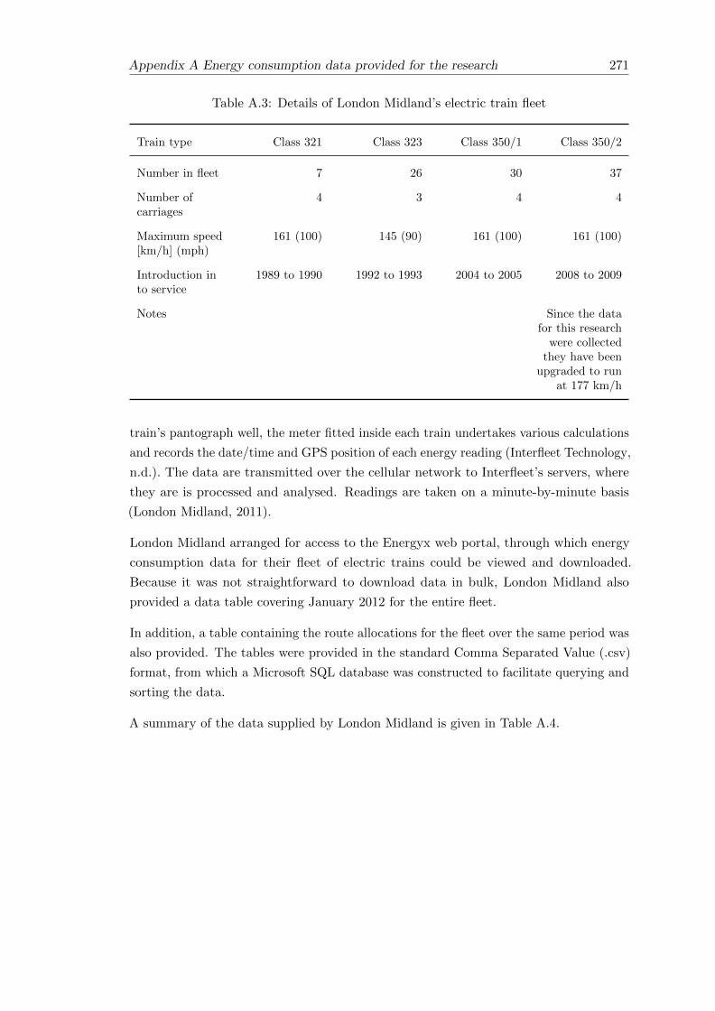
Appendix A Energy consumption data provided for the research 271
Table A.3: Details of London Midland’s electric train fleet
Train type Class 321 Class 323 Class 350/1 Class 350/2
Number in fleet 7 26 30 37
Number ofcarriages
4 3 4 4
Maximum speed[km/h] (mph)
161 (100) 145 (90) 161 (100) 161 (100)
Introduction into service
1989 to 1990 1992 to 1993 2004 to 2005 2008 to 2009
Notes Since the datafor this research
were collectedthey have been
upgraded to runat 177 km/h
train’s pantograph well, the meter fitted inside each train undertakes various calculations
and records the date/time and GPS position of each energy reading (Interfleet Technology,
n.d.). The data are transmitted over the cellular network to Interfleet’s servers, where
they are is processed and analysed. Readings are taken on a minute-by-minute basis
(London Midland, 2011).
London Midland arranged for access to the Energyx web portal, through which energy
consumption data for their fleet of electric trains could be viewed and downloaded.
Because it was not straightforward to download data in bulk, London Midland also
provided a data table covering January 2012 for the entire fleet.
In addition, a table containing the route allocations for the fleet over the same period was
also provided. The tables were provided in the standard Comma Separated Value (.csv)
format, from which a Microsoft SQL database was constructed to facilitate querying and
sorting the data.
A summary of the data supplied by London Midland is given in Table A.4.

272 Appendix A Energy consumption data provided for the research
Table A.4: A summary of the data supplied by London Midland
Data Period Covered Notes
Energy Readings 1st January 2012 to 31stJanuary 2012 inclusive
3,933,803 records in total.Each record is assigned aunique integer ID andincludes the time the readingwas taken and the train itwas taken from. Energymeasurements are split intogross energy, energy returnedto the grid via regenerativebraking and net energy — allin kWh. Each record alsoincludes a location field, witha GPS measurementdescribing the location of thetrain at the time the readingwas taken and integer fieldsto indicate the reliability ofthe data. Additional fieldsinclude measurement ofcurrent and voltage andestimates of CO2 emissions.
Fleet Allocation Records 30th December 2011 to 2ndFebruary 2012
Matches energy readings to ascheduled service, defined byan integer “service code”, analphanumeric “serviceheadcode”, a start time andan end time. 1,739,744allocated energy readingsover 19,477 scheduledservices.

Appendix B
A synopsis of the data tables built
for analysing London Midland
data
To facilitate analysis of the energy data supplied by London Midland, a new Microsoft SQL
database was created and populated accordingly. The key data tables are summarised
here.
273

274Appendix B A synopsis of the data tables built for analysing London Midland data
Table B.1: A summary of the data contained in the “EnergyReadings” datatable
Field Name Field Contents
EnergyReadingID The unique integer supplied with each energyreading
UnitClass The first four digits of the fleet number of thetrain. These describe the type of train inquestion and have been included separatelybecause the energy data is for anon-homogenous fleet of trains and needs tobe analysed accordingly.
FleetNumber The last two digits of the fleet number of thetrain, identifying a particular train within aUnitClass
TimeStamp The date/time of the energy reading
LatitudeThe GPS data supplied with the energy reading
Longitude
GrossKwh The total energy consumed (summed over allmetering points)
RegenKwh The total energy returned to the grid(summed over all metering points)
EnergyQualityRef An integer recorded to indicate the quality ofthe energy data
LocationQualityRef An integer recorded to indicate the quality ofthe location data
Table B.2: A summary of selected fields in the “EnergyReadingStatus” datatable
Field Name Field Contents
EnergyReadingID (see Table B.1)
UnitClass (see Table B.1)
Train The full six digit identifying number for thetrain, in the format UnitClass +FleetNumber
TimeStamp (see Table B.1)
TimePeriod The time period in which the energy readingwas taken.
EnergyStatus “OK” if the relevant energy quality referenceis 127, “N” otherwise

Appendix B A synopsis of the data tables built for analysing London Midland data 275
Table B.3: A summary of the data contained in the “AllocationID” data table
Field Name Field Contents
EnergyReadingID The unique integer to identify a particularenergy reading. Synonymous withIDtblRawEnergyUsage in the tables suppliedby London Midland
AllocationID An integer generated to identify theallocation of a specific train to a specificservice
UnitClass The class of train which has been allocated tothe service
FleetNumber The specific train which has been allocated
ServiceID An integer generated to identify a specificservice
ServiceHeadCode The alphanumeric code used to identify aparticular train service — as provided byLondon Midland in the allocations table.
ServiceCode An integer used to identify a particular trainservice — as provided by London Midland inthe allocations table.
ServiceStartDateTime The date and time at which the servicestarted — as provided by London Midland inthe allocations table.
ServiceEndDateTime The date and time at which the servicestopped — as provided by London Midlandin the allocations table.

276Appendix B A synopsis of the data tables built for analysing London Midland data
Table B.4: A summary of the data contained in the “AllocationDetails” datatable
Field Name Field Contents
AllocationID The unique integer ID for the allocation of aparticular train to a particular service
UnitClass The class of train which has been allocated tothe service
FleetNumber The specific train which has been allocated
ServiceID The integer ID of the service to which thetrain has been allocated
UnitCount The number of trains which have beenallocated to the service — used to identifyservices which are operated by trains runningin multiple
ServiceHeadcode The alphanumeric code used to identify aparticular train service — as provided byLondon Midland in the allocations table
ObservedOrigin The nearest TIPLOC matched to the firstenergy reading for a given service from theAllocationID table
ObservedDestination The nearest TIPLOC matched to the lastenergy reading for a given service from theAllocationID table
ServiceStartDateTime The date and time at which the servicestarted — as provided by London Midland inthe allocations table
ServiceEndDateTime The date and time at which the servicestopped — as provided by London Midlandin the allocations table
ServiceMinutes The number of minutes between theServiceStartDateTime and theServiceEndDateTime
TotalReadings The total number of energy readings linkedto a particular allocation
NonStationaryReadings The number of energy readings correspondingto a period of movement linked to aparticular allocation
ValidEnergyReadings The number of energy readings linked to aparticular allocation which are not thought tobe erroneous
ValidLocationReadings The number of energy readings linked to aparticular allocation which are thought tohave been located correctly

Appendix B A synopsis of the data tables built for analysing London Midland data 277
Table B.5: A summary of the data contained in the “MatchedScheduleAllocation’data table
Field Name Field Contents
AllocationID The unique integer ID for the allocation of aparticular train to a particular service
ScheduleID The unique integer ID assigned to aparticular schedule in the Train ServiceDatabase.
DayOfWeek An integer representing the day of the weekon which the service is run, from 1 (Monday)to 7 (Sunday)
OriginPuncuality The number of minutes between thescheduled departure from the origin and theactual departure from the origin (a negativenumber indicates a delay)
DestinationPunctuality The number of minutes between thescheduled arrival at the destination and theactual arrival (a negative number indicates adelay)
OriginEnergyReadingID The EnergyReadingID corresponding to thetrain at the origin
DestEnergyReadingID The EnergyReadingID following arrival atthe destination
ScheduleKm The length of the journey (in km)


Appendix C
A synopsis of the data tables built
for analysing Virgin Trains data
To facilitate analysis of the energy data supplied by Virgin Trains, a new Microsoft SQL
database was created and populated accordingly. The key data tables are summarised
here.
Table C.1: A summary of the data contained in the “ValidEnergyReadings”table
Field Name Field Contents
ReadingID A unique integer generated and assigned toeach record for ease of referencing later.Analogous to the EnergyReadingID field inthe London Midland data but generated aspart of the analysis rather than beingsupplied in the original data.
Train The fleet number of the train in the format390xxx
Date The date/time of the energy reading
GPS The GPS data supplied with the energyreading
TotalGrossKwh The total energy consumed (summed over allmetering points)
TotalRegenKwh The total energy returned to the grid(summed over all metering points)
279

280 Appendix C A synopsis of the data tables built for analysing Virgin Trains data
Table C.2: A summary of the data contained in the “ElevenCarUpgrades” table
Field Name Field Contents
FleetNumber The last two digits of the train’s fleet number,identifying a specific train in the fleet
IntegrationDate The “11 Car Integration” date in themaintenance records for the specific train. Ifmore than one such date exists, the first onewas taken. If no date exists, this field is leftempty (NULL).
FirstElevenCarSchedDept The first entry in the service allocation datareferring to the train as 3901xx rather than3900xx. If there is no such date, this field isleft empty.
FirstEnergyReading The first energy reading for the train inwhich the “653” RecordState is “OK” andthe recorded consumption is greater thanzero. If there is no such reading, this field isleft empty.
NineCarExService The assumed last day in service as anine-carriage train; the earliest of theintegration date and the day before the first11-carriage energy reading. If there are norelevant dates for the train then the fieldremains NULL.
ElevenCarInService The assumed first day in service as an11-carriage train; if no such service allocationdata exists then this is taken as the day ofthe first 11-carriage energy reading. If thereare no relevant dates for the train then thefield remains NULL.
Table C.3: A summary of the data contained in the “StopDays” data table
Field Name Field Contents
FleetNumber The last two digits of the train’s fleet number
StopDate The date at which the train was recorded asout of service
OKDate The “OK” date given in the maintenancerecords (the date the train was fit for serviceagain)
StopDays The number of consecutive days the train wasout of service for

Appendix C A synopsis of the data tables built for analysing Virgin Trains data 281
Table C.4: A summary of the data contained in the “VTEnergyReadingStatus”data table
Field Name Field Contents
EnergyReadingID The unique integer identifying the energyreading
Train The fleet number of the train in the format390xxx
TrainLength The number of carriages (9 or 11)
TimeStamp The date/time of the energy reading
TimePeriod The time period during which the readingwas taken
TrainStatus Used to identify when the train was inservice, at a depot or on maintenance.
AllocatedHeadcode Refers to the service the train was allocatedto at the time the reading was taken.
RunID Refers to the OTMR RunID at the time thereading was taken.
MatchedScheduleID Refers to the service the train was allocatedto at the time the reading was taken.
RouteName Refers to the service the train was allocatedto at the time the reading was taken.
TempC Gives an estimate of the temperature at thetime the reading was taken

282 Appendix C A synopsis of the data tables built for analysing Virgin Trains data
Table C.5: A summary of the data contained in the “RunAllocations” data table
Field Name Field Contents
RunID The integer identifying a particular run
FleetNumber The two digits which identify a particulartrain in the fleet
DriverID A unique integer which is tied to a particulardriver. No personally identifiable informationis held, but this can be used to help assesshow energy consumption varies according todriving style
Headcode The alphanumeric code used to identify aparticular train service
ScheduledDeparture The scheduled departure time of the service
Origin The origin TIPLOC of the service
Destination The destination TIPLOC of the service
OriginPunctuality The difference in minutes between thescheduled departure and the train runningdata (where available)
DestinationPunctuality The difference in minutes between thescheduled departure and the train runningdata (where available)
RouteMiles The distance (in miles) of the allocated route
RunMiles The distance (in miles) recorded by theOTMR along the route. It is expected to bewithin 10% of the allocated data
TrainLength The number of carriages — either 9 or 11
OTMRInstance Either 1 or 2. Used to identify the twoRunIDs which correspond to the same trainon the same run (one from each train half)and to filter the data accordingly so thatduplicate data can be excluded

Appendix C A synopsis of the data tables built for analysing Virgin Trains data 283
Table C.6: A summary of the data contained in the “MatchedRunSchedule” datatable
Field Name Field Contents
RunID The integer identifying a particular run
Headcode The two digits which identify a particulartrain in the fleet
AllocatedDeparture The allocated departure time of the service inthe data provided by Virgin Trains
ScheduledDeparture The scheduled departure time of the servicein the Train Service Database provided byNetwork Rail
AllocatedArrival The allocated arrival time of the service inthe data provided by Virgin Trains
ScheduledArrival The scheduled arrival time of the service inthe Train Service Database provided byNetwork Rail
Origin The origin TIPLOC of the service
Destination The destination TIPLOC of the service
ScheduleID The unique integer ID assigned to aparticular schedule in the Train ServiceDatabase.


Appendix D
Additional rail network and train
schedule details
D.1 Key depots and sidings used by London Midland and
Virgin Trains
285

286 Appendix D Additional rail network and train schedule details
Table D.1: Key depots and sidings used by London Midland and Virgin Trains
Depot Name TIPLOC Code Type Operator
Soho LightMaintenance Depot
SOHODED Depot London Midland
Longsight TractionMaintenance Depot(Electric)
LNGSEMD Depot Virgin Trains
Polmadie CarriageMaintenance Depot
PLMDCMD Depot Virgin Trains
Wembley Inter CityDepot
WMBYICD Depot Virgin Trains
Oxley CarriageMaintenance Depot
OXLEYCS Depot Virgin Trains
Edge Hill CarriageMaintenance Depot
EDGHCMD Depot Virgin Trains
NorthamptonElectric MaintenanceDepot
NMPTEMD Depot London Midland
Camden CarriageServicing Depot
CMDNCSD Depot London Midland
Camden CarriageWashing Machine
CMDNCWN Sidings London Midland
Bletchley CarriageSidings
BLTCCS Sidings London Midland
Bletchley CarriageWashing Machine
BLTCCWM Sidings London Midland
Coventry Yard COVNYD Sidings London Midland
LongbridgeReversing Sidings
LONBRS Sidings London Midland
Northampton RiverSidings
NMPTNRS Sidings London Midland
WolverhamptonCarriage Sidings
WVRMCS Sidings London Midland
Crewe CarriageSidings L&NWR Site
CREWLNW Sidings London Midland

Appendix D Additional rail network and train schedule details 287
D.2 The format of train schedule data
Train scheduling data were obtained from Network Rail’s Train Service Database (TSDB),
which adheres to the Common Interface File (CIF) standard. A CIF Extract file is
sequential, containing fixed-length 80 character records. There are different types of
record, which can be identified by the first two bytes of a record — the record identity.
An individual train schedule comprises the following set of records:
• A basic schedule record (BS)
• A basic schedule extra details record (BX)
• Train specific note records (TN), if present
• An origin location record (LO)
• A sequence of intermediate location records (LI) in journey order, preceded by a
change en route record (CI) if present for a given location
• A terminating location record (LT)
Location specific note records (LN) may follow any LO, LI or LT records.
Basic Schedule records (BS and BX) contain a whole set of fields describing aspects of a
particular schedule. This includes dates between which the schedule is valid, the days of
the week on which the service runs, some details about the type of train used, maximum
speed data and a set of fields used to identify the service.
Although it is important to have a defined standard for train scheduling data, the CIF
format used by Network Rail is not easily linked with other data, such as train allocation
data from the operators. In order to overcome this, Python was used to extract schedule
data from the supplied CIF files and produce data tables which could be imported into
an SQL database.
A Python module was written to produce two data tables from any given CIF file. The
first table is based mainly on the “basic schedule” (BS and BX) records and contains a
summary of all the schedules contained within the CIF file. Each schedule is assigned a
unique integer ID for easy referencing later, and other fields include the Headcode, the
Train Operator (ATOC) code, the origin and destination, departure and arrival times
and the days on which the schedule is valid.
The second table is based mainly on the location fields from the CIF file and lists the
timings given at each location for a schedule, and identifies each location appropriately
as an Origin, Destination, (other) Stop or just a point which is passed (“Pass”). Each
record is associated with a schedule in the first table by means of an integer ID.

288 Appendix D Additional rail network and train schedule details
The Python module also contains a function to ensure that the timings given in the
CIF file are properly formatted in standard SQL datetime format, and the output tables
are saved in Comma Separated Value (.csv) format, which can be imported into an
SQL database. In this research, Microsoft SQL Server was used, because that was the
standard adopted by one of the train operators who supplied data. SQL queries could
then be written to match train schedule data with data provided by the TOCs.

Appendix E
Mathematical Formulae
E.1 The Haversine Formula
The distance d between two points with latitude and longitude co-ordinates (Φ1,Λ1) and
(Φ2,Λ2) can be calculated by:
d = R.c (E.1)
where c = 2.arcsin(√a)
and a = sin2(∆Φ2 ) + cos(Φ1)cos(Φ2)sin2(∆Λ
2 )
and R is the radius of the Earth (6,371km)
E.2 The Median Absolute Deviation (MAD)
For a set of values x with median M , the MAD is defined as follows (Leys et al., 2013):
MAD = Mi(|xi −Mj(xj)|) (E.2)
289


Bibliography
Ademe, SNCF, and RFF (2009). 1st Bilan Carbone - global railway carbon footprint. The
Rhine-Rhone LGV serving Sustainable Europe. Tech. rep.
Allan, Ian (1966). British Rail - Mainline Gradient Profiles. Ian Allan in collaboration
with Tothill Press, p. 76. isbn: 0711008752.
AREMA (2003). “Chapter 2 - Railway Industry Overview”. In: Practical Guide to Railway
Engineering. Chap. 2, pp. 33–57. url: www.arema.org/publications/pgre/Practical\
_Guide/PGChapter2.pdf.
Armstrong, John and John Preston (2010). “Rail in the context of climate change:
strengths, weaknesses, opportunities and threats”. In: Proceedings from the 12th World
Conference on Transport Research, Lisbon.
Arriva Trains Wales (2014). Arriva Trains Wales Fleet. url: http://www.arrivatrain
swales.co.uk/Fleet/ (visited on 03/25/2014).
Arup (2009). Initial Report Literature Search and Knowledge Review. Tech. rep.
ATOC (2007). Baseline energy statement energy consumption and carbon dioxide
emissions on the railway. Tech. rep. url: http://www.atoc.org/clientfiles/
File/publicationsdocuments/npsB3A7\_tmp.pdf.
— (2012). Rolling stock requirements 2014-2019: An ATOC Overview. Tech. rep. url:
http://www.atoc.org/clientfiles/File/ATOCRollingStockStrategy-Final.pdf.
— (2013). Long Term Passenger Rolling Stock Strategy for the Rail Industry. Tech. rep.
url: http://www.atoc.org/clientfiles/File/RollingStockStrategyFebruary201
3-Final11022013.pdf.
Baldwin, S (2006). “Carbon footprint of electricity generation”. In: London: Parliamentary
Office of Science and . . . 268. url: http://www.parliament.uk/documents/post/pos
tpn268.pdf.
Banister, David (Feb. 2010). “Cities, Mobility, and Climate Change”. In: Proceedings
from the 12th World Conference on Transport Research, Lisbon. Vol. 11. 2.
Baron, T, G Martinetti, and D Pepion (2011). “Carbon footprint of high speed rail”. In:
url: http://trid.trb.org/view.aspx?id=1134978.
Brundtland, G (1987). Our Common Future: The World Commission on Environment
and Development. Oxford.
Carpages.co.uk (2013). The Green Guide to Car CO2 Emissions. url: http://www.car
pages.co.uk/co2/ (visited on 11/05/2013).
291

292 BIBLIOGRAPHY
Center for Clean Air Policy and Center For Neighborhood Technology (2006). High Speed
Rail and Greenhouse Gas Emissions in the U.S. Tech. rep. url: http://www.cnt.org/
repository/HighSpeedRailEmissions.pdf.
Chester, Mikhail (2008). “Life-cycle Environmental Inventory of Passenger Transportation
in the United States”. PhD thesis. url: http://ideas.repec.org/p/cdl/itsrrp/668
705.html.
Chester, Mikhail and Arpad Horvath (Apr. 2009). “Environmental assessment of passenger
transportation should include infrastructure and supply chains”. In: Environmental
Research Letters 4.2, p. 024008. issn: 1748-9326. doi: 10.1088/1748-9326/4/2/024008.
url: http://stacks.iop.org/1748-9326/4/i=2/a=024008?key=crossref.a051e66b
20b42b902f9f87ef022ef1c3.
— (Jan. 2010). “Life-cycle assessment of high-speed rail: the case of California”. In:
Environmental Research Letters 5.1, p. 014003. issn: 1748-9326. doi: 10.1088/174
8-9326/5/1/014003. url: http://stacks.iop.org/1748-9326/5/i=1/a=01400
3?key=crossref.4b62cd6078ca9f8a4e47bf6165463b0d.
Cox, Tom, Jonathan Houdmont, and Amanda Griffiths (Mar. 2006). “Rail passenger
crowding, stress, health and safety in Britain”. In: Transportation Research Part A: Policy
and Practice 40.3, pp. 244–258. issn: 09658564. doi: 10.1016/j.tra.2005.07.001. url:
http://linkinghub.elsevier.com/retrieve/pii/S096585640500100X.
Deaves, Phil (2013a). CRS, NLC, TIPLOC and STANOX Codes. url: http://deaves4
7.zxq.net/CRS/CRS0.htm (visited on 12/17/2013).
— (2013b). Engineer’s Line References. url: http://deaves47.zxq.net/ELRs/ELR
0.htm (visited on 09/20/2013).
DECC (2012a). Fuel Mix Disclosure Table. url: http://www.decc.gov.uk/en/c
ontent/cms/statistics/energy\_stats/fuel\_mix/fuel\_mix.aspx (visited on
10/03/2012).
— (2012b). Statistical Release - 2011 UK Greenhouse Gas Emissions. Tech. rep. DECC.
url: http://www.decc.gov.uk/assets/decc/11/stats/4856-2011-uk-greenhouse-
gas-emissions-provisional-figur.pdf.
— (2013a). DUKES 2013 Chapter 5: Electricity. Tech. rep. url: https://www.gov.
uk/government/uploads/system/uploads/attachment\_data/file/65818/DUKES\
_2013\_Chapter\_5.pdf.
— (2013b). Statistical Release: 2012 UK Greenhouse Gas Emissions. Final figures by
fuel type and end user. Tech. rep. March. url: https://www.gov.uk/government/up
loads/system/uploads/attachment\_data/file/193414/280313\_ghg\_national\
_statistics\_release\_2012\_provisional.pdf.
DEFRA (2009). Guidance on how to measure and report your greenhouse gas emissions.
Tech. rep. September. url: https://www.gov.uk/government/uploads/system/uplo
ads/attachment\_data/file/69282/pb13309-ghg-guidance-0909011.pdf.

BIBLIOGRAPHY 293
DEFRA (2010). 2010 Guidelines to Defra / DECC’s GHG Conversion Factors for
Company Reporting. url: http://archive.defra.gov.uk/environment/business/re
porting/pdf/101006-guidelines-ghg-conversion-factors.xls.
DEFRA (2012). Greenhouse gas conversion factors for company reporting. Tech. rep.
url: http://www.defra.gov.uk/publications/files/pb13773-ghg-conversionfac
tors-2012.pdf.
DEFRA (2013a). 2013 GHG Conversion Factors (Complete Offline DataSet). url:
http://www.ukconversionfactorscarbonsmart.co.uk/.
DEFRA (2013b). 2013 Government GHG Conversion Factors for Company Reporting
: Methodology Paper for Emission Factors. Tech. rep. July. url: https://www.gov.u
k/government/uploads/system/uploads/attachment\_data/file/224437/pb1398
8-emission-factor-methodology-130719.pdf.
DEFRA (2014). National Atmospheric Emissions Inventory. url: http://naei.defra.
gov.uk/ (visited on 06/03/2015).
DfT (1998). A new deal for transport: better for everyone - white paper. url: http:
//www.dft.gov.uk/about/strategy/whitepapers/previous/anewdealfortranspor
tbetterfo5695.
— (2007). National Public Transport Access Node (NaPTAN) database. url: http:
//www.dft.gov.uk/naptan/.
— (2009a). Factsheets - UK Transport and Climate Change Data. url: http://www.df
t.gov.uk/pgr/statistics/datatablespublications/energyenvironment/climate
changefactsheets.pdf.
— (2009b). National Travel Survey. url: http://www.dft.gov.uk/pgr/statistics/d
atatablespublications/nts/ (visited on 08/30/2011).
— (2011). Climate Change Fact Sheets. Tech. rep. url: http://assets.dft.gov.uk/s
tatistics/series/energy-and-environment/climatechangefactsheets.pdf.
— (2013a). Greenhouse gas emissions (ENV02): Table ENV0201. url: https://www.go
v.uk/government/uploads/system/uploads/attachment\_data/file/265439/env0
201.xls.
— (2013b). Greenhouse gas emissions (ENV02): Table ENV0202. Tech. rep. url: file:
///government/uploads/system/uploads/attachment\_data/file/265440/env020
2.xls.
— (2013c). National Travel Survey: 2012. Tech. rep. July. url: https://www.gov.uk/
government/uploads/system/uploads/attachment\_data/file/243957/nts2012-0
1.pdf.
Dijkstra, Edsger W (1959). “A note on two problems in connexion with graphs”. In:
Numerische mathematik 1.1, pp. 269–271.
Dongen, Lam Van and Jh Schuit (1989). “Energy-efficient driving patterns in electric
railway traction”. In: Main Line Railway Electrification, . . . Pp. 154–158. issn: 05379989.
url: http://ieeexplore.ieee.org/xpls/abs\_all.jsp?arnumber=51862.

294 BIBLIOGRAPHY
Dunne, Jim and Heather Ceney (2005). Britpave Ballast and Slab Track Cost Comparison
Report. Tech. rep. Solihull: Ove Arup & Partners Ltd.
European Commission (2013). EU Transport in figures: Statistical Pocket Book 2013.
isbn: 9789279288609. doi: 10.2832/19314. url: http://ec.europa.eu/transport/fa
cts-fundings/statistics/doc/2013/pocketbook2013.pdf.
— (2014a). Reducing CO2 emissions from passenger cars. url: http://ec.europa.eu/
clima/policies/transport/vehicles/cars/index\_en.htm (visited on 03/27/2014).
— (2014b). Road transport: Reducing CO2 emissions from vehicles. url: http://e
c.europa.eu/clima/policies/transport/vehicles/index\_en.htm (visited on
01/21/2014).
European Environment Agency (2010). Occupancy rates of passenger vehicles (TERM
029) - dataset. url: http://www.eea.europa.eu/data-and-maps/figures/term2
9-occupancy-rates-in-passenger-transport-1/2009-29-occupancy-rates-of-p
assenger.xls/at\_download/file.
Franklin, Andy (2006). “Current practice in ballast maintenance & renewal”. In: Improving
the Performance of Ballasted Rail Track: from research to practice. June. Nottingham. url:
http://www.nottingham.ac.uk/railwaysymposium/Presentations/Franklin.pdf.
Go Ahead (2012). Go-Ahead bus company Bluestar receives funding for free customer wifi.
url: http://www.go-ahead.com/media/news/2012news/2012-07-04.aspx (visited
on 03/06/2014).
Goldman, Todd and Roger Gorham (Jan. 2006). “Sustainable urban transport: Four
innovative directions”. In: Technology in Society 28.1-2, pp. 261–273. issn: 0160791X.
doi: 10.1016/j.techsoc.2005.10.007. url: http://linkinghub.elsevier.com/ret
rieve/pii/S0160791X05000606.
Govia (2014). Southern Railway - Useful Information. url: http://www.southernrail
way.com/southern/media-centre/useful-information/ (visited on 03/03/2014).
Gross, Robert et al. (2009). What policies are effective at reducing carbon emissions from
surface passenger transport? Tech. rep. March. UK Energy Research Centre. doi: 19031
44078. url: http://www.ukerc.ac.uk/support/tiki-download\_file.php?fileId=
1635.
Hammond, Geoff and Craig Jones (2011). Inventory of Energy and Carbon (ICE).
Tech. rep. University of Bath. url: http://www.bath.ac.uk/mech-eng/sert/embodie
d/.
Hart, Peter E, Nils J Nilsson, and Bertram Raphael (1968). “A formal basis for the
heuristic determination of minimum cost paths”. In: Systems Science and Cybernetics,
IEEE Transactions on 4.2, pp. 100–107.
Hawkins, Troy R. et al. (Feb. 2012). “Comparative Environmental life-cycle Assessment of
Conventional and Electric Vehicles”. In: Journal of Industrial Ecology 17.1, pp. 53–64. issn:
10881980. doi: 10.1111/j.1530-9290.2012.00532.x. url: http://doi.wiley.com/1
0.1111/j.1530-9290.2012.00532.x.

BIBLIOGRAPHY 295
Hewicker, Christian, Michael Hogan, and Arne Mogren (2011). Power Perspectives
2030. On the road to a decarbonised power sector. Tech. rep. RoadMap 2050. url:
http://www.roadmap2050.eu/attachments/files/PowerPerspectives2030\_Full
Report.pdf.
Hicks, Peter (2011). “UK Rail Data from a Technical Perspective”. In: OpenTech 2011.
url: http://stash.poggs.com/OpenTech2011-OpenRailData.pdf.
Hobson, Melanie and Alison Smith (2001). Rail Emission Model - Final Report. Tech. rep.
AEA for Strategic Rail Authority. url: http://s3.amazonaws.com/zanran\_storage/
www.dft.gov.uk/ContentPages/2354166.pdf.
House of Commons Transport Committee (2003). Overcrowding on Public Transport.
Seventh Report of Session 2002-03. Tech. rep. url: http://www.publications.parlia
ment.uk/pa/cm200203/cmselect/cmtran/201/201.pdf.
Interfleet Technology (n.d.). Energy Metering for London Midland. Tech. rep. url:
https://www.clyx.net/Clyx/clyxPortal/Resources/CaseStudies/CS\_432\_.pdf.
International Energy Agency (2012). “CO2 emissions from fuel combustion: highlights
(2012 Edition)”. In: url: https://www.iea.org/co2highlights/co2highlights.pdf.
IPCC (2007a). Climate Change 2007: Mitigation of Climate Change. Tech. rep. url: http:
//www.ipcc.ch/pdf/assessment-report/ar4/wg3/ar4\_wg3\_full\_report.pdf.
— (2007b). Climate Change 2007: Synthesis Report. An Assessment of the Intergovernmental
Panel on Climate Change. Tech. rep. November. IPCC. url: http://www.ipcc.ch/pd
f/assessment-report/ar4/syr/ar4\_syr.pdf.
Jain, Juliet and Glenn Lyons (Mar. 2008). “The gift of travel time”. In: Journal of
Transport Geography 16.2, pp. 81–89. issn: 09666923. doi: 10.1016/j.jtrangeo.2007.0
5.001. url: http://linkinghub.elsevier.com/retrieve/pii/S0966692307000531.
Jong, JC and En-fu Chang (2005). “Models for estimating energy consumption of electric
trains”. In: Journal of the eastern Asia society for transportation . . . 6, pp. 278–291.
url: http://www.easts.info/on-line/journal\_06/278.pdf.
Leys, Christophe et al. (2013). “Journal of Experimental Social Psychology Detecting
outliers : Do not use standard deviation around the mean , use absolute deviation around
the median”. In: pp. 4–6.
London Midland (2011). London Midland fits trains with energy meters. url: http:
//www.londonmidland.com/about-us/latest-news/london-midland-fits-trains-
with-electricity-meters/ (visited on 08/29/2013).
— (2012). London Midland Sustainability Report 2012. Tech. rep. url: http://www.go-
ahead.com/\~/media/Files/G/Go-Ahead/storage/pdf/sr2012/london-midland-sr
12.pdf.
Lyons, Glenn and John Urry (Feb. 2005). “Travel time use in the information age”. In:
Transportation Research Part A: Policy and Practice 39.2-3, pp. 257–276. issn: 09658564.
doi: 10.1016/j.tra.2004.09.004. url: http://linkinghub.elsevier.com/retriev
e/pii/S0965856404000977.

296 BIBLIOGRAPHY
Lyons, Glenn et al. (2012). “Comparing rail passengers travel time use in Great Britain
between 2004 and 2010”. In: UTSG 2012. Aberdeen.
Metropolitan Transport Commission (2005). Regional Travel Characteristics Report:
Bay Area Travel Survey 2000: Volume I + II (Weekdays + Weekends). url: ftp:
//ftp.abag.ca.gov/pub/mtc/planning/BATS/BATS2000/Travel\_Characteristic
s/Report\_Word\_Excel.zip.
Mock, Peter, John German, and Anup Bandivadekar Icct (2013). “From laboratory to
road - a comparison of official and ’ “real-world”’ fuel consumption and CO2 values for
cars in Europe and the United States”. url: http://www.theicct.org/sites/defaul
t/files/publications/ICCT\_LabToRoad\_20130527.pdf.
Mock, Peter et al. (2012). “Discrepancies between type-approval and “real-world”
fuel-consumption and CO2 values”. url: http://www.theicct.org/sites/defau
lt/files/publications/ICCT\_EU\_fuelconsumption2\_workingpaper\_2012.pdf.
Morency, Catherine (Oct. 2006). “The ambivalence of ridesharing”. In: Transportation
34.2, pp. 239–253. issn: 0049-4488. doi: 10.1007/s11116-006-9101-9. url: http:
//link.springer.com/10.1007/s11116-006-9101-9.
National Audit Office (2008). UK greenhouse gas emissions: measurement and reporting.
Tech. rep. March. url: http://www.nao.org.uk/wp-content/uploads/2012/10/0708\
_greenhouse\_gas\_emissions.pdf.
Network Rail (2009a). Comparing environmental impact of conventional and high speed
rail. Tech. rep. url: http://www.networkrail.co.uk/documents/Aboutus/NewLines
Programme/5878\_Comparingenvironmentalimpactofconventionalandhighspeedra
il.pdf.
— (2009b). Network RUS: Electrification. Tech. rep. October. url: http://www.networ
krail.co.uk/networkrus\_electrification.pdf.
— (2010a). Route Plans 2010: Route Plan C. Wessex. Tech. rep. url: http://www.net
workrail.co.uk/RoutePlans/PDF/RouteC-Wessex.pdf.
— (2010b). Route Plans 2010: Route Plan L. Wales. Tech. rep. url: http://www.netwo
rkrail.co.uk/RoutePlans/PDF/RouteL-Wales.pdf.
— (2010c). Route Plans 2010: Route Plan N. West Coast. Tech. rep. url: http://www.
networkrail.co.uk/RoutePlans/PDF/RouteN-WestCoast.pdf.
— (2012). Extracts from Network Rail Timetable Database.
— (2013a). Basic Asset Data Report. Tech. rep.
— (2013b). Data Extract GN0116 - Supporting Information.
— (2013c). Data Extract GN0152 - Supporting Information.
— (2013d). Network Rail proposal : Auditing and re-calibrating on-train energy measurement
systems. Tech. rep. September 2010. url: http://www.networkrail.co.uk/WorkArea/
DownloadAsset.aspx?id=30064786029.
Nugent, Helen (2008). Planes fly empty to keep slots at Heathrow. url: http://www.tim
esonline.co.uk/tol/travel/news/article4340518.ece (visited on 12/01/2010).

BIBLIOGRAPHY 297
OECD (1996). “OECD Proceedings: Towards Sustainable Transportation”. In: The
Vancouver Conference. Vancouver. url: http://www.oecd.org/greengrowth/greenin
gtransport/2396815.pdf.
OECD and International Transport Forum (2009). Discussion Paper No . 2009-7 -
Competitive Interaction between Airports, Airlines and High-Speed Rail. Tech. rep. Joint
Transport Research Centre. url: http://www.internationaltransportforum.org/jt
rc/DiscussionPapers/DP200907.pdf.
Ordnance Survey (2013). OS Open Data. url: http://www.ordnancesurvey.co.uk/bu
siness-and-government/products/opendata-products.html.
ORR (2011). National Rail Trends 2010-11 Yearbook. Tech. rep. url: http://www.rai
l-reg.gov.uk/upload/pdf/nrt-yearbook-2010-11.pdfhttp://orr.gov.uk/\_\_da
ta/assets/pdf\_file/0017/3482/nrt-yearbook-2010-11.pdfhttp://orr.gov.uk/
\_\_data/assets/excel\_doc/0007/3499/nrt-yearbook-2010-11.xls.
Pantelidou, Heleni, Duncan Nicholson, and Asim Gaba (2012). “Sustainable Geotechnics”.
In: ICE Manual of Geotechnical Engineering Volume 1: Geotechnical Engineering Principles,
Problematic Soils and Site Investigation. Vol. 1. Institution of Civil Engineers. Chap. 11,
pp. 125–136. isbn: 978-0-7277-5708-1. doi: 10.1680/moge.57074.0125. url: http:
//z-telford-01.ingenta.com/content/chapter/moge.57074.s0001.0011.
Patterson, Jane, Marcus Alexander, and Adam Gurr (2011). Preparing for a life-cycle CO2
Measure. Tech. rep. LowCVP. url: http://www.lowcvp.org.uk/assets/reports/RD1
1\_124801\_5-LowCVP-life-cycleCO2Measure-FinalReport.pdf.
Portsmouth City Council (n.d.). Uncomfortable Reading. Portsmouth-Waterlook commuter
services - report and passenger survey. Tech. rep. url: http://www.portsmouth.gov.u
k/media/Train\_Report\_FINAL.pdf.
Powell, J.P., A. Gonzalez-Gil, and R. Palacin (Mar. 2014). “Experimental assessment of
the energy consumption of urban rail vehicles during stabling hours: influence of ambient
temperature”. In: Applied Thermal Engineering. issn: 13594311. doi: 10.1016/j.applt
hermaleng.2014.02.057. url: http://linkinghub.elsevier.com/retrieve/pii/S1
359431114001495.
Pritchard, James (2011). “The potential of the railway to reduce greenhouse gas
emissions”. In: eceee 2011 Summer Study. eceee, pp. 942–950. url: http://procee
dings.eceee.org/visabstrakt.php?doc=4-244.
— (2012). “Investigating the key factors which affect emissions from rail vehicle operation
- is a train really significantly less polluting than a car?” In: Proceedings from the 44th
Annual UTSG Conference, Aberdeen.
— (2013a). “Investigating the operational energy consumption of a train - understanding
the factors which affect it, and the potential of rail to be a sustainable mode of transport.”
In: Proceedings from the 13th World Conference on Transport Research, Rio de Janeiro,
pp. 1–19.

298 BIBLIOGRAPHY
Pritchard, James (2013b). “Understanding carbon emissions from railway operations - how
can they be reduced and under what circumstances does catching the train make sense?”
In: Proceedings from the 45th Annual UTSG Conference, Oxford. January, pp. 1–12.
Pritchard, James, John Preston, and John Armstrong (2015). “Making meaningful
comparisons between road and rail–substituting average energy consumption data for rail
with empirical analysis”. In: Transportation Planning and Technology 38.1, pp. 111–130.
Purvis, Mike (2013). LatLongUTMconversion.py File Reference. url: http://mirro
r.umd.edu/roswiki/doc/diamondback/api/husky\_localization/html/LatLongUT
Mconversion\_8py.html (visited on 09/20/2013).
Raghunathan, Raghu S, H.-D Kim, and T Setoguchi (Aug. 2002). Aerodynamics of
high-speed railway train. Vol. 38. 6-7, pp. 469–514. isbn: 8254820562. doi: 10.1016/S03
76-0421(02)00029-5. url: http://linkinghub.elsevier.com/retrieve/pii/S0376
042102000295.
Rail.One GmbH (2011). Rheda 2000 Ballastless Track System. url: http://www.railone.
com/fileadmin/dateien/03\_Broschueren/EN/Rheda2000\_EN\_2011\_ebook.pdf.
Railwaygazette.com (2009). London Overground Class 378 ready to enter service. url:
http://www.railwaygazette.com/news/single-view/view/class-378-ready-to-e
nter-service.html (visited on 03/05/2014).
— (2012). DMUs to test regenerative braking. url: http://www.railwaygazette.co
m/news/business/single-view/view/dmus-to-test-regenerative-braking.html
(visited on 02/01/2014).
Ranganathan, J et al. (2004). The greenhouse gas protocol: a corporate accounting and
reporting standard (revised edition). url: http://www.ghgprotocol.org/files/ghgp/
public/ghg-protocol-revised.pdf.
Rochard, B P and F Schmid (Jan. 2000). “A review of methods to measure and calculate
train resistances”. In: Proceedings of the Institution of Mechanical Engineers, Part F:
Journal of Rail and Rapid Transit 214.4, pp. 185–199. issn: 0954-4097. doi: 10.1243/09
54409001531306. url: http://pif.sagepub.com/lookup/doi/10.1243/09544090015
31306.
Rozycki, C., Heinz Koeser, and Henning Schwarz (Mar. 2003). “Ecology profile of the
german high-speed rail passenger transport system, ICE”. In: The International Journal
of life-cycle Assessment 8.2, pp. 83–91. issn: 0948-3349. doi: 10.1007/BF02978431. url:
http://www.springerlink.com/index/6251685627776463.pdf.
RSSB (2007). Traction Energy Metrics. Tech. rep. RSSB. url: http://www.rssb.co.uk/
SiteCollectionDocuments/pdf/reports/research/T618\_traction-energy-metri
cs\_final.pdf.
— (2010a). Engineering Research into trains with lower mass in Britain: Quantification
of benefit of train mass reduction. Tech. rep. url: http://www.rssb.co.uk/sitecolle
ctiondocuments/pdf/reports/research/T712\_rpt\_final.pdf.

BIBLIOGRAPHY 299
— (2010b). Quantification of benefit of train mass reduction: E Annexes. Tech. rep. RSSB.
url: http://www.rssb.co.uk/sitecollectiondocuments/pdf/reports/research/T
712\_anxE.pdf.
— (2010c). Railway Group Standard GM/RT2132: On-board Energy Metering for Billing
Purposes. url: http://www.rgsonline.co.uk/Railway\_Group\_Standards/Rolling
Stock/RailwayGroupStandards/GMRT2132Iss1.pdf.
— (2011). Meeting Rail’s Carbon Ambition. Tech. rep. url: http://www.rssb.co.uk/N
P/SRP/Documents/Meetingrail’scarbonambition.pdf.
Santos, A et al. (2011). Summary of travel trends: 2009 national household travel survey.
Tech. rep. U.S. Department of Transportation. url: http://nhts.ornl.gov/200
9/pub/stt.pdf.
Schafer, Andreas et al. (2009). Transportation in a climate-constrained world. MIT press.
isbn: 978-0-262-51234-3.
Scott, Phil (2004). 390045 at Carlisle.JPG. url: http://en.wikipedia.org/wiki/File:
390045\_at\_Carlisle.JPG.
ShareGeo (2010). GB Transportation Network (1:50 000 Meridian 2). url: http://www.
sharegeo.ac.uk/handle/10672/49.
Siemens (2010). Desiro City. Evolution in motion. Tech. rep. url: http://w3.siemen
s.co.uk/mobility/uk/en/rail\_solutions/Commuter\_Regional/Desiro/desiro\
_city/Documents/desiro-city-booklet.pdf.
Skuce, Peter (2009a). 321411 Watford Junction E.JPG. url: http://en.wikipedia.or
g/wiki/File:321411\_Watford\_Junction\_E.JPG.
— (2009b). 350101 Watford Junction.JPG. url: http://en.wikipedia.org/wiki/
File:350101\_Watford\_Junction.JPG.
SMMT (2013). New Car CO2 Report 2013 The 12th report. Tech. rep. url: http:
//www.smmt.co.uk/wp-content/uploads/sites/2/SMMT-New-Car-CO2-Report-201
3-web.pdf.
Soga, Kenichi et al. (May 2011). “Carbon dioxide from earthworks: a bottom-up approach”.
In: Proceedings of the ICE - Civil Engineering 164.2, pp. 66–72. issn: 0965-089X. doi:
10.1680/cien.2011.164.2.66. url: http://www.icevirtuallibrary.com/content/
article/10.1680/cien.2011.164.2.66.
Stern, Nicholas (2006). STERN REVIEW: The Economics of Climate Change - Summary
of Conclusions (Short Executive Summary). url: http://webarchive.nationalarchiv
es.gov.uk/+/http://www.hm-treasury.gov.uk/sternreview\_summary.htm.
Stimpson, Jo (2011). “Carbon footprints: lies, damned lies, and statistics?” In: New Civil
Engineer. url: http://www.nce.co.uk/opinion/jo-stimpson/carbon-footprints-
lies-damned-lies-and-statistics/8618424.blog.
swlines Ltd. (2012a). RailMiles Mileage Engine. url: http://mileage.railmiles.org/
(visited on 11/13/2012).
— (2012b). TIPLOC Mileage Data.

300 BIBLIOGRAPHY
SYSTRA (2011). Carbon Impacts of HS2: Factors affecting carbon impacts of HSR.
Tech. rep. SYSTRA. url: http://www.greengauge21.net/wp-content/uploads/SYS
TRA-Factors-affecting-HSR-carbon-impacts.pdf.
technology.com, www.railway (2013). South West Trains-Network Rail alliance to upgrade
tracks at London Waterloo station. url: http://www.railway-technology.com/news/
newssouth-west-trains-network-rail-alliance-to-upgrade-tracks-at-london-
waterloo-station-4141552.
The Centre for Sustainable Transportation (2005). Defining sustainable transportation.
Tech. rep. Transport Canada. url: cst.uwinnipeg.ca/documents/Defining\_Sustai
nable\_2005.pdf.
The Committee on Climate Change (n.d.). “The role of gas in a decarbonised economy”. In:
pp. 1–15. url: http://www2.nationalgrid.com/WorkArea/DownloadAsset.aspx?id=
10471.
The Railway Centre.Com (2006). Electric Multiple Unit Recognition - Technical data.
url: www.therailwaycentre.com/NewTRCMainPages/EMU\_index.html (visited on
03/05/2014).
The Scipy Community (2013a). scipy.spatial.cKDTree. url: http://docs.scipy.org/d
oc/scipy/reference/generated/scipy.spatial.cKDTree.html\#scipy.spatial.c
KDTree (visited on 09/20/2013).
— (2013b). Spatial algorithms and data structures. url: http://docs.scipy.org/doc/
scipy/reference/spatial.html (visited on 09/20/2013).
Transport Direct (2010a). Carbon Emission Assumptions. Tech. rep. October.
— (2010b). Frequently Asked Questions (FAQ) - CO2 Information. url: http://www.t
ransportdirect.info/Web2/staticnoprint.aspx?id=\_web2\_help\_helpcarbon\
#A12.1 (visited on 12/01/2010).
— (2012a). Frequently Asked Questions - CO2 Information. url: http://www.transpo
rtdirect.info/Web2/staticnoprint.aspx?id=\_web2\_help\_helpcarbon\#A12.2
(visited on 09/11/2012).
— (2012b). transportdirect.info. url: www.transportdirect.info (visited on 10/08/2012).
Transport Watch UK (2006). Facts sheet 5(a) Emissions: Like for like comparisons for
rail and road transport. Tech. rep. url: http://www.transport-watch.co.uk/transpo
rt-fact-sheet-5a.htm.
Travelfootprint.org (2012a). About Travelfootprint. url: http://www.travelfootprint.
org/about (visited on 09/11/2012).
— (2012b). Travelfootprint methodology. url: http://www.travelfootprint.org/met
hod (visited on 09/11/2012).
Tuchschmid, Matthias (2009). Carbon Footprint of High-Speed railway infrastructure
(Pre-Study). Tech. rep. Zurich: The International Union of Railways.
Ueda, H, T Miyauchi, and T Tsujimura (Jan. 2003). “Application of life-cycle assessment
to Shinkansen vehicles and cross ties in Japan”. In: Journal of Rail and Rapid Transit

BIBLIOGRAPHY 301
217.4, pp. 271–278. issn: 0954-4097. doi: 10.1243/095440903322712874. url: http:
//pep.metapress.com/index/725372l69rm565m7.pdf.
UIC (2003). EVENT Evaluation of Energy Efficiency Technologies for Rolling Stock and
Train Operation of Railways. Tech. rep. March. url: www.uic.org/download.php/envi
ronnement/energy\_EVENT.pdf.
— (2010). EcoPassenger: environmental methodology and data. Tech. rep. Heidelberg:
Institut fur Energie- und Umweltforschung Heidelberg GmbH. url: http://ecopasseng
er.hafas.de/hafas-res/download/Ecopassenger\_Methodology\_Report.pdf.
U.S. Energy Information Administration (2014). International Energy Statistics. url:
http://www.eia.gov/cfapps/ipdbproject/iedindex3.cfm?tid=90\&pid=44\
&aid=8\&cid=ww,\&syid=2004\&eyid=2004\&unit=MMTCD (visited on 01/17/2014).
Virgin Trains Ltd. (2010). Pendolino EC4T Technical File Overview. Tech. rep. url:
http://www.networkrail.co.uk/browsedocuments/trackaccess/2completedconsu
ltations/2010/2010.06.11westcoasttrains9thsa-consultationclosed07july201
0/vt-ec4t-390technicalfileissue1b.pdf.
WBCSD (2004). “Mobility 2030: Meeting the Challenges to Sustainability - Overview”. In:
url: http://www.wbcsd.org/Pages/Adm/Download.aspx?ID=168\&ObjectTypeId=7.
Weather Underground Inc. (2013). www.wunderground.com. url: http://www.wundergr
ound.com/ (visited on 09/20/2013).
Westcott, Matt (2013). traingraph repository. url: https://github.com/trainhack/t
raingraph (visited on 09/18/2013).
Wikimedia Commons (2008). London Midland Class 323. url: http://en.wikipedia.
org/wiki/File:London\_Midland\_Class\_323.jpg.
Wikipedia (2014). British Rail Pendolino. url: http://en.wikipedia.org/wiki/
British\_Rail\_Class\_390 (visited on 03/27/2014).