Embed Size (px)
Citation preview

Universal Symbols In Health CareWorkbook
Executive Summary
Best Practices for Sign Systems
Produced by With support from


This Workbook would not be possible without the following
organizations, professionals and contributors:
OVERALL PROJECT UNDERWRITERS AND ADMINISTRATORS The Robert Wood Johnson Foundation; Hablamos Juntos National
Program Office
UNIVERSAL SYMBOLS DESIGN AND TESTINGManaging Design Firm JRC Design, Jamie Cowgill, Jim Bolek
Design Team Jack Biesek, Biesek Design; Gladys Brenner, AB Design,
Inc.; Meg Faye, FayeWorks Design, LLC; Jamie Cowgill, Jim Bolek,
JRC Design; Kate Keating, Kate Keating Associates, Inc.
Symbol Testing Consultant Wendy T. Olmstead, Ivy Tech Community
College
SYMBOLS WAYFINDING TESTING Technical Advisory Committee Craig Berger, SEGD; John Bosio, Hillier;
Dan Clements, Karlsberger Companies; Ken Ethridge AIA RIBA, iZone;
David Gibson, Two Twelve Associates; Lance Wyman, Lance Wyman
Ltd; Roger Whitehouse RIBA FSEGD, Whitehouse & Company
Wayfinding Test Design Phil Garvey; Pennsylvania State Visual
Communications Research Institute; Craig Berger, SEGD
PILOT TESTING SITESSomerville Hospital, Somerville, Massachusetts; Saint Francis Medical
Center, Grand Island, Nebraska; Grady Memorial Hospital, Atlanta,
Georgia; Kaiser Permanente, San Francisco Medical Center, San
Francisco California
MANUFACTURERS AND FABRICATORS OF TEST SIGNSAlcan Composites USA Inc; APCO; Poblocki Sign Company; Design
Communications, Inc.
WORKBOOK Writer and Editor Craig Berger, SEGD
Layout JRC Design
CREDITSExecutive Summary 1:1-1:8
Best Practises for Sign Systems 2:1-2:15
Summary of Recommendations 2:16-2:18
CONTENTS


1:1U N I V E R S A L S Y M B O L S I N H E A L T H C A R E | E X E C U T I V E S U M M A R Y
One of the most important issues facing health care executives today is the
demand for health services from an increasing number of patients with Limited
English Proficiency (LEP). The design community is challenged to develop
design tools and methodologies that will enable those with LEP and limited
literacy access to health services. Universal symbols are an effective design
tool to help visitors navigate health facilities. This summary will cover the
importance of universal symbols and the benefits they provide to hospitals
and health care facilities including:
• Universal symbols are proven to be more effective and efficient than
other wayfinding methods.
• Patients find symbols easier to see and understand.
• Universal symbols can be flexible and simple to implement, yet
can be integrated into complex and far reaching sign, print and
internet programs.
What are Universal Symbols?
Long before the existence of written language, pictographs (word pictures)
served as a means of communication. As societies grew and written languages
developed, pictographs were employed to provide information to people who
were largely illiterate. However, pictographs mainly served an informal function
until the second half of the 20th century, when air travel and expanding world
immigration increased, causing universal symbols to increasingly serve as an
international communications tool.
Designer and researcher, Jim Bolek, describes universal symbols as a language
that is “read” when a picture or symbol is connected with the viewer’s concept
of its meaning. Some symbols, such as an airplane or train, can be universally
understood while other symbols, such as a cross or money, are subject to the
viewer’s interpretation, which is highly influenced by that individual’s culture
and background. However, either type of symbol can become universally
understood after being widely used over time.
EXECUTIVE SUMMARY

1:2 E X E C U T I V E S U M M A R Y | U N I V E R S A L S Y M B O L S I N H E A L T H C A R E
Why Universal Symbols in Hospitals?
In hospitals, universal symbols on signs are rare, although alternatives such
as the use of identification signs incorporating a combination of text, letters,
numbers and symbols, and the use of hospital specific landmarks is quite
common. Although hospital symbols have been developed in countries from India
to Australia to Argentina, it was not until recently that universal health care
symbols have become an important option for wayfinding in North America due to
changing American demographics and new health care developments.
Several American trends make a case for symbols based wayfinding in health care:
• Increased immigration from around the world has dramatically enlarged
the population with Limited English Proficiency (LEP). The Census 2000
Supplementary Survey estimates that over 44 million Americans over the
age of 5 speak a language other than English at home, and that language
is Spanish for 62% of those 44 million.
• Through common use in transportation, parks, and institutional buildings,
universal symbols and pictograms have become familiar sights. Since their
development in the early and mid-1970s, universal symbols have been
used in over 90% of American international airports and most significantly
in large immigrant hubs like New York’s John F. Kennedy Airport.
• Resurgent attention to federal and state laws requiring
health facilities to make signage available in the language
of their patients as a result of a Presidential Executive
Order 13663, “Improving Access to Services for Persons
with Limited English Proficiency” and National Standards
for Culturally and Linguistically Appropriate Services in
Health Care adopted by the United States Department of
Health and Human Services.
• Hospitals are increasingly hiring health interpreters to meet the language
needs of their LEP patients.
• Some hospitals and health care management companies have developed
approaches to assessing wayfinding systems. These testing projects,
Terminal 4 at John F. Kennedy International Airport. Chermayeff and Geismar
Photo by Chermayeff and Geismar

1:3U N I V E R S A L S Y M B O L S I N H E A L T H C A R E | E X E C U T I V E S U M M A R Y
promoted by organizations like the Center for Healthcare Design, have
measured the positive effects of efficient and comprehensive wayfinding
systems to the corporate bottom line through decreased staff time used
in directing visitors and greater visitor satisfaction.
The Current Options for Hospital Multilingual Signs and Wayfinding Solutions
Hospitals currently use many means to direct patients and visitors through their
complex facilities, such as:
• Multilingual word signs that contain two or
more languages. Multilingual word signs, often
with English in larger and bolder print, are
frequently used for non-English language groups.
These can be complex to design and maintain,
posing challenges for designers working to
adhere to Americans with Disabilities Act (ADA)
guidelines while ensuring the signs are correctly
translated in multiple languages.
• Words, numbers, landmarks, and unique symbols.
Designers have ingeniously and successfully
used words, numbers, and floor lines to create
symbols for wayfinding systems that can respond
to the language needs of LEP patients. These systems, when used
with print, directory, or kiosk backup can be successful within specific
environments. The unique nature of these systems requires significant
public education that is not transferable beyond an individual hospital.
• Interpreters. Interpreters can help guide LEP patients through facilities
or provide instructional support at kiosks, but are impractical and
expensive solutions.
(Top) A hospital directional sign in both English and Spanish. Note the diminished size of the Spanish text.
(Left) Boston Children’s Hospital Identification Sign using unique symbols. TwoTwelve Design Associates
(Right) Kaiser Permanente Number symbol sign. Kate Keating Design
Photos by (Top) Craig Berger, (Left) Kevin Burke, (Right) Kate Keating Design

1:4 E X E C U T I V E S U M M A R Y | U N I V E R S A L S Y M B O L S I N H E A L T H C A R E
The Advantages of Universal Health Care Symbols
Universal symbols have a variety of advantages that make them very attractive
in health care settings:
• Universal symbols are much easier to implement and maintain than
multilingual signs. They can be designed without troublesome translation
processes and can be updated and changed with few mistakes.
Translation approaches that utilize software often lead to errors when
unusual accent markings or non-Latin letter based languages are used.
• Universal symbols are more easily noticed and comprehended compared
to multilingual word signs.
• Universal symbols are simpler to integrate into American with
Disabilities Act Guidelines because signs can be user-friendly to the
visually impaired due to consistency in size and clarity of configuration.
• Universal symbols can be equally successful in simple identification
signs and complex wayfinding systems. Universal symbols can also be
used in combination with numbers and letters to make those systems
more effective.
How Were The Universal Health Care Symbols Developed?
The development of universal symbols required an extensive design and research
process. Funded by The Robert Wood Johnson Foundation and overseen by the
National Program Office of Hablamos Juntos, the 28 health care symbols were
(Left) Signs with multiple languages can be difficult to design, correct and change.
(Middle, Right) Universal symbols are easier to make ADA accessible.
Photos by (Left) Craig Berger, (Middle) Ronald Shakespear, (Right) Craig Berger

1:5U N I V E R S A L S Y M B O L S I N H E A L T H C A R E | E X E C U T I V E S U M M A R Y
developed by a design team of leading health facility designers led by JRC
Design and tested by Wendy T. Olmstead, a top symbols researcher, using testing
methods adopted by the International Organization for Standardization (ISO).
Existing symbols, along with newly designed symbols (approximately 600
total), were collected and evaluated by the design team. For each referent,
five to six symbols were chosen to be used in the first round of testing. The
symbols were tested across four language groups: English,
Spanish, Indo-European, and Asian, in ten states. Based
upon each round’s results, symbols were either rejected or
accepted and refined for further testing. With an iterative
symbol design and testing process, consisting of three
rounds of testing and nearly three hundred test subjects,
the health care symbols set represents one of the most
comprehensive symbols design efforts ever undertaken.
A few of the lessons learned in the symbol design testing
process included focusing on a limited number of distinct
symbols that could be recognized instead of a large group
of symbols similar in appearance. It was also learned that
while some symbols, representing easy to understand
destinations, could be read with few problems, others
were difficult to comprehend. This is endemic of a lack of
understanding of the meaning of certain hospital functions
by the general population, and brought to light the need to use symbols for
tough-to-comprehend destinations as educational tools.
Once developed, a team led by the Society for Environmental Graphic Design
(SEGD) and the Pennsylvania State University evaluated the symbols by placing
them on signs and in print formats in diverse health care settings. They
conducted wayfinding exercises with four language groups to compare navigation
with symbols versus navigation with multilingual word signs. This testing enabled
the design team to assess the symbols‘ appropriateness among different cultural
Symbol development and testing.
Photos by (Top) Craig Berger, (Bottom) Phil Garvey

1:6 E X E C U T I V E S U M M A R Y | U N I V E R S A L S Y M B O L S I N H E A L T H C A R E
17 SYMBOLS TESTING >87Surgery, Billing Department, Intensive Care Unit, Family Practice Clinic, Social Services
Cardiology, Radiology, OB Clinic, Immunizations, Waiting Room
Chapel, Ambulance Entrance, Pharmacy, Laboratory, Medical Records
Pediatrics, Emergency
11 SYMBOLS TESTING ≤87Oncology, Internal Medicine, Diabetes Center, Care Staff Area, Mammography
Interpretive Services, Registration, OB/GYN, Physical Therapy, Outpatient
Infectious Diseases
groups and the effectiveness of universal symbols in the health care environment.
Furthermore, focus groups with facility staff enhanced the understanding of
how symbols could best be implemented in hospital settings. The design and
management recommendations included in this workbook are based on the
lessons learned from the observations made during the wayfinding testing
process in the pilot hospitals, matched to examples of best practices found in
different facilities around the world. The final universal health care symbols are
the product of many contributors and are a testament to a unique and extensive
open testing process.

1:7U N I V E R S A L S Y M B O L S I N H E A L T H C A R E | E X E C U T I V E S U M M A R Y
Universal Symbols are Effective in Hospitals
The overall conclusion of this work is that universal health care symbols are
effective in hospitals for the following reasons:
• Seventeen of the 28 symbols were found to be “most meaningful” by
at least 88% of the tested multilingual population group. These symbols
represent commonly understood destinations like Radiology and Pediatrics.
• The 11 remaining symbols did not meet the threshold of 88% acceptance.
These symbols tended to represent concepts like Oncology and Outpatient.
Recognition of these symbols and the meaning behind them will improve
with further use and public education.
• During testing, participants walked one foot per second faster to find
their destination when guided by symbols than when guided by
multilingual word signs.
• In a test of 86 study participants, only one person felt that word signs
were superior to symbol signs, 19 felt symbol and word signs were equally
effective while 66 stated that symbol signs were more effective.
• In a test of 85 study participants, 70 felt that using symbol print support
increased their ease in finding a destination.
• In focus groups of hospital staff, 41 of 49 participants felt that symbols
would facilitate dispensing hospital directions.
Universal Health Care Symbol Ingredients for Best Practices
Universal symbols are an exciting design innovation that can improve the health
care environment. For successful implementation, there is no need to create complex
systems when four important elements are considered:
• Sign Location Identification. The first and most important task in using
symbols in a hospital is to properly identify visible locations for placement.
• Incorporate Wayfinding. A wayfinding program using universal symbols can
be combined with existing wayfinding systems. Symbols can be used with
text or with other symbol support including numbers and letters. There
can be endless successful creative solutions to designing the optimal
wayfinding system.
Identifying destinations with symbols is a simple first step to developing and effective wayfinding system.
Photo by Craig Berger

1:8 E X E C U T I V E S U M M A R Y | U N I V E R S A L S Y M B O L S I N H E A L T H C A R E
• Print and Interpretive Media Support. Print support, including handouts
and maps, are an ideal opportunity to deepen the understanding of the
symbols and customize information to respond to diverse languages and
population groups.
• Establish Staff and Volunteer Support. Symbols are an easy tool for
teaching hospital staff and volunteers direction giving skills.
Universal Health Care Symbols Can Be Part of a Successful Health Care
Wayfinding System
For hospital executives and administrators, universal symbols can be a simpler
and more flexible way to create a culture of communication and wayfinding
among the entire hospital staff, stretching from the facilities staff and
strategists to the doctors and nurses, interpreters, and volunteers. For architects
and designers of wayfinding systems, universal symbols can be the cornerstone
of creative and unique solutions for a wide variety of health care facilities,
while minimizing errors in the implementation and ongoing maintenance of sign
systems. For everyone who works in health care environments, universal symbols
can be the key ingredient in satisfying their core health care mission of providing
access and help to all in need.
Massachusetts General Hospital has a print program that connects to a symbol system in multiple languages.TwoTwelve Design Associates
FOR MORE INFORMATIONMore workbook information will be available as well as additional tools at hablamosjuntos.org or segd.org.
Photo by Kevin Burke

2:1U N I V E R S A L S Y M B O L S I N H E A L T H C A R E | W O R K B O O K
Wayfinding is a term that many people associate only with signs, but
wayfinding is an overall design philosophy that aids a diverse population to
arrive at a destination with ease and comfort. Universal symbols can be a key
factor in successfully increasing hospital efficiency and visitor satisfaction,
and are an essential part of any effective wayfinding strategy.
Start Simple but Think “Big Picture”
A wayfinding strategy does not need to be implemented completely at one
time. A program can start by identifying key destinations using symbols,
and then expand into more complex signs systems and print support.
Simultaneously, it is important to ensure that a long range plan is kept in
mind, so that symbols will be an integral part of all design decision making.
Hiring a Qualified Design Firm
When it comes to developing a complete new wayfinding sign system in a
hospital, it is important to hire a qualified design firm that specializes in
planning, design, and implementation of wayfinding sign systems. Most of these
firms will have experience working with universal symbols on other projects,
but it is crucial to specify the use of universal health care symbols when
selecting a designer for a wayfinding hospital sign project. Universal health care
symbols must play a central role at the onset of the planning process.
Steps to Developing a Universal Health Care Symbol Based Wayfinding System
Even though it is important to work with a qualified design firm when working
on a wayfinding project, it is also important to understand all of the parts
involved with creating a complete system. Many of these parts extend beyond
creating a sign system, and include architectural and interior elements, print
and interactive media, and staff and volunteer training programs. Hospital
executives and facilities managers must have an understanding and assume
active management of all these parts in order to develop a successful and
complete system.
BEST PRACTICES FOR SYMBOLS IN WAYFINDINGBest Practices for Symbols in Wayfinding
Introduction
Part 1 The Levels of Universal Health Care Symbols
Part 2 Wayfinding Concepts Using Universal Health Care Symbols
Part 3 The Types and Locations of Symbol Signs
Part 4 Symbols and Text on Signs
Part 5 Symbol Signs and ADA
Part 6 Reducing Clutter
Part 7 Lighting and Color of Symbol Signs
Part 8 Symbols with Print and Interactive Media
Part 9 Staff and Volunteer Training with Symbols
Summary of Recommendations

2:2 W O R K B O O K | U N I V E R S A L S Y M B O L S I N H E A L T H C A R E
It is important to begin any design project using symbols by understanding the
types of universal symbols available, and where they can be most effectively
used in a health care facility.
Universal Health Care Symbols are graphic representations of language that can
be understood by most people or easily learned. In addition to the 28 universal
symbols designed for hospital functions, there are a number of other symbols
that can be used in medical facilities.
Primary Activity Based Symbols
These symbols are for people using specific hospital functions and include
the 28 universal health care symbols profiled in this workbook. These symbols
represent activities common to health facilities/or health environments. These
symbols are readily connected to their associated hospital activity by diverse
populations. Sometimes additional support, including printed text, is needed
to communicate the meaning, especially for specialized hospital functions like
a diabetes clinic or cancer (oncology) lab.
Secondary Support Symbols
These symbols are for hospital functions that are universal to most buildings
and are easily recognized. Common secondary support symbols are those
used for elevators, restrooms, and cafeterias. These symbols need very little
additional support to be understood. The Federal Highway Administration has a
symbol set (available on www.aiga.org) designed for airports and train stations
that are also commonly used in hospitals and other public buildings.
Tertiary Exterior Symbols
These symbols are part of the landscape outside of the hospital and direct
drivers and pedestrians around the building’s exterior. These external symbols
connect the building to parking and other information. The symbols are easily
read by drivers and pedestrians, need little or no additional support to be
understood, and are common sights in most cities.
(Top) Universal Health Care Symbols. (Clockwise) Pharmacy, Laboratory, Cardiology, Medical Records.
(Middle) Examples of support symbols. (Clockwise) Elevators, Restaurant, Telephone, Women’s Room.
(Bottom) Examples of tertiary symbols. (Clockwise) No Parking, Steep Grade, Roadside Bench, Road Left or Forward.
Part 1: The Levels of Universal Health Care Symbols

2:3U N I V E R S A L S Y M B O L S I N H E A L T H C A R E | W O R K B O O K
In wayfinding tests it was evident that large symbols can be visible from a much longer distance than text.
Photo by Craig Berger
Part 2: Wayfinding Concepts Using Universal Health Care SymbolsEffective wayfinding systems are based on two basic concepts: visibility
and consistency. The signs must be easily visible for people, consistent in
height, and placed in easily observable locations. It is difficult for many
hospitals to achieve this goal because they are often developed over a period
of time and consist of several connected buildings with few landmarks and
visual references. In this environment, successful design is based on having
a multitude of wayfinding elements in consistent locations and at sizes that
make them easily visible.
Wayfinding with Universal Health Care Symbols on One Floor
Hospitals often contain many of their functions on one floor. These sprawling
complexes often have confusing floor plans and need large numbers of
overhead and wall directional signs to assist visitors.
It is important to space symbols at consistent distances
on long corridors. Symbols are easier to see than text
over longer distances, allowing for greater distances
between wayfinding signs. When small symbols (3-6
inches) are used, signs should be placed close together
(less than 50 feet apart). If larger symbols (8 inches
and larger) are used, much longer distances are possible.
Other factors affecting the number and frequency of
signs needed include lighting and clutter. It is important
to test symbol signs for legibility in the specific hospital
environment in order to determine optimal visibility.
Sign information should be placed in consistent places at every decision point.
Whenever signs are placed in a corridor or at a corner, the sign information
must be at exactly the same height and in the same location, i.e., symbols that
occur on the left side of a sign must stay on the left side on every sign.
Numbers, letters, and physical landmarks augment universal symbols and

2:4 W O R K B O O K | U N I V E R S A L S Y M B O L S I N H E A L T H C A R E
permit them greater flexibility. Using additional physical and graphic
information is also important on campuses and interconnected buildings.
Wayfinding with Universal Health Care Symbols across Many Floors
In multi-floor hospitals, directories are needed to inform visitors about what
exists on other floors in the building. Testing has shown that directories are
very difficult for many people to find and use. The following recommendations
can increase the visibility and usability of directories with symbols:
• Symbols on directories must be of a legible size. It is recommended
that symbols be at least 3/8 inch in height on directories.
• Directories must be strategically located. Directories need to be seen
in order to be used. Directories should be large and placed in the most
prominent location possible, and should also be placed in a consistent
location on each floor.
• Backup information and identification. Many visitors have difficulty
using directories to locate elevators and staircases. Identifying these
areas with symbols or color information on directories can help create
a link between the elevator and the directory.
(Left) Building unit information supports universal symbols. New York City Hospital Corporation, Hillier Group
(Middle) LaGuardia Airport has easy to read symbols on directory signs. Chermayeff and Geismar
(Right) Lankenau Hospital has well identified symbol information on elevator doors. AGS
Photos by (Left) John Bosio, (Middle) Chermayeff and Geismar, (Right) AGS

2:5U N I V E R S A L S Y M B O L S I N H E A L T H C A R E | W O R K B O O K
Using two signs for important destinations are better than one. Kaiser Permanente, Kate Keating Associates, Inc.
Photo by Kate Keating Associates, Inc.
Effective wayfinding depends on the consistent location of specific sign types.
Appropriately designing and installing signs in a hospital can be difficult due
to the many specific issues unique to hospitals, such as:
• Ceilings that are often low and at varying heights.
• Hallways that are narrow and often of varying widths.
• Lighting that is inconsistent.
• Large numbers of people, equipment, and information that make
visibility difficult.
Hospital Wayfinding Sign Types: Identification Signs
To place identification signs correctly, it is important to consider two
population groups: the visually impaired and the blind. Each group has
distinctly different needs that require two different types of signs:
• For both the sighted and visually impaired, an overhead sign
perpendicular to the destination entrance is preferable for visibility
from a distance. In testing, people saw identification signs
perpendicular to destinations 50% farther away than parallel signs.
• The Americans with Disabilities Act mandates that Grade II Braille
be used on identification signs. These signs are to be parallel to
the wall surface and be centered 60 inches above the finished floor.
Identification signs must always be at the same height to be effective.
It is important to use both parallel and perpendicular signs to identify
important locations like departments and functions. Redundant identification
information assures visibility by all population groups.
Directional Signs
Since ceilings in hospitals are often low or of varying heights, it is important
to develop creative approaches when dealing with universal symbols. There
are a variety of approaches that can be successfully implemented. These
directional signs include:
Part 3: The Types and Locations of Symbol Signs

2:6 W O R K B O O K | U N I V E R S A L S Y M B O L S I N H E A L T H C A R E
Overhead Signs
Overhead signs are commonly used when allowed by ceiling heights.
Because overhead signs must be at least seven feet off the ground,
existing conditions must be carefully assessed. For symbols to be effective,
two approaches are possible:
• For high ceiling (9 feet and above). Large, complex signs with
symbols and text can be placed on overhead signs. It is important
with atrium spaces and varying ceiling heights that signs are
placed at the same height.
• For low ceilings (9 feet and below). With less than 2 feet of
clearance, symbol information should be very simple with only
three or four of the most important destinations placed on the
signs and little other additional information. It is important to
combine overhead signs with redundant wall signs and maps if the
signs require more information.
Wall, Pillar, and Kiosk Mounted Directional Signs
In many cases ceilings may be too low (8 feet and below) to install
wayfinding signs. In these cases, signs can be mounted on walls or pillars.
The bottom of wall mounted signs should be high enough off the ground
to be easily visible above the clutter of the hospital hallways. If the signs
are placed lower or are freestanding kiosks, they should have a prominent
landmark or symbol.
(Above Left) Airport wayfinding signs are at consistent heights without regard to ceiling height. Lester B. Pearson International Airport, Toronto, Pentagram
(Above Right) Overhead signs at low heights have little room for complex information. Boston Children’s Hospital, Two Twelve Design Associates
(Bottom) Kiosk signs should have easily visible landmarks to attract attention. Christiana Healthcare, Mitchell Associates
Photos by (Top Left) Peter Mauss/Esto, (Top Right) Kevin Burke, (Right) Mitchell Associates

2:7U N I V E R S A L S Y M B O L S I N H E A L T H C A R E | W O R K B O O K
Part 4: Symbols and Text on Signs
(Top) Buenos Aires Hospital System. Ronald Shakespear
(Bottom) The Laredo Hospital uses wall mounted directional signs with symbols of equal height. Lebowitz Gould
Photos by (Top) Ronald Shakespear, (Bottom) Lebowitz Gould
The key to success in designing with universal symbols in hospitals is
remembering that the symbols are not intended to replace text, but should
be integrated with the text on signs. There are a large number of successful
solutions possible for combining text and symbols on signs. These solutions
usually fall into two categories:
Dominant Symbols, Secondary Text
In this approach, the universal symbols are much larger than the text on
the signs, making the symbol the first and most visible design element
to be seen by the visitor. Text becomes only a secondary source of
information and is not visible until the visitor is only a few feet away.
The text reinforces the meaning of the symbol while allowing the symbol
to be the dominant wayfinding approach. This method works well in
environments with a high percentage of non-English and low-literacy
visitors by placing the focus on the graphic. To be effective, these signs
need considerable backup information that includes print graphics, maps,
and other identification to support the system. The Buenos Aires Hospital
system by Ronald Shakespear is a good example of the dominant symbol
approach. Text is much smaller than the symbols and only in one language,
but sign size allows for the placement of more information and the symbol
to be seen from great distances.
Balance of Text and Symbols
In facilities where English speakers comprise a large percentage of the
visitors or in which there may be a desire for two languages on the signs,
larger text can be used and balanced with the symbols as support. For
these signs to be effective, it is important that the print is of adequate
size to be seen from a distance three inches for overhead signs for interior
environments) and that the symbols are close to being the same size as the
text height. It is also important that the symbols be placed on consistent
locations on the signs to be visible across multiple signs.
2:8 W O R K B O O K | U N I V E R S A L S Y M B O L S I N H E A L T H C A R E
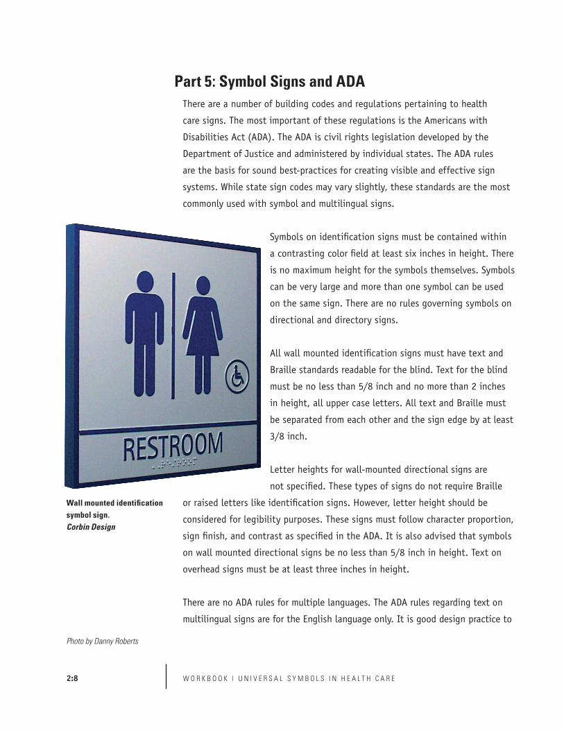
Part 5: Symbol Signs and ADA
Wall mounted identification symbol sign.Corbin Design
Photo by Danny Roberts
There are a number of building codes and regulations pertaining to health
care signs. The most important of these regulations is the Americans with
Disabilities Act (ADA). The ADA is civil rights legislation developed by the
Department of Justice and administered by individual states. The ADA rules
are the basis for sound best-practices for creating visible and effective sign
systems. While state sign codes may vary slightly, these standards are the most
commonly used with symbol and multilingual signs.
Symbols on identification signs must be contained within
a contrasting color field at least six inches in height. There
is no maximum height for the symbols themselves. Symbols
can be very large and more than one symbol can be used
on the same sign. There are no rules governing symbols on
directional and directory signs.
All wall mounted identification signs must have text and
Braille standards readable for the blind. Text for the blind
must be no less than 5/8 inch and no more than 2 inches
in height, all upper case letters. All text and Braille must
be separated from each other and the sign edge by at least
3/8 inch.
Letter heights for wall-mounted directional signs are
not specified. These types of signs do not require Braille
or raised letters like identification signs. However, letter height should be
considered for legibility purposes. These signs must follow character proportion,
sign finish, and contrast as specified in the ADA. It is also advised that symbols
on wall mounted directional signs be no less than 5/8 inch in height. Text on
overhead signs must be at least three inches in height.
There are no ADA rules for multiple languages. The ADA rules regarding text on
multilingual signs are for the English language only. It is good design practice to

2:9U N I V E R S A L S Y M B O L S I N H E A L T H C A R E | W O R K B O O K
use other languages based on the same regulations.
Note: The ADA is currently being reviewed and revised, with significant changes
being projected for the signage portion of the Act. As of this writing (November,
2005) the changes have not been enacted. This is expected to happen in mid-
2006 or early 2007.
(Left) Even though there is no height requirement for languages other than English it is advisable that text in other languages be as visible. Ottawa McDaniel International Airport, Gottshalk and Ash
(Right) Wayfinding signs where symbols are the primary wayfinding element can have smaller text.MD Andersen Cancer Center, fd2s
Photo by William P. McElligott Photography, Artwork by fd2s

2:10 W O R K B O O K | U N I V E R S A L S Y M B O L S I N H E A L T H C A R E
Clutter is one of the biggest issues affecting wayfinding in hospitals today.
In symbols testing, clutter ranked among the largest issues affecting
people finding their destinations. Signs, planters, bulletin boards, and other
information can prevent wayfinding signs from being visible while also
degrading the quality of signs. Additionally, too much information on a sign can
reduce the ability to recognize the required information. There are two kinds
of clutter that need to be addressed when designing and placing symbol signs:
clutter in the environment and clutter on individual signs.
Clutter in the Environment
Consistency in the health care environment is the key to
legible identification signs. Not only should unnecessary
information be removed, but the entire environment must
be designed to avoid inconsistencies. All wall and floor
coverings should be consistent in circulation areas. Even
design elements like planters, paintings, sculptures, and
donor walls can affect legibility if placed indiscriminately.
Sign Clutter
Designing wayfinding signs using symbols is a balancing
act of simplicity and clutter. There are two approaches
to controlling clutter: putting a large amount of
information on a few signs, and spreading out information among a large
number of sign and print elements.
Prioritize information on complex signs
Symbol signs have an advantage over text signs because of their ability
to include a much larger amount of information on a single sign. Complex
symbol signs can be illegible if not carefully designed. Complex symbol
signs should have a clear hierarchy where the most important information
is most visible from a distance and less important information further in
the background. For example, in the New York City Health and Hospitals
Part 6: Reducing Clutter
Consistently placed design elements include furniture and floor patterns. Lankenau Hospital, AGS
Photo by AGS

2:11U N I V E R S A L S Y M B O L S I N H E A L T H C A R E | W O R K B O O K
Corporation design guidelines, designed by Hillier, a single sign contains
building unit identification, the identification of adjacent units, and parking
and transportation information. These symbols are all different sizes with
unit identification being most prominent, providing a hierarchy of the most
important information.
Simplicity should be supported across a number of signs
Symbols also can be used on very simple signs, where only three or four pieces
of information can be seen. For these signs to be successful there must be
a great amount of backup information that includes
maps, directories, landmarks, and print directions. An
excellent example is the M.D. Andersen Cancer Center,
designed by the firm fd2s, where very simple wayfinding
signs with just a few symbols are used. These simple
signs are augmented with interactive directories, maps,
and landmarks. This large number of elements must be
carefully managed to avoid an overload of information,
but are necessary to support the complete system.
(Top) Coney Island Hospital, Hillier Group
(Bottom) MD Andersen Cancer supports a large number of simple symbol elements with print and graphic support. fd2s
Photos by (Top) John Bosio, (Bottom) David Omer

2:12 W O R K B O O K | U N I V E R S A L S Y M B O L S I N H E A L T H C A R E
Hospitals are different from other institutional facilities in that they serve
a residential population as well as a large number of visitors. Lighting levels
are often set very low in hospital facilities, and are often too low for sighted
people, let alone those with vision disabilities. When using the symbols,
developing color and lighting standards is crucial to creating a visible and
consistent system. The following three standards are most important to consider
when establishing standards:
• Minimum lighting requirements are needed, especially in public areas.
Lighting in hospital environments should make signs legible to most
people from a distance of at least 25 feet. This requires either a higher
level of overall internal lighting, or lighting the signs directly. Directly
lighting the signs increases their legibility by contrasting the signs with
a darker surrounding environment.
• If lighting levels are low it is advised that a light background be used.
Light backgrounds refl ect rather than absorb light. If lighting levels are
low, a refl ective surface can generate light in a low lighting area. Since
glare can be an issue in reading signs, light backgrounds can provide
minimum glare visibility.
• Color contrast on signs should be a minimum of 60% and is
recommended to be 70%. Color contrast between foreground and
background sign elements is also an excellent way to make signs
more visible. The greater the contrast the easier it is to see the sign
information. Color calculators like the one provided by ASI-Modulex at
www.asi-modulex.com are ways to measure contrast between two colors.
Part 7: Lighting and Color of Symbol Signs
(Top) Massachusetts General Hospital uses signs with light backgrounds for darker hallways. Two Twelve Design Associates
(Bottom) ASI-Modulex color calculator.
Photo by Kevin Burke

2:13U N I V E R S A L S Y M B O L S I N H E A L T H C A R E | W O R K B O O K
Good environmental design and sign systems are not the only factors used in
creating effective wayfinding systems. Adding symbols to print and electronic
media can provide ideal additional support and reassurance for people trying to
locate their destination.
Elements of Print and Electronic Graphics
Printed Handouts
Handouts are simple and successful print pieces. In testing, handouts were
found to be effective in 98% of participants relying on signs. Handouts can
simply explain the meaning of the universal symbols in multiple languages
while allowing the signs to perform most of the wayfinding duties. With
printed handouts it is important to consider the following:
• Translations must be absolutely correct. Mistakes reduce trust in the
entire sign system.
• If using an ambiguous name, i.e., Birthing Center instead of OB Clinic,
be sure that there is a clear definition along with the name.
• Names and definitions used on the handouts must match information
on the signs.
Printed Maps
Printed maps are more difficult to read than handouts. A smaller number of
people can read and understand maps, especially when discerning building
interiors. Some tips for effective maps using symbols include:
• Universal symbols should be at least 3/8 inch in size, if possible, to be
easily legible.
• Interior maps should be very simple and contain limited information.
Many hospitals use specialized maps meant to serve a specific use or
many maps that represent individual buildings or units.
Cards and Printed Instructions
Universal symbols can be integrated into medical paperwork and other support
print material. These graphics have the advantage over maps and handouts in
Part 8: Symbols with Print and Interactive Media
(Top) Portion of handout explaining the meaning of universal symbols in Spanish. Sample handouts in multiple languages are available at www.hablamosjuntos.org or www.segd.org.
(Bottom) New York Hospitals Corporation map standards.Hillier Group
���������������������������������������������������������������������
�������������������������������������������������������
������������������������������������������������
�������������������������������������������������������������������������
����������������������������������������������������������������������������
�����������������������
���������������������������������������������������
����������������������������������������������������������������������������������
���������������������������������������������������������������������������������
���������������������������������������������������������������������������������������������
��������������������������������������������������������
�����������������������������������������������������������������������������������������
����������������������������������������������������������������������������
���������������������������������������������������
Artwork by (Top) JRC Design, (Bottom) Hillier Group

2:14 W O R K B O O K | U N I V E R S A L S Y M B O L S I N H E A L T H C A R E
that they can be highly specialized, focusing only on the functions in which
visitors are interested.
The Internet and Electronic Kiosks
Symbols can be highly effective when used with electronic media. The key to
effectively using Web sites and electronic kiosks is attracting people to use
them. There is evidence that younger people are more comfortable with using
electronic media than their elders. It is important to consider electronic media
as part of an overall wayfinding program and not the main support system.
Electronic graphics must match print and sign graphics.
Locations of Print Materials
Hospitals have made large investments in visitor information kiosks and
help desks. Visitors gravitate to these areas, making them the best places to
locate print information. Since visitors often do not arrive through a central
entrance, it is important to include smaller information centers containing
print information. These should be placed strategically in hospital departments
throughout the building.
(Left) Internet directions and kiosk. MD Andersen Cancer Center.fd2s
(Middle) Interactive map. Saint Vincent’s Hospital.TTSS
(Right) Visitor information desk at Somerville Hospital, Somerville, Massachusetts.
Photo by Craig Berger

2:15U N I V E R S A L S Y M B O L S I N H E A L T H C A R E | W O R K B O O K
Signs and print graphics can be highly effective in helping people find their
way in buildings and can save hospital staff and translators time in directing
people. Hospital staffs need clear instructions on how to best use the signs.
Information desks must have a clear and legible sign for interpretive services.
It is a legal public access requirement to have sign information about
interpretive services in many languages. Putting maps and handouts next
to the sign for interpretive services helps make the connection for visitors.
Visitors have ready access to information to find their way on their own or they
can request interpretive services if they have higher level needs.
All hospital staff and volunteers must be trained in teaching visitors how to
use the signs. Hospital staff should be given training in instructing people how
to find their way to a specific destination using symbol signs and graphics.
Some simple procedures will save staff time and energy when giving directions:
• Training should include a walk-through of the hospital, pointing out
signs, maps, locations of print graphics, and major destinations.
• Instructions on how to best use printed handouts when helping
visitors. Circling the specific symbol on a print piece or map helps
visitors easily find their destination.
• Training on how to give verbal instructions using the symbols on
the signs.
• Training on directing visitors with interpretive needs to the nearest
information desk.
Interpreters can also teach people about the sign system. The interpreter
should be encouraged to help orient people to the facility, pointing out
destinations as they walk with visitors. Interpreters can also play a role in
teaching visitors how to find destinations on their own, and should keep
materials on hand that support the sign system.
Part 9: Staff and Volunteer Training with Symbols
(Top) Sign in multiple languages directing visitors to interpretive services.
(Bottom) A trained staff is one of the best aids for interpretive services.
Photos by Craig Berger

2:16 W O R K B O O K | U N I V E R S A L S Y M B O L S I N H E A L T H C A R E
Part 1: The Levels of Universal Health Care Symbols
• Create a hierarchy of symbol information based on destination importance.
Part 2: Wayfinding Concepts Using Universal Health Care Symbols
• Symbols should be in the same location on every directional sign
if possible.
• Signs can use visible numbers, letters, and landmarks.
• Signs should be placed in every location where a decision must be made.
• Signs should be spaced so that successive signs are completely visible to
each other.
• Symbols on building directories should be at least 3/8 inch in height.
• Directories should be in the same location on every floor.
• Directories should be large landmarks in prominent locations.
Part 3: The Types and Locations of Symbol Signs
• Two identity signs should be used, the first parallel and at eye level to
the destination entrance and the second perpendicular and overhead
at the destination entrance.
• Overhead signs must have at least 80 inches of clearance.
• Wall mounted directional signs should be at least 60 inches off
the ground.
Part 4: Symbols and Text on Signs
• Use extensive print and map support for symbol dominant signs.
• Use for signs that have an equal emphasis on symbols and text.
Part 5: Symbols and the Americans with Disabilities Act
• Signs must centered at 60 inches off the ground.
• The symbol field on identification signs must be at least 6 inches
in height.
• Raised text and Braille must be in English.
Summary of Recommendations

2:17U N I V E R S A L S Y M B O L S I N H E A L T H C A R E | W O R K B O O K
Part 6: Reducing Sign Clutter
• Reduce the number of information elements not directly related to
wayfinding and identification.
• Use fewer signs, with a clear hierarchy of information for complex signs.
• Use many sign elements that indicate specific tasks for simple signs.
Part 7: Lighting and Color of Symbol Signs
• Provide lighting that can make signs readable from at least 25 feet away.
• Use a white or light background if lighting is low.
• Sign contrast should be at least 60% between type or symbol and
background colors.
Part 8: Symbols with Print and Interactive Media
• Multilingual handouts and cards provide the best support of symbol signs.
• Maps can be effective if kept very simple.
• Locate print support in multiple locations through the hospital.
Part 9: Staff and Volunteer Symbol Training
• Train volunteers and staff in giving directions using signs and handouts.
• Interpreters should help orient people to the facility and play a role in
teaching people how to use the sign system on their own.

2:18 W O R K B O O K | U N I V E R S A L S Y M B O L S I N H E A L T H C A R E
This workbook is meant to serve as a resource to help health care executives,
designers, and facilities managers become acquainted with universal health
care symbols and how they can be integrated into wayfinding systems and
management strategies.
If you would like more information on developing a strategy for Limited
English Proficient users in health care facilities, and how universal symbols
can be involved in that strategy, visit www.hablamosjuntos.org. This Web
site contains information on the efforts of Hablamos Juntos to create more
accessible health care facilities using interpretive services, improved writing,
wayfinding, and management.
For more information on technical issues related to symbols and wayfinding
in health care facilities, visit the Society for Environmental Graphic Design at
www.segd.org. Their web site contains information on best practices for health
care wayfinding, case studies on specific programs, and educational programs
and publications on health care wayfinding. For a CD containing all document
reports and a tutorial on wayfinding in health care based on previous SEGD
educational programs contact SEGD at 202-638-5555 or [email protected].
Final Summary

2:19U N I V E R S A L S Y M B O L S I N H E A L T H C A R E | W O R K B O O K