Embed Size (px)
Citation preview

Unit 3 – Digital Portfolio
By Michael Rich

Audience and Purpose
• My portfolio is mainly aimed at employers at the company Konneckted and people that want or need to see my achievements. I will achieve this by making my portfolio unique so it will stand out from all of the other applicants. I believe this will help me get the job as my portfolio will attract the employers to look at my portfolio instead of other applicants.
• I am making my portfolio so that employers can have a look at all of my work and achievements. This is good as it will help me get a job at a top IT company such as Konneckted. I will include images and colours in my digital portfolio as this will help it stand out more.
• I will also make my portfolio simple so that potential employers will be able to navigate around it easily. If I over complicate it then it might not achieve its intended purpose. My digital portfolio could also help me move onto further education.

Unit 3 – Aim A Timeline
Start – 16/10/14 End – 13/11/14

Unit 3 – Aim B Timeline
Start – 4/12/14 End – 23/4/15

Unit 3 – Aim C Timeline
Start – 7/5/15 End – 21/5/15

Photo of me
Michael Rich – My Portfolio
My Achievements
Pages About Me
My Achievements Unit 1 Unit 2 Unit 3 Unit 6
Unit 11 Unit 12 Unit 13 Unit 14
Home Page My home page has my recent posts on it. These will also be short cuts to the
post.
Search bar
Indicates what you are looking at.
This is just a plain background.
Indicates what you are looking at.
The font for this page will be avenir black because it is bold and easy to read.
The background for these parts will be green so that my pages stand out.
The colour change signals that this is the page you are on.
Image of a
computer
Link to a video about computers

Photo of me
Michael Rich – My Portfolio
My Achievements
Pages About Me
My Achievements Unit 1 Unit 2 Unit 3 Unit 6
Unit 11 Unit 12 Unit 13 Unit 14
Search bar
Indicates what you are looking at.
Unit 1 Page
This page will have all of my work from unit 1 on it so that people can see
what I have done.
There will also be “read-only” PDF documents so that people can see my work.
This is just a plain green background.
Indicates what you are looking at.
The font for this page will be avenir black because it is bold and easy to read.
The background for these parts will be green so that my pages stand out.
The colour change signals that this is the page you are on.
This will be an image of a
piece of work from
unit 1.

Photo of me
Michael Rich – My Portfolio
My Achievements
Pages About Me
My Achievements Unit 1 Unit 2 Unit 3 Unit 6
Unit 11 Unit 12 Unit 13 Unit 14
Search Bar
Indicates what you are looking at.
Unit 2 Page
This page will have all of the work that I have done for unit 2 so that people
can see what I have done.
This is just a plain green background.
Indicates what you are looking at.
There will also be “read-only” PDF documents so that people can see my work.
The font for this page will be avenir black because it is bold and easy to read.
The background for these parts will be green so that my pages stand out.
The colour change signals that this is the page you are on.
This will be an image of a
piece of work from
unit 2.

Photo of me
Michael Rich – My Portfolio
My Achievements
Pages About Me
My Achievements Unit 1 Unit 2 Unit 3 Unit 6
Unit 11 Unit 12 Unit 13 Unit 14
Search Bar
Indicates what you are looking at.
Unit 3 Page
This page will have all of my work from unit 3 on it so that people who come
on my portfolio can see the work I have done.
This is just a plain green background.
Indicates what you are looking at.
There will also be “read-only” PDF documents so that people can see my work.
The font for this page will be avenir black because it is bold and easy to read.
The background for these parts will be green so that my pages stand out.
This will be an image of a
piece of work from
unit 3.

Photo of me
Michael Rich – My Portfolio
My Achievements
Pages About Me
My Achievements Unit 1 Unit 2 Unit 3 Unit 6
Unit 11 Unit 12 Unit 13 Unit 14
Search Bar
Indicates what you are looking at.
Unit 6 Page
This page will have all of my work from unit 6 on it so that people who come
on my portfolio can see the work I have done.
This is just a plain green background.
Indicates what you are looking at.
There will also be “read-only” PDF documents so that people can see my work.
The font for this page will be avenir black because it is bold and easy to read.
The background for these parts will be green so that my pages stand out.
This will be an image of a
piece of work from
unit 6.
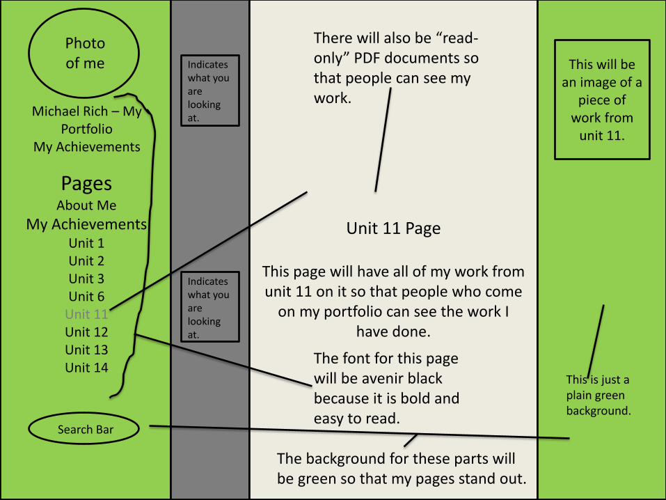
Photo of me
Michael Rich – My Portfolio
My Achievements
Pages About Me
My Achievements Unit 1 Unit 2 Unit 3 Unit 6
Unit 11 Unit 12 Unit 13 Unit 14
Search Bar
Indicates what you are looking at.
Unit 11 Page
This page will have all of my work from unit 11 on it so that people who come
on my portfolio can see the work I have done.
This is just a plain green background.
Indicates what you are looking at.
There will also be “read-only” PDF documents so that people can see my work.
The font for this page will be avenir black because it is bold and easy to read.
The background for these parts will be green so that my pages stand out.
This will be an image of a
piece of work from
unit 11.

Photo of me
Michael Rich – My Portfolio
My Achievements
Pages About Me
My Achievements Unit 1 Unit 2 Unit 3 Unit 6
Unit 11 Unit 12 Unit 13 Unit 14
Search Bar
Indicates what you are looking at.
Unit 12 Page
This page will have all of my work from unit 12 on it so that people who come
on my portfolio can see the work I have done.
This is just a plain green background.
Indicates what you are looking at.
There will also be “read-only” PDF documents so that people can see my work.
The font for this page will be avenir black because it is bold and easy to read.
The background for these parts will be green so that my pages stand out.
This will be an image of a
piece of work from
unit 12.

Photo of me
Michael Rich – My Portfolio
My Achievements
Pages About Me
My Achievements Unit 1 Unit 2 Unit 3 Unit 6
Unit 11 Unit 12 Unit 13 Unit 14
Search Bar
Indicates what you are looking at.
Unit 13 Page
This page will have all of my work from unit 13 on it so that people who come
on my portfolio can see the work I have done.
This is just a plain green background.
Indicates what you are looking at.
There will also be “read-only” PDF documents so that people can see my work.
The font for this page will be avenir black because it is bold and easy to read.
The background for these parts will be green so that my pages stand out.
This will be an image of a
piece of work from
unit 13.

Photo of me
Michael Rich – My Portfolio
My Achievements
Pages About Me
My Achievements Unit 1 Unit 2 Unit 3 Unit 6
Unit 11 Unit 12 Unit 13 Unit 14
Search Bar
Indicates what you are looking at.
Unit 14 Page
This page will have all of my work from unit 14 on it so that people who come
on my portfolio can see the work I have done.
This is just a plain green background.
Indicates what you are looking at.
There will also be “read-only” PDF documents so that people can see my work.
The font for this page will be avenir black because it is bold and easy to read.
The background for these parts will be green so that my pages stand out.
This will be an image of a
piece of work from
unit 14.

Home Page
Unit 1 Unit 2 Unit 3 Unit 6 Unit 11 Unit 12 Unit 13 Unit 14
About Me PDF Links
Video
Blue – context page Yellow – section pages Red – main page

Photo of me
Michael Rich – My Portfolio
My Achievements
Pages About Me
My Achievements Unit 1 Unit 2 Unit 3 Unit 6 Unit 11 Unit 12 Unit 13 Unit 14
Home Page My home page has my recent posts on it. These will also be short cuts to the
post.
Search bar
This is just a plain green background.
The font for this page will be avenir black because it is bold and easy to read.
The background for these parts will be green so that my pages stand out.
Image of a
computer
Link to a video about computers

This is just a plain green background.
The font for this page will be avenir black because it is bold and easy to read.
Image of a
computer
Link to a video about computers
Photo of me
Pages About Me
My Achievements Unit 1 Unit 2 Unit 3 Unit 6
Unit 11 Unit 12 Unit 13 Unit 14
Michael Rich – My Portfolio
My Achievements
Search bar
Home Page My home page has my recent posts on it. These will also be short cuts to the
post.
The background for these parts will be green so that my pages stand out.

Name/File Type Description Link
Me.JPEG This is a photo of me. N/A – Taken by myself.
Computer.JPEG
This a cartoon image of a computer.
N/A – Taken by myself.
Unit work 1.JPEG This is an image a piece of work from unit 1.
N/A – Taken by myself.
Unit work 2.JPEG
This is an image a piece of work from unit 2.
N/A – Taken by myself.
Unit work 3.JPEG
This is an image a piece of work from unit 3.
N/A – Taken by myself.
Unit work 6.JPEG
This is an image a piece of work from unit 6.
N/A – Taken by myself.
Unit work 11.JPEG
This is an image a piece of work from unit 11.
N/A – Taken by myself.
Unit work 12.JPEG
This is an image a piece of work from unit 12.
N/A – Taken by myself.
Unit work 13.JPEG This is an image a piece of work from unit 13.
N/A – Taken by myself.
Unit work 14.JPEG This is an image a piece of work from unit 14.
N/A – Taken by myself.
Video about computers.MP4 This a video from YouTube about how fascinating computers are.
http://www.youtube.com/watch?v=f6TfNEbEn_U

Justification of My Design.
• I will be choosing my first design for my digital portfolio as it is overall a better design compared to my alternative designs. First of all my navigation bar is on the left side of the page; I think that it is easily accessible from there and easy to understand because it is easy to see as you read from the left hand side. Whereas on my first alternative it is at the top but is very spaced out and hard to navigate around and also very hard to understand because the text is too small to see properly. For my second alternative it is in the centre on the page. This makes it easier to read and see but it takes up a lot of room on the page. This means that I wouldn’t be able to have other things on the page.
• Another reason why I will be choosing my first design is because the colour scheme is a lot better and works well because you can read the text easily and clearly. On my first alternative the colour scheme is blue and white. I don’t think this is a good colour scheme because you cannot see and read the text clearly over those colours. The colour scheme for my second alternative is orange, yellow and white. This is a bad colour scheme because the colours don’t work well with each other and make it hard to read the text.