Embed Size (px)
DESCRIPTION
A compilation of grammar and copy etiquette that every student and graphic designer needs. This is for personal use only and is not to be copied or sold.
Citation preview

university of
2013
elizabeth post
typography
Class project for Typographic Systems at the University
of Kansas, Spring 2013. The text was compiled from the
following sources: Elements of Typographic Style by Robert
Bringhurst, Getting it Right with Type: the Do’s and Don’ts
of Typography by Victoria Square, and Mac is Not A Type-
writer by Robin Williams. This book is not to be sold to the
public and to only be used by the designer for their reference
and student design portfolio.

tableof contents
476
40
6
80
46
2036
6050
CH
EC
KLI
ST
TYP
E R
ULE
S
GR
IDS
CO
LUM
N W
IDTH
ALI
GN
ME
NT
KE
RN
ING
JUS
TIFI
CAT
ION
X-H
EIG
HT
QU
OTE
S &
AP
OS
TRO
PH
ES
DA
SH
ES

84
144
102
86
114
9298
134126
HY
PH
EN
S
CH
AR
AC
TER
S
SM
ALL
CA
PS
NU
ME
RA
LS
FON
T C
OM
BIN
ATIO
NS
PAR
AG
RA
PH
BR
EA
KS
HE
AD
ER
S &
SU
BH
EA
DS
EN
DN
OTE
S &
CA
PTI
ON
S
TYP
E S
TUD
IES

4

5
rulescheck sheet
use only one space between sentences
use real quotation marks
use real apostrophes
make sure the apostrophes are where they belong
hang the punctuation off the aligned edge
use en or em dashes, use consistently
kern all headlines where necessary
never use the space bar to align text, always set tabs and use the tab key
leave no widows or orphans
avoid more than three hyphenations in a row
avoid too many hyphenations in any paragraph
avoid hyphenating or line breaks of names and proper nouns
leave at least two characters on the line and three following
avoid beginning consecutive lines with the same word
avoid ending consecutive lines with the same word
avoid ending lines with the words: the, of, at, a, by
never hyphenate words in a headline and avoid hyphenation in a callout
never justify the text on a short line
keep the word spacing consistent
tighten up the leading in lines with all caps or with few ascenders and descenders
use a one-em first-line indent on all indented paragraphs
adjust the spacing between paragraphs
either indent the first line of paragraphs or add extra space between them - not both
use a decimal or right-aligned tab for numbers in numbered paragraphs
never have one line in a paragraph in the column or following
never combine two serif fonts on one page
rarely combine two sans serif fonts on one page
rarely combine more than three typefaces on one page
use the special characters whenever necessary, including super- and subscript
spend the time to create nice fraction or chose a font that has fractions
if a correctly spelled word needs an accent mark, use it

6

7RULES
typographicrules
Inserting two spaces after a period was
common when using a typewriter. Mono-
space typefaces were designed to occupy the
same amount of space no matter the width
of the character. Therefore, two spaces were
needed to identify the end of a sentence and
the beginning of another sentence. With the
introduction of the Mac and digital type, char-
acters are designed proportionately, which
allows for the correct practice of using one
space after all punctuation.
An em is a unit of measure equal to the point
size that you are using. An em dash is a
type of punctuation used to offset clauses in
a sentence or to indicate an abrupt change
in thought. An en dash is equal to half the
length of an em dash. En dashes are used to
denote duration (time.)
INSERT ONLY A SINGLE SPACE AFTER ALL PUNCTUATION
USE PROPER ‘EM’ DASHES, ‘EN’ DASHES, AND HYPHENS

8
Use true quotation marks and apostrophes in-
stead of using inch marks and feet marks. Place
all punctuations inside the quotation marks.
When setting text that contains acronyms,
select a typeface with small caps as a family. Se-
lecting small caps from the style menus is a poor
choice because the compute reduces the overall
size of the type by 80%. This changes the stroke
weight and the feel of the font. Expert sets in the
Adobe Type Library have small caps options.
USE PROPER QUOTE AND APOSTROPHE MARKS USE TRUE SMALL CAPS

9RULES
Letterspacing is the amount of space between
characters in a word. Some software programs
caller letterspacing tracking. Use positive num-
ber values (to about 2 or 3) to open up letterspac-
ing to capitalized text and small caps, except
when periods are used between characters.
Old style figures, also known as non-lining
figures do not line up on the baseline as regular
or lining numerals do. They can be found in
various fonts. If the body text has a significant
amount of numbers, research a font family
where they are included. If non-lining numerals
are not available, use a slightly smaller point
size for the lining numbers. Think of lining
numbers as upper case numbers and non-lining
numbers as lower case.
ADD LETTER SPACING TO CAPITALIZED TEXT AND SMALL CAPS
USE OLD STYLE FIGURES WHEN APPROPRIATE

10
With options given to you by almost any type
family (bold, point size, etc) you will seldom
need to use all caps to draw attention to your
text. Not all typefaces are legible when set in
all caps; esp. true for script and decorative type-
faces. Short headlines may be the once excep-
tion to this rule.
The copyright, register, and trademark char-
acters need to be reduced to work with body
text. At times, depending on the typeface, you
may need to reduce the mark between 50% and
70%. The goal is to match the x-height. The
copyright mark should be approximately 70%
of the surrounding text. Unlike the ™ sym-
bol, the © should NOT be superscripted and
should remain on the baseline. ™ is usually
superscripted for the chosen font. ™ and ® are
normally set higher then other marks. If you
choose to superscript ®, reduce it to about 60%
of the size.
USE CAPS PROPERLY USE COPYRIGHT, REGISTER, AND TRADEMARK MARKS PROPERLY

11RULES
Use the ellipsis character and NOT three peri-
ods. You can access the ellipsis by typing Op-
tion + : (colon). Allow a small amount of space
before and after. However if it is not crowding
the text, leave no space at all.
This was useful back in the days of the type-
writer to draw attention to the text. With digi-
tal type and their families, you should not need
to use underlined text.
ELLIPSIS CHARACTER AVOID UNDERLINED TEXT
12
Line spacing (aka leading) refers to the space
between lines of text. It is important for readabil-
ity and appearance. Leading is measured from
baseline to baseline. As a rule of thumb, allow
leading that is 120% of the point size. For sans
serif, you may need 130% or more. When setting
headlines, solid leading (leading = point size,
12/12) or negative leading (leading =< point size,
12/10) may be appropriate.
Body text is set anywhere from 9-12 points.
When you print text, it is usually larger than
what it looked like on the screen. So, print out
your text before finalizing your layout. Type stud-
ies will help you determine the proper size before
you proceed with your layout.
INCREASE LINE SPACING TO IM-PROVE READABILITY IN BODY TEXT BODY COPY SIZE

13RULES
Don’t alter the original typeface by stretching or
condensing the letters improperly. Certain type
families provide you with a lot of flexibility, so
you should not need to destroy/alter text.
Sans serif typefaces work well for headlines and
to set text that is aligned to vertical/horizontal
lines. Certain sans serif typefaces which are not
very geometrical work well for body copy (i.e.
Frutiger, Meta, Scala Sans, etc.)
ALTERING FONTS LEGIBILITY OF FONTS

14
Line length is a measure of text on one line.
Any measure between 45 and 75 characters is
comfortable for single column widths. The ideal
measure for body text length is 66 characters
(counting both letters, punctuation, and spaces.)
For multiple columns, a measure between 40 and
50 characters is ideal.
Don’t letterspace body copy as it really hampers
legibility. Use letterspacing when working with
caps. small caps, numbers and display text where
looser type spacing may increase legibility.
DECREASE LINE LENGTH AND INCREASE MARGINS
AVOID LETTERSPACING LOWERCASE BODY COPY

15RULES
For text meant for extended reading, the
amount of space between words in a para-
graph should be fairly close–about the width
of a lowercase “i.” If the word spacing is too
close, it appears as one giant word and leg-
ibility is decreased. Keep the spaces between
words fairly thin, consistent and even!.
For single-column pages, 4.25 inches is ideal.
For two-column width, columns can be as nar-
row as 2 inches. Turning on the hyphenation
feature can improve word spacing.
WORD SPACING SHOULD BE FAIRLY CLOSE IDEAL COLUMN WIDTH

16
Justification can be appropriate in cer-
tain places. However, it can create certain
problems such as rivers and word spacing.
Adjusting size of margins, decreasing body
copy size, turning on auto hyphenatation and
manually hyphenating the text are all exam-
ples of possible solutions.
Make sure the alignment chosen for all areas
of text are legible and consistent with the de-
sign and guidelines. Left-aligned text is easier
to read and set. Justified text is harder to set
w/o inevitable word spacing problems. Right-
aligned and centered are generally not used
for body copy.
JUSTIFICATION OF TEXT CHOOSE THE ALIGNMENT THAT FITS

17RULES
Don’t rely on the software to judge where
hyphens should be placed. At the end of lines,
leave at least two characters behind and take
at least three forward. For example, “ele-
gantly” is acceptable, but “elegant-ly” is not be-
cause it takes too little of the word to the next
line. Avoid leaving the stub end of a hyphen-
ated word or any word shorter then four letters
as the last line of a paragraph. Avoid more
then 3 consecutive hyphenated lines. Avoid
hyphenating or breaking proper names and
titles. Creating a non-breaking space before
and after the name will ensure that the name
will not break.
Since software programs deal with line breaks
automatically based upon a number of vari-
ables, it is possible to have paragraphs with
consecutive lines beginning with the same
word. When this happens simply adjust the
text to avoid/fix the problem.
RULES OF HYPHENATION AVOID BEGINNING THREE CONSECU-TIVE LINES WITH THE SAME WORD
18
Once you are finished with your design, spell
check the text using both of the following:
a. Use spell=check option that comes with the
software you are using for the project.
b. Print the document and read it. The moni-
tor and design of the document will make text
look perfect when it may not be. Even if text is
given to you by a client, check it. Never ever
assume that it is correct. Keep a dictionary
close as well.
Widows are either single words alone on a
line or single sentences alone on a new page.
Orphans are single lines of copy alone at the
end of a page.
ALWAYS SPELL CHECK! AVOID WIDOWS AND ORPHANS

19RULES
Adjust the space between two particular letters
to allow for more consistent negative space.
In continuous text, mark all paragraphs after
the first with an indent of at least one “em” (3
spaces). Do NOT use three spaces but rather
use the tabs or indents option in your software.
KERNING IN HEADLINES INDENTS

20

21

22
gridstructures
When Designing a layout and working with text
and/or images the use of a grid is essential, as it
is the basis on which information is organized and
clarified, ensuring legibility. The grid provides a
framework were text, image and space can be com-
bined into a cohesive manner.
A grid subdivides a page vertically and horizon-
tally into margins, columns, inter-column spaces,
lines of type, and spaces between blocks of type
and images. These subdivisions form the basis of
a modular and systematic approach to the layout,
particularly for multi-page documents, making the
design process quicker, and ensuring visual consis-
tency between related pages.

23GRIDS
At its most basic, the sizes of a grid’s compo-
nent parts are determined by ease of reading
and handling. From the sizes of type to the
overall page or sheet size, decision-making is
derived from physiology and the psychology of
perception as much as by aesthetics. Type sizes
are generally determined by hierarchy—cap-
tions smaller than body text and so on—column
widths by optimum word counts of eight to
ten words to the line, and overall layout by the
need to group related items. This all sounds
rather formulaic, and easy. But designers
whose grids produce dynamic or very subtle
results take these rules as a starting point only,
developing flexible structures in which their
sensibility can flourish.
Grids often need to be designed to give more
flexibility than the single column of text per
page (Jan Tschichold’s grid). This is due to to a
change in our reading patterns. Grid structures
have to accommodate a greater variety of ma-
terial such as photographs, illustrations, head-
ings, captions, references, charts; they need
to be more complicated than a grid using only
text and may utilize more modules. The design
of the grid had to be relevant to the purpose.
“The grid system is an aid, not a guarantee. It permits a number of possible uses and each designer can look for a solution appro-priate to his personal style. But one must learn how to use the grid; it is an art that re-quires practice.” —Josef Müller-Brockmann
24
Modular grids are created by positioning
horizontal guidelines in relation to a baseline
grid that governs the whole document. Base-
line grids serve to anchor all (or nearly all)
layout elements to a common rhythm. Create
a baseline grid by choosing the type size and
leading of your text, such as 10-pt Scala Pro
with 12 pts leading (10/12). Avoid auto lead-
ing so that you can work with whole numbers
that multiply and divide cleanly. Use this line
space increment to set the baseline grid in
your document preferences.
Adjust the top or bottom page margin to
absorb any space left over by the baseline
grid. Determine the number of horizontal
page units in relation to the number of lines
in your baseline grid. Count how many lines
fit in a full column of text and then choose a
number that divides evenly into the line count
to create horizontal page divisions. A column
with forty-two lines of text divides neatly
into seven horizontal modules with six lines
each. If your line count is not neatly divisible,
adjust the top and/or bottom page margins to
absorb the leftover lines.
BASELINE GRIDS

25GRIDS

26

27GRIDS
The perfect book. This is how designer-genius
Jan Tschichold described this system.This
method existed long before the computer, the
printing press and even a defined measuring
unit. No picas or points, no inches or millime-
ters. It can be used with nothing more than a
straight edge, a piece of paper and a pencil.
And you can still use it. This is a system which
is still as valid, beautiful and elegant with ul-
tra-modern design as it ever was for the work
of the scribes, Gutenberg and Tschichold.
A module is to a grid, as a cell is to a table.
Then there is the fact that on a spread, the text-
blocks on both pages will be the same distance
apart, over the gutter, as they are from the
outer edge of the page.
TSCHICHOLD’S GRID / SYMMETRICAL GRID

28
The √5 rectangle is closely related to the
golden mean rectangle. The golden mean
is not a rooted rectangle because it does not
subdivide into an exact number of similar rect-
angles. The golden mean rectangle has a ratio
of 1:1:618.
Because of its unique properties, the golden
mean is sometimes called the “whirling
square” rectangle. Proportionally decreas-
ing squares can produce a spiral by using the
length of their sides for the radius of a circle.
This phenomenon is illustrated by the Fibo-
nacci mathematical sequence. The Fibonacci
sequence is produced by starting with 1 and
adding the previous two numbers, in order to
arrive at the next, continuing to infinity.
The first twelve numbers are:
1, 1, 2, 3, 5, 8, 13, 21, 34, 55, 89, 144
FIBONACCI’S SEQUENCE & THE GOLDEN MEAN

29GRIDS

30

31GRIDS
These may consist simply of a number of vertical
columns used to position text and image matter,
and may include the space between columns --
the gutters -- and the margins of the page, which
must be given consideration. It may be necessary
to produce grids with narrower subcolumns to
enable a greater degree of flexibility in the de-
sign and layout of pages. Text widths can be set
to multiples of the narrower columns, allowing
the design to accommodate different matter thus
allowing for a change of pace, rhythm and style
from one page or section to the next, while still
relating the content.
COLUMN GRID

32
Modular grids are associated with Swiss
typography or the ‘International Style’ of the
1950s and 60s. As well as a vertical division
of space, modular grids divide space horizon-
tally too, creating units or cells. The depth of
the cell may depend upon the size of the text
type and leading being used. Multiples of the
line depth (leading size) form a good basis on
which to construct the cells.
For example, ten lines of 10pt type type on
12pt leading could allow for a cell height of
120pt within the grid. Again, each cell divi-
sion is spaced by the equivalent of a gutter
both vertically and horizontally. Vertical col-
umns still appear, but further rationalization as
to the position of text and image in relation to
the depth of the page can be made via the grid.
MODULAR GRID

33GRIDS

34
35GRIDS
These grids may have an off-centre appearance
either as single pages or combined in spreads.
If used in spreads, the grid is not mirrored
from one page to the next as in symmetrical
grids, but is more likely to appear repeated in
a single position from page to page. Again, as
with all grid systems, attention to the relation-
ship of the margins is important. It can be this
element alone that determines the success of
the eventual layout.
ASYMMETRICAL GRID

36

37

38
columnwidth
A general guideline for determining if your
line length is long enough to satisfactorily
justify the text: the line length in picas should
be about twice the point size of the type; that
is, if the type you are using is 12 point, the line
length should be at least 24 picas (24 picas is 4
inches-simply divide the number of picas by 6,
as there are 6 picas per inch). Thus 9-point type
should be on an 18-pica line (3 inches) before
you try to justify it, and 18-point type should be
on a 36-pica line (6 inches). The rulers in most
programs can be changed to picas, if you like.
DETERMINING LINE LENGTH

39
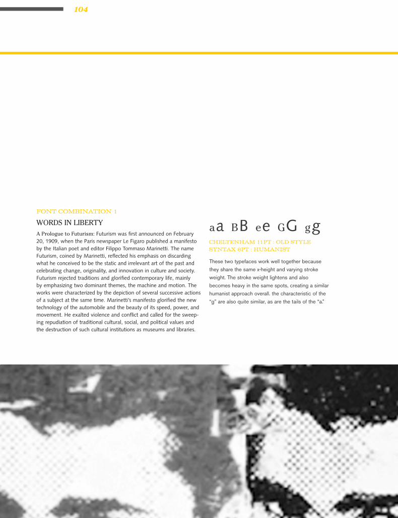
Futurism was first announced on February 20,
1909, when the Paris newspaper Le Figaro
published a manifesto by the Italian poet and
editor Filippo Tommaso Marinetti. The name
Futurism, coined by Marinetti, reflected his
emphasis on discarding what he conceived to
be the static and irrelevant art of the past and
celebrating change, originality, and innovation
in culture and society. Futurism rejected tradi-
tions and glorified contemporary life, mainly
by emphasizing two dominant themes, the ma-
chine and motion. The works were character-
ized by the depiction of several successive ac-
tions of a subject at the same time. Marinetti’s
manifesto glorified the new technology of the
automobile and the beauty of its speed, power,
and movement. He exalted violence and con-
flict and called for the sweeping repudiation of
traditional cultural, social, and political values
and the destruction of such cultural institutions
as museums and libraries.
DEFINITION VISUALIZED 8 PT / 16 PICAS

40

41

42
alignment
In unjustified text, the text block is set with
normal letter and word spacing. Because of the
even word spacing the text will have an even
texture – no large spaces between words. The
lines will naturally vary in length. a ragged
text block can integrate with the layout and
add visual interest to the page. The difficulty
is making the ragged edge have a pleasing
silhouette. When the first line in the text is lon-
ger than the second, it becomes separate from
the layout and creates a box-like shape. This
destroys one of the advantages of unjustified
text. The ragged edge needs to have a life, but
a narrow column can be less active. Another
advantage to ragged text is less hyphenation
is needed. Therefore, names, dates or words
which are normally read together can stay
together.If someone insists that fully justified
text is better than left-aligned text, tell them
they are wrong. If someone else tells you that
left-aligned text is better than justified text, tell
them they are wrong.
If they are both wrong, then what’s right?
Alignment is only a small piece of the puzzle.
What works for one design might be totally
inappropriate for another layout. As with all
layouts, it depends on the purpose of the piece,
the audience and its expectations, the fonts, the
margins and white space, and other elements
on the page. The most appropriate choice is
alignment that works for a particular design.

43
As with all layouts, alignment depends on the
purpose of the piece, the audience and its expecta-
tions, the fonts, the margins and white space, and
other elements on the page. The most appropri-
ate choice is the alignment that works for that
particular design.
No matter what alignment you use, remember to
pay close attention to hyphenation and word/char-
acter spacing as well to insure that your text is as
readable as possible.
There will undoubtedly be well-meaning friends,
business associates, clients, and others who will
question your choices. Be prepared to explain
why you chose the alignment you did and be pre-
pared to change it (and make necessary adjust-
ments to keep it looking good) if the person with
final approval still insists on something different.

44
•Oftenconsideredmoreformal,lessfriendly
than left-aligned text.
•Usuallyallowsformorecharactersperline,
packing more into the same amount of space
(than the same text set left-aligned).
•Mayrequireextraattentiontowordand
character spacing and hyphenation to avoid
unsightly rivers of white space running
through the text.
•Maybemorefamiliartoreadersinsome
types of publications, such as books and
newspapers.
•Somepeoplearenaturallydrawntothe
“neatness” of text that lines up perfectly on
the left and right.
JUSTIFIED TEXT
•Oftenconsideredmoreinformal,friendlierthan
justified text.
•Theraggedrightedgeaddsanelementof
white space.
•Mayrequireextraattentiontohyphenationto
keep right margin from being too ragged.
•Generallytypesetleft-alignediseasierto
work with (i.e. requires less time, attention,
and tweaking to make it look good).
LEFT-ALIGNED, RAGGED RIGHT

45ALIGNMENT
There is nothing inherently wrong with
centered text. As with ragged right or fully-
justified text alignment, what works for one
design might be totally inappropriate for an-
other layout. There are simply fewer situations
where centered text is appropriate. When in
doubt, don’t center it.
CENTERED TEXT

46

47

48
Kerning is an adjustment of the space be-
tween two letters. The characters of the Latin
alphabet emerged over time; they were never
designed with mechanical or automated spac-
ing in mind. Thus some letter combinations
look awkward without special spacing con-
siderations. Gaps occur, for example, around
letters whose forms angle outward or frame
an open space (W, Y, V, T). In metal type, a
kerned letter extends past the lead slug that
supports it, allowing two letters to fit more
closely together. In digital fonts, the space
between letter pairs is controlled by a kerning
table created by the type designer, which speci-
fies spaces between problematic letter combi-
nations. Working in a page layout program, a
designer can choose to use metric kerning or
optical kerning as well as adjusting the space
between letters manually where desired. A
well-designed typeface requires little or no ad-
ditional kerning, especially at text sizes.

49
kerning
METRIC KERNING OPTICAL KERNING
Metric kerning is using the kerning tables that
are built into the typeface. When you select
metric kerning in your page layout program,
you are using the spacing that was intended by
the type designer. Metric kerning usually looks
good, especially at small sizes. Cheap novelty
fonts often have little or no built-in kerning
and will need to be optically kerned.
Optical kerning is executed automatically by
the page layout program. Rather than using
the pairs addressed in the font’s kerning table,
optical kerning assesses the shapes of all
characters and adjusts the spacing wherever
needed. Some graphic designers apply optical
kerning to headlines and metric kerning to
text. You can make this process efficient and
consistent by setting kerning as part of your
character styles.

50

51

52
justification
Justify text only if the line is long enough
to prevent awkward and inconsistent word
spacing. The only time you can safely justify
text is if your type is small enough and your
line is long enough, as in books where the
text goes all the way across the page. If your
line is shorter, as in newsletter, or if you don’t
have many words on the line, than as the
type aligns to the margins the words space
themselves to accommodate it. It usually looks
awkward. You’ve seen newspaper columns
where all text is justified, often with a word
stretching all the way across the column, or a
little word on either side of the column with a
big gap in the middle. Gross. But that’s what
can happen with justified type. When you
do it, the effect might not be as radical as the
newspaper column, but if your lines are rela-
tively short, you will inevitably end up with
uncomfortable gaps in some lines, while other
lines will be all squished together.
When your work comes out of the printer,
turn it upside down and squint at it. The riv-
ers will be very easy to spot. Get rid of them.
Try squinting at the example on the bottom of
the previous page.

53
In typography, rivers, or rivers of white, are
visually unattractive gaps appearing to run
down a paragraph of text. They can occur with
any spacing, though they are most noticeable
with wide word spaces caused by either full text
justification or monospaced fonts.
Never leave widows and orphans bereft on the
page. Avoid both of these situations. If you have
editing privileges, rewrite the copy, or at least
add or delete a word or two. Sometimes you can
remove spacing from the letters, words, or lines,
depending on which program you’re working in.
Sometimes widening a margin just a hair will
do it. But it must be done. Widows and orphans
on a page are wrong.
RIVERS WIDOWS AND ORPHANS

54
When a paragraph ends and leaves fewer than
seven characters (not words, characters) on
the last line, that line is called a widow. Worse
than leaving one word at the end of a line is
leaving part of a word, the other part being
paraphrased on the line above.
When the last line of a paragraph, be it ever
so long, won’t fit at the bottom of a column and
must end itself at the top of the next column,
that is an orphan. ALWAYS correct this.
WIDOW ORPHAN

55JUSTIFICATION
Us re magnam acimpore magnimo loritib us-
trumque nonsed que voluptae pliaectiat quiat
labore in et delloris re si ut et, odis modignis-
cid quos a eum receria cum volorpos el most
ium, natem entiore etur sequid ut ped mollam
re plia comnimp ellaces eostemp oresequi dolest
iusaectur millesentis rem et ullende bitatur se-
quaeperum que dit ma voluptatur, sitisquiae vel
explis expediti rate elique nimagnis mi, utectus
ciliquas as rest, num ex expero es de porum ea-
quias ditatem pelique vent ab is ullaut reprae
suntur sunt.
90% MIN / 100% DESIRED / 110% MAXVOLTA REGULAR 8/11
90% MIN / 100% DESIRED / 110% MAXAKZIDENZ GROTESQUE 8/11
Us re magnam acimpore magnimo loritib ustrumque non-
sed que voluptae pliaectiat quiat labore in et delloris re si
ut et, odis modigniscid quos a eum receria cum volorpos
el most ium, natem entiore etur sequid ut ped mollam re
plia comnimp ellaces eostemp oresequi dolest iusaectur
millesentis rem et ullende bitatur sequaeperum que dit
ma voluptatur, sitisquiae vel explis expediti rate elique ni-
magnis mi, utectus ciliquas as rest, num ex expero es de
porum eaquias ditatem pelique vent ab is ullaut reprae
suntur sunt.
TOO MANY RIVERS

56
Us re magnam acimpore magnimo loritib us-
trumque nonsed que voluptae pliaectiat quiat
labore in et delloris re si ut et, odis modignis-
cid quos a eum receria cum volorpos el most
ium, natem entiore etur sequid ut ped mollam
re plia comnimp ellaces eostemp oresequi dolest
iusaectur millesentis rem et ullende bitatur se-
quaeperum que dit ma voluptatur, sitisquiae vel
explis expediti rate elique nimagnis mi, utectus
ciliquas as rest, num ex expero es de porum ea-
quias ditatem pelique vent ab is ullaut reprae
suntur sunt.
Us re magnam acimpore magnimo loritib ustrumque non-
sed que voluptae pliaectiat quiat labore in et delloris re si
ut et, odis modigniscid quos a eum receria cum volorpos
el most ium, natem entiore etur sequid ut ped mollam re
plia comnimp ellaces eostemp oresequi dolest iusaectur
millesentis rem et ullende bitatur sequaeperum que dit
ma voluptatur, sitisquiae vel explis expediti rate elique ni-
magnis mi, utectus ciliquas as rest, num ex expero es de
porum eaquias ditatem pelique vent ab is ullaut reprae
suntur sunt.
75% MIN / 100% DESIRED / 125% MAXVOLTA REGULAR 8/11
75% MIN / 100% DESIRED / 125% MAXAKZIDENZ GROTESQUE 8/11
JUST RIGHT

57JUSTIFICATION
Us re magnam acimpore magnimo loritib us-
trumque nonsed que voluptae pliaectiat quiat
labore in et delloris re si ut et, odis modignis-
cid quos a eum receria cum volorpos el most
ium, natem entiore etur sequid ut ped mollam
re plia comnimp ellaces eostemp oresequi dolest
iusaectur millesentis rem et ullende bitatur se-
quaeperum que dit ma voluptatur, sitisquiae vel
explis expediti rate elique nimagnis mi, utectus
ciliquas as rest, num ex expero es de porum ea-
quias ditatem pelique vent ab is ullaut reprae
suntur sunt.
Us re magnam acimpore magnimo loritib ustrumque non-
sed que voluptae pliaectiat quiat labore in et delloris re si
ut et, odis modigniscid quos a eum receria cum volorpos
el most ium, natem entiore etur sequid ut ped mollam re
plia comnimp ellaces eostemp oresequi dolest iusaectur
millesentis rem et ullende bitatur sequaeperum que dit
ma voluptatur, sitisquiae vel explis expediti rate elique ni-
magnis mi, utectus ciliquas as rest, num ex expero es de
porum eaquias ditatem pelique vent ab is ullaut reprae
suntur sunt.
100% MIN / 110% DESIRED / 120% MAXVOLTA REGULAR 8/11
100% MIN / 110% DESIRED / 120% MAXAKZIDENZ GROTESQUE 8/11
TOO OPEN
58
Us re magnam acimpore magnimo loritib us-
trumque nonsed que voluptae pliaectiat quiat
labore in et delloris re si ut et, odis modignis-
cid quos a eum receria cum volorpos el most
ium, natem entiore etur sequid ut ped mollam
re plia comnimp ellaces eostemp oresequi dolest
iusaectur millesentis rem et ullende bitatur se-
quaeperum que dit ma voluptatur, sitisquiae vel
explis expediti rate elique nimagnis mi, utectus
ciliquas as rest, num ex expero es de porum ea-
quias ditatem pelique vent ab is ullaut reprae
suntur sunt.
Us re magnam acimpore magnimo loritib ustrumque non-
sed que voluptae pliaectiat quiat labore in et delloris re si
ut et, odis modigniscid quos a eum receria cum volorpos
el most ium, natem entiore etur sequid ut ped mollam re
plia comnimp ellaces eostemp oresequi dolest iusaectur
millesentis rem et ullende bitatur sequaeperum que dit
ma voluptatur, sitisquiae vel explis expediti rate elique
nimagnis mi, utectus ciliquas as rest, num ex expero es
de porum eaquias ditatem pelique vent ab is ullaut reprae
suntur sunt.
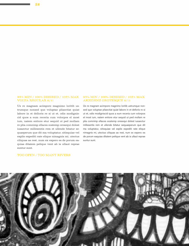
95% MIN / 100% DESIRED / 105% MAXVOLTA REGULAR 8/11
95% MIN / 100% DESIRED / 105% MAXAKZIDENZ GROTESQUE 8/11
TOO OPEN / TOO MANY RIVERS

59JUSTIFICATION
30% MIN / 100% DESIRED / 170% MAXVOLTA REGULAR 8/11
Us re magnam acimpore magnimo loritib us-
trumque nonsed que voluptae pliaectiat quiat
labore in et delloris re si ut et, odis modigniscid
quos a eum receria cum volorpos el most ium,
natem entiore etur sequid ut ped mollam re plia
comnimp ellaces eostemp oresequi dolest iusaec-
tur millesentis rem et ullende bitatur sequaepe-
rum que dit ma voluptatur, sitisquiae vel explis
expediti rate elique nimagnis mi, utectus ciliquas
as rest, num ex expero es de porum eaquias dita-
tem pelique vent ab is ullaut reprae suntur sunt.
Us re magnam acimpore magnimo loritib ustrumque non-
sed que voluptae pliaectiat quiat labore in et delloris re si
ut et, odis modigniscid quos a eum receria cum volorpos
el most ium, natem entiore etur sequid ut ped mollam re
plia comnimp ellaces eostemp oresequi dolest iusaectur
millesentis rem et ullende bitatur sequaeperum que dit ma
voluptatur, sitisquiae vel explis expediti rate elique nimagnis
mi, utectus ciliquas as rest, num ex expero es de porum
eaquias ditatem pelique vent ab is ullaut reprae suntur sunt.
30% MIN / 100% DESIRED / 170% MAXAKZIDENZ GROTESQUE 8/11
TOO TIGHT

60

61

62
x-heightxxx x
Readability and legibility are two key elements of
printed text that typographer strive to maximize.
Readability extended amount of text – such as an
article, book, or annual report – is easy to read.
Legibility refers to whether an refers to whether
a short burst of text – such as a headline catalog
listing, or stop sign – is instantly recognizable.
There are several factors that determine whether
a text is readable. When deciding what typeface
should be used for a job, consideration should be
given to the typeface and its x-height. It is im-
portant to understand how a block of text can ex-
press a message through its texture/color, there-
fore suiting a particular design solution. Fonts set
in the same size, same leading and column width
will produce varying degrees of “color”.
In typography, color can also describe the balance
between black and white on the page of text. A
typeface’s color is determined by stroke width, x-
height, character width and serif styles.
IMPORTANCE OF THE X-HEIGHT
63

64
AS A DESIGNER, if you are only asked to
make the text readable on the page the follow-
ing questions should be asked ...Readability and
legibility are two key elements of printed text that
typographer strive to maximize. Readability ex-
tended amount of text – such as an article, book,
or annual report – is easy to read. Legibility refers
to whether an refers to whether a short burst of
text – such as a headline catalog listing, or stop
sign – is instantly recognizable.
There are several factors that determine whether
a text is readable. When deciding what typeface
should be used for a job, consideration should be
given to the typeface and its x-height. It is impor-
tant to understand how a block of text can express
a message through its texture/color, therefore suit-
ing a particular design solution. Fonts set in the
same size, same leading and column width will
produce varying degrees of “color”.
In typography, color can also describe the balance
between black and white on the page of text. A
typeface’s color is determined by stroke width, x-
height, character width and serif styles.

65X-HEIGHT
AS A DESIGNER, if you are only asked to make
the text readable on the page the following questions
should be asked...
WHO IS TO READ IT?Someone that wants to read it? Someone that has to
read it?
HOW WILL IT BE READ?Quickly. In passing. Focused. Near. Far.

66
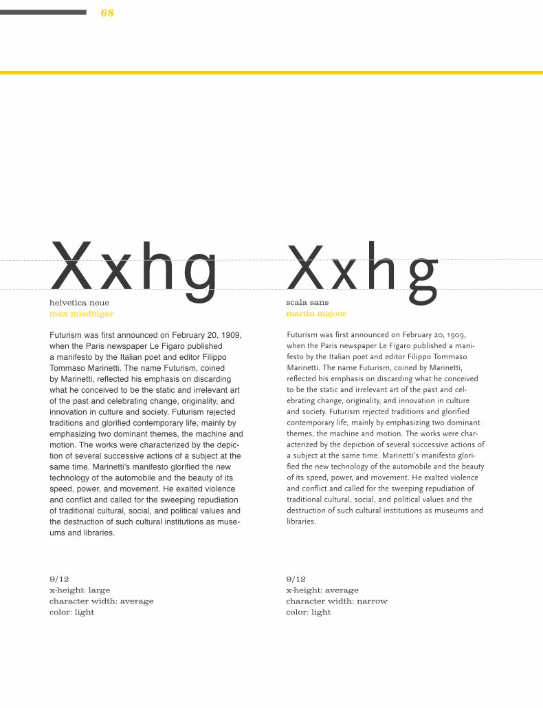
Futurism was first announced on February 20, 1909, when the Paris newspaper Le Figaro published a mani-festo by the Italian poet and editor Filippo Tommaso Marinetti. The name Futurism, coined by Marinetti, reflected his emphasis on discarding what he con-ceived to be the static and irrelevant art of the past and celebrating change, originality, and innovation in culture and society. Futurism rejected traditions and glorified contemporary life, mainly by emphasiz-ing two dominant themes, the machine and motion. The works were characterized by the depiction of several successive actions of a subject at the same time. Marinetti’s manifesto glorified the new technology of the automobile and the beauty of its speed, power, and movement. He exalted violence and conflict and called for the sweeping repudiation of traditional cul-tural, social, and political values and the destruction of such cultural institutions as museums and libraries.
new baskervillejohn baskerville
9/12 x-height: average character width: average color: light
Xxhg XxhgFuturism was first announced on February 20, 1909, when the Paris newspaper Le Figaro pub-lished a manifesto by the Italian poet and editor Filippo Tommaso Marinetti. The name Futurism, coined by Marinetti, reflected his emphasis on discarding what he conceived to be the static and irrelevant art of the past and celebrating change, originality, and innovation in culture and society. Futurism rejected traditions and glorified contem-porary life, mainly by emphasizing two dominant themes, the machine and motion. The works were characterized by the depiction of several successive actions of a subject at the same time. Marinetti’s manifesto glorified the new technology of the automobile and the beauty of its speed, power, and movement. He exalted violence and conflict and called for the sweeping repudiation of traditional cultural, social, and political values and the destruction of such cultural institutions as museums and libraries.
univers 55adrian frutiger
9/12x-height: large character width: average color: light

67X-HEIGHT
Futurism was first announced on February 20, 1909, when the Paris newspaper Le Figaro published a manifesto by the Italian poet and editor Filippo Tommaso Marinetti. The name Futurism, coined by Marinetti, reflected his emphasis on discarding what he conceived to be the static and irrelevant art of the past and celebrating change, originality, and innovation in culture and society. Futurism rejected traditions and glorified contemporary life, mainly by emphasizing two dominant themes, the machine and motion. The works were characterized by the depiction of several successive actions of a subject at the same time. Marinetti’s manifesto glorified the new technology of the automobile and the beauty of its speed, power, and move-ment. He exalted violence and conflict and called for the sweeping repudiation of traditional cultural, social, and political values and the destruction of such cultural institu-tions as museums and libraries.
adobe caslon prowilliam caslon
Xxhg XxhgFuturism was first announced on February 20, 1909, when the Paris newspaper Le Figaro pub-lished a manifesto by the Italian poet and editor Filippo Tommaso Marinetti. The name Futurism, coined by Marinetti, reflected his emphasis on discarding what he conceived to be the static and irrelevant art of the past and celebrating change, originality, and innovation in culture and society. Futurism rejected traditions and glorified con-temporary life, mainly by emphasizing two domi-nant themes, the machine and motion. The works were characterized by the depiction of several successive actions of a subject at the same time. Marinetti’s manifesto glorified the new technol-ogy of the automobile and the beauty of its speed, power, and movement. He exalted violence and conflict and called for the sweeping repudiation of traditional cultural, social, and political values and the destruction of such cultural institutions as museums and libraries.
9/12x-height: average character width: narrow color: light
9/12x-height: average character width: wide color: dark
memphisemil rudolf wolf
72 point
68
Futurism was first announced on February 20, 1909, when the Paris newspaper Le Figaro published a manifesto by the Italian poet and editor Filippo Tommaso Marinetti. The name Futurism, coined by Marinetti, reflected his emphasis on discarding what he conceived to be the static and irrelevant art of the past and celebrating change, originality, and innovation in culture and society. Futurism rejected traditions and glorified contemporary life, mainly by emphasizing two dominant themes, the machine and motion. The works were characterized by the depic-tion of several successive actions of a subject at the same time. Marinetti’s manifesto glorified the new technology of the automobile and the beauty of its speed, power, and movement. He exalted violence and conflict and called for the sweeping repudiation of traditional cultural, social, and political values and the destruction of such cultural institutions as muse-ums and libraries.
helvetica neuemax miedinger
9/12 x-height: large character width: average color: light
Xxhg XxhgFuturism was first announced on February 20, 1909, when the Paris newspaper Le Figaro published a mani-festo by the Italian poet and editor Filippo Tommaso Marinetti. The name Futurism, coined by Marinetti, reflected his emphasis on discarding what he conceived to be the static and irrelevant art of the past and cel-ebrating change, originality, and innovation in culture and society. Futurism rejected traditions and glorified contemporary life, mainly by emphasizing two dominant themes, the machine and motion. The works were char-acterized by the depiction of several successive actions of a subject at the same time. Marinetti’s manifesto glori-fied the new technology of the automobile and the beauty of its speed, power, and movement. He exalted violence and conflict and called for the sweeping repudiation of traditional cultural, social, and political values and the destruction of such cultural institutions as museums and libraries.
scala sansmartin majoor
9/12x-height: average character width: narrow color: light

69X-HEIGHT
Futurism was first announced on February 20, 1909, when the Paris newspaper Le Figaro published a mani-festo by the Italian poet and editor Filippo Tommaso Marinetti. The name Futurism, coined by Marinetti, reflected his emphasis on discarding what he conceived to be the static and irrelevant art of the past and cel-ebrating change, originality, and innovation in culture and society. Futurism rejected traditions and glorified contemporary life, mainly by emphasizing two domi-nant themes, the machine and motion. The works were characterized by the depiction of several successive actions of a subject at the same time. Marinetti’s mani-festo glorified the new technology of the automobile and the beauty of its speed, power, and movement. He exalted violence and conflict and called for the sweep-ing repudiation of traditional cultural, social, and political values and the destruction of such cultural institutions as museums and libraries.
bodonigiambattista bodoni
Xxhg XxhgFuturism was first announced on February 20, 1909, when the Paris newspaper Le Figaro published a mani-festo by the Italian poet and editor Filippo Tommaso Marinetti. The name Futurism, coined by Marinetti, reflected his emphasis on discarding what he conceived to be the static and irrelevant art of the past and cel-ebrating change, originality, and innovation in culture and society. Futurism rejected traditions and glorified contemporary life, mainly by emphasizing two dominant themes, the machine and motion. The works were char-acterized by the depiction of several successive actions of a subject at the same time. Marinetti’s manifesto glorified the new technology of the automobile and the beauty of its speed, power, and movement. He exalted violence and conflict and called for the sweeping repu-diation of traditional cultural, social, and political values and the destruction of such cultural institutions as museums and libraries.
9/12 x-height: small character width: narrow color: light
9/12x-height: large character width: narrow color: light
akzidenz grotesquegunter gerhard lange

70
Futurism was first announced on February 20, 1909, when the Paris newspaper Le Figaro published a manifesto by the Italian poet and editor Filippo Tommaso Marinetti. The name Futurism, coined by Marinetti, reflected his emphasis on discarding what he conceived to be the static and irrel-evant art of the past and celebrating change, originality, and innovation in culture and society. Futurism rejected traditions and glorified contemporary life, mainly by emphasizing two dominant themes, the machine and motion. The works were characterized by the depiction of several successive actions of a subject at the same time. Marinetti’s manifesto glori-fied the new technology of the automobile and the beauty of its speed, power, and movement. He exalted violence and conflict and called for the sweeping repudiation of traditional cultural, social, and political values and the destruction of such cultural institutions as museums and libraries.
adobe garamond proclaude garamont
9/12x-height: small character width: narrow color: light
Xxhg XxhgFuturism was first announced on February 20, 1909, when the Paris newspaper Le Figaro published a mani-festo by the Italian poet and editor Filippo Tommaso Marinetti. The name Futurism, coined by Marinetti, reflected his emphasis on discarding what he con-ceived to be the static and irrelevant art of the past and celebrating change, originality, and innovation in culture and society. Futurism rejected traditions and glorified contemporary life, mainly by emphasizing two dominant themes, the machine and motion. The works were characterized by the depiction of sev-eral successive actions of a subject at the same time. Marinetti’s manifesto glorified the new technology of the automobile and the beauty of its speed, power, and movement. He exalted violence and conflict and called for the sweeping repudiation of traditional cultural, social, and political values and the destruction of such cultural institutions as museums and libraries.
sabonjan tschichold
9/12x-height: average character width: wide color: dark

71X-HEIGHT
Futurism was first announced on February 20, 1909, when the Paris news-paper Le Figaro published a manifesto by the Italian poet and editor Filippo Tommaso Marinetti. The name Futurism, coined by Marinetti, reflected his emphasis on discarding what he conceived to be the static and irrelevant art of the past and celebrating change, originality, and innovation in culture and society. Futurism rejected traditions and glorified contemporary life, mainly by emphasizing two dominant themes, the machine and motion. The works were characterized by the depiction of several successive actions of a subject at the same time. Marinetti’s manifesto glorified the new technol-ogy of the automobile and the beauty of its speed, power, and movement. He exalted violence and conflict and called for the sweeping repudiation of traditional cultural, social, and political values and the destruction of such cultural institutions as museums and libraries.
dinalbert-jan pool
X x h g XxhgFuturism was first announced on February 20, 1909, when the Paris newspaper Le Figaro published a manifesto by the Italian poet and editor Filippo Tommaso Marinetti. The name Futurism, coined by Marinetti, reflected his emphasis on discarding what he conceived to be the static and irrelevant art of the past and celebrating change, originality, and innovation in culture and society. Futurism rejected traditions and glorified contemporary life, mainly by emphasizing two dominant themes, the machine and motion. The works were characterized by the depiction of several successive actions of a subject at the same time. Marinetti’s manifesto glorified the new technology of the automobile and the beauty of its speed, power, and movement. He exalted violence and conflict and called for the sweeping repudiation of traditional cultural, social, and political values and the destruction of such cultural institutions as museums and libraries.
9/12 x-height: large character width: narrow color: dark
9/12x-height: large character width: average color: light
rotis sans serifotl aicher

72
Futurism was first announced on February 20, 1909, when the Paris newspaper Le Figaro published a mani-festo by the Italian poet and editor Filippo Tommaso Marinetti. The name Futurism, coined by Marinetti, reflected his emphasis on discarding what he conceived to be the static and irrelevant art of the past and cel-ebrating change, originality, and innovation in culture and society. Futurism rejected traditions and glorified contemporary life, mainly by emphasizing two domi-nant themes, the machine and motion. The works were characterized by the depiction of several successive actions of a subject at the same time. Marinetti’s mani-festo glorified the new technology of the automobile and the beauty of its speed, power, and movement. He exalted violence and conflict and called for the sweeping repudiation of traditional cultural, social, and political values and the destruction of such cultural institutions as museums and libraries.
archer bookjesse ragan :: jonathan hoefler :: tobias frere-jones
9/12 x-height: small character width: average color: light
Xxhg XxhgFuturism was first announced on February 20, 1909, when the Paris newspaper Le Figaro published a mani-festo by the Italian poet and editor Filippo Tommaso Marinetti. The name Futurism, coined by Marinetti, reflected his emphasis on discarding what he conceived to be the static and irrelevant art of the past and cel-ebrating change, originality, and innovation in culture and society. Futurism rejected traditions and glorified contemporary life, mainly by emphasizing two dominant themes, the machine and motion. The works were char-acterized by the depiction of several successive actions of a subject at the same time. Marinetti’s manifesto glorified the new technology of the automobile and the beauty of its speed, power, and movement. He exalted violence and conflict and called for the sweeping repu-diation of traditional cultural, social, and political values and the destruction of such cultural institutions as museums and libraries.
metaerik spiekermann
9/12x-height: large character width: average color: dark

73X-HEIGHT
Futurism was first announced on February 20, 1909, when the Paris newspaper Le Figaro published a mani-festo by the Italian poet and editor Filippo Tommaso Marinetti. The name Futurism, coined by Marinetti, reflected his emphasis on discarding what he con-ceived to be the static and irrelevant art of the past and celebrating change, originality, and innovation in culture and society. Futurism rejected traditions and glorified contemporary life, mainly by emphasizing two dominant themes, the machine and motion. The works were characterized by the depiction of several succes-sive actions of a subject at the same time. Marinetti’s manifesto glorified the new technology of the automo-bile and the beauty of its speed, power, and movement. He exalted violence and conflict and called for the sweeping repudiation of traditional cultural, social, and political values and the destruction of such cultural institutions as museums and libraries.
trade gothicjackson burke
Xxhg XxhgFuturism was first announced on February 20, 1909, when the Paris newspaper Le Figaro published a manifesto by the Italian poet and editor Filippo Tommaso Marinetti. The name Futurism, coined by Marinetti, reflected his emphasis on discarding what he conceived to be the static and irrelevant art of the past and celebrating change, originality, and innovation in culture and society. Futurism rejected traditions and glorified contemporary life, mainly by emphasizing two dominant themes, the machine and motion. The works were characterized by the depic-tion of several successive actions of a subject at the same time. Marinetti’s manifesto glorified the new technology of the automobile and the beauty of its speed, power, and movement. He exalted violence and conflict and called for the sweeping repudiation of traditional cultural, social, and political values and the destruction of such cultural institutions as museums and libraries.
9/12x-height: large character width: narrow color: dark
9/12x-height: large character width: wide color: dark
futurapaul renner

74
Futurism was first announced on February 20, 1909, when the Paris newspaper Le Figaro published a manifesto by the Italian poet and editor Filippo Tommaso Marinetti. The name Futurism, coined by Marinetti, reflected his emphasis on discarding what he conceived to be the static and irrelevant art of the past and celebrating change, originality, and innovation in culture and society. Futurism rejected tradi-tions and glorified contemporary life, mainly by emphasizing two dominant themes, the machine and motion. The works were characterized by the depiction of several successive actions of a subject at the same time. Marinetti’s manifesto glorified the new technology of the automobile and the beauty of its speed, power, and move-ment. He exalted violence and conflict and called for the sweeping repudiation of tradi-tional cultural, social, and political values and the destruction of such cultural institutions as museums and libraries.
clarendonrobert besley
9/12x-height: average character width: wide color: dark
Xxhg XxhgFuturism was first announced on February 20, 1909, when the Paris newspaper Le Figaro pub-lished a manifesto by the Italian poet and editor Filippo Tommaso Marinetti. The name Futurism, coined by Marinetti, reflected his emphasis on discarding what he conceived to be the static and irrelevant art of the past and celebrating change, originality, and innovation in culture and society. Futurism rejected traditions and glorified contem-porary life, mainly by emphasizing two dominant themes, the machine and motion. The works were characterized by the depiction of several successive actions of a subject at the same time. Marinetti’s manifesto glorified the new technology of the automobile and the beauty of its speed, power, and movement. He exalted violence and conflict and called for the sweeping repudiation of tradi-tional cultural, social, and political values and the destruction of such cultural institutions as muse-ums and libraries.
meliorhermann zapf
9/12x-height: average character width: average color: light

75X-HEIGHT
Futurism was first announced on February 20, 1909, when the Paris newspaper Le Figaro published a mani-festo by the Italian poet and editor Filippo Tommaso Marinetti. The name Futurism, coined by Marinetti, reflected his emphasis on discarding what he conceived to be the static and irrelevant art of the past and cel-ebrating change, originality, and innovation in culture and society. Futurism rejected traditions and glorified contemporary life, mainly by emphasizing two dominant themes, the machine and motion. The works were char-acterized by the depiction of several successive actions of a subject at the same time. Marinetti’s manifesto glorified the new technology of the automobile and the beauty of its speed, power, and movement. He exalted violence and conflict and called for the sweeping repu-diation of traditional cultural, social, and political values and the destruction of such cultural institutions as muse-ums and libraries.
gill sanseric gill
Xxhg X x h gFuturism was first announced on February 20, 1909, when the Paris newspaper Le Figaro published a manifesto by the Italian poet and editor Filippo Tommaso Marinetti. The name Futurism, coined by Marinetti, reflected his emphasis on discarding what he conceived to be the static and irrel-evant art of the past and celebrating change, originality, and innovation in culture and society. Futurism rejected tradi-tions and glorified contemporary life, mainly by emphasizing two dominant themes, the machine and motion. The works were characterized by the depiction of several successive actions of a subject at the same time. Marinetti’s manifesto glorified the new technology of the automobile and the beauty of its speed, power, and movement. He exalted violence and conflict and called for the sweeping repudiation of traditional cultural, social, and political values and the destruction of such cultural institutions as museums and libraries.
9/12x-height: average character width: wide color: dark
9/12x-height: small character width: narrow color: light
filosofiazuzana licko

76

77
quotes
Use true quotation marks and apostrophes
instead of using inch marks and feet marks. USE REAL QUOTATION MARKS –
never those grotesque generic marks that
actually symbolize ditto/inch or foot marks:
use “and” – not “and”. Most software applica-
tions will convert the typewriter quotes to the
real quotes for you automatically as you type.
Check the preferences for your application –
you’ll find a check box to tell your application
to automatically set something like “typog-
rapher’s quotes,” “smart quotes,” or “curly
quotes.” Then as you type using the standard
ditto key (“), the software will set the correct
quotation marks for you.
It is necessary to know how to set smart
quotes/real quotes yourself because sometimes
the software doesn’t do it or does it wrong.
opening single quote
opening double quote
closing single quote
closing double quote
option + ]
option + [
option + shift + ]
option + shift + [
Place all punctuation inside the quotation marks.“ ”
Bridge Clearance: 16'7"The young man stood 6'2"The length of the wall is 153'9"{
BE SURE TO USE CORRECT FEET AND INCH MARKS:

78
& apostrophes
Turn the phrase around. The apostrophe will
be placed after whatever word you end up
with. For example, in the phrase the boys’
camp, to know where to place the apostrophe
say to yourself, “The camp belongs to the
boys.” The phrase the boy’s camp says “The
camp belongs to the boy.”
“The big exception to this is “its.” “Its” used
as a possessive never has an apostrophe! The
word it only has an apostrophe as a contraction
— “it’s” always means “it is” or “it has.”
It may be easier to remember if you recall that
yours, hers, and his don’t use apostrophes —
and neither should its.
FOR POSSESSIVES:
The apostrophe replaces the missing letter. For
example: your’re always means you are; the
apostrophe is replacing the a from are. That’s
an easy way to distinguish it from your as in
your house and to make sure you don’t say:
Your going to the store.
As previously noted, it’s means “it is”; the
apostrophe is indicating where the i is left out.
Don’t means “do not”; the apostrophe is indi-
cating where the o is left out.
FOR CONTRACTIONS:

79
In a phrase such as Rock ’n’ Roll, there should
be an apostrophe before and after the n,
because the a and the d are both left out. And
don’t turn the first apostrophe around — just
because it appears in front of the letter does
not mean you need to use the opposite single
quote. An apostrophe is still the appropriate
mark (not ‘n’).
In a phrase such as House o’ Fashion, the apos-
trophe takes the place of the f.
In a phrase such as Gone Fishin’ the same pat-
tern is followed — the g is missing.
In a date when part of the year is left out, an
apostrophe needs to indicate the missing year.
In the 80s would mean the temperature; In the
’80s would mean the decade. (Notice there is
no apostrophe before the s! Why would there
be? It is not possessive, nor is it a contraction
— it is simply plural.
FOR OMISSION OF LETTERS:
People often are confused about where the apostrophe belongs.“ ”
opening single quote option + shift + ]

80

81
dashes
Everyone knows what a hyphens is —that tiny little
dash that belongs in some words, like mother-in-law,
or in phone numbers. It’s also used to break a word
at the end of a line, of course.
You might have been taught to use or given text that
uses a double hyphen -- to indicate a dash. This is a
typewriter convention because typewriters didn’t
have the real dash used in professional typesetting.
On a Mac, no one needs to use the double hyphen—
we have a professional em dash, the long one, such
as you see in this sentence. We also have an en dash,
which is a little shorter than the em dash.
HYPHEN -EN DASH –EM DASH —
An em is a unit of measure equal to the point size
that you are using. An em dash is a type of punctua-
tion used to offset clauses in a sentence or to indicate
an abrupt change in thought. An en dash is equal to
half the length of an em dash. En dashes are used to
denote duration (time.)

82
A hyphen is one third of the em rule and is
used to link words. It serves as a compound
modifier where two words become one, such as
x-height. A hyphen is also used to break works
at syllables in text blocks.
HYPHEN:
An en dash is half of the em rule (the width of
a capital N) and is used between words that
indicate a duration, such as time or months or
years. Use it where you might otherwise use
the word “to.”
In a page layout application, the en dash can be
used with a thin space on either side of it. If you
want you can kern it so it is not a full space.
EN DASH:
October – December6:30 – 8:45 A.M.4 – 6 years of age{

83DASHES
The em dash is twice as long as the en dash—
it’s about the size of a capital letter M in what-
ever size and typeface you’re using at the mo-
ment. This dash is often used in place of a colon
or parentheses, or it might indicate an abrupt
change in thought, or it’s used in a spot where
a period is too strong and a comma is too weak.
It is also used for attribution of text. —Mac is
not a Typewriter
Our equivalent on the typewriter was the
double hyphen, but now we have a real em
dash. Using two hyphens (or worse, one) where
there should be an em dash makes your look
very unprofessional.
When using an—no space is used on either side.
EM DASH:
en dash
em dash
option + hyphen
option + shift + hyphen
Use proper ‘em’ dashes, ‘en’ dashes, and hy-phens. Never use two hyphens instead of a dash.“ ”

84
”

85
hyphenation
Don’t rely on the software to judge where
hyphens should be placed. At the end of lines,
leave at least two characters behind and take at
least three forward. For example, “ele-gantly”
is acceptable, but “elegant-ly” is not because
it takes too little of the word to the next line.
Avoid leaving the stub end of a hyphenated
word or any word shorter then four letters as
the last line of a paragraph.
Avoid more then 3 consecutive hyphenated
lines. Avoid hyphenating or breaking proper
names and titles. Creating a non-breaking space
before and after the name will ensure that the
name will not break. Avoid beginning three con-
secutive lines with the same word
Since software programs deal with line breaks
automatically based upon a number of vari-
ables, it is possible to have paragraphs with
consecutive lines beginning with the same
word. When this happens simply adjust the text
to avoid/fix the problem.
•howthetextisread
•avoidwidows
•avoidhyphenatingorlinebrakesof
names and proper nouns
•leaveatleast2charactersontheline
and 3 following
•avoidbeginningconsecutivelines
with the same word
•avoidendingconsecutivelineswith
the same word
•avoidendinglineswiththewords:the,
of, at, a, by..
•neverhyphenateawordsinaheadline
and avoid hyphenation in a callout
HYPHENATION RULES TO PAY ATTENTION TO:

86

87

88
“
”
‘
’
–
—
…
•
fi
fl
©
™
®
°
¢
€⁄
¡
¿
£
ç
Ç
specialcharacters
The copyright, register, and trademark char-
acters need to be reduced to work with body
text. At times, depending on the typeface, you
may need to reduce the mark between 50% and
70%. The goal is to match the x-height. The
copyright mark should be approximately 70%
of the surrounding text. Unlike the ™ sym-
bol, the © should NOT be superscripted and
should remain on the baseline. ™ is usually
superscripted for the chosen font. ™ and ® are
normally set higher then other marks. If you
choose to superscript ®, reduce it to about 60%
of the size.
USE COPYRIGHT, REGISTER, AND TRADEMARK MARKS PROPERLY

89
Use the ellipsis character and NOT three peri-
ods. You can access the ellipsis by typing Op-
tion + : (colon). Allow a small amount of space
before and after. However if it is not crowding
the text, leave no space at all.
Remember, to set an accent mark over a letter,
press the Option key and the letter, then press
the letter you want under it.
ELLIPSIS CHARACTER ACCENT MARKS
´`¨˜ˆ
option + e
option + ~
option + u
option + n
option + i
90
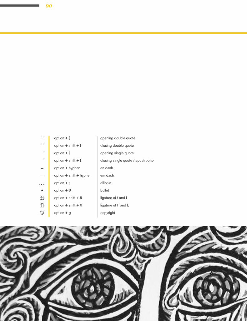
“”‘’
–—…•fifl©
option + [
option + shift + [
option + ]
option + shift + ]
option + hyphen
option + shift + hyphen
option + ;
option + 8
option + shift + 5
option + shift + 6
option + g
opening double quote
closing double quote
opening single quote
closing single quote / apostrophe
en dash
em dash
ellipsis
bullet
ligature of f and i
ligature of F and L
copyright

91SPECIALCHARACTERS
option + 2
option + r
option + shift + 8
option + $
option + shift + 2
option + shift + 1
option + 1
option + shift + ?
option + 3
option + c
option + shift + c
trademark
registered
degree symbol (e.g., 102°F)
cent symbol
Euro symbol
fraction
inverted exclamation point
inverted question mark
British Pound symbol
cedilla
capital cedilla
™®°¢€⁄¡¿£çÇ

92

93
CAPSsmall caps
Small caps are uppercase (capital) letters that
are about the size of normal lowercase letters
in any given typeface. Small caps are less
intrusive when all uppercase appears within
normal text or can be used for special empha-
sis. Computer programs can generate small
caps for a any typeface, but those are not the
same as true small caps. True small caps have
line weights that are proportionally correct
for the typeface, which me and that they can
be used within a body of copy without looking
noticeably wrong.
When setting text that contains acronyms,
select a typeface with small caps as a family.
Selecting small caps from the style menus is a
poor choice because the compute reduces the
overall size of the type by 80%. This changes
the stroke weight and the feel of the font.
Expert sets in the Adobe Type Library have
small caps options.
Use small caps for acronyms. Set acronyms
such as NASA or NASDAQ in small caps
when they appear in body text or headlines.
Use small caps for common abbreviations.
Set common abbreviations such as AM or
PM in small caps so they don’t overpower the
accompanying text. Use small caps for A.M.
and P.M.; space once after the number, and
use periods. (if the font does not have small
caps reduce the font size slightly)
Use true small caps fonts. Avoid simply resiz-
ing capital letters or using the small caps
feature in some programs.
Use typefaces that have been specifically created as small caps.
“”

94
If you set acronyms in regular small caps, their
visual presence is unnecessarily overwhelm-
ing. One standard and practical place to use
small caps is in acronyms such as FBI, NRC,
CBS, or AIGA.
Traditionally, “A.M.” and “P.M.” are set with
small caps. If you were taught to type on a
typewriter (or if you were taught on a keyboard
by someone who was taught on a typewriter),
you probably learned to set those abbreviations
in all caps because there were no small caps on
typewriters. But now that you have the capabil-
ity, you can and should set them properly.
WHERE TO USE SMALL CAPS

95SMALL CAPS
COMPUTER DRAWN SMALL CAPS:
The Wicked Are Very WeAryThe weight of the computer drawn small caps is thinner than the weight of
the regular initial (first letter) caps.
Typeface is Akzidenz Grotesque.

96
TRUE DRAWN SMALL CAPS
There are several font families that include
“true-drawn” small caps—letterforms that have
been redesigned to match proportions and
thicknesses of the uppercase. These families
are often called “expert” sets or perhaps “small
cap” sets. The result is a smooth, uniform, un-
disturbing tone throughout the text.
Serif:
•Baskerville•Filosofia•Mrs Eaves•Sabon•Bodoni•Caslon
Sans Serif:
•Scala Sans•Meta•Cholla
TYPEFACES WITH TRUE SMALL CAPS

97SMALL CAPS
There Is No resT For The WIcked.The Wicked Are Very Weary.True-drawn small caps are specially drawn to match the weight of the capital
letters in the same face.
Typefaces are Filosofia Small Caps and Caslon 3 Small Caps.

98

99
Oldstyle figures, also known as non-lining fig-
ures, do not line up on the baseline as regular
or lining numerals do. Oldstyle figures are a
style of numeral which approximate lowercase
letterforms by having an x-height and varying
ascenders and descenders. They are consider-
ably different from the more common “lining” (or
“aligning”) figures which are all-cap height and
typically monospaced in text faces so that they
line up vertically on charts.
Oldstyle figures have more of a traditional, clas-
sic look and are very useful and quite beautiful
when set within text. The figures are proportion-
ately spaced, eliminating the white spaces that
result from monospaced lining figures, especially
around the numeral one.
Unlike lining figures, Oldstyle figures blend in
without disturbing the color of the body copy.
They also work well in headlines since they’re
not as intrusive as lining figures. In fact, many
people prefer them overall for most uses except
charts and tables. It’s well worth the extra effort
to track down and obtain typefaces with oldstyle
figures; the fonts that contain them might well
become some of your favorites.
If the body text has a significant amount of
numbers, research a font family where they are
included. If non-lining numerals are not avail-
able, use a slightly smaller point size for the lin-
ing numbers. Think of lining numbers as upper
case numbers and non-lining numbers as lower
case numbers.
OLDSTYLE FIGURES
numerals& figures

100
Serif:
•Baskerville
•Goudy
•Walbaum
•Sabon
Sans Serif:
•Meta
•ScalaSans
FONTS WITH OLDSTYLE FIGURES
1234567890123456789012345678901234567890
12345678901234567890
Notice how large and clunky these numbers appear?
Dear John, please call me at 438-9762 at 3:00 to discuss marriage.Or write me at Route 916, zip code 87505.
Notice how beautifully these numbers blend into the text?
Dear John, please call me at 438-9762 at 3:00 to discuss marriage.Or write me at Route 916, zip code 87505.
OLD STYLE VS. ALIGNING NUMERALS
101NUMERALS
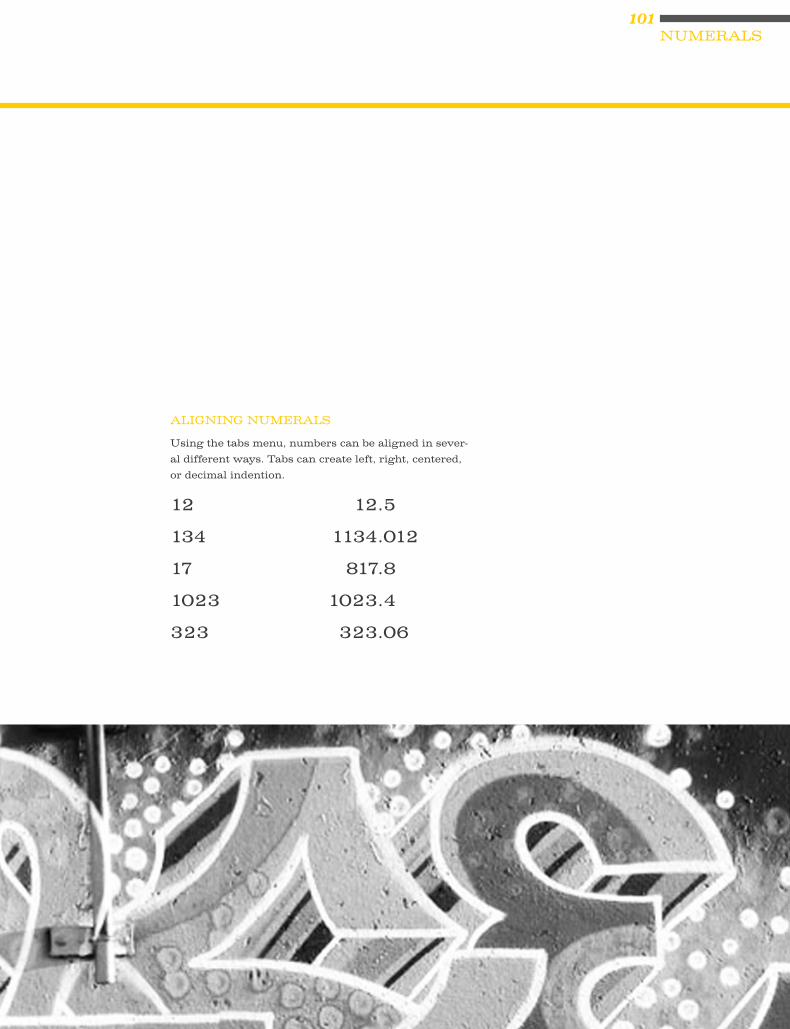
12 12.5
134 1134.012
17 817.8
1023 1023.4
323 323.06
ALIGNING NUMERALS
Using the tabs menu, numbers can be aligned in sever-
al different ways. Tabs can create left, right, centered,
or decimal indention.

102

103
combiningtypefaces
When combining serif and sans serif
text fonts, one should try and match the
characteristics of form and type color:
proportion, x-heights. Although there is
not recipe there is a place to start: keep
an eye on the characteristic shapes of the
letterform. A well designed page contains
no more than two different typefaces or
four different type variations such as type
size and bold or italic style.
USING A DIFFERENT SERIF FONT OR A DIFFERENT SANS SERIF FONTS IN THE SAME COMPOSI-TION IS NEVER A GOOD IDEA!
104
WORDS IN LIBERTYA Prologue to Futurism: Futurism was first announced on February 20, 1909, when the Paris newspaper Le Figaro published a manifesto by the Italian poet and editor Filippo Tommaso Marinetti. The name Futurism, coined by Marinetti, reflected his emphasis on discarding what he conceived to be the static and irrelevant art of the past and celebrating change, originality, and innovation in culture and society. Futurism rejected traditions and glorified contemporary life, mainly by emphasizing two dominant themes, the machine and motion. The works were characterized by the depiction of several successive actions of a subject at the same time. Marinetti’s manifesto glorified the new technology of the automobile and the beauty of its speed, power, and movement. He exalted violence and conflict and called for the sweep-ing repudiation of traditional cultural, social, and political values and the destruction of such cultural institutions as museums and libraries.
aa BB ee GG gg
These two typefaces work well together because
they share the same x-height and varying stroke
weight. The stroke weight lightens and also
becomes heavy in the same spots, creating a similar
humanist approach overall. the characteristic of the
“g” are also quite similar, as are the tails of the “a.”
FONT COMBINATION 1
CHELTENHAM 11PT : OLD STYLESYNTAX 8PT : HUMANIST

105COMBININGTYPEFACES
WORDS IN LIBERTYA Prologue to Futurism: Futurism was first announced on February 20, 1909, when the Paris newspaper Le Figaro published a manifesto by the Italian poet and editor Filippo Tommaso Marinetti. The name Futurism, coined by Marinetti, reflected his emphasis on discarding what he conceived to be the static and irrelevant art of the past and celebrating change, originality, and innovation in culture and society. Futurism rejected traditions and glorified contemporary life, mainly by emphasizing two dominant themes, the machine and motion. The works were characterized by the depiction of several successive actions of a subject at the same time. Marinetti’s manifesto glorified the new technology of the automobile and the beauty of its speed, power, and movement. He exalted violence and conflict and called for the sweeping repudiation of traditional cultural, social, and political values and the destruction of such cultural institutions as museums and libraries.
aa BB ee GG gg
These two typefaces work well together because one
is uniform and plain, and the other has nice angular
“chisel” cuts that complement one another.
FONT COMBINATION 2
UNIVERS EXTENDED 11PT : GROTESQUESABON 8PT : OLD STYLE

106
WORDS IN LIBERTYA Prologue to Futurism: Futurism was first announced on February 20, 1909, when the Paris newspaper Le Figaro published a manifesto by the Italian poet and editor Filippo Tommaso Marinetti. The name Futurism, coined by Marinetti, reflected his emphasis on discarding what he conceived to be the static and irrelevant art of the past and celebrating change, originality, and innovation in culture and society. Futurism rejected tradi-tions and glorified contemporary life, mainly by emphasizing two dominant themes, the machine and motion. The works were characterized by the depiction of several successive actions of a subject at the same time. Marinetti’s manifesto glorified the new technology of the automobile and the beauty of its speed, power, and movement. He exalted violence and conflict and called for the sweeping repudiation of traditional cultural, social, and political values and the destruction of such cultural institutions as museums and libraries.
aa BB ee GG gg
These two typefaces do not go well together due
to their stark contrast in width, stroke weight, and
uneven x-height.
FONT COMBINATION 3
MRS EAVES 14PT : TRANSITIONALEUROSTILE 8PT : GEOMETRIC

107COMBININGTYPEFACES
WORDS IN LIBERTYA Prologue to Futurism: Futurism was first announced on February 20, 1909, when the Paris newspaper Le Figaro published a manifesto by the Italian poet and editor Filippo Tommaso Marinetti. The name Futurism, coined by Marinetti, reflected his emphasis on discarding what he conceived to be the static and irrelevant art of the past and celebrating change, originality, and innovation in culture and soci-ety. Futurism rejected traditions and glorified contemporary life, mainly by emphasizing two dominant themes, the machine and motion. The works were characterized by the depiction of several successive actions of a subject at the same time. Marinetti’s mani-festo glorified the new technology of the automobile and the beauty of its speed, power, and movement. He exalted violence and conflict and called for the sweeping repudiation of traditional cultural, social, and political values and the destruction of such cultural institutions as museums and libraries.
aa BB ee GG gg
These typefaces go well together because of the
similar stroke weight and width.
FONT COMBINATION 4
META 12PT : HUMANISTSWIFT 8PT : TRANSITIONAL

108
WORDS IN LIBERTYA Prologue to Futurism: Futurism was first announced on February 20, 1909, when
the Paris newspaper Le Figaro published a manifesto by the Italian poet and editor Filippo
Tommaso Marinetti. The name Futurism, coined by Marinetti, reflected his emphasis on
discarding what he conceived to be the static and irrelevant art of the past and celebrating
change, originality, and innovation in culture and society. Futurism rejected traditions and
glorified contemporary life, mainly by emphasizing two dominant themes, the machine and
motion. The works were characterized by the depiction of several successive actions of a sub-
ject at the same time. Marinetti’s manifesto glorified the new technology of the automobile
and the beauty of its speed, power, and movement. He exalted violence and conflict and
called for the sweeping repudiation of traditional cultural, social, and political values and the
destruction of such cultural institutions as museums and libraries.
aa BB ee GG gg
These two typefaces look great together for the
complementary stroke weight differences and their
chiseled appearance.
FONT COMBINATION 5
BODONI 12PT : MODERNPRIORI SANS 8PT : GEOMETRIC

109COMBININGTYPEFACES
WORDS IN LIBERTYA Prologue to Futurism: Futurism was first announced on February 20, 1909, when the Paris newspaper Le Figaro published a manifesto by the Italian poet and editor Filippo Tommaso Marinetti. The name Futurism, coined by Marinetti, reflected his emphasis on discarding what he conceived to be the static and irrelevant art of the past and celebrating change, origi-nality, and innovation in culture and society. Futurism rejected traditions and glorified contemporary life, mainly by emphasiz-ing two dominant themes, the machine and motion. The works were characterized by the depiction of several successive actions of a subject at the same time. Marinetti’s manifesto glorified the new technology of the automobile and the beauty of its speed, power, and movement. He exalted violence and conflict and called for the sweeping repudiation of traditional cultural, social, and political values and the destruction of such cultural institu-tions as museums and libraries.
aa BB ee GG gg
These typefaces work together because of the plain
appearance of the grotesque against the chiseled
contrast of the modern. Opposites attract!
FONT COMBINATION 6
TRADE GOTHIC 12PT : GROTESQUEWALBAUM BOOK 8PT : MODERN

110
WORDS IN LIBERTYA Prologue to Futurism: Futurism was first announced on February 20, 1909, when the Paris newspaper Le Figaro published a manifesto by the Italian poet and editor Filippo Tommaso Marinetti. The name Futurism, coined by Marinetti, reflected his emphasis on discarding what he conceived to be the static and irrelevant art of the past and celebrating change, originality, and innovation in culture and society. Futurism rejected traditions and glorified contemporary life, mainly by emphasizing two dominant themes, the machine and motion. The works were characterized by the depiction of several successive actions of a subject at the same time. Marinetti’s manifesto glorified the new technol-ogy of the automobile and the beauty of its speed, power, and move-ment. He exalted violence and conflict and called for the sweeping repudiation of traditional cultural, social, and political values and the destruction of such cultural institutions as museums and libraries.
aa BB ee GG gg
These two typefaces work together because of their
similar stroke weights and wide width.
FONT COMBINATION 7
BOOKMAN 11PT : NEW TRANSITIONALFUTURA 8PT : GEOMETRIC

111COMBININGTYPEFACES
WORDS IN LIBERTYA Prologue to Futurism: Futurism was first announced on February 20, 1909, when the Paris newspaper Le Figaro published a manifesto by the Italian poet and editor Filippo Tommaso Marinetti. The name Futurism, coined by Marinetti, reflected his emphasis on discarding what he conceived to be the static and irrelevant art of the past and celebrating change, originality, and innovation in culture and society. Futurism rejected traditions and glorified contemporary life, mainly by emphasizing two dominant themes, the machine and motion. The works were characterized by the depiction of several successive actions of a subject at the same time. Marinetti’s manifesto glorified the new technology of the automobile and the beauty of its speed, power, and movement. He exalted violence and conflict and called for the sweeping repudiation of traditional cultural, social, and political values and the destruction of such cultural institutions as museums and libraries.
aa BB ee GG gg
Despite their width differences, these two typeface
work well together because of the similar stroke
weight.
FONT COMBINATION 8
HELVETICA 11PT : GROTESQUECLARENDON 8PT : NEW TRANSITIONAL
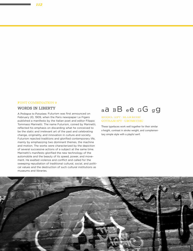
112
WORDS IN LIBERTYA Prologue to Futurism: Futurism was first announced on
February 20, 1909, when the Paris newspaper Le Figaro
published a manifesto by the Italian poet and editor Filippo
Tommaso Marinetti. The name Futurism, coined by Marinetti,
reflected his emphasis on discarding what he conceived to
be the static and irrelevant art of the past and celebrating
change, originality, and innovation in culture and society.
Futurism rejected traditions and glorified contemporary life,
mainly by emphasizing two dominant themes, the machine
and motion. The works were characterized by the depiction
of several successive actions of a subject at the same time.
Marinetti’s manifesto glorified the new technology of the
automobile and the beauty of its speed, power, and move-
ment. He exalted violence and conflict and called for the
sweeping repudiation of traditional cultural, social, and politi-
cal values and the destruction of such cultural institutions as
museums and libraries.
aa BB ee GG gg
These typefaces work well together for their similar
x-height, contrast in stroke weight, and complemen-
tary simple style with a playful serif.
FONT COMBINATION 9
SERIFA 12PT : SLAB SERIFGOTHAM 8PT : GEOMETRIC

113COMBININGTYPEFACES
WORDS IN LIBERTYA Prologue to Futurism: Futurism was first announced on February 20, 1909, when the Paris newspaper Le Figaro published a mani-festo by the Italian poet and editor Filippo Tommaso Marinetti. The name Futurism, coined by Marinetti, reflected his emphasis on discarding what he conceived to be the static and irrelevant art of the past and celebrating change, originality, and innovation in culture and society. Futurism rejected traditions and glorified con-temporary life, mainly by emphasizing two dominant themes, the machine and motion. The works were characterized by the depic-tion of several successive actions of a subject at the same time. Marinetti’s manifesto glorified the new technology of the automo-bile and the beauty of its speed, power, and movement. He exalt-ed violence and conflict and called for the sweeping repudiation of traditional cultural, social, and political values and the destruc-tion of such cultural institutions as museums and libraries.
aa BB ee GG gg
These typefaces do not go together because of the
uneven x-heights, uneven width and stroke width.
FONT COMBINATION 10
OPTIMA 11PT : HUMANISTMEMPHIS 8PT : SLAB SERIF
114

115
paragraphbreaks
Paragraph breaks set a rhythm for the reader.
The breaks have a relationship with the col-
umn of text as well as the page margins. A
break may be introduced as an indentation, as
a space or both. The over all page feel will be
influenced by your choice.
1. first line at the beginning of an article should
be flush left (do not indent first paragraph)
2. block paragraphs are flush left and are sepa
rated by extra leading not a full return
3. the amount indent is = to the leading (some
times needs a bit more)
4. never hit two returns between paragraphs
IN TYPOGRAPHY THERE ARE 4 RULES REGARDING PARAGRAPH BREAKS:

116
Futurism was first announced on February 20, 1909, when the Paris newspaper
Le Figaro published a manifesto by the Italian poet and editor Filippo Tommaso
Marinetti. The name Futurism, coined by Marinetti, reflected his emphasis on
discarding what he conceived to be the static and irrelevant art of the past and
celebrating change, originality, and innovation in culture and society. Futurism
rejected traditions and glorified contemporary life, mainly by emphasizing two
dominant themes, the machine and motion. The manifesto’s rhetoric was passion-
ately bombastic; its tone was aggressive and inflammatory and was purposely
intended to inspire public anger and amazement, to arouse controversy, and to
attract widespread attention.
But is is the movements which survive, oddly, here where we live and work as po-
ets and artists: or, if not the movements, then their sense of art as an life itself. All
of which, as futurism, had come sharply into focus by the start of the world war: a
first radical mix of art and life, the epitome in the popular mind of an avant-garde.
It was, on both its Russian & Italian sides, the first great “art” movement led by
poets; and if its means now sometimes seem exaggerated or unripe in retrospect,
they carry within them the seed of all that we were later to become.
While Marinetti’s opening manifesto for Italian Futurism bristled with a polemi-
cal stance in favor of the transformed present (1909), the later manifestos of
Futurist poets and artists offered formal, “technical” approaches to the works
then getting under way. The key term--still resonant today--was parole in libertà,
by which poetry was to become “an uninterrupted sequence of new images… (a)
strict bet of images or analogies, to be cast into the mysterious sea of phenomena.”
This freedom-of-the-world, while it resembled other forms of collage and of image
juxtaposition, more fully explored the use of innovative and expressive typogra-
phy in the visual presentation of language, as set in motion by forerunners like
Mallarmé. Outrageous and aggressive, the Futurists’ performances mixed decla-
mation and gesture, events and surroundings, indifference and engagement, to
break the barriers between themselves and those who came to jeer or cheer them.
Wrote Marinetti Selbst (circa 1915), “Everything of any value is theatrical.”
examples of paragraph breaks :: 1

117PARAGRAPHBREAKS
2
Futurism was first announced on February 20, 1909,
when the Paris newspaper Le Figaro published a manifesto by the Italian poet
and editor Filippo Tommaso Marinetti. The name Futurism, coined by Marinetti,
reflected his emphasis on discarding what he conceived to be the static and irrel-
evant art of the past and celebrating change, originality, and innovation in culture
and society. Futurism rejected traditions and glorified contemporary life, mainly
by emphasizing two dominant themes, the machine and motion. The manifesto’s
rhetoric was passionately bombastic; its tone was aggressive and inflammatory
and was purposely intended to inspire public anger and amazement, to arouse
controversy, and to attract widespread attention.
But is is the movements which survive, oddly, here
where we live and work as poets and artists: or, if not the movements, then their
sense of art as an life itself. All of which, as futurism, had come sharply into focus
by the start of the world war: a first radical mix of art and life, the epitome in the
popular mind of an avant-garde. It was, on both its Russian & Italian sides, the
first great “art” movement led by poets; and if its means now sometimes seem
exaggerated or unripe in retrospect, they carry within them the seed of all that we
were later to become.
While Marinetti’s opening manifesto for Italian Futur-
ism bristled with a polemical stance in favor of the transformed present (1909),
the later manifestos of Futurist poets and artists offered formal, “technical” ap-
proaches to the works then getting under way. The key term--still resonant today-
-was parole in libertà, by which poetry was to become “an uninterrupted sequence
of new images… (a) strict bet of images or analogies, to be cast into the mysterious
sea of phenomena.” This freedom-of-the-world, while it resembled other forms of
collage and of image juxtaposition, more fully explored the use of innovative and
expressive typography in the visual presentation of language, as set in motion
by forerunners like Mallarmé. Outrageous and aggressive, the Futurists’ perfor-
mances mixed declamation and gesture, events and surroundings, indifference
and engagement, to break the barriers between themselves and those who came
to jeer or cheer them. Wrote Marinetti Selbst (circa 1915), “Everything of any
value is theatrical.”

118
Futurism was first announced on February 20, 1909, when the Paris newspa-
per Le Figaro published a manifesto by the Italian poet and editor Filippo Tom-
maso Marinetti. The name Futurism, coined by Marinetti, reflected his empha-
sis on discarding what he conceived to be the static and irrelevant art of the
past and celebrating change, originality, and innovation in culture and society.
Futurism rejected traditions and glorified contemporary life, mainly by empha-
sizing two dominant themes, the machine and motion. The manifesto’s rhetoric
was passionately bombastic; its tone was aggressive and inflammatory and
was purposely intended to inspire public anger and amazement, to arouse con-
troversy, and to attract widespread attention.
But is is the movements which survive, oddly, here where we
live and work as poets and artists: or, if not the movements,
then their sense of art as an life itself. All of which, as futur-
ism, had come sharply into focus by the start of the world
war: a first radical mix of art and life, the epitome in the
popular mind of an avant-garde. It was, on both its Russian
& Italian sides, the first great “art” movement led by poets;
and if its means now sometimes seem exaggerated or unripe
in retrospect, they carry within them the seed of all that we
were later to become.
While Marinetti’s opening manifesto for Italian Futurism bristled with a po-
lemical stance in favor of the transformed present (1909), the later manifes-
tos of Futurist poets and artists offered formal, “technical” approaches to the
works then getting under way. The key term--still resonant today--was parole
in libertà, by which poetry was to become “an uninterrupted sequence of new
images… (a) strict bet of images or analogies, to be cast into the mysterious sea
of phenomena.” This freedom-of-the-world, while it resembled other forms of
collage and of image juxtaposition, more fully explored the use of innovative
and expressive typography in the visual presentation of language, as set in mo-
tion by forerunners like Mallarmé. Outrageous and aggressive, the Futurists’
performances mixed declamation and gesture, events and surroundings, indif-
ference and engagement, to break the barriers between themselves and those
who came to jeer or cheer them. Wrote Marinetti Selbst (circa 1915), “Every-
thing of any value is theatrical.”
3

119PARAGRAPHBREAKS
Futurism was first announced on February 20, 1909, when the Paris newspaper
Le Figaro published a manifesto by the Italian poet and editor Filippo
Tommaso Marinetti. The name Futurism, coined by Marinetti, reflected
his emphasis on discarding what he conceived to be the static and irrel-
evant art of the past and celebrating change, originality, and innovation
in culture and society. Futurism rejected traditions and glorified contem-
porary life, mainly by emphasizing two dominant themes, the machine
and motion. The manifesto’s rhetoric was passionately bombastic; its tone
was aggressive and inflammatory and was purposely intended to inspire
public anger and amazement, to arouse controversy, and to attract wide-
spread attention.
But is is the movements which survive, oddly, here where we live and work as
poets and artists: or, if not the movements, then their sense of art as an
life itself. All of which, as futurism, had come sharply into focus by the
start of the world war: a first radical mix of art and life, the epitome in
the popular mind of an avant-garde. It was, on both its Russian & Italian
sides, the first great “art” movement led by poets; and if its means now
sometimes seem exaggerated or unripe in retrospect, they carry within
them the seed of all that we were later to become.
While Marinetti’s opening manifesto for Italian Futurism bristled with a polemi-
cal stance in favor of the transformed present (1909), the later manifestos
of Futurist poets and artists offered formal, “technical” approaches to
the works then getting under way. The key term--still resonant today-
-was parole in libertà, by which poetry was to become “an uninterrupted
sequence of new images… (a) strict bet of images or analogies, to be cast
into the mysterious sea of phenomena.” This freedom-of-the-world, while
it resembled other forms of collage and of image juxtaposition, more fully
explored the use of innovative and expressive typography in the visual
presentation of language, as set in motion by forerunners like Mallarmé.
Outrageous and aggressive, the Futurists’ performances mixed declama-
tion and gesture, events and surroundings, indifference and engagement,
to break the barriers between themselves and those who came to jeer
or cheer them. Wrote Marinetti Selbst (circa 1915), “Everything of any
value is theatrical.”
4

120
Futurism was first announced on February 20, 1909, when the Paris newspaper
Le Figaro published a manifesto by the Italian poet and editor Filippo Tommaso
Marinetti. The name Futurism, coined by Marinetti, reflected his emphasis on
discarding what he conceived to be the static and irrelevant art of the past and
celebrating change, originality, and innovation in culture and society. Futurism
rejected traditions and glorified contemporary life, mainly by emphasizing two
dominant themes, the machine and motion. The manifesto’s rhetoric was passion-
ately bombastic; its tone was aggressive and inflammatory and was purposely
intended to inspire public anger and amazement, to arouse controversy, and to
attract widespread attention.
But is is the movements which survive, oddly, here where we live and work as po-
ets and artists: or, if not the movements, then their sense of art as an life itself. All
of which, as futurism, had come sharply into focus by the start of the world war: a
first radical mix of art and life, the epitome in the popular mind of an avant-garde.
It was, on both its Russian & Italian sides, the first great “art” movement led by
poets; and if its means now sometimes seem exaggerated or unripe in retrospect,
they carry within them the seed of all that we were later to become.
While Marinetti’s opening manifesto for Italian Futurism bristled with a polemi-
cal stance in favor of the transformed present (1909), the later manifestos of
Futurist poets and artists offered formal, “technical” approaches to the works
then getting under way. The key term--still resonant today--was parole in libertà,
by which poetry was to become “an uninterrupted sequence of new images… (a)
strict bet of images or analogies, to be cast into the mysterious sea of phenomena.”
This freedom-of-the-world, while it resembled other forms of collage and of image
juxtaposition, more fully explored the use of innovative and expressive typogra-
phy in the visual presentation of language, as set in motion by forerunners like
Mallarmé. Outrageous and aggressive, the Futurists’ performances mixed decla-
mation and gesture, events and surroundings, indifference and engagement, to
break the barriers between themselves and those who came to jeer or cheer them.
Wrote Marinetti Selbst (circa 1915), “Everything of any value is theatrical.”
5

121PARAGRAPHBREAKS
Futurism was first announced on February 20, 1909, when
the Paris newspaper Le Figaro published a manifesto by the Italian poet and
editor Filippo Tommaso Marinetti. The name Futurism, coined by Marinetti,
reflected his emphasis on discarding what he conceived to be the static and
irrelevant art of the past and celebrating change, originality, and innovation
in culture and society. Futurism rejected traditions and glorified contemporary
life, mainly by emphasizing two dominant themes, the machine and motion. The
manifesto’s rhetoric was passionately bombastic; its tone was aggressive and
inflammatory and was purposely intended to inspire public anger and amaze-
ment, to arouse controversy, and to attract widespread attention.
But is is the movements which survive, oddly, here where we live and work as poets and artists: or, if not the movements, then their sense of art as an life itself. All of which, as futurism, had come sharply into focus by the start of the world war: a first radical mix of art and life, the epitome in the popular mind of an avant-garde. It was, on both its Russian & Italian sides, the first great “art” movement led by poets; and if its means now sometimes seem exaggerated or unripe in retrospect, they carry within them the seed of all that we were later to become.
6
While Marinetti’s opening manifesto for Italian Futurism bris-
tled with a polemical stance in favor of the transformed present (1909), the later
manifestos of Futurist poets and artists offered formal, “technical” approaches
to the works then getting under way. The key term--still resonant today--was
parole in libertà, by which poetry was to become “an uninterrupted sequence of
new images… (a) strict bet of images or analogies, to be cast into the mysterious
sea of phenomena.” This freedom-of-the-world, while it resembled other forms
of collage and of image juxtaposition, more fully explored the use of innovative
and expressive typography in the visual presentation of language, as set in mo-
tion by forerunners like Mallarmé. Outrageous and aggressive, the Futurists’
performances mixed declamation and gesture, events and surroundings, indif-
ference and engagement, to break the barriers between themselves and those
who came to jeer or cheer them. Wrote Marinetti Selbst (circa 1915), “Every-
thing of any value is theatrical.”

122
Futurism was first announced on February 20, 1909, when the Paris newspaper
Le Figaro published a manifesto by the Italian poet and editor Filippo Tommaso
Marinetti. The name Futurism, coined by Marinetti, reflected his emphasis on
discarding what he conceived to be the static and irrelevant art of the past and
celebrating change, originality, and innovation in culture and society. Futurism
rejected traditions and glorified contemporary life, mainly by emphasizing two
dominant themes, the machine and motion. The manifesto’s rhetoric was passion-
ately bombastic; its tone was aggressive and inflammatory and was purposely
intended to inspire public anger and amazement, to arouse controversy, and to
attract widespread attention.
But is is the movements which survive, oddly, here where we live and work as po-
ets and artists: or, if not the movements, then their sense of art as an life itself. All
of which, as futurism, had come sharply into focus by the start of the world war: a
first radical mix of art and life, the epitome in the popular mind of an avant-garde.
It was, on both its Russian & Italian sides, the first great “art” movement led by
poets; and if its means now sometimes seem exaggerated or unripe in retrospect,
they carry within them the seed of all that we were later to become.
While Marinetti’s opening manifesto for Italian Futurism bristled with a polemi-
cal stance in favor of the transformed present (1909), the later manifestos of
Futurist poets and artists offered formal, “technical” approaches to the works
then getting under way. The key term--still resonant today--was parole in libertà,
by which poetry was to become “an uninterrupted sequence of new images… (a)
strict bet of images or analogies, to be cast into the mysterious sea of phenomena.”
This freedom-of-the-world, while it resembled other forms of collage and of image
juxtaposition, more fully explored the use of innovative and expressive typogra-
phy in the visual presentation of language, as set in motion by forerunners like
Mallarmé. Outrageous and aggressive, the Futurists’ performances mixed decla-
mation and gesture, events and surroundings, indifference and engagement, to
break the barriers between themselves and those who came to jeer or cheer them.
Wrote Marinetti Selbst (circa 1915), “Everything of any value is theatrical.”
7

123PARAGRAPHBREAKS
Futurism was first announced on February 20, 1909, when the Paris newspaper
Le Figaro published a manifesto by the Italian poet and editor Filippo Tommaso
Marinetti. The name Futurism, coined by Marinetti, reflected his emphasis on
discarding what he conceived to be the static and irrelevant art of the past and
celebrating change, originality, and innovation in culture and society. Futurism
rejected traditions and glorified contemporary life, mainly by emphasizing two
dominant themes, the machine and motion. The manifesto’s rhetoric was passion-
ately bombastic; its tone was aggressive and inflammatory and was purposely
intended to inspire public anger and amazement, to arouse controversy, and to
attract widespread attention.
But is is the movements which survive, oddly, here where we live and work as po-
ets and artists: or, if not the movements, then their sense of art as an life itself. All
of which, as futurism, had come sharply into focus by the start of the world war: a
first radical mix of art and life, the epitome in the popular mind of an avant-garde.
It was, on both its Russian & Italian sides, the first great “art” movement led by
poets; and if its means now sometimes seem exaggerated or unripe in retrospect,
they carry within them the seed of all that we were later to become.
While Marinetti’s opening manifesto for Italian Futurism bristled with a polemi-
cal stance in favor of the transformed present (1909), the later manifestos of
Futurist poets and artists offered formal, “technical” approaches to the works
then getting under way. The key term--still resonant today--was parole in libertà,
by which poetry was to become “an uninterrupted sequence of new images… (a)
strict bet of images or analogies, to be cast into the mysterious sea of phenomena.”
This freedom-of-the-world, while it resembled other forms of collage and of image
juxtaposition, more fully explored the use of innovative and expressive typogra-
phy in the visual presentation of language, as set in motion by forerunners like
Mallarmé. Outrageous and aggressive, the Futurists’ performances mixed decla-
mation and gesture, events and surroundings, indifference and engagement, to
break the barriers between themselves and those who came to jeer or cheer them.
Wrote Marinetti Selbst (circa 1915), “Everything of any value is theatrical.”
8

124
Futurism was first announced on February 20, 1909, when the Paris newspaper Le
Figaro published a manifesto by the Italian poet and editor Filippo Tommaso Mari-
netti. The name Futurism, coined by Marinetti, reflected his emphasis on discard-
ing what he conceived to be the static and irrelevant art of the past and celebrating
change, originality, and innovation in culture and society. Futurism rejected tradi-
tions and glorified contemporary life, mainly by emphasizing two dominant themes,
the machine and motion. The manifesto’s rhetoric was passionately bombastic; its
tone was aggressive and inflammatory and was purposely intended to inspire public
anger and amazement, to arouse controversy, and to attract widespread attention.
But is is the movements which survive, oddly, here where we live and work as poets and art-ists: or, if not the movements, then their sense of art as an life itself. All of which, as futurism, had come sharply into focus by the start of the world war: a first radical mix of art and life, the epitome in the popular mind of an avant-garde. It was, on both its Russian & Italian sides, the first great “art” movement led by poets; and if its means now sometimes seem exaggerated or unripe in retrospect, they carry within them the seed of all that we were later to become.While Marinetti’s opening manifesto for Italian Futurism bristled with a polemical
stance in favor of the transformed present (1909), the later manifestos of Futurist
poets and artists offered formal, “technical” approaches to the works then getting
under way. The key term--still resonant today--was parole in libertà, by which poetry
was to become “an uninterrupted sequence of new images… (a) strict bet of images
or analogies, to be cast into the mysterious sea of phenomena.” This freedom-of-the-
world, while it resembled other forms of collage and of image juxtaposition, more
fully explored the use of innovative and expressive typography in the visual pre-
sentation of language, as set in motion by forerunners like Mallarmé. Outrageous
and aggressive, the Futurists’ performances mixed declamation and gesture, events
and surroundings, indifference and engagement, to break the barriers between
themselves and those who came to jeer or cheer them. Wrote Marinetti Selbst (circa
1915), “Everything of any value is theatrical.”
9

125PARAGRAPHBREAKS
Futurism was first announced on February 20, 1909, when the Paris news-
paper Le Figaro published a manifesto by the Italian poet and editor Filippo
Tommaso Marinetti. The name Futurism, coined by Marinetti, reflected his
emphasis on discarding what he conceived to be the static and irrelevant art
of the past and celebrating change, originality, and innovation in culture and
society. Futurism rejected traditions and glorified contemporary life, mainly
by emphasizing two dominant themes, the machine and motion. The manifes-
to’s rhetoric was passionately bombastic; its tone was aggressive and inflam-
matory and was purposely intended to inspire public anger and amazement,
to arouse controversy, and to attract widespread attention.i But is is the
movements which survive, oddly, here where we live and work as poets and
artists: or, if not the movements, then their sense of art as an life itself. All of
which, as futurism, had come sharply into focus by the start of the world war:
a first radical mix of art and life, the epitome in the popular mind of an avant-
garde. It was, on both its Russian & Italian sides, the first great “art” move-
ment led by poets; and if its means now sometimes seem exaggerated or un-
ripe in retrospect, they carry within them the seed of all that we were later to
become.i While Marinetti’s opening manifesto for Italian Futurism bristled
with a polemical stance in favor of the transformed present (1909), the later
manifestos of Futurist poets and artists offered formal, “technical” approaches
to the works then getting under way. The key term--still resonant today--was
parole in libertà, by which poetry was to become “an uninterrupted sequence
of new images… (a) strict bet of images or analogies, to be cast into the myste-
rious sea of phenomena.” This freedom-of-the-world, while it resembled other
forms of collage and of image juxtaposition, more fully explored the use of
innovative and expressive typography in the visual presentation of language,
as set in motion by forerunners like Mallarmé. Outrageous and aggressive,
the Futurists’ performances mixed declamation and gesture, events and
surroundings, indifference and engagement, to break the barriers between
themselves and those who came to jeer or cheer them. Wrote Marinetti Selbst
(circa 1915), “Everything of any value is theatrical.”
10

126

127
headers& subheads
Headers are an important element in good
type design. They establish hierarchy, which
can be achieved in a number of ways. Headers
do not need to be at the “head” of the layout,
nor do they need to be the highest point size.
Overall, placement is still key to the effec-
tiveness of a header, but it can be anywhere
within the spread, and still establish a sense of
hierarchy.
Subheaders are similar, but their purpose is to
supplement the visual design with the header.
HEADER: one or more lines of text that establishes hier-
archy within a spread
SUBHEAD: may be either a display line continuing the pur-
pose of the header, usually in a smaller point
size, and often seen to break up long periods of
gray or monotony.

128
Futurism was first announced on February 20, 1909, when the Paris newspaper
Le Figaro published a manifesto by the Italian poet and editor Filippo Tommaso
Marinetti. The name Futurism, coined by Marinetti, reflected his emphasis on
discarding what he conceived to be the static and irrelevant art of the past and
celebrating change, originality, and innovation in culture and society. Futurism
rejected traditions and glorified contemporary life, mainly by emphasizing two
dominant themes, the machine and motion. The manifesto’s rhetoric was passion-
ately bombastic; its tone was aggressive and inflammatory and was purposely
intended to inspire public anger and amazement, to arouse controversy, and to
attract widespread attention.
But is is the movements which survive, oddly, here where we live and work as po-
ets and artists: or, if not the movements, then their sense of art as an life itself. All
of which, as futurism, had come sharply into focus by the start of the world war: a
first radical mix of art and life, the epitome in the popular mind of an avant-garde.
It was, on both its Russian & Italian sides, the first great “art” movement led by
poets; and if its means now sometimes seem exaggerated or unripe in retrospect,
they carry within them the seed of all that we were later to become.
While Marinetti’s opening manifesto for Italian Futurism bristled with a polemi-
cal stance in favor of the transformed present (1909), the later manifestos of
Futurist poets and artists offered formal, “technical” approaches to the works
then getting under way. The key term--still resonant today--was parole in libertà,
by which poetry was to become “an uninterrupted sequence of new images… (a)
strict bet of images or analogies, to be cast into the mysterious sea of phenomena.”
This freedom-of-the-world, while it resembled other forms of collage and of image
juxtaposition, more fully explored the use of innovative and expressive typogra-
phy in the visual presentation of language, as set in motion by forerunners like
Mallarmé. Outrageous and aggressive, the Futurists’ performances mixed decla-
mation and gesture, events and surroundings, indifference and engagement, to
break the barriers between themselves and those who came to jeer or cheer them.
Wrote Marinetti Selbst (circa 1915), “Everything of any value is theatrical.”
WORDS IN LIBERTY a prologue to futurismRADICAL MIX OF ART AND LIFE

129HEADERS
Futurism was first announced on February
20, 1909, when the Paris newspaper Le Figaro published a manifesto by the Ital-
ian poet and editor Filippo Tommaso Marinetti. The name Futurism, coined by
Marinetti, reflected his emphasis on discarding what he conceived to be the static
and irrelevant art of the past and celebrating change, originality, and innovation
in culture and society. Futurism rejected traditions and glorified contemporary
life, mainly by emphasizing two dominant themes, the machine and motion. The
manifesto’s rhetoric was passionately bombastic; its tone was aggressive and in-
flammatory and was purposely intended to inspire public anger and amazement,
to arouse controversy, and to attract widespread attention.
But is is the movements which survive, oddly,
here where we live and work as poets and artists: or, if not the movements, then
their sense of art as an life itself. All of which, as futurism, had come sharply into
focus by the start of the world war: a first radical mix of art and life, the epitome
in the popular mind of an avant-garde. It was, on both its Russian & Italian sides,
the first great “art” movement led by poets; and if its means now sometimes seem
exaggerated or unripe in retrospect, they carry within them the seed of all that we
were later to become.
While Marinetti’s opening manifesto for Ital-
ian Futurism bristled with a polemical stance in favor of the transformed present
(1909), the later manifestos of Futurist poets and artists offered formal, “techni-
cal” approaches to the works then getting under way. The key term--still resonant
today--was parole in libertà, by which poetry was to become “an uninterrupted
sequence of new images… (a) strict bet of images or analogies, to be cast into
the mysterious sea of phenomena.” This freedom-of-the-world, while it resembled
other forms of collage and of image juxtaposition, more fully explored the use of
innovative and expressive typography in the visual presentation of language, as
set in motion by forerunners like Mallarmé. Outrageous and aggressive, the Fu-
turists’ performances mixed declamation and gesture, events and surroundings,
indifference and engagement, to break the barriers between themselves and those
who came to jeer or cheer them. Wrote Marinetti Selbst (circa 1915), “Everything
of any value is theatrical.”
WORDS IN LIBERTY
a prologue to futurism
radical mix of art and life

130
Futurism was first announced on February 20, 1909, when the Paris newspa-
per Le Figaro published a manifesto by the Italian poet and editor Filippo Tom-
maso Marinetti. The name Futurism, coined by Marinetti, reflected his empha-
sis on discarding what he conceived to be the static and irrelevant art of the
past and celebrating change, originality, and innovation in culture and society.
Futurism rejected traditions and glorified contemporary life, mainly by empha-
sizing two dominant themes, the machine and motion. The manifesto’s rhetoric
was passionately bombastic; its tone was aggressive and inflammatory and
was purposely intended to inspire public anger and amazement, to arouse con-
troversy, and to attract widespread attention.
But is is the movements which survive, oddly, here where
we live and work as poets and artists: or, if not the move-
ments, then their sense of art as an life itself. All of which,
as futurism, had come sharply into focus by the start of the
world war: a first radical mix of art and life, the epitome in
the popular mind of an avant-garde. It was, on both its Rus-
sian & Italian sides, the first great “art” movement led by
poets; and if its means now sometimes seem exaggerated or
unripe in retrospect, they carry within them the seed of all
that we were later to become.
While Marinetti’s opening manifesto for Italian Futurism bristled with a po-
lemical stance in favor of the transformed present (1909), the later manifes-
tos of Futurist poets and artists offered formal, “technical” approaches to the
works then getting under way. The key term--still resonant today--was parole
in libertà, by which poetry was to become “an uninterrupted sequence of new
images… (a) strict bet of images or analogies, to be cast into the mysterious sea
of phenomena.” This freedom-of-the-world, while it resembled other forms of
collage and of image juxtaposition, more fully explored the use of innovative
and expressive typography in the visual presentation of language, as set in mo-
tion by forerunners like Mallarmé. Outrageous and aggressive, the Futurists’
performances mixed declamation and gesture, events and surroundings, indif-
ference and engagement, to break the barriers between themselves and those
who came to jeer or cheer them. Wrote Marinetti Selbst (circa 1915), “Every-
thing of any value is theatrical.”
words in
libertya prologue of futurismradical mix of life and art

131HEADERS
Futurism was first announced on February 20, 1909, when the Paris newspaper
Le Figaro published a manifesto by the Italian poet and editor Filippo Tommaso
Marinetti. The name Futurism, coined by Marinetti, reflected his emphasis on
discarding what he conceived to be the static and irrelevant art of the past and
celebrating change, originality, and innovation in culture and society. Futurism
rejected traditions and glorified contemporary life, mainly by emphasizing two
dominant themes, the machine and motion. The manifesto’s rhetoric was passion-
ately bombastic; its tone was aggressive and inflammatory and was purposely
intended to inspire public anger and amazement, to arouse controversy, and to
attract widespread attention.
But is is the movements which survive, oddly, here where we live and work as po-
ets and artists: or, if not the movements, then their sense of art as an life itself. All
of which, as futurism, had come sharply into focus by the start of the world war: a
first radical mix of art and life, the epitome in the popular mind of an avant-garde.
It was, on both its Russian & Italian sides, the first great “art” movement led by
poets; and if its means now sometimes seem exaggerated or unripe in retrospect,
they carry within them the seed of all that we were later to become.
While Marinetti’s opening manifesto for Italian Futurism bristled with a polemi-
cal stance in favor of the transformed present (1909), the later manifestos of
Futurist poets and artists offered formal, “technical” approaches to the works
then getting under way. The key term--still resonant today--was parole in libertà,
by which poetry was to become “an uninterrupted sequence of new images… (a)
strict bet of images or analogies, to be cast into the mysterious sea of phenomena.”
This freedom-of-the-world, while it resembled other forms of collage and of image
juxtaposition, more fully explored the use of innovative and expressive typogra-
phy in the visual presentation of language, as set in motion by forerunners like
Mallarmé. Outrageous and aggressive, the Futurists’ performances mixed decla-
mation and gesture, events and surroundings, indifference and engagement, to
break the barriers between themselves and those who came to jeer or cheer them.
Wrote Marinetti Selbst (circa 1915), “Everything of any value is theatrical.”
WORDS IN LIBERTYa prologue of futurism
radical mix of life and art

132
Futurism was first announced on February 20, 1909, when the Paris news-
paper Le Figaro published a manifesto by the Italian poet and editor Filippo
Tommaso Marinetti. The name Futurism, coined by Marinetti, reflected his
emphasis on discarding what he conceived to be the static and irrelevant art
of the past and celebrating change, originality, and innovation in culture and
society. Futurism rejected traditions and glorified contemporary life, mainly
by emphasizing two dominant themes, the machine and motion. The manifes-
to’s rhetoric was passionately bombastic; its tone was aggressive and inflam-
matory and was purposely intended to inspire public anger and amazement,
to arouse controversy, and to attract widespread attention.i But is is the
movements which survive, oddly, here where we live and work as poets and
artists: or, if not the movements, then their sense of art as an life itself. All of
which, as futurism, had come sharply into focus by the start of the world war:
a first radical mix of art and life, the epitome in the popular mind of an avant-
garde. It was, on both its Russian & Italian sides, the first great “art” move-
ment led by poets; and if its means now sometimes seem exaggerated or un-
ripe in retrospect, they carry within them the seed of all that we were later to
become.i While Marinetti’s opening manifesto for Italian Futurism bristled
with a polemical stance in favor of the transformed present (1909), the later
manifestos of Futurist poets and artists offered formal, “technical” approaches
to the works then getting under way. The key term--still resonant today--was
parole in libertà, by which poetry was to become “an uninterrupted sequence
of new images… (a) strict bet of images or analogies, to be cast into the myste-
rious sea of phenomena.” This freedom-of-the-world, while it resembled other
forms of collage and of image juxtaposition, more fully explored the use of
innovative and expressive typography in the visual presentation of language,
as set in motion by forerunners like Mallarmé. Outrageous and aggressive,
the Futurists’ performances mixed declamation and gesture, events and
surroundings, indifference and engagement, to break the barriers between
themselves and those who came to jeer or cheer them. Wrote Marinetti Selbst
(circa 1915), “Everything of any value is theatrical.”
word
s in
lib
erty
a pr
olog
ue to
futu
rism
radi
cal m
ix o
f art
and
life
i

133HEADERS
Futurism was first announced on February 20, 1909, when the Paris newspaper
Le Figaro published a manifesto by the Italian poet and editor Filippo Tommaso
Marinetti. The name Futurism, coined by Marinetti, reflected his emphasis on
discarding what he conceived to be the static and irrelevant art of the past and
celebrating change, originality, and innovation in culture and society. Futurism
rejected traditions and glorified contemporary life, mainly by emphasizing two
dominant themes, the machine and motion. The manifesto’s rhetoric was passion-
ately bombastic; its tone was aggressive and inflammatory and was purposely
intended to inspire public anger and amazement, to arouse controversy, and to
attract widespread attention.
But is is the movements which survive, oddly, here where we live and work as po-
ets and artists: or, if not the movements, then their sense of art as an life itself. All
of which, as futurism, had come sharply into focus by the start of the world war: a
first radical mix of art and life, the epitome in the popular mind of an avant-garde.
It was, on both its Russian & Italian sides, the first great “art” movement led by
poets; and if its means now sometimes seem exaggerated or unripe in retrospect,
they carry within them the seed of all that we were later to become.
While Marinetti’s opening manifesto for Italian Futurism bristled with a polemi-
cal stance in favor of the transformed present (1909), the later manifestos of
Futurist poets and artists offered formal, “technical” approaches to the works
then getting under way. The key term--still resonant today--was parole in libertà,
by which poetry was to become “an uninterrupted sequence of new images… (a)
strict bet of images or analogies, to be cast into the mysterious sea of phenomena.”
This freedom-of-the-world, while it resembled other forms of collage and of image
juxtaposition, more fully explored the use of innovative and expressive typogra-
phy in the visual presentation of language, as set in motion by forerunners like
Mallarmé. Outrageous and aggressive, the Futurists’ performances mixed decla-
mation and gesture, events and surroundings, indifference and engagement, to
break the barriers between themselves and those who came to jeer or cheer them.
Wrote Marinetti Selbst (circa 1915), “Everything of any value is theatrical.”
words inlibertya prologue to futurismradical mix of art and life

134
radical mix of life and art

135

136
endnotes
Footnotes and endnotes are necessary com-
ponents of scholarly and technical writing.
They’re also frequently used by writers of
fiction, from Herman Melville (Moby-Dick) to
contemporary novelists. Whether their intent
is academic or artistic, footnotes present spe-
cial typographic challenges.
Specifically, a footnote is a text element at the
bottom of a page of a book or manuscript that
provides additional information about a point
made in the main text. The footnote might pro-
vide deeper background, offer an alternate in-
terpretation or provide a citation for the source
of a quote, idea or statistic. Endnotes serve the
same purpose but are grouped together at the
end of a chapter, article or book, rather than at
the bottom of each page.
These general guidelines will help you design
footnotes and endnotes that are readable,
legible and economical in space. (Note that
academic presses and journals can be sticklers
for format: before proceeding, check with your
client or publisher to see if they have a specific
stylesheet that must be followed.)
FOOTNOTES & ENDNOTES

137
& captions
Footnotes are most often indicated by placing a
superscript numeral immediately after the text
to be referenced. The same superscript numeral
then precedes the footnoted text at the bottom of
the page. Numbering footnotes is essential when
there are many of them, but if footnotes are few
they can be marked with a dagger, asterisk, or
other symbol instead. Endnotes should always
use numerals to facilitate easy referencing.
Footnotes and endnotes are set smaller than
body text. The difference in size is usually about
two points, but this can vary depending on the
size, style and legibility of the main text. Even
though they’re smaller, footnotes and endnotes
should still remain at a readable size.
NUMBERS OR SYMBOLS SIZE

138
Futurism was first announced on February 20, 1909, when the Paris newspaper
Le Figaro published a manifesto by the Italian poet and editor Filippo Tommaso
Marinetti. The name Futurism, coined by Marinetti, reflected his emphasis on
discarding what he conceived to be the static and irrelevant art of the past and
celebrating change, originality, and innovation in culture and society. Futurism
rejected traditions and glorified contemporary life, mainly by emphasizing two
dominant themes, the machine and motion. The manifesto’s rhetoric was passion-
ately bombastic; its tone was aggressive and inflammatory and was purposely
intended to inspire public anger and amazement, to arouse controversy, and to
attract widespread attention.
But is is the movements which survive, oddly, here where we live and work as po-
ets and artists: or, if not the movements, then their sense of art as an life itself. All
of which, as futurism, had come sharply into focus by the start of the world war: a
first radical mix of art and life, the epitome in the popular mind of an avant-garde.
It was, on both its Russian & Italian sides, the first great “art” movement led by
poets; and if its means now sometimes seem exaggerated or unripe in retrospect,
they carry within them the seed of all that we were later to become.
While Marinetti’s opening manifesto for Italian Futurism bristled with a polemi-
cal stance in favor of the transformed present (1909), the later manifestos of
Futurist poets and artists offered formal, “technical” approaches to the works
then getting under way. The key term--still resonant today--was parole in libertà,
by which poetry was to become “an uninterrupted sequence of new images… (a)
strict bet of images or analogies, to be cast into the mysterious sea of phenomena.”
This freedom-of-the-world, while it resembled other forms of collage and of image
juxtaposition, more fully explored the use of innovative and expressive typogra-
phy in the visual presentation of language, as set in motion by forerunners like
Mallarmé. Outrageous and aggressive, the Futurists’ performances mixed decla-
mation and gesture, events and surroundings, indifference and engagement, to
break the barriers between themselves and those who came to jeer or cheer them.
Wrote Marinetti Selbst (circa 1915), “Everything of any value is theatrical.”
WORDS IN LIBERTYRADICAL MIX OF ART AND LIFEa prologue to futurism
1
2
3
1 Philip Meggs, History of Graphic Design, Van Nostrand Reinhold, 1988
2 parole in liberta = words set free (liberty)3 selbst = himself

139ENDNOTES
Futurism was first announced on February
20, 1909, when the Paris newspaper Le Figaro published a manifesto by the Ital-
ian poet and editor Filippo Tommaso Marinetti. The name Futurism, coined by
Marinetti, reflected his emphasis on discarding what he conceived to be the static
and irrelevant art of the past and celebrating change, originality, and innovation
in culture and society. Futurism rejected traditions and glorified contemporary
life, mainly by emphasizing two dominant themes, the machine and motion. The
manifesto’s rhetoric was passionately bombastic; its tone was aggressive and in-
flammatory and was purposely intended to inspire public anger and amazement,
to arouse controversy, and to attract widespread attention.
But is is the movements which survive, oddly,
here where we live and work as poets and artists: or, if not the movements, then
their sense of art as an life itself. All of which, as futurism, had come sharply into
focus by the start of the world war: a first radical mix of art and life, the epitome
in the popular mind of an avant-garde. It was, on both its Russian & Italian sides,
the first great “art” movement led by poets; and if its means now sometimes seem
exaggerated or unripe in retrospect, they carry within them the seed of all that we
were later to become.
While Marinetti’s opening manifesto for Ital-
ian Futurism bristled with a polemical stance in favor of the transformed present
(1909), the later manifestos of Futurist poets and artists offered formal, “techni-
cal” approaches to the works then getting under way. The key term--still resonant
today--was parole in libertà, by which poetry was to become “an uninterrupted
sequence of new images… (a) strict bet of images or analogies, to be cast into
the mysterious sea of phenomena.” This freedom-of-the-world, while it resembled
other forms of collage and of image juxtaposition, more fully explored the use of
innovative and expressive typography in the visual presentation of language, as
set in motion by forerunners like Mallarmé. Outrageous and aggressive, the Fu-
turists’ performances mixed declamation and gesture, events and surroundings,
indifference and engagement, to break the barriers between themselves and those
who came to jeer or cheer them. Wrote Marinetti Selbst (circa 1915), “Everything
of any value is theatrical.”
WORDS IN LIBERTY
a prologue to futurism
radical mix of art and life
1
2
3
1 Philip Meggs, History of Graphic Design, Van Nostrand Reinhold, 1988
2 parole in liberta = words set free (liberty)3 selbst = himself

140
Futurism was first announced on February 20, 1909, when the Paris newspa-
per Le Figaro published a manifesto by the Italian poet and editor Filippo Tom-
maso Marinetti. The name Futurism, coined by Marinetti, reflected his empha-
sis on discarding what he conceived to be the static and irrelevant art of the
past and celebrating change, originality, and innovation in culture and society.
Futurism rejected traditions and glorified contemporary life, mainly by empha-
sizing two dominant themes, the machine and motion. The manifesto’s rhetoric
was passionately bombastic; its tone was aggressive and inflammatory and
was purposely intended to inspire public anger and amazement, to arouse con-
troversy, and to attract widespread attention.
But is is the movements which survive, oddly, here where
we live and work as poets and artists: or, if not the move-
ments, then their sense of art as an life itself. All of which,
as futurism, had come sharply into focus by the start of the
world war: a first radical mix of art and life, the epitome in
the popular mind of an avant-garde. It was, on both its Rus-
sian & Italian sides, the first great “art” movement led by
poets; and if its means now sometimes seem exaggerated or
unripe in retrospect, they carry within them the seed of all
that we were later to become.
While Marinetti’s opening manifesto for Italian Futurism bristled with a po-
lemical stance in favor of the transformed present (1909), the later manifes-
tos of Futurist poets and artists offered formal, “technical” approaches to the
works then getting under way. The key term--still resonant today--was parole
in libertà, by which poetry was to become “an uninterrupted sequence of new
images… (a) strict bet of images or analogies, to be cast into the mysterious sea
of phenomena.” This freedom-of-the-world, while it resembled other forms of
collage and of image juxtaposition, more fully explored the use of innovative
and expressive typography in the visual presentation of language, as set in mo-
tion by forerunners like Mallarmé. Outrageous and aggressive, the Futurists’
performances mixed declamation and gesture, events and surroundings, indif-
ference and engagement, to break the barriers between themselves and those
who came to jeer or cheer them. Wrote Marinetti Selbst (circa 1915), “Every-
thing of any value is theatrical.”
words in
libertya prologue of futurismradical mix of life and art
1 Philip Meggs, History of Graphic Design, Van Nostrand Reinhold, 1988
2 parole in liberta = words set free (liberty)
3 selbst = himself
2
1
3

141ENDNOTES
Futurism was first announced on February 20, 1909, when the Paris newspaper
Le Figaro published a manifesto by the Italian poet and editor Filippo Tommaso
Marinetti. The name Futurism, coined by Marinetti, reflected his emphasis on
discarding what he conceived to be the static and irrelevant art of the past and
celebrating change, originality, and innovation in culture and society. Futurism
rejected traditions and glorified contemporary life, mainly by emphasizing two
dominant themes, the machine and motion. The manifesto’s rhetoric was passion-
ately bombastic; its tone was aggressive and inflammatory and was purposely
intended to inspire public anger and amazement, to arouse controversy, and to
attract widespread attention.
But is is the movements which survive, oddly, here where we live and work as po-
ets and artists: or, if not the movements, then their sense of art as an life itself. All
of which, as futurism, had come sharply into focus by the start of the world war: a
first radical mix of art and life, the epitome in the popular mind of an avant-garde.
It was, on both its Russian & Italian sides, the first great “art” movement led by
poets; and if its means now sometimes seem exaggerated or unripe in retrospect,
they carry within them the seed of all that we were later to become.
While Marinetti’s opening manifesto for Italian Futurism bristled with a polemi-
cal stance in favor of the transformed present (1909), the later manifestos of
Futurist poets and artists offered formal, “technical” approaches to the works
then getting under way. The key term--still resonant today--was parole in libertà,
by which poetry was to become “an uninterrupted sequence of new images… (a)
strict bet of images or analogies, to be cast into the mysterious sea of phenomena.”
This freedom-of-the-world, while it resembled other forms of collage and of image
juxtaposition, more fully explored the use of innovative and expressive typogra-
phy in the visual presentation of language, as set in motion by forerunners like
Mallarmé. Outrageous and aggressive, the Futurists’ performances mixed decla-
mation and gesture, events and surroundings, indifference and engagement, to
break the barriers between themselves and those who came to jeer or cheer them.
Wrote Marinetti Selbst (circa 1915), “Everything of any value is theatrical.”
WORDS IN LIBERTYa prologue of futurism
radical mix of life and art1 Philip Meggs, History of Graphic Design, Van Nostrand Reinhold, 1988
2 parole in liberta = words set free (liberty)
3 selbst = himself
1
2
3

142
Futurism was first announced on February 20, 1909, when the Paris news-
paper Le Figaro published a manifesto by the Italian poet and editor Filippo
Tommaso Marinetti. The name Futurism, coined by Marinetti, reflected his
emphasis on discarding what he conceived to be the static and irrelevant art
of the past and celebrating change, originality, and innovation in culture and
society. Futurism rejected traditions and glorified contemporary life, mainly
by emphasizing two dominant themes, the machine and motion. The manifes-
to’s rhetoric was passionately bombastic; its tone was aggressive and inflam-
matory and was purposely intended to inspire public anger and amazement,
to arouse controversy, and to attract widespread attention.i But is is the
movements which survive, oddly, here where we live and work as poets and
artists: or, if not the movements, then their sense of art as an life itself. All of
which, as futurism, had come sharply into focus by the start of the world war:
a first radical mix of art and life, the epitome in the popular mind of an avant-
garde. It was, on both its Russian & Italian sides, the first great “art” move-
ment led by poets; and if its means now sometimes seem exaggerated or un-
ripe in retrospect, they carry within them the seed of all that we were later to
become.i While Marinetti’s opening manifesto for Italian Futurism bristled
with a polemical stance in favor of the transformed present (1909), the later
manifestos of Futurist poets and artists offered formal, “technical” approaches
to the works then getting under way. The key term--still resonant today--was
parole in libertà, by which poetry was to become “an uninterrupted sequence
of new images… (a) strict bet of images or analogies, to be cast into the myste-
rious sea of phenomena.” This freedom-of-the-world, while it resembled other
forms of collage and of image juxtaposition, more fully explored the use of
innovative and expressive typography in the visual presentation of language,
as set in motion by forerunners like Mallarmé. Outrageous and aggressive,
the Futurists’ performances mixed declamation and gesture, events and
surroundings, indifference and engagement, to break the barriers between
themselves and those who came to jeer or cheer them. Wrote Marinetti Selbst
(circa 1915), “Everything of any value is theatrical.”
word
s in
lib
erty
a p
rolo
gu
e to
fu
turi
smra
dica
l mix
of a
rt a
nd li
fe
i1
Ph
ilip
Meg
gs,
His
tory
of
Gra
ph
ic D
esig
n,
Va
n N
ostr
an
d R
ein
hol
d,
198
82
pa
role
in
lib
erta
= w
ord
s se
t fr
ee (
lib
erty
)3
sel
bst
= h
imse
lf
3
1
2

143ENDNOTES
Futurism was first announced on February 20, 1909, when the Paris newspaper
Le Figaro published a manifesto by the Italian poet and editor Filippo Tommaso
Marinetti. The name Futurism, coined by Marinetti, reflected his emphasis on
discarding what he conceived to be the static and irrelevant art of the past and
celebrating change, originality, and innovation in culture and society. Futurism
rejected traditions and glorified contemporary life, mainly by emphasizing two
dominant themes, the machine and motion. The manifesto’s rhetoric was passion-
ately bombastic; its tone was aggressive and inflammatory and was purposely
intended to inspire public anger and amazement, to arouse controversy, and to
attract widespread attention.
But is is the movements which survive, oddly, here where we live and work as po-
ets and artists: or, if not the movements, then their sense of art as an life itself. All
of which, as futurism, had come sharply into focus by the start of the world war: a
first radical mix of art and life, the epitome in the popular mind of an avant-garde.
It was, on both its Russian & Italian sides, the first great “art” movement led by
poets; and if its means now sometimes seem exaggerated or unripe in retrospect,
they carry within them the seed of all that we were later to become.
While Marinetti’s opening manifesto for Italian Futurism bristled with a polemi-
cal stance in favor of the transformed present (1909), the later manifestos of
Futurist poets and artists offered formal, “technical” approaches to the works
then getting under way. The key term--still resonant today--was parole in libertà,
by which poetry was to become “an uninterrupted sequence of new images… (a)
strict bet of images or analogies, to be cast into the mysterious sea of phenomena.”
This freedom-of-the-world, while it resembled other forms of collage and of image
juxtaposition, more fully explored the use of innovative and expressive typogra-
phy in the visual presentation of language, as set in motion by forerunners like
Mallarmé. Outrageous and aggressive, the Futurists’ performances mixed decla-
mation and gesture, events and surroundings, indifference and engagement, to
break the barriers between themselves and those who came to jeer or cheer them.
Wrote Marinetti Selbst (circa 1915), “Everything of any value is theatrical.”
1 Philip Meggs, History of Graphic Design, Van Nostrand Reinhold, 19882 parole in liberta = words set free (liberty)3 selbst = himself
words inlibertya prologue to futurism
1
2
3

144
radical mix of life and art

145

146
CLASSIFICATION: SLAB SERIF
BOOK
HAIRLINE
SEMI-BOLD
BOLD ITALIC
Archer
MaxogGdQRstA basic system for classifying typefaces was devised in the nineteenth century, when printers sought to identify a heritage for their own craft analogous to that of art his-tory. Humanist letterforms are closely con-nected to calligraphy and the movement of the hand. Transitional and modern typefaces are more abstract and less organic. These three main groups correspond roughly to the Renaissance, Baroque, and Enlightenment periods in art and literature. Designers in the twentieth and twenty-first centuries have continued to create new typefaces based on historic characteristics.
A basic system for classifying typefaces was devised in the nineteenth century, when printers sought to identify a heritage for their own craft analogous to that of art his-tory. Humanist letterforms are closely con-nected to calligraphy and the movement of the hand. Transitional and modern typefaces are more abstract and less organic. These three main groups correspond roughly to the Renaissance, Baroque, and Enlighten-ment periods in art and literature. Designers in the twentieth and twenty-first centuries have continued to create new typefaces based on historic characteristics.
Aa Bb Cc Dd Ee Ff Gg Hh Ii Jj Kk Ll Mm Nn Oo Pp Qq Rr Ss Tt Uu Vv Ww Xx Yy Zz 1 2 3 4 5 6 7 8 9 0 ( ) { } ? ! @ & *
Aa Bb Cc Dd Ee Ff Gg Hh Ii Jj Kk Ll Mm Nn Oo Pp Qq Rr Ss Tt Uu Vv Ww Xx Yy Zz 1 2 3 4 5 6 7 8 9 0 ( ) { } ? ! @ & *
Aa Bb Cc Dd Ee Ff Gg Hh Ii Jj Kk Ll Mm Nn Oo Pp Qq Rr Ss Tt Uu Vv Ww Xx Yy Zz 1 2 3 4 5 6 7 8 9 0 { } ? ! @ & *
Aa Bb Cc Dd Ee Ff Gg Hh Ii Jj Kk Ll Mm Nn Oo Pp Qq Rr Ss Tt Uu Vv Ww Xx Yy Zz 1 2 3 4 5 6 7 8 9 0 { } ? ! @ & *
font studies
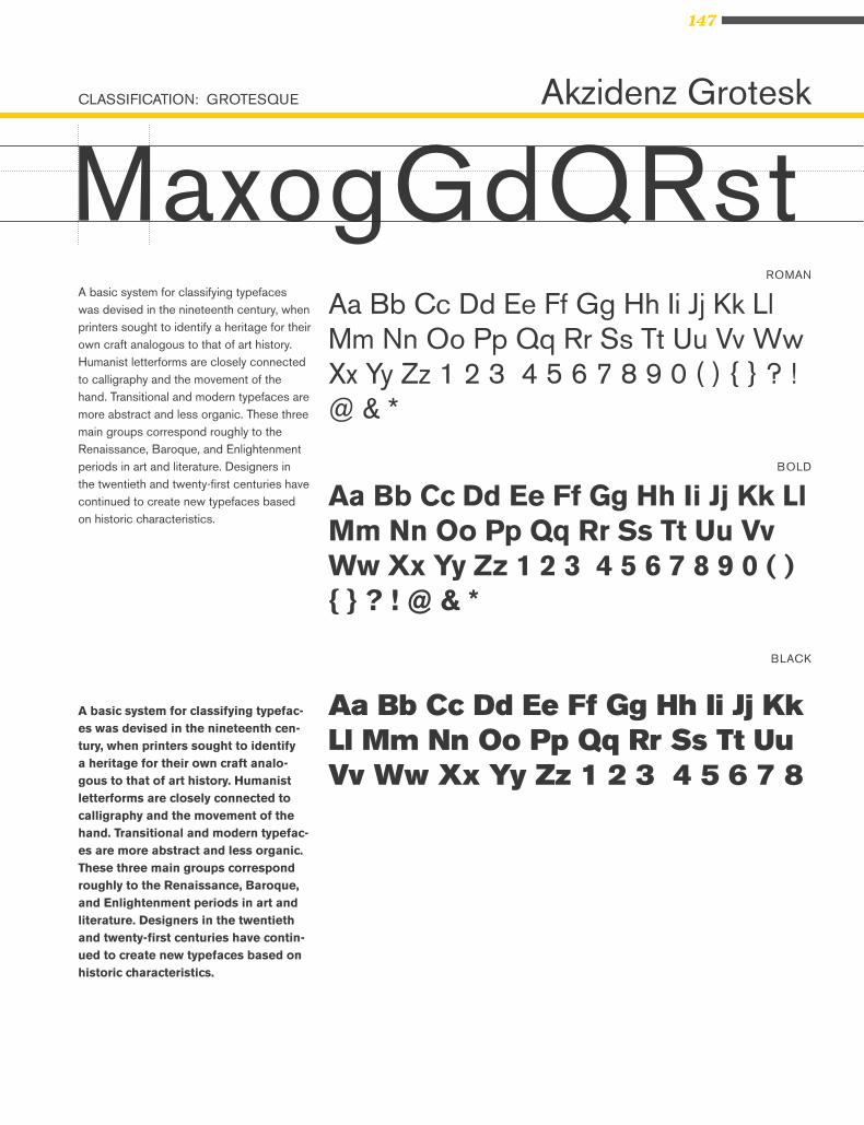
147
CLASSIFICATION: GROTESQUE
ROMAN
BOLD
BLACK
Akzidenz Grotesk
MaxogGdQRstA basic system for classifying typefaces was devised in the nineteenth century, when printers sought to identify a heritage for their own craft analogous to that of art history. Humanist letterforms are closely connected to calligraphy and the movement of the hand. Transitional and modern typefaces are more abstract and less organic. These three main groups correspond roughly to the Renaissance, Baroque, and Enlightenment periods in art and literature. Designers in the twentieth and twenty-first centuries have continued to create new typefaces based on historic characteristics.
A basic system for classifying typefac-es was devised in the nineteenth cen-tury, when printers sought to identify a heritage for their own craft analo-gous to that of art history. Humanist letterforms are closely connected to calligraphy and the movement of the hand. Transitional and modern typefac-es are more abstract and less organic. These three main groups correspond roughly to the Renaissance, Baroque, and Enlightenment periods in art and literature. Designers in the twentieth and twenty-first centuries have contin-ued to create new typefaces based on historic characteristics.
Aa Bb Cc Dd Ee Ff Gg Hh Ii Jj Kk Ll Mm Nn Oo Pp Qq Rr Ss Tt Uu Vv Ww Xx Yy Zz 1 2 3 4 5 6 7 8 9 0 ( ) { } ? ! @ & *
Aa Bb Cc Dd Ee Ff Gg Hh Ii Jj Kk Ll Mm Nn Oo Pp Qq Rr Ss Tt Uu Vv Ww Xx Yy Zz 1 2 3 4 5 6 7 8 9 0 ( ) { } ? ! @ & *
Aa Bb Cc Dd Ee Ff Gg Hh Ii Jj Kk Ll Mm Nn Oo Pp Qq Rr Ss Tt Uu Vv Ww Xx Yy Zz 1 2 3 4 5 6 7 8
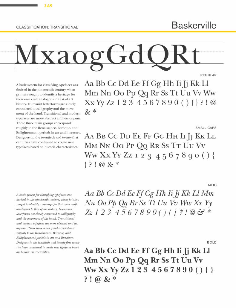
148
CLASSIFICATION: TRANSITIONAL
REGULAR
SMALL CAPS
ITALIC
BOLD
Baskerville
MxaogGdQRtA basic system for classifying typefaces was devised in the nineteenth century, when printers sought to identify a heritage for their own craft analogous to that of art history. Humanist letterforms are closely connected to calligraphy and the move-ment of the hand. Transitional and modern typefaces are more abstract and less organic. These three main groups correspond roughly to the Renaissance, Baroque, and Enlightenment periods in art and literature. Designers in the twentieth and twenty-first centuries have continued to create new typefaces based on historic characteristics.
A basic system for classifying typefaces was devised in the nineteenth century, when printers sought to identify a heritage for their own craft analogous to that of art history. Humanist letterforms are closely connected to calligraphy and the movement of the hand. Transitional and modern typefaces are more abstract and less organic. These three main groups correspond roughly to the Renaissance, Baroque, and Enlightenment periods in art and literature. Designers in the twentieth and twenty-first centu-ries have continued to create new typefaces based on historic characteristics.
Aa Bb Cc Dd Ee Ff Gg Hh Ii Jj Kk Ll Mm Nn Oo Pp Qq Rr Ss Tt Uu Vv Ww Xx Yy Zz 1 2 3 4 5 6 7 8 9 0 ( ) { } ? ! @ & *
Aa Bb Cc Dd Ee Ff Gg Hh Ii Jj Kk Ll Mm Nn Oo Pp Qq Rr Ss Tt Uu Vv Ww Xx Yy Zz 1 2 3 4 5 6 7 8 9 0 ( ) { } ? ! @ & *
Aa Bb Cc Dd Ee Ff Gg Hh Ii Jj Kk Ll Mm Nn Oo Pp Qq Rr Ss Tt Uu Vv Ww Xx Yy Zz 1 2 3 4 5 6 7 8 9 0 ( ) { } ? ! @ & *
Aa Bb Cc Dd Ee Ff Gg Hh Ii Jj Kk Ll Mm Nn Oo Pp Qq Rr Ss Tt Uu Vv Ww Xx Yy Zz 1 2 3 4 5 6 7 8 9 0 ( ) { } ? ! @ & *

149FONT STUDY
CLASSIFICATION: SLAB SERIF
REGULAR
ITALIC
BOLD
BLACK ITALIC
Belizio
MxagGdQrRA basic system for classifying type-faces was devised in the nineteenth century, when printers sought to identify a heritage for their own craft analogous to that of art histo-ry. Humanist letterforms are closely connected to calligraphy and the movement of the hand. Transitional and modern typefaces are more ab-stract and less organic. These three main groups correspond roughly to the Renaissance, Baroque, and Enlightenment periods in art and literature. Designers in the twenti-eth and twenty-first centuries have continued to create new typefaces based on historic characteristics.
A basic system for classifying typefac-es was devised in the nineteenth cen-tury, when printers sought to identify a heritage for their own craft analogous to that of art history. Humanist letter-forms are closely connected to callig-raphy and the movement of the hand. Transitional and modern typefaces are more abstract and less organic. These three main groups correspond roughly to the Renaissance, Baroque, and Enlightenment periods in art and literature. Designers in the twentieth and twenty-first centuries have con-tinued to create new typefaces based on historic characteristics.
Aa Bb Cc Dd Ee Ff Gg Hh Ii Jj Kk Ll Mm Nn Oo Pp Qq Rr Ss Tt Uu Vv Ww Xx Yy Zz 1 2 3 4 5 6 7 8 9 0 ( ) { } ? ! @ & *
Aa Bb Cc Dd Ee Ff Gg Hh Ii Jj Kk Ll Mm Nn Oo Pp Qq Rr Ss Tt Uu Vv Ww Xx Yy Zz 1 2 3 4 5 6 7 8 9 0 ( ) { } ? ! @ & *
Aa Bb Cc Dd Ee Ff Gg Hh Ii Jj Kk Ll Mm Nn Oo Pp Qq Rr Ss Tt Uu Vv Ww Xx Yy Zz 1 2 3 4 5 6 7 8 9 0 ( ) { } ? ! @ & *
Aa Bb Cc Dd Ee Ff Gg Hh Ii Jj Kk Ll Mm Nn Oo Pp Qq Rr Ss Tt Uu Vv Ww Xx Yy Zz 1 2 3 4 5 6 7 8 9 0 ( ) { } ? ! @ & *

150
CLASSIFICATION: GROTESQUE
LIGHT
BOLD
BLACK
Bell Gothic
MxagGdQrRIA basic system for classifying typefaces was
devised in the nineteenth century, when printers
sought to identify a heritage for their own craft
analogous to that of art history. Humanist
letterforms are closely connected to calligraphy
and the movement of the hand. Transitional and
modern typefaces are more abstract and less
organic. These three main groups correspond
roughly to the Renaissance, Baroque, and
Enlightenment periods in art and literature.
Designers in the twentieth and twenty-first cen-
turies have continued to create new typefaces
based on historic characteristics.
Aa Bb Cc Dd Ee Ff Gg Hh Ii Jj Kk Ll Mm Nn Oo Pp Qq Rr Ss Tt Uu Vv Ww Xx Yy Zz 1 2 3 4 5 6 7 8 9 0 ( ) { } ? ! @ & *
Aa Bb Cc Dd Ee Ff Gg Hh Ii Jj Kk Ll Mm Nn Oo Pp Qq Rr Ss Tt Uu Vv Ww Xx Yy Zz 1 2 3 4 5 6 7 8 9 0 ( ) { } ? ! @ & *
Aa Bb Cc Dd Ee Ff Gg Hh Ii Jj Kk Ll Mm Nn Oo Pp Qq Rr Ss Tt Uu Vv Ww Xx Yy Zz 1 2 3 4 5 6 7 8 9 0 ( ) { } ? ! @ & *
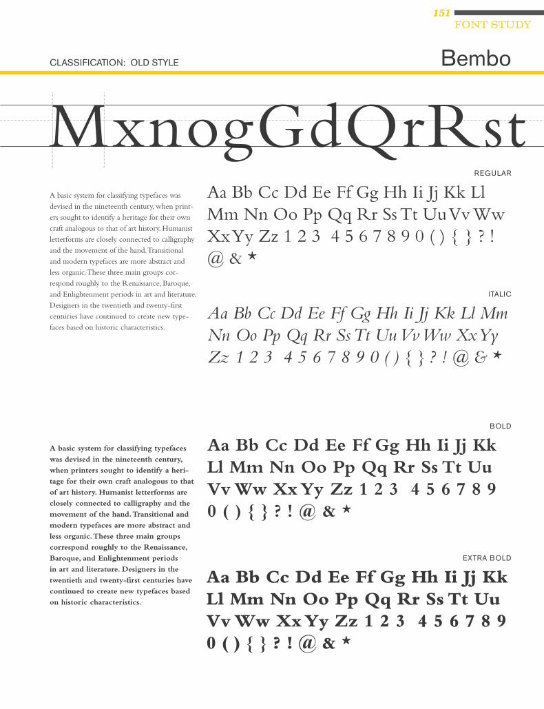
151FONT STUDY
CLASSIFICATION: OLD STYLE
REGULAR
ITALIC
BOLD
EXTRA BOLD
Bembo
MxnogGdQrRstA basic system for classifying typefaces was
devised in the nineteenth century, when print-
ers sought to identify a heritage for their own
craft analogous to that of art history. Humanist
letterforms are closely connected to calligraphy
and the movement of the hand. Transitional
and modern typefaces are more abstract and
less organic. These three main groups cor-
respond roughly to the Renaissance, Baroque,
and Enlightenment periods in art and literature.
Designers in the twentieth and twenty-first
centuries have continued to create new type-
faces based on historic characteristics.
A basic system for classifying typefaces
was devised in the nineteenth century,
when printers sought to identify a heri-
tage for their own craft analogous to that
of art history. Humanist letterforms are
closely connected to calligraphy and the
movement of the hand. Transitional and
modern typefaces are more abstract and
less organic. These three main groups
correspond roughly to the Renaissance,
Baroque, and Enlightenment periods
in art and literature. Designers in the
twentieth and twenty-first centuries have
continued to create new typefaces based
on historic characteristics.
Aa Bb Cc Dd Ee Ff Gg Hh Ii Jj Kk Ll Mm Nn Oo Pp Qq Rr Ss Tt Uu Vv Ww Xx Yy Zz 1 2 3 4 5 6 7 8 9 0 ( ) { } ? ! @ & *
Aa Bb Cc Dd Ee Ff Gg Hh Ii Jj Kk Ll Mm Nn Oo Pp Qq Rr Ss Tt Uu Vv Ww Xx Yy Zz 1 2 3 4 5 6 7 8 9 0 ( ) { } ? ! @ & *
Aa Bb Cc Dd Ee Ff Gg Hh Ii Jj Kk Ll Mm Nn Oo Pp Qq Rr Ss Tt Uu Vv Ww Xx Yy Zz 1 2 3 4 5 6 7 8 9 0 ( ) { } ? ! @ & *
Aa Bb Cc Dd Ee Ff Gg Hh Ii Jj Kk Ll Mm Nn Oo Pp Qq Rr Ss Tt Uu Vv Ww Xx Yy Zz 1 2 3 4 5 6 7 8 9 0 ( ) { } ? ! @ & *

152
CLASSIFICATION: NEW TRANSITIONAL
REGULAR
ITALIC
BOLD
BOLD ITALIC
Bookman
MxaogGdQrRA basic system for classifying type-faces was devised in the nineteenth century, when printers sought to identify a heritage for their own craft analogous to that of art history. Hu-manist letterforms are closely con-nected to calligraphy and the move-ment of the hand. Transitional and modern typefaces are more abstract and less organic. These three main groups correspond roughly to the Renaissance, Baroque, and Enlight-enment periods in art and literature. Designers in the twentieth and twenty-first centuries have continued to create new typefaces based on historic characteristics.
A basic system for classifying type-faces was devised in the nineteenth century, when printers sought to identify a heritage for their own craft analogous to that of art his-tory. Humanist letterforms are closely connected to calligraphy and the movement of the hand. Transitional and modern typefaces are more abstract and less organic. These three main groups corre-spond roughly to the Renaissance, Baroque, and Enlightenment peri-ods in art and literature. Designers in the twentieth and twenty-first centuries have continued to create new typefaces based on historic characteristics.
Aa Bb Cc Dd Ee Ff Gg Hh Ii Jj Kk Ll Mm Nn Oo Pp Qq Rr Ss Tt Uu Vv Ww Xx Yy Zz 1 2 3 4 5 6 7 8 9 0 ( ) { } ? ! @ & *
Aa Bb Cc Dd Ee Ff Gg Hh Ii Jj Kk Ll Mm Nn Oo Pp Qq Rr Ss Tt Uu Vv Ww Xx Yy Zz 1 2 3 4 5 6 7 8 9 0 ( ) { } ? ! @ & *
Aa Bb Cc Dd Ee Ff Gg Hh Ii Jj Kk Ll Mm Nn Oo Pp Qq Rr Ss Tt Uu Vv Ww Xx Yy Zz 1 2 3 4 5 6 7 8 9 0 ( ) { } ? ! @ & *
Aa Bb Cc Dd Ee Ff Gg Hh Ii Jj Kk Ll Mm Nn Oo Pp Qq Rr Ss Tt Uu Vv Ww Xx Yy Zz 1 2 3 4 5 6 7 8 9 0 ( ) { } ? ! @ & *

153FONT STUDY
CLASSIFICATION: MODERN (DIDONE)
REGULAR
ITALIC
BOLD
ORNAMENTS
Bodoni
MxaogGdQrRstA basic system for classifying typefaces was devised in the nineteenth century, when printers sought to identify a heritage for their own craft analogous to that of art history. Humanist letterforms are closely connected to calligraphy and the move-ment of the hand. Transitional and modern typefaces are more abstract and less or-ganic. These three main groups correspond roughly to the Renaissance, Baroque, and Enlightenment periods in art and literature. Designers in the twentieth and twenty-first centuries have continued to create new typefaces based on historic characteristics.
A basic system for classifying typefaces was devised in the nineteenth century, when printers sought to identify a heritage for their own craft analogous to that of art history. Humanist letterforms are closely connected to calligraphy and the move-ment of the hand. Transitional and modern typefaces are more abstract and less or-ganic. These three main groups correspond roughly to the Renaissance, Baroque, and Enlightenment periods in art and literature. Designers in the twentieth and twenty-first centuries have continued to create new typefaces based on historic characteristics.
Aa Bb Cc Dd Ee Ff Gg Hh Ii Jj Kk Ll Mm Nn Oo Pp Qq Rr Ss Tt Uu Vv Ww Xx Yy Zz 1 2 3 4 5 6 7 8 9 0 ( ) { } ? ! @ & * 1 2 3 4 5 6 7 8 9
Aa Bb Cc Dd Ee Ff Gg Hh Ii Jj Kk Ll Mm Nn Oo Pp Qq Rr Ss Tt Uu Vv Ww Xx Yy Zz 1 2 3 4 5 6 7 8 9 0 ( ) { } ? ! @ & *
Aa Bb Cc Dd Ee Ff Gg Hh Ii Jj Kk Ll Mm Nn Oo Pp Qq Rr Ss Tt Uu Vv Ww Xx Yy Zz 1 2 3 4 5 6 7 8 9 0 ( ) { } ? ! @ & *
Aa Bb Cc Dd Ee Ff Gg Hh Ii Jj Kk Ll Mm Nn Oo Pp Qq Rr Ss Tt Uu Vv Ww Xx Yy Zz 1 2 3 4 5 6 7 8 9 0 ( ) { } ? ! @ & *
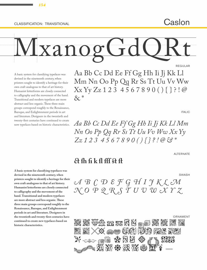
154
CLASSIFICATION: TRANSITIONAL
REGULAR
ITALIC
SWASH
ORNAMENT
ALTERNATE
Caslon
MxanogGdQRtA basic system for classifying typefaces was devised in the nineteenth century, when printers sought to identify a heritage for their own craft analogous to that of art history. Humanist letterforms are closely connected to calligraphy and the movement of the hand. Transitional and modern typefaces are more abstract and less organic. These three main groups correspond roughly to the Renaissance, Baroque, and Enlightenment periods in art and literature. Designers in the twentieth and twenty-first centuries have continued to create new typefaces based on historic characteristics.
A basic system for classifying typefaces was devised in the nineteenth century, when printers sought to identify a heritage for their own craft analogous to that of art history. Humanist letterforms are closely connected to calligraphy and the movement of the hand. Transitional and modern typefaces are more abstract and less organic. These three main groups correspond roughly to the Renaissance, Baroque, and Enlightenment periods in art and literature. Designers in the twentieth and twenty-first centuries have continued to create new typefaces based on historic characteristics.
Aa Bb Cc Dd Ee Ff Gg Hh Ii Jj Kk Ll Mm Nn Oo Pp Qq Rr Ss Tt Uu Vv Ww Xx Yy Zz 1 2 3 4 5 6 7 8 9 0 ( ) { } ? ! @ & *
Aa Bb Cc Dd Ee Ff Gg Hh Ii Jj Kk Ll Mm Nn Oo Pp Qq Rr Ss Tt Uu Vv Ww Xx Yy Zz 1 2 3 4 5 6 7 8 9 0 ( ) { } ? ! @ & *
A B C D E F G H I J K L M N O P Q R S T U V W X Y Z
A a Bb C c D d Ee F f G g H h Ii Jj Kk Ll Mm Nn o Pp Qq r S s t Uu Vv Ww X x y Z z 1 2 3 4
c h i k l Ss T t
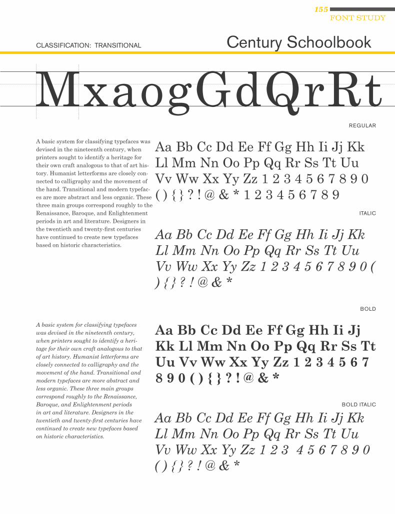
155FONT STUDY
CLASSIFICATION: TRANSITIONAL
REGULAR
ITALIC
BOLD
BOLD ITALIC
Century Schoolbook
MxaogGdQrRtA basic system for classifying typefaces was devised in the nineteenth century, when printers sought to identify a heritage for their own craft analogous to that of art his-tory. Humanist letterforms are closely con-nected to calligraphy and the movement of the hand. Transitional and modern typefac-es are more abstract and less organic. These three main groups correspond roughly to the Renaissance, Baroque, and Enlightenment periods in art and literature. Designers in the twentieth and twenty-first centuries have continued to create new typefaces based on historic characteristics.
A basic system for classifying typefaces was devised in the nineteenth century, when printers sought to identify a heri-tage for their own craft analogous to that of art history. Humanist letterforms are closely connected to calligraphy and the movement of the hand. Transitional and modern typefaces are more abstract and less organic. These three main groups correspond roughly to the Renaissance, Baroque, and Enlightenment periods in art and literature. Designers in the twentieth and twenty-first centuries have continued to create new typefaces based on historic characteristics.
Aa Bb Cc Dd Ee Ff Gg Hh Ii Jj Kk Ll Mm Nn Oo Pp Qq Rr Ss Tt Uu Vv Ww Xx Yy Zz 1 2 3 4 5 6 7 8 9 0 ( ) { } ? ! @ & * 1 2 3 4 5 6 7 8 9
Aa Bb Cc Dd Ee Ff Gg Hh Ii Jj Kk Ll Mm Nn Oo Pp Qq Rr Ss Tt Uu Vv Ww Xx Yy Zz 1 2 3 4 5 6 7 8 9 0 ( ) { } ? ! @ & *
Aa Bb Cc Dd Ee Ff Gg Hh Ii Jj Kk Ll Mm Nn Oo Pp Qq Rr Ss Tt Uu Vv Ww Xx Yy Zz 1 2 3 4 5 6 7 8 9 0 ( ) { } ? ! @ & *
Aa Bb Cc Dd Ee Ff Gg Hh Ii Jj Kk Ll Mm Nn Oo Pp Qq Rr Ss Tt Uu Vv Ww Xx Yy Zz 1 2 3 4 5 6 7 8 9 0 ( ) { } ? ! @ & *

156
CLASSIFICATION: OLD STYLE
REGULAR
ITALIC
BOLD
BOLD ITALIC
Cheltenham
MaxogGdQrRsA basic system for classifying typefaces was devised in the nineteenth century, when printers sought to identify a heri-tage for their own craft analogous to that of art history. Humanist letterforms are closely connected to calligraphy and the movement of the hand. Transitional and modern typefaces are more abstract and less organic. These three main groups correspond roughly to the Renaissance, Baroque, and Enlightenment periods in art and literature. Designers in the twentieth and twenty-first centuries have continued to create new typefaces based on historic characteristics.
A basic system for classifying typefaces was devised in the nineteenth century, when printers sought to identify a heritage for their own craft analogous to that of art histo-ry. Humanist letterforms are closely connect-ed to calligraphy and the movement of the hand. Transitional and modern typefaces are more abstract and less organic. These three main groups correspond roughly to the Renaissance, Baroque, and Enlightenment periods in art and literature. Designers in the twentieth and twenty-first centuries have continued to create new typefaces based on historic characteristics.
Aa Bb Cc Dd Ee Ff Gg Hh Ii Jj Kk Ll Mm Nn Oo Pp Qq Rr Ss Tt Uu Vv Ww Xx Yy Zz 1 2 3 4 5 6 7 8 9 0 ( ) { } ? ! @ & *
Aa Bb Cc Dd Ee Ff Gg Hh Ii Jj Kk Ll Mm Nn Oo Pp Qq Rr Ss Tt Uu Vv Ww Xx Yy Zz 1 2 3 4 5 6 7 8 9 0 ( ) { } ? ! @ & *
Aa Bb Cc Dd Ee Ff Gg Hh Ii Jj Kk Ll Mm Nn Oo Pp Qq Rr Ss Tt Uu Vv Ww Xx Yy Zz 1 2 3 4 5 6 7 8 9 0 ( ) { } ? ! @ & *
Aa Bb Cc Dd Ee Ff Gg Hh Ii Jj Kk Ll Mm Nn Oo Pp Qq Rr Ss Tt Uu Vv Ww Xx Yy Zz 1 2 3 4 5 6 7 8 9 0 ( ) { } ? ! @ & *

157FONT STUDY
CLASSIFICATION: MODERN
UNICASE
REGULAR
Cholla
MaxnogGdQrRstA basic system for classifying typefaces
was devised in the nineteenth century, when
printers sought to identify a heritage for
their own craft analogous to that of art his-
tory. Humanist letterforms are closely con-
nected to calligraphy and the movement of
the hand. Transitional and modern typefaces
are more abstract and less organic. These
three main groups correspond roughly to the
Renaissance, Baroque, and Enlightenment pe-
riods in art and literature. Designers in the
twentieth and twenty-first centuries have
continued to create new typefaces based on
historic characteristics.
A basic system for classifying typefaces was devised in the nineteenth century, when printers sought to identify a heritage for their own craft analogous to that of art his-tory. Humanist letterforms are closely con-nected to calligraphy and the movement of the hand. Transitional and modern typefaces are more abstract and less organic. These three main groups correspond roughly to the Renaissance, Baroque, and Enlightenment periods in art and literature. Designers in the twentieth and twenty-first centuries have continued to create new typefaces based on historic characteristics.
Aa Bb Cc Dd Ee Ff Gg Hh Ii Jj Kk Ll Mm Nn
Oo Pp Qq Rr Ss Tt Uu Vv Ww Xx Yy Zz 1 2
3 4 5 6 7 8 9 0 ( ) { } ? ! @ & *
Aa Bb Cc Dd Ee Ff Gg Hh Ii Jj Kk Ll Mm Nn Oo Pp Qq Rr Ss Tt Uu Vv Ww Xx Yy Zz 1 2 3 4 5 6 7 8 9 0 ( ) { } ? ! @ & *

158
CLASSIFICATION: NEW TRANSITIONAL
LIGHT
REGULAR
BOLD
Clarendon
MxagGdQrRtA basic system for classifying type-faces was devised in the nineteenth century, when printers sought to identify a heritage for their own craft analogous to that of art history. Hu-manist letterforms are closely connect-ed to calligraphy and the movement of the hand. Transitional and modern typefaces are more abstract and less organic. These three main groups cor-respond roughly to the Renaissance, Baroque, and Enlightenment periods in art and literature. Designers in the twentieth and twenty-first centuries have continued to create new typefaces based on historic characteristics.
A basic system for classifying type-faces was devised in the nineteenth century, when printers sought to identify a heritage for their own craft analogous to that of art histo-ry. Humanist letterforms are closely connected to calligraphy and the movement of the hand. Transitional and modern typefaces are more ab-stract and less organic. These three main groups correspond roughly to the Renaissance, Baroque, and Enlightenment periods in art and literature. Designers in the twenti-eth and twenty-first centuries have continued to create new typefaces based on historic characteristics.
Aa Bb Cc Dd Ee Ff Gg Hh Ii Jj Kk Ll Mm Nn Oo Pp Qq Rr Ss Tt Uu Vv Ww Xx Yy Zz 1 2 3 4 5 6 7 8 9 0 ( ) { } ? ! @ & *
Aa Bb Cc Dd Ee Ff Gg Hh Ii Jj Kk Ll Mm Nn Oo Pp Qq Rr Ss Tt Uu Vv Ww Xx Yy Zz 1 2 3 4 5 6 7 8 9 0 ( ) { } ? ! @ & *
Aa Bb Cc Dd Ee Ff Gg Hh Ii Jj Kk Ll Mm Nn Oo Pp Qq Rr Ss Tt Uu Vv Ww Xx Yy Zz 1 2 3 4 5 6 7 8 9 0 ( ) { } ? ! @ & *

159FONT STUDY
CLASSIFICATION: GRID BASED SANS SERIF
REGULAR
Clicker
MaxnogGdQRsA basic system for classifying type-faces was devised in the nineteenth century, when printers sought to identify a heritage for their own craft analogous to that of art histo-ry. Humanist letterforms are closely connected to calligraphy and the movement of the hand. Transitional and modern typefaces are more ab-stract and less organic. These three main groups correspond roughly to the Renaissance, Baroque, and Enlightenment periods in art and literature. Designers in the twenti-eth and twenty-first centuries have continued to create new typefaces based on historic characteristics.
Aa Bb Cc Dd Ee Ff Gg Hh Ii Jj Kk Ll Mm Nn Oo Pp Qq Rr Ss Tt Uu Vv Ww Xx Yy Zz 1 2 3 4 5 6 7 8 9 0 ( ) { } ? ! @ & *

160
CLASSIFICATION: MODERN
REGULAR
ITALIC
BOLD
Didot
MxaogGdQrRtA basic system for classifying typefaces was devised in the nineteenth century, when printers sought to identify a heri-tage for their own craft analogous to that of art history. Humanist letterforms are closely connected to calligraphy and the movement of the hand. Transitional and modern typefaces are more abstract and less organic. These three main groups correspond roughly to the Renaissance, Baroque, and Enlightenment periods in art and literature. Designers in the twentieth and twenty-first centuries have continued to create new typefaces based on historic characteristics.
A basic system for classifying typefaces was devised in the nineteenth century, when print-ers sought to identify a heritage for their own craft analogous to that of art history. Humanist letterforms are closely connected to calligraphy and the movement of the hand. Transitional and modern typefaces are more abstract and less organic. These three main groups correspond roughly to the Renaissance, Baroque, and Enlightenment periods in art and literature. Designers in the twentieth and twenty-first centuries have continued to create new typefaces based on historic characteristics.
Aa Bb Cc Dd Ee Ff Gg Hh Ii Jj Kk Ll Mm Nn Oo Pp Qq Rr Ss Tt Uu Vv Ww Xx Yy Zz 1 2 3 4 5 6 7 8 9 0 ( ) { } ? ! @ & * 1 2 3 4 5 6 7 8 9
Aa Bb Cc Dd Ee Ff Gg Hh Ii Jj Kk Ll Mm Nn Oo Pp Qq Rr Ss Tt Uu Vv Ww Xx Yy Zz 1 2 3 4 5 6 7 8 9 0 ( ) { } ? ! @ & *
Aa Bb Cc Dd Ee Ff Gg Hh Ii Jj Kk Ll Mm Nn Oo Pp Qq Rr Ss Tt Uu Vv Ww Xx Yy Zz 1 2 3 4 5 6 7 8 9 0 ( ) { } ? ! @ & *

161FONT STUDY
CLASSIFICATION: GROTESQUE DIN
MaxnogGdQrRtLIGHT
REGULAR
MEDIUM
BLACK
A basic system for classifying typefaces was devised in the nineteenth century, when printers sought to identify a heritage for their own craft analogous to that of art history. Humanist letterforms are closely connected to calligraphy and the move-ment of the hand. Transitional and modern typefaces are more abstract and less or-ganic. These three main groups correspond roughly to the Renaissance, Baroque, and Enlightenment periods in art and literature. Designers in the twentieth and twenty-first centuries have continued to create new typefaces based on historic characteristics.
A basic system for classifying typefaces was devised in the nineteenth century, when printers sought to identify a heritage for their own craft analogous to that of art his-tory. Humanist letterforms are closely con-nected to calligraphy and the movement of the hand. Transitional and modern typefaces are more abstract and less organic. These three main groups correspond roughly to the Renaissance, Baroque, and Enlightenment periods in art and literature. Designers in the twentieth and twenty-first centuries have continued to create new typefaces based on historic characteristics.
Aa Bb Cc Dd Ee Ff Gg Hh Ii Jj Kk Ll Mm Nn Oo Pp Qq Rr Ss Tt Uu Vv Ww Xx Yy Zz 1 2 3 4 5 6 7 8 9 0 ( ) { } ? ! @ & * 1 2 3 4 5 6 7 8 9
Aa Bb Cc Dd Ee Ff Gg Hh Ii Jj Kk Ll Mm Nn Oo Pp Qq Rr Ss Tt Uu Vv Ww Xx Yy Zz 1 2 3 4 5 6 7 8 9 0 { } ? ! @ & *
Aa Bb Cc Dd Ee Ff Gg Hh Ii Jj Kk Ll Mm Nn Oo Pp Qq Rr Ss Tt Uu Vv Ww Xx Yy Zz 1 2 3 4 5 6 7 8 9 0 { ? ! @ & *
Aa Bb Cc Dd Ee Ff Gg Hh Ii Jj Kk Ll Mm Nn Oo Pp Qq Rr Ss Tt Uu Vv Ww Xx Yy Zz 1 2 3 4 5 6 7 8 9 0 { ? ! @ & *

162
CLASSIFICATION: GROTESQUE DIN condensed
MaxngdQHAMBURGLIGHT CONDENSED
REGULAR CONDENSED
BOLD CONDENSED
BLACK CONDENSED
A basic system for classifying typefaces was devised in the nineteenth century, when printers sought to identify a heritage for their own craft analogous to that of art history. Humanist letterforms are closely connected to calligraphy and the movement of the hand. Transitional and modern typefaces are more abstract and less organic. These three main groups correspond roughly to the Renaissance, Baroque, and Enlightenment periods in art and literature. Designers in the twentieth and twenty-first centuries have continued to create new typefaces based on historic characteristics.
A basic system for classifying typefaces was devised in the nineteenth century, when printers sought to identify a heritage for their own craft analogous to that of art history. Humanist letterforms are closely connected to calligraphy and the movement of the hand. Transitional and modern typefaces are more abstract and less organic. These three main groups correspond roughly to the Renaissance, Baroque, and Enlightenment periods in art and literature. Designers in the twentieth and twenty-first centuries have continued to create new typefaces based on historic characteristics.
Aa Bb Cc Dd Ee Ff Gg Hh Ii Jj Kk Ll Mm Nn Oo Pp Qq Rr Ss Tt Uu Vv Ww Xx Yy Zz 1 2 3 4 5 6 7 8 9 0 ( ) { } ? ! @ & * 1 2 3 4 5 6 7 8 9
Aa Bb Cc Dd Ee Ff Gg Hh Ii Jj Kk Ll Mm Nn Oo Pp Qq Rr Ss Tt Uu Vv Ww Xx Yy Zz 1 2 3 4 5 6 7 8 9 0 ( ) { } ? ! @ & *
Aa Bb Cc Dd Ee Ff Gg Hh Ii Jj Kk Ll Mm Nn Oo Pp Qq Rr Ss Tt Uu Vv Ww Xx Yy Zz 1 2 3 4 5 6 7 8 9 0 ( ) { } ? ! @ & *
Aa Bb Cc Dd Ee Ff Gg Hh Ii Jj Kk Ll Mm Nn Oo Pp Qq Rr Ss Tt Uu Vv Ww Xx Yy Zz 1 2 3 4 5 6 7 8 9 0 ( ) { } ? ! @ & *
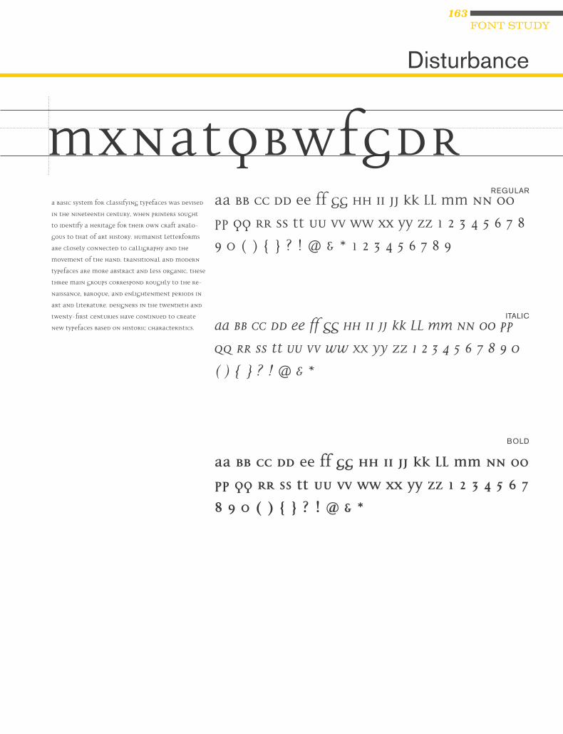
163FONT STUDY
REGULAR
ITALIC
BOLD
Disturbance
MxnatQbWFGdRA basic system for classifying typefaces was devised
in the nineteenth century, when printers sought
to identify a heritage for their own craft analo-
gous to that of art history. Humanist letterforms
are closely connected to calligraphy and the
movement of the hand. Transitional and modern
typefaces are more abstract and less organic. These
three main groups correspond roughly to the Re-
naissance, Baroque, and Enlightenment periods in
art and literature. Designers in the twentieth and
twenty-first centuries have continued to create
new typefaces based on historic characteristics.
Aa Bb Cc Dd Ee Ff Gg Hh Ii Jj Kk Ll Mm Nn Oo
Pp Qq Rr Ss Tt Uu Vv Ww Xx Yy Zz 1 2 3 4 5 6 7 8
9 0 ( ) { } ? ! @ & * 1 2 3 4 5 6 7 8 9
Aa Bb Cc Dd Ee Ff Gg Hh Ii Jj Kk Ll Mm Nn Oo Pp
Qq Rr Ss Tt Uu Vv Ww Xx Yy Zz 1 2 3 4 5 6 7 8 9 0
( ) { } ? ! @ & *
Aa Bb Cc Dd Ee Ff Gg Hh Ii Jj Kk Ll Mm Nn Oo
Pp Qq Rr Ss Tt Uu Vv Ww Xx Yy Zz 1 2 3 4 5 6 7
8 9 0 ( ) { } ? ! @ & *

164
CLASSIFICATION: BLACKLETTER
REGULAR
Fette Fraktur
MxnaopQrRtfgA basic system for classifying typefaces was devised in the nineteenth century, when printers sought to identify a heri-tage for their own craft analogous to that of art history. Humanist letterforms are closely connected to calligraphy and the movement of the hand. Transitional and modern typefaces are more abstract and less organic. These three main groups correspond roughly to the Renaissance, Baroque, and Enlightenment periods in art and literature. Designers in the twentieth and twenty-first centuries have continued to create new typefaces based on historic characteristics.
Aa Bb Cc Dd Ee Ff Gg Hh Ii Jj Kk Ll Mm Nn Oo Pp Qq Rr Ss Tt Uu Vv Ww Xx Yy Zz 1 2 3 4 5 6 7 8 9 0 ( ) { } ? ! @ & *Idunt aliquam adignim velit utat. Etuer accum dunt ad magniam, ven-diat lam verostrud essi tetum illa facipisl utet endre feu faccum dit praessi. Ing ea feuguer aessenim atisi.Delessi. Sectet, sit, ver si.Alit ipit esequis exer adigna adignit aliquat lam dunt utpat aut nisisi.Tate conse nim adionsecte feuis etum dolobore molore verit veniss

165FONT STUDY
CLASSIFICATION: MODERN
REGULAR
FRACTIONS
UNICASE
Filosofia
MxnaopQrRtfGgA basic system for classifying typefaces was devised in the nineteenth century, when printers sought to identify a heritage for their own craft analogous to that of art history. Humanist letterforms are closely connected to calligraphy and the movement of the hand. Transitional and modern typefaces are more abstract and less organic. These three main groups correspond roughly to the Renaissance, Baroque, and Enlightenment periods in art and literature. Designers in the twentieth and twenty-first centuries have continued to create new typefaces based on historic characteristics.
A basic system for classifying type-faces was devised in the nine-teenth century, when printers sought to identify a heritage for their own craft analogous to that of art history. Humanist letter-forms are closely connected to calligraphy and the movement of the hand. Transitional and mod-ern typefaces are more abstract and less organic. These three main groups correspond roughly to the Renaissance, Baroque, and Enlightenment periods in art and literature. Designers in the twentieth and twenty-first cen-turies have continued to create new typefaces based on historic characteristics.
Aa Bb Cc Dd Ee Ff Gg Hh Ii Jj Kk Ll Mm Nn Oo Pp Qq Rr Ss Tt Uu Vv Ww Xx Yy Zz 1 2 3 4 5 6 7 8 9 0 ( ) { } ? ! @ & *
Aa Bb Cc Dd Ee Ff Gg Hh Ii Jj Kk Ll Mm Nn Oo Pp Qq Rr Ss Tt Uu Vv Ww Xx Yy Zz 1 2 3 4 5 6 7 8 9 0 ( ) { } ? ! @ & *
Aa Bb Cc Dd Ee Ff Gg Hh Ii Jj Kk Ll Mm Nn Oo Pp Qq Rr Ss Tt Uu Vv Ww Xx Yy Zz 1 2 3 4 5 6 7 8 9 0 ( ) { } ? ! @ & *

166
CLASSIFICATION: GROTESQUE
BOOK
DEMI
HEAVY
Franklin Gothic
MaxodQRtfGgA basic system for classifying typefaces was devised in the nineteenth century, when printers sought to identify a heritage for their own craft analogous to that of art history. Humanist letterforms are closely connected to calligraphy and the move-ment of the hand. Transitional and modern typefaces are more abstract and less or-ganic. These three main groups correspond roughly to the Renaissance, Baroque, and Enlightenment periods in art and literature. Designers in the twentieth and twenty-first centuries have continued to create new typefaces based on historic characteristics.
A basic system for classifying typefaces was devised in the nineteenth century, when printers sought to identify a heritage for their own craft analogous to that of art history. Humanist letterforms are closely connected to calligraphy and the move-ment of the hand. Transitional and modern typefaces are more abstract and less or-ganic. These three main groups correspond roughly to the Renaissance, Baroque, and Enlightenment periods in art and literature. Designers in the twentieth and twenty-first centuries have continued to create new typefaces based on historic characteristics.
Aa Bb Cc Dd Ee Ff Gg Hh Ii Jj Kk Ll Mm Nn Oo Pp Qq Rr Ss Tt Uu Vv Ww Xx Yy Zz 1 2 3 4 5 6 7 8 9 0 ( ) { } ? ! @ & *
Aa Bb Cc Dd Ee Ff Gg Hh Ii Jj Kk Ll Mm Nn Oo Pp Qq Rr Ss Tt Uu Vv Ww Xx Yy Zz 1 2 3 4 5 6 7 8 9 0 ( ) { } ? ! @ & *
Aa Bb Cc Dd Ee Ff Gg Hh Ii Jj Kk Ll Mm Nn Oo Pp Qq Rr Ss Tt Uu Vv Ww Xx Yy Zz 1 2 3 4 5 6 7 8 9 0 ( ) { } ? ! @ & *

167FONT STUDY
CLASSIFICATION: HUMANIST
CONDENSED
REGULAR
BOLD
ULTRA BLACK
Frutiger
MaxodQRtfGgA basic system for classifying typefaces was devised in the nineteenth century, when printers sought to identify a heritage for their own craft analogous to that of art history. Humanist letter-forms are closely connected to callig-raphy and the movement of the hand. Transitional and modern typefaces are more abstract and less organic. These three main groups correspond roughly to the Renaissance, Baroque, and Enlightenment periods in art and literature. Designers in the twentieth and twenty-first centuries have contin-ued to create new typefaces based on historic characteristics.
A basic system for classifying typefaces was devised in the nineteenth century, when printers sought to identify a heritage for their own craft analo-gous to that of art history. Humanist letterforms are closely connected to calligraphy and the movement of the hand. Transitional and modern typefac-es are more abstract and less organic. These three main groups correspond roughly to the Renaissance, Baroque, and Enlightenment periods in art and literature. Designers in the twentieth and twenty-first centuries have contin-ued to create new typefaces based on historic characteristics.
Aa Bb Cc Dd Ee Ff Gg Hh Ii Jj Kk Ll Mm Nn Oo Pp Qq Rr Ss Tt Uu Vv Ww Xx Yy Zz 1 2 3 4 5 6 7 8 9 0 ( ) { } ? ! @ & *
Aa Bb Cc Dd Ee Ff Gg Hh Ii Jj Kk Ll Mm Nn Oo Pp Qq Rr Ss Tt Uu Vv Ww Xx Yy Zz 1 2 3 4 5 6 7 8 9 0 ( ) { } ? ! @ & *
Aa Bb Cc Dd Ee Ff Gg Hh Ii Jj Kk Ll Mm Nn Oo Pp Qq Rr Ss Tt Uu Vv Ww Xx Yy Zz 1 2 3 4 5 6 7 8 9 0 ( ) { } ? ! @ & *
Aa Bb Cc Dd Ee Ff Gg Hh Ii Jj Kk Ll Mm Nn Oo Pp Qq Rr Ss Tt Uu Vv Ww Xx Yy Zz 1 2 3 4 5 6 7 8 9 0 ( ) { } ? ! @ & *

168
CLASSIFICATION: GEOMETRIC
BOOK
BOLD
EXTRA BOLD
Futura
MxaopQRstGgA basic system for classifying typefaces was devised in the nineteenth century, when printers sought to identify a heritage for their own craft analogous to that of art history. Humanist letterforms are closely connected to calligraphy and the move-ment of the hand. Transitional and modern typefaces are more abstract and less or-ganic. These three main groups correspond roughly to the Renaissance, Baroque, and Enlightenment periods in art and literature. Designers in the twentieth and twenty-first centuries have continued to create new typefaces based on historic characteristics.
A basic system for classifying type-faces was devised in the nineteenth century, when printers sought to identify a heritage for their own craft analogous to that of art histo-ry. Humanist letterforms are closely connected to calligraphy and the movement of the hand. Transitional and modern typefaces are more ab-stract and less organic. These three main groups correspond roughly to the Renaissance, Baroque, and Enlightenment periods in art and literature. Designers in the twenti-eth and twenty-first centuries have continued to create new typefaces based on historic characteristics.
Aa Bb Cc Dd Ee Ff Gg Hh Ii Jj Kk Ll Mm Nn Oo Pp Qq Rr Ss Tt Uu Vv Ww Xx Yy Zz 1 2 3 4 5 6 7 8 9 0 ( ) { } ? ! @ & *
Aa Bb Cc Dd Ee Ff Gg Hh Ii Jj Kk Ll Mm Nn Oo Pp Qq Rr Ss Tt Uu Vv Ww Xx Yy Zz 1 2 3 4 5 6 7 8 9 0 ( ) { } ? ! @ & *
Aa Bb Cc Dd Ee Ff Gg Hh Ii Jj Kk Ll Mm Nn Oo Pp Qq Rr Ss Tt Uu Vv Ww Xx Yy Zz 1 2 3 4 5 6 7 8 9 0 ( ) { } ? ! @ & *
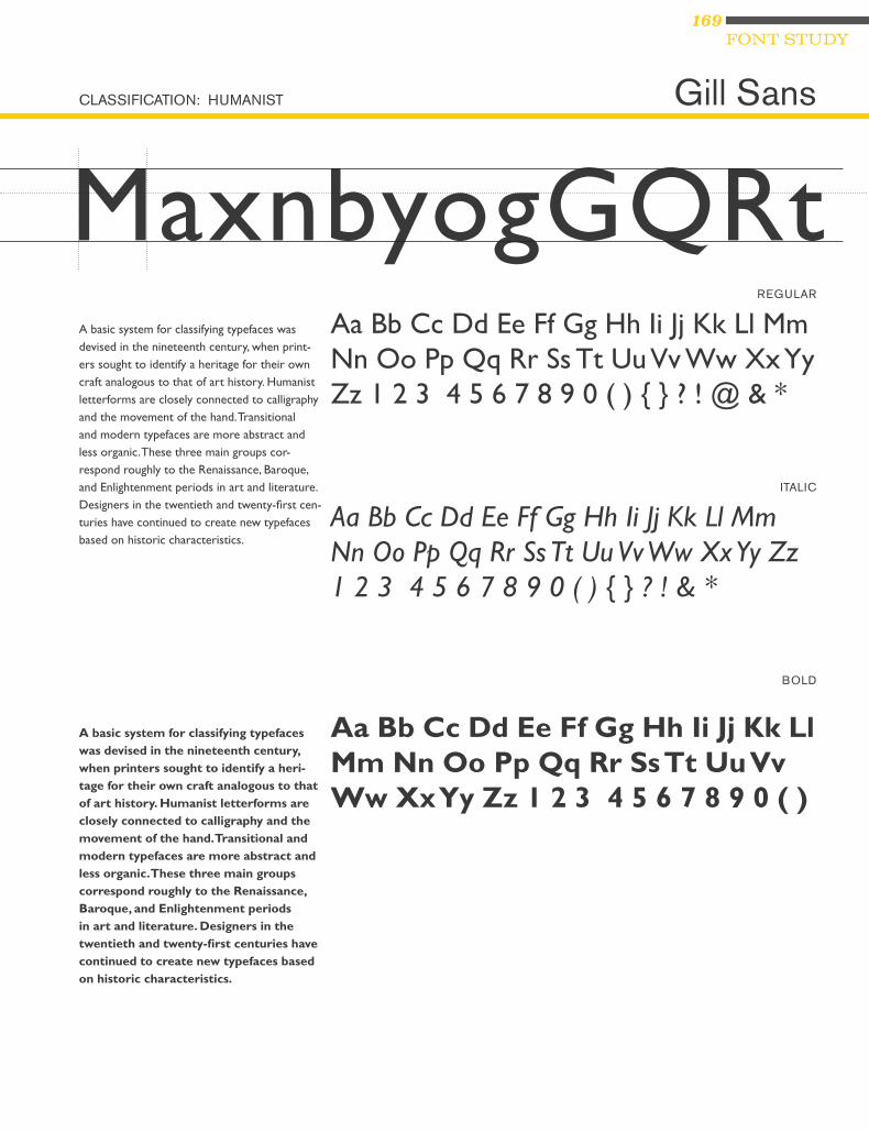
169FONT STUDY
CLASSIFICATION: HUMANIST
REGULAR
ITALIC
BOLD
Gill Sans
MaxnbyogGQRtA basic system for classifying typefaces was devised in the nineteenth century, when print-ers sought to identify a heritage for their own craft analogous to that of art history. Humanist letterforms are closely connected to calligraphy and the movement of the hand. Transitional and modern typefaces are more abstract and less organic. These three main groups cor-respond roughly to the Renaissance, Baroque, and Enlightenment periods in art and literature. Designers in the twentieth and twenty-first cen-turies have continued to create new typefaces based on historic characteristics.
A basic system for classifying typefaces was devised in the nineteenth century, when printers sought to identify a heri-tage for their own craft analogous to that of art history. Humanist letterforms are closely connected to calligraphy and the movement of the hand. Transitional and modern typefaces are more abstract and less organic. These three main groups correspond roughly to the Renaissance, Baroque, and Enlightenment periods in art and literature. Designers in the twentieth and twenty-first centuries have continued to create new typefaces based on historic characteristics.
Aa Bb Cc Dd Ee Ff Gg Hh Ii Jj Kk Ll Mm Nn Oo Pp Qq Rr Ss Tt Uu Vv Ww Xx Yy Zz 1 2 3 4 5 6 7 8 9 0 ( ) { } ? ! @ & *
Aa Bb Cc Dd Ee Ff Gg Hh Ii Jj Kk Ll Mm Nn Oo Pp Qq Rr Ss Tt Uu Vv Ww Xx Yy Zz 1 2 3 4 5 6 7 8 9 0 ( ) { } ? ! & *
Aa Bb Cc Dd Ee Ff Gg Hh Ii Jj Kk Ll Mm Nn Oo Pp Qq Rr Ss Tt Uu Vv Ww Xx Yy Zz 1 2 3 4 5 6 7 8 9 0 ( )

170
CLASSIFICATION: GEOMETRIC
BOOK
BOLD
ITALIC
LIGHT
Gotham
MayogGdQRtA basic system for classifying type-
faces was devised in the nineteenth
century, when printers sought to
identify a heritage for their own
craft analogous to that of art history.
Humanist letterforms are closely con-
nected to calligraphy and the move-
ment of the hand. Transitional and
modern typefaces are more abstract
and less organic. These three main
groups correspond roughly to the
Renaissance, Baroque, and Enlight-
enment periods in art and litera-
ture. Designers in the twentieth and
twenty-first centuries have continued
to create new typefaces based on
historic characteristics.
A basic system for classifying type-
faces was devised in the nineteenth
century, when printers sought to
identify a heritage for their own
craft analogous to that of art history.
Humanist letterforms are closely
connected to calligraphy and the
movement of the hand. Transitional
and modern typefaces are more ab-
stract and less organic. These three
main groups correspond roughly
to the Renaissance, Baroque, and
Enlightenment periods in art and
literature. Designers in the twenti-
eth and twenty-first centuries have
continued to create new typefaces
based on historic characteristics.
Aa Bb Cc Dd Ee Ff Gg Hh Ii Jj Kk Ll Mm Nn Oo Pp Qq Rr Ss Tt Uu Vv Ww Xx Yy Zz 1 2 3 4 5 6 7 8 9 0 ( ) { } ? ! @ & *
Aa Bb Cc Dd Ee Ff Gg Hh Ii Jj Kk Ll Mm Nn Oo Pp Qq Rr Ss Tt Uu Vv Ww Xx Yy Zz 1 2 3 4 5 6 7 8 9 0 ( ) { } ? ! @ & *
Aa Bb Cc Dd Ee Ff Gg Hh Ii Jj Kk Ll Mm Nn Oo Pp Qq Rr Ss Tt Uu Vv Ww Xx Yy Zz 1 2 3 4 5 6 7 8 9 0 ( ) { } ? ! @ & *
Aa Bb Cc Dd Ee Ff Gg Hh Ii Jj Kk Ll Mm Nn Oo Pp Qq Rr Ss Tt Uu Vv Ww Xx Yy Zz 1 2 3 4 5 6 7 8 9 0 ( ) { } ? ! @ & *

171FONT STUDY
CLASSIFICATION: MODERN
REGULAR
BOLD
CONDENSED BLACK
ULTRA LIGHT
Helvetica
MaoygGdQrRtA basic system for classifying typefaces was devised in the nineteenth century, when printers sought to identify a heritage for their own craft analogous to that of art history. Humanist letterforms are closely connected to calligraphy and the movement of the hand. Transitional and modern typefaces are more abstract and less organic. These three main groups correspond roughly to the Renaissance, Baroque, and Enlightenment periods in art and literature. Designers in the twentieth and twenty-first centuries have continued to create new typefaces based on historic characteristics.
A basic system for classifying typefaces was devised in the nineteenth century, when print-ers sought to identify a heritage for their own craft analogous to that of art history. Humanist letterforms are closely connected to calligraphy and the movement of the hand. Transitional and modern typefaces are more abstract and less organic. These three main groups cor-respond roughly to the Renaissance, Baroque, and Enlightenment periods in art and literature. Designers in the twentieth and twenty-first cen-turies have continued to create new typefaces based on historic characteristics.
Aa Bb Cc Dd Ee Ff Gg Hh Ii Jj Kk Ll Mm Nn Oo Pp Qq Rr Ss Tt Uu Vv Ww Xx Yy Zz 1 2 3 4 5 6 7 8 9 0 ( ) { } ? ! @ & *
Aa Bb Cc Dd Ee Ff Gg Hh Ii Jj Kk Ll Mm Nn Oo Pp Qq Rr Ss Tt Uu Vv Ww Xx Yy Zz 1 2 3 4 5 6 7 8 9 0 ( ) { } ? ! @ & *
Aa Bb Cc Dd Ee Ff Gg Hh Ii Jj Kk Ll Mm Nn Oo Pp Qq Rr Ss Tt Uu Vv Ww Xx Yy Zz 1 2 3 4 5 6 7 8 9 0 ( ) { } ? ! @ & *
Aa Bb Cc Dd Ee Ff Gg Hh Ii Jj Kk Ll Mm Nn Oo Pp Qq Rr Ss Tt Uu Vv Ww Xx Yy Zz 1 2 3 4 5 6 7 8 9 0 ( ) { } ? ! @ & *

172
CLASSIFICATION: GROTESQUE
REGULAR
BOLD
BLACK
BOLD CONDENSED
Interstate
MaoygGdQrRtA basic system for classifying typefaces
was devised in the nineteenth century,
when printers sought to identify a heri-
tage for their own craft analogous to that
of art history. Humanist letterforms are
closely connected to calligraphy and the
movement of the hand. Transitional and
modern typefaces are more abstract and
less organic. These three main groups
correspond roughly to the Renaissance,
Baroque, and Enlightenment periods
in art and literature. Designers in the
twentieth and twenty-first centuries have
continued to create new typefaces based
on historic characteristics.
A basic system for classifying typefac-
es was devised in the nineteenth cen-
tury, when printers sought to identify
a heritage for their own craft analo-
gous to that of art history. Humanist
letterforms are closely connected to
calligraphy and the movement of the
hand. Transitional and modern typefac-
es are more abstract and less organic.
These three main groups correspond
roughly to the Renaissance, Baroque,
and Enlightenment periods in art and
literature. Designers in the twentieth
and twenty-first centuries have contin-
ued to create new typefaces based on
historic characteristics.
Aa Bb Cc Dd Ee Ff Gg Hh Ii Jj Kk Ll Mm Nn Oo Pp Qq Rr Ss Tt Uu Vv Ww Xx Yy Zz 1 2 3 4 5 6 7 8 9 0 ( ) { } ? ! @ & *
Aa Bb Cc Dd Ee Ff Gg Hh Ii Jj Kk Ll Mm Nn Oo Pp Qq Rr Ss Tt Uu Vv Ww Xx Yy Zz 1 2 3 4 5 6 7 8 9 0 ( ) { } ? ! @ & *
Aa Bb Cc Dd Ee Ff Gg Hh Ii Jj Kk Ll Mm Nn Oo Pp Qq Rr Ss Tt Uu Vv Ww Xx Yy Zz 1 2 3 4 5 6 7 8 9 0 ( ) { } ? ! @ & *
Aa Bb Cc Dd Ee Ff Gg Hh Ii Jj Kk Ll Mm Nn Oo Pp Qq Rr Ss Tt Uu Vv Ww Xx Yy Zz 1 2 3 4 5 6 7 8 9 0 ( ) { } ? ! @ & *

173FONT STUDY
CLASSIFICATION: SCRIPT
REGULAR
Kunstler Script
xyogGdQrRstAa Bb Cc Dd Ee Ff Gg Hh Ii Jj Kk Ll Mm Nn Oo Pp Qq Rr Ss Tt Uu Vv Ww Xx Yy Zz 1 2 3 4 5 6 7 8 9 0 ( ) { } ? ! @ & *
Pat. San ea consectet ad duis dolorem eu facil dit am, summy
nisim ipit, quat, velit pratismodo diat.
Et lorperi liquat lor sequam zzrilit, velese facin ut verosti nciduis
modit, qui erosto odit ut verit nos nos amet iure doluptatisl digna
facin hendre ming ea feum incilla ad dunt dunt ipit vulput lor-
per sumsand ionsenit num ip erit la feu feumsan henis exerci esto
etumsan hent am, velit, quisit nummy nosto dolutat irit veniam
zzrilit, qui tincilit wis eum zzriustis ex eraestrud delit lamcon vero
exercidunt aliscidui bla facip et veniam eum illan veros dignit alit
vullandiat nis nisl dunt aliquam consent alit etuero odionsecte
dunt nulla faci et in vulla feugait lore eum zzril ullamco nsequi
bla autpatet nummodipisi.
Ed etummodit vullamcon utat ulluptat delendit nonsenim in-
ciliqui tio odoloreet ver sum velis aliquis del irit aut nosto conse-
quam zzrit aut ipsum diamcon sequam num et wisi tio dolorem
elesto dolobor iuscilisci et, quis endre te dolobor sum volenibh
exerit utpat. Uptat, vel dolese molorem eraessis nit niamcorperos
autat, venit in etum erilissit irit eui bla feum iurem nonsequi e

174
CLASSIFICATION: TRANSITIONAL
REGULAR
ITALIC
BOLD
Melior
MayogGdQrRtA basic system for classifying typefaces was devised in the nineteenth century, when printers sought to identify a heri-tage for their own craft analogous to that of art history. Humanist letterforms are closely connected to calligraphy and the movement of the hand. Transitional and modern typefaces are more abstract and less organic. These three main groups correspond roughly to the Renaissance, Baroque, and Enlightenment periods in art and literature. Designers in the twentieth and twenty-first centuries have continued to create new typefaces based on historic characteristics.
A basic system for classifying typefaces was devised in the nineteenth century, when printers sought to identify a heri-tage for their own craft analogous to that of art history. Humanist letterforms are closely connected to calligraphy and the movement of the hand. Transitional and modern typefaces are more abstract and less organic. These three main groups correspond roughly to the Renaissance, Baroque, and Enlightenment periods in art and literature. Designers in the twentieth and twenty-first centuries have continued to create new typefaces based on historic characteristics.
Aa Bb Cc Dd Ee Ff Gg Hh Ii Jj Kk Ll Mm Nn Oo Pp Qq Rr Ss Tt Uu Vv Ww Xx Yy Zz 1 2 3 4 5 6 7 8 9 0 ( ) { } ? ! @ & *
Aa Bb Cc Dd Ee Ff Gg Hh Ii Jj Kk Ll Mm Nn Oo Pp Qq Rr Ss Tt Uu Vv Ww Xx Yy Zz 1 2 3 4 5 6 7 8 9 0 ( ) { } ? ! @ & *
Aa Bb Cc Dd Ee Ff Gg Hh Ii Jj Kk Ll Mm Nn Oo Pp Qq Rr Ss Tt Uu Vv Ww Xx Yy Zz 1 2 3 4 5 6 7 8 9 0 ( ) { } ? ! @ & *

175FONT STUDY
CLASSIFICATION: SLAB SERIF
LIGHT
MEDIUM
EXTRA BOLD
Memphis
MxagGdQrRtA basic system for classifying typefaces was devised in the nineteenth century, when printers sought to identify a heri-tage for their own craft analogous to that of art history. Humanist letterforms are closely connected to calligraphy and the movement of the hand. Transitional and modern typefaces are more abstract and less organic. These three main groups correspond roughly to the Renaissance, Baroque, and Enlightenment periods in art and literature. Designers in the twentieth and twenty-first centuries have continued to create new typefaces based on historic characteristics.
A basic system for classifying typefaces was devised in the nineteenth century, when printers sought to identify a heri-tage for their own craft analogous to that of art history. Humanist letterforms are closely connected to calligraphy and the movement of the hand. Transitional and modern typefaces are more abstract and less organic. These three main groups correspond roughly to the Renaissance, Baroque, and Enlightenment periods in art and literature. Designers in the twentieth and twenty-first centuries have continued to create new typefaces based on historic characteristics.
Aa Bb Cc Dd Ee Ff Gg Hh Ii Jj Kk Ll Mm Nn Oo Pp Qq Rr Ss Tt Uu Vv Ww Xx Yy Zz 1 2 3 4 5 6 7 8 9 0 ( ) { } ? ! @ & *
Aa Bb Cc Dd Ee Ff Gg Hh Ii Jj Kk Ll Mm Nn Oo Pp Qq Rr Ss Tt Uu Vv Ww Xx Yy Zz 1 2 3 4 5 6 7 8 9 0 ( ) { } ? ! @ & *
Aa Bb Cc Dd Ee Ff Gg Hh Ii Jj Kk Ll Mm Nn Oo Pp Qq Rr Ss Tt Uu Vv Ww Xx Yy Zz 1 2 3 4 5 6 7 8 9 0 ( ) { } ? ! @ & *

176
CLASSIFICATION: HUMANIST
REGULAR
CAPS
BLACK
ITALIC
Meta
MaxogGdQrRstA basic system for classifying typefaces was devised in the nineteenth century, when printers sought to identify a heritage for their own craft analogous to that of art his-tory. Humanist letterforms are closely con-nected to calligraphy and the movement of the hand. Transitional and modern typefac-es are more abstract and less organic. These three main groups correspond roughly to the Renaissance, Baroque, and Enlighten-ment periods in art and literature. Designers in the twentieth and twenty-first centuries have continued to create new typefaces based on historic characteristics.
A basic system for classifying typefaces was devised in the nineteenth century, when printers sought to identify a heritage for their own craft analogous to that of art history. Humanist letterforms are closely connected to calligraphy and the move-ment of the hand. Transitional and modern typefaces are more abstract and less or-ganic. These three main groups correspond roughly to the Renaissance, Baroque, and Enlightenment periods in art and literature. Designers in the twentieth and twenty-first centuries have continued to create new typefaces based on historic characteristics.
Aa Bb Cc Dd Ee Ff Gg Hh Ii Jj Kk Ll Mm Nn Oo Pp Qq Rr Ss Tt Uu Vv Ww Xx Yy Zz 1 2 3 4 5 6 7 8 9 0 ( ) { } ? ! @ & *
Aa Bb Cc Dd Ee Ff Gg Hh Ii Jj Kk Ll Mm Nn Oo Pp Qq Rr Ss Tt Uu Vv Ww Xx Yy Zz 1 2 3 4 5 6 7 8 9 0 ( ) { } ? ! @ & *
Aa Bb Cc Dd Ee Ff Gg Hh Ii Jj Kk Ll Mm Nn Oo Pp Qq Rr Ss Tt Uu Vv Ww Xx Yy Zz 1 2 3 4 5 6 7 8 9 0 ( ) { } ? ! @ & *
Aa Bb Cc Dd Ee Ff Gg Hh Ii Jj Kk Ll Mm Nn Oo Pp Qq Rr Ss Tt Uu Vv Ww Xx Yy Zz 1 2 3 4 5 6 7 8 9 0 ( ) { } ? ! @ & *

177FONT STUDY
CLASSIFICATION: TRANSITIONAL
REGULAR
ITALIC
BOLD
FRACTIONS
Mrs Eaves
MaxogGdQrRstA basic system for classifying typefaces was
devised in the nineteenth century, when print-
ers sought to identify a heritage for their own
craft analogous to that of art history. Humanist
letterforms are closely connected to calligraphy
and the movement of the hand. Transitional
and modern typefaces are more abstract and less
organic. These three main groups correspond
roughly to the Renaissance, Baroque, and
Enlightenment periods in art and literature.
Designers in the twentieth and twenty-first cen-
turies have continued to create new typefaces
based on historic characteristics.
A basic system for classifying typefaces was devised in the
nineteenth century, when printers sought to identify a heritage
for their own craft analogous to that of art history. Humanist
letterforms are closely connected to calligraphy and the move-
ment of the hand. Transitional and modern typefaces are more
abstract and less organic. These three main groups correspond
roughly to the Renaissance, Baroque, and Enlightenment
periods in art and literature. Designers in the twentieth and
twenty-first centuries have continued to create new typefaces
based on historic characteristics.
Aa Bb Cc Dd Ee Ff Gg Hh Ii Jj Kk Ll Mm Nn Oo Pp Qq Rr Ss Tt Uu Vv Ww Xx Yy Zz 1 2 3 4 5 6 7 8 9 0 ( ) { } ? ! @ & * 1 2 3 4 5 6 7 8 9
Aa Bb Cc Dd Ee Ff Gg Hh Ii Jj Kk Ll Mm Nn Oo Pp Qq Rr Ss Tt Uu Vv Ww Xx Yy Zz 1 2 3 4 5 6 7 8 9 0 ( ) { } ? ! @ & *
Aa Bb Cc Dd Ee Ff Gg Hh Ii Jj Kk Ll Mm Nn Oo Pp Qq Rr Ss Tt Uu Vv Ww Xx Yy Zz 1 2 3 4 5 6 7 8 9 0 ( ) { } ? ! @ & *
Aa Bb Cc Dd Ee Ff Gg Hh Ii Jj Kk Ll Mm Nn Oo Pp Qq Rr Ss Tt Uu Vv Ww Xx Yy Zz 1 2 3 4 5 6 7 8 9 0 ( ) { } ? ! @ & *

178
CLASSIFICATION: GROTESQUE
REGULAR
ITALIC
BOLD
News Gothic
MaxogGdQrRstA basic system for classifying typefaces was devised in the nineteenth century, when print-ers sought to identify a heritage for their own craft analogous to that of art history. Humanist letterforms are closely connected to calligraphy and the movement of the hand. Transitional and modern typefaces are more abstract and less organic. These three main groups correspond roughly to the Renaissance, Baroque, and Enlightenment periods in art and literature. Designers in the twentieth and twenty-first centuries have continued to create new typefaces based on historic characteristics.
A basic system for classifying typefaces was devised in the nineteenth century, when print-ers sought to identify a heritage for their own craft analogous to that of art history. Humanist letterforms are closely connected to calligraphy and the movement of the hand. Transitional and modern typefaces are more abstract and less organic. These three main groups correspond roughly to the Renaissance, Baroque, and Enlightenment periods in art and literature. Designers in the twentieth and twenty-first centuries have continued to create new typefaces based on historic characteristics.
Aa Bb Cc Dd Ee Ff Gg Hh Ii Jj Kk Ll Mm Nn Oo Pp Qq Rr Ss Tt Uu Vv Ww Xx Yy Zz 1 2 3 4 5 6 7 8 9 0 ( ) { } ? ! @ & * 1 2 3 4 5 6 7 8 9
Aa Bb Cc Dd Ee Ff Gg Hh Ii Jj Kk Ll Mm Nn Oo Pp Qq Rr Ss Tt Uu Vv Ww Xx Yy Zz 1 2 3 4 5 6 7 8 9 0 ( ) { } ? ! @ & *
Aa Bb Cc Dd Ee Ff Gg Hh Ii Jj Kk Ll Mm Nn Oo Pp Qq Rr Ss Tt Uu Vv Ww Xx Yy Zz 1 2 3 4 5 6 7 8 9 0 ( ) { } ? ! @ & *

179FONT STUDY
CLASSIFICATION: GEOMETRIC
REGULAR
OCR A
MaopQRfGgA basic system for clas-
sifying typefaces was
devised in the nineteenth
century, when print-
ers sought to identify
a heritage for their own
craft analogous to that
of art history. Humanist
letterforms are closely
connected to calligraphy
and the movement of the
hand. Transitional and
modern typefaces are more
historic characteristics.
Aa Bb Cc Dd Ee Ff Gg Hh Ii Jj Kk Ll Mm Nn Oo Pp Qq Rr Ss Tt Uu Vv Ww Xx Yy Zz 1 2 3 4 5 6 7 8 9 0 ( ) { } ? ! @ & *

180
CLASSIFICATION: HUMANIST
BOOK
ITALIC
BOLD
Optima
MxaopQRstGgA basic system for classifying typefaces was devised in the nineteenth century, when printers sought to identify a heritage for their own craft analogous to that of art history. Humanist letterforms are closely connected to calligraphy and the movement of the hand. Transitional and modern typefaces are more abstract and less organic. These three main groups correspond roughly to the Renaissance, Baroque, and Enlightenment periods in art and literature. Designers in the twentieth and twenty-first centuries have continued to create new typefaces based on historic characteristics.
A basic system for classifying typefaces was devised in the nineteenth century, when printers sought to identify a heritage for their own craft analogous to that of art his-tory. Humanist letterforms are closely con-nected to calligraphy and the movement of the hand. Transitional and modern typefaces are more abstract and less organic. These three main groups correspond roughly to the Renaissance, Baroque, and Enlightenment periods in art and literature. Designers in the twentieth and twenty-first centuries have continued to create new typefaces based on historic characteristics.
Aa Bb Cc Dd Ee Ff Gg Hh Ii Jj Kk Ll Mm Nn Oo Pp Qq Rr Ss Tt Uu Vv Ww Xx Yy Zz 1 2 3 4 5 6 7 8 9 0 ( ) { } ? ! @ & *
Aa Bb Cc Dd Ee Ff Gg Hh Ii Jj Kk Ll Mm Nn Oo Pp Qq Rr Ss Tt Uu Vv Ww Xx Yy Zz 1 2 3 4 5 6 7 8 9 0 ( ) { } ? ! @ & *
Aa Bb Cc Dd Ee Ff Gg Hh Ii Jj Kk Ll Mm Nn Oo Pp Qq Rr Ss Tt Uu Vv Ww Xx Yy Zz 1 2 3 4 5 6 7 8 9 0 ( ) { } ? ! @ & *

181FONT STUDY
CLASSIFICATION: OLD STYLE
LIGHT
OLD STYLE
MEDIUM
BLACK
Palatino
MxaopQRstGgA basic system for classifying typefaces was devised in the nineteenth century, when printers sought to identify a heritage for their own craft analogous to that of art history. Humanist letterforms are closely connected to calligraphy and the move-ment of the hand. Transitional and modern typefaces are more abstract and less or-ganic. These three main groups correspond roughly to the Renaissance, Baroque, and Enlightenment periods in art and literature. Designers in the twentieth and twenty-first centuries have continued to create new typefaces based on historic characteristics.
A basic system for classifying typefaces was devised in the nineteenth century, when printers sought to identify a heri-tage for their own craft analogous to that of art history. Humanist letterforms are closely connected to calligraphy and the movement of the hand. Transitional and modern typefaces are more abstract and less organic. These three main groups correspond roughly to the Renaissance, Baroque, and Enlightenment periods in art and literature. Designers in the twentieth and twenty-first centuries have continued to create new typefaces based on historic characteristics.
Aa Bb Cc Dd Ee Ff Gg Hh Ii Jj Kk Ll Mm Nn Oo Pp Qq Rr Ss Tt Uu Vv Ww Xx Yy Zz 1 2 3 4 5 6 7 8 9 0 ( ) { } ? ! @ & *
Aa Bb Cc Dd Ee Ff Gg Hh Ii Jj Kk Ll Mm Nn Oo Pp Qq Rr Ss Tt Uu Vv Ww Xx Yy Zz 1 2 3 4 5 6 7 8 9 0 ( ) { } ? ! @ & *
Aa Bb Cc Dd Ee Ff Gg Hh Ii Jj Kk Ll Mm Nn Oo Pp Qq Rr Ss Tt Uu Vv Ww Xx Yy Zz 1 2 3 4 5 6 7 8 9 0 ( ) { } ? ! @ & *
Aa Bb Cc Dd Ee Ff Gg Hh Ii Jj Kk Ll Mm Nn Oo Pp Qq Rr Ss Tt Uu Vv Ww Xx Yy Zz 1 2 3 4 5 6 7 8 9 0 ( ) { } ? ! @ & *

182
CLASSIFICATION: TRANSITIONAL
REGULAR
ITALIC
BOLD
Perpetua
MxaopQRstGgqA basic system for classifying typefaces was devised in the nineteenth century, when printers sought to identify a heritage for their own craft analogous to that of art history. Humanist letterforms are closely connected to calligraphy and the movement of the hand. Transitional and modern typefaces are more abstract and less organic. These three main groups correspond roughly to the Renaissance, Ba-roque, and Enlightenment periods in art and litera-ture. Designers in the twentieth and twenty-first centuries have continued to create new typefaces based on historic characteristics.
A basic system for classifying typefaces was devised in
the nineteenth century, when printers sought to identify
a heritage for their own craft analogous to that of art
history. Humanist letterforms are closely connected to cal-
ligraphy and the movement of the hand. Transitional and
modern typefaces are more abstract and less organic. These
three main groups correspond roughly to the Renaissance,
Baroque, and Enlightenment periods in art and literature.
Designers in the twentieth and twenty-first centuries
have continued to create new typefaces based on historic
characteristics.
Aa Bb Cc Dd Ee Ff Gg Hh Ii Jj Kk Ll Mm Nn Oo Pp Qq Rr Ss Tt Uu Vv Ww Xx Yy Zz 1 2 3 4 5 6 7 8 9 0 ( ) { } ? ! @ & *
Aa Bb Cc Dd Ee Ff Gg Hh Ii Jj Kk Ll Mm Nn Oo Pp Qq Rr Ss Tt Uu Vv Ww Xx Yy Zz 1 2 3 4 5 6 7 8 9 0 ( ) { } ? ! @ & *
Aa Bb Cc Dd Ee Ff Gg Hh Ii Jj Kk Ll Mm Nn Oo Pp Qq Rr Ss Tt Uu Vv Ww Xx Yy Zz 1 2 3 4 5 6 7 8 9 0 ( ) { } ? ! @ & *

183FONT STUDY
CLASSIFICATION: HUMANIST
THIN
REGULAR
HEAVY
Platelet
MaxbyogGQrRtA basic system for classifying typefaces
was devised in the nineteenth century, when
printers sought to identify a heritage for
their own craft analogous to that of art
history. Humanist letterforms are closely
connected to calligraphy and the movement of
the hand. Transitional and modern typefaces
are more abstract and less organic. These
three main groups correspond roughly to the
Renaissance, Baroque, and Enlightenment
periods in art and literature. Designers in
the twentieth and twenty-first centuries
have continued to create new typefaces based
on historic characteristics.
A basic system for classifying typefaces
was devised in the nineteenth century, when
printers sought to identify a heritage for
their own craft analogous to that of art
history. Humanist letterforms are closely
connected to calligraphy and the movement of
the hand. Transitional and modern typefaces
are more abstract and less organic. These
three main groups correspond roughly to the
Renaissance, Baroque, and Enlightenment
periods in art and literature. Designers in
the twentieth and twenty-first centuries
have continued to create new typefaces based
on historic characteristics.
Aa Bb Cc Dd Ee Ff Gg Hh Ii Jj Kk Ll
Mm Nn Oo Pp Qq Rr Ss Tt Uu Vv Ww Xx
Yy Zz 1 2 3 4 5 6 7 8 9 0 ( ) { }
? ! @ & *
Aa Bb Cc Dd Ee Ff Gg Hh Ii Jj Kk Ll
Mm Nn Oo Pp Qq Rr Ss Tt Uu Vv Ww Xx
Yy Zz 1 2 3 4 5 6 7 8 9 0 ( ) { }
? ! & *
Aa Bb Cc Dd Ee Ff Gg Hh Ii Jj Kk Ll
Mm Nn Oo Pp Qq Rr Ss Tt Uu Vv Ww Xx
Yy Zz 1 2 3 4 5 6 7 8 9 0 ( ) { }
? ! @ & *

184
CLASSIFICATION: GEOMETRIC
REGULAR
ALTERNATE
Priori Sans
MxanopdrRtSfGgA basic system for classifying typefaces was devised in
the nineteenth century, when printers sought to identify
a heritage for their own craft analogous to that of art
history. Humanist letterforms are closely connected to
calligraphy and the movement of the hand. Transitional
and modern typefaces are more abstract and less
organic. These three main groups correspond roughly to
the Renaissance, Baroque, and Enlightenment periods
in art and literature. Designers in the twentieth and
twenty-first centuries have continued to create new
typefaces based on historic characteristics.
Aa Bb Cc Dd Ee Ff Gg Hh Ii Jj Kk Ll Mm Nn Oo Pp Qq Rr Ss Tt Uu Vv Ww Xx Yy Zz 1 2 3 4 5 6 7 8 9 0 ( ) { } ? ! @ & *
Aa Bb Cc Dd Ee Ff Gg Hh Ii Jj Kk Ll Mm Nn Oo Pp Qq Rr Ss Tt Uu Vv Ww Xx Yy Zz 1 2 3 4 5 6 7 8 9 0 ( ) { } ? ! @ & *

185FONT STUDY
CLASSIFICATION: GEOMETRIC
REGULAR
ALTERNATE
BOLD
Priori Serif
MxanodQrRtSfgA basic system for classifying typefaces was devised
in the nineteenth century, when printers sought to
identify a heritage for their own craft analogous to
that of art history. Humanist letterforms are closely
connected to calligraphy and the movement of the
hand. Transitional and modern typefaces are more
abstract and less organic. These three main groups
correspond roughly to the Renaissance, Baroque,
and Enlightenment periods in art and literature.
Designers in the twentieth and twenty-first centu-
ries have continued to create new typefaces based
on historic characteristics.
A basic system for classifying typefaces was de-
vised in the nineteenth century, when printers
sought to identify a heritage for their own craft
analogous to that of art history. Humanist let-
terforms are closely connected to calligraphy
and the movement of the hand. Transitional and
modern typefaces are more abstract and less
organic. These three main groups correspond
roughly to the Renaissance, Baroque, and
Enlightenment periods in art and literature.
Designers in the twentieth and twenty-first
centuries have continued to create new type-
faces based on historic characteristics.
Aa Bb Cc Dd Ee Ff Gg Hh Ii Jj Kk Ll Mm Nn Oo Pp Qq Rr Ss Tt Uu Vv Ww Xx Yy Zz 1 2 3 4 5 6 7 8 9 0 ( ) { } ? ! @ & *
Aa Bb Cc Dd Ee Ff Gg Hh Ii Jj Kk Ll Mm Nn Oo Pp Qq Rr Ss Tt Uu Vv Ww Xx Yy Zz 1 2 3 4 5 6 7 8 9 0 ( ) { } ? ! @ & *
Aa Bb Cc Dd Ee Ff Gg Hh Ii Jj Kk Ll Mm Nn Oo Pp Qq Rr Ss Tt Uu Vv Ww Xx Yy Zz 1 2 3 4 5 6 7 8 9 0 ( ) { } ? ! @ & *

186
CLASSIFICATION: SANS HUMANIST / SERIF OLD STYLE
(55) SANS
ITALIC
SERIF
ITALIC
Rotis
MxanopQrRtGgA basic system for classifying typefaces was devised in the nineteenth century, when print-ers sought to identify a heritage for their own craft analogous to that of art history. Humanist letterforms are closely connected to calligraphy and the movement of the hand. Transitional and modern typefaces are more abstract and less organic. These three main groups cor-respond roughly to the Renaissance, Baroque, and Enlightenment periods in art and literature. Designers in the twentieth and twenty-first centuries have continued to create new type-faces based on historic characteristics.
A basic system for classifying typefaces was devised in the nineteenth century, when printers sought to identify a heritage for their own craft analogous to that of art his-tory. Humanist letterforms are closely con-nected to calligraphy and the movement of the hand. Transitional and modern typefaces are more abstract and less organic. These three main groups correspond roughly to the Renaissance, Baroque, and Enlightenment periods in art and literature. Designers in the twentieth and twenty-first centuries have continued to create new typefaces based on historic characteristics.
Aa Bb Cc Dd Ee Ff Gg Hh Ii Jj Kk Ll Mm Nn Oo Pp Qq Rr Ss Tt Uu Vv Ww Xx Yy Zz 1 2 3 4 5 6 7 8 9 0 ( ) { } ? ! @ & *
Aa Bb Cc Dd Ee Ff Gg Hh Ii Jj Kk Ll Mm Nn Oo Pp Qq Rr Ss Tt Uu Vv Ww Xx Yy Zz 1 2 3 4 5 6 7 8 9 0 ( ) { } ? ! @ & *
Aa Bb Cc Dd Ee Ff Gg Hh Ii Jj Kk Ll Mm Nn Oo Pp Qq Rr Ss Tt Uu Vv Ww Xx Yy Zz 1 2 3 4 5 6 7 8 9 0 ( ) { } ? ! @ & *
Aa Bb Cc Dd Ee Ff Gg Hh Ii Jj Kk Ll Mm Nn Oo Pp Qq Rr Ss Tt Uu Vv Ww Xx Yy Zz 1 2 3 4 5 6 7 8 9 0 ( ) { } ? ! @ & *

187FONT STUDY
CLASSIFICATION: OLD STYLE
REGULAR
SMALL CAPS
BOLD
BOLD ITALIC
Sabon
MxayogGQfRA basic system for classifying typefaces was devised in the nineteenth century, when printers sought to identify a heritage for their own craft analogous to that of art history. Humanist letterforms are closely connected to calligraphy and the move-ment of the hand. Transitional and modern typefaces are more abstract and less or-ganic. These three main groups correspond roughly to the Renaissance, Baroque, and Enlightenment periods in art and literature. Designers in the twentieth and twenty-first centuries have continued to create new typefaces based on historic characteristics.
A basic system for classifying typefaces was devised in the nineteenth century, when printers sought to identify a heritage for their own craft analogous to that of art history. Humanist letterforms are closely connected to calligraphy and the move-ment of the hand. Transitional and modern typefaces are more abstract and less or-ganic. These three main groups correspond roughly to the Renaissance, Baroque, and Enlightenment periods in art and literature. Designers in the twentieth and twenty-first centuries have continued to create new typefaces based on historic characteristics.
Aa Bb Cc Dd Ee Ff Gg Hh Ii Jj Kk Ll Mm Nn Oo Pp Qq Rr Ss Tt Uu Vv Ww Xx Yy Zz 1 2 3 4 5 6 7 8 9 0 ( ) { } ? ! @ & *
Aa Bb Cc Dd Ee Ff Gg Hh Ii Jj Kk Ll Mm Nn Oo Pp Qq Rr Ss Tt Uu Vv Ww Xx Yy Zz 1 2 3 4 5 6 7 8 9 0 ( ) { } ? ! & *
Aa Bb Cc Dd Ee Ff Gg Hh Ii Jj Kk Ll Mm Nn Oo Pp Qq Rr Ss Tt Uu Vv Ww Xx Yy Zz 1 2 3 4 5 6 7 8 9 0 ( ) { } ? ! @ & *
Aa Bb Cc Dd Ee Ff Gg Hh Ii Jj Kk Ll Mm Nn Oo Pp Qq Rr Ss Tt Uu Vv Ww Xx Yy Zz 1 2 3 4 5 6 7 8 9 0 ( ) { } ? ! @ & *

188
CLASSIFICATION: HUMANIST
REGULAR
CAPS
ITALIC
BOLD
Scala Sans
MxabyogGdQrRA basic system for classifying typefaces was
devised in the nineteenth century, when
printers sought to identify a heritage for their
own craft analogous to that of art history.
Humanist letterforms are closely connected
to calligraphy and the movement of the
hand. Transitional and modern typefaces
are more abstract and less organic. These
three main groups correspond roughly to the
Renaissance, Baroque, and Enlightenment
periods in art and literature. Designers in
the twentieth and twenty-first centuries have
continued to create new typefaces based on
historic characteristics.
A basic system for classifying typefaces was
devised in the nineteenth century, when
printers sought to identify a heritage for their
own craft analogous to that of art history.
Humanist letterforms are closely connected
to calligraphy and the movement of the
hand. Transitional and modern typefaces
are more abstract and less organic. These
three main groups correspond roughly to the
Renaissance, Baroque, and Enlightenment
periods in art and literature. Designers in
the twentieth and twenty-first centuries have
continued to create new typefaces based on
historic characteristics.
Aa Bb Cc Dd Ee Ff Gg Hh Ii Jj Kk Ll Mm Nn Oo Pp Qq Rr Ss Tt Uu Vv Ww Xx Yy Zz 1 2 3 4 5 6 7 8 9 0 ( ) { } ? ! @ & *
Aa Bb Cc Dd Ee Ff Gg Hh Ii Jj Kk Ll Mm Nn Oo Pp Qq Rr Ss Tt Uu Vv Ww Xx Yy Zz 1 2 3 4 5 6 7 8 9 0 ( ) { } ? ! & *
Aa Bb Cc Dd Ee Ff Gg Hh Ii Jj Kk Ll Mm Nn Oo Pp Qq Rr Ss Tt Uu Vv Ww Xx Yy Zz 1 2 3 4 5 6 7 8 9 0 ( ) { } ? ! @ & *
Aa Bb Cc Dd Ee Ff Gg Hh Ii Jj Kk Ll Mm Nn Oo Pp Qq Rr Ss Tt Uu Vv Ww Xx Yy Zz 1 2 3 4 5 6 7 8 9 0 ( ) { } ? ! @ & *

189FONT STUDY
CLASSIFICATION: SLAB SERIF
REGULAR
ITALIC
BOLD
BLACK
Serifa
MxaoygGdQRA basic system for classifying typefaces
was devised in the nineteenth cen-
tury, when printers sought to identify
a heritage for their own craft analo-
gous to that of art history. Humanist
letterforms are closely connected to
calligraphy and the movement of the
hand. Transitional and modern typefac-
es are more abstract and less organic.
These three main groups correspond
roughly to the Renaissance, Baroque,
and Enlightenment periods in art and
literature. Designers in the twentieth
and twenty-first centuries have contin-
ued to create new typefaces based on
historic characteristics.
A basic system for classifying type-faces was devised in the nineteenth century, when printers sought to identify a heritage for their own craft analogous to that of art histo-ry. Humanist letterforms are closely connected to calligraphy and the movement of the hand. Transitional and modern typefaces are more ab-stract and less organic. These three main groups correspond roughly to the Renaissance, Baroque, and Enlightenment periods in art and literature. Designers in the twenti-eth and twenty-first centuries have continued to create new typefaces based on historic characteristics.
Aa Bb Cc Dd Ee Ff Gg Hh Ii Jj Kk Ll Mm Nn Oo Pp Qq Rr Ss Tt Uu Vv Ww Xx Yy Zz 1 2 3 4 5 6 7 8 9 0 ( ) { } ? ! @ & *
Aa Bb Cc Dd Ee Ff Gg Hh Ii Jj Kk Ll Mm Nn Oo Pp Qq Rr Ss Tt Uu Vv Ww Xx Yy Zz 1 2 3 4 5 6 7 8 9 0 ( ) { } ? ! @ & *
Aa Bb Cc Dd Ee Ff Gg Hh Ii Jj Kk Ll Mm Nn Oo Pp Qq Rr Ss Tt Uu Vv Ww Xx Yy Zz 1 2 3 4 5 6 7 8 9 0 ( ) { } ? ! @ & *
Aa Bb Cc Dd Ee Ff Gg Hh Ii Jj Kk Ll Mm Nn Oo Pp Qq Rr Ss Tt Uu Vv Ww Xx Yy Zz 1 2 3 4 5 6 7 8 9 0 ( ) { } ? ! @ & *

190
CLASSIFICATION: SCRIPT
REGULAR
Snell Roundhand
axogbGdQrRstAa Bb Cc Dd Ee Ff Gg Hh Ii Jj Kk Ll Mm Nn Oo Pp Qq Rr Ss Tt Uu Vv Ww Xx Yy Zz 1 2 3 4 5 6 7 8 9 0 ( ) { } ? ! @ & *
Dolessecte ver sim er aut wismod mincilit loboreet praessed tat. Iquis eu feuis dolore faci ercil eriurer sisi tet, quamconse do odolor amcom-modit vulla feugait luptatisl dolorer augait praessi. Lut vel iriuscil et luptat. Nullandre magna feugiam, quis aute conullu ptatincip ea alit wis et volore dip et, cortin henisi. Quis autet, veros accum ipit vel ute mod ting eumsandreet am, qui te faciniat num-mod eu feugiat ex essim vent vendre tat venibh et pratuer ipsum volortio eniat praessed mincilit dolobortie tat. Lam dolut amcommy nos eraessed tin ulput ut vulputat, quat, volo-bor incip et essi.orper sum quamconsed magniam, quisit accum voloborem alit iuscipit la consequam dit nulput acing eu feum quat. Ut lup-tat at.

191FONT STUDY
CLASSIFICATION: TRANSITIONAL
BOLD CONDENSED
REGULAR
ITALIC
BOLD
Swift
MxaoygGdQrRA basic system for classifying typefaces was
devised in the nineteenth century, when
printers sought to identify a heritage for
their own craft analogous to that of art
history. Humanist letterforms are closely
connected to calligraphy and the move-
ment of the hand. Transitional and modern
typefaces are more abstract and less or-
ganic. These three main groups correspond
roughly to the Renaissance, Baroque, and
Enlightenment periods in art and literature.
Designers in the twentieth and twenty-first
centuries have continued to create new
typefaces based on historic characteristics.
A basic system for classifying typefaces was
devised in the nineteenth century, when
printers sought to identify a heritage for their
own craft analogous to that of art history.
Humanist letterforms are closely connected to
calligraphy and the movement of the hand.
Transitional and modern typefaces are more
abstract and less organic. These three main
groups correspond roughly to the Renaissance,
Baroque, and Enlightenment periods in art
and literature. Designers in the twentieth and
twenty-first centuries have continued to create
new typefaces based on historic characteristics.
Aa Bb Cc Dd Ee Ff Gg Hh Ii Jj Kk Ll Mm Nn Oo Pp Qq Rr Ss Tt Uu Vv Ww Xx Yy Zz 1 2 3 4 5 6 7 8 9 0 ( ) { } ? ! @ & *
Aa Bb Cc Dd Ee Ff Gg Hh Ii Jj Kk Ll Mm Nn Oo Pp Qq Rr Ss Tt Uu Vv Ww Xx Yy Zz 1 2 3 4 5 6 7 8 9 0 ( ) { } ? ! @ & *
Aa Bb Cc Dd Ee Ff Gg Hh Ii Jj Kk Ll Mm Nn Oo Pp Qq Rr Ss Tt Uu Vv Ww Xx Yy Zz 1 2 3 4 5 6 7 8 9 0 ( ) { } ? ! @ & *
Aa Bb Cc Dd Ee Ff Gg Hh Ii Jj Kk Ll Mm Nn Oo Pp Qq Rr Ss Tt Uu Vv Ww Xx Yy Zz 1 2 3 4 5 6 7 8 9 0 ( ) { } ? ! @ & *

192
CLASSIFICATION: HUMANIST
REGULAR
BOLD
BLACK
BLACK
Syntax
MxaoygGdQrRA basic system for classifying typefaces was devised in the nineteenth century, when printers sought to identify a heritage for their own craft analogous to that of art history. Humanist letterforms are closely connected to calligraphy and the move-ment of the hand. Transitional and modern typefaces are more abstract and less or-ganic. These three main groups correspond roughly to the Renaissance, Baroque, and Enlightenment periods in art and literature. Designers in the twentieth and twenty-first centuries have continued to create new typefaces based on historic characteristics.
A basic system for classifying typefaces was devised in the nineteenth century, when printers sought to identify a heritage for their own craft analogous to that of art history. Humanist letterforms are closely connected to calligraphy and the move-ment of the hand. Transitional and modern typefaces are more abstract and less or-ganic. These three main groups correspond roughly to the Renaissance, Baroque, and Enlightenment periods in art and literature. Designers in the twentieth and twenty-first centuries have continued to create new typefaces based on historic characteristics.
Aa Bb Cc Dd Ee Ff Gg Hh Ii Jj Kk Ll Mm Nn Oo Pp Qq Rr Ss Tt Uu Vv Ww Xx Yy Zz 1 2 3 4 5 6 7 8 9 0 ( ) { } ? ! @ & *
Aa Bb Cc Dd Ee Ff Gg Hh Ii Jj Kk Ll Mm Nn Oo Pp Qq Rr Ss Tt Uu Vv Ww Xx Yy Zz 1 2 3 4 5 6 7 8 9 0 ( ) { } ? ! @ & *
Aa Bb Cc Dd Ee Ff Gg Hh Ii Jj Kk Ll Mm Nn Oo Pp Qq Rr Ss Tt Uu Vv Ww Xx Yy Zz 1 2 3 4 5 6 7 8 9 0 ( ) { } ? ! @ & *
Aa Bb Cc Dd Ee Ff Gg Hh Ii Jj Kk Ll Mm Nn Oo Pp Qq Rr Ss Tt Uu Vv Ww Xx Yy Zz 1 2 3 4 5 6 7 8 9 0 ( ) { } ? ! @ & *

193FONT STUDY
CLASSIFICATION: GROTESQUE
CONDENSED
MEDIUM
BOLD
BOLD NO.2
Trade Gothic
MxanyogGdQrRA basic system for classifying typefaces was devised in the nineteenth century, when printers sought to identify a heritage for their own craft analogous to that of art history. Humanist letterforms are closely connected to calligraphy and the move-ment of the hand. Transitional and modern typefaces are more abstract and less or-ganic. These three main groups correspond roughly to the Renaissance, Baroque, and Enlightenment periods in art and literature. Designers in the twentieth and twenty-first centuries have continued to create new typefaces based on historic characteristics.
A basic system for classifying typefaces was devised in the nineteenth century, when printers sought to identify a heritage for their own craft analogous to that of art history. Humanist letterforms are closely connected to calligraphy and the move-ment of the hand. Transitional and modern typefaces are more abstract and less or-ganic. These three main groups correspond roughly to the Renaissance, Baroque, and Enlightenment periods in art and literature. Designers in the twentieth and twenty-first centuries have continued to create new typefaces based on historic characteristics.
Aa Bb Cc Dd Ee Ff Gg Hh Ii Jj Kk Ll Mm Nn Oo Pp Qq Rr Ss Tt Uu Vv Ww Xx Yy Zz 1 2 3 4 5 6 7 8 9 0 ( ) { } ? ! @ & *
Aa Bb Cc Dd Ee Ff Gg Hh Ii Jj Kk Ll Mm Nn Oo Pp Qq Rr Ss Tt Uu Vv Ww Xx Yy Zz 1 2 3 4 5 6 7 8 9 0 ( ) { } ? ! @ & *
Aa Bb Cc Dd Ee Ff Gg Hh Ii Jj Kk Ll Mm Nn Oo Pp Qq Rr Ss Tt Uu Vv Ww Xx Yy Zz 1 2 3 4 5 6 7 8 9 0 ( ) { } ? ! @ & *
Aa Bb Cc Dd Ee Ff Gg Hh Ii Jj Kk Ll Mm Nn Oo Pp Qq Rr Ss Tt Uu Vv Ww Xx Yy Zz 1 2 3 4 5 6 7 8 9 0 ( ) { } ? ! @ & *

194
CLASSIFICATION: MODERN
REGULAR
ITALIC
SMALL CAPS
BOLD
Walbaum
MxyagGdQrRA basic system for classifying typefaces was devised in the nineteenth century, when printers sought to identify a heritage for their own craft analogous to that of art history. Humanist letter-forms are closely connected to callig-raphy and the movement of the hand. Transitional and modern typefaces are more abstract and less organic. These three main groups correspond roughly to the Renaissance, Baroque, and Enlightenment periods in art and literature. Designers in the twentieth and twenty-first centuries have contin-ued to create new typefaces based on historic characteristics.
A basic system for classifying type-faces was devised in the nineteenth century, when printers sought to identify a heritage for their own craft analogous to that of art history. Humanist letterforms are closely connected to calligraphy and the movement of the hand. Transitional and modern typefaces are more ab-stract and less organic. These three main groups correspond roughly to the Renaissance, Baroque, and Enlightenment periods in art and literature. Designers in the twentieth and twenty-first centuries have con-tinued to create new typefaces based on historic characteristics.
Aa Bb Cc Dd Ee Ff Gg Hh Ii Jj Kk Ll Mm Nn Oo Pp Qq Rr Ss Tt Uu Vv Ww Xx Yy Zz 1 2 3 4 5 6 7 8 9 0 ( ) { } ? ! @ & *
Aa Bb Cc Dd Ee Ff Gg Hh Ii Jj Kk Ll Mm Nn Oo Pp Qq Rr Ss Tt Uu Vv Ww Xx Yy Zz 1 2 3 4 5 6 7 8 9 0 ( ) { } ? ! @ & *
Aa Bb Cc Dd Ee Ff Gg Hh Ii Jj Kk Ll Mm Nn Oo Pp Qq Rr Ss Tt Uu Vv Ww Xx Yy Zz 1 2 3 4 5 6 7 8 9 0 ( ) { } ? ! @ & *
Aa Bb Cc Dd Ee Ff Gg Hh Ii Jj Kk Ll Mm Nn Oo Pp Qq Rr Ss Tt Uu Vv Ww Xx Yy Zz 1 2 3 4 5 6 7 8 9 0 ( ) { } ? ! @ & *

195FONT STUDY
CLASSIFICATION: SLAB SERIF
REGULAR
MEDIUM
MEDIUM ITALIC
BOLD
Volta
MxygGdQrRA basic system for classifying type-faces was devised in the nineteenth century, when printers sought to identify a heritage for their own craft analogous to that of art history. Humanist letterforms are closely connected to calligraphy and the movement of the hand. Transitional and modern typefaces are more ab-stract and less organic. These three main groups correspond roughly to the Renaissance, Baroque, and Enlightenment periods in art and literature. Designers in the twentieth and twenty-first centuries have con-tinued to create new typefaces based on historic characteristics.
A basic system for classifying type-faces was devised in the nineteenth century, when printers sought to identify a heritage for their own craft analogous to that of art histo-ry. Humanist letterforms are close-ly connected to calligraphy and the movement of the hand. Transitional and modern typefaces are more ab-stract and less organic. These three main groups correspond roughly to the Renaissance, Baroque, and Enlightenment periods in art and literature. Designers in the twenti-eth and twenty-first centuries have continued to create new typefaces based on historic characteristics.
Aa Bb Cc Dd Ee Ff Gg Hh Ii Jj Kk Ll Mm Nn Oo Pp Qq Rr Ss Tt Uu Vv Ww Xx Yy Zz 1 2 3 4 5 6 7 8 9 0 ( ) { } ? ! @ & *
Aa Bb Cc Dd Ee Ff Gg Hh Ii Jj Kk Ll Mm Nn Oo Pp Qq Rr Ss Tt Uu Vv Ww Xx Yy Zz 1 2 3 4 5 6 7 8 9 0 ( ) { } ? ! @ & *
Aa Bb Cc Dd Ee Ff Gg Hh Ii Jj Kk Ll Mm Nn Oo Pp Qq Rr Ss Tt Uu Vv Ww Xx Yy Zz 1 2 3 4 5 6 7 8 9 0 ( ) { } ? ! @ & *
Aa Bb Cc Dd Ee Ff Gg Hh Ii Jj Kk Ll Mm Nn Oo Pp Qq Rr Ss Tt Uu Vv Ww Xx Yy Zz 1 2 3 4 5 6 7 8 9 0 ( ) { } ? ! @ & *