Embed Size (px)
Citation preview

Wittgenstein Centre for Demography and Global Human Capital
Tutorial: Mapping Data from the Wittgenstein Centre Data Explorer WIC Summer School 2016
Jakob Eder 7.6.2016

Tutorial: Mapping Data from the Wittgenstein Centre Data Explorer
WIC Summer School 2016 page 1 of 11 Jakob Eder
Mapping Data from the Wittgenstein Centre Data Explorer
1. Preparing the data from the Explorer
1.1. Creating a Data Extract
Follow the four steps from left to right in the Wittgenstein Centre Data Explorer: (1) Chose an indicator,
like in our case Mean Years of Schooling by Age. (2) Chose your Geography. This can be either coun-
tries, regions or the World. The easiest way to select multiple countries is to type in the region in
question and then klick the checkbox “Include countries of selected regions”. (3) Specify if you need
further information on age and sex. (4) Select your scenario(s) and your time(s). Then proceed by view-
ing your data selection to check if everything’s there. Sometimes there is an error if you proceed
straight to download, so it is always safer to view your extract first.
Review if the data table shows what you need. Make sure to include the numeric ISO-Codes if you want
to use this data for a map or to join this data with another data set or data base. If everything’s fine,
download your extract. If not, press “Back to Selection” to make adjustments.
Tutorial: Mapping Data from the Wittgenstein Centre Data Explorer
WIC Summer School 2016 page 2 of 11 Jakob Eder
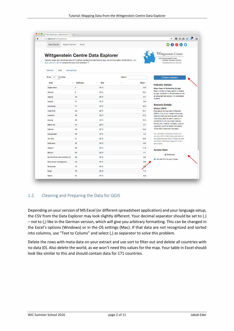
1.2. Cleaning and Preparing the Data for QGIS
Depending on your version of MS Excel (or different spreadsheet application) and your language setup,
the CSV from the Data Explorer may look slightly different. Your decimal separator should be set to (.)
– not to (,) like in the German version, which will give you arbitrary formatting. This can be changed in
the Excel’s options (Windows) or in the OS settings (Mac). If that data are not recognized and sorted
into columns, use “Text to Colums” and select (,) as separator to solve this problem.
Delete the rows with meta data on your extract and use sort to filter out and delete all countries with
no data (0). Also delete the world, as we won’t need this values for the map. Your table in Excel should
look like similar to this and should contain data for 171 countries.

Tutorial: Mapping Data from the Wittgenstein Centre Data Explorer
WIC Summer School 2016 page 3 of 11 Jakob Eder
1.3. Adding alpha2-Codes
To join data to a shapefile, you’ll always need a corresponding column both in your data extract, and
in your shapefile. If you are lucky, your shapefile already has a column with the numeric ISO codes so
you can join data your data right away. In many cases you’ll need to add some information. The table
provided contains the numeric and the alpha2 and alpha3 codes which should be sufficient most of
the time. Such lists can be found online as well.
For the EUROSTAT shapefiles, we’ll need alpha2 codes, so we will use MS Excel and the VLOOKUP
function to link the numeric with the alpha2 codes (more information on this very useful function can
be found here). In our specific case (alterations will have to be made if other data are joined), the
following code will give you the results you want, but first add a new column header (e.g. alpha2):
=VLOOKUP(B2;'[ISO_3166-1_Countries.xlsx]ISO_3166-1_Countries'!$C:$D;2;FALSE).
Expressed in Words this would be: Dear Excel, please look for what’s in cell B2 in Column C of the
matching Excel File. If you find it, give me what’s in Column D of the matching Excel file (indicated by
2, 3 would indicate Column E and so forth), but only give me results, if there is a 100% match (indicated
by FALSE – TRUE could lead to wrong results). Extend the formula to the bottom so that all countries
get an alpha2 code. Copy and paste this results (as values only) to remove the formulas, as a CSV file
can’t store formulas – and QGIS can’t import Excel files.
Note that there is an #NV for the Netherlands Antilles and Sudan, which were both split and do not
exist like this anymore. Note also that for some reason the EUROSTAT shapefile contains incorrect
alpha2 codes for Great Britain and Greece. So if you want to have results for these countries as well,
manually change the alpha2 codes from GB (correct) to UK (wrong) and from GR (correct) to EL (wrong)
in the Data Explorer extract. As said, our match was correct, but the shapefile is wrong. As it is more
complicated to adjust the shapefile, this is the easier way. So by now, your data should like similar to
this:

Tutorial: Mapping Data from the Wittgenstein Centre Data Explorer
WIC Summer School 2016 page 4 of 11 Jakob Eder
If that is the case, save it (as CSV!), close it and proceed to QGIS.
2. Downloading a Shapefile and Importing Data in QGIS
2.1. Downloading Geodata from EUROSTAT
EUROSTAT has a great website for downloading free geodata. Mainly they offer geometry for European
analyses, but they also have one shapefile with borders of countries worldwide. These can be accessed
here. Depending on your scale, they also offer different generalizations. This means, the more you
zoom in (regional maps), the more detailed geometry you should use. So for a regional map, I would
choose 1:3 million, for a global map, 1:60 million is totally sufficient.
As it is the easier format, always make sure that you download shapefiles, not geodatabases. Down-
load the shapefile you selected and extract the ZIP file. EUROSTAT is really good in hiding their shape-
files, so you might have to navigate a little through all the folders to locate the Data folder containing
what you need.

Tutorial: Mapping Data from the Wittgenstein Centre Data Explorer
WIC Summer School 2016 page 5 of 11 Jakob Eder
2.2. Importing Shapefiles in QGIS
A shapefile contains not only of the .shp files, but all that’s also there in the extracted folder. So if you
copy your shapes to another computer, make sure you copy the whole folder. The easiest way to add
geodata to QGIS is to drag and drop the .shp files to the QGIS windows. Every other file other than a
.shp will cause an error, so you can’t do much wrong.
You won’t need the capitals and the centres of the country polygons, so if you added them, remove
the layers again by right click and then remove. Then check in the attribute table of your polygon
shapefile, if you have a column you can use for the join with the Data Explorer Data (right click on the
layer and then open attribute table). As you’ll see, the column CNTR_ID contains the alpha2 codes we
were adding before to the data extract, so we are save to go.

Tutorial: Mapping Data from the Wittgenstein Centre Data Explorer
WIC Summer School 2016 page 6 of 11 Jakob Eder
2.3. Importing a CSV Layer
To import your CSV layer, go to Layer in the menu bar, then to Add Layer and then to Add Delimited
Text Layer. Locate your CSV file and make sure that in the preview table your columns are separated
accordingly.
In our case make sure that Semicolon is selected as separator (if QGIS does not do it automatically)
and check “No geometry (attribute table only)”, otherwise you won’t be able to proceed. QGIS thinks
adding a CSV layer will always contain geodata in text format (e.g. address data), so this is the default.
Click OK and you should see now a new text layer in your layer overview (bottom left). Right click and
open the attribute table to see if everything’s there as you need it to be (check especially if the alpha2
column was imported correctly!).

Tutorial: Mapping Data from the Wittgenstein Centre Data Explorer
WIC Summer School 2016 page 7 of 11 Jakob Eder
2.4. Joining the Data Extract with the Shapefile
If everything went well so far, we can join or data now. Right click your shapefile with the polygons
(not the one with the borders!) and select Properties. Select Join of the options on the left and click
the small green plus sign on the bottom of the window that just opened. The Join Layer is your CSV file
(you want to join the CSV to the Shapefile), your Join field is alpha2 (or whatever name you gave the
column in the CSV file) and your Target field is CNTR_ID, the corresponding column in the Shapefile.
Hit OK to continue.

Tutorial: Mapping Data from the Wittgenstein Centre Data Explorer
WIC Summer School 2016 page 8 of 11 Jakob Eder
Your join should now show up in the previous window. If yes, click ok and check the attribute table of
the shapefile to see if the join was correct (right click and then Open attribute table). Like below for
the United Arab Emirates, 171 countries should have now values with the MYS 2015 attached.
3. Visualizing Your Data
3.1. MYS and No Data Values
Now we are done with data preparation, we can finally proceed with the data preparation. Right click
your shapefile, select Properties and then Style of the options on the right. On the very top, change
from Single Symbol to Graduated. Next, select the column you want to visualize, in my Case
mys_2015_Years. Next, specify the number of classes you want to have (e.g. 5) and try the different
classification methods. Pretty breaks is most of the time a good solution, as the classes are easy to
understand. Of course, this can be changed manually as well (see the QGIS help). Also select a Color
ramp that suits you. It is quite common to select a blue scale for decrease and a red scale for increase,
so I’ve chosen brighter red colours for low MYS and darker red colours for high MYS.

Tutorial: Mapping Data from the Wittgenstein Centre Data Explorer
WIC Summer School 2016 page 9 of 11 Jakob Eder
If you hit OK, you should see your map changing colours according to your settings: The darker the
colour, the higher the MYS in 2015. If you uncheck the borders layer (line), you’ll notice that we lost all
the countries were we had not data (like Afghanistan). Instead, it would be nicer to have these coun-
tries in a grey colour to indicate no data. This can be done easily by duplicating our layer (right click,
Duplicate). Select the lower layer of the two clones, go to the Layer Properties and Style and change
back to Single Symbol and choose a grey colour. Renaming your Layers and formatting the labels can
also help to make your map more easily to understand (right click, rename – respectively layer prop-
erties and click into the “Legend” rows of your legend to format your legend labels).
After doing all this, your map might look like the one below:

Tutorial: Mapping Data from the Wittgenstein Centre Data Explorer
WIC Summer School 2016 page 10 of 11 Jakob Eder
3.2. Layout and Export Your Map as PDF or PNG
Finally, we need to finalize the layout and export the map so
that you can use it in your presentation or publication. To do
so, click on Project in the menu bar and start a New Print
Composer. Give the new composer a name, like MYS 2015.
A new window will open, giving you everything you need to
layout a map containing all important elements. These are:
- A title with a reference to where, what, and when. This
would be for example “MYS for Countries 2015” in our case
- A legend
- A scale bar, indicating the scale of our map
- Information on the data source and the creator of the map
These elements are all found on the right of your print composer. You can hover a little over the icons
and then a tool tip will show you what the button does. Browse through the Item properties on the
right to change font size, text, frames,…
Once you are satisfied, save your print composer (top left corner) and export the map in the formats
you like (center top menu bar). There are specific buttons for exporting as image (JPG, PNG), SVG or
PDF and import your map in other programs.
You can access your print composer also later when you saved and closed your QGIS document. For
this, go again to Project in the menu bar and then select Composer Manager – this will show you all
the maps you created based on this QGIS document and you can continue with changes. If you are
satisfied, your final map could look like this (which can be achieved with just a few clicks).

Tutorial: Mapping Data from the Wittgenstein Centre Data Explorer
WIC Summer School 2016 page 11 of 11 Jakob Eder
3.3. Concluding Remarks
This was just a very quick introduction to QGIS and how to create maps. Every map is different and
data preparation will differ with every different source. However, this tutorial should give you a
glimpse on what is possible and what can be done with not so much efforts. If you have any more
questions or if one (or all) steps were not clear enough, consult the QGIS help and the online tutorials
(they are pretty good). And if this all does not help, send me a message: [email protected]