Embed Size (px)
Citation preview


Tohu Brand Presentation
New For 2009

Where We Were•Original label adapted from Sandy Adsett painting named He Mihi Aroha Ki a Koe (A Gift of Love to You)•This format was used over the 10 years Tohu has been in business, with some modifications over time

Reason For Change…•Market feedback was that the current labels were not conveying premium cues and not identifiable as Māori•Brand story was complicated to communicate, particularly in offshore markets•Inconsistency between the Reserve and Premium range, not reinforcing brand•Tohu board requested change to make brand be more premium
Tohu Mission StatementThrough sustainable business and environmental practices
Tohu strive to produce award winning, premium quality New Zealand wines that reflect our unique terroir and
company values. As custodians of Māori culture and Māori land we have a responsibility to promote and preserve these traditions with the utmost integrity, commitment and care. Through successful relationships the Tohu brand is a vehicle
used to promote Māori culture to the world.

Rebranding Objectives1. To create a contemporary wine brand2. To create a brand that will span a lifecycle of 10 years3. To create a brand that is easily identifiable as Māori to all markets without
compromising integrity 4. Incorporate premium cues that are associated with the NZ wine industry5. Develop a brand that can be consistently reproduced for a variety of mediums6. To create a stronger connection between the by-line “Our Gift from the land –
Ngā Hua a Te Whenua” and Tohu

Target Audience Kaumātua (Reserve)• Male/Female aged 40+• Professional, tertiary educated, well traveled and are high income earners• These consumers are well researched in wine and are truly passionate about what they chose to drink• They understand the benefits derived when
paying a premium price for their wine, therefore their expectation of what they purchase is very high
• These consumers are willing to try any variety of wine, as they acknowledge the intrinsic quality each wine presents
• These consumers have an extensive wine collection and are most likely to be a member of a wine club (or two)

Target Audience Taonga (Premium)• Male/Female aged 30+• Professional, tertiary educated and are high income earners that can afford wine for regular consumption• Have children that are grown up, or do not
have children • They have a moderate interest in wine, and
will generally taste wine when available during in-store tastings
• They seek some form of reassurance from their purchase, influenced by awards and accolades, recommendations from sales staff, associates (family and friends)
• Generally risk adverse in purchasing and are brand loyal
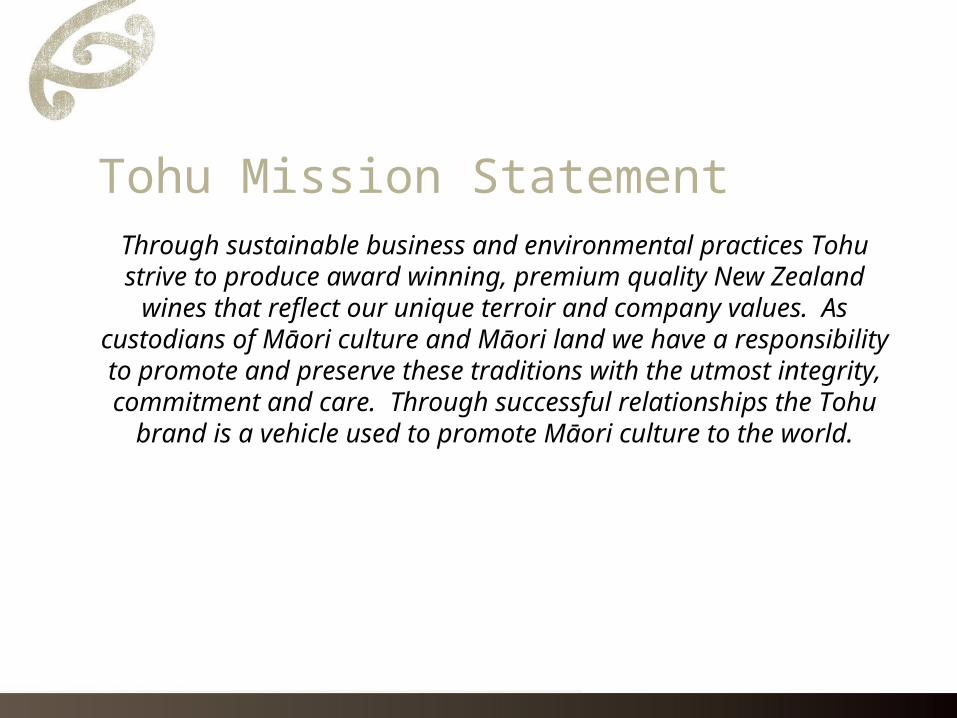
Rebranding Process• Detailed brief compiled and submitted to design agency• Vast selection of concepts presented• Strongest concepts were selected and submitted to key
markets for feedback• From this the No.1 choice was identified• Further refinements made

Market Research – Comments• “Looks clean and fresh and reflects the image of Tohu”• “Looks a lot like Air New Zealand which is a good thing”• “It’s a much more sophisticated look. Less is more”• “It has the feeling of crisp white tablecloths” • “I like the kōwhaiwhai. Its more than a koru. I would know instantly it’s Tohu. A much stronger and
mature logo”• “I would recongise the symbol now, without necessarily knowing the name.”• “Clear branding...they understand who they are now”• “I really like the image of the hills on the back label with ‘Our gift from the land’ in English and Māori
makes you think about where the grapes are grown”• “I see unfurling of vines. You know, grapes when they start growing”• “I was recently visiting my daughter in the UK. If i’d seen that in the supermarket shelf, it would have
definitely been bought! Even though I don’t like Sav!”

Presentation of Brand• New branding focuses on 3 key elements
• Koru• Unique font, representing Rauponga carving• Our Gift from the Land – Ngā Hua a te Whenua with
silhouette of Mt Tapua-o-Uenuku

Presentation of Brand - Koru• Taken from original Kōwhaiwhai as seen in the Sandy Adsett painting• Koru symbolises growth, life
and the natural world
• For Tohu this Koru represents new growth or bud burst that starts our growing season
• This Koru becomes Tohu’s unique mark (Tohu translatedmeans signature in Māori)

Presentation of Brand – Rauponga• Unique font developed to represent carving, one of Māori
celebrate and recognised traditions• This particular form of carving used
is known as Rauponga, characterised by a row of notched chevrons
• Here we see Rauponga used in the poa situated in Wakatu House

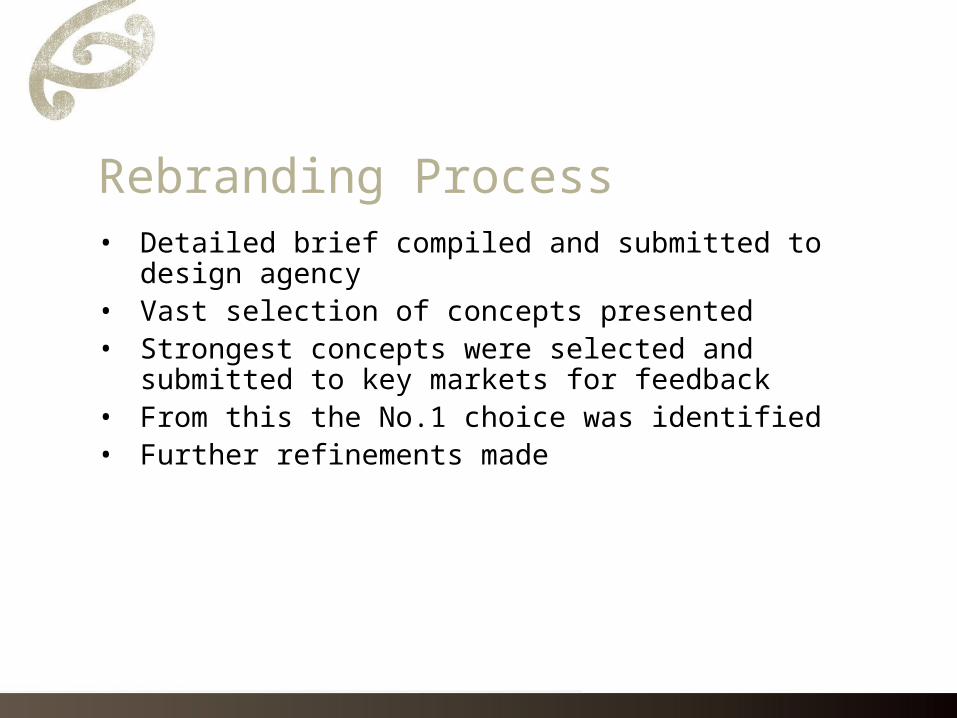
Presentation of Brand – Our Gift from the land - Ngā Hua a te Whenua
• Our by-line represents Māori relationship with the land
• Māori spiritual belief system revolves around the understanding that the earth is the giver of all life
• Our gift from the land is the outstanding quality of grapes grown and consequently wines produced
• This by-line is symbolised by the silhouette of Mt Tapuae-o-Uenuku, the spectacular view from our Awatere Valley vineyard

Summary• Rebranding has resulted in a contemporary, distinctly Māori wine
brand• Incorporates premium cues synonymous with the New Zealand wine
industry• Rebranding has achieved a simple while symbolic brand story that
maintains cultural integrity• Overall rebranding increases Tohu’s competitiveness, drawing on
Tohu’s unique point of difference

Mt Tapuae-o-Uenuku – View from Awatere Valley Vineyard
![Tohu-Bohu - Frac Bretagne · Tohu wa (et) Bohu signifie en Hébreu le désert ou le chaos et le vide. […] Tohu tendrait plutôt vers « vide spirituel » (une sorte de perte de](https://img.dokumen.tips/doc/110x75/612927ed2f542c675721cf5e/tohu-bohu-frac-bretagne-tohu-wa-et-bohu-signifie-en-hbreu-le-dsert-ou-le.jpg)