Embed Size (px)
Citation preview

Tk Tutorial For The Little Language
Mark Roseman (TkDocs) Francisco José Marín Pérez (L code and LATEX)
This tutorial is based on TkDocsThis work is licensed under the Creative Commons Attribution-NonCommercial-ShareAlike 2.5 Canada License.To view a copy of this license, visit http://creativecommons.org/licenses/by-nc-sa/2.5/ca/ or send a letter to CreativeCommons, PO Box 1866, Mountain View, CA 94042, USA.
1 TkDocs - Tk TutorialThis tutorial is designed to help people get up to speed quickly with building mainstream desktop graphical user interfaceswith Tk, and in particular Tk 8.5, which is an incredibly significant milestone release and a significant departure from theolder versions of Tk which most people know and love recognize.
The downside is that unless you know one or two particular things, it’s actually not that significant a release; Forbackwards compatibility reasons, unless existing programs make a few simple changes, they won’t look all that muchdifferent. So while this tutorial will certainly benefit newcomers to Tk, it will also help existing Tk developers bring theirknowledge right up to date. It’s a cliche, but I can’t believe how much I’ve learned in writing this tutorial, and I’ve beenusing Tk for over fifteen years.
The general state of Tk documentation (outside the Tcl-oriented reference documentation, which is excellent) is un-fortunately not at a high point these days. This is particularly true for developers using Tk from languages other than Tcl,and developers working on multiple platforms.
So this tutorial will, as much as possible, target developers on the three main platforms (Windows, Mac, Linux), andalso be language-neutral. Initially, the tutorial will cover Tcl, Ruby, Perl and Python. Over time, additional languagesmay be added. Even if your own language isn’t included, the chances are you’ll still benefit; since all the languages usethe same underlying Tk library, there’s obviously a lot of overlap.
This is also not a reference guide, it’s not going to cover everything, just the essentials you need in 95% of applications.The rest you can find in reference documentation.
1.1 Who this Tutorial is forThis tutorial is designed for developers building tools and applications in Tk. It’s also concerned with fairly mainstreamgraphical user interfaces, with buttons, lists, checkboxes, rich text editing, 2D graphics and so on. So if you’re eitherlooking to hack on Tk’s internal C code, or build the next great 3D immersive game interface, this is probably not thematerial for you.
This tutorial also doesn’t teach you the underlying programming language (Tcl, Ruby, Perl, Python, etc.), so youshould have a basic grasp on that already. Similarly, you should have a basic familiarity with desktop applications ingeneral, and while you don’t have to be a user interface designer, some appreciation of GUI design is always helpful.
1.2 Modern Best PracticesThis tutorial is all about building modern Tk user interfaces using the current tools Tk has to offer. It’s all about the bestpractices you need to know to do this.
For most tools, you wouldn’t think you’d have to say something like that, but for Tk that’s not the case. Tk has hada very long evolution (see Tk Backgrounder), and any evolution tends to leave you with a bit of cruft; couple that withhow much graphical user interface platforms and standards have evolved in that time, and you can see where keepingsomething as large and complex as a GUI library up to date as well as backwards compatible may be challenging.
Tk has, in recent years, gotten a bad rap, to put it mildly. Some of this has been well deserved, most of it not so much.Like any GUI tool, it can be used to create absolutely terrible looking and outdated user interfaces, but with the proper
1

1 TkDocs - Tk Tutorial 2
care and attention, it can also be used to create spectacularly good ones as well. Most people know about the crappy ones;most of the good ones people don’t even know are done in Tk. In this tutorial, we’re going to focus on what you need tobuild good user interfaces, which isn’t nearly as hard as it used to be before Tk 8.5.
So modern desktop graphical user interfaces, using modern conventions and design sense, using the modern toolsprovided by Tk 8.5.
1.2.1 Tk Extensions
When it comes to modern best practices, Tk extensions deserve a special word of note. Over the years, a number of groupshave provided all kinds of add-ons to Tk, for example adding new widgets not available in the core (or at least not at thetime). Some well-known and quite popular Tk extensions include BLT, Tix, iWidgets, BWidgets; there are many, manyothers.
Many of these extensions were created years ago. Because core Tk has always been highly backwards compatible,these extensions generally continue to work with newer versions. However, many have not been updated, or not beensignificantly updated, in a long time. They may not reflect current platform conventions or styles, and so while they“work”, they can make your application appear extremely dated or out of place.
If you do decide to use Tk extensions, it’s highly recommended that you investigate and review your choices carefully.
1.3 The Better Way ForwardTk also gives you a lot of choices. There are at least six different ways to layout widgets on the screen, often multipledifferent widgets that could accomplish the same thing, especially if you count the huge assortment of Tk extensions likeTix, BLT, BWidgets, Itk and others. Most of these also are older, most not updated and therefore crappy looking, and inmany cases, the facilities they provide have been obsoleted by newer and more modern facilities recently built into Tkitself. But for backwards compatibility reasons, most of these old ways of doing things still keep working, year after year.That doesn’t necessarily mean people should still be using some of them.
So there are a lot of choices in Tk, but frankly, all that choice gets in the way. If you want to learn and use Tk,you don’t need all the choices, you need the right choice, so you don’t have to do all the research and make that choiceyourself. That’s what this tutorial will give you. Think of it as the documentation equivalent of opinionated software. Sowe’ll often use different ways of doing things than in other documentation or examples; often, it’s because when thosewere written, the better ways didn’t even exist yet. Later on, once you’re an expert, and you’re encountering some wackysituation where the normal choice doesn’t fit, you can go hunt around for alternatives.
1.4 How to UseWhile the tutorial is designed to be used linearly, feel free to jump around as you see fit. We’ll often provide linkswhere you can go for more information, whether links to other documentation on this site, such as our “widget roundup”providing usage info on each Tk widget, or to external documentation, such as the full reference for a particular command.
1.5 The Obligatory First ProgramTo make sure that everything actually did work, let’s try to run a “Hello World” program in Tk. While for something thisshort you could just type it in directly to the interpreter, instead use your favorite text editor to put it in a file.
grid(ttk::button(".b", text: "Hello World"));
Save this to a file named ‘hello.l’. From the L-gui shell, type:
% source hello.l
Couldn’t find hello.l? You might be looking in the wrong directory. You can either give the full path to hello.tcl, oruse Tcl’s “pwd” and “cd” commands to see what directory you’re in, and change to a different one.
With that out of the way, let’s try a slightly more useful example, which will give you an initial feel for what the codebehind a Tk program looks like.

1 TkDocs - Tk Tutorial 3
Figure 1: Our FirstProgram. Some work left to do before the IPO.
1.6 DesignThe example we’ll use is a simple GUI tool that will convert a number of feet to the equivalent number of meters. If wewere to sketch this out, it might look something like this:
Figure 2: A sketchof our feet to meters conversion program.
So it looks like we have a short text entry widget that will let us type in the number of feet, and a ‘Calculate’ buttonthat will get the value out of that entry, perform the calculation, and then put the resulting number of meters on the screenjust below where the entry is. We’ve also got three static labels (“feet”, “is equivalent to”, and “meters”) which help ouruser figure out how to use the interface.
In terms of layout, things seem to naturally divide into three columns and three rows:
Figure 3: The layoutof our user interface, which follows a 3 x 3 grid.

1 TkDocs - Tk Tutorial 4
1.7 CodeNow here is the Tcl/Tk code to create this program.
#!/usr/local/bin/L-gui
#lang L
require("Tk");
string feet, meters; // texvariables
// feet to meters conversionvoid calculate() {
float f, m;meters = "";if (isdigit(feet)) {
f = (float)feet;m = round(f*0.3048*10000.0)/10000.0;meters = (string)m;
} else {feet = "";
}}
void main() {wm("title",".", "Feet to Meters");grid(ttk::frame(".c", padding: "3 3 12 12"),
column: 0, row: 0, sticky: "nwes");grid("columnconfigure", ".", 0, weight: 1);grid("rowconfigure", ".", 0, weight: 1);
grid(ttk::entry(".c.feet", width: 7, textvariable: &feet),column: 2, row: 1, sticky: "we");
grid(ttk::label(".c.meters", textvariable: &meters),column: 2, row: 2, sticky: "we");
grid(ttk::button(".c.calc", text: "Calculate", command: "calculate"),column: 3, row: 3, sticky: "w");
grid(ttk::label(".c.flbl", text: "feet"),column: 3, row: 1, sticky: "w");
grid(ttk::label(".c.islbl", text: "is equivalent to"),column: 1, row: 2, sticky: "e");
grid(ttk::label(".c.mlbl", text: "meters"),column: 3, row: 2, sticky: "w");
{widget w;foreach (w in (string[])winfo("children", ".c")) {
grid("configure", w, padx: 5, pady: 5);}
}focus(".c.feet");bind(".", "<Return>", "calculate");
}

1 TkDocs - Tk Tutorial 5
And the resulting user interface:
Figure 4: Screenshot ofour completed feet to meters user interface (on Mac OS X, Windows and
Linux).
1.7.1 A Note on Coding Style
Each of the languages included in this tutorial has a variety of coding styles and conventions available to choose from,which help determine conventions for variable and function naming, procedural, functional or object-oriented styles, andso on.
Because the focus on this tutorial is Tk, this tutorial will keep things as simple as possible, generally using a verydirect coding style, rather than wrapping up most of our code in procedures, modules, objects, classes and so on. As muchas possible, you’ll also see the same names for objects, variables, etc. used across the languages for each example.
1.8 Step-by-Step WalkthroughLet’s take a closer look at that code, piece by piece. For now, all we’re trying to do is get a basic understanding of thetypes of things we need to do to create a user interface in Tk, and roughly what those things look like. We’ll go into detailslater.
require("Tk");
First thing we do is tell Tcl that our program needs Tk. Though not strictly necessary, it’s considered good form toinclude this line. It can also be used to specify exactly what version of Tk is needed.
wm("title", ".", "Feet to Meters");grid(ttk::frame(".c", padding: "3 3 12 12"),
column: 0, row: 0, sticky: "nwes");grid("columnconfigure", ".", 0, weight: 1);grid("rowconfigure", ".", 0, weight: 1);
Next, the above lines set up the main window, giving it the title “Feet to Meters”. Next, we create a frame widget,which will hold all the content of our user interface, and place that in our main window. The "columnconfigure"/ "rowconfigure" bits just tell Tk that if the main window is resized, the frame should expand to take up the extraspace.
Strictly speaking, we could just put the other parts of our interface directly into the main root window, without theintervening content frame. However, the main window isn’t itself part of the “themed” widgets, so its background colorwouldn’t match the themed widgets we will put inside it. Using a “themed” frame widget to hold the content ensures thatthe background is correct.
grid(ttk::entry(".c.feet", width: 7, textvariable: &feet),column: 2, row: 1, sticky: "we");
grid(ttk::label(".c.meters", textvariable: &meters),column: 2, row: 2, sticky: "we");
grid(ttk::button(".c.calc", text: "Calculate", command: "calculate"),column: 3, row: 3, sticky: "w");
The preceding lines create the three main widgets in our program: the entry where we type the number of feet in, alabel where we put the resulting number of meters, and the calculate button that we press to perform the calculation.

1 TkDocs - Tk Tutorial 6
For each of the three widgets, we need to do two things: create the widget itself, and then place it onscreen. All threewidgets, which are ‘children’ of our content window are created as instances of one of Tk’s themed widget classes. Atthe same time as we create them, we give them certain options, such as how wide the entry is, the text to put inside theButton, etc. The entry and label each are assigned a mysterious "textvariable"; we’ll see what that does shortly.
If the widgets are just created, they won’t automatically show up on screen, because Tk doesn’t know how you wantthem to be placed relative to other widgets. That’s what the "grid" part does. Remembering the layout grid for ourapplication, we place each widget in the appropriate column (1, 2 or 3), and row (also 1, 2 or 3). The "sticky" optionsays how the widget would line up within the grid cell, using compass directions. So "w" (west) means anchor the widgetto the left side of the cell, "we" (west-east) means anchor it to both the left and right sides, and so on.
grid(ttk::label(".c.flbl", text: "feet"),column: 3, row: 1, sticky: "w");
grid(ttk::label(".c.islbl", text: "is equivalent to"),column: 1, row: 2, sticky: "e");
grid(ttk::label(".c.mlbl", text: "meters"),column: 3, row: 2, sticky: "w");
The above three lines do exactly the same thing for the three static text labels in our user interface; create each one,and place it onscreen in the appropriate cell in the grid.
{widget w;foreach (w in (string[])winfo("children", ".c")) {
grid("configure", w, padx: 5, pady: 5);}
}focus(".c.feet");bind(".", "<Return>", "calculate");
The preceeding three lines help put some nice finishing touches on our user interface.The first line walks through all of the widgets that are children of our content frame, and adds a little bit of padding
around each, so they aren’t so scrunched together. We could have added these options to each "grid" call when we firstput the widgets onscreen, but this is a nice shortcut.
The second line tells Tk to put the focus on our entry widget. That way the cursor will start in that field, so the userdoesn’t have to click in it before starting to type.
The third line tells Tk that if the user presses the Return key (Enter on Windows) anywhere within the root window,that it should call our calculate routine, the same as if the user pressed the Calculate button.
void calculate() {float f, m;meters = "";if (isdigit(feet)) {
f = (float)feet;m = round(f*0.3048*10000.0)/10000.0;meters = (string)m;
} else {feet = "";
}}
Here we define our calculate procedure, which is called either when the user presses the Calculate button, or hits theReturn key. It performs the feet to meters calculation, taking the number of feet from our entry widget, and placing theresult in our label widget.
Say what? It doesn’t look like we’re doing anything with those widgets! Here’s where the magic "textvariable"options we specified when creating the widgets come into play. We specified the global variable “feet” as the textvariablefor the entry, which means that anytime the entry changes, Tk will automatically update the global variable feet. Similarly,if we explicitly change the value of a textvariable associated with a widget (as we’re doing for “meters” which is attachedto our label), the widget will automatically be updated with the current contents of the variable. Slick.

1 TkDocs - Tk Tutorial 7
1.9 What’s MissingIt’s also worth examing what we didn’t have to include in our Tk program to make it work. For example:
we didn’t have to worry about redrawing the screen as things changed
we didn’t have to worry about parsing and dispatching events, hit detection, or handling events on each widget
we didn’t have to provide a lot of options when we created widgets; the defaults seemed to take care of most things, andso we only had to change things like the text the button displayed
we didn’t have to write complex code to get and set the values of simple widgets; we just attached them to variables
we didn’t have to worry about what happens when the user closes the window or resizes it
we didn’t need to write extra code to get this all to work cross-platform
With a first example behind you, you should have a basic idea of what a Tk program might look like and the types oftasks it needs to accomplish. We’ll step back and look at three broad concepts that you need to know to understand Tk:widgets, geometry management, and event handling.
1.10 WidgetsWidgets are all the things that you see onscreen. In our example, we had a button, an entry, a few labels, and a frame.Others are things like checkboxes, tree views, scrollbars, text areas, and so on. Widgets are what are often referred to as“controls”; you’ll also often see them referred to as “windows”, particularly in Tk’s documentation, a holdover from itsX11 roots (so under that terminology, both a toplevel window and things like a button would be called windows).
Here is an example showing some of Tk’s widgets, which we’ll cover individually shortly.
Figure 5: SeveralTk Widgets.
1.10.1 Widget Classes
Widgets are objects, instances of classes that represent buttons, frames, and so on. So the first thing you’ll need to do isidentify the specific class of the widget you’d like to instantiate. This tutorial and the widget roundup will help with that.
1.10.2 Window Hierarchy
The other thing you’ll need to know is the parent of the widget instance you’d like to create. In Tk, all widgets are part of awindow hierarchy, with a single root at the top of the hierarchy. This hierarchy can be arbitrarily deep; so you might havea button in a frame in another frame within the root window. Even a new toplevel window is part of that same hierarchy,with it and all its contents forming a subtree of the overall window hierarchy.
In our metric conversion example, we had a single frame that was created as a child of the root window, and that framehad all the other controls as children. The root window was a container for the frame, and was therefore the frame’sparent. The complete hierarchy for the example looked like this:

1 TkDocs - Tk Tutorial 8
Figure 6: The windowhierarchy of the metric conversion example.
1.10.3 Creating and Using Widgets
In Tcl, each widget is given an explicit pathname, which both differentiates it from other widgets, and also indicates itsplace in the window hierarchy. The root of the hierarchy, the toplevel widget that Tk automatically creates, is namedsimply "." (dot).
The frame, which was a child of the root, was named ".c". We could have put pretty much anything in place of the“c”, naming it for example ".content". This name is purely for use by your program, so it’s best to choose some-thing meaningful. The controls that were children of the frame were given names like ".c.feet", ".c.meters",".c.flbl", and so on. If there were any widgets at a deeper level of the hierarchy, we’d add another "." and then aunique identifier.
So to create a widget, we need to provide the widget class, and the pathname. The pathname is used to indicate thewidget’s parent (which must of course exist also), and hence its position in the window hierarchy. For example:
ttk::button(".b");ttk::frame(".f");ttk::entry(".f.entry");
This also creates a new object command with the same name as the widget’s pathname, which will let us commu-nicate with the widget. So the above code would produce new L functions named ".b", ".f", ".f.entry", andso on. You can then use that function to communicate further with the widget, calling e.g. ".b("invoke")", or".f.entry("state" "disabled")". Because of the obvious parallels with many object-oriented systems, we’lloften refer to the functions as objects, and calls on those objects (like the "invoke") as method calls. For example,you’ll see below the use of the "configure" and "cget" methods.
1.10.4 Configuration Options
All widgets also have a number of different configuration options, which generally control how they are displayed or howthey behave.
The options that are available depend upon the widget class of course. There is a lot of consistency between differentwidget classes, so options that do pretty much the same thing tend to be named the same. So both a button and a labelhave a "text" option to adjust the text the widget displays, while a scrollbar for example would not have a "text"option since it’s not needed. In the same way, the button has a "command" option telling it what to do when pushed,while a label, which holds just static text, does not.
Configuration options can be set when the widget is first created, by passing along the names and values of theoptions as optional parameters. You can later check what the value of those options are, and with a very small number ofexceptions, change them at any time. If you’re not sure what all the different options are for a widget, you can ask thewidget to provide it. This gives you a long list of all the options, and for each option, you can see the name of the optionand its current value (along with three other attributes which you won’t normally need to worry about).
This is all best illustrated with the following interactive dialog with the interpreter. [NOTE: L-gui doesn’t work ininteractive mode so this example doesn’t work]
% L-guicreate a button, passing two options:% grid(ttk::button(".b", text: "Hello", command: "button_pressed"));check the current value of the text option:% .b("cget", text:);Hellocheck the current value of the command option:% .b("cget", command:);

1 TkDocs - Tk Tutorial 9
button_pressedchange the value of the text option:% .b("configure", text: "Goodbye");check the current value of the text option:% .b("cget", text:);Goodbyeget all information about the text option:% .b("configure", text:);-text text Text {} Goodbyeget information on all options for this widget:% .b("configure");{-takefocus takeFocus TakeFocus ttk::takefocus ttk::takefocus}{-command command Command {} button_pressed} {-default default Default normal normal}{-text text Text {} Goodbye} {-textvariable textVariable Variable {} {}}{-underline underline Underline -1 -1} {-width width Width {} {}} {-image image Image {} {}}{-compound compound Compound none none} {-padding padding Pad {} {}}{-state state State normal normal} {-takefocus takeFocus TakeFocus {} ttk::takefocus}{-cursor cursor Cursor {} {}} {-style style Style {} {}} {-class {} {} {} {}}
1.11 Geometry ManagementIf you’ve been playing around creating widgets, you’ve probably noticed that just by creating them they didn’t end upshowing up onscreen. Having things actually put in the onscreen window, and precisely where in the window they showup is a separate step called geometry management.
In our example, this positioning was accomplished by the "grid" command, where we passed along the column androw we wanted each widget to go in, how things were to be aligned within the grid, and so on. Grid is an example of ageometry manager (of which there are several in Tk, grid being the most useful). We’ll talk about grid in detail in a laterchapter, but for now we’ll look at geometry management in general.
A geometry manager’s job is to figure out exactly where those widgets are going to be put. This turns out to be avery difficult optimization problem, and a good geometry manager relies on quite complex algorithms. A good geometrymanager provides the flexibility, power and ease of use that makes programmers happy, and Tk’s "grid" is without adoubt one of the absolute best. A poor geometry manager. . . well, all the Java programmers who have suffered through“GridBagLayout” please raise their hands.
1.11.1 The Problem
The problem for a geometry manager is to take all the different widgets the program creates, plus the instructions forwhere in the window the program would like things to go (explicitly, or more often, relative to other widgets), and thenactually put them in the window.
In doing so, the geometry manager has to balance a number of different constraints:
• The widgets may have a “natural” size (e.g. the natural width of a label would normally be determined by the textand font in it), but the toplevel all these different widgets are trying to fit into isn’t big enough to accommodatethem; the geometry manager must decide which widgets to shrink to fit, by how much, etc.
• If the toplevel window is bigger than the natural size of all the widgets, how is the extra space used? Is it just usedfor extra space between widgets, and if so, how is that space distributed? Is it used to make certain widgets biggerthan they normally want to be?
• If the toplevel window is resized, how does the size and position of the widgets in it change? Will certain areas (e.g.a text entry area) expand or shrink, while other parts stay the same size, or is the area distributed differently? Docertain widgets have a minimum (or maximum) size that you want to avoid going under (over)?
• How can widgets in different parts of the user interface be aligned with each other, to present a clean layout andmatch platform guidelines to do with inter-widget spacing?
• For a complex user interface, which may have many frames nested in other frames nested in the window (etc.), howcan all the above be accomplished, trading off the conflicting demands of different parts of the entire user interface?

1 TkDocs - Tk Tutorial 10
1.11.2 How it Works
Geometry management in Tk relies on the concept of master and slave widgets. A master is a widget, typically a toplevelwindow or a frame, which will contain other widgets, which are called slaves. You can think of a geometry manager astaking control of the master widget, and deciding what will be displayed within.
The geometry manager will ask each slave widget for its natural size, or how large it would ideally like to be dis-played. It then takes that information and combines it with any parameters provided by the program when it asks thegeometry manager to manage that particular slave widget. In our example, we passed grid a "column" and "row"number for each widget, which indicated the relative position of the widget with respect to others, and also a "sticky"parameter to suggest how the widget should be aligned or possibly stretched. We also used "columnconfigure" and"rowconfigure" to indicate the columns and rows we’d like to have expand if there is extra space available in thewindow. Of course, all these parameters are specific to grid; other geometry managers would use different ones.
The geometry manager takes all the information about the slaves, as well as the information about how large themaster is, and uses its internal algorithms to determine the area each slave will be allocated (if any!). The slave is thenresponsible for drawing etc. within that particular rectangle. And of course, any time the size of the master changes (e.g.because the toplevel window was resized), the natural size of a slave changes (e.g. because we’ve changed the text in alabel), or any of the geometry manager parameters change (e.g. like "row", "column", or "sticky") we repeat thewhole thing.
This all works recursively as well. In our example, we had a content frame inside the toplevel window, and then anumber of other controls in the content frame. We therefore had a geometry manager working on two different masters.At the outer level, the toplevel window was the master, and the content frame was the slave. At the inner level, the contentframe was the master, with each of the other widgets being slaves. So the same widget can be both a master and a slave.This hierarchy can of course also be nested much more deeply.
While each master can have only one geometry manager (e.g. grid), it’s entirely possible for different masters to havedifferent geometry managers; while grid is generally used, others may make sense for a particular layout used in one partof your user interface. Also, we’ve been making the assumption that slave widgets are the immediate children of theirmaster in the widget hierarchy. While this is usually the case, and mostly there’s no good reason to do it any other way,it’s also possible (with some restrictions) to get around this.
1.12 Event HandlingIn Tk, as in most other user interface toolkits, there is an event loop which receives events from the operating system.These are things like button presses, keystrokes, mouse movement, window resizing, and so on.
Generally, Tk takes care of managing this event loop for you. It will figure out what widget the event applies to (didthe user click on this button? if a key was pressed, which textbox had the focus?), and dispatch it accordingly. Individualwidgets know how to respond to events, so for example a button might change color when the mouse moves over it, andrevert back when the mouse leaves.
1.12.1 Command Callbacks
Often though you want your program to handle particular events, for example doing something when a button is pushed.For those events that are pretty much essential to customize (what good is a button without something happening whenyou press it?), the widget will provide a callback as a widget configuration option. We saw this in the example with the"command" option of the button.
Callbacks in Tk tend to be simpler than in toolkits used with compiled languages (where a callback must generally bedirected at a procedure with a certain set of parameters or an object method with a certain signature). Instead, the callbackis just a normal bit of code that the interpreter evaluates. While it can be as complex as you want to make it, most timesthough you’ll just want your callback to call some other procedure.
1.12.2 Event Bindings
For events that don’t have a command callback associated with them, you can use Tk’s "bind" to capture any event, andthen (like with callbacks) execute an arbitrary piece of code.
Here is a (silly) example that shows how a label can have bindings set up for it to respond to different events, which itdoes so by just changing what is displayed in the label.
void change_text (string text) {.l("configure", text: text);
}grid(ttk::label(".l", text: "Starting..."));

1 TkDocs - Tk Tutorial 11
bind(".l", "<Enter>", {&change_text, "Moved mouse inside"});bind(".l", "<Leave>", {&change_text, "Moved mouse outside"});bind(".l", "<1>", {&change_text, "Clicked left mouse button"});bind(".l", "<Double-1>", {&change_text, "Double clicked"});bind(".l", "<B3-Motion>", {&change_text, "right button drag to %x %y"});
Note that the bind command lives in the global namespace; there is not a ttk::bind command.The first three event bindings are pretty straightforward, just looking at simple events. The double click binding
introduces the idea of an event modifier; in this case we want to trigger the event on a left mouse click (the "1"), but onlywhen it’s a double click (the "Double-").
The last binding also uses a modifier: capture mouse movement ("Motion"), but only when the right mouse button("B3") is held down. This binding also shows an example of how to use event parameters, through the use of percentsubstitutions. Many events, such as mouse clicks or movement have as parameters additional information like the currentposition of the mouse. These percent substitutions let you capture them so they can be used in your script.
Tkx lets us provide command callbacks as just a Perl function (the first four), or as a two element array (the last case).The first element is the Perl code to be called, while the second array element specifies parameters to pass to that code.The function “Tkx::Ev()” will expand its parameter ("%x %y" in this case) when the callback is invoked, which willperform the percent substitutions. These then are passed as parameters to our function.
Tkinter expects you to provide a function as the event callback, whose first argument is an event object representingthe event that triggered the callback. It’s usually not worth the bother of defining regular named functions for one-offcallbacks such as in this example, so we’ve just used Python’s anonymous functions via lambda. The earlier feet to metersexample used a regular defined function (calculate).
For a complete description of all the different event names, modifiers, and the different event parameters that areavailable with each, the best place to look is the “bind” command reference.
Virtual Events Beyond the low-level operating system events like mouse clicks and window resizes, many widgetsgenerate higher level events called virtual events. For example, a listbox widget will generate a "ListboxSelect"virtual event anytime the selection changes, regardless of whether that was because the user clicked on an item, movedto it with the arrow keys, or whatever. This avoids the problem of setting up multiple, possibly platform-specific eventbindings to capture the change. Virtual events for a widget, if any, will be listed in the widget’s documentation.
Multiple Bindings Widgets can actually have a number of different event bindings trigger for a single event. Normally,events can be set up for: the individual widget itself, all widgets of a certain class (e.g. buttons), the toplevel windowcontaining the widget, and all widgets in the application. Each of these will fire in sequence.
We saw this in our example when we set up a binding for the Return key on the toplevel window, and that applied toevery widget within that window.
The default behavior of each widget class in Tk is itself defined with script-level event bindings, and so can beintrospected and modified to alter the behavior of all widgets of a certain class. You can even completely modify thehandling of this multiple sequence of events for each widget; see the “bindtags” command reference if you’re curious.
This chapter introduces you to the basic Tk widgets that you’ll find in just about any user interface: frames, labels,buttons, checkbuttons, radiobuttons, entries and comboboxes. By the end, you’ll know how to use all the widgets you’dever need for a typical fill-in form type of user interface.
This chapter (and those following that discuss more widgets) are meant to be read in order. Because there is so muchcommonality between many widgets, we’ll introduce certain concepts in an earlier widget that will also apply to a laterone. Rather than going over the same ground multiple times, we’ll just refer back to when the concept was first introduced.
At the same time, each widget will also refer to the widget roundup page for the specific widget, as well as thereference manual page, so feel free to jump around a bit too.
1.13 FrameA frame is a widget that displays just as a simple rectangle. Frames are primarily used as a container for other widgets,which are under the control of a geometry manager such as grid.
Frames are created using the ttk::frame command:
ttk::frame(".frame");
Frames can take several different configuration options which can alter how they are displayed.

1 TkDocs - Tk Tutorial 12
Figure 7: FrameWidgets
Requested Size Like any other widget, after creation it is added to the user interface via a (parent) geometry manager.Normally, the size that the frame will request from the geometry manager will be determined by the size and layout ofany widgets that are contained in it (which are under the control of the geometry manager that manages the contents ofthe frame itself).
If for some reason you want an empty frame that does not contain other widgets, you should instead explicitly set thesize that the frame will request from its parent geometry manager using the "width" and/or "height" configurationoptions (otherwise you’ll end up with a very small frame indeed).
Normally, distances such as width and height are specified just as a number of pixels on the screen. You can alsospecify them via one of a number of suffixes. For example, "350" means 350 pixels, "350c" means 350 centimeters,"350i" means 350 inches, and "350p" means 350 printer’s points (1/72 inch).
Padding The "padding" configuration option is used to request extra space around the inside of the widget; this wayif you’re putting other widgets inside the frame, there will be a bit of a margin all the way around. A single numberspecifies the same padding all the way around, a list of two numbers lets you specify the horizontal then the verticalpadding, and a list of four numbers lets you specify the left, top, right and bottom padding, in that order.
.frame("configure", padding: "5 10");
Borders You can display a border around the frame widget; you see this a lot where you might have a part of the userinterface looking “sunken” or “raised” in relation to its surroundings. To do this, you need to set the "borderwidth"configuration option (which defaults to 0, so no border), as well as the "relief" option, which specifies the visualappearance of the border: "flat" (default), "raised", "sunken", "solid", "ridge", or "groove".
.frame("configure", borderwidth: 2, relief: "sunken");
Changing Styles There is also a "style" configuration option, which is common to all of the themed widgets, whichcan let you control just about any aspect of their appearance or behavior. This is a bit more advanced, so we won’t go intoit right now.
Styles mark a sharp departure from the way most aspects of a widget’s visual appearance are changed in the “classic”Tk widgets. While in classic Tk you could provide a wide range of options to finely control every aspect of behavior(foreground color, background color, font, highlight thickness, selected foreground color, padding, etc.), in the new themedwidgets these changes are done by changing styles, not adding options to each widget.
As such, many of the options you may be familiar with in certain widgets are not present in their themed version.Given that overuse of such options was a key factor undermining the appearance of Tk applications, especially whenmoved across platforms, transitioning to themed widgets provides an opportune time to review and refine if and how suchappearance changes are made.
1.14 LabelA label is a widget that displays text or images, typically that the user will just view but not otherwise interact with.Labels are used for such things as identifying controls or other parts of the user interface, providing textual feedback orresults, etc.
Labels are created using the ttk::label command, and typically their contents are set up at the same time:

1 TkDocs - Tk Tutorial 13
Figure 8: LabelWidgets
ttk::label(".label", text: "Full name:");
Like frames, labels can take several different configuration options which can alter how they are displayed.
Displaying Text The "text" configuration option shown above when creating the label is the most commonly used,particularly when the label is purely decorative or explanatory. You can of course change this option at any time, not onlywhen first creating the label.
You can also have the widget monitor a variable in your script, so that anytime the variable changes, the label willdisplay the new value of the variable; this is done with the "textvariable" option:
string resultContent;.label("configure", textvariable: &resultContents);resultContents = "New value to display";
Variables must be global, or the fully qualified name given for those within a namespace.
Displaying Images You can also display an image in a label instead of text; if you just want an image sitting in yourinterface, this is normally the way to do it. We’ll go into images in more detail in a later chapter, but for now, let’s assumeyou want to display a GIF image that is sitting in a file on disk. This is a two-step process, first creating an image “object”,and then telling the label to use that object via its "image" configuration option:
image("create", "photo", "imgobj", file: "myimage.gif");.label("configure", image: "imgobj");
You can use both an image and text, as you’ll often see in toolbar buttons, via the "compound" configuration option.The default value is "none", meaning display only the image if present, otherwise the text specified by the "text" or"textvariable" options. Other options are "text" (text only), "image" (image only), "center" (text in centerof image), "top" (image above text), "left", "bottom", and "right".
Layout While the overall layout of the label (i.e. where it is positioned within the user interface, and how large it is) isdetermined by the geometry manager, there are several options that can help you control how the label will be displayedwithin the box the geometry manager gives it.
If the box given to the label is larger than the label requires for its contents, you can use the "anchor" option tospecify what edge or corner the label should be attached to, which would leave any empty space in the opposite edgeor corner. Possible values are specified as compass directions: "n" (north, or top edge), "ne", (north-east, or top rightcorner), "e", "se", "s", "sw", "w", "nw" or "center".
Labels can be used to display more than one line of text. This can be done by embedding carriage returns ("\n") inthe "text"/"textvariable" string. You can also let the label wrap the string into multiple lines that are no longerthan a given length (with the size specified as pixels, centimeters, etc.), by using the "wraplength" option.
Multi-line labels are a replacement for the older "message" widgets in classic Tk.You can also control how the text is justified, by using the "justify" option, which can have the values "left",
"center" or "right". If you only have a single line of text, this is pretty much the same as just using the "anchor"option, but is more useful with multiple lines of text.

1 TkDocs - Tk Tutorial 14
Fonts, Colors and More Like with frames, normally you don’t want to touch things like the font and colors directly,but if you need to change them (e.g. to create a special type of label), this would be done via creating a new style, whichis then used by the widget with the "style" option.
Unliked most themed widgets, the label widget also provides explicit widget-specific options as an alternative; again,you’d use this only in special one-off cases, when using a style didn’t necessarily make sense.
You can specify the font used to display the label’s text using the "font" configuration option. While we’ll go intofonts in more detail in a later chapter, here are the names of some predefined fonts you can use:
TkDefaultFont The default for all GUI items not otherwise specified.
TkTextFont Used for entry widgets, listboxes, etc.
TkFixedFont A standard fixed-width font.
TkMenuFont The font used for menu items.
TkHeadingFont The font typically used for column headings in lists and tables.
TkCaptionFont A font for window and dialog caption bars.
TkSmallCaptionFont A smaller caption font for subwindows or tool dialogs
TkIconFont A font for icon captions.
TkTooltipFont A font for tooltips.
Because the choice of fonts is so platform specific, be careful of hardcoding them (font families, sizes, etc.); this issomething else you’ll see in a lot of older Tk programs that can make them look ugly.
The foreground (text) and background color can also be changed via the "foreground" and "background"options. Colors are covered in detail later, but you can specify these as either color names (e.g. "red") or hex RGBcodes (e.g. "#ff340a").
Labels also accept the “relief” option that was discussed for frames.
1.15 ButtonA button, unlike a frame or label, is very much designed for the user to interact with, and in particular, press to performsome action. Like labels, they can display text or images, but also have a whole range of new options used to control theirbehavior.
Figure 9: ButtonWidgets
Buttons are created using the ttk::button command, and typically their contents and command callback are setup at the same time:
ttk::button(".button", text: "Okay", command: "submitForm");
As with other widgets, buttons can take several different configuration options which can alter their appearance andbehavior.

1 TkDocs - Tk Tutorial 15
Text or Image Buttons take the same "text", "textvariable" (rarely used), "image" and "compound" con-figuration options as labels, which control whether the button displays text and/or an image.
Buttons have a "default" option, which tells Tk that the button is the default button in the user interface (i.e. theone that will be invoked if the user hits Enter or Return). Some platforms and styles will draw this with a different borderor highlight. Set the option to "active" to specify this is a default button; the regular state is "normal". Note thatsetting this option doesn’t create an event binding that will make the Return or Enter key activate the button; that you haveto do yourself.
The Command Callback The "command" option is used to provide an interface between the button’s action and yourapplication. When the user clicks the button, the script provided by the option is evaluated by the interpreter.
You can also ask the button to invoke the command callback from your application. This is useful so that you don’tneed to repeat the command to be invoked several times in your program; so you know if you change the option on thebutton, you don’t need to change it elsewhere too.
Button State Buttons and many other widgets can be in a normal state where they can be pressed, but can also be putinto a disabled state, where the button is greyed out and cannot be pressed. This is done when the button’s command isnot applicable at a given point in time.
All themed widgets carry with them an internal state, which is a series of binary flags. You can set or clear thesedifferent flags, as well as check the current setting using the "state" and "instate" methods. Buttons make use ofthe "disabled" flag to control whether or not the user can press the button. For example:
.button("state", "disabled"); // set the disabled flag, disabling the button
.button("state", "!disabled"); // clear the disabled flag
.button("instate", "disabled"); // return 1 if the button is disabled, else 0
.button("instate", "!disabled"); // return 1 if the button is not disabled, else 0
.button("instate", "!disabled", "mycmd"); // execute ’mycmd’//if the button is not disabled
Using "state"/"instate" replaces the older "state" configuration option (which took the values "normal"or "disabled"). This configuration option is actually still available in Tk 8.5, but “write-only”, which means thatchanging the option calls the appropriate "state" command, but other changes made using the "state" commandare not reflected in the option. This is only for compatibility reasons; you should change your code to use the new statevector.
The full list of state flags available to themed widgets is: "active", "disabled", "focus", "pressed","selected", "background", "readonly", "alternate", and "invalid". These are described in the themedwidget reference; not all states are meaningful for all widgets. It’s also possible to get fancy in the "state" and"instate" methods and specify multiple state flags at the same time.
1.16 CheckbuttonA checkbutton is like a regular button, except that not only can the user press it, which will invoke a command callback,but it also holds a binary value of some kind (i.e. a toggle). Checkbuttons are used all the time when a user is asked tochoose between e.g. two different values for an option.
Figure 10: Checkbutton Widgets
Checkbuttons are created using the ttk::checkbutton command, and typically set up at the same time:

1 TkDocs - Tk Tutorial 16
ttk::checkbutton(".check", text: "Use Metric", command: "metricChanged",variable: "measuresystem", onvalue: "metric", offvalue: "imperial");
Checkbuttons use many of the same options as regular buttons, but add a few more. The "text", "textvariable","image", and "compound" options control the display of the label (next to the check box itself), and the "state"and "instate" methods allow you to manipulate the "disabled" state flag to enable or disable the checkbutton.Similarly, the "command" option lets you specify a script to be called everytime the user toggles the checkbutton, andthe "invoke" method will also execute the same callback.
Widget Value Unlike buttons, checkbuttons also hold a value. We’ve seen before how the "textvariable" optioncan be used to tie the label of a widget to a variable in your program; the "variable" option for checkbuttons behavessimilarly, except it is used to read or change the current value of the widget, and updates whenever the widget is toggled.By default, checkbuttons use a value of "1" when the widget is checked, and "0" when not checked, but these can bechanged to just about anything using the "onvalue" and "offvalue" options.
What happens when the linked variable contains neither the on value or the off value (or even doesn’t exist)? In thatcase, the checkbutton is put into a special “tristate” or indeterminate mode; you’ll sometimes see this in user interfaceswhere the checkbox holds a single dash rather than being empty or holding a check mark. When in this state, the stateflag "alternate" is set, so you can check for it with the "instate" method:
Because the checkbutton won’t automatically set (or create) the linked variable, your program needs to make sure itsets the variable to the appropriate starting value.
1.17 RadiobuttonA radiobutton lets you choose between one of a number of mutually exclusive choices; unlike a checkbutton, it is notlimited to just two choices. Radiobuttons are always used together in a set, and are a good option when the number ofchoices is fairly small, e.g. 3-5.
Figure 11: Radiobutton Widgets
Radiobuttons are created using the ttk::radiobutton command, typically as a set:
ttk::radiobutton(".home", text: "Home", variable: "phone", value: "home");ttk::radiobutton(".office", text: "Office", variable: "phone", value: "office");ttk::radiobutton(".cell", text: "Mobile", variable: "phone", value: "cell");
Radiobuttons share most of the same configuration options as checkbuttons. One exception is that the "onvalue"and "offvalue" options are replaced with a single "value" option. Each of the radiobuttons of the set will havethe same linked variable, but a different value; when the variable has the given value, the radiobutton will be selected,otherwise unselected. When the linked variable does not exist, radiobuttons also display a “tristate” or indeterminate,which can be checked via the "alternate" state flag.
1.18 EntryAn entry presents the user with a single line text field that they can use to type in a string value. These can be just aboutanything: their name, a city, a password, social security number, and so on.
Entries are created using the ttk::entry command:
ttk::entry(".name", textvariable: &username);

1 TkDocs - Tk Tutorial 17
Figure 12: EntryWidgets
A "width" configuration option may be specified to provide the number of characters wide the entry should be,allowing you for example to provide a shorter entry for a zip or postal code.
We’ve seen how checkbutton and radiobutton widgets have a value associated with them. Entries do as well, and thatvalue is normally accessed through a linked variable specified by the "textvariable" configuration option. Note thatunlike the various buttons, entries don’t have a separate text or image beside them to identify them; use a separate labelwidget for that.
You can also get or change the value of the entry widget directly, without going through the linked variable. The"get" method returns the current value, and the "delete" and "insert" methods let you change the contents, e.g.
puts("current value is ${.name("get")}");.name("delete", 0, "end"); // delete between two indices, 0-based.name("insert", 0, "your name"); // insert new text at a given index
Note that entry widgets do not have a "command" option which will invoke a callback whenever the entry is changed.To watch for changes, you should watch for changes on the linked variable. See also “Validation”, below.
Passwords Entries can be used for passwords, where the actual contents are displayed as a bullet or other symbol. Todo this, set the "show" configuration option to the character you’d like to display, e.g. "*".
Widget States Like the various buttons, entries can also be put into a disabled state via the "state" command (andqueried with "instate"). Entries can also use the state flag "readonly"; if set, users cannot change the entry, thoughthey can still select the text in it (and copy it to the clipboard). There is also an "invalid" state, set if the entry widgetfails validation, which leads us to. . .
Validation validate (controls overall validation behavior) - none (default), key (on each keystroke, runs before - preval-idation), focus/focusin/focusout (runs after.. revalidation), allvalidatecommand script (script must return 1 or 0)invalidcommand script (runs when validate command returns 0)- various substitutions in scripts.. most useful %P (new value of entry), %s (value of entry prior to editing)- the callbacks can also modify the entry using insert/delete, or modify -textvariable, which means the in progress edit isrejected in any case (since it would overwrite what we just set).e validate to force validation now
1.19 ComboboxA combobox combines an entry with a list of choices available to the user. This lets them either choose from a set ofvalues you’ve provided (e.g. typical settings), but also put in their own value (e.g. for less common cases you don’t wantto include in the list).
Comboboxes are created using the ttk::combobox command:
ttk::combobox(".country", textvariable: &country);
Like entries, the "textvariable" option links a variable in your program to the current value of the combobox.As with other widgets, you should initialize the linked variable in your own code. You can also get the current valueusing the "get" method, and change the current value using the "set" method (which takes a single argument, the newvalue).
A combobox will generate a "<ComboboxSelected>" virtual event that you can bind to whenever its valuechanges.
1 TkDocs - Tk Tutorial 18
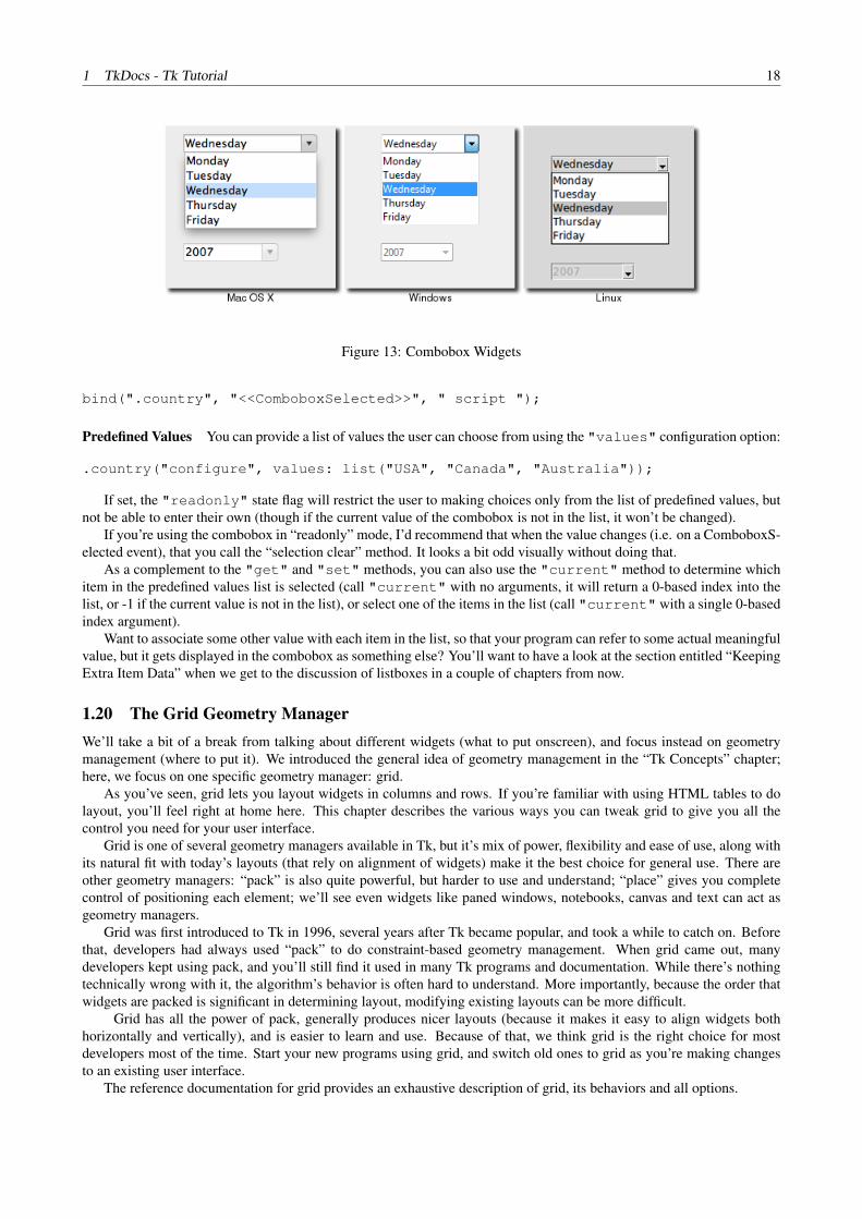
Figure 13: Combobox Widgets
bind(".country", "<<ComboboxSelected>>", " script ");
Predefined Values You can provide a list of values the user can choose from using the "values" configuration option:
.country("configure", values: list("USA", "Canada", "Australia"));
If set, the "readonly" state flag will restrict the user to making choices only from the list of predefined values, butnot be able to enter their own (though if the current value of the combobox is not in the list, it won’t be changed).
If you’re using the combobox in “readonly” mode, I’d recommend that when the value changes (i.e. on a ComboboxS-elected event), that you call the “selection clear” method. It looks a bit odd visually without doing that.
As a complement to the "get" and "set" methods, you can also use the "current" method to determine whichitem in the predefined values list is selected (call "current" with no arguments, it will return a 0-based index into thelist, or -1 if the current value is not in the list), or select one of the items in the list (call "current" with a single 0-basedindex argument).
Want to associate some other value with each item in the list, so that your program can refer to some actual meaningfulvalue, but it gets displayed in the combobox as something else? You’ll want to have a look at the section entitled “KeepingExtra Item Data” when we get to the discussion of listboxes in a couple of chapters from now.
1.20 The Grid Geometry ManagerWe’ll take a bit of a break from talking about different widgets (what to put onscreen), and focus instead on geometrymanagement (where to put it). We introduced the general idea of geometry management in the “Tk Concepts” chapter;here, we focus on one specific geometry manager: grid.
As you’ve seen, grid lets you layout widgets in columns and rows. If you’re familiar with using HTML tables to dolayout, you’ll feel right at home here. This chapter describes the various ways you can tweak grid to give you all thecontrol you need for your user interface.
Grid is one of several geometry managers available in Tk, but it’s mix of power, flexibility and ease of use, along withits natural fit with today’s layouts (that rely on alignment of widgets) make it the best choice for general use. There areother geometry managers: “pack” is also quite powerful, but harder to use and understand; “place” gives you completecontrol of positioning each element; we’ll see even widgets like paned windows, notebooks, canvas and text can act asgeometry managers.
Grid was first introduced to Tk in 1996, several years after Tk became popular, and took a while to catch on. Beforethat, developers had always used “pack” to do constraint-based geometry management. When grid came out, manydevelopers kept using pack, and you’ll still find it used in many Tk programs and documentation. While there’s nothingtechnically wrong with it, the algorithm’s behavior is often hard to understand. More importantly, because the order thatwidgets are packed is significant in determining layout, modifying existing layouts can be more difficult.
Grid has all the power of pack, generally produces nicer layouts (because it makes it easy to align widgets bothhorizontally and vertically), and is easier to learn and use. Because of that, we think grid is the right choice for mostdevelopers most of the time. Start your new programs using grid, and switch old ones to grid as you’re making changesto an existing user interface.
The reference documentation for grid provides an exhaustive description of grid, its behaviors and all options.

1 TkDocs - Tk Tutorial 19
1.20.1 Columns and Rows
Using grid, widgets are assigned a "column" number and a "row" number, which indicates their relative position toeach other. All widgets in the same column will therefore be above or below each other, while those in the same row willbe to the left or right of each other.
Column and row numbers must be integers, with the first column and row starting at 0. You can leave gaps in columnand row numbers (e.g. column 0, 1, 2, 10, 11, 12, 20, 21), which is handy if you plan to add more widgets in the middleof the user interface at a later time.
The width of each column (or height of each row) depends on the width or height of the widgets contained within thecolumn or row. This means when sketching out your user interface, and dividing it into rows and columns, you don’t needto worry about each column or row being equal width.
1.20.2 Spanning Multiple Cells
Widgets can take up more than a single cell in the grid; to do this, you’ll use the "columnspan" and "rowspan"options when gridding the widget. These are analogous to the “colspan” and “rowspan” attribute of HTML tables.
Here is an example of creating a user interface that has multiple widgets, some that take up more than a single cell.
Figure 14: Griddingmultiple widgets
int one = 1, two = 2, three = 3;ttk::frame(".c");ttk::frame(".c.f", borderwidth: 5, relief: "sunken", width: 200, height: 100);ttk::label(".c.namelbl", text: "Name");ttk::entry(".c.name");ttk::checkbutton(".c.one", text: "One", variable: "one", onvalue: 1);ttk::checkbutton(".c.two", text: "Two", variable: "two", onvalue: 1);ttk::checkbutton(".c.three", text: "Three", variable: "three", onvalue: 1);ttk::button(".c.ok", text: "Okay");ttk::button(".c.cancel", text: "Cancel");
grid(".c", column: 0, row: 0);grid(".c.f", column: 0, row: 0, columnspan: 3, rowspan: 2);grid(".c.namelbl", column: 3, row: 0, columnspan: 2);grid(".c.name", column: 3, row: 1, columnspan: 2);grid(".c.one", column: 0, row: 3);grid(".c.two", column: 1, row: 3);grid(".c.three", column: 2, row: 3);grid(".c.ok", column: 3, row: 3);grid(".c.cancel", column: 4, row: 3);
1.20.3 Layout within the Cell
Because the width of a column (and height of a row) depends on all the widgets that have been added to it, the odds arethat at least some widgets will have a smaller width or height than has been allocated for the cell its been placed in. Sothe question becomes, where exactly should it be put within the cell?
By default, if a cell is larger than the widget contained in it, the widget will be centered within it, both horizontallyand vertically, with the master’s background showing in the empty space around it. The "sticky" option can be usedto change this default behavior.

1 TkDocs - Tk Tutorial 20
The value of the "sticky" option is a string of 0 or more of the compass directions “nsew”, specifying which edgesof the cell the widget should be “stuck” to. So for example, a value of "n" (north) will jam the widget up against thetop side, with any extra vertical space on the bottom; the widget will still be centered horizontally. A value of "nw"(north-west) means the widget will be stuck to the top left corner, with extra space on the bottom and right.
Specifying two opposite edges, such as "we" (west, east) means that the widget will be stretched, in this case so it isstuck both to the left and right edge. So the widget will then be wider than its “ideal” size. Most widgets have options thatcan control how they are displayed if they are larger than needed. For example, a label widget has an "anchor" optionwhich controls where the text of the label will be positioned.
If you want the widget to expand to fill up the entire cell, grid it with a sticky value of "nsew" (north, south, east,west) meaning it will stick to every side.
1.20.4 Handling Resize
If you’ve taken a peek below and added the extra "sticky" options to our example, when you try it out you’ll noticethings still don’t look quite right (the entry is lower on the screen then we’d want), and things are even worse if you try toresize the window — nothing moves at all!
It looks like “sticky” may tell Tk how to react if the cell’s row or column does resize, but doesn’t actually say that therow or columns should resize if extra room becomes available. Let’s fix that.
Every column and row has a "weight" grid option associated with it, which tells it how much it should grow if thereis extra room in the master to fill. By default, the weight of each column or row is 0, meaning don’t expand to fill space.
For the user interface to resize then, we’ll need to give a positive weight to the columns we’d like to expand. This isdone using the "columnconfigure" and "rowconfigure"methods of grid. If two columns have the same weight,they’ll expand at the same rate; if one has a weight of 1, another of 3, the latter one will expand three pixels for every onepixel added to the first.
Both "columnconfigure" and "rowconfigure" also take a "minsize" grid option, which specifies a min-imum size which you really don’t want the column or row to shrink beyond.
1.20.5 Padding
Normally, each column or row will be directly adjacent to the next, so that widgets will be right next to each other. Thisis sometimes what you want (think of a listbox and its scrollbar), but often you want some space between widgets. In Tk,this is called padding, and there are several ways you can choose to add it.
We’ve already actually seen one way, and that is using a widget’s own options to add the extra space around it. Notall widgets have this, but one that does is a frame; this is useful because frames are most often used as the master to gridother widgets. The frame’s "padding" option lets you specify a bit of extra padding inside the frame, whether the sameamount for each of the four sides, or even different for each.
A second way is using the "padx" and "pady" grid options when adding the widget. As you’d expect, "padx"puts a bit of extra space to the left and right of the widget, while "pady" adds extra space top and bottom. A single valuefor the option puts the same padding on both left and right (or top and bottom), while a two value list lets you put differentamounts on left and right (or top and bottom). Note that this extra padding is within the grid cell containing the widget.
If you want to add padding around an entire row or column, the "columnconfigure" and "rowconfigure"methods accept a "pad" option, which will do this for you.
Let’s add the extra sticky, resizing, and padding behavior to our example.
int one = 1, two = 2, three = 3;ttk::frame(".c", padding: "3 3 12 12");ttk::frame(".c.f", borderwidth: 5, relief: "sunken", width: 200, height: 100);ttk::label(".c.namelbl", text: "Name");ttk::entry(".c.name");ttk::checkbutton(".c.one", text: "One", variable: &one, onvalue: 1);ttk::checkbutton(".c.two", text: "Two", variable: &two, onvalue: 1);ttk::checkbutton(".c.three", text: "Three", variable: &three, onvalue: 1);ttk::button(".c.ok", text: "Okay");ttk::button(".c.cancel", text: "Cancel");
grid(".c", column: 0, row: 0, sticky: "nsew");grid(".c.f", column: 0, row: 0, columnspan: 3, rowspan: 2, sticky: "nsew");grid(".c.namelbl", column: 3, row: 0, columnspan: 2, sticky: "nw", padx: 5);grid(".c.name", column: 3, row: 1, columnspan: 2, sticky: "new", pady: 5, padx: 5);

1 TkDocs - Tk Tutorial 21
grid(".c.one", column: 0, row: 3);grid(".c.two", column: 1, row: 3);grid(".c.three", column: 2, row: 3);grid(".c.ok", column: 3, row: 3);grid(".c.cancel", column: 4, row: 3);
grid("columnconfigure", ".", 0, weight: 1);grid("rowconfigure", ".", 0, weight: 1);grid("columnconfigure", ".c", 0, weight: 3);grid("columnconfigure", ".c", 1, weight: 3);grid("columnconfigure", ".c", 2, weight: 3);grid("columnconfigure", ".c", 3, weight: 1);grid("columnconfigure", ".c", 4, weight: 1);grid("rowconfigure", ".c", 1, weight: 1);
This looks more promising. Play around with the example to get a feel for the resize behavior.
Figure 15: Gridexample, handling in-cell layout and resize.
You’ll notice the little resize gadget at the very bottom right of the window; while we’re just taking the easy route andavoiding it with the extra padding, we’ll see later how to better take it into account using a “sizegrip” widget.
1.20.6 Additional Grid Features
As you could see from the grid reference, there are lots of other things you can do with grid. Here are a few of the moreuseful ones.
1.20.7 Querying and Changing Grid Options
Like widgets themselves, it’s easy to introspect the various grid options, as well as change them; setting options when youfirst grid the widget is just a convenience, and you can certainly change them anytime you’d like.
The "slaves" method will tell you all the widgets that have been gridded inside a master, or optionally those withinjust a certain column or row. The "info" method will give you a list of all the grid options for a widget and their values.Finally, the "configure" method lets you change one or more grid options on a widget.
These are illustrated in this interactive session: (NOTE: Interactive mode not working yet).
% grid("slaves", ".c");.c.cancel .c.ok .c.three .c.two .c.one .c.name .c.namelbl .c.f% grid("slaves", ".c", row: 3);.c.cancel .c.ok .c.three .c.two .c.one% grid("slaves", ".c", column: 0);.c.one .c.f% grid("info", ".c.namelbl");-in .c -column 3 -row 0 -columnspan 2 -rowspan 1 -ipadx 0
-ipady 0 -padx 5 -pady 0 -sticky nw% grid("configure", ".c.namelbl", sticky: "ew");% grid("info", ".c.namelbl");
1 TkDocs - Tk Tutorial 22
-in .c -column 3 -row 0 -columnspan 2 -rowspan 1 -ipadx 0-ipady 0 -padx 5 -pady 0 -sticky ew
1.20.8 Internal Padding
You saw how the "padx" and "pady" grid options added extra space around the outside of a widget. There’s also aless used type of padding called “internal padding”, which is controlled by the grid options "ipadx" and "ipady".
The difference can be subtle. Let’s say you have a frame that’s 20x20, and specify normal (external) padding of 5pixels on each side. The frame will request a 20x20 rectangle (its natural size) from the geometry manager. Normally,that’s what it will be granted, so it’ll get a 20x20 rectangle for the frame, surrounded by a 5 pixel border.
With internal padding, the geometry manager will effectively add the extra padding to the widget when figuring outits natural size, as if the widget has requested a 30x30 rectangle. If the frame is centered, or attached to a single side orcorner (using "sticky"), you’ll end up with a 20x20 frame with extra space around it. If however the frame is set tostretch (i.e. a "sticky" value of "we", "ns", or "nwes") it will fill the extra space, resulting in a 30x30 frame, withno border.
1.20.9 Forget and Remove
The "forget" method of grid, taking as arguments a list of one or more slave widgets, can be used to remove slavesfrom the grid they’re currently part of. This does not destroy the widget altogether, but takes it off the screen, as if it hadnot been gridded in the first place. You can grid it again later, though any grid options you’d originally assigned will havebeen lost.
The "remove" method of grid works the same, except that the grid options will be remembered.
1.20.10 Nested Layouts
As your user interface gets more complicated, the grid that you’re using to organize all your widgets can get more andmore complicated, and more fine-grained. This can make changing and maintaining your program very difficult.
Luckily, you don’t have to manage your entire user interface with a single grid. If you have one area of your userinterface that is fairly independent of others, create a new frame to hold that area, and grid the widgets that are part of thatarea within that frame. If you had a graphics program of some kind with multiple palletes, toolbars, and so on, each oneof those areas might be a candidate for putting in its own frame.
In theory, these frames, each with its own grid, can be nested arbitrarily deep, though in practice this usually doesn’tgo beyond a few levels. This can be a big help in modularizing your program. If for example you have a pallete of drawingtools, you can create the whole thing in a separate procedure, including creating all the component widgets, gridding themtogether, setting up event bindings, and so on. From the point of view of your main program, all it needs to see is thesingle frame widget containing it all.
Our examples have shown just a hint of this, where a content frame was gridded into the main window, and then allthe other widgets gridded into the content frame.
This chapter carries on introducing several more widgets: listbox, scrollbar, text, progressbar, scale and spinbox.Some of these are starting to be a bit more powerful than the basic ones we looked at before. Here we’ll also see a fewinstances of using the classic Tk widgets, in instances where there isn’t (or there isn’t a need for) a themed counterpart.
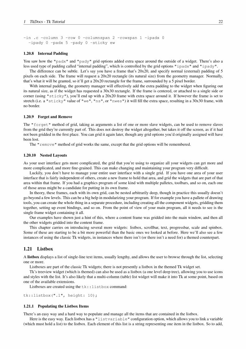
1.21 ListboxA listbox displays a list of single-line text items, usually lengthy, and allows the user to browse through the list, selectingone or more.
Listboxes are part of the classic Tk widgets; there is not presently a listbox in the themed Tk widget set.Tk’s treeview widget (which is themed) can also be used as a listbox (a one level deep tree), allowing you to use icons
and styles with the list. It’s also likely that a multi-column (table) list widget will make it into Tk at some point, based onone of the available extensions.
Listboxes are created using the tk::listbox command:
tk::listbox(".l", height: 10);
1.21.1 Populating the Listbox Items
There’s an easy way and a hard way to populate and manage all the items that are contained in the listbox.Here is the easy way. Each listbox has a "listvariable" configuration option, which allows you to link a variable
(which must hold a list) to the listbox. Each element of this list is a string representing one item in the listbox. So to add,

1 TkDocs - Tk Tutorial 23
Figure 16: ListboxWidgets
remove, or rearrange items in the listbox, you can simply manipulate this variable as you would any other list. Similarly,to find out which item is on the third line of the listbox, just look at the third element of the list variable.
Unfortunately, you can’t pass a reference to a Perl list for this “listvariable” parameter. It actually requires a Tclformatted list, which is a string with elements separated by spaces, and braces around all but the simplest elements. So,you’ll need to do the conversion yourself. There’s a simple one-liner in the upcoming example that handles convertingfairly simple lists, but for unknown data you’ll need something more robust.
The reason there is a hard way at all is because the "listvariable" option was only introduced in Tk 8.3. Beforethat, you were stuck with the hard way. Because using the list variable lets you use all the standard list operations, itprovides a much simpler API, and is certainly an upgrade worth considering if you have listboxes doing things the olderway.
The older, harder way to do things is use a set of methods that are part of the listbox widget itself that operate on the(internal) list of items:
• The "insert idx item ?item... ?" method is used to add one or more items to the list; "idx" is a0-based index indicating the position of the item before which the item(s) should be added; specify "end" to putthe new items at the end of the list.
• Use the "delete first ?last?" method to delete one or more items from the list; "first" and "last"are indices as per the "insert" method.
• Use the "get first ?last?" method to return the contents of a single item at the given position, or a list ofthe items between "first" and "last".
• The "size" method returns the number of items in the list.
1.21.2 Selecting Items
The first thing you need to decide is whether it is possible for the user to select only a single item at a time, or if multipleitems can simultaneously be selected. This is controlled by the "selectmode" option: the default is only being able toselect a single item ("browse"), while a selectmode of "extended" allows the user to select multiple items.
The names "browse" and "extended", again for backwards compatibility reasons, are truly awful. This is madeworse by the fact that there are two other modes, "single" and "multiple" which you should not use (they use anold interaction style that is inconsistent with modern user interface and platform conventions).
To find out which item or items in the listbox the user has currently selected, use the "curselection" method,which will return the list of indices of all items currently selected; this may be an empty list, and for lists with aselectmode of "browse", will never be longer than one item. You can also use the "selection includesindex" method to check if the item with the given index is currently selected.
To programmatically change the selection, you can use the "selection clear first ?last?" method todeselect either a single item, or any within the range of indices specified. To select an item, or all items in a range, usethe "selection set first ?last?" method. Both of these will not touch the selection of any items outside therange specified.
If you do change the selection, you should also make sure that the newly selected item is visible to the user (i.e. it isnot scrolled out of view). To do this, use the "see index" method.
When the selection is changed by the user, a "<ListboxSelect>" virtual event is generated. You can bind to thisto take any action you need. Depending on your application, you may also want to bind to a double-click "Double-1"event, and use it to invoke an action with the currently selected item.

1 TkDocs - Tk Tutorial 24
1.21.3 Stylizing the List
Like most of the “classic” Tk widgets, you have immense flexibility in modifying the appearance of a listbox. As de-scribed in the reference manual, you can modify the font the listbox items are displayed in, the foreground (text) andbackground colors for items in their normal state, when selected, when the widget is disabled, and so on. There is also an"itemconfigure" method which allows you to change the foreground and background colors of individual items.
As is often the case, restraint is useful. Generally, the default values will be entirely suitable, and a good match forplatform conventions. In the example we’ll get to momentarily, we’ll show how restrained use of these options can be putto good effect, in this case displaying alternate lines of the listbox in slightly different colors.
1.21.4 Keeping Extra Item Data
The "listvariable" (or the internal list, if you’re managing things the old way) contains the strings that will beshown in the listbox. It’s very often the case though that each string in your program is associated with some other dataitem, and what you’re really interested in is not so much the string displayed in the listbox, but the associated data item.For example, a listbox containing names may be what is presented to the user, but your program is really interested in theuser object (or id number) that is selected, not the particular name.
How can we associate this value with the displayed name? Unfortunately, the listbox widget itself doesn’t offer anyfacilities, so it’s something we’ll have to manage separately. There are a couple of obvious approaches. First, if thedisplayed strings are guaranteed unique, you could use a hash table to map the names to the associated object. So, giventhe name you can easily get the associated object. This probably wouldn’t work well for doing names, but could work forchoosing countries for example.
A second approach is to keep a second list, parallel to the list of strings displayed in the listbox, which will hold theassociated objects. So the first item in the strings list corresponds to the first item in the objects list, the second to thesecond, and so on. Any changes you make in one list (insert, delete, reorder) you need to make in the other. You can theneasily map from the list item to the underlying object, based on their position in the list.
1.21.5 Example
Here is a silly example showing these various listbox techniques. We’ll have a list of countries displayed. Behind thescenes, we have a database (a simple hash table) which contains the population of each country, indexed by the twoletter country code. We’ll be able to select only a single country at a time, and as we do so, a status bar will displaythe population of the country. Double-clicking on the list, or hitting the Return key, will send one of several gifts to theselected country’s head of state (well, not really, but use your imagination).
Figure 17: CountrySelector Listbox Example
#!/usr/local/bin/L
/*Initialize our country "databases":- the list of country codes (a subset anyway)- a parallel list of country names, in the same order as the country codes- a hash table mapping country code to population<
*/string countrycodes[] =

1 TkDocs - Tk Tutorial 25
{"ar", "au", "be", "br", "ca", "cn", "dk", "fi","fr", "gr", "in", "it", "jp", "mx", "nl", "no","es", "se", "ch"};
string countrynames[] ={"Argentina", "Australia", "Belgium", "Brazil", "Canada","China", "Denmark", "Finland", "France", "Greece", "India","Italy", "Japan", "Mexico", "Netherlands", "Norway", "Spain","Sweden", "Switzerland"};
int populations{string} ={"ar"=>41000000, "au"=>21179211, "be"=>10584534, "br"=>185971537,"ca"=>33148682, "cn"=>1323128240, "dk"=> 5457415, "fi"=>5302000,"fr"=>64102140, "gr"=>11147000, "in"=>1131043000, "it"=>59206382,"jp"=>127718000, "mx"=>106535000, "nl"=>16402414, "no"=>4738085,"es"=>45116894, "se"=>9174082, "ch"=>7508700};
// Names of the gifts we can sendstring gifts{string} =
{"card"=>"Greeting card", "flowers"=>"Flowers","nastygram"=>"Nastygram"};
widget lbox; // .c.countriesstring gift, sentmsg, statusmsg;
// Create and grid the outer content framegrid(ttk::frame(".c", padding: "5 5 12 0"), column: 0, row: 0, sticky: "nwes");grid("columnconfigure", ".", 0, weight: 1);grid("rowconfigure", ".", 0, weight: 1);
/*Create the different widgets; note the variables that manyof them are bound to, as well as the button callback.The listbox is the only widget we’ll need to refer to directlylater in our program, so for convenience we’ll assign it to a variable.
*/
lbox = tk::listbox(".c.countries", listvariable: &countrynames, height: 5);ttk::label(".c.lbl", text: "Send to country’s leader:");ttk::radiobutton(".c.g1", text: gifts{"card"}, variable: &gift, value: "card");ttk::radiobutton(".c.g2", text: gifts{"flowers"}, variable: &gift, value: "flowers");ttk::radiobutton(".c.g3", text: gifts{"nastygram"}, variable: &gift, value: "nastygram");ttk::button(".c.send", text: "Send Gift", command: &sendGift, default: "active");ttk::label(".c.sentlbl", textvariable: &sentmsg, anchor: "center");ttk::label(".c.status", textvariable: &statusmsg, anchor: "w");
// Grid all the widgetsgrid(".c.countries", column: 0, row: 0, rowspan: 6, sticky: "nsew");grid(".c.lbl", column: 1, row: 0, padx: 10, pady: 5);grid(".c.g1", column: 1, row: 1, sticky: "w", padx: 20);grid(".c.g2", column: 1, row: 2, sticky: "w", padx: 20);grid(".c.g3", column: 1, row: 3, sticky: "w", padx: 20);grid(".c.send", column: 2, row: 4, sticky: "e");grid(".c.sentlbl", column: 1, row: 5, columnspan: 2, sticky: "n", pady: 5, padx: 5);grid(".c.status", column: 0, row: 6, columnspan: 2, sticky: "we");grid("columnconfigure", ".c", 0, weight: 1); grid("rowconfigure", ".c", 5, weight: 1);
// Set event bindings for when the selection in the listbox changes,// when the user double clicks the list, and when they hit the Return keybind(lbox, "<<ListboxSelect>>", &showPopulation);bind(lbox, "<Double-1>", &sendGift);bind(".", "<Return>", &sendGift);
/*Called when the selection in the listbox changes; figure out

1 TkDocs - Tk Tutorial 26
which country is currently selected, and then lookup its countrycode, and from that, its population. Update the status messagewith the new population. As well, clear the message about thegift being sent, so it doesn’t stick around after we start doingother things.
*/void showPopulation() {
int idx[] = .c.countries("curselection");if (length(idx) == 1) {string code = countrycodes[idx[0]];string name = countrynames[idx[0]];int popn = populations{code};statusmsg = "The population of ${name} (${code}) is ${popn}";
}sentmsg = "";
}
/*Called when the user double clicks an item in the listbox, pressesthe "Send Gift" button, or presses the Return key. In case the selecteditem is scrolled out of view, make sure it is visible.
Figure out which country is selected, which gift is selected with theradiobuttons, "send the gift", and provide feedback that it was sent.
*/void sendGift() {
int idx[] = .c.countries("curselection");if (length(idx) == 1) {string name = countrynames[idx[0]];sentmsg = "Sent ${gifts{gift}} to leader of ${name}";
}}
// Colorize alternating lines of the listbox{int i;
for (i = 0; i< length(countrynames); i = i+2) {.c.countries("itemconfigure", i, background: "#f0f0ff");
}}
/*Set the starting state of the interface, including selecting thedefault gift to send, and clearing the messages. Select the firstcountry in the list; because the <<ListboxSelect>> event is onlygenerated when the user makes a change, we explicitly call showPopulation.
*/gift = "card";sentmsg = "";statusmsg = "";.c.countries("selection", "set", 0);showPopulation();
One obvious thing missing from this example was that while the list of countries could be quite long, only part of it fiton the screen at once. To show countries further down in the list you had to either drag with your mouse or use the downarrow key. A scrollbar would have been nice. Let’s fix that.
1.22 ScrollbarA scrollbar helps the user to see all parts of another widget, whose content is typically much larger than what can beshown in the available screen space.
Scrollbars are created using the ttk::scrollbar command:

1 TkDocs - Tk Tutorial 27
Figure 18: Scrollbar Widgets
ttk::scrollbar(".s", orient: "vertical", command: ".l yview");.l("configure", yscrollcommand: ".s set");
Unlike in some toolkits, scrollbars are not a part of another widget (e.g. a listbox), but are a separate widget altogether.Instead, scrollbars communicate with the scrolled widget by calling methods on the scrolled widget; as it turns out, thescrolled widget also needs to call methods on the scrollbar.
If you’re using a recent Linux distribution, you’ve probably noticed that the scrollbars you see in many applicationshave changed to look more like what you’d see on Mac OS X. This newer look isn’t supported yet in Tk.
The "orient" configuration option of scrollbars determines whether it will be used to scroll in the "horizontal"or "vertical". You then need to set up the "command" configuration option to communicate with the scrolled widget.This needs to be the method to call on the scrolled widget.
Every widget that can be scrolled vertically includes a method named "yview" (those that can be scrolled horizon-tally have a method named "xview"). As long as this method is present, the scrollbar doesn’t need to know anything elseabout the scrolled widget. When the scrollbar is manipulated, it will tack on some number of parameters to the methodcall, indicating how it was scrolled, to what position, etc.
The scrolled widget also needs to communicate back to the scrollbar, telling it what percentage of the entire contentarea is now visible. Besides the yview and/or xviewmethods, every scrollable widget also has a "yscrollcommand"and/or "xscrollcommand" configuration option. This is used to specify a method call, which must be the scrollbar’s"set" method. Again, additional parameters will be automatically tacked onto the method call.
If for some reason you want to move the scrollbar to a particular position from within your program, you can call the"set first last" method yourself. Pass it two values between 0 and 1 indicating the start and end percentage ofthe content area that is visible.
1.22.1 Example
Listboxes are one of several types of widgets that are scrollable. Here we’ll build a very simple user interface, consistingjust of a vertically scrollable listbox that takes up the entire window, with just a status line at the bottom.
Figure 19: Scrollinga Listbox

1 TkDocs - Tk Tutorial 28
grid(tk::listbox(".l", yscrollcommand: ".s set", height: 5),column: 0, row: 0, sticky: "nwes");
grid(ttk::scrollbar(".s", command: ".l yview", orient: "vertical"),column: 1, row: 0, sticky: "ns");
grid(ttk::label(".stat", text: "Status message here", anchor: "w"),column: 0, row: 1, sticky: "we");
grid(ttk::sizegrip(".sz"),column: 1, row: 1, sticky: "se");
grid("columnconfigure", ".", 0, weight: 1);grid("rowconfigure", ".", 0, weight: 1);{
int i;for (i = 0; i < 100; i++)
.l("insert", "end", "Line ${i} of 100");}
1.23 SizeGripWe actually snuck in one new widget in that last example, the sizegrip. This is the little box at the bottom right corner ofthe window that allows you to resize it.
Figure 20: SizeGrip Widgets
SizeGrips are created using the ttk::sizegrip command:
grid(ttk::sizegrip(".sz"), column: 999, row: 999, sticky: "se");
While you’ll notice that on some platforms (e.g. Mac OS X), Tk will automatically put the size grip there for you, itdoesn’t hurt to explicitly add it yourself. We’ll discuss how to change the window size, determine if it’s resizable, etc. ina later chapter.
Platform conventions tend to evolve faster than long-lived open source GUI toolkits. Mac OS X 10.7 did away withthe size grip in the corner, in favour of allowing resizing from any window edge, finally catching up with the rest of theworld. It’s therefore best to check the operating system version you’re running before adding the sizegrip.
1.24 TextA text widget provides users with an area so that they can enter multiple lines of text. Text widgets are part of the classicTk widgets, not the themed Tk widgets.
Tk’s text widget is, along with the canvas widget, one of two uber-powerful widgets that provide amazingly deep buteasily programmed features. Text widgets have formed the basis for full word processors, outliners, web browsers andmore. We’ll get into some of the advanced stuff in a later chapter, but here we’ll just show you what you need to use thetext widget to capture fairly simple, multi-line text input.
Text widgets are created using the tk::text command:
tk::text(".t", width: 40, height: 10);
The "width" and "height" options specify the requested screen size of the text widget, in characters and rowsrespectively. The contents of the text can be arbitrarily large. You can use the "wrap" configuration option to control how

1 TkDocs - Tk Tutorial 29
Figure 21: TextWidgets
line wrapping is handled: values are "none" (no wrapping, text may horizontally scroll), “char” (wrap at any character),and "word" (wrapping will only occur at word boundaries).
A text widget can be disabled so that no editing can occur; because text is not a themed widget, the usual "state" and"instate"methods are not available. Instead, use the configuration option "state", setting it to either "disabled"or "normal".
Scrolling works the same way as in listboxes. The "xscrollcommand" and "yscrollcommand" configurationoptions are available to attach the text widget to horizontal and/or vertical scrollbars, and the "xview" and "yview"methods are available to be called from scrollbars. To ensure that a given line is visible (i.e. not scrolled out of view), youcan use the "see index" method, where index is in the form “line number.character number”, e.g. "5.0" for thefirst (0-based) character of line 5 (1-based).
1.24.1 Contents
Text widgets do not have a linked variable associated with them, like for example entry widgets do. To retrieve the textcontent for the entire widget, call the method "get 1.0 end"; the "1.0" is an index into the text, and means the firstcharacter of the first line, and "end" is a shortcut for the index of the last character, last line. Other indices could bepassed to retrieve smaller ranges of text if needed.
Text can be added to the widget using the "insert index string" method; again index is in the form"line.char" and marks the character before which text is inserted; use "end" to add text to the end of the wid-get. You can delete a range of text using the "delete start end" method, where both start and end are textindices as already described.
We’ll get into the text widget’s many additional advanced features in a later chapter.
1.25 ProgressbarA progressbar widget provides a way to give feedback to the user about the progress of a lengthy operation. This maybe done either as a percentage complete display for operations where this can be estimated, or a display that changes toindicate the operation is continuing, but without an estimate of completion.
Figure 22: Progressbar Widgets
Progessbar widgets are created using the ttk::progressbar command:
ttk::progressbar(".p", orient: "horizontal", length: 200, mode: "determinate");

1 TkDocs - Tk Tutorial 30
The "orient" option may be either "horizontal" or "vertical". The "length" option, which representsthe longer axis of either horizontal or vertical progressbars, is specified in screen units (e.g. pixels). The "mode"configuration option can be set to either "determinate", where the progressbar will indicate relative progress towardscompletion, or to "indeterminate", where its not possible to know how far along in the task the program is, but westill want to provide feedback that things are still running.
1.25.1 Determinate Progess
In determinate mode, you’re able to provide more-or-less accurate feedback to the user about how far an operation hasprogressed. To do this, you need to first of all tell the progressbar how many “steps” the operation will take, and then asyou go along, tell the progressbar how far along the operation is.
You can provide the total number of steps to the progressbar using the "maximum" configuration option; this isa floating point number that defaults to 100 (i.e. each step is 1%). To tell the progressbar how far along you are in theoperation, you will repeatedly change the "value" configuration option. So this would start at 0, and then count upwardsto the maximum value you have set. There are two slight variations on this. First, you can just store the current valuefor the progressbar in a variable linked to it by the progressbar’s "variable" configuration option; that way, when youchange the variable, the progressbar will update. The other alternative is to call the progressbar’s "step ?amount?"method to increment the value by the given “amount” (defaults to 1.0).
1.25.2 Indeterminate Progress
Indeterminate mode is for when you’re not able to easily know (or estimate) how far along in a long running task youactually are, but still want to provide feedback to the user that the operation is still running (or that your program hasn’tcrashed). Rather than providing specific values to indicate progress along the way, at the start of the operation you’ll justcall the progressbar’s "start" method, and at the end of the operation, you’ll call its "stop" method. The progressbarwill take care of the rest.
1.26 ScaleA scale widget provides a way for users to choose a numeric value through direct manipulation.
Figure 23: ScaleWidgets
Scale widgets are created using the ttk::scale command:
ttk::scale(".s", orient: "horizontal", length: 200, from: 1.0, to: 100.0);
In some ways, scale widgets are like progressbars, except they are designed for the user to manipulate them. As withprogressbars, they should be given an orientation (horizontal or vertical) with the "orient" configuration option, andan optional "length". You should also define the range of the number that the scale allows users to choose; to do this,set a floating point number for each of the "from" and "to" configuration options.
There are several different ways you can set the current value of the scale (which must be a floating point value betweenthe "from" and "to" values). You can set (or read, to get the current value) the scale’s "value" configuration option.You can link the scale to a variable using the "variable" option. Or, you can call the scale’s "set value" methodto change the value, or the "get" method to read the current value.

1 TkDocs - Tk Tutorial 31
There is a "command" configuration option, which lets you specify a script to call whenever the scale is changed. Tkwill automatically append the current value of the scale as a parameter each time it invokes this script (we saw a similarthing with extra parameters being added to scrollbar callbacks and those on the widgets they scroll).
As with other themed widgets, you can use the "state disabled", "state !disabled" and "instatedisabled" methods if you wish to prevent the user from modifying the scale.
As the scale widget does not display the actual values, you may want to add those as labels.
1.27 SpinboxA spinbox widget allows users to choose numbers (or in fact, items from an arbitrary list). It does this by combining anentry-like widget showing the current value with a pair of small up/down arrows which can be used to step through therange of possible choices.
Spinboxes are part of the classic Tk widgets. There is not presently a spinbox in the themed Tk widget set.That last statement is not entirely accurate. A themed spinbox widget was in fact added in Tk 8.5.9. So if your code
just assumes 8.5 (as this tutorial does), you can’t rely on it. It may be worth checking to see if you’re running 8.5.9 orhigher, and if so, use the themed version. But as with other themed widgets, the API is slightly different than the classicwidget.
Figure 24: SpinboxWidgets
Spinbox widgets are created using the tk::spinbox command:
tk::spinbox(".s", from: 1.0, to: 100.0, textvariable: &spinval);
Like scale widgets, spinboxes are normally used to let the user choose a number between a certain range (specifiedusing the "from" and "to" configuration options), though through a very different user interface. You can also specifya "increment", which controls how much the value changes everytime you click the up or down button.
Like a listbox or combobox, spinboxes can also be used to let the user choose an item from an arbitrary list of strings;these can be specified using the "values" configuration option, which works in the same was as in comboboxes.Specifying a list of values will override to "from" and "to" settings.
You might be puzzled about when to choose a scale, listbox, combobox, entry or a spinbox, since usually several ofthese can be used for the same types of data. The answer really depends on the type of data you want the user to select,platform user interface conventions, and the role the value plays in your user interface.
For example, both a combobox and a spinbox have the benefit of taking up fairly small amounts of space, whichmight make sense for a more peripheral setting, where the primary choice in a user interface may warrant the extra spacea listbox occupies. Spinboxes don’t make much sense when items don’t have a natural and obvious ordering to them. Youshould be careful about both comboboxes and spinboxes that have too many items in them, which can make it more timeconsuming to select an item.
Both a numeric and arbitrary range, there is a "wrap" option which accepts a boolean, and determines whether thevalue should wrap around when it goes beyond the starting or ending values. You can also specify a "width" for theentry holding the current value of the spinbox.
Again there are choices as to how to set or get the current value in the spinbox. Normally, you would specify a linkedvariable with the "textvariable" configuration option; as usual, any changes to the variable are reflected in thespinbox, while any changes in the spinbox are reflected in the linked variable. As well, the "set value" and "get"methods allow you to set or get the value directly.
You can arranged to be called whenever the spinbox changes using the "command" configuration option.The command has a couple of percent substitutions, %s = current value, and %d = up or down. Need to figure out the
right way to specify this in Ruby. Also need to add stuff about validation.

1 TkDocs - Tk Tutorial 32
Because spinbox is not a themed widget, the "state" and "instate" methods are not available. Instead, youcan change its state using the "state" configuration option. This may be "normal", "disabled" to prevent anychanges.
This chapter describes how to handle menubars and popup menus in Tk. For a polished application, these are areas youparticularly want to pay attention to. Menus need special care if you want your application to fit in with other applicationson your users’ platform.
Speaking of which, the recommended way to figure out which platform you’re running on is:
tk("windowingsystem"); // will return x11, win32 or aqua
This is probably more useful than examining global variables like tcl_platform or RUBY_PLATFORM, and olderchecks that used these methods should be examined. While in the olden days there was a pretty good correlation betweenplatform and windowing system, it’s less true today. For example, if your platform is identified on Unix, that might meanLinux under X11, Mac OS X under Aqua, or even Mac OS X under X11.
1.28 MenubarsIn this section we’ll look at menubars: how to create them, what goes in them, how they’re used, and so on.
Properly designing a menubar and its set of menus is beyond the scope of this tutorial, but a few pieces of advice.First, if you find yourself with a large number of menus, very long menus, or deeply nested menus, you may need torethink how your user interface is organized. Second, many people use the menus to explore what the program can do,particularly when they’re first learning it, so try to ensure major features are accessible by the menus. Finally, for eachplatform you’re targeting, become familiar with how applications use menus, and consult the platform’s human interfaceguidelines for full details about design, terminology, shortcuts, and much more. This is an area you will likely have tocustomize for each platform.
You’ll notice on some recent Linux distributions that many applications show their menus at the top of the screenwhen active, rather than in the window itself. Tk does not yet support this style of menus.
1.28.1 Menu Widgets and Hierarchy
Menus are implemented as widgets in Tk, just like buttons and entries. Each menu widget consists of a number of differentitems in the menu. Items are things like the “Open. . . ” command in a File menu, but also separators between other items,and items which open up their own submenu (so-called cascading menus). Each of these menu items also has attributes,such as the text to display for the item, a keyboard accelerator, and a command to invoke.
Menus are arranged in a hierarchy. The menubar is itself a menu widget. It has several children (submenus) consistingof items like “File”, “Edit” and so on. Each of those in turn is a menu containing different items, some of which mightthemselves contain submenus. As you’d expect from other things you’ve seen already in Tk, anytime you have a submenu,it must be created as a child of its parent menu.
1.28.2 Before you Start
It’s important to put the following line in your application somewhere before you start creating menus.Without it, each of your menus (on Windows and X11) will start with what looks like a dashed line, and allows you to
“tear off” the menu so it appears in its own window. You really don’t want that there.This is a throw-back to the Motif-style X11 that Tk’s original look and feel were based on. Unless your application is
designed to run on that old box collecting dust in the basement, you really don’t want to see this, as its not a part of anymodern user interface style.
And we’ll all be looking forward to a version of Tk where this backwards compatibility is not preserved, and thedefault is not to have these tear-off menus.
1.28.3 Creating a Menubar
In Tk, menubars are associated with individual windows; each toplevel window can have at most one menubar. OnWindows and X11, this is visually obvious, as the menus are part of each window, sitting just below the title bar at thetop.
On Mac OS X though, there is a single menubar along the top of the screen, shared by each window. As far asyour Tk program is concerned, each window still does have its own menubar; as you switch between windows, Tk willautomatically take care of making sure that the correct menubar is displayed at the top of the screen. If you don’t specifya menubar for a particular window, Tk will use the menubar associated with the root window; you’ll have noticed by nowthat this is automatically created for you when your Tk application starts.

1 TkDocs - Tk Tutorial 33
Because on Mac OS X all windows have a menubar, it’s important to make sure you do define one, either for eachwindow or a fallback menubar for the root window. Otherwise, you’ll end up with the “built-in” menubar, which containsmenus that are only intended for use when typing commands directly into the interpreter.
To actually create a menubar for a window, we first create a menu widget, and then use the window’s "menu"configuration option to attach the menu widget to the window.
toplevel(".win");menu(".win.menubar");.win("configure", menu: ".win.menubar");
Note that you can use the same menubar for more than one window (i.e. use one menubar as the value of the“menu” configuration option for different toplevel windows). This is particularly useful on Windows and X11, whereyou may want a window to include a menu, but don’t necessarily need to juggle different menus in your application. Butremember, if the contents or state of the menubar depend on what’s going on in the active window, you’ll have to dealwith that yourself.
This is truly ancient history, but menubars used to be done by creating a frame widget containing the menu items,and packing it into the top of the window like you would any other widget. Hopefully you don’t have any code ordocumentation that still does this.
1.28.4 Adding Menus
We now have a menubar, but that’s pretty useless without some menus to go in it. So again, we’ll want to create a menuwidget for each menu that will go in the menubar (each one a child of the menubar), and then add them all to the menubar.
widget m, file, edit;toplevel(".win");m = menu(".win.menubar");.win("configure", menu: m);file = menu("${m}.file");edit = menu("${m}.edit");eval(m, "add", "cascade", menu: file, label: "File");eval(m, "add", "cascade", menu: edit, label: "Edit");
1.28.5 Adding Menu Items
Now that we have a couple of menus in our menubar, it’s probably a good time to add a few items to each menu. Rememberthat menu items are part of the menu itself, so we thankfully don’t have to go and create another menu widget for eachone.
eval(m.file, "add", "command", label: "New", command: "newFile");eval(m.file, "add", "command", label: "Open...", command: "openFile");eval(m.file, "add", "command", label: "Close", command: "closeFile");
On Mac OS X, the ellipsis (“. . . ”) is actually a special character, which is more tightly spaced than three periods in arow. Tk takes care of substituting this character for you automatically.
So adding menu items to a menu is essentially the same as adding a submenu, but rather than adding a menu item oftype “cascade”, we’re adding one of type “command”.
Each menu item has associated with it a number of configuration options, in the same way widgets do, though eachmenu item type has a different set of relevant options. Cascade menu items have a "menu" option used to specify thesubmenu, command menu items have a "command" option used to specify the command to invoke when the item isselected, and both have a "label" option to specify the text to display for the item.
As well as adding items to the end of menus, you can also insert them in the middle of menus via the "insertindex type ?option value...?" method; here "index" is the position (0..n-1) of the item you want to insertbefore. You can also delete a menu using the "delete index" method.

1 TkDocs - Tk Tutorial 34
1.28.6 Types of Menu Items
We’ve already seen "command" menu items, which are the common menu items that when selected will invoke acommand.
We’ve also seen the use of "cascade" menu items, used to add a menu to a menubar. Not surprisingly, if you wantto add a submenu to an existing menu, you also use a "cascade" menu item, in exactly the same way.
A third type of menu item is the "separator", which produces the dividing line you often see between differentsets of menu items.
Finally, there are also "checkbutton" and "radiobutton" menu items, which behave analogously to check-button and radiobutton widgets. These menu items have a variable associated with them, and depending on the value ofthat variable, will display an indicator (i.e. a checkmark or a selected radiobutton) next to the item’s label.
eval(m.file, "add", "checkbutton", label: "Check", variable: &check,onvalue: 1, offvalue: 0);
eval(m.file, "add", "radiobutton", label: "One", variable: &radio, value: 1);eval(m.file, "add", "radiobutton", label: "Two", variable: &radio, value: 2);
When the user selects a checkbutton item that is not already checked, it will set the associated variable to the value in"onvalue", while selecting a item that is already checked sets it to the value in "offvalue". Selecting a radiobuttonitem sets the associated variable to the value in "value". Both types of items also react to changes in the associatedvariable from within other parts of your program.
As with command items, checkbutton and radiobutton menu items do accept a "command" configuration option,that will be invoked when the menu item is selected; the associated variable, and hence the menu item’s state, is updatedbefore the callback is invoked.
Radiobutton menu items are not part of the Windows or Mac OS X human interface guidelines, so on those platformsthe indicator next to the item’s label is a checkmark, as it would be for a checkbutton item. The semantics still workthough; it’s a good way to select between multiple items, since the display will show one of the items selected (checked).
1.28.7 Accelerator Keys
The "accelerator" option is used to indicate the menu accelerator that should be associated with this menu. Thisdoes not actually create the accelerator, but only displays what it is next to the menu item. You still need to create abinding for the accelerator yourself.
Remember that event bindings can be set on individual widgets, all widgets of a certain type, the toplevel windowcontaining the widget you’re interested in, or the application as a whole. As menu bars are associated with individualwindows, normally the event bindings you create will be on the toplevel window the menu is associated with.
Accelerators are very platform specific, not only in terms of which keys are used for what operation, but whatmodifier keys are used for menu accelerators (e.g. on Mac OS X it is the “Command” key, on Windows and X11it is usually the “Control” key). Example of valid accelerator options are "Command-N", "Shift+Ctrl+X", and"Command-Option-B". Commonly used modifiers include “Control”, “Ctrl”, “Option”, “Opt”, “Alt”, “Shift”, “Com-mand”, “Cmd” and “Meta”).
On Mac OS X, those modifiers will be automatically mapped to the different modifier icons that appear in menus.
1.28.8 More on Item Options
There are a few more common options for menu items.
Underline While all platforms support keyboard traversal of the menubar via the arrow keys, on Windows and X11, youcan also use other keys to jump to particular menus or menu items. The keys that trigger these jumps are indicated by anunderlined letter in the menu item’s label. If you want to add one of these to a menu item, you can use the "underline"configuration option for the item. The value of this option should be the index of the character you’d like underlined (from0 to the length of the string - 1).
Images It is also possible to use images in menu items, either beside the menu item’s label, or replacing it altogether.To do this, you can use the "image" and "compound" options, which work just like in label widgets. The value for"image" must be a Tk image object, while "compound" can have the values "bottom", "center", "left","right", "top" or "none".
State It is also possible to disable a menu, so that the user cannot select it. This can be done via the "state" option,setting it to a value of "disabled", or a value of "normal" to reenable the item.

1 TkDocs - Tk Tutorial 35
Querying and Changing Item Options Like most everything in Tk, you can look at or change the value of an item’soptions at any time. Items are referred to via an index. Normally, this is a number (0..n-1) indicating the item’s positionin the menu, but you can also specify the label of the menu item (or in fact, a “glob-style” pattern to match against theitem’s label).
puts(eval(m.file, "entrycget", 0, label:)); // get label of top entry in menueval(m.file, "entryconfigure", "Close", state: "disabled"); // change an entryputs(eval(m.file, "entryconfigure", 0)); // print info on all options for an item
1.29 Platform MenusEach platform has a few menus that are handled specially by Tk.
1.29.1 Mac OS X
You’ve probably noticed if you’ve been playing around with the previous examples on Mac OS X, that Tk supplies itsown default menubar, including a menu named after the program being run (in this case, your programming language’sshell, e.g. ‘Wish’, ‘Python’, etc.), a File menu, and standard Edit, Windows, and Help menu, all stocked with variousmenu items.
You can override this menubar in your own program, but to get the results you want, you’ll need to follow someparticular steps (in some cases, in a particular order).
Starting at Tk 8.5.13, the handling of special menus on the Mac changed, a result of the underlying Tk code switchingfrom the obsolete Carbon API to Cocoa. If you’re seeing duplicate menu names, missing items, things you didn’t putthere, etc. review this section carefully.
The first thing to know is that if you don’t specify a menubar for a window (or its parent window, e.g. the rootwindow) you’ll end up with the default menubar Tk supplies, which unless you’re just mucking around on your own, isalmost certainly not what you want.
The Application Menu If you do supply a menubar, at the time the menubar is attached to the window, if there is nota specially named “.apple” menu (see below), Tk will provide a standard application menu, named after the binary beingrun. It will contain an “About Tcl & Tk” item, followed by the standard menu items: preferences, the services submenu,hide/show items, and quit. Again, you don’t want this.
If you supply your own “.apple” menu, when the menubar is attached to the window, it will add the standard items(preferences and onward) onto the end of any items you have added. Perfect! (Items you add after the menubar is attachedto the window will appear after the quit item, which, again, you don’t want.)
The application menu, which is the one we’re dealing with here, is distinct from the apple menu (the one with theapple icon, just to the left of the application menu). Despite that we do really mean the application menu, in Tk it is stillreferred to as the “apple” menu. This is a holdover from pre-OS X days, when these sorts of items did go in the actualapple menu, and there was no separate application menu.
So in other words, in your program, make sure you:
1. Create a menubar for each window, or the root window. Do not attach the menubar to the window yet!
2. Add a menu to the menubar named “.apple” which will be used as the application menu.
3. The title of the menu will automatically be named the same as the application binary; if you want to change this,rename (or make a copy of) the binary used to run your script.
4. Add the items you want to appear at the top of the application menu, i.e. an “About yourapp” item, followed by aseparator.
5. After you have done all this, you can then attach the menubar to your window.
toplevel(".win");menu(".win.menubar");.win.menubar("add", "cascade", menu: menu(".win.menubar.apple"));.win.menubar.apple("add", "command", label: "About My Application");.win.menubar.apple("add", "separator");.win("configure", menu: ".win.menubar");
The pathname of the application menu must be ".apple".

1 TkDocs - Tk Tutorial 36
Handling the Preferences Menu Item As you’ve noticed, the application menu always includes a “Preferences. . . ”menu item; this is automatically included. If your application has a preferences dialog, selecting this menu item shouldopen it. If your application has no preferences dialog, this menu item should be disabled, which it is by default.
To hook up your preferences dialog, you’ll need to define a Tcl procedure named "::tk::mac::ShowPreferences".This will be called when the Preferences menu item is chosen; if the procedure is not defined, the menu item will be dis-abled.
void tk::mac::ShowPreferences() {showMyPreferencesDialog();
}
Providing a Help Menu Like the application menu, any help menu you add to your own menubar is treated speciallyon Mac OS X. As with the application menu that needed a special name (’.apple’), the help menu must be given the name’.help’. Also like the application menu, the help menu should also be added before the menubar is attached to the window.
The help menu will include the standard OS X search box to search help, as well as an item named ’yourapp Help’.As with the name of the application menu, the name of this item comes from the name of the binary running your programand cannot be changed. Similar to how preferences dialogs are handled, to respond to this help item, you need to define aTcl procedure named "::tk::mac::ShowHelp". Unlike with preferences, not defining this procedure will generatean error, not disable the menu item.
If you don’t want to include help, just don’t add a help menu to the menubar, and none will be shown.Unlike on X11 and earlier versions of Tk on Mac OS X, the Help menu will not automatically be put at the end of the
menubar, so ensure it is the last menu added.You can also add other items to the help menu, which will appear after the application help item.
.win.menubar("add", "cascade", menu: menu(".win.menubar.help"), label: "Help");void ::tk::mac::ShowHelp() {...}
Providing a Window Menu On Mac OS X, a ‘Window’ menu is used to contain items like minimize, zoom, bringall to front, etc. It also contains a list of currently open windows. Before that list, other application-specific items aresometimes provided.
By providing a menu named “.window”, this standard window menu will be added, and Tk will automatically keep itin sync with all your toplevel windows, without any extra code on your part. You can also add any application-specificcommands to this menu, which will appear before the list of your windows.
.win.menubar("add", "cascade", menu: menu(".win.menubar.window"), label: "Window");
Other Menu Handlers You saw previously how handling certain menu items required you to define Tcl callback proce-dures, in particular for displaying the preferences dialog (’tk::mac::ShowPreferences’) and displaying help (’tk::mac::ShowHelp’).
There are several other callbacks that you can define, for example to intercept the Quit menu item to prompt to savechanges, or to be informed when the application is hidden or shown. Here is the complete list:
tk::mac::ShowPreferencesCalled when the “Preferences. . . ” menu item is selected.tk::mac::ShowHelpCalled to display main online help for the application.tk::mac::QuitCalled when the Quit menu item is selected, when the user is trying to shut down the system etc.tk::mac::OnHideCalled when your application has been hidden.tk::mac::OnShowCalled when your application is shown after being hidden.tk::mac::OpenApplicationCalled when your application is first opened.tk::mac::ReopenApplicationCalled when the user “reopens” your already-running application (e.g. clicks on it in the Dock)tk::mac::OpenDocumentCalled when the Finder wants the application to open one or more documents (e.g. that were dropped on it). The
procedure is passed a list of pathnames of files to be opened.tk::mac::PrintDocumentAs with OpenDocument, but the documents should be printed rather than opened.

1 TkDocs - Tk Tutorial 37
1.29.2 Windows
On Windows, each window has a “System” menu at the top left of the window frame, with a small icon for your applica-tion. It contains items like “Close”, “Minimize”, etc. In Tk, if you create a system menu, you can add new items that willappear below the standard items.
eval(m, "add", "cascade", menu: menu(m.system));
The pathname of the menu widget must be ".system".
1.29.3 X11
On X11, if you create a help menu, Tk will ensure that it is always the last menu in the menubar.
eval(m, "add", "cascade", label: "Help", menu: menu(m.help));
The pathname of the menu widget must be ".help".
1.30 Contextual MenusContextual menus (“popup” menus) are typically invoked by a right mouse button click on an object in the application.A menu pops up at the location of the mouse cursor, and the user can select from one of the items in the menu (or clickoutside the menu to dismiss it without choosing any item).
To create a contextual menu, you’ll use exactly the same commands you did to create menus in the menubar. Typically,you’ll create one menu with several command items in it, and potentially some cascade menu items and their associatedmenus.
To activate the menu, the user will use a contextual menu click, which you will have to bind to. That however, canmean different things on different platforms. On Windows and X11, this is the right mouse button being clicked (the thirdmouse button). On Mac OS X, this is either a click of the left (or only) button with the control key held down, or a rightclick on a multi-button mouse. Unlike Windows and X11, Mac OS X refers to this as the second mouse button, not thethird, so that’s the event you’ll see in your program.
Most earlier programs that have used popup menus assumed it was only “button 3” they needed to worry about.Besides capturing the correct contextual menu event, you’ll also need to capture the location the mouse was clicked.
It turns out you need to do this relative to the entire screen (global coordinates) and not local to the window or widgetyou clicked on (local coordinates). The “%X” and “%Y” substitutions in Tk’s event binding system will capture those foryou.
The last step is simply to tell the menu to popup at the particular location. Here’s an example of the whole process,using a popup menu on the application’s main window.
menu(".menu");string str;string lst[] = {"One", "Two", "Three"};
foreach (str in lst) {.menu("add", "command", label: str);
}
if (tk("windowingsystem") == "aqua") {bind(".", "<2>", "tk_popup .menu %X %Y");bind(".", "<Control-1>", "tk_popup .menu %X %Y");
} else {bind(".", "<3>", "tk_popup .menu %X %Y");
}
Everything we’ve done up until now has been in a single window. In this chapter, we’ll cover how to use multiplewindows, changing various attributes of windows, and use some of the standard dialog box windows that are available inTk.

1 TkDocs - Tk Tutorial 38
1.31 Creating and Destroying WindowsYou’ve already seen that all Tk programs start out with a root toplevel window, and then widgets are created as childrenof that root window. Creating new toplevel windows works almost exactly the same as creating new widgets.
Toplevel windows are created using the tk::toplevel command:
tk::toplevel(".t");
Unlike regular widgets, you don’t have to “grid” a toplevel for it to appear onscreen. Once you’ve created a newtoplevel, you can then create other widgets which are children of that toplevel, and grid them inside the toplevel. In otherwords, the new toplevel behaves exactly like the automatically created root window.
To destroy a window, you can use the destroy command:
destroy(".win1", ".win2", ...");
Note that the destroy command lives in the global namespace; there is not a tk::destroy command.Note that you can use destroy on any widget, not just a toplevel window. Also, when you destroy a window, all
windows (widgets) that are children of that window are also destroyed. So if you happen to destroy the root window (thatall other widgets are descended from), that will normally end your application.
1.32 Changing Window Behavior and StylesThere are lots of things about how windows behave and how they look that can be changed.
Window Title To examine or change the title of the window:
string oldtitle = wm("title", ".window");wm("title", ".window", "New title");
The “wm” here stands for “window manager” which is an X11 term used for a program that manages all the windowsonscreen, including their title bars, frames, and so on. What we’re effectively doing is asking the window manager tochange the title of this particular window for us. The same terminology has been carried over to Tk running on Mac OSX and Windows.
Note that the wm command lives in the global namespace; there is not a tk::wm command.
Size and Location In Tk, a window’s position and size on the screen is known as its geometry. A full geometryspecification looks like this:
widthxheight±x±y
Width and height (normally in pixels) are pretty self-explanatory. The “x” (horizontal position) is specified with aleading plus or minus, so "+25" means the left edge of the window should be 25 pixels from the left edge of the screen,while "-50" means the right edge of the window should be 50 pixels from the right edge of the screen. Similarly, a “y”(vertical) position of “+10” means the top edge of the window should be ten pixels below the top of the screen, while“-100” means the bottom edge of the window should be 100 pixels above the bottom of the screen.
Remember that the geometry’s position are the actual coordinates on the screen, and don’t make allowances forsystems like Mac OS X which have a menubar along the top, or a dock area along the bottom. So specifying a positionof “+0+0” would actually place the top part of the window under the system menu bar. It’s a good idea to leave a healthymargin (at least 30 pixels) from an edge of the screen.
Here is an example of changing the size and position, placing the window towards the top righthand corner of thescreen:
wm("geometry", ".window", "300x200-5+40");

1 TkDocs - Tk Tutorial 39
Stacking Order Stacking order refers to the order that windows are “placed” on the screen, from bottom to top. Whenthe positions of two windows overlap each other, the one closer to the top of the stacking order will obscure or overlapthe one lower in the stacking order.
You can obtain the current stacking order, a list from lowest to heighest, via:You can also just check if one window is above or below another:
if (wm("stackorder", ".window", "isabove", ".other")) {...}if (wm("stackorder", ".window", "isbelow", ".other")) {...}
You can also raise or lower windows, either to the very top (bottom) of the stacking order, or just above (below) adesignated window:
raise(".window");raise(".window", ".other");lower(".window");lower(".window", ".other");
Wondering why you needed to pass a window to get the current stacking order? It turns out that stacking order, raiseand lower, etc. work not only for toplevel windows, but with any “sibling” widgets (those having the same parent). Soif you have several widgets gridded together but overlapping, you can raise and lower them relative to each other. Forexample:
grid(ttk::label(".little", text: "Little"),column: 0, row: 0);
grid(ttk::label(".bigger", text: "Much Bigger Label"),column: 0, row: 0);
after(2000, "raise", ".little");
The "after" command schedules a script to be executed at a certain number of milliseconds in the future, but allowsnormal processing of the event loop to continue in the meantime.
Resizing Behavior Normally, toplevel windows, both the root window and others that you create, can be resized bythe user. However, sometimes in your user interface, you may want to prevent the user from resizing the window. Youcan prevent it from being resized, in fact independently specifying whether the window’s width (first parameter) can bechanged, as well as its height (second parameter). So to disable all resizing:
Remember that if you’ve added a ttk::sizegripwidget to the window, that you should remove it if you’re makingthe window non-resizable.
If resizing is enabled, you can specify a minimum and/or maximum size that you’d like the window’s size to beconstrained to (again, parameters are width and height):
wm("minsize", ".window", 200, 100);wm("maxsize", ".window", 500, 500);
Iconifying and Withdrawing On most systems, you can temporarily remove the window from the screen by iconifyingit. In Tk, whether or not a window is iconified is referred to as the window’s state. The possible states for a windowinclude "normal" and "iconic" (for an iconified window), as well as several others: "withdrawn", "icon" or"zoomed".
You can query or set the current window state, and there are also the methods "iconify" and "deiconify"which are shortcuts for setting the "iconic" or "normal" states respectively.
string thestate = wm("state", ".window");wm("state", ".window", "normal");wm("iconify", ".window");wm("deiconify", ".window");
1.33 Standard DialogsDialog boxes are a type of window used in applications to get some information from the user, inform them that someevent has occurred, confirm an action and more. The appearance and usage of dialog boxes is usually quite specificallydetailed in a platform’s style guide. Tk comes with a number of dialog boxes built-in for common tasks, and which helpyou conform to platform specific style guidelines.

1 TkDocs - Tk Tutorial 40
Selecting Files and Directories Tk provides several dialogs to let the user select files or directories. On Windows andMac, these invoke the underlying operating system dialogs directly. The “open” variant on the dialog is used when youwant the user to select an existing file (like in a “File | Open. . . ” menu command), while the “save” variant is used tochoose a file to save into (normally used by the “File | Save As. . . ” menu command).
string filename = tk_getOpenFile();string filename = tk_getSaveFile();string dirname = tk_chooseDirectory();
All of these commands produce modal dialogs, which means that the commands (and hence your program) will notcontinue running until the user submits the dialog. The commands return the full pathname of the file or directory the userhas chosen, or return an empty string if the user cancels out of the dialog.
Figure 25: OpenFile Dialogs
Figure 26: SaveFile Dialogs
There are a variety of different options that can be passed to these dialogs, allowing you to set the allowable file types,default filename, and more. These are detailed in the getOpenFile/getSaveFile and chooseDirectory reference manualpages.
Selecting Colors There is also a modal dialog to let the user select a color. It will return a color value, e.g. “#ff62b8”.The dialog takes an optional "initialcolor" option to specify an existing color that the user is presumably replacing.
tk_chooseColor(initialcolor: "#ff0000");
One thing missing in Tk 8.5 is a font chooser dialog. That has actually been added in Tk 8.6.
Alert and Confirmation Dialogs Many applications use various simple modal alerts or dialogs to notify the user of anevent, ask them to confirm an action, or make another similar choice which is done by clicking on a button. Tk providesa versatile “message box” that encapsulates all these different types of dialogs.

1 TkDocs - Tk Tutorial 41
tk_messageBox(message: "Have a good day");
tk_messageBox(type: "yesno",message: "Are you sure you want to install SuperVirus?",
Figure 27: ChooseDirectory Dialogs
Figure 28: Choose Color Dialogs
Figure 29: SimpleMessage Boxes

1 TkDocs - Tk Tutorial 42
icon: "question",title: "Install");
Figure 30: Example Message Boxes
Like the previous dialogs that we’ve seen, these are modal, and will return the result of the user’s action to the caller.The exact return value will depend on the "type" option passed to the command, as shown here:
Type optionPossible return valuesok (default)"ok"okcancel"ok" or "cancel"yesno"yes" or "no"yesnocancel"yes", "no" or "cancel"retrycancel"retry" or "cancel"abortretryignore"abort", "retry" or "ignore"Rather than using a ‘type’ option, Tkinter uses a different method name for each type of dialog. The available methods
are: askokcancel, askquestion, askretrycancel, askyesno, askyesnocancel, showerror, showinfo, showwarning.The full list of possible options is shown here:
type As described above.
message The main message displayed inside the alert.
detail If needed, a secondary message, often displayed in a smaller font under the main message.
title Title for the dialog window. Not used on Mac OS X.
icon Icon to show: one of "info" (default), "error", "question" or "warning".
default Specify which button (e.g. "ok" or "cancel" for a "okcancel" type dialog) should be the default.
parent Specify a window of your application this dialog is being posted for; this may cause the dialog to appear on top,or on Mac OS X appear as a sheet for the window.
These new messagebox dialogs are a replacement from the older "tk_dialog" command, which does not complywith current platform user interface conventions.
If you have a large user interface, you’ll need to find ways to organize it in ways that don’t overwhelm your users withthe complexity. There are a number of different approaches to doing this; again, both general and platform specific humaninterface guidelines are a good resource when deciding.
Note that when we’re talking about complexity in this chapter, it’s not the underlying technical complexity of how theprogram is put together, but how it’s presented to the user. A user interface can be pulled together from many differentmodules, be built up from multiple canvas widgets and deeply nested frames, but that doesn’t necessarily mean the userperceives it to be complex.

1 TkDocs - Tk Tutorial 43
Multiple windows One of the benefits of using multiple windows in an application can be to simplify the user interface,by requiring the user to focus only on the contents of one window at a time (requiring them to focus on or switch betweenseveral windows can also have the opposite effect). Similarly, showing only the widgets that are relevant for the currenttask (via grid) can help simplify the user interface.
White space If you do need to display a large number of widgets onscreen at the same time, you have to think abouthow to organize them visually. You’ve seen how grid can help by making it easy to align widgets with each other.White space is another useful aid. Placing related widgets quite close to each other (possible with an explanatory labelimmediately above) and separated from other less-related widgets by white space helps the user organize the user interfacein their own mind.
The amount of white space around different widgets, between groups of widgets, around borders and so on is highlyplatform specific. While you can do an adequate job without worrying about exact pixel numbers, if you want a highlypolished user interface, you’ll need to tune this for each platform.
1.34 SeparatorA second approach to grouping widgets in one display is to place a thin horizontal or vertical rule between groups ofwidgets; often this can be more space efficient than using white space, which may be relevant for a tight display. Tkprovides a very simple separator widget for this purpose.
Figure 31: Separator Widgets
Separators are created using the ttk::separator command:
ttk::separator(".s", orient: "horizontal");
The "orient" option may be specified as either "horizontal" or "vertical".
1.35 Label FramesA labelframe widget, also commonly known as a group box, provides another way to group related components. Itacts like a normal ttk::frame, in that you will normally use it as a container for other widgets you grid inside it.However, it displays in a way that visually sets it off from the rest of the user interface. You can optionally provide a textlabel to be displayed outside the labelframe.

1 TkDocs - Tk Tutorial 44
Figure 32: Labelframe Widgets
Labelframes are created using the ttk::labelframe command:
ttk::labelframe(".lf", text: "Label");
1.36 Paned WindowsA panedwindow widget lets you stack two or more resizable widgets above and below each other (or to the left and right).The user can adjust the relative heights (or widths) of each pane by dragging a sash located between them. Typically thewidgets you’re adding to a panedwindow will be frames containing many other widgets.
Figure 33: Panedwindow Widgets (Shown here managing several labelframes)
Panedwindows are created using the ttk::panedwindow command:
ttk::panedwindow(".p", orient: "vertical");// first pane, which would get widgets gridded into it:ttk::labelframe(".p.f1", text: "Pane1", width: 100, height: 100);ttk::labelframe(".p.f2", text: "Pane2", width: 100, height: 100); // second pane.p("add", ".p.f1");.p("add", ".p.f2");
A panedwindow is either "vertical" (it’s panes are stacked vertically on top of each other), or "horizontal".Importantly, all of the panes that you add to the panedwindow must be a direct child of the panedwindow itself.
Calling the "add"method will add a new pane at the end of the list of panes. The "insert position subwindow"method allows you to place the pane at the given position in the list of panes (0..n-1); if the pane is already managed by
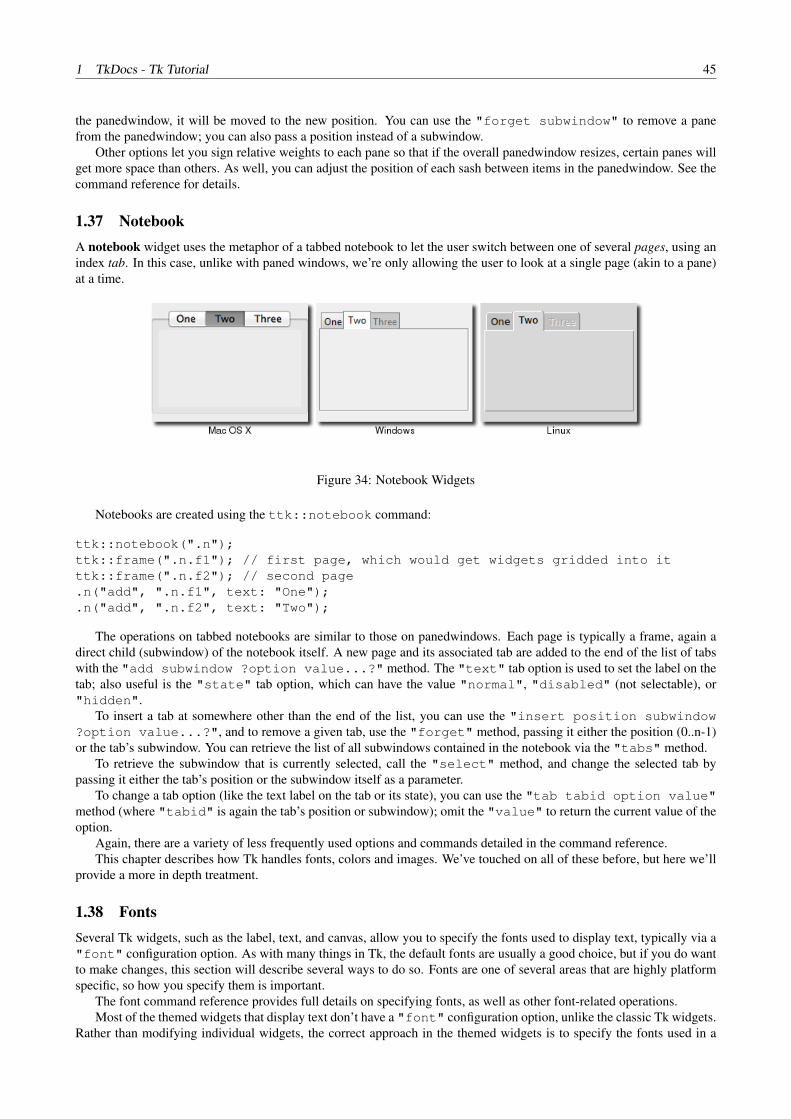
1 TkDocs - Tk Tutorial 45
the panedwindow, it will be moved to the new position. You can use the "forget subwindow" to remove a panefrom the panedwindow; you can also pass a position instead of a subwindow.
Other options let you sign relative weights to each pane so that if the overall panedwindow resizes, certain panes willget more space than others. As well, you can adjust the position of each sash between items in the panedwindow. See thecommand reference for details.
1.37 NotebookA notebook widget uses the metaphor of a tabbed notebook to let the user switch between one of several pages, using anindex tab. In this case, unlike with paned windows, we’re only allowing the user to look at a single page (akin to a pane)at a time.
Figure 34: Notebook Widgets
Notebooks are created using the ttk::notebook command:
ttk::notebook(".n");ttk::frame(".n.f1"); // first page, which would get widgets gridded into itttk::frame(".n.f2"); // second page.n("add", ".n.f1", text: "One");.n("add", ".n.f2", text: "Two");
The operations on tabbed notebooks are similar to those on panedwindows. Each page is typically a frame, again adirect child (subwindow) of the notebook itself. A new page and its associated tab are added to the end of the list of tabswith the "add subwindow ?option value...?" method. The "text" tab option is used to set the label on thetab; also useful is the "state" tab option, which can have the value "normal", "disabled" (not selectable), or"hidden".
To insert a tab at somewhere other than the end of the list, you can use the "insert position subwindow?option value...?", and to remove a given tab, use the "forget" method, passing it either the position (0..n-1)or the tab’s subwindow. You can retrieve the list of all subwindows contained in the notebook via the "tabs" method.
To retrieve the subwindow that is currently selected, call the "select" method, and change the selected tab bypassing it either the tab’s position or the subwindow itself as a parameter.
To change a tab option (like the text label on the tab or its state), you can use the "tab tabid option value"method (where "tabid" is again the tab’s position or subwindow); omit the "value" to return the current value of theoption.
Again, there are a variety of less frequently used options and commands detailed in the command reference.This chapter describes how Tk handles fonts, colors and images. We’ve touched on all of these before, but here we’ll
provide a more in depth treatment.
1.38 FontsSeveral Tk widgets, such as the label, text, and canvas, allow you to specify the fonts used to display text, typically via a"font" configuration option. As with many things in Tk, the default fonts are usually a good choice, but if you do wantto make changes, this section will describe several ways to do so. Fonts are one of several areas that are highly platformspecific, so how you specify them is important.
The font command reference provides full details on specifying fonts, as well as other font-related operations.Most of the themed widgets that display text don’t have a "font" configuration option, unlike the classic Tk widgets.
Rather than modifying individual widgets, the correct approach in the themed widgets is to specify the fonts used in a

1 TkDocs - Tk Tutorial 46
style, and then use that style for the individual widget. This is akin to the difference between hardcoding display-orientedmarkup like font tags inside HTML pages, vs. using CSS stylesheets that keep all the display specific information in oneplace.
Many older Tk programs hardcoded a lot of fonts, using either the “family size style” format we’ll see below, X11font names, or the older and more arcane X11 font specification string. In many cases, this left these applications with adated look as platforms evolved. Further, many programs specified fonts on a per-widget basis, leaving the font decisionsspread out through the program. Named fonts, and use of the standard fonts that Tk provides, are a far better solution.Reviewing and updating the usage of fonts is an easy and important change to make in any existing applications.
1.38.1 Standard Fonts
Particularly for more-or-less standard user interface elements, each platform defines specific fonts that should be used. Tkencapsulates many of these into a standard set of fonts that are always available, and of course the standard widgets usethese fonts. This helps abstract away platform differences. The predefined fonts are:
TkDefaultFont The default for all GUI items not otherwise specified.
TkTextFont Used for entry widgets, listboxes, etc.
TkFixedFont A standard fixed-width font.
TkMenuFont The font used for menu items.
TkHeadingFont The font typically used for column headings in lists and tables.
TkCaptionFont A font for window and dialog caption bars.
TkSmallCaptionFont A smaller caption font for subwindows or tool dialogs
TkIconFont A font for icon captions.
TkTooltipFont A font for tooltips.
1.38.2 Platform-Specific Fonts
A number of additional predefined fonts are available, but the precise set depends on the platform. Obviously, if you’reusing these, and your application is portable across different platforms, you’ll need to ensure that proper fonts are definedindividually for each platform.
On X11, any valid X11 font name (see e.g. the “xlsfonts” command) may be used. Remember though that there is noguarantee that a particular font has been installed on a particular machine.
On Windows, the following font names, which map to the fonts that can be set in the “Display” Control Panel, areavailable: system, ansi, device, systemfixed, ansifixed, oemfixed.
On Mac OS X, the following fonts are available (see the Apple HIG for details):
systemsystemfont, systemsmallsystemfont, systemapplicationfont,systemviewsfont, systemmenuitemfont, systemmenuitemcmdkeyfont,systempushbuttonfont, systemalertheaderfont, systemminisystemfont,systemdetailemphasizedsystemfont, systemEmphasizedSystemFont,systemSmallEmphasizedSystemFont, systemLabelFont, systemMenuTitleFont,systemMenuItemMarkFont, systemWindowTitleFont, systemUtilityWindowTitleFont,systemToolbarFont, systemDetailSystemFont.
If you’d like to examine what actual font is being assigned to any of the standard or default fonts (or any font for thatmatter), you can use the “font actual” call.
1.38.3 Named Fonts
You can also create your own fonts, which can be used exactly like the predefined ones. To do so, you’ll need to pick aname to refer to the font, and then specify various font attributes that define how the font should look. Typically, you’duse different font attributes on different platforms; that way, you can use the font in your program without worrying aboutthe details except in the one place the font is actually defined.
Here’s an example:

1 TkDocs - Tk Tutorial 47
font("create", "AppHighlightFont", family: "Helvetica", size: 12, weight: "bold");grid(ttk::label(".l", text: "Attention!", font: "AppHighlightFont"));
The "family" specifies the font name; the names Courier, Times, and Helvetica are guaranteed to besupported (and mapped to an appropriate monospaced, serif, or sans-serif font), but other fonts installed on the system canbe used (again, be careful to ensure the font exists, or the system will supply a different font, which may not necessarilybe a good match). You can get the names of all available fonts with:
font("families");
The "size" option specifies the size of the font, in points. The "weight" option can be either bold or normal.You can specify a "slant" of roman (normal) or italic. Finally, the boolean options "underline" and "overstrike"are available.
The current settings of these options can be examined or changed using the same mechanisms that you’d use forchanging the configuration options of a widget (e.g. configure).
1.38.4 Font Descriptions
Another way to specify fonts is via a list of attributes, starting with the name of the font, and then optionally includ-ing a size, and optionally one or more style options. Some examples of this are "Helvetica", “Helvetica 12”,"Helvetica 12 bold", and "Helvetica 12 bold italic". These font descriptions are then used as thevalue of the "font" configuration option, rather than a predefined or named font.
In general, switching from font descriptions to named fonts is advisable, again to isolate font differences in onelocation in the program.
1.39 ColorsAs with fonts, there are various ways to specify colors. Full details can be found in the colors command reference.
In general, the system will provide the right colors for most things. Like with fonts, both Mac and Windows specifya large number of system-specific color names (see the reference), whose actual color may depend upon system settings(e.g. text highlight colors, default backgrounds).
You can also specify colors via RGB, like in HTML, e.g. "#3FF" or "#FF016A". Finally, Tk recognizes the set ofcolor names defined by X11; normally these are not used, except for very common ones such as "red", "black", etc.
For themed Tk widgets, colors are often used in defining styles that are applied to widgets, rather than applying thecolor to a widget directly.
It probably goes without saying that restraint in the use of colors is normally warranted.
1.40 ImagesWe’ve seen the basics of how to use images already, displaying them in labels or buttons for example. We create an imageobject, usually from a file on disk.
image("create", "photo", "imgobj", file: "myimage.gif");.label("configure", image: "imgobj");
Out of the box, Tk includes support for GIF and PPM/PNM images. However, there is a Tk extension library called“Img” which adds support for many others: BMP, XBM, XPM, PNG, JPEG, TIFF, etc. Though not included directly inthe Tk core, Img is usually included with other packaged distributions (e.g. ActiveTcl).
require("Img");image("create", "photo", "myimg", file: "myimage.png");
Tk’s images are actually quite powerful and sophisticated, and provide a wide variety of ways to inspect and modifyimages. You can find out more from the image command reference and the photo command reference.
The types of multi-color images we’ve seen here are referred to in Tk as photo images. Tk also provides a secondtype of images, two-bit bitmap images, which were widely used in the 90’s when most Unix workstations used quite large(compared with PCs) monitors, but they were only black and white. Needless to say, color is de rigueur these days, soupdating to full color images for icons and so on is highly advisable.
A canvas widget manages a 2D collection of graphical objects — lines, circles, images, other widgets and more. Tk’scanvas is an incredibly powerful and flexible widget, and truly one of Tk’s highlights. It is suitable for a wide range of
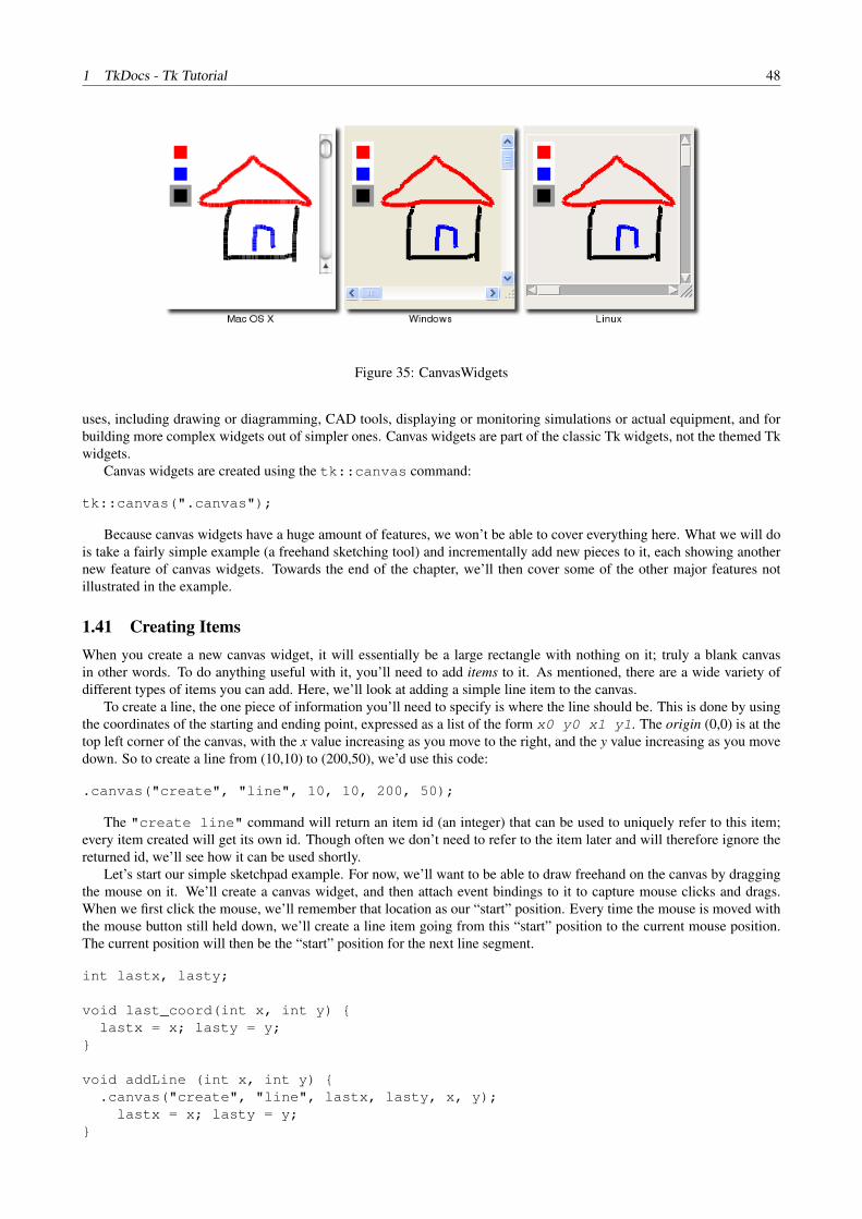
1 TkDocs - Tk Tutorial 48
Figure 35: CanvasWidgets
uses, including drawing or diagramming, CAD tools, displaying or monitoring simulations or actual equipment, and forbuilding more complex widgets out of simpler ones. Canvas widgets are part of the classic Tk widgets, not the themed Tkwidgets.
Canvas widgets are created using the tk::canvas command:
tk::canvas(".canvas");
Because canvas widgets have a huge amount of features, we won’t be able to cover everything here. What we will dois take a fairly simple example (a freehand sketching tool) and incrementally add new pieces to it, each showing anothernew feature of canvas widgets. Towards the end of the chapter, we’ll then cover some of the other major features notillustrated in the example.
1.41 Creating ItemsWhen you create a new canvas widget, it will essentially be a large rectangle with nothing on it; truly a blank canvasin other words. To do anything useful with it, you’ll need to add items to it. As mentioned, there are a wide variety ofdifferent types of items you can add. Here, we’ll look at adding a simple line item to the canvas.
To create a line, the one piece of information you’ll need to specify is where the line should be. This is done by usingthe coordinates of the starting and ending point, expressed as a list of the form x0 y0 x1 y1. The origin (0,0) is at thetop left corner of the canvas, with the x value increasing as you move to the right, and the y value increasing as you movedown. So to create a line from (10,10) to (200,50), we’d use this code:
.canvas("create", "line", 10, 10, 200, 50);
The "create line" command will return an item id (an integer) that can be used to uniquely refer to this item;every item created will get its own id. Though often we don’t need to refer to the item later and will therefore ignore thereturned id, we’ll see how it can be used shortly.
Let’s start our simple sketchpad example. For now, we’ll want to be able to draw freehand on the canvas by draggingthe mouse on it. We’ll create a canvas widget, and then attach event bindings to it to capture mouse clicks and drags.When we first click the mouse, we’ll remember that location as our “start” position. Every time the mouse is moved withthe mouse button still held down, we’ll create a line item going from this “start” position to the current mouse position.The current position will then be the “start” position for the next line segment.
int lastx, lasty;
void last_coord(int x, int y) {lastx = x; lasty = y;
}
void addLine (int x, int y) {.canvas("create", "line", lastx, lasty, x, y);
lastx = x; lasty = y;}

1 TkDocs - Tk Tutorial 49
grid(tk::canvas(".canvas"), sticky: "nwes", column: 0, row: 0);grid("columnconfigure", ".", 0, weight: 1);grid("rowconfigure", ".", 0, weight: 1);
bind(".canvas", "<1>", {&last_coord, "%x", "%y"});bind(".canvas", "<B1-Motion>", {&addLine, "%x", "%y"});
Try it out - drag the mouse around the canvas to create your masterpiece.
1.42 Item AttributesWhen creating items, you can also specify one or more attributes for the item, that will affect how it is displayed. Forexample, here we’ll specify that the line should be red, and three pixels wide.
.canvas("create", "line", 10, 10, 200, 50, fill: "red", width: 3);
The exact set of attributes will vary according to the type of item.Like with Tk widgets, changing attributes for canvas items after you’ve already created them can also be done.
widget id = .canvas("create", "line", 0, 0, 10, 10, fill: "red");....canvas("itemconfigure", id, fill: "blue", width: 2);
1.43 BindingsWe’ve already seen that the canvas widget as a whole, like any other Tk widget, can capture events using the "bind"command.
You can also attach bindings to individual items in the canvas (or groups of them, as we’ll see in the next section usingtags). So if you want to know whether or not a particular item has been clicked on, you don’t need to watch for mouseclick events for the canvas as a whole, and then figure out if that click happened on your item. Tk will take care of all thisfor you.
To capture these events, you use a bind command built into the canvas. It works exactly like the regular bind command,taking an event pattern and a callback. The only difference is you specify the canvas item this binding applies to.
.canvas("bind", id, "<1>", {...});
Let’s add some code to our sketchpad example to allow changing the drawing color. We’ll first create a few differentrectangle items, each filled with a different color. Creating rectangle items is just like creating line items, where you’llspecify the coordinates of two diagonally opposite corners. We’ll then attach a binding to each of these so that whenthey’re clicked on, they’ll set a global variable to the color to use. Our mouse motion binding will look at that variablewhen creating the line segments.
string color = "black";widget id;
void setColor(string c) {color = c;
}
void addLine(int x, int y) {.canvas("create", "line", lastx, lasty, x, y, fill: color);
lastx = x; lasty = y;}
id = .canvas("create", "rectangle", 10, 10, 30, 30, fill: "red");.canvas("bind", id, "<1>", {&setColor, "red"});
id = .canvas("create", "rectangle", 10, 35, 30, 55, fill: "blue");

1 TkDocs - Tk Tutorial 50
.canvas("bind", id, "<1>", {&setColor, "blue"});
id = .canvas("create", "rectangle", 10, 60, 30, 80, fill: "black");.canvas("bind", id, "<1>", {&setColor, "black"});
1.44 TagsWe’ve seen that every canvas item has a unique id number, but there is another very useful and powerful way to refer toitems on a canvas, and that is using tags.
A tag is just an identifier of your creation, something meaningful to your program. You can attach tags to canvasitems; each item can have any number of tags. Unlike item id numbers, which are unique for each item, many items canhave the same tag.
What can you do with tags? We saw that you can use the item id to modify a canvas item (and we’ll see soon thereare other things you can do to items, like move them around, delete them, etc.). Any time you can use an item id, you canuse a tag. So for example, you can change the color of all items having a specific tag.
Tags are a good way to identify certain types of items in your canvas (items that are part of a drawn line, items thatare part of the pallette, etc.). You can use tags to correlate canvas items to particular objects in your application (so forexample, tag all canvas items that are part of the robot with id #37 with the tag “robot37”). With tags, you don’t have tokeep track of the ids of canvas items to refer to groups of items later; tags let Tk do that for you.
You can assign tags when creating an item using the "tags" item configuration option. You can add tags later withthe "addtag" method, or remove them with the "dtags" method. You can get the list of tags for an item with the"gettags" method, or return a list of item id numbers having the given tag with the "find" command. (NOTE:currently interactive mode doesn’t work in Little)
For example:
% canvas(".c");.c% .c("create", "line", 10, 10, 20, 20, tags: "firstline drawing");1% .c("create", "rectangle", 30, 30, 40, 40, tags: "drawing");2% .c("addtag", "rectangle", "withtag", 2);% .c("addtag", "polygon", "withtag", "rectangle");% .c("gettags", 2);drawing rectangle polygon% .c("dtag", 2, "polygon");% .c("gettags", 2);drawing rectangle% .c("find", "withtag", "drawing");1 2
As you can see, things like "withtag" will take either an individual item or a tag; in the latter case, they will applyto all items having that tag (which could be none). The "addtag" and "find" have many other options, allowing youto specify items near a point, overlapping a particular area, and more.
Let’s use tags first to put a border around whichever item in our color palette is currently selected.
void setColor (string c) {color = c;.canvas("dtag", "all", "paletteSelected");.canvas("itemconfigure", "palette", outline: "white");.canvas("addtag", "paletteSelected", "withtag", "palette$color");.canvas("itemconfigure", "paletteSelected", outline: "#999999");
}.canvas("create", "rectangle", 10, 10, 30, 30, fill: "red", tags: "palette palettered");.canvas("create", "rectangle", 10, 35, 30, 55, fill: "blue", tags: "palette paletteblue");.canvas("create", "rectangle", 10, 60, 30, 80, fill: "black", tags: "palette paletteblack paletteSelected");
setColor("black");.canvas("itemconfigure", "palette", width: 5);

1 TkDocs - Tk Tutorial 51
Let’s also use tags to make the current stroke we’re drawing appear more visible; when we release the mouse we’llput it back to normal.
void doneStroke() {.canvas("itemconfigure", "currentline", width: 1);
}
bind(".canvas", "<B1-ButtonRelease>", "doneStroke");
void addLine(int x, int y) {.canvas("create", "line", ::lastx, ::lasty, x, y, fill: ::color, width: 5, tags: "currentline");
lastx = x; lasty = y;}
1.45 Modifying ItemsYou’ve seen how you can modify the configuration options on an item — its color, width and so on. There are a numberof other things you can do items.
To delete items, use the "delete" method. To change an item’s size and position, you can use the "coords"method; this allows you to provide new coordinates for the item, specified the same way as when you first created theitem. Calling this method without a new set of coordinates will return the current coordinates of the item. To move oneor more items by a particular horizontal or vertical amount from their current location, you can use the "move" method.
All items are ordered from top to bottom in what’s called the stacking order. If an item later in the stacking orderoverlaps the coordinates of an item below it, the item on top will be drawn on top of the lower item. The "raise" and"lower" methods allow you to adjust an item’s position in the stacking order.
There are several more operations described in the reference manual page, both to modify items and to retrieveadditional information about them.
1.46 ScrollingIn many applications, you’ll want the canvas to be larger than what appears on the screen. You can attach horizontal andvertical scrollbars to the canvas in the usual way, via the "xview" and "yview" methods.
As far as the size of the canvas, you can specify both how large you’d like it to be on screen, as well as what the fullsize of the canvas is, which would require scrolling to see. The "width" and "height" configuration options for thecanvas widget will request the given amount of space from the geometry manager. The "scrollregion" configurationoption (e.g. "0 0 1000 1000") tells Tk how large the canvas surface is.
You should be able to modify the sketchpad program to add scrolling, given what you already know. Give it a try.Once you’ve done that, scroll the canvas down just a little bit, and then try drawing. You’ll see that the line you’re
drawing appears above where the mouse is pointing! Surprised?What’s going on is that the global "bind" command doesn’t know that the canvas is scrolled (it doesn’t know the
details of any particular widget). So if you’ve scrolled the canvas down by 50 pixels, and you click on the top left corner,bind will report that you’ve clicked at (0,0). But we know that because of the scrolling, that position should really be(0,50).
The "canvasx" and "canvasy" methods will translate the position onscreen (which bind is reporting) into theactual point on the canvas, taking into account scrolling. If you’re adding these directly to the event bindings (as opposedto procedures called from the event bindings), be careful about quoting and substitutions, to make sure that the conversionsare done when the event fires.
Here then is our complete example. We probably don’t want the palette to be scrolled away when the canvas isscrolled, but we’ll leave that for another day.
int lastx, lasty;widget id;string color = "black";
void last_coord(int x, int y) {lastx = .canvas("canvasx", x);lasty = .canvas("canvasy", y);
}

1 TkDocs - Tk Tutorial 52
void addLine(int x, int y) {.canvas("create", "line", lastx, lasty, .canvas("canvasx", x), .canvas("canvasy", y),
fill: color, width: 5, tags: "currentline");lastx = .canvas("canvasx", x);lasty = .canvas("canvasy", y);
}
void setColor(string c) {color = c;.canvas("dtag", "all", "paletteSelected");.canvas("itemconfigure", "palette", outline: "white");.canvas("addtag", "paletteSelected", "withtag", "palette${color}");.canvas("itemconfigure", "paletteSelected", outline: "#999999");
}
grid(tk::canvas(".canvas", scrollregion: "0 0 1000 1000",yscrollcommand: ".v set", xscrollcommand: ".h set"),
sticky: "nwes", column: 0, row: 0);grid("columnconfigure", ".", 0, weight: 1);grid("rowconfigure", ".", 0, weight: 1);
grid(ttk::scrollbar(".h", orient: "horizontal", command: ".canvas xview"), column: 0, row: 1, sticky: "we");grid(ttk::scrollbar(".v", orient: "vertical", command: ".canvas yview"), column: 1, row: 0, sticky: "ns");grid(ttk::sizegrip(".sz"), column: 1, row: 1, sticky: "se");
bind(".canvas", "<1>", {&last_coord, "%x" ,"%y"});bind(".canvas", "<B1-Motion>", {&addLine, "%x", "%y"});bind(".canvas", "<B1-ButtonRelease>", "doneStroke");
id = .canvas("create", "rectangle", 10, 10, 30, 30, fill: "red", tags: "palette palettered");.canvas("bind", id, "<1>", {&setColor, "red"});
id = .canvas("create", "rectangle", 10, 35, 30, 55, fill: "blue", tags: "palette paletteblue");.canvas("bind", id, "<1>", {&setColor, "blue"});
id = .canvas("create", "rectangle", 10, 60, 30, 80, fill: "black", tags: "palette paletteblack paletteSelected");.canvas("bind", id, "<1>", {&setColor, "black"});
setColor("black");.canvas("itemconfigure", "palette", width: 5);
void doneStroke() {.canvas("itemconfigure", "currentline", width: 1);
}
1.47 Other Item TypesBesides lines and rectangles, there are a number of different types of items that canvas widgets support. Remember thateach one has its own set of item configuration options, detailed in the reference manual.
Items of type "line" can actually be a bit fancier than what we’ve seen. A line item can actually be a series of linesegments, not just one; in our example, we could have chosen to use a single line item for each complete stroke. The linecan also be drawn directly point-to-point, or smoothed out into a curved line.
Items of type "rectangle" we’ve seen. Items of type "oval" work the same but draw as an oval. Items of type"arc" allow you to draw just a piece of an oval. Items of type "polygon" allow you to draw a closed polygon withany number of sides.
Pictures can be added to canvas widgets, using items of type "bitmap" (for black and white), or type "image" (forfull color).

1 TkDocs - Tk Tutorial 53
You can add text to a canvas using items of type "text". You have complete control of the font, size, color andmore, as well as the actual text that is displayed.
Perhaps most interestingly, you can embed other widgets (which would include a frame which itself contains otherwidgets) into a canvas using an item of type "window". When we do this, the canvas in effect acts as a geometrymanager for those other widgets. This capability raises all kinds of possibilities for your application.
There is a lot more to canvas widgets than we’ve described here; be sure to consult the reference manual, as well asthe wide range of example programs included with the Tk distribution.
A text widget manages a multi-line text area. Like the canvas widget, Tk’s text widget is an immensely flexible andpowerful tool which can be used for a wide variety of tasks. Some example uses of text widgets have included anythingfrom providing a simple multi-line text area as part of a form, to a stylized code editor, to an outliner, to a web browser.Text widgets are part of the classic Tk widgets, not the themed Tk widgets.
Figure 36: TextWidgets
Text widgets are created using the tk::text command:
tk::text(".text", width: 40, height: 10);
While we briefly introduced text widgets in an earlier chapter, here we’ll go into much more detail, to give you a senseof the level of sophistication it allows. Still, for any significant work with the text widget, the reference manual is verywell organized and useful.
1.48 The BasicsIf you just want to use the text widget to get a simple multi-line text from the user as part of a form, there’s only a fewthings you’ll need to worry about: creating and sizing the widget (check), providing an initial value for the text in theform, and retrieving the text in the widget after the user has submitted the form.
1.48.1 Providing Initial Content
When you first create it, the text widget has nothing in it, so if you want to provide an initial piece of text, you’re going tohave add it yourself. Unlike for example the entry widget, text widgets don’t support a "textvariable" configurationoption; as we’ll soon see, text widgets can contain a lot more than just plain text, so a simple variable isn’t sufficient tohold it all.
Instead, to set the initial text for the widget, you’ll use the widget’s "insert" method:
.text("insert", 1.0, "here is my text to insert");
The “1.0” here represents where to insert the text, and can be read as “line 1, character 0”. This refers to the firstcharacter of the first line; for historical conventions related to how programmers normally refer to lines and characters,line numbers are 1-based, and character numbers are 0-based.
The text to insert is just a string. Because the widget can hold multi-line text, the string you supply can be multi-lineas well. To do, simply embed "\n" (newline) characters in your string at the appropriate locations.
1.48.2 Scrolling
Scrollbars, both horizontal and vertical, can be attached to the text widget. This works exactly the same as using scrollbarsin any other widget, such as a listbox or canvas.
You can also ask the widget to ensure that a certain part of the text is visible. For example, if you’ve added more textto the widget than will fit onscreen (so it will scroll) but want to ensure that the top of the text rather than the bottom isvisible, call the "see" method, passing it the position of the text (e.g. “1.0”).

1 TkDocs - Tk Tutorial 54
1.48.3 Controlling Wrapping
What if some lines of text in the widget are very long, longer than the width of the widget? By default, text will just wraparound to the next line, but if and how it does this can be controlled by the "wrap" configuration option. The defaultvalue is "char", meaning wrap around right at the character at the end of the line; other options are "word" to causewrapping, but only at word breaks (e.g. spaces), and "none" meaning don’t wrap around at all. In the latter case, someof the text won’t be visible unless you attach a horizontal scrollbar to the widget.
1.48.4 Disabling the Widget
Some forms will temporarily disable editing in particular widgets unless certain conditions are met (e.g. some otheroptions are set to a certain value). To prevent the user from making any changes to a text widget, set the "state"configuration option to "disabled"; re-enable editing by setting this option back to "normal".
1.48.5 Retrieving the Text
Finally, after the user has made any changes and submitted the form, your program will want to retrieve the contents ofthe widget, which is done with the "get" method:
string thetext = .text("get", 1.0, "end");
1.49 Modifying the Text in CodeWhile the user can modify the text in the text widget interactively, your program can also make changes. Adding text isdone with the "insert" method, which we used above to provide an initial value for the text widget.
1.49.1 Text Positions and Indices
When we specified a position of “1.0” (first line, first character), this was an example of an index. It tells the insert methodwhere to insert the new text (just before the first line, first character, i.e. at the very start of the widget). There are a varietyof ways to specify these indices. You’ve also seen another one: the "end" (from the “get” example) means just past theend of the text (“just past” because text insertions go right before the given index, so inserting at “end” will add text to theend of the widget). Note that Tk will always add a newline at the very end of the text widget.
Here are a few additional examples of indices, and what they mean:
3.end The newline at the end of line 3.
1.0 + 3 chars Three characters past the start of line 1.
2.end -1 chars The last character before the new line in line 2.
end -1 chars The newline that Tk always adds at the end of the text.
end -2 chars The actual last character of the text.
end -1 lines The start of the last actual line of text.
2.2 + 2 lines The third character (index 2) of the fourth line of text.
2.5 linestart The first character of line 2.
2.5 lineend The position of the newline at the end of line 2.
2.5 wordstart The first character of the word containing the character at index 2.5.
2.5 wordend The first character just past the last character of the word containing index 2.5.
3.end The newline at the end of line 3.
Some additional things to keep in mind:
• The term “chars” can be abbreviated as “c”, and “lines” as “l”.
• You can omit the spaces between the terms, e.g. “1.0+3c”.

1 TkDocs - Tk Tutorial 55
• If you specify an index past the end of the widget (e.g. “end + 100c”) it will be interpreted as the end.
• Adding characters will wrap to the next lines as needed; e.g. “1.0 + 10 chars” on a line with only five characterswill end up being on the second line.
• When using indices containing multiple words, make sure to quote them appropriately so that Tk sees the entireindex as a single argument.
• When moving up or down a certain number of lines, this is interpreted as logical lines, where each line is terminatedonly by the “\n”. With long lines and wrapping enabled, this may be represent multiple lines on the display. If you’dlike to move up or down a single line on the display, you can specify this as e.g. “1.0 + 2 display lines”.
• To determine the actual canonical position of an index, use the "index" method, passing it the index expression,and it will return the corresponding index in the form "line.char".
• You can compare two indices using the "compare" method, which lets you check for equality, whether one indexis later in the text than the other, etc.
1.49.2 Deleting Text
While the "insert" method adds new text anywhere in the widget, the "delete" method removes it. You can specifyeither a single character to be deleted (by index), or a range of characters specified by the start and end index. In the lattercase, characters from (and including) the start index through to just before the end index will be deleted (so the characterat the end index is not deleted). So this would remove a single line of text (including its trailing newline) from the start ofthe text:
There is also a "replace" method, taking a starting index, and ending index and a string as parameters. It does thesame as a delete, followed by an insert at the same location.
1.49.3 Example: Logging Window
Here’s a short example illustrating how to use a text widget as a 80x24 logging window for your application. The userdoesn’t edit the text widget at all; instead, your program will write log messages to it. You’d like to keep the content tono more than 24 lines (so no scrolling), so as you add new messages at the end, you’ll have to remove old ones from thetop if there are already 24 lines.
grid(text(".log", state: "disabled", width: 80, height: 24, wrap: "none"));
void writeToLog (string msg) {string newLinePos[] = split(/\./, .log("index", "end - 1 line"));int numlines = (int)newLinePos[0];.log("configure", state: "normal");
if (numlines == 24).log("delete", 1.0, 2.0);if (.log("index", "end-1c") != "1.0").log("insert", "end", "\n");
.log("insert", "end", msg);
.log("configure", state: "disabled");}
Note that because the widget was disabled, we had to reenable it to make any changes, even from our program.
1.50 Formatting with TagsUp until now, we’ve just dealt with plain text. Now it’s time to look at how to add special formatting, such as bold, italic,strikethrough, background colors, font sizes, and much more. Tk’s text widget implements these using a feature calledtags.
Tags are objects associated with the text widget. Each tag is referred to via a name chosen by the programmer. Eachtag can have a number of different configuration options; these are things like fonts, colors, etc. that will be used to formattext. Though tags are objects having state, they don’t need to be explicitly created; they’ll be automatically created thefirst time the tag name is used.

1 TkDocs - Tk Tutorial 56
1.50.1 Adding Tags to Text
Tags can be associated with one or more ranges of text in the widget. As before, these are specified via indices; a singleindex to represent a single character, and a start and end index to represent the range from the start character to just beforethe end character. Tags can be added to ranges of text using the "tag add" method, e.g.
.text("tag", "add", "highlightline", 5.0, 6.0);
Tags can also be provided when inserting text by adding an optional parameter to the "insert" method, whichholds a list of one or more tags to add to the text you’re inserting, e.g.
.text("insert", "end", "new material to insert", "highlightline recent warning");
As the text in the widget is modified, whether by the user or your program, the tags will adjust automatically. So forexample if you had tagged the text “the quick brown fox” with the tag “nounphrase”, and then replaced the word “quick”with “speedy”, the tag would still apply to the entire phrase.
1.50.2 Applying Formatting to Tags
Formatting is applied to tags via configuration options; these work similarly to configuration options for the entire widget.As an example:
.text("tag", "configure", "highlightline",background: "yellow",font: "helvetica 14 bold",relief: "raised");
The currently available configuration options for tags are: "background", "bgstipple", "borderwidth","elide", "fgstipple", "font", "foreground", "justify", "lmargin1", "lmargin2", "offset","overstrike", "relief", "rmargin", "spacing1", "spacing2", "spacing3", "tabs", "tabstyle","underline", and "wrap". Check the reference manual for detailed descriptions of these. The "tag cget"methodallows you to query the configuration options of a tag.
Because multiple tags can apply to the same range of text, there is the possibility for conflict (e.g. two tags specifyingdifferent fonts). A priority order is used to resolve these; the most recently created tags have the highest priority, butpriorities can be rearranged using the "tag raise" and "tag lower" methods.
1.50.3 More Tag Manipulations
To delete a tag altogether, you can use the "tag delete" method. This also of course removes any references to thetag in the text. You can also remove a tag from a range of text using the "tag remove" method; even if that leaves noranges of text with that tag, the tag object itself still exists.
The "tag ranges" method will return a list of ranges in the text that the tag has been applied to. There are also"tag nextrange" and "tag prevrange" methods to search forward or backward for the first such range from agiven position.
The "tag names" method, called with no additional parameters, will return a list of all tags currently defined inthe text widget (including those that may not be presently used). If you pass the method an index, it will return the list oftags applied to just the character at the index.
Finally, you can use the first and last characters in the text having a given tag as indices, the same way you can use“end” or “2.5”. To do so, just specify "tagname.first" or "tagname.last".
1.50.4 Differences between Tags in Canvas and Text Widgets
While both canvas and text widgets support “tags” which can be used to apply to several objects, style them, and so on,these tags are not the same thing. There are important differences to take note of.
In canvas widgets, individual canvas items have configuration options that control their appearance. When you referto a tag in a canvas, the meaning of that is identical to “all canvas items presently having that tag”. The tag itself doesn’texist as a separate object. So in the following snippet, the last rectangle added will not be colored red.
.canvas("itemconfigure", "important", fill: "red");
.canvas("create", "rectangle", 10, 10, 40, 40, tags: "important");

1 TkDocs - Tk Tutorial 57
In text widgets by contrast, it’s not the individual characters that retain the state information about appearance, buttags, which are objects in their own right. So in this snippet, the newly added text will be colored red.
.text("insert", "end", "first text", "important");
.text("tag", "configure", "important", foreground: "red");
.text("insert", "end", "second text", "important");
1.51 Events and BindingsOne quite cool thing is that you can define event bindings on tags. That allows you to do things like easily recognizemouse clicks just on particular ranges of text, and popup up a menu or dialog in response. Different tags can havedifferent bindings, so it saves you the hassle of sorting out questions like “what does a click at this location mean?”.Bindings on tags are implemented using the "tag bind" method:
.text("tag", "bind", "important", "<1>", "popupImportantMenu");
Widget-wide binding to events works as it does for every other widget. Besides the normal low-level events, there arealso two virtual events that will be generated: <Modified> whenever a change is made to the content of the widget, and<Selection> whenever there is a change made to which text is selected.
1.52 Selecting TextYour program may want to know if a range of text has been selected by the user, and if so, what that range is. For example,you may have a toolbar button to bold the selected text in an editor. While you can tell when the selection has changed(e.g. to update whether or not the bold button is active) via the <Selection> virtual event, that doesn’t tell you what hasbeen selected.
The text widget automatically maintains a tag named “sel”, which refers to the selected text. Whenever the selectionchanges, the “sel” tag will be updated. So you can find the range of text selected using the "tag ranges" method,passing it “sel” as the tag to report on.
Similarly, you can change the selection by using "tag add" to set a new selection, or "tag remove" to removethe selection. You can’t actually delete the “sel” tag of course.
Though the default widget bindings prevent this from happening, “sel” is like any other tag in that it can supportmultiple ranges, i.e. disjoint selections. To prevent this from happening when changing the selection from your code,make sure you remove any old selection before adding a new one.
The text widget manages the concept of the insertion cursor (where newly typed text will appear) separate from theselection. It does so using a new concept called a mark.
1.53 MarksMarks are used to indicate a particular place in the text. In that respect they are like indices, except that as the text ismodified, the mark will adjust to be in the same relative location. In that way they are resemble tags, but refer to a singleposition rather than a range of text. Marks actually don’t refer to a position occupied by a character in the text, but specifya position between two characters.
Tk automatically maintains two different marks. The first is named “insert”, and is the present location of the insertioncursor. As the cursor is moved (via mouse or keyboard), the mark moves with it. The second mark is named “current”,and reflects the position of the character underneath the current mouse position.
To create your own marks, use the widget’s "mark set" method, passing it the name of the mark, and an index (themark is positioned just before the character at the given index). This is also used to move an existing mark to a differentposition. Marks can be removed using the "mark unset" method, passing it the name of the mark. If you delete arange of text containing a mark, that also removes the mark.
The name of a mark can also be used as an index (in the same way “1.0” or “end-1c” are indices). You can find thenext mark (or previous one) from a given index in the text using the "mark next" or "mark previous" methods.The "mark names" method will return a list of the names of all marks.
Marks also have a gravity, which can be modified with the "mark gravity" method, which affects what happenswhen text is inserted at the mark. Suppose we have the text “ac”, with a mark in between that we’ll symbolize with apipe, i.e. “a|c”. If the gravity of that mark is “right” (the default) the mark will attach itself to the “c”. If the new text “b”is inserted at the mark, the mark will remain stuck to the “c”, and so the new text will be inserted before the mark, i.e.“ab|c”. If the gravity is instead “left”, the mark will attach itself to the “a”, and so new text will be inserted after the mark,i.e. “a|bc”.

1 TkDocs - Tk Tutorial 58
1.54 Images and WidgetsLike canvas widgets, text widgets can contain not only text, but also images and any other Tk widgets (including a frameitself containing many other widgets). In some senses, this allows the text widget to work as a geometry manager in itsown right. The ability to add images and widgets within the text opens up a world of possibilities for your program.
Images are added to a text widget at a particular index, with the image normally specified as an existing Tk image.There are also other options that allow you to fine-tune padding and so on.
image("create", "photo", "flowers", file: "flowers.gif");.text("image", "create", "sel.first", image: "flowers");
Widgets are added to a text widget pretty much the same way as images. The widget you’re adding should be adescendant of the text widget in the overall window hierarchy.
ttk::button(".text.b", text: "Push Me");.text("window", "create", 1.0, window: ".text.b");
1.55 Even MoreThere are many more things that the text widget can do; here we’ll briefly mention just a few more of them. For detailson using any of these, see the reference manual.
1.55.1 Search
The text widget includes a powerful "search" method which allows you to locate a piece of text within the widget; thisis useful for a “Find” dialog, as one obvious example. You can search backwards or forwards from a particular positionor within a given range, specify your search using exact text, case insensitive, or using regular expressions, find one or alloccurrences of your search term, and much more.
1.55.2 Modifications, Undo and Redo
The text widget keeps track of whether or not changes have been made to the text (useful to know whether you need tosave it for example), which you can query (or change) using the "edit modified" method. There is also a completemulti-level undo/redo mechanism, managed automatically by the widget when you set its "undo" configuration optionto true. Calling "edit undo" or "edit redo" then will modify the current text using information stored on theundo/redo stack.
1.55.3 Eliding Text
You can actually include text in the widget that is not displayed; this is known as “elided” text, and is made availableusing the "elide" configuration option for tags. You can use this to implement for example an outliner, a “folding”code editor, or even just to bury some extra meta-data intermixed with your text. When specifying positioning with elidedtext you have to be a bit more careful, and so commands that deal with positions have extra options to either include orignore the elided text.
1.55.4 Introspection
Like most Tk widgets, the text widget goes out of its way to expose information about its internal state; we’ve seen mostof this in terms of the "get" method, widget configuration options, "names" and "cget" for both tags and marks, andso on. There is even more information available that you can use for a wide variety of tasks. Check out the "debug","dlineinfo", "bbox", "count" and "dump" methods in the reference manual.
1.55.5 Peering
The Tk text widget allows the same underlying text data (containing all the text, marks, tags, images, and so on) to beshared between two or more different text widgets. This is known as peering, and is controlled via the "peer" method.
A treeview widget can display and allow browsing through a hierarchy of items, and can show one or more attributesof each item as columns to the right of the tree. It allows you to build user interfaces similar to the tree display you’d findin file managers like the OS X Finder or Windows Explorer. As with most Tk widgets, there is a ton of flexibility to makeit behave as you need for a wide range of situations.
Treeview widgets are created using the ttk::treeview command:

1 TkDocs - Tk Tutorial 59
ttk::treeview(".tree");
Horizontal and vertical scrollbars can be added in the usual manner, if desired.
1.56 Adding Items to the TreeTo do anything useful with the treeview, you’ll need to add one or more items to it. Each item represents a single nodein the tree, whether a leaf node or an internal node. Items are referred to by a unique id; this can be assigned by theprogrammer when the item is first created, or the widget can automatically choose an id for the item.
Items are created by inserting them into the tree, using the treeview’s ’"insert" method. To insert an item, youneed to know where in the tree to insert it, which means specifying the parent item as well as what position in the list ofthe parent’s children the new item should be inserted at.
The treeview widget automatically creates a root node (which is not displayed), having the id of “{}” (i.e. the emptystring), which can serve as the parent of the first level of items you add. Positions within the list of the parent’s childrenare specified by index (0 being the first, with the special “end” index meaning inserting after all existing children).
Normally, you’ll also specify the name of each item, which is displayed in the tree. There are other options to add animage beside the name, specify whether the node is open or closed, and so on.
# Inserted at the root, program chooses id:.tree("insert", "", "end", id: "widgets", text: "Widget Tour");
# Same thing, but inserted as first child:.tree("insert", "", 0, id: "gallery", text: "Applications");
# Treeview chooses the id:widget id = .tree("insert","" , "end", text: "Tutorial");
# Inserted underneath an existing node:.tree("insert", "widgets", "end", text: "Canvas");.tree("insert", id, "end", text: "Tree");
Inserting the item returns the id of the newly created item.
1.57 Rearranging ItemsA node (and its descendants, if any) can be moved to a different location in the tree; the only restriction is that a nodecannot be moved underneath one of its descendants. The target location is specified via parent and index into the list ofchildren, as was done with "insert".
.tree("move", "widgets", "gallery", "end"); // move widgets under gallery
Items can be detached from the tree, which removes the item and its descendants from the hierarchy, but does notdestroy the items, allowing you to later reinsert them with "move".
Items can also be deleted, which does completely get rid of the item and its descendants.If you’d like to navigate the hierarchy, there are methods that let you find the parent of an item ("parent"), find the
next or previous siblings of an item ("next" and "prev"), and return the list of children of an item ("children").
Figure 37: Treeview Widgets

1 TkDocs - Tk Tutorial 60
You can control whether or not the item is open and shows its children by modifying the "open" item configurationoption.
.tree item widgets -open trueset isopen [.tree item widgets -open]