Embed Size (px)
Citation preview

PATRICK OLLIFFEINTERVIEW & DEMO
#23SUMMER 2012$7.95 In The US
Spider-M
an TM & ©2012 M
arvel Characters, Inc.
THE PROFESSIONAL “HOW-TO” MAGAZINE ON COMICS AND CARTOONING
ROUGH STUFF’sBOB McLEOD
CRITIQUES ANEWCOMER’S WORK
AL WILLIAMSONTHE MAN & HIS WORK
REMEMBERED BY TORRES,BLEVINS, SCHULTZ, YEATES,
ROSS, AND VEITCH
PLUS: MIKE MANLEY AND BRET BLEVINS’
1 82658 27764 2
0 2
Contains nudity for demonstration offigure drawing • Mature Readers Only
DRAW! SUMMER 2012 1
THE PROFESSIONAL “HOW-TO” MAGAZINE ON COMICS & CARTOONING
SUMMER 2012VOL. 1, No. 23
Editor-in-Chief • Michael ManleyDesigner • Eric Nolen-WeathingtonPublisher • John MorrowLogo Design • John CostanzaCopy-Editing • Eric Nolen- WeathingtonFront Cover • Pat Olliffe
DRAW! Summer 2012, Vol. 1, No. 23 was produced by Action Planet, Inc. and published by TwoMorrows Publishing. Michael Manley, Editor. John Morrow, Publisher. Editorial address: DRAW! Magazine, c/o Michael Manley, 430 Spruce Ave., Upper Darby, PA 19082. Subscription Address: TwoMorrows Publishing, 10407 Bedfordtown Dr., Raleigh, NC 27614.
DRAW! and its logo are trademarks of Action Planet, Inc. All contributions herein are copyright 2012 by their respective contributors.
Action Planet, Inc. and TwoMorrows Publishing accept no responsibility for unsolicited submissions. All artwork herein is copyright the year of produc-tion, its creator (if work-for-hire, the entity which contracted said artwork); the characters featured in said artwork are trademarks or registered trade-marks of their respective owners; and said artwork or other trademarked material is printed in these pages with the consent of the copyright holder and/or for journalistic, educational, or historical purposes with no infringement intended or implied.
This entire issue is ©2012 Action Planet, Inc. and TwoMorrows Publishing and may not be reprinted or retransmitted without written permission of the copyright holders. ISSN 1932-6882. Printed in Canada. FIRST PRINTING.
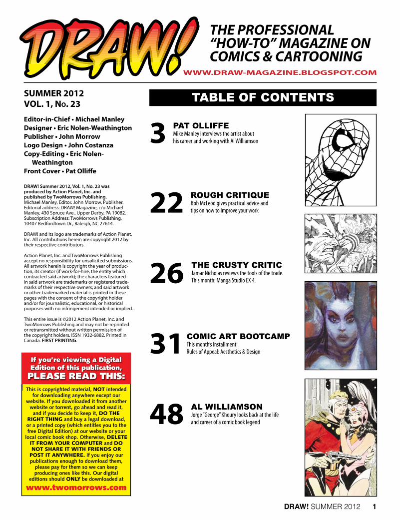
TABLE OF CONTENTS
3
22
26
31
48
PAT OLLIFFEMike Manley interviews the artist about his career and working with Al Williamson
rOugh CrITIquEBob McLeod gives practical advice and tips on how to improve your work
ThE CruSTy CrITICJamar Nicholas reviews the tools of the trade.This month: Manga Studio EX 4.
COmIC ArT BOOTCAmPThis month’s installment:Rules of Appeal: Aesthetics & Design
AL wILLIAmSONJorge “George” Khoury looks back at the life and career of a comic book legend
WWW.DRAW-MAGAZINE.BLOGSPOT.COM
If you’re viewing a DigitalEdition of this publication,PLEASE READ THIS:
This is copyrighted material, NOT intendedfor downloading anywhere except our
website. If you downloaded it from anotherwebsite or torrent, go ahead and read it,
and if you decide to keep it, DO THERIGHT THING and buy a legal download,or a printed copy (which entitles you to thefree Digital Edition) at our website or your
local comic book shop. Otherwise, DELETEIT FROM YOUR COMPUTER and DONOT SHARE IT WITH FRIENDS OR
POST IT ANYWHERE. If you enjoy ourpublications enough to download them,
please pay for them so we can keep producing ones like this. Our digital
editions should ONLY be downloaded at
www.twomorrows.com
DRAW! SUMMER 2012 3
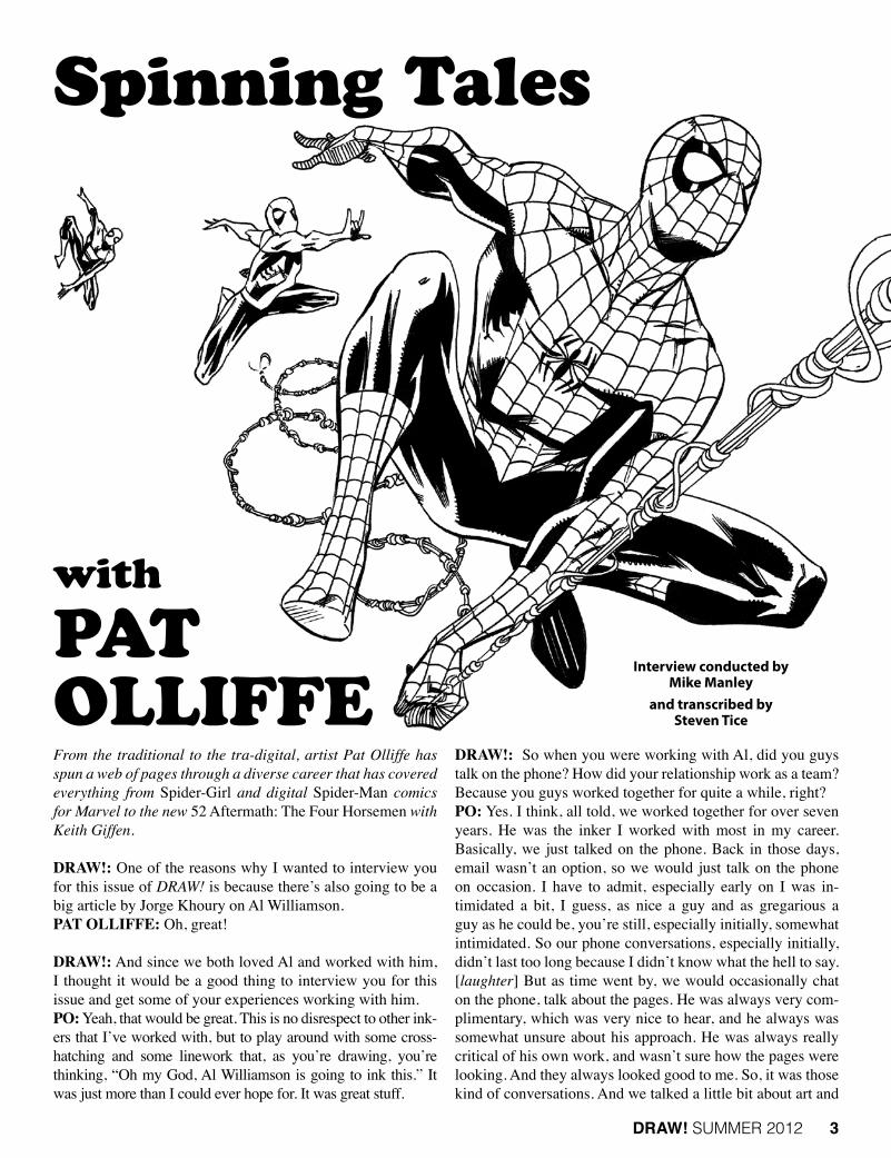
From the traditional to the tra-digital, artist Pat Olliffe has spun a web of pages through a diverse career that has covered everything from Spider-Girl and digital Spider-Man comics for Marvel to the new 52 Aftermath: The Four Horsemen with Keith Giffen.
DRAW!: One of the reasons why I wanted to interview you for this issue of DRAW! is because there’s also going to be a big article by Jorge Khoury on Al Williamson.PAT OLLIFFE: Oh, great!
DRAW!: And since we both loved Al and worked with him, I thought it would be a good thing to interview you for this issue and get some of your experiences working with him.PO: Yeah, that would be great. This is no disrespect to other ink-ers that I’ve worked with, but to play around with some cross-hatching and some linework that, as you’re drawing, you’re thinking, “Oh my God, Al Williamson is going to ink this.” It was just more than I could ever hope for. It was great stuff.
DRAW!: So when you were working with Al, did you guys talk on the phone? How did your relationship work as a team? Because you guys worked together for quite a while, right?PO: Yes. I think, all told, we worked together for over seven years. He was the inker I worked with most in my career. Basically, we just talked on the phone. Back in those days, email wasn’t an option, so we would just talk on the phone on occasion. I have to admit, especially early on I was in-timidated a bit, I guess, as nice a guy and as gregarious a guy as he could be, you’re still, especially initially, somewhat intimidated. So our phone conversations, especially initially, didn’t last too long because I didn’t know what the hell to say. [laughter] But as time went by, we would occasionally chat on the phone, talk about the pages. He was always very com-plimentary, which was very nice to hear, and he always was somewhat unsure about his approach. He was always really critical of his own work, and wasn’t sure how the pages were looking. And they always looked good to me. So, it was those kind of conversations. And we talked a little bit about art and
Interview conducted by Mike Manley
and transcribed by Steven Tice
Spinning Tales
with PAT OLLIFFE

4 DRAW! SUMMER 2012
that kind of stuff. That’s mostly how it ended up working. We eventually had some great phone conversations over the course of the years.
DRAW!: What would you say would be a couple of the best things you think you learned the most from working with a guy like Al?PO: You tend to learn things, at least I did, in just how he would talk about different parts of his career, or early on in his career. He was obviously still a fan of the genre that he grew up in. You know what I mean?
DRAW!: Oh yeah. I mean, clearly, he still was; he was still like the twelve-year-old his entire life. He still had that love and passion for the material.PO: Right, exactly. So for someone to be involved in this business that long and to still retain that kind of attitude, I think, in terms of just an overall approach, I thought that was pretty impressive. As you know, this industry can kind of knock that little inner flame around quite a bit, but he was able to keep it going to a certain extent, and so I think Al was a nice little lesson to learn. Plus, the thing that I think I learned from Al when I would look at the pages, and look how he handled the inks—there’s an inking process that seems to have been really prevalent in comics over the 25 years that I’ve been working in the indus-try, that just seems to be a tighter, more-polished ink line. And I think that’s fine. That look has quite a value to it, and I’ve
worked with guys that have a slick look to them, and it gives your work a different kind of an overall veneer, and I think that can be pretty good for certain projects. But looking at the linework and the ink lines that Al was laying down, he really just seemed to be so organic, and it just kind of flowed. It was almost like he was just drawing with the ink in terms of how he was aware of line weight, aware of creating foreground, background, and midground. But it wasn’t; how he was going to ink a certain line wasn’t all-encompassing for him. He was inking it as he would ink his own work, as an illustrator would ink his own work. That kind of almost organic approach. I would look at these pages, and when I would think about it in terms of my own inks, I remember thinking to myself that I’ve got to let go a little bit. I mean, I’ve got to just let the lines flow a little bit. That tends to be a little bit closer to my own personal ink style. So I think that was another thing, just kind of looking over the pages and going, “He’s just letting it go.” I mean, he’s just drawing with it, so it was kind of cool.
DRAW!: When you would get the pages back, when Marvel would return the pages to you, would you ever go back and look at your Xeroxes of your pencils compared to how Al interpreted with the inks?PO: Yeah. Oh, definitely, definitely. And Al was trying to stay pretty close, structurally, with what I had. I thought that was kind of nice. I mean, he’s Al Williamson, and I’m not, and he was nice enough not to try to keep me in there, It didn’t seem like he was going to go in and redraw a bunch of stuff or
(left) Pat’s thumbnails for pages seven and eight of Spider-Man Annual #37’s “Untold Tales” back-up story.
(opposite page) Finished art for page seven of Spider-Man Annual #37’s “Untold Tales” back-up story.
Spider-Man and all re-lated characters ™ and © Marvel Characters, Inc.

16 DRAW! SUMMER 2012
DRAW!: Yeah, he would ink it, then he would cut it back in with a pen, and then he would cut it back in with white, and then he’d go back over the white, or he’d cut into it with a razor. I have some originals of his, and they’re pretty beat up in places because he would really work on that.PO: Yeah, and I remember an instructor of mine at the art school said, “Don’t worry about being too precious with the original piece because, as long as it reproduces cleanly and it does what you want it to do, you’re fine. People can kind of get too hung up on this. Now, in our work it’s different because you do have an original art market. And it dictates how clean you want your boards to be. But I always thought about that in terms of Zaffino just kind of attacking the board. Even though the thing looks like hell when he’s done with it, the fact that it reproduces and achieves what he wanted it to achieve on the printed page, that’s all you need.
ArT SChOOLDRAW!: Where did you go to school?PO: I went to the Art Institute of Pittsburgh.
DRAW!: And what did you go there to study?PO: Basically, I went there to draw comics. I mean, I was a comics fan when I was a kid, and I knew that’s what I wanted to do. In junior high school and high school, I had done a little bit of grunt work for a little animation company in Pittsburgh, and Ron Frenz did some work occasionally for them as well. So, I knew Ron had gone to the Art Institute at Pittsburgh, Paul Gulacy had gone to the Art Institute of Pittsburgh, so I felt, “Well, that should be a pretty good place to go.” I went to the Art Institute with the idea that I was going to become a comic artist. When I was there, I talked to other kids and other students, and you start to see a larger illustration world. So I left the Art Institute thinking, “Well, do I want to do commercial illustration, or do I want to do comics?” And comics kind of bit first, so I said, “Okay, let’s pursue this.” But I did go there initially just to be a comics artist.
DRAW!: And they had classes specifically in comic art?PO: Well, no, actually, they didn’t. It was a general commer-cial art/visual communications program, but, like I said, Gu-lacy and Frenz came through that school. But, no, they didn’t have a cartooning class that really addressed comic books spe-cifically. It was more just a general cartooning kind of thing. Essentially it was a general commercial art school that taught certain basics that you could then apply that to comics art.
DRAW!: Was it a two-year school, like an associate’s degree?PO: That’s correct, yeah.
DRAW!: Did you go straight out of high school?PO: Yeah, right out of high school I started there.
DRAW!: How did you go about breaking in? Did you go to the local conventions?PO: I was just sending out samples to editors and got my box
of rejection letters. There was a handful of guys in art school that were all interested in drawing comics. There was a guy that had graduated ahead of us—I didn’t really know him that well, but he had started to get work at this little black-and-white comic book company in California called Malibu Com-ics, which was just starting out. I guess they had a project for him, and he couldn’t do it or something. I don’t know. Through a friend of mine, I became aware that they were looking for an artist. So, I sent them some samples, and they hired me to do Stealth Force. I got that first gig about a month before I graduated art school.
DRAW!: Well, that must have felt pretty good, getting a gig right before you graduate.PO: Yeah, it was. Fortunately, my mother was kind enough to let me live and work in the basement because I didn’t make a damn thing. But it was great. It was really nice to get a job before I even graduated in ’87, and I thought, “Well, here you go.” I started getting work at Malibu and Eternity, in that late ’80s black-and-white comic book glut—there were black-and-white comics everywhere. I was getting work through them, but still getting my rejection letters from Marvel and DC.
(above) Thumbnail layout for Booster Gold #40, page 12.(opposite page) Pencils for Booster Gold #40, page 12.
Booster Gold ™ and © DC Comics.

DRAW! SUMMER 2012 17
I had met Ron Frenz through the animation studio here in Pittsburgh. I stayed in touch, and I sent him some samples. They sat on the shelf for a little bit, and then, I think it was around ’90, Marvel needed somebody to do some “Tales of Asgard” stories, and it was through Ron showing my stuff to Ralph Macchio that I got my first gig at Marvel. From there, my first regular gig at Marvel was because Glenn Herdling walked into the office of Ralph Macchio and said, “Hey, do you know anybody to help us out on this Nomad book?” And he said, “How about this guy?” So he showed him my stuff, Glenn liked it enough, and they hired me to do Nomad, and that was my first regular gig.
DRAW!: Y’know, it’s funny. I realized a little while ago—because we’ve known each other for a couple of years—I actu-ally inked a few pages on a Nomad that you did. [Pat laughs] I think there was deadline problem, and I inked some on a weekend. I forget who he was fight-ing. That was when he was going around dressed up like the Lone Ranger or something like that?PO: Well, yeah, he had the eyeglasses. I did it when he had the eyeglasses, the long hair, and the trench coat. I took over for Clarke Hawbaker. And he would carry a little baby around with him all the time.
DRAW!: Yes! I inked some pages of one of those, “Hey, can you do three pages over the weekend?” kind of jobs.PO: [laughs] Yeah, that’s about right. That’s funny. I didn’t know that. That’s pretty cool.
DRAW!: I don’t even know if that re-ally happens now. I mean, I ended up helping Bill Reinhold and Jerry Ordway in the last few years. But that used to be the kind of way people would get a job is you’d be hanging around, and some-body would say, “Hey, we need four pages inked—stat!” PO: And that’s really how the last few years went before I got the Dark Horse Samson gig, after Spider-Man Digital and The Atom. I spent a good deal of the last year or so doing exactly that. I helped out on Sigil from Marvel just doing a few pages here and there to help Leon-ard Kirk, who was the penciler. He had some other issues; I don’t know if he had a problem at the studio or something like that, but he needed a hand, so I just came in and did a couple pages here and there. And I was starting to just do more of that
kind of Mr. Fixit stuff. “Hey, can you do four pages, five pag-es?” As it was happening, I was thinking, “Yeah, it might not be a good idea to continue to do this kind of stuff too much.” But, yeah, they have so many deadline problems that I actually for a while thought that maybe that would be my new cottage industry, that, since nobody seems to be able to hit a deadline well, I’ll just make a paycheck by just standing around. “Okay, whenever the deadline is in the weeds, give me a buzz, and I’ll help you out.” But that’s no way to make a career.
DRAW!: No, you don’t always want to be the fireman.PO: Right, right.

DRAW! SUMMER 2012 19
find the person who’s in charge of a particular show, or the show-runner, or the person in Human Resources. You get so-and-so’s email from such-and-such, and you just email the person and ask them. I mean, in the beginning, when you were living in Pitts-burgh, you were kind of like me; you were in the Midwest. So the idea of being able to just hop on the subway and run into the office didn’t exist. I was in Michigan. You didn’t live in New York. If you lived in New York, you could just go, like, haunt the office until somebody gave you something.PO: Right, exactly, exactly.
DRAW!: But now people can actually do that over the Internet. I mean, there are people that are getting jobs over the Internet, and are never even going in to the office. There are people that are working together that have never even met each other,PO: It’s been years since I’ve been to either the Marvel or DC offices. All the relationships that I have are either work relationships or online relationships. But I think you’re right, the Internet kind of closes that gap a little bit and creates a smaller environment.
TECh AND gEArDRAW!: We should talk the technical specs. What kind of computer rig do you have? What kind of set-up do you have?PO: I just have a PC running Windows 7, Photoshop CS3, and I just picked up a little Wacom tablet. That’s basically it. It’s pretty simple at this point. And I have to admit, the Wacom tablet, I’m not technically proficient enough at it yet to really make use of it other than doing layouts, but it’s been a fun tool to play around with. I stood in Best Buy for I don’t know how long deciding whether to get the small, medium, or large version. [Mike laughs] And there was nobody in the store I could ask because they don’t know what the hell I’m talking about. They’re aware of what it is, but, y’know, I am trying to draw comic book layouts with these things. So, true to my nature, I picked the middle version.
DRAW!: I have a big one for my old G4 upstairs that I still use, and then I have a little one for my laptop.PO: On Judge Parker, are you doing traditional layouts, or are you doing digital layouts and pencils and traditional inks?
DRAW!: On Judge Parker it’s still traditional as far as drawing and inking. The only digital part is the coloring and the lettering. Everything else is done traditionally, and, as long as I can work that way, I’m very happy to continue to do it that way. It’s much more relaxing. I mean, the other thing about technology, as you know, is that you’re always having to update it. Or something breaks, or you’re trying to print something, or you’re trying to send something… it crashes and you lose everything!PO: Oh, yeah, I just had that. Not long after I got the Wacom tablet, suddenly my computer wouldn’t recognize the tablet driver, and I had to uninstall it and reinstall it. And I was like, “For #*$!!’s sake.”
DRAW!: So what about paper, pens, inks? Do you have any preferences?
PO: Oh, the only other thing that I forgot to mention is I have a Brother all-in-one printer so I can print out the boards. It’s an 11" x 17" bed, so I can scan my pages, and I can print out stuff; it’s a Brother MS36490CW. It seems to be the work-horse a lot of guys are using, and that has served me well.
DRAW!: And that wasn’t too expensive, right?PO: No, it wasn’t. It’s been a few years. I got it during some kind of a sale, and, like I said, I don’t remember how much it was, but it was really, really reasonable. Before that I had a smaller scanner, 8-1/2" x 11", and you’re trying to stitch togeth-er pages, and it was a pain in the ass. This way you can just scan in everything you need, and then you can print out bluelines. That’s how I approached the Disney stuff. It’s traditional pen-cil thumbnails on 8-1/2" x 11" sheet of paper. I have two page layouts per page on that 8-1/2" x 11" sheet, and then I just print them out in blueline on board, so that’s come in pretty handy.
DRAW!: And then you just ink it or tighten it up from there?PO: I would ink it up for comics if I was doing that, but for the Disney stuff I just tighten it up in pencil and send it off. The funny thing is, as I’m learning to do that kind of stuff, it suddenly feels like everybody has their own formula for how to print bluelines. [Mike laughs] “Well, how do you do it? I set the hue for one thing, saturation for another, lightness for another.” And you talk to somebody else, “No, no, no. I do it this way.” I’m thinking, “What?” Sometimes it’s more like blue, some it’s slightly green, so anyway….

20 DRAW! SUMMER 2012
DRAW!: I always found that when I did it, I would adjust each page based upon how dark or light the pencils were. Be-cause some people would pencil lighter and there would be parts that would be very faint, so you would have to darken that, or darken that part of the panel, so that you could actu-ally even see the art when printed in blue.PO: Right, exactly. There was a time when I was trying to make sure the pencils, the blueline was light enough, even though the blue on the board is fine because you’ll remove it when it gets scanned, but I still wanted it a little bit cleaner. And I remember trying to print them out as light as I could print them, and as I’m penciling them, I’m thinking, “Man, I’m getting a headache.” And I realize that I printed them out too light. I’m straining to see these tiny little lines. “Okay, that’s not working.”
DRAW!: Do you like a hard lead or soft lead pencil?PO: I tend to be, as my Wacom tablet choice indicates, kind of the in middle. I use an HB pencil, sometimes a 2B pencil—an HB is what I usually use. And, unfortunately, I have been having a little pencil problem lately because the pencil that I’ve been using for a while, I don’t know if they changed their lead, all their HB pencils are all drawing like 4Bs, and I’ve been trying to change pencil makers and that kind of thing.
DRAW!: Who were you using?PO: I was using the Design drawing pencils.
DRAW!: Was that by Letraset or Tria? I think the Design markers are gone.PO: Yeah, it’s from Design: Design Drawing Pencil, Series 3800 and 00. That’s what I’ve been using for a while, but now all of the pencil lines are super-soft. I don’t know what is go-ing on there. But I usually stick with the HB pencil, standard kneaded erase or the Pink Pearl eraser, and then any boards that I get. It’s interesting that the tighter my pencils have got-ten over the years, the smoother board I prefer to work on. If I can get a smoother paper, I prefer it. The more toothy it gets, the slower I pencil, so I try to get a plate finish of some kind, whatever the companies tend to office. Although, on the Dark Horse stuff, if that work was going to go on too much longer, I was going to start buying my own board. I don’t know what you thought of that paper, but that was a little too rough.
DRAW!: In my case, since I was doing layouts and scanning and sending them, I was penciling the layouts on the Canson Fanboy Paper. And Bill was printing them out at his end and doing whatever he needed to do before he inked it. What do you ink with?PO: I use a Hunt 102, usually Higgins Black Magic. If I can get my hands on Pelican ink, I like that better. Higgins tends to be not dense enough, so I sometimes will try to combine a couple of inks. But most of the Samson stuff was inked with the Faber-Castell Pitt pens, and occasionally what I would do is I would use the Faber-Castell Pitt pens, the S and the F, which are really small, and then the brush pens. If I couldn’t get the effect I wanted—there were a couple places where I couldn’t achieve the crosshatched look I wanted—then I would use the crow quill, the Hunt 102, to get that kind of crosshatchy look. And another thing, because I wanted it to be a little differ-ent look than some of the stuff that I’ve inked in the past, and in the past I’ve only used a crow quill and a brush, I wanted to change the tools up a little bit to see if that would allow me a slightly different look to the work that I was doing. And the other change of approach that I did with Samson was that, kind of by accident, and I’ve heard since then that other artists have done this, is that once I penciled the page, my first step would be to just pull out the brush pen and just blast in as much black as I could. I’d draw as much of the page as I could with large shapes, just kind of draw with the brush, and then go to the penwork afterwards. And that’s backwards from the way I had previously worked all my career. When I’d inked my own stuff before, it would be linework first, brush second, and that kind of thing, fill in your blacks. But this time I wanted a different approach, and, if nothing else, just to make it kind of an experiment for me. And I thought that worked really well. That was a lot of fun.
DRAW!: I think that’s an interesting approach. I’ve done that too. I think actually, in a way, that’s almost a much more painterly approach because what you’re doing is you’re deal-ing with the big shapes first, and then you’re working to the
Pat inked by Al Williamson. The opening splash of Spider-Girl #14.Spider-Girl ™ and © Marvel Characters, Inc.

22 DRAW! SUMMER 2012
constructiveANALYSIS&CRITICISM
newcomer’s workof aby
BOB McLEOD
In this column, I try my best to help a young artist move up to the next level and hope-fully break into comics. I’ve penciled many
jobs for Marvel and DC, and I teach sequen-tial art at the Penn. College of Art & Design, so hopefully I know what I’m talking about. This issue’s Spider-Man sample page was submitted by Brandon Hendricks. Brandon’s obviously worked hard to get to this level, and he shows some real potential, but some basic problems common to many beginners are holding him back. I notice more and more in today’s comics that the basic principles of visual storytelling that I learned back in the ’70s when I started drawing comics are often no longer valued, or perhaps a lot of current artists simple don’t know them. So it may be argued that some of my comments are irrel-evant to success as a professional comic artist, but I’m still going to attempt to convey what I believe to be the best way to draw comics. If you think you can get by without being able to tell a clear story visually, or without learning basic anatomy or perspective or composition, then good luck to you. But I still think the fundamentals are important. Although comic art is, or should be, pri-marily more about storytelling than draw-ing, good comic art requires a basic level of competency at figure drawing. And I use the term “figure drawing” rather than “anatomy” deliberately. It’s not all that important to put all of the muscles in the right place (although it’s certainly desirable), and many published artists don’t, but it is very important to be able to pose the figures dynamically rather than awkwardly. And in my opinion the basic structure should also be sound, meaning for example that the arms should extend from
Elec
tro,
Spi
der-
Man
™ a
nd ©
Mar
vel C
hara
cter
s, In
c.

DRAW! SUMMER 2012 23
the socket rather than stick out from the rib cage, and the legs should extend from the hips, not the waist. Unfortunately, there are innumerable examples of popular published artists where this isn’t the case, but I still think it should be. A good artist should also know where to place things in a panel to create a sound composition. Moving the point of view (or “camera angle” as it’s commonly called) around is impor-tant, but even more important is simply creating a good, inter-esting picture with a strong composition. The problem with so many beginners is that they want to draw comics so much that they try to draw a page full of pictures before they’ve learned how to draw even a single picture correctly. Whenever you’re drawing a panel, you’re obviously choosing to show an edited view of the scene, so how you edit that scene is critical. The proper way to begin is to place the center of interest, then any other primary focal points, then design a background to bal-ance against them if a background is necessary. Drawing a background in every panel can make a page look crowded and claustrophobic, with no “eye relief,” so you can often leave out the background on close-ups and medium shots. Brandon is doing a lot of things well here. He’s moving the camera around, choosing good angles, using a lot of dynamic diagonals, balancing his blacks, showing good action, drawing pretty good proportions, and adding a lot of well-done back-grounds. He’s obviously working hard and putting in a good amount of effort, and he’s studied anatomy and perspective. I think he’s on the cusp of being ready to get work. But it’s often that last ten yards that holds people back. More than a few art-ists have come this far and given up before they ever managed to get published. What can he do to move forward from here? In panel one, Brandon chose a good standard viewpoint: an over-the-shoulder shot of Electro with Spidey in the dis-tance. But he’s shoving Electro off to the side unnecessarily, his arm is at an awkward angle, and the hand is a bit too small.
Perspective affects our bodies just as much as it affects back-grounds. If the distance from his head to his hand affects their relative sizes that radically, then the distance from Spidey’s foot to his head would affect their relative sizes just as much. Brandon’s also having Electro look at Spidey out of the corner of his eye because he doesn’t want to just show the back of his head. But we can face him toward Spidey quite a bit more and still get his face in. Also, it’s not a good idea to draw de-tached body parts because the viewer can get confused about to whom they belong. And Electro’s right hand here simply can’t be attached to his body at that angle. It would require his elbow to be too far from his shoulder. Do comic artists do this all the time? Sure, but it’s still a bad idea. If you’re going to do it, at least go ahead and draw the whole arm outside the panel to see how it would look, then erase it. Heads and hands are usually the primary focal points, so it’s important to keep them unobstructed like Spidey’s are here. Marvel’s ex-editor-in-chief Jim Shooter’s first rule in all things regarding comic art was clarity. So all that black stuff next to Electro’s left hand is confusing clutter that should be removed. And I don’t see any reason to crop Spidey, the center of interest. As long as there’s room, why not bring him down into the panel, as I’ve done? Brandon’s got him in a nice, spidery pose, but his structure is off. His right arm and shoulder are dislocated, and his left forearm simply can’t be there and still be attached to his body. His right foot is also incorrectly attached to his leg. I know it’s Spider-Man, and trying to use correct anatomy with his extreme poses can of-ten be counterproductive, but I think you need to be a bit more in control of where you bend the rules, rather than breaking them out of ignorance. Studying the skeleton and understand-ing its limits really pays off when drawing figures. In panel two, Spidey looks squeezed into the panel, with his leg and arm seemingly posed to avoid going off panel. It’s
FIGURE 2
FIGURE 1
FIGuRE 1: You don’t have to know all the muscles in the leg, but they aren’t that hard to learn.
FIGURe 2: Arch the back, add the foot, and learn to draw hands.
Spider-Man ™ and © Marvel Characters, Inc.

26 DRAW! SUMMER 2012
UNDER REVIEW
Salutations once again to all and sundry! Back again, your loyal maestro of markers, your swami of Strath-more, the artistic surveyor of supplies with the eagle
eyes, the Crusty Critic, here again to help you navigate the mine field of art tools. So heed my advice, and you will keep from blowing off your leg, or even worse—blowing your deadline! We are now firmly entrenched in the digi-tal age, where nothing is spared from the e-hands of fate—erm, technol-ogy. The recent uptick of affordable art and design have been great to artists in some amazing ways—the advances of art tech have shaved off hours, even days of time it took to get something done. Imagine in 2012 having to drive to the copy store to have the clerk shrink down your 11" x 17" art board so you could then fax it to your editor in another state to get advice on a page that needs reworking, going home to wait to hear back, then returning with more of the same? That’s days (or more) of back-and-forth that can now be done in minutes due to email, and cartoonists having smart all-in-one copier hubs in their studios. How about having to build travel time into a job’s schedule so that you could gather all of your art into a
FedEx box and then send it to the publisher so they got the art before the deadline (hoping it doesn’t get lost or damaged)? A quick Dropbox or MegaUpload transfer has even taken the place of FTP (File Transfer Protocol) in a lot of studios. Wotta world! The muss and fuss of making comics has gotten even
easier due to the Adobe Suites: Photoshop, mainly for clean-up and coloring, and Illustrator for lettering comics. There have been great books written about the digital process and comic- making, notably the great, but quickly aging Digital Prepress for Comic Books (by Kevin Tinsley, Stickman Press) and more recently The DC Comics Guide to Digitally Drawing
MANGA STUDIO EX 4

DRAW! SUMMER 2012 27
Comics (by Freddie E. Williams II, Watson-Guptill), which I hope to review in a later article, that has uncovered and shone light over the mystery and guesswork of creating comics on your computer. A contender to the mighty Photoshop has appeared on the horizon, and will be the focus of my review: Manga Studio by SmithMicro Software. This program has been around for a few iterations already, and from all of the cartoonist circles I fraternize with, not a lot of people had the inclination or time to tinker with the older versions of this. Cartoonists are a superstitious lot, and once they find something that works in their digital workflow, they’re not in a hurry to change it. There’s a never-ending
quest to find a best, shiniest way to invent (and draw!) the wheel, and once you find a method that works, you don’t want to mess with it. I also believe the name of the software freezes out a lot of American cartoonists who don’t want to buy something that’s not marketed for them. Manga Studio doesn’t sound like something a cartoonist interested in draw-ing for Marvel would want to buy, does it? But enter Manga Studio EX 4, and everything changed. There is another SmithMicro box on the shelves called Manga Studio Debut 4, but your Crusty Critic has put it at arm’s length because it is a crippled, cheaper version of EX 4, and there are so many things disabled in that version that it’s not worth reviewing. Let’s begin, shall we?
(opposite page) Screen display of the layout palette options.(above) G.I. Joe artist, Will Rosado, demonstrates his step-by-step process when using Manga Studio eX 4.G.I. Joe ™ and © Hasbro.

DRAW! SUMMER 2012 31
Aesthetics is the study of artistic phenomena, such as painting, music, literature, dance, and sculpture and is usually used in reference to the visual arts.
For hundreds of years, the best philosophers, artists, and critics have discussed, created, critiqued, and debated one an-other to determine the most important, attractive, effective, and esthetically pleasing elements in the design of artistic works and objects from fashion to toasters to automobiles and everything from film and print to painting. In comics we can look at something like the design of not only a page, a panel, or a costume, but also, more importantly, how those elements and objects are designed and how they work together to make a page or cover really go POW! Design, which is a combination and arrangement of visu-al elements such as line, shape, proportion, form, color, and pattern, is the way we build an image. Artists—in our case illustrators, comic artists, cartoonists, and animators—achieve a good design though the manipulations of these elements in the “design process,” the rough sketch or layouts where they manipulate line and shape and the silhouette of those shapes.
Here we prove our design and work out all of the bugs. Line is considered the main design element, our chief tool in the way we separate, cut, or create divisions or space on the picture plane. Or, to put it simply, the way we draw space and objects in that space. Of the visual attributes, aestheticians believe silhouette to be most important because it “frames” an object in its sur-roundings. Line also interacts with color to emphasize or de-emphasize silhouette and shape. (DeLong, 1987)
The interaction of line and color is the most important determinant of “significant form”—a visual image—that peo-ple find attractive. (Bell, 1914)
The qualities that create an appealing image vary with in-dividual taste, personal experience and awareness of aesthet-ics, but the technical principles discussed here are basic and universal—they physically construct the artwork. It’s useful to consider a drawing or painting as a journey for the viewer’s
Rules of AppeAl:Aesthetics&DESIGN

32 DRAW! SUMMER 2012
eye—a literal, physical journey directing the eye through, around, over, into, and across the contents of the image. The artist is in complete control of this journey, and dictates the ease or difficulty of the viewer’s experience by the choices made and the arrangement of the marks, shapes, tones, and colors used. Speed seems to be a crucial element—the pace, fast or slow, that the moving eye navigates through the image. This tempo can (and usually should) vary throughout the experi-ence, but an image that can be apprehended quickly without
confusion, and yet reward a longer, slower continued perusal with deeper and more subtle content will always appeal to the widest spectrum of viewers. Most of the examples shown in this article are unfinished, revealing the process of finding, improving, and refining the design that best suits the intent. Often this vital (and frequent-ly hard-won) essence is hidden to the untrained eye of the casual viewer, but it is this careful planning and discovery beneath the final rendering that creates the satisfying response we are calling appeal or attraction.
PAuL POwEr’S EAST mEETS wEST
The first rough reveals a clear idea of my intention,
and the basic rhythm, strong overall pyramid shape, balance of masses, and general energy of the action is good, but the forward position of Om's left arm, though explaining the thrust of the big cat’s pull, creates a lumpen silhouette on that side of his body. The second attempt solves most of the problems—I’ve moved his left arm clear of his body, thrust his right arm back, brought him forward, and added a more jaunty, con-fident attitude to his stride. By the time I was ready to render the finished piece (in a faux J. C. Leyendecker's style, as assigned), the buildings seemed intrusive and distracting, so I strengthened the silhouette by replac-ing them with a bleached cow skull and bit of cactus which explains the western location more elegantly than the storefronts.

DRAW! SUMMER 2012 33
hOOKThis fantasy piece is designed to read very quickly, with slashing diagonals thrusting at each other in very simple, strong silhou-etted poses. You can see in the sketchbook roughs that the basic shape relationships were clearly conceived from the outset. I re-fined proportions and anatomy in the charcoal block-in, and de-cided what the woman is holding by her left hand. At this early stage of painting, I am further solidifying masses and structure.

38 DRAW! SUMMER 2012
mONSTEr mENThe digital scribble was a memory doodle of a Frank Frazetta frontis piece ink sketch printed in an Ace paperback of edgar Rice Burroughs’ Monster Men. I followed the general layout of my doodle, but changed the feeling of the scene by adjusting the pose, and subse-quently the figure’s rhythm and attitude. I decided I wanted to shift the emotion from an impression of direct angry menace to one of less certainty—more tentative. This makes the monster more pathetic, possibly even a bit sympathetic. Subtle changes can create significant shifts in effect.

DRAW! SUMMER 2012 39
mOON mAIDIn this Burroughs scene from The
Moon Maid, I had a clear idea of the action from the first sketch—aside from adjusting the centaur-like crea-ture’s anatomy to suggest some-thing slightly more otherworldly and alien rather than a normal earth horse physiognomy, very little was modified in the pencil and under-painting stages. The placement of the bat-toads are specifically de-signed to subliminally suggest the arcing rhythm of the beast’s gallop.

48 DRAW! SUMMER 2012
It is impossible to not gaze your eyes upon his beautiful artwork without being captivated by the stunning draftsmanship and sheer devotion behind it. From his vivid doodles to the impeccable
sequential storytelling, his lifetime pursuit of perfection can be seen in every precise line he put down. With his elegant techniques and sensi-bilities, he never exaggerated his human figures and yet showed move-ment effortlessly. A master of positive and negative space, mood and atmosphere, this consummate craftsman did it all with gusto and domi-nance in his compositions. All of these hallmarks were the calling card of the late Al Williamson, one of the most important artistic talents the comics arts will ever know. Alfonso “Al” Williamson was born on March 21, 1931, in New York City. His Colombian father was part of an affluent family in his home country; his mother, a native of Pennsylvania, was a telephone operator in Manhattan. By 1933, young Al, along with his mother, had immigrated to Colombia to rejoin his father. Between the crum-bling relationship of his parents and his own loneliness, his child-hood years in Bogota were not easy, but it was there that his great
Al WilliAmson
by Jorge “george” Khoury
TheMaestro
photo by Greg Preston
Flas
h G
ordo
n ™
and
© K
ing
Feat
ures
Syn
dica
te, I
nc.

DRAW! SUMMER 2012 49
love affair for comics and cinema began, introducing him to fantastical worlds and creativity. In 1940, during the Golden Age of comics, he traded his skates for a stack of Pacquins (a Spanish-language comics magazine) and never looked back as he searched for more comics wherever he travelled. Riding on his enthusiasm, he began to fill up notebooks of drawings emulating his favorite strips, like Flash Gordon, his favorite hero in the funny books and cinema. After the break-up of his parents, Williamson and his mother, Sally, returned to the States in 1943, originally to San Fran-cisco and a year later back to his hometown of New York City. In Manhattan the youngster—one of the first true fanboys of the comics medium—found himself in the heart of the comics industry, and he visited the syndicates themselves in search of more comics or anything else comics-related he could get his hands on be it actual original art, clippings, tear-sheets, or proofs. All he wanted was to study the art techniques and production process of his favorite creators up close. It wasn’t very long before Williamson started taking art classes taught by legendary Tarzan artist Burne Hogarth and befriending fellow students like Wally Wood and Roy Krenkel. By 17 he broke into the industry doing a few spot illustrations for Famous Funnies. As comic fans and artists tend to do, Williamson soon became great friends with other kindred spirits like Frank Frazetta, Angelo Torres, George Woodbridge, and future
Mad editor Nick Meglin—all in the infancy of their respec-tive careers. Together these young men pushed one another to better themselves, and they collaborated on many artistic as-signments in those early days. At the height of legendary EC Comics line, Williamson was a Wunderkind cutting his teeth on now-classic comics like Tales from the Crypt, The Vault of Horror, Weird Fantasy, and Weird Science amongst others. Only in his early 20s, EC Comics allowed him to cement his name and show the world that he was an artist with incredible range, who could draw science fiction as well as any crime story without missing a beat. After 1954 the years were lean for all comics profession-als—and EC in particular—due to the public outcry and wave of censorship triggered by a Senate hearing investigating the link between juvenile delinquency and comics. During this unglamorous period, Williamson worked for nearly every publisher in New York, and for low page rates—primarily at Atlas Comics, but also other outfits like ACG, Charlton, Dell, and Harvey. On this rugged road, sometimes the work was done quickly and suffered for it, but he persevered because he had a solid foundation and, frankly, only the best artists survived this comics crash. Into the 1960s Williamson continued perfecting his craft and made a pivotal move to work as an assistant to artist John Prentice on the newspaper strip Rip Kirby, an Alex Raymond creation. Working and following Prentice’s lead, Williamson began to develop a sense of self-discipline and professional-ism that he felt he was lacking next to the all-business ap-proach of the older Prentice. Here he began understanding how to effectively use perspective and blacks in his layouts and inking. He now had all the tools to make even the most mundane of civilian scenarios look compelling and interest-ing. By the end of the experience, he would ghost art not only
(left) A sample page Al worked up circa 1947-48 in an attempt to get work from Fiction House.(above) A 1950 portfolio illustration.Artwork © Estate of Al Williamson.

54 DRAW! SUMMER 2012
house. I thought, “What the hell did I get myself into?” But we went in, and finally they restored the power, and Sid said, “Can you help me with this?” I think he was working on a story for Timely or some other company. And I said, “Sure,” and he started passing me pages, and I started working, and I realized this was going to take all night. I had never been up all night working on a job in my life. But we ended up staying up until morning working on these, and getting these jobs finished. And then he said, “Oh, Frank is coming over this morn-ing to bring some pages he was helping me on.” And I said, “Frank who?” He said, “Frank Frazetta. He’s been working on one of my jobs, trying to get it finished for me.” Sure enough, at about 7:30 or 8:00 in the morning, Frank shows up. So I met Frank first, before I met Al, and we started talk-ing and yakking it up and everything else, and I was familiar with his work, but not that much. But we hit it off right away. He found out that we like to play baseball. Turns out he’s a
baseball fanatic. He actually played a lot of ball when he was young. We took it out to his car and opened the trunk, and he had about ten baseball gloves, and bats, and balls, and all kinds of stuff in there, and we just flipped out. We said, “We gotta go down and play ball.” And he said, “First, I have to deliver the work. Let’s go over and pick up Williamson, and we’ll all go into the city.” So that’s what we did. We drove down to near Pratt Insti-tute, where Al lived, and that’s when I met him. We picked him up that same morning. I met both these guys. We picked up Al, we went into the city and delivered Sid’s work, or we left him in town or whatever, then we drove back to Brooklyn and we pulled up to the nearest schoolyard we could find and we knocked the ball around for a couple of hours. And Al and I just hit it off right away. I found out that he spoke Spanish, and that he grew up in Columbia in South America. His father was Colombian. From then on, we just went out together. We
(left) Illustrations by the dynamic duo of Al Williamson and Frank Frazetta!(above) Frazetta pitched in to help Al with the inking on this 1950 John Wayne story.
© respective owners.

DRAW! SUMMER 2012 55
started hanging around. We loved movies, we grew up watch-ing movies in chapters down there, and I grew up in Puerto Rico, so we had a lot in common. And I was thrilled to death to actually see the EC stuff, because we were all very familiar with the EC work being done in school. Everybody wanted to work for EC some day, so here I was with Al and his science-fiction work, which I loved. He was probably my favorite art-ist up there. We just became close friends.SCHULTZ: Well, I guess you would say a second genera-tion came along that had a love for the stuff. I think the first generation more or less saw it as a business, and a lot of those cartoonists, working in the comic book industry anyway, they didn’t see comic books themselves as anything great. They were looking to graduate into being illustrators. And even in the comic strips, there wasn’t a great appreciation for the val-ue of the stuff beyond that initial, you get it in the paper, you hit your deadlines, you get it published, you get it printed, and they didn’t see—there were no collections on the horizons, then, or anything. But he was that second generation that did see that stuff that he was seeing in the papers inspired him, and if he could get better copies of it for himself, wow, that was excellent.
LATINOTORRES: He was born in Colombia, in Bogota. He spent quite a few years down there as a kid, before his mother brought him back to the States. And I grew up in Puerto Rico. I didn’t come to this country until I was about 13 or 14... His father was Colombian. But [his mother] spoke Spanish, and she was just a sweet old lady, and she just loved to have us over. One day while I was there, Roy Krenkel dropped in, and I met Roy then. And this was tremendous. Roy had also been to the Visual Arts when Hogarth opened that school, so it turned out that they both used to drop by my school just to bust chops, just to go up to my room, and say hello to Burne Hogarth, and sit in the back of the class with me. It was just a great, great friendship. And eventually I broke into comics on my own. EC was having problems then, and even though, at the time I met Al, it was just the biggest thing going, I mean, Bill [Gaines] was putting out the two science-fiction books, and the horror stuff, and of course Harvey Kurtzman was still putting out the war stuff. EC was a wonderful place. We used to go up there just to hang out, and there was always somebody up there. John Severin used to be up there, Marie Severin worked up there, Johnny Craig used to work up there, too. So it was great, and we were always welcome. Bill never said, “Get out of here, we have work to do.” He always wel-comed the guys. And we were just art students, for heaven’s sake. And we were always welcome up there. Of course, Nick eventually went on to become one of the Mad editors later. But Al and I just became very close friends. We lived right near each other. We hung out, we went to the beach, we went to the movies. We used to get in my car and drive up to 42nd Street around midnight and find a movie. It was just a great friendship. And, of course, Frank, too. And Frank was mostly playing baseball and running around Brooklyn. That was a tie
there with Frank. We used to play ball every weekend. I’d go out there and play softball with Frank and Nick and the people out there. So it just became a great clique of artists, but it had other interests besides just drawing and doing comic books. We had a lot of other things in common, so it really worked out nicely.
EC COmICSTORRES: Actually, the first Mad magazine came out after I left the service, I think it was ’54. So I was aware of all this, though I never in my life saw myself drawing for Mad. But I wanted to work for EC someday, and of course I end up doing so a little bit with Al, and then later on my own. I just wanted to break in, and while at Visual Arts, I won two scholarships while I was there. One of them allowed me to get myself a car so I could run around with the Frazetta crowd out there in Brooklyn and play ball and all of that. But mostly it steered me in that direction. But I won a scholarship my first year, and I won a six-month the second year, and then I won a con-test that Stan Lee gave at the school. He gave out scripts to all the artists, and the winner would finish the story, and he would print it—which turned out to be me. I did the job, and Stan picked that one, and he offered me another script, and I
Angelo inked Al on this story for Piracy #2— one of their collaborations while working for eC.
© William M. Gaines Agent, Inc.

56 DRAW! SUMMER 2012
© W
illia
m M
. Gai
nes
Agen
t, In
c.
DRAW! #23PATRICK OLLIFFE interview and demo, career of ALWILLIAMSON examined by ANGELO TORRES, BRET BLEVINS,MARK SCHULTZ, TOM YEATES, ALEX ROSS, RICK VEITCH,and others, MIKE MANLEY and BRET BLEVINS’ “Comic ArtBootcamp”, a “Rough Critique” of a newcomer’s work by BOBMcLEOD, art supply reviews by “Crusty Critic” JAMARNICHOLAS, and more!
(84-page magazine with COLOR) $7.95(Digital Edition) $2.95
http://twomorrows.com/index.php?main_page=product_info&products_id=1028
IF YOU ENJOYED THIS PREVIEW,CLICK THE LINK TO ORDER THIS
ISSUE IN PRINT OR DIGITAL FORMAT!