Embed Size (px)
Citation preview

Interaction of Color
Contrast is the perceived different between adjacent colors in a design.
The highest levels of contrast appear between the achromatic colors – black,white and fully saturated gray.
Complementary colors also have high chromatic contrast.
Contrast levels allow for aesthetic expression and determine legibility.
Yellow text on a white background blue text on a blackbackground, are difficult to read due to the low level of contrast between
figure and ground.
Some color combinations such as Red text on a blue background,cause illusions when positioned together.
When choosing complementary colors, fully saturated colors will offer the highestlevel of contrast. Choosing from tints or shades within the hue family reduces theoverall contrast of the composition.
Frank Stella Khurasan Gate II , 1970, mixed technique

Itten’s Color Contrast Johannes Itten was one of the first people to define and identify strategies for
successful color combinations.
Through his research he devised seven methodologies for coordinating colorsutilizing the hue's contrasting properties.
These contrasts add other variations with respect to the intensity of the respectivehues; i.e. contrasts may be obtained due to light, moderate, or dark value.
The famed color theorist Johannes Itten observed the following 7 types of contrast:
1. The contrast of hue:the juxtaposition of colors at their mostintense.
2. The contrast of light and dark:The contrast is formed by the juxtaposition of light and dark values. This could be a monochromatic composition.

Mark Tansey (American, 1949-), Forward Retreat , 1986, oil on canvas

3. The contrast of warm and coolThe contrast is formed by the juxtaposition of hues considered 'warm' or 'cool.'
4. The contrast of complementsThe contrast is formed by the juxtaposition of color wheel or perceptual opposites.
5. Simultaneous contrastThe contrast is formed when the boundaries between colors perceptually vibrate. Some interesting illusions are accomplished with this contrast.
6. The contrast of saturationThe contrast is formed by the juxtaposition of light and dark values and their relative saturation.
7. The contrast of extensionAlso known as the Contrast of Proportion. The contrast is formed by assigning proportional field sizes in relation to the visual weight of a color.

Design firm: Ogilvy & Mather
Creative director: Brian Collins Art director: W eston Bingham
Designers: Maja Blazejewska, Satian Pengsathapon, Jason Ring,Iwona W aluk Illustrators: Maja Blazejewska, Iwona Waluk
Client: The Coca-Cola Company
When creating a composition - either something freeform, or a more text basedlayout, a determination for the final impact of the whole presentation needs to beidentified. Is your intent to craft a vibrant, attention grabbing ad, or a presentationwith a low, or more moderate level of contrast? These decisions concern what isknown as the dominant elements of the design.
The dominant element may be classified as either "contrast dominant" or"value dominant." Designs that evidence contrast dominance or valuedominance are then sub-divided into low, moderate, and high contrast, or light,medium, and dark value categories.
The choice of colors will enhance or minimize the overall impact.
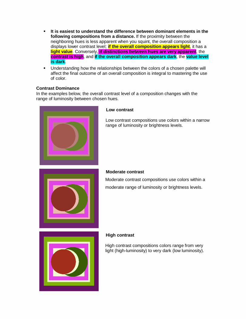
It is easiest to understand the difference between dominant elements in thefollowing compositions from a distance. If the proximity between theneighboring hues is less apparent when you squint, the overall composition adisplays lower contrast level; if the overall composition appears light, it has alight value. Conversely, if distinctions between hues are very apparent, thecontrast is high, and if the overall composition appears dark, the value levelis dark.
Understanding how the relationships between the colors of a chosen palette willaffect the final outcome of an overall composition is integral to mastering the useof color.
Contrast Dominance In the examples below, the overall contrast level of a composition changes with the range of luminosity between chosen hues.
Low contrast
Low contrast compositions use colors within a narrow range of luminosity or brightness levels.
Moderate contrast Moderate contrast compositions use colors within a
moderate range of luminosity or brightness levels.
High contrast
High contrast compositions colors range from very light (high-luminosity) to very dark (low luminosity).

Value Dominance In the examples below, the overall value of each composition changes with the incorporated hues' relative saturation.
Light value: a composition made up of tints, displays an overall light value.
Medium value: a medium value composition is made up of a balance between tints, saturated hues, and shades.
Dark value: a dark value composition displays mostly shades.
Artwork by Corey Day / Color & Design Spring 2012