Embed Size (px)
Citation preview
Policy Research Working Paper 7911
The Morphology of African CitiesSarah E. AntosSomik V. Lall
Nancy Lozano-Gracia
Social, Urban, Rural and Resilience Global Practice GroupDecember 2016
WPS7911P
ublic
Dis
clos
ure
Aut
horiz
edP
ublic
Dis
clos
ure
Aut
horiz
edP
ublic
Dis
clos
ure
Aut
horiz
edP
ublic
Dis
clos
ure
Aut
horiz
ed
Produced by the Research Support Team
Abstract
The Policy Research Working Paper Series disseminates the findings of work in progress to encourage the exchange of ideas about development issues. An objective of the series is to get the findings out quickly, even if the presentations are less than fully polished. The papers carry the names of the authors and should be cited accordingly. The findings, interpretations, and conclusions expressed in this paper are entirely those of the authors. They do not necessarily represent the views of the International Bank for Reconstruction and Development/World Bank and its affiliated organizations, or those of the Executive Directors of the World Bank or the governments they represent.
Policy Research Working Paper 7911
This paper is a product of the Social, Urban, Rural and Resilience Global Practice Group. It is part of a larger effort by the World Bank to provide open access to its research and make a contribution to development policy discussions around the world. Policy Research Working Papers are also posted on the Web at http://econ.worldbank.org. The authors may be contacted at [email protected].
This paper illustrates how the capabilities of GIS and satellite imagery can be harnessed to explore and better understand the urban form of several large African cities (Addis Ababa, Nairobi, Kigali, Dar es Salaam, and Dakar). To allow for comparability across very diverse cities, this work looks at the above mentioned cities through the lens of several spatial indicators and relies heavily on data derived from satellite imagery. First, it focuses on understanding the distribution of population across the city, and more specifically how the variations in population density could
be linked to transportation. Second, it takes a closer look at the land cover in each city using a semi-automated texture based land cover classification that identifies neighborhoods that appear more regular or irregularly planned. Lastly, for the higher resolution images, this work studies the changes in the land cover classes as one moves from the city core to the periphery. This work also explored the classification of slightly coarser resolution imagery which allowed analysis of a broader number of cities, sixteen, provided the lower cost.

The Morphology of African Cities Sarah E. Antos, Somik V. Lall and Nancy Lozano‐Gracia
JEL classification: R14, R30, O21
Keywords: Urban Development; Geographic Information Systems; Urban Land Supply and Markets;
Urban Participatory Planning; Urban Governance and City Systems
2
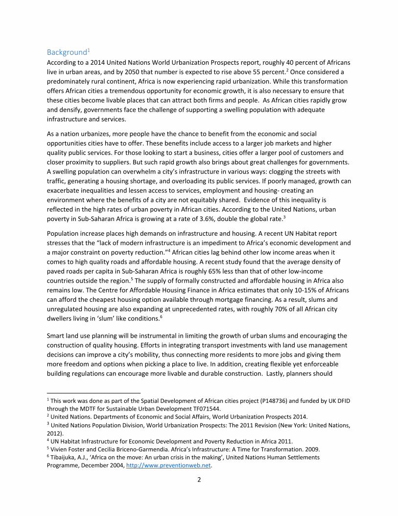
Background1 According to a 2014 United Nations World Urbanization Prospects report, roughly 40 percent of Africans
live in urban areas, and by 2050 that number is expected to rise above 55 percent.2 Once considered a
predominately rural continent, Africa is now experiencing rapid urbanization. While this transformation
offers African cities a tremendous opportunity for economic growth, it is also necessary to ensure that
these cities become livable places that can attract both firms and people. As African cities rapidly grow
and densify, governments face the challenge of supporting a swelling population with adequate
infrastructure and services.
As a nation urbanizes, more people have the chance to benefit from the economic and social
opportunities cities have to offer. These benefits include access to a larger job markets and higher
quality public services. For those looking to start a business, cities offer a larger pool of customers and
closer proximity to suppliers. But such rapid growth also brings about great challenges for governments.
A swelling population can overwhelm a city’s infrastructure in various ways: clogging the streets with
traffic, generating a housing shortage, and overloading its public services. If poorly managed, growth can
exacerbate inequalities and lessen access to services, employment and housing‐ creating an
environment where the benefits of a city are not equitably shared. Evidence of this inequality is
reflected in the high rates of urban poverty in African cities. According to the United Nations, urban
poverty in Sub‐Saharan Africa is growing at a rate of 3.6%, double the global rate.3
Population increase places high demands on infrastructure and housing. A recent UN Habitat report
stresses that the “lack of modern infrastructure is an impediment to Africa’s economic development and
a major constraint on poverty reduction.”4 African cities lag behind other low income areas when it
comes to high quality roads and affordable housing. A recent study found that the average density of
paved roads per capita in Sub‐Saharan Africa is roughly 65% less than that of other low‐income
countries outside the region.5 The supply of formally constructed and affordable housing in Africa also
remains low. The Centre for Affordable Housing Finance in Africa estimates that only 10‐15% of Africans
can afford the cheapest housing option available through mortgage financing. As a result, slums and
unregulated housing are also expanding at unprecedented rates, with roughly 70% of all African city
dwellers living in ‘slum’ like conditions.6
Smart land use planning will be instrumental in limiting the growth of urban slums and encouraging the
construction of quality housing. Efforts in integrating transport investments with land use management
decisions can improve a city’s mobility, thus connecting more residents to more jobs and giving them
more freedom and options when picking a place to live. In addition, creating flexible yet enforceable
building regulations can encourage more livable and durable construction. Lastly, planners should
1 This work was done as part of the Spatial Development of African cities project (P148736) and funded by UK DFID through the MDTF for Sustainable Urban Development TF071544. 2 United Nations. Departments of Economic and Social Affairs, World Urbanization Prospects 2014. 3 United Nations Population Division, World Urbanization Prospects: The 2011 Revision (New York: United Nations, 2012). 4 UN Habitat Infrastructure for Economic Development and Poverty Reduction in Africa 2011. 5 Vivien Foster and Cecilia Briceno‐Garmendia. Africa’s Infrastructure: A Time for Transformation. 2009. 6 Tibaijuka, A.J., ‘Africa on the move: An urban crisis in the making’, United Nations Human Settlements Programme, December 2004, http://www.preventionweb.net.
3
prioritize expansion of public services to reach marginalized neighborhoods, so that basic services, such
as waste collection, water supply, and electricity grids, reach even the most poor.
Accurate spatial data and city maps are a crucial ingredient to smart land use and city planning.
Historically, shanty areas have often been omitted from city planning maps, making it difficult to address
the improvements these neighborhoods need. When the master plans for many African cities were
drafted, the current rates of growth and poverty were unforeseen.7 By accurately identifying and
including slums in city land maps, policy makers will be better equipped to properly guide the planning
of inclusive urban development. Furthermore, precise and up‐to‐date maps of a city can help facilitate
better coordination between transportation projects and current land use, and prioritize areas in need
of housing upgrades.
Urban developers can leverage spatial data to not only improve planning, but also to better understand
the interactions between firm locations, residential growth, and unplanned expansion. Advances in
geographic information systems (GIS) and satellite imagery provide policy makers with new tools to
analyze the changing morphology of cities. A better understanding of the composition of cities, and how
land (residential, commercial, green space) changes throughout a city, can provide helpful insights for
city planning. For example, In London city planners have relied upon GIS to plan and create more
“livable streets” that encourage walking, cycling, and transit trips. Planners depend upon land use data
and transport layers to target arterial roads and intersections that could be redesigned without
significantly impacting the movement of motorized vehicles, but at the same time benefiting the
greatest number of pedestrians. 8 In Madrid developers consult a GIS application before breaking ground
on new construction. Following the national guidelines and regulations, the system identifies buildable
land, ensures compliance with historical preservation rules, and informs users of land use restrictions.9
These are just a few of many examples where accurate and timely spatial data is a crucial component to
planning and decision making.
7 Watson, Vanessa and Batatunde Agbola. 2013. Who will Plan Africa’s Cities? Africa Research Institute: Understanding Africa Today. http://www.africaresearchinstitute.org/publications/counterpoints/who‐will‐plan‐africas‐cities/. 8 UN Habitat. 2013. Streets as Public Spaces and Drivers of Urban Prosperity. Page 83. 9 SGGAGE. GIS Application: ESRI Solutions City Planning https://sggage.wordpress.com/2011/01/12/gis‐application‐esri‐solutions‐city‐planning/.
4
In what follows, this paper illustrates how the capabilities of GIS and satellite imagery can be harnessed
to explore and better understand the urban form of several large African cities (Addis Ababa, Nairobi,
Kigali, Dar es Salaam, and Dakar). To allow for comparability across very diverse cities, this work looks at
the above mentioned cities through the lens of several spatial indicators and relies heavily on data
derived from satellite imagery. First, it focuses on understanding the distribution of population across
the city, and more specifically how the variations in population density could be linked to
transportation. Second, it takes a closer look at the land cover in each city using a semi‐automated
texture based land cover classification that identifies neighborhoods that appear more regular or
irregularly planned. Lastly, for the higher resolution images, this work studies the changes in the land
cover classes as one moves from the city core to the periphery. This work also explored the classification
of slightly coarser resolution imagery which allowed analysis of a broader number of cities, 16, provided
the lower cost.
URBAN DENSITY Urban economists have long argued that a compact and well‐connected city is necessary for the
development of an economically strong and livable city. The benefits of dense cities are well
documented and empirically proven. Advantages include, among many others, higher firm and worker
productivity10 and improved consumer access to goods and services.11 In dense cities, firms face stiff
competition, thus making only the most efficient and productive likely to survive. When nestled among
many other businesses, firms are also encouraged to interact more frequently with their neighbors,
promoting a drop in cost and an increase in speed of business transactions.12 Consumers can also
benefit from this density, with the opportunity for shorter commutes, lower travel costs, and more
variety of available products.13 Additional benefits include reduced per capita energy consumption and
greater access to running water, sewerage, waste disposal, and public institutions like schools, hospitals
and law enforcement.14
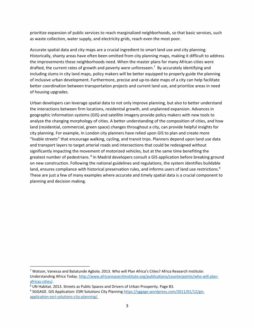
There are several well documented methods to calculating urban density. The first and most common
approach is to divide total population living within the city limit by the total area of the city. Figure 1
shows the overall density of the four African cities in this study, and compares them to other major
cities in the world.
Figure 1 – Overall density of African cities compared to several international cities
10 Melo, Patricia C., Daniel J. Graham, and Robert B. Noland. 2009. A meta‐analysis of estimates of urban agglomeration economies. Regional Science and Urban Economics 39(3):332–342. 11 Glaeser, Edward L., Jed Kolko, and Albert Saiz. 2001. Consumer city. Journal of Economic Geography 1(1):27–50. 12 Pierre‐Philippe Combes, Gilles Duranton, Laurent Gobillon, Diego Puga, and Sébastien Roux in their article 'The productivity advantages of large cities: Distinguishing agglomeration from firm selection', published in Econometrica 80(6), November 2012: 2543‐2594. 13 Couture, Victor. Valuing the Consumption Benefits of Urban Density, Preliminary Draft: 26 November 2012. University of Toronto. 14 Larivière, Isabelle and Lafrance, Gaetan. Modelling electricity consumption of cities: effect of urban density. Energy Economics. Volume 21, Issue 1, 1 February 1999, Pages 53–66.
5
Source: Population statistics and land area numbers from http://citypopulation.de/, calculations made by author.
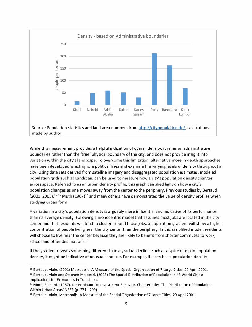
While this measurement provides a helpful indication of overall density, it relies on administrative
boundaries rather than the ‘true’ physical boundary of the city, and does not provide insight into
variation within the city’s landscape. To overcome this limitation, alternative more in depth approaches
have been developed which ignore political lines and examine the varying levels of density throughout a
city. Using data sets derived from satellite imagery and disaggregated population estimates, modeled
population grids such as Landscan, can be used to measure how a city’s population density changes
across space. Referred to as an urban density profile, this graph can shed light on how a city’s
population changes as one moves away from the center to the periphery. Previous studies by Bertaud
(2001, 2003),15 16 Muth (1967)17 and many others have demonstrated the value of density profiles when
studying urban form.
A variation in a city’s population density is arguably more influential and indicative of its performance
than its average density. Following a monocentric model that assumes most jobs are located in the city
center and that residents will tend to cluster around those jobs, a population gradient will show a higher
concentration of people living near the city center than the periphery. In this simplified model, residents
will choose to live near the center because they are likely to benefit from shorter commutes to work,
school and other destinations.18
If the gradient reveals something different than a gradual decline, such as a spike or dip in population
density, it might be indicative of unusual land use. For example, if a city has a population density
15 Bertaud, Alain. (2001) Metropolis: A Measure of the Spatial Organization of 7 Large Cities. 29 April 2001. 16 Bertaud, Alain and Stephen Malpezzi. (2003) The Spatial Distribution of Population in 48 World Cities: Implications for Economies in Transition. 17 Muth, Richard. (1967). Determinants of Investment Behavior. Chapter title: ‘The Distribution of Population Within Urban Areas’ NBER (p. 271 ‐ 299). 18 Bertaud, Alain. Metropolis: A Measure of the Spatial Organization of 7 Large Cities. 29 April 2001.
0
50
100
150
200
250
Kigali Nairobi AddisAbaba
Dakar Dar esSalaam
Paris Barcelona KualaLumpur
peo
ple per hectare
Density ‐ based on Administrative boundaries
6
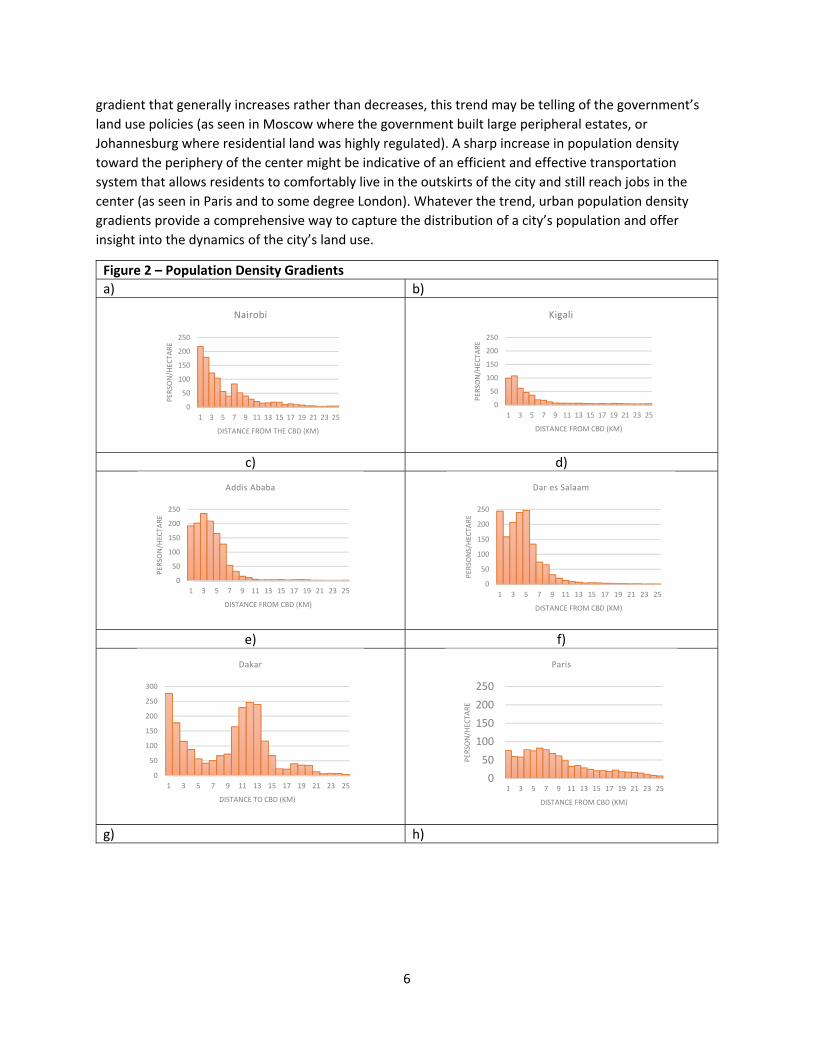
gradient that generally increases rather than decreases, this trend may be telling of the government’s
land use policies (as seen in Moscow where the government built large peripheral estates, or
Johannesburg where residential land was highly regulated). A sharp increase in population density
toward the periphery of the center might be indicative of an efficient and effective transportation
system that allows residents to comfortably live in the outskirts of the city and still reach jobs in the
center (as seen in Paris and to some degree London). Whatever the trend, urban population density
gradients provide a comprehensive way to capture the distribution of a city’s population and offer
insight into the dynamics of the city’s land use.
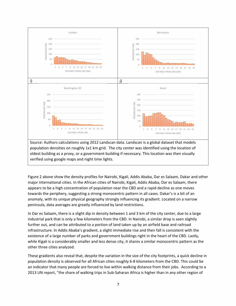
Figure 2 – Population Density Gradients
a) b)
c) d)
e) f)
g) h)
0
50
100
150
200
250
1 3 5 7 9 11 13 15 17 19 21 23 25
PER
SON/HEC
TARE
DISTANCE FROM THE CBD (KM)
Nairobi
0
50
100
150
200
250
1 3 5 7 9 11 13 15 17 19 21 23 25
PER
SON/HEC
TARE
DISTANCE FROM CBD (KM)
Kigali
0
50
100
150
200
250
1 3 5 7 9 11 13 15 17 19 21 23 25
PER
SON/HEC
TARE
DISTANCE FROM CBD (KM)
Addis Ababa
0
50
100
150
200
250
1 3 5 7 9 11 13 15 17 19 21 23 25
PER
SONS/HEC
TARE
DISTANCE FROM CBD (KM)
Dar es Salaam
0
50
100
150
200
250
300
1 3 5 7 9 11 13 15 17 19 21 23 25
DISTANCE TO CBD (KM)
Dakar
0
50
100
150
200
250
1 3 5 7 9 11 13 15 17 19 21 23 25
PER
SON/HEC
TARE
DISTANCE FROM CBD (KM)
Paris
7
i) j)
Source: Authors calculations using 2012 Landscan data. Landscan is a global dataset that models
population densities on roughly 1x1 km grid. The city center was identified using the location of
oldest building as a proxy, or a government building if necessary. This location was then visually
verified using google maps and night time lights.
Figure 2 above show the density profiles for Nairobi, Kigali, Addis Ababa, Dar es Salaam, Dakar and other
major international cities. In the African cities of Nairobi, Kigali, Addis Ababa, Dar es Salaam, there
appears to be a high concentration of population near the CBD and a rapid decline as one moves
towards the periphery, suggesting a strong monocentric pattern in all cases. Dakar’s is a bit of an
anomaly, with its unique physical geography strongly influencing its gradient. Located on a narrow
peninsula, data averages are greatly influenced by land restrictions.
In Dar es Salaam, there is a slight dip in density between 1 and 3 km of the city center, due to a large
industrial park that is only a few kilometers from the CBD. In Nairobi, a similar drop is seen slightly
further out, and can be attributed to a portion of land taken up by an airfield base and railroad
infrastructure. In Addis Ababa’s gradient, a slight immediate rise and then fall is consistent with the
existence of a large number of parks and government buildings right in the heart of the CBD. Lastly,
while Kigali is a considerably smaller and less dense city, it shares a similar monocentric pattern as the
other three cities analyzed.
These gradients also reveal that, despite the variation in the size of the city footprints, a quick decline in
population density is observed for all African cities roughly 6‐8 kilometers from the CBD. This could be
an indicator that many people are forced to live within walking distance from their jobs. According to a
2013 UN report, “the share of walking trips in Sub‐Saharan Africa is higher than in any other region of
0
50
100
150
200
250
1 3 5 7 9 11 13 15 17 19 21 23 25
PER
SON/HEC
TARE
DISTANCE FROM CBD (KM)
London
0
50
100
150
200
250
1 3 5 7 9 11 13 15 17 19 21 23 25
PER
SON/HEC
TARE
DISTANCE FROM CBD (KM)
Barcelona
0
50
100
150
200
250
1 3 5 7 9 11 13 15 17 19 21 23 25
PER
SON/HEC
TARE
DISTANCE FROM CBD
Washington DC
0
50
100
150
200
250
300
1 3 5 7 9 11 13 15 17 19 21 23 25
PER
SON/HEC
TARE
DISTANCE FROM CBD (KM)
Seoul
8
the world.”19 For example, In Dar es Salaam, an estimated 70 percent of all travel is done on foot and
roughly 20 percent is by minibus.
In African cities, residents lack access to efficient and affordable transit systems and are thus forced to
live close to the city center. In contrast, cities like Barcelona, London, Washington DC and Paris all have
extensive and proficient transport systems. Barcelona has a population of 1.6 million, similar in size to
Dar es Salaam’s 1.4 million, but in Barcelona 33 percent of commuters rely on public transportation,
while in Dar es Salaam only 5 percent of its residents use public transit. As a result, the gradients in
Figure 2 show African cities have a steeper decline in population density than the European cities in
Figure 2 with well‐developed transport infrastructure. While all the cities seem to follow a monocentric
model, in Africa density drops off more dramatically than in European and Asian cities.
In a smartly planned well‐functioning monocentric city, one would expect to see a high peak in
population density near the city center, followed by a gradual decline moving away from the city center.
A strong and far reaching urban transit system allows residents to efficiently and affordably reach jobs
and amenities that might be many miles from their homes. This gives residents the freedom to live in
the periphery of the city and still benefit from the job opportunities in the urban core. In European cities
a high proportion of central and peripheral land is dedicated to transport, in contrast African cities tend
to have a much lower share of land used for transport with a rapid decline near the edges of the city.
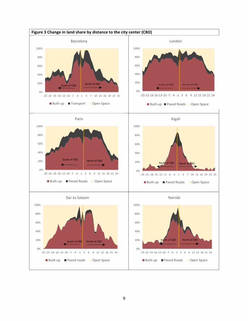
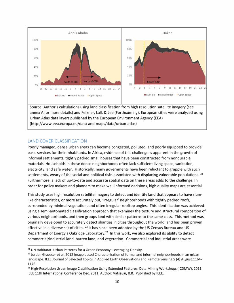
The land cover charts shown in Figure 3 provide a visualization of how the share in land cover changes
as one moves to either the north or south of the city center. In Paris, roughly 16% of the land within
10kms of the CBD is dedicated to paved roads. In urban planning literature Paris is often held up as an
example of a city with a sustainable and effective urban form.20 With a prominent core and high land
use density, Paris also benefits from high accessibility through a well‐developed road network. In
contrast, a city like Dar es Salaam devotes only 7% of its land within 10kms to paved roads, and beyond
12kms the amount of paved roads drops off rapidly. This dramatic drop is consistently observed in
almost all the Africa cities examined in this study, and is suggestive of low peripheral connectivity and
limited accessibility of the city’s core.
19 UNEP (2013) Share the Road: Design Guidelines for Non Motorised Transport in Africa. 20 Rodger L. Kemp and Carl J. Stephani. Global Models of Urban Planning: Best Practices Outside the United States. Originally published as “Paris: A New Blue Print” Urban Land Vol. 69 No. ¾ (March/April 2010), by the Urban Land Institute, Washington DC.
9
Figure 3 Change in land share by distance to the city center (CBD)
0%
20%
40%
60%
80%
100%
‐25 ‐22 ‐19 ‐16 ‐13 ‐10 ‐7 ‐4 1 4 7 10 13 16 19 22 25
Barcelona
Built‐up Transport Open Space
0%
20%
40%
60%
80%
100%
‐25‐22‐19‐16‐13‐10 ‐7 ‐4 ‐1 3 6 9 12 15 18 21 24
London
Built‐up Paved Roads Open Space
0%
20%
40%
60%
80%
100%
‐25 ‐22 ‐19 ‐16 ‐13 ‐10 ‐7 ‐4 ‐1 3 6 9 12 15 18 21 24
Paris
Built‐up Paved Roads Open Space
0%
20%
40%
60%
80%
100%
‐24 ‐21 ‐18 ‐15 ‐12 ‐9 ‐6 ‐3 1 4 7 10 13 16 19 22 25
Kigali
Built‐up Paved Roads Open Space
0%
20%
40%
60%
80%
100%
‐25 ‐22 ‐19 ‐16 ‐13 ‐10 ‐7 ‐4 ‐1 3 6 9 12 15 18 21 24
Dar es Salaam
Built‐up Paved roads Open Space
0%
20%
40%
60%
80%
100%
‐25 ‐22 ‐19 ‐16 ‐13 ‐10 ‐7 ‐4 ‐1 3 6 9 12 15 18 21 24
Nairobi
Built‐up Paved Roads Open Space
North of CBD North of CBDSouth of CBDSouth of CBD
South of CBD
North of CBD South of CBD North of CBD South of CBD
North of CBD South of CBD North of CBD
10
Source: Author’s calculations using land classification from high resolution satellite imagery (see
annex A for more details) and Felkner, Lall, & Lee (Forthcoming). European cities were analyzed using
Urban Atlas data layers published by the European Environment Agency (EEA)
(http://www.eea.europa.eu/data‐and‐maps/data/urban‐atlas)
LAND COVER CLASSIFICATION Poorly managed, dense urban areas can become congested, polluted, and poorly equipped to provide
basic services for their inhabitants. In Africa, evidence of this challenge is apparent in the growth of
informal settlements; tightly packed small houses that have been constructed from nondurable
materials. Households in these dense neighborhoods often lack sufficient living space, sanitation,
electricity, and safe water. Historically, many governments have been reluctant to grapple with such
settlements, weary of the social and political risks associated with displacing vulnerable populations. 21
Furthermore, a lack of up‐to‐date and accurate spatial data on these areas adds to the challenge. In
order for policy makers and planners to make well informed decisions, high quality maps are essential.
This study uses high resolution satellite imagery to detect and identify land that appears to have slum‐
like characteristics, or more accurately put, ‘irregular’ neighborhoods with tightly packed roofs,
surrounded by minimal vegetation, and often irregular rooftop angles. This identification was achieved
using a semi‐automated classification approach that examines the texture and structural composition of
various neighborhoods, and then groups land with similar patterns to the same class. This method was
originally developed to accurately detect shanties in cities throughout the world, and has been proven
effective in a diverse set of cities. 22 It has since been adopted by the US Census Bureau and US
Department of Energy’s Oakridge Laboratory.23 In this work, we also explored its ability to detect
commercial/industrial land, barren land, and vegetation. Commercial and industrial areas were
21 UN Habitatat. Urban Patterns for a Green Economy: Leveraging Density. 22 Jordan Graesser et al. 2012 Image based Characterization of formal and informal neighborhoods in an urban landscape. IEEE Journal of Selected Topics in Applied Earth Observations and Remote Sensing 5 (4) August:1164‐1176. 23 High‐Resolution Urban Image Classification Using Extended Features: Data Mining Workshops (ICDMW), 2011 IEEE 11th International Conference Dec. 2011. Author: Vatsavai, R.R. Published by IEEE.
0%
20%
40%
60%
80%
100%
‐25 ‐22 ‐19 ‐16 ‐13 ‐10 ‐7 ‐4 ‐1 3 6 9 12 15 18 21 24
Addis Ababa
Buit‐up Paved Roads Open Space
0%
20%
40%
60%
80%
100%
‐4 ‐2 1 3 5 7 9 11 13 15 17 19 21 23 25
Dakar
Built‐up Paved roads Open Space
North of CBD South of CBD East of CBD
11
combined into a single class, due to the challenge of distinguishing between large factory buildings and
large retail buildings. 24
Data and Classification Methodology
The imagery used in this paper was multispectral high‐resolution imagery (>1m). To gain full coverage of
each city, several scenes from multiple sensors were mosaicked to create a single seamless image.
For each city, high spatial resolution imagery containing 4 bands (Red, Green, Blue, and Near Infrared)
was obtained. A combination of sensors (GeoEye, IKONOs, and Worldview) was necessary to obtain full
coverage of each city. All scenes were then mosaicked and resampled to a resolution of 1m. Each image
was captured between 2010 and 2013 and contained minimal cloud cover. All imagery and analysis
layers are projected as WGS 1984 UTM Zones
Areas of interest (AOI) are defined using official administrative borders and local knowledge. An effort
was made to include all the official city land and also areas of peripheral growth whenever possible. Due
to the large size of the cities, and high spatial resolution of the imagery, the data were aggregated and
summarized to a 0.5x0.5km grid. This larger unit of measure minimizes the effects of any single pixel
misclassification and simplifies the data for better visualization.
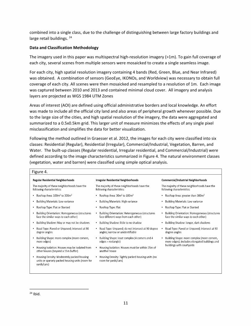
Following the method outlined in Graesser et al. 2012, the images for each city were classified into six
classes: Residential (Regular), Residential (Irregular), Commercial/Industrial, Vegetation, Barren, and
Water. The built‐up classes (Regular residential, Irregular residential, and Commercial/Industrial) were
defined according to the image characteristics summarized in Figure 4. The natural environment classes
(vegetation, water and barren) were classified using simple optical analysis.
Figure 4.
24 Ibid.
12
This classification approach utilizes spatial and textural characteristics of the imagery at the
neighborhood level. A combination of spatial features and spectral information was extracted from the
original imagery using the open source MapPy python script library available on GitHub. A set of six
spatial features and two spectral features was extracted using the python scripts, and are listed below:
Differential Morphological Profiles (DMP) segment imagery according to an area’s degree of
homogeneity.25
Fourier Transform (FT) examines edges by decomposing the image into different spatial
frequencies.26
Gabor Filters are edge extraction filters at different scales and orientations.27
The Histogram of Oriented Gradients (HOG) captures the distribution of structure edge
orientations in a histogram.28
Local Binary Pattern Moments (LBPM) is a texture algorithm that examines relationships
between a center pixel and its neighboring pixels. The layout of the pixel group represents the
local pattern as flat areas, edges, corners, and line ends.29
PanTex is a contrast texture designed specifically to identify buildings. It is derived from the
Gray Level Co‐Occurrence Matrix (GLCM), an algorithm that determines how often adjacent
pixels have the same gray level value.30
The Normalized Difference Vegetation Index (NDVI) is a simple spectral indicator that assesses
whether a pixel has green vegetation.31
The local mean of each of the original four bands and composite image was also computed.
Each of the features was computed with a block size (output resolution) and scale size (window size).
Block size represents the output layer resolution. Because this analysis focuses on neighborhoods,
rather than individual buildings, block sizes that produced output resolutions closest to 15m were
used.32 A block size of 32 produced an output classification resolution of 16m (0.5m input imagery X
block size 32 = 15m output resolution). Scale size represents the window size, or the amount of pixels
from which the spatial feature algorithm will extract contextual information. Three scale sizes, starting
at the block size and increasing in octaves, were chosen (32, 64, and 128). Once all feature layers were
computed, they were layered into a virtual stack.
Training Sites
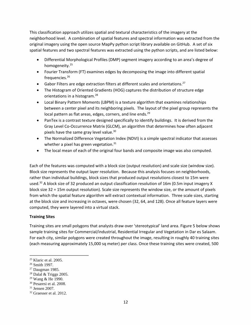
Training sites are small polygons that analysts draw over ‘stereotypical’ land area. Figure 5 below shows
sample training sites for Commercial/industrial, Residential Irregular and Vegetation in Dar es Salaam.
For each city, similar polygons were created throughout the image, resulting in roughly 40 training sites
(each measuring approximately 15,000 sq meter) per class. Once these training sites were created, 500
25 Klaric et al. 2005. 26 Smith 1997. 27 Daugman 1985. 28 Dalal & Triggs 2005. 29 Wang & He 1990. 30 Pesaresi et al. 2008. 31 Jensen 2007. 32 Graesser et al. 2012.
13
random points were generated throughout each class. These points are then used to ‘teach’ the
classifier how to best determine which areas in the image should be assigned to each class.
Figure 5: Example Training sites
Source: QuickBird imagery 2013
The image was classified using a Random Forest (RF) classifier. RF is a machine learning algorithm that
constructs multiple decision trees and outputs the most frequently chosen class. This RF classifier used
100 trees that mapped the area at the block size described earlier. The image was then smoothed using
a 5x5 majority filter, which eliminates anomalous pixels and creates contiguous and fluid land cover
class regions. Finally, the paved roads were derived from the high resolution imagery, and added into
the layer post classification (Felkner, Lall, & Lee, forthcoming). Clouds and cloud shadows were masked
from the final classification to avoid misclassification errors. Accuracy assessments were performed on
the final classified layers using 50 randomly generated points per class, resulting in a 400 point sample
(see Table 1). In all cases, accuracy levels were above 87 percent, reaching levels as high as 92 percent
for the most recent images for Nairobi and Addis Ababa.
Table 1. Accuracy Assessment Results
City Overall Accuracy
Addis Ababa c. 2000 87.8%
Addis Ababa c. 2010 92.0%
Dar es Salaam c. 2000 88.0%
Dar es Salaam c. 2010 87.3%
Kigali c. 2000 87.3%
14
Kigali c. 2010 87.0%
Nairobi c. 2000 90.3%
Nairobi c. 2010 92.3%
LAND COVER ANALYSIS RESULTS
Dar es Salaam, Tanzania
Dar es Salaam’s rapid population growth of 5.6% annually from 2002‐2012 makes it Africa’s 3rd fastest
growing city. In 1963 the Ministry of Lands, Housing and Urban development used aerial photography
to estimate that there were roughly 7,000 units in unplanned areas. By 1972 that number had more
than tripled to 28,000.33 In 2002, Tanzania’s Community Infrastructure Upgrading Project estimated that
about 68% of the city’s population lived in unplanned settlements.34 The UN echoes this estimate,
approximating that in 1995, 70% of Dar es Salaam’s population resided in informal settlements. While
the methodology used in the study cannot quantify ‘slums’ or informal settlements as they are defined
by the UN (it is impossible to determine land tenure or sanitation from satellite imagery) this
methodology is able to detect residential neighborhoods that appear irregularly planned. This analysis
therefore uses ‘irregular’ as a proxy for slum or shanty.
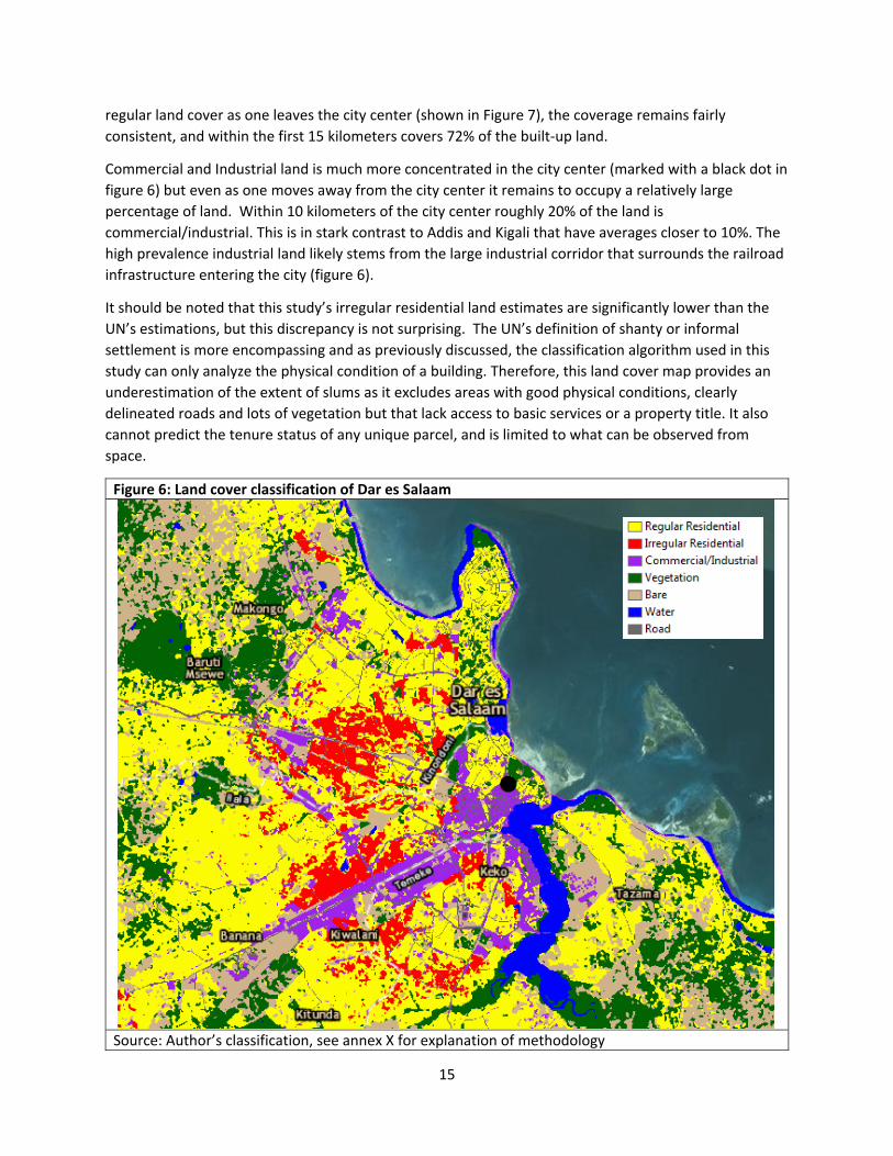
Figure 6 below shows the land cover classification for Dar es Salaam. Land with irregular residential
characteristics is shown in red, and appears predominately towards the core of the city in the western
and northern side. The center of the city is marked with a black dot. Just beyond the
commercial/industrial city center, irregular housing begins to appear with many of them found clustered
near the large industrial park that transects the city (shown in purple in Figure 6). Upon closer
inspection, small pockets of irregular settlements are detected directly adjacent to large warehouses
and transit infrastructure.
In order to quantify these observed trends, the classified data layer was summarized by distance to the
city center. Figure 6 shows how the coverage of residential (regular and irregular) and
commercial/industrial land changes as one moves from the center to the periphery of the city. As
expected, the first few kilometers of built‐up land around the CBD is dominated by
commercial/industrial and residential regular, with a noticeable low percentage of irregular residential.
It is not until 3 to 4 kilometers beyond the city center that residential irregular begins to appear, it then
peaks between 6 to 9 kilometers with residential irregular occupying roughly 18% of the built‐up land.
In contrast, residential regular neighborhoods are spread throughout the city. The residential regular
class captures neighborhoods with moderately dense housing units, some lawns/trees and gridded or
well organized road network. Given this rather broad/encompassing definition, the class includes both
attached homes (townhouses) within the city center that have a gridded road, as well as large
development single family houses near the periphery. While there is a slight increase in residential
33 UN Habitat (2010) Dar es Salaam: A Rapidly Urbanising Informal City. 34 CIUP, 2004. Dar es Salaam Infrastructure Development Programme. Community Infrastructure Upgrading Project.
15
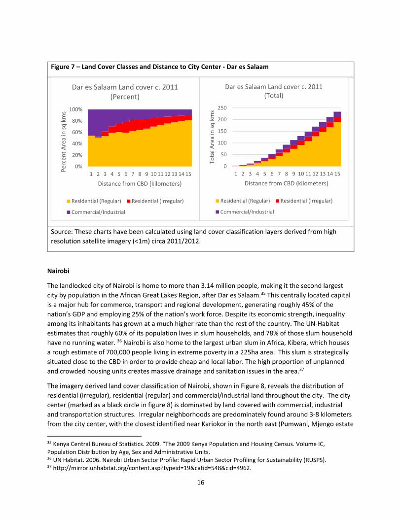
regular land cover as one leaves the city center (shown in Figure 7), the coverage remains fairly
consistent, and within the first 15 kilometers covers 72% of the built‐up land.
Commercial and Industrial land is much more concentrated in the city center (marked with a black dot in
figure 6) but even as one moves away from the city center it remains to occupy a relatively large
percentage of land. Within 10 kilometers of the city center roughly 20% of the land is
commercial/industrial. This is in stark contrast to Addis and Kigali that have averages closer to 10%. The
high prevalence industrial land likely stems from the large industrial corridor that surrounds the railroad
infrastructure entering the city (figure 6).
It should be noted that this study’s irregular residential land estimates are significantly lower than the
UN’s estimations, but this discrepancy is not surprising. The UN’s definition of shanty or informal
settlement is more encompassing and as previously discussed, the classification algorithm used in this
study can only analyze the physical condition of a building. Therefore, this land cover map provides an
underestimation of the extent of slums as it excludes areas with good physical conditions, clearly
delineated roads and lots of vegetation but that lack access to basic services or a property title. It also
cannot predict the tenure status of any unique parcel, and is limited to what can be observed from
space.
Figure 6: Land cover classification of Dar es Salaam
Source: Author’s classification, see annex X for explanation of methodology
16
Figure 7 – Land Cover Classes and Distance to City Center ‐ Dar es Salaam
Source: These charts have been calculated using land cover classification layers derived from high
resolution satellite imagery (<1m) circa 2011/2012.
Nairobi
The landlocked city of Nairobi is home to more than 3.14 million people, making it the second largest
city by population in the African Great Lakes Region, after Dar es Salaam.35 This centrally located capital
is a major hub for commerce, transport and regional development, generating roughly 45% of the
nation’s GDP and employing 25% of the nation’s work force. Despite its economic strength, inequality
among its inhabitants has grown at a much higher rate than the rest of the country. The UN‐Habitat
estimates that roughly 60% of its population lives in slum households, and 78% of those slum household
have no running water. 36 Nairobi is also home to the largest urban slum in Africa, Kibera, which houses
a rough estimate of 700,000 people living in extreme poverty in a 225ha area. This slum is strategically
situated close to the CBD in order to provide cheap and local labor. The high proportion of unplanned
and crowded housing units creates massive drainage and sanitation issues in the area.37
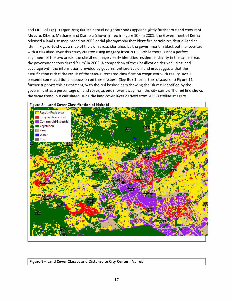
The imagery derived land cover classification of Nairobi, shown in Figure 8, reveals the distribution of
residential (irregular), residential (regular) and commercial/industrial land throughout the city. The city
center (marked as a black circle in figure 8) is dominated by land covered with commercial, industrial
and transportation structures. Irregular neighborhoods are predominately found around 3‐8 kilometers
from the city center, with the closest identified near Kariokor in the north east (Pumwani, Mjengo estate
35 Kenya Central Bureau of Statistics. 2009. “The 2009 Kenya Population and Housing Census. Volume IC, Population Distribution by Age, Sex and Administrative Units. 36 UN Habitat. 2006. Nairobi Urban Sector Profile: Rapid Urban Sector Profiling for Sustainability (RUSPS). 37 http://mirror.unhabitat.org/content.asp?typeid=19&catid=548&cid=4962.
0%
20%
40%
60%
80%
100%
1 2 3 4 5 6 7 8 9 10 11 12 13 14 15
Percent Area in sq kms
Distance from CBD (kilometers)
Dar es Salaam Land cover c. 2011 (Percent)
Residential (Regular) Residential (Irregular)
Commercial/Industrial
0
50
100
150
200
250
1 2 3 4 5 6 7 8 9 10 11 12 13 14 15
Total A
rea in sq kms
Distance from CBD (kilometers)
Dar es Salaam Land cover c. 2011 (Total)
Residential (Regular) Residential (Irregular)
Commercial/Industrial
17
and Kitui Village). Larger irregular residential neighborhoods appear slightly further out and consist of
Mukuru, Kibera, Mathare, and Kiambiu (shown in red in figure 10). In 2005, the Government of Kenya
released a land use map based on 2003 aerial photography that identifies certain residential land as
‘slum’. Figure 10 shows a map of the slum areas identified by the government in black outline, overlaid
with a classified layer this study created using imagery from 2003. While there is not a perfect
alignment of the two areas, the classified image clearly identifies residential shanty in the same areas
the government considered ‘slum’ in 2003. A comparison of the classification derived using land
coverage with the information provided by government sources on land use, suggests that the
classification is that the result of the semi‐automated classification congruent with reality. Box 1
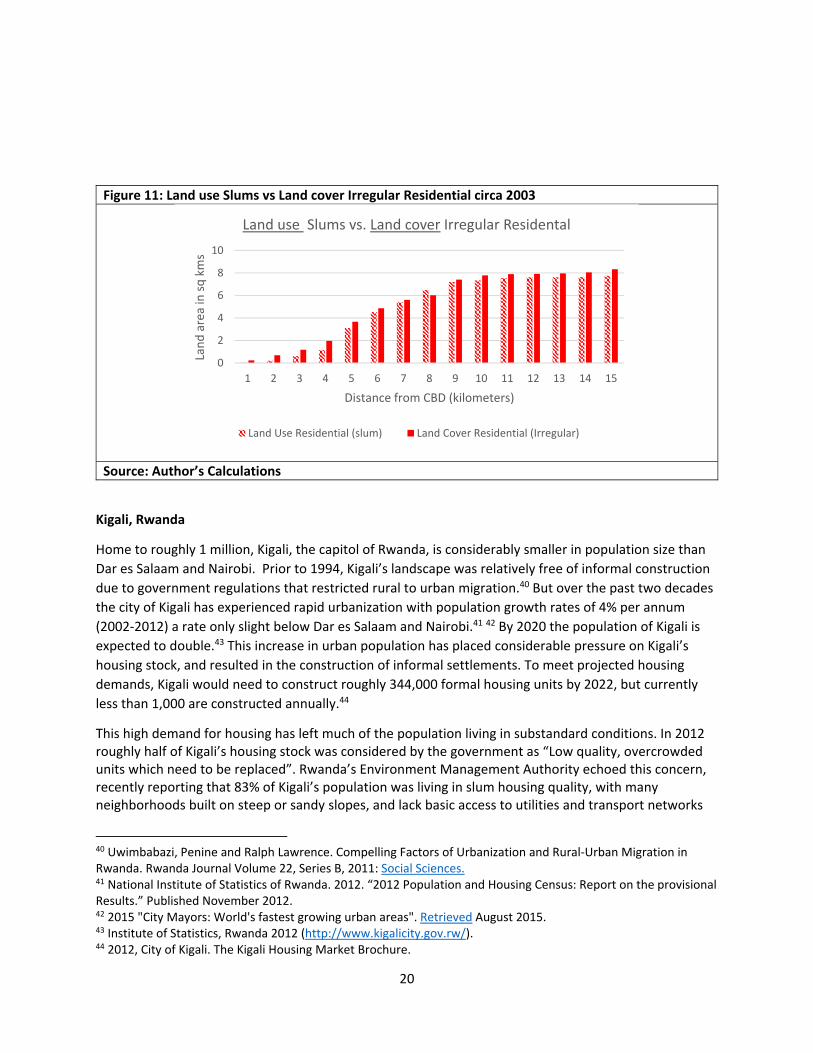
presents some additional discussion on these issues. (See Box 1 for further discussion.) Figure 11
further supports this assessment, with the red hashed bars showing the ‘slums’ identified by the
government as a percentage of land cover, as one moves away from the city center. The red line shows
the same trend, but calculated using the land cover layer derived from 2003 satellite imagery.
Figure 8 – Land Cover Classification of Nairobi
Figure 9 – Land Cover Classes and Distance to City Center ‐ Nairobi
18
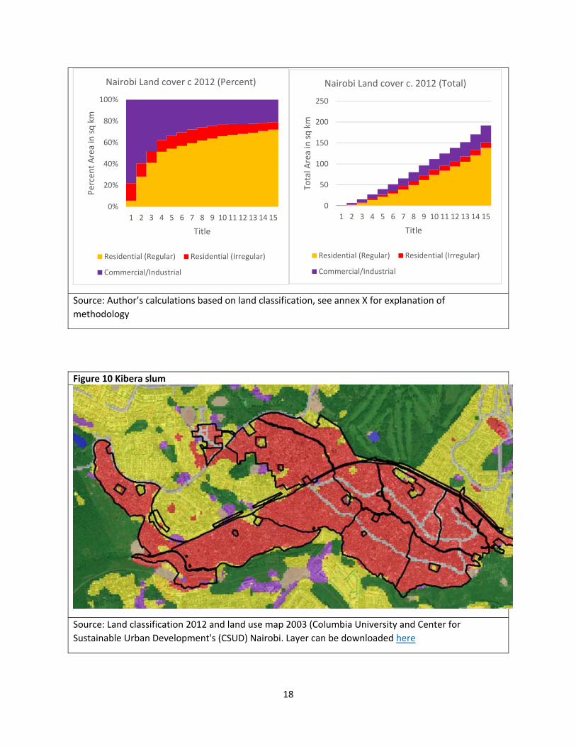
Source: Author’s calculations based on land classification, see annex X for explanation of
methodology
Figure 10 Kibera slum
Source: Land classification 2012 and land use map 2003 (Columbia University and Center for
Sustainable Urban Development's (CSUD) Nairobi. Layer can be downloaded here
0%
20%
40%
60%
80%
100%
1 2 3 4 5 6 7 8 9 10 11 12 13 14 15
Percent Area in sq km
Title
Nairobi Land cover c 2012 (Percent)
Residential (Regular) Residential (Irregular)
Commercial/Industrial
0
50
100
150
200
250
1 2 3 4 5 6 7 8 9 10 11 12 13 14 15
Total A
rea in sq km
Title
Nairobi Land cover c. 2012 (Total)
Residential (Regular) Residential (Irregular)
Commercial/Industrial
19
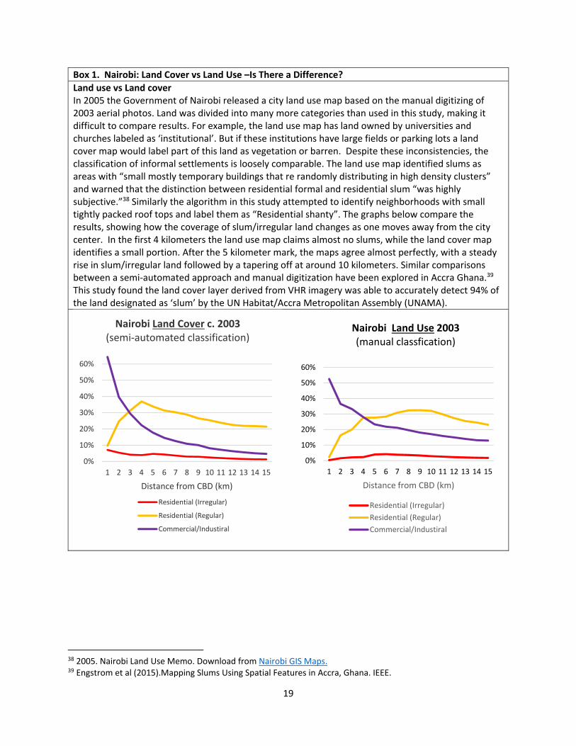
Box 1. Nairobi: Land Cover vs Land Use –Is There a Difference?
Land use vs Land cover In 2005 the Government of Nairobi released a city land use map based on the manual digitizing of 2003 aerial photos. Land was divided into many more categories than used in this study, making it difficult to compare results. For example, the land use map has land owned by universities and churches labeled as ‘institutional’. But if these institutions have large fields or parking lots a land cover map would label part of this land as vegetation or barren. Despite these inconsistencies, the classification of informal settlements is loosely comparable. The land use map identified slums as areas with “small mostly temporary buildings that re randomly distributing in high density clusters” and warned that the distinction between residential formal and residential slum “was highly subjective.”38 Similarly the algorithm in this study attempted to identify neighborhoods with small tightly packed roof tops and label them as “Residential shanty”. The graphs below compare the results, showing how the coverage of slum/irregular land changes as one moves away from the city center. In the first 4 kilometers the land use map claims almost no slums, while the land cover map identifies a small portion. After the 5 kilometer mark, the maps agree almost perfectly, with a steady rise in slum/irregular land followed by a tapering off at around 10 kilometers. Similar comparisons between a semi‐automated approach and manual digitization have been explored in Accra Ghana.39 This study found the land cover layer derived from VHR imagery was able to accurately detect 94% of the land designated as ‘slum’ by the UN Habitat/Accra Metropolitan Assembly (UNAMA).
38 2005. Nairobi Land Use Memo. Download from Nairobi GIS Maps. 39 Engstrom et al (2015).Mapping Slums Using Spatial Features in Accra, Ghana. IEEE.
0%
10%
20%
30%
40%
50%
60%
1 2 3 4 5 6 7 8 9 10 11 12 13 14 15
Distance from CBD (km)
Nairobi Land Cover c. 2003(semi‐automated classification)
Residential (Irregular)
Residential (Regular)
Commercial/Industiral
0%
10%
20%
30%
40%
50%
60%
1 2 3 4 5 6 7 8 9 10 11 12 13 14 15
Distance from CBD (km)
Nairobi Land Use 2003 (manual classfication)
Residential (Irregular)
Residential (Regular)
Commercial/Industiral
20
Figure 11: Land use Slums vs Land cover Irregular Residential circa 2003
Source: Author’s Calculations
Kigali, Rwanda
Home to roughly 1 million, Kigali, the capitol of Rwanda, is considerably smaller in population size than
Dar es Salaam and Nairobi. Prior to 1994, Kigali’s landscape was relatively free of informal construction
due to government regulations that restricted rural to urban migration.40 But over the past two decades
the city of Kigali has experienced rapid urbanization with population growth rates of 4% per annum
(2002‐2012) a rate only slight below Dar es Salaam and Nairobi.41 42 By 2020 the population of Kigali is
expected to double.43 This increase in urban population has placed considerable pressure on Kigali’s
housing stock, and resulted in the construction of informal settlements. To meet projected housing
demands, Kigali would need to construct roughly 344,000 formal housing units by 2022, but currently
less than 1,000 are constructed annually.44
This high demand for housing has left much of the population living in substandard conditions. In 2012 roughly half of Kigali’s housing stock was considered by the government as “Low quality, overcrowded units which need to be replaced”. Rwanda’s Environment Management Authority echoed this concern, recently reporting that 83% of Kigali’s population was living in slum housing quality, with many neighborhoods built on steep or sandy slopes, and lack basic access to utilities and transport networks
40 Uwimbabazi, Penine and Ralph Lawrence. Compelling Factors of Urbanization and Rural‐Urban Migration in Rwanda. Rwanda Journal Volume 22, Series B, 2011: Social Sciences. 41 National Institute of Statistics of Rwanda. 2012. “2012 Population and Housing Census: Report on the provisional Results.” Published November 2012. 42 2015 "City Mayors: World's fastest growing urban areas". Retrieved August 2015. 43 Institute of Statistics, Rwanda 2012 (http://www.kigalicity.gov.rw/). 44 2012, City of Kigali. The Kigali Housing Market Brochure.
0
2
4
6
8
10
1 2 3 4 5 6 7 8 9 10 11 12 13 14 15
Land area in sq kms
Distance from CBD (kilometers)
Land use Slums vs. Land cover Irregular Residental
Land Use Residential (slum) Land Cover Residential (Irregular)
21
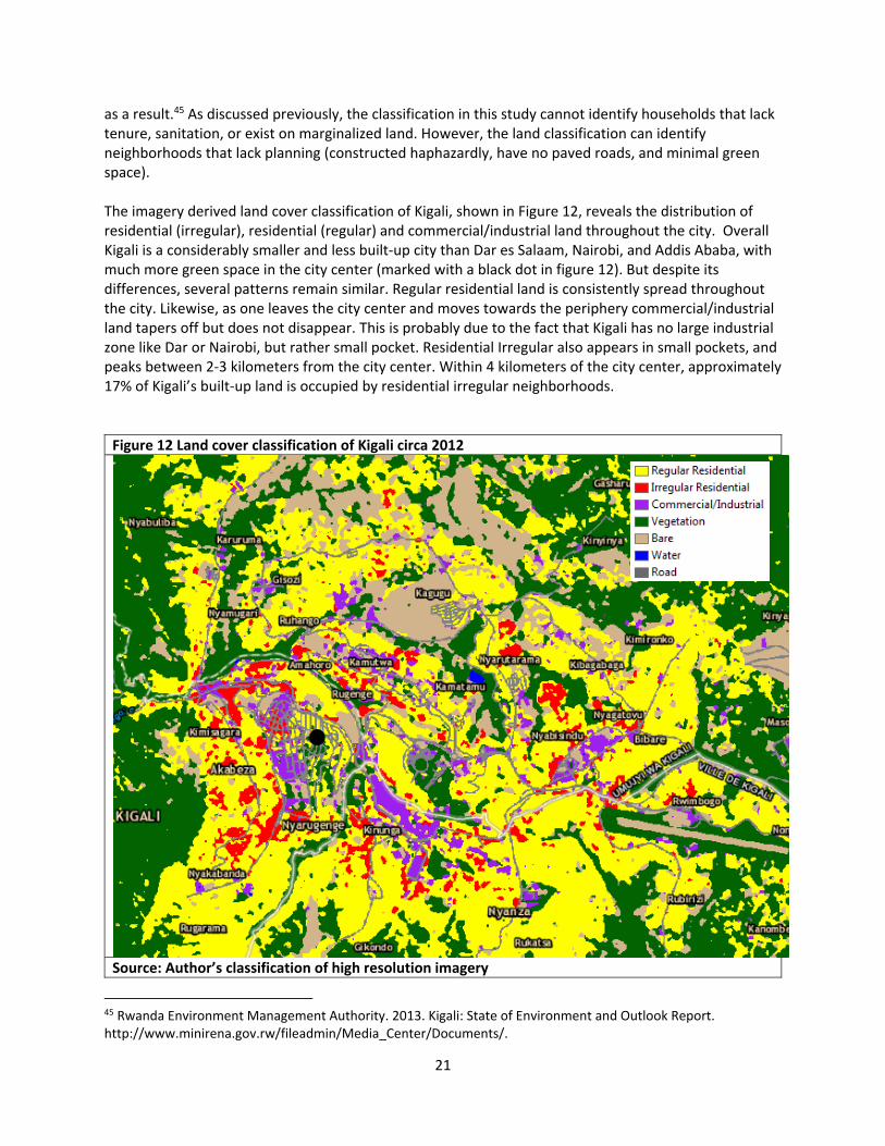
as a result.45 As discussed previously, the classification in this study cannot identify households that lack tenure, sanitation, or exist on marginalized land. However, the land classification can identify neighborhoods that lack planning (constructed haphazardly, have no paved roads, and minimal green space). The imagery derived land cover classification of Kigali, shown in Figure 12, reveals the distribution of residential (irregular), residential (regular) and commercial/industrial land throughout the city. Overall Kigali is a considerably smaller and less built‐up city than Dar es Salaam, Nairobi, and Addis Ababa, with much more green space in the city center (marked with a black dot in figure 12). But despite its differences, several patterns remain similar. Regular residential land is consistently spread throughout the city. Likewise, as one leaves the city center and moves towards the periphery commercial/industrial land tapers off but does not disappear. This is probably due to the fact that Kigali has no large industrial zone like Dar or Nairobi, but rather small pocket. Residential Irregular also appears in small pockets, and peaks between 2‐3 kilometers from the city center. Within 4 kilometers of the city center, approximately 17% of Kigali’s built‐up land is occupied by residential irregular neighborhoods.
Figure 12 Land cover classification of Kigali circa 2012
Source: Author’s classification of high resolution imagery
45 Rwanda Environment Management Authority. 2013. Kigali: State of Environment and Outlook Report. http://www.minirena.gov.rw/fileadmin/Media_Center/Documents/.

22
Figure 13 – Land Cover Classification and Distance to City Center ‐ Kigali
Addis Ababa, Ethiopia
Addis Ababa is one of the oldest and largest cities in Africa, making it a central urban hub for many
Ethiopians in search of better living and employment conditions. The city accounts for approximately
20% of the country’s GDP, although it is home to less than 5% of the country’s residents.46 According to
the 2007 Ethiopian census, roughly 2.7 million people live in Addis, a number that has doubled every
decade since 1984. This rapid growth is expected to continue, with the UN Habitat estimating a
population of 12 million by 2024. 47 48
Triggered by this population growth, Addis is undergoing a construction boom. With new
condominiums, office buildings and infrastructure projects breaking ground almost simultaneously
throughout the city. Unfortunately this development has not always followed government regulations,
resulting in roads cut off due to building construction, or major road intersections being built with no
means for pedestrian crossings.49 While this new development has created jobs and raised tax revenues,
it often lacks coordination and the support of a strong transport system. As a result, neighborhoods are
mostly medium density and possess an ‘urban village’ type environment, where residents are in walking
distance to all of their amenities. While satellite imagery cannot detect these pockets of mixed use land,
the classification in Figure 12 clearly depicts small pockets of various land cover throughout the city,
46 Cour, Jean‐Marie. 2004. “Assessing the ‘benefits’ and ‘costs’ of urbanization in Vietnam”. Annex to “Urbanization and Sustainable Development: A DemoEconomic Conceptual Framework and its Application to Vietnam”. Report to Fifth Franco‐Vietnamese Economic and Financial Forum, Ha Long, November 2004. 47 http://www.csa.gov.et/newcsaweb/images/documents/surveys/Population%20and%20Housing%20census/ETH‐pop‐2007/survey0/data/Doc/Reports/Addis_Ababa_Statistical.pdf. 48 Un Habitat. 2008. Ethiopia: Addis Ababa Urban Profile. 49 Young, Adrian. 2014. “No pain, no gain? Rapid urban growth and urbanism in Addis Ababa. UrbanAfrica.net.
0%
20%
40%
60%
80%
100%
1 2 3 4 5 6 7 8 9 10 11 12 13 14 15
Percent Land cover
Distance from CBD (kilometers)
Kigali Land cover c. 2012 (Percent)
Residential (Regular) Residential (Irregular)
Commercial/Industrial
0
20
40
60
80
100
120
1 2 3 4 5 6 7 8 9 10 11 12 13 14 15
Total Land cover
Distance from CBD (kilometers)
Kigali Land cover c. 2012 (Total)
Residential (Regular) Residential (Irregular)
Commercial/Industrial
23
while in contrast, cities like Dar es Salaam and Nairobi have large areas of industrial land or irregular
residential (see figure 6 and 8).
This rapid expansion has also impacted the quality of the housing stock. Fast construction has led many
buildings to be made with low quality and nondurable material. The UN Habitat estimated in 2007 that
some 75% of all buildings had been constructed with mud and wood, and lacked a proper foundation.
Furthermore, a startling 97% of all buildings were single story, and only 17% could be considered in good
condition. Currently it is estimated that between 70% and 80% of housing units are considered slums,
with a bulk of these dwellings located in prime central locations, thus preventing its use for more
productive activity. 50 51
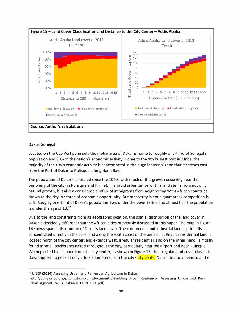
The land cover classification map of Addis created in this study reflects many of the trends mentioned
above. In Figure 14 irregular residential settlements are colored red, and appear to be highly
concentrated in and around the city center. In contrast to Nairobi, Dar es Salaam and Kigali, a significant
proportion of land in the city center is being occupied by irregular residential (Figure 14X). Within the
first 4 kilometers from the city center about 26% of the built‐up land is residential Irregular, with this
number dropping off dramatically around to around 8% around 6 kilometers outside of the city center.
Pockets of Irregular residential continue to appear towards the city’s periphery, but there are no single
large sized slums like Kibera in Nairobi. Industrial and Commercial land (shown in purple in Figure 14) is
also found in small pockets throughout the city rather than concentrated in large zones like in Dar es
Salaam and Nairobi. This pattern of small pockets of land cover might be indicative of the ‘urban village’
environment described in the literature.
50 Un Habitat. 2008. Ethiopia: Addis Ababa Urban Profile. 51 UN Habitat. 2007. Situation Analysis of Informal Settlements in Addis Ababa pg 28‐30.

24
Figure 14 Land cover classification of Addis Ababa
Source: Author’s classification of high resolution imagery
25
Figure 15 – Land Cover Classification and Distance to the City Center – Addis Ababa
Source: Author’s calculations
Dakar, Senegal
Located on the Cap Vert peninsula the metro area of Dakar is home to roughly one‐third of Senegal’s
population and 80% of the nation’s economic activity. Home to the 9th busiest port in Africa, the
majority of the city’s economic activity is concentrated in the huge industrial zone that stretches east
from the Port of Dakar to Rufisque, along Hann Bay.
The population of Dakar has tripled since the 1970s with much of this growth occurring near the
periphery of the city (in Rufisque and Pikine). The rapid urbanization of this land stems from not only
natural growth, but also a considerable influx of immigrants from neighboring West African countries
drawn to the city in search of economic opportunity. But prosperity is not a guarantee/ competition is
stiff. Roughly one‐third of Dakar’s population lives under the poverty line and almost half the population
is under the age of 18.52
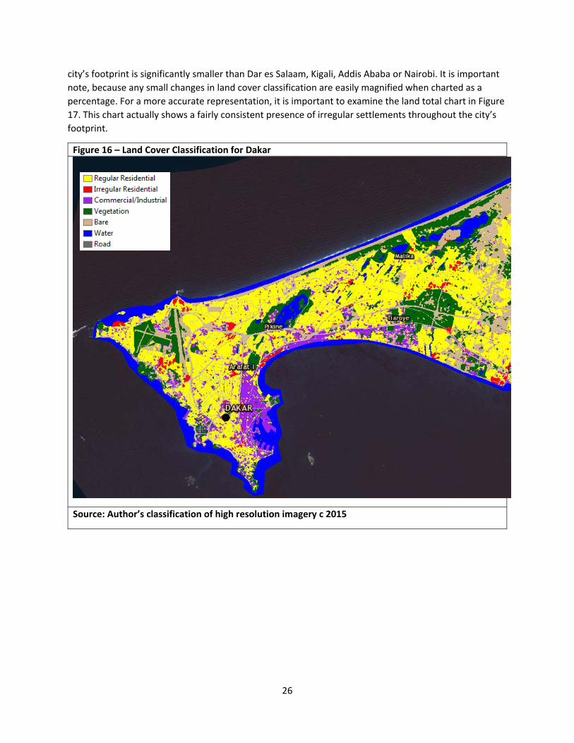
Due to the land constraints from its geographic location, the spatial distribution of the land cover in
Dakar is decidedly different than the African cities previously discussed in this paper. The map in Figure
16 shows spatial distribution of Dakar’s land cover. The commercial and industrial land is primarily
concentrated directly in the core, and along the south coast of the peninsula. Regular residential land is
located north of the city center, and extends west. Irregular residential land on the other hand, is mostly
found in small pockets scattered throughout the city, particularly near the airport and near Rufisque.
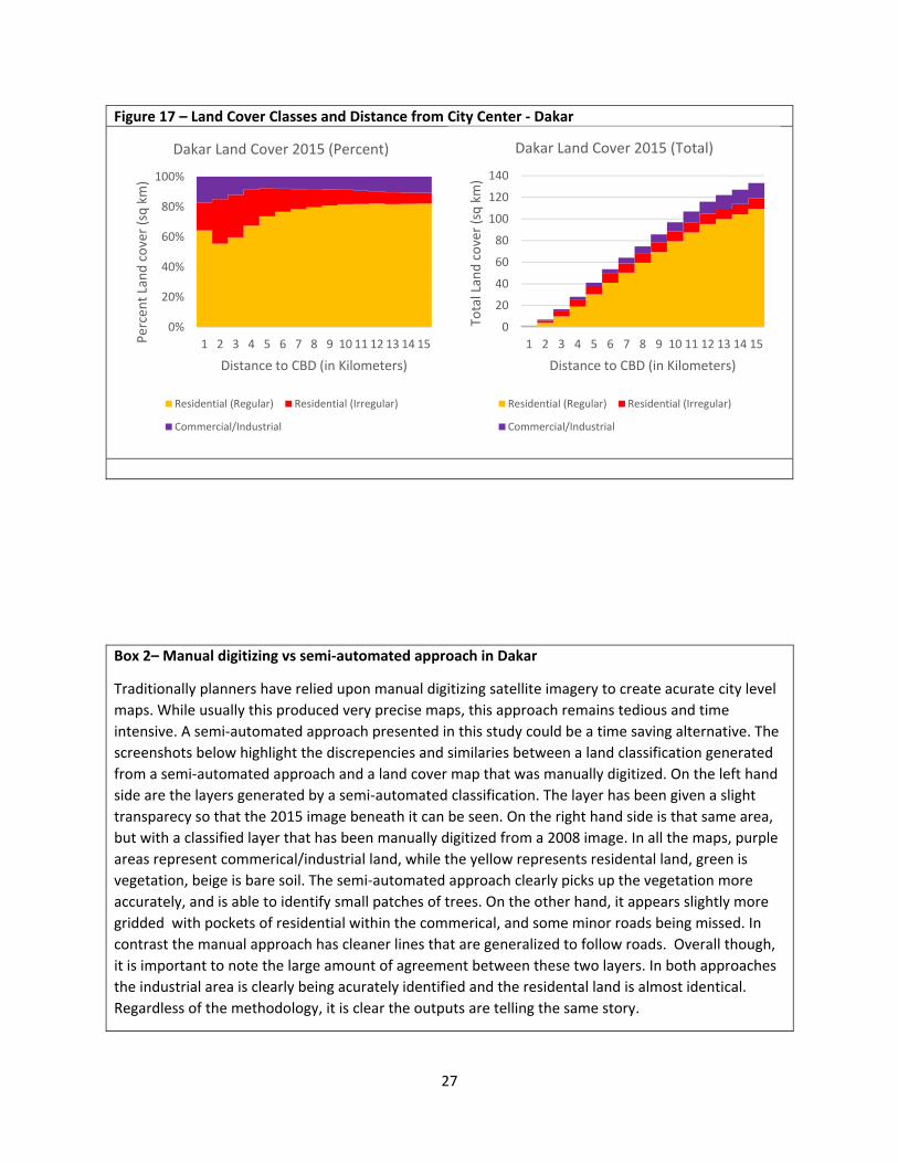
When plotted by distance from the city center, as shown in Figure 17, the irregular land cover classes in
Dakar appear to peak at only 2 to 3 kilometers from the city <city center?>. Limited to a peninsula, the
52 UNEP (2014) Assessing Urban and Peri‐urban Agriculture in Dakar. (http://apps.unep.org/publications/pmtdocuments/‐Building_Urban_Resilience__Assessing_Urban_and_Peri‐urban_Agriculture_in_Dakar‐2014EN_UPA.pdf).
0%
20%
40%
60%
80%
100%
1 2 3 4 5 6 7 8 9 10 11 12 13 14 15
Total Land Cover
Distance to CBD (in kilometers)
Addis Ababa Land cover c. 2012 (Percent)
Residential (Regular) Residential (Irregular)
Commercial/Industrial
0
20
40
60
80
100
120
140
1 2 3 4 5 6 7 8 9 10 11 12 13 14 15
Total Land Cover in sq kms
Distance to CBD (in kilometers)
Addis Ababa Land cover c. 2012 (Total)
Residential (Regular) Residential (Irregular)
Commercial/Industrial
26
city’s footprint is significantly smaller than Dar es Salaam, Kigali, Addis Ababa or Nairobi. It is important
note, because any small changes in land cover classification are easily magnified when charted as a
percentage. For a more accurate representation, it is important to examine the land total chart in Figure
17. This chart actually shows a fairly consistent presence of irregular settlements throughout the city’s
footprint.
Figure 16 – Land Cover Classification for Dakar
Source: Author’s classification of high resolution imagery c 2015
27
Figure 17 – Land Cover Classes and Distance from City Center ‐ Dakar
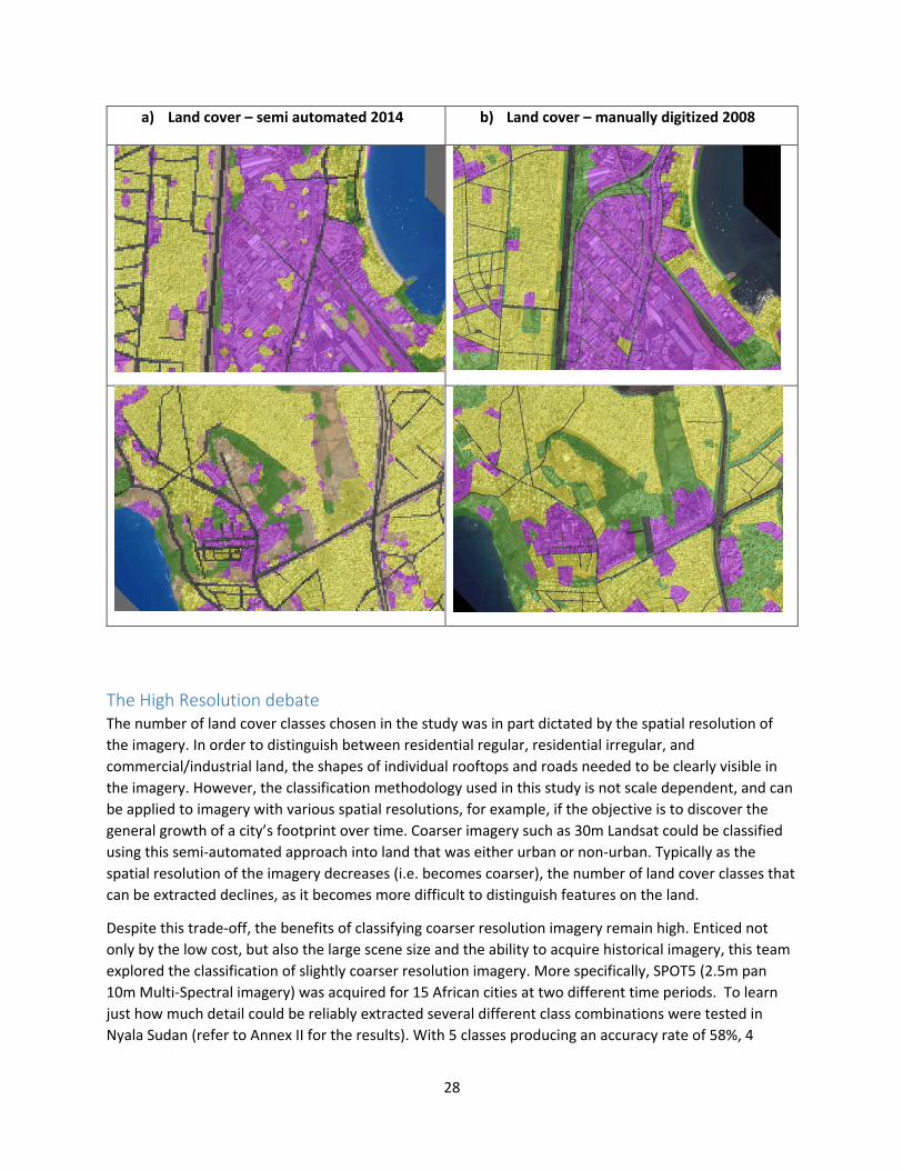
Box 2– Manual digitizing vs semi‐automated approach in Dakar
Traditionally planners have relied upon manual digitizing satellite imagery to create acurate city level
maps. While usually this produced very precise maps, this approach remains tedious and time
intensive. A semi‐automated approach presented in this study could be a time saving alternative. The
screenshots below highlight the discrepencies and similaries between a land classification generated
from a semi‐automated approach and a land cover map that was manually digitized. On the left hand
side are the layers generated by a semi‐automated classification. The layer has been given a slight
transparecy so that the 2015 image beneath it can be seen. On the right hand side is that same area,
but with a classified layer that has been manually digitized from a 2008 image. In all the maps, purple
areas represent commerical/industrial land, while the yellow represents residental land, green is
vegetation, beige is bare soil. The semi‐automated approach clearly picks up the vegetation more
accurately, and is able to identify small patches of trees. On the other hand, it appears slightly more
gridded with pockets of residential within the commerical, and some minor roads being missed. In
contrast the manual approach has cleaner lines that are generalized to follow roads. Overall though,
it is important to note the large amount of agreement between these two layers. In both approaches
the industrial area is clearly being acurately identified and the residental land is almost identical.
Regardless of the methodology, it is clear the outputs are telling the same story.
0%
20%
40%
60%
80%
100%
1 2 3 4 5 6 7 8 9 10 11 12 13 14 15Percent Land cover (sq km)
Distance to CBD (in Kilometers)
Dakar Land Cover 2015 (Percent)
Residential (Regular) Residential (Irregular)
Commercial/Industrial
0
20
40
60
80
100
120
140
1 2 3 4 5 6 7 8 9 10 11 12 13 14 15
Total Land cover (sq km)
Distance to CBD (in Kilometers)
Dakar Land Cover 2015 (Total)
Residential (Regular) Residential (Irregular)
Commercial/Industrial
28
a) Land cover – semi automated 2014 b) Land cover – manually digitized 2008
The High Resolution debate The number of land cover classes chosen in the study was in part dictated by the spatial resolution of
the imagery. In order to distinguish between residential regular, residential irregular, and
commercial/industrial land, the shapes of individual rooftops and roads needed to be clearly visible in
the imagery. However, the classification methodology used in this study is not scale dependent, and can
be applied to imagery with various spatial resolutions, for example, if the objective is to discover the
general growth of a city’s footprint over time. Coarser imagery such as 30m Landsat could be classified
using this semi‐automated approach into land that was either urban or non‐urban. Typically as the
spatial resolution of the imagery decreases (i.e. becomes coarser), the number of land cover classes that
can be extracted declines, as it becomes more difficult to distinguish features on the land.
Despite this trade‐off, the benefits of classifying coarser resolution imagery remain high. Enticed not
only by the low cost, but also the large scene size and the ability to acquire historical imagery, this team
explored the classification of slightly coarser resolution imagery. More specifically, SPOT5 (2.5m pan
10m Multi‐Spectral imagery) was acquired for 15 African cities at two different time periods. To learn
just how much detail could be reliably extracted several different class combinations were tested in
Nyala Sudan (refer to Annex II for the results). With 5 classes producing an accuracy rate of 58%, 4
29
classes a rate of 69.5 and 3 classes achieving a rate of 78.8% it was determined that a maximum of 3
classes could be reasonably extracted. With some manual cleanup, all 15 African cities reached an
accuracy level above 85%.
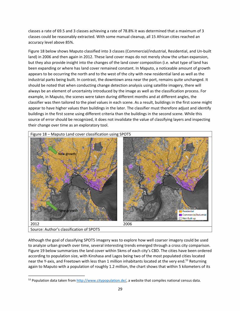
Figure 18 below shows Maputo classified into 3 classes (Commercial/industrial, Residential, and Un‐built
land) in 2006 and then again in 2012. These land cover maps do not merely show the urban expansion,
but they also provide insight into the changes of the land cover composition (i.e. what type of land has
been expanding or where has land cover remained constant. In Maputo, a noticeable amount of growth
appears to be occurring the north and to the west of the city with new residential land as well as the
industrial parks being built. In contrast, the downtown area near the port, remains quite unchanged. It
should be noted that when conducting change detection analysis using satellite imagery, there will
always be an element of uncertainty introduced by the image as well as the classification process. For
example, in Maputo, the scenes were taken during different months and at different angles, the
classifier was then tailored to the pixel values in each scene. As a result, buildings in the first scene might
appear to have higher values than buildings in the later. The classifier must therefore adjust and identify
buildings in the first scene using different criteria than the buildings in the second scene. While this
source of error should be recognized, it does not invalidate the value of classifying layers and inspecting
their change over time as an exploratory tool.
Figure 18 – Maputo Land cover classification using SPOT5
2012 2006
Source: Author’s classification of SPOT5
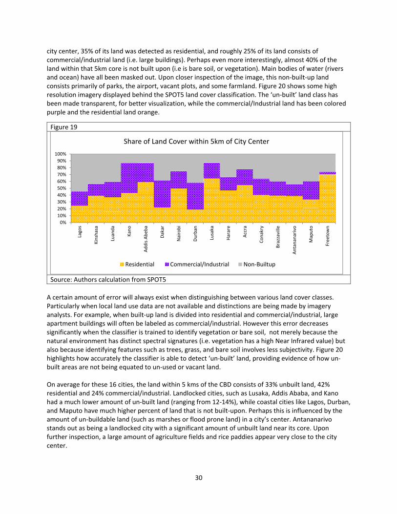
Although the goal of classifying SPOT5 imagery was to explore how well coarser imagery could be used to analyze urban growth over time, several interesting trends emerged through a cross city comparison. Figure 19 below summarizes the land cover within 5kms of each city’s CBD. The cities have been ordered according to population size, with Kinshasa and Lagos being two of the most populated cities located near the Y‐axis, and Freetown with less than 1 million inhabitants located at the very end.53 Returning again to Maputo with a population of roughly 1.2 million, the chart shows that within 5 kilometers of its
53 Population data taken from http://www.citypopulation.de/, a website that compiles national census data.
New growth
New growth
30
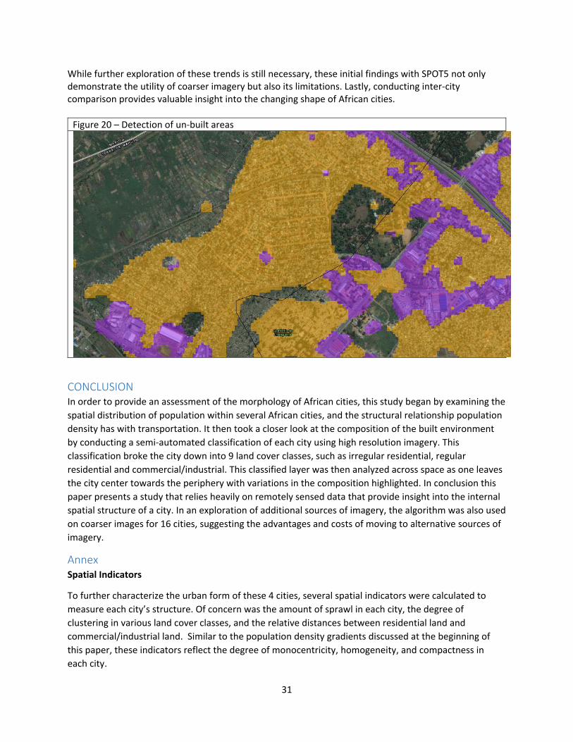
city center, 35% of its land was detected as residential, and roughly 25% of its land consists of commercial/industrial land (i.e. large buildings). Perhaps even more interestingly, almost 40% of the land within that 5km core is not built upon (i.e is bare soil, or vegetation). Main bodies of water (rivers and ocean) have all been masked out. Upon closer inspection of the image, this non‐built‐up land consists primarily of parks, the airport, vacant plots, and some farmland. Figure 20 shows some high resolution imagery displayed behind the SPOT5 land cover classification. The ‘un‐built’ land class has been made transparent, for better visualization, while the commercial/Industrial land has been colored purple and the residential land orange.
A certain amount of error will always exist when distinguishing between various land cover classes. Particularly when local land use data are not available and distinctions are being made by imagery analysts. For example, when built‐up land is divided into residential and commercial/industrial, large apartment buildings will often be labeled as commercial/industrial. However this error decreases significantly when the classifier is trained to identify vegetation or bare soil, not merely because the natural environment has distinct spectral signatures (i.e. vegetation has a high Near Infrared value) but also because identifying features such as trees, grass, and bare soil involves less subjectivity. Figure 20 highlights how accurately the classifier is able to detect ‘un‐built’ land, providing evidence of how un‐built areas are not being equated to un‐used or vacant land. On average for these 16 cities, the land within 5 kms of the CBD consists of 33% unbuilt land, 42% residential and 24% commercial/industrial. Landlocked cities, such as Lusaka, Addis Ababa, and Kano had a much lower amount of un‐built land (ranging from 12‐14%), while coastal cities like Lagos, Durban, and Maputo have much higher percent of land that is not built‐upon. Perhaps this is influenced by the amount of un‐buildable land (such as marshes or flood prone land) in a city’s center. Antananarivo stands out as being a landlocked city with a significant amount of unbuilt land near its core. Upon further inspection, a large amount of agriculture fields and rice paddies appear very close to the city center.
Figure 19
Source: Authors calculation from SPOT5
0%
10%
20%
30%
40%
50%
60%
70%
80%
90%
100%
Lagos
Kinshasa
Luanda
Kano
Addis Abeb
a
Dakar
Nairobi
Durban
Lusaka
Harare
Accra
Conakry
Brazzaville
Antananarivo
Maputo
Freetown
Share of Land Cover within 5km of City Center
Residential Commercial/Industrial Non‐Builtup
31
While further exploration of these trends is still necessary, these initial findings with SPOT5 not only demonstrate the utility of coarser imagery but also its limitations. Lastly, conducting inter‐city comparison provides valuable insight into the changing shape of African cities.
Figure 20 – Detection of un‐built areas
CONCLUSION In order to provide an assessment of the morphology of African cities, this study began by examining the
spatial distribution of population within several African cities, and the structural relationship population
density has with transportation. It then took a closer look at the composition of the built environment
by conducting a semi‐automated classification of each city using high resolution imagery. This
classification broke the city down into 9 land cover classes, such as irregular residential, regular
residential and commercial/industrial. This classified layer was then analyzed across space as one leaves
the city center towards the periphery with variations in the composition highlighted. In conclusion this
paper presents a study that relies heavily on remotely sensed data that provide insight into the internal
spatial structure of a city. In an exploration of additional sources of imagery, the algorithm was also used
on coarser images for 16 cities, suggesting the advantages and costs of moving to alternative sources of
imagery.
Annex Spatial Indicators
To further characterize the urban form of these 4 cities, several spatial indicators were calculated to
measure each city’s structure. Of concern was the amount of sprawl in each city, the degree of
clustering in various land cover classes, and the relative distances between residential land and
commercial/industrial land. Similar to the population density gradients discussed at the beginning of
this paper, these indicators reflect the degree of monocentricity, homogeneity, and compactness in
each city.
32
Methodology
To begin, a 0.5x0.5km grid was created over each city. This grid functioned as the base unit of
measurement for all the indicator analysis. All spatial data layers were aggregated to this resolution and
joined to this grid.
Urban footprints (city boundaries) were created by combining a population density layer (Landscan)
with an urban footprint layer (Global Human Settlement Layer ‐ GHSL). Created by European
Commission’s Joint Research Centre (JRC), the GHSL offers a systematic and detailed representation of
‘built‐up’ areas, and classifies each 30m pixel as ‘built‐up’ if it intersects with a building or road. 54 In
order to make these datasets comparable they were overlaid and summarized to the 0.5x0.5km grid.
Grid cells comprised of more than 10% built‐up land and had more than 100 inhabitants were labeled as
urban. These thresholds were created from visual interpretation, and are consistent with previous urban
mapping studies.55 While the city boundary created in this study differs from the administrative border,
it more accurately reflects each city’s physical ‘built‐up’ land and hence it is better suited for inter‐city
comparisons.
Following the creation of the city footprints, the land cover classification layers were converted to
0.5x0.5km grids. Each grid cell was labeled as a class (vegetation, residential regular, residential
irregular, etc.) based on the majority land cover class contained in that cell. The following analyses use
only grid cells within a 15km buffer from the CBD.
Centrality Urban sprawl is defined as areas with low density, and scattered, discontinuous, and commercial strip
development patterns.56 Sprawl reduces inner‐urban connectivity and typically places higher
transportation costs on families living in these areas. However, the effects of sprawl are not just felt in
the areas experiencing sprawl, but are also felt by firms and employers in the inner city. Without a
competitive workforce in the vicinity, employment centers may experience the ripples of sprawl in the
form of increased costs of labor. Similarly, increased infrastructure investments, such as road networks,
sewage pipes, and school systems are required to service these sprawling populations, placing a
monetary burden on local governments as well.57 Additionally, non‐monetary effects of sprawl include
increased air pollution, loss of natural land, and ecosystem fragmentation.58
City decentralization is a common effect of sprawl, and leads to longer travel distances and time for households. To measure the degree to which development has diffused across the city, an index
54 Pesaresi, M.; Guo Huadong; Blaes, X.; Ehrlich, D.; Ferri, S.; Gueguen, L.; Halkia, M.; Kauffmann, M.; Kemper, T.; Linlin Lu;
Marin‐Herrera, M.A.; Ouzounis, G.K.; Scavazzon, M.; Soille, P.; Syrris, V.; Zanchetta, L., "A Global Human Settlement Layer From Optical HR/VHR RS Data: Concept and First Results," Selected Topics in Applied Earth Observations and Remote Sensing, IEEE Journal of, vol.6, no.5, pp.2102,2131, Oct. 2013 doi: 10.1109/JSTARS.2013.2271445. 55 Azar et al 2010. Spatial refinement of census population distribution using remotely sensed estimates of impervious surfaces in Haiti. International Journal of Remote Sensing. Taylor and Frances. page 5641. 56 Ewing, Reid. 1997. Is Los Angeles‐style sprawl desireable? Journal of American Planning Association, 63 (1): 107‐126. 57 Squires, Gregory. 2002. Urban Sprawl: Causes, Consequences, & Policy Responses. 2002. The Urban Institute: Washington, DC. 58 Johnson, Michael. 2001. Environmental impacts of urban sprawl: a survey of the literature and proposed research agenda. Enviornment and Planning A, 33: 717‐735.
33
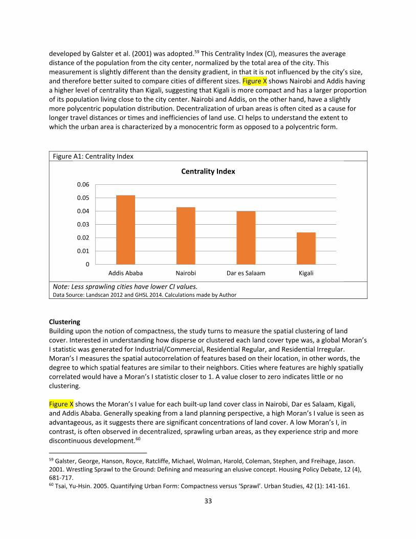
developed by Galster et al. (2001) was adopted.59 This Centrality Index (CI), measures the average distance of the population from the city center, normalized by the total area of the city. This measurement is slightly different than the density gradient, in that it is not influenced by the city’s size, and therefore better suited to compare cities of different sizes. Figure X shows Nairobi and Addis having a higher level of centrality than Kigali, suggesting that Kigali is more compact and has a larger proportion of its population living close to the city center. Nairobi and Addis, on the other hand, have a slightly more polycentric population distribution. Decentralization of urban areas is often cited as a cause for longer travel distances or times and inefficiencies of land use. CI helps to understand the extent to which the urban area is characterized by a monocentric form as opposed to a polycentric form.
Figure A1: Centrality Index
Note: Less sprawling cities have lower CI values. Data Source: Landscan 2012 and GHSL 2014. Calculations made by Author
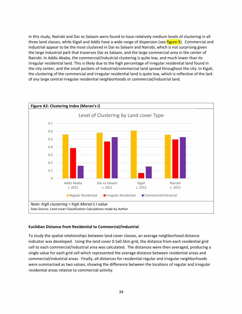
Clustering Building upon the notion of compactness, the study turns to measure the spatial clustering of land cover. Interested in understanding how disperse or clustered each land cover type was, a global Moran’s I statistic was generated for Industrial/Commercial, Residential Regular, and Residential Irregular. Moran’s I measures the spatial autocorrelation of features based on their location, in other words, the degree to which spatial features are similar to their neighbors. Cities where features are highly spatially correlated would have a Moran’s I statistic closer to 1. A value closer to zero indicates little or no clustering. Figure X shows the Moran’s I value for each built‐up land cover class in Nairobi, Dar es Salaam, Kigali, and Addis Ababa. Generally speaking from a land planning perspective, a high Moran’s I value is seen as advantageous, as it suggests there are significant concentrations of land cover. A low Moran’s I, in contrast, is often observed in decentralized, sprawling urban areas, as they experience strip and more discontinuous development.60
59 Galster, George, Hanson, Royce, Ratcliffe, Michael, Wolman, Harold, Coleman, Stephen, and Freihage, Jason. 2001. Wrestling Sprawl to the Ground: Defining and measuring an elusive concept. Housing Policy Debate, 12 (4), 681‐717. 60 Tsai, Yu‐Hsin. 2005. Quantifying Urban Form: Compactness versus ‘Sprawl’. Urban Studies, 42 (1): 141‐161.
0
0.01
0.02
0.03
0.04
0.05
0.06
Addis Ababa Nairobi Dar es Salaam Kigali
Centrality Index
34
In this study, Nairobi and Dar es Salaam were found to have relatively medium levels of clustering in all three land classes, while Kigali and Addis have a wide range of dispersion (see figure X). Commercial and Industrial appear to be the most clustered in Dar es Salaam and Nairobi, which is not surprising given the large industrial park that traverses Dar es Salaam, and the large commercial area in the center of Nairobi. In Addis Ababa, the commercial/Industrial clustering is quite low, and much lower than its irregular residential land. This is likely due to the high percentage of irregular residential land found in the city center, and the small pockets of industrial/commercial land spread throughout the city. In Kigali, the clustering of the commercial and irregular residential land is quite low, which is reflective of the lack of any large central irregular residential neighborhoods or commercial/industrial land.
Figure A2: Clustering Index (Moran’s I)
Note: high clustering = high Moran’s I value Data Source: Land cover Classification Calculations made by Author
Euclidian Distance from Residential to Commercial/Industrial
To study the spatial relationships between land cover classes, an average neighborhood distance
indicator was developed. Using the land cover 0.5x0.5km grid, the distance from each residential grid
cell to each commercial/industrial area was calculated. The distances were then averaged, producing a
single value for each grid cell which represented the average distance between residential areas and
commercial/industrial areas. Finally, all distances for residential regular and irregular neighborhoods
were summarized as two values, showing the difference between the locations of regular and irregular
residential areas relative to commercial activity.
0
0.1
0.2
0.3
0.4
0.5
0.6
0.7
Addis Ababac. 2012
Dar es Salaamc. 2011
Kigalic. 2012
Nairobic. 2012
Level of Clustering by Land cover Type
Regular Residential Irregular Residential Commercial/Industrial
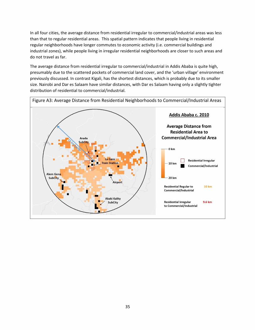
35
In all four cities, the average distance from residential irregular to commercial/industrial areas was less
than that to regular residential areas. This spatial pattern indicates that people living in residential
regular neighborhoods have longer commutes to economic activity (i.e. commercial buildings and
industrial zones), while people living in irregular residential neighborhoods are closer to such areas and
do not travel as far.
The average distance from residential irregular to commercial/industrial in Addis Ababa is quite high,
presumably due to the scattered pockets of commercial land cover, and the ‘urban village’ environment
previously discussed. In contrast Kigali, has the shortest distances, which is probably due to its smaller
size. Nairobi and Dar es Salaam have similar distances, with Dar es Salaam having only a slightly tighter
distribution of residential to commercial/industrial.
Figure A3: Average Distance from Residential Neighborhoods to Commercial/Industrial Areas
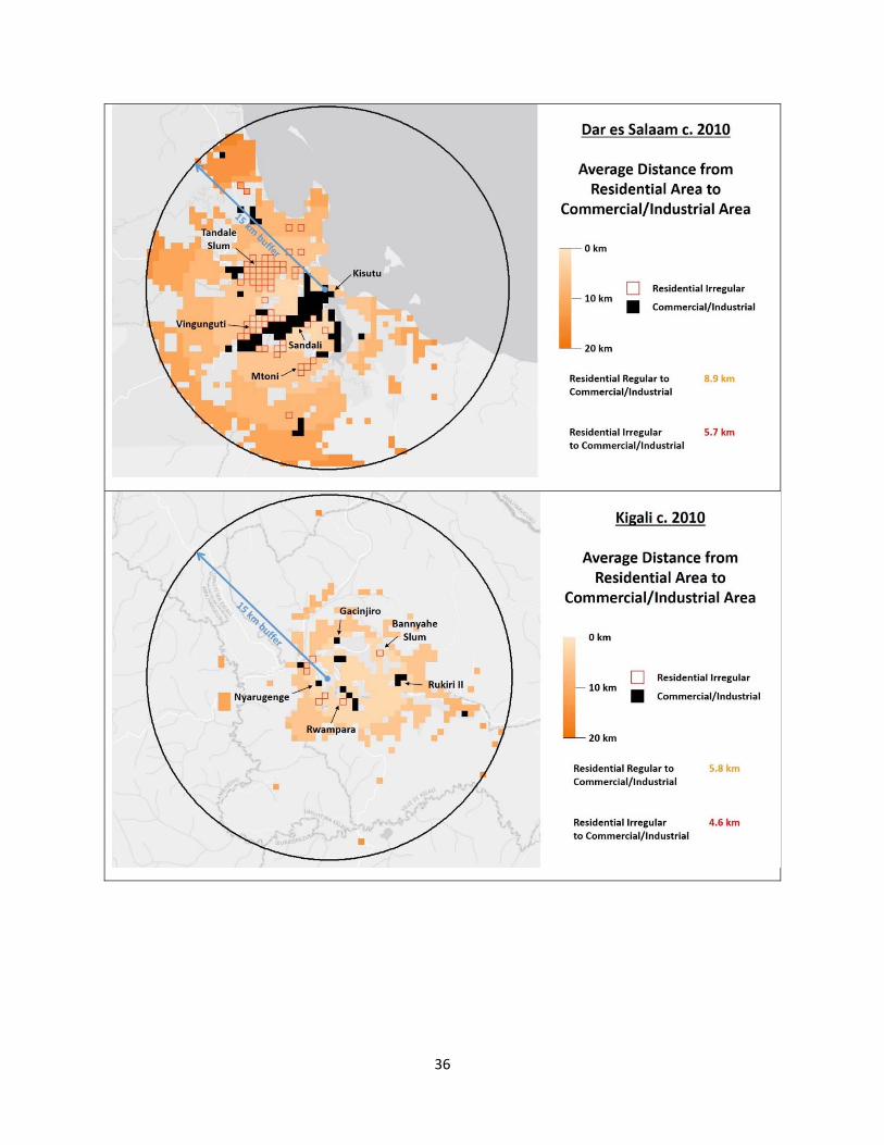
36
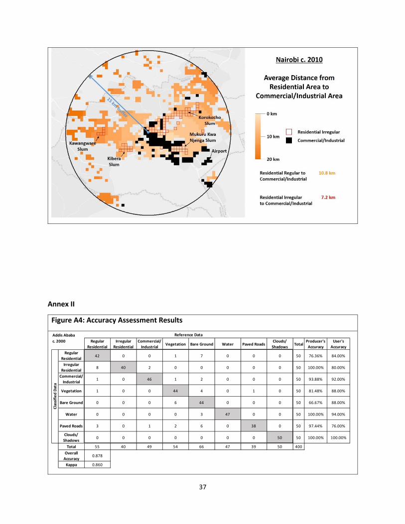
37
Annex II
Figure A4: Accuracy Assessment Results
Regular
Residential
Irregular
Residential
Commercial/
IndustrialVegetation Bare Ground Water Paved Roads
Clouds/
ShadowsTotal
Producer's
Accuracy
User's
Accuracy
Regular
Residential42 0 0 1 7 0 0 0 50 76.36% 84.00%
Irregular
Residential8 40 2 0 0 0 0 0 50 100.00% 80.00%
Commercial/
Industrial1 0 46 1 2 0 0 0 50 93.88% 92.00%
Vegetation 1 0 0 44 4 0 1 0 50 81.48% 88.00%
Bare Ground 0 0 0 6 44 0 0 0 50 66.67% 88.00%
Water 0 0 0 0 3 47 0 0 50 100.00% 94.00%
Paved Roads 3 0 1 2 6 0 38 0 50 97.44% 76.00%
Clouds/
Shadows0 0 0 0 0 0 0 50 50 100.00% 100.00%
Total 55 40 49 54 66 47 39 50 400
Overall
Accuracy0.878
Kappa 0.860
Reference Data
Classified Data
Addis Ababa
c. 2000
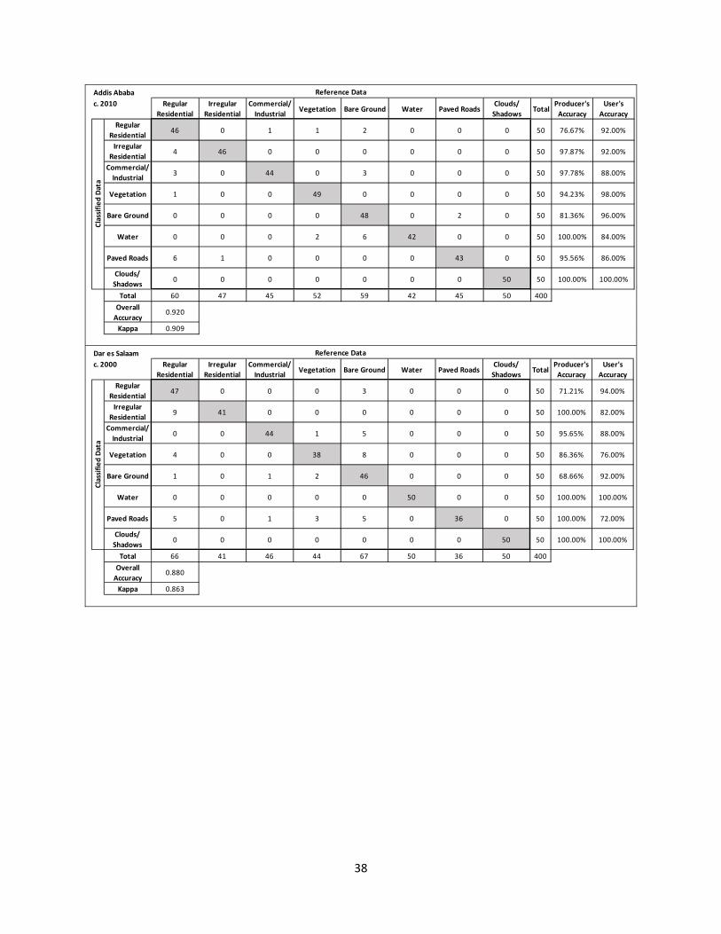
38
Regular
Residential
Irregular
Residential
Commercial/
IndustrialVegetation Bare Ground Water Paved Roads
Clouds/
ShadowsTotal
Producer's
Accuracy
User's
Accuracy
Regular
Residential46 0 1 1 2 0 0 0 50 76.67% 92.00%
Irregular
Residential4 46 0 0 0 0 0 0 50 97.87% 92.00%
Commercial/
Industrial3 0 44 0 3 0 0 0 50 97.78% 88.00%
Vegetation 1 0 0 49 0 0 0 0 50 94.23% 98.00%
Bare Ground 0 0 0 0 48 0 2 0 50 81.36% 96.00%
Water 0 0 0 2 6 42 0 0 50 100.00% 84.00%
Paved Roads 6 1 0 0 0 0 43 0 50 95.56% 86.00%
Clouds/
Shadows0 0 0 0 0 0 0 50 50 100.00% 100.00%
Total 60 47 45 52 59 42 45 50 400
Overall
Accuracy0.920
Kappa 0.909
Addis Ababa Reference Data
c. 2010Classified Data
Regular
Residential
Irregular
Residential
Commercial/
IndustrialVegetation Bare Ground Water Paved Roads
Clouds/
ShadowsTotal
Producer's
Accuracy
User's
Accuracy
Regular
Residential47 0 0 0 3 0 0 0 50 71.21% 94.00%
Irregular
Residential9 41 0 0 0 0 0 0 50 100.00% 82.00%
Commercial/
Industrial0 0 44 1 5 0 0 0 50 95.65% 88.00%
Vegetation 4 0 0 38 8 0 0 0 50 86.36% 76.00%
Bare Ground 1 0 1 2 46 0 0 0 50 68.66% 92.00%
Water 0 0 0 0 0 50 0 0 50 100.00% 100.00%
Paved Roads 5 0 1 3 5 0 36 0 50 100.00% 72.00%
Clouds/
Shadows0 0 0 0 0 0 0 50 50 100.00% 100.00%
Total 66 41 46 44 67 50 36 50 400
Overall
Accuracy0.880
Kappa 0.863
Dar es Salaam Reference Data
c. 2000
Classified Data
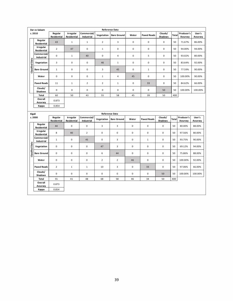
39
Regular
Residential
Irregular
Residential
Commercial/
IndustrialVegetation Bare Ground Water Paved Roads
Clouds/
ShadowsTotal
Producer's
Accuracy
User's
Accuracy
Regular
Residential43 1 1 2 3 0 0 0 50 71.67% 86.00%
Irregular
Residential2 47 0 1 0 0 0 0 50 94.00% 94.00%
Commercial/
Industrial0 1 40 0 4 0 5 0 50 93.02% 80.00%
Vegetation 3 0 0 46 1 0 0 0 50 83.64% 92.00%
Bare Ground 1 0 0 3 45 0 1 0 50 77.59% 90.00%
Water 0 0 0 1 4 45 0 0 50 100.00% 90.00%
Paved Roads 11 1 2 2 1 0 33 0 50 84.62% 66.00%
Clouds/
Shadows0 0 0 0 0 0 0 50 50 100.00% 100.00%
Total 60 50 43 55 58 45 39 50 400
Overall
Accuracy0.873
Kappa 0.854
Dar es Salaam Reference Data
c. 2010Classified Data
Regular
Residential
Irregular
Residential
Commercial/
IndustrialVegetation Bare Ground Water Paved Roads
Clouds/
ShadowsTotal
Producer's
Accuracy
User's
Accuracy
Regular
Residential44 0 0 3 3 0 0 0 50 80.00% 88.00%
Irregular
Residential8 40 2 0 0 0 0 0 50 97.56% 80.00%
Commercial/
Industrial1 0 45 0 3 0 1 0 50 93.75% 90.00%
Vegetation 0 0 0 47 3 0 0 0 50 69.12% 94.00%
Bare Ground 0 0 0 6 44 0 0 0 50 75.86% 88.00%
Water 0 0 0 2 2 46 0 0 50 100.00% 92.00%
Paved Roads 2 1 1 10 3 0 33 0 50 97.06% 66.00%
Clouds/
Shadows0 0 0 0 0 0 0 50 50 100.00% 100.00%
Total 55 41 48 68 58 46 34 50 400
Overall
Accuracy0.873
Kappa 0.854
Kigali Reference Data
c. 2000
Classified Data
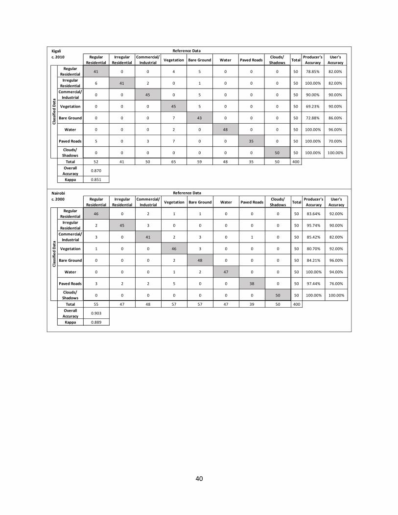
40
Regular
Residential
Irregular
Residential
Commercial/
IndustrialVegetation Bare Ground Water Paved Roads
Clouds/
ShadowsTotal
Producer's
Accuracy
User's
Accuracy
Regular
Residential41 0 0 4 5 0 0 0 50 78.85% 82.00%
Irregular
Residential6 41 2 0 1 0 0 0 50 100.00% 82.00%
Commercial/
Industrial0 0 45 0 5 0 0 0 50 90.00% 90.00%
Vegetation 0 0 0 45 5 0 0 0 50 69.23% 90.00%
Bare Ground 0 0 0 7 43 0 0 0 50 72.88% 86.00%
Water 0 0 0 2 0 48 0 0 50 100.00% 96.00%
Paved Roads 5 0 3 7 0 0 35 0 50 100.00% 70.00%
Clouds/
Shadows0 0 0 0 0 0 0 50 50 100.00% 100.00%
Total 52 41 50 65 59 48 35 50 400
Overall
Accuracy0.870
Kappa 0.851
Kigali Reference Data
c. 2010Classified Data
Regular
Residential
Irregular
Residential
Commercial/
IndustrialVegetation Bare Ground Water Paved Roads
Clouds/
ShadowsTotal
Producer's
Accuracy
User's
Accuracy
Regular
Residential46 0 2 1 1 0 0 0 50 83.64% 92.00%
Irregular
Residential2 45 3 0 0 0 0 0 50 95.74% 90.00%
Commercial/
Industrial3 0 41 2 3 0 1 0 50 85.42% 82.00%
Vegetation 1 0 0 46 3 0 0 0 50 80.70% 92.00%
Bare Ground 0 0 0 2 48 0 0 0 50 84.21% 96.00%
Water 0 0 0 1 2 47 0 0 50 100.00% 94.00%
Paved Roads 3 2 2 5 0 0 38 0 50 97.44% 76.00%
Clouds/
Shadows0 0 0 0 0 0 0 50 50 100.00% 100.00%
Total 55 47 48 57 57 47 39 50 400
Overall
Accuracy0.903
Kappa 0.889
Nairobi Reference Data
c. 2000
Classified Data
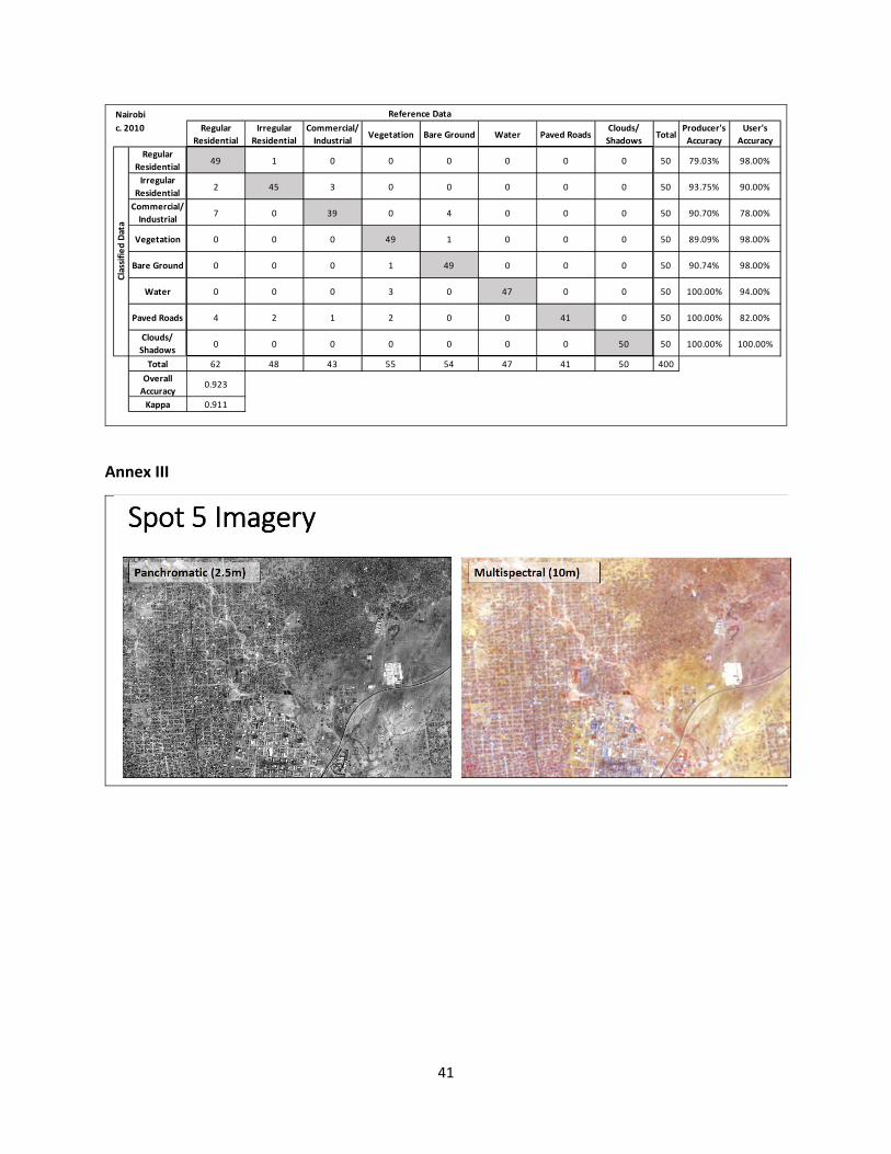
41
Annex III
Regular
Residential
Irregular
Residential
Commercial/
IndustrialVegetation Bare Ground Water Paved Roads
Clouds/
ShadowsTotal
Producer's
Accuracy
User's
Accuracy
Regular
Residential49 1 0 0 0 0 0 0 50 79.03% 98.00%
Irregular
Residential2 45 3 0 0 0 0 0 50 93.75% 90.00%
Commercial/
Industrial7 0 39 0 4 0 0 0 50 90.70% 78.00%
Vegetation 0 0 0 49 1 0 0 0 50 89.09% 98.00%
Bare Ground 0 0 0 1 49 0 0 0 50 90.74% 98.00%
Water 0 0 0 3 0 47 0 0 50 100.00% 94.00%
Paved Roads 4 2 1 2 0 0 41 0 50 100.00% 82.00%
Clouds/
Shadows0 0 0 0 0 0 0 50 50 100.00% 100.00%
Total 62 48 43 55 54 47 41 50 400
Overall
Accuracy0.923
Kappa 0.911
Nairobi Reference Data
c. 2010Classified Data
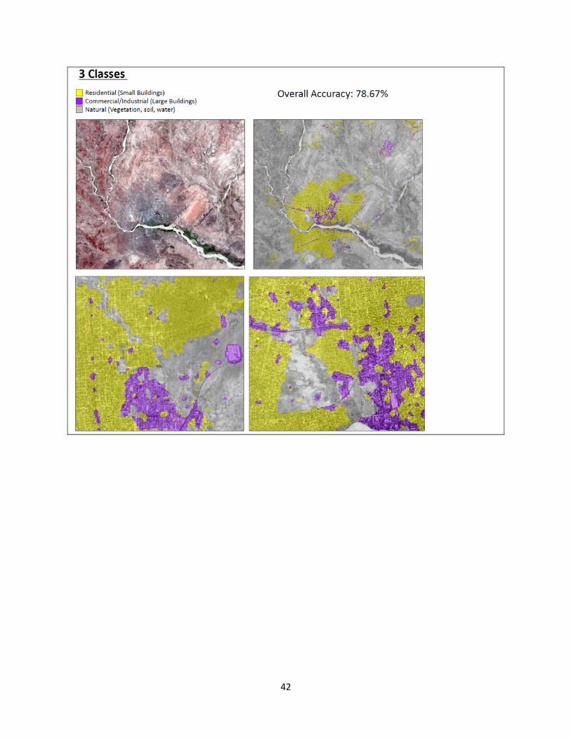
42
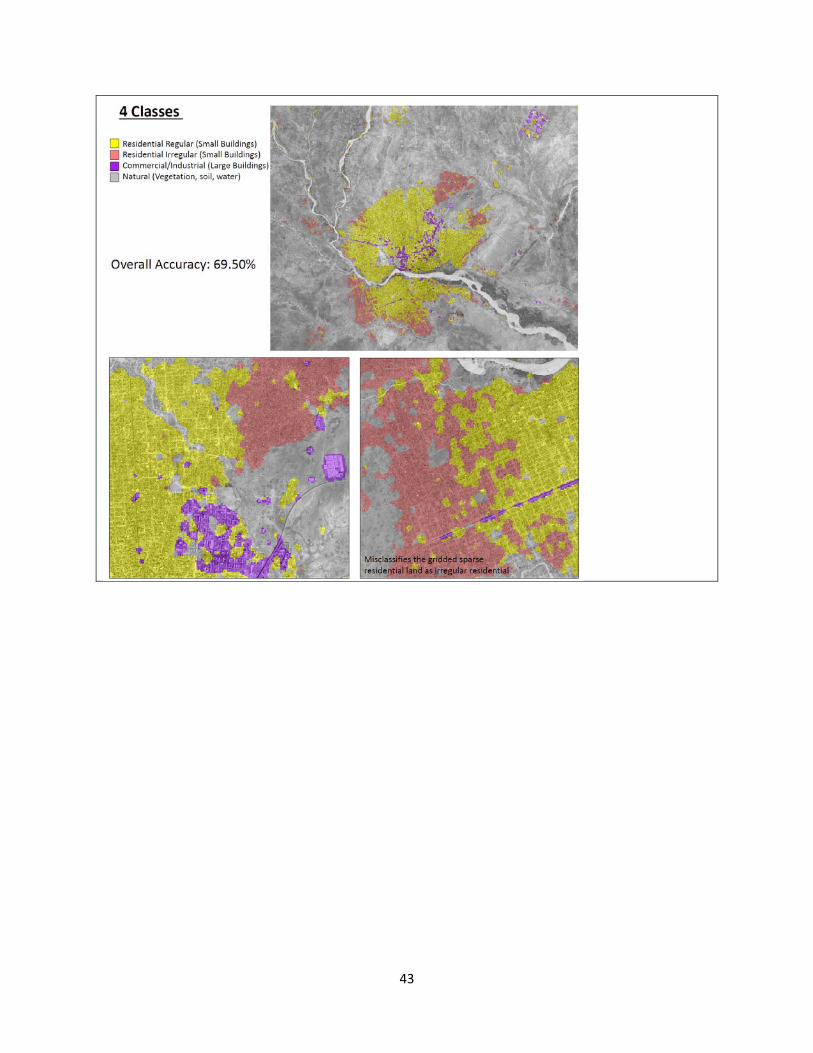
43
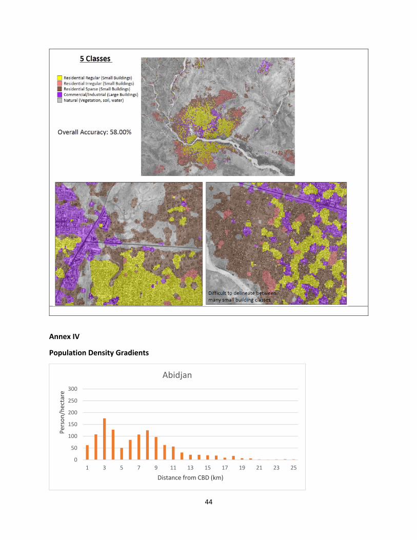
44
Annex IV
Population Density Gradients
0
50
100
150
200
250
300
1 3 5 7 9 11 13 15 17 19 21 23 25
Person/hectare
Distance from CBD (km)
Abidjan
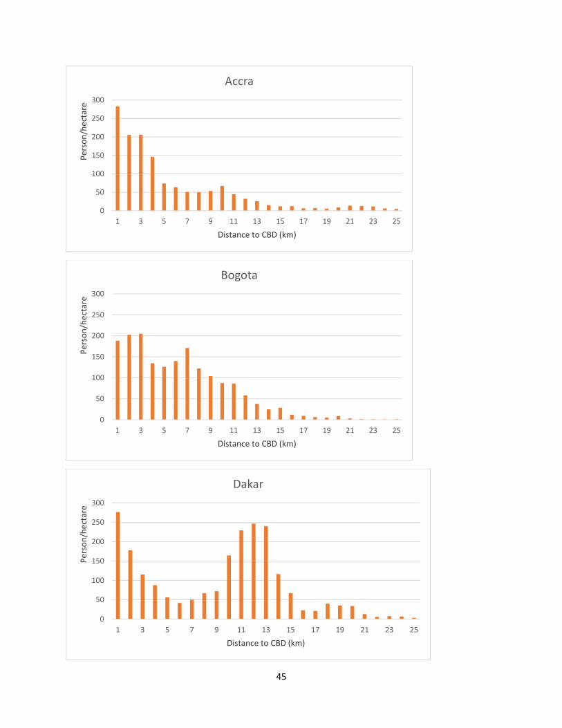
45
0
50
100
150
200
250
300
1 3 5 7 9 11 13 15 17 19 21 23 25
Person/hectare
Distance to CBD (km)
Accra
0
50
100
150
200
250
300
1 3 5 7 9 11 13 15 17 19 21 23 25
Person/hectare
Distance to CBD (km)
Bogota
0
50
100
150
200
250
300
1 3 5 7 9 11 13 15 17 19 21 23 25
Person/hectare
Distance to CBD (km)
Dakar

46
0
50
100
150
200
250
300
1 3 5 7 9 11 13 15 17 19 21 23 25
Person/Hectare
Distance to CBD (km)
New Delhi
0
50
100
150
200
250
300
1 3 5 7 9 11 13 15 17 19 21 23 25
Person/hectare
Distance to CBD (km)
Durban
0
50
100
150
200
250
300
1 3 5 7 9 11 13 15 17 19 21 23 25
Person/hectare
Distance to CBD (km)
Istanbul
47
0
50
100
150
200
250
300
1 3 5 7 9 11 13 15 17 19 21 23 25
Person/hectare
Distance to CBD (km)
Kampala
0
50
100
150
200
250
300
1 3 5 7 9 11 13 15 17 19 21 23 25
Person/hectare
Distance to CBD (km)
Lagos
0
50
100
150
200
250
300
1 3 5 7 9 11 13 15 17 19 21 23 25
Person/hectare
Distance from CBD (km)
Lima
48
0
50
100
150
200
250
1 3 5 7 9 11 13 15 17 19 21 23 25
Person/hectare
Distance to CBD (km)
Luanda
0
50
100
150
200
250
300
1 3 5 7 9 11 13 15 17 19 21 23 25
Person/hectare
Distance to CBD (km)
Lusaka
0
50
100
150
200
250
300
1 3 5 7 9 11 13 15 17 19 21 23 25
Person/hectare
Distance to CBD (km)
Mexico City
49
0
100
200
300
400
500
600
700
1 3 5 7 9 11 13 15 17 19 21 23 25
Percon/hectare
Distance from CBD (km)
New York City