Embed Size (px)
Citation preview

NBER WORKING PAPER SERIES
WHAT DOES A DEDUCTIBLE DO? THE IMPACT OF COST-SHARING ON HEALTHCARE PRICES, QUANTITIES, AND SPENDING DYNAMICS
Zarek C. Brot-GoldbergAmitabh Chandra
Benjamin R. HandelJonathan T. Kolstad
Working Paper 21632http://www.nber.org/papers/w21632
NATIONAL BUREAU OF ECONOMIC RESEARCH1050 Massachusetts Avenue
Cambridge, MA 02138October 2015
We thank Eva Lyubich and Ishita Chordia for excellent research assistance. We thank Martin Gaynorand Gautam Gowrisankaran for insightful discussions. We thank seminar participants for their commentsprovided at Analysis Group, Chicago Harris, Chicago Booth, Erasmus, Georgia State, Harvard, MicrosoftResearch, Lund University, NBER Insurance, NBER Health Care, North Carolina, Notre Dame, OhioState, Penn State, Queens University, Southern Denmark University, Texas A & M, UCLA, UCSD,Universidad de Los Andes and the University of British Columbia. We thank Microsoft Research fortheir support of this work. The views expressed herein are those of the authors and do not necessarilyreflect the views of the National Bureau of Economic Research.
At least one co-author has disclosed a financial relationship of potential relevance for this research.Further information is available online at http://www.nber.org/papers/w21632.ack
NBER working papers are circulated for discussion and comment purposes. They have not been peer-reviewed or been subject to the review by the NBER Board of Directors that accompanies officialNBER publications.
© 2015 by Zarek C. Brot-Goldberg, Amitabh Chandra, Benjamin R. Handel, and Jonathan T. Kolstad.All rights reserved. Short sections of text, not to exceed two paragraphs, may be quoted without explicitpermission provided that full credit, including © notice, is given to the source.

What Does a Deductible Do? The Impact of Cost-Sharing on Health Care Prices, Quantities,and Spending DynamicsZarek C. Brot-Goldberg, Amitabh Chandra, Benjamin R. Handel, and Jonathan T. KolstadNBER Working Paper No. 21632October 2015, Revised November 2015JEL No. D12,G22,H51,I11,I13
ABSTRACT
Measuring consumer responsiveness to medical care prices is a central issue in health economics anda key ingredient in the optimal design and regulation of health insurance markets. We study consumerresponsiveness to medical care prices, leveraging a natural experiment that occurred at a large self-insuredfirm which required all of its employees to switch from an insurance plan that provided free healthcare to a non-linear, high deductible plan. The switch caused a spending reduction between 11.79%-13.80%of total firm-wide health spending. We decompose this spending reduction into the components of(i) consumer price shopping (ii) quantity reductions and (iii) quantity substitutions, finding that spendingreductions are entirely due to outright reductions in quantity. We find no evidence of consumers learningto price shop after two years in high-deductible coverage. Consumers reduce quantities across thespectrum of health care services, including potentially valuable care (e.g. preventive services) andpotentially wasteful care (e.g. imaging services). We then leverage the unique data environment tostudy how consumers respond to the complex structure of the high-deductible contract. We find thatconsumers respond heavily to spot prices at the time of care, and reduce their spending by 42% whenunder the deductible, conditional on their true expected end-of-year shadow price and their prior yearend-of-year marginal price. In the first-year post plan change, 90% of all spending reductions occurin months that consumers began under the deductible, with 49% of all reductions coming for the exante sickest half of consumers under the deductible, despite the fact that these consumers have quitelow shadow prices. There is no evidence of learning to respond to the true shadow price in the secondyear post-switch.
Zarek C. Brot-GoldbergDepartment of EconomicsUniversity of California, Berkeley508-1 Evans Hall #3880Berkeley, CA [email protected]
Amitabh ChandraJohn F. Kennedy School of GovernmentHarvard University79 JFK StreetCambridge, MA 02138and [email protected]
Benjamin R. HandelDepartment of EconomicsUniversity of California, Berkeley508-1 Evans Hall #3880Berkeley, CA 94720and [email protected]
Jonathan T. KolstadHaas School of BusinessUniversity of CaliforniaBerkeley, CA 94720and [email protected]

1 Introduction
Spending on health care services in the United States has grown rapidly over the past 50 years,
increasing from 5.0% of GDP in 1960 to 17.4% in 2013 [CMS (2015)]. As health care spending
has risen, policymakers, large employers, and insurers have grappled with the problem of how
to limit growth in health care spending without substantially reducing the quality of medical care
consumed. One approach to addressing cost growth is to rely on demand side incentives by exposing
consumers with insurance to a greater portion of the full price for health care services. Increasingly
both public programs, such as Medicare and state-based insurance exchanges, and employers have
moved towards a reliance on these demand side incentives. For example, in 2014, 41% of consumers
with employer provided coverage had individual deductibles greater than $1,000, up from 22%
in 2009 [Kaiser Family Foundation (2015)]. Moreover, the share of employers offering only high-
deductible coverage in 2014 was 16% and projected to increase markedly to 30% for 2015 [Towers
Watson (2014)].
Assessing the appropriate combination of supply side policies, which aim to directly restrict
the technologies and services consumers can access, and demand side policies depends on how
consumers respond to cost-sharing. Accordingly, consumer responsiveness to medical care prices
has been studied in great detail in large scale randomized control trials, notably in the RAND Health
Insurance Experiment [Newhouse and the Insurance Experiment Group (1993)], the Oregon Health
Insurance Experiment [Finkelstein et al. (2012)] and, more recently, in quasi-experimental studies of
high-deductible care plans. While the bulk of the evidence suggests higher prices reduce spending,
there is limited evidence on precisely how these spending reductions are achieved. Consequently
many employers and regulators worry that increased consumer cost-sharing is a relatively blunt
instrument in the sense that (i) it may cause consumers to cut back on needed (as well as wasteful)
services [Baicker et al. (2013), Haviland et al. (2012)] and (ii) consumers may not appropriately
understand the nature of the price incentives embedded in their insurance contracts [Handel and
Kolstad (2015)].1
In this paper we use a new proprietary dataset from a large self-insured firm to better understand
precisely how and why consumers reduce medical spending when faced with higher cost-sharing.
Originally, almost all of the employees at the firm were enrolled in a generous insurance option
with no cost-sharing (i.e. completely free medical care) and a broad set of providers and covered
services.2 During and after the treatment year, which we refer to as t0,3 the firm discontinued
this option, moving all of its employees enrolled in that plan into a non-linear high-deductible
insurance plan that, for the population on average, paid 78% of total employee expenditures in t0.
1See also, e.g., a recent Modern Healthcare article on the high-deductible plan experience and concerns of Fed Exand other large employers at http://www.modernhealthcare.com/article/20150613/MAGAZINE/306139981.
2In order to preserve the anonymity of the firm, we cannot give an exact employee count, but can note that thetotal number of employees is larger than 35,000 and the total number of additional dependents they cover is greaterthan 70,000.
3We cannot reveal the exact year that this change occurred, though we can reveal that the change occurred duringthe timeframe 2011-2014. We refer to the year of the change as t0, the year after the change as t1, and the yearsbefore as t−1, t−2, etc. Accordingly, we can also only reveal that the full six consecutive years of data we study arefrom a window between 2006 and 2015.
2

Importantly, this high-deductible plan gave access to the same providers and medical services as
the prior free option leaving only variation in financial features. Additionally, employees received
an up front lump sum subsidy post-switch into their Health Savings Accounts (HSA), similar in
value to the population average of out-of-pocket payments in that plan.4 With this context in
mind, we observe detailed administrative data, spanning a window of six consecutive years (four
years pre-switch, two years post-switch) in the time window 2006-2015, with individual-level line
by line health claims providing granular information on medical spending, medical diagnoses, and
patient-provider relationships. In addition to this comprehensive health data, over this span we
observe employee and dependent demographic and employment characteristics as well as data on
several linked benefit decisions (such as Health Savings Account elections and 401(k) contributions).
Employees at the firm are relatively high income (median income $125,000-$150,000), an important
fact to keep in mind when interpreting our analysis. In addition, post-switch there is no meaningful
change in the relatively small rates of employee entry or exit from the firm.
The required firm-wide change from free health care to high-deductible insurance constituted
both a substantial increase in average employee cost-sharing and a meaningful change in the struc-
ture and complexity of that cost-sharing. We use this natural experiment, together with the detailed
data described to assess several aspects of how consumers respond to this increased cost-sharing.
First, we develop a causal framework to understand how spending changed, in aggregate and for
heterogeneous groups and services. In doing so, we account for both medical spending trends and
consumer spending in anticipation of the required plan switch.5 We find that the required switch to
high-deductible care caused a spending reduction of between 11.09-15.42% for t0, with the bounds
reflecting a range of assumptions on how much anticipatory spending at the end of t−1 would have
been spent under higher marginal prices in t0. Spending was causally reduced by 12.48% for t1
relative to t−1, implying that this reduction persists in the second year post-switch. These numbers
are broadly consistent with other recent work quantifying the impact of high-deductible coverage
on total medical spending: see, e.g., Haviland et al. (2015), Lo Sasso et al. (2010), and Buntin et al.
(2011) for specific examples and Cutler (2015) for a brief overview.6 7 We translate our estimate
into a semi-arc elasticity so that it can be directly compared to prior work in the literature, finding
a value that lies in the range -0.59 to -0.69, about a third of the effect found in the oft-cited RAND
4While there is some nuance in how these funds are valued, they are similar to a straight income transfer thatcompensates employees, on average, for these increased out-of-pocket payments. This transfer mirrors the experi-mental design used to address income effects in the RAND HIE [Newhouse and the Insurance Experiment Group(1993)].
5Two recent papers, Cabral (2013) and Einav et al. (2013a), quantify intertemporal substitution of spending asa function of how insurance contracts evolve for an individual over time, in dental insurance and Medicare Part Dprescription drug insurance respectively. These studies point to the importance of quantifying these effects in ourcontext in order to establish the causal impact of the switch to high-deductible care on medical spending.
6These prior analyses do not integrate the impacts of anticipatory spending, which we show can be important.7Kowalski (2013) studies price sensitivity in a large employer setting using other family members’ spending as an
instrument for marginal price. Cardon and Hendel (2001) and Einav et al. (2013b) focus on separately identifyingadverse selection and moral hazard in large employer settings, an issue we don’t face because of the policy change.Several other papers identify price sensitivity by investigating dispersion around non-linear contract kink points.
3

Health Insurance Experiment.8 9
Our initial treatment effect analysis also leverages the detailed data to study heterogeneous
effects for different types of consumers and different types of medical services. We find causal
reductions in spending across all categories of health spending including inpatient care (7-11%),
outpatient spending (6-12%), ER spending (25%), pharmaceutical spending (15-17%), and preven-
tive health spending (5-8%). Though quite different in terms of context, these results mirror those
found in the RAND Health Insurance Experiment [see e.g. Lohr et al. (1986)) and the Oregon
Medicaid Experiment (Finkelstein et al. (2012)], in the sense that consumers reduce quantities
across the range of medical services in response to high cost-sharing. A key finding is that the
sickest quartile of consumers causally reduce medical spending by between 18-22% from t−1 to t0,
post-switch.10 This is puzzling viewed through a standard lens of forward looking, rational (homo
economicus) consumers, since these consumers are relatively wealthy and the true shadow price of
care for these consumers is close to zero throughout the year, given the structure of the non-linear
high-deductible contract. This finding motivates our analyses of (i) price shopping / quantity re-
ductions and (ii) consumer responses to the complex structure of the non-linear high-deductible
contract, both of which dive into much more detail on how these spending reductions are achieved.
The remainder of the paper studies the mechanisms for spending reductions. One argument for
HDHP plans is that, given appropriate financial incentives, consumers will price shop, i.e. search
for cheaper providers offering a given service without compromising much on quality [see, e.g.,
Lieber (2015), Whaley (2015) and Bundorf (2012)].11 In turn, providers may lower prices to reflect
increasing consumer price sensitivity. Advocates argue that, over time, complementary innovations
will aid the price shopping process, by making in- network search for specific providers, and specific
service prices more transparent. In our setting consumers were provided a comprehensive price
shopping tool that allowed them to search for doctors providing particular services by price as
well as other features (e.g. location). Whether or not price shopping actually occurs is an em-
pirical question that depends upon a range of factors, including consumers’ provider preferences,
information about prices, and search effort.12
Given the extent of price shopping, consumer quantity reductions can be viewed as positive or
8See, e.g., Newhouse and the Insurance Experiment Group (1993) for a summary of the RAND results, whichtypically compute arc elasticities, not semi-arc elasticities to represent price sensitivity. We use semi-arc elasticities,because, for a change starting from (or ending in) a health plan with 0 price for consumers, an arc elasticity yieldsan estimate that does not reflect the magnitude of the price change. We compute RAND semi-arc elasticities usingstatistics in Newhouse and the Insurance Experiment Group (1993).
9As discussed in Aron-Dine et al. (2012) and Einav et al. (2013a), these elasticity measures substantially simplifyconsumer price responsiveness by aggregating responses to differential non-linear contract incentives into one pricemeasure, an issue that we address directly when studying consumer responses to non-linear contract features here.
10We assess health status in an ex ante predictive sense using the Johns Hopkins ACG software, which integratesmedical diagnoses and health spending data to predict medical spending in a sophisticated manner.
11See, e.g., http://www.wsj.com/articles/SB113011622503277210 for an example of the value potential of high-deductible plans.
12In this context, recent work by Lieber (2015) and Whaley (2015) finds that most consumers do not actively engagewith price shopping platforms similar to the current state-of-the-art but that those who do substitute to cheaperproviders for the services they search for. The price shopping tools they study are similar to those implemented atthe firm we study: in a mid-t0 survey, we find that approximately 40% of consumers have heard of the price shoppingtool, 15% have logged in at least once, and 7% characterize themselves as active users.
4

negative from a welfare standpoint, depending on how those reductions are achieved. A model with
rational and fully-informed consumers predicts that all quantity reductions are welfare improving,
since consumers would value the foregone care at less than the total cost. Conversely, if consumers
lack information or face other constraints, they may reduce valuable services as well as wasteful
services potentially leading to a net welfare loss.13 Recent work by Baicker et al. (2013) sets up
a theoretical framework for analyzing inefficient consumer reductions in care, with corresponding
empirical examples, while Chandra et al. (2008) study an empirical case where consumers’ reduction
in current spending as a result of higher cost-sharing lead to increased future hospitalizations.
In this paper, we investigate these aspects of consumer behavior by leveraging the granular
data on medical procedures and patient-provider relationships together with the required consumer
switch from free to high-deductible health care. We perform our analysis in the spirit of Oaxaca
(1973) and Blinder (1973), and decompose the total reduction in medical spending into (i) price
shopping for cheaper providers (ii) outright quantity reductions and (iii) quantity substitutions to
lower-cost procedures. As part of this decomposition, we also assess and control for supply-side
price responses. In this decomposition, our price shopping measure accounts for within-procedure
shifts down the distribution of prices, while our quantity substitution measures accounts for shifts
across types of procedures, given the outright quantity reductions that occur. To our knowledge,
this is the first study able to separately identify these effects with this kind of natural experiment
and granular data.
We find no evidence of price shopping in the first year post switch. The effect is near zero
and looks similar for the t−1 − t0 year pair (moving from pre- to post-change) as it does for
earlier year pairs from t−4 to t−1. Second, we find no evidence of an increase in price shopping in
the second year post-switch; consumers are not learning to shop based on price. Third, we find
that essentially all spending reductions between t−1 and t0 are achieved through outright quantity
reductions whereby consumer receive less medical care. From t−1 to t0 consumers reduce service
quantities by 17.9%. Fourth, there is limited evidence that consumers substitute across types of
procedures (substitution leads to a 2.2% spending reduction from t−1 − t0). Finally, fifth, we find
that these quantity reductions persist in the second-year post switch, as the increase in quantities
between t0 and t1 is only 0.7%, much lower than the pre-period trend in quantity growth. These
results occur in the context of consistent (and low) provider price changes over the whole sample
period.
It is clear that consumer quantity reductions are the key to total spending reductions in our
setting. We next investigate service-specific reductions to shed more light on the types of care con-
sumers are foregoing. To this end, we perform our decomposition for each of the top 30 procedures
by revenue across each two-year pair. The results are striking. We find that for t−3− t−2, t−2− t−1,
and t0 − t1 between 22-24 of the top 30 procedures have quantity increases. For t−1 − t0 when
the change occurs, only 5 have quantity increases. This suggests that consumers reduce quanti-
ties across the board rather than targeting specific kinds of services. We drill down further into
13There are many recent media articles to this effect. See, e.g., http://www.nytimes.com/2015/05/05/upshot/with-sickest-patients-cost-sharing-comes-at-a-price.html
5

the types of procedures consumers economize on. We find, e.g., that consumers reduce quantities
of valuable preventive care, with reductions of approximately 10% for t0 and t1 relative to t−1
(a marked departure from earlier upward quantity trends). Specifically, for example, consumers
reduce colonoscopies by 31.6% and care that is considered preventive with a prior diagnosis (e.g.
diabetes) by 12.2%. We also investigate services that many consider potentially wasteful. When we
perform this decomposition for imaging services (e.g. MRI, CT Scan) we find that consumers re-
duce quantities by 17.7% from t−1−t0, relative to increases between 3.5% and 13.5% from t−4−t−1.
We also find no evidence for price shopping for imaging services, despite the relative homogeneity
of the service. Finally, we note that our overall pattern also holds true specifically for the sickest
quartile of consumers ex ante, who reduce quantities by 20% but show little price shopping.
These findings help motivate the last major part of our analysis, which seeks to better under-
stand exactly why consumers who are predictably sick reduce spending during the year, despite
the fact that their true shadow price (i.e. expected end-of-year marginal price) of care should be
close to zero. With a rational, forward-looking model, the price consumers should consider is this
true shadow price, equal to the price they should expect to pay for care on the margin at the end
of the contract year. However, a range of recent evidence across different contexts with non-linear
contracts suggests that consumers often respond to simpler to understand prices such as spot prices,
the price consumers pay for care on the spot, or their prior end-of-year marginal price.14 If con-
sumers respond to their spot prices, which are always weakly higher than their true shadow prices
of care throughout the year, then they will under-consume care relative to what a fully rational
dynamically optimizing consumer would do.
Our data and setting provides a unique opportunity to understand how consumers respond to
non-linear contracts because we observe a large population of consumers who are required to move
from completely free health care, with no non-linearities, to the non-linear high-deductible contract.
This implies that we observe these consumers transition from a “dynamics free” price environment
to one with complex price signals typical of non-linear contracts. We perform descriptive and
regression analyses that shed light on which contract price signals consumers are responding to,
under the two assumptions (i) that the cross-sectional distribution of consumer health status is
the same across the years in our sample and (ii) that the mapping between year-to-date health
spending and health status is monotonic.15
We model reduced consumer spending in t0 and t1 as a function of high-deductible contract
14Einav et al. (2013a), Dalton et al. (2015) and Abaluck et al. (2015) show that consumers respond heavily to spotprices before and after passing the “donut hole” in Medicare Part D prescription drug coverage, while Aron-Dineet al. (2012) studies related questions in a large employer health setting similar to our own. Ito (2014) shows thatconsumers are more likely to respond to average prices, rather than marginal prices, in non-linear electricity tariffs,Nevo et al. (2015) shows that consumers exhibit some forward looking behavior in non-linear broadband contracts,and Grubb and Osborne (2015) shows that consumers exhibit a range of biases in how they respond to non-linearcellular phone contracts. Liebman and Zeckhauser (2004) discuss some micro-foundations for why consumers havedifficulty dealing with non-linear tariff complexity, including information constraints and transaction costs.
15One key reason the first assumption could be violated is if, in the course of spending less at the beginning oft0, consumers become sicker later in that year (or the next year) relative to the same time in earlier years. Wediscuss how, if such “offsets” occur [see, e.g., Chandra et al. (2008) and Gaynor et al. (2007)], they would bias againstour primary findings. We also provide some evidence that such “offsets” are unlikely to be large within the twopost-period years we study.
6

price signals, and study how incremental consumer spending at different points in the calendar year
changes relative to pre-period incremental spending for consumers with the same health status, un-
der free care. We match consumers in the post-period and pre-period on health status using a
quantile-based approach that conditions on ex ante health status, demographics, and year-to-date
spending. For example, if we want to study incremental spending for people under the deductible
for the month of February, and 62% of consumers for a given demographic / health status com-
bination are under the the deductible at the start of that month, we compare the distribution of
incremental spending for those consumers to the distribution of spending for the lowest spending
62% of consumers in that cell in a pre-period year, e.g. t−2 (adjusted for time trends). Both our
descriptive and regression analyses are similar in spirit to treatment effect quantile regressions.
We model three high-deductible contract price signals: (i) the spot price, or price paid when
seeking care (ii) a consumer’s end-of-year marginal price from the prior year and (iii) a consumer’s
true shadow price of care, i.e. their expected end-of-year marginal price.16 We model the true
shadow price of care using a detailed cell-based approach that conditions on year-to-date spending
and predictive measures of future spending from the Johns Hopkins ACG program, which leverages
specific diagnoses and procedures in its predictions. We deal with potential reverse causality in
constructing t0 and t1 shadow prices by constructing prices for comparable consumers in t−3 and
using those as instruments for the shadow prices consumers face in the post-period.
Our descriptive analysis investigates (i) incremental monthly spending and (ii) incremental
rest-of-year spending for consumers starting at a given calendar year month in a given arm of the
non-linear high-deductible contract. Our key findings are clear: throughout the calendar year in
high-deductible care, consumers do not reduce incremental spending relative to pre-period years
when they begin a month in the coinsurance arm or above the out-of-pocket maximum. In fact,
incremental spending in t0 and t1 almost exactly mimics pre-period incremental spending for these
consumers, suggesting that once they reach this phase of the contract they perceive prices close to
zero (or are not price sensitive).
Strikingly, we find that essentially all incremental spending reductions in high-deductible care
are achieved in months where consumers began those months under the deductible (90% or larger
in t0 and t1). When we condition on consumers’ true shadow prices, we continue to find that con-
sumers substantially reduce spending when under the deductible. For example, 25% of all spending
reductions come from the sickest quartile of consumers conditional on being under the deductible,
and 49% from the sickest two quartiles of consumers. This is true even though throughout the
year, the sickest quartile of consumers can expect to pass the deductible with near certainty, and,
for some cases, pass the out-of-pocket maximum. These consumers no longer reduce incremental
spending once they actually hit the coinsurance arm. We find no evidence that consumers learn to
respond to their shadow price relative to their spot price in the second-year post-switch, t1 (similar
to results found in Medicare Part D).
We bring these pieces together in a regression analysis that, in addition to controlling for our
16For consumers in t0, we model their prior year end-of-year implied marginal price as what their high-deductiblemarginal price would have been if they spent exactly what they spent in t−1.
7

three price measures, also controls for spending persistence, demographics, and health status in a
granular manner. We find results the mirror our descriptive analysis: consumers reduce spending
under the deductible by 42.2%, conditional on other price measures, relative to similar consumers
in pre-period years, and show substantially lower responses to their true shadow prices and last
year’s implied end-of-year marginal price. For example, consumers in the second, third, and fourth
quartiles of shadow prices reduce spending by approximately 6% relative to both similar consumers
in the pre-period and those in the lowest shadow price quintile. While we find no evidence that
consumers respond more heavily to shadow prices, or less heavily to spot prices, in the second year
post-switch, we do find evidence that consumers more heavily respond to their t0 actual end-of-year
marginal price in t1. Conditional on all other prices and variables, consumers in t1 reduce spending
by 10% if they ended t0 under the deductible, relative to what similar consumers would have done
in t0 based on t1 total spending. This suggests that consumers may learn to respond to their
end-of-year prices, but may form projections based on what happened in the previous year, rather
than forming new expectations for the current year.
Taken in sum, our results suggest that consumers reduce total spending and do so by reducing
the quantity of care consumed across a range of services. They do so only when under the deductible
in the calendar year, even when they should be able to predict that they will have a very low
end-of-year marginal price. These results suggest that the typical structure of health insurance
contracts, with decreasing marginal prices throughout the year, helps reduce total spending relative
to alternative designs, e.g. that in Medicare Part D. However, the results also suggest that these
spending reductions may be achieved in a blunt manner, where consumers reduce all types of care,
including both valuable and wasteful care.
The rest of the paper proceeds as follows. Section 2 describes our empirical setting and the
data we use to conduct our analysis. Section 3 presents our aggregated treatment effect analysis
of the medical spending response to the introduction of the high-deductible plan, and describes
those treatment effects for heterogeneous consumers and across medical service types. Section 4
presents our decomposition of these treatment effects into (i) consumer price shopping (ii) consumer
quantity reductions and (iii) consumer quantity substitutions and investigates this decomposition
for a range of services and consumer types. Section 5 presents our analysis of consumers responding
to different prices in the context of the non-linear high-deductible contract, and Section 6 concludes.
2 Data and Setting
We analyze administrative data from a large self-insured firm over six consecutive years during
the time window between 2006 and 2015. These six years include the year the policy took effect,
which we denote t0, the next year after, which we denote t1, and the four years prior, which we
denote t−4 through t−1.17 Our dataset includes three major components. First, we observe each
individual’s enrollment in a health insurance plan for each month over the course of these six years,
17In order to protect the anonymity of the firm, we cannot reveal the exact year of the policy change, nor the exactyears covered in our data.
8

including their choice of plan and level of coverage. Second, we observe the universe of line-item
health care claims incurred by all employees and their dependents, including the total payment
made both by the insurer and the employee as well as detailed codes indicating the diagnosis,
procedure, and service location associated with the claim. In the course of our analysis, we use
these detailed medical data together with the Johns Hopkins ACG software to measure predicted
health status for the upcoming year.18 Finally, we observe rich demographic data, encompassing
not only standard demographics such as age and gender, but also detailed job characteristics and
income, as well as the employee’s participation in and contributions to health savings accounts
(HSA), flexible spending accounts (FSA), and 401k savings vehicles. These data are similar in
content to other detailed data sets used recently in the health insurance literature, such as those
in, e.g., Einav et al. (2010), Einav et al. (2013b), Handel (2013), or Carlin and Town (2009). The
data we use here have a particular advantage for studying moral hazard in health care utilization
due to a policy change that occurred during our sample period, which we discuss in detail below.
The first column of Table 1 presents summary statistics for the entire sample of employees and
dependents enrolled in insurance at the firm. Though we cannot reveal the precise number of overall
employees, to preserve firm anonymity, we can say that the number of employees is between 35,000-
60,000 and the total number of employees and dependents is between 105,000-200,000.19 51.2% of
all employees and dependents are male, and employees are high income (91.7% ≥ $100,000 per year)
relative to the general population. The employees are relatively young (12.0% ≤ 29 years, 83.2%
between 30 and 54), though we have substantial coverage of the age range 0-65 once dependents are
taken into account. 23.5% of employees have insurance that only covers themselves, 20.0% cover
one dependent and 56.5% cover two or more. Mean total medical expenditures (including payments
by the insurer and the employee) for an individual in the plan (an employee or their dependent)
were $5,020 in t−1. While the sample of employees and dependents differs from the U.S. population
as a whole, it is at least partially representative of other large firms nationwide, many of which
are in the process of transitioning their health benefits programs in similar manners [see Towers
Watson (2014)]. Moreover, given the high income of employees at the firm, it is quite likely that
our results can be interpreted as lower bounds on the utilization impact of cost sharing relative to
a lower income population.
Policy Change. From t−4 through t−1, employees at the firm had two primary insurance op-
tions. Table 2 lists features of the two plans, side by side. The first was a popular broad network
PPO plan with unusually generous first-dollar coverage. This plan had no up front premium and
18This score reflects the type of diagnoses that an individual had in the past year, along with their age andgender, rather than relying on past expenditures alone. See e.g. Handel (2013), Handel and Kolstad (2015) or Carlinand Town (2009) for a more in depth explanation of predictive ACG measures and their use in economics research.See http://acg.jhsph.org/index.php/the-acg-system-advantage/predictive-models for further technical details on thesepredictive algorithms.
19These numbers only count employees enrolled in the PPO or HDHP insurance plans, the primary options for allemployees in t−1. It does not include employees enrolled in an HMO option available to some employees in selectlocations. It also does not include employees who otherwise did not have access to the same menu of plans (e.g.,because they were part-time employees). The percent of employees in these two categories is 5% of all employees,and is stable over time.
9

Sample DemographicsPPO or HDHP in t−1 PPO in t−1 Primary Sample
N - Employees [35,000-60,000]* [35,000-60,000]* 22,719N - Emp. & Dep. [105,000-200,000]* [105,000-200,000]* 76,759
Enrollment in PPO in t−1 85.21% 100% 100%
Gender - Emp. & Dep. 51.9% 51.5% 51.4%% Male
Age, t−1 - Employees
18-29 12.0% 10.3% 4.3%30-54 83.2% 84.8% 91.4%≥ 55 4.8% 4.9% 4.3%
Age, t−1 - Emp.& Dep.
< 18 34.5% 35.3% 36.1%18-29 12.3% 11.5% 8.8%30-54 50.1% 50.1% 52.0%≥ 55 3.1% 3.1% 2.8%
Income, t−1
Tier 1 (< $100K) 8.4% 8.2% 7.3%Tier 2 ($100K-$150K) 65.0% 64.9% 64.7%Tier 3 ($150K-$200K) 21.8% 22.0% 22.6%Tier 4 (> $200K) 4.9% 4.9% 4.7%
Family Size, t−1
1 23.7% 21.4% 16.1%2 19.6% 19.1% 17.9%3+ 56.7% 59.5% 65.9%
Individual Spending, t−1
Mean $5,020 $5,401 $5,22325th Percentile $609 $687 $631Median $1,678 $1,869 $1,79575th Percentile $4,601 $5,036 $4,82795th Percentile $18,256 $19,367 $18,81099th Percentile $49,803 $52,872 $52,360
*Exact numbers concealed to preserve firm anonymity.
Table 1: This table presents summary demographic statistics for (i) employees enrolled in the PPO orHDHP plan options at the firm in t−1; (ii) employees enrolled in the PPO plan option at the firm in t−1;and (iii) our final sample, which is restricted to employees present in all six years of our data, and theirdependents. This sample is described in depth in the text. When relevant, statistics for the primary sampleare presented for the year t−1. Appendix A replicates our key statistics for an alternative primary sample.
10

Health Plan CharacteristicsFamily Tier
PPO HDHP*
Premium $0 $0
Health Savings Account (HSA) No YesHSA Subsidy - [$3,000-$4,000]**Max. HSA Contribution - $6,250***
Deductible $0**** [$3,000-$4,000]**Coinsurance (IN) 0% 10%Coinsurance (OUT) 20% 30%Out-of-Pocket Max. $0**** [$6,000-$7,000]**
* We don’t provide exact HDHP characteristics to help preserve firm anonymity.
**Values for family coverage tier (2+ dependents). Single employees (or w/ one dependent) have .4× (.8×) the values given here.
***Single employee legal maximum contribution is $3,100. Employees over 55 can contribute an extra $1,000 in ’catch-up.’
****For out-of-network spending, PPO has a very low deductible and out-of-pocket max. both less than $400 per person.
Table 2: This table presents key characteristics of the two primary plans offered over time at the firm westudy. The PPO option has more comprehensive risk coverage while the HDHP option gives a lump sumpayment to employees up front but has a lower degree of risk protection. The numbers in the main table arepresented for the family tier (the majority of employees) though we also note the levels for single employeesand couples below the main table. Both plan options were present at the firm from t−4 − t−1, but thePPO option was removed in t0, requiring employees to join the HDHP in that year. HDHP characteristicsremained the same throughout the study period.
no employee cost-sharing for in-network medical services. The second primary option was a high-
deductible health plan (HDHP) with the same broad network of providers and same covered services
as the PPO. Enrollees in this plan face cost-sharing for medical expenditures, with a deductible,
coinsurance arm, and out-of-pocket maximum typical of more generous high-deductible health plans
(in t0, this plan paid 78.1% of ex post total medical expenditures at the firm). Despite higher cost
sharing, this plan was potentially attractive relative to the PPO because it offered a substantial
subsidy to enrollees that was directly deposited into their health savings account that was directly
linked to the HDHP. As shown in table 1, in t−1, 85.2% of employees (corresponding to 94.3% of
firm-wide medical spending) chose the PPO with the remainder choosing the HDHP. Regarding
employee plan choice in the pre-period, for this paper it is only important to note that the large
majority of employees were enrolled in the PPO prior to the required plan switch that occurred at
the firm for t0.
In year t−3, the firm announced to its employees that it would discontinue the PPO option
as of t0. This required the vast majority of employees and dependents, who were still enrolled in
the PPO in t−1, to switch to the HDHP option for t0. For these employees, this policy change
represented a substantial and exogenous change to the marginal prices they faced for health care
services. Moreover, because of the PPO plan structure, the employees that were required to switch
into the HDHP had a zero marginal price for medical care prior to the switch, implying that we
observe true cost-free demand for health care services as our baseline.
11
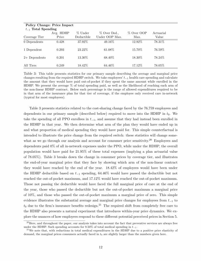
Policy Change: Price Impactt−1 Total Spending
Avg. HDHP % Under % Over Ded., % Over OOP ActuarialCoverage Tier Price Deductible Under OOP Max. Max. Value
0 Dependents 0.428 37.92% 49.16% 12.92% 78.31%
1 Dependent 0.293 23.22% 61.08% 15.70% 76.59%
2+ Dependents 0.201 13.30% 68.40% 18.30% 78.24%
All Tiers 0.249 18.42% 64.46% 17.12% 78.05%
Table 3: This table presents statistics for our primary sample describing the average and marginal pricechanges resulting from the required HDHP switch. We take employees’ t−1 health care spending and calculatethe amount that they would have paid out-of-pocket if they spent the same amount while enrolled in theHDHP. We present the average % of total spending paid, as well as the likelihood of reaching each arm ofthe non-linear HDHP contract. Below each percentage is the range of allowed expenditures required to bein that arm of the insurance plan for that tier of coverage, if the employee only received care in-network(typical for most employees).
Table 3 presents statistics related to the cost-sharing change faced by the 76,759 employees and
dependents in our primary sample (described below) required to move into the HDHP in t0. We
take the spending of all PPO enrollees in t−1, and assume that they had instead been enrolled in
the HDHP in that year. We then determine what arm of the plan they would have ended up in
and what proportion of medical spending they would have paid for. This simple counterfactual is
intended to illustrate the price change from the required switch: these statistics will change some-
what as we go through our analysis and account for consumer price sensitivity.20 Employees and
dependents paid 0% of all in-network expenses under the PPO, while under the HDHP, the overall
population would have paid for 21.95% of these total expenses (implying a plan actuarial value
of 78.05%). Table 3 breaks down the change in consumer prices by coverage tier, and illustrates
the end-of-year marginal price that they face by showing which arm of the non-linear contract
they would have reached by the end of the year. 18.42% of employees would have been under
the HDHP deductible based on t−1 spending, 64.46% would have passed the deductible but not
reached the out-of-pocket maximum, and 17.12% would have reached the out-of-pocket maximum.
Those not passing the deductible would have faced the full marginal price of care at the end of
the year, those who passed the deductible but not the out-of-pocket maximum a marginal price
of 10%, and those who passed the out-of-pocket maximum a marginal price of zero. This simple
evidence illustrates the substantial average and marginal price changes for employees from t−1 to
t0 due to the firm’s insurance benefits redesign.21 The required shift from completely free care to
the HDHP also presents a natural experiment that introduces within-year price dynamics. We ex-
plore the nuances of how employees respond to these different potential perceived prices in Section 5.
20Here, and throughout the paper, our analysis takes into account the fact that preventive services are always freeunder the HDHP. Such spending accounts for 9.50% of total medical spending in t−1.
21We note that, with reductions in total medical expenditures in the HDHP due to a positive price elasticity ofdemand, the marginal prices consumers actually faced in t0 are slightly larger than the numbers given here.
12

Primary Sample. For the majority of our forthcoming analysis, we use the sample of employees
who (i) were present at the firm for the whole six years of the sample period (t−4 through t1) and
(ii) were enrolled in the PPO prior to the required switch in t−1. We use this sample to ensure
that we have a substantial time series of information on the health status of employees we analyze.
Column 3 of Table 1 shows the summary statistics for this primary sample, which can be compared
to the full sample of employees present in t−1 presented in Column 1. There are 22,719 employees in
the primary sample covering 76,759 dependents (approximately 50% of employees and dependents
present in the t−1 full sample in Column 1). Relative to all employees present, primary sample em-
ployees have similar distributions of age and gender, are slightly higher income, and cover slightly
more dependents. Taking employees and dependents together, the primary sample and entire firm
have similar distributions of age and gender, while those in the primary sample have about 4%
higher medical spending on average. For robustness, in Appendix A we present summary statistics
and some of our core results for an alternative sample that includes all employees and dependents
present from t−2 − t0 and who are in the PPO for t−2 and t−1. Our main results are essentially
unchanged for this alternative sample.
Figure 1 examines whether there is substantial incremental attrition from the firm after the
announcement of the switch to the HDHP (later in year t−3) or after the actual required switch
to that plan in t0. If such attrition occurred, it would cause concern that our primary sample did
not represent a sample that was exogenously exposed to the high-deductible plan and was instead
a selected sample of consumers willing to stay at the firm and enroll in the high-deductible plan.
Reassuringly, the figure shows that there is no meaningful change in employee exit either around
the announcement date for the plan switch (year t−3), after the implementation date (January of
year t0), or at any point in between. There is some incremental dependent attrition at the imple-
mentation date (about 1 percentage point higher than baseline), but not enough to meaningfully
impact our main results. Appendix A includes additional charts showing both (i) that employees
and dependents who exit around the implementation date are not sicker than average and (ii) that
employee and dependent entry is also not related to key transition dates.
3 Impact of Cost-Sharing on Spending
We first investigate the impact of the required switch of consumers to the high-deductible plan on
total medical spending. We present a series of analyses for our primary sample, beginning with a
description of the raw data and ending with a complete analysis that is intended to reflect a causal
impact of the contract change.
Figure 2 plots mean monthly spending at the individual level for our primary sample over the
six years in our data (Figure A12 in Appendix A.8 plots median spending over time to remove the
effects of very high cost consumers). The vertical line in the figure represents December of t−1. The
figure clearly illustrates that spending drops after the required switch to the HDHP: the average
yearly spending for an individual dropped from $5222.60 in t−1 to $4446.08 in t0. This constituted
13

Figure 1: This figure plots employee and dependent attrition from the firm over time. It presents themonthly exit hazard rate separately for employees and for spouses / dependents. It shows that there is nomeaningful change in employee exit either around the announcement date for the plan switch (October ofyear t−3) or the implementation date (January of year t0). There is some incremental dependent attritionat the implementation date, but not enough to meaningfully impact our main results.
Figure 2: This figure plots mean monthly spending by individuals in our primary sample over the six yearsin our data, both adjusted and unadjusted for age and price trends.
a year on year 14.87% drop in spending in the raw data, effectively returning nominal spending
to just below t−4 spending levels for this sample. Table 4 presents the year-on-year mean total
spending changes for the primary sample in the raw data over the six years, while Table A11 in the
Appendix presents mean monthly spending values for select months across these years, illustrating
that this drop in spending occurs consistently throughout the calendar year.
As is typical in health care, the raw spending data shows total medical spending increasing
steadily over time. We attribute this to two factors in our environment. First, our primary sample
is a balanced panel where consumers age over the six year period. Second, the price of care typically
rises over time due to both price inflation and other factors such as the introduction of new medical
technologies. If we fail to account for these factors, we will understate the causal impact of the
required HDHP switch on medical spending because t0 spending will be mechanically larger than
t−1 spending.
Figure 2 also shows the raw spending data adjusted for in-sample aging over time and for
14

HDHP SwitchSpending Impact Model
(1) (2) (3) (4)– CPI & Intertemp. Early Switcher
Year Age Adj. Substitution Diff-in-Diff
t−4 4,031.49 3,910.87 3,910.87 –t−3 4,256.21 3,858.78 3,858.78 –t−2 4,722.03 4,055.01 4,051.01 –t−1 5,222.60 4,277.84 4,112.61 –t0 4,446.08 3,490.97 [3,490.97 , 3,656.20] –t1 4,799.14 3,599.25 3,599.25 –
% Decreaset−1-t0 -14.87% -18.39% [-11.09%, -15.12%] [-20.17%, -20.93%]t−1-t1 -8.01% -15.86% -12.48% –
Semi-Arc Elasticity* -0.57 -0.85 [-0.59,-0.69] [-1.04,-1.08]
*Column 1-3 elasticities average t−1-t0 and t−1-t1 estimated effectsColumn 4 elasticity for t−1-t0 only
Table 4: This table details the treatment effect of the required HDHP switch under different frameworks:(i) nominal spending (ii) age and CPI adjusted spending (iii) causal estimates with anticipatory spending(age and CPI adjusted) and (iv) causal estimates from the early switcher matched difference-in-differencesapproach. Under each framework we display the predicted values for mean yearly individual spending, foreach year as well as the predicted % change in this spending as a result of the required HDHP switch fromt−1-t0 and from t−1-t1. We present the mean yearly amount saved from the switch in the two years postswitch (t0 − t1) as well as the implied semi-arc elasticity of the switch comparing t−1 to the two post years,as described in the text.
medical price inflation. To adjust spending for age, we take monthly individual-level spending for
January of year t−4 and regress it on age and a number of other controls. Within our sample,
mean monthly spending increases by $7.50 for each year someone ages. This provides an estimate
of the increase in spending that comes about from aging one year in our sample and indicates a
very small effect of aging on the t−1 − t0 treatment effect estimates.22 Additionally, we adjust
for medical price inflation using the Consumer Price Index (CPI) for medical care for each month
in our sample.23 This index adjusts for price inflation, but not price increases from technological
change, and as a result we may slightly understate the impact of the required switch to the HDHP
on spending reductions. We note also that in this section we intentionally use this broader price
inflation index so that any equilibrium price effects as a result of the required HDHP switch are
still accounted for in our treatment effect estimates, an issue we return to in Section 4. 24
22One would normally expect a nonlinear relationship between age and health spending that is flatter at youngerages and steeper at older ages. The relative youthfulness of our sample (see table 1) is a key reason for the lowestimated impact of aging here. Using nonlinear specifications gives similar results.
23This comes from the index collected by the Bureau of Labor Statistics. A time series of this index can be foundat http://research.stlouisfed.org/fred2/series/CPIMEDNS. A description on how this is collected can be foundat http://www.bls.gov/cpi/cpifact4.htm.
24To foreshadow, we find values similar in magnitude to the CPI adjustments we use here.
15

In Figure 2 we apply both the within-sample aging and medical price inflation adjustments to
the raw data. We express the adjusted spending values in January t−4 dollars, i.e. in terms of
ages and medical prices at year t−4. The figure clearly illustrates the drop in average monthly
individual spending following the required HDHP switch. The numbers in Table 4 show that, once
these adjustments are accounted for, average individual spending drops by 19.36% from t−1 to t0
as individuals are required to move from free health care to the HDHP. It is important to note
that adjusted spending drops by 15.86% comparing t−1 to t1, implying that the impact of high-
deductible insurance on medical spending persists for both years post-switch.
Anticipatory Spending. While it is clear from Figure 2 that aggregate spending decreases
when the HDHP is introduced in t0, it is also apparent that consumer spending ramps up at the
end of t−1 in anticipation of the required plan shift. As discussed in Section 2, the t0 HDHP switch
was first announced in October t−3 with many regular subsequent related announcements leading
up to the actual change in t0. As a result, the plan switch was a well known and salient event
throughout t−1, leading to anticipatory spending by consumers before the switch actually occurred,
when health care spending was cheaper. This kind of anticipatory spending is clearly documented
in Einav et al. (2013a) in the context of Medicare Part D prescription drug insurance and Cabral
(2013) in the context of dental insurance.
In our context, quantifying the extent of anticipatory spending is important for obtaining a
causal impact of the required HDHP shift. Without understanding the extent of such spending our
estimates would overstate the true impact of the increase in cost sharing on medical spending since
some of the spending that would have occurred in a normal HDHP year would have been shifted
to the end of t−1. To that end, we perform a regression analysis using monthly spending data at
the population level to quantify excess spending in the second half of the year t−1.25 We estimate
the following specification to predict mean monthly spending:
ym = α+ βm+ λM + εm
We estimate the regression on data from January t−4 to December t−2, well in advance of the
HDHP switch. m denotes one of the specific 36 months over this timeframe, while m denotes a
given month in the calendar year. ym is mean individual-level spending in our primary sample at
the firm in a given month m, β is a linear time trend to account for inflation and aging, λM is
a calendar month fixed effect to adjust for seasonality, and ε is the population level idiosyncratic
monthly shock to mean spending.
We determine which months have meaningful anticipatory spending by looking at the months
at the end of t−1 that have ym that is statistically larger than the predicted value ym from the above
25It is also possible that some anticipatory spending occurs prior to the second half of t−1. Such spending is highlyunlikely to matter for our analysis, since consumers would have to be substituting medical care over six monthsforward. We note that though there is a spike in March t−1 mean spending in the pre-period, this is attributableto several concurrent very high cost consumers. Figures 3 in the text and A12 in Appendix A clearly illustrate thatclaim counts and median monthly spending spike in October-December t−1, but not earlier in t−1.
16
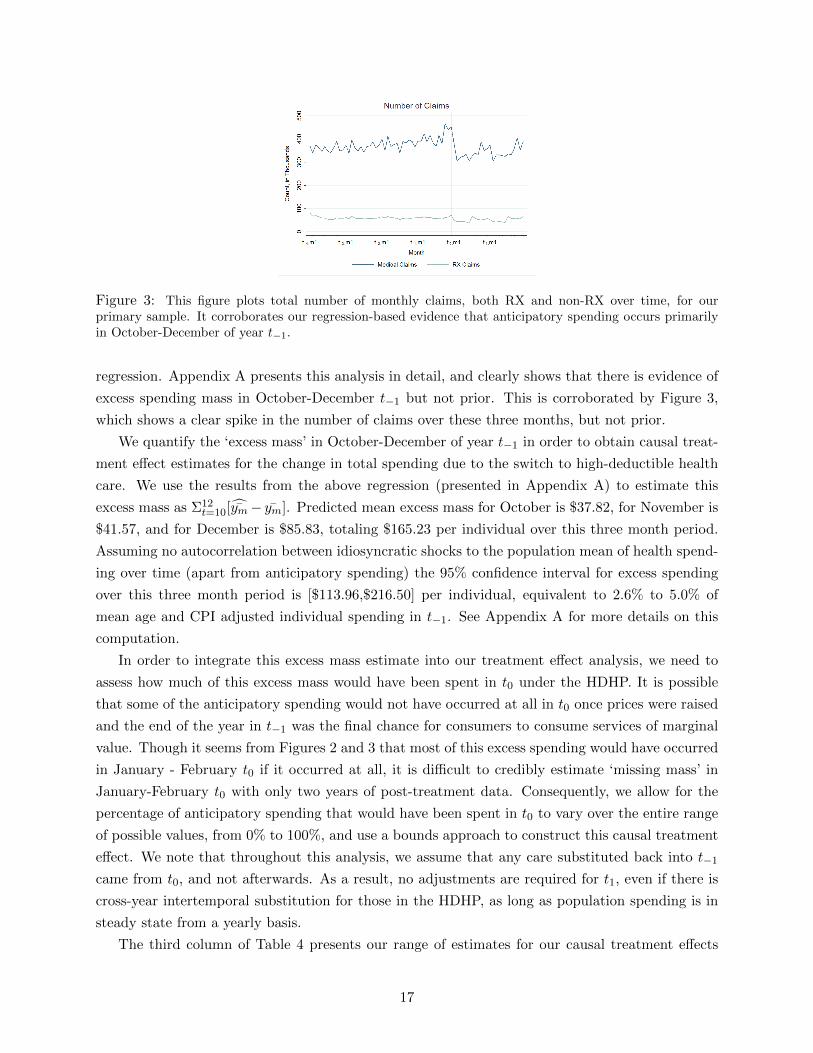
Figure 3: This figure plots total number of monthly claims, both RX and non-RX over time, for ourprimary sample. It corroborates our regression-based evidence that anticipatory spending occurs primarilyin October-December of year t−1.
regression. Appendix A presents this analysis in detail, and clearly shows that there is evidence of
excess spending mass in October-December t−1 but not prior. This is corroborated by Figure 3,
which shows a clear spike in the number of claims over these three months, but not prior.
We quantify the ‘excess mass’ in October-December of year t−1 in order to obtain causal treat-
ment effect estimates for the change in total spending due to the switch to high-deductible health
care. We use the results from the above regression (presented in Appendix A) to estimate this
excess mass as Σ12t=10[ym− ym]. Predicted mean excess mass for October is $37.82, for November is
$41.57, and for December is $85.83, totaling $165.23 per individual over this three month period.
Assuming no autocorrelation between idiosyncratic shocks to the population mean of health spend-
ing over time (apart from anticipatory spending) the 95% confidence interval for excess spending
over this three month period is [$113.96,$216.50] per individual, equivalent to 2.6% to 5.0% of
mean age and CPI adjusted individual spending in t−1. See Appendix A for more details on this
computation.
In order to integrate this excess mass estimate into our treatment effect analysis, we need to
assess how much of this excess mass would have been spent in t0 under the HDHP. It is possible
that some of the anticipatory spending would not have occurred at all in t0 once prices were raised
and the end of the year in t−1 was the final chance for consumers to consume services of marginal
value. Though it seems from Figures 2 and 3 that most of this excess spending would have occurred
in January - February t0 if it occurred at all, it is difficult to credibly estimate ‘missing mass’ in
January-February t0 with only two years of post-treatment data. Consequently, we allow for the
percentage of anticipatory spending that would have been spent in t0 to vary over the entire range
of possible values, from 0% to 100%, and use a bounds approach to construct this causal treatment
effect. We note that throughout this analysis, we assume that any care substituted back into t−1
came from t0, and not afterwards. As a result, no adjustments are required for t1, even if there is
cross-year intertemporal substitution for those in the HDHP, as long as population spending is in
steady state from a yearly basis.
The third column of Table 4 presents our range of estimates for our causal treatment effects
17

that incorporate anticipatory spending. Once anticipatory spending is taken into account, assuming
that all such spending would have occurred in t0, we find that the required switch to the HDHP in
t0 decreased total spending by between 11.09% and the upper bound of 15.12%, which corresponds
to the case where all anticipatory spending would not have otherwise occurred after the required
switch. The difference between this range, and our 19.36% estimate where anticipatory spending
is not accounted for, indicates the importance of measuring anticipatory spending when using a
pre-post or difference-in-differences design to measure the impact of cost-sharing on health care
spending. When t−1 spending adjusted for anticipatory spending is compared to t1 spending, the
estimated impact is a 12.48% spending reduction.
Early Switcher Difference-In-Differences. In addition to our main analysis, which relies on
the change over time to identify the effects of the HDHP on spending, we investigate a difference-in-
differences approach that uses consumers who switched to the HDHP in years prior to the required
switch as a control group. We consider this to be a robustness check, instead of a primary piece
of analysis, because the ‘control’ group of early switchers actively selected into the HDHP in t−2
and t−1 and were clearly not randomly assigned to that plan. As a result, early switchers are not a
true control group and should not be treated as such. We use the entire sample of early switchers
present through t0 for the analysis, and compare their spending over time to a weighted version of
our primary sample, where the weighting gives the modified primary sample the same health status
distribution (based on ex ante ACG predictive risk scores) as the early switcher sample.
We discuss this approach in more detail in Appendix A.3, and present additional supporting
evidence there. The final column in Table 4 presents the primary estimate of a 20.17-20.93%
spending reduction as a result of the required HDHP switch. This is qualitatively similar to our
primary causal estimate of 11.02-15.19% (Column 3 in Table 4), indicating the robustness of that
primary analysis to the difference-in-differences approach. While this is reassuring, we note that the
difference-in-differences analysis explicitly considers a healthier sample than the primary analysis
due to the health status distribution of early switchers (and the corresponding matched population
in the primary sample), and thus, should not necessarily lead to the same result.
Elasticity Estimates. A typical metric used to compare price sensitivity estimates in medi-
cal spending is the arc elasticity of total medical spending with respect to the price consumers face.
As discussed in Aron-Dine et al. (2013), describing a non-linear insurance contract by one price
is an oversimplification, since consumers face many potential true marginal prices throughout the
contract and also face different marginal prices based on their respective health risks. The notion
that it is difficult for one price to represent an insurance contract for a population is supported in
our Section 5 analysis, which shows that consumers face very different prices throughout the year
and that they respond to spot prices instead of true expected marginal prices.
Nevertheless, for comparison purposes, in Table 4 we present the semi-arc elasticity of total
medical spending with respect to price:
18

2(qt0 − qt−1)/(qt0 + qt−1)
(pt0 − pt−1)
Here, qt is mean individual total medical spending in year t, and pt is the single ‘price’ of insurance
coverage for the population in year t. We follow the literature here, and take the single price of
the HDHP in t0 to be the proportion of medical spending that consumers in the overall population
would have paid for if t−1 medical spending occurred under the HDHP plan design. This is .219
in the primary sample in our setting. The price of the PPO in t−1 is 0 since consumers do not
pay anything for health care on the margin in the PPO. We note that while most of the literature
uses arc elasticity rather than semi-arc elasticity, when the price change in question starts from
zero price, arc elasticity just represents the % quantity change so is not a satisfactory descriptive
statistic.26 The semi-arc elasticity represents the change in quantity, normalized by the baseline
quantity, divided by the change in price.27
As Table 4 reveals, the semi-arc elasticity for our primary causal treatment effect estimate lies
in the range [-0.59, -0.69], averaging over both post-period years, while those from the other ap-
proaches in the Table lie between -0.57 and -1.08. These semi-arc elasticities are less than half
of those for two of the main estimates cited in the RAND Health Insurance Experiment where
consumers are randomized between coverage with (i) 100% and 84% actuarial value or (i) 84%
and 69% actuarial value.28 We use statistics from Keeler and Rolph (1988) to compute RAND
semi-arc elasticities of -2.11 and -2.26 respectively for these two scenarios. Though, by this metric,
consumers are less price sensitive in our setting, we note that the economic magnitudes of our treat-
ment effect estimates are still substantial (regardless of the elasticity measures / comparison) and
that there are many potentially important differences between our setting and the RAND setting.
Heterogeneous Treatment Effects. While it is important to document the impact of the
required switch to high-deductible health care on total medical spending, it is just as crucial to
understand how and why consumers are reducing spending. Understanding how and why medical
spending is reduced is important both to assess the positive impacts of different policies (e.g. in-
surance contract regulation, insurance exchange design, physician market regulation) as well as to
draw some normative inferences about these policies’ impacts. The rich claims data we observe, to-
gether with our large sample size, allow us to investigate the heterogeneous impact of the required
HDHP switch in substantial detail. Here, we document these heterogeneous impacts using the
methodology developed in this Section, while in the rest of the paper we focus on the mechanisms
26The arc elasticity in our context would be (q2−q1)/(q2+q1)(p2−p1)/(p2+p1)
. If p1 is 0, then the bottom of this fraction alwaysequals 1 and just the quantity change is given, regardless of the magnitude of the price change.
27In general, as with the arc-elasticity measure, one might want to normalize the price change as well to reflectdifferences in scale (e.g. comparing changes of $5 to $10 versus $5000 to $10000). In our setting, this is not an issuebecause we define price as the share of firm-wide costs that fall on the employee, following past work on moral hazard(see e.g. Manning et al. (1987)). Since this percentage is a relative measure already, this scaling issue does not arisewhen using the semi-arc elasticity measure.
28The 84% actuarial value contract has a 25% coinsurance rate up to an out-of-pocket maximum of $1000 whilethe 69% actuarial value plan has a 95% coinsurance up to a $1000 out-of-pocket maximum.
19

Figure 4: This figure plots adjusted spending for individuals in a given month, by ACG predictive healthindex quartile (the index is calculated at the beginning of each calendar year).
underlying these spending reductions.
Figure 4 investigates the impact of the switch to high-deductible health care as a function of
consumer health status. The figure plots spending over time by consumer health status, categorized
into quartiles using the ACG predictive index described Section 2. Consumers in the sickest quartile
are those who, at the beginning of each calendar year, based on the last year of medical diagnoses
and spending, are predicted to spend the most for the upcoming calendar year (while the healthiest
quartile are those predicted to spend the least). One key difference between this figure and prior
figures in this section is that the sample in each group can switch from year to year: consumers
in the top quartile line for t−1 are those predicted to be the sickest for t−1, who might not be the
same predicted sickest 25% of consumers for t0. It is crucial to construct the figure this way (rather
than fixing health status at a given point in time) to avoid reversion to the mean that occurs when
categorizing health at one point in time.
The figure clearly shows that health spending is reduced for the sickest three quartiles, and that
the majority of the spending reductions we document come from the sickest quartile of consumers,
predicted on an ex ante basis. This is striking for several reasons. First, as we will document in
Section 5, all of the consumers in the sickest quartile are expected to spend well past the deductible
in a statistical sense. Given the HDHP contract design, many of these consumers can expect to pass
the out-of-pocket maximum and all of these consumers have an expected end-of-year marginal price
in between 0 and 10%, the coinsurance rate. This implies that the true price change these consumers
should expect to face is quite low.29 Second, because these consumers are predicted ex ante to be
in the sickest group, many of them have chronic medical conditions where medical care may have
especially high value. In the next section we explore what services these consumers are actually
reducing, and show that they reduce consumption of a broad range of medical services, ranging
from those that seem elective to those that should not be. Finally, it is important to emphasize
29We discuss this more in Section 5. Just because they should expect to face low marginal prices doesn’t meanthey do expect to face low marginal prices.
20

that these sick consumers are relatively high-income: as shown in Table 1 median income for just
the employee is between $125,000 and $150,000, which is high relative to the family out-of-pocket
maximum (between $6,000-$7,000) in the HDHP.
Table 5 presents treatment effect estimates using the methods developed earlier in this section,
for different cohorts of consumers categorized by health status. The table presents estimates com-
paring t−1 spending to t0 spending for parsimony: t−1 to t1 comparisons are similar and included
in Table A5 in Appendix A.30 The sickest quartile of individuals, who spend on average $12, 335
in t−1, reduce spending by between 18-22% under our treatment effect measures that adjust for
aging, the health care CPI, and anticipatory spending. These treatment effects are slightly larger
for the ex ante health status quartiles 1 (healthiest), 2, and 3 respectively, though off much lower
spending bases.31 32 The table also presents these results for consumers categorized by number of
documented chronic conditions entering a given calendar year, revealing limited heterogeneity on
this dimension. Figure A4 in Appendix A breaks down the spending reductions for quantiles within
the sickest quartile of consumers, and shows even the sickest ex ante consumers reduce spending
under the HDHP. Figure A5 in Appendix A shows that median monthly spending is also reduced
for the sickest quartile of consumers.
Table 5 also documents heterogeneous treatment effects by (i) consumer demographics and
(ii) broad categories of medical services (we present more details on medical services in the next
section). One notable result is that spending reductions for dependents are limited (12%) and there
are no anticipatory spending shifts for this group, suggesting that parents may be less willing to
economize on care or shift care for their children. Table 5 also presents these treatment effects
broken down by age and employee income.
We break down medical services into eight broad categories for this analysis, with a ninth
category that includes all remaining services. One notable result is that spending is reduced across
all eight of these broad spending categories, and that the effects have a fairly narrow range of a
6% CPI adjusted reduction (mental health) to a 25% reduction (ER spending). This is somewhat
surprising, since some categories seem more elective (e.g. physician office visits, 18% reduction)
and others seem less elective (e.g. inpatient, 13% reduction). Notably, consumers reduce spending
for both branded drugs (20%) and generic drugs (19%). In addition, spending on services that are
classified as preventive is reduced by 10%. This is especially striking since (i) these services are all
30Table A4 in Appendix A also presents in detail the means and standard errors for anticipatory spending acrossall cohorts / categories in Table 5.
31The health status quartile treatment effect analysis fixes the quartiles based on predictive indices for t−1, butallows consumers to switch between those quartiles from one year to the next. This means that the cross-sectionalhealth status quartile populations change over time, but the definition of a quartile in terms of health status remainsthe same. This is why the % of consumers in each quartile is slightly different than 25%.
32We note that the average of these health status quartile treatment effects, weighted by total spending, is slightlylarger than the treatment effect presented for the entire population in Table 4. In the raw spending and age/CPI-adjusted only treatment effects, this difference is because the quartiles have slightly different mixtures of health statuswithin the health status range for the quartile over the years. For the anticipatory spending adjusted estimates, thisdifference could also come from the fact that anticipatory spending regressions /adjustments are done separatelyfor each quartile. In Table A6 in Appendix A we present some additional versions of this analysis, intended forrobustness, where health status quartiles are defined as true quartiles on a year to year basis, though the ACG indexboundaries of each quartile may change .
21

Heterogeneous HDHPSpending Impact
Treatment Effect(1) (2) (3)
Group Spending t−1 Mean Nominal CPI Anticipatory% % Spending Spending Spending
Age 0-17 36.26 24.29 3465.65 -0.07 -0.11 -0.11*Age 18-29 8.81 7.59 4442.77 -0.15 -0.19 -0.19*Age 30-54 51.99 62.08 6164.59 -0.19 -0.23 [-0.13,-0.18]Age 55+ 2.92 5.95 11051.14 -0.11 -0.15 [-0.05,-0.11]
Income $0-100K 6.30 6.91 5701.99 -0.03 -0.07 [-0.00, -0.04]Income $100-150K 63.04 62.98 5209.86 -0.13 -0.17 [-0.08, -0.13]Income $150-200K 24.93 24.20 5026.86 -0.15 -0.18 [-0.15, -0.17]Income $200K+ 5.73 5.91 5340.94 -0.12 -0.15 [-0.09,-0.12]
Employee 33.47 35.77 5532.76 -0.20 -0.23 [-0.12,-0.18]Spouse 23.92 35.12 7495.02 -0.16 -0.20 [-0.10,-0.16]Dependent 42.61 29.11 3570.33 -0.08 -0.12 -0.12*
ACG Quartile 1** 28.51 9.74 1643.56 -0.25 -0.28 -0.28*ACG Quartile 2** 23.83 12.15 2824.78 -0.39 -0.41 [-0.39,-0.40]ACG Quartile 3** 23.53 21.45 4564.50 -0.36 -0.38 [-0.33,-0.36]ACG Quartile 4** 24.13 56.66 12335.85 -0.21 -0.25 [-0.18,-0.22]ACG Top 1%** 0.79 9.33 66606.47 -0.25 -0.28 -0.28*
0 Chronic Cond. 62.78 38.34 3202.64 -0.15 -0.19 [-0.16,-0.18]1-2 Chronic Cond. 33.13 47.38 7240.37 -0.18 -0.22 [-0.18, -0.20]3+ Chronic Cond. 4.19 14.18 19093.34 -0.13 -0.17 [-0.05,-0.12]
Inpatient Hosp. 16.53 863.48 -0.09 -0.13 [-0.07,-0.11]Outpatient Hosp. 18.07 944.15 -0.13 -0.17 [-0.06,-0.12]ER 3.11 162.40 -0.21 -0.25 -0.25*Office Visit 7.61 397.86 -0.15 -0.18 [-0.13,-0.16]RX 16.91 883.62 -0.16 -0.19 [-0.15,-0.17]RX - Brand 12.23 638.82 -0.16 -0.20 [-0.16,-0.18]RX - Generic 4.05 211.62 -0.15 -0.19 [-0.19,-0.19]Mental Health 9.45 493.86 -0.02 -0.06 -0.06*Preventive 9.50 496.28 -0.06 -0.10 [-0.05,-0.08]Other 22.94 1198.07 -0.26 -0.29 [-0.17,-0.24]
*Anticipatory spending estimate negative or not significant from 0**Quartile definition constant, population shifts across quartiles each year.
Mixture of health status within quartile bounds differs from year to year.
Table 5: This table summarizes our descriptive evidence for the heterogeneous treatment effects of therequired HDHP switch. For parsimony, the tables presents the estimates from t−1-t0: see the Appendix forthe estimates comparing t−1 to t1. The table presents the results for different (i) demographics (ii) healthstatus measures and (iii) types of health services. The first column reports the % of people within a givendemographic group or health status group for categories (i) and (ii), and the % of total spending a givenservice spending is for category (iii). The second column reports average mean individual yearly spendingfor categories (i) and (ii), and average mean individual spending for each type of service for category (iii).The second through fourth columns present, for each respective framework, the % change in spending (foreach demographic group, or type of service) as a result of the required HDHP switch from t−1 to t0.
22

free to consumers under the HDHP (as mandated under the ACA) and (ii) these are services that
may prevent higher spending and poor health in the future.
In Appendix A, we present more detailed description of spending across these categories, in-
cluding figures specific to each service category (Figures A6 and A7). These treatment effects tell
us that total medical spending is reduced across these medical spending categories, but don’t tell
us enough about how or why spending is reduced. In the next section, we break down these doc-
umented spending reductions into (i) reductions from provider price changes (ii) reductions from
consumer price shopping and (iii) reductions from consumer quantity reductions. We conduct that
analysis in aggregate, but, importantly, also for specific service categories and for specific proce-
dures. In doing so, we are able to dig deeper than the treatment effect measures presented here
for total medical spending and better assess exactly how consumers and providers are responding
behaviorally to the increase in cost sharing associated with the required switch to high-deductible
health care.
4 Spending Reduction: Decomposition
In the previous section we provided a range of evidence illustrating the impact of increased cost
sharing on total medical spending. We showed that the required switched to the HDHP plan in t0
causally reduced total medical spending by between 11.79-13.80%. Additionally, we examined the
impact of increased cost sharing on different categories of medical spending and different types of
consumers. In this section we decompose the overall change in spending from the required switch to
the HDHP into three main effects (i) consumer price shopping (ii) outright quantity reductions and
(iii) quantity substitutions to lower-cost procedures. In doing so, we also control for any provider
price changes that occur (potentially in response to the large-scale change in insurance).
For this decomposition, we restrict the set of provider-procedure combinations we consider to
those that have at least 15 observations over the two years we are studying the medical spending
change for. Thus, when examining the total medical spending change from t−1 to t0 (the year of the
required switch) we only consider provider-procedure combinations that have at least 15 combined
observations in the claims data across both of those years. This ensures that we have accurate
price data for the services performed, and are using a consistent set of providers and procedures to
perform this analysis. These procedure-provider combinations account for 77% of overall spending.
In addition, we focus this analysis on the main region where the company employs people,
in order to allow for the possibility that provider price changes could reflect market responses
for providers in area where the firm has some monopsony power with respect to providers. The
regional restriction reduces the number of employees considered in our analysis to an average of
16,814 (50,219 covered lives) per year, or about 75% of our primary sample.
Framework. We define the factors that we consider so that they are mutually exclusive and ex-
haustive for explaining the total change in medical spending. We define the provider price change
index as the average increase in medical prices paid, holding constant the mix and quantity of
23

services consumed. This procedure essentially defines a Laspeyres index for provider price levels:
PPIt+1,t =TSt+1,t − TSt,t
TSt,t(1)
Here, TSt′,t is defined as total spending for period t choices at period t′ prices. We define a choice
as a choice of a procedure-provider combination, and price as the relevant-procedure-provider price
in a given year. Thus, e.g., if t + 1 = 2013 and t = 2012, the index measures the increase
in spending if the same provider-procedure combinations purchased in 2012 at 2012 prices were
purchased at 2013 prices. This provider price inflation index takes into account a number of factors
that lead to provider price changes including (i) basic medical price inflation and (ii) providers
changing their prices in response to the regime shift to the HDHP.33 In our upcoming results, we
also present PPIm,t+1,t, or this provider price index for different specific procedures m. While we
are intrinsically interested in price changes, our main focus in measuring the provider price index
is to isolate price shopping and quantity reductions.
The second component of our decomposition is the price shopping effect, which measures the
extent to which consumers substitute to lower price providers conditional on receiving a specific
kind of procedure m.34 To do this, e.g., for 2012 − 2013, we hold the 2013 distribution of prices
for provider-procedure combinations fixed, and examine whether, for a given procedure, consumers
substituted to differently priced providers in their 2013 choices, relative to their 2012 choices. This
decomposition assumes that the ranking of prices across providers within a class of procedures is
constant over time, something that we verify is approximately true in Appendix A. In addition,
when we perform our aggregated price shopping calculation (the impact across all medical spending)
we hold the mix of procedures constant across the set of feasible procedures, so that substitution
to or away from certain procedures does not impact our price shopping measure.
Formally, take Pm,Q,t to be the vector of prices for procedure m across the set of providers Q
offering that procedure, at year t. Define Cm,Q,t as the vector of provider choices by consumers for
procedure m in year t across the feasible set of providers Q. Then, we define the price shopping
statistic for procedure m as:
PSm,t+1,t =Pm,Q,t+1 ·Cm,Q,t+1 −Pm,Q,t+1 ·Cm,Q,t
Pm,Q,t+1 ·Cm,Q,t(2)
For procedure m, the price shopping effect tells us, holding prices constant at t+ 1 prices, whether
consumers shifted towards cheaper or more expensive providers conditional on doing that procedure.
We compute the overall price shopping effect for overall spending by holding the revenue mix of
procedures constant across procedures at year t revenue. Specifically, define Ym,t as the total
revenue for procedure m in year t and Yt as total revenue across all procedures in year t. Then,
33Provider prices are typically set through negotiations with the insurer, who typically presents in-network inclusionas a ‘take-it-or-leave-it’ offer for smaller scale providers. If renegotiations are ‘sticky’ in the sense that they occurinfrequently, our price index may overstate or understate the long-run impact of the HDHP plan on price changes.
34We study this question in an environment where consumers had access to a tool that could provide them withprice information. Therefore, our setting is less representative of most consumer choice settings but, if anything, wewould expect to find more shopping based on prices.
24

the overall price shopping effect is:
PSt+1,t = ΣMm=1
Ym,t
YtPSm,t+1,t (3)
The overall price shopping effect tells us the extent to which consumers substitute to higher or
lower priced providers from one year to the next year, conditional on doing a specific procedure,
summed up across procedures. This statistic incorporates any effect related to the mix of providers
patients see for a given procedure moving from one year to the next year. This includes, e.g.,
consumers shopping for providers with lower prices (as a result of the HDHP switch) or trends
whereby consumers are moving over time towards seeing more expensive doctors (e.g. because of
shifting preferences).35
The third part of the decomposition reflects quantity changes by consumers. Our provider price
index and price shopping measure reflect how price changes or the mixture of prices chosen for
procedures contribute to the total spending reduction documented in the previous section. Our
aggregated quantity change measure tells us how much of the change in total medical spending is
due to consumers reducing quantities or substituting to different kinds of procedures: we also break
down this measure into the medical spending change due to each of these two components.
Here, given that we have already defined the first two parts of this three-part exhaustive and
mutually exclusive decomposition, we define the quantity reduction effect as the remaining % of
the change in total spending not explained by the first two effects.
To do this, we define the year on year change in total spending as:
∆TSt+1,t =Pt+1 ·Ct+1 −Pt ·Ct
Pt ·Ct
Here, Pt+1 is the vector of prices across all provider-procedure combinations present in this analysis,
and Ct+1 is a vector describing the quantity consumed for each procedure-provider combination.
∆TSt+1,t is thus the change in total medical spending for the set of procedure-provider combinations
studied in this analysis. Given this we define the quantity reduction effect, which captures the effect
of year to year quantity changes on total spending, as:
QEt+1,t = ∆TSt+1,t − PPIt+1,t − PSt+1,t (4)
The quantity effect thus equals the change in total spending between two years, netting out provider
price inflation and the price shopping effect. We break down the effect of quantity changes into
that due to quantity reductions and that due to substitution across types of procedures. To do
this, we directly define the reduction in quantity of medical services as:
35We note that our aggregate price shopping statistic is performed conditional on procedure and not conditionalon episode of illness. Thus, our measure incorporates shifting to lower priced providers for a given procedure, butnot the impact of shifting to lower priced kinds of procedures for a given episode of illness. We quantify the impactof shifting to lower priced procedures in the quantity change measures we describe momentarily. Of course, when weapply this price shopping measure to a specific procedure, this distinction is immaterial.
25

Qt+1,t =Qt+1 −Qt
Qt(5)
Here, Qt is the count of medical procedures/services consumed in year t. If consumers shifted to
lower priced procedures as a result of the HDHP plan shift, this would be accounted for by a change
in the average price per medical procedure consumed overall. We define the aggregated impact of
substitution across procedures on total medical spending as the residual of the quantity change
effect not explained by straight quantity reductions:
QSt+1,t = QEt+1,t −Qt+1,t (6)
We note here that our quantity change measures do not explicitly account for the anticipatory
spending documented in the previous section, which reduced our estimate of the total reduction in
medical spending by between 4-8%. Figure 3 illustrates that anticipatory spending is associated
with quantity changes: such spending is unlikely to impact the provider price index and price
shopping statistics presented here. We discuss this in the context of our results.
We now present the results for this decomposition, first for overall total medical spending,
and second for specific procedure and diagnostic categories of interest. When we study specific
procedures of interest, there is no distinction between QEt+1,t and Qt+1,t (since there is only one
procedure involved in the calculation) so we only present on statistic for the impact of quantity
changes on medical spending.
Results. Table 6 describes the results of this decomposition for the overall change in medical
spending for consecutive years in our data. This table focuses on non-drug spending: we analyze
drug spending separately afterwards. We report the results for all pairs of consecutive years from
t−4 − t1. While our main focus is on the t−1-t0 period when the required switch to the HDHP
occurred (and subsequent t0-t1 trends), we believe that it is helpful to present the results for the
prior years to have a baseline for each effect. The first column presents the year-on-year change in
total spending change for our modified primary sample, showing similar results to our Section 3
analysis.
The second column presents the results for PPIt+1,t, the provider price inflation index. The
table illustrates how this effect is fairly consistent and small across the four pairs of years studied,
ranging from 0.2% for t−2-t−1 to 3.4% from t−4-t−3. The effect for t−1-t0 is 1.7%: as described in
the prior section, this could be due to either standard medical price inflation or providers changing
prices in response to the introduction of the HDHP. Given the similarity of this effect for t−1-t0
relative to prior years, we can rule out a large provider price change as a result of the required
HDHP shift, under the presumption of a steady time trend in baseline medical inflation. This
statistic for t0-t1 is 1.7%, indicating no major change in the second year of full HDHP enrollment.
Similarly, the overall price shopping effect PSt+1,t, presented in the third column, is fairly small
across the pairs of years studied ranging from -0.6% for t−4-t−3 to 3.6% from t−1-t0. Interestingly,
this effect is largest for t−1-t0, implying that after the required switch to the HDHP consumers are
26

actually increasing the expense they are paying for a given procedure, rather than price shopping
and moving to lower priced providers when they face a higher marginal price for care. Remember
that this statistic conditions on year t+1 prices (here t0 prices) so the 3.6% reflects shifting to more
expensive providers for a given procedure (and not price inflation). The fact that this estimate
goes in the ‘wrong direction’ suggests that other demand / preference trends for consumption
may have shifted consumers towards more expensive providers conditional on a given procedure
and, importantly, that medical spending was not markedly reduced due to consumers shopping
for cheaper providers for a given procedure.36 These results are particularly striking insofar as we
study an environment where consumers were provided a comprehensive online tool to help them
for prices in their region for different procedures. The t0-t1 price shopping statistic is 0.7%: this is
not sufficiently different from the prior year values to conclude that consumers learn to price-shop
over time, in year two after the required switch. This does not mean that some learning did not
occur, but does mean that it did not meaningfully impact overall spending.
Table 7 presents a measure of potential savings from price shopping to give a sense of how large
such savings could be in our environment, in a partial equilibrium sense. We compute a statistic
that assesses what percentage of total spending would be saved if consumers who spend above the
median price for a given procedure substituted to the median priced provider for that procedure in
their region. For our overall spending metric, we then aggregate these statistics over all procedures.
This potential savings metric does not incorporate any notion of whether higher-priced providers
are higher quality, which would be important to assess welfare. For each two year pair presented,
the percentage that could be saved is based on potential substitutions in the second year of each
pair. Column 1 shows potential price shopping savings for overall spending, which ranges from
18.3% from t−4-t−3 to 21.1% in t−2-t1. t−1-t0 and t0-t1 values are 20.1% and 20.8% respectively.
These results give a sense that there are quite a bit of potential savings from price shopping that
are not currently being realized, though a complete welfare analysis would have to integrate factors
such as travel costs and provider quality.
Spending is not decreasing in t0 and t1 because of provider price decreases or consumer price
shopping. The main reason for the total medical spending reduction after the required switch was
quantity reductions by consumers. For the three pairs of years between t−4-t−1, the % change in
overall medical service quantities ranges from 6.0-8.4%., indicating increasing quantities over that
time frame. For t−1-t0, the quantity of services consumed dropped by 17.9%, and, thus, was the
primary contributor to the drop in total medical spending over those two years as a result of the
required HDHP shift. Interestingly, from t0 to t1, quantities increase by only 0.7%, indicating a
lower growth rate than prior to the HDHP switch. The table also reports the impact of substitution
36For robustness, in Appendix A we perform this decomposition for new employees. We do this because one reasonfor a lack of short-run price shopping may be that consumers have existing relationships with providers that they wantto maintain. New employees in each year should be less likely to have such relationships. We perform a cross-sectionalversion of this analysis for new employees in t−1, compared to new employees in t0 (approx. 2,600 new employeesand 4,300 new covered lives in each year). These new enrollees spend on average $3,994 in t−1 and $2,976 in t0,about 25% lower than our primary sample. For new enrollees we find similar patterns for the spending reductiondecomposition: a 1.6% effect of our price shopping measure on spending, a -16.5% impact of reduced quantities onmedical spending, and a 1.3% increase in provider prices. See the appendix for more detail on this analysis.
27
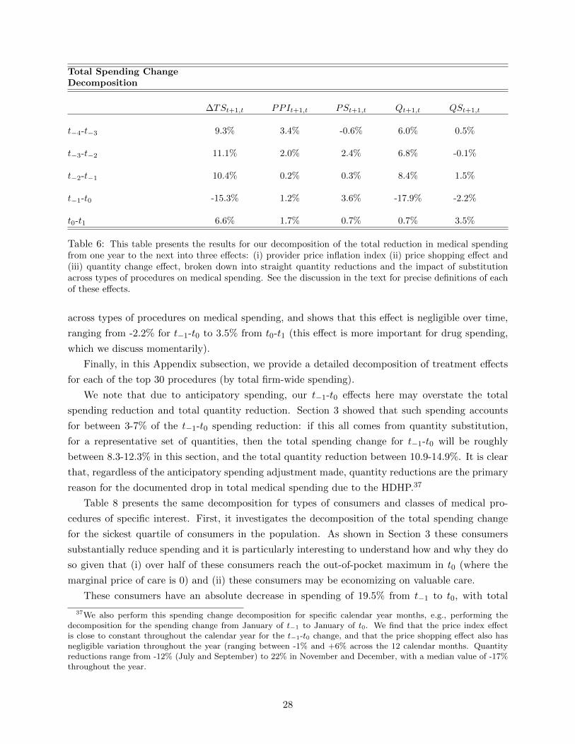
Total Spending ChangeDecomposition
∆TSt+1,t PPIt+1,t PSt+1,t Qt+1,t QSt+1,t
t−4-t−3 9.3% 3.4% -0.6% 6.0% 0.5%
t−3-t−2 11.1% 2.0% 2.4% 6.8% -0.1%
t−2-t−1 10.4% 0.2% 0.3% 8.4% 1.5%
t−1-t0 -15.3% 1.2% 3.6% -17.9% -2.2%
t0-t1 6.6% 1.7% 0.7% 0.7% 3.5%
Table 6: This table presents the results for our decomposition of the total reduction in medical spendingfrom one year to the next into three effects: (i) provider price inflation index (ii) price shopping effect and(iii) quantity change effect, broken down into straight quantity reductions and the impact of substitutionacross types of procedures on medical spending. See the discussion in the text for precise definitions of eachof these effects.
across types of procedures on medical spending, and shows that this effect is negligible over time,
ranging from -2.2% for t−1-t0 to 3.5% from t0-t1 (this effect is more important for drug spending,
which we discuss momentarily).
Finally, in this Appendix subsection, we provide a detailed decomposition of treatment effects
for each of the top 30 procedures (by total firm-wide spending).
We note that due to anticipatory spending, our t−1-t0 effects here may overstate the total
spending reduction and total quantity reduction. Section 3 showed that such spending accounts
for between 3-7% of the t−1-t0 spending reduction: if this all comes from quantity substitution,
for a representative set of quantities, then the total spending change for t−1-t0 will be roughly
between 8.3-12.3% in this section, and the total quantity reduction between 10.9-14.9%. It is clear
that, regardless of the anticipatory spending adjustment made, quantity reductions are the primary
reason for the documented drop in total medical spending due to the HDHP.37
Table 8 presents the same decomposition for types of consumers and classes of medical pro-
cedures of specific interest. First, it investigates the decomposition of the total spending change
for the sickest quartile of consumers in the population. As shown in Section 3 these consumers
substantially reduce spending and it is particularly interesting to understand how and why they do
so given that (i) over half of these consumers reach the out-of-pocket maximum in t0 (where the
marginal price of care is 0) and (ii) these consumers may be economizing on valuable care.
These consumers have an absolute decrease in spending of 19.5% from t−1 to t0, with total
37We also perform this spending change decomposition for specific calendar year months, e.g., performing thedecomposition for the spending change from January of t−1 to January of t0. We find that the price index effectis close to constant throughout the calendar year for the t−1-t0 change, and that the price shopping effect also hasnegligible variation throughout the year (ranging between -1% and +6% across the 12 calendar months. Quantityreductions range from -12% (July and September) to 22% in November and December, with a median value of -17%throughout the year.
28

Price ShoppingPotential Savings
Overall Imaging Preventive Preventive w/ Diag. Sickest 25%
t−4-t−3 18.3% 24.9% 11.8% 8.8% 18.1%
t−3-t−2 18.7% 28.1% 12.2% 10.5% 19.0%
t−2-t−1 21.1% 37.1% 12.4% 10.4% 21.5%
t−1-t0 20.1% 34.2% 12.5% 12.0% 21.3%
t0-t1 20.8% 37.0% 11.4% 12.5% 21.3%
Table 7: This table presents the potential savings from price shopping in each two year pair studied.Potential savings are defined by savings that would occur if consumers spending above the median fora given procedure reduced their spending to the median value for that procedure. Potential savings arecalculated for the second-year of each two year pair, and presented for overall spending and specific spendingcategories.
spending changes of 6.1% and 5.9% for the prior two pairs of years. Over all two year pairs,
the price inflation index ranges between -0.1% and 1.1%, with similarly small values for the price
shopping index. Again, for this population the key component of spending reductions from t−1-t0
are quantity reductions, which are responsible for a 20.0% reduction in spending for this group
over those two years (in prior years, this ranges from 3.5% to 4.1%). Quantity substitutions across
procedures account for a 3.3% reduction in spending from t−1-t0. Spending and quantities rise
for these consumers from t0-t1, with a quantity increase of 9.0% and a quantity substitution effect
of 7.9%, indicting a movement / trend towards higher priced procedures. Overall, there is strong
evidence that the sickest consumers are primarily reducing quantities when reducing spending: at
the end of this section we break this down at the procedure level and find that these consumers are
reducing quantities of most common medical services.
Table 8 also investigates this decomposition for (i) general preventive services (ii) preventive
services that are only considered preventive with a prior diagnosis and (iii) imaging services, which
are often cited as services where there is potentially wasteful spending. Preventive services are
interesting to study because they are considered to be valuable services that consumers typically
under-consume, and they are free under the HDHP (so that there is no true price change for them
from t−1-t0). For general preventive services (which don’t require a prior diagnosis) the results
are quite interesting: total spending only decreases by 0.3% from t−1 to t0, but the provider
price inflation for these services is 6.4%, implying that prices increased much more than average.
Consumers reduce quantities of these services by 7.5% from t−1-t0, which is direct evidence in
support of ‘behavioral hazard’ (Baicker et al. (2013)) whereby consumers reduce consumption of
services that are of potentially high value. Interestingly, from t0-t1 preventive quantities continue
to decrease (by 5.2%) but provider prices increase by 12.6% and total spending increases by 13.0%
on these services.
29

The fact that consumers economize on care that is still free could suggest limited consumer
information on prices when making medical consumption decisions (e.g. preventive services that are
in fact free). Another explanation for why consumers reduce preventive services is that consumption
of these services may be bundled together with more expensive services during visits to providers: if
consumers reduce visits overall they are likely to reduce consumption of preventive services. Similar
results hold for preventive services where a prior diagnosis is required (which may encompass more
essential care): total spending on these services is reduced by 10.6% from t−1 to t0, with quantity
reductions accounting for a 12.2% spending drop (for this category, quantities rebounded slightly,
by 3.8%, from t0 to t1). For both kinds of preventive services trends in prior years had both
increasing total spending on these services, and flat or increasing quantities consumed. Neither
preventive service category shows a significant price shopping effect, and potential price shopping
savings are 12.5% for services that are always preventive and 12.0% for those that are preventive
with a prior diagnosis.
The results on imaging decompose a substantial reduction in imaging spending, 19.5%, from t−1
to t0 (for earlier years, this spending increases between 5.5% and 12.4%). Price inflation in imaging
is low, at -0.4% from t−1-t0, down from between 0.4% to 5.6% in earlier years. Tellingly, consumers
reduce service quantities from t−1-t0 by 17.7%. Thus spending on imaging decreases, prices stay
flat, and consumers reduce quantities of imaging services after the switch to the HDHP. Despite
the relative homogeneity of imaging services and the large potential savings from price shopping
(34.2%), there is a negligible impact of price shopping on spending, Finally, quantities for imaging
only increase by 1.1% from t0-t1 and total spending continues to decrease, by 2.3%, for imaging
services over that pair of years.
Next, we take a deeper dive looking at specific procedures, and present the results of this
decomposition for the 30 procedures on which consumers spend the most at the firm over the two-
year treatment period t−1-t0. Table 9 presents the results for 9 of these top 30 procedures, with
the rest presented in Table A9 in Appendix A. For quantity changes we only present QEt+1,t since
there is no possibility of substitution across procedure types when studying one procedure at a
time.
Overall, for these top 30 procedures by revenue, 22 had increases in quantity consumed from
t−3 to t−2, 24 had increases in quantity consumed from t−2 to t−1, but only 5 had increases in
quantity consumed over the treatment period t−1-t0. This number rebounded to 24 that increased
quantity from t0-t1. 13 procedures had positive spending increases due to the price shopping effect
from t−3-t−2, with 19 having positive effects for t−2-t−1, 18 for t−1-t0, and 17 for t0-t1. 19 of the
procedures had provider prices increase on average from t−3-t−2, with 21 from t−2-t−1, and only 16
and 11 for t−1-t0 and t0-t1 respectively. At a high-level, this suggests that most of the reduction in
spending due to the switch to the high-deductible plan came from consumers reducing quantities
of care, with the remainder of the effect due to slightly decreasing provider prices. While we
cannot rule out a true price-shopping effect, since our price shopping calculation could incorporate
trends towards moving to higher price providers, our results suggest the the one-year spending
spending reductions resulting from the switch to the high-deductible plan were not the result of
30

Specific EffectsSpending Decomposition
% Tot. Spend ∆TSt+1,t PPIt+1,t PSt+1,t Qt+1,t QSt+1,t
Sickest Quartile
t−3-t−2 44.7% 6.1% 1.1% -0.4% 4.1% 1.3%t−2-t−1 45.0% 5.9% -0.1% -0.5% 3.5% 3.0%t−1-t0 49.7% -19.5% 0.4% 3.4% -20.0% -3.3%t0-t1 56.0% 19.2% 0.0% 2.3% 9.0% 7.9%
Preventive w/ Diagnosis
t−4-t−3 16.0% 1.5% 3.0% -0.8% -0.4% -0.3%t−3-t−2 14.7% 3.0% 2.4% -0.7% 0.1% 1.2%t−2-t−1 13.7% 13.0% 3.6% 0.8% 7.3% 1.3%t−1-t0 16.1% -10.6% 2.0% 1.0% -12.2% -1.4%t0-t1 14.9% 10.3% 5.8% -0.2% 3.8% 0.9%
Preventive Always
t−4-t−3 7.4% 4.0% 3.9% -2.1% -5.7% 7.9%t−3-t−2 7.6% 4.1% -1.6% 9.2% -0.4% -3.1%t−2-t−1 7.9% 1.3% -6.5% -0.5% 6.3% 2.0%t−1-t0 9.1% -0.3% 6.4% 2.1% -7.5% -1.3%t0-t1 8.8% 13.0% 12.6% 4.8% -5.2% 0.8%
Imaging
t−4-t−3 10.1% 7.5% 5.6% 0.1% 3.1% -1.3%t−3-t−2 9.5% 5.5% 2.7% -1.9% 6.3% -1.6%t−2-t−1 10.0% 12.4% 0.4% 0.2% 13.5% -1.7%t−1-t0 11.1% -19.5% -0.4% 0.6% -17.7% -2.0%t0-t1 9.2% -2.3% -2.3% 3.7% 1.1% -4.8%
Table 8: This table presents the results for our decomposition of the total reduction in medical spendingfrom one year to the next into three effects: (i) provider price inflation index (ii) price shopping effect and (iii)quantity reduction effect, broken down into straight quantity reductions and the impact of within-categorysubstitution across types of procedures on medical spending. It presents the decomposition for (i) the sickestquartile of consumers (ii) procedures which are preventive as stand alone procedures (iii) procedures whichare preventive only in combination with a diagnosis and (iv) imaging procedures.
31
increased consumer price shopping. Finally, and tellingly, 24 of the 30 procedures had increasing
total spending from t−3-t−2, 24 from t−2-t−1, but only 4 from t−1-t0. These results add context to
the aggregate results: consumers reduce quantities across almost all of the most common / highest
total spend medical procedures. This suggests that cost-sharing might be an effective but blunt
instrument to control health spending: higher cost-sharing clearly reduces medical spending, but
seems to do so across the spectrum of medical procedures, some of which are likely still valuable
and others which are likely not.38
The results for specific procedures given in Table 9 are also of interest. Both routine pregnancy
deliveries and C-section deliveries have very small quantity changes over the treatment period, but
prices for each procedure declined by approximately 16%, much more so than in non-treatment
years (e.g. t−3-t−2, presented in the table). Despite the flat change in overall pregnancies, in the
treatment period there was a 13.8% decrease in ultrasounds due to pregnancy (compared to a 2.0%
quantity increase for t−3-t−2) and an overall 17.7% decrease in total spending on those ultrasounds.
In the treatment period, consumers reduced their quantity of colonoscopy biopsies by 25.8%,
compared to an 18.6% increase in quantity consumed from that service from t−3-t−2. They re-
duced consumption of colonoscopy diagnostics by 31.6% in the treatment period, compared to a
9.9% increase from t−3 to t−2. There was a 8.9% decrease in mammography screenings during the
treatment period, compared to a 17.2% increase in those screenings from t−3-t−2. These services
are especially interesting since they are preventive services that consumers could receive at no cost
under the high-deductible plan. This suggests that quantities were reduced either because con-
sumers did not know that these screenings were still free, or because they made fewer overall visits
to the doctor’s office, where some services were preventive and others were not. There were also
substantial reductions in quantities of Brain MRIs and joint MRIs, as shown in Table 9.
Drug Spending. Since the nature of shopping is inherently different for prescription drugs than
for typical medical services and providers, we excluded drug spending from the spending reduction
decomposition just presented. Here, we discuss a similar decomposition for prescription drugs.
For prescription drugs, because allowed drugs prices are essentially the same across all in-
network pharmacies, we combine the provider price index measuring price inflation and the price
shopping index into one average price change index. Table 10 shows these average price changes and
the quantity changes for drugs for year pairs spanning t−4-t1: the quantity change is still broken
down in straight quantity reductions and the impact of substitution across drug types on spending.
The table also studies this decomposition separately for brand drugs and generic drugs.
As in our analysis of overall medical spending, the table reveals that drug spending increased
at a steady rate from t−4-t−1, decreased sharply for t0, and began to increase again in t1. For all
drugs, the drop in spending for t0 was almost entirely due to quantity reductions, as was the case
38More research is needed to determine the welfare implications of the type of spending reductions we documenthere. Without a careful welfare assessment of the value of medical services, across the range of medical services, wecan only suggest that reduced quantities across the range of services is consistent with reductions in both valuableand non-valuable services. E.g., there could just be consumers for whom certain procedures aren’t valuable, acrossall procedures, and those consumers are the ones reducing care.
32
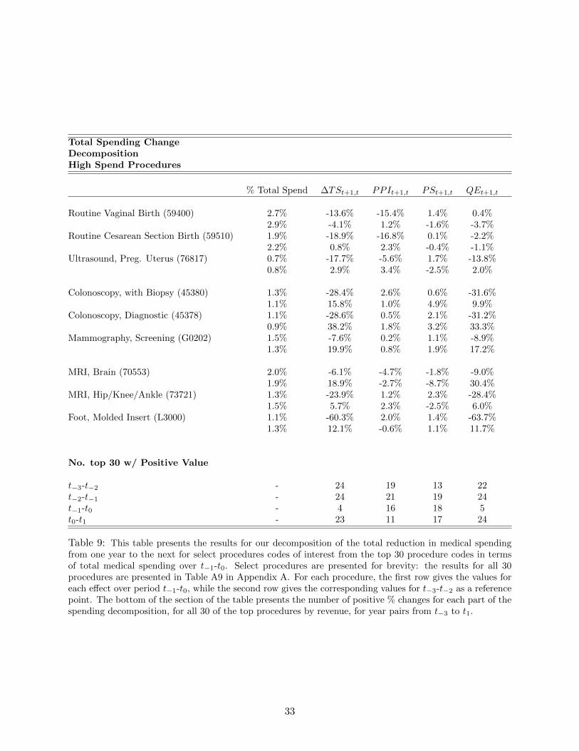
Total Spending ChangeDecompositionHigh Spend Procedures
% Total Spend ∆TSt+1,t PPIt+1,t PSt+1,t QEt+1,t
Routine Vaginal Birth (59400) 2.7% -13.6% -15.4% 1.4% 0.4%2.9% -4.1% 1.2% -1.6% -3.7%
Routine Cesarean Section Birth (59510) 1.9% -18.9% -16.8% 0.1% -2.2%2.2% 0.8% 2.3% -0.4% -1.1%
Ultrasound, Preg. Uterus (76817) 0.7% -17.7% -5.6% 1.7% -13.8%0.8% 2.9% 3.4% -2.5% 2.0%
Colonoscopy, with Biopsy (45380) 1.3% -28.4% 2.6% 0.6% -31.6%1.1% 15.8% 1.0% 4.9% 9.9%
Colonoscopy, Diagnostic (45378) 1.1% -28.6% 0.5% 2.1% -31.2%0.9% 38.2% 1.8% 3.2% 33.3%
Mammography, Screening (G0202) 1.5% -7.6% 0.2% 1.1% -8.9%1.3% 19.9% 0.8% 1.9% 17.2%
MRI, Brain (70553) 2.0% -6.1% -4.7% -1.8% -9.0%1.9% 18.9% -2.7% -8.7% 30.4%
MRI, Hip/Knee/Ankle (73721) 1.3% -23.9% 1.2% 2.3% -28.4%1.5% 5.7% 2.3% -2.5% 6.0%
Foot, Molded Insert (L3000) 1.1% -60.3% 2.0% 1.4% -63.7%1.3% 12.1% -0.6% 1.1% 11.7%
No. top 30 w/ Positive Value
t−3-t−2 - 24 19 13 22t−2-t−1 - 24 21 19 24t−1-t0 - 4 16 18 5t0-t1 - 23 11 17 24
Table 9: This table presents the results for our decomposition of the total reduction in medical spendingfrom one year to the next for select procedures codes of interest from the top 30 procedure codes in termsof total medical spending over t−1-t0. Select procedures are presented for brevity: the results for all 30procedures are presented in Table A9 in Appendix A. For each procedure, the first row gives the values foreach effect over period t−1-t0, while the second row gives the corresponding values for t−3-t−2 as a referencepoint. The bottom of the section of the table presents the number of positive % changes for each part of thespending decomposition, for all 30 of the top procedures by revenue, for year pairs from t−3 to t1.
33

Prescription DrugSpending Change Decomposition
∆TSt+1,t PPIt+1,t + PSt+1,t Qt+1,t QSt+1,t
t−4-t−3 10.1% 6.4% 3.6% 0.1%— Brand (38.8%) 10.5% 14.0% -3.0% -0.5%— Generic (61/2%) 16.3% 5.2% 10.5% 0.6%
t−3-t−2 6.6% 5.3% 1.2% 0.1%— Brand (35.3%) 7.5% 13.1% -4.9% 0.7%— Generic (64.7%) 8.3% 1.1% 7.1% 0.1%
t−2-t−1 4.2% -0.2% 4.5% -0.1%— Brand (32.9%) 7.1% 6.7% 0.3% 0.1%— Generic (67.1%) -4.1% -10.4% 6.9% -0.6%
t−1-t0 -21.3% -4.3% -17.8% 0.8%— Brand (28.7%) -20.7% 13.6% -30.3% -4.0%— Generic (71.3%) -22.4% -12.0% -11.8% 1.4%
t0-t1 13.9 5.3% 8.1% 0.5%— Brand (25.1%) 19.1% 17.5% 1.3% 0.3%— Generic (74.9%) -2.7% -10.2% 8.3% -0.8%
Table 10: This table presents the results for our spending reduction decomposition, applied to prescriptiondrugs. The numbers in parenthesis in the first column indicate the percentage of drugs used that are brandvs. generic.
with overall spending. When broken down into the impacts on brand drug consumption and generic
drug consumption, some interesting patterns emerge. While brand drug counts steadily decrease
and generics steadily increase over time in the pre-period, over the treatment period t−1-t0 the
quantity of brand drugs consumed decreases by 30.3% while that of generics only decreases by
11.8%. Within the class of brand drugs, from t−1-t0, quantity substitutions across the mixture of
brand drugs reduces spending by 4%, while for generics this increases spending by 1.4%, suggesting
together that consumers are substituting away from more expensive brand drugs to their generic
counterparts. Additionally, price inflation for brand drugs is quite high over time, while generic
drugs prices are decreasing in a meaningful way over time. Taken in sum, our spending reduction
decomposition for prescription drugs suggests that consumer spending reductions are primarily
due to reduced quantities (rather than substitution from brand to generic) and that brand drug
consumption is much more heavily reduced than generic consumption.
5 Consumer Responses to Non-Linear Contract
As a result of the required shift to high-deductible health care from free health care, the consumers
we study reduced health care spending causally between 11.02% and 15.19%. These spending
34

reductions came in large part from well-off and predictably sick consumers facing reasonably low
yearly out-of-pocket maximums. Moreover, consumers reduced spending almost exclusively by
buying lower quantities of health care services, rather than through price shopping for cheaper
services, or, indirectly, by having access to lower priced providers over time.
While these facts clearly establish who reduced spending, and how they did so, they do not
explain why. In this section, we investigate in depth how consumers respond to the complex yearly
price structure of the HDHP in order to explain why predictably sick and well-off consumers with
low out-of-pocket maximums reduce medical spending. Our analysis is motivated by research across
a range of industries suggesting that consumers may respond to ‘spot’ prices, i.e. the prices they
face on any given day, rather than the price a fully rational consumer would respond to, which is
the actual shadow price of current spending given the contract and expected future spending (we
also refer to this as the expected marginal price). In the context of Medicare Part D prescription
drug coverage, Einav et al. (2013a), Dalton et al. (2015), and Abaluck et al. (2015) use different
approaches to show that consumers markedly reduce consumption after they hit the ‘donut hole’
(a region where they pay 100% of cost), even when they should have clearly expected to end their
year in that coverage region, with a shadow price equal to the full cost of a given drug. Aron-
Dine et al. (2012) study consumer responses to non-linear insurance contracts in a large-employer
health insurance setting, and conclude that consumers respond to both spot and true shadow
prices for care during the year. Grubb and Osborne (2015) and Nevo et al. (2015) study consumers
responding to non-linear tariffs in cellular phone and broadband markets respectively. In electricity
markets, Ito (2014) documents how consumers respond to average prices over the course of non-
linear contracts, rather than true marginal prices. Liebman and Zeckhauser (2004) refer to this
phenomenon as “schmeduling,” and discuss behavioral foundations for why consumers may not
respond to expected marginal prices in complex non-linear contracts.
In our environment, if consumers respond to simpler spot prices, rather than the true marginal
(i.e. shadow) price of care, then they will under-consume care relative to what a fully rational
dynamically optimizing consumer would do. This is true because the spot price in the HDHP is
weakly decreasing during the year, and will thus always be weakly higher than the true shadow
price of care. In some cases it will be much higher: for example, a predictably sick consumer will be
under the deductible early in the year (spot price of 100% of cost) but will have a true shadow price
close to 0%, since they can expect to get close to, or surpass, the plan out-of-pocket maximum.
Here, we investigate the extent to which consumers’ emphasis on spot prices, rather than the
true shadow prices, reduces their medical spending. This could be one potential explanation for
why predictably sick and relatively well-off consumers still reduce spending under the HDHP. We
also leverage our two years of post-period data to investigate whether consumers learn to respond
to the true shadow price instead of the spot price once they have experience with the HDHP plan.
Our empirical environment is uniquely well suited to study consumer dynamic responses to spot
and shadow prices in non-linear contracts. In the pre-period, all consumers in the primary sample
are enrolled in completely free health care, with no shadow price dynamics throughout the year
as risks are realized. Because the entire large population shifted from free health care to the non-
35

linear HDHP contract for t0, we can use simple cross-sectional assumptions on population health
together with detailed micro-level data on health status and incremental spending throughout the
calendar year (pre and post switch) to trace out consumer responses to spot prices vs. shadow
prices. We compare incremental spending and dynamics for consumers in t0 (first treatment year)
and t1 (second treatment year) to that in t−2, a pre-period year without anticipatory spending at
the end of the year.39
Model. Denote consumer health status at the beginning of a calendar year by Ht and con-
sumer demographics as Xt. Our key assumption maintains that the cross-sectional distribution of
population health needs at any month m during treatment year t is the same as that cross-sectional
distribution at the same point in month m in control year t′. We assume this is true conditional on
Ht and Xt, to leverage the scale and depth of the data. Formally, using t0 as an example treatment
year and t−2 as an example control year, we assume:
Ft0 [sm, |Ht0 , Xt0 ] = Ft−2 [sm|Ht−2 , Xt−2 ] ∀t = 1, ....12
Here, sm describes the health state of consumers at the beginning of month m and F denotes the
distribution of that health state. This assumptions implies that, conditional on ex ante health
status and demographics, the dynamic evolution of population health needs throughout the year
is identical in the treatment year and the control year. This assumes that, in the treatment years
of t0-t1, consumers do not become, on average, sicker throughout the year due to dynamic effects
from reducing the care consumed earlier in the year. To the extent that this assumption is violated,
this will work against our main results as we will predict lower differences in spending for t0 and
t1 relative to t−2 because consumers will be conditionally sicker in those years. Our upcoming
analysis of consumers who have already passed the out-of-pocket maximum in the treatment years
also supports the notion that such within-sample health effects on spending are minimal, since their
incremental spending is identical to equivalent pre-period consumers.
With this assumption on the within-year evolution of health status in place, we next define the
mapping from the health state and insurance contract to incremental consumer spending as:
G[Sm+x − Sm|sm, H,X, Insm]
Here, Sm is year-to-date spending at the beginning of month m and Sm+x is the year-to-date
spending at the beginning of month m + x. So, here if x = 1, G reflects the distribution of
incremental monthly spending in the population for month m, given the health state, insurance
contract Insm, ex ante health status, and ex ante demographics. For any given month m, if
x = 12 −m then G reflects the distribution of rest of year spending from the beginning of month
m.
39In t0, spending in January and February may be depressed because of anticipatory t−1 spending, as discussed inSection 3. This becomes a smaller concern as we move through the year t0 and is not of high enough magnitude tomarkedly impact our results.
36

Empirically, we observe Sm and Sm+x for feasible t and x within a calendar year, as well as
insurance contract details Insm and ex ante health status and demographics H and X. st is
unobserved. To implement our analysis, we assume that there is a one-to-one monotonic mapping
between st, which is unobserved, and year-to-date spending Sm, conditional on H and X. Thus,
if a consumer spending Sm by month m in t0 is at the Zth quantile for Sm, conditional on other
observables, then that consumer is directly comparable to the Zth quantile consumer for Sm in t−2.
This means, e.g., that if 35% of consumers have Sm that places them in the coinsurance region for
the high-deductible plan at the beginning of June, t0, those consumers can be directly compared to
the 35% of consumers in t−2 in the same quantile range for Sm in that year.40 This permits direct
comparison between spending patterns within the calendar year for consumers under the HDHP in
t0, as a function of insurance contract prices, and those patterns for equivalent consumers in t−2
under free health care.
The final part of the model is the definition of different potential prices consumers might respond
to in the HDHP as the calendar year evolves (i.e. the components of Insm). The primary prices
we study are:
• Spot Price, P sm: This is the marginal price a consumer faces at the time they make the decision
to consume health care. This corresponds directly to the three arms of the non-linear high-
deductible contract, and equals 1 if consumers have not reached the deductible (they bear 100%
of cost), equals .1 if consumers are in the coinsurance region (they pay 10% of cost), and equals
0 if consumers have passed the out-of-pocket maximum. Prior to the high-deductible plan,
consumers always have spot prices of 0.
• Shadow Price / Expected Marginal EOY Price, P em = Et[P
sm|Sm, H,X, Insm]: The
shadow price is the expected marginal end-of-year price for a given consumer, given their health
status and year-to-date spending at t. This price evolves dynamically throughout the year as
risks are realized, and is the only price that a fully rational and informed consumer without
liquidity constraints would use when making health care decisions.
• Prior Year End Marginal Price, PLm: This price is defined as the actual end of year price a
consumer would have faced if their total medical spending during the prior year occurred in the
HDHP. For consumers in t1, this is their actual end-of-year price from t0. For consumers in t0,
this is what their end-of-year price in t−1 would have been if they had been in the HDHP in that
year. This price is intended to capture consumer behavior where consumers explicitly use their
most recent risk realizations to project their shadow price of care.
Computing P sm is straightforward for each consumer and each month by mapping Sm to the
corresponding non-linear contract spot price (deductible, coinsurance, or out-of-pocket maximum).
40This concept manifests slightly differently for individuals and for families. For individuals, it is as described inthe text and straightforward to implement in both descriptive analysis and regressions. For families, in the descriptiveanalysis we assume that families have one health state measure st, and conduct the analysis under that assumption.For our regression analysis, we pursue a more sophisticated approach that studies individual behavior within thefamily structure.
37

Computing PLt is similarly straightforward, taking the spot price implied by the previous year’s
total spending applied to the HDHP. Computing the shadow price / expected marginal price is
more complex because it involves computing expectations about total end-of-year spending for
each consumer at the beginning of each month. To construct P sm we use the following process:
1. For each month m define cells of equivalent consumers using the triple (H,X, Sm). We define
these cells to be as precise as possible while maintaining sufficient sample sizes to determine
a distribution of end-of-year spending realizations for each cell. In practice we define these
cells as follows. We divide individuals by sextiles based on Ht. We use age as our only X
variable, and split consumers into five age bins (0-15, 16-25, 26-35, 36-45, 46+). Then, for each
cell combination of age and health, we divide consumers into deciles based on year-to-date
spending Sm. Overall, we use 270 cells.41
2. Assign individual i to one of these cells for each month m.
3. Form non-parametric end-of-year spending distribution for individuals i in cell t using all
the observations for actual end-of-year spending in cell (H,X, Sm). Denote this distribution
fi,m(Si,M |H,X, Si,m).
4. Combine individual end-of-year spending distributions into family distributions, assuming no
correlation in spending for individuals with a family:
fj(i),m(SM ) = ΣΣSi,M=SMΠ
j(i)i fi,m(Si,M )
Thus, the family distribution of end-of-year total spending is just the distribution of the sum
of individual end-of-year spending across individuals in that family.
5. The distribution of family end-of-year prices P sj,M is the distribution that results from mapping
the SM coming out of fj(i),m(SM ) to the corresponding spot prices for each SM , either 1,.1,
or 0. The expected marginal price, or shadow price, is thus:
P ej,m = ΣSM∈SM
P sj,M (SM )fj,m(SM )
P ej,m in our model is intended to serve as the price a rational and fully informed consumer should
perceive as their true price of incremental care at m. We note that this framework is not intended
to be a model of how consumers actually behave but rather a model of how a rational consumer in
their situation would behave.42 Our upcoming analysis investigates whether consumers respond to
41We combine 30 of the 300 possible cells into neighboring cells if sample sizes are too small, i.e. sick consumersbetween 16-25.
42In our analysis, we focused on this as the true marginal price of care, or shadow price. This abstracts away fromwithin-year risk aversion with respect to the shadow price.
38

alternative prices (e.g. spot prices or last year’s end marginal price): if they do so, this suggests a
departure from what a fully informed and rational consumer would do.43
Finally, we note that, when forming the expected end-of-year price, we deal with the issue
of reverse causality (where cohort spending reductions imply changes to the expected end-of-year
prices) by instrumenting for expected end-of-year prices in treatment years with the projected end-
of-year prices for similar consumers prior to the required HDHP switch. These prices are correlated
with those from equivalent consumers post-switch, but not correlated with changes to incremental
spending that result post-switch. We use these instrumented versions of P em throughout the de-
scriptive and regression analysis.
Descriptive Analysis. We first use this framework as the basis for a series of descriptive analyses
that investigate incremental consumer spending as a function of sm and Insm across the calendar
year. Then, we turn to regression analyses that formally quantify how consumers respond to the
different possible prices they respond to. For parsimony, we present the descriptive analysis in
this section for families (covering 3+ individuals total) since the majority of employees are in this
coverage tier and the vast majority of spending comes from employees and dependents in this tier.
Similar analysis for individuals and those with just one dependent are presented in Appendix A.
See Table 3 for additional descriptive statistics on which non-linear contract plan arms consumers
would have ended the year in had they been enrolled in the HDHP in t−1.
Our first set of descriptive analyses examines incremental spending (age and year adjusted)
by month for consumers in t0 (or t1) relative to that spending by equivalent consumers under
free insurance in t−2. We examine the distribution of consumers’ incremental spending for (i) the
next month and (ii) the rest of the year, starting at any given month m. We begin by examining
incremental spending as a function of the spot price consumers face at the beginning of month m
in t−2, and compare that to the incremental spending of the equivalent quantiles of consumers for
Sm in t−2.
It is useful to provide an example to illustrate the methodology when we consider spot prices
alone. Consider incremental spending for the next month for consumers who have passed the
out-of-pocket maximum by month m in t0. For those consumers, we (i) determine the threshold
quantile of total spending for consumers who have passed the out-of-pocket maximum and (ii) form
a comparison population in t−2 corresponding to the same quantiles of Sm in that year. Thus, e.g.,
if 15% of families have passed the out-of-pocket maximum by November t0, the comparison group
for November t−2 is the top 15% of families by total spending at that point.
Figure 5 shows the mean and median incremental spending for the next month (left panel) and
for the rest of the year (right panel) for families who have passed the out-of-pocket maximum by
month m in t0. The figure presents the results for July-December of the calendar year, since few
families pass the out-of-pocket maximum prior to those months in t0.44
43It is important to note that, to the extent that our expected end-of-year price has statistical error, or is biased,this will suggest that consumers place some weight on other prices in our regression analysis. Given the precision ofour model, and the large emphasis on spot prices we find, this seems like a secondary concern.
44Table A12 shows the number of families who have passed the out-of-pocket maximum by the beginning of a given
39

Figure 5: This figure shows incremental spending for employees who have passed the out-of-pocket maximumby the start of a given month in t0. The left side of the figure studies incremental spending for the nextmonth, while the right side studies incremental spending for the rest of the year. This t0 incrementalspending is compared to t−2 incremental spending for the equivalent quantiles of consumers based on totalyearly spending up to month m, Sm.
The figure illustrates that incremental spending for the next month is essentially the same for
families in t0 who have passed the out-of-pocket maximum at t and their comparison quantiles
of families in t−2. The mean and median are almost identical across all months m from July to
December between the control and treatment groups. Further, it shows that incremental spending
for the rest of the year is also essentially identical for the treatment cohorts in t0 and their respective
comparison groups in t−2, across all m.
Taken together, these results suggest that once consumers have passed the out-of-pocket maxi-
mum under the HDHP in t0, they spend exactly as much as they would have spent incrementally
as in t−2. Since consumers who pass the out-of-pocket maximum always have P sm = P e
m = 0, the
same spot and shadow prices as the pre-period, the fact that these consumers spend the same in t0
as their comparison groups do in t−2 provides a check showing that consumers respond equivalently
to a price of zero in both periods. It also provides a simple test for our empirical strategy, akin to
a falsification test. Were our assumptions about disease dynamics driving biased results we would
expect to find differences even when prices are the same in both t0 and t−2. Additionally, it implies
that all of the spending and quantity reductions that we document earlier in this paper, including
those for the sickest ex ante quartile of consumers, must come from consumers when they are either
in the deductible arm or the coinsurance arm of the HDHP.
Next, we present analogous figures for consumers who begin a month in the coinsurance arm
of the high-deductible plan in t0. Here, for example, if families who have Mm placing them in the
coinsurance arm are between the 27th and 70th quantiles of total spending by t, then we compare
the incremental spending for this population in t0 to the incremental spending for families between
the 27th and 70th quantiles of total spending by m in t−2. Table A12 shows the number of families
in the coinsurance region at the beginning of each month in t0.
The left and right panels of Figure 6 portray incremental monthly spending and incremental
rest of year spending for these treatment and comparison groups. It is evident that both types of
month in t0, climbing from 673 in July to almost 1,655 by December.
40

Figure 6: This figure shows incremental spending for employees who are in the coinsurance arm of theHDHP by the start of a given month in t0. The left side of the figure studies incremental spending for thenext month, while the right side studies incremental spending for the rest of the year. This t0 incrementalspending is compared to t−2 incremental spending for the equivalent quantiles of consumers based on totalyearly spending up to month m, Sm.
incremental spending are essentially the same for the treatment cohorts in t0 and their relevant
comparison groups in t−2. This is true uniformly throughout the calendar year. Once consumers
reach the coinsurance region, their spending does not drop relative to the pre-period in free health
care. Taken together with the out-of-pocket maximum results, this suggests that essentially all the
reductions we have documented for reduced post-period spending come from consumers when they
are actually under the deductible in the calendar year. In turn, this suggests that when predictably
sick consumers reduce spending, they only do so when under the deductible early in the year.
This is borne out when we examine the analogous figures for families who begin a given month
under the deductible (family counts by month given in Table A12). The left and right panels
of Figure 7 plot incremental monthly spending and incremental rest of year spending across the
calendar year for consumers under the deductible at the beginning of each month in t0, and their
relevant t−2 comparison groups. The figure shows substantial decreases in incremental monthly
spending for consumers under the deductible in t0, relative to their t−2 comparison groups. This
decrease is approximately 25-30% throughout the calendar year for mean monthly spending, and
50% throughout the year for median spending. As expected, rest of year spending also drops for
consumers in the treatment cohorts relative to the comparison cohorts.
When combined with our earlier descriptive evidence on predictably sick consumers reducing
spending, these analyses suggest that these consumers only reduce spending when under the de-
ductible, even though they should predictably go well past the deductible during the calendar year.
We explore this more precisely by examining analogous descriptive analyses that examine incre-
mental spending as a function of both spot price and expected family end-of-year price, i.e. the
true shadow price of care. In our setting, this allows us to separate how predictably sick consumers
respond when under the deductible, since those consumers will have quite low shadow prices, re-
flecting the expectation that they will almost surely pass the deductible, and possibly pass the
out-of-pocket maximum, during the HDHP plan year.
The top panel of Figure 8 presents incremental monthly and rest of year spending for families
41
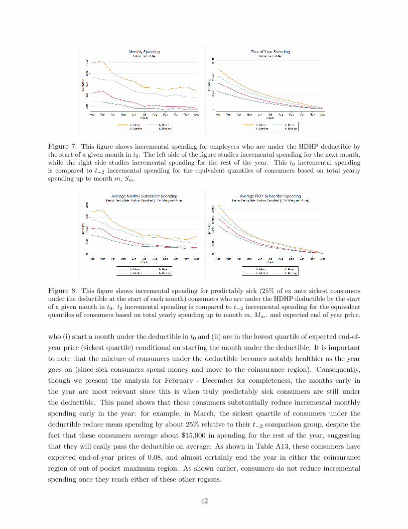
Figure 7: This figure shows incremental spending for employees who are under the HDHP deductible bythe start of a given month in t0. The left side of the figure studies incremental spending for the next month,while the right side studies incremental spending for the rest of the year. This t0 incremental spendingis compared to t−2 incremental spending for the equivalent quantiles of consumers based on total yearlyspending up to month m, Sm.
Figure 8: This figure shows incremental spending for predictably sick (25% of ex ante sickest consumersunder the deductible at the start of each month) consumers who are under the HDHP deductible by the startof a given month in t0. t0 incremental spending is compared to t−2 incremental spending for the equivalentquantiles of consumers based on total yearly spending up to month m, Mm. and expected end of year price.
who (i) start a month under the deductible in t0 and (ii) are in the lowest quartile of expected end-of-
year price (sickest quartile) conditional on starting the month under the deductible. It is important
to note that the mixture of consumers under the deductible becomes notably healthier as the year
goes on (since sick consumers spend money and move to the coinsurance region). Consequently,
though we present the analysis for February - December for completeness, the months early in
the year are most relevant since this is when truly predictably sick consumers are still under
the deductible. This panel shows that these consumers substantially reduce incremental monthly
spending early in the year: for example, in March, the sickest quartile of consumers under the
deductible reduce mean spending by about 25% relative to their t−2 comparison group, despite the
fact that these consumers average about $15,000 in spending for the rest of the year, suggesting
that they will easily pass the deductible on average. As shown in Table A13, these consumers have
expected end-of-year prices of 0.08, and almost certainly end the year in either the coinsurance
region of out-of-pocket maximum region. As shown earlier, consumers do not reduce incremental
spending once they reach either of these other regions.
42

% Savings byStart of Month Plan Arm
% t0 Savings % t1 SavingsStart of Month Plan Arm
Deductible 91% 120%– EOY Q1 (Sick) 25% 33%– EOY Q2 24% 30%– EOY Q3 19% 24%– EOY Q4 (Healthy) 23% 32%
Coinsurance -5% -10%
OOP Max 14% -10%
Table 11: This table shows the % of total reduced t0 and t1 spending coming from consumers who start agiven month in a given plan arm of the non-linear contract. The table integrates spending at the monthlylevel: e.g., a consumer starting February under the deductible has February spending count towards underdeductible, while if that consumer starts March in the coinsurance range, March spending counts in thecoinsurance category. t0 and t1 consumers’ spending are compared to comparable quantiles of consumers’spending from t−2 as discussed in the text. For deductible, we break down consumers into the quartile oftheir shadow prices conditional on being in that plan arm at the start of a month.
Applying a more stringent criterion — the sickest 10% of the population — we find patterns that
mimic those for the sickest quartile, and show that these consumers reduce spending early in the
year, despite having mean true shadow prices of 0.06. Appendix A includes additional analyses by
illness level. Table A13 shows expected end-of-year prices conditional on plan arm and distribution
and ex ante health status.
Table 11 brings together these descriptive analyses to illustrate the proportion of total yearly
savings due to incremental monthly spending changes for consumers who start a given month in a
given plan arm. 91% of the total yearly spending reductions from t−2 to t0 for the families studied
comes from consumers who started a given month under the deductible. This reflects the intuition
presented in the earlier figures in this section: when consumers are under the deductible during the
calendar year they reduce their spending, but otherwise only have negligible spending reductions.
The Table shows that, for the families studied in this section, 25% of all spending reductions during
the year come from consumers who are (i) under the deductible and (ii) predictably sick in the
sense that they have low expected end of year marginal prices, i.e. true shadow prices of care.
Interestingly, 24%, 19%, and 23% of total spending reductions come from families in quartiles 2, 3,
and 4 of shadow prices: this suggests that healthier consumers ex ante are also responsible for large
portions of overall spending reductions, and that those occur when they are under the deductible
during the year.45
45Note that these numbers imply slightly different predictions than those in Table 5 in Section 3 because thissection restricts the analysis to families and end-of-year marginal price is determined at the family level, as opposedto thinking about health status from the individual perspective as is done in Table 5.
43

Evolution of Spending Dynamics. It is possible that consumers respond heavily to spot prices,
rather than true shadow prices, in t0 because they are new to high-deductible health care and are
still learning about the financial implications of that contract. In fact, Handel and Kolstad (2015)
surveys consumers at the firm in t−1 and t0 and shows many consumers lack information about
specific financial aspects of the HDHP, even after they are required to switch that plan. Further,
other papers in the literature that study how consumers respond to non-linear contracts study
environments where consumers have been enrolled in those contracts for some meaningful period
time already (see e.g. Einav et al. (2013a) in Medicare Part D). Though the literature doesn’t
study the evolution of these dynamic responses over time, their results suggest that consumers’
experience in the market does not come close to eliminating their emphasis on spot prices relative
to true shadow prices.
Figure 9 replicates, for t1 spending, the descriptive results presented earlier this section inves-
tigating how t0 incremental spending compares to t−2 incremental spending as a function of the
contract plan arm a consumer starts a given month in. The figure highlights that the patterns
we discussed in depth for t0 spending continue to hold in t1, suggesting limited learning in how
consumers respond to the non-linear HDHP contract moving through their second year in it. The t1
panels that examine incremental spending in the deductible and co-insurance region look essentially
identical to those from t0. Consumers substantially reduce both incremental monthly and rest-of-
year spending when they begin a given month under the deductible, but show no such incremental
reductions when they begin in the coinsurance arm. Beyond the out-of-pocket max spending is, if
anything, slightly higher relative to t−2. This small but positive effect may reflect the fact that the
price trend adjustments made over time may slightly understate actual price inflation for high risk
consumers.
Figure 10 examines the extent to which predictably sick consumers reduce incremental spending
when under the deductible in t1. The results mimic those for t0: predictably sick consumers exhibit
lower spending for the next month, and for the rest of the year, relative to comparable consumers
in t−2, when they start the month under the deductible. Both the lowest shadow price quartile,
and decile, reduce spending by meaningful amounts in this scenario, supporting the notion that
these consumers are responding to spot prices in a meaningful manner (since their true shadow
prices are still quite low, as in t0).
Table 11 illustrates that in t1, as in t0, essentially all the spending reductions during the year
come from consumers spending incrementally less when they start a month under the deductible,
relative to their t−2 comparison cohorts. In fact, in t1 consumers slightly increase spending relative
to t−2 when in either the coinsurance arm or out-of-pocket maximum arm, implying that spending
reductions coming from when consumers are under the deductible actually comprise 120% of total
spending reductions for t1 relative to t−2.
44

Figure 9: This figure presents descriptive results for t1, comparing incremental spending in that year byplan arm to spending by equivalent quantiles of consumers in t−2. These figures are directly analogous tothose presented earlier in this section, describing how incremental spending in t0 compares to that in t−2.The left panels present incremental spending for the next month conditional on start of month plan arm,while the right panels present incremental spending for the rest of the year.
45

Figure 10: This figure presents descriptive results for t1, and examines how predictably sick consumersunder the deductible at the beginning of a month reduce incremental spending. These figures are directlyanalogous to those presented earlier in this section, describing how incremental spending in t0 compares tothat in t−2. The left panels present incremental spending for the next month conditional on start of monthplan arm, while the right panels present incremental spending for the rest of the year.
5.1 Regression Analysis
The descriptive analysis in this section presents strong evidence that consumers (i) heavily respond
to spot prices, even when they are predictably sick, and that (ii) reduced incremental spending
under the deductible accounts for essentially all treatment year spending reductions. Now, we
perform a series of regression analyses to deal with underlying correlations in the data and more
precisely quantify the impacts of different non-linear contract prices on total medical spending.
Specifically, we include (i) spot prices (ii) shadow prices and (iii) prior year-end marginal prices
in one regression framework, and determine which of these prices is most important for predicting
consumer spending reductions in the t0-t1 treatment years.
Our primary regression studies incremental monthly spending for families in the t0 and t1
treatment years relative to their t−2 comparison quantile groups (as defined earlier in this section).
Our main specification is:
log(Yi,m + 1) = α+ [βePei,m + βsP
si,m + βLP
Li ] + [θeP
ei,m + θsP
si,m + θLP
Li ]It0−t1
+[κePei,m + κsP
si,m + κLP
Li ]It1 + γHHi + γXXi + γY lΣ2
l=1 log(Yi,t−l + 1)
+Σm∈MγmIm + Σt∈TγtIt + εi,m
Here, Yi,t is total monthly incremental spending (insurer + out-of-pocket) in month m for a given
46

family. P k are the three prices defined at the family-level for each month m. The regression
includes observations from one control year, t−2, and both treatment years, t0 and t1. Importantly,
we define counterfactual HDHP non-linear contract prices for the t−2 control population using the
same quantile comparison method discussed earlier in this section: this means that conditional
on (H,X) we match deciles of Mm in t−2 to comparable deciles in t0 and t1, and assign the t−2
consumers the same prices as those treatment year consumers. This mimics the approach used in the
descriptive analysis comparing treatment consumers to comparable control consumers, leveraging
the cross-sectional assumptions described earlier. The regressions control for ex ante family health
status (adding up individual family spending predictions), demographics (ages, family size, gender
mixture), and calendar month and year fixed effects. Additionally, the regressions control for lagged
spending from each of the prior two months, to deal with spending autocorrelation.
Our primary parameters of interest are the interaction of price measures and treatment years.
θk coefficients gives an estimate for the % reduction in incremental monthly spending as a function
of each kind of non-linear contract price in the treatment years. For example, θk = 0 would
imply that, conditional on health status, demographics, and other prices, families do not change
spending in response to changes in P k. Negative values imply that consumers reduce spending
by θk% in response to a price change of 1 (i.e. 100%). The κk parameters are also of interest,
and measure whether consumers’ responses to the different non-linear contract prices change in t1,
after they have already been enrolled in the HDHP for a full year. By including prices directly
in the regression in the period prior to the introduction of the HDHP we can flexibly capture any
mechanical correlations between estimates prices and spending.46
When we implement these regressions, we use indicator variables to represent various values
of each P k, rather than continuous measures of those prices. For spot prices and prior year-end
marginal prices this is natural, since 0,.1, and 1 are the only possible values for these prices.
For those two prices, we omit the value of 0 (consumers passed the out-of-pocket maximum) and
include two dummies for starting a month (ending the year) in the deductible arm or coinsurance
arm. For the shadow price in the current year (expected end-of-year marginal price) our main
specification considers quintiles of this price, described in our results table, though we also examine
a specification with ventiles. We note that, as discussed earlier, we use instrumented versions
of expected end-of-year prices in the treatment years to deal with the issue of reverse causality
(where cohort spending reductions imply changes to the expected end-of-year prices).47 Finally, it
46Table A14 motivates this regression analysis by illustrating the underlying correlations in these three prices atdifferent months during the calendar years in t0 and t1. All prices are positively correlated in all months considered.In February, there are relatively low correlations between spot prices and shadow prices (0.285), and spot prices andthe previous end-year marginal price (0.131). These correlations increase over the calendar year, equal to 0.668 and0.315 respectively in July, and 0.857 and 0.381 respectively in December. The correlation between shadow pricesand prior year-end prices decreases as the year goes on and equals 0.627 in February, 0.513 in July, and 0.437 inDecember.
47To do this we use projected end-of-year prices for comparable quantiles of consumers in t−3, prior to the requiredHDHP switch (and prior to the observations included in the regression). These prices are correlated with those fromequivalent consumers post-switch, but not correlated with changes to incremental spending that result post-switch.It is important to note that these prices will be biased slightly lower than actual t0 and t1 shadow prices (becausespending in the pre-period is higher). However, because the change in total spending implies only small changes in
47

is important to note that if our measures of expected future prices are noisy projections of true
shadow prices, this will reduce the magnitude of our expected price coefficients (biased towards 0)
which works against the results we eventually find.
Table 12 presents the results from our primary specification, along with five robustness anal-
yses. The regression has 749,705 observations and an R2 of 0.381. The table presents the main
coefficients of interest. Our primary specification shows that on average in t0, consumers under the
deductible reduce incremental monthly spending by 42.2%, significant at the 1% level, controlling
for their shadow prices and prior year-end marginal price. This change is relative to the the pooled
population with the t−2 control group and treatment year consumers who have passed the out-of-
pocket maximum. This treatment effect for t1 is not statistically different from that for t0, with a
small standard error of 0.0374 for this difference. Consumers in the coinsurance region at the start
of a month in t0 reduce incremental spending by 14.4% on average, controlling for everything else,
with this t0 effect statistically the same as the t1 effect.
Consumers’ responses to their true shadow prices are much lower in magnitude: for example,
consumers in the 4th highest shadow price quintile (0.275, 0.730) only reduce incremental spending
by 6.66%, statistically significant at 1%, relative the control group consumers (and omitted t0
OOP-max consumers) who have shadow prices of 0. These results are similar across the quintiles,
except for quintile 5 (highest shadow prices) which shows higher relative spending, likely due to the
presence of many consumers spending 0 in this group regardless of the price regime. The coefficients
which examine the t1 differential for these treatment effects are positive and small, suggesting that
consumers are not learning in the second-year that the shadow prices are the true prices they should
consider (if so, these coefficients would be negative).
The coefficient on prior year-end marginal price is small and positive for t0 when t−1 end of
year spending would have placed the consumer under the HDHP deductible. This suggests that
this is not a meaningful driver of spending reductions in t0. However, the coefficient examining the
t1 differential is -0.0962, statistically significant at 1%, suggesting that consumers in t1 who ended
t0 under the deductible reduce incremental monthly spending by 10% in t1. This suggests that,
to the extent that consumers learned about the HDHP from t0 to t1, they learned based on their
prior-year end-of-year price realization, rather than through an understanding of the more complex
shadow price. Ending the prior year in the coinsurance arm does not have a meaningful impact on
next year spending next year, either in t0 or t1.
Table 12 also presents five regression specification that change the primary specification to
examine robustness to different versions. The specification in the second column replaces shadow
price quintiles with ventiles, to see if finer and more precise measures of shadow prices impact our
results. The results are very similar between this specification and the primary one just described
(ventile coefficients are presented in Appendix A, for parsimony). The third column omits, prior
year-end marginal price from the regression, and shows that the results are unchanged, though
the R2 is slightly lower. The fourth column omits the shadow price measures, and shows that the
primary specification results are essentially unchanged otherwise. The fifth column omits health
these shadow prices, this should not have a meaningful impact on our results.
48

Non-Linear ContractIncremental Spending Regressions
SpecificationPrimary Shadow P No Prior No Shadow Fewer t0
Variable Ventiles Year MP Price Controls OnlySpot Price X Treatment Year
1 (Deductible) -0.422*** -0.414*** -0.434*** -0.347*** -0.525*** -0.411***(0.0385) (0.0458) (0.0384) (0.0328) (0.0395) (0.0386)
1 (Deductible X t1) -0.0547 -0.0727 -0.0671* 0.0323 -0.0860** –(0.0374) (0.0443) (0.0372) (0.0318) (0.0860) –
0.1 (Coinsurance) -0.144*** -0.0938** -0.143*** -0.117*** -0.181*** -0.139***(0.0377) (0.0401) (0.0335) (0.0325) (0.0346) (0.0337)
0.1 (Coinsurance X t1) -0.0197 -0.0416 -0.0331 -0.001 -0.0314 –(0.0328) (0.0390) (0.0326) (0.0307) (0.0336) –
Shadow Price X Treatment Yr.
Quintile 2 – [0.089,0.100] -0.0570*** −−a -0.0655*** – -0.0773*** -0.0597***(0.0217) −−a (0.0214) – (0.0222) (0.0219)
Quintile 2 X t1 0.0424* −−a 0.0211 – 0.0456 –(0.0217) −−a (0.0214) – (0.0223) –
Quintile 3 – [0.100,0.2755] -0.0424* −−a -0.0443 – -0.0479* -0.0564***(0.0255) −−a (0.0249) – (0.0261) (0.0262)
Quintile 3 X t1 0.0549** −−a 0.0253 – 0.0615* –(0.0260) −−a (0.0256) – (0.0267) –
Quintile 4 – [0.2756,0.7303] -0.0666*** −−a -0.0381 – -0.0715** -0.0513*(0.0294) −−a (0.0285) – (0.0301) (0.0311)
Quintile 4 X t1 0.106*** −−a 0.0196 – 0.115*** –(0.0292) −−a (0.0283) – (0.0300) –
Quintile 5 – [0.7304,1] 0.135*** −−a 0.205*** – 0.167*** 0.160***(0.0312) −−a (0.0288) – (0.0320) (0.0355)
Quintile 5 X t1 0.0967*** −−a -0.0114 – 0.109*** –(0.0307) −−a (0.0284) – (0.0315) –
Prior Yr. End MPX Treatment Yr.
1 (Deductible) 0.0657*** 0.0509* – 0.0948*** 0.0516* 0.0607(0.0262) (0.0269) – (0.0244) (0.0268) (0.0384)
1 (Deductible X t1) -0.0962*** -0.0822*** – -0.0569** -0.0786*** –(0.0254) (0.0260) – (0.0236) (0.0260) –
0.1 (Coinsurance) -0.0333 -0.0308 – -0.0497** -0.0471** -0.0384(0.0210) (0.0216) – (0.0205) (0.0215) (0.0310)
0.1 (Coinsurance X t1) -0.0159 -0.0102 – 0.0283 -0.0181 –(0.0205) (0.0216) – (0.0200) (0.0210) –
Demographics & Seasonality YES YES YES YES YES YESPrior Month Spend Controls YES YES YES YES NO YESHealth Controls YES YES YES YES NO YES
Observations 749,705 749,705 749,705 749,705 749,705 499,796R2 0.381 0.383 0.374 0.371 0.349 0.382
*** p < 0.01, ** p < 0.05, * p < 0.10a Shadow price ventile coefficients displayed in Table A10 in Appendix A
Table 12: Results for regressions examining consumer responses to non-linear contract prices in the HDHP.
49

controls and prior month spending controls. Removing these variables reduces the R2 to 0.349,
showing that these variables meaningfully impact the predictive ability of the regression. The spot
price coefficients increase in magnitude, while all other price coefficients remain similar. The sixth
and final column examines the primary regression run for t0 only, and, not surprisingly, shows
results similar to the primary specification.
In addition to the descriptive analysis and the regression results presented thus far we also
estimate a set of penalized regression models, specifically a LASSO model.48 Following the approach
employed by Backus et al. (2015), we can flexibly capture the many potential relationships between
prices and subsequent spending as well as potential correlations amongst dependent variables. The
results, which we present in the Appendix, further support the key finding that the primary impact
is for a spot price of 1.
Taken in sum, these regression results illustrate that relative to shadow prices and last year’s
ending marginal price, spot prices are the primary driver of the spending reductions we document.
Shadow prices have a limited impact on spending reductions. Consumers have limited responses
to the prior year’s end-of-year marginal price in the first HDHP plan year, t0, but increasingly
respond to that price in t1, the second year of HDHP enrollment. Together with the descriptive
results presented earlier in this section, it is clear that, at least in the first two years of HDHP
enrollment, consumers respond to spot prices (or something correlated with spot prices) much
more so than they do to true shadow prices or the prior year’s marginal price.
6 Conclusion
In this paper we studied the health care decisions and spending behavior for a large population of
employees (and their dependents) who were required to switch into high-deductible insurance after
years of having access to completely free health care. The change caused a spending drop between
11.79% and 13.80%, occurring across the spectrum of health care service categories. We investigated
whether spending reductions came from (i) consumer price shopping for cheaper providers (ii)
quantity reductions or (iii) substitution across procedures by consumers. We clearly documented
that spending reductions were due almost entirely to consumer quantity reductions across a broad
range of services, including some that were likely of high value in terms of health and potential to
avoid future costs. Consumers did not shift to cheaper providers, either immediately in the first
year post-switch or afterwards in the second year.
A meaningful portion of all spending reductions came from well-off consumers who were pre-
dictably sick, implying that the true marginal prices they faced under high-deductible care were
actually quite low. We investigated consumers’ responses to the different potential prices they
might perceive in the non-linear high-deductible insurance contract to help explain the puzzle of
why these consumers reduce spending. To do this we leveraged a unique feature of our environ-
ment, namely that we observe a large population of consumers in completely free health care (with
48LASSO is equivalent to OLS (a linear model minimizing squared residuals) with an additional constraint on thesum of the absolute values of the coefficients.
50
no price dynamics) in the pre-period, and that same population of consumers in the post-period
as prices are more complex and evolve over time. We developed a framework to conduct both
descriptive and regression-based analysis to study how incremental consumer spending during the
calendar year responds to (i) spot prices (ii) true shadow prices (expected end-of-year marginal
prices) and (iii) the marginal price implied by their previous year’s total spending.
We found that almost all spending reductions during the year occurred while consumers were
still under the deductible, despite the fact that the majority of incremental spending occurs for
consumers that have already passed the deductible. Moreover, about 30% of all spending reductions
come from consumers in months when they (i) began that month under the deductible but (ii) were
predictably sick, in the sense that they had very low shadow prices for health care. Once these
consumers (predictably) reached the coinsurance arm and out-of-pocket maximum arms of the
non-linear contract, they did not reduce spending further. These spending patterns are almost
identical for t1, implying that consumers did not learn to respond to the true shadow prices of care
by the second-year of enrollment in high-deductible health care. Regression analysis that controls
for health status, demographics, and recent months’ health spending shows that consumers reduce
spending by 42.2% when under the deductible, controlling for both their shadow prices and last
year’s end-of-year marginal price. The regressions reveal that consumers do reduce relative spending
by 10% in t1 when they ended t0 under the deductible. This suggests that while consumers may
not respond to their true shadow price of care in the second-year, they do respond somewhat to
their price experience in the prior year.
By revisiting a well studied topic using new data we provide, to our knowledge, the most com-
prehensive assessment of consumer price elasticity of demand in an employer-sponsored insurance
population since the RAND Health Insurance Experiment.49 We assess not only whether consumers
reduced spending but how, leading to insights with potentially important normative implications.
We study an environment with relatively educated, high-income consumers who have access to a
price shopping tool typical of the state of the art in the market today. Yet, we find that price
shopping is not an important component of the spending reductions resulting from the switch to
high-deductible care and, instead, that outright health care quantity reductions across the spectrum
of services drives those reductions. This suggests that the nature of those quantity reductions is
crucial, in the current climate, for assessing the welfare impact of increased cost-sharing [see Baicker
et al. (2013)]. We document similar reductions in care that is likely valuable (e.g. preventive care)
and care that is potentially wasteful (e.g. imaging services). We believe that a comprehensive
assessment of whether such quantity reductions are welfare increasing on net is an important path
for future research.50 Additionally, we believe that further research on the positive and normative
49We note that the recent Oregon Health Insurance experiment provides a detailed analysis of the price responsive-ness of the relatively poor and sick Oregon Medicaid population. We see our results as complementary in that the twostudies cover the majority of the populations of interest in considering health policy options: prime age workers andtheir families receiving coverage from an employer (or in principal on an insurance exchange) and Medicaid. Bothstudies investigate mechanisms underlying price responsiveness, with some, but certainly not full overlap.
50Most current studies that consider health outcomes are limited in the outcomes they (i) can measure and (ii) arepowered to identify the effects for. Studies that exist typically distill the multifaceted nature of health outcomes downto simple measures like mortality. Furthermore, even in relatively sick populations outcomes like mortality require
51

implications of different “value-based” contract designs [see, e.g., Chernew et al. (2007)] is crucial
to assess the degree to which tailoring out-of-pocket payments to specific health behaviors can
drive purchasing value. While it is clear that such contracts can improve on designs that lump all
services together, it is less clear how specific such contracts can be before they become too complex
for consumers to effectively navigate. If the effectiveness of such contracts is limited by their in-
herent complexity, supply-side policies such as the move towards Accountable Care Organizations
(ACOs) may be a more effective mechanism to efficiently cut back on high cost, low value care than
demand-side policies such as raising deductibles.
Our results also suggest the typical structure of non-linear health insurance contracts, with
decreasing marginal prices throughout the year, reduces medical spending and consumption and
may yield dramatically different behavior relative to plans that cover the same proportion of overall
population expenditures but have flatter structures throughout the year. This creates a challenge
for employers and exchange regulators: highly non-linear contracts, such as a catastrophic contract
with a large deductible that transitions directly to a zero marginal price stop-loss, will help control
spending and protect consumers from large financial risks, relative to flatter contracts, but may
also discourage the use of valuable services(along with wasteful services). For example, a transition
to decreasing non-linear tariffs in Medicare Part D may reduce overall spending and better protect
consumers from financial risk, but may also discourage adherence to important medications [see,
e.g., Einav et al. (2013a)]. We believe that a careful empirical investigation of optimal non-linear
contract design in the context of these responses to different price signals, building on work such
as Vera-Hernandez (2003), is a valuable avenue for future research.
expensive trials with large sample sizes (e.g. the RAND and Oregon HIEs). We believe that analysis that presentsinterim signals on the value of health care consumed (or foregone), such as ours, is important for making progress onassessing the normative impact of increased cost-sharing, while comprehensively assessing the health implications ofthe behaviors we document is a challenge for future work.
52

References
Abaluck, Jason, Jonathan Gruber, and Ashley Swanson, “Prescription Drug Use underMedicare Part D: A Linear Model of Nonlinear Budget Sets,” February 2015. MIT. WorkingPaper.
Aron-Dine, Aviva, Liran Einav, Amy Finkelstein, and Mark Cullen, “Moral Hazardin Health Insurance: How Important is Forward Looking Behavior?,” November 2012. NBERWorking Paper No. 17802.
, , and , “The RAND Health Insurance Experiment, Three Decades Later,” Journal ofEconomic Perspectives, 2013, 27 (1), 197–222.
Backus, Matt, Tom Blake, and Steven Tadelis, “Cheap Talk, Round Numbers, and theEconomics of Negotiation,” 2015. eBay Working Paper.
Baicker, Katherine, Sendhil Mullainathan, and Joshua Schwartzstein, “Behavioral Haz-ard in Health Insurance,” September 2013. Harvard Working Paper.
Blinder, Alan S., “Wage Discrimination: Reduced Form and Structural Estimates,” Journal ofHuman Resources, 1973, 8 (4), 436–455.
Bundorf, M. Kate, “Consumer-Directed Health Plans: Do They Deliver?,” 2012. Robert WoodJohnson Foundation.
Buntin, Melinda B., Amelia M. Haviland, Roland McDevitt, and Neeraj Sood, “Health-care Spending and Preventive Care in High-Deductible and Consumer-Directed Health Plans,”American Journal of Managed Care, 2011, 17 (3), 222–230.
Cabral, Marika, “Claim Timing and Ex Post Adverse Selection,” 2013. University of TexasWorking Paper.
Cardon, James and Igal Hendel, “Asymmetric Information in Health Insurance: Evidencefrom the National Medical Expenditure Survey,” The RAND Journal of Economics, 2001, 32(3), 408–427.
Carlin, Caroline and Robert Town, “Adverse Selection, Welfare, and Optimal Pricing ofEmployer Sponsored Health Plans,” 2009. University of Minnesota Working Paper.
Chandra, Amitabh, Jonathan Gruber, and Robin McKnight, “Patient Cost-Sharing, Hos-pitalization Offsets, and the Design of Optimal Health Insurance for the Elderly,” 2008. NBERWorking Paper No. 12972.
Chernew, Michael, Allison B. Rosen, and A. Mark Fendrick, “Value-Based InsuranceDesign,” Health Affairs, 2007, 26 (2), 195–203.
CMS, “National Health Expenditure Data,” August 2015. https://www.cms.
gov/Research-Statistics-Data-and-Systems/Statistics-Trends-and-Reports/
NationalHealthExpendData/NationalHealthAccountsHistorical.html.
Cutler, David, “From the Affordable Care Act to Affordable Care,” Journal of the AmericanMedical Association, 2015, 314 (4), 337–338.
53

Dalton, Christina M., Gautam Gowrisankaran, and Robert Town, “Myopia and ComplexDynamic Incentives: Evidence from Medicare Part D,” June 2015. University of Arizona WorkingPaper.
Einav, Liran, Amy Finkelstein, and Mark Cullen, “Estimating Welfare in Insurance MarketsUsing Variation in Prices,” Quarterly Journal of Economics, 2010, 125 (3), 877–921.
, , and Paul Schrimpf, “The Response of Drug Expenditure to Non-Linear Contract Design:Evidence from Medicare Part D,” August 2013. NBER Working Paper No. 19393.
, , Stephen P. Ryan, Paul Schrimpf, and Mark R. Cullen, “Selection on Moral Hazardin Health Insurance,” American Economic Review, 2013, 103 (1), 178–219.
Finkelstein, Amy, Sarah Taubman, Bill Wright, Mira Bernstein, Jonathan Gruber,Joseph P. Newhouse, Heidi Allen, Katherine Baicker, and The Oregon Health StudyGroup, “The Oregon Health Insurance Experiment: Evidence From the First Year,” QuarterlyJournal of Economics, 2012, 127 (3), 1057–1106.
Gaynor, Martin, Jian Li, and William B. Vogt, “Substitution, Spending Offsets, and Pre-scription Drug Benefit Design,” Forum for Health Economics & Policy, 2007, 10 (2).
Grubb, Michael D. and Matthew Osborne, “Cellular Service Demand: Biased Beliefs, Learn-ing, and Bill Shock,” American Economic Review, 2015, 105, 234–271.
Handel, Benjamin R., “Adverse Selection and Inertia in Health Insurance Markets: WhenNudging Hurts,” American Economic Review, 2013, 103 (7), 2643–2682.
and Jonathan T. Kolstad, “Health Insurance for “Humans:” Information Frictions, PlanChoice, and Consumer Welfare,” American Economic Review, August 2015, 105.
Haviland, Amelia M., Matthew Eisenberg, Ateev Mehrora, Peter Huckfeldt, andNeeraj Sood, “Do Consumer Directed Health Plans Bend the Cost Curve Over Time?,” 2015.NBER Working Paper no. 21031.
, Susan Marquis, Roland McDevitt, and Neeraj Sood, “Growth of Consumer DirectedHealth Plans To One-Half of All Employer-Sponsored Insurance Could Save 57 Billion Annually,”Health Affairs, 2012, 31 (5), 1009–1015.
Ito, Koichiro, “Do Consumers Respond to Marginal or Average Price? Evidence from NonlinearElectricity Pricing,” American Economic Review, 2014, 104 (2), 537–563.
Kaiser Family Foundation, “Employee Health Benefits: 2014 Summary of Findings,” August2015.
Keeler, Emmett B. and John E. Rolph, “The Demand For Episodes of Treatment in theHealth Insurance Experiment,” Journal of Health Economics, 1988, 7 (4), 337–367.
Kowalski, Amanda, “Censored Quantile Instrumental Variable Estimates of the Price Elasticityof Expenditure on Medical Care,” November 2013. Yale Working Paper.
Lieber, Ethan M.J., “Does it Pay to Know the Prices in Health Care?,” 2015. Notre DameWorking Paper.
54

Liebman, Jeffrey B. and Richard J. Zeckhauser, “Schmeduling,” October 2004. HarvardWorking Paper.
Lo Sasso, Anthony T., Lorens A. Helmchen, and Robert Kaestner, “The Effects ofConsumer-Directed Health Plans on Health Care Spending,” The Journal of Risk and Insurance,2010, 77 (1).
Lohr, Kathleen N., Robert H. Brook, Caren J. Kamberg, George A. Goldberg, ArleenLeibowitz, Joan Keesey, David Reboussin, and Joseph P. Newhouse, “Use of MedicalCare in the Rand Health Insurance Experiment: Diagnosis- and Service-Specific Analyses in aRandomized Controlled Trial,” Medical Care, 1986, 24 (9), S1–S87.
Manning, Willard G., Joseph P. Newhouse, Naihua Duan, Emmett B. Keeler, andArleen Leibowitz, “Health Insurance and the Demand for Medical Care: Evidence From aRandomized Experiment,” American Economic Review, 1987, 77 (3), 251–277.
Nevo, Aviv, John L. Turner, and Jonathan W. Williams, “Usage-Based Pricing and De-mand for Residential Broadband,” July 2015. NBER Working Paper No. 21321.
Newhouse, Joseph P. and the Insurance Experiment Group, Free For All?: Lessons fromthe RAND Health Insurance Experiment, Harvard Univ. Press, 1993.
Oaxaca, Ronald, “Male-Female Wage Differentials in Urban Labor Markets,” International Eco-nomic Review, 1973, 14 (3), 693–709.
Towers Watson, “Driving Performance, Connecting to Value,” 19th Annual Towers Watson /National Business Group on Health Employer Survey on Purchasing Value in Health Care, 2014.
Vera-Hernandez, Marcos, “Structural estimation of a principal-agent model: moral hazard inmedical insurance,” RAND Journal of Economics, 2003, 34 (4), 670–693.
Whaley, Christopher, “Searching for Health: The Effects of Online Price Transparency,” 2015.Berkeley Working Paper.
55

A Appendix: Additional Analysis
This appendix supplements the main text with additional analyses and robustness checks. It is
organized the same way as the main body of the paper to provide easy navigation.
A.1 Primary Sample Construction
The main sample we use throughout the paper is constructed so as to ensure we can analyze long-
term trends in spending. We constructed a similar sample using weaker restrictions to show that our
sample restrictions are innocuous in terms of their effects on the final result. Our primary sample
is restricted to only include employees who were enrolled in a health insurance plan at the firm for
all years between t−4 and t1, the entire span of our data. Our alternate sample is only restricted to
employees who were enrolled between t−2 and t0, which includes employees who may have left the
firm in t1, or joined it in t−4 or t−3. Summary statistics for our main sample and this alternative
are given in the first two columns of Table A1. This new sample includes approximately 8,000
additional employees and 10,000 additional dependents. These excluded employees are relatively
younger, and have smaller families (mostly those employees who joined the first during t−4 or
t−3), but the overall mix of ages among them and their dependents changes only slightly. Most
importantly, the distribution of health spending is nearly identical.
Another concern with our approach is that, since employees were aware of the policy change well
in advance, they might make the decision to leave the firm in advance of being required to switch
into a health insurance plan with cost-sharing. In particular, one might expect these employees
to be relatively sicker, which might induce a selection bias into our results. To examine this, we
look at employees who exited the firm in t−1, the year before the change. Summary statistics for
this group of 1,153 employees are given in the third column of Table A1. This group of employees
and their dependents does differ somewhat on demographic variables. Moreover, on average, this
group spends approximately $700 more in t−1 than individuals in our main sample. However, this
difference seems to be driven by the upper tail of a small number of individuals, as the medians
of the two spending distributions are nearly identical, and the 75th percentiles are different by a
minor amount.
Given these similarities, we feel comfortable using our main sample restrictions throughout the
paper.
A.2 Intertemporal Substitution Analysis
In our analysis, we measure the extent to which employees increase spending in t−1 above expecta-
tions by substituting care that would otherwise have been obtained in the future if not for the policy
change. To measure this ‘excess mass’, we first try to predict from prior years what spending would
have been during t−1, then measure the disparity. We run a regression as described in the main
text in Section 3, for which the results are given in Table A2. We then calculate the excess mass as
the difference between the true mean monthly individual spending amount and the predicted level.
56
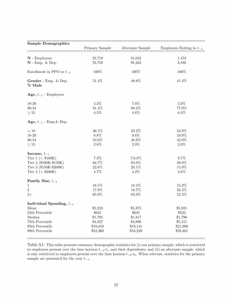
Sample DemographicsPrimary Sample Alternate Sample Employees Exiting in t−1
N - Employees 22,719 31,042 1,153N - Emp. & Dep. 76,759 95,224 3,180
Enrollment in PPO in t−1 100% 100% 100%
Gender - Emp. & Dep. 51.4% 48.8% 41.4%% Male
Age, t−1 - Employees
18-29 4.3% 7.0% 5.9%30-54 91.4% 88.2% 77.0%≥ 55 4.3% 4.8% 6.4%
Age, t−1 - Emp.& Dep.
< 18 36.1% 33.2% 24.8%18-29 8.8% 9.6% 10.9%30-54 52.0% 48.9% 42.0%≥ 55 2.8% 2.9% 3.9%
Income, t−1
Tier 1 (< $100K) 7.3% 7.6.8% 9.7%Tier 2 ($100K-$150K) 64.7% 65.0% 59.0%Tier 3 ($150K-$200K) 22.6% 20.1% 15.9%Tier 4 (> $200K) 4.7% 4.2% 2.6%
Family Size, t−1
1 16.1% 18.4% 15.2%2 17.9% 18.7% 32.4%3+ 65.9% 62.9% 52.4%
Individual Spending, t−1
Mean $5,223 $5,375 $5,92125th Percentile $631 $645 $533Median $1,795 $1,817 $1,79675th Percentile $4,827 $4,890 $5,15195th Percentile $18,810 $19,141 $21,98699th Percentile $52,360 $53,239 $59,481
Table A1: This table presents summary demographic statistics for (i) our primary sample, which is restrictedto employees present over the time horizon t−4-t1, and their dependents; and (ii) an alternate sample, whichis only restricted to employees present over the time horizon t−2-t0. When relevant, statistics for the primarysample are presented for the year t−1.
57

Regression ResultsVariable Coefficient
Months Since Jan. in Year t−4 0.442
February -32.37March 15.28April -11.07May -11.90June -5.87July -32.34August -20.96September -31.93October -19.79November -22.54December -27.71
Table A2: This table presents coefficients from the regression model used to measure excess mass.
This measurement of excess mass is given in Table A3.
We note that, starting in December, excess mass is positive and high for December, November,
and October (the three months with the largest excess mass among months in t−1), before it drops
down to nearly zero in September. There are some other outlier months across t−1 (March and
August both have unusually high spending levels), however, as shown in Figure 3, the number of
claims in those months is fairly reasonable relative to the trend. Careful investigation of those
months (which cannot be shown due to individual privacy issues) uncovers that spikes in mean
spending in those two months are primarily driven by a very small handful of unusually high-
cost consumers. We take these combined trends as evidence that the majority of intertemporal
substitution behavior is coming from care substituted into the last three months of t−1.
One issue is that deviations from trend can occur both because of intertemporal substitution, as
well as because of some nonzero draw of the unobservable idiosyncratic error term, εt. To account
for our uncertainty over this term, we construct a confidence interval around our excess mass
computation. We note that the mean squared error (MSE) of a regression is a consistent estimator
of the variance of ε in our model. Assuming that errors are not serially correlated, the standard
deviation of the sum of the error terms for October, November, and December is√
3 ·MSE, which
in our case is approximately equal to 26.16. We multiply this term by 1.96 to get the 95% confidence
interval for excess mass used in Table 4.
A.3 Early Switcher Difference-In-Differences
Our primary sample includes individuals who were in the PPO prior to the required switch, and thus
those that were actively required to join the HDHP in t0. As discussed in Section 2, approximately
85% of consumers at the firm fall into this category and were required to switch into the HDHP. In
this section, we use consumers who voluntarily switched to the HDHP earlier, in either t−2 or t−1,
58
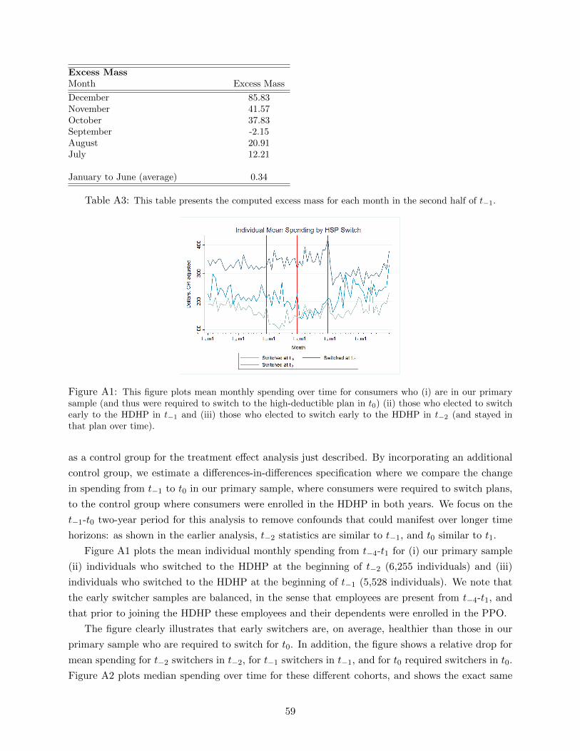
Excess MassMonth Excess Mass
December 85.83November 41.57October 37.83September -2.15August 20.91July 12.21
January to June (average) 0.34
Table A3: This table presents the computed excess mass for each month in the second half of t−1.
Figure A1: This figure plots mean monthly spending over time for consumers who (i) are in our primarysample (and thus were required to switch to the high-deductible plan in t0) (ii) those who elected to switchearly to the HDHP in t−1 and (iii) those who elected to switch early to the HDHP in t−2 (and stayed inthat plan over time).
as a control group for the treatment effect analysis just described. By incorporating an additional
control group, we estimate a differences-in-differences specification where we compare the change
in spending from t−1 to t0 in our primary sample, where consumers were required to switch plans,
to the control group where consumers were enrolled in the HDHP in both years. We focus on the
t−1-t0 two-year period for this analysis to remove confounds that could manifest over longer time
horizons: as shown in the earlier analysis, t−2 statistics are similar to t−1, and t0 similar to t1.
Figure A1 plots the mean individual monthly spending from t−4-t1 for (i) our primary sample
(ii) individuals who switched to the HDHP at the beginning of t−2 (6,255 individuals) and (iii)
individuals who switched to the HDHP at the beginning of t−1 (5,528 individuals). We note that
the early switcher samples are balanced, in the sense that employees are present from t−4-t1, and
that prior to joining the HDHP these employees and their dependents were enrolled in the PPO.
The figure clearly illustrates that early switchers are, on average, healthier than those in our
primary sample who are required to switch for t0. In addition, the figure shows a relative drop for
mean spending for t−2 switchers in t−2, for t−1 switchers in t−1, and for t0 required switchers in t0.
Figure A2 plots median spending over time for these different cohorts, and shows the exact same
59

Figure A2: This figure plots median monthly individual spending over time for consumers who (i) are inour pooled sample of early switchers and (ii) are in our weighted primarily sample through t0, matched tothe early switcher sample based on the health status distribution.
pattern with slightly less noise since the median is a more robust statistic.
The fact that early switchers are healthier suggests that, in order to use them as a meaningful
comparison group for the primary sample, we need to form a modified primary sample that matches
the population of early switchers based on health status. For this analysis, we pool the two groups
of early switchers (t−2 and t−1) since we will be analyzing the spending change from t−1-t0. To
measure health status in a predictive sense, we leverage the Johns Hopkins ACG software, which
assigns each individual a predictive score, based on their past year of detailed claims data, for the
upcoming health year. This score reflects the type of diagnoses that an individual had in the past
year, along with their age and gender, rather than relying on past expenditures alone.51
We quantify the health status of early switchers with the observed distribution of individual-
level ACG health status predictions for the year t−1. We characterize this distribution with ventiles
(20 equal sized buckets) of this predictive score, and weight the primary sample observations to
match this distribution. Each ventile has, by definition, 5% of the early switcher sample. Thus, if
8% of the primary sample is contained in one of the early switcher ventiles, those individuals are
weighted by .05.08 = 5
8 in the weighted primary sample. We construct weights in this manner across
the health status distribution to match the primary sample to the early switcher sample based on
health status.
Figure A3 plots mean monthly individual-level spending for the pooled sample of early switchers
and for our health-status weighted primary sample through t0. The figure clearly illustrates that,
prior to the switch in t−1, when the two samples are in different plans, the HDHP consumers spend
approximately 25% less than PPO consumers. In t0, when both groups are in the HDHP, they
spend almost identically (which also indicates successful matching on health status). Column 4
in Table 4 presents the quantitative difference-in-differences t−1-t0 spending reduction due to the
HDHP switch implied by this figure:
51See e.g. Handel (2013), Handel and Kolstad (2015) or Carlin and Town (2009) for a more in depth explanation ofpredictive ACG measures and their use in economics research. See http://acg.jhsph.org/index.php/the-acg-system-advantage/predictive-models for further technical details on these predictive algorithms.
60

Figure A3: This figure plots mean monthly individual spending over time for consumers who (i) are in ourpooled sample of early switchers and (ii) are in our weighted primarily sample through t0, matched to theearly switcher sample based on the health status distribution.
[ ¯yWPSAS,t0
− ¯yWPSAS,t−1
]− [ ¯yESCPI,t0
− ¯yESCPI,t−1
]
Here, ¯ySM,T refers to mean individual spending in year T under model M for sample S. Model AS
refers to the model with both anticipatory spending and age/CPI adjustments. Model CPI refers
to the model adjusting for age/CPI adjustments.52 Sample WPS refers to the weighted primary
sample, while sample ES refers to the early switcher sample.
A.4 Additional Analysis of Treatment Effect Heterogeneity
In this section, we present a number of figures and graphs that provide more detail on heterogeneity
in spending trends across a variety of categories. First, in Figures A4 and A5, we break down
the highest quartile of ACG score into four subgroups, and show that we can observe spending
responses to the policy change broadly across the top end of the sickness distribution. Figure A5
in particular shows that the median individual even in the 99th percentile of expected health risk
reduces spending in the years following the change, despite the fact that these individuals should
have no incentive to do so. Figure A6 breaks down spending reductions by the location where
medical care was received, plotting spending in these categories over the entire timespan of our
data. We see sharp reductions in office and ER visits, outpatient hospital care, and preventive
care, with no real change in mental health spending or inpatient hospital care. Figure A7 shows
additional cutbacks for prescription drugs, showing that cuts come from both branded and generic
drugs.
Table A4 displays our ‘excess mass’ calculations, constructed as described in Appendix A.2.
The first column shows the final excess mass calculation used in Table 5, while the second column
gives the standard error for that calculation. The last three columns break down the excess mass
52We adjust for anticipatory spending in the weighted primary sample, which switches for t0, and not for the earlyswitcher sample, which remains in the HDHP over these two years. Even if there is some anticipatory spending forsome HDHP consumers in December in a given year, it should be the same cross-sectionally (detrended) in t−1 andt0.
61
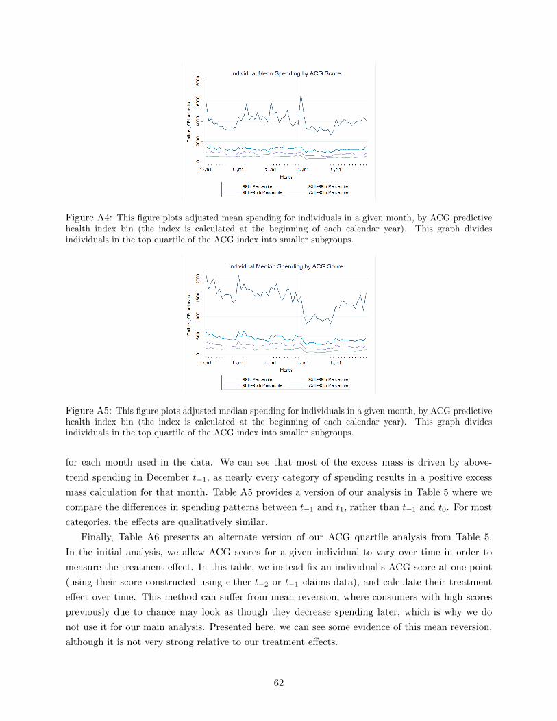
Figure A4: This figure plots adjusted mean spending for individuals in a given month, by ACG predictivehealth index bin (the index is calculated at the beginning of each calendar year). This graph dividesindividuals in the top quartile of the ACG index into smaller subgroups.
Figure A5: This figure plots adjusted median spending for individuals in a given month, by ACG predictivehealth index bin (the index is calculated at the beginning of each calendar year). This graph dividesindividuals in the top quartile of the ACG index into smaller subgroups.
for each month used in the data. We can see that most of the excess mass is driven by above-
trend spending in December t−1, as nearly every category of spending results in a positive excess
mass calculation for that month. Table A5 provides a version of our analysis in Table 5 where we
compare the differences in spending patterns between t−1 and t1, rather than t−1 and t0. For most
categories, the effects are qualitatively similar.
Finally, Table A6 presents an alternate version of our ACG quartile analysis from Table 5.
In the initial analysis, we allow ACG scores for a given individual to vary over time in order to
measure the treatment effect. In this table, we instead fix an individual’s ACG score at one point
(using their score constructed using either t−2 or t−1 claims data), and calculate their treatment
effect over time. This method can suffer from mean reversion, where consumers with high scores
previously due to chance may look as though they decrease spending later, which is why we do
not use it for our main analysis. Presented here, we can see some evidence of this mean reversion,
although it is not very strong relative to our treatment effects.
62

Figure A6: This figure plots mean medical spending for individuals in a given month, by the type of care,both adjusted and unadjusted for age and price trends. These categories are mutually exclusive, except forPreventive.
63

Excess MassCalculation
Individual Month CalculationsTotal Excess Mass Standard Error October November December
Age 0-17 -85.51 12.09 -26.65 -43.50 -15.37Age 18-29 -33.24 38.13 -20.89 -2.70 -9.65Age 30-54 253.49 8.65 42.24 61.23 150.01Age 55+ 525.20 78.48 110.05 68.57 346.58
Income 0-100K 201.84 29.77 99.47 28.29 74.08Income 100-150K 190.07 15.36 43.67 52.99 93.41Income 150-200K 71.60 21.73 0.20 19.47 51.93Income 200K+ 126.37 23.98 51.14 28.09 47.14
Employee 243.51 9.75 46.09 46.36 151.06Spouse 308.67 19.70 53.90 89.33 165.44Dependent -91.79 13.15 -32.01 -41.88 -17.90
ACG Quartile 1 0.12 7.72 -3.15 2.18 1.09ACG Quartile 2 42.49 11.94 -9.33 18.68 33.14ACG Quartile 3 101.35 11.69 29.46 -13.83 85.72ACG Quartile 4 446.90 26.67 77.45 107.11 262.34ACG Top 1% 139.48 664.99 -945.06 -1068.03 2152.57
0 Chronic Conditions 56.33 9.10 9.13 14.57 32.631-2 Chronic Conditions 118.64 16.04 10.94 5.75 101.943+ Chronic Conditions 985.15 65.44 102.65 165.03 717.47
Inpatient Hosp. 25.89 8.79 9.80 1.81 14.27Outpatient Hosp. 48.37 3.70 8.05 15.95 24.38ER -1.40 0.69 -1.64 -1.20 1.44Office Visit 12.48 1.02 2.56 4.04 5.88RX 18.87 1.47 0.94 5.54 12.39RX - Brand 11.93 1.05 -0.39 3.50 8.83RX - Generic 1.82 0.58 0.06 0.35 1.42Mental Health -5.58 1.96 2.30 -4.63 -3.25Preventive 11.52 1.15 1.96 3.58 5.99Other 61.34 2.44 14.58 18.56 28.20
Table A4: This table gives the excess mass calculations (with their associated standard error) for eachcategory of individual spending, calculated as detailed in Appendix A.2. These excess mass calculations areused in the construction of the final column of Table 5.
64

Heterogeneous HDHPSpending Impact
Treatment Effect(1) (2) (3)
Group Spending t−1 Mean Nominal CPI Anticipatory% % Spending Spending Spending
Age 0-17 34.41 22.83 3465.65 -0.03 -0.11 -0.11*Age 18-29 8.39 7.13 4442.77 -0.07 -0.15 -0.15*Age 30-54 49.45 58.37 6164.59 -0.12 -0.19 [-0.09,-0.14]Age 55+ 2.65 5.60 11051.14 -0.07 -0.15 [-0.04,-0.09]
Income 0-100K 6.09 6.64 5701.99 -0.02 -0.10 [-0.01,-0.06]Income 100-150K 61.34 61.19 5209.86 -0.09 -0.17 [-0.08,-0.12]Income 150-200K 24.50 23.58 5026.86 -0.07 -0.14 [-0.11,-0.13]Income 200K+ 5.31 5.43 5340.94 -0.08 -0.16 [-0.10,-0.13]
Employee 31.66 33.54 5532.77 -0.07 -0.15 [-0.04,-0.09]Spouse 22.85 32.79 7495.02 -0.12 -0.20 [-0.10,-0.15]Dependent 40.38 27.61 3570.33 -0.02 -0.11 -0.11*
ACG Quartile 1 27.21 8.56 1643.56 -0.09 -0.17 -0.17*ACG Quartile 2 22.63 12.24 2824.79 -0.29 -0.35 [-0.31,-0.33]ACG Quartile 3 22.36 19.54 4564.51 -0.26 -0.32 [-0.27,-0.29]ACG Quartile 4 22.69 53.59 12335.85 -0.02 -0.10 [-0.01,-0.06]ACG Top 1% 0.69 8.80 66606.47 -0.05 -0.13 -0.13*
0 Chronic Conditions 59.76 36.65 3202.64 -0.07 -0.14 [-0.10,-0.12]1-2 Chronic Conditions 31.34 43.46 7240.37 -0.04 -0.13 [-0.09,-0.11]3+ Chronic Conditions 3.78 13.83 19093.35 0.02 -0.07 [0.06,0]
Inpatient 16.53 863.48 -0.13 -0.20 [-0.13,-0.16]Outpatient Hosp. 18.08 944.16 -0.08 -0.15 [-0.03,-0.09]ER 3.11 162.41 0.12 0.03 0.03*Office Visit 7.62 397.86 -0.10 -0.18 [-0.10,-0.14]RX 16.92 883.62 -0.01 -0.09 [-0.04,-0.07]RX - Brand 12.23 638.83 -0.08 -0.16 [-0.11,-0.14]RX - Generic 4.05 211.62 -0.17 -0.24 [-0.22,-0.23]Mental Health 9.46 493.87 0.07 -0.02 -0.02*Preventive 9.50 496.29 0.01 -0.07 [-0.02,-0.05]Other 22.94 1198.08 -0.21 -0.27 [-0.15,-0.21]
Table A5: This table summarizes our descriptive evidence for the heterogeneous treatment effects of therequired HDHP switch, for estimates giving the effect between t−1 and t1 (compared to Table 5’s descriptionof . The table presents the results for different (i) demographics (ii) health status measures and (iii) types ofhealth services. The first column reports the % of people within a given demographic group or health statusgroup for categories (i) and (ii), and the % of total spending a given service spending is for category (iii).The second column reports average mean individual yearly spending for categories (i) and (ii), and averagemean individual spending for each type of service for category (iii). The second through fourth columnspresent, for each respective framework, the % change in spending (for each demographic group, or type ofservice) as a result of the required HDHP switch from t−1 to t0.
65
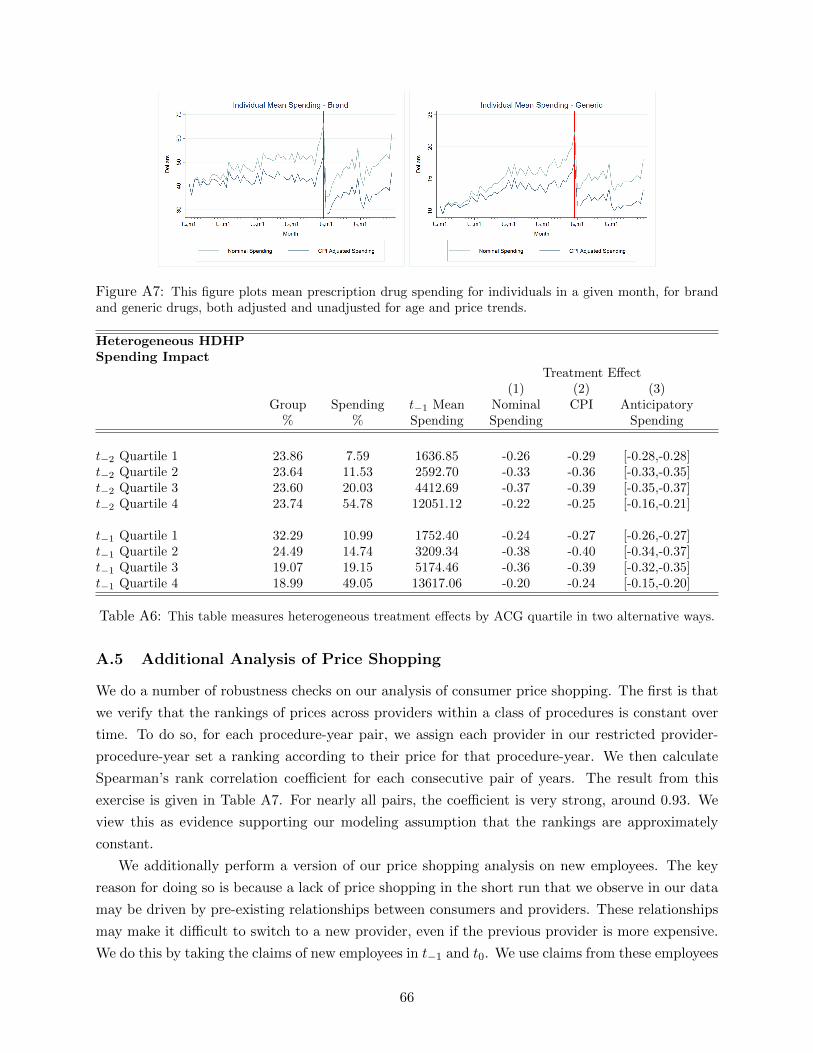
Figure A7: This figure plots mean prescription drug spending for individuals in a given month, for brandand generic drugs, both adjusted and unadjusted for age and price trends.
Heterogeneous HDHPSpending Impact
Treatment Effect(1) (2) (3)
Group Spending t−1 Mean Nominal CPI Anticipatory% % Spending Spending Spending
t−2 Quartile 1 23.86 7.59 1636.85 -0.26 -0.29 [-0.28,-0.28]t−2 Quartile 2 23.64 11.53 2592.70 -0.33 -0.36 [-0.33,-0.35]t−2 Quartile 3 23.60 20.03 4412.69 -0.37 -0.39 [-0.35,-0.37]t−2 Quartile 4 23.74 54.78 12051.12 -0.22 -0.25 [-0.16,-0.21]
t−1 Quartile 1 32.29 10.99 1752.40 -0.24 -0.27 [-0.26,-0.27]t−1 Quartile 2 24.49 14.74 3209.34 -0.38 -0.40 [-0.34,-0.37]t−1 Quartile 3 19.07 19.15 5174.46 -0.36 -0.39 [-0.32,-0.35]t−1 Quartile 4 18.99 49.05 13617.06 -0.20 -0.24 [-0.15,-0.20]
Table A6: This table measures heterogeneous treatment effects by ACG quartile in two alternative ways.
A.5 Additional Analysis of Price Shopping
We do a number of robustness checks on our analysis of consumer price shopping. The first is that
we verify that the rankings of prices across providers within a class of procedures is constant over
time. To do so, for each procedure-year pair, we assign each provider in our restricted provider-
procedure-year set a ranking according to their price for that procedure-year. We then calculate
Spearman’s rank correlation coefficient for each consecutive pair of years. The result from this
exercise is given in Table A7. For nearly all pairs, the coefficient is very strong, around 0.93. We
view this as evidence supporting our modeling assumption that the rankings are approximately
constant.
We additionally perform a version of our price shopping analysis on new employees. The key
reason for doing so is because a lack of price shopping in the short run that we observe in our data
may be driven by pre-existing relationships between consumers and providers. These relationships
may make it difficult to switch to a new provider, even if the previous provider is more expensive.
We do this by taking the claims of new employees in t−1 and t0. We use claims from these employees
66
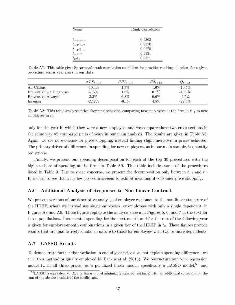
Years Rank Correlation
t−4-t−3 0.9363t−3-t−2 0.9370t−2-t−1 0.9275t−1-t0 0.9321t0-t1 0.9371
Table A7: This table gives Spearman’s rank correlation coefficient for provider rankings in prices for a givenprocedure across year pairs in our data.
∆TSt+1,t PPIt+1,t PSt+1,t Qt+1,t
All Claims -10.4% 1.3% 1.6% -16.5%Preventive w/ Diagnosis -7.5% 1.8% 0.7% -10.2%Preventive Always 3.3% 6.8% 0.6% -6.5%Imaging -22.2% -0.1% 4.5% -22.4%
Table A8: This table analyzes price shopping behavior, comparing new employees at the firm in t−1 to newemployees in t0.
only for the year in which they were a new employee, and we compare these two cross-sections in
the same way we compared pairs of years in our main analysis. The results are given in Table A8.
Again, we see no evidence for price shopping, instead finding slight increases in prices achieved.
The primary driver of differences in spending for new employees, as in our main sample, is quantity
reductions.
Finally, we present our spending decomposition for each of the top 30 procedures with the
highest share of spending at the firm, in Table A9. This table includes some of the procedures
listed in Table 9. Due to space concerns, we present the decomposition only between t−1 and t0.
It is clear to see that very few procedures seem to exhibit meaningful consumer price shopping.
A.6 Additional Analysis of Responses to Non-Linear Contract
We present versions of our descriptive analysis of employee responses to the non-linear structure of
the HDHP, where we instead use single employees, or employees with only a single dependent, in
Figures A8 and A9. These figures replicate the analysis shown in Figures 5, 6, and 7 in the text for
those populations. Incremental spending for the next month and for the rest of the following year
is given for employee-month combinations in a given tier of the HDHP in t0. These figures provide
results that are qualitatively similar in nature to those for employees with two or more dependents.
A.7 LASSO Results
To demonstrate further that variation in end of year price does not explain spending differences, we
turn to a method originally employed by Backus et al. (2015). We restructure our prior regression
model (with all three prices) as a penalized linear model, specifically a LASSO model,53 and
53LASSO is equivalent to OLS (a linear model minimizing squared residuals) with an additional constraint on thesum of the absolute values of the coefficients.
67
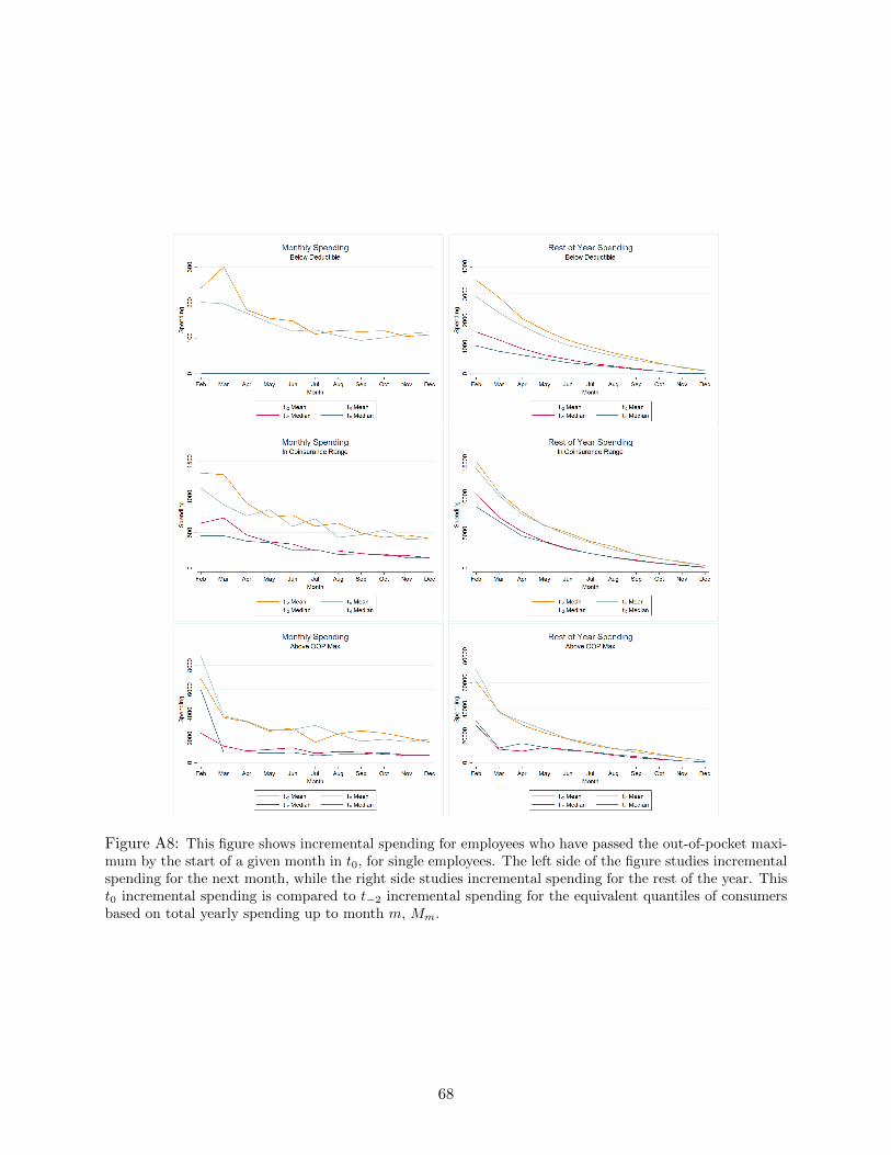
Figure A8: This figure shows incremental spending for employees who have passed the out-of-pocket maxi-mum by the start of a given month in t0, for single employees. The left side of the figure studies incrementalspending for the next month, while the right side studies incremental spending for the rest of the year. Thist0 incremental spending is compared to t−2 incremental spending for the equivalent quantiles of consumersbased on total yearly spending up to month m, Mm.
68

Figure A9: This figure shows incremental spending for employees who have passed the out-of-pocket max-imum by the start of a given month in t0, for employees with one dependent.
Figure A10: This figure shows incremental spending for employees who have passed the out-of-pocketmaximum by the start of a given month in t0, for families with the highest quartile of shadow price.
69
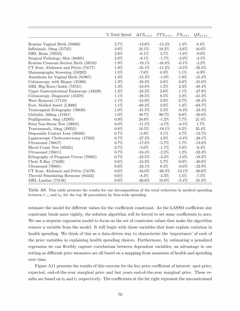
% Total Spend ∆TSt+1,t PPIt+1,t PSt+1,t QEt+1,t
Routine Vaginal Birth (59400) 2.7% -13.6% -15.4% 1.4% 0.4%Infliximab, 10mg (J1745) 2.6% 24.1% 10.2% -2.6% 16.6%MRI, Brain (70553) 2.0% -6.1% 4.7% -1.8% -9.0%Surgical Pathology, Skin (88305) 2.0% -9.1% -1.7% -2.9% -4.5%Routine Cesarean Section Birth (59510) 1.9% -19.1% -16.8% -0.1% -2.2%CT Scan, Abdomen and Pelvis (74177) 1.9% -35.1% -11.2% -3.5% -20.5%Mammography Screening (G0202) 1.5% -7.6% 0.3% 1.1% -8.9%Anesthesia for Vaginal Birth (01967) 1.3% -15.4% -1.0% 1.0% -15.4%Colonoscopy, with Biopsy (45380) 1.3% -28.3% 2.6% 0.6% -31.6%MRI, Hip/Knee/Ankle (73721) 1.3% -24.8% 1.2% 2.3% -28.4%Upper Gastrointestinal Endoscopy (43239) 1.2% -24.2% 2.6% 1.1% -27.9%Colonoscopy, Diagnostic (45378) 1.1% -28.5% 0.5% 2.2% -31.2%Wart Removal (17110) 1.1% -24.9% 2.9% 0.7% -28.4%Foot, Molded Insert (L3000) 1.1% -60.3% 2.0% 1.4% -63.7%Transvaginal Echography (76830) 1.0% -21.5% 2.2% -0.3% -23.4%Globulin, 500mg (J1561) 1.0% 49.7% 99.7% 0.0% -50.0%Pegfilgrastim, 6mg (J2505) 0.9% 28.0% -1.2% 7.7% 21.4%Fetal Non-Stress Test (59025) 0.8% -11.5% -4.7% -8.5% 1.7%Trastuzumab, 10mg (J9355) 0.8% 16.5% -19.1% 0.2% 35.4%Disposable Contact Lens (S0500) 0.7% -5.9% 3.1% 4.7% -13.7%Laparoscopic Cholecystectomy (47563) 0.7% -27.2% 4.3% -3.4% -28.1%Ultrasound (76817) 0.7% -17.8% -5.7% 1.7% -13.8%Blood Count Test (85025) 0.7% -5.0% -1.7% 5.0% -8.4%Ultrasound (76811) 0.7% -24.4% -2.2% 1.2% -23.3%Echography of Pregnant Uterus (76805) 0.7% -23.5% -3.2% -1.0% -19.3%Chest X-Ray (71020) 0.6% -24.3% 5.7% 0.0% -30.0%Ultrasound (76801) 0.6% -23.1% 0.4% -0.6% -22.9%CT Scan, Abdomen and Pelvis (74176) 0.6% -34.0% -26.5% 13.1% -20.6%Thyroid Stimulating Hormone (84443) 0.6% -8.3% -2.3% 1.5% -7.5%MRI, Lumbar (72148) 0.6% -26.6% 10.6% -5.4% -31.8%
Table A9: This table presents the results for our decomposition of the total reduction in medical spendingbetween t−1 and t0, for the top 30 procedures by firm-wide spending.
estimate the model for different values for the coefficient constraint. As the LASSO coefficient size
constraint binds more tightly, the solution algorithm will be forced to set some coefficients to zero.
We use a stepwise regression model to focus on the set of constraint values that make the algorithm
remove a variable from the model. It will begin with those variables that least explain variation in
health spending. We think of this as a data-driven way to characterize the ‘importance’ of each of
the price variables in explaining health spending choices. Furthermore, by estimating a penalized
regression we can flexibly capture correlations between dependent variables, an advantage in our
setting as different price measures are all based on a mapping from measures of health and spending
over time.
Figure A11 presents the results of this exercise for the key price coefficient of interest: spot price,
expected, end-of-the-year marginal price and last years end-of-the-year marginal price. These re-
sults are based on t0 and t1 respectively. The coefficients at the far right represent the unconstrained
70
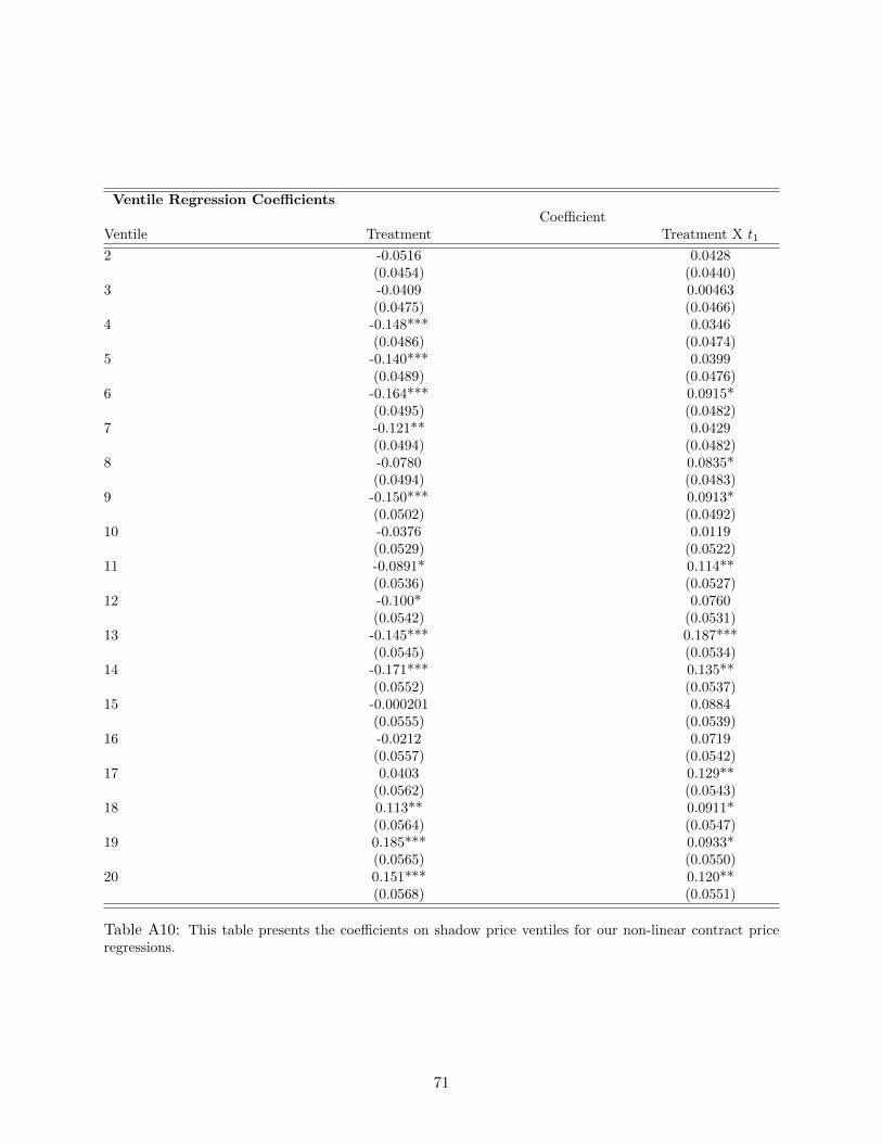
Ventile Regression CoefficientsCoefficient
Ventile Treatment Treatment X t1
2 -0.0516 0.0428(0.0454) (0.0440)
3 -0.0409 0.00463(0.0475) (0.0466)
4 -0.148*** 0.0346(0.0486) (0.0474)
5 -0.140*** 0.0399(0.0489) (0.0476)
6 -0.164*** 0.0915*(0.0495) (0.0482)
7 -0.121** 0.0429(0.0494) (0.0482)
8 -0.0780 0.0835*(0.0494) (0.0483)
9 -0.150*** 0.0913*(0.0502) (0.0492)
10 -0.0376 0.0119(0.0529) (0.0522)
11 -0.0891* 0.114**(0.0536) (0.0527)
12 -0.100* 0.0760(0.0542) (0.0531)
13 -0.145*** 0.187***(0.0545) (0.0534)
14 -0.171*** 0.135**(0.0552) (0.0537)
15 -0.000201 0.0884(0.0555) (0.0539)
16 -0.0212 0.0719(0.0557) (0.0542)
17 0.0403 0.129**(0.0562) (0.0543)
18 0.113** 0.0911*(0.0564) (0.0547)
19 0.185*** 0.0933*(0.0565) (0.0550)
20 0.151*** 0.120**(0.0568) (0.0551)
Table A10: This table presents the coefficients on shadow price ventiles for our non-linear contract priceregressions.
71

OLS regression; the far left represents the completely constrained LASSO model (where all coef-
ficients are set to zero), with points in between representing constraint levels between these two
extremes.
As the constraint binds (moving from right to left), the coefficients on the expected end-of-year
marginal price variables are the first set to zero, implying that they are relatively unimportant for
explaining the variation. In t0 and t1 we see the most important factor, both in terms of effect
size and the fact that it remains different from zero as the penalty function gets vary large (steps
go to 0), is spot price of 1. In t0 we see some impact of the 4th quartile of the E[EOY Marginal
Price] though the magnitude is far smaller. A similar result occurs for last years marginal price of
.1 in the t0 plot. For t1 the results are quite similar for spot price of 1: it is the most significant in
terms of longevity as well as in magnitude. Together these results lend further evidence, using an
alternate empirical approach that flexibly allows the price response to fit the data, that primary
driver of the behavioral response is for those under the deductible.
72

Figure A11: This figure presents our results from the LASSO procedure described in the text. Each stepdenotes the point where (moving from right to left) a variable is removed from the regression (i.e., itscoefficient is set to zero).
73

Figure A12: This figure plots median monthly spending for individuals in our primary sample from t−4-t1,both adjusted and unadjusted for age and price trends.
A.8 Additional Tables and Figures
74

Mean Individual SpendingBy Month
Mean Spending,Month Mean Spending Detrended
t−4, March 352.15 347.91t−4, June 360.89 351.71t−4, September 333.98 319.80t−4, December 358.07 337.26t−3, March 397.97 365.47t−3, June 362.47 328.91t−3, September 351.97 313.95t−3, December 368.23 324.94t−2, March 436.87 381.86t−2, June 412.69 355.13t−2, September 385.52 327.83t−2, December 376.79 316.01t−1, March 471.71 393.43t−1, June 414.34 338.62t−1, September 404.86 329.01t−1, December 526.96 422.53t0, March 355.94 282.28t0, June 338.97 268.07t0, September 372.86 287.69t0, December 417.47 322.12t1, March 405.21 306.96t1, June 386.42 290.04t1, September 412.19 307.42t1, December 512.89 378.54
Table A11: This table gives mean spending by individuals for a set of months in our data.
Family Counts and Total Spendby HDHP Plan Arm
February April June August October December
Family Counts
t0 Deductible Arm 14,161 11,775 9,369 7,636 6,161 5,031t0 Coinsurance Arm 991 3,216 5,311 6,713 7,848 8,522t0 OOP Maximum Arm 56 227 518 859 1,199 1,655
Total Spend ($ million)
t0 Deductible Arm 10.44 7.93 4.45 3.37 2.54 1.86t0 Coinsurance Arm 3.86 6.84 7.59 8.74 9.76 10.24t0 OOP Maximum Arm 0.72 2.02 3.13 4.76 5.59 6.25
Table A12: This table shows the number of families who begin a month in t0 in a given arm of the non-linearHDHP, as well as total spending by month and plan arm across these families for that month.
75

Shadow Prices byPlan Arm and Health Status
Sickest 10% Quartile 1 (Sickest) Quartile 2 Quartile 3 Quartile 4
t0 Deductible ArmFebruary 0.06 0.08 0.15 0.31 0.58April 0.09 0.10 0.17 0.40 0.70June 0.10 0.10 0.22 0.52 0.80August 0.10 0.11 0.31 0.67 0.88October 0.10 0.14 0.51 0.83 0.95December 0.10 0.19 0.75 0.96 0.99
t0 Coinsurance ArmFebruary – 0.01 0.04 0.06 0.10April – 0.03 0.06 0.08 0.10June – 0.04 0.08 0.09 0.10August – 0.05 0.09 0.10 0.10October – 0.07 0.09 0.10 0.10December – 0.08 0.10 0.10 0.10
Table A13: This table shows mean t0 family shadow prices, i.e. true expected end-of-year marginal prices,as a function of (i) their spot price at the start of a month and (ii) where they fall in the distribution offamily expected-of-year price, conditional on their spot price.
Price Correlationsby Month, t0-t1
Spot-Shadow Spot-Prior End Shadow-Prior End
February 0.285 0.131 0.627April 0.489 0.229 0.564July 0.668 0.315 0.513October 0.798 0.363 0.460December 0.857 0.381 0.437
Table A14: This table shows the correlation in different non-linear contract prices that we consider in ourprimary regressions, for months pooled over the treatment years t0-t1.
76