Embed Size (px)
Citation preview
9
The Graphic Herald: Exploring Heraldic Language Through Graphic Design
by Daniel McCabe
Heraldry is everywhere around us. Its visual language is found in a rich variety of graphic guises and contemporary contexts, from castles and pubs to street signs and fine wines. But to what extent do those with an interest in heraldry appreciate and understand the ways in which the language of armory is applied and perceived in the modern world? Drawing on insights gained during an extensive practice-based research project, this essay considers the extent to which graphic design can explore, expose, and challenge the application and perception of heraldry within the context of twenty-first-century British society.1 Graphic design as an academic discipline offers particular advantages to heraldic enquiry, since it utilizes a dynamic range of investigative methods in relation to undertaking practice-based research. It offers researchers the opportunity to record, analyse, test, and communicate ideas through a combination of visual and textual responses. Graphic design also draws upon specific semiotic theories connected to how we read and find meaning in symbolic matter, all of which are especially pertinent to exploring the visual field of heraldry. Therefore, graphic design provides both an excellent research framework through which the existence of heraldic visual language in contemporary society can be examined critically, and a conceptual approach to exploring ways in which its relationship with the public can be revealed. For the graphic design educator and practitioner, heraldry can appear both distant and, yet, strangely familiar. On one level it is a symbolically enigmatic art form, one that speaks of knights, of chivalry, and of societal hierarchy. On other levels, however, it bears many similarities to contemporary brand identity and design through its use of abstract symbols, pictographic representations, simple shapes, limited colour palettes, and structural hierarchies. Perhaps the most engaging aspects of this long-established language become apparent with an informed understanding of how to decode the pictorial and symbolic devices within: heraldry then reveals itself to be a highly regulated, systematized, emblematic signifier of social identity. A research project initiated in September 2012 set out to explore the manner in which heraldry is applied and perceived in contemporary society. The project began by surveying manifestations of heraldic language — such as the ordinaries and heraldic beasts — in an array of observable forms. Over five hundred examples were photographed in various public spaces throughout Britain. Attention was paid to both the context in which they were located, and the extent to which they could be considered ‘authentic’.2 Based on these collected images, a number of visual explorations and outputs intended to examine and reveal contemporary appropriations and perceptions of this long-established art form were produced. The project therefore adopted a mixed methodology in which close analysis of visual data was informed and enriched by an extensive practical component. What follows is both a critical reflection on the research project and some thoughts on how heraldic scholars might further explore its enduring presence.
Status Symbols and Vanity SignalsA comprehensive visual survey of heraldry’s application reveals numerous instances where authentic arms are used in traditionally appropriate ways. From armorial designs embedded in historic architecture to coats of arms adorning judicial documents, true heraldry has a long-established presence in Britain. Examples of legitimate heraldry are also found being used by 1 The use of the term ‘twenty-first-century British society’ refers here to physical environments in which heraldry can be found. It also represents the diverse population that inhabits that space, and that will inevitably and regularly come into contact with all the various forms of heraldry as identified in this essay.2 Authentic, in this instance, refers to whether or not heralds and heraldic experts would consider it as being legally or traditionally proper. Additional materials gained from the Heraldry Society and the Suffolk Heraldry Society supported this process.

Semy-de-Lys: 2016
10
organizations and authorities within a variety of contemporary contexts (Fig. 1). One of the most interesting examples of this can be seen in Portsmouth. Here we find a city that has borne its arms for over 700 years, legitimately gaining a motto in 1927 and a full achievement of arms in 1970 (Fig. 2). Although the exact origin of these arms is debated, the golden estoile and crescent on an azure field have remained constant throughout the centuries. The modern use of these arms is restricted to use by the council only, and a graphically stylized version of the shield can be found adorning every single street sign, parking meter, and licensed taxi within the city (Fig. 3). What this demonstrates is the extent to which civic heraldry exists within twenty-first-century British society and how local governing authorities have embraced the use of arms as a subtle yet authoritative symbol of status, one that communicates identity and influence. In contrast, the project reveals several examples of arms that do not appear to follow the traditional rules or presentations of heraldic design, yet still retain elements of the heraldic. This form of heraldry is typically referred to in the heraldic community as the quasi-heraldic (Fig. 4). However, simply to label these examples as either authentic or quasi-heraldic overlooks the nuances of how each is constructed and the ways and means in which the language is applied. In his study Heraldry: Sources, Symbols and Meaning (1977), Ottfried Neubecker attempts to
Fig. 1: Examples of authentic arms in ancient architecture, on a legal document, and, rather unglamorously, on a waste bin.
Fig. 2: The arms of the city of Portsmouth, U.K.(Source: http://www.ngw.nl/heraldrywiki/index.php?title=Portsmouth)

Daniel McCabe
11
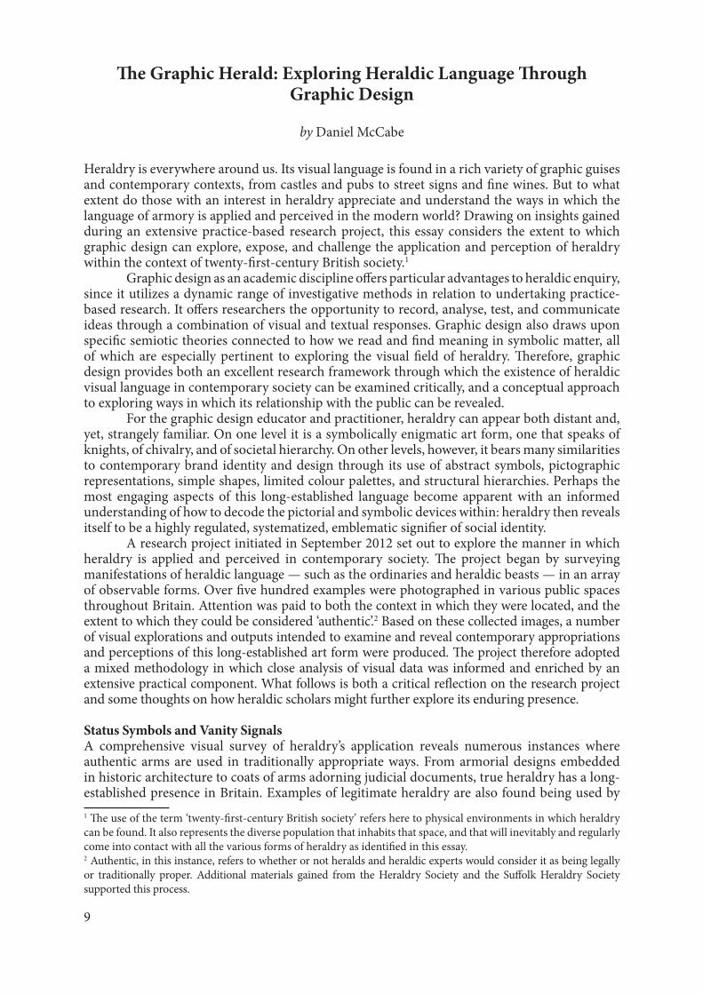
draw clear distinctions between varieties of quasi-heraldry as being either ‘para’ or ‘cachet’ in nature. Neubecker discusses para-heraldry as being a more stylized form of heraldry that uses symbolically relevant motifs (Fig. 5). He describes para-heraldry as ‘badges’ that often look like arms. These badges (or ‘logos’) are used by sporting clubs, schools, military corps, and masonic lodges, and have no apparent motive to deceive anyone.3 On the other hand, cachet heraldry is a more calculated attempt at harnessing the inherent pedigree and prestige of armorial language. According to Neubecker, it is the most common form of faux heraldry and examples can be seen adorning products such as cigarettes and bottles of wine (Fig. 6). He states that very few commercial firms have arms of their own, and instead choose to use designs that give the impression of being armorial. This lends cachet to their products.4 Even though Neubecker made these distinctions over thirty-five years ago, they are still a relevant categorization for the ways in which quasi-heraldry exists in modern society. Furthermore, it could be argued that this form of heraldry has become even more nuanced, particularly in its manifestations in popular culture. From fantasy fiction, such as J. K. Rowling’s Harry Potter novels, to the current trend of hipster branding, there is a widespread referencing of heraldic language
3 Ottfried Neubecker, Heraldry: Sources, Symbols and Meaning (London: Macdonald and Jane’s, 1977), p. 263.4 Ibid., pp. 260–62.
Fig. 3: An example of Portsmouth’s arms being used within the city, shown here on the door of a city taxi.
Fig. 4: An example of quasi-heraldry; a stylized coat of arms representing the ‘noble’ House of Denim.
Fig. 5: Examples of para-heraldry according to Neubecker; badges for automotive brands Alfa Romeo
and Abarth.
Semy-de-Lys: 2016
12
in contemporary visual communication.5 This is an observation that has been previously made by graphic designer and author Per Mollerup in his book Marks of Excellence: The History and Taxonomy of Trademarks (1998), which discusses the role of heraldry in the development of modern marks of identity, and states that heraldic marks are often quoted or paraphrased in modern design.6
Images obtained during the photographic survey undertaken as part of the author’s project indicate that there were many instances of the adoption of heraldic motifs by brands to
5 Hipster branding is a popular term used to describe a current trend of logo marks with a vintage aesthetic that use specific motifs, described by Dave Spengler as being ‘ribbons, anchors, crowns, arrows, crests’, Dave Spengler, ‘Hipster Branding’, <http://www.logodesignlove.com/hipster-branding> [accessed 12 August 2015].6 Per Mollerup, Marks of Excellence: History and Taxonomy of Trademarks (London: Phaidon, 1998), p. 15.
Fig. 6: An example of cachet heraldry according to Neubecker — Pierre Darcys Champagne lookingsuspiciously heraldic.
Fig. 7: Examples of heraldry as recorded within the second visual survey focusing on wine packaging.

Daniel McCabe
13
create quasi-heraldry. For example, a visual analysis of 482 wine bottles available at a Waitrose store in Portsmouth7 revealed that sixty-eight per cent of all wines sold within the store had some form of heraldic language on the label (Fig. 7). In reviewing these bottles and the forms of heraldry being used, it was clear that the wine sector is a hot-bed of quasi-heraldic language, much of which appears poorly conceived. One could argue that there is a convention in which armorial motifs are placed on the wine label to signify quality and provenance with a view to seducing and reassuring the consumer into a purchase. In his article ‘Simplicity of Semiotics’, J. Duncan Berry makes a similar argument through a semiotic analysis of a Châteauneuf-du-Pape in which he calls the use of a heraldic device a ‘vanity signal’.8 He goes on to state that only a handful of truly historic houses are able to deploy this kind of strong non-verbal message with traditional assurance and authenticity. What appears to be evident here is the existence of a thematic convention, one in which specific heraldic motifs are used repeatedly owing to their inherent signification. Informally, David White, Somerset Herald, has astutely observed that the use of heraldic motifs has become increasingly prevalent in today’s society, especially within the context of branded consumer goods.9 In a sense, one could ascribe the prevalence of heraldry in branding as an attempt on the part of marketers and designers to associate a product with status, heritage, and ‘quality’. However, with a marketplace saturated with references to heraldry, there is also the danger that its original meanings become diluted and its implied value lost. Attempting to communicate these issues through visual means, several text and image responses were generated by the author in the form of printed posters. Figures 8 and 9 show two of these pieces of work. Figure 8 juxtaposes the quotation ‘a designer without a sense of history is worth nothing’10 from the highly respected Italian designer Massimo Vignelli (1931–2014) with the image of an unbranded bottle of wine. Through this statement, Vignelli suggests that designers would do well to develop a deeper understanding and appreciation of history to inform their practice. With this in mind, the poster suggests that those responsible for the creation of quasi-heraldic language, as found within this context, could better reflect on their understanding of its construction and the ethics of its application. Figure 9 shows a more direct approach to asking the audience to consider the authenticity and application of heraldic language on branded goods. This is achieved by overlaying Berry’s statement onto a monochromatic grid of images depicting a range of quasi-heraldic motifs as found on the surveyed bottles of wine. The poster’s underlying emphasis recognizes the role of quasi-heraldic language in building consumer trust and influencing purchasing behaviour. Irrespective of armorial authenticity, the modern world presents a profusion of heraldic design representing authorities and institutions, businesses and brands. More difficult to find, however, are examples of genuine coats of arms belonging to, and being used by, individuals. As one might expect, the most notable instances of where this can be seen publicly were found embedded within established heritage sites such as castles and churches. These findings led towards a consideration of the practice and practicalities of bearing personal arms in the twenty-first century. Aside from acknowledging the differing degrees to which this process is regulated and scrutinized within Britain, it raises questions about the extent to which an individual may feel it is both acceptable and appropriate to display their arms in modern society. To explore this proposition by means of a graphic response, a coat of arms was designed and assumed by the author for a period of three months (Fig. 10). The arms were designed by referencing heraldic elements from existing coats of arms connected to previously inhabited places. These included the City of London, Brighton, Portsmouth, and the London Borough of Bexley. Arms belonging to Alexander McCabe (fl.1869) were also used as a point of reference and 7 Permission was obtained via email from Melanie Thompson at Waitrose head office on 8 February 2013 to carry out this survey. 8 J. Duncan Berry, ‘Labels & Shrink Slieves: Simplicity of Semiotics’, in Package Design: Elevating the Collaborative Design Process <http://www.packagedesignmag.com/content/simplicity-semiotics> [accessed 12 August 2015].9 Discussion with David White at the Who do You Think You Are? genealogy expo, London, 23 February 2013.10 Vignelli gave this response in the context of a 2010 interview with Debbie Millman for her Design Matters podcast series: ‘Massimo Vignelli’, Design Matters < http://www.debbiemillman.com/designmatters/massimo-vignelli/> [accessed 12 August 2015].

Semy-de-Lys: 2016
14
Fig. 8: ‘A designer without a sense of history’: one of the posters expressing critical positions in relation to the Waitrose survey.

Daniel McCabe
15
Fig. 9: ‘Something of a vanity signal’: one of the posters expressing critical positions in relation to the Waitrose survey.

Semy-de-Lys: 2016
16
Fig. 10: My assumed coat of arms as designed for the experiment.
Fig. 11: A poster illustrating the various manifestations of the assumed arms.

Daniel McCabe
17
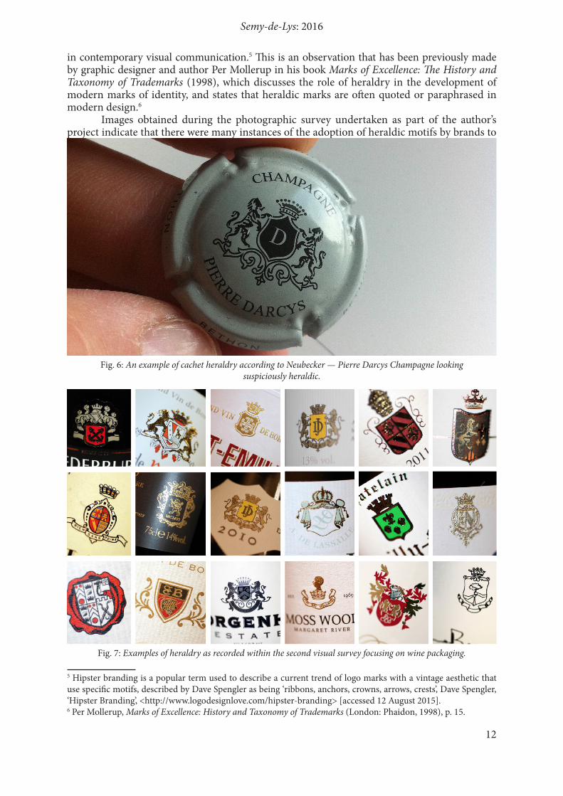
included in the final design. Potential uses for the arms were explored and visually documented, and their application became gradually more audacious and less conventional; a plaque, a flag, a tie, a blazer, business cards, a t-shirt, and an online social media avatar were all created (Fig. 11). The arms were given a motto that read ‘nom sum dignus’, which roughly translates as ‘I am not worthy’. This is a pun intended to express both sentiment and fact. Throughout this experiment it proved challenging to find credible and creative ways in which to bear arms. Rather surprisingly, the application of such imagery seemed to encourage a high level of critical response from those who encountered it. Many people questioned the relevance and appropriateness of displaying what was indirectly referred to as an antiquated symbol of status. Some assumed a financial windfall had occurred, while others lamented the fact that I had departed from academia and now worked for the Government. Several thought it profoundly unusual and attributed it to eccentricity, while a few regarded it as highly pretentious and tasteless. Anecdotal evidence at this stage suggested that heraldry, or at least the application of heraldic language within such a context, was prone to being perceived negatively by the British public. Reactions from those participating in and interacting with various aspects of the research project up until this point suggested that public perceptions of heraldry were largely negative and that the language’s history and meaning were commonly misunderstood. Scholars of heraldry, such as Stephen Slater, have noted that the art form is seen by many as an ‘snobbish anachronism’.11 Similarly, Kimon Andreou argues informally that ‘the British public perceives heraldry as being exclusively the domain of the nobility’.12 One can only feel frustrated in response to such suggestions given the fact that heraldry appears to have such a multi-faceted functional existence within modern British society. The sheer quantity of heraldic language on display in contemporary society, as already discussed, indicates that heraldry is a stereotypical indication of wealth and social status, but also more than this. In response to these widespread misconceptions of heraldry, a series of experimental posters was generated. The concept centred upon embedding particular arms within the context of a constructed visual narrative, one that is there to be interpreted on several levels. In the first instance viewers see a character, an exaggeration of a societal stereotype, one intended to elicit certain attitudes and preconceived ideas (Fig. 12). On closer inspection the image becomes less clear and the viewer is presented with a network of small black dots, a method known as half-toning (Fig. 13). All that is visible now is a small gold foiled heraldic detail planted within the image. Again, the viewers will find themselves entertaining certain attitudes towards the coat of arms, particularly in relation to understanding its purpose within the narrative. The final layer of interaction invites the viewer to read a small block of text at the bottom of the poster. This gives the reader succinct information about the arms, as well as introducing them to blazon and its associated language of description. This response is an abstract critical comment about the ways in which heraldry is perceived, and it is also intended to encourage the viewer to reflect on any preconceived ideas they themselves may have about the subject. Perhaps more contentious than the notion of heraldry being simply misunderstood is the suggestion that societal perceptions of heraldry are underpinned by a form of heraldic ignorance. Several heraldic experts have suggested this to be the case. Interestingly, when questioned why, the same individuals identified one of the key contributing factors to be the existence of bucket-shop heraldry. Kimon Andreou offers a useful and concise definition of a bucket shop as an enterprise that will ‘sell unsuspecting customers a coat of arms belonging to others with the tacit understanding (if not the explicit statement) that the customer is entitled to them’.13 He also goes on to state that he does not condemn all those who sell arms in this way as they may not know better themselves — an indication perhaps of the extent to which heraldic ignorance exists.
11 Stephen Slater, The Illustrated Book of Heraldry: An International History of Heraldry and its Contemporary Uses (London: Hermes House, 2006), p. 6.12 Kimon Andreou, email message to author, 16 June 2013.13 Kimon Andreou, ‘Bucket Shops’, in IDTG: Kimon Andreou’s Blog on Heraldry, Genealogy, History and Other Things <http://www.idtg.org/archive/350-bucket-shops> [accessed 12 August 2015].

Semy-de-Lys: 2016
18
Fig. 12: Example of one of the posters produced for this experiment.
Daniel McCabe
19
Fig. 13: A close-up of the gold foil heraldic detail found embedded within the poster.

Semy-de-Lys: 2016
20
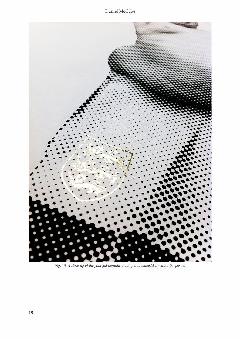
Through further investigation, other sources connected with heraldry were found to express congruent views. One example is the American College of Heraldry, which states that ‘bucket shops do nothing but damage to the public’s understanding of true heraldry’.14 Online, prominent members of the heraldic community voice a range of opinions on bucket-shop practice, from those who appear to consider it as a harmless annoyance, to those who berate it as being unlawfully deceitful.15 Regardless of personal opinion, it is important that the public should better understand heraldry, particularly in relation to how bucket shops operate. With this in mind, an experimental visual commentary was devised. The premise of this experiment assumed a playful scenario in which a fictional heraldic authority decides anonymously to tackle ‘heraldic ignorance’ by way of a guerrilla communications campaign intended to inform the public about heraldry proper. After many attempts to develop a suitable concept based on typographic propaganda-style posters, a solution was found by way of mechanically laser-cut typographic stencils.16 These stencils use a shield-shaped border motif and play with heraldic terms (Fig. 14). The typographic statements inside the shape take the form of warnings that allude to issues the public may be more familiar with. For example, ‘beware the bogus charges’ has connotations of banking or booking holidays. At the bottom of each stencil is a logo, consisting of a bird with a raised wing above text that reads ‘www.diligentandsecret.info’. These particular aspects of the design are a subtle allusion to England’s official heraldic authority, the College of Arms. In an attempt to discover what these typographic statements refer to, the viewer can visit the aforementioned website where they are greeted with a series of shields that, when clicked, reveal information intended to address heraldic misunderstandings (Fig. 15). The concept dictates that the stencils would be used within established heritage sites around Britain and the messages would target visitors to such places. Out of respect to these sites, no castle, church or ancient building would actually be emblazoned with a sprayed message. Rather, the stencils are attached directly to the building, thus becoming non-permanent artworks in their own right. Although built upon a fictional narrative, the experiment has a functionality that, if developed and directed in a more appropriate manner, could go some way to addressing heraldic misconceptions. Research by this stage of the project had revealed that the general public has a common tendency to characterize heraldry as an anachronistic symbol of wealth, privilege, and status. It had exposed ways in which creative industries and entrepreneurial individuals, rightly or wrongly, use heraldry to exploit and perpetuate these value-judgements. Perhaps more significantly, it had identified an opportunity for graphic design to be used as an experimental tool to engage the public with heraldry and to improve their awareness and perception of it. In order to do this, an engaging response needed to be developed with both clear purpose and parameters.
14 ‘Introduction’, The American College of Heraldry <http://www.americancollegeofheraldry.org> [accessed 12 August 2015].15 Most notable opinions can be found in David Appleton, Heraldry: Musings on an Esoteric Topic <http://blog.appletonstudios.com> [accessed 12 August 2015], and on Kimon Andreou’s blog, IDTG. 16 Stenciling is both a process and a visual language synonymous with guerilla or street-art style.

Daniel McCabe
21
Fig. 14: ‘Kick the bucket shop’: one of the stencil posters produced for this experiment.
Semy-de-Lys: 2016
22
Fig. 15: Screenshot of the website homepage created for the experiment.

Daniel McCabe
23
Heraldry Unmasked The resulting concept was conceived as a visual exposé of heraldry as something relevant, playful, and meaningful, as opposed to pointless, snobbish, and anachronistic. The concept took the form of an interactive generative experiment in which 100 members of the public would be inspired to take an active part in the creation of their own unique piece of heraldic design. The initial phase of the experiment took place over two days at Southsea Castle, a small and well-preserved fortification situated in Portsmouth (Fig. 16). With the permission of the City Council, a point of contact was set up in the castle’s keep. This consisted of a workstation, questionnaires, books, and various banners promoting the event (Fig. 17). Visitors to the castle were asked to take part in the experiment by filling in a questionnaire. The questionnaire was qualitatively structured to enable the participant to provide enough details for a shield of arms to be designed and presented to them at a later date. The reason for focusing on a shield is because symbolically it is considered to be the heart of the arms and evokes the purest and earliest form of heraldry. The structure of the questionnaire was as follows: firstly, it asked the participant to provide some basic personal details such as surname, age, sex, occupation, and contact email or
Fig. 16: Southsea Castle, Portsmouth.
Fig. 17: The workstation that was set up in the keep of Southsea castle in order to engage with visitors.

Semy-de-Lys: 2016
24
postal address. It then asked the participant to select the following elements: one of ten common shield divisions, one of five heraldic tinctures, and one of two armorial metals. The remaining questions then required the participant to ideate more openly and to give both an animal and an object that they felt best represented their interests, personality, or profession. Finally they were asked if they would prefer these chosen elements to appear once, twice, or three times on the shield. The reason for this was to introduce structural parameters and to ensure graphic clarity and simplicity. The participants represented a diverse spectrum of ages, backgrounds, professions, and nationalities, and others enquired into the purpose of the experiment, which served as a catalyst for further discussion about heraldry. Given that this experiment was set in the context of a castle, it was no surprise that the majority of participants were keen to enhance their visiting ‘experience’ and learn more about the subject. The participation of these visitors resulted in the generation of 100 unique shields of arms over a period of three months (Figs 18–22). Designs for the arms were informed and influenced by three key factors. The first was a decision to inject integrity into the project and to follow established rules of heraldic design. Participants were made aware that even though the arms they had received were not legally correct, nevertheless the designs reflected artistic principles that govern authentic heraldry. The second was a desire to take inspiration from Norwegian heraldic expert and artist Hallvard Traetteberg (1898-1987). Traetteberg rationalized and modernized heraldry in Norway, creating over fifty coats of arms for Norwegian municipalities and counties.17 He aimed to avoid ‘compound motifs’ and favoured the use of limited colours and metals to create high-contrast imagery.18 Applying his early twentieth-century theoretical approach to heraldic design allowed for the production of a clean and balanced aesthetic (Fig. 23). The third and final factor was that the arms themselves proved to be an intriguing mix of ancient symbolic conventions and modern cultural motifs. The methodological approach taken to designing the arms reflected the way in which one would undertake the design of a brand identity; looking for ways playfully and harmoniously to combine elements in order to tell a story. The various divisions and lines of partition provided a conceptual and physical platform upon which the charges could interact and create visual narratives. The resulting arms were eventually printed and presented in a large hardbound book (Fig. 24). Designed and produced to the same dimensions as a British Museum archive folder, a gold shield constructed from motifs created for the experiment adorns the front board. Each shield is coupled with a block of textual information, and this text serves two specific functions. The first of these is to contrast the personal details of the participant with the visual interpretation of the choices the participants have made. It presents a game in which the profile of the individual can be compared to the elements they have chosen to represent themselves. The second function is to blazon the arms. Whether real or imagined, the words used can be translated from a glossary at the back of the book. As a body of work, the arms reveal underlying rules and systems that have governed heraldic design for over 700 years, while simultaneously exploring new ways in which they can be applied. They pay homage to the often overlooked graphic simplicity of early twentieth-century Norwegian heraldry and play with familiar heraldic motifs such as the lion rampant, the dragon, and the wolf. They explore and reveal ways in which heraldry can represent the individual in contemporary British society, and offer up some intriguing twenty-first century alternatives to established heraldic conventions. They demonstrate how the design practitioner can apply heraldic language with a sense of creativity and history. Perhaps most importantly, this work offers a progressive approach to engaging the public with heraldry and altering negative perceptions.
17 Norwegian Petroleum Directorate, ‘Updated Seahorse’ < http://www.npd.no/en/news/News/2011/NPD-in-a-new-building/Updated-seahorse/> [accessed 12 August 2015].. 18 Venke Åsheim Olsen, ‘The Landscape in the Sign, the Sign in the Landscape: Periphery and Plurality and Aspects of North Norwegian Regional Identity’, ed. by Michael Jones and Kenneth R. Olwig, Nordic Landscapes: Region and Belonging on the Northern Edge of Europe (Minneapolis: University of Minnesota Press, 2008), p. 319.

Daniel McCabe
25
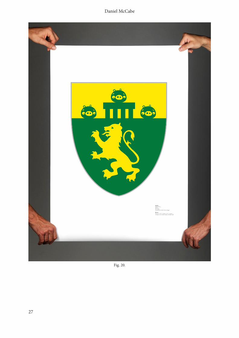
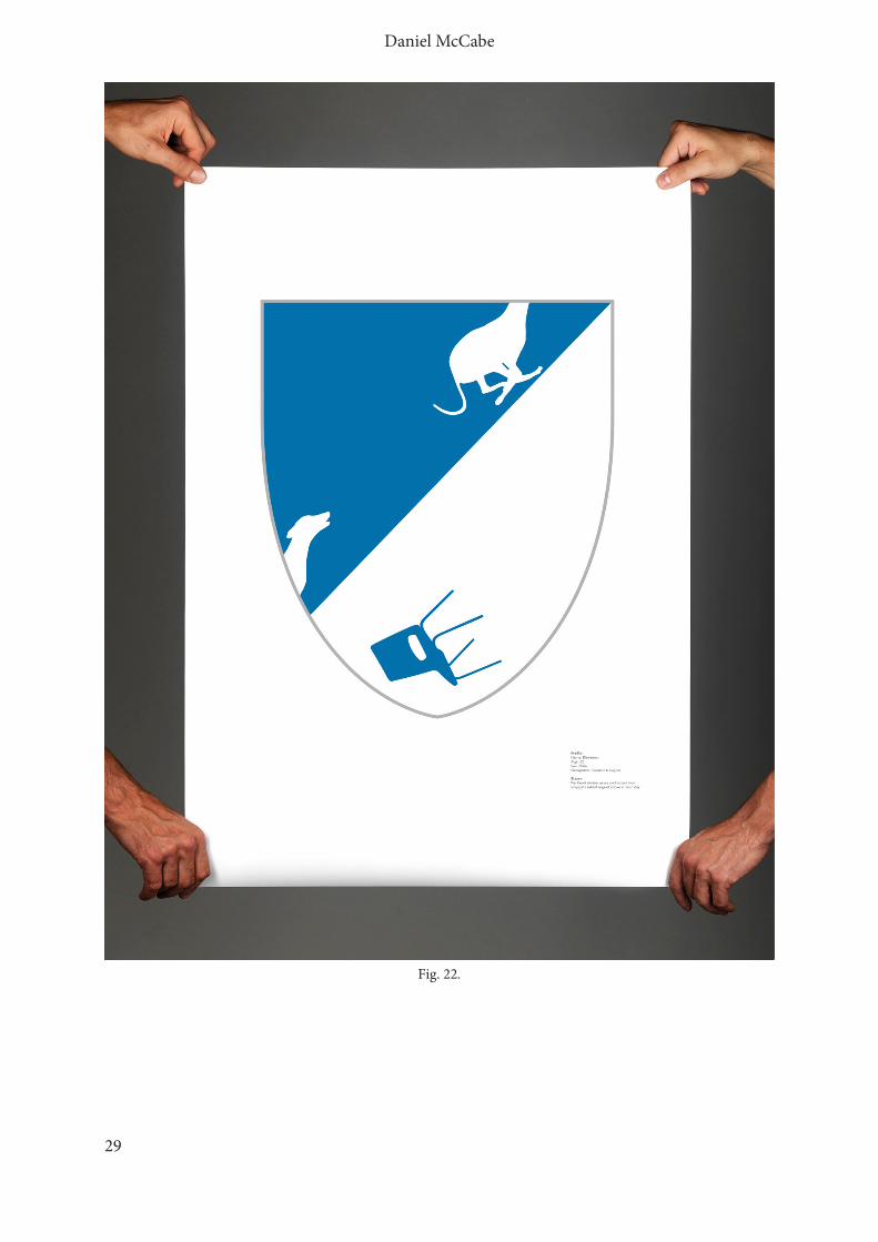
Fig. 18 (Figs 18–22): Samples of armorial shields generated from the experiment, showing how chosen charges were drawn and integrated to create an interesting visual narrative.

Semy-de-Lys: 2016
26
Fig. 19.
Daniel McCabe
27
Fig. 20.

Semy-de-Lys: 2016
28
Fig. 21.
Daniel McCabe
29
Fig. 22.

Semy-de-Lys: 2016
30
By using a model of practice-based research in order to explore and expose the application and perception of heraldic language within twenty-first-century British society, it has been possible to develop an informed understanding of the ways in which society engages with heraldry. Furthermore, utilizing graphic design practice in relation to academic research provided an experimental yet systematic approach to generating and communicating research findings. It also allowed for the production of outputs with the purpose of changing public perceptions of heraldry as a discipline and a language. In presenting and discussing this creative journey the author hopes to encourage dialogue within the heraldic community, particularly in relation to the diversity of heraldic forms that coexist and communicate in the modern world. Certainly there is further work to be done in regard to investigating and improving the relationship between heraldry and the society in which it exists. It could be argued within the context of this essay that this is work best carried out through an interdisciplinary approach, one that harnesses and blends the expertise of both herald and graphic designer.
Fig. 23: A selection of Scandinavian arms designed by Hallvard Trætteberg (source: http://commons.wikimedia.org/w/index.php?search=Hallvard+Trætteberg+
&title=Special%3ASearch&go=Go&uselang=en).

Daniel McCabe
31
Fig. 24: The final book with gold foil detail on the cover, containing 100 unique coats of arms.