Embed Size (px)
DESCRIPTION
Magazine Publishing Guide for all artwork setup and promotion of all magazines.
Citation preview

THE EDITORS LITTLE GUIDE TO PUBLISHING GREATNESS

INTRODUCTIONThis guide is a seed sowing for all the basics you need to consider when thinking about designing a magazine. This is not design bible but we will happily help you with any further help you need laying out or designing your magazine from scratch.

When creating your artwork for print, make sure that all the opposing pages flow together as all readers will flow though pages one by one generally.
With an online magazine most people click randomly at articles they want to read directly so make this information and links easily accessible.
Use RGB colour modes for online publications not CMKY mode used generally for four colour print processes.
For both formats try to make sure you adverts are relevant to the pages or articles they are sat with. Web resolutions do not have to be as high as print versions this will make the end files smaller and quicker to load on screen.
WEB vs PRINT DESIGN
vs

Make sure you plan your magazine artwork in counts of 4 pages. As this is not only the most economical way for us to calculate your prices but as a general rule stitched (stapled) and perfect bound magazines will be printed and created using folded sheets, so pages of 4 printed sides folded in half to create the finished size.
PAGINATION
Cover 1 2 3 4
5 6 7 8
AD 01Table of Contents
Article 01AD 02
Article 02 AD 03 AD 04 Article 03
CONTENT & FONTSClear and concise is the phrase here. Helvetica is proven to be the most readable font but if you do not have it, make sure that the look and feel of your magazine has an easy to read font size and regardless of what is in the background. Make sure the text stands out ahead of all other images.
Make sure all fonts are converted to curves or outlines before sending to print. This turns the font into an image eliminating any font issues with the printer.
Remember headlines grab attention but if they cannot be read because you have chosen a complicated script font then your potential readers will be put off.
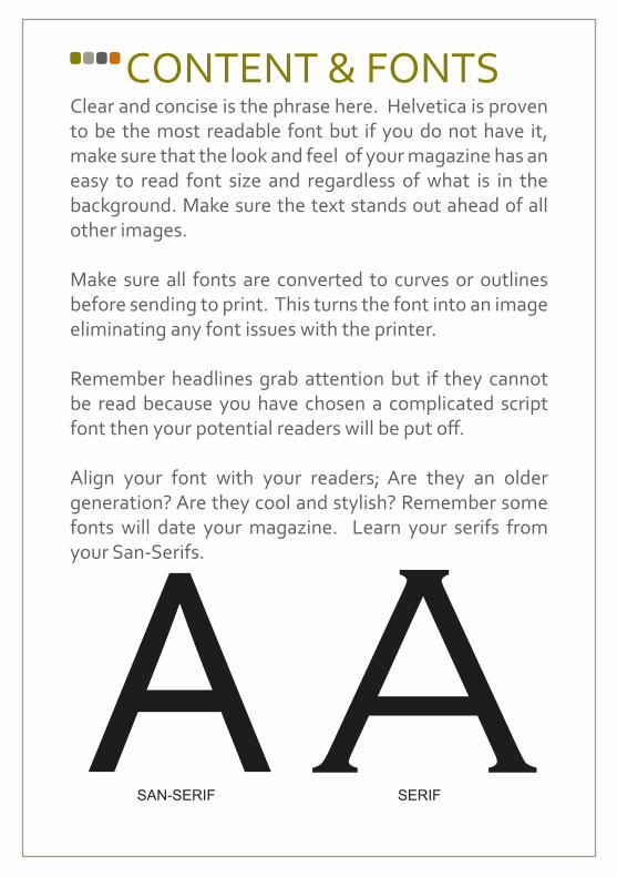
Align your font with your readers; Are they an older generation? Are they cool and stylish? Remember some fonts will date your magazine. Learn your serifs from your San-Serifs.
A ASAN-SERIF SERIF

With 300dpi Under 300dpi
IMAGESKeep your images clear and concise. Relate them to articles on the page they sit with. Always make sure that the images are over 300dpi (dots per inch), this will ensure a standard of print you will be happy with.
Try to steer clear of stock images where you can, the personal touch always maks your magazine look more polished and professional.

Your layout of your magazine needs to be clear and easy to read. But also portray the image you want to. So make sure you use the right colours and images laid out correctly to suit your audience. Your cover is the first impression, so make sure you images and headlines grab the right attention and relate to your main theme/headline article. USE A GREAT PHOTO! To attract readers and make sure inside your magazine all the text stays away from the edge as you don’t want it trimmed off!
Make sure your images are professional looking and try to stay away from stock images or clipart as they tend to cheapen the look and feel.
LAYOUT

YOUR LOGO DESIGN
JPEG format
EPS format
Make your logo distinctive and clear to recognise. If you can always support graphical symbols with words to tell your new readers who you are and what you’re about then you will be able to use the symbol to reinforce your brand.
Make sure your logo is never pixelated and never appears in a low resolution this will only debase your brand and at all times you need to look professional and polished.
Try getting your logo made in all file formats including Ai, PDF and EPS to help with infinite scalability.

This is the area of the artwork that is extended over the actual size of the design.
Printing industry standards are to have 3mm of bleed on each edge extra to the actualfinished design size, which will then be cut down to size. This is to ensure there are no white edges around your finished magazine.
3mm
3mm
Print area3mm gapActual sizeTrim marks
BLEEDS
A

DISTRIBUTIONHow are you going to get your magazines out to your readers? As we see it you have 3 main options. Royal Mail, Door to Door distributors and doing it yourself. Each has its own successes and failures, each has its own costs and doing it yourself isn’t necessarily the cheapest. Don’t be precious about your magazine going out on a shared drop (with other items) your readers will look for your magazine and will read it once dropped through their door.
For Nationwide distribution, think about all options on poly wrapping, envelope enclosing and depending on volume and weight, what postage discounts are available to you.
Finally think about timing of your drop, what day it will arrive? Are there any advertisers with timed events or competitions that have deadlines?

C M Y KAs a standard print colour format C – Cyan, M – Magenta, Y – Yellow and K- Key (black) these four colours represent the four colour process of a standard printing press that will make up the majority of your full colour work. Make sure when setting your artwork that the files are saved in CMYK mode and not RGB (Red, Green and Blue) mode as this will alter the end result of the colours in your magazine.

Your readers will respond best to clearly laid out articles and colours that they should relate to. So no matter your target audience speak to them as the knowledge of your subject and try to reflect that in your branding i.e. Photography magazines have large clear imagery or cooking magazines have images on the cooking process and finished dishes. Make sure your magazine logo and colours are instantly recognisable this will help build readership loyalty and always make sure all references to you are clear and of the best printing quality
BRANDING
T: +44 (0) 1242 237652
F: +44 (0) 1242 236186
W: www.cbfnet.co.uk
Lawson WilletClient Services Executive
T: +44 (0) 1242 237652
F: +44 (0) 1242 236186
W: www.cbfnet.co.uk
Lawson Willet
Client Services Executive

PROMOTIONHow are you going to get your magazine out to the public? Do you have a budget to get your publication out to your target audience? Don’t worry if not, Think outside the box.
Thought about getting involved in your readers community? Sponsoring events, becoming the knowledge for your industry? Get involved! You even find that with some ‘sponsored space’ in your magazine you will get a lot of exposure in return.
Make sure you think about Social Media as your friend. Your readers will be using Facebook, Twitter, Linkedin, Google + and all the other social networks, so make sure you are active on there. Although a learning curve similar to a language to learn, once mastered you will be able to get your audience engaging with you and your creative banter to enhance your publications brand and readership.
We offer a load of tools for FREE to help you with this ask us for more information.

Known and trusted since 1986
www.magazineprintquote.co.ukt: 01242 237 652
@cbfprinters