Embed Size (px)
DESCRIPTION
The Omega Issue
Citation preview

punc
h
welcome to issue four 25.11.05
Ω
the department of design research newsletter

*
Hello.Welcome to the Omega issue of The Dis-ciples of Design. This, the fourth but not as the name suggests, the last installment of our on going voyage into the collective subconscious. The design and contents of this artifact is a constant work in progress. The documen-tation of thoughts, ideas and connections both visual and verbal. We look back to look forward and are at times both literal and lateral. The fluid ad hoc nature of the design and content is a conscious decision to create a dynamic that reflects the speed of the digital age. This is our raison dʼêtre and we are up and running.
Enjoy!
page fifty one
images by Steve Wilkin Course Leader - Illustration

By chance or design the format of a McDonalds takeaway bag is identical to that of the standard in flight sick bag. *Both bags featured are from the Department of Design ephemera archive.
page fifty three

Description: Typeface Illustration
Size: 1040mm x1400mm x 30mm
Medium: Wooden Type Blocks
Quantity: 15 Trays (approx. 3750 pieces)
Time Scale: 3 Days
Tools: Pencil, Ruler, Masking Tape, Scalpel, Double Sided Tape (extra strong)
1
Description: Dry Stone Wall
Size: 24 yards in length. 5 feet high by two feet wide (tapering to 18 inches)
Medium: Sedimentary Sand Stone
Quantity: 35 Tonnes
Time Scale: 3 Weeks
Tools: Pick, Spade, Barrow, Lump Hammer, Stone Chisel, Plum Line
A good dry stone waller never picks up
the same stone twice.
2
*
traditional saying*
page fifty fife

page fifty seven
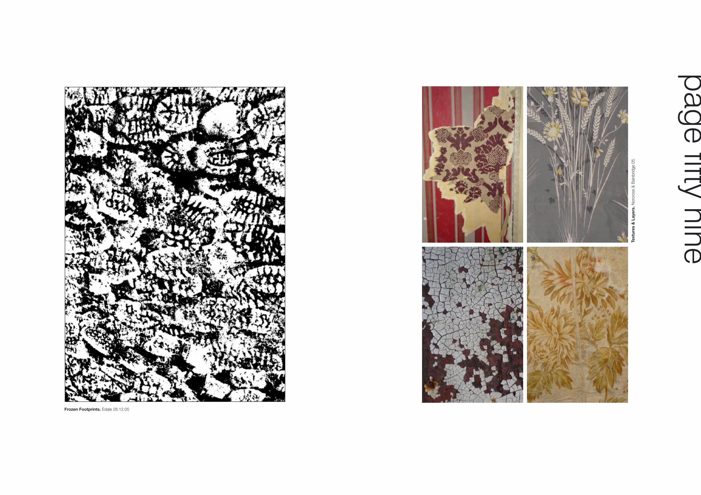
Frozen Footprints. Edale 28.12.05
Text
ures
& L
ayer
s. N
orcr
oss
& B
ainb
ridge
05
page fifty nine

Brief Background - Cleaner Coastal Campaign
Yorkshire Water wanted to tell their customers that they had cleaned up Yorkshires Seaside. We commissioned a set of three saucy seaside postcards and cleaned up the saucy or ‘dirty’ innuendo usually associated with a typical 1960’s seaside postcard (originally created in Yorkshire).
Mike Rigby (BA Hons) Graphic Design - Graduate 2002
Mike Tyson - Edvard Munch - Sebastian Coe - Ann Bolyn - Megatron - The Saint - Peter parker (AKA Spiderman)
Brief Background
First year Graphic Design Students were given the one day lateral thinking exercise below. The brief was to take a cup from a vending machine and use it to project a famous personality of their choice. The answers to the selection shown can be found at the base of this page.
page sisty one

embankment
Box 2.
A“A visit to the turbine hall on the south bank to see Rachel Whitereads huge sugar cube installation is well worth the effort. Not just because itʼs free but because itʼs there.
AThe 40,000 moulded cardboard boxes are plastic casts of plaster casts. Placed at random and not so random they offer the viewer quite a sight.
AThe installation is running up until March 06, when all the boxes are going to be recycled into traffic cones.
AThey can then be viewed at your leisure when they will appear in a continuous installation on the M25.
ARenamed hard shoulder?”.
Box 1.
reviewed by William Whitehead
not so random
random
Box 3.
page sixty three
Dear Reader
This an example of how the logotype might appear on the stationary? The green Seeder tree is placed on the horizon in all appropriate formats where ever possible. The S.E.E.D acronym is typeset in Times Roman and should always appear white out of green. This is the preferred colour combination.
However there may be times when a reversal is appropriate as in example shown top right. Seasonal colours are permitted as shown on the badge concepts right: Spring Summer, Autumn, Winter.
Tie velisim dolore velit, sum dui bla feugue faccummolore commy num vulla adigna faci ea commodolore euip ea accumsan-deummod minim nisl dipisi tet inisi blandrero doloreet wisciliquat. Ut ad eu feu feugait augait am, venim volor ilit, quis alis del iril et utpat.
Wipit ad magna facil dolorti ssectem iniam vel enim nulput luptat lam, qui eu feugiatue dolute minim numsandiatio odolorper aut eu feugait del in henim zzrit autetum iriure del iriliquat. Cidunt aliscil iquatum in ut lorem .
Em quisi ea acil iure deliquipit ut endrerit, velit, commy nisseniam, conse duisit il iuscipit euguera estrud min etueros do-lorem vulputat wiscincin eros eumsan utpat iliquat. Feu feuguero od tat pratie te feugiam nim zzriustrud et, voloborerat.
Yours Faithfully
Seed Building, Ridge Lea Hospital, Quernmore Road, Lancaster LA1 3JR T: 01524 586 255 E: [email protected]
seede
Supportive Environments Encouraging Development
����
�����
�����
�������������������������������
���
se de
����
�����
�����
�������������������������������
���
se de
����
�����
�����
�������������������������������
���
se de
����
�����
�����
�������������������������������
���
se de
����
�����
�����
�������������������������������
���
se de
����
�����
�����
�������������������������������
���
se de
����
�����
�����
�������������������������������
���
se de
����
�����
�����
�������������������������������
���
se de
����
�����
�����
�������������������������������
���
se de
����
�����
�����
�������������������������������
���
se de
����
�����
�����
�������������������������������
���
se de
����
�����
�����
�������������������������������
���
se de
����
�����
�����
�������������������������������
���
se de
����
�����
�����
�������������������������������
���
se de
����
�����
�����
�������������������������������
���
se de
����
�����
�����
�������������������������������
���
se de
se de
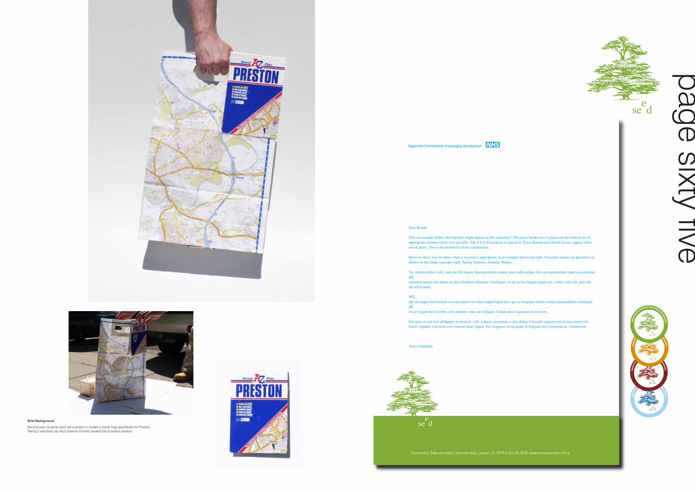
Brief Background
Second year students were set a project to create a carrier bag specifically for Preston. Taking a standard city AtoZ Graeme Forrest created this inovative solution.
page sixty five

Title: B’s 2005
page sixty seven

Virtual AF - Regular
Family: Virtual AF Re
Type: PostScript
Screen Font: Virtual AF - Re
Printer Font:
Screen Font Location: /Users/andyb/fonts/Bitstream/Virtual AF/Virtual Re
Family: Virtual AF RE /Users/andyb/fonts/Bitstream/Virtual Re
Suitcase: Virtual AF Re
Foundry: Bitstream (Tokyo)
Version: 2.0-1.0
Font ID: revised 11/05
An experimental and controversial new type family has recently emerged hot of the hard drive of Swedish type svengali Olof Prila. Using a new virtual reality software package from the Adobe workshops Tokyo, it enables the designer for the first time, to view a typeface in side elevation. The new typographical twist, Virtual AF, at present consists of only three weights complete with none aligning figures. Olof believes this face could herald a new era in type design, Olof “it’s the biggest typographical breakthrough since Gutenbergs letterpress Bibles”. However some purists have lambasted the face as illegible, vague and lacking personality. All we can say is draw your own conclusions?
Above: Typographical April Fool. Featured in Design Week & Creative Review Circa. 1994
Lim
ited
editi
on s
ilksc
reen
by
Jon
Har
ker
- 05
page sixty nine

Naturally projected spectrum - digitally captured. Time to design - 5minutes and 27 seconds.
s
ΩΩ
Ω
page seventy one

Rhodi Plc 2005COPYRIGHTc
These apparent floral designs were created by 4th year Graphic Design student Lucy Gascoigne on her industrial placement.
On closer inspection the designs are a clever blend of graphic explosions and bomb motifs. While working at Rhobi Design in Preston Lucy also undertook a vast array of fashion designs, those featured were used for the lining of jackets.
Rhodi Plc 2005COPYRIGHTc
page seventy three

Royal Mail information booklet - detail C.1979
The serendipity of these two images is remarkable and one can only wonder at the coincidence?
Postman Pat and his black & white cat (Jess). Created by John Cuncliffe C.1981
page seventy five

Ap
pat
ure
ligh
t fo
r H
abita
t. D
esig
ned
by C
laire
Nor
cros
s 20
04©
The
mak
ing
of a
pro
toty
pe
page seventy seven
Ribbon light for Habitat. Designed by Claire Norcross 2004©

The image above was taken by Jon Harker on a recent visit to Porto.
page seventy nine
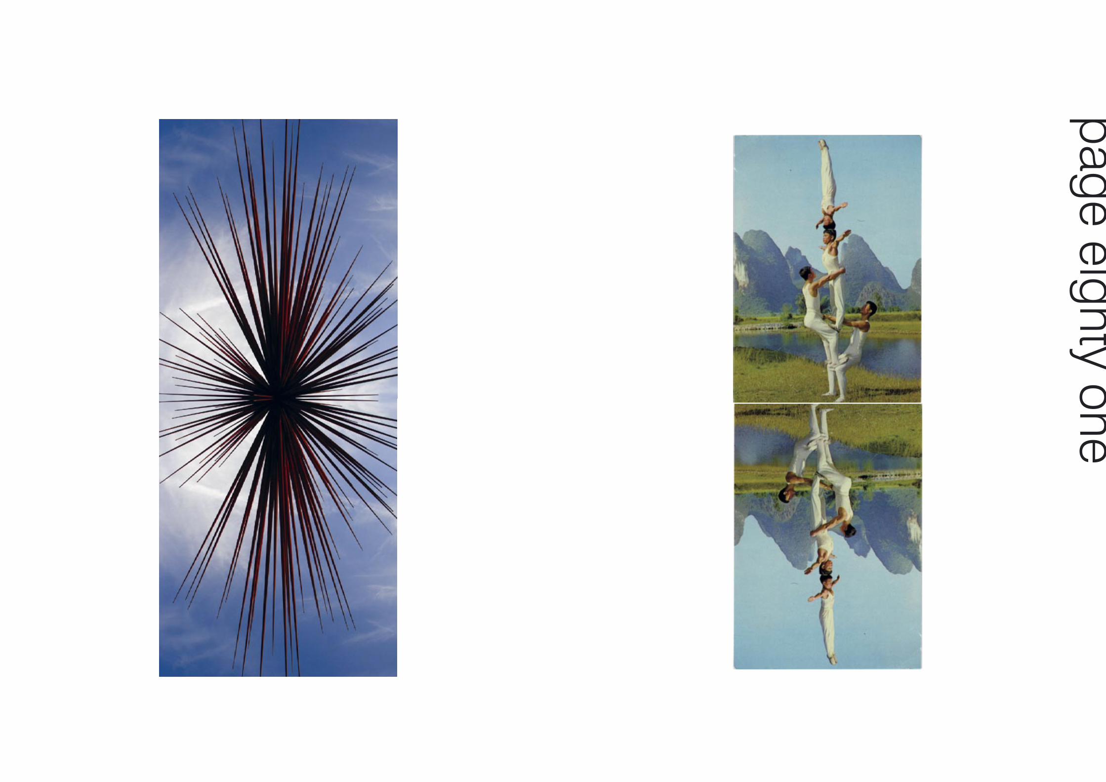
page eighty one
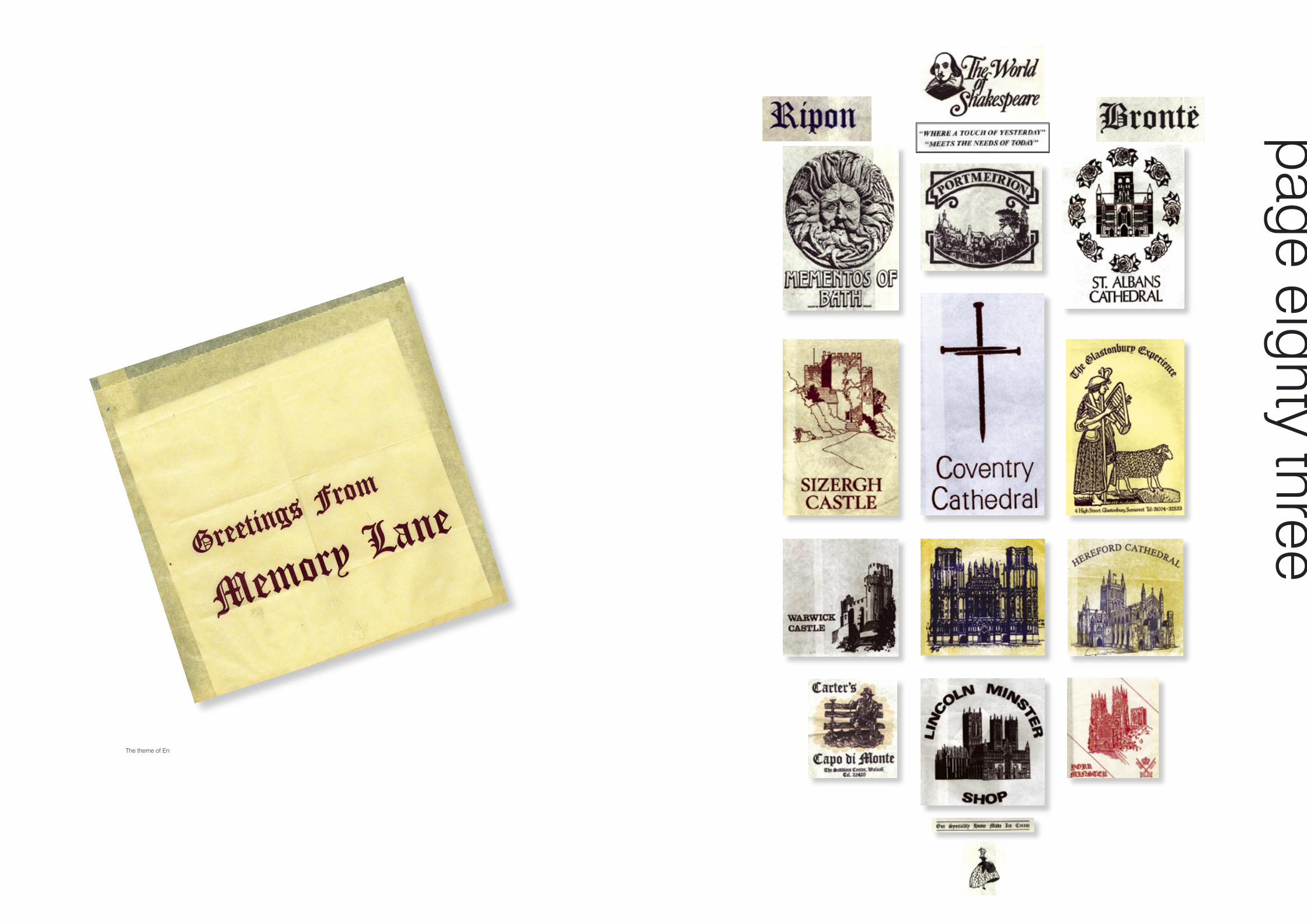
The theme of En
page eighty three
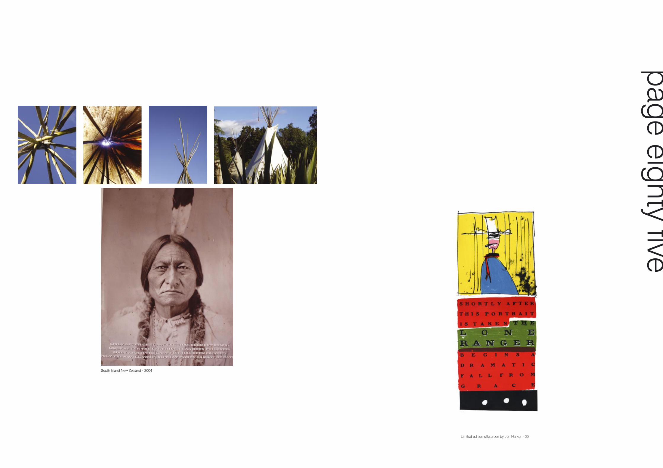
page eighty five
Limited edition silkscreen by Jon Harker - 05
South Island New Zealand - 2004

page eighty seven

These current film poster designs are by Graphic Design graduate Gary Dalton.Gary, a Prestonian, graduated in 2003 and is now working for Empire Design in London.
page eighty nine

Lim
ited
editi
on s
ilksc
reen
by
Jon
Har
ker
- 05
Pillar of salt. Intervention 2001
page ninety one

.......New York as of 26.11.05
page ninety three

This inventive print is taken from the lid off a frozen Sainsburys 3 layer lasagne
page ninety five

Key Cutters Logotype. Designed by Mike Rigby 2005Blackberry preserve 2003. Picked on the B6243 the traffic Jam featured above was made in a limited edition of 20.
page ninety nine
page one hundred

While Silk Cut was changing the face of cigarette advertising with the purple cut campaign, JPS remained firmly old school. The featured campaign relys on an increasingly tenious word play and standard pack shot solution, which now looks truly dated.
In the interveening years our societies attitude to smoking and especially the advertising of the product has changed radically. Smokers or ʻsnoutcasts ̓have been increasingly margionalised and all tobacco related advertising outlawed.
A pritty naff brand, JPS were only ever considered cool due to their shrewed product placement on the side of the Lotus F1 car of the 70ʼs and early 80ʼs. They made motering look mean
“do you think we really need the Kanga-roos?”
A ʻlook black ̓at the John Player Special press advertisments of the early 1980ʼs. By vince Vaughn