Embed Size (px)
Citation preview

The Center for IDEAEarly Childhood Data Systems
April 25, 2014
Data Visualization: A Picture’s Worth a Thousand Numbers
Nick Ortiz, Alice Ridgway and Robin Nelson

2
Why Data Visualization? Basic Principles Considerations for Approach Examples Community of Practice
Agenda
3
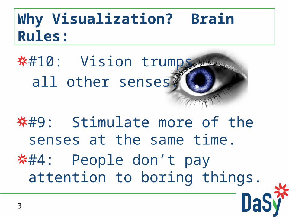
#10: Vision trumps all other senses.
#9: Stimulate more of the senses at the same time.#4: People don’t pay attention to boring things.
Why Visualization? Brain Rules:
5

66

7
Two basic types– Exploration – find a story in the data– Explanation – tell a story to an audience
Represent large quantities of data in a comprehensible way Help the user see relationships in the data
The Value of Data Visualization
8
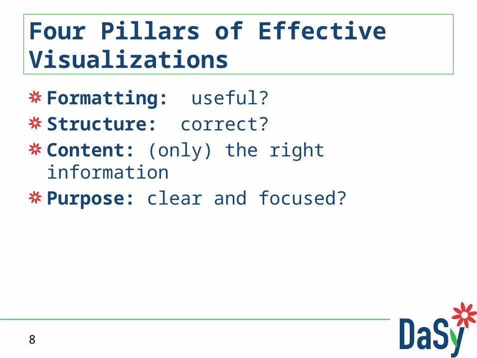
Formatting: useful?Structure: correct?Content: (only) the right informationPurpose: clear and focused?
Four Pillars of Effective Visualizations

9
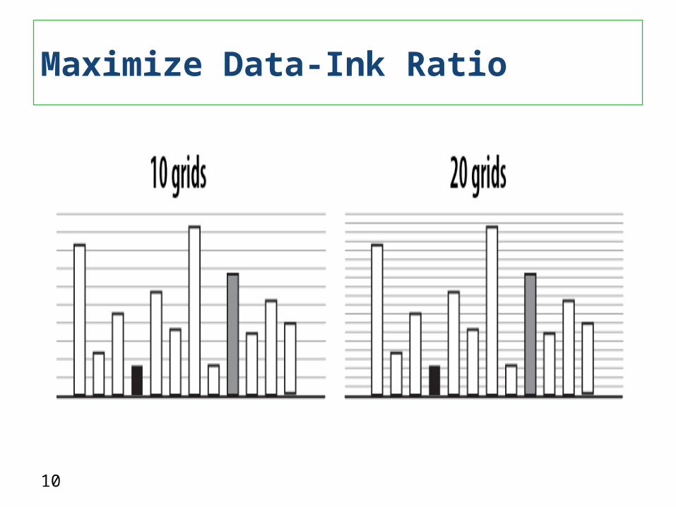
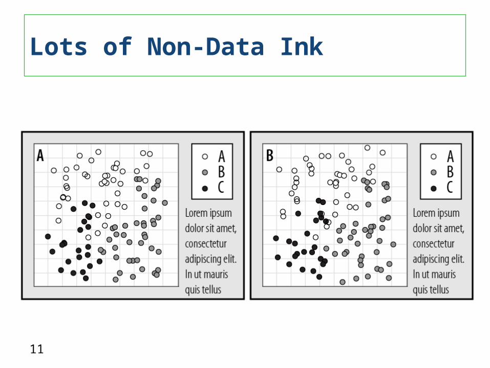
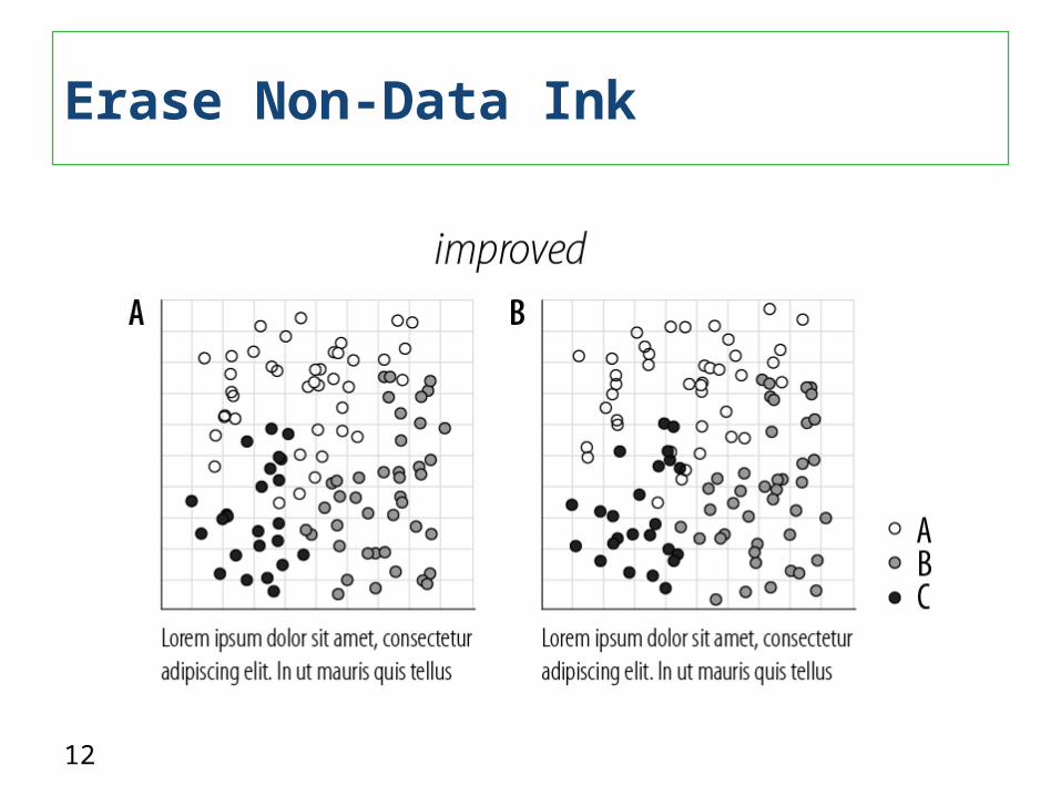
Above all else, show the data Maximize the data to ink ratio– Data ink is the ink on a graph that
represents data
Erase non-data ink “Do no harm” with color – color used poorly is worse than no color at all
A Few of Tufte’s Principles
10
Maximize Data-Ink Ratio
11
Lots of Non-Data Ink
12
Erase Non-Data Ink

13
Erase Non-Data Ink
14
Inappropriate display choices that distort reality, e.g., pie charts, 3-D chartsVariety for the sake of varietyPoorly designed display choices that use noisy fill patterns, line styles, saturated/bright colorsInconsistent ordering and placementInconsistent or reversed scalesProportional axis scaling
Common Data Visualization Issues
15
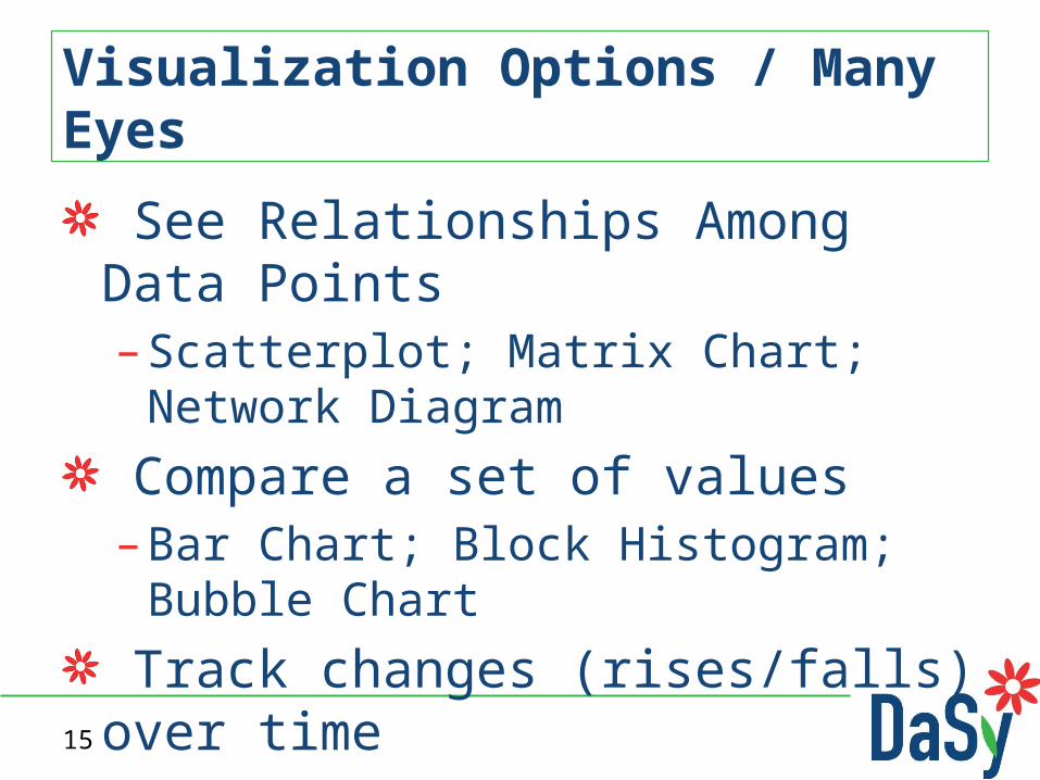
See Relationships Among Data Points– Scatterplot; Matrix Chart; Network Diagram
Compare a set of values– Bar Chart; Block Histogram; Bubble Chart
Track changes (rises/falls) over time– Line Graph; Stack Graph; Stack Graph for
Categories
Visualization Options / Many Eyes
16
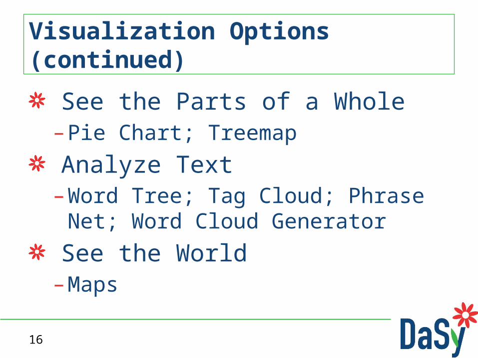
See the Parts of a Whole– Pie Chart; Treemap
Analyze Text– Word Tree; Tag Cloud; Phrase Net; Word
Cloud Generator
See the World– Maps
Visualization Options (continued)

17
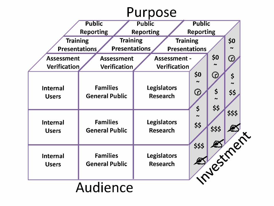
Factors to Consider for Data Visualizations
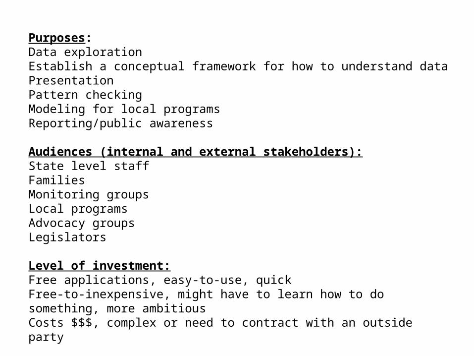
Purposes:Data explorationEstablish a conceptual framework for how to understand dataPresentationPattern checkingModeling for local programsReporting/public awareness
Audiences (internal and external stakeholders):State level staffFamiliesMonitoring groupsLocal programsAdvocacy groupsLegislators
Level of investment:Free applications, easy-to-use, quickFree-to-inexpensive, might have to learn how to do something, more ambitiousCosts $$$, complex or need to contract with an outside party


21
Resource List
22
Questions
23
Alice Ridgway– Accountability and Monitoring Manager– Connecticut Birth to Three System– Email: [email protected]– Telephone: (860) 496-3073
Nick Ortiz– Implementation & Data Consultant, Results Matter– Colorado Department of Education– Email: [email protected]– Telephone: (303) 866-3368
Contact Information for Presenters

24
Visit the DaSy website at:http://dasycenter.org/Like us on Facebook: https://www.facebook.com/dasycenterFollow us on Twitter:@DaSyCenter
Stay in Touch with DaSy

25
The contents of this presentation were developed under a grant from the U.S. Department of Education, #H373Z120002. However, those contents do not necessarily represent the policy of the U.S. Department of Education, and you should not assume endorsement by the Federal Government. Project Officers, Meredith Miceli and Richelle Davis.