Embed Size (px)
Citation preview

Morse Original Submission
1
Testing Visual Information Retrieval Methodologies
Case Study: Comparative Analysis Of Textual, Icon,
Graphical And “Spring” Displays
Emile Morse 1 and Michael Lewis2
School of Information Sciences, University of Pittsburgh
135 N. Bellefield St.
Pittsburgh, PA 15260
Voice: (412) 624-9426
Fax: (412) 624-2788
Email: [email protected]
Kai A. Olsen
Box 308, N-6401
Molde College, Norway
Voice: (+47) 71 21 42 33
Fax: (+47) 71 21 41 00
Email: [email protected]
1 Current Address: National Institute of Standards and Technology, 100 Bureau Drive, Stop 8940,
Gaithersburg, MD 20899; (301) 975-8239; [email protected] 2 To whom correspondence should be addressed.

Morse Original Submission
1
Abstract
Although many different visual information retrieval systems have been
proposed, few have been tested, and where testing has been performed results
were often inconclusive. Further, there is very little evidence of
benchmarking systems against a common standard. An approach for testing
novel interfaces is proposed which uses bottom-up, stepwise testing to allow
evaluation of a visualization, itself, rather than restricting evaluation to the
system instantiating it. This approach not only makes it easier to control
variables, but the tests are also easier to perform. The methodology will be
presented through a case study, where a new visualization technique is
compared to more traditional ways of presenting data.
1 Introduction
Modern technology has given us the ability to store, retrieve and disseminate huge amounts
of documents. At the same time, our ability to read the documents returned from our
searches to the web or the bibliographic databases is as slow as ever. Where the retrieval
systems may return hundreds to thousands of references, we may only sample a pitiful few.
Visualization techniques appear promising as a means for overcoming this problem. By
mapping contents and relevance onto multidimensional spaces the user may be given an
overview of a document collection, helping her to retrieve the documents of interest. In the
last decade close to a hundred different visualization systems have been proposed. Very few
of these have been subjected to user studies. One reason for this may be that full-featured

Morse Original Submission
2
systems are complex to evaluate. It is difficult to choose a control system, performance is
related not only to the task but also to the mode of interaction, the computer resources and
to the choice of features. Other problems are the number of prototype systems that exist,
and the dynamic nature of most systems and the costs of user training.
In this paper we propose, through a case study, a basic stepwise (BASSTEP) method for
testing such interfaces. Instead of putting the full system on the bench, we concentrate on
the basic visualization strategy behind the systems. This allows for simple test situations,
where it is possible to run many subjects, thus providing robust results, which can provide a
scientific base for further development of visual systems. The test methodology is presented
through a case study.
A set of basic displays will be used to determine the effectiveness of different techniques.
The tests presented here start with simple two-term Boolean situations, then move to three
terms and finally, vector representations of two and three terms. Tests were performed both
on paper and over the web.
In order to determine the robustness of the results the Boolean test cases have been run in
two different settings, using subjects from two different cultures (US and Norway). All
together more than 600 subjects took part in the study (216 for the 2-term Boolean tests,
223 for the 3-term Boolean, 196 for the more advanced vector techniques).
Morse Original Submission
3
2 Visualization systems for information retrieval
Visualization System Reference Tested?
Component Scale Drawing Crouch & Korfhage 1990 yes Cougar Hearst 1994 no
GUIDO Nuchprayoon 1996 yes
InfoCrystal Spoerri 1993 no
SIRRA Aalbersberg 1995 no
Space Newby 1992 yes
TileBars Hearst 1995 yes
VIBE Olsen et al 1992 yes
WebVIBE Morse & Lewis 1997 yes
Table 1: Reference point visualizations
Visual interfaces for information retrieval and browsing can take many forms, e.g.,
reference point systems, map displays, 3-dimensional systems. Here we will focus on
reference point systems, however, the test methodology proposed here, may be applied to
any type of visualization technique.
Table 1 presents a set of reference point systems. Each of these relies on a representation of
documents as vectors, although systems such as InfoCrystal contain Boolean vectors. A
short description of each system is given below.
Component Scale Drawing (Crouch & Korfhage 1990) uses a graph that shows query terms
on the x-axis; the order of the terms is determined by the user’s weighting. The y-axis
indicates classes of term weights. Documents are represented as broken lines and the query
itself is represented as a solid line. The purpose of the system is to assist users in
determining the similarity of query and documents.

Morse Original Submission
4
Cougar (Hearst 1994) uses a Venn diagram to represent the relationship between documents
and query terms. Each query term is mapped to a circular area of the display. Document
identifiers are shown as icons in the list box in the appropriate sector of the graph. GUIDO
(Nuchprayoon 1996) uses a novel type of display to allow sophisticated mathematical
manipulation of similarity metrics. The display allows the selection of two reference points
that are then shown as points on the x- and y-axes. The resulting document set is then
displayed in the plank that is generated at a 45° angle in the graph. Various retrieval caps
and metrics are provided to enhance selection of desirable subsets of documents.
InfoCrystal (Spoerri 1993) is another example of a reference point system that is based on
the Venn diagram model. Figure 1 shows the results of a 4-term Boolean query. The query
terms are indicated at the vertices and the resultant subsets are associated with the other
shapes shown in the bounding box. The number of edges of an included shape indicates the
number of query terms and the direction of the vertex points to the query term. InfoCrystal
is useful for determining the distribution of documents in a document collection that satisfy
each of the possible Boolean queries. Spoerri describes higher dimensional InfoCrystals. He
also illustrates a version that allows the creation of weighted vector queries, although the
display looks tremendously complex.

Morse Original Submission
5
Figure 1: InfoCrystal.
SIRRA (Aalbersberg 1995) incorporates a list of multicolor icons. Each query term is
assigned a color and each icon represents a single document. Users can compare documents
with respect to the strength of a query term within and across documents in a set. Space
(Newby 1992) is an IR system based on the principles of navigation, which he defines as
“human behavior to make sense of an information space” . In the part of the interface termed
the ‘Navigation window’ , keywords and document identifiers float in the field. The
placement of the documents with respect to the keyterms is based on the relative strength of
attraction of the document for the term. Other windows in the interface include a map view
and a key term list. TileBars (Hearst 1995) is based on segmentation of the underlying full-
text into topics, where grayscale rectangular areas show the relative amount of the term in
sequential fragments of the text.
Morse Original Submission
6
Figure 2: Vibe display (example)
An example of VIBE (Olsen et al 1992) is shown in Figure 2. Query terms, called points-
of-interest (POIs) are shown at the vertices of the figure and the resulting retrieved sets of
documents are shown as icons scattered around the enclosing triangle. VIBE can be used to
represent the results of Boolean as well as vector queries. This visual is part of a fully
featured interface that allows users to interact with multidimensional displays (i.e., any
number of POIs) and moderately large document collections. WebVIBE (Morse & Lewis
1997) is a relative of VIBE, which reduces the number of features to simplify use and
learning.
Several types of visual approaches can be seen when the above examples are analyzed.
Four major categories are: Venn diagram, icon lists, and two types of spatial systems. Both
Cougar and InfoCrystal are based on the Venn diagram. SIRRA and TileBars present icon
lists. VIBE, WebVIBE and Space employ a spatial method to render the relationship
between documents and key terms. GUIDO and Component Scale Drawing provide
information retrieval
visual interface

Morse Original Submission
7
graphical representations based on an x-y graph Component Scale Drawing uses a line
graph and nominal scales while the GUIDO uses icons and continuous scales.
The prototypes described for testing in the present studies contain representatives of the
icon list and spatial types of displays. The Venn diagram appears to be useful for displaying
Boolean data but falls short of making compelling displays of vector data. The x-y graph
type that is to be used in the 2-term prototype testing is similar to GUIDO and Component
Scale Drawing and closely related to another IR visualization, BIRD (Kim & Korfhage,
1994).
3 Evaluation of Visual Interfaces for Information Retrieval
Of the reference-point visualizations discussed in the previous section, only Component
Scale Drawing, GUIDO, Space, TileBars and VIBE have been subjected to user studies.
Each of the studies will be reviewed briefly here. The purpose in reviewing these evaluation
methods is to determine what tasks were given to the subjects and also to determine which
interfaces were subjected to usability evaluation as opposed to task performance
evaluations. Other pertinent aspects of the studies, such as number of subjects used and
characteristics of the user/subject populations, will be noted where such information exists.
Component Scale Drawing (Crouch & Korfhage 1990) was tested by presenting a user with
a display based on each of 15 queries. The task of the user was to apply the Component
Scale Drawing tools to rank the documents with respect to their similarity to the underlying
query. The rankings were then compared with the known relevance rankings. The results
showed that there was a highly significant relationship between the user’s rankings and the
Morse Original Submission
8
known rankings (Spearman coefficient 0.85 across queries). The number of users is not
clear from the paper but may be limited to a single person. The task is clearly highly
specific to the interface.
GUIDO was subjected to usability testing (Nuchprayoon 1996). Sixteen subjects were
charged with performing nine information retrieval tasks. Tasks were graded as ‘easy’ and
‘hard’ ; ‘easy’ tasks presented the test subject with pre-selected metrics, retrieval threshold,
and POIs, while ‘hard’ tasks required the subject to select each on his own. The primary
goal of each task was to choose the 8 ‘best’ documents from the resultant display. The
primary measure was the amount of time that it took the subjects to perform the document
selection. The results showed that there were some interactions between the retrieval
threshold and metric. Subjects provided positive feedback on the GUIDO system.
Newby (1992) tested Space with 20 users. They were provided with a full system display
that included the multi-window display and a mouse and PowerGlove. His primary goal
was to test the ability of users to navigate abstract spaces. Users performed two information
retrieval tasks: 1) a closed-ended question that was based on key-term synonymy and 2) an
open-ended task based on a vague statement of information need. The ‘Space’ system was
compared with a traditional IR system (Prism). Newby demonstrated considerable
learnability of the Space system and high user ratings. Comparison with the more
traditional system showed that users preferred the system with which they were already
familiar.

Morse Original Submission
9
TileBars has not been subjected to the same type of user studies mentioned thus far. The
TileBars interface itself has not been user tested but the algorithm underlying its
segmentation of text into topics has been compared with human segmentation of the same
text. High correlations were found between the two types of segment generators (Hearst
1995). This study, however, is not particularly relevant for the purposes of the proposed
work.
VIBE has been subjected to user testing by Koshman (1996). She compared performance of
expert and novice searchers using VIBE or a conventional text-based interface (AskSAM).
There were 15 novices, 12 online search experts and 4 subjects who had VIBE system
expertise. Due to the small sample of VIBE experts, the study concentrates on the former 2
groups. This was a thorough usability study of the VIBE interface in that it sought to
measure users’ performance at tasks that required use of novel interface features. Subjects
performed seven tasks that were chosen for their likelihood to represent ‘normal’ user IR
tasks. In general, the tasks have a Boolean flavor, e.g., how many documents contain (all,
one, or two) terms. Scenarios were constructed to provide a naturalistic information seeking
setting. Usability was assessed by measuring: 1) system familiarity time, 2) task
performance speed, 3) frequency with which online help is accessed, 4) number of errors in
task results, 5) subjective satisfaction, and 6) system feature retention. Familiarity time
showed no difference for interface or for expertise level. She showed that time to complete
tasks was inversely related to expertise. Users preferred the familiar, text-based interface to
the visual VIBE interface. She states that users retained what they learned from one session
to the next but believes that this was due to increased ‘ familiarity with the kinds of task and

Morse Original Submission
10
the tools needed to perform the tasks’ . It is reasonable to conclude that the Boolean nature
of the tasks chosen for this study influenced the outcome, in that Boolean tasks are probably
accomplished more effectively with Boolean systems such as AskSAM.
WebVIBE was subjected to usability testing (Morse & Lewis 1997). The overall aim of
these studies was to determine whether defeaturing existing IR interfaces could produce
interfaces that could be used successfully in ‘walk-up’ systems, especially on the Web. The
results showed that users could indeed form correct inferences about retrieved documents
and their relationship to the query terms without extensive training when the VIBE
interface was simplified.
4 Basic visualization techniques
A distinction is made in this paper between text-based, word-based, tabular, graphical, and
visual displays. Text-based presentations show words in their usual semantic context. This
is the usual form for text lists returned by Internet search engines. Word-based displays
show frequency of occurrence of query terms in a document listing. Tables are two-
dimensional listings in which the values of the elements are numeric. Graphical displays are
the set of usual graph types, e.g., pie chart, bar chart, histogram, and scatterplot. Visual
displays, in contrast, are composed of icons and connecting lines that do not have the
normal Cartesian coordinate interpretation. Icon displays have been used in the TileBars
system and have been observed as a component of some search engine results (Aalbersberg
1995). The final display is based on the VIBE display using its spring method both in a
Boolean and a vector variant.
Morse Original Submission
11
Lohse et al (1990) investigated how visual displays were categorized by subjects who
sorted 40 display instances. The results of hierarchical clustering analysis of the data
showed five clusters—icons, maps, diagrams, network charts, and graph and tables, which
closely mirror the four categories of visualization examined in this study.
5 Bottom-up testing
Using our BASSTEP methodology we first establish the parameters for common retrieval
methods before moving to more sophisticated and novel displays. This provides a control
with proper foundation for explaining the possible benefits of the techniques used in the
prototype systems.
The initial testing can be performed on paper, which has the advantage of not requiring
computer literacy, and eliminating extraneous elements from the test. Paper allows running
a large number of subjects, often with only the cost of data entry. The primary drawback
with paper tests is the difficulty in obtaining timing data. By limiting the time for the whole
test, or for parts of the tests, timing data may, to some extent, be measured indirectly
through its effect on correctness.
Online testing is somewhat more costly to prepare than paper tests, however, after the test
has been prepared it may be cost-independent with respect to the number of subjects. This
is especially true of Internet testing which makes it possible for subjects to perform the test
on their own computer. A big advantage with online tests is that all the test data, including
data from a post-test questionnaire, may be registered automatically. In addition, it is
possible to register the time that the subjects used for each task.

Morse Original Submission
12
To apply this approach to IR visualization we began with the simplest case of 2-term
Boolean queries, then studied 3-term Boolean queries, and finally investigated more
complex vector representations for two and three query terms using online testing.
5.1 2-term Boolean test (paper)
The 218 subjects for this study were members of undergraduate courses at University of
Pittsburgh or Molde College, Norway. The test was administered as a paper-and-pencil
exercise during a normal class meeting. Subjects were given a packet, in English or
Norwegian, respectively, containing instructions for completing the experiment, a randomly
ordered set of 5 presentation types and a post-test questionnaire. The instructions were read
aloud to each class before the booklets were opened. Subjects were instructed to refrain
from changing answers on a page after they had flipped to the next page. This constraint
was applied in order to detect more easily learning effects over the course of the repeated
presentation of questions. No restriction was placed on the amount of time for completing
the test but most subjects handed in their booklet in 10-15 minutes.
Approximately half of the subjects received additional explanation of the various interfaces.
The information provided was limited to a preview of each type using dummy data, e.g., X
and Y rather than actual terms and A and B rather that numeric values.

Morse Original Submission
13
Figure 3: Sample of presentations types, text list (upper left), icon list (upper right), table (middle
left), graph (lower right) and spring /Vibe display (lower left).
The five kinds of presentations were: text, icon list, table, graph and Vibe display. Figure 3
shows an example of each display condition. Text is ordered so that the items at the head of
the list contain both terms, then items containing term X but not Y, and the tail of the list
contains Y but not X. The icon list is presented in the same order as text; dark shading
indicates the presence of the term and white indicates a term's absence. The table is
constructed so that counts of documents containing the various combinations of terms are
presented. The graph display plots term X along the X-axis and Y along the Y-axis. The
spring display, also called a VIBE display [5], is based on a model in which documents are
placed in a display according to the amount of attraction that the document has for the terms
placed at the ends of the line segment. In this 2-term instance, documents that are about
1. American Banknote Corp Chemical Credit Agreement. 2. Chemical Banking Corp Form 8-A12B A. 3. American Banknote Corp Credit Security Agreement. 4. ARCO Chemical CO Tax Sharing Agreement.
Bank Chemical 1. 2. 3. 4.
Bank Chemical Number + + 2 + - 1 - + 1
3
3
2
Chemical
Bank
1
0
1 0
Chemical Bank
2 1 1

Morse Original Submission
14
term “bank” will be counted up at the end of the line labeled “bank” . Documents that are
about both terms will be counted at the middle of the segment.
For each type of presentation the subject was required to answer two questions.
• Circle the item(s) that contain terms X and Y.
• How many items contain the term X?
After all five interfaces had been seen and used by the subject, he was asked to rank the
interfaces with respect to:
• support for answering type A questions
• support for answering type B questions
• overall preference for general use
The primary measures of the study are performance and preference. Performance is
measured as number of correct answers to the questions related to each display type. In
general, preference results concentrate to the subjects’ top choice for each ranking category.
In order to determine if any of the factors probed in the post-test questionnaire might have
confounding effects on the study design, we analyzed the data for covariate effects. Overall
performance as measured as total correct answers or display performance as measured as
the number correct answers per presentation type, was not affected by gender, age, prior
computer experience or current year in academic program. Initial analysis of performance
showed a significant effect for country (U.S. vs. Norway); Norwegian students scored
higher on all displays except for the “ table” for which performance was equivalent in both
groups. Subsequent factoring in of native language resulted in a disappearance of any
difference by country in which the study was done. The explanation is that the relatively
Morse Original Submission
15
high proportion of international students in the Pittsburgh sample performed significantly
more poorly than the native English speakers. The Norwegian sample did not have any non-
native Norwegian speakers.
Figure 4: Overall performance Figure 5: Percent correctness
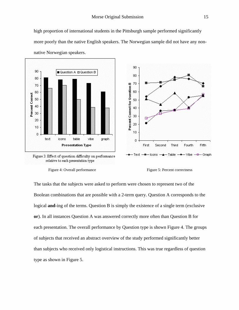
The tasks that the subjects were asked to perform were chosen to represent two of the
Boolean combinations that are possible with a 2-term query. Question A corresponds to the
logical and-ing of the terms. Question B is simply the existence of a single term (exclusive
or). In all instances Question A was answered correctly more often than Question B for
each presentation. The overall performance by Question type is shown Figure 4. The groups
of subjects that received an abstract overview of the study performed significantly better
than subjects who received only logistical instructions. This was true regardless of question
type as shown in Figure 5.

Morse Original Submission
16
The order of the presentations was randomized to control for order effects. Our results show
that a significant amount of learning occurred during the trials. Figure 5 shows that the
interfaces that were poorest with respect to performance, i.e., spring model and graph,
became more useful if they were presented later in the sequence.
Subjects were asked to rank the five presentations. Overall the icons (by 33%) and the
spring model (29%) were considered the best displays, text the worst (by 47%). 60% of the
users preferred the visual methods, i.e., icon list and spring displays. It is interesting to note
that although performance was superior with the 'text' interface, users dislike it.
5.2 3-term Boolean tests (paper and online)
A similar set-up was used for this test situation. Of the 223 subjects, a paper-and-pencil
version of the test was administered to 32 subjects and 191 were performed the experiment
using the web. Text, table, icon and Vibe displays were used in this test.
The user's task was to answer questions related to the displays. The same questions were
used for each display. The basic form of the questions conformed to a set of Boolean
operations using the and and or connectives. For instance, the question “How many
documents have all the three terms in them?”, is equivalent to the A and B and C.
Performance was assessed as number of correct answers. Computer-mediated session were
also assessed based on time-to-completion for each display. In addition, subjects were
asked to rank the displays with respect to their preference for using them. A post-test
questionnaire captured information about the subjects (age, gender, year in program,
whether the experiment was performed in their native language), their computer and

Morse Original Submission
17
Internet experience, and, for the computer-mediated group, some specifics about their
equipment configuration (modem speed, CPU speed, and monitor size).
There was no significant effect of any of the demographic parameters except for native
language. All of the subjects who performed the testing in Norwegian spoke that language
as their native tongue, while approximately 15% of the subjects who took the test in English
spoke a language other than English as their first language. These non-native English
speakers performed more slowly on each of the display except for the table display. This
difference in performance was also noted in the previous 2-term study where it was found
to be stronger. None of the computer-related parameters showed any significance whether
they were from the expertise or environment categories.
Display Type Time to answer set of 4 questions (sec.) Number Correct
Text List 186 + 9 3.56 + 0.06 Icon List 175 + 7 3.64 + 0.04 Table 147 + 7 * 3.63 + 0.05 Spring 145 + 7 * 3.35 + 0.06 *
Table 2: Effect of display type on performance (mean + SE).
* Indicates p<0.01 compared with non-marked categories The results show that there was no significant difference between computer-mediated
administration and paper and pencil. Timing data (Error! Reference source not found.)
for these subjects who performed the experiment in the computer-mediated mode showed
highly significant differences among the groups when analyzed with a repeated-measures
ANOVA (ref).
Morse Original Submission
18
Best Second Third Worst
Text 18 17 53 95
Icon List 79 62 31 11
Table 22 57 75 29
Spring 64 47 24 48
Table 3 Preference ratings of various displays
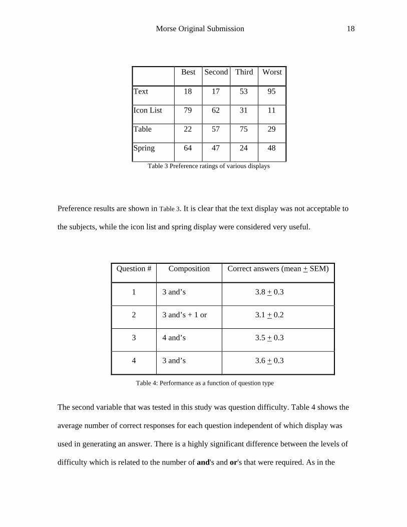
Preference results are shown in Table 3. It is clear that the text display was not acceptable to
the subjects, while the icon list and spring display were considered very useful.
Question # Composition Correct answers (mean + SEM)
1 3 and’s 3.8 + 0.3
2 3 and’s + 1 or 3.1 + 0.2
3 4 and’s 3.5 + 0.3
4 3 and’s 3.6 + 0.3
Table 4: Performance as a function of question type
The second variable that was tested in this study was question difficulty. Table 4 shows the
average number of correct responses for each question independent of which display was
used in generating an answer. There is a highly significant difference between the levels of
difficulty which is related to the number of and's and or's that were required. As in the

Morse Original Submission
19
previous 2-term study, questions requiring the use of or were more difficult. In this case,
Question #2 was phrased so that it required the subject to use an or.
5.3 Vector studies (online)
Figure 6: Examples of table, graph, and spring displays used in the 3-term vector study

Morse Original Submission
20
Vector studies were performed with displays as shown in Figure 6. For the text display all
words except keywords were filtered, while the table gave the number of occurrences for
each keyword. 195 subjects were randomized to receive either the 2-term or 3-term
experimental study. Both vector studies were performed online.
Figure 7: Relationship of time to completion and Figure 8: Relationship of time to completion and
correctness for 2-term study correctness for 3-term study
In order to determine whether the two performance measures employed in this study – time
to completion and number of correct answers – were correlated, the data for overall test
performance on both scales over all displays was analyzed visually and statistically. Figures
7 and 8 show the results for the 2-term and 3-term studies, respectively. Open squares
indicate outliers. Diamonds show data for remaining subjects. The trendline shows
association between measures for diamonds. This comparison shows that the primary
measures used in this study are not correlated. In other words, performance measured by
time to complete a task is not predictive of the score that the subject is likely to achieve.
Subjects who completed the total battery of tasks in a relatively short amount of time were

Morse Original Submission
21
no more likely to achieve a high score than subjects who took longer. Similarly, subjects
who scored particularly well or particularly poorly were not associated with skewed
performance times. The Pearson Correlation Coefficient was 0.038 and 0.177 for 2-term
and 3-term data, respectively; neither value was statistically significant.
From the distribution of values, it appears that time exhibits a wider range of values while
correctness is more constrained. An inference could be made that time is a more sensitive
measure. It might also be suggested that the type of test that was administered was quite
easy and that subjects performed too well to allow correctness to be discriminating.
2-term (n=120) 3-term (n=72)
Word 35.35±2.91 39.30±4.39
Icon 35.17±2.46 32.93±3.05
Table 35.60±2.92 32.49±3.04
Graph 54.38±3.44* NA
Spring 51.76±4.55* 35.14±3.14
Table 5: Time spent on instruction page (seconds; Mean ± S.E.M.).
* : p<0.05 compared with displays in the same column without an asterisk.
Subjects were presented with a short description of an upcoming display type. The material
consisted of an explanation of the key elements in the display and an example of how it
could be interpreted. When the subject was finished using this information, he submitted a
request for the first display of this type. The time elapsed was captured and labeled as
instruction time. Table 5 shows a statistical summary of the data. On average, the

Morse Original Submission
22
instructional material was viewed for less than a minute. The amount of time spent learning
about a display was similar for the word, icon, and table display and the triangular ‘spring’
display used in the 3-term study. In the 2-term study, both the graph and the linear ‘spring’
required significantly longer times.
These longer times seem to indicate a degree of novelty of the displays. The fact that the 3-
term ‘spring’ was not accompanied by a longer instructional period would not be expected.
It might be conjectured that the ‘ triangle’ was less confusing than its ‘ linear’ counterpart,
but no data was gathered that could support or refute this idea.
Figure 9: Time to completion
The results of the analysis of time to completion with respect to display type are shown
graphically in Figure 9. There are several important observations that can be made upon
inspecting the data. There are significant differences among both the 2- and 3-term the
displays with respect to performance times. Analysis of variance showed a p value < 0.001
for this comparison.
Morse Original Submission
23
Data on correctness provided similar information; time to completion, however, appeared to
be more sensitive. The variation in timing data, assessed as the standard error of the mean,
was larger than the relative standard error for correctness data.
It was shown that each display type was associated with poorer performance, as measured
by time-to-completion, when it was presented first in the series. This effect was not shown
for the number of correct answers. The key observations regarding the time effect are: 1)
there is a steep drop in time required between the first and second display regardless of
which displays are seen in these slots; and 2) the ‘spring’ display is handled extremely
rapidly in the 3-term condition; the ‘spring’ display is the only display that is not influenced
by the increased complexity of the 3-term condition when compared with the paired 2-term
display. Perhaps this shows that the idea behind the more complex spring display is more
clearly understood in the more complex situation.
Subjects ranked the displays after using all of them. Analysis showed that there was no
relationship of these preference rankings and subject performance, when measured by time
to completion. There was, however, a correlation between rankings and correctness for both
the 2-term and 3-term groups. In each case, subjects who received high scores when using
the ‘spring’ display preferred it. In the 2-term study, the same observation was made for
Graph.
In addition to ranking the display, the subjects were given the opportunity to rate the
displays as ‘Easy’ , ‘Hard’ , ‘Fun’ , and/or ‘Annoying’ . Every subject voted in at least one
category and many people selected more than one display as exhibiting a certain
characteristic. The percentages are shown in Table 6 for the 2-term study, Table 7 for the 3-
term.

Morse Original Submission
24
Easy Hard Fun Annoying
Word 10 50 8 74
Icon 51 9 34 6
Table 39 7 7 21
Graph 48 13 30 17
Spring 10 55 15 50
Table 6: 2-term (n=120) study, percentage of subjects categorizing display according to various criteria.
Easy Hard Fun Annoying
Word 3 78 ** 4 89 *
Icon 56 3 17 * 4
Table 33 7 7 17
Spring 29 ** 24 ** 47 ** 21 **
Table 7: 3-term (n=72) study, percentage of subjects categorizing display according to various criteria,
* : p<0.05; ** p<0.01
These data confirm the results of the rankings. As the difficulty of the scenario increased,
i.e., 2-term to 3-term condition, the Word display became significantly more difficult to use
(50% of 2-term subjects vs. 78% of 3-term subjects), while the ‘spring’ display became
more useful (i.e., significantly easier, less hard, more fun and less annoying). The ‘spring’
display was perceived in the harder environment to be easier and more fun to use.
Morse Original Submission
25
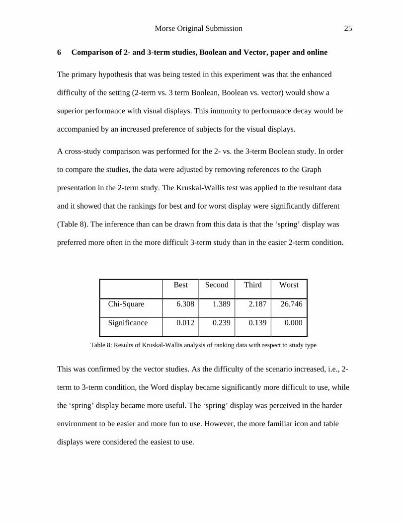
6 Comparison of 2- and 3-term studies, Boolean and Vector, paper and online
The primary hypothesis that was being tested in this experiment was that the enhanced
difficulty of the setting (2-term vs. 3 term Boolean, Boolean vs. vector) would show a
superior performance with visual displays. This immunity to performance decay would be
accompanied by an increased preference of subjects for the visual displays.
A cross-study comparison was performed for the 2- vs. the 3-term Boolean study. In order
to compare the studies, the data were adjusted by removing references to the Graph
presentation in the 2-term study. The Kruskal-Wallis test was applied to the resultant data
and it showed that the rankings for best and for worst display were significantly different
(Table 8). The inference than can be drawn from this data is that the ‘spring’ display was
preferred more often in the more difficult 3-term study than in the easier 2-term condition.
Best Second Third Worst
Chi-Square 6.308 1.389 2.187 26.746
Significance 0.012 0.239 0.139 0.000
Table 8: Results of Kruskal-Wallis analysis of ranking data with respect to study type
This was confirmed by the vector studies. As the difficulty of the scenario increased, i.e., 2-
term to 3-term condition, the Word display became significantly more difficult to use, while
the ‘spring’ display became more useful. The ‘spring’ display was perceived in the harder
environment to be easier and more fun to use. However, the more familiar icon and table
displays were considered the easiest to use.

Morse Original Submission
26
7 Discussion
As illustrated by this study, the BASSTEP approach has several advantages for testing of
novel techniques:
• Results from each test are simple to analyze
• Results may be used to plan the next step.
• Conclusions may be drawn based on a comparison of results from different steps.
• The simplicity of the tests, paper or on-line, make it practical to use a large number
of subjects, thus decreasing the influence from outside factors and increasing
confidence levels.
We found few differences in results between paper and online tests, showing that the choice
of medium for these types of tests may safely be made based on pragmatic considerations
alone. Paper tests are simpler to prepare than the online tests, but online testing can be fully
automated, allowing large number of subjects to be run conveniently. Online testing has
the additional advantage of allowing collection of timing data. This allowed us to draw
more and better conclusions than for the paper data, where only correctness was used as a
dependent measure.
While a step-wise approach may be applicable in many testing situations, this principle is
most useful for new, non-mature areas. The hundreds of different visualization systems
proposed is a clear sign that we are still in “ let the hundred flowers bloom” phase of
development. With the methodology proposed here it becomes possible to test the usability
of visualization techniques. Through the BASSTEP methodology we can evaluate and
compare the visualization principles behind the systems, without considering the bells-and-

Morse Original Submission
27
whistles of the systems in which they were implemented. The BASSTEP method allows
comparisons which are independent of the resources spent of implementing prototypes or
systems. This is especially applicable to visual systems, as these often rely on one or a
small set of basic visualization strategies to add value to a complex information processing
system.
From observable usability, and natural selection, we expect that certain of these
visualization methods will be accepted as the better, and that new systems will emerge that
rely on these techniques. When a set of consensus techniques is established, the differences
will become more between systems than techniques, and the BASSTEP method will no
longer be applicable. This is clearly true in more mature areas such as spreadsheet systems.
Today these systems rely on the same basic principles, and the differences between them
are found in details of implementation rather than the conceptual design of the system.
8 Conclusion
This study illustrates a systematic approach to evaluating novel information displays. By
isolating basic representational constructs from the system implementation and defining
tasks independently of existing systems, it becomes possible to evaluate new interface
techniques directly without the delay and effort of full implementation and deployment.
This stepwise method (BASSTEP) was applied to both paper and online tests. While the
data showed no significant differences between these two media, online tests gave the
possibility of adding more accurate timing data to the study, as well as automating the data
collection process. In some conditions, however, the advantages of online testing may be
outweighed by the greater difficulty of implementing them.
Morse Original Submission
28
BASSTEP provided clear results in a case study where five different display types used in
existing information retrieval visualization systems were evaluated. Of text, tables, icon,
graphs and a novel visualization technique, the spring/Vibe technique, the graphical
methods (icon, graphs, ‘spring’ ) were preferred when the complexity of the task increased.
The novel method proved to give best performance in the most complex situation, a three-
term task with vector data.
Acknowledgement
This work was supported by a grant from the National Science Foundation (#9529072).
Morse Original Submission
29
References
����� ������� ���������� ���������������������! �"�$#%�'&(&()� +*,#��%- *,�' �* /.()0#1+2+���"34�+�' 657������8:9
; ���!)0#1��=<>���� �?A@B� @B��C��!�%DE1���������57������FG9�HB1��I)0J�K�+DML�*"�)0�������2+�%��J� �-7�%- *,�' �N* �* �D��!�&>�%- *,�! �����- �*,�LO���
�"2+2+� *,#��G- *,�! �J���� �H�����#�1+*,PM��QA�%��RK�S��)� +�����-7��TU@���@���CA�'�%DE1��"���K5SRV?+�� 9J�:WX*"�)0����YK�� +�Z)0������[�" �?
�X2N2+� *,#��%- *,�! �J�=.>�Q]\A�!��P��=�0�,�� +)4&^�$����J���_�F���`"_�a�8��
b ���"��J-7�=c]� ���d57������e:9gfh�* N�(#%�%-S�����!�*,��[-7�X2+���!L�*,?+�K#%�' �-7�ig-�D��!�VDE)�� �,`"-7��iO-Z����- ��*,�LO�������%7)��,-7J����
�$���+#%����?�* +��[�+D0- 1��K@�����jlk���e��=.>�Q]\A�!��P��
b ���"��J-7�=c]� ���d57�������:9gH[* �"�mn���%Jo=L�*,7)0��� *,p!�%- *,�! q�+D0-7���&r?�*,J- ��* �N)0- *,�! �* �D"�!�&>�%- *,�! /* 6DE)�� �O-S��ig-
* �D"�!�&>�%- *,�! q�%#�#%��J�� ; b � k �����$���+#����%?�* +�����a���_�`"a�a�F
CK* &>� b ��Ts@�� @B��CA�!��DE1��"�g�%�d57������e:9gmn��@O<>o=m[���!Q�7* +�(�� �-7��%D��%#��VD��!�K- 1��K@���- ��*,�LO���O�+D�<>�+#)�&t�� -7��
�u ��0�%�N#%����?�* N�� �+D0- 1 �V�����Med�vRKRKRxwG3�&(2��+7* )�&r�! �Wy*,7)0�"�MYV�� +�Z)0���������w�-7�=YK�!)�*,J����z�8�`,��z�z��
YV�!1�J����{(� � b ��@g)I�%-S������CA�:m[*,�!�,7*,���� �?X.>�=|U�"�"P������d57������F:9 ; �,�%J�*,DE3�* +�nL�*,7)0���OP: ��'QK�,��?����
�%�2+���%J� �-7�%- *,�' ��o���D��!)� �?+�G- *,�! 6D"�'�0L�*,7)0��� *,p!�%- *,�! �����J�%����#1���WX*,7)0��� *,p!�%- *,�! 6k ��F�o=�0���+#����%?�* +��[�+D$- 1��
} * ���- ; �! �D����� �#��V�' �Wy*,7)0��� *,p!�G- *"�! �����_���`"��_�~
CA�+�1N&>�� ���wM��57���M��8:9�fhJ���+* � *,- 3A-7���- * +�(�+D0�$2N�%�N-7�+- 3�2��IL�*,7)0��� *,p!�%- *,�! ` ���%J�%?K* �D"�!�&>�%- *,�' ����%- �*,�LO���
�34J-7�&>�B<(*"�J��%-S�G- *,�! ��=fd +* LO�����*"- 3A�+DM�0*,-S-77�+)����Z1��
c]�!�������RK� ���� ?Kc]�=YK�QK*"��d57������z:9�|�1+3K* �D"�!�&>�%- *,�! /L�*,7)0�"� *,p!�%- *,�! �[J�!&>��- * &t�%[D���* �,�B�$���+#����%?!* +��[�+D
�vRKRKR��� �-S��� ��%- *,�! �"� ; �! �D���%� �#��K�! 6w%34�-S��&>�c��� 6�� �? ; 3������ ��- *,#����j����"�" �?+�+� } YV��j�#�-7�'�����X��a�`
������������z��
Morse Original Submission
30
.>�QK�N3���{(� mn�d57������a:9g�y �* +LO��J- * ���%- *,�! q�+D$- 1��I�%�!�"�V�+D� ���L�* ���%- *,�! qD��!�0* �D��!�&>�%- *,�' ��%��- �*,�LO���,�
�$���+#%����?�* +��[�+D���w��vw�k ��a���a�F�`"a��
.()0#1+2+���"34�+�' ��=��57������8:9=��{nfh��<>j�o:��fh����+* � *,- 3�w�- )0?�3A�+D�*,-7����%7*,#I���%- �*,�LO���O�!2 �����%- *,�! �J�B<t�+#�-7�!���"�
<(*,�J��%-S�%- *,�! ��dwM#�1 �+�!�O�+D0�� �D��!��&>�%- *"�! 6wM#*,� �#�����=fd N* LO��%7*,- 3A�+D��$*,-S-7��N)����Z1��
j��,J�� ���CA� �/� �S�4� {(�=|�* � � *,��&>J��CA� c]��w��+#1��%-7����" ?AwM� ; � b * ��- �,����57���M��a:9[��?4���%- *,�! q- 1+���!)��Z1�L�*"�)I�"� *"p!�G- *"�! �o
- 1��IW/�um�Rx73�J-7�&>��c6)��"- * &>��?�*,�V@���L�*"��Q�_�57_:9Jo�e�~�`"�����
wG2��+����*,�=�/��5S������_:9[�� �D"� ; �3�J-7���,o=��WX*,7)0����H��+�!�OD��!�V�� �D��!��&t�G- *,�! q@B��- �*,��L$�"�,�d�u /�$���+#��%��?�* +��
WX*,7)0��� *,p!�%- *,�! qk ��_���wM�� X�4�+J��� ; ��������F�`"����z��