Embed Size (px)
Citation preview
Reading 13 Technical Analysis
–––––––––––––––––––––––––––––––––––––– Copyright © FinQuiz.com. All rights reserved. ––––––––––––––––––––––––––––––––––––––
FinQ
uiz N
otes
– 2
0 1
9
2. TECHNICAL ANALYSIS: DEFINITION AND SCOPE
Technical analysis is a security analysis technique that involves forecasting the future direction of prices by studying past market data, primarily price and volume. • Technical analysis can be used for a wide range of
financial instruments i.e. equities, bonds, commodity futures, and currency futures.
• Technical analysis can be applied over any time interval e.g. short-term price movements or long-term movements of annual closing prices.
• Technical analysis is based on three factors: 1) Prices are determined by the equilibrium between
supply and demand. Supply and demand depend on various factors both rational and irrational
2) Changes in prices are caused by changes in supply and demand.
3) Charts of past prices and other technical tools can be used to identify historical price patterns and to predict future price movements.
Fundamental analysis is based on identifying the fundamental economic and political factors to determine a security’s price.
2.1 Principles and Assumptions
Assumptions:
1. Market trends and patterns reflect both the rational and irrational human behavior.
2. Historical market trends and patterns tend to repeat themselves and are, therefore, predictable to some extent.
3. Technical analysis is based on the concept that securities are traded in a freely traded market where all the available fundamental information, as well as other information, i.e. traders’ expectations and the psychology of the market is reflected in market prices on timely basis.
• Note that in a freely traded market, only those
market participants who actually buy or sell a security have an impact on price and the greater the volume of a participant’s trades, the more impact that market participant will have on price.
4. The price and volume is determined by the trade,
which is affected by investor sentiments.
5. Investors follow the market trend.
2.2 Technical and Fundamental Analysis
Comparison: • Technical analysis solely involves analyzing markets
and the trading of financial instruments; therefore, technical analysis does not require detailed knowledge of the instrument. o Fundamental analysis involves financial and
economic analysis as well as analysis of societal and political trends.
• Technical analysis is less time consuming than fundamental analysis; thus, short-term investors (i.e. traders) tend to prefer technical analysis (not always, however).
• Unlike fundamental analysis, technical analysis is based on the assumption that markets are inefficient and reflect irrational human behavior e.g. an investor may sell a security with favorable fundamentals for other reasons e.g. pessimistic investor sentiment, margin calls, to meet child's college tuition fees etc.
• Technical analysis is based on objective and concrete data i.e. price and volume data; whereas, the fundamental analysis is based on less objective data because analyzing financial statements involves numerous estimates and assumptions.
• Fundamental analysis is considered to be more theoretical approach because it seeks to determine the underlying long-term (or intrinsic) value of a security; whereas, technical analysis is considered to be more practical approach because it involves studying prevailing prices and market trends.
• Fundamental analysis is widely used in the analysis of fixed-income and equity securities whereas technical analysis is widely used in the analysis of commodities, currencies, and futures.
• Technicians trade when a security has started moving to its new equilibrium whereas, a fundamental analyst identifies undervalued securities that may or may not adjust to “correct” prices.
• Technicians seek to forecast the price level at which a financial instrument will trade without caring about the reasons behind buying and selling of market participants; whereas fundamental analysts seek to forecast the price level at which a financial instrument should trade.
• Technical analysis is based on the theory that security price movements occur before fundamental developments are disclosed. Therefore, stock prices are one of the 12 components of the National Bureau of Economic Research's Index of Leading Economic Indicators.
Reading 13 Technical Analysis FinQuiz.com Important to Note: • An important principle of technical analysis is that
the equity market moves approximately six months ahead of inflection points in the broad economy.
• In case of securities fraud, technical analysis is considered to be a superior tool relative to fundamental analysis.
Drawbacks of Technical Analysis:
1) Technical analysis only focuses on studying market movements and ignores other predictive analytical methods.
2) Although market trends are determined by collective investor sentiments, these trends may change without warning.
3) Market trends are not evident at first and changes in
trends under technical analysis can be identified only when these changes are already in progress.
4) Technical analysis is based on rules that require subjective judgment.
5) Technical analysis is not appropriate to use for: • Markets that are subject to large outside
manipulation. • Illiquid markets. • Bankrupt and financially distressed companies.
3. TECHNICAL ANALYSIS TOOLS
The two primary tools used in technical analysis are:
1) Charts: Charts are the graphical representation of price and volume data. Chart analysis involves identifying market trends, patterns, and cycles.
2) Technical Indicators: They include various measures of relative price level e.g. price momentum, market sentiments and funds flow.
3.1 Charts
Under chart analysis, prices are plotted on the Y-axis (vertical axis) and time is plotted on the X-axis (horizontal axis). The most commonly used charts that are used to identify price patterns to predict future price movements are:
a) Line charts b) Bar charts c) Candlestick charts d) Point-and-figure charts
The selection of the type of chart used in technical analysis depends on the purpose of analysis.
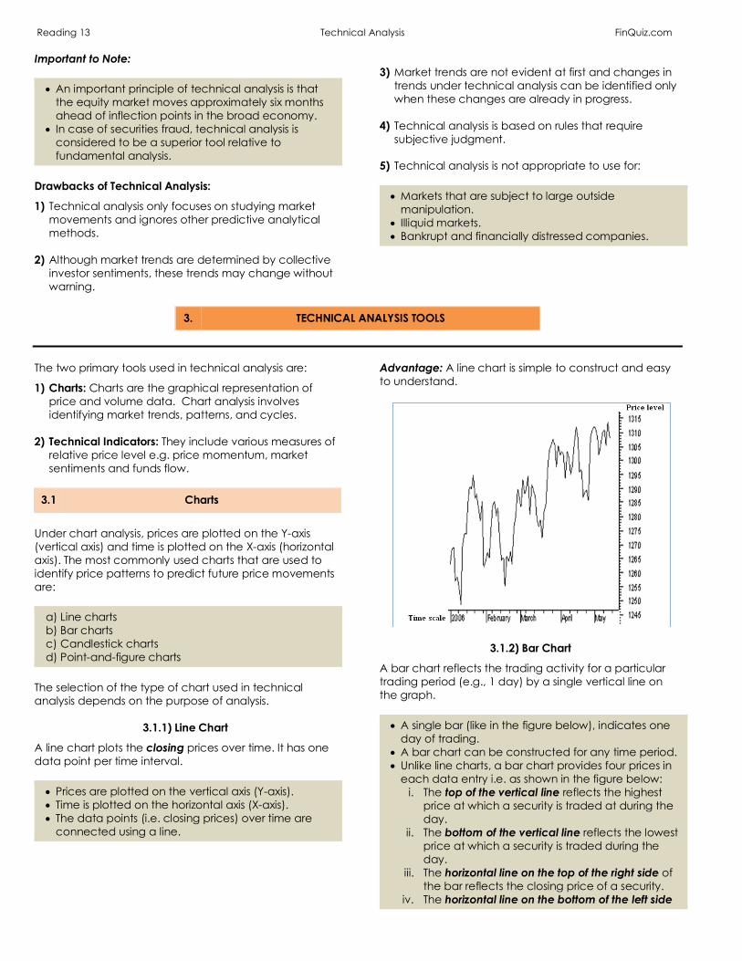
3.1.1) Line Chart
A line chart plots the closing prices over time. It has one data point per time interval. • Prices are plotted on the vertical axis (Y-axis). • Time is plotted on the horizontal axis (X-axis). • The data points (i.e. closing prices) over time are
connected using a line.
Advantage: A line chart is simple to construct and easy to understand.
3.1.2) Bar Chart
A bar chart reflects the trading activity for a particular trading period (e.g., 1 day) by a single vertical line on the graph. • A single bar (like in the figure below), indicates one
day of trading. • A bar chart can be constructed for any time period. • Unlike line charts, a bar chart provides four prices in
each data entry i.e. as shown in the figure below: i. The top of the vertical line reflects the highest
price at which a security is traded at during the day.
ii. The bottom of the vertical line reflects the lowest price at which a security is traded during the day.
iii. The horizontal line on the top of the right side of the bar reflects the closing price of a security.
iv. The horizontal line on the bottom of the left side
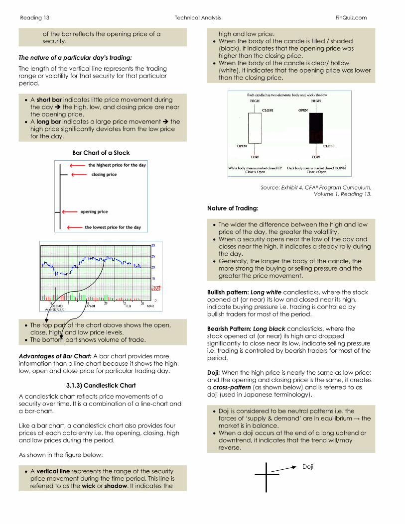
Reading 13 Technical Analysis FinQuiz.com
of the bar reflects the opening price of a security.
The nature of a particular day's trading:
The length of the vertical line represents the trading range or volatility for that security for that particular period. • A short bar indicates little price movement during
the day è the high, low, and closing price are near the opening price.
• A long bar indicates a large price movement è the high price significantly deviates from the low price for the day.
Bar Chart of a Stock
• The top part of the chart above shows the open, close, high, and low price levels.
• The bottom part shows volume of trade. Advantages of Bar Chart: A bar chart provides more information than a line chart because it shows the high, low, open and close price for particular trading day.
3.1.3) Candlestick Chart
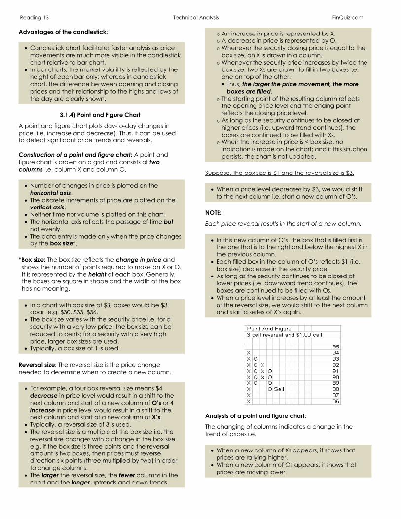
A candlestick chart reflects price movements of a security over time. It is a combination of a line-chart and a bar-chart. Like a bar chart, a candlestick chart also provides four prices at each data entry i.e. the opening, closing, high and low prices during the period. As shown in the figure below: • A vertical line represents the range of the security
price movement during the time period. This line is referred to as the wick or shadow. It indicates the
high and low price. • When the body of the candle is filled / shaded
(black), it indicates that the opening price was higher than the closing price.
• When the body of the candle is clear/ hollow (white), it indicates that the opening price was lower than the closing price.
Source: Exhibit 4, CFA® Program Curriculum, Volume 1, Reading 13.
Nature of Trading: • The wider the difference between the high and low
price of the day, the greater the volatility. • When a security opens near the low of the day and
closes near the high, it indicates a steady rally during the day.
• Generally, the longer the body of the candle, the more strong the buying or selling pressure and the greater the price movement.
Bullish pattern: Long white candlesticks, where the stock opened at (or near) its low and closed near its high, indicate buying pressure i.e. trading is controlled by bullish traders for most of the period. Bearish Pattern: Long black candlesticks, where the stock opened at (or near) its high and dropped significantly to close near its low, indicate selling pressure i.e. trading is controlled by bearish traders for most of the period. Doji: When the high price is nearly the same as low price; and the opening and closing price is the same, it creates a cross-pattern (as shown below) and is referred to as doji (used in Japanese terminology). • Doji is considered to be neutral patterns i.e. the
forces of ‘supply & demand’ are in equilibrium → the market is in balance.
• When a doji occurs at the end of a long uptrend or downtrend, it indicates that the trend will/may reverse.
Doji
Reading 13 Technical Analysis FinQuiz.com Advantages of the candlestick: • Candlestick chart facilitates faster analysis as price
movements are much more visible in the candlestick chart relative to bar chart.
• In bar charts, the market volatility is reflected by the height of each bar only; whereas in candlestick chart, the difference between opening and closing prices and their relationship to the highs and lows of the day are clearly shown.
3.1.4) Point and Figure Chart
A point and figure chart plots day-to-day changes in price (i.e. increase and decrease). Thus, it can be used to detect significant price trends and reversals. Construction of a point and figure chart: A point and figure chart is drawn on a grid and consists of two columns i.e. column X and column O. • Number of changes in price is plotted on the
horizontal axis. • The discrete increments of price are plotted on the
vertical axis. • Neither time nor volume is plotted on this chart. • The horizontal axis reflects the passage of time but
not evenly. • The data entry is made only when the price changes
by the box size*. *Box size: The box size reflects the change in price and shows the number of points required to make an X or O. It is represented by the height of each box. Generally, the boxes are square in shape and the width of the box has no meaning.
• In a chart with box size of $3, boxes would be $3
apart e.g. $30, $33, $36. • The box size varies with the security price i.e. for a
security with a very low price, the box size can be reduced to cents; for a security with a very high price, larger box sizes are used.
• Typically, a box size of 1 is used. Reversal size: The reversal size is the price change needed to determine when to create a new column. • For example, a four box reversal size means $4
decrease in price level would result in a shift to the next column and start of a new column of O’s or 4 increase in price level would result in a shift to the next column and start of a new column of X’s.
• Typically, a reversal size of 3 is used. • The reversal size is a multiple of the box size i.e. the
reversal size changes with a change in the box size e.g. if the box size is three points and the reversal amount is two boxes, then prices must reverse direction six points (three multiplied by two) in order to change columns.
• The larger the reversal size, the fewer columns in the chart and the longer uptrends and down trends.
o An increase in price is represented by X. o A decrease in price is represented by O. o Whenever the security closing price is equal to the
box size, an X is drawn in a column. o Whenever the security price increases by twice the
box size, two Xs are drawn to fill in two boxes i.e. one on top of the other. § Thus, the larger the price movement, the more
boxes are filled. o The starting point of the resulting column reflects
the opening price level and the ending point reflects the closing price level.
o As long as the security continues to be closed at higher prices (i.e. upward trend continues), the boxes are continued to be filled with Xs.
o When the increase in price is < box size, no indication is made on the chart; and if this situation persists, the chart is not updated.
Suppose, the box size is $1 and the reversal size is $3. • When a price level decreases by $3, we would shift
to the next column i.e. start a new column of O’s. NOTE:
Each price reversal results in the start of a new column. • In this new column of O’s, the box that is filled first is
the one that is to the right and below the highest X in the previous column.
• Each filled box in the column of O’s reflects $1 (i.e. box size) decrease in the security price.
• As long as the security continues to be closed at lower prices (i.e. downward trend continues), the boxes are continued to be filled with Os.
• When a price level increases by at least the amount of the reversal size, we would shift to the next column and start a series of X’s again.
Analysis of a point and figure chart:
The changing of columns indicates a change in the trend of prices i.e. • When a new column of Xs appears, it shows that
prices are rallying higher. • When a new column of Os appears, it shows that
prices are moving lower.
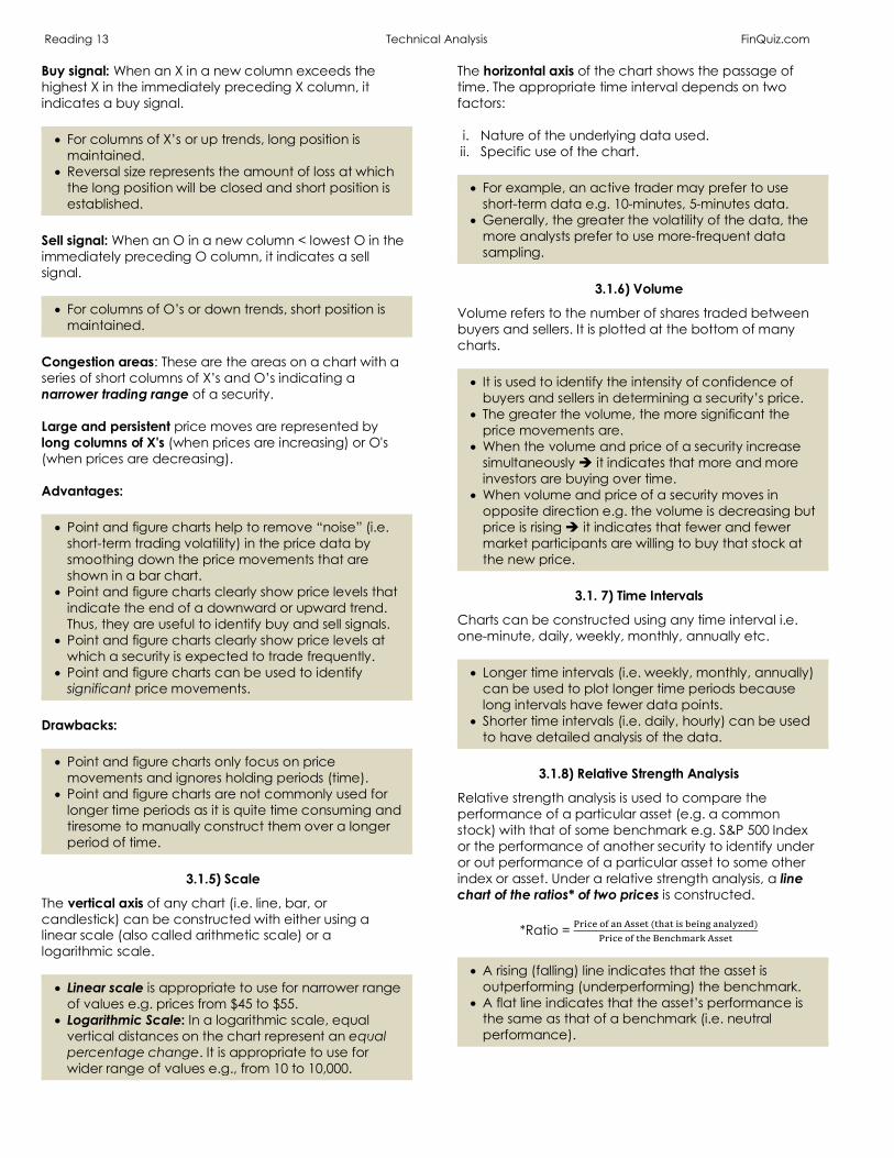
Reading 13 Technical Analysis FinQuiz.com Buy signal: When an X in a new column exceeds the highest X in the immediately preceding X column, it indicates a buy signal. • For columns of X’s or up trends, long position is
maintained. • Reversal size represents the amount of loss at which
the long position will be closed and short position is established.
Sell signal: When an O in a new column < lowest O in the immediately preceding O column, it indicates a sell signal. • For columns of O’s or down trends, short position is
maintained. Congestion areas: These are the areas on a chart with a series of short columns of X’s and O’s indicating a narrower trading range of a security. Large and persistent price moves are represented by long columns of X's (when prices are increasing) or O's (when prices are decreasing). Advantages: • Point and figure charts help to remove “noise” (i.e.
short-term trading volatility) in the price data by smoothing down the price movements that are shown in a bar chart.
• Point and figure charts clearly show price levels that indicate the end of a downward or upward trend. Thus, they are useful to identify buy and sell signals.
• Point and figure charts clearly show price levels at which a security is expected to trade frequently.
• Point and figure charts can be used to identify significant price movements.
Drawbacks: • Point and figure charts only focus on price
movements and ignores holding periods (time). • Point and figure charts are not commonly used for
longer time periods as it is quite time consuming and tiresome to manually construct them over a longer period of time.
3.1.5) Scale
The vertical axis of any chart (i.e. line, bar, or candlestick) can be constructed with either using a linear scale (also called arithmetic scale) or a logarithmic scale. • Linear scale is appropriate to use for narrower range
of values e.g. prices from $45 to $55. • Logarithmic Scale: In a logarithmic scale, equal
vertical distances on the chart represent an equal percentage change. It is appropriate to use for wider range of values e.g., from 10 to 10,000.
The horizontal axis of the chart shows the passage of time. The appropriate time interval depends on two factors: i. Nature of the underlying data used. ii. Specific use of the chart. • For example, an active trader may prefer to use
short-term data e.g. 10-minutes, 5-minutes data. • Generally, the greater the volatility of the data, the
more analysts prefer to use more-frequent data sampling.
3.1.6) Volume
Volume refers to the number of shares traded between buyers and sellers. It is plotted at the bottom of many charts. • It is used to identify the intensity of confidence of
buyers and sellers in determining a security’s price. • The greater the volume, the more significant the
price movements are. • When the volume and price of a security increase
simultaneously è it indicates that more and more investors are buying over time.
• When volume and price of a security moves in opposite direction e.g. the volume is decreasing but price is rising è it indicates that fewer and fewer market participants are willing to buy that stock at the new price.
3.1. 7) Time Intervals
Charts can be constructed using any time interval i.e. one-minute, daily, weekly, monthly, annually etc. • Longer time intervals (i.e. weekly, monthly, annually)
can be used to plot longer time periods because long intervals have fewer data points.
• Shorter time intervals (i.e. daily, hourly) can be used to have detailed analysis of the data.
3.1.8) Relative Strength Analysis
Relative strength analysis is used to compare the performance of a particular asset (e.g. a common stock) with that of some benchmark e.g. S&P 500 Index or the performance of another security to identify under or out performance of a particular asset to some other index or asset. Under a relative strength analysis, a line chart of the ratios* of two prices is constructed.
*Ratio = !"#$%'()*+,,%-(-/)-#,0%#*1)*)234%5)
!"#$%'(-/%7%*$/8)"9+,,%-
• A rising (falling) line indicates that the asset is
outperforming (underperforming) the benchmark. • A flat line indicates that the asset’s performance is
the same as that of a benchmark (i.e. neutral performance).

Reading 13 Technical Analysis FinQuiz.com Example:
Suppose, on 10th August 2010, the share price of Company A closed at $8.42 and the S&P 500 closed at $676.53.
Relative strength data point = 8.42/ 676.53 = 0.0124
Source: Exhibit 10, CFA® Program Curriculum, Volume 1, Reading 13.
3.2 Trend
A trend line is a straight line that connects periodic high or low prices on a chart and then extends into the future. Two common types of trend lines are: 1) Uptrend line: An uptrend is a sequence of higher highs
and higher lows. It is a positively sloped line and is drawn by connecting two or more low points. In order to have a positive slope, the second low point on a line must be greater than the first one.
• An uptrend line acts as support (discussed below) è
indicating bullish pattern i.e. there are more buyers than sellers (i.e. demand exceeds supply).
• When price remains above the uptrend line, it gives a signal to buy.
• When the closing price is significantly below the uptrend line (e.g. 5-10% below the trendline), it indicates that the uptrend is over and gives a signal to sell.
• The longer the price remains below the trendline, the more meaningful the breakdown in price is considered to be.
NOTE:
Retracement refers to a reversal in the movement of the security's price.
2) Downtrend line: A downtrend is a sequence of lower lows and lower highs. It is a negatively sloped line and is drawn by connecting two or more high points. In order to have a negative slope, the second low point on a line must be less than the first one.
• A downtrend line acts as resistance (discussed
below) è indicating bearish pattern i.e. there are more sellers than buyers (i.e. supply exceeds demand).
• When price remains below the downtrend line, it gives a signal to go short/sell.
• When the closing price is significantly above the downtrend line (e.g. 5-10% above the trendline), it indicates that the downtrend is over and gives a signal to go long/buy.
• The longer the price remains above the trendline, the more meaningful the breakout in price is considered to be.
NOTE: • From the technical analysis perspective, the reason
behind selling or buying is irrelevant. • In up trends, it is rare that a security with unattractive
fundamentals has an attractive technical position. • In downtrends, a security may have attractive
fundamentals but a currently negative technical position.
Important to Note: • It is not always possible to draw a trend line for every
security. • Technical analysis is less useful when a security is not

Reading 13 Technical Analysis FinQuiz.com
in a trend. • Trend lines can provide useful information; however,
they may give false signals when used improperly. • The trading decisions should not solely be based on
trend lines. • Trendlines and trendline breakdown/breakout vary
with time interval i.e. a chart with a shorter time-interval may have a different trendline as well as a different trendline breakdown relative to a chart with a longer time-interval.
Support: Support is the level at which a security’s price stops falling because buying activity increases such that supply no longer exceeds demand. Resistance: Resistance is the level at which a security’s price stops rising because selling activity increases such that supply becomes greater than demand. • Support and resistance levels can be sloped lines or
horizontal lines. Change in Polarity Principle: According to this principle, once a support (resistance) level is breached, it becomes a resistance (support) level. Congestion occurs when a security trades in a narrow price range on low volumes. A congestion area indicates that the forces of supply and demand are evenly balanced. • When the price breaks out of the congestion area
by penetrating the support it gives a signal to buy. • When the price breaks out of the congestion area
by penetrating resistance it gives a signal to sell.
3.3 Chart Patterns
Chart patterns refer to some type of recognizable shape in price charts that graphically reflect the collective behavior of the market participants at a given time. These patterns can be used to predict security prices. However, it is important to note that chart patterns have no predictive value without a clear trend in place prior to the pattern. Chart patterns can be divided into two categories: 1) Reversal patterns: A reversal pattern indicates the end
of a trend i.e. change in the direction of price movement of a financial instrument. Its types are discussed in section 3.3.1.1 to 3.3.1.6 below.
2) Continuation patterns: A continuation pattern indicates that the ongoing trend will continue for some time i.e. the direction of the price movement will continue to follow the same trend as it was before the formation of the pattern.
• From the supply/demand perspective, a
continuation pattern indicates a change in ownership from one group of investors to another.
• Generally, it is referred to as a “healthy correction” because, for example, if the price is declining, it will quickly start rising as another set of investors will start buying è indicating that the long-term market trend will continue to be the same.
• Its types are discussed in section 3.3.2.1 to 3.3.2.3 below.
3.3.1.1 Head and Shoulders
The head and shoulders pattern is a type of a reversal pattern and it is most often observed in uptrends. • It must be noted that without a prior uptrend, there
cannot be a Head and Shoulders reversal pattern. • The formation of a head and shoulders pattern is
considered to be a bearish indicator (i.e. end of uptrend).
It consists of three parts i.e. 1) Left shoulder: It reflects the high point of the current
uptrend with a strong volume. After this point, the rally reverses back (price falls) to the initial price level at which the left shoulder started i.e. forming an inverted “V pattern” with lower volume.
• It reflects the first peak and is associated with high
volume i.e. highly aggressive buying pressure. NOTE:
Rally refers to a period of sustained increases in the prices of stocks. 2) Head: The head refers to a part that starts from the
low point of the left shoulder and shows a more pronounced uptrend (rally), however, with a lower volume relative to upward side of the left shoulder.
After reaching the peak point, the price again starts to fall to the same level at which the left shoulder started and ended. This price level is referred to as the neckline* and is below the uptrend line preceding the beginning of the head and shoulders pattern. The head pattern gives the first signal of a reversal è indicating the end of the rally. • It reflects the middle peak (highest) and is
associated with moderate volumeèless aggressive buying è fewer bullish market participants.
• The top of the head reflects a new higher price but without increase in volume. This situation is referred
Reading 13 Technical Analysis FinQuiz.com
to as divergence. 3) Right shoulder: The right shoulder is a mirror image (or
roughly a mirror image) of the left shoulder but with lower volume. It is formed when the price rises from the low of the head.
• It reflects the third peak and is associated with lower
volume relative to head è indicating significantly lower demand, resulting in decline in prices.
• This peak is lower than that of the head and is approximately the same as the first peak.
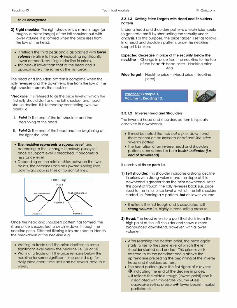
The head and shoulders pattern is complete when the rally reverses and the downtrend line from the low of the right shoulder breaks the neckline. *Neckline: It is referred to as the price level at which the first rally should start and the left shoulder and head should decline. It is formed by connecting two low points i.e.
i. Point 1: The end of the left shoulder and the
beginning of the head.
ii. Point 2: The end of the head and the beginning of the right shoulder.
• The neckline represents a support level; and
according to the “change in polarity principle”, once a support level is breached, it becomes a resistance level.
• Depending on the relationships between the two points, the necklines can be upward sloping lines, downward sloping lines or horizontal lines.
Once the head and shoulders pattern has formed, the share price is expected to decline down through the neckline price. Different filtering rules are used to identify the breakdown of the neckline e.g. • Waiting to trade until the price declines to some
significant level below the neckline i.e. 3% or 5%. • Waiting to trade until the price remains below the
neckline for some significant time period e.g. for daily price chart, time limit can be several days to a week.
3.3.1.3 Setting Price Targets with Head and Shoulders Pattern
Under a head and shoulders pattern, a technician seeks to generate profit by short selling the security under analysis. For this purpose, the price target is set as follows. In a head and shoulders pattern, once the neckline support is broken, Expected decrease in price of the security below the neckline = Change in price from the neckline to the top of the head è Head price - Neckline price
And
Price Target = Neckline price – (Head price - Neckline price)
3.3.1.2 Inverse Head and Shoulders
The inverted head and shoulders pattern is typically observed in downtrends. • It must be noted that without a prior downtrend,
there cannot be an inverted Head and Shoulders reversal pattern.
• The formation of an inverse head and shoulders pattern is considered to be a bullish indicator (i.e. end of downtrend).
It consists of three parts i.e. 1) Left shoulder: This shoulder indicates a strong decline
in prices with strong volume and the slope of this downtrend is greater than the prior downtrend. After this point of trough, the rally reverses back (i.e. price rises) to the initial price level at which the left shoulder started i.e. forming a V pattern, but on lower volume.
• It reflects the first trough and is associated with
strong volume i.e. highly intense selling pressure. 2) Head: The head refers to a part that starts from the
high point of the left shoulder and shows a more pronounced downtrend, however, with a lower volume.
• After reaching the bottom point, the price again
starts to rise to the same level at which the left shoulder started and ended. This price level is referred to as the neckline* and is above the uptrend line preceding the beginning of the inverse head and shoulders pattern.
• The head pattern gives the first signal of a reversal è indicating the end of the decline in prices. o It reflects the middle trough (lowest point) and is
associated with moderate volume èless aggressive selling pressureè fewer bearish market participants.
Practice: Example 1, Volume 1, Reading 13.
Reading 13 Technical Analysis FinQuiz.com 3) Right shoulder: The right shoulder is a mirror image (or
roughly a mirror image) of the left shoulder but with lower volume. It is formed when the price falls from the high point of the head.
• The price declines down to roughly the same level as
the first shoulder; however, the bottom point is higher than that of the head and is approximately the same as the first trough.
• It reflects the third trough (or bottom point) and is associated with lower volume relative to head è indicating significantly lower selling pressure, resulting in rise in prices.
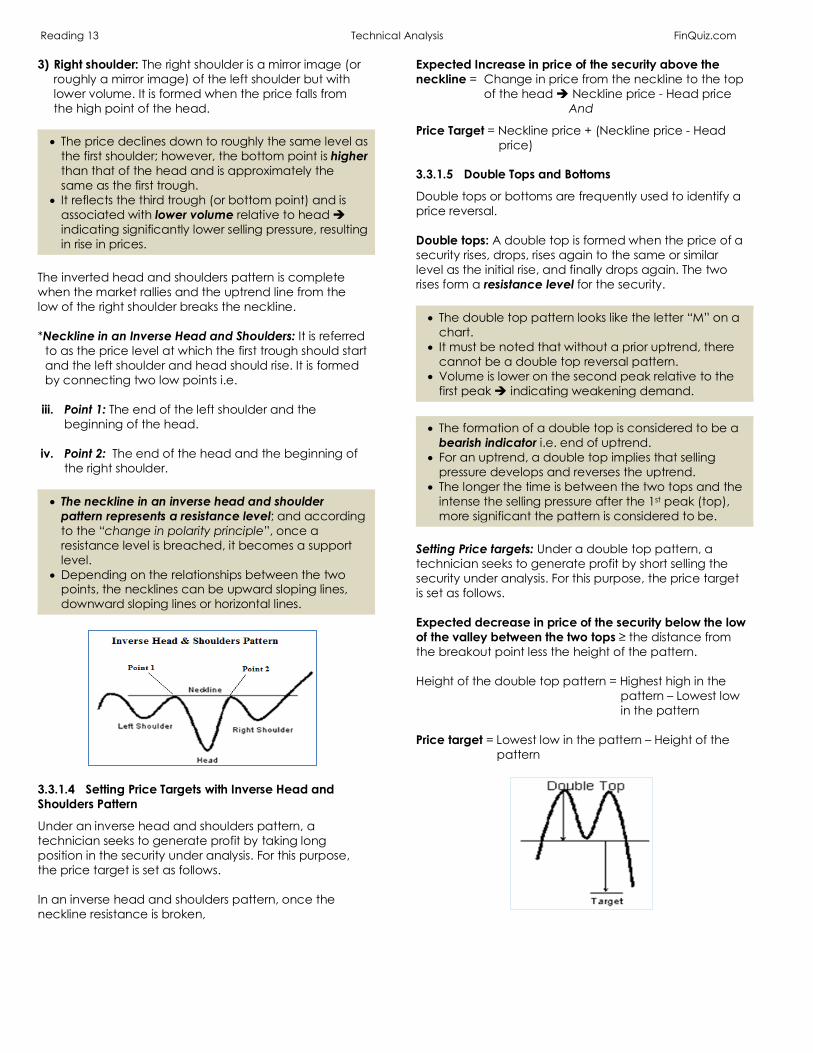
The inverted head and shoulders pattern is complete when the market rallies and the uptrend line from the low of the right shoulder breaks the neckline. *Neckline in an Inverse Head and Shoulders: It is referred
to as the price level at which the first trough should start and the left shoulder and head should rise. It is formed by connecting two low points i.e.
iii. Point 1: The end of the left shoulder and the
beginning of the head.
iv. Point 2: The end of the head and the beginning of the right shoulder.
• The neckline in an inverse head and shoulder
pattern represents a resistance level; and according to the “change in polarity principle”, once a resistance level is breached, it becomes a support level.
• Depending on the relationships between the two points, the necklines can be upward sloping lines, downward sloping lines or horizontal lines.
3.3.1.4 Setting Price Targets with Inverse Head and Shoulders Pattern
Under an inverse head and shoulders pattern, a technician seeks to generate profit by taking long position in the security under analysis. For this purpose, the price target is set as follows. In an inverse head and shoulders pattern, once the neckline resistance is broken,
Expected Increase in price of the security above the neckline = Change in price from the neckline to the top of the head è Neckline price - Head price
And
Price Target = Neckline price + (Neckline price - Head price)
3.3.1.5 Double Tops and Bottoms
Double tops or bottoms are frequently used to identify a price reversal. Double tops: A double top is formed when the price of a security rises, drops, rises again to the same or similar level as the initial rise, and finally drops again. The two rises form a resistance level for the security. • The double top pattern looks like the letter “M” on a
chart. • It must be noted that without a prior uptrend, there
cannot be a double top reversal pattern. • Volume is lower on the second peak relative to the
first peak è indicating weakening demand. • The formation of a double top is considered to be a
bearish indicator i.e. end of uptrend. • For an uptrend, a double top implies that selling
pressure develops and reverses the uptrend. • The longer the time is between the two tops and the
intense the selling pressure after the 1st peak (top), more significant the pattern is considered to be.
Setting Price targets: Under a double top pattern, a technician seeks to generate profit by short selling the security under analysis. For this purpose, the price target is set as follows.
Expected decrease in price of the security below the low of the valley between the two tops ≥ the distance from the breakout point less the height of the pattern. Height of the double top pattern = Highest high in the
pattern – Lowest low in the pattern
Price target = Lowest low in the pattern – Height of the
pattern
Reading 13 Technical Analysis FinQuiz.com Example:
Suppose, • The lowest low of the double top = $250. • The highest high of the double top = $280.
Height of the pattern = $280 - $250 = $30 Target Price = $250 - $30 = $220
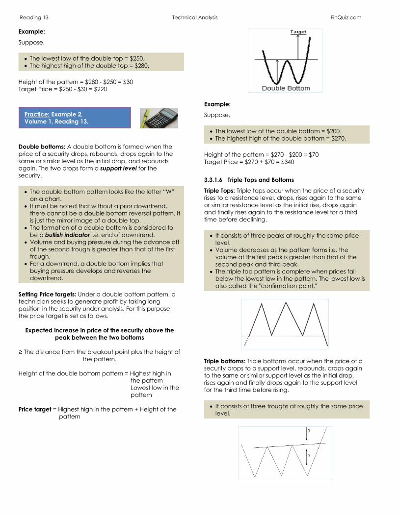
Double bottoms: A double bottom is formed when the price of a security drops, rebounds, drops again to the same or similar level as the initial drop, and rebounds again. The two drops form a support level for the security. • The double bottom pattern looks like the letter “W”
on a chart. • It must be noted that without a prior downtrend,
there cannot be a double bottom reversal pattern. It is just the mirror image of a double top.
• The formation of a double bottom is considered to be a bullish indicator i.e. end of downtrend.
• Volume and buying pressure during the advance off of the second trough is greater than that of the first trough.
• For a downtrend, a double bottom implies that buying pressure develops and reverses the downtrend.
Setting Price targets: Under a double bottom pattern, a technician seeks to generate profit by taking long position in the security under analysis. For this purpose, the price target is set as follows.
Expected increase in price of the security above the peak between the two bottoms
≥ The distance from the breakout point plus the height of
the pattern. Height of the double bottom pattern = Highest high in
the pattern – Lowest low in the pattern
Price target = Highest high in the pattern + Height of the
pattern
Example:
Suppose, • The lowest low of the double bottom = $200. • The highest high of the double bottom = $270.
Height of the pattern = $270 - $200 = $70 Target Price = $270 + $70 = $340
3.3.1.6 Triple Tops and Bottoms
Triple Tops: Triple tops occur when the price of a security rises to a resistance level, drops, rises again to the same or similar resistance level as the initial rise, drops again and finally rises again to the resistance level for a third time before declining. • It consists of three peaks at roughly the same price
level. • Volume decreases as the pattern forms i.e. the
volume at the first peak is greater than that of the second peak and third peak.
• The triple top pattern is complete when prices fall below the lowest low in the pattern. The lowest low is also called the "confirmation point."
Triple bottoms: Triple bottoms occur when the price of a security drops to a support level, rebounds, drops again to the same or similar support level as the initial drop, rises again and finally drops again to the support level for the third time before rising. • It consists of three troughs at roughly the same price
level.
Practice: Example 2, Volume 1, Reading 13.

Reading 13 Technical Analysis FinQuiz.com Challenges of the double top & bottom and triple top & bottom patterns: • Double top and triple top patterns cannot be
identified ex-ante. • There is no guarantee that downtrend (uptrend)
must end with a double bottom (double top). Important to note: • Double tops and bottoms are considered to be
more significant patterns than single tops and bottoms.
• Triple tops and bottoms are considered to be more significant patterns than double tops and bottoms.
• The greater the number of times the price reverses at the same level, and the greater the time interval during which this pattern occurs è the more significant the pattern is considered to be.
3.3.2.1 Triangles
Triangle patterns are a type of continuation pattern. These patterns are formed when the distance between high and low prices narrows. In this pattern, a triangle is formed by connecting two trendlines i.e. i. One trendline connects the high prices. ii. Other trendline connects the low prices. Types of Triangle Patterns: There are three types of triangle patterns. 1) Symmetrical triangles: A symmetrical triangle is
formed by connecting two trendlines i.e. a descending resistance line and an ascending support line. These two lines must have the same slope in order to reflect a symmetrical pattern.
• These patterns are formed in markets where both the
buyers and sellers are uncertain about the direction of price movement.
• These patterns indicate that buyers are becoming more bullish while, simultaneously, sellers are becoming more bearish è such that the forces of supply and demand are nearly equal.
• These patterns end in the same direction as the trend that preceded it i.e. either uptrend or downtrend.
Measuring Implication: It refers to the height of a triangle, where,
Height of a triangle = Price at the start of the downward sloping trendline – Price at the start of the upward sloping trendline
• The vertical bar in Exhibit 20 below represents the
measuring implication.
Source: Exhibit 20, CFA® Program Curriculum, Volume 1, Reading 13.
2) Ascending triangles: They are typically formed in an
uptrend and are considered to be bullish indicators. In an ascending triangle, • The trendline that connects the high prices is
horizontal in shape è reflecting that sellers are earning profits at around the same price point.
• The trendline that connects the low prices is an upward sloping line.
An ascending triangle indicates that: • The security is being sold by market participants at
the same price level over a period of time è resulting in an end to uptrend.
• However, the buyers are becoming more and more bullish è resulting in rise in prices.
• Then, buying pressure weakens and price fall, although at a higher level than before.
• But demand again rises and prices increase at their previous high level.
• Eventually, prices breakout through the previous high level and continue rising as demand increases è representing a rally.
As shown in the figure below, the rally continues beyond the triangle and it is considered to be a bullish signal.
Reading 13 Technical Analysis FinQuiz.com
3) Descending triangles: They are typically formed in a downtrend and are considered to be bearish indicators.
In a descending triangle, • The trendline that connects the low prices is
horizontal in shape è reflecting that sellers are earning profits at around the same price point.
• The trendline that connects the high prices is a downward sloping line.
A descending triangle indicates that: • As the prices fall due to selling pressure, demand
increases è resulting in an end to a downtrend è prices rise.
• However, higher price attracts more sellers and prices drop to their previous low level.
• Then, selling pressure weakens and prices begin to rise, but at a lower level than before è reflecting that selling pressure has greater impact on prices than that of buying.
• But, selling pressure again rises and prices decrease at their previous low level.
• Eventually, prices breakdown through the previous low level and continue declining as supply increases.
Important to Note: • The longer the time period during which the triangle
pattern occurs, the more volatile and sustained the subsequent price movement is likely to be.
• Typically, triangles should break out about half to three-quarters of the way through the pattern formation.
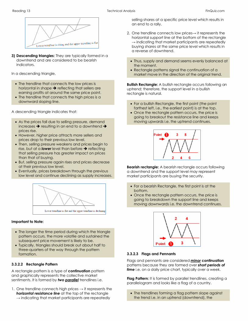
3.3.2.2 Rectangle Pattern
A rectangle pattern is a type of continuation pattern and graphically represents the collective market sentiments. It is formed by two parallel trendlines i.e. 1. One trendline connects high prices → it represents the
horizontal resistance line at the top of the rectangle → indicating that market participants are repeatedly
selling shares at a specific price level which results in an end to a rally.
2. One trendline connects low prices→ it represents the horizontal support line at the bottom of the rectangle → indicating that market participants are repeatedly buying shares at the same price level which results in a reverse of downtrend.
• Thus, supply and demand seems evenly balanced at
the moment. • Rectangle patterns signal the continuation of a
market move in the direction of the original trend. Bullish Rectangle: A bullish rectangle occurs following an uptrend; therefore, the support level in a bullish rectangle is natural. • For a bullish Rectangle, the first point (the point
farthest left, i.e., the earliest point) is at the top. • Once the rectangle pattern occurs, the price is
going to breakout the resistance line and keeps moving upwards i.e. the uptrend continues.
Bearish rectangle: A bearish rectangle occurs following a downtrend and the support level may represent market participants are buying the security. • For a bearish Rectangle, the first point is at the
bottom. • Once the rectangle pattern occurs, the price is
going to breakdown the support line and keeps moving downwards i.e. the downtrend continues.
3.3.2.3 Flags and Pennants
Flags and pennants are considered minor continuation patterns because they are formed over short periods of time i.e. on a daily price chart, typically over a week. Flag Pattern: It is formed by parallel trendlines, creating a parallelogram and looks like a flag of a country. • The trendlines forming a flag pattern slope against
the trend i.e. in an uptrend (downtrend), the

Reading 13 Technical Analysis FinQuiz.com
trendlines slope downwards (upwards). • Flag patterns signal the continuation of a market
move in the direction of the original trend. Expected change in price ≥ Change in price from the
start of the trend to the formation of the flag
Thus,
Price Target = Price level at which the flag ends – (Price level at which the trend starts - Price level at which the flag starts to form)
Pennant Pattern: It is formed by two trendlines that converge to create a triangle and looks like the pennants of many sports teams or pennants flown on ships. • It is important to note that a pennant is a short-term
pattern and is typically smaller in size (volatility) and duration; whereas, a triangle is a long-term pattern.
• Pennant patterns signal the continuation of a market move in the direction of the original trend.
Expected change in price ≥ Change in price from the start of the trend to the formation of the pennant Thus,
Price Target = Price level at which the pennant ends – (Price level at which the trend starts - Price level at which the pennant starts to form)
Example:
Suppose,
A downtrend begins at point A, at price = $104. A pennant begins to form at point B, at price = $70. The pennant ends at point C, at price = $76. Price Target = $76 – ($104 - $70) = $42
Source: Exhibit 22, CFA® Program Curriculum, Volume 1, Reading 13.
Reading 13 Technical Analysis FinQuiz.com
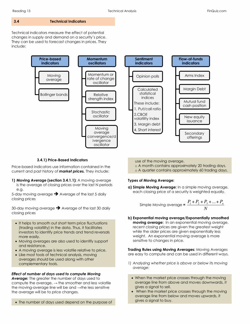
3.4 Technical Indicators
Technical indicators measure the effect of potential changes in supply and demand on a security’s price. They can be used to forecast changes in prices. They include:
3.4.1) Price-Based Indicators
Price-based indicators use information contained in the current and past history of market prices. They include: 1) Moving Average (section 3.4.1.1): A moving average
is the average of closing prices over the last N periods e.g.
5-day moving average è Average of the last 5 daily closing prices 30-day moving average è Average of the last 30 daily closing prices • It helps to smooth out short term price fluctuations
(trading volatility) in the data. Thus, it facilitates investors to identify price trends and trend reversals more easily.
• Moving averages are also used to identify support and resistance.
• A moving average is less volatile relative to price. • Like most tools of technical analysis, moving
averages should be used along with other complementary tools.
Effect of number of days used to compute Moving Average: The greater the number of days used to compute the average, → the smoother and less volatile the moving-average line will be and →the less sensitive the average will be to price changes. • The number of days used depend on the purpose of
use of the moving average. o A month contains approximately 20 trading days. o A quarter contains approximately 60 trading days.
Types of Moving Average:
a) Simple Moving Average: In a simple moving average, each closing price of a security is weighted equally.
Simple Moving average =
b) Exponential moving average/Exponentially smoothed
moving average: In an exponential moving average, recent closing prices are given the greatest weight while the older prices are given exponentially less weight. An exponential moving average is more sensitive to changes in price.
Trading Rules using Moving Averages: Moving Averages are easy to compute and can be used in different ways. 1) Analyzing whether price is above or below its moving
average: • When the market price crosses through the moving
average line from above and moves downwards, it gives a signal to sell.
• When the market price crosses through the moving average line from below and moves upwards, it gives a signal to buy.
Price-based indicators
Moving average
Bollinger bands
Momentum oscillators
Momentum or rate of change
oscillator
Relative strength index
Stochastic oscillator
Moving average
convergence/divergence oscillator
Sentiment indicators
Opinion polls
Calculated statistical indices
These include:1. Put/call ratio2.CBOE volatility index3. Margin debt4. Short interest
Flow-of-funds indicators
Arms Index
Margin Debt
Mutual fund cash position
New equity issuance
Secondary offerings
P1 +P2 +P3 +...+PnN

Reading 13 Technical Analysis FinQuiz.com
2) Analyze the distance between the moving-average line and price i.e.
• When a price starts to move upwards toward its
moving average, it acts as a resistance level. • When a price reaches the moving-average line, it
gives a warning signal that rally is about to end; thus, security should be sold.
3) Analyzing short-term and long-term moving average: When a short-term moving average crosses a long-term average from: • Below, it is considered to be a bullish indicator and is
referred to as Golden Cross. • Above, it is considered to be a bearish indicator and
is referred to as Dead Cross.
Source: Exhibit 23, CFA® Program Curriculum, Volume 1, Reading 13.
NOTE: • A trading strategy derived from an optimized
moving average computed for one security may not work for other similar and/or dissimilar securities.
• A trading strategy derived from an optimized moving average computed for one security may not be useful if market conditions change.
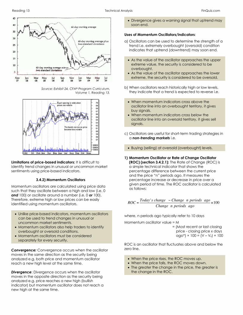
2) Bollinger Bands (3.4.1.2): Bollinger Bands are plotted
at standard deviation levels above and below a moving average. i.e.
a) Moving average of the closing price + Higher band • Where, higher band è Moving average + a set
number of standard deviations from average price (e.g. 2 S.Ds above the mean)
b) Moving average of the closing price + Lower band • Where, lower band è Moving average - a set
number of standard deviations from average price (e.g. 2 S.Ds below the mean)
Since standard deviation is a measure of volatility, the bands are self-adjusting i.e. they widen during volatile markets and contract during less volatile periods. • The difference between the bands represents
volatility i.e. the higher the price volatility, the wider the range between the two outer bands.
Trading rules using Bollinger Bands:
a) Contrarian strategy i.e. sell (buy) a security when its price reaches the upper (lower) band.
• This strategy assumes that the security price will
remain within the bands. • This strategy results in a large number of trades and
consequently higher trading costs; however, it also reduces risk of loss as investors can exit unprofitable trades.
• This strategy is not profitable in case of large price movements and changes in trend.
b) When the bands tighten (i.e. as volatility decreases),
sharp price changes tend to occur.
c) When prices move outside the bands, it indicates that the current trend will continue i.e.
• When a price significantly* breaks out above the
upper band → it signals that a change in trend is expected to persist for some time → thus, long-term investors may prefer to buy.
• When a price significantly* breaks down below the lower band → it signals that a change in trend is expected to persist for some time → thus, long-term investors may prefer to sell.
(*e.g. 5% -10% or for a certain period of time e.g. week for a daily price chart)
Reading 13 Technical Analysis FinQuiz.com
Source: Exhibit 24, CFA® Program Curriculum, Volume 1, Reading 13.
Limitations of price-based indicators: It is difficult to identify trend changes in unusual or uncommon market sentiments using price-based indicators.
3.4.2) Momentum Oscillators
Momentum oscillators are calculated using price data such that they oscillate between a high and low (i.e. 0 and 100) or oscillate around a number (i.e. 0 or 100). Therefore, extreme high or low prices can be easily identified using momentum oscillators. • Unlike price-based indicators, momentum oscillators
can be used to trend changes in unusual or uncommon market sentiments.
• Momentum oscillators also help traders to identify overbought or oversold conditions.
• Momentum oscillators must be considered separately for every security.
Convergence: Convergence occurs when the oscillator moves in the same direction as the security being analyzed e.g. both price and momentum oscillator reach a new high level at the same time. Divergence: Divergence occurs when the oscillator moves in the opposite direction as the security being analyzed e.g. price reaches a new high (bullish indicator) but momentum oscillator does not reach a new high at the same time.
• Divergence gives a warning signal that uptrend may soon end.
Uses of Momentum Oscillators/indicators:
a) Oscillators can be used to determine the strength of a trend i.e. extremely overbought (oversold) condition indicates that uptrend (downtrend) may soon end.
• As the value of the oscillator approaches the upper
extreme value, the security is considered to be overbought.
• As the value of the oscillator approaches the lower extreme, the security is considered to be oversold.
b) When oscillators reach historically high or low levels,
they indicate that a trend is expected to reverse i.e. • When momentum indicators cross above the
oscillator line into an overbought territory, it gives buy signals.
• When momentum indicators cross below the oscillator line into an oversold territory, it gives sell signals.
c) Oscillators are useful for short-term trading strategies in
a non-trending markets i.e. • Buying (selling) at oversold (overbought) levels.
1) Momentum Oscillator or Rate of Change Oscillator
(ROC) (section 3.4.2.1): The Rate of Change (ROC) is a simple technical indicator that shows the percentage difference between the current price and the price “n” periods ago. It measures the percentage increase or decrease in price over a given period of time. The ROC oscillator is calculated as follows:
where, n periods ago typically refer to 10 days
Momentum oscillator value = M = (Most recent or last closing
price - closing price x days ago*) × 100 = (V – Vx) × 100
ROC is an oscillator that fluctuates above and below the zero line. • When the price rises, the ROC moves up. • When the price falls, the ROC moves down. • The greater the change in the price, the greater is
the change in the ROC.
ROC = Today 's change − Change n periods agoChange n periods ago
×100

Reading 13 Technical Analysis FinQuiz.com Trading rules using ROC:
a) When the ROC oscillator crosses above the zero line into the positive (overbought) territory, it is viewed as a buy signal.
b) When the ROC oscillator crosses below the zero line into the negative (oversold) territory, it is viewed as a sell signal.
• Generally, the higher (lower) the ROC, the more
overbought (sold) security is considered to be. • However, in many cases, the extremely
overbought/oversold ROC may indicate that the recent trend is going to continue.
• It is important to note that as long as the ROC remains positive (negative), it signals that prices are constantly increasing (decreasing).
NOTE:
Generally, When the ROC oscillator crosses the 0 level in the opposite direction as that of the trend, it is ignored by technicians. Alternative method of calculating oscillators: Oscillators can be calculated using the following formula by setting them in a way so that they fluctuate above and below 100, instead of 0.
Momentum oscillator value = M = :
:; × 100
Trading rule: When the oscillator moves above (below) outside this range by a significant amount, it indicates that the security's close was the highest (lowest) price that the security has traded during the preceding n-time periods. NOTE:
Like all technical indicator, the ROC oscillator should be used in conjunction with other tools of technical analysis. 2) Relative Strength Index (section 3.4.2.2): Relative
strength index (RSI) measures the relative strength of a security against itself i.e. it graphically compares the magnitude of recent gains of a security to its recent losses and this information is converted into a number that ranges from 0 to 100*. It helps to determine whether the security is overbought or oversold.
• RSI is also known as Wilder RSI. • RSI is computed over a rolling time period. • RSI uses a single parameter that is the number of
time periods in its calculation (generally, 14-day time period is used). o Shorter time periods (i.e. 14-days) can be used to
analyze short-term price behavior. o Longer time periods (i.e. 200 days) can be used to
smooth out short-term price volatility.
RSI is computed as follows:
𝑅𝑆𝐼 = 100 −𝟏𝟎𝟎𝟏 +𝑹𝑺
where,
𝑅𝑆
= ∑(Upchangesfortheperiodunderconsideration)
∑(|Downchangesfortheperiodunderconsideration|)è𝑒. 𝑔.
𝑅𝑆 = Totalofgainsduringthefirst14periodsTotaloflossesduringthefirst14periods
• Note that sum of losses is also reported as positive
value. Trading Rule: *As mentioned above, RSI converts the information into number that lies within 0 and 100. • When RSI ≥ 70 è it indicates market is overbought →
do not buy (long) èSell signal. • When RSI ≤ 30è it indicates market is oversold → do
not sell (short) èBuy signal. Generally, less volatile stocks (i.e. utilities) may trade in a narrower range whereas more volatile stocks (i.e. small-capitalization technology stocks) may trade in a wider range. NOTE:
The range of RSI is not necessarily symmetrical around 50 e.g. uptrend may range from 40-80 and downtrend may range from 20-60. Example:
Computing an RSI for one month. It would be a 22-day RSI with 21 price changes i.e. • 11 up changes. • 9 down changes. • 1 no change.
In order to compute RSI, we would: • Add 11 up changes, suppose they sum to $1.50. • Add 9 down changes, suppose they sum to –$1.57.
RS = $c.de
$c.df = $0.96
RSI = 100 - cee
cge.hi = 100 – 51.02 = 48.98
Practice: Example given below Exhibit 26, Volume 1, Reading 13.

Reading 13 Technical Analysis FinQuiz.com IMPORTANT TO NOTE:
RSI is a momentum oscillator and is different from the relative strength analysis (which plots the ratio of two security prices over time). 3) Stochastic Oscillator (section 3.4.2.3): The stochastic
oscillator measures the relationship between the close, high and low prices and is based on the assumption that:
a) During uptrends, prices tend to close at or near top
of each period's trading range. b) During downtrends, prices tend to close at or near
bottom of each period's trading range. Trading rules:
a) Bullish signal: If a security’s price constantly rises during the day and also closes near the top of the range, it indicates buying pressure.
b) Bearish signal: If a security’s price constantly falls during the day and also closes near the bottom of the range, it indicates selling pressure.
c) If security’s price constantly rises (falls) during the day but then starts to decline (rise) by the close, it signals that the rally (downtrend) is not expected to continue.
Drawback of using shorter time period: The shorter the time period is used, the more volatile the oscillator is and the more false signals it generates. Computation of stochastic oscillator: The stochastic oscillator is composed of two lines, known as %K and %D. They are calculated as follows:
%𝐾 = 100lC − L14H14 − L14p
where,
C = latest closing price L14 = lowest price in past 14 days H14 = highest price in past 14 days • %K is the faster moving line. • %K line shows that latest closing price was in the %K
percentile of the high-low range.
And
%D = Average of the last three %K values calculated daily
• %D is slower moving, smoother line and is referred to
as the Signal line. Trading rules:
a) Buy signals occur when the stochastic oscillator crosses above 20% level.
b) Sell signals occur when the stochastic oscillator crosses below 80% level.
NOTE:
Like RSI, stochastic oscillator is not necessarily symmetrical around 50. c) When the %K crosses %D line from below, it is
considered a bullish short-term trading signal. d) When the %K crosses %D line from above, it is
considered a bearish short-term trading signal. Like RSI, the stochastic oscillator always ranges between 0% and 100% and generally uses 14-day time period (however it can be adjusted). • When the stochastic oscillator is 0% (100%), it shows
that the security's close was the lowest (highest) price that the security has traded during the preceding n-time periods.
NOTE:
Like all technical indicator, the stochastic oscillator should be used in conjunction with other tools of technical analysis. • When both the stochastic oscillator and other tools
give same signals, it is referred to as convergence/confirmation condition.
• When the stochastic oscillator and other tools give conflicting signals, it is referred to as divergence condition and suggests that trader should do further analysis.
4) Moving-Average Convergence/Divergence Oscillator
(section 3.4.2.4): The moving-average convergence/divergence oscillator is commonly referred to as MACD, pronounced as Mack Dee. The MACD is the difference between a short-term and a long-term moving average of the security's price. The MACD is composed of two lines i.e.
1. MACD line: It is the difference between 26-day and
12-day exponential moving average.
2. Signal line: It is a 9-day exponentially smoothed moving average. This line is plotted on top of the MACD line to reflect buy/sell opportunities.
The resulting outcome is an MACD oscillator indicator that oscillates around zero and has no upper or lower limit. Trading rules: MACD in technical analysis can be used in three ways. a) Crossovers of the MACD line and the signal line: • When the MACD crosses above the signal line into
overbought territory, it gives Buy signals. • When the MACD crosses below the signal line into
oversold territory, it gives Sell signals.

Reading 13 Technical Analysis FinQuiz.com b) Comparing the current level of the MACD oscillator for
a security with its historical level to discern when a security is trading beyond its normal sentiment range:
• When the current level of the MACD oscillator is
unusually low compared to its historical level, it indicates that the security is oversold and gives a bullish signal.
• When the current level of the MACD oscillator is unusually high compared to its historical level, it indicates that the security is overbought and gives an early warning of a bearish signal.
c) Analyzing trend lines on the MACD itself: • When both the MACD and the price trend are in the
same direction, it is referred to as convergence and it signals the continuation of the current trend.
• When the MACD and the price trend are in opposite direction, it is referred to as divergence and signals the end of the current trend.
d) Analyzing whether the MACD is above or below zero: • When the MACD is above zero → short-term (i.e. 12-
day) average is above the long-term (i.e. 26-day) average → it indicates that current expectations are more bullish than previous expectations → thus, it signals a bullish market.
• When the MACD is below zero → short-term (i.e. 12-day) average is below the long-term (i.e. 26-day) average → it signals a bearish market.
NOTE:
The zero line often acts as an area of support and resistance for the MACD oscillator.
3.4.3) Sentiment Indicators
Sentiment indicators measure the sentiments and expectations of various market participants. Sentiment indicators are of two types: 1) Opinion Polls (Section 3.4.3.1): Opinion polls refer to
the surveys that are conducted to identify sentiments of investors about the equity market. For example,
• Surveys conducted on investment professionals
include Investors Intelligence Advisors Sentiment reports, Market Vane Bullish Consensus, Consensus Bullish Sentiment Index, and Daily Sentiment Index.
• Surveys conducted on individual investors include reports of the American Association of Individual Investors (AAII) etc.
In order to forecast the future market trend, previous market activity is compared with highs or lows in sentiments and inflection points in sentiment currently observed. These surveys are useful in predicting major market turns only when they are published over several cycles.
2) Calculated Statistical Indices (Section 3.4.3.2): These indicators are calculated using market data i.e. security prices. These include:
a) Put/Call Ratio: • Put options are purchased by bearish investors
whereas call options are purchased by bullish investors.
𝑃𝑢𝑡/𝑐𝑎𝑙𝑙𝑟𝑎𝑡𝑖𝑜 = VolumeofputoptionstradedVolumeofcalloptionstraded
• Normally, put/call ratio < 1.0 because over time, the volume traded in call options > volume traded in put options.
Interpretation: This ratio is considered to be a contrarian indicator; thus, Higher or rising ratio indicates investors are bearish. Lower or falling ratio indicates investors are bullish. However,
When the ratio is extremely high è market sentiment is excessively negative è security’s price is likely to increase. When the ratio is extremely low è market sentiment is excessively positive è security’s price is likely to decrease. • The value of ratio and its normal range differs for
each security or market. • When the ratio deviates from its historical normal
range, it may indicate the change of market sentiment and market movements.
b) CBOE Volatility Index (VIX): It is used to measure short-
term market volatility and is calculated by the Chicago Board Options Exchange.
• Rising VIX indicates market participants are bearish
and thus bidding up the price of puts. Interpretation: VIX is used with other technical tools and is interpreted from a contrarian perspective i.e.
When other technical indicators indicate that the market is:
• oversold and VIX value is extremely high è it gives a Buy signal.
• overbought and VIX value is extremely low è it gives a Sell signal.
c) Margin Debt: Margin debt is the amount borrowed by
investors from the brokerage firm to fund a part of the investment cost. Margin debt and index level have positive correlation i.e.
When index level increases → margin debt rises. When index level decreases → margin debt falls.

Reading 13 Technical Analysis FinQuiz.com
• When the market is rising → demand for securities increases → as a result, margin debt of a security increases → indicating intense buying pressure → resulting in further increase in stock prices due to higher demand.
• Eventually, as all of the available credit has been utilized, buying pressure and demand decrease → resulting in decrease in prices → this leads to margin calls and forced selling and prices further decrease.
d) Short Interest: Short interest refers to the total number
of shares currently sold short in the market. It is interpreted differently by various investors e.g.
• High value of short interest may indicate that
investors are bearish as it may reflect “informed” selling by institutional investors and/or a large number of short sellers.
• High value of short interest may indicate that investors are bullish as the short interest may represent future (latent) demand for the securities, implying that all short sales must be covered which will ultimately increase the buying demand and price of a security.
The short interest ratio represents the number of days of trading activity represented by short interest.
𝑺𝒉𝒐𝒓𝒕𝒊𝒏𝒕𝒆𝒓𝒆𝒔𝒕𝒓𝒂𝒕𝒊𝒐 = Shortinterest
Averagedailytradingvolume ∗
• *Average daily trading volume is used to normalize
the value of short interest to facilitate comparisons of large and small companies.
• Its interpretation is similar to that of short interest.
3.4.4) Flow of Funds Indicators
Flow of funds indicators are used to measure the potential supply and demand for equities. • Demand side indicators include margin debt, mutual
fund cash position. • Supply side indicators include new or secondary
issuance of stock. Types of Flow of Funds Indicators:
1) Arms Index (Section 3.4.4.1): Arms index is also known as TRIN (i.e. trading index). It is applied to a broad market (i.e. S&P 500 index) to measure the relative strength of a market rise or fall by analyzing the speed with which money is moving into or out of rising and declining stocks. It is computed as:
𝐴𝑟𝑚𝑠𝐼𝑛𝑑𝑒𝑥𝑜𝑟𝑇𝑅𝐼𝑁
= Numberofadvancingissues ÷ NumberofdecliningissuesVolumeofadvancingisues ÷ Vomueofdecliningissues
• When TRIN = 1.0, è the market is in balance. • When TRIN > 1.0, è volume in declining stocks >
volume in rising stock, è indicating selling pressure è bear market.
• When TRIN < 1.0, è volume in declining stocks < volume in rising stock, è indicating buying pressure è bull market.
2) Margin Debt (Section 3.4.4.2):
When margin borrowing against current holdings (i.e. margin balances):
• Increases, it indicates rising demand for securities and gives a bullish signal.
• Decreases, it indicates declining demand for securities and gives a bearish signal.
3) Mutual Fund Cash Position (Section 3.4.4.3):
The percentage of mutual fund assets held in cash* can be used to predict market trend. It is also considered to be a contrarian indicator.
When cash holdings by mutual funds and other institutional investors (i.e. insurance companies, pension funds):
• increases, it indicates rising demand for securities and gives a bullish signal.
• decreases, it indicates falling demand for securities and gives a bearish signal.
*Cash is received from customer deposits, interest earned, dividends or sale of securities. Cash is held to pay bills and to meet redemption payments. It is important to note that cash is held in the form of a deposit, which earns interest. Thus,
• When interest rates are low and market rises, holding
cash negatively affect fund’s performance. • When interest rates are high and market falls,
holding cash is less costly. Limitation: These indicators only indicate the potential buying power of various large investors; they do not provide any information about the probability that those investors will buy.
Practice: Example 3, Volume 1, Reading 13.
Practice: Example 4, Volume 1, Reading 13.
Practice: Example 5, Volume 1, Reading 13.
Reading 13 Technical Analysis FinQuiz.com 4) New Equity Issuance (Section 3.4.4.4): According to
the new equity issuance indicator, When the number of initial public offerings (IPOs) increases → the aggregate supply of shares available for investors to purchase increases è indicating that the upward price trend may be about to end è and is considered as a bearish indicator. 5) Secondary Offerings (3.4.4.5): Secondary offerings
refer to the existing shares that are sold by insiders to the general public.
• They do not increase the supply of shares; rather,
they only increase the supply of shares available for trading or the float.
• When the secondary offerings increase, the supply of shares available for trading increase and is considered as a bearish indicator.
3.5 Cycles
The cyclical analysis is useful to predict prices and market trends provided that the cycle should have a strong track record (i.e. appropriate sample). Like other technical indicators, cycles should be used in conjunction with other technical tools.
3.5.1) Kondratieff Wave
It is a long-term, 54-year cycle that is identified in commodity prices and economic activity of Western economies. It is named after a Russian economist ‘Kondratieff’ and is referred to as the Kondratieff Wave or K Wave. • The up-wave represents rising prices, a growing
economy, and slightly bullish stock markets. • The plateau represents stable prices, economic
working at its peak capacity, and strong bullish stock markets.
• The down-wave represents falling prices, slowing economy, highly bear markets, and condition of a major war.
3.5.2) 18-Year Cycle
The long-term, 54-year cycle (K-wave) is made up of three 18-year cycles, implying that the K-wave has only
repeated itself three times in the stock market.18-year cycle can be found in equities, real estate prices and other markets.
3.5.3) Decennial Pattern
The decennial pattern is the pattern of average stock market returns (based on the DJIA). According to this pattern, stock market appears to have a price pattern that reflects similar characteristics every ten years. Under decennial pattern theory, the price pattern is broken down on the basis of the last digit in the year i.e., the theory states that • Years ending with a 0 have had the worst
performance è reflecting down years. • Years ending with a 5 have had the best
performance è reflecting advancing years.
3.5.4) Presidential Cycle
This cycle is based on the theory that the performance of the DJIA is linked with the presidential election that occurs every four years in the United States. Under this theory, years are categorized as follows: Third year or Pre-election year: It is the year before the next election. It is associated with the best performance of stocks as the politicians who are up for re-election take steps to stimulate the economy in order to improve their chances to be re-elected. Election years: These years also show positive performance of the stock market, however, with less consistency. Post-election years or Mid-term: In the post-election years, stock prices fall (i.e. the worst performance of stock market) as the newly elected president takes unpopular steps to make adjustments to the economy. Limitations of the Cycles: • All cycles and the theories related to them are
based on small sample size and thus are not statistically reliable e.g. only 56 presidential elections have been held so far, only 4 completed Kondratieff cycles have occurred in U.S. history.
• These theories do not always generate the same outcome.
4. ELLIOTT WAVE THEORY
The ‘Elliott Wave Theory’ was proposed by Ralph Nelson Elliott in 1938. This theory states that the movement of the stock market could be predicted by observing and identifying a repetitive pattern of waves. Thus, according to the Elliot wave theory, “The stock market moves in regular and repeated waves
or cycles”.
Basic concepts of the Elliott Wave Theory:
1) Action is followed by reaction.
2) The basic pattern is made up of eight waves i.e. five up and three down.

Reading 13 Technical Analysis FinQuiz.com
• Five waves move up in a bull market in the following pattern are referred to as “Impulse waves”:
1 = up, 2 = down, 3 = up, 4 = down and 5 = up.
NOTE:
Opposite will occur in case of bear market.
• Three waves follow the impulse waves in the following pattern and are referred to as “Correctives waves”.
a = down, b = up and c = down
NOTE:
Opposite will occur in case of bear market. o This implies that waves a, b, and c always move in
the opposite direction of waves 1 through 5. 3) The main trend is formed by waves 1 through 5 and
can be either upward or downward. 4) Each wave can be broken down into smaller and
smaller sub-waves.
The impulse and corrective waves in a bull market
Source: Exhibit 34, CFA® Program Curriculum, Volume 1, Reading 13.
Characteristics of each wave:
Wave 1 forms a basic pattern and represents an increase in price, volume and breadth*.
• Wave 1 is made up of five smaller waves.
Wave 2 moves down and represents a slight reverse of
uptrend in wave 1. • Commonly, wave 2 reverses the gain in wave 1 by
certain percentages (reflecting Fibonacci ratios, explained below) i.e. 50-62%.
• Wave 2 never reduced all of the gains from Wave 1. • Wave 2 is made up of three smaller waves.
Wave 3 an up wave and is higher than that of the first wave.
• It reflects strong breadth, volume, and price
movement. • It reflects the highest price movement in an uptrend. • In wave 3, prices are 1.68 times (a Fibonacci ratio)
higher than the length of Wave 1. • Wave 3 is made up of five smaller waves.
Wave 4 is a corrective wave.
∆inpriceduringwave4∆inpriceduringwave3 = 𝐹𝑖𝑏𝑜𝑛𝑎𝑐𝑐𝑖𝑟𝑎𝑡𝑖𝑜
• Commonly, wave 4 reverses the gain in wave 3 by
38%. Wave 5 is also an up wave. • Generally, the price movement in Wave 5 < Wave 3. • However, when Wave 5 becomes extended (e.g.
due to euphoria in the market), the price movement in Wave 5 may be > Wave 3.
• Wave 5 is made up of five smaller waves. Corrective waves: After Wave 5 is completed, three
corrective waves are formed in the market labeled as a, b and c.
• Wave a: In a bull (bear) market, Wave a is a down
(up) wave. It is made up of three waves. • Wave b: In a bull (bear) market, Wave b is an up
(down) wave. It is made up of five waves. o Wave b represents a false rally and is often called
a “bull trap”. • Wave c: Wave c is the final corrective wave. In a
bull (bear) market, it does not move below (above) the start of the prior Wave 1 pattern. It is made up of three sub-waves.
∗ 𝐵𝑟𝑒𝑎𝑑𝑡ℎ =�/%*�80%"'()5�)*$#*1,%$�"#-#%,#*)*#*5%�'"-")5%5'*)1#�%*,-'$98)"9%-�/%*�80%"'(5%$2#*#*1,%$�"#-#%,#*)*#*5%�'"-")5%5'*)1#�%*,-'$98)"9%-
Summary: According to the theory,
When the market is a bull market, • On the first wave a market rises, on wave 2 it
declines, begins to rise again on the wave 3. The third wave is followed by a period of declining prices known as the wave 4, and finally completes the rise on the wave 5.
• Then the five wave sequence is followed by the declining period referred to as the correction period. During this time the market theoretically declines for wave a, begins to rise for wave b, and falls again for wave c.
NOTE:
Opposite will occur in case of Bear market.
Reading 13 Technical Analysis FinQuiz.com Types of Major Cycles:
i. Grand supercycle: The longest of the waves is known as the "grand super cycle" and it is formed over centuries. Grand Supercycle waves are comprised of Supercycles, and Supercycles are comprised of Cycles.
ii. Super-cycle iii. Cycle iv. Primary v. Intermediate vi. Minor vii. Minute viii. Minuette ix. Subminuette → it is formed over several minutes.
Mathematical Foundation of Elliott Wave Theory: The Elliott Wave Theory is based on the Fibonacci number sequence. The Fibonacci number sequence is a sequence that starts with the numbers 0,1,1 and then each subsequent number is added to the previous number to arrive at the new number i.e.,
0+1=1, 1+1=2, 2+1=3, 3+2=5, 5+3=8, 8+5=13, etc. The Elliott Wave Theory uses the wave count in conjunction with the Fibonacci numbers to predict the time interval and magnitude of future market trends and concludes that:
“Market waves follow patterns that are basically the ratios* of the numbers in the Fibonacci sequence.”
Explanation: After making make initial judgments on wave counts, lines representing Fibonacci ratios are drawn on the charts. These lines help to identify future changes in trends. • In case of upward price movements, prices
generally increase by some Fibonacci ratio of prior highs (e.g., 1.5 or 1.62).
• In case of downward price movements, prices generally decrease by a Fibonacci ratio (e.g., 0.50 or 0.667).
*Most important Ratios are:
The ratio of a preceding number to its Fibonacci sequence number:
1/ 2 = 0.50, 2/ 3 = 0.6667, 3/ 5 = 0.6, 5/ 8 = 0.625, 8/ 13 = 0.6154
And
The ratio of a Fibonacci sequence number to its preceding number: 2/ 1 = 2, 3/ 2 = 1.5, 5/3 = 1.6667, 8/5 = 1.600, 13/ 8 = 1.6250 The Golden Ratio: The ratios of the numbers in the Fibonacci sequence converge around the number 1.618. This number (1.618) is known as the “golden ratio”. • This ratio is found in astronomy, biology, botany, art,
architecture and many other fields. • This ratio and its inverse are extensively used by
technical analysts to predict price moves. Advantage of Elliott Wave Theory: Like other technical analysis tools, Elliott Wave Theory can be applied in both very short-term trading as well as in very long-term economic analysis. Limitations of Elliott Wave Theory: • The quality of predictive value under Elliott Wave
Theory is dependent on an accurate wave count. • It is quite difficult to identify the waves as they are
occurring because determining where one wave starts and another wave ends involves highly subjective judgment.
• In addition, the waves are not clearly evident at first.
5. INTERMARKET ANALYSIS
Inter-market analysis is a form of technical analysis that involves a combined analysis of major types of securities (i.e. equities, bonds, currencies, and commodities) to identify market trends and changes in a trend. A. Relationship between stock prices and bond prices:
Stock prices have positive (inverse) relation with bond prices (interest rates) i.e.
• When bond prices are high (i.e. interest rates are
low) è stock prices are increasing. Reason: When interest rates are low, borrowing costs are low è using discounted cash flow analysis in fundamental analysis, it will result in higher equity valuations (due to lower discount rate used).
• Thus, rising (declining) bond prices are bullish (bearish) indicator.
B. Relationship between commodity prices and bond
prices: • Bond prices are inversely related to interest rates. • Interest rates are positively related to expectations to
future prices of commodities or inflation. Thus, bond prices are inversely related to future prices of commodities i.e. • Rising (falling) bond prices indicate possible
declining (rising) commodity prices.
Reading 13 Technical Analysis FinQuiz.com C. Relationship between currencies and commodity
prices: Commodity prices are inversely related to currencies. We know that majority of the commodity trading is denominated in U.S. dollars. Thus,
• A strong (weak) dollar results in lower (higher)
commodity prices. Inter-market analysis also focuses on analyzing industry subsectors and the relationships among the major stock markets of countries with the largest economies (i.e. New York, London, and Tokyo stock exchanges). It is based on the fact that with the increase in the globalization of the world economy, markets have become more inter-related than before. • Inter-market Relationships: As markets are inter-
related, inflection points in one market can be used as an indicator of change in trend in a related market. Inter-market relationships can be identified using various tools e.g. relative strength analysis.
Relative strength analysis: It graphically compares a security's price change with that of a "base" security by plotting the ratio of the price of one security to the price of another on the chart. It can be used to identify the strongest performing securities in a sector i.e. • When the Relative Strength indicator is moving up, it
shows that the security is performing better than the base security.
• When the indicator is moving sideways, it shows that performance of both securities is the same (i.e., rising and falling by the same percentages).
• When the indicator is moving down, it shows that the security is underperforming relative to the base security (i.e., not rising as fast or falling faster).
Inter-market analysis can be used to identify the strongest performing sectors in the equity market in relation with the business (economic) cycles i.e. • Sectors that tend to outperform at the beginning of
an economic cycle include utilities, financials, consumer nondurables, and transportation stocks.
• Sectors that tend to outperform during the economic recovery include retailers, manufacturers, health care, and consumer durables.
Lagging sectors: Sectors that are linked with commodity prices (i.e. energy and basic industrial commodities) and technology stocks are referred to as Lagging sectors. • Inter-market analysis can also be used to allocate
funds across national markets. NOTE:
Some economies are more closely tied to commodities relative to others; however, these relationships must be regularly monitored as they change with the changes in economies.
Practice: End of Chapter Practice Problems for Reading 13.