Embed Size (px)
Citation preview

Teacher’s Station
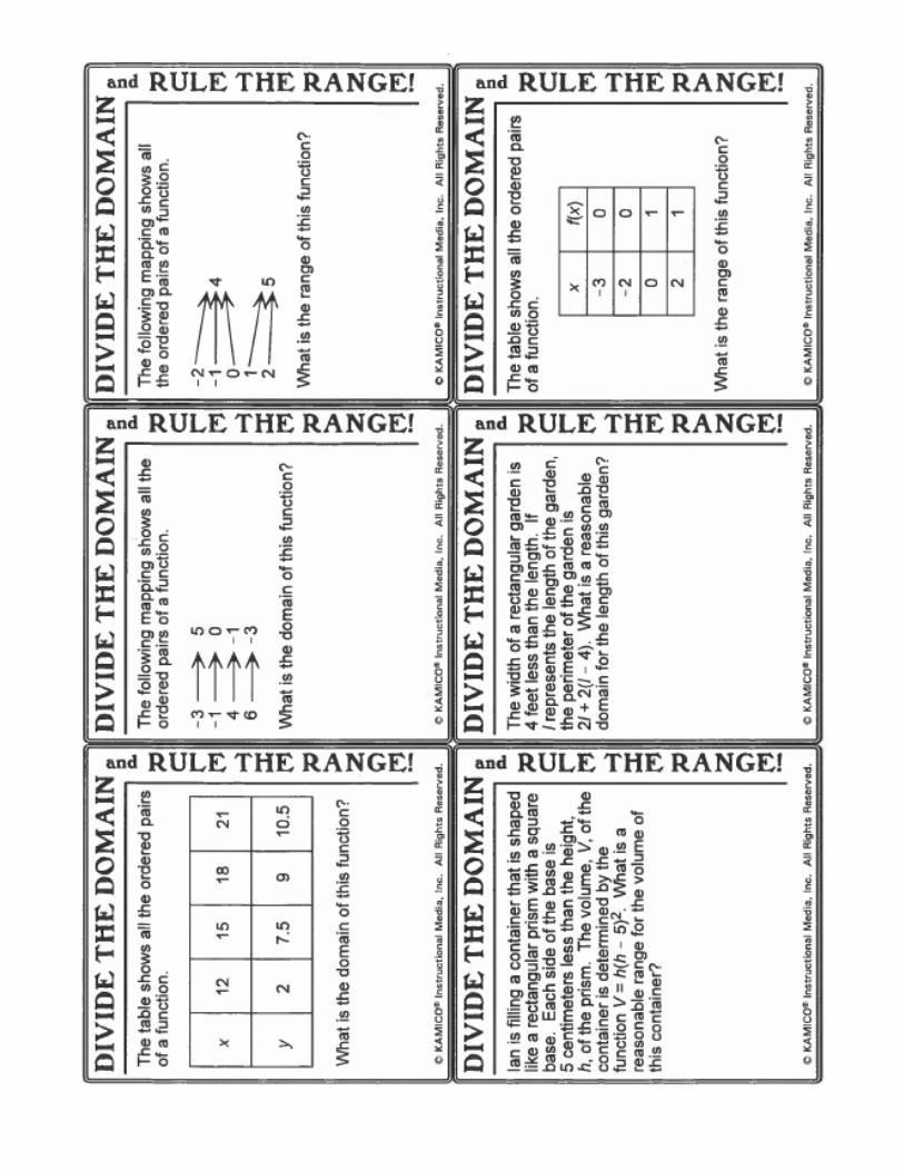
Domain and Range
Discrete vs. Continuous Data A local neighborhood community is asking everyone to participate in a new recycling program. At the end of each month, each house records the number of aluminum cans they recycle. The following data is compiled in the subsequent table.
Is this discrete or continuous? Why?
Mark is working at the local fast food restaurant and earns $7.15 per hour. The following table shows the amount of money he earns by working a particular number of hours per week.
Is this discrete or continuous? Why?
Map and graph the data. y
10
5 x 1
Map and graph the data. y
20
5 x 3
State the domain and range in appropriate notations and describe them.
State the domain and range in appropriate notations and describe them.
Notation Notes Lists of domain and range in sets Ex: Domain 1, 2, 3, 4, 5 Range 2, 4, 6, 8, 10 Symbolic (inequality, set-builder, interval)
Inequality: Ex: Domain x > 0; -3 < x < 4 Range y ≤ 0; 4 < y ≤ 8 Set-Builder: Ex: Domain x I x > 1 Range y I 2 < y ≤ 10 Interval: Use [ or ] for closed dots and symbols ≤ ≥ (Included) Use ( or ) for open dots and symbols < >, ∞ (infinity) (Not Included) Ex: Domain (1, 11]; (-∞, 6] Range [2, 12]; (3, +∞)

Scatterplots and Correlation
A scatterplot is a graph that shows how closely _____ ___________ ________ are related.
The data are plotted as _______________________________ __________________ (x, y)
The closer the points are to forming a ____________________________ line, the _____________________
their correlation.
If both variables are _________________________, the scatterplot shows a _________________________ correlation
If one variable is increasing and the other ________________________, ________________________ correlation
When data sets show a positive or negative correlation a trend line or ___________ _____ ___________ _________ can
be drawn to approximate the data.
We draw the line so that about the same number of points are above and below the line.
Identify the type of correlation depicted in each graph.
Choose from: positive correlation, negative correlation, or no correlation
_________________________ _________________________ _______________________
The table and graph show the hours a student studied for each of 7 tests and the score earned on each test.
increasing
coordinate pairs
straight
decreasing
stronger
positive
line of best fit
negative

The data shows a ____________________ correlation because ________________________ study time resulted in
_______________________ test scores.
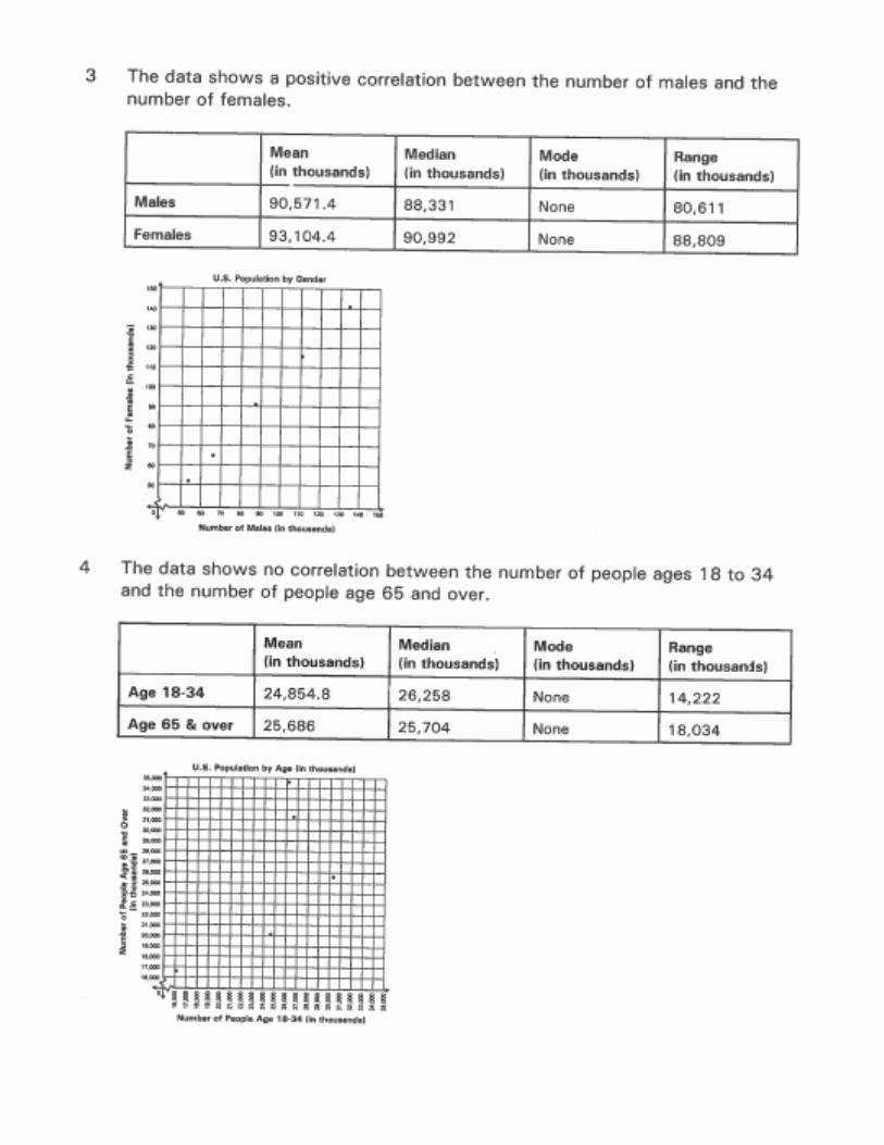
Use the following table to complete 1-3.
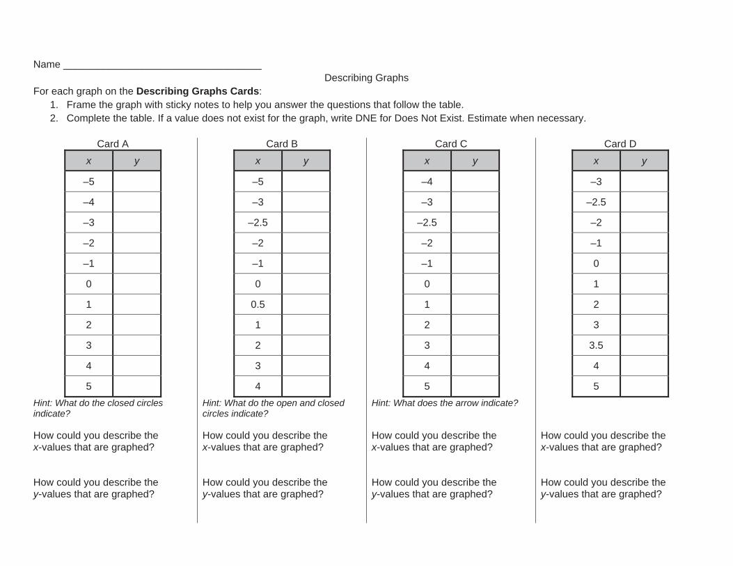
Name ___________________________________ Describing Graphs
For each graph on the Describing Graphs Cards: 1. Frame the graph with sticky notes to help you answer the questions that follow the table. 2. Complete the table. If a value does not exist for the graph, write DNE for Does Not Exist. Estimate when necessary.
Card A
x y
–5
–4
–3
–2
–1
0
1
2
3
4
5 Hint: What do the closed circles indicate? How could you describe the x-values that are graphed? How could you describe the y-values that are graphed?
Card B x y
–5
–3
–2.5
–2
–1
0
0.5
1
2
3
4 Hint: What do the open and closed circles indicate? How could you describe the x-values that are graphed? How could you describe the y-values that are graphed?
Card C x y
–4
–3
–2.5
–2
–1
0
1
2
3
4
5 Hint: What does the arrow indicate? How could you describe the x-values that are graphed? How could you describe the y-values that are graphed?
Card D x y
–3
–2.5
–2
–1
0
1
2
3
3.5
4
5 How could you describe the x-values that are graphed? How could you describe the y-values that are graphed?

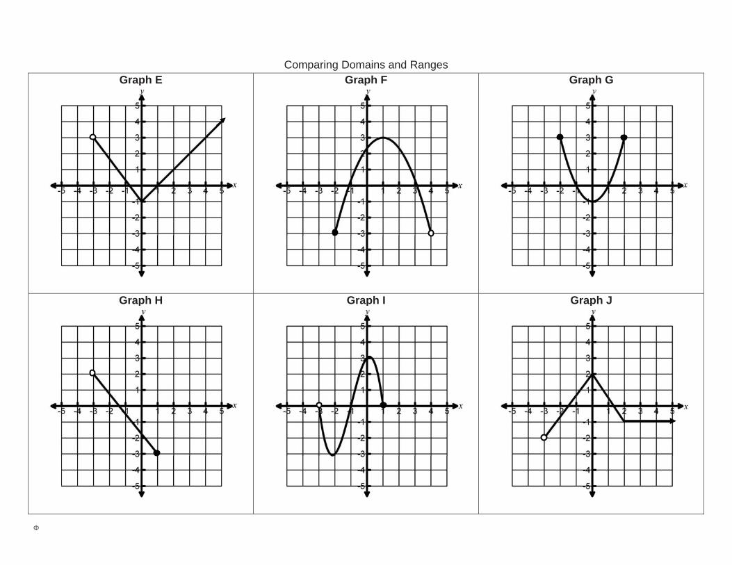
Describing Graphs (continued) The possible x-values for a graph is called the domain. The possible y-values for a graph is called the range. Use Cards A – D from Describing Graphs Cards and Graphs E – J on Comparing Domains and Ranges to answer the following questions. 1. Which graph(s) have the same possible x-values (domain) as the graph on Card A?
Which graph(s) have the same possible y-values (range) as the graph on Card A? 2. Which graph(s) have the same possible x-values (domain) as the graph on Card B?
Which graph(s) have the same possible y-values (range) as the graph on Card B? 3. Which graph(s) have the same possible x-values (domain) as the graph on Card C?
Which graph(s) have the same possible y-values (range) as the graph on Card C? 4. Which graph(s) have the same possible x-values (domain) as the graph on Card D?
Which graph(s) have the same possible y-values (range) as the graph on Card D?

Φ
Describing Graphs Cards
Cut along the dotted lines.
Card A
Card B
Card C
Card D
Φ
Comparing Domains and Ranges Graph E
Graph F
Graph G
Graph H
Graph I
Graph J
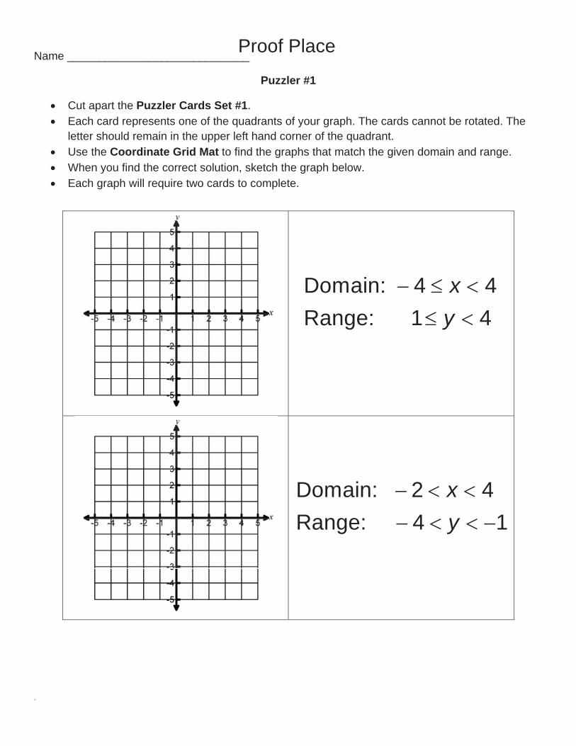
Name _____________________________
Puzzler #1
Cut apart the Puzzler Cards Set #1. Each card represents one of the quadrants of your graph. The cards cannot be rotated. The
letter should remain in the upper left hand corner of the quadrant. Use the Coordinate Grid Mat to find the graphs that match the given domain and range. When you find the correct solution, sketch the graph below. Each graph will require two cards to complete.
Domain: 4 4Range: 1 4
xy
Domain: 2 4Range: 4 1
xy
Proof Place

.
Domain: 4Range: 4
xy
Domain: Range: 3
All Realsy
1 y:Range2x:Domain

.
Puzzler Cards Set #1
A
D
E
C
B

.
Coordinate Grid Mat

.
Name _____________________________
Puzzler #2
Cut apart the Puzzler Cards Set #2. Each card represents one of the quadrants of your graph. The cards can be rotated. Use the Coordinate Grid Mat to find the graphs that match the given domain and range. When you find the correct solution, sketch the graph below. Each graph will require either two or three cards to complete.
Domain: 4 4Range: 1 4
xy
Domain: x 4Range: 2y
Proof Place

.
Domain: 4Range: 4
xy
Domain: Range: 3
All Realsy
1 y:Range2x:Domain

.
Puzzler Cards Set #2

.
Coordinate Grid Mat

Name __________________
Scatterplots and Lines of Best Fit 1. MUSIC The scatter plot shows the number of CDs (in millions) that were sold from 1999 to 2005.
If the trend continued, about how many CDs were sold in 2006? Justify your answer. 2. FAMILY The table shows the predicted annual cost of
a middle income family to raise a child from birth until adulthood. Draw a scatter plot and describe what relationship exists within the data. How do you know?
3. Make a scatter plot of the data in the table. Draw a line of best fit.
What is the equation of the line of best fit? Justify your answer.
4. EDUCATION The table gives the number of hours spent studying for a
science exam and the final exam grade. a. Draw a scatter plot of the data and draw in the line of best fit.
b. What is the equation for the line of best fit?
c. Predict the grade for a student who studied for 6 hours.
d. Could this line go on forever? Why or why not?

5. BASEBALL The scatter plot shows the average price of a major-league baseball ticket from 1997 to 2006. a. Use the points (2001, 17.60) and (2002, 18.75) to write the slope-intercept form of equation
for the line of best fit shown in the scatter plot.
b. Use your equation to tell the price of a ticket in 2009. Is this extrapolation or interpolation? Why?
6. DISEASE The table shows the number of cases of Foodborne
Botulism in the United States for the years 2001 to 2005. a. Draw a scatter plot and determine, what relationship, if
any, exists in the data.
b. Draw a line of fit for the scatter plot, and write the slope-intercept form of an equation for the line of fit. Justify.
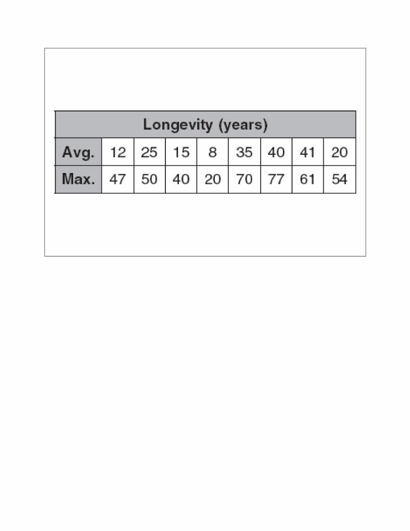
7. ZOOS The table shows the average and maximum longevity of various animals in captivity.
a. Draw a scatter plot and determine, what relationship, if any, exists in the data.
b. Draw a line of fit for the scatter plot, and write the slope-intercept form of an equation for the line of fit.
c. Predict the maximum longevity for an animal with an average longevity of 33 years. Is this an example of Extrapolation or Interpolation? How do you know?


Proof Place
SCATTER GRAPHS AND CORRELATION Match the graph to the type and strength of correlation and the graph labels
0
50
100
150
200
250
300
350
0 20 40 60 80 100
0
50
100
150
200
250
300
0 20 40 60 80 100 120
0
50
100
150
200
250
0 20 40 60 80 100
0
10
20
30
40
50
60
70
80
90
100
0 20 40 60 80 100 120
TYPES OF CORRELATION No correlation Strong positive correlation Weak positive correlation Strong negative correlation Weak negative correlation LABELS ON GRAPHS Height of person and Score in a maths test Distance travelled in car and Money spent on petrol Age of car and Value of car Outside temperature and Number of ice creams bought

Line of Best Fit Label each coordinate plane with numbers using any scale of your choice. Use a pipe cleaner to estimate the line of best fit for each scatterplot, when applicable. How do you justify that your line is the best estimate? Predict at least two other points using your line of best fit. How did you use your line of best fit to predict these points? Can you still predict other points even if they’re out of the graph? Why or why not?

Practice Plaza


Name: ______________________Write the domain and range in set-builder and interval notations.

Practice Plaza Name ___________________________
Practicing Scatterplots Part I:
1. Rank the following ten cafeteria foods in order from the food you like the most to the food you like the least. 1. Pizza 2. Calzone 3. Hamburger 4. Fries 5. Pretzel 6. Salad 7. Cookies 8. Chicken Sandwiches 9. Ice Cream 10. Popsicles
Record your preferences below:
The number of the food I like the most is: _____ The number of the food I like 2nd most is: _____ The number of the food I like 3rd most is: _____ The number of the food I like 4th most is: _____ The number of the food I like 5th most is: _____ The number of the food I like 6th most is: _____ The number of the food I like 7th most is: _____ The number of the food I like 8th most is: _____ The number of the food I like 9th most is: _____
The number of the food I like the least: _____
2. Find a partner. Write your responses for the 10 items above as ordered pairs. For example, if your 1st favorite food is pizza and your partner’s favorite food is Fries, write the ordered pair (1, 4). Then go on to the food you both like second most. You will have 10 ordered pairs. Whoever uses their choice as the x-coordinate should remain the x-coordinate for all 10 ordered pairs.
List the ordered pairs here: ____________________________________________________________________
__________________________________________________________________________________________
3. Plot your 10 points on the coordinate plane below.
___________’s Food Preferences
4. Draw a line of best fit in #3. Make at least three scenarios based on #3 data for your partner to predict.
0 1 2 3 4 5 6 7 8 9 10
10 9 8 7 6 5 4 3 2 1
____
____
__’s
Foo
d Pr
efer
ence
s 4. Analyze the Data: • The stronger the positive association, the more likely
you and your partner would enjoy going out to eat together.
• The stronger the negative association, the less likely you and your partner would enjoy going out to eat together.
• If the association is weak, then your agreement on dinner would be hit and miss.
What conclusions can you draw based upon your scatterplot? ____________________________________________________________________________________________________ __________________________________________________ __________________________________________________

Name __________________
Φ
Scatterplots for Bivariate Data
Draw a scatter plot and a line of best fit and predict at least two more points.
1. Following is 10 days of data which shows the sale of apples and mangoes. Describe the association between the apple and mango sales.
Days 1 2 3 4 5 6 7 8 9 10
Apple 62 49 81 26 45 55 16 74 97 34
Mango 36 44 49 37 26 11 76 83 64 81
2. The chart shows the number of books and pens purchased for 10 students. Describe the association between the purchase of books and pens.
Student 1 2 3 4 5 6 7 8 9 10
Books 35 55 70 80 69 48 69 78 49 90
Pens 47 71 55 63 12 87 74 98 40 96
3. The chart shows the number of men and women to attend a college class over 10 years. Describe the association between the number of men and women.
Year 1 2 3 4 5 6 7 8 9 10
Men 22 47 84 12 26 33 44 54 71 68
Women 22 58 61 53 43 81 86 94 50 94
4. The food committee followed the lunch habits of 10 students. The chart displays the number of times they had pizza and burgers for lunch. Describe the association between the students eating pizza and eating burgers.
Student 1 2 3 4 5 6 7 8 9 10
Pizza 34 69 42 12 22 54 66 29 54 37
Burger 40 26 37 85 78 34 98 47 76 50
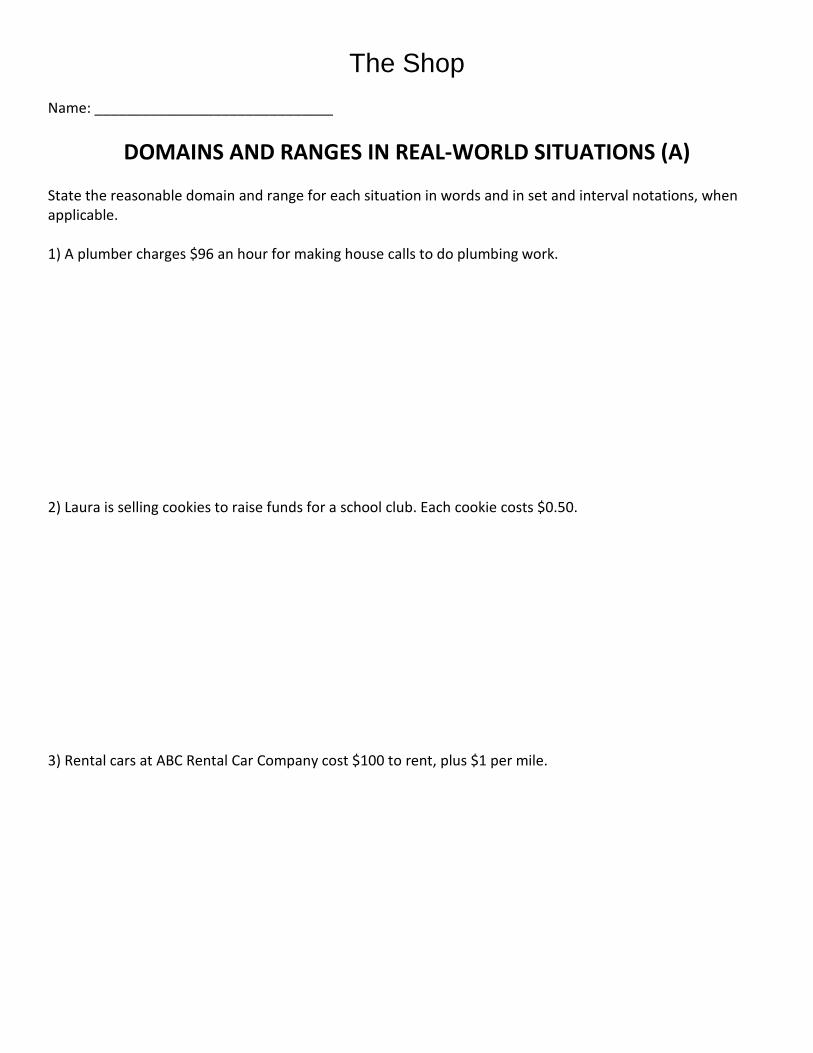
The Shop
Name: ______________________________
DOMAINS AND RANGES IN REAL-WORLD SITUATIONS (A) State the reasonable domain and range for each situation in words and in set and interval notations, when applicable. 1) A plumber charges $96 an hour for making house calls to do plumbing work. 2) Laura is selling cookies to raise funds for a school club. Each cookie costs $0.50. 3) Rental cars at ABC Rental Car Company cost $100 to rent, plus $1 per mile.

4. The surface area of a cube is the total outside area of the cube. Your geometry teacher asks you to construct a cube that has a side length of at least 3 inches. 5. A local youth group is planning a trip to a local amusement park. They are taking their church bus which holds 32 people. It will cost $25 for parking and tickets to enter the park are $22.50 per person. 6. Joe has an afterschool job at the local sporting goods store. He makes $6.50 an hour. He never works more than 20 hours in a week. 7. Jovante decides to start a business by printing designs on t-shirts and selling them for $25 each. The printing machine costs $1000, and the materials for each t-shirt cost $7.50. Jovante is interested in calculating the profit of her business. (Profit is defined as revenue minus expenses.) To get started, Jovante orders 500 t-shirts.
The Shop
Name: ______________________________
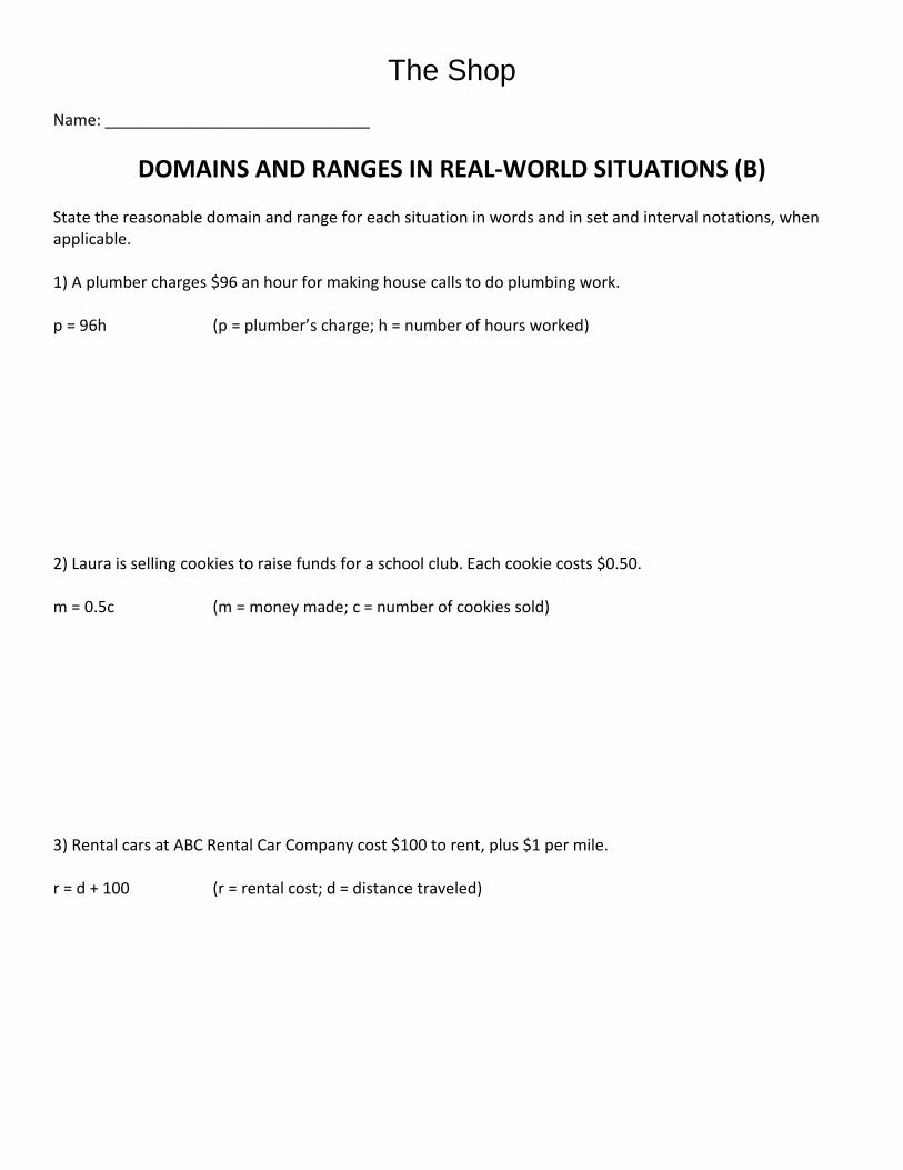
DOMAINS AND RANGES IN REAL-WORLD SITUATIONS (B) State the reasonable domain and range for each situation in words and in set and interval notations, when applicable. 1) A plumber charges $96 an hour for making house calls to do plumbing work. p = 96h (p = plumber’s charge; h = number of hours worked) 2) Laura is selling cookies to raise funds for a school club. Each cookie costs $0.50. m = 0.5c (m = money made; c = number of cookies sold) 3) Rental cars at ABC Rental Car Company cost $100 to rent, plus $1 per mile. r = d + 100 (r = rental cost; d = distance traveled)

4. The surface area of a cube is the total outside area of the cube. Your geometry teacher asks you to construct a cube that has a side length of at least 3 inches. A = 6s^2 (A = Area; s = side length) 5. A local youth group is planning a trip to a local amusement park. They are taking their church bus which holds 32 people. It will cost $25 for parking and tickets to enter the park are $22.50 per person. c = 22.5n + 25 (c = cost; n = number of people) 6. Joe has an afterschool job at the local sporting goods store. He makes $6.50 an hour. He never works more than 20 hours in a week. s = 6.5h (s = salary; h = number of hours worked) 7. Jovante decides to start a business by printing designs on t-shirts and selling them for $25 each. The printing machine costs $1000, and the materials for each t-shirt cost $7.50. Jovante is interested in calculating the profit of her business. (Profit is defined as revenue minus expenses.) To get started, Jovante orders 500 t-shirts. p = 17.5n – 100 (p = profit; n = number of t-shirts sold)

The Shop Name Student Activity Class
Open the TI-Nspire document AppDomainRange. What can a graph tell you about domain and range? In this activity, you will apply domain and range to real-world problems.
Move to page 1.2.
Press / and / to navigate through the lesson.
Jessie is parking is parking in a garage for a concert. It costs $6 for the first 2 hours, an additional $3 for each additional hour or fraction of an hour, with a maximum charge of $24 for a day. 1. In this situation, what represents the domain? 2. What variable is associated with the range?
3. What piecewise defined function represents the total cost?
On page 1.7, graph the equations you determined above. You may need to try several approaches before finding the correct graph. 4. Sketch your graph here.
5. State the domain and range.
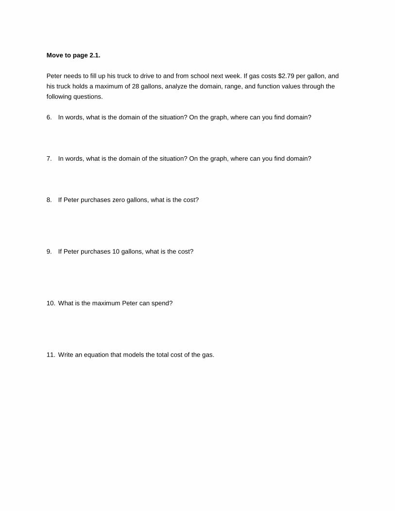
Move to page 2.1.
Peter needs to fill up his truck to drive to and from school next week. If gas costs $2.79 per gallon, and his truck holds a maximum of 28 gallons, analyze the domain, range, and function values through the following questions. 6. In words, what is the domain of the situation? On the graph, where can you find domain? 7. In words, what is the domain of the situation? On the graph, where can you find domain? 8. If Peter purchases zero gallons, what is the cost? 9. If Peter purchases 10 gallons, what is the cost?
10. What is the maximum Peter can spend? 11. Write an equation that models the total cost of the gas.

On page 2.9, graph your equations and determine if they accurately represent the situation. If not, modify and graph again 12. Sketch your graph here.
13. State the domain and range of this situation. 14. Summarize what you have found in this lesson. Explain how and why the domain and
range are different between the two examples in this activity.
Name: ________________
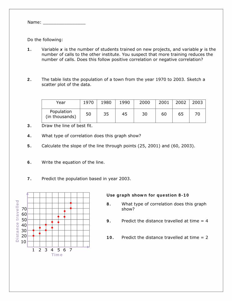
Do the following:
1. Variable x is the number of students trained on new projects, and variable y is the number of calls to the other institute. You suspect that more training reduces the number of calls. Does this follow positive correlation or negative correlation?
2. The table lists the population of a town from the year 1970 to 2003. Sketch a scatter plot of the data.
Year 1970 1980 1990 2000 2001 2002 2003
Population (in thousands) 50 35 45 30 60 65 70
3. Draw the line of best fit.
4. What type of correlation does this graph show?
5. Calculate the slope of the line through points (25, 2001) and (60, 2003).
6. Write the equation of the line.
7. Predict the population based in year 2003.
Use graph shown for question 8-10
8. What type of correlation does this graph show?
9. Predict the distance travelled at time = 4
10. Predict the distance travelled at time = 2
Time
Dis
tan
ce t
rave
lled
1 2 3 4 5 6 7
10 20 30 40 50 60 70

Do the following:
1. Variable x is the number of students trained on new projects, and variable y is the number of calls to the other institute. You suspect that some training increases the number of calls and some training decreases the number of calls. Does this follow positive correlation or negative correlation?
2. The table lists the population of a town from the year 1970 to 2003. Sketch a scatter plot of the data.
Year 1970 1980 1990 2000 2001 2002 2003
Population (in thousands) 10 20 30 40 50 60 70
3. Draw the line of best fit.
4. What type of correlation does this graph show?
5. Calculate the slope of the line through points (10, 1970) and (20, 1980).
6. Write the equation of the line.
7. Predict the population based in year 2000.
Use graph shown for question 8-10
8. What type of correlation does this graph show?
9. Predict the distance travelled at time = 7
10. Predict the distance travelled at time = 6
Time
Dis
tan
ce t
rave
lled
1 2 3 4 5 6 7
10 20 30 40 50 60 70

Name: ________________
Do the following:
1. Variable x is the number of students trained on new projects, and variable y is the number of calls to the other institute. You suspect that more training increases the number of calls. Does this follow positive correlation or negative correlation?
2. The table lists the population of a town from the year 1970 to 2003. Sketch a scatter plot of the data.
Year 1970 1980 1990 2000 2001 2002 2003
Population (in thousands) 65 55 45 35 25 15 5
3. Draw the line of best fit.
4. What type of correlation does this graph show?
5. Calculate the slope of the line through points (45, 1990) and (65, 2002).
6. Write the equation of the line.
7. Predict the population based in year 2003.
Use graph shown for question 8-10
8. What type of correlation does this graph show?
9. Predict the distance travelled at time = 2
10. Predict the distance travelled at time = 3
Time
Dis
tan
ce t
rave
lled
1 2 3 4 5 6 7
10 20 30 40 50 60 70

Do the following:
1. Variable x is the number of students trained on new projects, and variable y is the number of calls to the other institute. You suspect that more training reduces the number of calls. Does this follow positive correlation or negative correlation?
2. The table lists the population of a town from the year 1970 to 2003. Sketch a scatter plot of the data.
Year 1970 1980 1990 2000 2001 2002 2003
Population (in thousands) 10 30 20 60 55 65 70
3. Draw the line of best fit.
4. What type of correlation does this graph show?
5. Calculate the slope of the line through points (30, 1980) and (75, 2002).
6. Write the equation of the line.
7. Predict the population based in year 1980.
Use graph shown for question 8-10
8. What type of correlation does this graph show?
9. Predict the distance travelled at time = 6
10. Predict the distance travelled at time = 2
Time
Dis
tan
ce t
rave
lled
1 2 3 4 5 6 7
10 20 30 40 50 60 70
The Shop
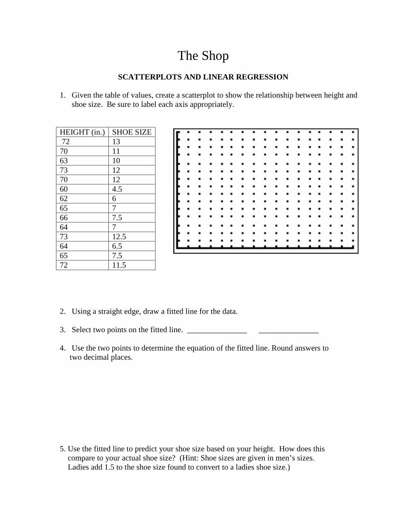
SCATTERPLOTS AND LINEAR REGRESSION
1. Given the table of values, create a scatterplot to show the relationship between height and shoe size. Be sure to label each axis appropriately.
2. Using a straight edge, draw a fitted line for the data.
3. Select two points on the fitted line. _______________ _______________ 4. Use the two points to determine the equation of the fitted line. Round answers to two decimal places.
5. Use the fitted line to predict your shoe size based on your height. How does this compare to your actual shoe size? (Hint: Shoe sizes are given in men’s sizes. Ladies add 1.5 to the shoe size found to convert to a ladies shoe size.)
HEIGHT (in.) SHOE SIZE 72 13 70 11 63 10 73 12 70 12 60 4.5 62 6 65 7 66 7.5 64 7 73 12.5 64 6.5 65 7.5 72 11.5

6. Enter the data into the statics editor of your graphing calculator.
Clear lists:
Enter the independent variable, height, as L1.
Enter each data item
followed by Repeat the process to enter the dependent variable, shoe size, as L2.
7. Create a scatterplot of the data. Adjust the window to fit the data.
Turn on the scatterplot function.
View the graph.

8. How does the calculator’s graph of the scatterplot compare to your graph in #1? 9. Determine the regression equation for the line of best fit. Store the equation in the Y=
Editor of the calculator.
(This is only an example screen.)
10. View the graph of the scatterplot with the line of best fit. 11. How does the calculator’s linear regression line compare to your fitted line?

More Linear Regression Application Do heavier cars really use more gasoline? Suppose that a car is chosen at random. Let x be the weight of the car in hundreds of pounds, and let y be the miles per gallon.
x 27 44 32 47 23 40 34 52 y 30 19 24 13 29 17 21 14
Run a linear regression using the calculator and answer the following questions. 1.) What is the regression equation? 2.) What does ‘a’ represent and what is the meaning of this value in relation to this situation?
3.) What does ‘b’ represent and what is the meaning of this value in relation to this situation?
4.) What does ‘r’ represent and what is the meaning of this value in relation to this situation?
5.) Do you think that the weight of a car is a good indicator of the miles per gallon? Justify your answer.

Anchor Activity Center


Anchor Activity Center
DR Notations and Their Graphs (Strategies)
Name: _____________________________ Match the domain and range notations with their corresponding graphs. 1. 7.
2. 8.
3. 9.
4. 10.
5. 11.
6. 12.
Describe the strategies you have used. How do you know you are correct with your matching?

DR Notations and Their Graphs Cards (Notations)
1. Domain: -6 ≤ x ≤ 3 Range: -6 ≤ y ≤ -1
2. Domain: 0 ≤ x < 5 Range: 0 ≤ y < 7
3. Domain: -5 ≤ x < 0 Range: -5 < y ≤ -1
4. Domain: -6 ≤ x ≤ 3 Range: -5 ≤ y ≤ -1
5. Domain: 0 ≤ x ≤ 6 Range: 0 ≤ y ≤ 7
6. Domain: -4 ≤ x ≤ 7 Range: -7 ≤ y ≤ -2
7. Domain: x ≤ 0 Range: y ≥ 0
8. Domain: 2 ≤ x ≤ 7 Range: 1 ≤ x ≤ 6
9. Domain: 0 ≤ x ≤ 4 Range: 0 ≤ y ≤ 6
10. Domain: -4 < x < 5 Range: -2 ≤ y < 5
11. Domain: x ≤ 5 Range: y = 0
12. Domain: -7 < x < 0 Range: -3 < y < 4

DR Notations and Their Graphs Cards (Graphs)
M
N
O
P
Q
R
S
T
U
V
W
X

EXAMPLES OF DOMAINS AND RANGES FROM GRAPHS
Important notes about Domains and Ranges from Graphs:
Remember that domain refers to the x-values that are represented in a problem and
range refers to the y-values that are represented in a problem.
Sometimes it isn’t possible to list all the values that x or y can be because the graph
is continuous and made up of an infinite number of points, like a line, a ray, or
even a segment.
In a continuous graph, to determine the domain, you should focus on looking left
to right of the graph.
In a continuous graph, to determine the range, you should focus on looking
bottom to top of the graph.
We use interval notation to help us describe the domain and range for graphs that
represent continuous situations.
Please review the following information to help you describe the domain and range
for three different types of continuous graphs.
Example 1: A continuous graph with two endpoints.
Domain: -7 ≤ x < 5
Notice that this graph has two endpoints, so the graph starts
and stops and the domain covers all x-values between the
two endpoints which makes it a continuous graph.
Since the left and right endpoints are at (-7, -3) and (5, 1), the
graph covers all x-values between the x-values of -7 and -3.
Notice that the first endpoint is a closed circle so it includes
that point; but the second endpoint is an open circle, so it does
not include that point.
Therefore, the graph covers all x-values ≥ -7 AND all x-
values < 5 – we write that in interval notation as -7 ≤ x < 5
Range: -3 ≤ y < 1
Notice that this graph has two endpoints, so the graph starts
and stops and the range covers all y-values between the two
endpoints which makes it a continuous graph.
Since the bottom and top endpoints are at (-7, -3) and (5, 1),
the graph covers all y-values between the y-values of -3 and
1.
Notice that the first endpoint is a closed circle so it includes
that point; but the second endpoint is an open circle, so it does
not include that point.
Therefore, the graph covers all y-values ≥ -3 AND all y-
values < 1 – we write that in interval notation as -3 ≤ y < 1
Important Note:
To find the domain for
a graph with two
endpoints, always
identify the x-values
of the point farthest to
the left and the point
farthest to the right.
For the range, you
want the y-values of
the lowest point and
the highest point.

Example 2 – a continuous graph with only one endpoint (so continues forever in the
other direction)
Example 3 – a continuous graph that has two arrows:
Domain: x ≥ 0 (remember to focus on left to right of the graph for
domain of a continuous graph):
Notice that this graph has one endpoint at (0, 0) and an arrow to
the right indicating that it continues forever in the positive x
direction.
Therefore, this graph covers all x-values that are greater than or
equal to 0 – there is no stopping point on the right side of the
graph.
We write the domain in interval notation as x ≥ 0.
Range: y ≥ 0 (remember to focus on bottom to top of the graph for
range of a continuous graph):
Notice that this graph has one endpoint at (0, 0) and an arrow
pointing up indicating that it continues forever in the positive y
direction.
Therefore, this graph covers all y-values that are greater than or
equal to 0 – there is no stopping point on the upper side of the
graph.
We write the range in interval notation as y ≥ 0.
Domain: x = all real numbers (remember to focus on left to
right of the graph to determine the domain for a continuous graph)
Notice that this graph has an arrow on the left side of the
graph and an arrow on the right side of the graph.
This indicates that the graph continues forever in the left
direction and forever in the right direction.
This means that the graph covers all possible x-values –
we call that all real numbers in algebra.
Therefore, we can write the domain in interval notation as:
x = all real numbers.
Range: y ≥ 0 (remember to focus on bottom to top of the graph
to determine the range of a continuous graph)
Notice that the graph’s lowest point is at (0, 0) (the
bottom of the parabola) – indicating that the y-values start
at 0.
However, notice at the top of the graph there are arrows
pointing up – this indicates the graph continues in the
positive y direction forever.
So, the graph covers all y-values greater than or equal to
0.
We can write the range in interval notation as: y ≥ 0.
Note: If the arrow were
pointing to the left, the
domain would be ≤ the
x-value. If the arrow
were pointing down, the
range would ≤ the y-
value.
Note: If one of the arrows
were pointing up and one
of the arrows were
pointing down, then the
range would be all real
numbers.
Anchor Activity Center
DR Notations and Their Graphs (Verbal Descriptions)
Name: _____________________________ Match the domain and range notations with their corresponding graphs. Then write a verbal description of each domain and range. 1.
2.
3.
4.
5.
6.
7.
8.
9.
10.
11.
12.

DR Notations and Their Graphs Cards (Notations)
1. Domain: -6 ≤ x ≤ 3 Range: -6 ≤ y ≤ -1
2. Domain: 0 ≤ x < 5 Range: 0 ≤ y < 7
3. Domain: -5 ≤ x < 0 Range: -5 < y ≤ -1
4. Domain: -6 ≤ x ≤ 3 Range: -5 ≤ y ≤ -1
5. Domain: 0 ≤ x ≤ 6 Range: 0 ≤ y ≤ 7
6. Domain: -4 ≤ x ≤ 7 Range: -7 ≤ y ≤ -2
7. Domain: x ≤ 0 Range: y ≥ 0
8. Domain: 2 ≤ x ≤ 7 Range: 1 ≤ x ≤ 6
9. Domain: 0 ≤ x ≤ 4 Range: 0 ≤ y ≤ 6
10. Domain: -4 < x < 5 Range: -2 ≤ y < 5
11. Domain: x ≤ 5 Range: y = 0
12. Domain: -7 < x < 0 Range: -3 < y < 4

DR Notations and Their Graphs Cards (Graphs)
M
N
O
P
Q
R
S
T
U
V
W
X

EXAMPLES OF DOMAINS AND RANGES FROM GRAPHS
Important notes about Domains and Ranges from Graphs:
Remember that domain refers to the x-values that are represented in a problem and
range refers to the y-values that are represented in a problem.
Sometimes it isn’t possible to list all the values that x or y can be because the graph
is continuous and made up of an infinite number of points, like a line, a ray, or
even a segment.
In a continuous graph, to determine the domain, you should focus on looking left
to right of the graph.
In a continuous graph, to determine the range, you should focus on looking
bottom to top of the graph.
We use interval notation to help us describe the domain and range for graphs that
represent continuous situations.
Please review the following information to help you describe the domain and range
for three different types of continuous graphs.
Example 1: A continuous graph with two endpoints.
Domain: -7 ≤ x < 5
Notice that this graph has two endpoints, so the graph starts
and stops and the domain covers all x-values between the
two endpoints which makes it a continuous graph.
Since the left and right endpoints are at (-7, -3) and (5, 1), the
graph covers all x-values between the x-values of -7 and -3.
Notice that the first endpoint is a closed circle so it includes
that point; but the second endpoint is an open circle, so it does
not include that point.
Therefore, the graph covers all x-values ≥ -7 AND all x-
values < 5 – we write that in interval notation as -7 ≤ x < 5
Range: -3 ≤ y < 1
Notice that this graph has two endpoints, so the graph starts
and stops and the range covers all y-values between the two
endpoints which makes it a continuous graph.
Since the bottom and top endpoints are at (-7, -3) and (5, 1),
the graph covers all y-values between the y-values of -3 and
1.
Notice that the first endpoint is a closed circle so it includes
that point; but the second endpoint is an open circle, so it does
not include that point.
Therefore, the graph covers all y-values ≥ -3 AND all y-
values < 1 – we write that in interval notation as -3 ≤ y < 1
Important Note:
To find the domain for
a graph with two
endpoints, always
identify the x-values
of the point farthest to
the left and the point
farthest to the right.
For the range, you
want the y-values of
the lowest point and
the highest point.

Example 2 – a continuous graph with only one endpoint (so continues forever in the
other direction)
Example 3 – a continuous graph that has two arrows:
Domain: x ≥ 0 (remember to focus on left to right of the graph for
domain of a continuous graph):
Notice that this graph has one endpoint at (0, 0) and an arrow to
the right indicating that it continues forever in the positive x
direction.
Therefore, this graph covers all x-values that are greater than or
equal to 0 – there is no stopping point on the right side of the
graph.
We write the domain in interval notation as x ≥ 0.
Range: y ≥ 0 (remember to focus on bottom to top of the graph for
range of a continuous graph):
Notice that this graph has one endpoint at (0, 0) and an arrow
pointing up indicating that it continues forever in the positive y
direction.
Therefore, this graph covers all y-values that are greater than or
equal to 0 – there is no stopping point on the upper side of the
graph.
We write the range in interval notation as y ≥ 0.
Domain: x = all real numbers (remember to focus on left to
right of the graph to determine the domain for a continuous graph)
Notice that this graph has an arrow on the left side of the
graph and an arrow on the right side of the graph.
This indicates that the graph continues forever in the left
direction and forever in the right direction.
This means that the graph covers all possible x-values –
we call that all real numbers in algebra.
Therefore, we can write the domain in interval notation as:
x = all real numbers.
Range: y ≥ 0 (remember to focus on bottom to top of the graph
to determine the range of a continuous graph)
Notice that the graph’s lowest point is at (0, 0) (the
bottom of the parabola) – indicating that the y-values start
at 0.
However, notice at the top of the graph there are arrows
pointing up – this indicates the graph continues in the
positive y direction forever.
So, the graph covers all y-values greater than or equal to
0.
We can write the range in interval notation as: y ≥ 0.
Note: If the arrow were
pointing to the left, the
domain would be ≤ the
x-value. If the arrow
were pointing down, the
range would ≤ the y-
value.
Note: If one of the arrows
were pointing up and one
of the arrows were
pointing down, then the
range would be all real
numbers.

Anchor Activity Center
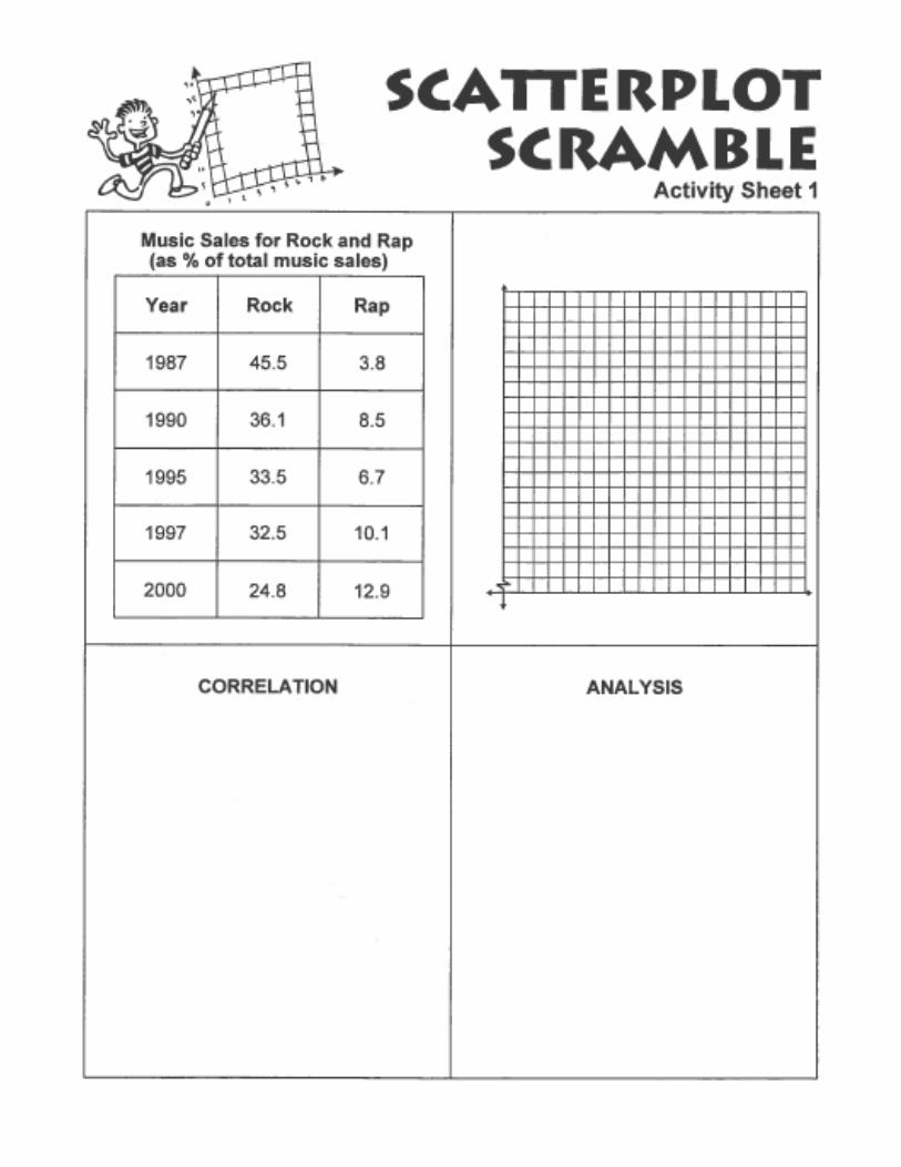
SCATTERPLOT SCRAMBLE
Materials:
Scatterplot Scramble Activity Sheets 1-6 Scissor Procedure: Each student will complete the graph, correlation, and analysis in each sheet (number of sheets will vary). He/She will cut the table, graph, correlation and analysis cards apart, scramble them, and find a partner. The student and his/her partner will ask each other to sort their cards out and then will take turn teaching their own cards to each other.


Start
Student Name: ______________________
Scatterplot Maze Circle the best answer for each question. 1. All of the domain values for the scatterplot lie
within which interval? 2. In general, the more horsepower an engine has, the lower the quarter mile elapsed time. 3. Predict the quarter mile elapsed time if the horsepower of a car is 350 hp. Use the direction arrow for each circled answer choice to find your way to a lettered exit.
Communicating About Mathematics Describe the relationship between quarter mile elapsed time and horsepower.
1 2 3 H
2 3 3 G
3 F
A B C D E
_______________________________________________________________
_______________________________________________________________
_______________________________________________________________
_______________________________________________________________
_______________________________________________________________
150 < x < 400 ↓ 12 < x < 18 →
True → False ↓
20.6 s ↓ 13.8 s →
Car Engine Power
x
y
Horsepower (hp)
¼ M
ile E
lap
sed
Tim
e (s
eco
nd
s)