Embed Size (px)
Citation preview
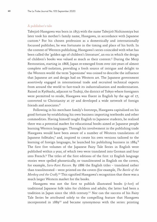
58
Takejirō Hasegawa’s Fairy Tale Series: Japanese crepe paper books
ALLISON O’CONNELL
Coveted by children and adults alike, made of paper that’s fabric-like to the touch, both Japanese and Western at the same time, Takejirō Hasegawa’s Japanese Fairy Tale Series broke the mould. It garnered numerous international accolades, was a commercial success in its day and continues to be highly prized by contemporary collectors around the world. State Library Victoria is fortunate to hold 13 of the series’ 31 English-language books in chirimen (crepe paper) format.1 The books are at once works of art and of literature, each containing exquisitely produced, brightly coloured original woodblock-print illustrations to complement the Japanese folk tales within.
Entrepreneurial businessman and publisher Takejirō Hasegawa (1853–1938) gathered the best translators, authors and artists for the books’ production. Originally published between 1885 and 1922, many of them were reprinted over decades, and revised editions were produced containing new sets of illustrations, utilising different traditional and modern binding techniques and translated in up to 10 languages.2 They ranged in size from 10 by 15 to 18 by 23 centimetres3 and in length from 18 to 32 pages, were printed on both plain and creped paper and were available for purchase as individual books and as sets. Hasegawa’s innovative packaging of these tales, in a format that was at once familiar yet intriguingly exotic, heightened their allure to a largely foreign clientele.
Opposite: Lafcadio Hearn, The Old Woman Who Lost Her Dumpling, Tokyo: T Hasegawa, [post-June 1911], cover, Rare Children’s Books Collection, RAREJ 398.4 H35O

59Takejirō Hasegawa’s Fairy Tale Series
60 The La Trobe Journal No. 105 September 2020
A publisher’s tale
Takejirō Hasegawa was born in 1853 with the name Takejirō Nishinomiya but later took his mother’s family name, Hasegawa, in accordance with Japanese custom.4 For his chosen profession as a domestically and internationally focussed publisher, he was fortunate in the timing and place of his birth. In the context of Western publishing, Hasegawa’s series coincided with what has been called the ‘golden age of children’s literature’, an era in which the design of children’s books was valued as much as their content.5 During the Meiji Restoration, starting in 1868, Japan re-emerged from over 220 years of almost complete self-isolation, providing a fresh source of intrigue and delight to the Western world: the term ‘Japonisme’ was coined to describe the influence that Japanese art and design had on Western art. The Japanese government assertively engaged in international trade and recruited technical experts from around the world to fast-track its industrialisation and modernisation. Raised in Kyōbashi, adjacent to Tsukiji, the district of Tokyo where foreigners were permitted to reside, Hasegawa was fluent in English by the age of 17, converted to Christianity at 27 and developed a wide network of foreign friends and associates.6
Following in his merchant family’s footsteps, Hasegawa capitalised on his good fortune by establishing his own business importing textbooks and other commodities. Having himself taught English to Japanese students, he realised there was a potential market for educational books aimed at Japanese people learning Western languages. Through his involvement in the publishing trade Hasegawa would have been aware of a number of Western translations of Japanese folktales,7 and, inspired to create his own versions tailored to the learning of foreign languages, he launched his publishing business in 1884.8 The first five volumes of the Japanese Fairy Tale Series in English were published within a year, of which two were translated into German and four into French.9 The titles of the first editions of the first 12 English language stories were spelled phonetically, or transliterated in English on the covers, for example, Saru-Kani Kassen. By 1886 the English titles – translated rather than transliterated – were printed on the covers (for example, The Battle of the Monkey and the Crab).10 This signified Hasegawa’s recognition that there was a much larger Western market for the books.
Hasegawa was not the first to publish illustrated books (e-hon) of traditional Japanese folk tales for children and adults; the latter had been a tradition in Japan since the 16th century.11 Nor can the success of his Fairy Tale Series be attributed solely to the compelling feature that Hasegawa incorporated in 188912 and became synonymous with the series: printing

61Takejirō Hasegawa’s Fairy Tale Series
on luxuriously textured chirimen-gami (crepe paper) to create soft, pliable, fabric-like books known as chirimen-bon. The genius of the series was in its combination of particular features. Hasegawa successfully integrated aspects of traditional and modern technologies, and of Japanese and Western book-making, maximising the books’ appeal to a foreign market eager for collectors’ items and souvenirs. While the text of the stories was in Western languages and the books were formatted in the Western manner, to be read from left to right, the tales, illustrations, binding and crepe paper were all distinctly of Japanese origin.13
The crepe paper editions were especially prized by Hasegawa’s foreign clientele as being uniquely Japanese,14 a feature which, together with their superior quality woodblock-print illustrations, elevated them to a collectable art form. The books can be seen in parallel with the international Arts and Crafts movement, which was simultaneously occurring on both sides of the Atlantic and epitomised in the revival of the art of the book as a symbol of idealised craftsmanship. Protagonists John Ruskin’s and William Morris’s promotion of moral regeneration through simpler, more natural forms of expression than those resulting from global industrialisation and commercialisation was exemplified in the Fairy Tale Series’s attention to unique design, use of indigenous materials and techniques, and technical expertise. Given the synchronicity of the books’ appeal to this philosophy together with Hasegawa’s assertive international marketing, it is not surprising that the books found an eager customer base in North America and Europe. As well as capitalising on the foreign market within Japan he also exported through Western-focussed publishing distributors and via both Japanese national industrial exhibitions and at World’s Expositions.15
The crepe paper factor
When Hasegawa started producing his chirimen-bon in 1889, individual crepe paper prints (chirimen-gami-e or simply chirimen-e, also known in Europe as crêpons), which had been produced in Japan since at least 1800,16 were undergoing a popular revival as collector’s items; Vincent van Gogh had at least 19 affixed to the walls of his Parisian flat.17 However, Hasegawa was, if not the first, among the very first of only a few contemporary publishers to produce chirimen-bon. The complexity of the process by which plain paper was converted into crepe paper added to the cost of the books, which limited their consumption to affluent customers.18 Competition for this niche market seems to have been fierce, with the leading retailer of Western-language books in Tokyo in 1899, Maruzen, proclaiming in an advertisement that they were

62 The La Trobe Journal No. 105 September 2020
‘sole agents of artistic crepe paper books for Tokyo’.19 It has been claimed, however, that Hasegawa’s Fairy Tale Series inspired the production of chirimen books with different themes and formats by publishers such as Akiyama Aisaburo (1873–1947), known for large chirimen books, and Ogawa Kazumasa (1860–1929), famous for chirimen photograph albums.20 The popularity of Hasegawa’s editions can be surmised from his having obtained his own equipment for producing the paper.21
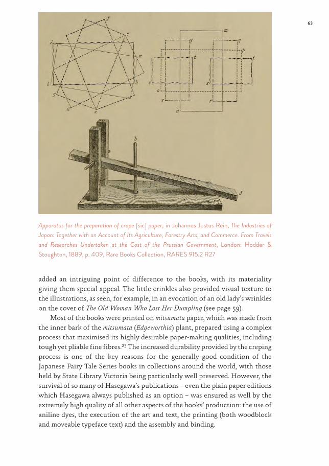
Plain paper prints were turned into crepe paper prints by being dampened, interleaved with cardboard moulds incised with parallel grooves, rolled up and then compressed up to 10 times in a purpose-built press, causing a reduction in size of approximately 50 per cent (see opposite).22 For each pressing, the paper was rotated slightly so that the creases were applied evenly in all directions, and neither the details nor the proportions of the illustrations or text were lost. The extreme pressure applied to the paper acted to reinforce its structure and provided the paper with increased durability. At the same time, the process imbued the material with a suppleness similar to that of chirimen fabric, which was made in a different way to achieve a similar crepe effect. The crepe paper
Lafcadio Hearn, Chin Chin Kobakama, Tokyo: T Hasegawa, 1931, inside front cover – p. 1, Rare Children’s Books Collection, RAREJ 398.4 H35C
63Takejirō Hasegawa’s Fairy Tale Series
added an intriguing point of difference to the books, with its materiality giving them special appeal. The little crinkles also provided visual texture to the illustrations, as seen, for example, in an evocation of an old lady’s wrinkles on the cover of The Old Woman Who Lost Her Dumpling (see page 59).
Most of the books were printed on mitsumata paper, which was made from the inner bark of the mitsumata (Edgeworthia) plant, prepared using a complex process that maximised its highly desirable paper-making qualities, including tough yet pliable fine fibres.23 The increased durability provided by the creping process is one of the key reasons for the generally good condition of the Japanese Fairy Tale Series books in collections around the world, with those held by State Library Victoria being particularly well preserved. However, the survival of so many of Hasegawa’s publications – even the plain paper editions which Hasegawa always published as an option – was ensured as well by the extremely high quality of all other aspects of the books’ production: the use of aniline dyes, the execution of the art and text, the printing (both woodblock and moveable typeface text) and the assembly and binding.
Apparatus for the preparation of crape [sic] paper, in Johannes Justus Rein, The Industries of Japan: Together with an Account of Its Agriculture, Forestry Arts, and Commerce. From Travels and Researches Undertaken at the Cost of the Prussian Government, London: Hodder & Stoughton, 1889, p. 409, Rare Books Collection, RARES 915.2 R27

64 The La Trobe Journal No. 105 September 2020
A cross-cultural collaboration
The production of the Japanese Fairy Tale Series involved the collaboration of a number of specialists with whom Hasegawa worked closely on every book. According to Basil Hall Chamberlain, one of the key authors of the series, Hasegawa only worked on one book at a time due to his personal oversight of every aspect of the production.24 The first point of collaboration was the engagement of Westerners who were skilled in either the translation of folk tales from Japanese into their native language or in the identification or writing of stories translated by others. The range of authors represented a cross-section of the Westerners living in Japan at the turn of the 20th century, including missionaries, university professors and renowned Japanologists. Whereas initially Hasegawa sought out the authors from among his close network of expatriate friends and acquaintances, as the series became more popular, he was increasingly approached with story proposals, as was the case with Lafcadio Hearn. An internationally recognised journalist and author when he moved to Japan in 1890, Hearn became a great admirer of the Japanese Fairy Tale Series: in a letter dated 2 June 1894, Hearn wrote to a friend, ‘By the way your little boy must soon be beginning to study English, so I am sending a package of the Japanese Fairy Tales for him’.25 That same year Hearn convinced his friend Basil Hall Chamberlain to arrange a meeting with Hasegawa to show him ‘a number of tales splendidly adapted to weird illustrations’ and ultimately became the author of five of the books in the series.26
The stories presented in the series range from ancient tales traceable to the earliest written records of Japan27 to those ‘rendered into English’ by Lafcadio Hearn. Some of these are thought to have been invented rather than translated; others, as in the case of Hearn’s The Old Woman Who Lost Her Dumpling, combine elements of multiple folk tales.28 Especially appealing to children and rich pickings for the illustrators, the stories in many cases were about animals, monsters and other supernatural beings.
The authors’ and translators’ diverse backgrounds informed the representation of the stories they relayed. The most prolific author of the Fairy Tale Series, Mrs TH (Kate) James, was introduced to Hasegawa by her husband’s colleague Chamberlain, with whom the Jameses became good friends during their 20 years living in Japan.29 Kate James had become familiar with many Japanese folk tales through translating them for her children, who were born and grew up in Japan. In her telling of The Matsuyama Mirror, the story becomes a moral fable about filial piety, reflecting her Scottish Episcopalian upbringing, and the protagonist experiences a fate more palatable to Western

65Takejirō Hasegawa’s Fairy Tale Series
children’s tastes than alternative Japanese versions.30 In his rendering of Chin Chin Kobakama, Hearn includes a preface in which he details the importance to the Japanese of keeping their tatami mats clean, reflecting his deep understanding of and respect for Japanese culture and his intention that the story be appreciated in its cultural context (see page 62).
When Hasegawa initially conceived of the books as an aid for Japanese people learning foreign languages, he chose traditional stories that would have been familiar to all his readers.31 However, as the primary market for the books became Westerners, his choice of texts for translations became increasingly targeted to appeal to his new audience. In some cases he needed to provide Japanese translations for his artists who were unfamiliar with the stories.32 As Hasegawa was concurrently producing a significant number of other publications in addition to the Japanese Fairy Tale Series, including illustrated calendars and postcards, reproductions of famous woodblock prints, and books about Japanese customs and culture, he developed a strong sense for
Lafcadio Hearn, Chin Chin Kobakama, Tokyo: T Hasegawa, 1931, pp. 8–9, Rare Children’s Books Collection, RAREJ 398.4 H35C

66 The La Trobe Journal No. 105 September 2020
what appealed most to his Western customers and applied this knowledge to advising his artists about the sorts of illustrations that he wanted.33
Hasegawa worked with well-known artists of the time to design his illustrations; these included Eitaku Kobayashi (also known as Sensei Eitaku, 1843–90) and Kason Suzuki (1860–1919),34 who between them illustrated all but one of the Japanese Fairy Tale Series books that are now in the State Library Victoria collection.35 Hasegawa recognised that the design of the illustrations was key to the success of the books and oversaw each stage of the production to ensure that the integrity of the artistic vision was being upheld from conception to printing.36 As the artists’ distinctive styles became increasingly recognised and appreciated by his customers, Hasegawa added some of the illustrators’ names on the covers as an additional marketing asset and occasionally even brief biographies of the artists at the ends of the books.37
The sophisticated expertise and flair of the artists who produced the series are demonstrated not only in the way their images illustrate the stories but also in the layout of the illustrations across the pages of the books. The imagery in Chin Chin Kobakama is particularly clever, using many tricks of the various artists’ trade. On one double-page opening, the (unknown) artist has inserted the key feature of the illustration – the little toothpick men – walking from the text page into the illustration page, ingeniously visualising the magical effect being conveyed in words of supernatural creatures incongruously entering the human realm (see page 65). In the same book, the artist’s skill in the use of woodblock colouring techniques is demonstrated where the upper edges of the scene melt away to focus attention on the subject at the centre of the page. The fading effect was achieved by means of a complex technique called bokashi, or blending of lightness and darkness, involving gradation of the ink to each sheet of paper. Additional examples of bokashi gradation are used throughout the illustration, from the depiction of the stylised clouds on the folding screen and in the pink, flushed skin under the eyebrows of the distressed young woman to the subtle shadowing on the tatami mat floor.
Once the illustrators had prepared their designs, the pages were sent out to be block cut and then to the text printer using moveable typefaces. To those pages that were to be transformed into chirimen-bon, the compression process was applied at this point. Lastly, the woodblock-print pages were bound using the traditional Japanese book-binding technique called fukuro-toji, meaning ‘pouch-binding’, in which the two facing pages of the woodblock illustrations and text were folded in half with the printed side facing out, forming a ‘pouch’ (fukuro) open at the top and bottom. The loose ends of the books were secured along the spine; for this, a range of different binding techniques was employed

Takejirō Hasegawa’s Fairy Tale Series
Lafcadio Hearn, The Fountain of Youth, Tokyo: T Hasegawa, 1925, p. 7, Rare Children’s Books Collection, RAREJ 398.4 H35F

68 The La Trobe Journal No. 105 September 2020
over the years, such as the Yamato toji style, in which tied silk string or ribbon bound the page ends at two points (see page 59).38 This was another distinctly and authentically Japanese feature which Hasegawa elected to use for some of his Fairy Tale books; for others, he used Western-style binding, with no visible binding ties.
The woodblock-print advantage
The time and effort involved in the production of the woodblocks were justified not only by the aesthetic outcome but by the ease with which additional printings could be undertaken whenever the first runs sold out or for new editions and collections. This was due to the durability of woodblocks: it was possible to reprint from them many more times than from Western copperplates before they degraded. The brevity of the books in the Fairy Tale Series also made them quickly reprintable, generally in runs of either 500 or 1000 books at a time.39 The separation of tasks between the woodblock-
Mrs TH James, The Matsuyama Mirror, Tokyo: T Hasegawa, 1921, inside cover – p. 1, Rare Children’s Books Collection, RAREJ 398.4 H35M

69Takejirō Hasegawa’s Fairy Tale Series
cutter and the type-setter was ideal for the printing of multiple translations, as the replacement text could be redesigned to fit within the existing confines of the illustrated pages. Hasegawa often commissioned new covers for subsequent editions – for example, producing nine different covers for the first Japanese Fairy Tale Series book, Momotaro, for translations into English, French, German, Portuguese, Spanish and Swedish, and for plain and crepe paper versions.40
The text was most often printed in moveable metal type, which had been introduced in Japan by both Western and Korean influences in the late 16th century but was not widely adopted throughout the country until the 19th century.41 Some of the pages of the Fairy Tale Series include a mix of different fonts, denoting that a combination of text-printing technologies was used, sometimes on the one page, as seen in Chin Chin Kobakama in the image on page 62. In other books, both text and illustration were integrated in the woodblock design, as in The Fountain of Youth in the image on page 67, in which handwritten script was replicated.
Mrs TH James, The Hare of Inaba, Tokyo: T Hasegawa, [1911], inside cover – p. 1, Rare Children’s Books Collection, RAREJ 398.4 H35H

The woodblock-print medium also allowed for clever and whimsical illustrated typography, as demonstrated in the use of the drop capital on the first letter of the first word in a number of the books in the Japanese Fairy Tale Series. Endearing examples from the books in State Library Victoria’s collections include The Matsuyama Mirror, in which the drop capital letter ‘A’ replicates the stand of a mirror, prefacing the key feature of the story (see page 68); Chin Chin Kobakama, in which the ‘T’ in the first word is represented as a leg of the table upon which a piece of cloth is laid, echoing the image on the facing page, depicting a tatami mat being produced, again setting the scene for the story (see page 62); and The Hare of Inaba, in which two hares cheekily hop through a flowing ribbon which spells the first word
Mrs TH James, The Cub’s Triumph, Tokyo: T Hasegawa, 1922, inside cover – p. 1, Rare Children’s Books Collection, RAREJ 398.4 H35CT

71Takejirō Hasegawa’s Fairy Tale Series
of the story (see page 69). In The Cub’s Triumph (see opposite) the two protagonists – one in the opening drop capital and one on the facing page – are shown peering at one another across the page divide. These little vignettes provide a playful element from the very first word of the story.
The Japanese Fairy Tale Series remained popular for over 50 years, well into the middle of the 20th century, when the books became a victim of their own success, in that others were inspired to produce competing collections of Japanese fairy tales, and the appetite for woodblock prints also waned.42 Too complex, time-consuming and expensive to be made today, these rare and beautiful books remain a fascinating time capsule of a unique moment in the meeting of Japanese and Western book-making and story-telling.43
Postscript
The Library building shut-down due to the COVID-19 pandemic meant that unfortunately we were unable to access and digitise in the Library’s imaging studio the books referred to in this article. The images shown are the author's reference images.