Embed Size (px)
Citation preview

Visualizing and Exploring Data
Sargur Srihari
University at Buffalo The State University of New York
Visual Methods for finding structures in data
• Power of human eye/brain to detect structures – Product of eons of evolution
• Display data in ways that capitalize on human pattern processing abilities
• Can find unexpected relationships – Limitation: very large data sets
2 Srihari
Exploratory Data Analysis
• Explore the data without any clear ideas of what we are looking for
• EDA techniques are – Interactive – Visual
• Many graphical methods for low-dimensional data • For higher dimensions -- Principal Components
Analysis
3 Srihari
Topics in Visualization
1. Summarizing Data Mean, Variance, Standard Deviation, Skewness
2. Tools for Single Variables (histogram) 3. Tools for Pairs of Variables (scatterplot) 4. Tools for Multiple Variables 5. Principal Components Analysis
– Reduced number of dimensions
4
Srihari
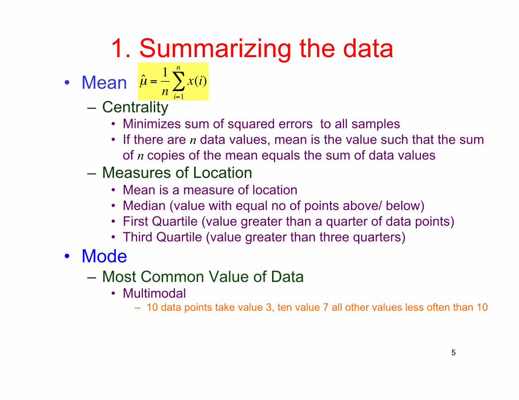
1. Summarizing the data • Mean
– Centrality • Minimizes sum of squared errors to all samples • If there are n data values, mean is the value such that the sum
of n copies of the mean equals the sum of data values – Measures of Location
• Mean is a measure of location • Median (value with equal no of points above/ below) • First Quartile (value greater than a quarter of data points) • Third Quartile (value greater than three quarters)
• Mode – Most Common Value of Data
• Multimodal – 10 data points take value 3, ten value 7 all other values less often than 10
€
ˆ µ =1n
x(i)i=1
n
∑
5
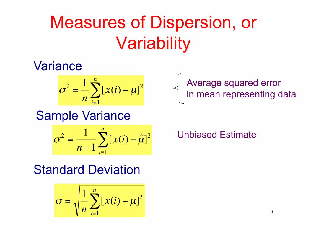
Measures of Dispersion, or Variability
€
σ 2 =1n
[x(i)i=1
n
∑ −µ]2
€
σ =1n
[x(i)i=1
n
∑ −µ]2
Average squared error in mean representing data
6
Variance
Standard Deviation
€
σ 2 =1n −1
[x(i)i=1
n
∑ − ˆ µ ]2
Sample Variance Unbiased Estimate
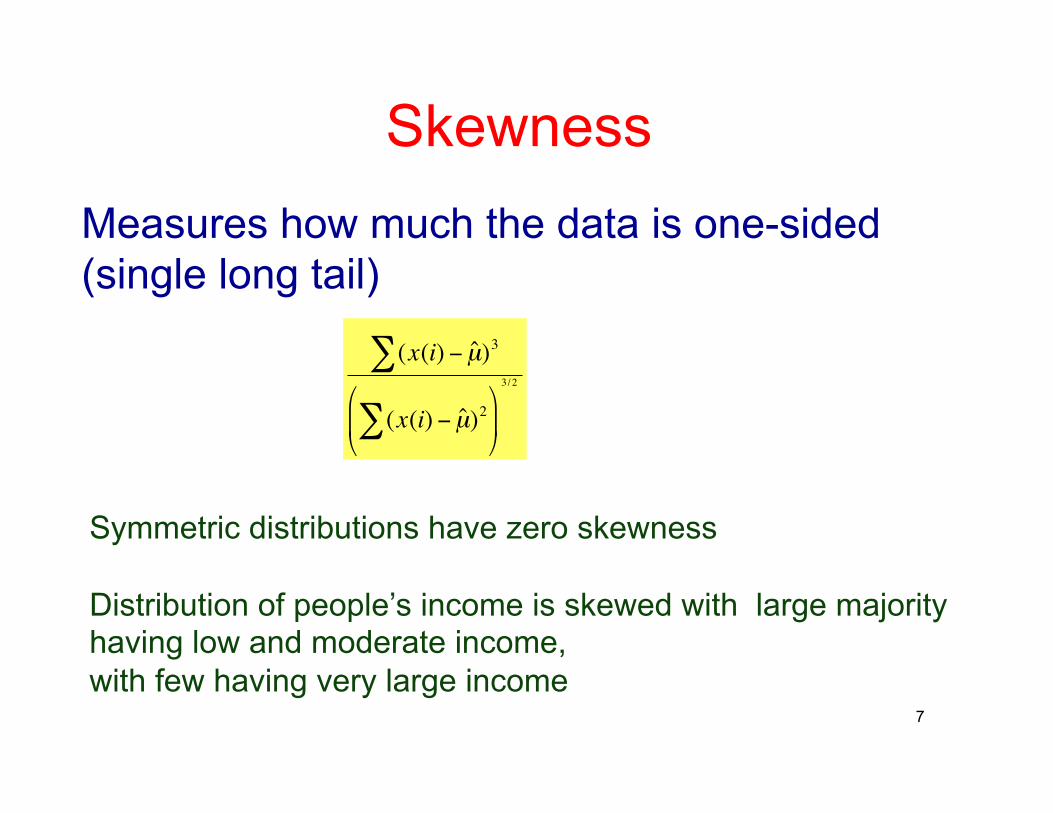
Skewness
7
€
(x(i) − ˆ µ )3∑
(x(i) − ˆ µ )2∑
3/2
Measures how much the data is one-sided (single long tail)
Symmetric distributions have zero skewness
Distribution of people’s income is skewed with large majority having low and moderate income, with few having very large income
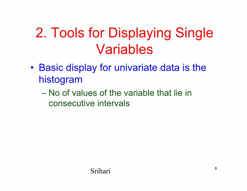
2. Tools for Displaying Single Variables
• Basic display for univariate data is the histogram – No of values of the variable that lie in
consecutive intervals
8 Srihari
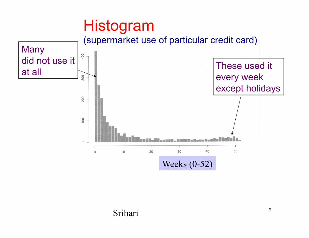
Histogram (supermarket use of particular credit card)
Many did not use it at all
These used it every week except holidays
Weeks (0-52)
9 Srihari
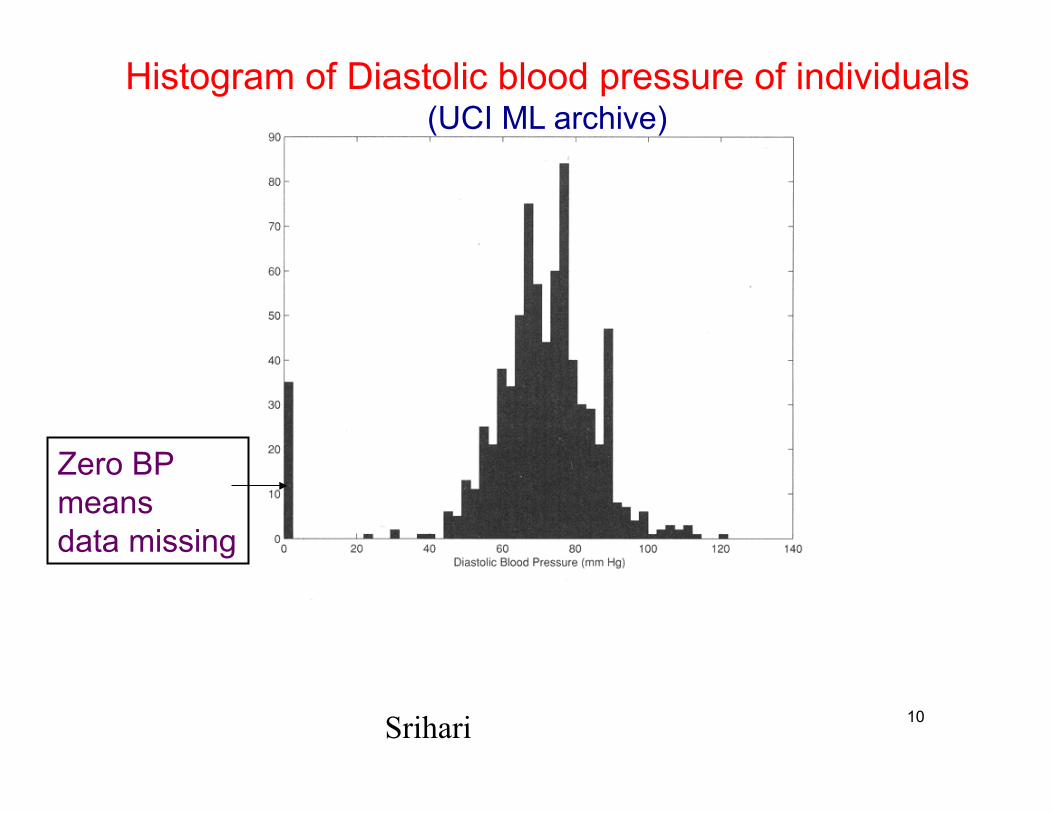
Histogram of Diastolic blood pressure of individuals (UCI ML archive)
Zero BP means data missing
10 Srihari
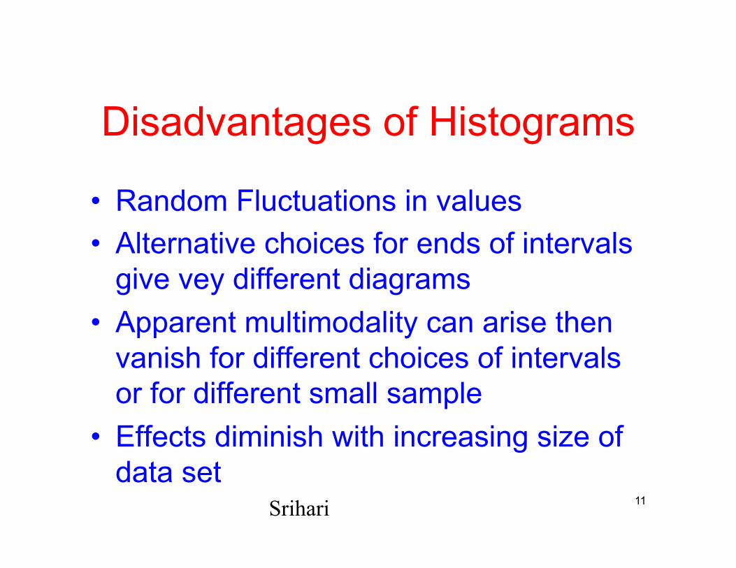
Disadvantages of Histograms
• Random Fluctuations in values • Alternative choices for ends of intervals
give vey different diagrams • Apparent multimodality can arise then
vanish for different choices of intervals or for different small sample
• Effects diminish with increasing size of data set
Srihari 11
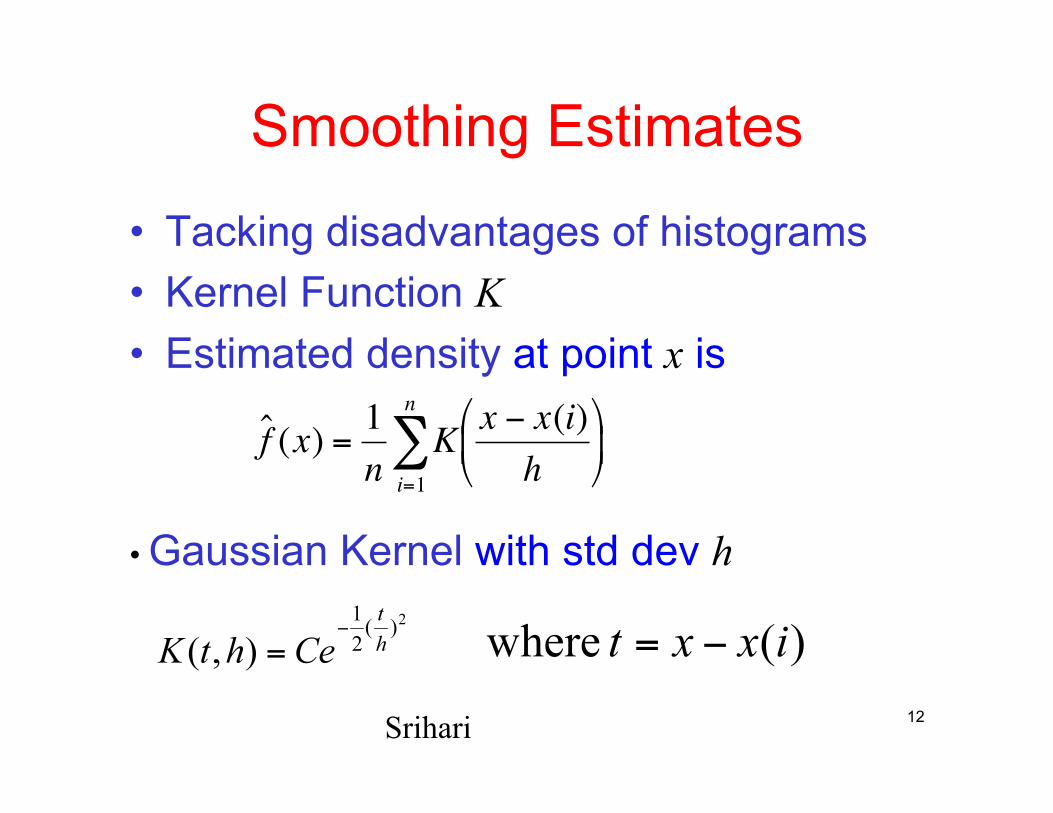
Smoothing Estimates
• Tacking disadvantages of histograms • Kernel Function K • Estimated density at point x is
€
ˆ f (x) =1n
K x − x(i)h
i=1
n
∑
• Gaussian Kernel with std dev h
12 Srihari
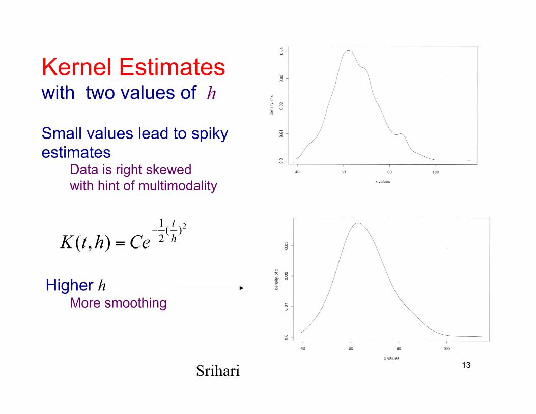
Kernel Estimates with two values of h
Small values lead to spiky estimates
Data is right skewed with hint of multimodality
Higher h More smoothing
13 Srihari
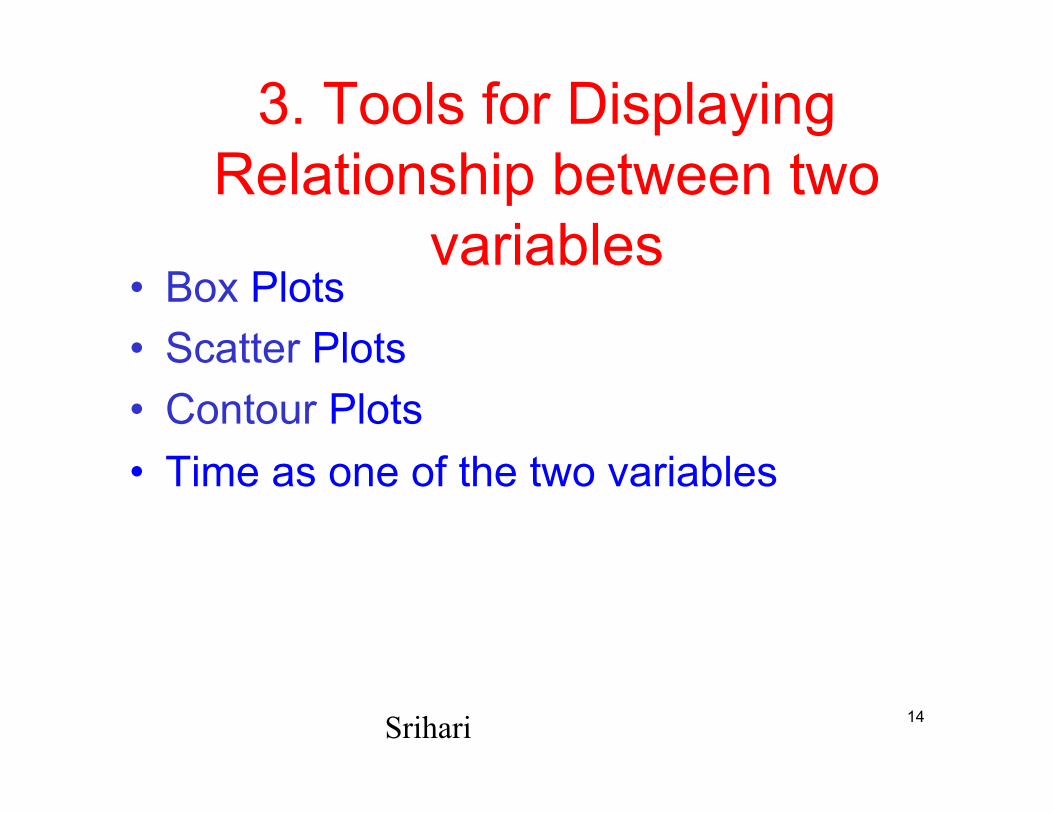
3. Tools for Displaying Relationship between two
variables • Box Plots • Scatter Plots • Contour Plots • Time as one of the two variables
14 Srihari
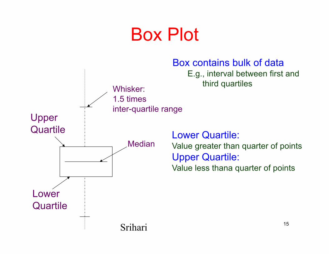
Box Plot
Median
Upper Quartile
Lower Quartile
Whisker: 1.5 times inter-quartile range
15 Srihari
Lower Quartile: Value greater than quarter of points Upper Quartile: Value less thana quarter of points
Box contains bulk of data E.g., interval between first and
third quartiles
Healthy Diabetic
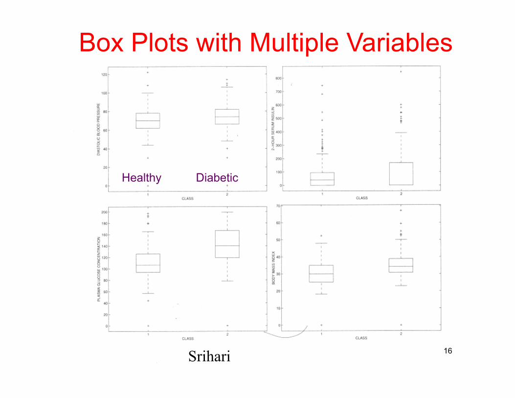
Box Plots with Multiple Variables
16 Srihari
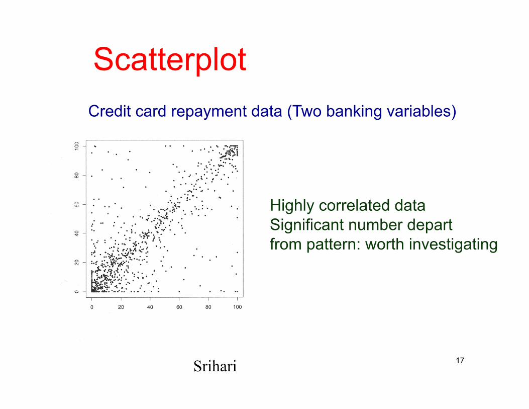
Scatterplot Credit card repayment data (Two banking variables)
Highly correlated data Significant number depart from pattern: worth investigating
17 Srihari
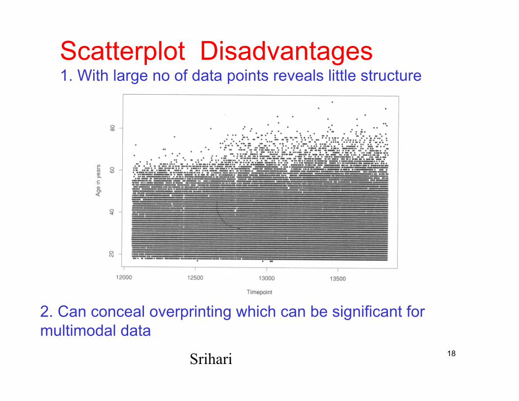
Scatterplot Disadvantages 1. With large no of data points reveals little structure
2. Can conceal overprinting which can be significant for multimodal data
18 Srihari
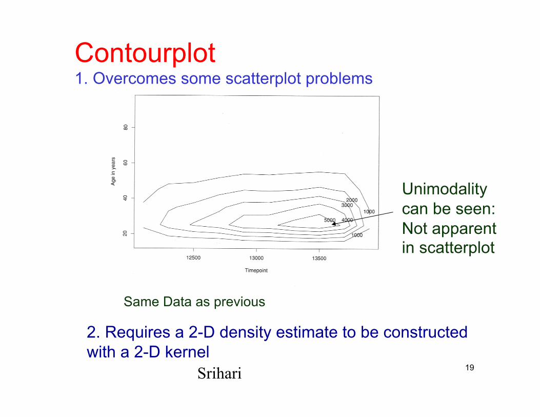
Contourplot 1. Overcomes some scatterplot problems
2. Requires a 2-D density estimate to be constructed with a 2-D kernel
Unimodality can be seen: Not apparent in scatterplot
19 Srihari
Same Data as previous
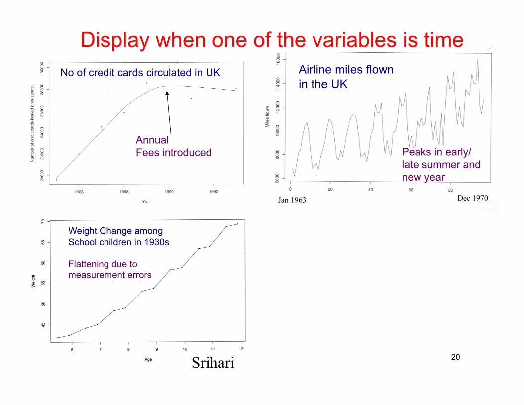
Display when one of the variables is time
Jan 1963 Dec 1970
Peaks in early/ late summer and new year
Annual Fees introduced
20
No of credit cards circulated in UK Airline miles flown in the UK
Weight Change among School children in 1930s
Flattening due to measurement errors
Srihari
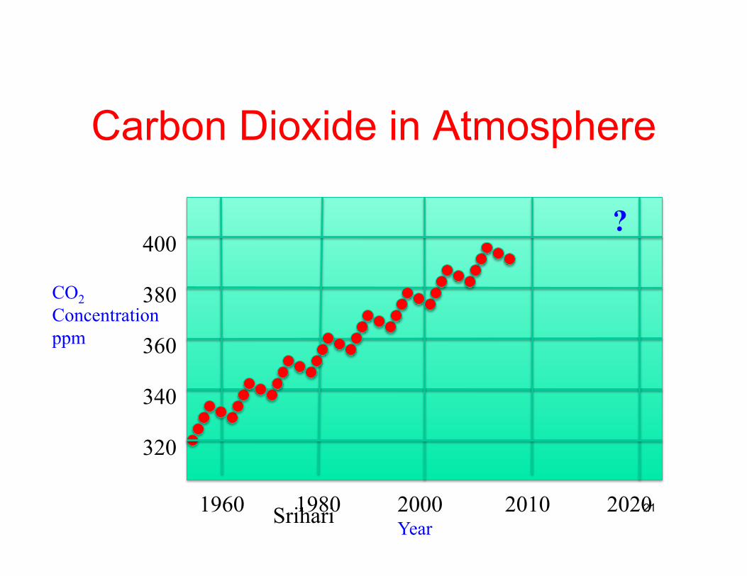
Carbon Dioxide in Atmosphere
1960 1980 2000 2010 2020
320
340
360
380
400
CO2 Concentration ppm
?
Year 21 Srihari
Tools for Displaying More than Two Variables
• Scatter plots for all pairs of variables • Trellis Plot • Parallel Coordinates Plot
22 Srihari
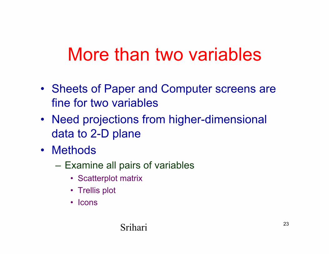
More than two variables
• Sheets of Paper and Computer screens are fine for two variables
• Need projections from higher-dimensional data to 2-D plane
• Methods – Examine all pairs of variables
• Scatterplot matrix • Trellis plot • Icons
23 Srihari
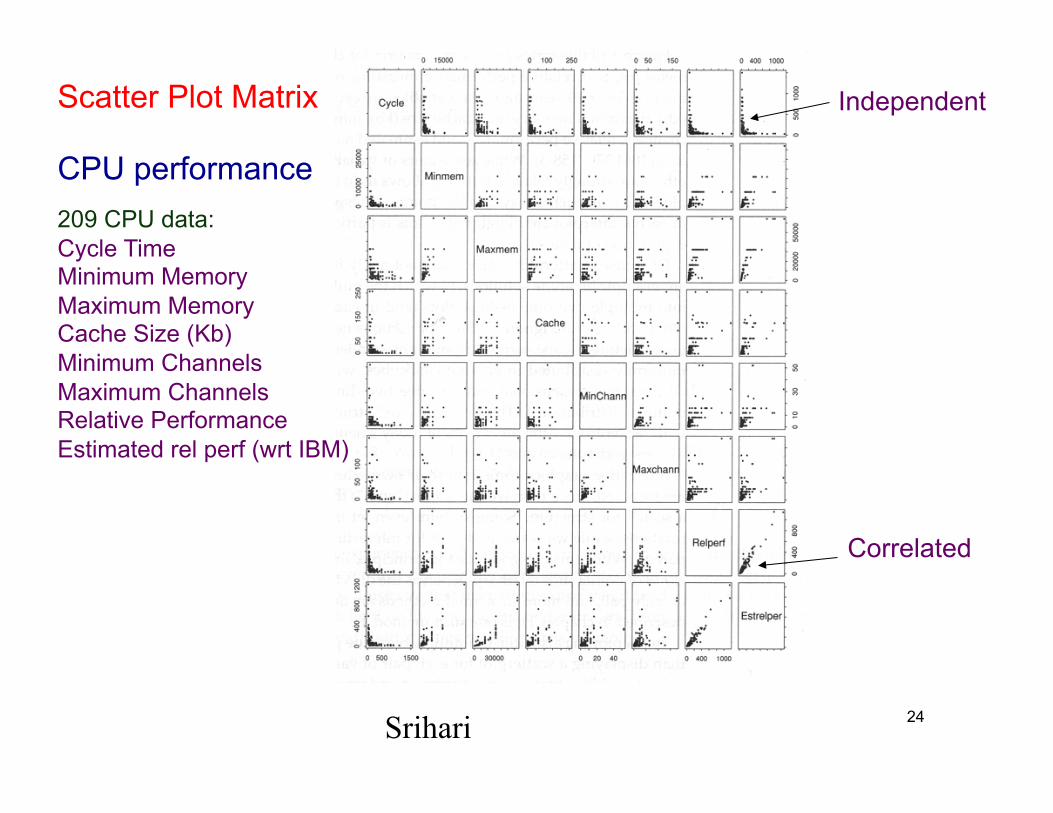
Correlated
Independent
CPU performance 209 CPU data: Cycle Time Minimum Memory Maximum Memory Cache Size (Kb) Minimum Channels Maximum Channels Relative Performance Estimated rel perf (wrt IBM)
24 Srihari
Scatter Plot Matrix
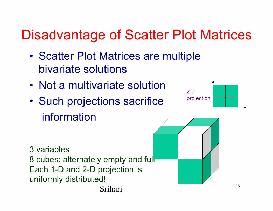
Disadvantage of Scatter Plot Matrices • Scatter Plot Matrices are multiple
bivariate solutions • Not a multivariate solution • Such projections sacrifice
information
3 variables 8 cubes: alternately empty and full Each 1-D and 2-D projection is uniformly distributed!
2-d projection
25 Srihari
Trellis Plot
• Rather than displaying scatter plot for each pair of variables
• Fix a particular pair of variables and produce a series of scatter plots, histograms, time series plots, contour plots etc
26 Srihari
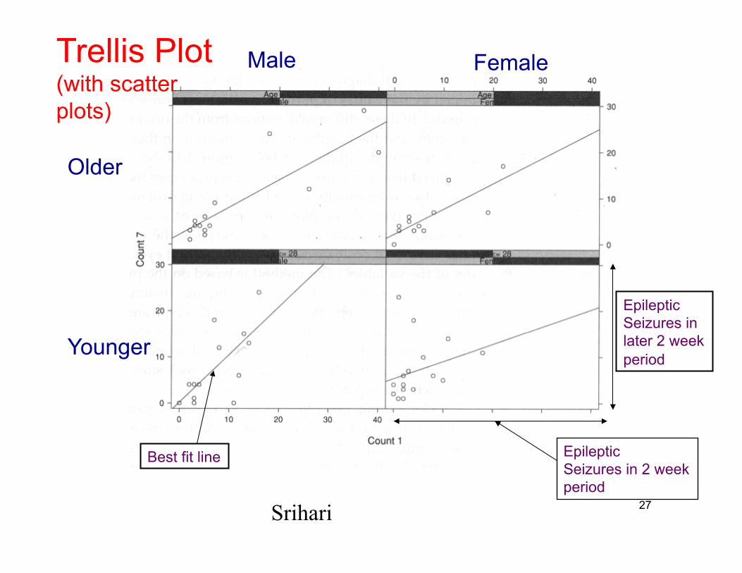
Male Female
Older
Younger
Epileptic Seizures in 2 week period
Epileptic Seizures in later 2 week period
Best fit line
Trellis Plot (with scatter plots)
27 Srihari
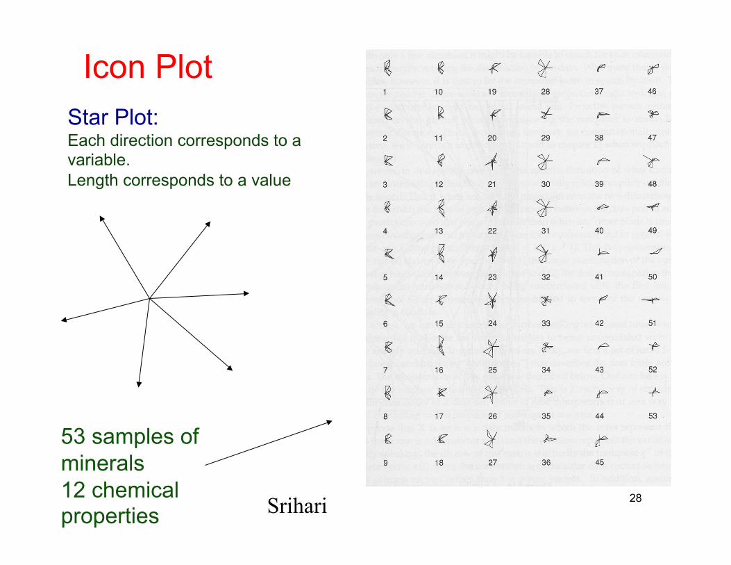
Icon Plot Star Plot: Each direction corresponds to a variable. Length corresponds to a value
53 samples of minerals 12 chemical properties
28 Srihari
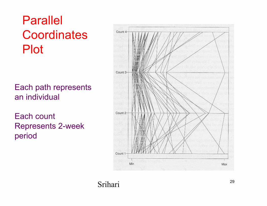
Parallel Coordinates Plot
Each path represents an individual
Each count Represents 2-week period
29 Srihari