Embed Size (px)
Citation preview

2015 Edition
10
2015 Edition
Style+Design2 0 1 6


We lead by design. Everything we do has a purpose. We aim to enhance
the entire visual experience at every touchpoint across the Brand.
The Standard

10
Traits

We like simple, clean and smart design. We measure the success of all creative by three criteria: does it engage, enrich, or help communicate the right message? Apply these guidelines and tips to build and evolve a cohesive look & feel across all visual channels for the Brand.
Fun Human AchievableOpen English is a symbol of hope and opportunity.We are casual, cool, and sophisticated – and we’re revolutionizing the way people learn.
STYLE GUIDE10

Opportunity AwaitsENGAGE. ENRICH. EDUCATE.
We like simple, clean and smart design. We measure the success of all creative by three criteria: does it engage, enrich, or help communicate the right message? Apply these guidelines and tips to build and evolve a cohesive look & feel across all visual channels for the Brand.
Opportunity AwaitsENGAGE. ENRICH. EDUCATE.
We like simple, clean, and smart design. We measure the success of all creative by three criteria: does it engage, enrich, or help communicate the right message? Apply these guidelines and tips to build and evolve a cohesive look & feel across all visual channels for the Brand.

Story

In 2007, we launched a groundbreaking product with the goal of giving students the most effective and affordable way to learn English from the comfort of their home or office. We built our model based on native English speaking teachers and multimedia content, eliminating the traditional barriers to learn a language: traffic, non-native teachers, outdated textbooks. We created Open English, a complete online learning solution with 24/7 access that quickly became the best English learning platform in the world. Open English has escalated like no other online language school since its inception, with an unprecedented explosion in the climbing number of enrolled students and the best part is, we’re just getting started.
Open EnglishONLINE. LEARNING. SOLUTION.

10-15
MarkLogo
16-24
TypographyTypeType Hierarchy
25-29
ColorPrimary and SecondaryColor Palette
30-37
ImagesPhotographyImages
38-44
ProductImagesLessons
45-65
MarketingSocial MediaPrintOE.comEmail / AdsBlog
66-69
WebFontDesignButtons
Content.

10
The Mark

THE MARK | LOGO
Logo History
In the summer of 2012, Open English partnered with Chermayeff & Geismar and Haviv, one of the most recognized identity & brand design firms in the world, to conceive our NEW visual identity.
Chermayeff & Geismar is a pioneering graphic design firm with an innovative portfolio stretching over half a century. They specialize in the development of trademarks, print and motion graphics, exhibitions, and art in architecture. The firm’s global reach in Europe, Asia, Latin America, and the Middle East places Open English in the world
stage with the deployment of LP2.0 and its new visual identity. At first sight, this mark is quite simple. It is also appropriate and, most importantly, memorable. These three features give our Logo the ability to burn into your mind.
The suggestions of the design structure are precise and fitting: is it a window? a door? a computer screen? The Open English logo can be all three; and that’s its beauty. Its success is bringing hope and opportunity to our students.
12

Mark Sizing Detail
THE MARK | LOGO
We all know that behind every well-placed Open English mark lies a well-informed brand ambassador who always makes the right decision. Follow these instructions to make our mark stand out:
x
.25x
.25x
.25x
.25x
x
x - Height of LogotypeKeep the designated area free of any graphical elements
MINIMUM HEIGHT.375in
9.525mm
THE MARK | LOGO
12

Do’s and Don’ts
THE MARK | LOGO
Correct Logo Usage
Need to know how to correctly place the Open English mark? Follow these simple diagrams below and you will be on your way:
THE MARK | LOGO
01
02
03
04
05
Correct Logo Usage
1. This is the perfect example showing the mark in a white background using the respective color guidelines.
2. This is the proper way to have the mark in a black background along with the proper color guidelines.
3. If using a gradient, choose a color that will let the Open English mark stand out.
4. When using the mark in black, use a solid white background to represent the mark.
5. When using the mark in white, use a solid black background to represent the mark.
14

Incorrect Logo Usage
THE MARK | LOGO
Do’s and Don’ts
Incorrect Logo Usage
6. Scale the logo unproportionately.
7. Change the color of the original logo.
8. Add extraneous effects to the logo. This includes, but is not limited to, bevel and emboss, lighting effects, and drop shadows.
9. Place the logo in a busy background. They ususally don’t mix.
10. Add titles/text to the logo.
THE MARK | LOGO
06
07
08
09
10 THEEVENT
Need to know how to avoid misplacing the Open English mark? Follow these simple diagrams below and you will be on your way:
15

Content.
TYPOGRAPHY10

OverviewThe consistent use of type gives Open English a unified apperance across all mediums. Each type brings a certain tone to each design in order to provide a rich and valuable experience through our brand.

THE TEXT | TYPE THE TEXT | TYPE
Marketing TypefaceBrandon Grotesque is our main typeface for marketing purposes only.
Brandon Grotesque | 21/36pt | No Tracking
ABCABCDEFGHIJKLMNOPQRSTUVWXYZabcdefghijklmnopqrstuvwxyz
Lorem ipsum dolor sit amet, consectetur adipiscing elit. Integer posuere erat a ante venenatis dap ibus posuere velit aliquet.
Brandon Grotesque Light | 18/36pt | No Tracking
ABCABCDEFGHIJKLMNOPQRSTUVWXYZabcdefghijklmnopqrstuvwxyz
Lorem ipsum dolor sit amet, consectetur adipiscing elit. Integer po-suere erat a ante venenatis dapibus posuere velit aliquet.
Brandon Grotesque Regular | 11/21pt | No Tracking
ABCABCDEFGHIJKLMNOPQRSTUVWXYZabcdefghijklmnopqrstuvwxyz
Lorem ipsum dolor sit amet, consectetur adipiscing elit. Integer posuere erat a ante venenatis dapibus posuere velit aliquet.
18

THE TEXT | TYPE
10
Marketing TypefaceProxima Nova can be a little sensitive of its height, so keep that in mind and keep all your titles in uppercase and lowercase.
Proxima Nova Bold for Titles | 21/36pt | No Tracking
ABCABCDEFGHIJKLMNOPQRSTUVWXYZabcdefghijklmnopqrstuvwxyz
Lorem ipsum dolor sit amet, consectetur adipiscing elit. Integer posuere erat a ante venenatis dapibus posuere velit aliquet.
Proxima Nova Light for Titles | 18/36pt | No Tracking
ABCABCDEFGHIJKLMNOPQRSTUVWXYZabcdefghijklmnopqrstuvwxyz
Lorem ipsum dolor sit amet, consectetur adipiscing elit. Integer posuere erat a ante venenatis dapibus posuere velit aliquet.
Proxima Nova Regular | 11/21pt | No Tracking
ABCABCDEFGHIJKLMNOPQRSTUVWXYZabcdefghijklmnopqrstuvwxyz
Lorem ipsum dolor sit amet, consectetur adipiscing elit. Integer posuere erat a ante venenatis dapibus posuere velit aliquet.
19

THE TEXT | TYPE
Marketing TypefaceProxima Nova is our primary typeface for web purposes.
Proxima Nova Bold for Titles | 21/36pt | No Tracking
ABCABCDEFGHIJKLMNOPQRSTUVWXYZabcdefghijklmnopqrstuvwxyz
Lorem ipsum dolor sit amet, consectetur adipiscing elit. Integer posuere erat a ante venenatis dapibus posuere velit aliquet.
Proxima Nova Light for Titles | 18/36pt | No Tracking
ABCABCDEFGHIJKLMNOPQRSTUVWXYZabcdefghijklmnopqrstuvwxyz
Lorem ipsum dolor sit amet, consectetur adipiscing elit. Integer posuere erat a ante venenatis dapibus posuere velit aliquet.
Proxima Nova Regular | 11/21pt | No Tracking
ABCABCDEFGHIJKLMNOPQRSTUVWXYZabcdefghijklmnopqrstuvwxyz
Lorem ipsum dolor sit amet, consectetur adipiscing elit. Integer posuere erat a ante venenatis dapibus posuere velit aliquet.
20

Marketing TypefaceOpen Sans is our secondary typeface for web purposes only.
Open Sans Bold for Titles | 21/36pt | No Tracking
ABCABCDEFGHIJKLMNOPQRSTUVWXYZabcdefghijklmnopqrstuvwxyz
Lorem ipsum dolor sit amet, consectetur adipiscing elit. Integer posuere erat a ante venenatis dapibus posuere velit aliquet.
Open Sans Light for Titles | 18/36pt | No Tracking
ABCABCDEFGHIJKLMNOPQRSTUVWXYZabcdefghijklmnopqrstuvwxyz
Lorem ipsum dolor sit amet, consectetur adipiscing elit. Integer posuere erat a ante venenatis dapibus posuere velit aliquet.
Open Sans Regular | 11/21pt | No Tracking
ABCABCDEFGHIJKLMNOPQRSTUVWXYZabcdefghijklmnopqrstuvwxyz
Lorem ipsum dolor sit amet, consectetur adipiscing elit. Integer posuere erat a ante venenatis dapibus posuere velit aliquet.
THE TEXT | TYPE
21

10
Marketing TypefaceRoboto Slab is our secondary typeface for web purposes only.
Roboto Slab Bold for Titles | 21/36pt | No Tracking
ABCABCDEFGHIJKLMNOPQRSTUVWXYZabcdefghijklmnopqrstuvwxyz
Lorem ipsum dolor sit amet, consectetur adipiscing elit. Integer posuere erat a ante venenatis dapibus posuere velit aliquet.
Roboto Slab Light for Titles | 18/36pt | No Tracking
ABCABCDEFGHIJKLMNOPQRSTUVWXYZabcdefghijklmnopqrstuvwxyz
Lorem ipsum dolor sit amet, consectetur adipiscing elit. Integer posuere erat a ante venenatis dapibus posuere velit aliquet.
Roboto Slab Regular | 11/21pt | No Tracking
ABCABCDEFGHIJKLMNOPQRSTUVWXYZabcdefghijklmnopqrstuvwxyz
Lorem ipsum dolor sit amet, consectetur adipiscing elit. Integer posuere erat a ante venenatis dapibus posuere velit aliquet.
THE TEXT | TYPE
22

THE TEXT | TYPE
Marketing TypefaceArial is our tertiary replacement typeface for web purposes only.
Arial Bold for Titles | 21/36pt | No Tracking
ABCABCDEFGHIJKLMNOPQRSTUVWXYZabcdefghijklmnopqrstuvwxyz
Lorem ipsum dolor sit amet, consectetur adipiscing elit. Integer posuere erat a ante venenatis dapibus posuere velit aliquet.
Arial Regular | 11/21pt | No Tracking
ABCABCDEFGHIJKLMNOPQRSTUVWXYZabcdefghijklmnopqrstuvwxyz
Lorem ipsum dolor sit amet, consectetur adipiscing elit. Integer pos-uere erat a ante venenatis dapibus posuere velit aliquet.
1023

THE TEXT | TYPE
10
THE TEXT | TYPE
Typography NumbersMuseo Sans 300 is our main typeface for number use purposes only.
Opening the ExperienceThe Story Behind the brand
Lorem ipsum dolor sit amet, consec-tetur adipiscing elit. Vestibulum im-perdiet turpis semper orci egestas id sagittis justo condimentum. Morbi eget risus eget lacus laoreet vulputate. In-teger aliquam leo in nisi. Praesent sed nisl laoreet leo sodales vestibulum. sed dapibus sem.
Proxima Novain Upper and Lower case 21/72pt | no Tracking
Proxima Nova Light in Upper and Lower case18/72pt | no Tracking
Proxima Nova Regular for text 16/21pt | no Tracking
Museo Sans 300 for numerals 11/18pt | no Tracking
0123456789
0123456789
Typography and Hierarchy ExampleMuseo Sans 300 is our main typeface for number use purposes only.
Museo Sans 100 | 12/18pt | Tracking 15
Teacher
0 1 2 3 4 5 6 7 8 9
0 1 2 3 4 5 6 7 8 9
Museo Sans 300 | 12/18pt | Tracking 15
Teacher
0 1 2 3 4 5 6 7 8 9
0 1 2 3 4 5 6 7 8 9
24

COLOR10
20
Color

OverviewColors say a lot; it is important to work with different schemes to create the perfect palette. Through our chosen colors, we clearly communicate who we are: energetic, trustworthy, and inspirational. Together or independently, the Open English colors send the right message.
Colors say a lot; it is important to work with different schemes to create the perfect palette. Through our chosen colors, we clearly communicate who we are: energetic, trustworthy, and inspirational. Together or independently, the Open English colors send the right message.

THE COLOR | COLORTHE COLOR | COLOR
The Logo ColorsOpen English Blue
The Open English logo uses two distinct colors when set on a black or a white back-ground. The mark is available for print and screen use in EPS, PDF, PNG, and JPEG. Contact [email protected] for access to downloadable files.
01. For use with a White Background
RGB 0-132-255 CMYK 100-20-0-0
HEX 0084FF Pantone PROB BLUE C
RGB 0-105-224 HEX 0069DF
02. For use with a Black Background
RGB 0-151-255 CMYK 100-20-0-0
RGB 0-110-208 HEX 006ED0
HEX 0097FF Pantone PROB BLUE C
Mark Color Details
x
.25x
.25x
.25x
.25x
x
x - Height of LogotypeKeep the designated area free of any graphical elements
MINIMUM HEIGHT.375in9.525mm
27

THE COLOR | COLOR
The Secondary Color PaletteSpecs
These colors bring out the best in our bright, fun, and playful color scheme. Use them to enhance the FUN in the Open English experience.
RGB 241-40-193CMYK 15-85-0-0
RGB 255-95-0 CMYK 0-77-100-0
RGB 206-222-0CMYK 24-0-100-0
RGB 37-202-211 CMYK 65-0-21-0
HEX F128C1 Pantone 807C
HEX FF5F00 Pantone 165C
HEX CEDE00 Pantone 389C
HEX 25CAD3 Pantone 319C
The Primary Color PaletteSpecs
01. Fun Yellow 02. Achievable Green
03. Human Blue
05. Light Gray
07. Black
06. Mid Gray
08. Dark Gray
04 Hope Blue
RGB 239-189-8CMYK 7-25-100-0
RGB 161-194-59 CMYK 42-6-99-0
RGB 20-108-178 CMYK 89-57-2-0
RGB 243-243-243 CMYK 3-2-2-0
RGB 0-0-0 CMYK 100-100-100-100
RGB 130-130-130 CMYK 51-43-43-7
RGB 77-77-77 CMYK 65-58-57-37
RGB 103-178-231 CMYK 55-16-0-0
HEX EFBD08 Pantone 123C
RGB 180-138-0HEX B48900
RGB 94-129-0HEX 5E8100
RGB 0-75-141HEX 004B8C
RGB 0-102-150HEX 006696
RGB 217-217-217HEX D9D9D9
RGB 162-160-159HEX A1A09F
RGB 34-33-33HEX 222120
RGB 95-94-93HEX 5F5D5D
RGB 184-0-143HEX B8008F
RGB 204-52-0HEX CC3400
RGB 148-167-0HEX 93A600
RGB 0-157-167HEX 009DA7
HEX A1C23B Pantone 584C
HEX 146CB2 Pantone 307C
HEX F3F3F3 Pantone 656C
HEX 000000 Pantone 426C
HEX 828282 Pantone 877C
HEX 4D4D4D Pantone 425C
HEX 67B2E7 Pantone 292C
THE COLOR | COLOR
The Secondary Color PaletteSpecs
The Primary Color PaletteSpecs
28
These colors are used to complement the main Open English blue hues in order to create the visual brand experience.

THE COLOR | COLOR
Color Scheme Hierarchy
The Open English primary and secondary color palettes with the hierarchy scheme.
Social MediaOpenEnglish.com, LP2 PlatformSocial Media, Marketing Purposes
10
THE COLOR | COLOR
Color Scheme Hierarchy
The Open English Colors can be applied to all creative. Our Primary Colors are Open English Blue used in our logo; Fun - Yellow; Human - Blue; Achievable - Green; and Hope - Blue.
Our Secondary Colors are: Fuchsia - Pink; Cerulean - Blue; Tangerine - Orange; and Chartreuse - Yellow. Lastly, our Supporting Colors help complement all creative sim-ply and effectively with neutral shades, tints, and tones by using Light Grey, Dark Grey, Charcoal, and Black.
We use our Primary Color Palette most frequently in all visual components; these are our anchor colors and compliment the Open English Logo & Branded Imagery. The use of our Secondary Color Palette is reserved for special projects, social media, and hello. the Open English blog. These colors can be used alone or can be combined with our anchor colors to add more variety to a complex project or campaign.
29

IMAGES10
10
THE IMAGES | PHOTOGRAPHY IMAGES
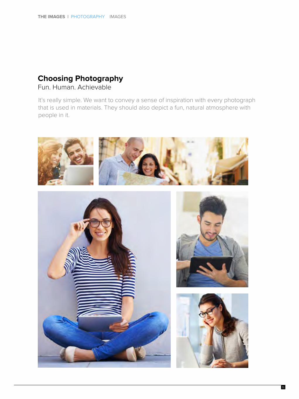
Choosing Photography Fun. Human. Achievable
It’s really simple. We want to convey a sense of inspiration with every photograph that is used in materials. They should also depict a fun, natural atmosphere with people in it.
31

10
THE IMAGES | PHOTOGRAPHY IMAGES
On Brand Photography
Lighting, Clarity, Depth of field, Vibrant colors, Warmth
Workstation
People
32

1033
Travel
City / Landmark
On Brand Photography
Lighting, Clarity, Depth of field, Vibrant colors, Warmth

10
THE IMAGES | PHOTOGRAPHY IMAGES
Imagery Do’sStriking a pose? Follow these simple steps and choose a photo that begs to be seen.
01
02
03
05
06
Correct Photo Usage:
1. This is photography at its finest. Follow this standard and succeed.
2. Photographs that suggest human emotions are always welcome.
3. Online is the best way to learn English. Let’s show it.
4. Choose images that show people in friendly, safe environments.
5. Use images of students learning from home.
6. Natural settings with computers are a plus!
04
34

10
THE IMAGES | PHOTOGRAPHY IMAGES
Imagery Don’tsThese are the images that should be avoided.
Incorrect Photo Usage:
1. If you are resizing the photo, make sure to use correct proportions.
2. Avoid black and white photographs. We want to let the colors shine.
3. While background settings look great, we need the human touch.
4. Choose images that show people in friendly, safe environments.
5. Use images of students learning from home.
6. Online is the best way to learn English. Let’s show it.
Photography Downloads For access to high-resolution photos, please contact us at [email protected].
01
02
03
05
06
04
35

THE IMAGES | PHOTOGRAPHY IMAGES
Students Imagery ExamplesThe students images should portray learning from home, or comfortable environments. For image downloads please contact us at [email protected].
36

THE IMAGES | PHOTOGRAPHY IMAGES
Our Website CharactersThese are the openenglish.com teachers and students. For image downloads please contact us at [email protected].
Teachers
Advisors
Students
Jenny
Anna
JuanDavid
Sheila
Fiorella Carlos
AndresDiana
Adam
37


10
PRODUCT | IMAGES LESSONS CHARACTERS
ProductImages
The recently redesigned learning platform boasts an all-new curriculum, mobile access, optimized study paths and more teacher interaction than ever before. We are ready to service hundreds of thousands of students with our new and improved learning platform.
Study Plan
Live Classes
Practice
39
,

10
PRODUCT | IMAGES LESSONS CHARACTERS
ProductImages
Open English developed the Weekly Study Plan as a solution to students’ common question – “what’s next?” The Weekly Study Plan guides students through an optimal combination of the 3 major activities of our curriculum – live classes, lessons and practice exercises. This tool helps to keep students on track so they are able to fulfill each learning objective before moving on to another concept. Completed activities turn blue, which is a great visual tool for students to focus on the next step.
Study Plan Practice
40

PRODUCT | IMAGES LESSONS CHARACTERS
ProductImagesSimply put, Open English’s goal is to help students succeed. With this goal in mind, Open English is on a quest to deliver the best service through continuously improving its learning platform. After observing over 100,000 students learn with our initial learning platform, we have developed and refined an innovative system to make human interaction more efficient and effective.
Live Classes News Reader
10
PRODUCT | IMAGES LESSONS CHARACTERS
ProductImages
Live Classes News Reader
41

PRODUCT | IMAGES LESSONS CHARACTERS
10
PRODUCT | IMAGES LESSONS CHARACTERS
ProductImagesOnce students complete the Open English Placement Test, they are placed in the appropriate level to begin taking lessons. Each level is a combination of unlimited live classes, 60 lessons and hundreds of practice exercises. These learning activities are organized within weekly study plans and provide the appropriate mix of learning content. The Weekly Study Plan is estimated to be 3 – 3 ½ hours of work and is located directly on the Home page.
Lessons
42

PRODUCT | IMAGES LESSONS CHARACTERS PRODUCT | IMAGES LESSONS CHARACTERS
ProductLessonsOpen English has developed eight English competency levels, where level 1 represents “brand new” English students and level 8 represents those who may be considered “bilingual”. Each Open English level is aligned with the equivalent levels on the Common European Framework of Reference for Languages (CEFR). There is additional functionality within the lesson page to enhance the students’ learning experience: Common Questions, and My Notes.
43

PRODUCT | IMAGES LESSONS CHARACTERS
ProductCharacters
These are the Open English lessons characters
THE HOSTAmy the host / on screen personality (Female)• Visits each city to discover all the popular attractions, shops and hot spots • On free time she plans parties for friends and clients in the city• Always has her smartphone with her • Knows lots of people in many cities • Dresses very hip, casual sleek • Traits: Adventurous, creative, thoughtful, charming
THE PHOTOGRAPHERJames the photographer / On screen personality (Male):• Writes about photography, and the latest trends in technology • Likes to photograph portraits, and landscapes• Likes visiting different cities• Dresses in hip, business casual • Traits: outgoing, active, passionate about photography
THE STUDENTSara the college student (Female) • Aspires to be in the entertainment industry. • Likes to study online • Stays current with pop culture trends • Always has her laptop • Dresses in jeans and nice blouses • Traits: warm, energetic, curious
CHEF AND FOODIEZack the chef/foodie/on-screen personality (Male): • Eats and writes about food the classy, hip, new restaurants in the featured cities • Likes trying new foods • Likes to ride his bike to work • Dresses in hip, business casual • Traits: outgoing, active, passionate about food
Amy
James
Sara
Zack
PRODUCT | IMAGES LESSONS CHARACTERS
44


MARKETING | SOCIAL MEDIA PRINT OE.COM EMAILS / ADS BLOG
MarketingSocial MediaSocial Media efforts at Open English strive to create content that attracts attention and encourages its readers to share it with their social networks. Therefore, it constantly changes its graphics and style but always stays on-brand.
Design Examples 2016
46

Design Examples 2016
MARKETING | SOCIAL MEDIA PRINT OE.COM EMAILS / ADS BLOG
Social MediaFacebookWith 1.44 billion monthly active users, Facebook is the world’s largest social network.
47

MARKETING | SOCIAL MEDIA PRINT OE.COM EMAILS / ADS BLOG
10
Facebook Image Guidelines• Use PS Save for Web Feature• Images with a logo or text may be best as a PNG file
Facebook Image Dimensions• Cover Photo – 851 x 315 pixels• Mobile Save Area Cover Photo – 563 x 315 pixels• Profile Picture – 180 x 180 pixels. (Displays 160 x 160 on Desktop)• Post Images – 600 x 600 pixels. (Click to Web: Multiple Product)
FacebookPlatform Specs
48

MARKETING | SOCIAL MEDIA PRINT OE.COM EMAILS / ADS BLOG
10
Social MediaTwitter
Twitter is one of the social media networks that our customers will most often use to discuss the Open English brand.
Design Examples 2016
49

MARKETING | SOCIAL MEDIA PRINT OE.COM EMAILS / ADS BLOG
10
TwitterPlatform Specs
Twitter Image Guidelines
Twitter Image Guidelines
• Profile Photo – 400 x 400 pixels. (Displays 200 x 200 pixels)• Header Photo – 1,500 x 500 pixels• Post Image Maximum to appear expanded 1024 x 512 pixels
• Square Image – recommended 400 x 400 pixels• Maximum file size 2 MB• JPG, GIF, or PNG
In order to make sure that Twitter is displaying the portion of the photo you want followers to see, make sure the width of your image fits the minimum require-ments and that your content is horizontally centered.
50

With 364 million users, LinkedIn is the world’s largest professional network. Where other social networks may be good drivers of traffic and customers, LinkedIn is a great place for Open English to source great employees and to connect with other industry leaders.
10
Social MediaLinkedIn
Design Examples 2016
MARKETING | SOCIAL MEDIA PRINT OE.COM EMAILS / ADS BLOG
51

10
LinkedInPlatform Specs
LinkedIn Image Dimensions
LinkedIn Image Guidelines
• Cover Photo – 851 x 315 pixels• Mobile Save Area Cover Photo – 563 x 315 pixels• Profile Picture – 180 x 180 pixels (Displays 160 x 160 on Desktop)• Post Images – 600 x 600 pixels (Click to Web: Multiple Product)
• Use PS Save for Web Feature• Images with a logo or text may be best as a PNG file
MARKETING | SOCIAL MEDIA PRINT OE.COM EMAILS / ADS BLOG
52

10
MARKETING | SOCIAL MEDIA PRINT OE.COM EMAILS / ADS BLOG
53
Social MediaInstagramInstagram is one of the most popular photo-sharing social networks with a user base of over 100 million.
Design Examples 2016

10
InstagramPlatform Specs
Image Dimensions
Instagram Image Guidelines
• Cover Photo – 851 x 315 pixels• Mobile Save Area Cover Photo – 563 x 315 pixels• Profile Picture – 180 x 180 pixels (Displays 160 x 160 on Desktop)• Post Images – 600 x 600 pixels (Click to Web: Multiple Product)
• Use Photoshop’s Save for Web feature• Images with a logo or text may be best save as a PNG file
Instagram is a great platform to share fun or creative photos that show what Open English is all about.
MARKETING | SOCIAL MEDIA PRINT OE.COM EMAILS / ADS BLOG
54
Social MediaGoogle+Google+ is an important site for Open English not just because of the social aspect, but also due to the fact that Open English’s Google+ account is also tied to the search engine itself.
Design Examples 2016
MARKETING | SOCIAL MEDIA PRINT OE.COM EMAILS / ADS BLOG
55

10
Google+Platform Specs
Google+ Image Guidelines
Google+ Image Dimensions• Profile Picture – 250 x 250 pixels• Cover Image – 1,080 x 608 pixels• Shared Image – 497 x 373 pixels• Shared Link – 150 x 150 pixels
• Appears in home stream and on page at a width of 426 pixels (height is scaled)
• Minimum width of 497 pixels (will scale the height for you)• Maximum upload 2,048 x 2,048 pixels• Shared Link – 150 x 150 (thumbnail)
Google+ images are the main attraction on our page, so choose your photo wisely! It’s a great opportunity to showcase the product and services that Open English has to offer.
MARKETING | SOCIAL MEDIA PRINT OE.COM EMAILS / ADS BLOG
56

10
Social MediaYouTubeYouTube has more than 1 billion unique users every month and is available on hundreds of millions of devices.
MARKETING | SOCIAL MEDIA PRINT OE.COM EMAILS / ADS BLOG
57
Design Examples 2016

10
YouTubePlatform Specs
Video Requirements• Videos must maintain a 16:9 aspect ratio• In order to qualify as full HD, your dimensions must be at least 1,280
x 720 pixels
More than 1 million brands have already realized that YouTube is a great opportunity to reach their fan-base.
MARKETING | SOCIAL MEDIA PRINT OE.COM EMAILS / ADS BLOG
58
YouTube Dimensions• Channel Cover Photo – 2,560 x 1,440
• Tablet display: 1,855 x 423• Mobile display: 1,546 x 423• TV display: 2,560 x 1,440
• Video Uploads• Videos must maintain a 16:9 aspect ratio• In order to qualify as full HD, your dimensions must be at least
1,280 x 720 pixels

MARKETING | SOCIAL MEDIA PRINT OE.COM EMAILS / ADS BLOG
MarketingPrint
Design Examples 2015
Innovation starts here.
10
MARKETING | SOCIAL MEDIA PRINT OE.COM EMAILS / ADS BLOG
MarketingPrint
Design Examples 2015
Innovation starts here.
MARKETING | SOCIAL MEDIA PRINT OE.COM EMAILS ADS BLOG
MarketingPrint
Print Ads request are summited to the Creative Department with all the proper requirements (brief, specs, etc.). Here are samples of print ads.
Design Examples
59
MARKETING | SOCIAL MEDIA PRINT OE.COM EMAILS ADS BLOG
MarketingPrint
Print Ads request are summited to the Creative Department with all the proper requirements (brief, specs, etc.). Here are samples of print ads.
Design Examples

MARKETING | SOCIAL MEDIA PRINT OE.COM EMAILS / ADS BLOG
Marketingwww.openenglish.comGraphics
60
MARKETING | SOCIAL MEDIA PRINT OE.COM EMAILS / ADS BLOG
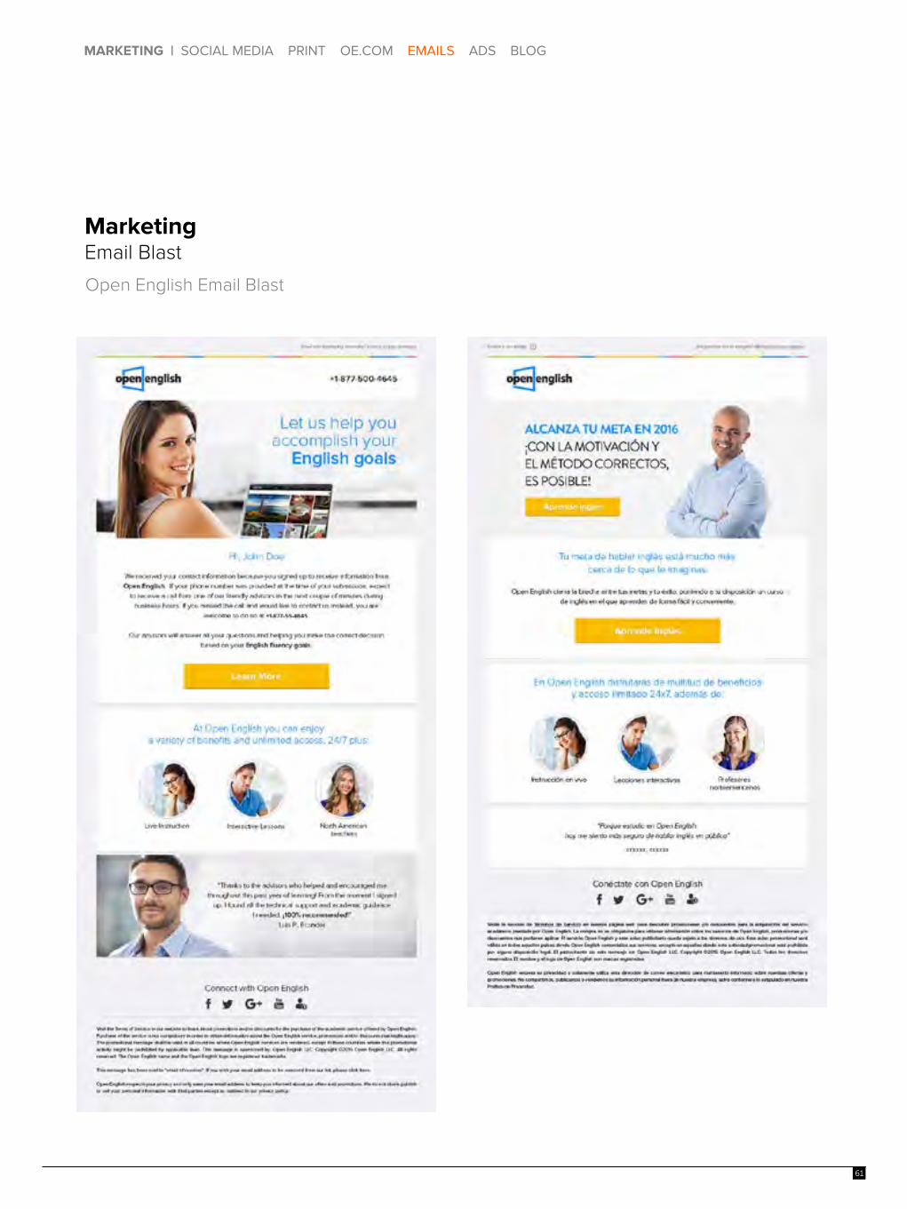
MarketingEmail Blast
!
SUSCRÍBASE HOY !
10
MARKETING | SOCIAL MEDIA PRINT OE.COM EMAILS / ADS BLOG
MarketingEmail BlastOpen English Email Blast
Ad Campaigns
!
SUSCRÍBASE HOY !
MARKETING | SOCIAL MEDIA PRINT OE.COM EMAILS ADS BLOG
MarketingEmail Blast
Open English Email Blast
MARKETING | SOCIAL MEDIA PRINT OE.COM EMAILS ADS BLOG
MarketingEmail Blast
Open English Email Blast
61

MarketingGDNOpen English Social Media Ads
1062

MARKETING | SOCIAL MEDIA PRINT OE.COM EMAILS / ADS BLOG
hello.The Open English Blog
Blog PostsHere are 3 examples of blog images for hello.
Healthy Habits Taking A Trip Award Season
10
MARKETING | SOCIAL MEDIA PRINT OE.COM EMAILS / ADS BLOG
hello.The Open English Blog
Blog PostsHere are 3 examples of blog images for hello.
Healthy Habits Taking A Trip Award Season
hello.The Open English Blog
Blog PostsHere are 2 examples of blog images for hello.
Welcome to hello. by Open English. We will inspire you, challenge you, and always make you think. We are not just a blog, we are a community of learners, dreamers, and innovators united by a passion to share the English language with the world. Visit our hello. blog weekly to learn, practice, and grow with Open English.
Travel Work
MARKETING | SOCIAL MEDIA PRINT OE.COM EMAILS ADS BLOG
63

MARKETING | SOCIAL MEDIA PRINT OE.COM EMAILS / ADS BLOG
10
MARKETING | SOCIAL MEDIA PRINT OE.COM EMAILS / ADS BLOG
64
hello.The Open English Blog ImageryThe imagery for the Open English blog should be vibrant and current. The people should look friendly, the places should come alive, and the subjects should be clear and interesting. The design + style of our imagery should be global, because English is a global language. We place emphasis on Latin America, Brazil, and the US Hispanic market, but it’s OK to represent the world as we share English with everyone.
Blog Image Size - 850x350px
Facebook Image Size - 484x252px
hello.The Open English Blog Imagery
Blog Image Size - 850x350px
Facebook Image Size - 484x252px

10
MARKETING | SOCIAL MEDIA PRINT OE.COM EMAILS / ADS BLOG
hello.The Open English Blog Do’s & Don’ts
Please refer to the Facebook Ads Policy and Guidelines below for more information.https://www.facebook.com/help/468870969814641
Do’s
Don’ts
65

CTAsWeb
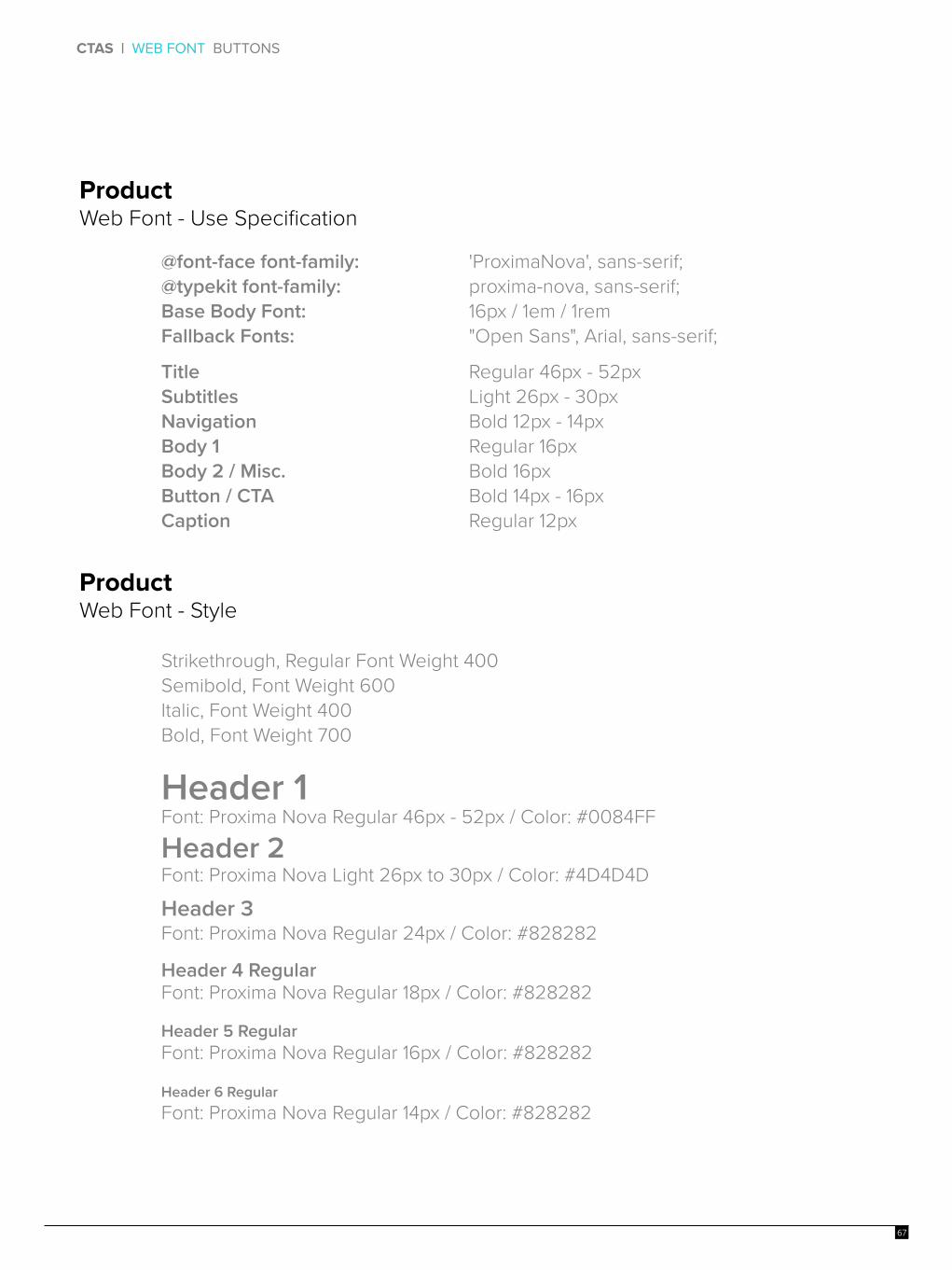
CTAS | WEB FONT BUTTONS
10
@font-face font-family: @typekit font-family: Base Body Font:Fallback Fonts:
'ProximaNova', sans-serif;proxima-nova, sans-serif;16px / 1em / 1rem"Open Sans", Arial, sans-serif;
TitleSubtitlesNavigationBody 1Body 2 / Misc.Button / CTACaption
Regular 46px - 52pxLight 26px - 30pxBold 12px - 14pxRegular 16pxBold 16pxBold 14px - 16pxRegular 12px
Italic, Font Weight 400 Bold, Font Weight 700
Strikethrough, Regular Font Weight 400Semibold, Font Weight 600
ProductWeb Font - Use Specification
ProductWeb Font - Style
Header 3Font: Proxima Nova Regular 24px / Color: #828282
Header 1 Font: Proxima Nova Regular 46px - 52px / Color: #0084FF
Header 2Font: Proxima Nova Light 26px to 30px / Color: #4D4D4D
Header 6 RegularFont: Proxima Nova Regular 14px / Color: #828282
Header 4 RegularFont: Proxima Nova Regular 18px / Color: #828282
Header 5 RegularFont: Proxima Nova Regular 16px / Color: #828282
67

CTAS | BUTTONS
ButtonsYour call-to-action (CTA) is one of the most important elements on your design. It’s the final point of interaction and the last opportunity to convert your viewers.
Primary Button - Height: 80px | Typeface: Proxima Nova Bold (Tracking 120 / 30pt)
Copyright © 2015 Open English LLC. All rights reserved. The Open English name and the Open English logo are registered trademarks.10
CTAS | BUTTONS
Width - Varies by length of copy
Width - Varies by length of copy
White Space - 40px
This is the space that the CTA should have between it and other objects within the design. Applies to all CTAs.
Height - 80px
Color - Fill
Human Blue
Achievable Green
Fun Yellow
Height - 80px
Alternate Button - Height: 80px | Typeface: Proxima Nova Bold (Tracking 120 / 30pt)
Lorem Ipsum
Lorem Ipsum
Lorem Ipsum
Color - Stroke 2px / No Fill
Human Blue
Achievable Green
Fun Yellow
68

CTAS | WEB FONT BUTTONS
10
EMPIEZA A APRENDER INGLÉSFont: Proxima Nova Bold 16px
TEXT FIELDS
ProductWeb Font - Use Specification

Thank You

10

10