Embed Size (px)
Citation preview


Studies Catalog
AVERAGES
Average Study MACD Study
CLASSIC
Consecutives Closes
Cooper study Di_Napoli_Trend
Island Pattern Pivot Show
RSI Study TRIX Study
VOLATILITY
IDNR4 Study
Outside Bar-Close
Thurstdays Study
Trend Line Down Study
Trend Line Up Study
TTF Study
VOLUME
Cumulative Volume Study
TRENDFOLLOWING
8020 Study
Heikin Ashi Study Heikin Ashi Candlestick Key Reversal
Shark32 Study

AVERAGES
Average Study Introduction
The aim of this study it to distinguish the bars of a chart according to the position of their close
in relation to two moving averages. The type of average can be chosen when inserting the
study in the chart.
The bars with a close lower than the two moving averages will be painted in red, the ones with
a close superior to the two moving averages in blue and finally the bars closing in between the
two moving averages will be painted in green .
Parameters
DataSource: Data source to apply the study.
Average1: Enables to select the period and the type of the first average.
Average2: Enables to select the period and the type of the second average
Chart example
Macd Study
Introduction
This studie tries to identify and appoint the médium/long term trend in order to find goog trades
occasions in the shorter term.
The slope is defined by 2 bars (see first screenshot) providing buy trading signals when it is
positive sell trading signals when negative.
STUDIES CATALOG | VISUALCHART 4
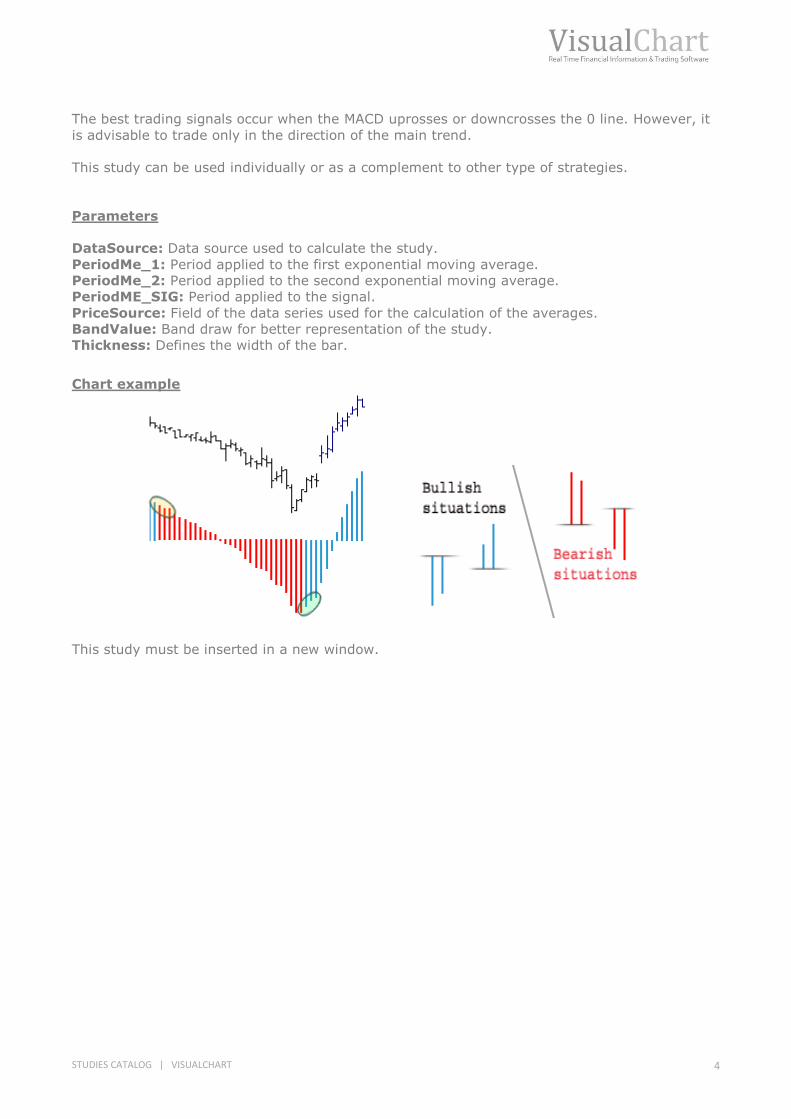
The best trading signals occur when the MACD uprosses or downcrosses the 0 line. However, it
is advisable to trade only in the direction of the main trend.
This study can be used individually or as a complement to other type of strategies.
Parameters
DataSource: Data source used to calculate the study.
PeriodMe_1: Period applied to the first exponential moving average.
PeriodMe_2: Period applied to the second exponential moving average.
PeriodME_SIG: Period applied to the signal.
PriceSource: Field of the data series used for the calculation of the averages.
BandValue: Band draw for better representation of the study.
Thickness: Defines the width of the bar. Chart example
This study must be inserted in a new window.

CLASSIC
Consecutives Closes
Introduction
This study paints the bars with a closing price superior to the previous bar close in blue, and the
bars in the opposite situation, in red.
While new consecutive bars are form and they match the previous characteristics, the width
they are painted with increases (see screenshot).
Parameters
DataSource: Data source used to run the calculation.
Chart example
Cooper Study Introduction
This study used the ADX, DIPositive and DINegative indicators.
These are the conditions to be fulfilled in order to paint a bar in blue:
1. The ADX must be above its band.
2. DIPositive must be higher than DINegative.
3. Three consecutive lows must occur.
4. Or two consecutive lows and an inside bar.
5. Or an inside bar and two consecutive lows.
Points 1 and 2 must be fulfilled mandatorily and at least one of the other points must also be
fulfilled. In the following image we can see how point number for is fulfilled, 2 consecuve lows
followed up by an inside bar.

STUDIES CATALOG | VISUALCHART 6
These are the conditions to be fulfilled in order to paint a bar in red:
1. The ADX must be above its band.
2. DIPositive must be lower than DINegative.
3. Three consecutive high must occur.
4. Or formation of two consecutive high and an inside bar.
5. Or formation of an insde bar and two consecutive high.
Points 1 and 2 must be fulfilled mandatorily and at least one of the other points must also be
fulfilled. Parameters
DataSource. Data source used to calculate the study.
Period. Period used for the calculation of the ADX.
AdxBandValue. Band value.

Chart example
Di_Napoli_Trend
Introduction
This study paints in blue the bars with a close superior to the previous bar´s close and in red
the bars in the opposite situation.
While new consecutive bars matching these criteria appear the width with which they are
painted increase (see image bellow).
The DMA must be included and compile in the indicator´s catalog to be able to use this study.
Parameters
DataSource. Data source to run the study.
STUDIES CATALOG | VISUALCHART 8
Chart example
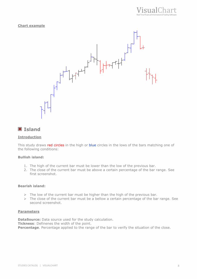
Island
Introduction
This study draws red circles in the high or blue circles in the lows of the bars matching one of
the following conditions:
Bullish island:
1. The high of the current bar must be lower than the low of the previous bar.
2. The close of the current bar must be above a certain percentage of the bar range. See
first screenshot.
Bearish island:
The low of the current bar must be higher than the high of the previous bar.
The close of the current bar must be a bellow a certain percentage of the bar range. See
second screenshot.
Parameters
DataSource: Data source used for the study calculation.
Tickness: Definenes the width of the point.
Percentage. Percentage applied to the range of the bar to verify the situation of the close.
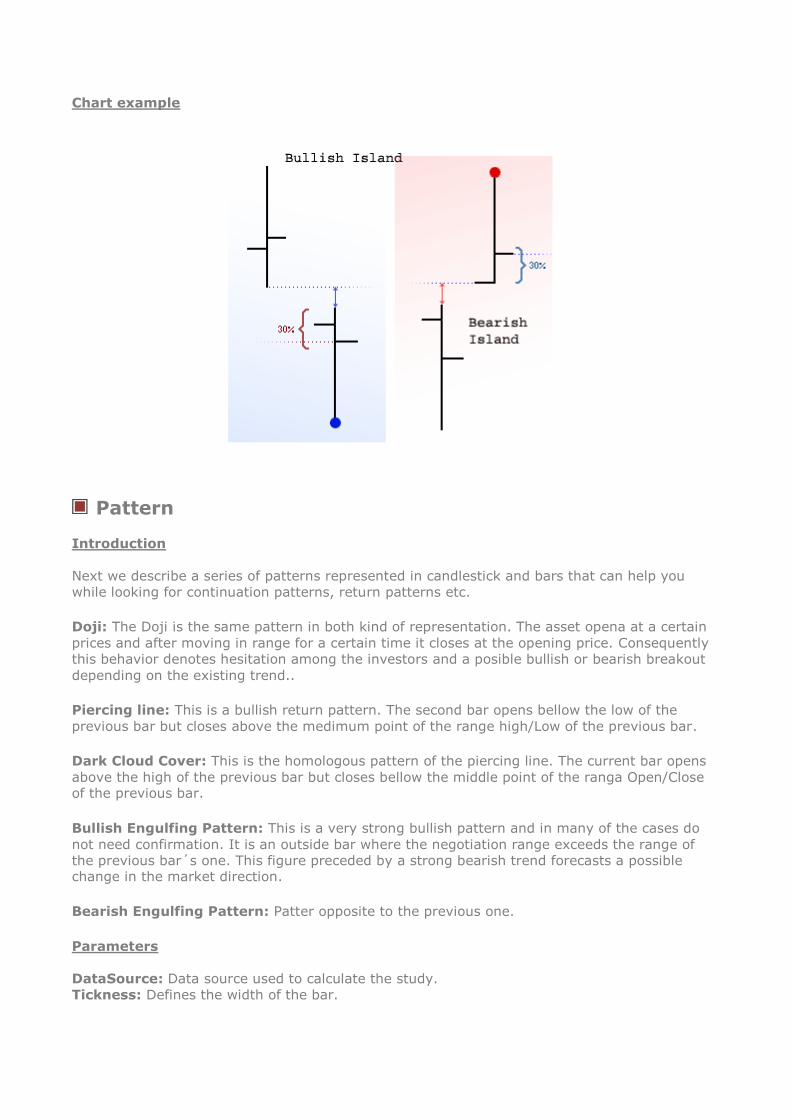
Chart example
Pattern
Introduction
Next we describe a series of patterns represented in candlestick and bars that can help you
while looking for continuation patterns, return patterns etc.
Doji: The Doji is the same pattern in both kind of representation. The asset opena at a certain
prices and after moving in range for a certain time it closes at the opening price. Consequently
this behavior denotes hesitation among the investors and a posible bullish or bearish breakout
depending on the existing trend..
Piercing line: This is a bullish return pattern. The second bar opens bellow the low of the
previous bar but closes above the medimum point of the range high/Low of the previous bar.
Dark Cloud Cover: This is the homologous pattern of the piercing line. The current bar opens
above the high of the previous bar but closes bellow the middle point of the ranga Open/Close of the previous bar.
Bullish Engulfing Pattern: This is a very strong bullish pattern and in many of the cases do
not need confirmation. It is an outside bar where the negotiation range exceeds the range of
the previous bar´s one. This figure preceded by a strong bearish trend forecasts a possible change in the market direction.
Bearish Engulfing Pattern: Patter opposite to the previous one.
Parameters
DataSource: Data source used to calculate the study.
Tickness: Defines the width of the bar.

STUDIES CATALOG | VISUALCHART 10
Chart example
Pivot Show
Introduction
We define as Pivot Up the bar with a high superior to the higher price of a certain number of
previous and subsequent bars (see first image). Likewise a Pivot Down is the bar where the low
is lower than the low of previous and subsequent bars (see second image).
Parameters
DataSource: Data source used to calculate the study.
LateralBars. Number of bars on the right and on the left of the pivot bar necessary to confirm
the pivot.

Chart example
RSI Study
Introduction
This study represents the bars of a certain estudy according to the value of the RSI in the same
bar:
If the value of the RSI is in between the upper and lower band the bar will be painted in red.
If the RSI is above the upper band, the bar will be painted in blue.
If the RSI is bellow the lower band, the bar will be painted in red.
Parameters
DataSource. Data source used to paint the study.
Period: Period used for the balculation of the RSI.
UpperBand: Value of the RSI upper band.
LowerBand: Value of the RSI lower band.

STUDIES CATALOG | VISUALCHART 12
Chart example
TRIX Study
Introduction
Based on the indicator with the same name the Trix study is in charge of painting the bars
where the oscillator is above its band.
The Trix is technically a momentum indicator and thus measures the percentage rate of change
of a certain asset by using an exponential moving average applied to the close.
The following conditions could be taken into account to generate buy/sell signals:
1. Place the orders when the indicator changes its direction, in fact, buy when the indicator is
bullish and sell when it is bearish.
2. Use a moving average applied to the Trix to generate a signal line (similar to the MACD). In
this case buy when the indicator upcrosses this line and sell when it downcrosses it.
3. Divergencies between the price of the asset and the Trix inidcator can help to idenfity return points.
Parameters
DataSource: Data source to run the study.
Thickness: Width used to represent the bar.
Period_1: Number of bars to be considered for the calculation of the first exponential moving
average applied to the closes.
Period_2: Number of bars to be considered for the calculation of the second exponential
moving average applied to the first EMA.
Period_3: Number of bars to be considered for the calculation of the second exponential
moving average applied to the second EMA.
Period_C: Period used for the calculation of the percentage rate of change on the last EMA.
BandValue: Band value.

Chart example

STUDIES CATALOG | VISUALCHART 14
TRENDFOLLOWING
8020 Study
Introduction
This study was created by Steve Moore, and is based on the following idea:
When a bar opens or closes a certain percentage above/bellow its range there is between 80
and 90 per cent of possibilities that the trend will continue in the following bar (in fact the real
possibilities are 50 per cent).
If we take this idea as a base for our trading system, goog possibilities will occur when the close
and the open are in the opposite extremes of the bar and both are comprised between the high
and low of the bar in relation with the applied percentage.
This study idenfities and paints the bar where the previously mentioned conditions are fulfilled.
The bar where the open is aboe 80 % of the toal range of the bar and the close is bellow 20%
of the same range will be painted in red while the bars where the opposite conditions are
fulfilled will be painted in blue.
Parameters
DataSource: Data source to run the study.
Percentage: Percentage applied to the extremes of the bar (high-low) to be able to consider a
bar as a 80/20 (0-50%).
Thickness: Width used to paint the bar.
Chart example

Heikin Ashi
Introduction
This is a visual technique that erases the irregulariteis of the chart offering a better visión of the
trends and consolidations. Only by looking the the chart after this method has been applied, we
can obtain a good vision of the state of the market and its strenght. In the image bellow we can
see the chart at the beginning and the chart after the technique has been applied.
Parameters
DataSource: Data source to calculate the study.
Width. Width of the bar.
Chart example

STUDIES CATALOG | VISUALCHART 16
Heikin Ashi Candlestick
Introduction
This study calculates an average of the open of the current bar and the close of the previous
bar and calculates the clsoe by making an average of the value of the fields in the current bar.
The high and low are calculated by comparing the high and low value (respectivelly) with the
open and alcose already calculated by the study. The novelty introduced in this study is that it
enables the representation in candlestics replacing the traditional representation in bars.
Parameters
DataSource: Data source to calculate the study.
RBullish, GBullish, BBullish. Amount of Red, Green and Blue the bar is going to be drawn
with. The difference amount ascribed to the colors red, , green and blue will configure the color
of the candlestick to be drawn.
RBearish, GBearish, BBearish. Amount of Red, Green and Blue the bar is going to be drawn
with. The difference amount ascribed to the colors red, green and blue will configure the color of
the candlestick to be drawn.
Chart example
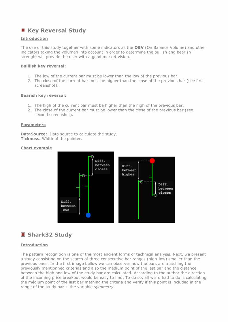
Key Reversal Study
Introduction
The use of this study together with some indicators as the OBV (On Balance Volume) and other
indicators taking the volumen into account in order to determine the bullish and bearish
strenght will provide the user with a good market vision.
Bulllish key reversal:
1. The low of the current bar must be lower than the low of the previous bar.
2. The close of the current bar must be higher than the close of the previous bar (see first screenshot).
Bearish key reversal:
1. The high of the current bar must be higher than the high of the previous bar.
2. The close of the current bar must be lower than the close of the previous bar (see
second screenshot).
Parameters
DataSource: Data source to calculate the study.
Tickness. Width of the pointer.
Chart example
Shark32 Study
Introduction
The pattern recognition is one of the most ancient forms of technical analysis. Next, we present
a study consisting on the search of three consecutive bar ranges (high-low) smaller than the
previous ones. In the first image bellow we can observer how the bars are matching the
previously mentionned criterias and also the médium point of the last bar and the distance
between the high and low of the study bar are calculated. According to the author the direction
of the incoming price breakout would be easy to find. To do so, all we´d had to do is calculating
the médium point of the last bar mathing the criteria and verify if this point is included in the
range of the study bar + the variable symmetry.

STUDIES CATALOG | VISUALCHART 18
Parameters
DataSource: Sata source used to calculate the study.
Tickness. Width of the bar.
Summetry. Factor applied to the high and low of the bar to determine the propability of the
direction of the breakout. This parameter is used in percentage so if we´d like to apply 2% we
will use 0.02.
VOLATILITY
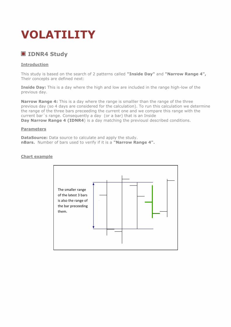
IDNR4 Study
Introduction
This study is based on the search of 2 patterns called "Inside Day" and "Narrow Range 4",
Their concepts are defined next:
Inside Day: This is a day where the high and low are included in the range high-low of the
previous day.
Narrow Range 4: This is a day where the range is smalller than the range of the three
previous day (so 4 days are considered for the calculation). To run this calculation we determine
the range of the three bars preceeding the current one and we compare this range with the
current bar´s range. Consequently a day (or a bar) that is an Inside
Day Narrow Range 4 (IDNR4) is a day matching the previousl described conditions.
Parameters
DataSource: Data source to calculate and apply the study.
nBars. Number of bars used to verify if it is a "Narrow Range 4".
Chart example
The smaller range
of the latest 3 bars
is also the range of
the bar preceeding
them.
STUDIES CATALOG | VISUALCHART 20
Outside Bar-Close
Introduction
Numerous patterns can generate benefits if they are identified adequately and negotiated
consistently. Unfortunatelly these pattern do not appear frequently this is the reason why some
investors get anxious and od not wait for good opportunities before taking their positions.
Those who consider the pattern as a combination of consecutive "victories", can make good
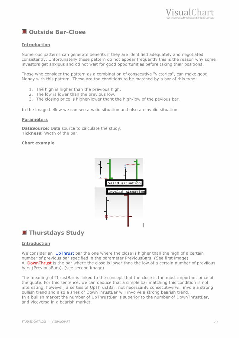
Money with this pattern. These are the conditions to be matched by a bar of this type:
1. The high is higher than the previous high.
2. The low is lower than the previous low. 3. The closing price is higher/lower thant the high/low of the pevious bar.
In the image bellow we can see a valid situation and also an invalid situation.
Parameters
DataSource: Data source to calculate the study.
Tickness: Width of the bar.
Chart example
Thurstdays Study
Introduction
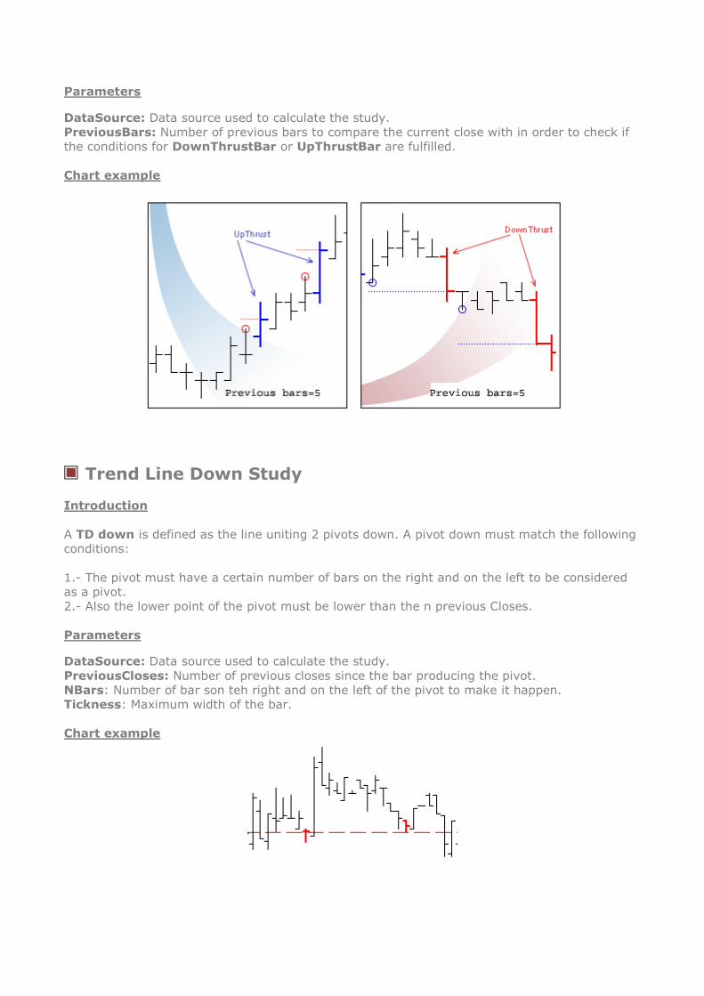
We consider an UpThrust bar the one where the close is higher than the high of a certain
number of previous bar specified in the parameter PreviousBars. (See first image)
A DownThrust is the bar where the close is lower thna the low of a certain number of previious
bars (PreviousBars). (see second image)
The meaning of ThrustBar is linked to the concept that the close is the most important price of
the quote. For this sentence, we can deduce that a simple bar matching this condition is not
interesting, however, a serties of UpThrustBar, not necessarily consecutive will invole a strong
bullish trend and also a sries of DownThrustBar will involve a strong bearish trend.
In a bullish market the number of UpThrustBar is superior to the number of DownThrustBar,
and viceversa in a bearish market.
Parameters
DataSource: Data source used to calculate the study.
PreviousBars: Number of previous bars to compare the current close with in order to check if
the conditions for DownThrustBar or UpThrustBar are fulfilled.
Chart example
Trend Line Down Study
Introduction
A TD down is defined as the line uniting 2 pivots down. A pivot down must match the following
conditions:
1.- The pivot must have a certain number of bars on the right and on the left to be considered
as a pivot.
2.- Also the lower point of the pivot must be lower than the n previous Closes.
Parameters
DataSource: Data source used to calculate the study.
PreviousCloses: Number of previous closes since the bar producing the pivot.
NBars: Number of bar son teh right and on the left of the pivot to make it happen.
Tickness: Maximum width of the bar.
Chart example

STUDIES CATALOG | VISUALCHART 22
Trend Line Up Study
Introduction
A TD up is defined as the line uniting 2 pivots down, a pivot down matches the following
conditions:
1.- Ha de haber un número determinado de barras a la izquierda y derecha del pivot (Barras)
para que sea considerado como tal.
2.- 1.- The pivot must have a certain number of bars on the right and on the left to be
considered as a pivot.
2.- Also the higher point of the pivot must be higher lower than the n previous Closes.
Parameters
DataSource: Data source used to calculate the study.
PreviousCloses: Number of previous closes since the bar producing the pivot.
NBars: Number of bar son teh right and on the left of the pivot to make it happen.
Tickness: Maximum width of the bar.
Chart example
TTF Study
Introduction
This study is base don the indicator TFF(Trend Tigger Factor).We must define the following
concepts for the representation of the study:
Buy Power. This is the difference between the high of the 15 most recent periods and the low
of the 15 periods preceeding them. In fact if today is day 1, and yesterday day 2, before
yesterday 3, etc. The buying power will be the difference between the high of the periods from
1 to 15 minus the low of the periods from 16 to 30.
Sell Power. This is the difference between the low of the 15 most recent periods and the high
of the 15 periods preceeding them. In fact if todays are day 1 and yesterday was day to etc…..
This is teh formula:
TTF = ((BuyPower –SellPower)/(0.5*( BuyPower + SellPower)))*100

Depending of the value of this variable the bars are drawn in different color:
Ifi TFF > 100 the study paints the bar in blue.
If TFF > - 100 y < 100 the study paints the bar in red.
If TFF < -100 the study paints the bar in yellow.
Parameters
DataSource. Data source to apply and calculate the study.
Length. Number of bars to be considered for the calculation.
Chart example

STUDIES CATALOG | VISUALCHART 24
VOLUME
Cumulative Volume Study
Introduction
This study paints the bars in different colors according to the trend of the indicator Cumulative
Volumen over the latest three bars. If, over the latest three bars, its value has increased the
current bar will be painted in green, if on the contrary the value of the indicator has decreased
the current bar will be painted in red. If none of the previous situations is mathed the bar will
be painted in yellow.
Parameters
DataSource. Data source to calculate and apply the study.
Chart example