Embed Size (px)
DESCRIPTION
p
Citation preview

MEP Jamaica: STRAND F UNIT 16 Data Presentation: Student Text Contents
STRAND F: Statistics
Unit 16 Data Presentation
Student Text
Contents
Section
16.1 Pie Charts
16.2 Line Graphs
16.3 Frequency Graphs: Histograms
16.4 Histograms with Unequal Class Intervals
© CIMT and e-Learning Jamaica
denotes that the topic is not on the current CXC/CSEC Mathematics syllabus andtherefore not examined, but is of relevance to the content of the Unit.

MEP Jamaica: STRAND F UNIT 16 Data Presentation: Student Text
© CIMT and e-Learning Jamaica 1
16 Data Presentation
16.1 Pie ChartsPie charts, which represent quantities as sectors of a circle, can be used to illustrate data.They are particularly effective if there is only a small number of items to illustrate. Intotal a complete circle, i.e. 360°, must always be used.
Worked Example 1
Tracey uses her pocket money of J$1800 per month in the following way.
Books J$400
Sweets J$300
Sport J$600
Transport J$400
Savings J$100
Draw a pie chart to show how Tracey uses her pocket money.
SolutionTracey has a total of J$1800.
3601800
0 2°= °.
So 0 2. ° should be used for each J$1. The angles needed are given in this list.
Books 400 0 2 80× ° = °.
Sweets 300 0 2 60× ° = °.
Sport 600 0 2 120× ° = °.
Transport 400 0 2 80× ° = °.
Savings 100 0 2 20× ° = °.
Alternatively, you could calculate each angle by taking the appropriate fraction of 360°.
For example, for Books, we have
400
1800360 80× ° = °
and for Sweets,
300
1800360 60× ° = ° , etc.
The pie chart can now be drawn.
Shading denotes that the topic is not on the current CXC/CSEC Mathematics syllabus andtherefore not examined, but is of relevance to the content of the Unit.

MEP Jamaica: STRAND F UNIT 16 Data Presentation: Student Text
© CIMT and e-Learning Jamaica 2
The diagram below, on the left, shows the first section for 'Books'.The completed pie chart is on the right.
Worked Example 2
The pie chart was constructed after asking 72 students howthey travel to school.
(a) How many of these students travel to school by:
(i) car, (ii) bus, (iii) route taxi?
(b) What percentage walk to school?
Solution(a) There are 72 students so
36072
5°= ° per student
(i) The angle for travelling by car is 40°.
405°°= 8
So 8 students travel by car.
(ii) The angle for travelling by bus is 20° .
205°°= 4
So 4 students travel by bus.
(iii) The angle for travelling by route taxi is 110° .
1105°°
= 22
So 22 students travel by route taxi.
16.1
Books
80°
Books
Sweets
Sports
Transport
Savings
80°80°60°
120°
20°
110°
Car
Walk
Bus
RouteTaxi
40°20°
190°

MEP Jamaica: STRAND F UNIT 16 Data Presentation: Student Text
© CIMT and e-Learning Jamaica 3
(b) The number who walk to school is given by
1905°°
= 38
so the percentage who walk is
3872
100× ≈ 52.8%
NoteAlternatively, you could just use the angles in the pie chart to give
190360
100× ≈ 52.8%
Worked Example 3
The pie chart below, not drawn to scale, shows the Saturday morning activities of agroup of 120 children.
Dance
Soccer
Swimming
(i) The sector for soccer is represented by an angle of 150° . Determine the number ofchildren who play soccer on Saturday mornings.
(ii) Given that 46 children swim on Saturday mornings, calculate the value of x.
(iii) Determine the probability that a child chosen at random, dances on Saturdaymornings. (CXC)
Solution
(i) Number playing soccer =150360
120×
= 50 children
(ii) Angle for swimming =46120
360× °
= 138°
(iii) Number dancing = 120 50 46− +( )
= 120 96−
= 24
So probability of dancing = 24120
15
=
(Probability is covered in detail in Unit 19.)
16.1
150°
x°

MEP Jamaica: STRAND F UNIT 16 Data Presentation: Student Text
© CIMT and e-Learning Jamaica 4
16.1
Exercises1. In an opinion poll 360 people were asked who they would vote for in the next
election. Their responses are:
Jamaica Labour Party 160
People's National Party 170
National Democratic Movement 20
Other 10
Draw a pie chart to show this.
2. Bethany recorded how she spent the last 24 hours. Her results are shown below.
Sleeping 9 hours
School 7 hours
Homework 2 hours
Watching TV 3 hours
Eating 1 hour
Travelling 2 hours
Draw a pie chart to show this information.
3. A student estimated that he had 30 hours available each week for home study andfor sports. The table below shows the percentage of time he spent on each activity.
(a) Calculate the number of hours he spent on sports.
(b) Calculate the angles in a pie chart that would be used to represent the hoursspent on
(i) Mathematics
(ii) Languages.
(c) Draw a pie chart to represent the distribution of hours in the week, which thestudent spends on the activities indicated in the table above.
(d) One hour in the 30 hours is chosen at random. Calculate the probability thatthe student is
(i) playing sports
(ii) studying Mathematics or Languages.
(CXC)
Activities %
Languages 30
Mathematics 20
Computer Studies 15
Sciences 15
Sports x

MEP Jamaica: STRAND F UNIT 16 Data Presentation: Student Text
© CIMT and e-Learning Jamaica 5
4. The 30 students in a class state their favourite sport. Their results are listed below.
Basketball 3
Cricket 9
Athletics 6
Netball 2
Football 10
Draw a pie chart to show this information.
5. The pie chart shows how the time Robertspends watching television is split betweendifferent channels, for one day.
Ron spends 1 hour watching RETV
(a) How long does he spend watching TVJ?
(b) How long does he spend watching SportsMax?
6. Andrew was given $60 on his birthday. Thepie chart shows how he spent this money.
How much did he spend on:
(a) cinema tickets,
(b) his new jeans,
(c) sports equipment?
7. The pie chart shows the football teams supported by a class of students. There are3 students who support Harbour View.
Boys Town
TivoliGardens
PortmoreUnited
HarbourView
16.1
RETV
SportsMax
TVJ
90° 45°
225°
Newjeans
Sportsequipment
Cinema tickets
210°
60°
90°
156°
72°36°

MEP Jamaica: STRAND F UNIT 16 Data Presentation: Student Text
© CIMT and e-Learning Jamaica 6
(a) What is the angle representing Tivoli Gardens?
(b) How many students support Boys Town?
(c) How many students are there in the class?
(d) How many students support Portmore United?
8. A Post Office in a Jamaican town dealt with720 letters in one week. They were sortedinto First Class, Second Class and Air Mail.
The pie chart shows the different number ofeach type.
How many letters of each type were handled?
9. Kelly spent $J9000.The table shows what she spent it on.
Items Amount spent
Bus fares
Going out
Clothes
CDs
Other
J$1200
J$2500
J$3000
J$1500
J$9000
J$800
Total Spending
Kelly is asked to construct a pie chart to show her spending.
(a) Work out the angle of each sector in the pie chart.
Items Angle of sector
Bus fares
Going out
Clothes
CDs
Other
Total of angles 360°
(b) Construct the pie chart to illustrate the data.
(c) What fraction of Kelly's spending was on clothes?
16.1
FirstClass
Air Mail
25˚
160˚SecondClass 175˚

MEP Jamaica: STRAND F UNIT 16 Data Presentation: Student Text
© CIMT and e-Learning Jamaica 7
10. Andrew spends $180 per week.
The way in which he spends his money is shown in the table.
Items Spending ($)
Food
Heating and lighting
Clothes
Other items
Housing
30
12
20
20
180
98
Total Spending
(a) Draw a pie chart to show how Andrew spends his money.
This pie chart shows how the average person spends money.
Clothes
Otheritems
Housing
Food
Heating and lighting
(b) Describe one way in which Andrew's spending differs from the averageperson's spending.
11. This question is about the way water is used in two Mozambique villages.
(a) In village A, 324 litres of water are used each day.
The pie chart shows how the water is used.
Given toanimals
Cooking
Washingclothes
Washingthemselves
Washing pots
90˚
72˚
90˚
54˚54˚
(i) How much water (in litres) is used each day for cooking?
(ii) What fraction of the water used is given to animals?
16.1

MEP Jamaica: STRAND F UNIT 16 Data Presentation: Student Text
© CIMT and e-Learning Jamaica 8
(b) In village B, the water is used as follows:
Cooking 20%
Washing themselves 50%
Washing clothes 20%
Washing pots 10%
Represent this information in a pie chart.
16.2 Line GraphsA line graph is drawn by plotting data points and joining them with straight lines. It isreally only the actual data points that count, but by drawing the lines you get a betterimpression of the trend in the data points. This method of representation is particularlyuseful when illustrating trends over time.
Worked Example 1
Samuel recorded the temperature in his shed at 6 am each day for a week. His records areshown on this line graph.
M T W T F S S
5
10
15
20
25
30
Day
Temperature (˚C)
(a) What was the temperature on Wednesday?
(b) What was the lowest temperature recorded?
(c) What was the highest temperature recorded?
16.1
MEP Jamaica: STRAND F UNIT 16 Data Presentation: Student Text
© CIMT and e-Learning Jamaica 9
Solution
(a) For Wednesday the temperature can be read as 25°C .
M T W T F S S
5
10
15
20
25
30
Day
25 C
Temperature (˚C)
(b) The lowest temperature occurred on Friday and was 19°C .
(c) The highest temperature occurred on Sunday and was 30°C.
Worked Example 2
As part of a science project Evan records the height of a plant every week. His results areshown in this table.
Week
Height (cm)
0 1 2 3 4 5 6
0 1 3 4 6 8 9
Draw a line graph to show the data.
SolutionFirst draw a suitable set of axes.
Then plot a point for each measurement as shown on the following graph.
16.2
M T W T F S S
5
10
15
20
25
30
Day
30 C
19 C
Temperature ˚C

MEP Jamaica: STRAND F UNIT 16 Data Presentation: Student Text
© CIMT and e-Learning Jamaica 10
0
1
2
3
4
5
6
7
8
9
10 2 3 4 5 6
Week 0, Height 0
Week 1, Height 1
Week 2, Height 3
Week 3, Height 4
Week 4, Height 6
Week 5, Height 8
Week 6, Height 9
Week
Height(cm)
The points can then be joined with straight lines as shown in the next graph.
0
1
2
3
4
5
6
7
8
9
10 2 3 4 5 6
Week
Height(cm)
16.2

MEP Jamaica: STRAND F UNIT 16 Data Presentation: Student Text
© CIMT and e-Learning Jamaica 11
16.2
Exercises
1. The line graph shows the monthly rainfall for a town.
(a) How much rain was there in September?
(b) In which month was the rainfall 5 cm?
(c) Which months were the wettest?
(d) Which months were the driest?
2. Paul recorded the temperature outside his house in New York at 8.00 am every day.His results are in the table.
Day
Temperature ( C)
M T W T F S S
3576458
Draw a line graph for this data.
3. Annie counted the number of cars that drove past her while she was waiting at thebus stop each morning on her way to work.
Day
Number of cars
M T W T F S
10436221218
Draw a line graph for this data.
0
1
2
3
4
5
6
7
8
J F M A M J J A S O N D
Month
Rainfall (cm)

MEP Jamaica: STRAND F UNIT 16 Data Presentation: Student Text
© CIMT and e-Learning Jamaica 12
4. A mug was filled with hot water and the temperature was recorded every5 minutes. The graph below shows the results.
(a) What was the temperature after 25 minutes?
(b) What was the temperature at the start of the experiment?
(c) When was the temperature 45°C?
(d) How long did it take for the temperature to drop from 68°C to 36°C?
5. Anna recorded the time it took her to walk to school every day for a week.
Draw a line graph for this data.
6. The following graph shows how the height of a sunflower plant changed in theweeks after it was planted in a garden.
(a) What was the height of the plant when it was planted in the garden?
(b) How much did the plant grow in the first week?
(c) What is the greatest height that the graph shows?
(d) How long did it take for the height to increase from 54 cm to 78 cm?
16.2
Temperature (˚C)
0
10
20
30
40
50
60
70
80
5 10 15 20 25 30 35 40
Time (mins)
0
Day M T W T F
Time taken (mins) 8 9 15 12 7

MEP Jamaica: STRAND F UNIT 16 Data Presentation: Student Text
© CIMT and e-Learning Jamaica 13
0
10
20
30
40
50
60
70
80
1 2 3 4 5 6 7
Weeks
0
Height (cm)
16.3 Frequency Graphs: HistogramsFor continuous data, when any value over a range of values is possible, a frequency graphlike the one below should be used, rather than a bar chart which is used for discrete data.
A graph like this is often called a histogram, and is characterised by having a continuousscale along the horizontal axis. Note that in this case the widths of the bars are all thesame, but this is not always the case, as you will see in the next section. Care thoughmust be taken about the end points. For example, the first class interval (in minutes)would normally be 30 35≤ <time , so that a time of 35 minutes would be in the secondclass interval.
16.2
25 30 35 40 45 50 55 600
5
10
15
20
25
30
Time (minutes)
Time to complete 5-mile Fun Run
Frequency
Time to complete Charity Fun Run

MEP Jamaica: STRAND F UNIT 16 Data Presentation: Student Text
© CIMT and e-Learning Jamaica 14
16.3
A frequency polygon could also be used to show the same data, as on the following graph.Note how it is related to the histogram.
Worked Example 1
Use the data shown on the graphs above to answer these questions.
(a) How many people completed the Fun Run in between 40 and 45 minutes?
(b) How many people completed the Fun Run in less than 40 minutes?
(c) How many people completed the Fun Run in less than 1 hour?
Solution(a) The 40-45 minute interval contains 21 people.
(b) The 30-35 and 35-40 minute intervals must be considered.
There are 10 people in the 30-35 minute interval.
There are 8 people in the 35-40 minute interval.
So there are 10 8 18+ = people who complete the run in less than 40 minutes.
(c) The number in each interval is needed.
So the number of people is:10 8 21 28 7 74+ + + + =
Worked Example 2
A group of students measured the reaction times of 50 other students. The times are givenbelow correct to nearest hundredth of a second.
0.44
0.33
0.29
0.49
0.49
0.32
0.46
0.40
0.21
0.16
0.31
0.41
0.29
0.42
0.29
0.47
0.33
0.24
0.43
0.30
0.27
0.31
0.41
0.28
0.41
0.31
0.28
0.22
0.36
0.27
0.40
0.38
0.25
0.24
0.29
0.28
0.29
0.47
0.37
0.28
0.16
0.17
0.31
0.34
0.40
0.26
0.26
0.36
0.27
0.42
Draw a histogram for this data.
25 30 35 40 45 50 55 600
5
10
15
20
25
30
Time (minutes)
Time to complete 5-mile Fun Run
Frequency
Time to complete Charity Fun Run

MEP Jamaica: STRAND F UNIT 16 Data Presentation: Student Text
© CIMT and e-Learning Jamaica 15
SolutionFirst the data must be collected into groups, using a tally chart.
Reaction Time(s) Tally Frequency
0.30 ≤ t < 0.35
0.45 ≤ t < 0.500.40 ≤ t < 0.45
0.35 ≤ t < 0.40
0.25 ≤ t < 0.30
0.20 ≤ t < 0.250.15 ≤ t < 0.20 3
4
15
9
410
5
Now that the data has been collected in this way, the histogram below can be drawn.
Reaction Time (s)
0.10 0.15 0.20 0.25 0.30 0.35 0.40 0.45 0.50 0.550
5
10
15
20
Frequency
Worked Example 3
Draw a frequency polygon for the data on the height of children, given in cm, in the tablebelow.
Height (cm) Frequency
3
4
6
8
12
5
2
150 ≤ h < 155
155 ≤ h <160
160 ≤ h < 165
165 ≤ h <170
170 ≤ h < 175
175 ≤ h <180
180 ≤ h < 185
SolutionPoints should be placed above the centre of each interval. The height is given by thefrequency. The following graph shows these points.
16.3

MEP Jamaica: STRAND F UNIT 16 Data Presentation: Student Text
© CIMT and e-Learning Jamaica 16
16.3
145 150 155 160 165 170 175 180 185 1900
5
10
15
Height (cm)
Frequency
Note that points have been placed on the horizontal axis in the intervals that havefrequencies of 0. The points can then be joined to give the frequency polygon below.
145 150 155 160 165 170 175 180 185 1900
5
10
15
Height (cm)
Frequency
Exercises1. The histogram below shows how the weights of students in a school class were
distributed.
0
5
10
15
20
40 45 50 55 60 65 70 75 80 85Weight (kg)
Frequency
(a) How many students had a weight greater than 70 kg?
(b) How many students had a weight between 50 and 65 kg?
(c) How many students had a weight less than 50 kg?
(d) How many students were there in that class?

MEP Jamaica: STRAND F UNIT 16 Data Presentation: Student Text
© CIMT and e-Learning Jamaica 17
16.3
2. The frequency polygon shows the weekly wages of a large firm.
(a) How many people earn between $300 and $350 per week?
(b) How many people earn between $100 and $300 per week?
(c) How many people are employed by the firm?
(d) What are the largest and smallest possible weekly wages that the graphshows could be paid?
3. An orchard contains 100 apple trees. The weight of apples produced by each treein one year was recorded. The results are given in the table .
Mass of apples (kg)
50 < m ≤ 60
60 < m ≤ 70
70 <m ≤ 80
80 < m ≤ 90
90 < m ≤ 100
100 < m ≤ 110
110 < m ≤ 120
120 < m ≤ 130
Frequency
5
7
13
10
20
22
18
5
Draw a histogram for the data.
4. A psychologist uses a test in which people have to solve a puzzle. He records thetime it took people to solve the puzzle.
12718325
Time taken (mins)
Frequency0 ≤ t < 1 1 ≤ t < 2 2 ≤ t < 3 3 ≤ t < 4 4 ≤ t < 5
Draw a histogram for the data.
0 50 100 150 200 250 300 350 400 450 500 550 6000
5
10
15
20
25
Weekly Wages (£)
Frequency
Weekly Wages ($)

MEP Jamaica: STRAND F UNIT 16 Data Presentation: Student Text
© CIMT and e-Learning Jamaica 18
16.3
5. The finishing times for a cross country race were recorded to the nearest minute.
Draw a suitable histogram for the data.
23
27
31
32
32
32
33
34
35
37
38
39
39
40
40
40
41
41
42
42
43
43
43
43
44
44
46
46
46
47
47
48
48
48
50
50
51
51
52
53
6. At the end of a football season a newspaper reported the average number of goalsscored per match for 100 top footballers.
2.7
1.2
1.3
1.3
2.7
2.1
1.1
1.7
1.8
1.2
1.4
2.0
1.4
0.3
2.2
1.6
2.2
1.4
0.6
2.2
2.9
0.6
1.9
1.2
0.7
0.7
1.8
2.1
1.9
1.4
1.3
2.2
2.1
2.0
1.5
1.5
1.5
2.2
2.6
2.1
2.1
2.2
1.8
1.4
1.6
2.0
1.8
1.5
1.6
1.2
2.1
2.2
0.9
1.7
1.4
0.9
2.6
2.1
2.1
0.4
2.9
2.7
2.1
2.4
2.7
1.6
0.2
2.4
2.0
2.6
2.1
1.6
2.3
1.9
2.0
1.6
1.2
0.5
1.8
1.9
1.7
1.3
1.9
1.7
1.9
1.5
1.4
0.9
1.3
0.9
3.1
1.9
1.3
1.5
2.7
2.6
1.9
1.4
2.0
2.1
Use the data given to draw a suitable histogram and then draw a frequencypolygon on top of the histogram.
7. The marks gained by a group of students in a mathematics test are shown below.
11 20 24 27
29 34 13 22
26 27 31 36
17 23 26 28
32 38 19 23
27 28 33 39
(a) Copy and complete the following frequency table to show the distribution ofthe marks.

MEP Jamaica: STRAND F UNIT 16 Data Presentation: Student Text
© CIMT and e-Learning Jamaica 19
16.3
(b) Draw a histogram to represent the information in the completedfrequency table from (a) above.
(c) Calculate the probability that a student chosen at random from thosewho wrote the test scored LESS THAN 25 marks.
(CXC)
8. The age distribution in a town is given in the table.
Draw a histogram to show the data.
Age Frequency
0 ≤ a <10
10 ≤ a < 20
20 ≤ a < 30
30 ≤ a < 40
40 ≤ a < 50
50 ≤ a < 60
60 ≤ a < 70
70 ≤ a < 80
80 ≤ a < 90
1800
1500
1450
1600
1250
1150800
500
150
9. A vehicle hire company owns three types of car which are classified as small,medium and large. The distance travelled by each car is always recorded.
Distance (miles)
Small Cars
Medium Cars
Large Cars
80
30
5
50
45
12
30
67
16
2
70
24
1
10
12
0 < t ≤ 100 100 < t ≤ 200 200 < t ≤ 300 300 < t ≤ 400 400 < t ≤ 500
(a) On the same set of axes draw frequency polygons for each type of car.
(b) Comment on the graphs you have drawn.
Marks Frequency
10 - 14 2
15 - 19
20 - 24
25 - 29
30 - 34
35 - 39 3
(km)

MEP Jamaica: STRAND F UNIT 16 Data Presentation: Student Text
© CIMT and e-Learning Jamaica 20
16.3
10. The graph shows the result of a survey of the times at which students arrived atschool one day.
0
20
40
60
80
0810 0820 0830 0840 0850 0900 0910Time
Number ofpupils
How many students arrived for school between 0730 and 0750?
11. The table below gives information about the expected lifetimes, in hours, of200 light bulbs.
Lifetime (t)
Frequency 32 56 90 16 60 < t ≤ 400 400 < t ≤ 800 800 < t ≤ 1200 1200 < t ≤ 16001600 < t ≤ 2000
(a) Mr Jones buys one of the light bulbs.
(i) What is the probability that it will not last more than 400 hours?
(ii) What is the probability that it will last at least 800 hours but not morethan 1600 hours?
(b) Using axes similar to those below, draw a frequency polygon toillustrate the information in the table.
0
20
40
60
80
100
Freq
uenc
y
400 800 1200 1600 2000Lifetime (hours)
0710 0720 0730 0740 0750 0800 0810
Number ofstudents
Time
Frequency

MEP Jamaica: STRAND F UNIT 16 Data Presentation: Student Text
© CIMT and e-Learning Jamaica 21
16.3
8 10 12 14 16 18 20 22 24Height (cm)
0
5
10Freq
uenc
y
15
20
Frequency
12. The height of each of 60 plants of type A was measured and recorded.
(a) Draw the frequency polygon of these results on a grid like the one below.
The following graph shows a frequency polygon of 60 plants of type B.
8 10 12 14 16 18 20 22 24Height (cm)
0
5
10Freq
uenc
y
15
20
Frequency
Height of plant (cm)
Number of plants 0 2 19183 018
8 - 10 10 - 12 16 - 1814 - 1612 - 14 20 - 2218 - 20

MEP Jamaica: STRAND F UNIT 16 Data Presentation: Student Text
© CIMT and e-Learning Jamaica 22
(b) Write down two differences between the two types of plant shown by thefrequency polygons.
16.4 Histograms with Unequal Class IntervalsWhen drawing histograms it is possible that the intervals will not have the same width.
Consider the data given in the table below.
Weight (in grams) Frequency
5
6
8
4
2
0 ≤ w
40 ≤ w
50 ≤ w60 ≤ w
70 ≤ w 100
< 40
< 50
< 60< 70
<
The way the data have been presented makes it impossible to draw a histogram with equalclass intervals.
In order to keep the histogram fair, the area of the bars, rather than the height, must beproportional to the frequency. So on the vertical scale we plot frequency density insteadof frequency, where
Frequency DensityFrequencyClass Width
=
Rewriting the table with an extra column for frequency density, gives
and you can draw the histogram with frequency density on the vertical axis.
16.3
Weight (in grams) Frequency Frequency Density
0 40≤ <w 5 0.125
40 50≤ <w 6 0.6
50 60≤ <w 8 0.8
60 70≤ <w 4 0.4
70 100≤ <w 2 0.066...

MEP Jamaica: STRAND F UNIT 16 Data Presentation: Student Text
© CIMT and e-Learning Jamaica 23
0
0.5
1.0
0 10 20 30 40 50 60 70 80 90 100Weight (in grams)
Frequencydensity
Note
You can see that it is the area that is proportional to the frequency – in fact, a frequencyof 1 is represented by 10 little squares.
Worked Example 1
Traffic police recorded the speeds of vehicles passing a speed camera on an open road.Draw a histogram for this data.
SolutionThe following table shows how the frequency density can be calculated.
16.4
Speed (km/h) Class width Frequency Frequency Density
0 ≤ v < 50 50 5550
= 0.1
50 ≤ v < 65 15 272715
= 1.8
65 ≤ v < 70 5 21215
= 4.2
70 ≤ v < 75 5 28285
= 5.6
75 ≤ v < 80 5 11115
= 2.2
Speed (km/h) Frequency
0 ≤ v < 50 5
50 ≤ v < 65 27
65 ≤ v < 70 21
70 ≤ v < 75 28
75 ≤ v < 80 11

MEP Jamaica: STRAND F UNIT 16 Data Presentation: Student Text
© CIMT and e-Learning Jamaica 24
16.4
120 130 140 150 160 170 180 190
Heights (cm)
0
1
2
3
125 135 145 155 165 175 185
Heights of Children
Frequencydensity
Height of students
Speed (km/h)
Frequencydensity
0 10 20 30 40 50 60 70 80
1
2
3
4
5
6
The histogram is shown below.
Worked Example 2
The histogram below shows the results of a survey into the height of students in a school,
(a) find the number of students with heights between:
(i) 120 and 140 cm, (ii) 170 and 175 cm.
(b) find the total number of students measured.
Solution(a) (i) For the 120 to 140 cm interval:
Frequency Density
Class Width
=
=
1 2
20
.
Frequency
students
= ×
=
20 1 2
24
.
Height

MEP Jamaica: STRAND F UNIT 16 Data Presentation: Student Text
© CIMT and e-Learning Jamaica 25
(ii) For the 170 to 175 cm interval:
Frequency Density
Class Width
=
=
2 4
5
.
Frequency
students
= ×
=
5 2 4
12
.
(b) To find the total, the numbers in each class interval must be found and addedtogether.
Total = × + × + × + × + × + × + ×
= + + + + + +
=
20 1 2 10 1 8 15 2 2 5 2 8 5 2 4 5 1 8 10 1 1
24 18 33 14 12 9 11
121
. . . . . . .
Exercises
1. For a project in Biology, Sharma gathered data on the length of leaves from a treeand drew the histogram below.
(a) How many leaves had a length less than 6 cm?
(b) How many leaves had a length greater than 9 cm?
(c) How many leaves did she measure?
2. Jennifer collected data on the length of time it took her to travel to school. Shedrew the histogram below.
This histogram contains an error. What is it?
16.4
0 1 2 3 4 5 6 7 8 9 10 11 12Length (cm)
1.0
2.0
3.0
Lengths of leaves
Frequencydensity
0
1
2
5 10 15 20 25 30
Time taken (mins)
Time taken to travel to school
Frequencydensity

MEP Jamaica: STRAND F UNIT 16 Data Presentation: Student Text
© CIMT and e-Learning Jamaica 26
3. A teacher recorded all the scores of the students who took a maths test in hisschool. These scores are summarised in the table below.
Frequency
3
7
20
42
16
Score
0 ≤ t < 35
35 ≤ t < 40
40 ≤ t < 55
55 ≤ t < 70≤ 10070 ≤ t
Draw a histogram for this data.
4. The distribution of the ages of inhabitants of a village is shown in the table below.
FrequencyAge
0 - 4
5 - 9
10 - 19
20 - 39
40 - 59
60 - 64
65 - 7980 - 99
10
12
19
36
30
9
11
3
(a) Explain why the width of the first class interval is 5.
(b) Find the width of all the other class intervals.
(c) Draw a histogram to show this data.
5. The finishing times to the nearest minute for the competitors in a half-marathon tocomplete the race are given below.
Group the data into suitable intervals and draw a histogram.
135
107
127
202
155
152
169
160
122
153
103
117
95
113
98
93
112
121
98
136
123
126
134
170
137
116
163
176
96
123
116
117
110
105
115
92
124
100
118
80
177
156
201
132
129
152
151
84
153
170
101
133
115
105
117
97
143
114
112
109
16.4

MEP Jamaica: STRAND F UNIT 16 Data Presentation: Student Text
© CIMT and e-Learning Jamaica 27
6. The age of each person at a party is illustrated in the histogram below.
0 10 20 30 40 50 60 70 80 90 100Age
Frequencydensity
There are 6 people in the 70-80 age range.
(a) How many people are there in the 45-50 age range?
(b) How many people are there in the 50-70 age range?
7. A sample was taken of the telephone calls to a school switchboard. The lengths ofthe telephone calls are recorded, in minutes, in this table.
Copy and complete the histogram to show this information.
0 5 10 15 200
5
10
15
20
Frequencyper 1 minuteinterval
Time in minutes (t)
16.4
Time in minutes (t)
Number of calls
10 < t ≤ 200 < t ≤ 1 1 < t ≤ 3 3 < t ≤ 5 5 < t ≤ 10
12 32 19 20 15
MEP Jamaica: STRAND F UNIT 16 Data Presentation: Student Text
© CIMT and e-Learning Jamaica 28
16.4
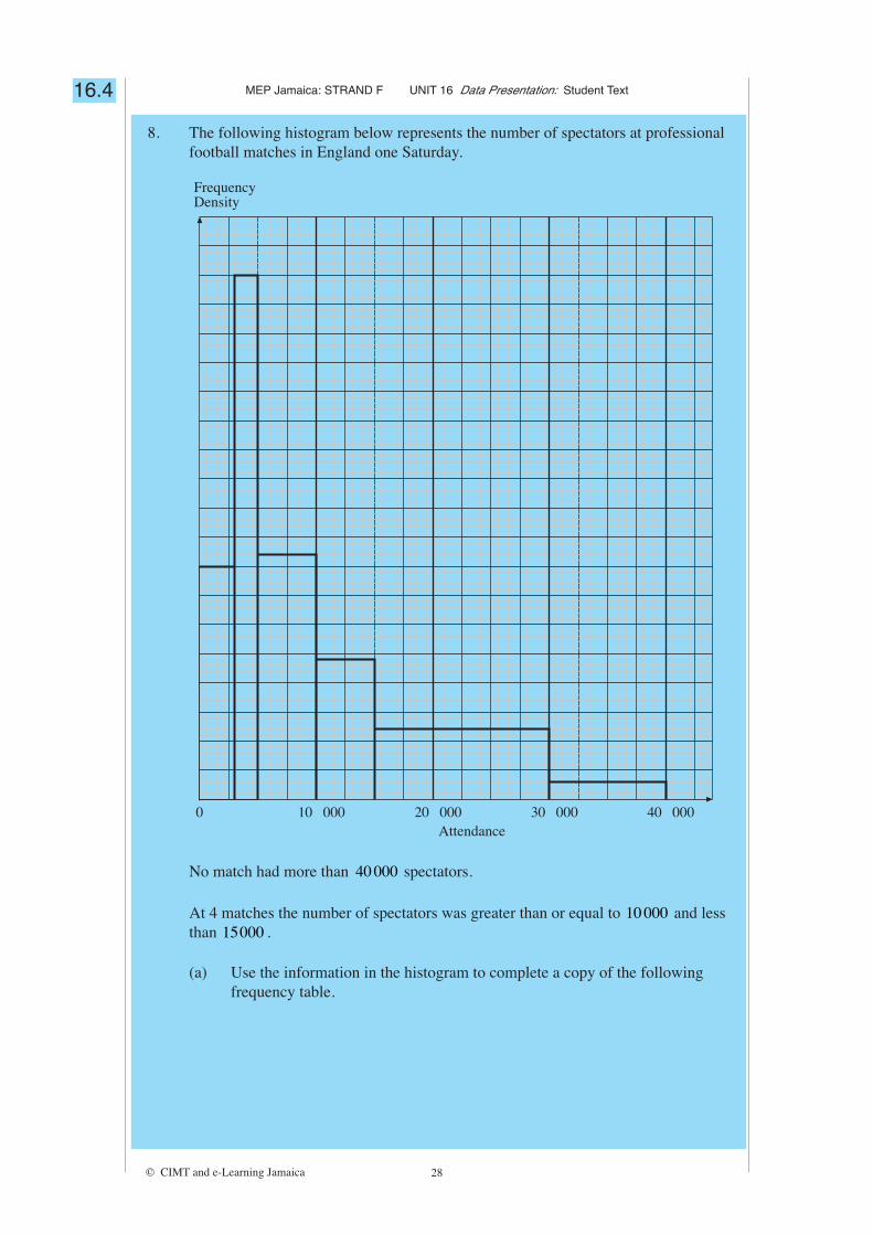
8. The following histogram below represents the number of spectators at professionalfootball matches in England one Saturday.
0 10 000 20 000 30 000 40 000Attendance
FrequencyDensity
No match had more than 40000 spectators.
At 4 matches the number of spectators was greater than or equal to 10000 and lessthan 15000 .
(a) Use the information in the histogram to complete a copy of the followingfrequency table.

MEP Jamaica: STRAND F UNIT 16 Data Presentation: Student Text
© CIMT and e-Learning Jamaica 29
Number of spectators (n) Frequency
4
≤ n <30 000 40 000
≤ n <15 000 30 000
≤ n <10 000 15 000
5000 ≤ n < 10 000
3000 ≤ n < 5000
0 ≤ n < 3000
(b) Calculate the total number of professional football matches played inEngland on that Saturday.
16.4
![PaperCut Student Guide Student Guide ver 1.3.pdf[Type text] [Type text] [Type text] PaperCut Student Guide 1.0 Sending a Print Job directly from student workstations (Direct Printing)](https://img.dokumen.tips/doc/110x75/5f4db73dc38b3872646b3ae0/papercut-student-guide-student-guide-ver-13pdf-type-text-type-text-type-text.jpg)