Embed Size (px)
DESCRIPTION
Statistics; tabulation & presentation of data
Citation preview

1
Data Classification, Tabulation, and Presentation
1.1 CLASSIFICATION OF DATA
Classification of data is the process of arranging data in groups/classes on the basis of certain properties. Classification of statistical data serves the following purposes:
1. It condenses the raw data into a form suitable for statistical analysis.2. It removes complexities and highlights the features of the data.3. It facilitates comparisons and drawing inferences from the data. For example, if university students in a
particular course are divided according to sex, their results can be compared.4. It provides information about the mutual relationships among elements of a data set. For example,
based on literacy and criminal tendency of a group of people, it can be established whether literacy has any impact on criminal tendency or not.
5. It helps in statistical analysis by separating elements of the data set into homogeneous groups and hence brings out the points of similarity and dissimilarity.
Basis of Classification
Generally, data are classified on the basis of the following four bases:
Geographical Classification In geographical classification, data are classified on the basis of geographical or locational differences — such as cities, districts, or villages — between various elements of the data set. The following is an example of a geographical distribution.
Chronological Classification When data are classified on the basis of time, the classification is known as chronological classification. Such classifications are also called time series because data are usually listed in chronological order starting with the earliest period. The following example would give an idea of chronological classification:
Qualitative Classification In qualitative classification, data are classified on the basis of descriptive characteristics or on the basis of attributes like sex, literacy, region, caste, or education, which cannot be quantified. This is done in two ways:
1. Simple classification: In this type of classification, each class is subdivided into two sub-classes and only one attribute is studied, for example male and female; blind and not blind, educated and uneducated; and so on.
2. Manifold classification: In this type of classification, a class is subdivided into more than two subclasses which may be sub-divided further.
Quantitative Classification In this classification, data are classified on the basis of characteristics which can be measured such as height, weight, income, expenditure, production, or sales.
Examples of continuous and discrete variables in a data set are shown in Table 1.1.

Table 1.1
1.2 ORGANIZING DATA USING DATA ARRAY
Table 1.2 presents the total number of overtime hours worked for 30 consecutive weeks by machinists in a machine shop. The data displayed here are in raw form, that is, the numerical observations are not arranged in any particular order or sequence.
Table 1.2 Raw Data Pertaining to Total Time Hours Worked by Machinists
The raw data can be reorganized in a data array and frequency distribution. Such an arrangement enables us to see quickly some of the characteristics of the data we have collected.
When a raw data set is arranged in rank order, from the smallest to the largest observation or vice-versa, the ordered sequence obtained is called an ordered array. Table 1.3 reorganizes data given in Table 1.2 in the ascending order
Table 1.3 Ordered Array of Total Overtime Hours Worked by Machinists
It may be observed that an ordered array does not summarize the data in any way as the number of observations in the array remains the same.
Frequency Distribution
A frequency distribution divides observations in the data set into conveniently established numerically ordered classes (groups or categories). The number of observations in each class is referred to as frequency denoted as f.
Summarizing data should not be at the cost of losing essential details. The purpose should be to seek an appropriate compromise between having too much of details or too little. To be able to achieve this compromise, certain criteria are discussed for constructing a frequency distribution.
The frequency distribution of the number of hours of overtime given in Table 1.2 is shown in Table 1.4.
Table 1.4 Array and Tallies

Number of Overtime Hours Tally Number of Weeks (Frequency)84 ∣∣ 2 85 ∣∣ 2 86 — 0 87 ∣ 1 88 ∣∣∣∣ 4 89 ∣∣∣ 3 90 ∣∣ 2 91 ∣∣ 2 92 ∣∣ 2 93 6
94 5
95 ∣ 1 30
Constructing a Frequency Distribution As the number of observations obtained gets larger, the method discussed above to condense the data becomes quite difficult and time-consuming. Thus, to further condense the data into frequency distribution tables, the following steps should be taken:
1. Select an appropriate number of non-overlapping class intervals.2. Determine the width of the class intervals.3. Determine class limits (or boundaries) for each class interval to avoid overlapping.
1. Decide the number of class intervals The decision on the number of class groupings depends largely on the judgment of the individual investigator and/or the range that will be used to group the data, although there are certain guidelines that can be used. As a general rule, a frequency distribution should have at least five class intervals (groups), but not more than fifteen. The following two rules are often used to decide approximate number of classes in a frequency distribution:
1. If k represents the number of classes and N the total number of observations, then the value of k will be the smallest exponent of the number 2, so that 2k ≥ N.
If N = 30 observations. If we apply this rule, then we shall have
23 = 8 (<30),
24 = 16 (<30),
25 = 32 (>30).
Thus we may choose k = 5 as the number of classes.

2. According to Sturge’s rule, the number of classes can be determined by the formula
k = 1 + 3.222 loge N
where k is the number of classes and loge N is the logarithm of the total number of observations.
For N = 30, we have
k = 1 + 3.222 log 30 = 1 + 3.222 (1.4771) = 5.759 ≅ 5.
2. Determine the width of class intervals The size (or width) of each class interval can be determined by first taking the difference between the largest and smallest numerical values in the data set and then dividing it by the number of class intervals desired.
The value obtained from this formula can be rounded off to a more convenient value based on the investigator’s preference.
From the ordered array in Table 1.3, the range is 95 − 84 = 11 hours. Using the above formula with 5 classes desired, the width of the class intervals is approximated as
width of class interval = hours.
For convenience, the selected width (or interval) of each class is rounded to 3 hours.
3. Determine class limits (boundaries) The limits of each class interval should be clearly defined so that each observation (element) of the data set belongs to one and only one class.
Each class has two limits—a lower limit and an upper limit. The usual practice is to let the lower limit of the first class be a convenient number slightly below or equal to the lowest value in the data set. In Table 1.3, we may take the lower class limit of the first class as 82 and the upper class limit as 85. Thus the class would be written as 82–85. This class interval includes all overtime hours ranging from 82 upto but not including 85 hours. The various other classes can be written as shown below:
Overtime Hours (Class Intervals)
Tallies Frequency
82 but less than 85 ∣ ∣ 2 85 but less than 88 ∣ ∣ ∣ 3 88 but less than 91 9

91 but less than 94 10
94 but less than 97 6
30
Mid-point of Class Intervals The class mid-point is the point halfway between the boundaries (both upper and lower class limits) of each class and is representative of all the observations contained in that class.
The width of the class interval should, as far as possible, be equal for all the classes. If this is not possible to maintain, the interpretation of the distribution becomes difficult.
Methods of Data Classification
There are two ways in which observations in the data set are classified on the basis of class intervals, namely
1. Exclusive method2. Inclusive method
Exclusive Method When the data are classified in such a way that the upper limit of a class interval is the lower limit of the succeeding class interval (i.e., no data point falls into more than one class interval), then it is said to be the exclusive method of classifying data. This method is illustrated in Table 1.5.
Table 1.5 Exclusive Method of Data Classification
Dividends Declared in Per cent
(Class Intervals)
Number of Companies
(Frequency)0–10 5 10–20 7 20–30 15 30–40 10
As shown in Table 1.5, five companies declared dividends ranging from 0 to 10 per cent, this means a company which declared exactly 10 per cent dividend would not be included in the class 0–10 but would be included in the next class 10–20. Since this point is not always clear, to avoid confusion data are displayed in a slightly different manner, as given in Table 1.6.
Table 1.6
Dividends Declared in Per cent
(Class Intervals)
Number of Companies
(Frequency)0 but less than 10 5 10 but less than 20 7

20 but less than 30 15 30 but less than 40 10
Inclusive Method When the data are classified in such a way that both lower and upper limits of a class interval are included in the interval itself, then it is said to be the inclusive method of classifying data. This method is shown in Table 1.7.
Table 1.7 Inclusive Method of Data Classification
Number of Accidents
(Class Intervals)
Number of Weeks
(Frequency)0–4 5 5–9 22 10–14 13 15–19 8 20–24 2
If a continuous variable is classified according to the inclusive method, then certain adjustment in the class interval is needed to obtain continuity as shown in Table 1.8.
Table 1.8
Class Intervals Frequency30–44 28 45–59 32 60–74 45 75–89 50 90–104 35
To ensure continuity, first calculate correction factor as
and then subtract it from the lower limits of all the classes and add it to the upper limits of all the classes.
From Table 1.8, we have x = (45 − 44) 2 = 0.5. Subtract 0.5 from the lower limits of all the classes and add 0.5 to the upper limits. The adjusted classes would then be as shown in Table 1.9.
Table 1.9

Class Intervals Frequency29.5–44.5 28 44.5–59.5 32 59.5–74.5 45 74.5–89.5 50 89.5–104.5 35
Class intervals should be of equal size to make meaningful comparison between classes. In a few cases, extreme values in the data set may require the inclusion of open-ended classes and this distribution is known as an open-ended distribution. An example of an open-ended distribution is given in Table 1.10.
Table 1.10
Age (Years)
Population
(Millions)
Under 517.8
5–1744.7
18–2429.9
25–4469.6
45–6444.6
65 and above27.4
234.0
Table 1.11 provides a tentative guide to determine an adequate number of classes.
Table 1.11 Guide to Determine the Number of Classes to Use
Number of Observations (N) Suggested Number of Classes20 5 50 7 100 8 200 9 500 10 1000 11

Example 1.1: The following set of numbers represents mutual fund prices reported at the end of a week for selected 40 nationally sold funds.
Arrange these prices into a frequency distribution having a suitable number of classes.
Solution: Since the number of observations are 40, it seems reasonable to choose 6 (26 > 40) class intervals to summarize values in the data set. Again, since the smallest value is 10 and the largest is 38, the class interval is given by
Now performing the actual tally and counting the number of values in each class, we get the frequency distribution by exclusive method as shown in Table 1.12.
Table 1.12 Frequency Distribution
Class Interval (Mutual Fund Prices, Rs.)
Tally Frequency (Number of Mutual Funds)
10–15 6
15–20 11
20–25 9
25–30 7
30–35 5
35–40 ∣ ∣ 2 40
Example 1.2: The take-home salary (in Rs.) of 40 unskilled workers from a company for a particular month was
Construct a frequency distribution having a suitable number of classes.
Solution: Since the number of observations are 30, we choose 5(25>30) class intervals to summarize values in the data set. In the data set the smallest value is 2365 and the largest is 2540, so the width of each class interval will be

Sorting the data values into classes and counting the number of values in each class, we get the frequency distribution by exclusive method as given in Table 1.13.
Table 1.13 Frequency Distribution
Class Interval
(Salary, Rs.)
Tally Frequency (Number of Workers)
2365–2400 6
2400–2435 7
2435–2470 10
2470–2505 6
2505–2540 ∣ 1 30
Example 1.3: A computer company received a rush order for as many home computers as could be shipped during a 6-week period. Company records provide the following daily shipments:
Group these daily shipments figures into a frequency distribution having the suitable number of classes.
Solution: Since the number of observations are 42, it seems reasonable to choose 6(26>42) classes. Again, since the smallest value is 22 and the largest is 87, the class interval is given by
Now performing the actual tally and counting the number of values in each class, we get the following frequency distribution by inclusive method as shown in Table 1.14.
Table 1.14 Frequency Distribution
Class Interval (Number of Computers)
Tally Frequency (Number of Days)
22–32 ∣ ∣ ∣ ∣ 4 33–43 ∣ ∣ ∣ ∣ 4 44–54 9

55–65 14
66–76 6
77–87 5
42
Example 1.4: Following is the increase of D.A. in the salaries of employees of a firm at the following rates.
Rs. 250 for the salary range up to Rs. 4749 Rs. 260 for the salary range from Rs. 4750 Rs. 270 for the salary range from Rs. 4950 Rs. 280 for the salary range from Rs. 5150 Rs. 290 for the salary range from Rs. 5350
No increase of D.A for salary of Rs. 5500 or more. What will be the additional amount required to be paid by the firm in a year which has 32 employees with the following salaries (in Rs.)?
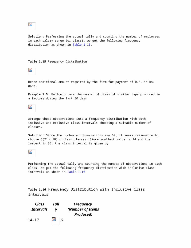
Solution: Performing the actual tally and counting the number of employees in each salary range (or class), we get the following frequency distribution as shown in Table 1.15.
Table 1.15 Frequency Distribution
Hence additional amount required by the firm for payment of D.A. is Rs. 8650.
Example 1.5: Following are the number of items of similar type produced in a factory during the last 50 days.
Arrange these observations into a frequency distribution with both inclusive and exclusive class intervals choosing a suitable number of classes.
Solution: Since the number of observations are 50, it seems reasonable to choose 6(26 > 50) or less classes. Since smallest value is 14 and the largest is 36, the class interval is given by
Performing the actual tally and counting the number of observations in each class, we get the following frequency distribution with inclusive class intervals as shown in Table 1.16.

Table 1.16 Frequency Distribution with Inclusive Class Intervals
Class Intervals Tally Frequency (Number of Items Produced)
14–17 6
18–21 18
22–25 15
26–29 5
30–33 ∣ ∣ ∣ 3 34–33 ∣ ∣ ∣ 3 50
Converting the class intervals shown in Table 1.16 into exclusive class intervals is shown in Table 1.17.
Table 1.17 Frequency Distribution with Exclusive Class Intervals
Class Intervals Mid-Value of Class Intervals Frequency (Number of Items Produced)
13.5–17.5 15.5 6 17.5–21.5 19.5 18 21.5–25.5 23.5 15 25.5–29.5 27.5 5 29.5–33.5 31.5 3 33.5–37.5 34.5 3
Example 1.6: Classify the following data by taking class such that their mid-values are 17, 22, 27, 32, and so on.
[Madurai-Kamaraj Univ., B.Com., 2005]
Solution: Since we have to classify the data in such a manner that the mid-values are 17, 22, 27, etc., the first class should be 15–19 (mid-value = (15 + 19)/2 = 17), second class should be 20–24, etc. Performing the actual tally and counting the number of observations in each class we get the frequency distribution as shown in Table 1.18.
Table 1.18 Frequency Distribution with Inclusive Class Intervals

Marks Tallies Frequency15–19
∣ ∣ ∣ ∣4
20–24 ∣ ∣ ∣ ∣
4
25–29 ∣ ∣ ∣ ∣
4
30–34 8
35–39 ∣ ∣ ∣ ∣
4
40–44 9
45–49 ∣ ∣ ∣
3
50–54 ∣ ∣ ∣
3
39
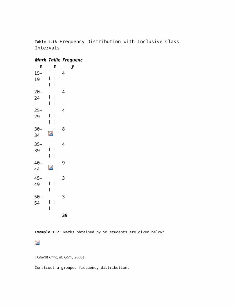
Example 1.7: Marks obtained by 50 students are given below:
[Calicut Univ., M. Com., 2006]
Construct a grouped frequency distribution.
Solution: Since the number of observations are 50, we may choose 6(26>50) or less classes. The lowest value is 2 and largest 63, the class intervals shall be
The frequency distribution is shown in Table 1.19.
Table 1.19 Frequency Distribution
Marks Tallies Frequency (Number of Students)
2–127
13–2314
24–3414
35–4513
45–56 ∣1
57–67 11
50
Example 1.8: Point out the mistakes in the following table to show the distribution of population according to sex, age, and literacy.
[Bombay Univ., M. Com., 1995]
Solution: All the characteristics are not revealed in the given table. The characteristic of literacy are complete and hence table needs to be re-arranged as shown in Table 1.20.
Table 1.20 Distribution of Population According to Age, Sex, and Literacy
Example 1.9:
1. Present the following data of the percentage marks of 60 students in the form of a frequency table with 10 classes of equal width, one class being 50–59.
[CSI, Foundation, 2007]
2. (b) A sample consists of 34 observations recorded correct to the nearest integer, ranging in value from 201 to 337. If it is decided to use seven classes of width 20 integers and to begin in the first class at 199.5, find the class marks of the seven classes.

[Calicut Univ., B.Sc., 2004]
Solution:
1. Since the number of observations are 60, we may choose 6(26 > 60) or less class intervals. The class interval is given by
The frequency distribution with inclusive intervals is shown in Table 1.21.
Table 1.21 Frequency Distribution
Marks Tallies Frequency
0–156
16–315
32–4716
48–6318
64–798
80–957
60 2. Since it is decided to begin with 199.5 and takes a classes interval of 20, the first class will be 199.5–
219.5, the second would be 219.5–239.5, and so on. The class mark shall be obtained by adding the lower and upper limits and dividing it by 2. Thus, for the first class, the marks shall be (199.5) + (219.5)/2 = 209.5. Since class interval is equal the other class marks can be obtained by adding 20 to the preceding class mark. Table 1.22 gives the class limits and class marks of the seven classes.
Table 1.22
Class Limits Class Marks199.5–219.5 206.5 219.5–239.5 229.5
239.5–259.5 249.5 259.5–279.5 269.5 279.5–299.5 289.5 299.5–319.5 309.5 319.5–339.5 329.5
Bivariate Frequency Distribution
The frequency distributions discussed so far involved only one variable and are therefore called univariate frequency distributions. In case the data involve two variables (such as profit and expenditure on advertisements of a group of companies, income and expenditure of a group of individuals, supply and demand of a commodity, etc.), then frequency distribution so obtained as a result of cross classification is called bivariate frequency distribution. It can be summarized in the form of a two-way (bivariate) frequency table and the values of each variable are grouped into various classes (not necessarily same for each variable) in the same way as for univariate distributions.
Frequency distribution of variable x for a given value of y is obtained by the values of x and vice versa. Such frequencies in each cell are called conditional frequencies. The frequencies of the values of variables x and y together with their frequency totals are called the marginal frequencies.
Example 1.10: The following figures indicate income (x) and percentage expenditure on food (y) of 25 families. Construct a bivariate frequency table classifying x into intervals 200–300, 300–400, …, and y into 10–15, 15–20, …
Write the marginal distribution of x and y and the conditional distribution of x when y lies between 15 and 20.
Solution: The two-way frequency table showing income (in Rs.) and percentage expenditure on food is shown in Table 1.23.
Table 1.23
The conditional distribution of x when y lies between 15 and 20 per cent is as follows:
Example 1.11: The following data give the points scored in a tennis match by two players X and Y at the end of 20 games:
Taking class intervals as 5–9, 10–14, 15–19, …, for both X and Y, construct

1. Bivariate frequency table2. Conditional frequency distribution for Y given X > 15
Solution: (a) The two-way frequency distribution is shown in Table 1.24.
Table 1.24 Bivariate Frequency Table
(ii) Conditional frequency distribution for Y given X>15.
Player Y Player X 15–19 20–24
5–9 1 — 10–14 1 — 15–19 3 1 20–24 1 1 6 2
Example 1.12: 30 pairs of values of two variables X and Y are given below. From a two-way table,
Take class intervals of X as 10–20, 20–30, etc., and that of Y as 100–200, 200–300. etc.
[Osmania Univ., B.Com., 2006]
Solution: The two-way frequency distribution is shown in Table 1.25.
Table 1.25 Bivariable Frequency Table
Types of Frequency Distributions
Cumulative Frequency Distribution Sometimes it is preferable to present data in a cumulative frequency (cf) distribution. A cumulative frequency distribution is of two types: (i) more than type and (ii) less than type.

In a less than cumulative frequency distribution, the frequencies of each class interval are added successively from top to bottom and represent the cumulative number of observations less than or equal to the class frequency to which it relates. But in the more than cumulative frequency distribution, the frequencies of each class interval are added successively from bottom to top and represent the cumulative number of observations greater than or equal to the class frequency to which it relates.
The frequency distribution given in Table 1.26 illustrates the concept of cumulative frequency distribution.
Table 1.26 Cumulative Frequency Distribution
The ‘less than’ cumulative frequencies are corresponding to the upper limit of class intervals and ‘more than’ cumulative frequencies are corresponding to the lower limit of class intervals shown in Tables 1.27(a) and (b).
Table 1.27(a)
Upper Limits Cumulative Frequency
(Less Than)Less than 4 5 Less than 9 27 Less than 14 40 Less than 19 48 Less than 24 50
Table 1.27(b)
Lower Limits Cumulative Frequency
(More Than)0 and more 50 5 and more 45 10 and more 23 15 and more 10 20 and more 2
Relative Frequency Distribution To convert a frequency distribution into a corresponding relative frequency distribution, we divide each class frequency by the total number of observations in the entire distribution. Each relative frequency is thus a proportion as shown in Table 1.29.
Percentage Frequency Distribution A percentage frequency distribution is one in which the number of observations for each class interval is converted into a percentage frequency by dividing it by the total number of

observations in the entire distribution. The quotient so obtained is then multiplied by 100, as shown in Table 1.28.
Table 1.28 Relative and Percentage Frequency Distributions
Example 1.13: Following are the number of two wheelers sold by a dealer during 8 weeks of 6 working days each.
1. Group these figures into a table having the classes 10–12, 13–15, 16–18, …, and 28–30.2. Convert the distribution of part (a) into a corresponding percentage frequency distribution and also a
percentage cumulative frequency distribution.
Solution:
1. Frequency distribution of the given data is shown in Table 1.29.
Table 1.29 Frequency Distribution
Number of Automobiles Sold
(Class Intervals)
Tally Number of Days
(Frequency)10–12 ∣ ∣ 2 13–15 6
16–18 10
19–21 16
22–24 8
25–27 5
28–30 ∣ 1 48
2. Percentage frequency distribution is shown in Table 1.30.
Table 1.30 Percentage and More Than Cumulative Percentage Distribution

Self-Practice Problems 1A
1.1 Form a frequency distribution of the following data. Use an equal class interval of 4 where the lower limit of the first class is 10.
10 17 15 22 11 16 19 24 29
18 25 26 32 14 17 20 23 27
30 12 15 18 24 36 18 15 21
28 33 38 34 13 10 16 20 22
29 29 23 31
1.2 If class mid-points in a frequency distribution of the ages of a group of persons are 25, 32, 39, 46, 53, and 60, find
1. the size of the class interval,2. the class boundaries,3. the class limits, assuming that the age quoted is the age completed on the last birthdays.
1.3 The distribution of ages of 500 readers of a nationally distributed magazine is given below:
Age (in Years) Number of ReadersBelow 14 20 15–19 125 20–24 25 25–29 35 30–34 80 35–39 140 40–44 30 45 and above 45
Find the relative and cumulative frequency distributions for this distribution.
1.4 The distribution of inventory to sales ratio of 200 retail outlets is given below:
Inventory to Sales Ratio Number of Retail Outlets1.0–1.2 20 1.2–1.4 30 1.4–1.6 60

1.6–1.8 40 1.8–2.0 30 2.0–2.2 15 2.2–2.4 5
Find the relative and cumulative frequency distributions for this distribution.
1.5 A wholesaler’s daily shipments of a particular item varied from 1,152 to 9,888 units per day. Indicate the limits of nine classes into which these shipments might be grouped.
1.6 A college book store groups the monetary value of its sales into a frequency distribution with the classes, Rs. 400–500, Rs. 501–600, and Rs. 601 and over. Is it possible to determine from this distribution the amount of sales
1. less than Rs. 6012. less than Rs. 5013. Rs. 501 or more?
1.7 The class marks of distribution of the number of electric light bulbs replaced daily in an office building are 5, 10, 15, and 20. Find (a) the class boundaries and (b) class limits.
1.8 The marks obtained by 25 students in Statistics and Economics are given below. The first figure in the bracket indicates the marks in Statistics and the second in Economics.
Prepare a two-way frequency table taking the width of each class interval as 4 marks, the first being less than 4.
1.9 Prepare a bivariate frequency distribution for the following data for 20 students:
Also prepare
1. a marginal frequency table for marks in Law and Statistics2. a conditional frequency distribution for marks in Law when the marks in Statistics are more than 22.
1.10 Classify the following data by taking class intervals such that their mid-values are 17, 22, 27, 32, and so on:
[Madurai-Kamraj Univ., B.Com., 1995]

1.11 In degree colleges of a city, no teacher is less than 30 years or more than 60 years in age. Their cumulative frequencies are as follows:
Find the frequencies in the class intervals 25–30, 30–35, …
Hints and Answers
1.1 The classes for preparing frequency distribution by inclusive method will be
10–13, 14–17, 18–21, …, 34–37, 38–41
1.2
1. Size of the class interval = Difference between the mid-values of any two consecutive classes = 72. The class boundaries for different classes are obtained by adding (for upper class boundaries or limits)
and subtracting (for lower class boundaries or limits) half the magnitude of the class interval, that is, 7 2 = 3.5 from the midvalues.
Class Intervals:
21.5–28.5 28.5–35.5 35.5–42.5
Mid-Values: 25 32 39
Class Intervals:
42.5–49.5 49.5–56.5 56.5–63.5
Mid-Values: 46 53 60
3. The distribution can be expressed in inclusive class intervals with width of 7 as 22–28, 29–35, …, 56–63.
1.5 One possibility is 1000–1999, 2000–2999, 3000–3999, …, 9000–9999 units of the item.
1.11
1.3 TABULATION OF DATA

Tabulation is another way of summarizing and presenting the given data in a systematic form in rows and columns. Such presentation facilitates comparisons by bringing related information close to each other and helps in further statistical analysis and interpretation.
Parts of a Table
1. Table number: A table should be numbered for easy identification and reference in future. The table number may be given either in the centre or side of the table but above the top of the title of the table. If the number of columns in a table is large, then these can also be numbered so that easy reference to these is possible.
2. Title of the table: Each table must have a brief, self-explanatory, and complete title which can 1. indicate the nature of data contained.2. explain the locality (i.e., geographical or physical) of data covered.3. indicate the time (or period) of data obtained.4. contain the source of the data to indicate the authority for the data, as a means of verification
and as a reference. The source is always placed below the table.3. Caption and stubs: The headings for columns and rows are called caption and stub, respectively. They
must be clear and concise.4. Body: The body of the table should contain the numerical information. The numerical information is
arranged according to the descriptions given for each column and row.5. Prefactory or head note: If needed, a prefactory note is given just below the title for its further
description in a prominent type. It is usually enclosed in brackets and is about the unit of measurement.6. Footnotes: Anything written below the table is called a footnote. It is written to further clarify either
the title captions or stubs. For example, if the data described in the table pertain to profits earned by a company, then the footnote may define whether it is profit before tax or after tax. There are various ways of identifying footnotes:
1. Numbering footnotes consecutively with small number 1, 2, 3, …, or letters a, b, c, …, or star *, **, …
2. Sometimes symbols like @ or $ are also used to identify footnotes.
A blank model table is given below:
Table Number and Title [Head or Prefactory Note (if any)]
Footnote :
Source Note :
Types of Tables
The classification of tables depends on various aspects: objectives and scope of investigation, nature of data (primary or secondary) for investigation, extent of data coverage, and so on. The different types of tables used in statistical investigations are as follows:

Simple and Complex Tables In a simple table (also known as one-way table), data are presented based on only one characteristic. Table 1.31 illustrates the concept.
Table 1.31 Candidates Interviewed for Employment in a Company
Candidate’s Profile Number of Candidates
Experienced50
Inexperienced70
Total120
In a complex table (also known as a manifold table) data are presented according to two or more characteristics simultaneously. The complex tables are two-way or three-way tables according to whether two or three characteristics are presented simultaneously.
1. Double or Two-Way Table: In such a table, the variable under study is further subdivided into two groups according to two inter-related characteristics. For example, if the total number of candidates given in Table 1.31 are further divided according to their sex, the table would become a two-way table because it would reveal information about two characteristics, namely male and female. The new shape of the table is shown in Table 1.32.
Table 1.32 Candidates Interviewed for Employment in a Company
2. Three-Way Table: In such a table, the variable under study is divided according to three interrelated characteristics. For example, if the total number of male and female candidates given in Table 1.32 are further divided according to the marital status, the table would become a three-way. The new shape of the table is shown in Table 1.35.
3. Manifold (or Higher Order) Table: Such tables provide information about a large number of interrelated characteristics in the data set. For example, if the data given in Table 1.33 is also available for other companies, then the table would become a manifold table.
Table 1.33 Candidates Interviewed for Employment in a Company
Original and Derived Tables Original tables are also called classification tables. Such a table contains data collected from a primary source. But if the information given in a table has been derived from a general table, then such a table is called a derived table.
Example 1.14: A state government has taken up a scheme of providing drinking water to every village. During the first 4 years of a five-year plan, the government has installed 39,664 tubewells. Out of the funds earmarked for natural calamities, the government has sunk 14,072 tubewells during the first 4 years of the plan. Thus, out of

the plan fund 9245 and 8630 tubewells were sunk in 2000–01 and 2001–02, respectively. Out of the natural calamities fund, the number of tubewells sunk in 1998–99 and 19992000 were 4511 and 637, respectively. The expenditure for 2000–01 and 2001–02 was Rs. 863.41 lakh and Rs. 1185.65 lakh, respectively.
The number of tubewells installed in 2002–03 was 16,740 out of which 4800 were installed out of the natural calamities fund and the expenditure of sinking of tubewells during 2002–03 was Rs. 1411.17 lakh.
The number of tubewells installed in 2003–04 was 13,973, out of which 9849 tubewells were sunk out of the fund for the plan and the total expenditure during the first 4 years was Rs. 5443.05 lakh.
Represent this data in a tabular form.
Solution: The data of the problem is summarized in Table 1.34.
Table 1.34 Tubewells for Drinking Water for Villages in a State
Example 1.15: In a sample study about coffee-drinking habits in two towns, the following information was received:
Town A
: Females were 40 per cent. Total coffee drinkers were 45 per cent and male non-coffee drinkers were 20 per cent
Town B
: Males were 55 per cent. Male non-coffee drinkers were 30 per cent and female coffee drinkers were 15 per cent.
Represent this data in a tabular form.
Solution: The given data is summarized in Table 1.35.
Table 1.35 Coffee Drinking Habit of Towns A and B (in Percentage)
Example 1.16: Industrial finance in India has showed great variation in respect of sources of funds during the first, second, and third five-year plans. There were two main sources—internal and external. The internal sources of funds are depreciation, free reserves, and surplus. The external sources of funds are capital issues and borrowings.
During the first plan, internal and external sources accounted for 62 per cent and 38 per cent of the total, and of the depreciation, fresh capital, and other sources formed 29 per cent, 7 per cent, and 10.6 per cent, respectively.

During the second plan, internal sources decreased by 17.3 per cent compared to the first plan, and depreciation was 24.5 per cent. The external finance during the same period consisted of 10.9 per cent fresh capital and 28.9 per cent borrowings.
Compared to the second plan, external finance during the third plan decreased by 4.4 per cent, and borrowings and ‘other sources’ were 29.4 per cent and 14.9 percent respectively. During the third plan, internal finance increased by 4.4 per cent and free reserves and surplus formed 18.6 per cent.
Tabulate this information with the above details as clearly as possible observing the rules of tabulation.
Solution: The given information is summarized in Table 1.36.
Table 1.36 Pattern of Industrial Finance (in Percentage)
Example 1.17: The following information about weather conditions at different stations was recorded at 8.30 a.m. on Thursday, 29 August 1990.
At Ahmednagar station, the maximum and minimum temperatures in 24 hours were 28°C and 20°C respectively. The rainfall in the past 24 hours at Ahmednagar was nil. Since 1 June the rainfall was 185 mm which is 105 mm below normal.
Bangalore’s minimum and maximum temperatures in 24 hours for the day were 19°C and 23°C respectively. It had no rainfall in the past 24 hrs and since 1 June the rainfall was 252 mm which is 54 mm below normal.
The minimum temperature at Udaipur was 21°C and the rainfall in the past 24 hours was nil. Since 1 June it experienced 434 mm of rainfall which is 24 mm below normal.
Panagarh’s maximum temperature in 24 hours was 28°C. It had 4 mm of rain in the past 24 hours and since 1 June it had 955 mm of rain.
Kolkata’s maximum and minimum day temperatures were 30°C and 26°C respectively. It had 3 mm of rainfall in the past 24 hours. Since 1 June it experienced a rainfall of 1079 mm which is 154 mm above normal.
Present the above data in a tabular form.
Solution: The given information is summarized in Table 1.37.
Table 1.37 Weather Conditions at Different Stations (at 8.30 a.m. on 29 August 1990)
Example 1.18: Present the following data in a tabular form:
A certain manufacturer produces three different products 1, 2, and 3. Product 1 can be manufactured in one of the three plants A, B, or C. However, product 2 can be manufactured in either plant B or C, whereas plant A or B can

manufacture product 3. Plant A can manufacture in an hour 10 pieces of 1 or 20 pieces of 31; however, 20 pieces of 2, 15 pieces of 1, or 16 pieces of 3 can be manufactured per hour in plant B. Plant C can produce 20 pieces of 1 or 18 pieces of 2 per hour.
Wage rates per hour are Rs. 20 at A, Rs. 40 at B and Rs. 25 at C. The costs of running plants A, B, and C are respectively Rs. 1000, 500, and 1250 per hour. Materials and other costs directly related to the production of one piece of the product are respectively Rs. 10 for 1, Rs. 12 for 2, and Rs. 15 for 3. The company plans to market product 1 at Rs. 15 per piece, product 2 at Rs. 18 per piece and product 3 at Rs. 20 per piece.
Solution: The given information is summarized in Table 1.38.
Table 1.38 Production Schedule of a Manufacturer
Example 1.19: Transforming the ratios into corresponding numbers prepare a complete table for the following information. Give a suitable title to the table.
In the year 2000 the total strength of students of three colleges X, Y, and Z in a city were in the ratio 4 : 2 : 5. The strength of college Y was 2000. The proportion of girls and boys in all colleges was in the ratio 2 : 3. The faculty-wise distribution of boys and girls in the faculties of Arts, Science, and Commerce was in the ratio 1 : 2 : 2 in all the three colleges.
Solution: The data of the problem is summarized in Table 1.39.
Table 1.39 Distribution of Students According to Faculty and Colleges in the Year 2000
Example 1.20: Represent the following information in a suitable tabular form with proper rulings and headings:
The annual report of a Public Library reveals the following information regarding the reading habits of its members.
Out of the total of 3718 books issued to the members in the month of June, 2100 were fiction. There were 467 members of the library during the period and they were classified into five classes—A, B, C, D, and E. The number of members belonging to the first four classes were respectively 15, 176, 98, and 129, and the number of fiction books issued to them were 103, 1187, 647, and 58, respectively. The number of books, other than text books and fiction, issued to these four classes of members were respectively 4, 390, 217, and 341. Text books were issued only to members belonging to classes C, D, and E, and the number of text books issued to them were respectively 8, 317, and 160.
During the same period, 1246 periodicals were issued. These include 396 technical journals of which 36 were issued to members of class B, 45 to class D, and 315 to class E.
To members of classes B, C, D, and E the number of other journals issued were 419, 26, 231, and 99, respectively.
The report, however, showed an increase of 4.1 per cent in the number of books issued over last month, though there was a corresponding decrease of 6.1 per cent in the number of periodicals and journals issued to members.
Solution: The data of the problem is summarized in Table 1.40.
Table 1.40 Reading Habits of the Members of a Public Library
Note: The figures for the month of May were calculated on the basis of percentage changes for each type of reading material given in the text.
Self-Practice Problems 1B
1.12 Draw a blank table to show the number of candidates sex-wise appearing in the pre-university, first year, second year, and third year examinations of a university in the faculties of Arts, Science, and Commerce in a certain year.
1.13 Let the national income of a country for the years 2000–01 and 2001–02 at current prices be 80,650, 90,010, and 90,530 crore of rupees respectively, and per capita income for these years be 1050, 1056, and 1067 rupees. The corresponding figures of national income and per capita income at 1999–2000 prices for the above years were 80,650, 80,820, and 80,850 crore of rupees and 1050, 1051, and 1048 respectively. Present this data in a table.
1.14 Present the following information in a suitable form supplying the figure not directly given. In 2004, out of a total of 4000 workers in a factory, 3300 were members of a trade union. The number of women workers employed was 500 out of which 400 did not belong to any union.
In 2003, the number of workers in the union was 3450 of which 3200 were men. The number of nonunion workers was 760 of which 330 were women.
1.15 Of the 1125 students studying in a college during a year, 720 were SC/ST, 628 were boys, and 440 were science students; the number of SC/ST boys was 392, that of boys studying science 205, and that of SC/ST students studying science 262; finally the number of science students among the SC/ST boys was 148. Enter these frequencies in a three-way table and complete the table by obtaining the frequencies of the remaining cells.
1.16 A survey of 370 students from the Commerce Faculty and 130 students from the Science Faculty revealed that 180 students were studying for only C.A. Examinations, 140 for only Costing Examinations, and 80 for both C.A. and Costing Examinations. The rest had opted for part-time management courses. Of those studying for Costing only, 13 were girls and 90 boys belonged to the Commerce Faculty. Out of the 80 studying for both C.A. and Costing, 72 were from the Commerce Faculty amongst whom 70 were boys. Amongst those who opted for part-time management courses, 50 boys were from the Science Faculty and 30 boys and 10 girls from the Commerce Faculty. In all, there were 110 boys in the Science Faculty.

Present this information in a tabular form. Find the number of students from the Science Faculty studying for part-time management courses.
1.17 An Aluminium Company is in possession of certain scrap materials with known chemical composition. Scrap 1 contains 65 per cent aluminium, 20 per cent iron, 2 per cent copper, 2 per cent manganese, 3 per cent magnesium and 8 per cent silicon. The aluminium content of scrap 2, scrap 3, and scrap 4 are 70 per cent, 80 per cent and 75 per cent respectively. Scrap 2 contains 15 per cent, iron, 3 per cent copper, 2 per cent manganese, 4 per cent magnesium, and the rest silicon. Scrap 3 contains 5 per cent iron. The iron content of Scrap 4 is the same as that of scrap 3, scrap 4 contains twice as much percentage of copper as scrap 3. scrap 3 contains 1 per cent copper. Scrap 3 contains manganese which is 3 times as much as copper it contains. The percentage of magnesium and silicon in scrap 3 are 3 per cent and 8 per cent respectively. The magnesium and silicon contents of scrap 4 are respectively 2 times and 3 times its manganese contents. The company also purchases some aluminium and silicon as needed. The aluminium purchased contains 96 per cent pure aluminium, 2 per cent iron, 1 per cent copper and 1 per cent silicon respectively, whereas the purchased silicon contains 98 per cent silicon and 2 per cent iron respectively. Present the above data in a table.
1.18 The ‘Financial Highlights’ of a public limited company in recent years were as follows:
In the year ending on 31 March 1998 the turnover of the company, including other income, was Rs. 157 million. The profit of the company in the same year before tax, investment allowance, reserve, and prior year’s adjustment was Rs. 19 million, and the profit after tax, investment allowance, reserve, and prior year’s adjustment was Rs. 8 million. The dividend declared by the company in the same year was 20 per cent. The turnover, including other income, for the years ending on 31 March 1999, 2000, and 2001 were Rs. 169, 191, and 197 million respectively. For the year ending on 31 March 1999 the profit before tax, investment allowance, reserve, and prior year’s adjustment was Rs. 192 million and the profit after tax, and so on Rs. 7.5 million, while the dividend declared for the same year was 17 per cent. For the year ending on 31 March 2000, 2001, and 2002 the profits before tax, investment allowance, reserve, and prior year’s adjustment were Rs. 21, 12, 13 million respectively, while the profits after tax, and so on, of the above three years were Rs. 9.5, 4, and 9 million respectively. The turnover, including other income, for the year ending on 31 March 2002 was Rs. 243 million. The dividend declared for the year ending on 31 March 2000–02 was 17 per cent, 10 per cent, and 20 per cent respectively. Present the above data in a table.
1.19 Present the following information in a suitable form:
In 1994, out of a total of 1950 workers of a factory, 1400 were members of a trade union.
The number of women employed was 400 of which 275 did not belong to a trade union. In 1999, the number of union workers increased to 1780 of which 1490 were men. On the other hand, the number of non-union workers fell to 408 of which 280 were men.
In the year 2004, there were 2000 employees who belonged to a trade union and 250 did not belong to a trade union. Of all the employees in 2000, 500 were women of whom only 208 did not belong to a trade union.
Hints and Answers
1.12 Distribution of candidates appearing in various university examinations
1.13 National income and per capita income of the country

For the year 1999–2000 to 2001–2002
1.14 Members of union by sex
1.15 Distribution of College Students by Caste and Faculty
1.16 Distribution of students according to Faculty and Professional Courses
1.17 The chemical composition of Scraps and Purchased Minerals
1.18 Financial highlights of the Public Ltd., Co.
1.19 Trade-union membership
1.4 GRAPHICAL PRESENTATION OF DATA
According to King, “One of the chief aims of statistical science is to render the meaning of masses of figures clear and comprehensible at a glance.” This is often best accomplished by presenting the data in a pictorial (or graphical) form.
Functions of a Graph
The shape of the graph gives an exact idea of the variations of the distribution trends. Graphic presentation, therefore, serves as an easy technique for quick and effective comparison between two or more frequency distributions. When the graph of one frequency distribution is superimposed on the other, the points of contrast regarding the type of distribution and the pattern of variation become quite obvious. All these advantages necessitate a clear understanding of the various forms of graphic representation of a frequency distribution.
General Rules for Drawing Diagrams

The following general guidelines are taken into consideration while preparing diagrams:
Title: Each diagram should have a suitable title. It may be given either at the top of the diagram or below it. The title must convey the main theme which the diagram intends to portray.
Size: The size and portion of each component of a diagram should be such that all the relevant characteristics of the data are properly displayed and can be easily understood.
Proportion of length and breadth: An appropriate proportion between the length and breadth of the diagram should be maintained. As such there are no fixed rules about the ratio of length to width. However, a ratio of
: 1 or 1.414 (long side) : 1 (short side) suggested by Lutz in his book Graphic Presentation may be adopted as a general rule.
Proper scale: There are again no fixed rules for selection of scale. The diagram should neither be too small nor too large. The scale for the diagram should be decided after taking into consideration the magnitude of data and the size of the paper on which it is to be drawn. The scale showing the values as far as possible should be in even numbers or in multiples of 5, 10, 20, and so on. The scale should specify the size of the unit and the nature of data it represents, for example, ‘millions of tonnes’, in Rs. thousand, and the like. The scale adopted should be indicated on both vertical and horizontal axes if different scales are used. Otherwise, it can be indicated at some suitable place on the graph paper.
Footnotes and source note: To clarify or elucidate any points which need further explanation but cannot be shown in the graph, footnotes are given at the bottom of the diagrams.
Index: A brief index explaining the different types of lines, shades, designs, or colours used in the construction of the diagram should be given to understand its contents.
Simplicity: Diagrams should be prepared in such a way that they can be understood easily. To keep it simple, too much information should not be loaded in a single diagram as it may create confusion. Thus if the data are large, then it is advisible to prepare more than one diagram, each depicting some identified characteristic of the same data.
1.5 TYPES OF DIAGRAMS
One-Dimensional Diagrams
These diagrams provide a useful and quick understanding of the shape of the distribution and its characteristics.
These diagrams are called one-dimensional diagrams because only the length (height) of the bar (not the width) is taken into consideration. Of course, width or thickness of the bar has no effect on the diagram, even then the thickness should not be too much otherwise the diagram would appear like a twodimensional diagram.
The one-dimensional diagrams (charts) used for graphical presentation of data sets are as follows:
Histograms Frequency polygons Pie diagrams Frequency curves Cumulative frequency distributions (Ogive)
(Bar Diagrams) Histograms These diagrams are used to graph both ungrouped and grouped data. In the case of an ungrouped data, values of the variable (the characteristic to be measured) are scaled along the horizontal axis and the number of observations (or frequencies) along the vertical axis of the graph. The plotted points are then

connected by straight lines to enhance the shape of the distribution. The height of such boxes (rectangles) measures the number of observations in each of the classes (Fig. 1.1).
Remarks: Bar diagrams are not suitable to represent long period time series.
Figure 1.1 Histogram for Mutual Funds
Simple Bar Charts The graphic techniques described earlier are used for group frequency distributions. The graphic techniques presented in this section can also be used for displaying values of categorical variables. Such data are first tallied into summary tables and then graphically displayed as either bar charts or pie charts.
Bar charts are used to represent only one characteristic of data and there will be as many bars as number of observations. For example, the data obtained on the production of oil seeds in a particular year can be represented by such bars. Each bar would represent the yield of a particular oil seed in that year. Since the bars are of the same width and only the length varies, the relationship among them can be easily established.
Sometimes only lines are drawn for comparison of given variable values. Such lines are not thick and their number is sufficiently large. The different measurements to be shown should not have too much difference, so that the lines may not show too much dissimilarity in their heights.
Example 1.21: The data on the production of oil seeds in a particular year are presented in Table 1.41.
Table 1.41
Oil Seed Yield (Million tonnes)
Percentage Production
(Million tonnes)
Ground nut5.80 43.03
Rapeseed3.30 24.48
Coconut1.18 8.75
Cotton2.20 16.32
Soyabean1.00 7.42
13.48 100.00
Represent this data by a suitable bar chart.
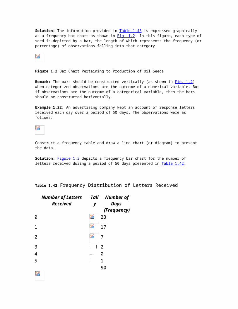
Solution: The information provided in Table 1.43 is expressed graphically as a frequency bar chart as shown in Fig. 1.2. In this figure, each type of seed is depicted by a bar, the length of which represents the frequency (or percentage) of observations falling into that category.
Figure 1.2 Bar Chart Pertaining to Production of Oil Seeds
Remark: The bars should be constructed vertically (as shown in Fig. 1.2) when categorized observations are the outcome of a numerical variable. But if observations are the outcome of a categorical variable, then the bars should be constructed horizontally.
Example 1.22: An advertising company kept an account of response letters received each day over a period of 50 days. The observations were as follows:
Construct a frequency table and draw a line chart (or diagram) to present the data.
Solution: Figure 1.3 depicts a frequency bar chart for the number of letters received during a period of 50 days presented in Table 1.42.
Table 1.42 Frequency Distribution of Letters Received
Number of Letters Received Tally Number of Days
(Frequency)0 23
1 17
2 7
3 ∣ ∣ 2 4 — 0 5 ∣ 1 50
Figure 1.3 Number of Letters Received
Multiple Bar Charts A multiple bar chart is also known as grouped (or compound) bar chart. Such charts are useful for direct comparison between two or more sets of data. The technique of drawing such a chart is same as that of a single bar chart with a difference that each set of data is represented in different shades or colours on the same scale. An index explaining shades or colours must be given.
Example 1.23: The data on fund flow (in Rs. crore) of an International Airport Authority during financial years 2001–02 to 2003–04 are given below:

Represent this data by a suitable bar chart.
Solution: The multiple bar chart of the given data is shown in Fig. 1.4.
Figure 1.4 Multiple Bar Chart Pertaining to Performance of an International Airport Authority
Deviation Bar Charts Deviation bar charts are suitable for presentation of net quantities in excess or deficit such as profit, loss, import, or exports. The excess (or positive) values and deficit (or negative) values are shown above and below the base line.
Example 1.24: The following are the figures of sales and net profits of a company over the last 3 years.
(Per cent change over previous year)
Year Sales Growth Net Profit2002–03 15 30 2003–04 12 53 2004–05 18 −72
Present this data by a suitable bar chart.
Solution: Fig. 1.5 depicts deviation bar charts for sales and per cent change in sales over previous year’s data.
Figure 1.5 Deviation Bar Chart Pertaining to Sales and Profits
Subdivided Bar Charts Subdivided bar charts are suitable for expressing information in terms of ratios or percentages. While constructing these charts the various components in each bar should be in the same order to avoid confusion. Different shades must be used to represent various ratio values but the shade of each component should remain the same in all the other bars. An index of the shades should be given with the diagram.
Example 1.25: The data on sales (Rs. in million) of a company are given below:
Solution: Fig. 1.6 depicts a subdivided bar chart for the given data.

Figure 1.6 Subdivided Bar Chart Pertaining to Sales
Percentage Bar Charts When the relative proportions of components of a bar are more important than their absolute values, then each bar can be constructed with same size to represent 100%. The component values are then expressed in terms of percentage of the total to obtain the necessary length for each of these in the full length of the bars. The other rules regarding the shades, index, and thickness are the same as mentioned earlier.
Example 1.26: The following table shows the data on cost, profit, or loss per unit of a good produced by a company during the year 2003–04.
Represent diagrammatically the data given above on percentage basis.
Solution: The cost, sales, and profit/loss data expressed in terms of percentages have been represented in the bar chart as shown in Fig. 1.7.
Figure 1.7 Percentage Bar Chart Pertaining to Cost, Sales, and Profit/Loss Heights of the Polygon at each Mid-point
Frequency Polygons A frequency polygon is formed by marking the mid-point at the top of horizontal bars and then joining these dots by a series of straight lines. The frequency polygons are formed as a closed figure with the horizontal axis, therefore a series of straight lines are drawn from the mid-point of the top base of the first and the last rectangles to the mid-point falling on the horizontal axis of the next outlaying interval with zero frequency.
A frequency polygon can also be converted back into a histogram by drawing vertical lines from the bounds of the classes shown on the horizontal axis, and then connecting them with horizontal lines at the hieghts of the polygon at each mid-point.
Fig. 1.8 shows the frequency polygon for the frequency distribution presented by histogram in Fig. 1.1.
Figure 1.8 Frequency Polygon for Mutual Fund
Frequency Curve It is described as a smooth frequency polygon as shown in Fig. 1.9. A frequency curve is described in terms of its (i) symmetry (skewness) and (ii) degree of peakedness (kurtosis).
Figure 1.9 Frequency Curve
Two frequency distributions can also be compared by superimposing two or more frequency curves provided the width of their class intervals and the total number of frequencies are equal for the given distributions. Even if the distributions to be compared differ in terms of total frequencies, they still can be compared by drawing per cent frequency curves where the vertical axis measures the per cent class frequencies and not the absolute frequencies.

Cumulative Frequency Distribution (Ogive) It enables us to see how many observations lie above or below certain values rather than merely recording the number of observations within intervals (see Table 1.43 and Fig. 1.10).
Table 1.43 Calculation of Cumulative Frequencies
Figure 1.10 Ogive for Mutual Funds Prices
Pie Diagrams These diagrams are normally used to show the total number of observations of different types in the data set on a percentage basis rather than on an absolute basis through a circle. Usually the largest percentage portion of data in a pie diagram is shown first at 12 o’clock position on the circle, whereas the other observations (in per cent) are shown in clockwise succession in descending order of magnitude. The steps to draw a pie diagram are summarized below:
1. Convert the various observations (in per cent) in the data set into corresponding degrees in the circle by multiplying each by 3.6 (360%100).
2. Draw a circle of appropriate size with a compass.3. Draw points on the circle according to the size of each portion of the data with the help of a protractor
and join each of these points to the center of the circle.
Example 1.27: The data show market share (in per cent) by revenue of the following companies in a particular year:
Draw a pie diagram for the above data.
Solution: Converting percentage figures into angle outlay by multiplying each of them by 3.6 as shown in Table 1.44.
Table 1.44
Company Market Share (Percent) Angle Outlay (Degree)
Batata-BPL30 108.0
Hutchison-Essar26 93.6
Bharti-Sing Tel19 68.4
Modi Dista Com12 43.2

Escorts First Pacific5 18.0
Reliance3 10.8
RPG2 7.2
Srinivas2 7.2
Shyam1 3.6
Total100 360.0
Using the data given in Table 1.44 construct a pie chart as shown in Fig. 1.11 by dividing the circle into 9 parts according to degrees of angle at the centre.
Figure 1.11 Percentage Pie Chart
Example 1.28: The following data relate to area in millions of square kilometer of oceans of the world.
Ocean Area (Million sq km)
Pacific70.8
Atlantic41.2
Indian28.5
Antarctic7.6
Arctic4.8
Solution: Converting given areas into angle outlay as shown in Table 1.45.
Table 1.45
Ocean Area (Million sq. km.) Angle Outlay (Degrees)

Pacific70.8
Atlantic41.2
Indian28.5
67.10
Antarctic7.6
17.89
Arctic4.8
11.31
Total152.9
360.00
Pie diagram is shown in Fig. 1.12.
Figure 1.12 Per cent Pie Diagram
Two-Dimensional Diagrams
In one-dimensional diagrams or charts, only the length of the bar is taken into consideration. But in twodimensional diagrams, both its height and width are taken into account for presenting the data. These diagrams, also known as surface diagrams or area diagrams, are categorized as following:
Rectangles Since area of a rectangle is equal to the product of its length and width, while making such type of diagrams both length and width are considered.
Rectangles are suitable for use in cases where two or more quantities are to be compared and each quantity is sub-divided into several components.
Example 1.29: The following data represent the income of two families A and B. Construct a rectangular diagram.
Item of Expenditure Family A (Monthly Income Rs. 30,000)
Family B (Monthly Income Rs. 40,000)
Food5550 7280
Clothing5100 6880
House rent4800 6480
Fuel and light4740 6320

Education4950 6640
Miscellaneous4860 6400
Total30,000 40,000
Solution: Converting individual values into percentages taking total income as equal to 100 as shown in Table 1.46.
Table 1.46 Percentage Summary Table Pertaining to Expenses Incurred by Two Families
The height of the rectangles shown in Fig. 1.13 is equal to 100. The difference in the total income is represented by the difference on the base line which is in the ratio of 3 : 4.
Squares To construct a square diagram, first the square-root of the values of various figures to be represented is taken and then these values are divided either by the lowest figure or by some other common figure to obtain proportions of the sides of the squares. The squares constructed on these proportionate lengths must have either the base or the center on a straight line. The scale is attached with the diagram to show the variable value represented by one square unit area of the squares.
Figure 1.13 Percentage of Expenditure by Two Families
Example 1.30: The following data represent the production (in million tonnes) of coal by different countries in a particular year.
Country Production
USA130.1
USSR44.0
UK16.4
India3.3
Represent the data graphically by constructing a suitable diagram.
Solution: The given data can be represented graphically by square diagrams. For constructing the sides of the squares, the necessary calculations are shown in Table 1.47.

Table 1.47 Side of a Square Pertaining to Production of Coal
The squares representing the amount of coal production by various countries are shown in Fig. 1.14.
Figure 1.14 Coal Production in Different Countries
Circles Circles are alternatives to squares to represent data graphically. The circles are also drawn such that their areas are in proportion to the figures represented by them. The circles are constructed in such a way that their centers lie on the same horizontal line and the distance between the circles is equal.
Since the area of a circle is directly proportional to the square of its radius, the radii of the circles are obtained in proportion to the square root of the figures under representation. Thus, the lengths that were used as the sides of the square can also be used as the radii of circles.
Example 1.31: The following data represent the land area in different countries. Represent this data graphically using suitable diagram.
Country Land Area (crore acres)
USSR590.4
China320.5
USA190.5
India81.3
Solution: The data can be represented graphically using circles. The calculations for constructing radii of circles are shown in Table 1.48.
Table 1.48 Radii of Circles Pertaining to Land Area of Countries
The various circles representing the land area of respective countries are shown in Fig. 1.15.

Figure 1.15 Land Area of Different Countries
Pictograms or Ideographs
A pictogram is another form of pictorial bar chart. Such charts are useful in presenting data to people who cannot understand charts. Small symbols or simplified pictures are used to represent the size of the data.
Example 1.32: Make a pictographic presentation of the output of vans during the year by a van manufacturing company.
Solution: Dividing the van output figures by 1000, we get 2.004, 2.996, 4.219, and 5.324 respectively.
Representing these figures by pictures of vans as shown in Fig. 1.16.
Figure 1.16 Output of Vans
1.6 EXPLORATORY DATA ANALYSIS
In this section one of the useful techniques of exploratory data analysis, stem-and-leaf displays (or diagrams) technique, is presented. This technique provides the rank order of the values in the data set and the shape of the distribution.
Stem-and-Leaf Displays It is a graphical display of the numerical values in the data set and separates these values into leading digits (or stem) and trailing digits (or leaves). The steps required to construct a stem-and-leaf diagram are as follows:
1. Divide each numerical value between the ones and the tens place. The number to the left is the stem and the number to the right is the leaf. The stem contains all but the last of the displayed digits of a numerical value. As with histograms, it is reasonable to have between 6 to 15 stems (each stem defines an interval of values). The stem should define equally spaced intervals. Stems are located along the vertical axis.
Sometimes numerical values in the data set are truncated or rounded off. For example, the number 15.69 is truncated to 15.6 but it is rounded off to 15.7.
2. List the stems in a column with a vertical line to their right.3. For each numerical value, attach a leaf to the appropriate stem in the same row (horizontal axis). A leaf
is the last of the displayed digits of a number. It is standard, but not mandatory, to put the leaves in increasing order at each stem value.
4. Provide a key to stem and leaf coding so that actual numerical value can be re-created, if necessary.
Remark: If all the numerical values are three-digit integers, then to form a stem-and-leaf diagram, two approaches are followed:
1. Use the hundreds column as the stems and the tens column as the leaves and ignore the units column.2. Use the hundreds column as the stems and the tens column as the leaves after rounding of the units
column.
Example 1.33: Consider the following marks obtained by 20 students in a business statistics test:
1. Construct a stem-and-leaf diagram for these marks to assess class performance.2. Describe the shape of this data set.3. Are there any outliers in this data set.
Solution:
1. The numerical values in the given data set are ranging from 54 to 93. To construct a stem-and-leaf diagram, we make a vertical list of the stems (the first digit of each numerical value) as shown below: Stem Leaf5
466
431237
842838
97818639
32. Rearrange all of the leaves in each row in rank order.
Stem Leaf5
466
123347
234888
13678899
3
3.4. Each row in the diagram is a stem and numerical value on that stem is a leaf. For example, if we take
the row 6/12334, it means there are five numerical values in the data set that begins with 6, that is, 61, 62, 63, 63, and 64.
5. If the page is turned 90° clockwise and rectangles are drawn arround the digits in each stem, we get a diagram similar to a histogram.
6. Shape of the diagram is not symmetrical.7. There is no outlier (an observation far from the center of the distribution).

Example 1.34: The following data represent the annual family expenses (in thousand of rupees) on food items in a city.
Construct a stem-and-leaf diagram.
Solution: Since the annual costs (in Rs. ’000) in the data set all have two-digit integer numbers, the tens and
units columns would be the leading digits and the remaining column (the tenth column) would be the trailing digits as shown below:
Stem Leaf12
813
814
1799998862114262815
262923516
717
218
00019
21Stem Leaf12
813
814
1112224667888999915
222356916
717
218
000

19 12
Rearrange all the leaves in each row in the rank order as shown above.
Self-Practice Problems 1C
1.20 The following data represent the gross income, expenditure (in Rs. lakh), and net profit (in Rs. lakh) during the years 1999–2002.
1.21 Which of the charts would you prefer to represent the following data pertaining to the monthly income of two families and the expenditure incurred by them.
Expenditure on Family A (Income Rs. 17,000)
Family B (Income Rs. 10,000)
Food4000 5400
Clothing2800 3600
House rent3000 3500
Education2300 2800
Miscellaneous3000 5000
Saving or deficits+ 1900 −300
1.22 The following data represent the outlays (Rs. crore) by heads of development.
Heads of Development Center States
Agriculture 4765 7039
Irrigation and flood control 6635 11,395
Energy 9995 8293
Industry and minerals 12,770 2985
Transport and communication 12,200 5120

Social services 8216 1420
Total 54,581 36,252
Represent the data by a suitable diagram and write a report on the data bringing out the salient features.
1.23 Make a diagrammatic representation of the following textile production and imports.
Value (in Crore)
Length (in Hundred Yards)
Mill production116.4 426.9
Handloom
production106.8 192.8
Imports319.7 64.7
What conclusions do you draw from the diagram?
1.24 The following data represent the estimated gross area under different cereal crops during a particular year.
Draw a suitable chart to represent the data.
1.25 The following data indicate the rupee sales (in ’000) of three products according to region.
1. Using vertical bars, construct a bar chart depicting total sales region-wise.2. Construct a component chart to illustrate the product breakdown of sales region-wise by horizontal
bars.3. Construct a pie chart illustrating total sales.
1.26 The following data represent the income and dividend for the year 2000.
Year Income Per Share (in Rs.)
Dividend Per Share (in Rs.)
1995 5.89 3.20 1996 6.49 3.60 1997 7.30 3.85 1998 7.75 3.95 1999 8.36 3.25

2000 9.00 4.45 1. Construct a line graph that indicates the income per share for the period 1995–2000.2. Construct a component bar chart that depicts dividends per share and retained earning per share for the
period 1995–2000.3. Construct a percentage pie chart depicting the percentage of income paid as dividend. Also construct a
similar percentage pie chart for the period 1998–2000. Observe any difference between the two pie charts.
1.27 The following time series data taken from the annual report of a company represents per-share net income, dividend, and retained earning during the period 1996–2000.
1. Construct a bar chart for per-share income for the company during 1996–2000.2. Construct a component bar chart depicting the allocation of annual earnings for the company during
1996–2000.3. Construct a line graph for the per-share net income for the period 1996–2000.
1.28 Find a business or economic related data set of interest to you. The data set should be made up of at least 100 quantitative observations.
1. Show the data in the form of a standard frequency distribution.2. Using the information obtained from (a) briefly describe the appearance of your data.
1.29 The first row of a stem-and-leaf diagram appears as follows: 26/14489. Assume whole number values.
1. What is the possible range of values in this row?2. How many data values are in this row?3. List the actual values in this row of data.
1.30 Given the following stem-and-leaf display representing the amount of CNG purchased in litres (with leaves in tenths litre) for a sample of 25 vehicles in Delhi.
9 714
10 82230
11 561776735
12 394282
13 201. Rearrange the leaves and form the revised stem-and-leaf display.2. Place the data into an ordered array.
1.31 The following stem-and-leaf display shows the number of units produced per day of in item an a factory.

3 8
4 —
5 6
6 0133559
7 0236778
8 59
9 00156
10 361. How many days were studied?2. What are the smallest and the largest values?3. List the actual values in second and fourth row.4. How many values are 80 or more?5. What is the middle value?
1.32 A survey of the number of customers that used PCO/ STD both located at a college gate to make telephone calls last week revealed the following information
1. Develop a stem-and-leaf display.2. How many calls did a typical customer made?3. What were the largest and the smallest number of calls made?
Hints and Answers
1.27
1. 260 to 2692. 53. 261, 264, 264, 268, 269
1.30
1.
9 147
10 02238

11 135566777
12 223489
13 022. 91 94 97 100 102 102 103 108 111 113115115116116117117122 122 123 124 128 129 130 132
1.31
1. 252. 38, 1063. No values, 60, 61, 63, 63, 65, 65, 694. 95. 76
1.32
1.
0 5
1 28
2 –
3 0024789
4 12366
5 22. 16 customers were studied.3. Number of customers visited ranged from 5 to 52.