Embed Size (px)
Citation preview

Statistics & Probability: Transition from Junior Cycle to Senior Cycle
@ProjectMaths_ie
Workshop 2 Booklet
Name: ___________________

P a g e | 2
Syllabus Learning Outcome 1.2 Task 1.1 – Modelling the Data: Naughty or Nice
Using one of the representations, calculate the probability of a person chosen at random being on the naughty list. Describe using words how you calculated this probability.

P a g e | 3
Task 1.2 – Modelling the Data: Using the App Tree Diagram
Two-way Table

P a g e | 4
Task 1.3 – Extension Questions
What is probability of someone picked at random being on the nice list?
What is probability of getting an incorrect alert?
Using words describe how you calculated this probability
Task 1.4 – Conditional Probability What is the probability of getting a naughty alert given that you were naughty? What is the probability of being naughty given that you received a naughty alert?

P a g e | 5
Syllabus Learning Outcome 1.7 Task 2.1 – Creating a Histogram in GeoGebra
1. In GeoGebra, open spreadsheet view. Enter 100 pieces of data, create a histogram (decrease column width)
2. Enter 100 more pieces, update histogram
3. Repeat and discuss spread of distribution until all data is included ○ Think, pair, share ○ Discuss the shapes of varying distributions
4. Click on statistics button on histogram view (capital sigma) showing the mean
and standard deviation
5. Questions: (Please choose the questions relevant to your data)
Height Data Set
o What is the probability of choosing a person with a height between 143.6 cm and 169.0 cm?
o What is the probability of choosing a person with a height between 130.9 cm and 181.7 cm?
o What is the probability of choosing a person with a height between
118.2 cm and 194.4 cm?
P a g e | 6
Foot Length Data Set (Using your Histogram)
○ What is the probability of choosing a person with a foot length between 21.9 cm and 26.1 cm?
○ What is the probability of choosing a person with a foot length between 19.9 cm and 28.1 cm?
○ What is the probability of choosing a person with a foot length between 17.8 cm and 30.2 cm?
Arm Span Data Set
o What is the probability of choosing a person with an arm span between 107.4 cm and 122.4 cm?
o What is the probability of choosing a person with an arm span between 100.0 cm and 130.0 cm?
o What is the probability of choosing a person with an arm span between 92.3 cm and 137.5 cm?

P a g e | 7
Task 2.2 – How to Create a Histogram in GeoGebra
Use this data to create a Histogram
In View: Choose to open a
Spreadsheet
Copy and paste data into the spreadsheet
Choose the command for One Variable
Analysis using the highlighted data
Choose to represent data using a histogram
Use slider to decrease &
increase the width of the columns

P a g e | 8
Using the åx button, automatically calculate the statistics from your histogram
.
P a g e | 9
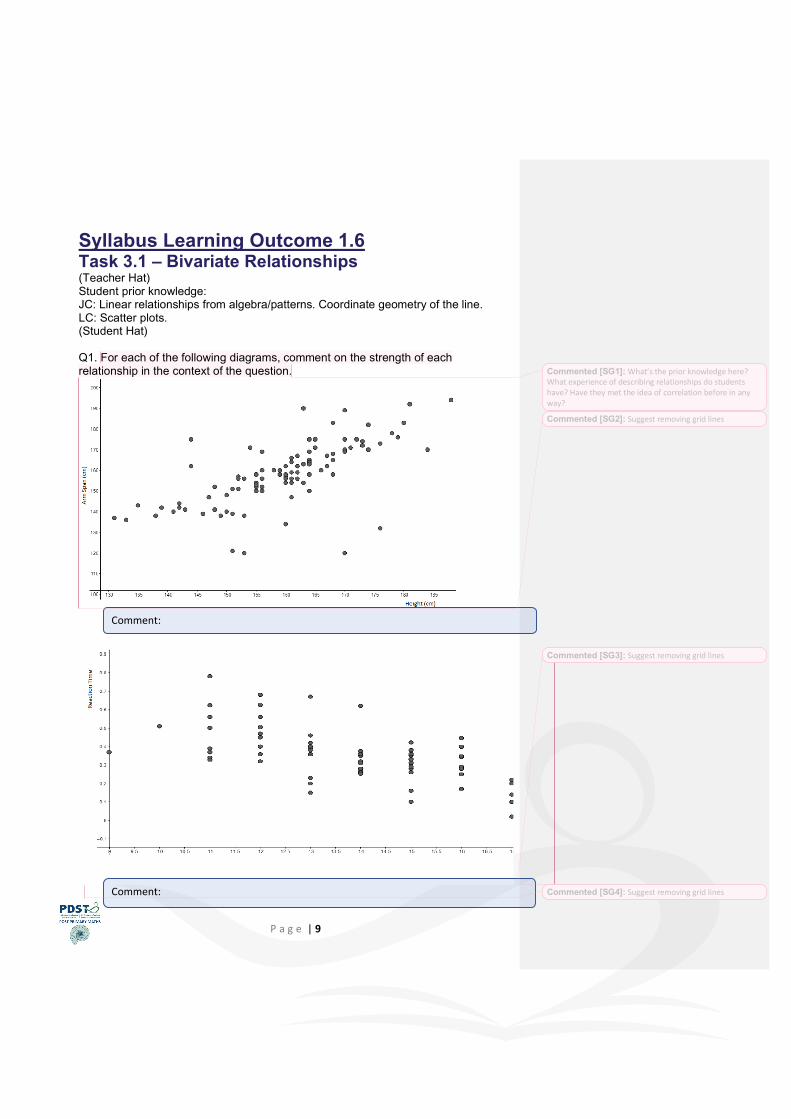
Syllabus Learning Outcome 1.6 Task 3.1 – Bivariate Relationships (Teacher Hat) Student prior knowledge: JC: Linear relationships from algebra/patterns. Coordinate geometry of the line. LC: Scatter plots. (Student Hat) Q1. For each of the following diagrams, comment on the strength of each relationship in the context of the question.
Comment:
Comment:
Commented [SG1]: What’s the prior knowledge here? What experience of describing relationships do students have? Have they met the idea of correlation before in any way?
Commented [SG2]: Suggest removing grid lines
Commented [SG3]: Suggest removing grid lines
Commented [SG4]: Suggest removing grid lines

P a g e | 10
Comment:
Comment:
Commented [SG5]: Suggest removing grid lines

P a g e | 11
HW Task 3.2 – Task Review (Teacher Hat)
Question: What was the purpose of this task?
If you were giving this task to your students list two effective questions that you would use to support their learning.

P a g e | 12
HW Task 3.3 – Correlation Coefficient (Teacher Hat) How do we differentiate between two ‘strongly correlated’ data sets? In addition to the language we have used to describe the relationships, we also have a mathematical value known as the correlation coefficient. (Student Hat) Log on to https://tinyurl.com/WS2HW to access the GeoGebra file.
Drag the points around and investigate the changes to the correlation coefficient. Note these observations in the box below.
Observations:
Commented [SG6]: Should we have a Bloom Diagram in this booklet too?
Commented [DM7R6]:

P a g e | 13
(Teacher Hat) Students should observe max/min values and the significance of the sign of the correlation coefficient ®. If you were giving this task to your students list 2 effective questions that you would use to support their learning (refer to Bloom’s Taxonomy). HW Task 3.4 – Line of Best Fit (Student Hat) Using the cheat sheet plot a line that best represents the data.
Effective questions relating to the correlation coefficient:
Select the line drop
down menu
Select two points (new) to position your line
Commented [SG8]: Are these the only things they should observe. Might it be worth asking teachers to fill in what they think students should take from this task? Definitely that r ranges from -1 to +1, definitely that the sign of r changes but also maybe when the sign of r changes and what the data looks like for a particular sign of r. This might be extending the workload for teachers too much but just wantto put it out there. Your call.

P a g e | 14
(Teacher Hat) Use of effective questioning to explore why students would choose this positioning. (Student Hat) Then, using GeoGebra enter in the actual best fit line using the best fit line tool (see below). Note that the equation of this line shows up in the Algebra view. Drag the points and notice the effect on the line of best fit.
Select all points by
clicking and dragging to cover the
points in the rectangle
Select the 4th icon to
get access to the list with the best fit
line.

P a g e | 15
HW Task 3.5 – Suggested Extension Questions (Teacher Hat) Extension Questions: Why is the ‘line of best fit’ a better representation of the strength of the relationship than your initial estimate line? Is there any reason why two seemingly unrelated quantities can be strongly correlated? (Causation/lurking variables) Can you predict what blood pressure a person of age ... would be? Is there any situation where the slope of the line of best fit and the correlation coefficient are the same? Justify your answer. HW Task 3.6 – Evaluation Please complete the following evaluation of this task. Google Form: https://tinyurl.com/Task3Evaluation
Commented [SG9]: Might it be worthwhile asking if correlation coefficient and slope can ever be the same? Or what the difference is between correlation coefficient and slope? Or are there any similarities between correlation coefficient and slope?

P a g e | 16