Embed Size (px)
Citation preview

Session VIII
“Statistical Process Control (SPC)”

Main Tools
Pareto Diagram
Cause-Effect Diagram
Check Sheets
Process Flow Diagram
Scatter Diagram
Histogram
Control Charts

Statistical Process Control
A methodology for monitoring
a process to identify special
causes of variation and signal
the need to take corrective
action when appropriate

The Pareto Principle
Vilfredo Pareto was an economist who is credited with
establishing what is now widely known as the Pareto
Principle or 80/20 rule. When he discovered the
principle, it established that 80% of the land in Italy was
owned by 20% of the population. Later, he discovered
that the Pareto principle was valid in other parts of his
life, such as gardening: 80% of his garden peas were
produced by 20% of the peapods.

The Pareto Principle
Some Sample 80/20 Rule Applications 80% of process defects arise from 20% of the process
issues.
20% of your sales force produces 80% of your company revenues.
80% of delays in schedule arise from 20% of the possible causes of the delays.
80% of customer complaints arise from 20% of your products or services.
80% of the inventory cost is for 20% of the items(The above examples are rough estimates.)
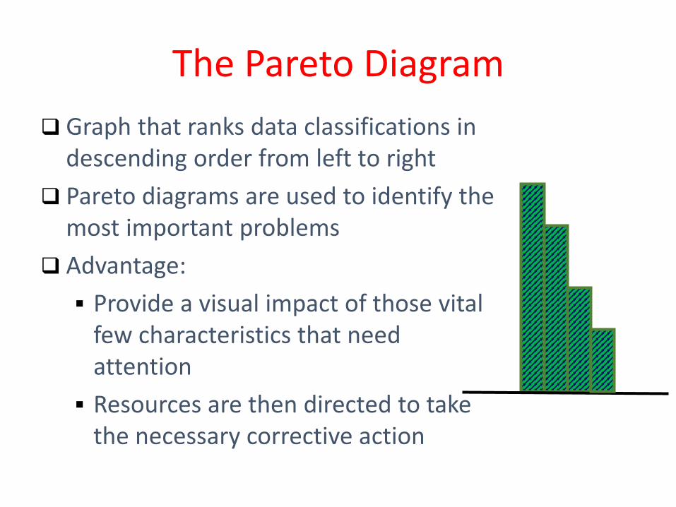
Graph that ranks data classifications in descending order from left to right
Pareto diagrams are used to identify the most important problems
Advantage:
Provide a visual impact of those vital few characteristics that need attention
Resources are then directed to take the necessary corrective action
The Pareto Diagram

Helps a team focus on causes that have the greatest impact
Displays the relative importance of problems in a simple visual format
Helps prevent “shifting the problem” where the solution removes some causes but worsens others
The Pareto Diagram

1. Determine the method of classifying the data: by problem, cause, type of nonconformity, etc.
2. Decide if dollars (best), weighted frequency, or frequency is to be used to rank the characteristics
3. Collect data for an appropriate time interval
4. Summarize the data and rank order categories from largest to smallest
5. Compute the cumulative percentage if it is to be used
6. Construct the diagram
Constructing a Pareto Diagram

Constructing a Pareto Diagram

It was developed by Dr. Kaoru Ishikawa in 1943
Picture composed of lines and symbols designed to
represent a meaningful relationship between an
effect and its causes
Effect (characteristics that need improvement) on
the right and causes on the left
Cause-and-Effect Diagram

Cause-and-Effect Diagram
Quality
Characteristic
People Materials
Equipment Measurement
Work Methods
Environment
Primary
Cause
Secondary Cause
Cause-and-Effect Diagram
EffectsCauses

Enables a team to focus on the content of a problem,
not on the history of the problem or differing personal
interests of team members
Creates a snapshot of collective knowledge and
consensus of a team; builds support for solutions
Focuses the team on causes, not symptoms
Used to investigate either a “bad” effect and to take
action to correct the causes or a “good” effect and to
learn those causes responsible
Cause-and-Effect Diagram

Steps
1. Identify the effect or quality problem
2. Determine the major causes
3. Determine all the minor causes. Request a
brainstorming session
4. Once the diagram is complete, evaluate it to
determine the most likely causes
5. Develop solutions
Cause-and-Effect Diagram

Advantages:
1. Analyzing actual conditions for the purpose of
product or service quality improvement
2. Elimination of conditions causing nonconforming
product or service and customer complaints
3. Standardization of existing and proposed
operations
4. Education and training in decision-making
Cause-and-Effect Diagram
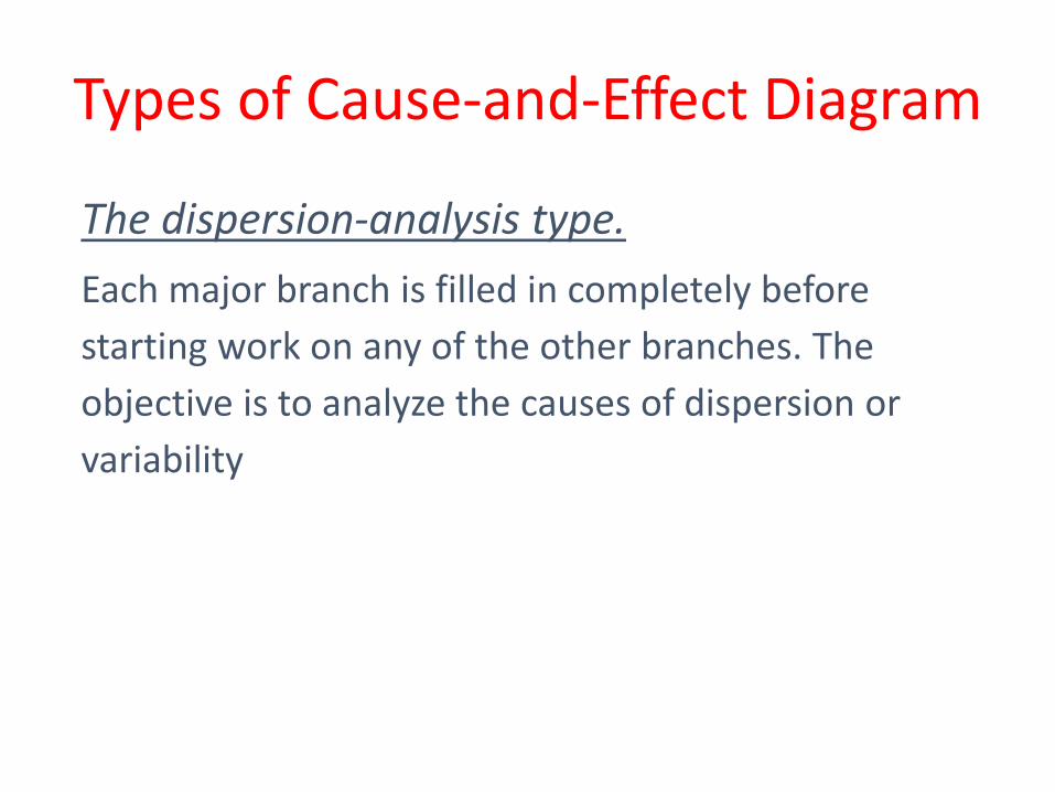
The dispersion-analysis type.
Each major branch is filled in completely before
starting work on any of the other branches. The
objective is to analyze the causes of dispersion or
variability
Types of Cause-and-Effect Diagram

The process-analysis type.
In order to construct it, it is necessary to write each
step of the production process. The advantage of this
type of diagram is the ease of construction and its
simplicity, since it follows the production sequence
Types of Cause-and-Effect Diagram

The main purpose is to ensure that the data are
collected carefully and accurately by operating
personnel for process control and problem solving
The form of the check sheet is individualized for each
situation and is designed by the project team
Check sheets are designed to show location
Check Sheets

Creates easy-to-understand data
Builds, with each observation, a clearer picture of
the facts
Forces agreement on the definition of each
condition or event of interest
Patterns in the data become obvious quickly
Creativity plays a major role in the design of a check
sheet
Check Sheets

Check Sheet for paint non-conformities
Check Sheets

Check Sheet for swimming pool
Check Sheets

21
It is a schematic diagram that shows the flow of the
product or service as it moves through the various
processing stations or operations
Makes it easy to visualize the entire system, identify
potential trouble spots, and locate activities
Compares and contrasts actual versus ideal flow of a
process
Process Flow Diagram

Process Flow Diagram

Serves as a training tool
Uses standardized symbols
Shows unexpected complexity, problem areas, redundancy,
unnecessary loops, and where simplification may be possible
Allows a team to reach agreement on process steps and
identify activities that may impact performance
Improvements to the process can be accomplished by
eliminating steps, combining steps, or making frequently
occurring steps more efficient
Process Flow Diagram

The simplest way to determine if a cause and-effect
relationship exists between two variables. Details
are in Chapter 5.
Scatter Diagram

Graphically shows the process capability and, if
desired, the relationship to the specifications and
the nominal
Histogram
Histogram for Hole Location

Displays large amounts of data that are difficult to
interpret in tabular form
Shows centering, variation, and shape
Illustrates the underlying distribution of the data
Provides useful information for predicting future
performance
Helps to answer the question “Is the process
capable of meeting requirements?
Histogram
27
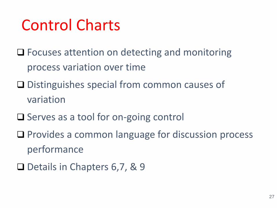
Control Charts
Focuses attention on detecting and monitoring
process variation over time
Distinguishes special from common causes of
variation
Serves as a tool for on-going control
Provides a common language for discussion process
performance
Details in Chapters 6,7, & 9

Control Chart
28