Embed Size (px)
Citation preview

Illinois Economic Report 1
State of IllinoisBruce Rauner, Governor
Department of Employment SecurityJeff Mays, Director
Illinois Economic Report

2 Illinois Economic Report
2016 Illinois Economic Report
Prepared by:
Illinois Department of Employment Security
Economic Information & Analysis Division
Evelina Tainer Loescher, Ph. D. – Illinois LMI Director
September 2016
Author:
Dave Bieneman, Ph. D.
Design:
Rachael Katz
This workforce product was funded, wholly or in part, by a grant awarded by the U.S. Department of Labor’s Employment and Training Administration. The product was created by the recipient and does not necessarily reflect the official position of the U.S. Department of Labor. The Department of Labor makes no guarantees, warranties, or assurances of any kind, express or implied, with respect to such information, including any information on linked sites and including, but not limited to, accuracy of the information or its completeness, timeliness, usefulness, adequacy, continued availability, or ownership. This product is copyrighted by the institution that created it. Internal use by an organization and/or personal use by an individual for non-commercial purposes is permissible. All other uses require the prior authorization of the copyright owner.”
The Federal Government reserves a paid-up, nonexclusive and irrevocable license to reproduce, publish or otherwise use, and to authorize others to use for federal purposes: i) the copyright in all products developed under the grant, including a sub grant or contract under the grant or subgrant; and ii) any rights of copyright to which the recipient, subrecipient or a contractor purchases ownership under an award (including but not limited to curricula, training models, technical assistance products, and any related materials). Such uses include, but are not limited to, the right to modify and distribute such products worldwide by any means, electronically or otherwise. Federal funds may not be used to pay any royalty or license fee for use of a copyrighted work, or the cost of acquiring by purchase a copyright in a work, where the Department has a license or rights of free use in such work, although they may be used to pay costs for obtaining a copy which is limited to the developer/seller costs of copying and shipping. If revenues are generated through selling products developed with grant funds, including intellectual property, these revenues are program income. Program income must be used in accordance with the provisions of this grant award and 2 CFR 200.307.

Illinois Economic Report 3
Table of Contents:Labor Market Information Facts for the U.S. and Illinois
Executive Summary
Introduction
U.S. Population and Economy
Agriculture and Manufacturing as Industrial Foundations of U.S. Economy
Research Related to National Decline of Rural Economies
Illinois Economy
Area Definitions
American Community Survey (ACS) Data
Other Data Notes
Demographic Data for Illinois and the U.S.
Economic Data for Illinois and the U.S.
Employment, Labor Force and Industry Earnings Data for Illinois and the U.S.
Local Area Unemployment Statistics (LAUS)
Current Employment Statistics (CES)
Quarterly Census of Employment and Wages (QCEW)
Industry Groupings
Summary of the U.S. and Illinois
Summary of Sub-state Areas
Chicago 9-county
Small Metro
Non-Metro
Economic Development Strategies
Economic Development Issues for Rural Areas
Community Revitalization
Broadband Access
Other Infrastructure Investment
Affordable Housing
Bioeconomy
Economic Challenges Facing Illinois and the Nation
Capital Markets and USDA Grants
Economic Development for Illinois
Conclusion
End Notes
Appendix
5
7
12
13
17
19
21
21
21
23
24
29
36
39
40
43
45
49
51
51
52
53
54
57
58
59
60
61
62
64
66
67
68
71
76

4 Illinois Economic Report
List of Exhibits:
Exhibit 1 – Apportionment of Congressional Seats, by Region of U.S.
Exhibit 2 – Population Proportions, by Region of U.S.
Exhibit 3 – Comparison of Population Growth and Employment Growth, by Region of U.S.
Exhibit 4 – Employment by Industry Grouping, by Region of U.S.
Exhibit 5 – U.S. Manufacturing Employment and Value of Industrial Output
Exhibit 6 – Population, by Age Group
Exhibit 7 – Population, by Race & Hispanic Ethnicity
Exhibit 8 – Population, by Nativity and Citizenship
Exhibit 9 – Population, by Marital Status
Exhibit 10 – Population, by Poverty Status
Exhibit 11 – Population, by Veteran Status
Exhibit 12 – Households with Children under 18 (Public Assistance and Poverty Status in Past
12 Months)
Exhibit 13 – Educational Attainment
Exhibit 14 – Housing Costs and Type (Rent/Own)
Exhibit 15 – Households with Income, by Type of Income
Exhibit 16 – Health insurance coverage
Exhibit 17 – Labor force participation rates, by Age Group
Exhibit 18 – Industry Employment
Exhibit 19 – Occupational Employment
Exhibit 20 – Unemployment Rates
Exhibit 21 – Labor Force Index
Exhibit 22 – Total Nonfarm Employment
Exhibit 23 – Goods Producing Employment
Exhibit 24 – Service Providing (minus Government) Employment
Exhibit 25 – Government Employment
Exhibit 26 – Average Annual Employment & Proportional Shares of Statewide Employment
Exhibit 27 – Average Annual Wages & Proportional Shares of Statewide Wages
13
14
14
16
17
25
26
26
27
27
28
30
31
32
33
35
37
37
38
39
40
41
42
42
43
44
47

LABOR MARKET INFORMATION FACTS FOR THE U.S. AND ILLINOIS
Illinois Economic Report 5

6 Illinois Economic Report
Illinois recovered the employment it lost after the U.S. did for both the July 1990-March 1991 & December 2007-June 2009 recessions. It took the nation over three years to regain the employment it lost after the March 2001-November 2001 recession. Illinois has still not yet recovered the employment peak it had prior to the 2001 recession.
National recessionary periods since 1990 – Date of employment recovery for U.S. and Illinois economies
Data Source: National Bureau of Economic Research (NBER)
6%
8%
10%
12%
14%
16%
18%
U.S. Illinois
Shadow Unemployment (U-6)U-6 is defined as the total number of unemployed, plus all marginally attached workers, plus total employed part time for economic reasons, as a percent of the civilian labor force plus all marginally attached workers. Illinois had a higher shadow unemployment rate than the nation in all but one year (2006) since 2003.
Data source: IDES and BLS Current Population Survey (CPS), full-time and part-time (NSA) data, 12-month moving average
79%
80%
81%
82%
83%
84%
U.S. Illinois
Full-Time Employment StatusIllinois has had a smaller proportion of its employment that is full-time than the U.S. since 2005.
Data source: Quarterly Census of Employment and Wages (QCEW), IDES and BLS
$30,000
$35,000
$40,000
$45,000
$50,000
$55,000
$60,000
U.S. Illinois
Average Annual Industry Earnings (U.S. and Illinois) Illinois’ average annual industry earnings have exceeded the national average since 2001.
ionillI.S.U:)0991 ecniS( snoisseceR lanoitaN s3991 ,lirpA3991 ,yraurbeF81991 hcraM hguorht 0991 yluJ
dehcaer tey toN5002 ,yraunaJ81002 rebmevoN hguorht 1002 hcraM5102 ,rebotcO4102 ,yaM819002 enuJ hguorht 7002 rebmeceD
Month & Year that Employment Lost in Recession was RecoveredDuration in Months

EXECUTIVE SUMMARY
Illinois Economic Report 7

8 Illinois Economic Report
During the 20th century, the United States moved from an agriculture-based economy to one of industrial might. Technological innovation eliminated the need for a high level of labor input working in the fields and this freed up resources for new industries that required brawn. Subsequently, further technological innovation significantly reduced the need for labor in factories. The country produces more industrial output now than ever before but requires fewer people to maintain this level of production.
Since the peak in national manufacturing employment occurred in 1979, the real value of industrial production has increased by almost 90 percent while employment has declined by almost 37 percent. Consequently, more people now attain higher education levels in order to pursue careers in professional services, health care, finance and other industries that employ people in occupations that require more brains than brawn.
However, not everyone has been successful managing this transition. The pool of jobs left for those who have no post-secondary schooling and yet pay good wages is shrinking rapidly. Wages for this group are declining relative to the more educated workforce, which has led to the shrinkage
of the nation’s middle class. The economic strength of the United States has been its middle class and so the nation must develop solutions to address these realities.
Historical trends show that Illinois has lagged behind national population growth for almost a century and behind employment growth for more than a quarter-century. Much of the shift in population, and subsequent employment growth, has been from the “Rust Belt” states in the Midwest
and Northeast toward the West Coast, Southwest, and South. Beyond the changes in requirements for human capital in the agriculture and manufacturing industries, other reasons for the shift include the lure of warmer climates, exposure to these locales to young people in the military, better transportation, air conditioning, jobs and affordable housing, etc. Residential construction, retail sales and services grow more rapidly in areas with growing, rather than lagging, population.
Some of the national economic trends are reflected within the state of Illinois. Different sub-state areas have been impacted by population
and employment shifts related to technological innovation in the agriculture and manufacturing industries, as well as other factors. The Chicago 9-county region has adapted by shifting away from goods-producing type industries and toward white collar service-providing industries faster than the Small Metro (counties outside of the Chicago 9-county region in a Metropolitan Statistical Area (MSA)) and Non-Metro (counties not in a MSA) portions of the state.
The Non-Metro portion of the state is lagging primarily because its economy was based on industries such as agriculture, mining and manufacturing in which jobs are declining. This region in particular has been challenged by its

Illinois Economic Report 9
inability to replace lost jobs in the goods-producing industries with higher-skilled service providing jobs. Demographic and economic data demonstrate that population and employment have migrated away from the Non-Metro region and toward the Chicago 9-county region. The Small Metro region lies somewhere in between these two sub-state regions.
Research produced by the U.S. Department of Agriculture shows that nationally, employment in rural areas was 3.2 percent below its pre-recession peak in 2007. The study states that rural areas have larger population loss, higher poverty rates, and lower educational attainment in comparison to urban areas. In fact, the period between 2010 and 2014 is the first time in the nation’s history that the overall population of Rural America has declined.
As a whole, the state of Illinois is a reasonable approximation of the diversity reflected in the national population. However, the Chicago 9-county region is the most diverse area of the state with significantly fewer whites (65.9%), significantly more blacks (17.1%), Asians (6.4%), people of other races (10.6%), and Hispanics (21.8%) than the national population. The large amount of diversity in the Chicago 9-county area is balanced by much less diversity in the rest of the state. The Small Metro region has a similar proportion of blacks in its population as the nation. Otherwise there is little racial and ethnic diversity in the Small Metro and Non-Metro regions of the state.
The proportion of the population 55 and older for the Non-Metro region is 31.8 percent, which is much higher than the proportions for the Chicago 9-County region (23.9%) and the Small Metro region (27.6%). The proportion for the entire nation is 26.3 percent. Although only a little more than one-third (34.4%) of the population that is at least 18 years of age reside in the combined areas of the Small Metro and Non-
Metro regions, almost one-half (47.8%) of the state’s veterans live in one of the two regions.
The Chicago 9-county region has the largest population share in the prime-age group 25 to 54, and a population with the highest educational attainment and the highest labor force participation rate. The size of the labor force has increased 14 percent in the last 25 years. More employment opportunities are available in growing industries and occupations. The region has the largest proportion of people employed in management, business, science, and art occupations; and sales and office occupations; occupational categories with the highest projected growth. These two occupational categories account for almost two-thirds of the employment in the Chicago 9-county region. Average annual wages are also the highest for the Chicago 9-county region across industries.
The Small Metro region has an older population than the Chicago 9-county region, but still younger than the Non-Metro region. A smaller proportion of its adult population holds at least a Bachelor’s degree than the Chicago 9-county region, although the percentage is higher than the Non-Metro region. Incomes for the Small Metro region are lower on average than for the Chicago 9-county region, but they are higher than the Non-Metro region.

10 Illinois Economic Report
The Small Metro region’s labor force participation rate is lower than the Chicago 9-county region, but higher than the Non-Metro region. The size of the labor force has increased by 4 percent over the last 25 years, less than the Chicago 9-county region, but more than the Non-Metro region. The proportion of people employed in the region lies between the other two sub-state regions for all five occupational categories with the Chicago 9-county region having the highest proportion for two and the Non-Metro region having the highest proportion for the other three. Average annual wages in the region are lower than the Chicago 9-county region but higher than the Non-Metro region.
The Non-Metro region has the oldest population of any sub-state region. The proportion of the region’s population that is veteran is larger than in the other two sub-state areas. However, most of these veterans are in the older age groups. Research has shown that a higher proportion of military enlistees come from rural areas. People from families with lower income are more likely to join the military than those with a higher family income since the military provides an economic opportunity to those who have limited options. The Non-Metro region has the smallest share of its adult population with the educational attainment of a Bachelor’s degree or higher. In fact, almost half of its population attained a high school diploma or less. The Non-Metro region has the lowest incomes and the lowest housing costs. It has the lowest labor force participation rate of any the three sub-state regions and the size of its labor force has decreased five percent in the last 25 years. It also has the highest
proportion of uninsured under the age of 18 in the state.
A decline in manufacturing employment hurt the Non-Metro region as well as the rest of the state but in this region, other industry sectors did not offset the lost jobs because employment in the service and government sectors also declined. The region does have the highest proportion of employment in the following ACS occupational categories: services; natural resources, construction, and maintenance; and production, transportation, and material moving. Industries that employ these occupations generally have declining employment levels in Illinois. Average annual wages for the Non-Metro region are the lowest across the broad industry sectors. The biggest problem for the Non-Metro region is its inability to replace lost jobs in goods producing industries with higher skilled jobs in service providing industries.
The counties comprising the Non-Metro region of Illinois match the USDA model for rural counties that are losing population nationally. The typical rural county in Illinois would likely have an industry base of agriculture, resource extraction or manufacturing. These industries have their largest share of employment within the state in the Non-Metro region. These same industries have employment that has been trending downward for years. The population and size of the labor force of the Non-Metro region is also in decline.
Poverty rates among households led by females (no husband present) are higher for the Illinois Balance of State area (combined Small Metro and Non-Metro) than in the Chicago 9-county region. The data also show that this rate is growing rapidly. Poor children are less likely to attain high levels of education and more likely to work later in life in low-wage jobs.
Illinois’ economic growth problems are most concerning in the less densely populated areas of the state. Creating an environment where more people would want to work and live and where employers would also want to locate could help
Illinois has both the natural and human resources to revitalize its economy

Illinois Economic Report 11
energize economic development in the more rural areas of the state. Investing in infrastructure, such as high quality broadband access, potentially opens these areas to new economic opportunities. This one step could help address critical issues involving education and training of the workforce; improved access to government services and health care; providing entrepreneurial opportunities; and making communities more livable.
Additional infrastructure investment is required to transform existing work sites to make them viable for new businesses. This would allow employers to tap into new labor pools and provide jobs to workers with skills who already live, or would prefer to live, in a smaller community. These same communities could provide affordable housing in a safe area, which is critical to a stable workforce. Having enough people live in these communities that have job-ready skills while providing employers with the infrastructure they need to succeed would be an ideal combination. Any plan should also encourage the creation of small businesses in these areas.
Illinois needs to keep more of its college graduates in the state, especially those with degrees in engineering and computer science as well as those with entrepreneurial skills to help the economy of the whole state. Technological innovation drives new industries and new industries create employment growth. Economic incentives may be considered to encourage this group of desired candidates.
Illinois has a history in both agriculture and manufacturing, which are the foundation of the bioeconomy. This sector includes the conversion of waste products into products of value and the more efficient utilization of resources. Illinois has a large quantity of agricultural and industrial waste that could be utilized for this purpose. This
includes production of biofuels (for vehicles of all types including commercial and military); plastics; and chemicals manufacturing. The renewable energy generation sector and manufacturing of components needed to support these industries would provide additional opportunities. Although overall manufacturing employment is in decline, manufacturing opportunities still exist.
The professional services component of energy efficiency is already thriving in the Chicago 9-county region and to some extent in the Small Metro region. This industry should continue to grow and Illinois should strive to become a leader that could export its expertise.
Illinois has both the natural and human resources to revitalize its economy. It has a central location within the nation with transportation networks of all types crossing it. It has some of the finest institutions of higher learning. It has open space and includes many areas where housing costs are reasonable. Illinois has the opportunity to build a better economic future.
Note: A follow-up report is forthcoming that focuses on the population segment that are struggling to adapt to recent changes in the economy.

INTRODUCTION
12 Illinois Economic Report

Illinois Economic Report 13
It is clear that Illinois has not kept up with national employment growth and the first part of this report provides a review. Illinois is economically diverse with the Chicago area dominating employment and production; another portion of the state is rural with a more relaxed lifestyle; while a third part of the state is a blend of these other two regions.
Issues related to stagnant employment growth for rural areas across the country are reviewed and compared to the rural portion of Illinois’ economy. Data obtained from the American Community Survey is used to compare the three sub-state regions in Illinois. This information, along with other statistical program data, is used to analyze the Illinois economy in detail.
Some examples of economic development strategy used for various geographies are reviewed. Given the different compositions of the urban and rural parts of the state, it makes sense that various strategies may be appropriate for the different regions of Illinois.
U.S. Population and Economy
A starting point is to look at the relationship between population and employment growth for different regions of the United States. First, note the changes in the apportionment of Congressional seats in the U.S. House. Since 1912, the size of the U.S. House has been fixed at 435 seats (except for a temporary increase to 437 in 1959 to account for the admission of Alaska and Hawaii as new states). States growing in population more than the national average tend to pick up Congressional seats while states below the national average in population growth are more likely to lose seats after the Census is conducted every 10 years.
The apportionment data in Exhibit 1 shows that 10 states have accounted for a gain of 108 Congressional seats since 1920 (based on changes in decennial Census data). These states are Arizona; California; Colorado; Florida; Nevada; New Mexico; Oregon; Texas; Utah; and Washington. For this analysis, the states are designated as “Florida,
the West Coast, and Southwest states”.
Note: Kentucky is included with the Midwest states in this analysis because it borders Illinois and because it has lost almost half of the Congressional seats it held in 1920.
In contrast, a total of 16 states account for a loss of 95 seats since 1920. This group of states includes: Illinois; Indiana; Iowa; Kansas; Kentucky; Massachusetts; Michigan; Minnesota; Missouri; Nebraska; New York;
0
50
100
150
200
250
300
Midwest and Selected Northeast States Florida, West Coast and Southwest States Remainder of U.S.
Exhibit 1 – Apportionment of Congressional Seats, by Region of U.S.
Data Source: 2010 Census Briefs, November 2011, U.S. Census Bureau
Florida, the West Coast and Southwest states (FL, AZ, CA, CO, NM, NV, OR, TX, UT, WA) (10 states)
Midwest and Selected Northeast states (IL, IN, IA, KS, KY, MI, MN, MO, NE, ND, OH, SD, WI, MA, NY, PA) (16 states)
Remainder of U.S. (24 states)

14 Illinois Economic Report
North Dakota; Ohio; Pennsylvania; South Dakota; and Wisconsin. These states are designated as the “Midwest and Selected Northeast states” for comparison.
Some of the remaining 24 states that account for the remaining loss of 13 Congressional seats since 1920 were losers of seats in the first half of this 90-year period, but now are gaining seats. This is true of a few states in the South. The group of 24 states is designated as the “Remainder of the U.S.” for this review.
Exhibit 2 uses annual population data available from 1929 through 2015. As expected, the three
groupings of states follow the same trends seen in the apportionment of Congressional seats. The “Florida, West Coast and Southwest states” had a 14.5 percent proportion of the U.S. population in 1929, growing to a 36.8 percent proportion of the nation’s population in 2015 (with a population level increase of 568.8%).
The “Midwest and Selected Northeast states” had a 55.2 percent proportion of the nation’s population in 1929, which fell to a 34.8 percent share in 2015 (even though the population level actually increased by 66.3%). Finally, the states that make up the “Remainder of the U.S.” declined from a 30.3 percent share in 1929 to a 28.4 percent share
0%
10%
20%
30%
40%
50%
60%
Midwest and Selected Northeast States Florida, West Coast and Southwest States Remainder of U.S.
Population Proportions by Regions of United States
Exhibit 2 – Population Proportions, by Region of U.S.
Data Source: Bureau of Economic Analysis; Haver Analytics
Population Employment growth between growth between
Region 1990 and 2015 Jan 1990 and Jan 2016Florida, the West Coast, and Southwest States 49.3% 51.9%Midwest and Selected Northeast States 12.4% 17.9%Remainder of the U.S. 28.8% 28.5%
Exhibit 3 – Comparison of Population Growth and Employment Growth, by Region of U.S.
Data Source: Bureau of Economic Analysis; Bureau of Labor Statistics; Haver Analytics

Illinois Economic Report 15
in 2015 (even though the population level increased by 147.6%).
Using the population data for the same three regions along with seasonally adjusted monthly employment data from Current Employment Statistics (CES) it can be seen in Exhibit 3, on the previous page, that the population for the “Florida, the West Coast, and Southwest states” grew 49.3 percent from 1990 to 2015 while employment from January 1990 to January 2016 for the same region grew 51.9 percent; the population for the “Midwest and Selected Northeast states” grew by 12.4 percent while employment rose 17.9 percent; and the population for the “Remainder of the U.S.” grew by 28.8 percent while employment increased 28.5 percent.
The population growth data is almost perfectly positively correlated with the employment growth seen in the regions’ total nonfarm employment numbers. The areas with the largest growth of population would be expected to have the highest growth rates in construction [residential construction in particular] and also in service industries needed to support the influx of people. Population growth is simply a natural driver of employment growth. To some extent, there is a “chicken and egg” situation because increased employment opportunities will draw people to an area.
Here, we investigate the types of industries employing people in the various regions by summing major industry data for the states in each region.
Note: Regional estimates are sums of industry estimates at state level. It was necessary to split out some state data due to industry differences among states.
Using CES data for the states, employment can be combined into broader industry sectors for the regions.
Industry Grouping Definitions used for purposes of this analysis:
• Goods Producing – Natural Resources and Mining; Construction; and Manufacturing
• White Collar Services - Information; Financial Activities; Professional, Scientific, and Technical Services; Management of Companies & Enterprises; Educational & Health Care Services
• Blue Collar Services - Utilities; Wholesale Trade; Retail Trade; Transportation & Warehousing; Administrative & Support & Waste Management; Arts, Entertainment & Recreation; Accommodation & Food Services; Other Services; Unclassified
• Government - Government

16 Illinois Economic Report
As seen in Exhibit 4, the “Florida, West Coast and Southwest states” had the largest level gains, and largest percentage gains for employment in the White Collar Services, Blue Collar Services, and Government sectors. In addition they had the smallest level loss and smallest percentage loss of employment in the Goods Producing sector. They have the highest share of Total Nonfarm jobs (January 2016) only for Blue Collar Services. They are second for both White Collar Services and Government and are third among the three regions for the share of Total Nonfarm jobs in the Goods Producing sector.
The “Midwest and Selected Northeast states” lost the most jobs in the Goods Producing sector from January, 1990 to January, 2016. They also gained the fewest number of jobs in the Blue Collar Services and Government sectors. The region was second in the level gain of jobs in the White Collar Services sector, although they were
third in the percentage gain for the sector. The region has the largest share of Total Nonfarm jobs in the Goods Producing and White Collar Services sectors as of January, 2016.
Note: Quarterly Census of Employment and Wages (QCEW) data for both the U.S. and Illinois are compiled later in this report show average industry sector earnings are ranked in the following order: 1) White Collar Services; 2) Goods Producing; 3) Government; and 4) Blue Collar Services.
The states that make up the “Remainder of the U.S.” maintained the biggest share of Total Nonfarm jobs in the Government sector in January, 2016. Although it had the largest share of employment in January, 1990 for the Goods Producing sector, it lost a larger proportion of jobs than did the “Midwest and Selected Northeast” states region and now has the second highest share of employment in that sector of the three regions.
Change in Level (January 1990 to January 2016)White Collar Goods Blue Collar
Region Services Producing Government ServicesFlorida, West Coast and Southwest States 7,219,230 -103,500 2,064,600 7,997,570Midwest and Selected Northeast States 5,603,365 -2,171,900 608,500 3,998,335Remainder of U.S. 5,401,405 -2,004,600 1,228,900 4,288,095
Proportional share of Total Employment (January 2016)White Collar Goods Blue Collar
Region Services Producing Government ServicesFlorida, West Coast and Southwest States 30.2% 12.9% 15.3% 41.5%Midwest and Selected Northeast States 32.8% 14.7% 14.5% 38.1%Remainder of U.S. 29.6% 13.5% 16.6% 40.2%
% Change in Level (January 1990 to January 2016)White Collar Goods Blue Collar
Region Services Producing Government ServicesFlorida, West Coast and Southwest States 90.9% -1.6% 36.5% 62.1%Midwest and Selected Northeast States 47.8% -21.9% 8.7% 24.8%Remainder of U.S. 82.8% -26.9% 22.5% 36.1%
Exhibit 4 – Employment by Industry Grouping, by Region of U.S.
Data Source: Bureau of Economic Analysis; Bureau of Labor Statistics; Haver Analytics

Illinois Economic Report 17
Agriculture and Manufacturing as Industrial Foundations of U.S. Economy
Employment in the United States was dominated by agriculture early in the twentieth century. As the century progressed technological innovation allowed for the increase of productivity on the farm and fewer agricultural workers were required to produce the same amount of output. At the start of the 20th century more than half of the U.S. population lived in rural areas and 41 percent of the workforce was employed in agriculture. By the start of the 21st century less than a quarter of the population lived in rural areas and only 1.9 percent of the workforce was employed in agriculture.1
However, total agricultural output increased significantly over the century. During
this same time, the level of labor input for agriculture dropped off because of productivity increases resulting from technological innovation.
One result of this transformation is that a large share of the population was freed up to work in other industries providing the economy the opportunity to grow even more. Only 20 percent of counties not connected to a metropolitan statistical area (MSA) were considered farming dependent in 2000. Also in 2000, 93 percent of farms earned off-farm income. This has driven
household income for farms to rise above the national average.2
As demonstrated in Exhibit 5, similar events happened in the manufacturing industry over the last few decades that occurred in the agricultural industry during the 20th century. Industrial output is a measure of output for manufacturing, mining, and
9,000
11,000
13,000
15,000
17,000
19,000
21,000
$0
$500
$1,000
$1,500
$2,000
$2,500
$3,000
1,000s
(Billions of 2
009 U.S. $s)
Recession Value of U.S. Industrial Production (Left Axis)
U.S. Manufacturing Employment (Right Axis)
Exhibit 5 – U.S. Manufacturing Employment and Value of Industrial Output
Data Sources: Federal Reserve Bank of St. Louis; Bureau of Labor Statistics

18 Illinois Economic Report
utilities; with manufacturing being the dominant employer and producer. The value of industrial output produced continues to rise as the level of employment in manufacturing continues to trend downward. As labor productivity has increased fewer workers are needed in manufacturing (as well as mining and utilities) to produce the same amount of output.
The data show that from 1972 through early 2016 the value of national industrial output has increased almost 150 percent (in constant 2009 U.S. Dollars) while national manufacturing employment has decreased almost 30 percent. The peak in national manufacturing employment occurred in 1979. Employment declined by almost 37 percent since then, yet the real value of industrial production rose by almost 90 percent.
Manufacturing employment should not be expected to return to the levels once maintained in the United States. Many high volume production jobs have moved to other countries and will not return. Most of these jobs required low skills. This has left many U.S. workers without jobs or with jobs that don’t pay as much as those they lost.
Those that fill the remaining lower-skilled positions in the U.S. manufacturing industry are often employed by temporary staffing firms. They receive wages typical of low-level service workers and though they may work full-time, they often receive no benefits. Workers in these positions often utilize government programs to help provide food, shelter, and clothing for their families. The lower-skilled production workers represent about half of all manufacturing workers. Nearly half of the families of production workers who worked at least 35 hours a week, 45 weeks a year, and were employed through staffing agencies, received government welfare of some kind. Eight of the ten states with the highest proportions of production workers whose families receive public assistance are in the South. The other two states in the top ten are California and New York.3
Current domestic manufacturing employment requires fewer, but more highly skilled workers than in the past. These jobs require precision and technical skills including proficiency in math and problem solving. Nationally it has recovered about 800,000 jobs since 2010, but it is far short of the over 5 million jobs lost between 2000 and 2010.4
According to Nobel-winning economist, Joseph Stiglitz, “Global employment in manufacturing is going down because productivity increases are exceeding increases in demand for manufactured products by a significant amount.” The richest countries were able to start moving from manufacturing economies to service economies because they had workforces that were capable of shifting into those jobs and because they had consumers who could afford to devote a portion of their income to leisure, advanced health care and other services. For poorer countries the decline in manufacturing jobs removes this pathway to success. Service jobs that have high wages are unlikely to occur in less developed countries.5
According to Nobel-winning economist,
Joseph Stiglitz, “Global employment in manufacturing is
going down because productivity increases
are exceeding increases in demand
for manufactured products by a
significant amount.”

Illinois Economic Report 19
What has happened in the U.S. is currently happening in China as a number of manufacturing jobs are now being lost. In May of 2016, it was reported that Foxconn Technology, a supplier for Apple and Samsung, replaced as many as 60,000 workers with robots in one factory. The reduction in labor costs will result in larger profits for the employer. A government survey in the manufacturing center of Kunshan found that 600 major companies in the area have similar plans.6
The shift in employment away from manufacturing demonstrates that labor once again is being freed up to work in other industries. The focus then turns to what existing or new industries will have their share of employment grow to cover the employment gap caused by the shrinking manufacturing base. Health care and professional services are industries that have been expanding with a number of jobs that pay well. The jobs in these industries are currently more likely to be found in metropolitan areas than in rural areas. Overall, people with higher skills are attracted to metropolitan areas where not only are they more likely to find economic opportunity, but social and cultural opportunities as well.
Research Related to National Decline of Rural Economies
The United States Department of Agriculture’s (USDA) Economic Research Service (ERS) research focuses on the economic, social, spatial, and demographic factors that affect the income and poverty status of rural residents and their participation in federal assistance programs. They have produced a “Rural America at a Glance” publication series with the most current edition for 2015 and other editions back to 2004 available on the USDA ERS Web site.
The 2015 version of the “Rural America at a Glance” report observes that nationally, employment in rural areas was 3.2 percent below its pre-recession peak in 2007. It also states that rural areas have larger population loss, higher poverty rates, and lower educational attainment in comparison to urban areas. However, unemployment rates for rural and urban areas have remained similar even as population, labor force, and employment growth have tended to be positive in urban areas. The key reason
Note: The USDA ERS publications reference a definition of rural population that is county-based and uses the Office of Management and Budget (OMB) Census 2000-based definition of metro counties, whereas all counties not included in the metro counties are considered rural. A closer look at the OMB definition shows that only 36 Illinois counties are included in the list of metropolitan counties whereas Illinois has 40 counties that are part of a Metropolitan Statistical Area (MSA [based on 2010 Census]). The 2016 Illinois Annual Economic Report is based on 2010 Census data definitions and includes the missing four counties (Alexander, De Witt, Jackson, and Williamson) in the Small Metro region referenced in this report.

20 Illinois Economic Report
behind similar unemployment rates is that labor force participation rates have been declining in rural areas. As both the labor force size and participation rates have fallen, the number of unemployed also decreased.7
About 700 rural counties in the nation had population growth between 2010 and 2014. The total amount of this population increase was 400,000. The counties with this growth tend to be concentrated in scenic areas such as the Rocky Mountains or southern Appalachia, or in energy boom regions such as in the northern Great Plains. In contrast, the nation also had 1,300 rural counties that lost population since 2010 summing to a total decrease of about 516,000. These counties are widespread in regions dependent on farming, manufacturing, or resource extraction.
The sum of the population change for all rural counties was negative making the period between 2010 and 2014 the first time in the nation’s history that the overall population of Rural America has declined. The total population of all rural counties in 2014 for the U.S. was just over 46 million or about 15 percent of total population.8
The latest data from the U.S. Census Bureau shows that the rural population of the U.S. (counties not included in a MSA) declined by just 4,000 from July 2014 to July 2015 after four consecutive years of losses averaging 33,000. The data suggest that the first-ever period of decline in the rural population may be ending. Net migration bottomed out in 2012 and the natural increase (births – deaths) is large enough that population increases should be realized in upcoming years.9
Poverty rates for children in rural areas showed a large increase during the Great Recession of 2007-2009, with an increase from 21.9 percent in 2007 to 24.2 percent in 2009. Single parent families are more likely to be in poverty, especially if headed by a woman. Single mothers in rural areas are more likely to work in low-wage occupations that are
most vulnerable to instability during periods of economic recession. Child poverty rates are also higher in counties with lower educational attainment. Although rural education attainment has improved since 2000, the recession and an increase in single-parent families, have led to an overall increase in poverty rates.10
Material gleaned from the 2014 edition of the “Rural America at a Glance” report shows that the economic recovery from the Great Recession has generally been more successful in rural counties where the working-age population has relatively high education levels. Since occupations
and industries associated with higher education, such as education and health services, have done relatively well since the recession, this provides those counties with higher educational attainment more opportunities for jobs. Innovative leadership, higher quality schools, and greater wealth may also have contributed to the high-education county advantage.11

Illinois Economic Report 21
According to a recent analysis by the President’s Council of Economic Advisors, about half of the decrease in labor force participation rates among working-age adults since the start of the Great Recession was attributable to aging trends of the labor force, about a sixth is due to the normal business cycle and about a third is due to other factors, including the unique severity of the Great Recession.12
Illinois Economy
Much of the recent discussion on economic growth within the state of Illinois has centered on the ability of the Chicago metropolitan region to achieve solid, yet unspectacular economic growth, while the remaining section of Illinois appeared to be in a state of stagnation. Initially, the hypothesis was the data would reveal a distinction between the economies in the Chicago metropolitan region and the remaining balance of state. This was examined, but soon proved to be an oversimplification.
After reviewing the research that revealed a national employment problem exists in rural areas of the country, it became apparent that the balance of state for Illinois was comprised of two distinct areas. Thus it makes sense to separate the balance of state area into a region combining the counties included in the smaller Metropolitan Statistical Areas (MSAs) in the state and a region combining the counties not included in the MSAs. Much of the difference in demographic and economic data for the three sub-state areas in Illinois is directly related to available workforce and the type of work available in each area.
Comparing data for the various geographies included in this report should help us to better understand the situations of people that live and work in these geographies. The intent is to extract some useful insights from this analysis.
Area Definitions
The focus of the 2016 Illinois Economic report is an analysis of data for the Chicago 9-County area, the Small Metro area (includes Illinois’ 31 counties that reside in MSAs other than the Chicago 9-County area), and the Non-Metro area, (the remaining 62 counties in Illinois not part of a MSA). Data from these three areas is also compared to data from the United States and Illinois.
It should be noted that in some instances not all of the county data was available to create the Small Metro and Non-Metro regions. In these cases a combination of these two areas [calculated by subtracting data for the Chicago 9-county area from Illinois data] and called the Illinois Balance of State [IL BOS] was used in the analysis.
American Community Survey (ACS) Data
5-year estimates were used in this report when American Community Survey (ACS) data was used because of the availability of data for all of Illinois’ 102 counties in most data tables. The nine counties in the Chicago 9-county area were summed together for that region while the remaining 31 metropolitan counties were summed to form the Small Metro region. The Non-Metro region was produced by

22 Illinois Economic Report
Chicago 9-County
Small Metro
Non-Metro
Chicago 9-County – Cook, De Kalb, Du Page, Grundy, Kane, Kendall, Lake, McHenry, Will.
Small Metro (31 counties) – Alexander, Bond, Boone, Calhoun, Champaign, Clinton, De Witt, Ford, Henry, Jackson, Jersey, Kankakee, McLean, Macon, Macoupin, Madison, Marshall, Menard, Mercer, Monroe, Peoria, Piatt, Rock Island, St. Clair, Sangamon, Stark, Tazewell, Vermilion, Williamson, Winnebago, Woodford.
Non-Metro (62 counties) – Adams, Brown, Bureau, Carroll, Cass, Christian, Clark, Clay, Coles, Crawford, Cumberland, Douglas, Edgar, Edwards, Effingham, Fayette, Franklin, Fulton, Gallatin, Greene, Hamilton, Hancock, Hardin, Henderson, Iroquois, Jasper, Jefferson, Jo Daviess, Johnson, Knox, La Salle, Lawrence, Lee, Livingston, Logan, McDonough, Marion, Mason, Massac, Montgomery, Morgan, Moultrie, Ogle, Perry, Pike, Pope, Pulaski, Putnam, Randolph, Richland, Saline, Schuyler, Scott, Shelby, Stephenson, Union, Wabash, Warren, Washington, Wayne, White, and Whiteside.
Data in all tables and charts use the U.S., Illinois, Chicago 9-county, Small Metro, and Non-Metro geographic regions unless otherwise indicated.
Illinois Balance of State [IL BOS] – [comprised of the union of counties in the Small Metro and Non-Metro regions]. IL BOS is used only in this report when insufficient county data was available to create data series for the Small Metro and Non-Metro regions.

Illinois Economic Report 23
subtracting the Chicago 9-county area and the Small Metro region from the state of Illinois data.
5-year estimates include survey information collected continuously over the 60 month period and represent the average value of a characteristic over the 60 month period. The Census Bureau suggests comparing periods that do not overlap and 5-year estimates should only be compared with other 5-year estimates. So any comparisons made over time in this report using ACS data are made between 2005-2009 estimates and 2010-2014 estimates.
A full set of data tables is included in the Appendix. The portion of the ACS data tables inserted in the main text only include the portion with the 5-year base estimates and do not include percentage changes from the previous 5-year estimates. To make the report easier to read, other ACS data tables with a large amount of data were edited in the main text. The analysis in the main text may refer to data that can only be viewed in the tables in the Appendix.
Using 5-year estimates requires waiting an additional five years to obtain the next data set available for comparison. The 5-year estimates provide less current information than what is available in the 1-year estimates but they provide more reliable estimates (especially for smaller populated areas) because they include more survey information.
It should also be noted that compilation of ACS data requires using a lot of multiplication with proportions that have only one digit to the right of the decimal point. This has created some issues with rounding errors especially in cases where the base numbers used in the calculations were small.
Other Data Notes
Annual average employment CES data is used since monthly county-level data is only available as Not Seasonally Adjusted (NSA).
ACS, CES, and Quarterly Census of Employment and Wages (QCEW) data are all sources of employment data. Data from the three sources would typically not be used in the same analysis since there are differences in the way employment is counted and they are not interchangeable. All three of these sources are used in this report. However, the usage of the data from the three sources is carefully done in an attempt not to use estimates from the different data sources in comparison with each other. Important information from each source contributes to improving the quality and depth of this report.

DEMOGRAPHIC DATA FOR ILLINOIS AND THE U.S.
24 Illinois Economic Report

Illinois Economic Report 25
A review of demographics data related to the U.S., Illinois, the Chicago 9-county region, the Small Metro and Non-Metro regions should help provide a better understanding of economic data for these same geographies.
Exhibit 6 shows population (ages 1 year and older) data by age group for 5-year ACS estimates (2010-2014). The age group of 55 and over was derived by summing the proportions for age groups 55 to 64, 65 to 74, and 75 years old and older (bottom row of top table). It shows the proportion of the population 55 and older for the Non-Metro region is 31.8 percent, which is much higher than the proportions for the Chicago 9-County region (23.9%) and the Small Metro region (27.6%). The proportion for the entire nation is 26.3 percent.
This provides clear evidence that the population of the Non-Metro
region of Illinois has a higher proportion of older individuals who are less likely to participate in the labor force. Conversely the Chicago 9-county region has a much lower proportion of the older individuals.
When considering economic growth or percentage changes in employment, (see the complete Exhibit
United Chicago Small Non-States Illinois 9-County Metro Metro
Population, 1 year and older 310,385,254 12,717,641 8,539,056 2,681,183 1,497,4021 to 4 years 5.2% 5.2% 5.4% 5.0% 4.5%5 to 17 years 17.3% 17.6% 18.1% 17.0% 16.2%18 to 24 years 10.1% 9.9% 9.6% 11.0% 9.3%25 to 34 years 13.6% 14.0% 14.8% 12.9% 11.7%35 to 44 years 13.1% 13.4% 14.0% 12.3% 11.9%45 to 54 years 14.3% 14.3% 14.4% 14.1% 14.5%55 to 64 years 12.4% 12.3% 11.8% 12.9% 13.8%65 to 74 years 7.7% 7.3% 6.7% 7.9% 9.4%75 years and older 6.2% 6.1% 5.4% 6.8% 8.6%55 years and older 26.3% 25.6% 23.9% 27.6% 31.8%
Exhibit 6 - Population, by Age Group
Data Source: American Community Survey (ACS) 2010-2014 5-year estimates (Table S0701)

26 Illinois Economic Report
6 in the Appendix) the population for the entire nation is growing older, specifically with increases in the 55 to 64 and 65 to 74 age groups. It also shows that the population for the Non-Metro region is shrinking, while all of the other regions show growth in population. The state of Illinois and all three of its sub-state regions all have smaller population growth rates than the United States.
Exhibit 7 provides a breakout of the population by major racial groups and Hispanic ethnicity. As a whole, the state of Illinois is a reasonable approximation of the diversity reflected in the national population. However most of the state’s population diversity resides in the Chicago 9-county region, an area which has significantly fewer whites (65.9%), and significantly more blacks (17.1%), Asians (6.4%), people of other races (10.6%), and Hispanics (21.8%) than the national population.
Both the Small Metro (82.5%) and Non-Metro (93.1%) regions have a higher proportion of whites than does the nation (73.9%). The Small Metro region does come close to the national average with its proportion of black residents (11.6%) and appears to have a growing share of Asians and people of other races (see Appendix). Both the Small Metro and Non-Metro regions show rapidly growing numbers of Hispanics.
The data in Exhibit 8 shows the population, by nativity and citizenship. It complements the data in the previous exhibit as the overall diversity reflected in the state’s population is actually the result of a large amount of diversity in the Chicago 9-county area balanced by a much smaller amount of diversity in the Small Metro and Non-Metro regions of the state.
United Chicago Small Non-States Illinois 9-County Metro Metro
Population, 1 year and older 310,385,254 12,717,641 8,539,056 2,681,183 1,497,402One race - White 73.9% 72.6% 65.9% 82.5% 93.1%One race - Black or African American 12.6% 14.4% 17.1% 11.6% 3.7%One race - Asian 5.0% 4.9% 6.4% 2.3% 0.6%Other race(s) 8.5% 8.2% 10.6% 3.7% 2.5%Hispanic or Latino origin (of any race) 16.8% 16.2% 21.8% 5.2% 3.8%
Exhibit 7 - Population, by Race & Hispanic Ethnicity
Data Source: American Community Survey (ACS) 2010-2014 5-year estimates (Table S0701)
United Chicago Small Non-States Illinois 9-County Metro Metro
Population, 1 year and older 310,385,254 12,717,641 8,539,056 2,681,183 1,497,402%, Native (2010-2014) 86.8% 86.0% 80.9% 95.3% 97.9%%, Foreign born 13.2% 14.0% 19.1% 4.7% 2.1%%, Foreign born - Naturalized U.S. citizen 6.1% 6.6% 9.0% 2.0% 0.9%%, Foreign born - Not a U.S. citizen 7.2% 7.5% 10.0% 2.8% 1.2%
Exhibit 8 - Population, by Nativity and Citizenship
Data Source: American Community Survey (ACS) 2010-2014 5-year estimates (Table S0701)

Illinois Economic Report 27
The 2010-2014 estimates for the Chicago 9-county area shows that over 19 percent of its population is born outside of the United States. This group is split almost evenly between the number that have been naturalized as U.S. citizens (9.0%) and those who have not (10.0%). The percentage change using data from the last 5-year estimates in 2005-2009 show that the population of foreign born in the Small Metro region is growing rapidly although the base numbers are relatively small (see Appendix).
The data in Exhibit 9 shows the marital status of the population for the five regions of comparison. The Chicago 9-county region has the highest proportion of its population that have never been married (36.6%), and the lowest proportions that are now married (47.2%), divorced or separated (10.7%), or widowed (5.5%). The
Non-Metro region is the exact opposite with the lowest proportion of its population that have never been married (27.2%), and the highest proportion that are now married (51.4%), divorced or separated (13.8%), or widowed (7.7%). Divorces/separations are rising the fastest in Illinois for the Non-Metro and Small Metro regions at a pace near the national rate of growth (see Appendix).
Data related to the poverty status of the population is available in Exhibit 10. The sub-state area with the largest proportion of the population in Illinois living below the 100 percent poverty level is the Small Metro region (15.7%). This proportion is similar to the proportion for the entire country (15.5%). The Non-Metro region has the highest proportion (10.2%) of its population living within the 100 percent to 149 percent band of
United Chicago Small Non-States Illinois 9-County Metro Metro
Population, 1 year and older - For whom Poverty Status is determined 302,554,055 12,416,841 8,402,516 2,596,522 1,417,803Below 100 percent of poverty level 15.5% 14.3% 13.8% 15.7% 14.6%100 to 149 percent of poverty level 9.6% 8.8% 8.6% 8.6% 10.2%At or above 150 percent of poverty level 74.9% 76.9% 77.5% 75.7% 75.1%
Exhibit 10 - Population, by Poverty Status
Data Source: American Community Survey (ACS) 2010-2014 5-year estimates (Table S0701)
United Chicago Small Non-States Illinois 9-County Metro Metro
Population, 15 years and older 252,974,135 10,347,484 6,905,654 2,196,736 1,245,094Never married 32.5% 34.4% 36.6% 31.7% 27.2%Now married, except separated 48.4% 48.0% 47.2% 48.7% 51.4%Divorced or separated 13.1% 11.6% 10.7% 13.2% 13.8%Widowed 5.9% 6.0% 5.5% 6.4% 7.7%
Exhibit 9 - Population, by Marital Status
Data Source: American Community Survey (ACS) 2010-2014 5-year estimates (Table S0701)

28 Illinois Economic Report
poverty level. The Chicago 9-county region has the highest proportion (77.5%) of its population living at or above 150 percent of the poverty level.
Exhibit 11 depicts information on the veteran population. Although only a little more than one-third (34.4%) of the population 18 years of age and older resides in the Small Metro and Non-Metro regions (combined), almost one-half (47.8%) of the state’s veterans live in those areas. An overwhelming majority of the veterans are male although this is impacted by the proportion of veterans that are ages 55 and older. The proportion of the veterans in Illinois that are ages 55 and older is 69.5 percent. This is a result of the military using less labor in recent history relative to operations in the 1940’s through 1970’s.
The proportion of the veterans population (25 years and older) with at least a Bachelor’s degree is much higher for the Chicago 9-county region
(28.7%) than it is for the Small Metro region (23.2%), or the Non-Metro region (13.7%) (see Appendix). The Non-Metro region has the highest proportion of veterans (41.1%) whose highest educational attainment is a High School diploma. Both the Small Metro region (32.1%) and the Chicago 9-county region (27.7%) have much smaller proportions of their population with the highest educational attainment of a High School diploma.
The state’s proportion of the veteran’s population (18 years and older) with any kind of disability is slightly smaller than the national proportion (25.9% compared to 27.0%) (see Appendix). The share of veterans with a disability is highest (30.3%) for the Non-Metro region, followed by the Small Metro region (25.2%) and the Chicago 9-county region (24.8%). The proportion of veterans who are disabled is close to double the proportions of the overall population for all of the geographies.
United Chicago Small Non-States Illinois 9-County Metro Metro
Total Civilian Population - 18 years and older 239,305,217 9,796,516 6,525,629 2,084,602 1,186,285% of Illinois Civilian Population - 18 years and older 66.6% 21.3% 12.1%Veterans Civilian Population - 18 years and older 20,700,711 699,522 365,411 209,504 124,607% of Illinois Veterans Civilian Population - 18 years and older 52.2% 29.9% 17.8%Veterans as a % of Area Civilian Population - 18 years and older 8.7% 7.1% 5.6% 10.1% 10.5%% of Veterans; Male 92.4% 94.0% 94.3% 93.0% 94.9%% of Veterans; Female 7.6% 6.0% 5.7% 7.0% 5.1%Veterans, by Age Group% of Total Pop. - 18 to 34 years 30.4% 30.8% 31.7% 30.6% 26.2%% of Veterans Pop. - 18 to 34 years 8.4% 8.0% 8.0% 8.6% 7.1%% of Total Pop. - 35 to 54 years 35.4% 35.9% 37.1% 33.8% 33.2%% of Veterans Pop. - 35 to 54 years 24.7% 22.4% 21.7% 24.6% 20.7%% of Total Pop. - 55 to 64 years 16.1% 15.9% 15.4% 16.6% 17.3%% of Veterans Pop. - 55 to 64 years 21.9% 21.6% 20.7% 22.8% 22.2%% of Total Pop. - 65 to 74 years 10.0% 9.4% 8.7% 10.2% 11.7%% of Veterans Pop. - 65 to 74 years 22.4% 22.7% 23.3% 21.4% 23.0%% of Total Pop. - 75 years and older 8.0% 7.9% 7.0% 8.8% 11.2%% of Veterans Pop. - 75 years and older 22.7% 25.2% 26.4% 22.5% 26.3%% of Total Pop. - 55 years and older 34.1% 33.2% 31.2% 35.6% 40.1%% of Veterans Pop. - 55 years and older 67.0% 69.5% 70.3% 66.8% 71.6%
Exhibit 11 - Population, by Veteran Status
Data Source: American Community Survey (ACS) 2010-2014 5-year estimates (Table S2101)

ECONOMIC DATA FOR ILLINOIS AND THE U.S.
Illinois Economic Report 29

30 Illinois Economic Report
Note: Because data is not available for all 102 counties in Illinois for ACS Table S0901, numbers for the Small Metro and Non-Metro regions could not be generated. Enough county data was available to generate numbers for the Chicago 9-county area so numbers for an Illinois Balance of State (IL BOS) area were generated as an alternative.
Data on children under 18 years of age living in households is available in Exhibit 12.
The data show that for the Chicago 9-county region, 67.7 percent of children live in households with married couples, 6.8 percent live in households led by males with no wife present, and 25.0 percent of children live in households led by females with no husband present. The
proportion for the Illinois Balance-of-State [IL BOS] area is a little lower (66.5%) for households led by married couples, a little higher (7.5%) for households led by males, and about the same (25.1%) for households led by females. The proportions for both areas are similar to national data.
The proportion of all children receiving Supplemental Security Income (SSI), cash public assistance income for Food Stamp/SNAP benefits is higher nationally (28.0%) than it is for either the Chicago 9-county region (27.3%) or the IL BOS area (26.4%). This
United ChicagoStates Illinois 9-County IL BOS
(1) Total Children under 18 in Households (HHs) 73,521,174 3,047,919 1,943,419 1,104,500(2) Children under 18 in married-couple family households 65.9% 67.3% 67.7% 66.5%(3) Children under 18 in male household, no wife present, family households 7.5% 7.1% 6.8% 7.5%(4) Children under 18 in female household, no husband present, family households 25.9% 25.0% 25.0% 25.1%Children in (1) with SSI, cash pub. assist. income, or FS/SNAP benefits 28.0% 27.0% 27.3% 26.4%Children in (2) with SSI, cash pub. assist. income, or FS/SNAP benefits 16.8% 15.1% 15.8% 13.9%Children in (3) with SSI, cash pub. assist. income, or FS/SNAP benefits 34.6% 36.1% 37.6% 33.6%Children in (4) with SSI, cash pub. assist. income, or FS/SNAP benefits 54.3% 56.4% 55.6% 57.8%Children in (1) for whom pov. stat. is determ. - Income in the past 12 months below poverty level 21.9% 20.3% 20.4% 20.1%Children in (2) for whom pov. stat. is determ. - Income in the past 12 months below poverty level 11.1% 9.6% 10.4% 8.2%Children in (3) for whom pov. stat. is determ. - Income in the past 12 months below poverty level 27.3% 26.1% 26.7% 25.1%Children in (4) for whom pov. stat. is determ. - Income in the past 12 months below poverty level 47.5% 47.3% 45.8% 50.0%
Exhibit 12 - Households with Children under 18 (Public Assistance and Poverty Status in Past 12 Months)
Data Source: American Community Survey (ACS) 2010-2014 5-year estimates (Table S0901)

Illinois Economic Report 31
is a result of the proportion of children in married-couple family households that are receiving benefits being higher for the nation (16.8%) than for Illinois (15.1%).
The Chicago 9-county region (37.6%) has a higher proportion of children in households led by males receiving public assistance and the IL BOS area (57.8%) has a higher proportion of children in households led by females receiving public assistance. The data also show that the IL BOS region (50.0%) has the highest proportion of children in households led by females with household income below the poverty level and that this rate is growing rapidly (see Appendix).
Data for educational attainment of the entire population is available in Exhibit 13. The proportion of Illinois’ population that has at least a Bachelor’s degree (31.9%) is higher than the proportion (29.3%) for the nation as a whole. The data shows that educational attainment for the state is higher than the nation as a whole and this is a primary reason why average wages for Illinois are higher than the national average.
The proportion of the population with at least a Bachelor’s degree is highest for the Chicago 9-county region (36.4%), followed by the Small Metro region (26.1%), and the Non-Metro region (16.9%). This ordering of Bachelor’s degree attainment is a key factor in explaining why average wages follow this same order within the state. The Small Metro region does have the highest percentage increase since 2005-2009 for number of the population with at least a Bachelor’s degree. It should also be noted that the proportion of the Non-Metro region population with a High School diploma or less is almost half (49.6%).
United Chicago Small Non-States Illinois 9-County Metro Metro
Total Population, 25 and older 209,056,129 8,560,555 5,720,771 1,793,046 1,046,738%, Less than HS grad 13.7% 12.4% 13.2% 9.9% 12.3%%, HS grad (includes equivalency) 28.0% 27.0% 23.7% 31.4% 37.3%%, Some college or associate's degree 29.1% 28.7% 26.6% 32.5% 33.5%%, Bachelor's degree 18.3% 19.7% 22.3% 16.6% 11.3%%, Graduate or professional degree 11.0% 12.2% 14.2% 9.6% 5.6%%, Bachelor's degree or higher 29.3% 31.9% 36.4% 26.1% 16.9%
Exhibit 13 - Educational Attainment
Data Source: American Community Survey (ACS) 2010-2014 5-year estimates (Table S0701)

32 Illinois Economic Report
Exhibit 14 provides information on the type of housing utilized by people in the state and nation and their housing costs. The proportion of housing units that are owner-occupied is higher for Illinois (66.9%) than the nation (64.4%). In fact, the Non-Metro region (74.3%), Small Metro region (69.0%), and the Chicago 9-county region (64.7%) all have higher proportions of housing
units that are owner-occupied than does the nation.
It is cheaper to own a house in the Non-Metro region of the state as the region has a higher share of owner-occupied units than the nation in the: Less than $299, $300 to $599, and $600 to $899 cost categories. The Small Metro region has a higher share of owner-occupied units than the nation in
the: $300 to $599, $600 to $899, and $900 to $1,499 cost categories. The Chicago 9-county region has a higher share of owner-occupied units than the nation in the $1,500 or more cost category.
The majority of renter-occupied housing units in the Chicago 9-county region (68.7%) fell in the range of $600 to $1,499. Likewise the majority of renters in the Small Metro region (61.7%) paid between $600
United Chicago Small Non-States Illinois 9-County Metro Metro
Occupied housing units 116,211,092 4,778,633 3,114,060 1,065,967 598,606Owner-occupied housing units 64.4% 66.9% 64.7% 69.0% 74.3%Renter-occupied housing units 35.6% 33.1% 35.3% 31.0% 25.7%Owner-occupied; monthly housing cost -Less than $299 7.9% 4.4% 1.8% 6.8% 12.4%Renter-occupied; monthly housing cost - Less than $299 4.4% 4.8% 3.9% 5.9% 8.8%Owner-occupied; monthly housing cost - $300 to $599 18.6% 15.2% 9.1% 23.1% 29.9%Renter-occupied; monthly housing cost - $300 to $599 13.6% 12.9% 7.0% 22.6% 34.2%Owner-occupied; monthly housing cost - $600 to $899 14.3% 15.7% 12.8% 19.3% 22.8%Renter-occupied; monthly housing cost - $600 to $899 27.5% 29.7% 26.5% 38.6% 33.2%Owner-occupied; monthly housing cost - $900 to $1,499 25.0% 24.1% 22.3% 29.6% 23.3%Renter-occupied; monthly housing cost - $900 to $1,499 34.0% 35.2% 42.2% 23.1% 11.0%Owner-occupied; monthly housing cost - $1,500 or more 34.4% 40.5% 54.0% 21.2% 11.5%Renter-occupied; monthly housing cost - $1,500 or more 15.1% 12.9% 17.0% 4.2% 2.0%
Exhibit 14 - Housing Costs and Type (Rent/Own)
Data Source: American Community Survey (ACS) 2010-2014 5-year estimates (Table S2503)

Illinois Economic Report 33
and $1,499 per month. The majority of Non-Metro region (67.6%) renters paid between $300 and $899.
Note: Because data is not available for all 102 counties in Illinois for ACS Table S0102, numbers for the Small Metro and Non-Metro regions could not be generated. Enough county data was available to generate numbers for the Chicago 9-county area so numbers for an Illinois Balance of State (IL BOS) area were generated as an alternative.
Exhibit 15 provides income information on all households as well as those headed by people 60 years of age and older. The table details types of household income including earnings from work activity, government benefits, and retirement income.
The proportion of households led by individuals of age 60 years and older (34.6%) for IL BOS is much higher than the proportion for Chicago 9-county region (28.9%) and the proportion for the entire nation (31.8%). Based on the population data in Exhibit 2 it is likely that the proportion for the Non-Metro region would be even higher than the proportion for IL BOS and that the proportion for the Small Metro region would lie between the
United ChicagoStates Illinois 9-County IL BOS
Total - Households 116,211,092 4,778,633 3,114,060 1,664,57360 years and older- Households 31.8% 30.9% 28.9% 34.6%Total - Households - With earnings 77.9% 79.0% 81.1% 75.0%60 years and older- Households - With earnings 46.6% 47.1% 49.8% 42.9%Total - Households - With Social Security income 29.3% 27.0% 24.5% 31.6%60 years and older- Households - With Social Security income 76.3% 74.2% 71.3% 78.7%Total - Households - With Supplemental Security Income 5.3% 4.5% 4.4% 4.7%60 years and older- Households - With Supplemental Security Income 6.6% 5.9% 6.4% 5.1%Total - Households - With cash public assistance income 2.8% 2.5% 2.7% 2.1%60 years and older- Households - With cash public assistance income 2.0% 2.1% 2.4% 1.6%Total - Households - With retirement income 17.8% 16.7% 14.3% 21.1%60 years and older- Households - With retirement income 43.8% 43.6% 39.9% 49.3%Total - Households - With Food Stamp/SNAP benefits 13.0% 12.5% 12.3% 12.8%60 years and older- Households - With Food Stamp/SNAP benefits 9.0% 8.7% 10.0% 6.6%
Exhibit 15 - Households with Income, by Type of Income
Data Source: American Community Survey (ACS) 2010-2014 5-year estimates (Table S0102)

34 Illinois Economic Report
proportions for the Chicago 9-county area and the Non-Metro region.
The share of households with work earnings is higher for Illinois than the nation (for both total households and households led by people 60 years of age and older). The Chicago 9-county region proportion with work earnings is much higher than the IL BOS proportion. One part of the explanation is that people with higher educational attainment tend to work longer. Another reason is because a larger proportion of older people need to work longer to earn enough to cover their expenses.
Labor force data show that the proportion of the population, 65 years old or more, that is employed has been steadily growing. The longtime trend toward early retirement reversed during the 1980s. Retirement policies have shifted and fewer employees have fixed pensions. More people continue to work to build the amount saved in their 401(k). The increase in Social Security full retirement age has also had an impact. Longer life spans and improved health allow people to work longer if that is their desire. People with higher education levels tend to work longer as they are more likely to have jobs that are more interesting and less physically demanding. Some older people have no choice but to work due to the fact they have no other source of income.13
The share of households with Social Security income, Supplemental Security income, cash public assistance income, retirement income, and Food Stamp/SNAP benefits is lower for Illinois than the nation for both total households and those households led by individuals 60 years of age and older.
A higher proportion of IL BOS households (total and led by people 60 years of age and older)
receive Social Security income and retirement income than do Chicago 9-county households. A higher proportion of Chicago 9-county households (total and led by people 60 years of age and older) receive cash public assistance income than do IL BOS households.
Data related to health insurance coverage is available in the ACS 2010-2014 5-year estimates and is reported in Exhibit 16, on the next page. The proportion of the population of Illinois (12.3%) that is uninsured is lower than the national proportion (14.2%). Even though the
Longer life spans and improved health allow people to work longer.
People with higher education levels tend
to work longer as they are more likely to have
jobs that are more interesting and less
physically demanding.

Illinois Economic Report 35
proportion of the Chicago 9-county region (13.6%) that is uninsured is higher than the Small Metro region (9.6%) and the Non-Metro region (10.1%), it is still lower than the national proportion.
The share of uninsured is higher for males than females across all geographies listed in the table. The proportion of uninsured for those under the age of 18 is highest in the state for the Non-Metro region. The share for the other age groups: 18 to 64; 65 years of age and older; and 19 to 25 years of age; are highest in the Chicago 9-county region. In fact the proportion for 65 years of age and older in the Chicago 9-county region is higher than the national share.
Other available data on health insurance coverage shows that the part of the population that is foreign born and not yet a citizen has extremely high proportions of being uninsured (U.S. – 45.5%;
United Chicago Small Non-States Illinois 9-County Metro Metro
Total, Civilian Noninstitutional Population (CNP) 309,082,258 12,690,056 8,565,783 2,671,805 1,452,468% Uninsured; CNP 14.2% 12.3% 13.6% 9.6% 10.1%% Uninsured; CNP - Male 15.6% 14.1% 15.4% 11.3% 11.4%% Uninsured; CNP - Female 12.8% 10.6% 11.8% 8.0% 8.8%% Uninsured; CNP - Age under 18 7.1% 3.8% 3.9% 3.1% 4.3%% Uninsured; CNP - 18 to 64 years old 19.8% 17.8% 19.4% 14.1% 15.1%% Uninsured; CNP - 65 years and older 1.0% 1.2% 1.8% 0.4% 0.3%% Uninsured; CNP - 19 to 25 years old 26.5% 23.8% 26.2% 18.1% 21.5%% Uninsured; CNP - One Race / White alone 12.6% 10.1% 10.8% 8.5% 9.7%% Uninsured; CNP - One Race / Black alone 16.7% 16.7% 16.8% 15.7% 19.0%% Uninsured; CNP - One Race / Asian alone 14.1% 13.8% 14.2% 10.3% 13.9%% Uninsured; CNP - Hispanic or Latino (of any race) 28.1% 25.1% 25.7% 19.5% 18.4%
Exhibit 16 - Health Insurance Coverage
Data Source: American Community Survey (ACS) 2010-2014 5-year estimates (Table S2701)
Illinois – 45.5%) (see Appendix). The proportion of the civilian population that is uninsured goes down with higher educational attainment, and goes down as household income goes up. Those who worked less than full-time, year round in the past 12 months have a higher proportion of being uninsured than those who did not work (of course this population includes people of retirement age who are more likely to have access to health insurance other than through employment).

36 Illinois Economic Report
EMPLOYMENT, LABOR FORCE AND INDUSTRY EARNINGS DATA FOR ILLINOIS AND THE U.S.

Illinois Economic Report 37
Industry employment data from ACS, CES, and QCEW and labor force data from ACS and LAUS are used in this section. It is intended that data from the different programs not be compared across statistical programs, but it is believed that useful information can be extracted from each program.
Exhibit 17 provides data on the labor force participation rate, by age group for the civilian labor force (16 years of age and over). The highest participation rate for all geographies is the 35-44 age group. The Chicago 9-county region has a higher labor force participation rate than both
United Chicago Small Non-States Illinois 9-County Metro Metro
Total Population, 16 and older 248,775,628 10,170,489 6,784,635 2,160,940 1,224,91416 and older: LFPR 63.5% 65.9% 67.7% 63.8% 59.5%16 to 19 years: LFPR 37.0% 38.7% 36.8% 41.0% 45.8%20 to 24 years: LFPR 72.2% 74.8% 75.4% 73.6% 73.7%25 to 34 years: LFPR 81.3% 83.9% 84.8% 83.6% 78.0%35 to 44 years: LFPR 82.1% 83.8% 84.3% 84.0% 79.9%45 to 54 years: LFPR 80.3% 82.7% 83.6% 82.1% 79.2%55 to 64 years: LFPR 64.3% 66.8% 68.5% 64.1% 62.6%65 to 69 years: LFPR 31.2% 32.4% 34.7% 29.2% 27.7%70 years and older: LFPR 9.9% 9.9% 10.3% 9.3% 9.5%
Exhibit 17 - Labor Force Participation Rates, by Age Group
Data Source: American Community Survey (ACS) 2010-2014 5-year estimates (Table B23001)
United Chicago Small Non-States Illinois 9-County Metro Metro
Civilian employed population, 16 years and older 143,435,233 6,032,031 4,111,860 1,256,063 664,108Agriculture, forestry, fishing and hunting, and mining 2.0% 1.1% 0.3% 1.6% 4.8%Construction 6.2% 5.1% 4.9% 5.3% 6.2%Manufacturing 10.4% 12.5% 12.0% 13.0% 15.4%Wholesale trade 2.7% 3.0% 3.2% 2.5% 2.7%Retail trade 11.6% 11.0% 10.7% 11.3% 12.4%Transportation and warehousing, and utilities 4.9% 5.9% 6.0% 5.3% 6.2%Information 2.1% 2.1% 2.3% 1.7% 1.4%Finance and insurance, and real estate and rental and leasing 6.6% 7.3% 7.9% 6.9% 4.7%Prof., scient., and mngmt., and admin. and waste mngmt. services 10.9% 11.3% 13.2% 8.2% 5.5%Educational services, and health care and social assistance 23.2% 23.1% 22.0% 26.0% 24.3%Arts, enter., and rec., and accomm. and food svcs. 9.5% 9.0% 9.4% 8.7% 7.3%Other services, except public administration 5.0% 4.8% 4.8% 4.8% 4.7%Public administration 4.9% 3.9% 3.4% 4.9% 4.4%
Exhibit 18 - Industry Employment
Data Source: American Community Survey (ACS) 2010-2014 5-year estimates (Table S2407)

38 Illinois Economic Report
the Small Metro and Non-Metro regions (and the U.S.) for all age groups except the 16 to 19 years of age group.
The data in Exhibit 18, on the previous page, provides total employment numbers and major industry proportion shares for the U.S., Illinois, and its sub-state areas. The bottom half of the table also provides data on the percentage change in employment from the 2005-2009 5-year estimates to the 2010-2014 5-year estimates (see Appendix). The state of Illinois has smaller proportions of total employment than the nation for industries including: agriculture, forestry, fishing and hunting, and mining; construction; retail trade; arts, entertainment, and recreation, and accommodation and food services; and public administration. The state has higher proportions of total employment than the nation for industries including: manufacturing; wholesale trade; transportation and warehousing, and utilities; finance and insurance, and real estate and rental and leasing; and professional, scientific, and management, and administrative and waste management services.
The Chicago 9-county region has the highest share of the three sub-state areas for the following industries: wholesale trade (3.2% share; -16.3% employment change from 2005-2009 to 2010-2014); information (2.3%; -11.5%); finance and insurance, and real estate and rental and leasing (7.9%; -10.8%); professional, scientific, and management, and administrative and waste
management services (13.2%; 4.6%); and arts, entertainment, and recreation, and accommodations and food services (9.4%; 9.8%).
The Small Metro region has the highest share for two industries: educational services, and health care and social assistance (26.0% share; 8.3% employment change); and public administration (4.9%; 0.6%). This region includes the state capital and many large public universities.
The Non-Metro region has the highest share for the following industries: agriculture, forestry, fishing and hunting, and mining (4.8% share; -4.3% employment change); construction (6.2%; -12.8%); manufacturing (15.4%; -7.7%); retail trade (12.4%; -0.5%); and transportation, warehousing, and utilities (6.2%; -6.6%). For all of the industries in this group, employment has dropped from the previous data estimates in 2005-2009. In the three industries (agriculture, forestry, fishing and hunting, and mining; manufacturing; and transportation, warehousing, and utilities) for which it has the highest share, employment growth is also the most negative of the sub-state areas.
The Non-Metro region not only lost goods-producing jobs, but it has been unable to replace them with service-oriented jobs in the way that the Chicago 9-county region and the Small Metro region have done.
Employment by occupational category is detailed in Exhibit 19. The proportions of employment
United Chicago SmallStates Illinois 9-County Metro
Civilian employed population, 16 years and over 143,435,233 6,032,031 4,111,860 1,256,063Management, business, science, and arts occupations 36.4% 36.5% 38.5% 34.7%Service occupations 18.2% 17.4% 16.9% 18.3%Sales and office occupations 24.4% 24.9% 25.3% 24.6%Natural resources, construction, and maintenance occupations 9.0% 7.3% 6.5% 8.3%Production, transportation, and material moving occupations 12.1% 13.9% 12.9% 14.2%
Exhibit 19 - Occupational Employment
Data Source: American Community Survey (ACS) 2010-2014 5-year estimates (Table S2406)

Illinois Economic Report 39
for management, business, science, and arts occupations are about the same for the nation (36.4% share; 6.3% employment change from 2005-2009 to 2010-2014) (see Appendix) and Illinois (36.5%; 3.1%) although the growth rate is higher for the nation than the state. The nation (18.2%; 9.2%) has a higher share of employment than the state (17.4%; 5.7%) for both service occupations, and natural resources, construction, and maintenance occupations [(U.S.: 9.0%; -10.4%) (IL: 7.3%; -13.3%)].
Illinois has a higher proportion of employment than the nation for both sales and office occupations [(U.S.: 24.4% share; -3.5% employment change) (IL: 24.9%; -5.7%)], and production, transportation, and material moving occupations [(U.S.: 12.1%; -2.2%) (IL: 13.9%; -3.3%)].
Within the state, the Chicago 9-county region has the highest share of workers in the management, business, science, and arts occupations (38.5% share; 3.3% employment change), and the sales and office occupations (25.3%; -5.6%).
These two occupational categories account for almost two-thirds of the employment in the Chicago 9-county region.
In contrast, the same two categories account for little more than half of the employment in the Non-Metro region (management, business, science, and arts (27.9% share; -2.5% employment change), sales and office (22.8%; -6.5%). The Non-Metro region has the highest proportion of workers in service occupations (18.9%;
0.1%), natural resources, construction, and maintenance occupations (10.8%; -8.5%), and production, transportation, and material moving occupations (19.5%; -7.3%). The Small Metro region lies between the proportions for the other two regions in all five occupational categories.
Local Area Unemployment Statistics (LAUS)
Exhibit 20 is a chart of annual average unemployment rates for the U.S., Illinois, Chicago 9-county region, the Small Metro region, and the Non-Metro region for the years from 1990 through
0%
2%
4%
6%
8%
10%
12%
Recession U.S. Illinois Chicago 9‐County Small Metro Non‐Metro
Exhibit 20 – Unemployment Rates
Data Source: Illinois Department of Employment Security (IDES) Local Area Unemployment
Statistics (LAUS)

40 Illinois Economic Report
2015. The rates stay fairly close together over the 26-year period with the Small Metro rate being slightly lower than the other geographical areas over the first decade and the national rate being the lowest over most of the period after the year 2000. Unemployment rates have remained close together as the number of unemployed and labor force size have changed in proportion to each other across geographies.
Exhibit 21 shows labor force indices for the five geographical areas plotted from 1990 through 2015. Each region has its annual average labor force data for each year in the period indexed to the labor force value it had in 1990 (so the index for each region is 1.00 in 1990). This allows for a comparison of how much the labor force in each area has changed since 1990. The labor force index has increased to 1.25 (an increase of 25%) for the nation in 2015 since 1990. The labor force index for Chicago 9-county region has increased to 1.14 (+14%), while the index for the Small Metro region has increased to 1.04 (+4%), and the Non-Metro region has decreased to 0.95 (-5%).
The chart shows that the path of the nation’s labor force index diverges from the Chicago 9-county
region’s index from 2001 to 2004. The paths seem to be on similar trajectories for the remaining time starting with 2005. The index for the Small Metro region falls off the nation’s trajectory even earlier in 1999 and falls even lower than the Chicago region. The Non-Metro region falls off the pace about the same time as the Small Metro did (in 1999) but then both the Small Metro and Non-Metro regions seem to regain some momentum in 2005. The Non-Metro region goes into steady decline about 2007 through
the rest of the period while the Small Metro region stays up through 2011 before starting to decline.
Current Employment Statistics (CES)
The value of the CES data in this analysis is that we can use official IDES employment estimates (annual averages) to compare employment at a broader sector level (Goods-Producing and Service Providing (minus Government) in particular).
For the section on CES data, charts are made for Total Nonfarm, Goods-Producing, Service Providing (minus Government), and Government. The Goods Producing sector is comprised of Natural Resources and Mining; Construction; and Manufacturing. The Service Providing (minus Government) sector is comprised of Wholesale Trade; Retail Trade; Transportation, Warehousing and Utilities; Information; Financial Activities; Professional and Business Services; Educational and Health Services; Leisure and Hospitality; and Other Services.
Note: Annual average data was used to build all series because of the need for individual county data in the summations for sub-state regions. All
0.6
0.7
0.8
0.9
1.0
1.1
1.2
1.3
Recession U.S. Illinois Chicago 9‐County Small Metro Non‐Metro
Exhibit 21 – Labor Force Index - LFI in Year 1990 = 1.00
Data Source: Illinois Department of Employment Security (IDES) Local Area Unemployment
Statistics (LAUS)

Illinois Economic Report 41
exhibits that use CES data for the five geographical areas are plotted from 2000 through 2015. Each region has its annual average employment data for each year in the time period indexed to the employment value it had in 2000 (so the index for each region is 1.00 in 2000). This allows for an easy comparison of how much employment in each area has changed since 2000.
Exhibit 22 shows total nonfarm employment from 2000 through 2015 for the U.S. rose 7 percent; declined 1 percent for Illinois; stayed level (0%) for the Chicago 9-county region; fell 3 percent for the Small Metro region; and dropped 9 percent for the Non-Metro region. Employment for the nation fell around the two recessions since 2000 [(1) March 2001 to November 2001; and (2) December 2007 to June 2009 (Great Recession)] but otherwise has been on the rise. The U.S. regained all of the employment it lost around the Great Recession by 2014. Illinois’ employment went up and down at the same time as the nation’s but the main difference between the two is
that Illinois’ recoveries do not have the same rate of positive growth.
The Chicago 9-county region was tracking the path of Illinois’ employment until after the Great Recession. Employment for the Chicago region then appeared to be growing on a similar track as the nation. The Chicago 9-county region finally regained its 2000 employment level in 2015.
During the time that the Chicago region
maintained pace with the nation, Illinois was held back by slow growth in the Small Metro region and stagnant growth in the Non-Metro region. The Small Metro region was steady immediately after the Great Recession while the path of employment growth for the Chicago region surpassed it. Employment in the Non-Metro region was sliding in 2000 and the declines have accelerated around the recessionary periods. In
0.80
0.85
0.90
0.95
1.00
1.05
1.10
Recession U.S. Illinois Chicago 9‐County Small Metro Non‐Metro
Exhibit 22 – Total Nonfarm Employment - Emp. in Year 2000 = 1.00
Data Source: Illinois Department of Employment Security (IDES) Current Employment
Statistics (CES)
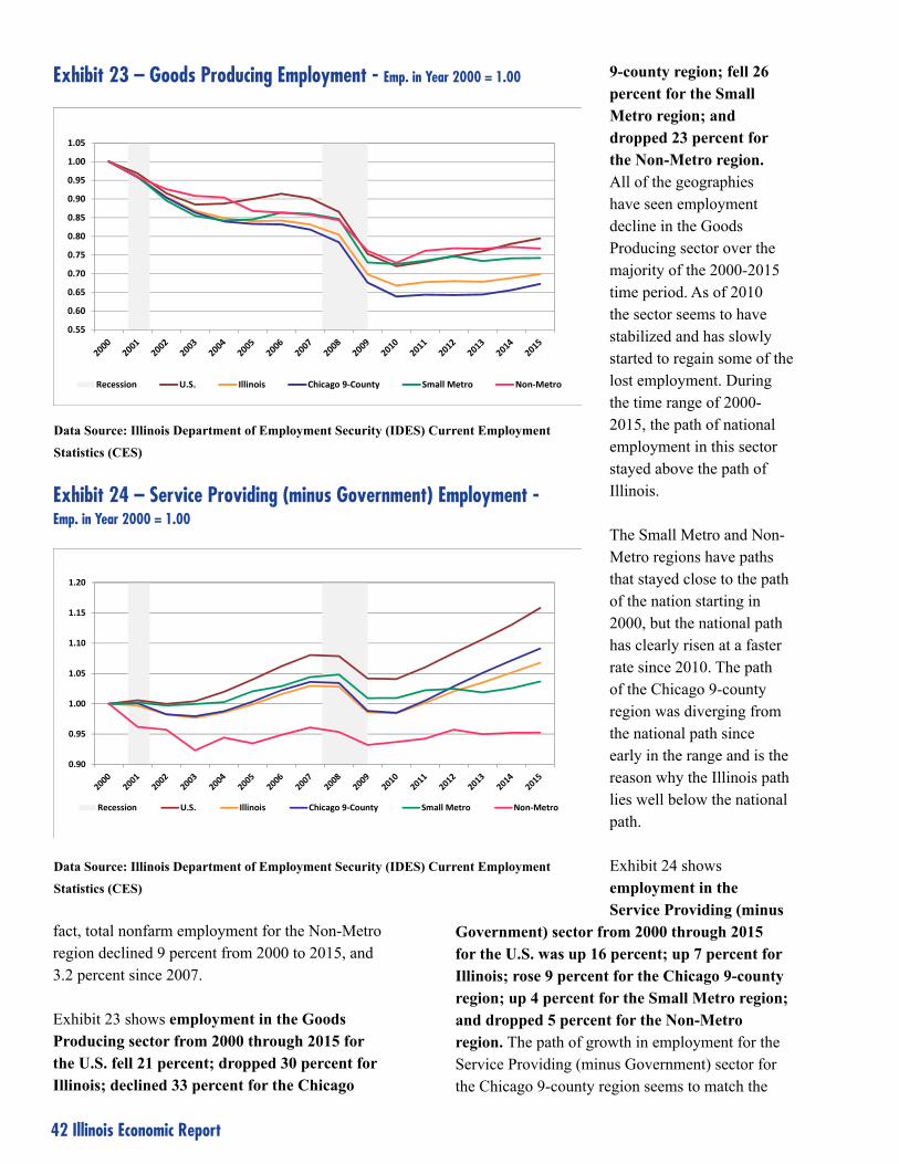
42 Illinois Economic Report
fact, total nonfarm employment for the Non-Metro region declined 9 percent from 2000 to 2015, and 3.2 percent since 2007.
Exhibit 23 shows employment in the Goods Producing sector from 2000 through 2015 for the U.S. fell 21 percent; dropped 30 percent for Illinois; declined 33 percent for the Chicago
9-county region; fell 26 percent for the Small Metro region; and dropped 23 percent for the Non-Metro region. All of the geographies have seen employment decline in the Goods Producing sector over the majority of the 2000-2015 time period. As of 2010 the sector seems to have stabilized and has slowly started to regain some of the lost employment. During the time range of 2000-2015, the path of national employment in this sector stayed above the path of Illinois.
The Small Metro and Non-Metro regions have paths that stayed close to the path of the nation starting in 2000, but the national path has clearly risen at a faster rate since 2010. The path of the Chicago 9-county region was diverging from the national path since early in the range and is the reason why the Illinois path lies well below the national path.
Exhibit 24 shows employment in the Service Providing (minus
Government) sector from 2000 through 2015 for the U.S. was up 16 percent; up 7 percent for Illinois; rose 9 percent for the Chicago 9-county region; up 4 percent for the Small Metro region; and dropped 5 percent for the Non-Metro region. The path of growth in employment for the Service Providing (minus Government) sector for the Chicago 9-county region seems to match the
0.55
0.60
0.65
0.70
0.75
0.80
0.85
0.90
0.95
1.00
1.05
Recession U.S. Illinois Chicago 9‐County Small Metro Non‐Metro
Exhibit 23 – Goods Producing Employment - Emp. in Year 2000 = 1.00
Data Source: Illinois Department of Employment Security (IDES) Current Employment
Statistics (CES)
0.90
0.95
1.00
1.05
1.10
1.15
1.20
Recession U.S. Illinois Chicago 9‐County Small Metro Non‐Metro
Exhibit 24 – Service Providing (minus Government) Employment - Emp. in Year 2000 = 1.00
Data Source: Illinois Department of Employment Security (IDES) Current Employment
Statistics (CES)

Illinois Economic Report 43
nation’s path since around the time of the Great Recession. The index for the Chicago region fell below 1.00 for the first few years on this chart before starting to move in a positive direction.
The path for the Small Metro region compared favorably with the path of the Chicago 9-county region before becoming stagnant after the recession. The Non-Metro region was in decline starting in 2000 before leveling off in the middle of that decade. It has remained stable ever since.
Exhibit 25 shows employment path for Government from 2000 through 2015 for the U.S. was up 6 percent, down 1 percent for Illinois; remained level (0%) for the Chicago 9-county region; down 2 percent for the Small Metro region; and fell 6 percent for the Non-Metro region. Changes in government employment are likely correlated with changes in population and tax revenues within geographies.
Quarterly Census of Employment and Wages (QCEW)
QCEW is the third source of industry employment used in this analysis. The data is used to separate Services into White Collar Services and Blue Collar
Services at the sub-state level, which appears to be critical to the analysis. This also allows for an investigation of industry wages among the broader sectors.
Note: It is a general rule to be very careful when using QCEW data as a time series in any analysis. However, by combining data into three sub-state areas and four broad industry groupings, the impact of non-economic coding changes can be minimized.
The Quarterly Census of Employment and Wages (QCEW) program is the foundation on which other employment statistics programs are built, including the CES program. CES data are generally considered official employment estimates for IDES because they are timely and reflect current over-the-month changes
0.85
0.90
0.95
1.00
1.05
1.10
1.15
Recession U.S. Illinois Chicago 9‐County Small Metro Non‐Metro
Exhibit 25 – Government Employment - Emp. in Year 2000 = 1.00
Data Source: Illinois Department of Employment Security (IDES) Current Employment
Statistics (CES)

44 Illinois Economic Report
in the Illinois economy the same way that national payroll estimates reveal current national conditions. QCEW data are valuable even though the data are reported with a 7-month lag because industry employment and wage data are more detailed and can be sorted by ownership of employers, by industry, and by county.
QCEW data is a tabulation of employment and wages pulled once a quarter from a large, dynamic QCEW database. Researchers are encouraged to be careful when using this data as noneconomic code changes occurring within the database can cause unintended consequences. The QCEW data used for this analysis goes back only to 2001 as that is when
the employer database first used the NAICS [North American Industry Classification System] industry coding structure.
In this case the services industries were separated into two groupings and both the employment and wage data were analyzed. Since QCEW is a compilation of employer data records, each employer is assigned an ownership code [employer in the federal government; state government; local government; or private sector]. So in order to take advantage of the QCEW data for the following analysis, each employer record is assigned to one of four industry groupings (IGs) based on its ownership and its NAICS industry code.
Emp as % of Emp as % ofAvg. Annual Employment Statewide Corr. StatewideEmployment Diff PDiff Total Ind. Group Tot.
2001 2015 2001-2015 2001-2015 2001 2015 2001 2015Chicago 9-county Goods 726,617 515,534 -211,083 -29.1% 12.6% 9.0% 66.0% 63.8%Chicago 9-county White Collar Services 1,240,206 1,372,320 132,114 10.7% 21.5% 23.9% 75.5% 76.4%Chicago 9-county Blue Collar Services 1,586,438 1,713,671 127,234 8.0% 27.5% 29.9% 72.0% 73.5%Chicago 9-county Public 481,028 485,244 4,216 0.9% 8.3% 8.5% 58.8% 60.8%Chicago 9-county Total 4,034,288 4,086,769 52,482 1.3% 70.0% 71.3% 70.0% 71.3%Small Metro Goods 230,766 180,310 -50,456 -21.9% 4.0% 3.1% 21.0% 22.3%Small Metro White Collar Services 285,638 308,612 22,974 8.0% 5.0% 5.4% 17.4% 17.2%Small Metro Blue Collar Services 421,061 427,642 6,582 1.6% 7.3% 7.5% 19.1% 18.3%Small Metro Public 233,860 215,998 -17,861 -7.6% 4.1% 3.8% 28.6% 27.1%Small Metro Total 1,171,324 1,132,562 -38,761 -3.3% 20.3% 19.8% 20.3% 19.8%Non-Metro Goods 143,083 112,569 -30,513 -21.3% 2.5% 2.0% 13.0% 13.9%Non-Metro White Collar Services 117,536 115,405 -2,131 -1.8% 2.0% 2.0% 7.2% 6.4%Non-Metro Blue Collar Services 196,504 189,316 -7,188 -3.7% 3.4% 3.3% 8.9% 8.1%Non-Metro Public 103,116 96,360 -6,756 -6.6% 1.8% 1.7% 12.6% 12.1%Non-Metro Total 560,238 513,650 -46,588 -8.3% 9.7% 9.0% 9.7% 9.0%Statewide Goods 1,100,466 808,414 -292,052 -26.5% 19.1% 14.1% 100.0% 100.0%Statewide White Collar Services 1,643,379 1,796,337 152,958 9.3% 28.5% 31.3% 100.0% 100.0%Statewide Blue Collar Services 2,204,002 2,330,629 126,627 5.7% 38.2% 40.7% 100.0% 100.0%Statewide Public 818,003 797,602 -20,401 -2.5% 14.2% 13.9% 100.0% 100.0%Statewide Total 5,765,850 5,732,982 -32,868 -0.6% 100.0% 100.0% 100.0% 100.0%
% of U.S. TotalUnited States Goods 24,865,272 20,712,002 -4,153,270 -16.7% 19.2% 14.8%United States White Collar Services 34,708,207 42,475,327 7,767,120 22.4% 26.8% 30.5%United States Blue Collar Services 49,731,326 55,114,270 5,382,944 10.8% 38.4% 39.5%United States Public 20,330,999 21,186,592 855,593 4.2% 15.7% 15.2%United States Total 129,635,804 139,488,191 9,852,387 7.6% 100.0% 100.0%
Exhibit 26 - Average Annual Employment & Proportional Shares of Statewide Employment
Data Source: Bureau of Labor Statistics (BLS); Illinois Department of Employment Security (IDES) Quarterly Census of
Employment and Wages

Illinois Economic Report 45
Industry Groupings (IGs)
Goods – includes private sector employers in agriculture, forestry, fishing & hunting; mining, quarrying, & oil and gas extraction; construction; and manufacturing.
White Collar Services – includes private sector employers in information; finance & insurance; real estate & rental & leasing; professional, scientific & technical services; management of companies & enterprises; educational services; and health care & social assistance.
Blue Collar Services – includes private sector employers in utilities; wholesale trade; retail trade; transportation & warehousing; administrative & support & waste management; arts, entertainment & recreation; accommodation & food services; other services, unclassified.
Public – includes employers in all industry sectors with federal, state, or local government ownership.
As shown in Exhibit 26, on the previous page, the entire state had a decline of 0.6 percent in employment (according to QCEW) from 2001 to 2015. Nationally, employment rose 7.6 percent. The Chicago 9-county region had a 1.3 percent increase, the Small Metro region had a decline of 3.3 percent in employment, and the Non-Metro region had a decrease of 8.3 percent.
Goods Statewide, the employment level for the Goods IG (data cells shaded in green in Exhibit 28) fell 26.5 percent from 2001 to 2015. The nation declined 16.7 percent in comparison. The region with the biggest percentage employment loss in this sector was the Chicago 9-county region with a 29.1 percent decrease. The Small Metro region lost 21.9 percent of its 2001 employment, and the Non-Metro region lost 21.3 percent of its 2001 employment. This decline in Goods IG employment for every region of the state resulted in the share of the state’s
total employment for the Goods IG falling from 19.1 percent to 14.1 percent.
What is notable about the Goods IG employment data in this table is that the share of total state employment for the Goods IG in the Chicago 9-county region fell from 12.6 percent to 9.0 percent. The region’s share of the statewide Goods IG employment total fell from 66.0 percent to 63.8 percent.
The share of total state employment for the Goods IG in the Small Metro region fell from 4.0 percent to 3.1 percent, and the region’s share of the state’s Goods IG employment rose from 21.0 percent to 22.3 percent. For the Non-Metro region these proportions declined from 2.5 percent to 2.0 percent, and rose from 13.0 percent to 13.9 percent. So even though Goods IG employment levels fell for both the Small Metro and Non-Metro regions, the proportion of statewide Goods IG employment increased for both.
White Collar Services Statewide, the employment level for the White Collar Services IG sector increased 9.3 percent from 2001 to 2015. The nation had an increase of 22.4 percent. The share of employment in the White Collar Services IG relative to total state employment rose from 28.5 percent to 31.3 percent.

46 Illinois Economic Report
The share of state total employment for the White Collar Services IG in the Chicago 9-county region increased from 21.5 percent to 23.9 percent. Almost a quarter of the state’s total employment exists in the White Collar Services IG within the Chicago 9-county region. The region’s share of the statewide White Collar Services IG employment increased from 75.5 percent to 76.4 percent. This represents over three/fourths of the state’s White Collar Services IG employment.
The Small Metro region rose from 5.0 percent to 5.4 percent for its share of total state employment, and fell from 17.4 percent to 17.2 percent for its share of state IG employment. The shares for the Non-Metro region remained steady at 2.0 percent relative to total state employment, and declined from 7.2 percent to 6.4 percent for state IG employment.
So the Small Metro region had an increase in its share of total state employment and the Non-Metro region remained level, yet both had a decline in the share of IG employment because of the large increase for the Chicago 9-county region.
Blue Collar Services Statewide, the employment level for the Blue Collar Services IG rose 5.7 percent from 2001 to 2015. The share of employment in the Blue Collar Services IG relative to total state employment rose from 38.2 percent to 40.7 percent. The national employment level for this IG rose 10.8 percent. The share of state total employment for the Blue Collar Services IG in the Chicago 9-county region increased from 27.5 percent to 29.9 percent. The region’s share of statewide Blue Collar Services IG employment increased from 72.0 percent to 73.5 percent. This is almost three quarters of the state’s Blue Collar Services IG employment.
The share for the Small Metro region rose from 7.3 percent to 7.5 percent for total state employment, and fell from 19.1 percent to 18.3 percent for state IG employment. The share for the Non-Metro region fell from 3.4 percent to 3.3 percent for total state employment, and fell from 8.9 percent to 8.1 percent for state IG employment.
So the Blue Collar Services IG is a similar case as the White Collar Services IG. The Small Metro region had an increase in its share of total state employment while the Non-Metro region had a slight decrease, yet both had a decline in the share of IG employment because of the significant increase for the Chicago 9-county region.
Public Statewide, the employment level for the Public IG declined 2.5 percent from 2001 to 2015. The proportion of employment in the Public IG relative to total state employment fell from 14.2 percent to 13.9 percent. The nation’s employment level for the Public IG rose 4.2 percent. The proportion of total state employment for the Public IG in the Chicago 9-county region rose from 8.3 percent to 8.5 percent. The region’s share of statewide Public IG employment rose from 58.8 percent to 60.8 percent.
The share for the Small Metro region fell from 4.1 percent to 3.8 percent for total state employment, and fell from 28.6 percent to 27.1 percent for state IG employment. The share for the Non-Metro region fell from 1.8 percent to 1.7 percent for total state employment, and fell from 12.6 percent to 12.1 percent for state IG employment.
It appears that the decline in state government employment between 2001 and 2015 had a major impact on these numbers as the state capital (Springfield) is included in the Small Metro region. The proportion of the total job loss in this region that is accounted for by the Public IG between 2001 and 2015 is 46.1 percent.
Wages from the QCEW are another measure of economic activity. Total wages paid by employers were summed by industry groupings, and by the sub-state regions within Illinois. Average annual wages are calculated by dividing total annual wages by average annual employment for the years 2001 and 2015.
As shown in Exhibit 27, the state had an increase of 41.7 percent in total wages paid by employers from 2001 to 2015. The Chicago 9-county region

Illinois Economic Report 47
had a 42.4 percent increase, the Small Metro region had an increase of 41.2 percent in total wages paid, and the Non-Metro region had an increase of 35.1 percent. The increase in total wages paid by employers nationally was 57.3 percent.
Average annual wages increased by 42.5 percent for the state; increased 40.6 percent for the Chicago 9-county region; increased 46.1 percent for the Small Metro region; and increased 47.3 percent for the Non-Metro region. Average annual wages for the nation increased 46.2 percent. According to the Bureau of Labor Statistics (BLS)14 the inflation calculator derived from the Consumer Price Index (CPI) shows that inflation for the U.S. (measure of change in price level) rose 34 percent from 2001 to 2015. Using data from the BLS CPI site for Midwest Urban data reflects a 29.8 percent increase for this period.
Goods Statewide, total wages paid by employers in the Goods IG increased 11.1 percent from 2001 to
2015. Average annual wages paid to employees in the Goods IG rose 51.2 percent over the same period. The proportional share of wages paid in the Goods IG relative to total wages paid in the state fell from 21.9 percent to 17.2 percent. Average annual wages for the nation rose 49.9 percent in the Goods IG.
The share of total wages paid in the state for the Goods IG in the Chicago 9-county region fell from 15.4 percent to 11.7 percent. The region’s share of statewide wages paid in the Goods IG fell from 70.2 percent to 68.2 percent. Average annual wages paid for this IG in this region increased 51.9 percent.
The share of wages paid in the Goods IG relative to total state wages paid for the Small Metro region fell from 4.3 percent to 3.7 percent. However, the share of wages paid statewide for the Goods IG in this region rose from 19.8 percent to 21.3 percent. Average annual wages for the Goods IG in the Small Metro region rose 52.8 percent.
Wages as % ofAvg. Annual Avg. Annual Wages % Share of Total Wages Wages as % of Corr. Statewide
Wages Diff PDiff Total Wages Diff PDiff Statewide Total Ind. Group Tot.2001 2015 2001-2015 2001-2015 2001 2015 2001-2015 2001-2015 2001 2015 2001 2015
Chicago 9-county Goods $47,178 $71,686 $24,508 51.9% 20.0% 15.1% $2,676,431,781 7.8% 15.4% 11.7% 70.2% 68.2%Chicago 9-county White Collar Services $55,781 $79,747 $23,966 43.0% 40.3% 44.8% $40,257,844,839 58.2% 31.0% 34.6% 84.1% 83.7%Chicago 9-county Blue Collar Services $30,667 $41,105 $10,438 34.0% 28.3% 28.8% $21,789,100,957 44.8% 21.8% 22.3% 79.5% 79.5%Chicago 9-county Public $40,589 $56,803 $16,214 39.9% 11.4% 11.3% $8,038,923,217 41.2% 8.8% 8.7% 63.6% 65.0%Chicago 9-county Total $42,544 $59,802 $17,258 40.6% 100.0% 100.0% $72,762,300,794 42.4% 77.0% 77.3% 77.0% 77.3%Small Metro Goods $41,931 $64,081 $22,151 52.8% 26.2% 22.2% $1,878,311,543 19.4% 4.3% 3.7% 19.8% 21.3%Small Metro White Collar Services $35,297 $54,590 $19,292 54.7% 27.3% 32.4% $6,764,808,601 67.1% 4.5% 5.3% 12.3% 12.9%Small Metro Blue Collar Services $20,781 $29,542 $8,761 42.2% 23.7% 24.3% $3,883,228,438 44.4% 3.9% 4.0% 14.3% 14.3%Small Metro Public $35,753 $51,107 $15,355 42.9% 22.7% 21.2% $2,677,972,971 32.0% 3.8% 3.5% 27.3% 26.0%Small Metro Total $31,477 $45,979 $14,502 46.1% 100.0% 100.0% $15,204,321,553 41.2% 16.5% 16.5% 16.5% 16.5%Non-Metro Goods $34,007 $50,730 $16,723 49.2% 33.7% 29.3% $844,900,729 17.4% 2.2% 1.8% 10.0% 10.5%Non-Metro White Collar Services $25,636 $38,621 $12,985 50.7% 20.9% 22.9% $1,443,935,458 47.9% 1.4% 1.4% 3.7% 3.4%Non-Metro Blue Collar Services $19,131 $29,243 $10,112 52.9% 26.0% 28.4% $1,776,823,149 47.3% 1.7% 1.8% 6.1% 6.2%Non-Metro Public $27,120 $39,358 $12,239 45.1% 19.4% 19.5% $996,093,934 35.6% 1.3% 1.2% 9.1% 8.9%Non-Metro Total $25,765 $37,957 $12,191 47.3% 100.0% 100.0% $5,061,753,270 35.1% 6.5% 6.2% 6.5% 6.2%Statewide Goods $44,365 $67,072 $22,707 51.2% 21.9% 17.2% $5,399,644,053 11.1% 21.9% 17.2% 100.0% 100.0%Statewide White Collar Services $50,065 $72,782 $22,718 45.4% 36.9% 41.4% $48,466,588,898 58.9% 36.9% 41.4% 100.0% 100.0%Statewide Blue Collar Services $27,750 $38,020 $10,270 37.0% 27.4% 28.0% $27,449,152,544 44.9% 27.4% 28.0% 100.0% 100.0%Statewide Public $37,509 $53,153 $15,645 41.7% 13.8% 13.4% $11,712,990,122 38.2% 13.8% 13.4% 100.0% 100.0%Statewide Total $38,666 $55,114 $16,449 42.5% 100.0% 100.0% $93,028,375,617 41.7% 100.0% 100.0% 100.0% 100.0%
% of U.S. TotalUnited States Goods $41,015 $61,482 $20,467 49.9% 20.0% 20.0% $253,560,986 24.9% 21.7% 17.2%United States White Collar Services $47,252 $70,131 $22,879 48.4% 36.2% 36.7% $1,338,801,009 81.6% 34.9% 40.3%United States Blue Collar Services $25,985 $36,340 $10,354 39.8% 27.4% 27.3% $710,549,262 55.0% 27.5% 27.1%United States Public $36,549 $53,289 $16,741 45.8% 16.3% 16.0% $385,946,776 51.9% 15.8% 15.3%United States Total $36,219 $52,937 $16,718 46.2% 100.0% 100.0% $2,688,858,033 57.3% 100.0% 100.0%
Exhibit 27 - Average Annual Wages & Proportional Shares of Statewide Wages
Data Source: Bureau of Labor Statistics (BLS); Illinois Department of Employment Security
(IDES) Quarterly Census of Employment and Wages

48 Illinois Economic Report
The share of wages paid in the Goods IG relative to total state wages paid for the Non-Metro region fell from 2.2 percent to 1.8 percent. The share of wages paid statewide for the Goods IG in this region rose from 10.0 percent to 10.5 percent. Average annual wages for the IG and region rose 49.2 percent.
White Collar Services Statewide, total wages paid by employers in the White Collar Services IG increased 58.9 percent from 2001 to 2015. Average annual wages paid to employees in the White Collar Services IG rose 45.4 percent statewide during this time. Average annual wages for the nation rose 48.4 percent in the White Collar Services IG.
The share of wages paid in the White Collar Services IG for the Chicago 9-county region relative to total wages paid statewide increased from 31.0 percent to 34.6 percent. The share of total wages paid in the state for the White Collar Services IG in the Chicago region fell from 84.1 percent to 83.7 percent. Average annual wages paid for the White Collar Services IG in the Chicago region increased 43.0 percent.
The share of wages paid in the White Collar Services IG relative to total state wages paid for the Small Metro region rose from 4.5 percent to
5.3 percent. The share of wages paid statewide for the White Collar Services IG in the Small Metro region rose from 12.3 percent to 12.9 percent. Average annual wages for the White Collar Services IG for the Small Metro region rose 54.7 percent.
The share of wages paid in the White Collar Services IG relative to total state wages paid for the Non-Metro region remained level at 1.4 percent. The share of wages paid statewide for the White Collar Services IG in this region fell from 3.7 percent to 3.4 percent. Average annual wages for the White Collar Services IG in the Non-Metro region rose 50.7 percent.
Blue Collar Services Statewide, total wages paid by employers in the Blue Collar Services IG increased 44.9 percent from 2001 to 2015. Average annual wages paid in the Blue Collar Services IG rose 37.0 percent from 2001 to 2015. Average annual wages for the nation rose 48.4 percent in the White Collar Services IG.
The share of wages paid in the Blue Collar Services IG for the Chicago 9-county region relative to total wages paid statewide rose from 21.8 percent to 22.3 percent. The share of wages paid in the state for Blue Collar Services IG in the Chicago 9-county region stayed at 79.5 percent. Average annual wages paid for Blue Collar Services
IG in the Chicago 9-county region increased 34.0 percent.
The share of wages paid in the Blue Collar Services IG relative to total state wages paid in the Small Metro region rose from 3.9 percent to 4.0 percent. The share of wages paid statewide for the Blue Collar Services IG in the Small Metro region stayed at 14.3 percent. Average annual wages for the Blue Collar Services IG in the Small Metro region rose 42.2 percent.
The share of wages paid in the Blue Collar Services IG relative

Illinois Economic Report 49
to total state wages paid for the Non-Metro region rose from 1.7 percent to 1.8 percent. The share of wages paid statewide for the Blue Collar Services IG in the Non-Metro region rose from 6.1 percent to 6.2 percent. Average annual wages for the Blue Collar Services IG in the Non-Metro region rose 52.9 percent.
Public Statewide, total wages paid by employers in the Public IG rose 38.2 percent from 2001 to 2015. Average annual wages paid rose 41.7 percent during this time. Average annual wages paid for the nation rose 45.8 percent in the Public IG.
The share of wages paid in the Public IG for the Chicago 9-county region relative to total wages paid statewide fell from 8.8 percent to 8.7 percent. The share of wages paid in the state for the Public IG in the Chicago region rose from 63.6 percent to 65.0 percent. Average annual wages paid for the Public IG in the Chicago 9-county region increased 39.9 percent.
The share of wages paid in the Public IG relative to total state wages paid for the Small Metro region fell from 3.8 percent to 3.5 percent. The share of wages paid statewide for the Public IG in the Small Metro region fell from 27.3 percent to 26.0 percent. Average annual wages for the Public IG in the Small Metro region rose 42.9 percent.
The share of wages paid in the Public IG relative to total state wages paid for the Non-Metro region fell from 1.3 percent to 1.2 percent. The share of wages paid statewide for the Public IG in the Non-Metro region fell from 9.1 percent to 8.9 percent. Average annual wages for the Public IG in the Non-Metro region rose 45.1 percent.
Summary of the U.S. and Illinois
Illinois is one of the states in the “Rust Belt” that have lost population and jobs over the last few
decades. Florida and the states in the west and southwest portions of the country have posted the strongest growth in the U.S. during this period. Illinois has remained below the national average for growth in both employment and population.
As a state, Illinois has a smaller share of its population in the 55 and over age group than does the nation. This could be due to the number of retirees leaving Illinois for warm weather climates. Illinois is reasonably close to the nation in its racial diversity and proportion of Hispanics. It is also close to the national average in its proportion of foreign-born and those with naturalized citizenship. It may appear odd that Illinois, in the middle of the country, has a large percentage of foreign-born, but Chicago has acted as a port of entry for many coming from around the world.
Illinois has a smaller share of its population than the nation with household income below the poverty level. It has a higher proportion of children under 18 living in households led by married couples. Those children that are living in households led by a single adult in Illinois are more likely to receive government benefits than in similar households across the nation.
The state of Illinois has a smaller share of its population, 18 and over, who are veterans compared to the nation. This last fact may due in part to the age distribution of veterans as some may have

50 Illinois Economic Report
previously lived in Illinois and now may be retirees who have moved out of state. It could also be due to those from Illinois joining the military not returning to live in the state after their service time. A number of veterans choose to stay around the area near the military base they worked. Illinois has three military bases, which is a small number compared to other states.
People in Illinois, 25 years of age or older, are much more likely than their national counterparts to have a Bachelor’s degree or higher. Illinois has a higher labor force participation rate than the nation, overall and for all age groups through 65 to 69. The average Illinoisan has a higher standard of living than the average person in the nation today. Housing costs for homeowners are higher for Illinois than the nation, but household incomes are also higher. A smaller proportion of people in Illinois are without health insurance.
The national labor force increased in size by 25 percent from 1990 to 2015. Illinois’ has only increased by 10 percent over the same period. Total nonfarm employment (CES) increased nationally by 7 percent from 1990 to 2015, but actually decreased in Illinois by 1 percent. Employment in Goods-Producing industries decreased 21 percent for the U.S. and 30 percent for Illinois. While manufacturing employment declined everywhere, it is not surprising that the construction industry is stronger nationally because the U.S. posted stronger population and economic growth during this period.
Employment in Service-Providing industries rose 14 percent nationwide from 1990 to 2015 but increased only 5 percent in Illinois. Government employment has increased 6 percent nationally but fell 1 percent in Illinois. Changes in Government employment levels are likely positively correlated with population shifts.
As of 2015, Illinois has a higher share of its employment in the White Collar Services and Blue Collar Services industry sectors than the nation according to QCEW. The nation has higher
proportions for the Goods and Public sectors. The nation has a larger proportion of employment for both natural resources (mining and logging in particular) and construction within the Goods sector while Illinois has a larger proportion of employment in manufacturing.
Average annual industry wages are higher for Illinois than the nation for Goods, White Collar Services, and Blue Collar Services. However, wages are slightly higher for the U.S. than Illinois in the Public sector.
The nation has a slightly larger share of people employed in service occupations; and natural resources, construction, and maintenance occupations. Illinois has a slightly larger share of people employed in sales and office occupations; and production, transportation, and material moving occupations. They have similar proportions employed in management, business, science, and arts occupations.
As was discussed earlier in the report, rural areas across the nation are facing economic challenges. Illinois may have one advantage over other parts of the nation (west and southwest in particular) in that its rural areas tend to lie closer to bigger cities and transportation networks.
Average annual industry wages are higher for
Illinois than the nation for Goods, White Collar
Services, and Blue Collar Services. However,
wages are slightly higher for the U.S. than Illinois
in the Public sector.

Illinois Economic Report 51
Summary of Sub-state Areas (Chicago 9-county; Small Metro; Non-Metro)
Chicago 9-county The Chicago 9-county region has the largest population of prime workforce age (25-54) of any sub-state region in Illinois, and that group also has the highest educational attainment. The population is more diverse (racially, Hispanic ethnicity, and foreign born) than the other sub-state regions and the nation as a whole. The region also has a higher percentage of the population that is not married.
The region has the highest labor force participation rate, which is positively correlated to educational attainment, and the lowest proportion of household incomes below the poverty level. However, the region also has the highest percentage of individuals not covered by health insurance. The foreign born who are not citizens have approximately a three times higher rate of not being covered by health insurance than the foreign born who are now citizens.
More employment opportunities are available in growing industries. This helps to draw people to the region with the skills to fit in-demand jobs. The highest incomes of any sub-state region are a result, which also drives housing costs to be the highest.
Both all households and those households led by someone 60 or over in the region have the highest average earnings from work activity. The region also has a higher proportion of all households and households led by someone at least 60 years old that is working. This implies that people in the Chicago region tend to work later in life. Given that this area also has more workers with a higher educational attainment of at least a Bachelor’s degree, it makes sense that the workers would have started career
jobs at a later age than those in the Small Metro or Non-Metro areas.
Female-led households in the region are also more successful than the other regions, on average. This is probably also a reflection of the higher educational attainment for females in this region.
The Chicago 9-county region has a smaller proportion of veterans to total population than any other sub-state region. This may be partly due to the larger number of job opportunities available to young people in the region. It could also be that older, retired veterans settle in less densely populated areas or warmer climates.
The percentage of the population receiving Food Stamp/SNAP benefits is lower in the Chicago 9-county area than the other sub-state regions. Average retirement income and Social Security payments are larger in this region than the other sub-state regions, but the differences between the regions for these types of income are not as large as for work earnings.
The size of the labor force for the region has increased by 14 percent from 1990 to 2015. Total nonfarm employment (CES) stayed level for the period from 1990 to 2015. Employment in

52 Illinois Economic Report
Goods-Producing industries declined 33 percent for the region primarily due to the decline of manufacturing. Employment in Service-Providing industries rose 7 percent and Government employment remained level.
The region has the largest share of people employed in management, business, science, and art occupations; and sales and office occupations relative to the other sub-state areas in Illinois. These two occupational categories account for almost two-thirds of the employment in the Chicago 9-county region. It has the smallest share of people employed in the remaining three occupational categories.
Average annual industry wages are higher for the Chicago 9-county region in all four broad industry groupings (Goods, White Collar Services, Blue Collar Services, and Public).
Small Metro The age distribution of the workforce in the Small Metro region is older than the Chicago 9-county region, but younger than the Non-Metro region. The region’s population is not as racially diverse as the nation overall, but it has a similar proportion of its population that is black. The share of foreign born among its population is small.
The proportion of the state’s veterans living in the region is higher than the region’s share of the state population. The region ranks behind the Chicago 9-county region in proportion of its adult population that has the highest educational attainment of a Bachelor’s degree or higher, but in front of the Non-Metro region.
The proportion of Small Metro adults that have never been married is smaller than the Chicago 9-county region, but larger than the Non-Metro region. The proportion of the population living in households with income below the poverty level is higher than both the Chicago 9-county region and the Non-Metro region. The Small Metro region has the lowest share of its population not covered by health insurance.
Incomes for the Small Metro region are lower on average than for the Chicago 9-county region, but higher than the Non-Metro region. Conversely, housing costs are less expensive in this region when compared to the Chicago 9-county region, but more expensive than the Non-Metro region.
The Small Metro’s labor force participation rate is lower than the Chicago 9-county region, but higher than the Non-Metro region. The size of the labor force for the region has increased by 4 percent from
1990 to 2015. This also lies between the Chicago 9-county region and the Non-Metro region. Again, labor force participation is strongly impacted by educational attainment and the attainment for the Small Metro area lies between Chicago and the Non-Metro areas.
Total nonfarm employment (CES) fell 3 percent for the period from 1990 to 2015. Employment in Goods-Producing industries declined 26 percent for the region primarily due to falling manufacturing employment. Employment in Service-Providing industries rose 2 percent while

Illinois Economic Report 53
Government employment declined 2 percent. It appears that state government employment had an impact on this last number.
The share of people employed in the region lies between the other two sub-state regions for all five occupational categories with the Chicago 9-county region having the highest proportion for two and the Non-Metro region having the highest proportion for the other three.
Although average annual industry wages for the Small Metro region are lower than wages for the Chicago 9-county region, the rates of growth in all industry groupings are higher for the Small Metro region from 2001 to 2015.
Non-Metro The age distribution for the Non-Metro region shows that its workforce is the oldest of any sub-state region in the state. It is not racially diverse and lacks much of a foreign born segment. It has the highest percentage of adults who are now married, divorced or separated, or widowed. It has the largest percentage of its population living in households with income between 100 percent and 149 percent of the poverty level.
The proportion of the state’s veterans living in the region is higher than the region’s share of the state population. However, most of the veterans that live in the Non-Metro region are in the older age groups. Research has shown that a higher than average proportion of military enlistees come from rural areas. Data show those with a lower family income are more likely to join the military than those with a higher family income. The military service provides economic opportunities to those who have limited options.15
Data compiled by the National Priorities Project show that rural counties dominated a list of the top
100 counties in the nation with the highest military recruitment rates. Illinois was one of the states with rural counties on the list. In 2004, nearly two-thirds of Army recruits came from counties with incomes lower than the median household income.16 It appears that although young people from the Non-Metro region may be enlisting in military service at a higher rate, many of this group may not return to live in the Non-Metro region.
The Non-Metro region has the lowest proportion of its adult population with a highest educational attainment of a Bachelor’s degree or higher. In fact, almost half of its population achieved a high school diploma or less as its highest educational attainment. The Non-Metro region has the lowest incomes of any sub-state region, as well as the lowest housing costs. It ranks second in the proportion of its population not covered by health insurance.
The Non-Metro region has the lowest labor force participation rate of any sub-state region and the size of its labor force has decreased 5 percent from 1990 to 2015 (below the other two sub-state regions). Since labor force participation is strongly impacted by educational attainment, this region’s lower labor force participation rate is not surprising given that educational attainment levels are lower

54 Illinois Economic Report
than the other regions. Furthermore, with a declining manufacturing sector that typically employs prime age males with the highest labor force participation rate; this drop in participation is consistent with the drop in manufacturing sector jobs.
Total nonfarm employment (CES) fell 9 percent in the region for the period from 1990 to 2015. Employment in Goods-Producing industries has fallen 23 percent for the region primarily due to manufacturing. Employment in Service-Providing industries declined 5 percent and Government employment declined 6 percent.
The region has the highest proportion of employment of the three sub-state areas for the following three occupational categories: services; natural resources, construction, and maintenance; and production, transportation, and material moving. It has the lowest proportion of employment for the other two occupational categories.
Average annual industry wages for the Non-Metro region are the lowest of the three sub-state regions in all industry groupings. However, average annual wages overall have increased slightly faster from 2001 to 2015 than in the other regions.
Economic Development Strategies
According to modern economic development theory a region builds on its existing strengths while at the same time recognizing which industries have a capacity for growth. The theory posits each region, or group of communities within the region, should develop a strategic plan around these strengths to build for the future. This same development model works for large urban areas, as well as smaller rural areas.
For example, the state of North Carolina put together a
comprehensive economic development strategy based on four broad goals:
1. Build on each region’s competitive advantages and leverage the marketplace;
2. Establish and maintain a robust regional infrastructure;
3. Create revitalized, healthy and vibrant communities; and
4. Develop talented and innovative people.17
Various regions of the state may be recognized for different types of business and industry clusters. Charlotte’s finance industry, and information technology in the Research Triangle area are a couple of examples. Infrastructure needs to be in place and maintained in good order. High speed broadband is a requirement in this era to bring employers and workforce to an area.18
Communities need to cultivate environments where businesses would want to locate and where people would want to work and live. Areas with affordable housing are preferred. Providing education and training support to maintain a skilled workforce is

Illinois Economic Report 55
also critical. Employers are increasingly demanding workers who have training in STEM-related (science, technology, engineering and mathematics) programs so that they may adapt to the more dynamic work environment.19
The economic development plan used for the Chicago metropolitan area is another example. In 2012, Chicago unveiled a new plan that was based on a study conducted by World Business Chicago (WBC), which is the city’s public-private development agency. The study identified ten strategies, which included a focus on specific industry clusters:
• Support advanced manufacturing;
• Increase the region’s attractiveness for business services and headquarters;
• Enhance the competitive position as a transportation and logistics hub;
• Make Chicago a premier destination for tourism and entertainment;
• Make Chicago a leading exporter;
• Develop a work force in a demand-driven and targeted manner;
• Support entrepreneurship and innovation in both mature and emerging sectors;
• Develop next-generation infrastructure and new models of public-private funding;
• Support neighborhood vitality that supports regional growth; and
• Develop a good business climate.20
The firms in a cluster can be more productive by sharing resources (specialized labor and inputs). Strong industry clusters produce higher employment, wages, patenting, and establishment growth. A traded industry is one that concentrates
in a particular region and sells products or services across regions or countries, as opposed to local industries serving primarily local markets and whose employment is evenly distributed across regions.
Chicago’s economy is specialized in professional services of all types and features major headquarters operations in the metro area, including pharmaceuticals, aerospace, food, retail merchandise, transportation, financial services, restaurants and utilities. Chicago has eight industry sectors with employment concentrations above the national average. These are:
1. finance and insurance;
2. transportation and warehousing;
3. educational services;
4. administrative and waste services;
5. management of companies;
6. professional and technical services;
7. manufacturing; and
8. wholesale trade.21
Chicago started a center of entrepreneurship
and innovation known as the 1871 Tech
Incubator five years ago. The public-private partnership has already
created 2,500 jobs in the Chicago area.

56 Illinois Economic Report
Chicago started a center of entrepreneurship and innovation known as the 1871 Tech Incubator five years ago. Venture capitalists, mentors, and local university representatives are on site to help startups with guidance. The public-private partnership has already created 2,500 jobs in the Chicago area.22
Twenty-five big-name businesses operate in a space within a cluster of buildings at the University of Illinois Research Park that opened in 2001 in Champaign. The university is one of the country’s biggest producers of computer science, math, and engineering students. The companies’ full-time employees work on research projects with part-time student employees and sometimes faculty.23
Companies in the Park can use university resources such as the Blue Waters supercomputer. The setup allows employees of the companies to interact with students prior to their graduation giving them an edge in hiring. While 62 percent of U of I graduates take jobs in Illinois, less than half of the engineering students stay, and just a third of the computer science graduates remain.24
An expansion of the Park has now been proposed that would bring apartments, restaurants and retail space to the area. A $10.8 million, three-story building would serve as a “town center” that could
stimulate even more development in the area. Construction is expected to be completed by 2018. Employment in the Park has grown from 1,378 in 2013 to 1,618 today.25
Rhode Island has had success attracting investments from global, advanced industry firms. The state’s universities are strong in both computer science and engineering and have drawn the attention of companies that are investing in innovations such as the “Internet of Things”. The city of Providence has both academic knowledge and a manufacturing heritage. General Electric recently located 100 software jobs here related to this rising industry. Old industrial cities across the Northeast and Midwest have similar characteristics to Providence and may appeal to related investments.26
The metropolis next to Hong Kong named Shenzhen with a population of 11 million people is reinventing itself by staking its future growth on finance, technology and culture. Millions of migrant workers are available to some of China’s biggest and hottest companies in Shenzhen. Many of the companies are led by a new wave of young Chinese entrepreneurs. Shenzhen made its name producing cheap clothes, electronics and toys for big foreign brands. But low cost manufacturers have been moving to areas where labor costs are cheaper.27
Now the focus for Shenzhen is on higher value-added, homegrown technology. Innovative companies are attracted to the well-established manufacturing supply chains and transportation links, as well as proximity to Hong Kong’s financial industry. The environment is also cleaner and less congested than Beijing and Shanghai. Shenzhen has the infrastructure for companies who want to turn their ideas into products.28
Emerging industries such as information technology, biotechnology, green energy

Illinois Economic Report 57
and new materials now account for 40 percent of Shenzhen’s output. The city government has earmarked $676 million (yuan equivalent) to hire foreign experts such as scientists and academics to facilitate innovation and entrepreneurship. The objective is to refashion the city as a modern, desirable place to live and work, the kind of place highly educated, well-paid white collar workers will want to call home.29
Economic Development Issues for Rural Areas
Rural communities in the U.S. are more likely to depend on a single industrial sector than other areas according to the Rural Assistance Center, a national clearinghouse on rural health issues. This dependence often translates to lower wages and more seasonal work. Lower per capita income limits the amount of tax revenue that is available to put back into the community. Regions vary greatly in workforce characteristics and economic drivers.30
Today, new businesses are much less likely to be started in small towns and rural communities than in the past. The recovery from the Great Recession has been marked by a nationwide slowdown in the creation of start-up businesses. The growth that has occurred is largely concentrated in a few large, innovative areas around the country according to an analysis of census data by the Economic Innovation Group. In the economic recovery of the early 1990s, 125 counties combined to generate half of the total new business establishments in the country. In this recovery, only twenty counties combined to generate half of the total new business establishments.31
The loss of construction and manufacturing jobs across the country and a pull-back in business lending appears to have hurt small towns and rural areas the most when it comes to business
formation. Rural areas with a big box retail store also have appeared to scare off competition.32
Industries that have flourished in recent times are often based on economic opportunities with high growth potential. These opportunities are concentrated around people who are highly educated and have more skills. This appears to be leading toward ever increasing gaps in income and employment between smaller areas and big cities.33
Today, nineteen percent of the nation’s population lives in rural areas, as opposed to 44 percent in 1930. However, roughly one-quarter of the nation’s senior adults live in rural areas, and 21 of the 25 oldest counties in the U.S. are rural. Rural-oriented industries such as agriculture, logging, mining and other resource-extraction industries have become more automated. Similar changes have taken place in manufacturing. Fewer opportunities have materialized in rural America to replace the jobs taken by machines.34
Areas like Scioto County, Ohio (just across the Ohio River from Kentucky) are fighting back. The area was a thriving manufacturing hub decades ago, but lost thousands of jobs and residents when companies closed or moved operations overseas. Key economic developers for the Southern Ohio

58 Illinois Economic Report
area have continued to actively recruit companies by showcasing their location, experienced workforce, low tax burden, and proximity to transportation such as railroads, highways, and the river.35
They also sell a low cost of living coupled with relatively low median wages. They focus on pursuing local and regional manufacturers and companies who have or have had locations here. They like to help local businesses grow so that they can hire more local workers and they find it is easier to work with them. Most of the former work locations are lacking in the basic infrastructure of natural gas, sewer and water lines, electricity, and fiber optics capacity, and consequently finding suitable sites for potential employers is a barrier they face.36
Community Revitalization
Other communities such as Jacksonville, Illinois are trying to make their town more livable. Jacksonville Main Street, a nonprofit organization working on behalf of the city has worked to transform its once-struggling downtown area into an area where they can have activities for families and visitors.37
The city completed an urban renewal project in the 1970’s that created a walking mall downtown. This turned into a less-than-desirable project when mall
tenants left and the vacancy rate increased to more than 27 percent. After a recent renovation effort, the vacancy rate is now less than 5 percent and includes more than two dozen business expansions and over 50 building improvements.38
New Mexico is pushing an initiative to revitalize downtown districts in isolated towns by rehabilitating historic theaters. The economic development program, similar to ones in Illinois and Iowa, seeks to save the facilities with money to refurbish the buildings and grants
for new digital projection and sound equipment. This provides opportunities to the towns so that they can become main attractions in those areas.39
The Illinois Historic Preservation Agency has helped restore theaters like the 500-seat Phoenix Opera House in Rushville. A historic theater in a small town has the potential to sustain 27 full-time equivalent jobs and generate around $84,000 in revenue for state and local governments.40
Similar plans are being used to help revitalize the downtown areas of mid-sized cities in Illinois. The Aurora City Council has endorsed a plan for a $35 million project downtown in the building that formerly housed the Aurora campus of Waubonsee Community College. The building has been vacant for nearly five years.41
Thirty-eight loft-style apartments will be targeted for artists benefitting from a common area, gallery spaces, studios for music practice, painting and dance, and even a business center. The development also would include four apartments the Paramount Theatre would control for the use of visiting performers as well as rehearsal space for the shows produced at the Paramount next door.42
About 6,000 square feet of space on the first floor of the 80,000-square-foot building would be dedicated to a high-end restaurant geared in large

Illinois Economic Report 59
part toward patrons of the Paramount. The city has acknowledged the need for more restaurants downtown, particularly to serve patrons of the Paramount’s popular Broadway Series. That series has brought about 300,000 people a year to downtown, and officials have said roughly 60 percent of them are going out to eat somewhere else before and after shows.43
Broadband Access
Access to very high speed broadband technology is a key component of creating an environment where people would want to work and live. It is also at the top of the requirement list for many employers today.
Electricity transformed life when the effort to bring it to rural areas began in the 1930’s. About 90 percent of the nation’s urban residents had access to electricity at that time in comparison to about 10 percent of rural residents. The effort to bring broadband access to rural areas now is very similar to the effort to bring electricity about eighty years ago. In some cases, rural municipalities are using laws established under the Rural Electrification Administration during the time of Franklin Delano Roosevelt in order to offer broadband. President Roosevelt had warned at the time that the electricity divide excluded farm families from the economic benefits provided by power.44
Electric cooperatives in rural areas believe that they have an obligation to spur economic development. The cooperatives are doing what cable and telecom companies aren’t willing to do, just like they did for electricity when the big private power companies weren’t willing to build the necessary infrastructure. In 2015, the federal government declared that broadband should be treated like a utility, as essential as electricity or the phone. Broadband is the kind of opportunity for rural areas once brought by electricity, railroads and the telegraph.45
High-speed broadband helps companies manage more efficiently, implement business-to-business
economic transactions cheaply and compete in a cost-effective and more productive way. Regions must offer access to increasingly higher bandwidths of service capable of deploying products or services. Ultra-high speed broadband access allow consumers to access technologies such as HD television or voice over Internet protocol (VOIP) telephone services, HD teleconference, and cloud computing.46
Most employment growth in recent decades has been in the services sector. Broadband service may allow rural areas to compete for a range of service jobs, from call centers to software development. In some non-service industries, Internet tools can help businesses connect more efficiently with customers and suppliers. Broadband helps to diversify rural economies with home businesses being one example. Rural businesses can use broadband to develop markets, help with online ordering and billing, and to integrate with the rest of economy.47
Broadband services also make online education and training accessible. It expands opportunities for improving medical and health services for rural communities. Telemedicine leads to savings from the outsourcing of procedures and transportation, as well as income savings for patients not having to miss work. It also increases cultural and social opportunities for residents.48
Research shows that rural counties with the highest levels of broadband adoption have the highest levels of income and education. Conversely, counties with the lowest adoption rates have the worst levels. Research focused on counties that were comparable before broadband adoption shows that the counties that adopted broadband demonstrated higher economic growth rates than those that did not. The results also showed that differences in growth were higher when very high broadband speeds were available.49
The federal government has increased its support of rural communities in the last decade. Broadband access was expanded to over 7 million rural

60 Illinois Economic Report
Americans, including 3 million rural households and over 350,000 rural businesses. The Smart Grid Investment Grant program was established to integrate clean energy into the country’s electric system, resulting in new jobs and lower energy costs in rural America. The Transportation Investment Generating Economic Recovery (TIGER) Discretionary Grant Program was created to focus on infrastructure investments vital to rural communities.50
The Federal Communications Commission (FCC) in 2015 redefined broadband as connections with 25 megabits per second (Mbps) download speeds and 4 Mbps upload speeds. This is more than six times the previous standard of 4 Mbps download. According to the FCC’s 2016 Broadband Progress Report, 39 percent of Americans in rural areas lack access to broadband by the new definition, compared to only 4 percent for urban areas. The digital divide remains too large for rural communities to prosper as the Internet has become a necessity in modern life. Rural communities may be unable to access critical government services as many agencies including Social Security are transitioning to online access. Tax forms and services are being increasingly streamlined through online portals, and with limited broadband
speed, rural America may struggle to access these services.51
Other Infrastructure Investment
A report prepared by the U.S. Department of Treasury, along with the President’s Council of Economic Advisers, states the nation should increase its investment in infrastructure. Research has shown that well-designed infrastructure investments can raise economic growth, productivity, and land values, while also positively impacting economic development, energy efficiency, public health, and manufacturing. At the community level, these investments could be focused on improving transit and recycling of property to revitalize the community, reduce public works costs, and safeguard landscapes.52
Architects are frequently asked to use their skill-sets to transform industrial wastelands (brownfields) into something more economically productive. The U.S. Government Accountability Office (GAO) estimates the nation has up to 425,000 brownfields, with the National Brownfield Association estimating that 5 million acres of these abandoned industrial sites exist. Many of these sites occupy what is likely to become valuable property once
they are cleaned up.53
The federal government passed the “Fixing America’s Surface Transportation Act” in 2015 that made federal money available, but the legislation also requires state matching funds to get the federal dollars. The grade for Illinois’ transportation infrastructure is poor and getting worse by the year. The price of fixing these problems becomes greater over time. Funding sources for the state need to be determined so that these issues can be addressed.54 Surveys show that people are willing to pay more for safe water and transportation infrastructure.55

Illinois Economic Report 61
Affordable Housing
Affordable housing provides more benefits than just to those fortunate enough to live in safe and clean housing. Construction of new, affordable housing and programs that rehabilitate existing housing stock to make it affordable, support a number of jobs employed in the construction trade.56
Persons who live in affordable housing tend to be more stable, long-term employees because they do not need to move as frequently and do not have problems getting to work regularly. Businesses benefit by having a stable employee population because it reduces employee turnover and related costs in training new employees. It also reduces problems associated with lack of dependability as to whether a sufficient number of employees will show up to work their shifts.57
Housing and jobs are strongly connected. When the economy is expanding, job creation promotes household formation, which in turn increases demand for rental and owner-occupied housing. Other economic drivers of housing include population growth, the need to replace or improve existing housing stock and regional population changes.58
All of these factors create jobs in housing-focused enterprises including builders/remodelers, realtors, and suppliers; and business that provide goods and services to these firms. For this reason, housing often leads an economy out of a recession by creating a virtuous cycle of improving housing demand that creates jobs and in turn fosters additional demand for construction.59
A study by the National Low Income Housing Coalition reported that the average renter in Chicago does not earn enough to comfortably afford a modest apartment. Rents have climbed since the housing bust and people have to skimp
on other necessities such as food, child care, and transportation in order to cover their rent. The study used the median rental price of a two-bedroom apartment in the Chicago area, which is $1,176 per month. Low-income people are eligible for housing subsidies, but only 1 in 4 eligible for the aid actually receive it because of waiting lists.60
Another report recently released by the MacArthur Foundation, shows that almost half of adults living in Chicago are spending more than they can afford on their homes or apartments. The problem is the worst among people ages 18 to 34, African-Americans and households with incomes under $40,000. The problems tend to be worse for renters than homeowners. As homeownership has fallen since the housing bust, the demand for rentals has increased, driving up monthly rents. The research also shows that there is a connection between stable housing and educational attainment among the students who live in that housing.61
Data provided by two different organizations show that a larger proportion of Chicago-area homeowners are underwater in their mortgages than other large metropolitan areas. The study done by CoreLogic shows that 16.7 percent of Chicago-area homeowners are underwater, which is slightly better off than those in Las Vegas and Miami

62 Illinois Economic Report
(reviewed 10 largest metropolitan areas). The study produced by Zillow shows that 20.3 percent of Chicago-area homeowners are underwater, which is the highest in the nation (reviewed 35 major metropolitan areas).62
Bioeconomy
The Federal Activities Report on the Bioeconomy emphasizes the potential for an even stronger national bioeconomy through the production and use of biofuels, bioproducts, and biopower. Assisted by public-private partnerships, development of new and innovative technologies in the United States is leading to renewable and drop-in fuels, biobased materials, and renewable chemicals that are replacing fossil-based products. One billion tons of biomass is projected to be sustainably produced by 2030 nationally.63
This effort intends to increase the sustainable production of biomass feedstocks and capture of usable wastes; development of innovative and
more efficient technologies to transform renewable carbon to intermediates and products; construction of more biorefineries and manufacturing facilities; and expansion of the market for biofuels, biochemical, biopower, and other biomass-derived products. Innovative technologies can extract non-renewable resources and transform them from costly pollutants into marketable products.64
One-tenth of global energy consumption in the transportation sector is consumed by global aviation. Advanced liquid biofuels are the only substitute for kerosene (used for aviation fuel) because of technical requirements. Short-term and medium-term prospects for production processes of biofuel substitutes for aviation fuel have already been recognized. Global aviation expects to grow by 5 percent annually through 2030 so continued growth in demand is expected.65
Stability in the price of aviation fuel is important as it is the most volatile cost for an airline. The industry is also interested in reducing its production of greenhouse gas emissions (GHG).66 Aviation operations contribute 2 percent of man-made CO2 emissions.67
The U.S. Navy is moving toward increased utilization of biofuels for national security reasons. In 2016, the “Great Green Fleet” paid $2.05 per gallon for the largest renewable fuel contract ever made. Currently the biofuel is blended (currently 10%) with petroleum products but it is expected that the biofuel will become a larger part of the blend over the coming years. The fuels are drop-in replacements for fossil fuels.68
Chicago has the world’s largest sewage treatment plant and it produces massive amounts of wastewater. The plant is the biggest single source of phosphorous in the entire region that drains into the Mississippi River. Combined with other sources, this pollution triggers algae growth that kills fish, makes drinking water taste sour, and contributes to the Connecticut-sized dead zone in the Gulf of Mexico each summer.69
Bioeconomy – “The global industrial transition of sustainably utilizing renewable aquatic and terrestrial biomass resources in energy, intermediate, and final products for economic, environmental, social, and national security benefits.”

Illinois Economic Report 63
A new project promises to take some of the phosphorous from the Chicago plant and convert it into a slow-release fertilizer. The $31 million project uses wastewater to produce 10,000 tons of fertilizer per year and will reduce phosphorous discharges by 30 percent. Revenue from fertilizer sales will eventually generate $2 million annually. By most estimates Illinois is the largest contributor of phosphorous and nitrogen pollution to the Gulf of Mexico.70
Chicago’s water-treatment plant processes 1.2 billion gallons every day. The sewage passing through the plant contains more energy than is required to treat it. Water treatment accounts for 3 percent of total energy use in the nation, and can use more than one-third of the energy used by the entire public sector. The water district is investing in new equipment to increase its ability to extract energy from the waste it processes.71
Since introducing the first-ever fully recyclable plastic bottle made partially from plants, Coca-Cola has distributed more than 25 billion of the bottles to consumers in 37 countries. The packaging now accounts for 30 percent of the company’s packaging volume in North America and 7 percent globally, making Coca-Cola the world’s largest bioplastics end-user. The company signed a contract in 2015 to use Liquid Light’s technology to more efficiently utilize plant material to make the bioplastic.72
Representatives of the biofuel industry released a report identifying at least five potential bio-based chemical production projects. They stated that Iowa is better positioned than most of its domestic competitors and indicated that a biochemical production tax credit would be fundamental to whether they would locate in Iowa or elsewhere. The report noted that the U.S. market for chemicals is more than $250 billion per year and that more than 50,000 jobs in bio-based chemicals and materials are projected to be created in the nation by 2020.73
One of the evolving movements in the bioeconomy is capturing carbon so that it can be converted
to valuable products rather than be sequestered underground. Research on related issues is leading to the commercialization step for multiple companies. These technological innovations include: using carbon dioxide (CO2) and saltwater for biofuel production; using waste CO2 for the production of thermal insulation; using CO2 as an input to making better concrete; using CO2 captured from geothermal plants to create methanol as an intermediate, which could then be used to produce biodiesel; using CO2 along with sunlight and water to produce hydrocarbons including jet fuel; and using the waste stream of CO2 from an ethanol plant to increase production of ethanol as well as other byproducts.74
Recycling saves significant resources in comparison to production from raw materials. The process of recycling paper generates 74% less air pollution, uses 50% less water, and uses only 60% of the

64 Illinois Economic Report
energy as production from new materials. Recycling steel and tin cans saves 74% of the energy needed to make them from scratch. It is possible to recycle aluminum cans over and over again. A steel mill using recycled scrap reduces water pollution, air pollution, and mining waste by about 70%. 86% of plastic bottles in the U.S. end up in a landfill or incinerator. That averages to around 60 million plastic bottles a day. 80% of glass is estimated to be recycled into new containers.75
Every pound of recycled PET (polyethylene terephthalate) plastic used instead of newly produced plastic reduces energy use in production by 84 percent. It costs $30 per ton to recycle trash on average, $50 to send it to the landfill, and $65 to $75 to incinerate it. About one-third of an average dump is made up of packaging material, which could easily be recycled. Currently, the nation recycles approximately 32% of its total waste so there is enormous potential for growth.76
Economic Challenges Facing Illinois and the Nation
The Great Recession has accelerated the recent decline in urban sprawl. Industries such as construction and manufacturing, based outside central cities, had larger employment declines than
industries such as business services in urban areas. Overall, job declines occurred more rapidly outside central cities.
People have an increasing desire to live, work, shop, and play in the same place, and to commute shorter distances. This is particularly true among the young and educated, who are the most coveted employees. Policy makers and employers in many cities have been trying to make living and working conditions more attractive.77
The young professionals that are attracted to the amenities of a
densely populated downtown raise demand for housing, which raises housing prices in the area as well. Research shows the change in downtown has more to do with who is living there than how many people are living there. The neighborhoods close to downtown are becoming higher-income, more educated and populated with a higher proportion of white residents. This transformation could make those same areas unaffordable to people who have lived there in the past.78
A Pew Research Center analysis of U.S. Census Bureau data found that the middle class in the Chicago metropolitan area has shrunk from 56 percent of households in 2000 to 51 percent in 2014. The Pew study based their measurement of middle class primarily on income. Households with combined earnings of two-thirds to twice the median household income, adjusted for household size were defined as middle class.79
More households in the Chicago metropolitan area slipped into the lower income class than climbed into the upper income class. The proportion of the middle class shrank in nine of every 10 U.S. metropolitan areas investigated in the Pew study. However, about half of the other metropolitan areas showed more households moving up than moving down from the middle class.80

Illinois Economic Report 65
A study conducted by researchers at the International Monetary Fund documents the “hollowing out” of the income distribution in the U.S. since the 1970s. In the early decades more middle-income households were moving up, as opposed to down, the income ladder. This changed as the nation transitioned into the 21st century and now more middle-income households are moving to a lower level of income rather than a higher level of income. Since households of lower and middle incomes already spend a larger proportion of their income on consumption than higher income households, this has resulted in a lower level of aggregate consumption since 1998.81
Rural areas across the country face a shortage of general practitioners. The number of for-profit medical schools is rising, in part to develop new doctors for underserved areas such as the rural portions of the country. A relatively high proportion of older people live in rural areas which lack an adequate supply of doctors. Opening public medical schools is expensive so the for-profits are seen as a welcome alternative. One concern is that the number of graduates will grow faster than the number of open slots in residency programs.82
Since the global financial crisis and Great Recession, productivity growth in advanced economies has been very slow (in absolute terms and relative to previous decades). It was expected that the world would be entering a new golden era of innovation that would dramatically increase productivity growth and improve the way we live and work.83
The breakthrough innovations that were expected to increase productivity growth are:
1. Energy technologies (new forms of fossil fuels; alternative-energy sources; storage technologies; clean tech; and smart grids);
2. Biotechnologies (genetic therapy; stem-cell research; use of big data to reduce health care costs);
3. Information technologies (next generation Internet; social media; new apps; Internet of Things; big data; cloud computing; artificial intelligence; virtual-reality devices);
4. Manufacturing technologies (robotics; automation; 3D printing; personalized manufacturing);
5. Financial technologies (revolutionize payment systems to lending, insurance services and asset allocation); and
6. Defense technologies (development of drones and other advanced weapon systems).84
Increased technological innovation leads to more jobs being replaced by machines. This often leads to a situation where not everyone is better off as a result of market forces. The group of people who are working, but have inadequate wages is increasing. This has caused many people to withdraw from the labor force.85

66 Illinois Economic Report
Capital Markets and USDA Grants
One of the hurdles of entrepreneurship and job creation in rural America is access to capital for small businesses. Rural entrepreneurs face an information gap of two kinds – less information about rural entrepreneurs for potential funders, and less information in rural communities about sources of funding.86
There is a perception that businesses, in particular small businesses, face unprecedented capital access challenges. Most firms – both urban and rural – start small and stay small. A higher proportion of rural firms remain small. However, rural firms are more persistent and tend to have better survival rates. They also tend to grow more slowly, create fewer jobs, and generate less spin-off benefits than their urban counterparts. Slower growth rates seem to result from natural competitive disadvantages such as smaller home markets, and more restricted access to business growth services.87
Rural firms that do achieve fast growth tend to lose any distinctive characteristics. Rural small businesses are more likely to utilize bank loans than their urban counterparts and are less likely to
attract outside equity investments. This pattern may be a result of rural equity capital gaps and a more robust rural marketplace in debt capital availability from banks, farm lending institutions, and various government-backed finance programs.88
The White House Rural Council announced a $10B investment fund (U.S. Rural Infrastructure Opportunity Fund) to promote rural economic development. The fund is intended to grow the rural economy by increasing access to capital for rural infrastructure projects and speeding up the process. Through the national broadband plan, the power of technology is leveraged
to overcome distance and increase collaboration in the acceleration of student achievement in rural schools.89
Federal agencies have also been directed to significantly increase their purchase of bio-based products. The bio-based products sector marries the two most important economic engines for rural America: agriculture and manufacturing. The “Rural Jobs Accelerator” links Federal programs to facilitate job creation and economic development in rural communities by utilizing regional development strategies. The Accelerator allows multiple agencies to coordinate technical assistance and grant/loan programs so that a consortium of public and private rural entities can have a single access point within the Federal government.90
It is vital that rural places create regional strategies to build stronger economies and remain competitive. Potential for economic growth exists in the bioeconomy, renewable energy, rural manufacturing, local and regional food systems, and production agriculture. The USDA has worked to support regional rural strategies in recent years, and now Congress has provided for a regional authority in the 2014 farm bill.91

Illinois Economic Report 67
Economic Development for Illinois
Illinois has a number of strengths that would serve as a foundation for any economic development plan the state or its sub-state regions may undertake. Although the basic planning process would be similar for all geographies, the related research suggests that the details would be different for the three sub-state areas of Illinois.
The Chicago 9-county region has proven it can succeed, attracting skilled, young professionals that are needed by many employers in growing industries. The perceived level of success is lower for the Small Metro region and almost nonexistent for the Non-Metro region. It seems that creating an environment where people would want to work and live and where employers would want to locate should be the focus for the Non-Metro region in particular and Small Metro region to a lesser degree.
References in this report suggest that a good starting point for building this environment would be done through investment in infrastructure. In order to attract people and employers, high-quality broadband access is a top priority. This one step alone could address a number of issues including opportunities for educating and training a skilled workforce. In addition, integration of broadband services could improve access to government services and health care; and social, cultural and entrepreneurial opportunities.
Additional infrastructure investment may be required to transform existing work sites in order to make them viable for new businesses. Brownfield remediation could be done in some cases to increase the economic value of abandoned work sites. Since these properties were used previously because of their optimal location, chances are they still retain value. These sites may also require updating to modern utility connections.
The state of Illinois is home to a number of outstanding institutions of higher learning. Among these are schools producing graduates in engineering and computer science with many of the students leaving the state for jobs elsewhere. Since these skills are often associated with technological innovation, creating incentives to keep students here would encourage technological innovation and promote entrepreneurship within the state. This would potentially create new industries that would provide high-skilled and well-paid jobs.
Some people are attracted to living in a rural area or small town with the caveat that the area meets their basic lifestyle needs. Some small town locations may be ideal for retirement communities while other areas may appeal to families seeking a simpler lifestyle and perhaps better access to local agriculture products. Providing work opportunities in some of these small town locations may allow people who cannot find affordable housing in urban areas a chance to live a better life.
The Workforce Innovation and Opportunity Act (WIOA) is the platform for rural economies to create regional strategies to strengthen their communities. The Non-Metro and Small Metro regions of Illinois have a background in both agriculture and manufacturing, which are the basis of the bioeconomy. Production of biofuels (for vehicles

68 Illinois Economic Report
of all types including commercial and military); plastics; and chemicals manufacturing could be done here.
Renewable energy generation operations and manufacturing of components needed to support these industries could also be expanded in Illinois.
The portion of industry composition that includes the conversion of waste products into products of value, and the more efficient utilization of resources is growing. This would likely be a key component of any industrial development plan. It appears that the professional services component of energy efficiency is already thriving in the Chicago 9-county region and to some extent in the Small Metro region. This industry could continue to grow making Illinois a leader in a field allowing it to export its expertise elsewhere.
Conclusion
Historical data trends demonstrate that Illinois has lagged behind national population growth for almost a century and national employment growth for decades. Much of the shift in population growth, and subsequent employment growth, has been a movement from the Midwest and Northeast states toward the West Coast, Southwest, and South. These shifts are partially related to technological innovation in both the agriculture and manufacturing
industries and for other reasons including the attraction of warmer climates, better transportation, jobs and housing affordability, exposure to these areas to young people while in the military, the advent of air conditioning, attraction to adventure in the new frontier, etc.
As people face life situations involving major economic decisions, they explore available opportunities. Since economic changes with negative impacts have taken place in Illinois, such as the loss of agricultural jobs and then more recently manufacturing jobs, the opportunity to look elsewhere likely led people in Illinois to change their place of residence. The shift in population levels has been a primary driver for the shift in employment levels. Within Illinois, economic data supports the notion that population and employment have migrated toward the Chicago 9-county region and away from the Non-Metro region. The Small Metro region is a blend of the other two sub-state regions.
The Chicago 9-county region has the largest population share in the prime-age group 25 to 54, and a population with the highest educational attainment and the highest labor force participation rate. The size of the labor force has increased 14 percent in the last 25 years. Jobseekers find a greater host of employment opportunities in growing industries and occupations. The Chicago 9-county region has the highest incomes but also
has the highest housing costs.
The region has a higher proportion of households led by someone at least 60 years old who is working. It is not clear if this means older people have to work to afford to live here or if they choose to work. However, it is not unusual to have workers stay in the labor force longer when they have greater educational attainment because the return to work is higher than for those with lower educational attainment. Households led by females in this region are less likely

Illinois Economic Report 69
to have income below the poverty level than similar households in the other sub-state areas.
The Small Metro region has a population that is older than the Chicago 9-county region, but still younger than the Non-Metro region. The region is not racially diverse overall, but it does have a similar proportional share of blacks as the nation. It has a lower proportion of its adult population than the Chicago 9-county region that has attained at least a Bachelor’s degree, but still higher than the Non-Metro region. The proportion of the population living in households with income below the poverty level is higher than both the Chicago 9-county region and the Non-Metro region.
Incomes for the Small Metro region are lower on average than for the Chicago 9-county region, but higher than the Non-Metro region. Conversely, housing costs are less expensive in this region when compared to the Chicago 9-county region, but more expensive than the Non-Metro region. The region’s labor force participation rate is lower than the Chicago 9-county region, but higher than the Non-Metro region. The proportion of people employed for the region lies between the other two sub-state regions for all five occupational categories with the Chicago 9-county region having the highest proportion for two and the Non-Metro region having the highest proportion for the other three.
The Non-Metro region has the oldest population of any sub-state region. It is not racially diverse. A larger proportion of the region’s population is veteran than the other two sub-state regions. The Non-Metro region has the lowest share of its adult population that have attained a Bachelor’s degree or higher. In fact, almost half of its population achieved a high school diploma or less as the highest educational attainment. The Non-Metro region has the lowest incomes and the lowest housing costs.
It has the lowest labor force participation rate of any sub-state region and the size of its labor force has decreased five percent in the last 25 years. Educational attainment and the loss of formerly middle class jobs in the manufacturing and construction industries have hurt the region not unlike the other two sub-state areas. But Non-Metro areas were hurt more dramatically because employment levels in the service and government sectors also declined. The major issue for the region is its inability to replace occupations in the goods producing sector with higher skilled occupations in service providing industries.
The counties comprising the Non-Metro region in Illinois are similar to the rural counties that are losing population nationally. The typical rural county in Illinois would likely have an industry base of agriculture, resource extraction or manufacturing. These industries have their highest proportional share in the Non-Metro region of all the sub-state regions in Illinois, but these industries have downward-trending employment levels. The population and size of the labor force of the Non-Metro region is also in decline.
In order to energize economic development across the state and in particular the less densely populated areas, a number of issues should be addressed. The smaller communities in particular need to create

70 Illinois Economic Report
an environment where people would want to live and work and where employers would also want to locate. Investing in infrastructure such as high-quality broadband access would be a good starting point. This one step could help address issues involving education and training of the workforce; improved access to government services and health care; providing entrepreneurial opportunities; and making the community more livable. It could have a similar impact as rural electrification in the 20th century.
Additional infrastructure investment may be required to transform existing work sites to make them viable for new businesses. This may allow employers to tap into new labor pools and provide jobs to workers with skills who already live, or would prefer to live in a smaller community. These communities may supply affordable housing in a safe area, which is critical to a stable workforce. Any plan should also encourage the creation of small businesses in these areas.
Illinois needs to keep more of its college graduates in the state, especially those with degrees in engineering and computer science as well as other graduates with entrepreneurial skills. Technological
innovation drives new industries and new industries create employment growth. Economic incentives may be considered to encourage this group to remain in state.
Illinois has a history in both agriculture and manufacturing, which are the foundation of the bioeconomy. This sector includes the conversion of waste products into products of value and the more efficient utilization of resources. It would be a key component of any industrial development plan for Illinois. It appears that the professional services component of energy efficiency is already thriving in the Chicago 9-county region and to some extent in the Small Metro region. This industry could continue to grow making Illinois a leader in the field allowing it to export its expertise elsewhere.
Illinois should concentrate on rebuilding the foundation of its economy with the realization that the various regions of the state have different issues to address. Providing incentives for college graduates with critical skills to remain in the state, providing support for small businesses to prosper, and investing in infrastructure that could enhance a community’s appeal as a place to live and work would be major steps toward success.

Illinois Economic Report 71
END NOTES

72 Illinois Economic Report
1 Carolyn Dimitri, Anne Effland, and Neilson Conklin, “The 20th Century Transformation of U.S. Agriculture and Farm Policy,” U.S. Department of Agriculture – Economic Research Service, Economic Information Bulletin Number 3, June 2005, http://www.ers.usda.gov/media/259572/eib3_1_.pdf
2 Ibid.3 Jim Tankersley,”A staggering number of people with factory jobs still need government help,” Washington Post, May 10, 2016, https://www.washingtonpost.com/news/wonk/wp/2016/05/10/the-staggering-number-of-people-with-good-factory-jobs-who-still-need-government-help/?hpid=hp_hp-more-top-stories_wb-assistance-910am%3Ahomepage%2Fstory
4 Tami Luhby, ”American manufacturing isn’t dead yet,” CNN Money, April 7, 2016, http://money.cnn.com/2016/04/07/news/economy/manufacturing-jobs/index.html?iid=hp-stack-dom
5 Eduardo Porter, “The Mirage of a Return to Manufacturing Greatness,” New York Times, April 26, 2016, http://www.nytimes.com/2016/04/27/business/economy/the-mirage-of-a-return-to-manufacturing-greatness.html?ref=business&_r=1
6 Phil Rosenthal, “Restore U.S. manufacturing? Robots just took 60K jobs at a factory in China,” Chicago Tribune, May 26, 2016, http://www.chicagotribune.com/business/columnists/ct-rosenthal-robots-jobs-manufacturing-0527-biz-20160526-column.html
7 U.S. Department of Agriculture, “Rural America at a Glance – 2015 Edition,” http://www.ers.usda.gov/media/1952235/eib145.pdf 8 Ibid.9 John Cromartie, “Five Years of Population Loss in Rural and Small-Town America May Be Ending,” USDA Economic Research Service,
June 6, 2016, http://www.ers.usda.gov/amber-waves/2016-june/five-years-of-population-loss-in-rural-and-small-town-america-may-be-ending.aspx#.V5pPzU1wWUk
10 USDA [2015], op. cit.11 U.S. Department of Agriculture, “Rural America at a Glance – 2014 Edition,” http://www.ers.usda.gov/media/1697681/eb26.pdf 12 Jason Furman, “Trends in Labor Force Participation,” Chairman – Council of Economic Advisers, National Press Club, August 6, 2015, https://www.whitehouse.gov/sites/default/files/docs/20150806_labor_force_participation_retirement_research_consortium.pdf
13 Paula Span, “Of Retirement Age, but Remaining in the Work Force,” New York Times, August 1, 2016, http://www.nytimes.com/2016/08/02/health/retirement-working-longer.html?hp&action=click&pgtype=Homepage&clickSource=story-heading&module=second-column-region®ion=top-news&WT.nav=top-news
14 Bureau of Labor Statistics (BLS), Consumer Price Index (CPI): http://stats.bls.gov/cpi/ 15 Amy Lutz, “Who Joins the Military?: A Look at Race, Class,
and Immigration Status,” Syracuse University SURFACE, Winter 2008, http://surface.syr.edu/cgi/viewcontent.cgi?article=1002&context=soc
16 Living History Farm, “Rural America Supplies More Recruits to the Military,” http://www.livinghistoryfarm.org/farminginthe70s/life_07.html
17 “2014 Report: North Carolina Regional and Statewide Strategies for Comprehensive Community and Economic Development,” NC Regional Councils, 2014, http://www.ncregions.org/NC_Regional_and_Statewide_Strategies.pdf
18 Ibid.19 Ibid.20 Rick Mattoon and Norman Wang, “Industry clusters and economic development in the Seventh District’s largest cities,” Federal Reserve Bank of Chicago, 2014, https://www.chicagofed.org/publications/publication-listing
21 Ibid.22 Rich Foreman, “Chicago’s 1871 Tech Incubator, a Model for Innovation,” Startup Grind, 2016, https://www.startupgrind.com/blog/chicagos-1871-tech-incubator-a-model-for-innovation/
23 Lynne Marek, “Why companies across the U.S. are flocking to this downstate research park,” Crain’s Chicago Business, February 13, 2016, http://www.chicagobusiness.com/article/20160213/ISSUE01/302139995/why-companies-across-the-u-s-are-flocking-to-this-downstate-research-park
24 Ibid.25 Johnathan Hettinger,”$10.8 million ‘town center’ planned for UI Research Park,” Champaign News-Gazette, July 11, 2016, http://www.news-gazette.com/news/local/2016-07-11/108-million-town-center-planned-ui-research-park.html
26 Mark Muro,” Can the Internet of Things help renew Rust Belt cities? ,” Brookings, June 14, 2016, http://www.brookings.edu/blogs/the-avenue/posts/2016/06/14-internet-of-things-rust-belt-muro?utm_campaign=Brookings+Brief&utm_source=hs_email&utm_medium=email&utm_content=30607847&_hsenc=p2ANqtz-9udUCHEge-6enFCi8d0qSz6PwoHnvqlyhsukF4-aQ8xb0f7P8xqLUf9YBlA

Illinois Economic Report 73
OGpsB8t5mEPTC5yLa9bMylMdjWQ6PLJWuv6zO5vR6VKvIKEh3ydI-U&_hsmi=3060784727 “China’s high-tech future emerges in factory town Shenzhen,” Daily Mail (Associated Press), May 19, 2016, http://www.dailymail.co.uk/wires/ap/article-3598253/Chinas-high-tech-future-emerges-factory-town-Shenzhen.html
28 Ibid.29 Ibid.30 Rural Assistance Center, “Economic Development,” http://www.raconline.org/topics/economic-development31 Jim Tankersley,”A very bad sign for all but America’s biggest cities,” Chicago Tribune (originally published in Washington Post), May 22, 2016, http://www.chicagotribune.com/business/ct-rural-start-up-decline-20160522-story.html
32 Ibid.33 Ibid.34 Alana Semuels, “The Graying of Rural America,” Citylab, June 2, 2016, http://www.citylab.com/housing/2016/06/the-graying-of-rural-america/485288/
35 Tami Luhby,” These Americans are fighting to bring manufacturing jobs back,” CNN.com, May 17, 2016, http://money.cnn.com/2016/05/17/news/economy/manufacturing-jobs-america/index.html?iid=Lead
36 Ibid.37 Tamara Browning,” Jacksonville vying for $25,000 grand prize in Main Street contest,” Springfield State Journal-Register, May 7, 2016, http://www.sj-r.com/news/20160508/jacksonville-vying-for-25000-grand-prize-in-main-street-contest
38 Ibid.39 Russell Contreras, “New Mexico joins push to restore aging theaters,” Chicago Tribune (Associated Press), May 26, 2016.40 Ibid.41 Steve Lord, “Aurora City Council backs $35 million arts center plan,” Aurora Beacon-News, June 29, 2016, http://www.chicagotribune.com/suburbs/aurora-beacon-news/news/ct-abn-aurora-artscenter-st-0630-20160629-story.html
42 Ibid.43 Ibid.44 Cecelia Kang , ”How to Give Rural America Broadband? Look to the Early 1900s,” New York Times, August 7, 2016, http://www.nytimes.com/2016/08/08/technology/how-to-give-rural-america-broadband-look-to-the-early-1900s.html?action=click&pgtype=Homepage&version=Moth-Visible&moduleDetail=inside-nyt-region-0&module=inside-nyt-region®ion=inside-nyt-region&WT.nav=inside-nyt-region&_r=0
45 Ibid.46 NC Regional Councils, op. cit.47 “Strengthening the Rural Economy – Strengthening Rural Infrastructure,” The White House – Council of Economic Advisers, April 2010, https://www.whitehouse.gov/administration/eop/cea/factsheets-reports/strengthening-the-rural-economy/strengthening-rural-infrastructure
48 Ibid.49 Brian Whitacre, Roberto Gallardo, Sharon Strover, “Broadband’s Contribution to Economic Health in Rural Areas,” Cornell University, Community & Regional Development Institute, Research & Policy Brief Series, Issue Number 64, February 2015, https://cardi.cals.cornell.edu/sites/cardi.cals.cornell.edu/files/shared/documents/ResearchPolicyBriefs/Policy-Brief-Feb15-draft03.pdf
50 “Jobs and Economic Security for Rural America,” White House Rural Council, August 2011, https://www.whitehouse.gov/sites/default/files/jobs_economic_security_rural_america.pdf
51 Jack Karsten and Darrell M. West, “Rural and urban America divided by broadband access,” Brookings, July 18, 2016, http://www.brookings.edu/blogs/techtank/posts/2016/07/15-rural-and-urban-america-broadband-access?utm_campaign=Brookings+Brief&utm_source=hs_email&utm_medium=email&utm_content=31854883&_hsenc=p2ANqtz-87ltAB7jA1R0yUtqFqKBBGdKl-Ly40dmjolKVvtjKHnWCbkG99jDQ87AIa-820oG3vEpN9YCNHMSgQ-c4ERgsIKzxo3AMYPSml2chhJlGkEPFmfS0&_hsmi=31854883
52 “A New Economic Analysis of Infrastructure Investment,” U.S. Department of the Treasury with the Council of Economic Advisers, March 23, 2012, https://www.treasury.gov/resource-center/economic-policy/Documents/20120323InfrastructureReport.pdf
53 Aaron Seward, “How to Remediate a Brownfield Site and Revitalize Communities,” Architect Magazine, July 2, 2012, http://www.architectmagazine.com/technology/how-to-remediate-a-brownfield-site-and-revitalize-communities_o
54 Mary Wisniewski, “The big sell: Making people care about infrastructure repair,” Chicago Tribune, May 15, 2016, http://www.

74 Illinois Economic Report
chicagotribune.com/news/ct-infrastructure-backlog-getting-around-20160515-story.html55 Michael Wiedmaier (Executive director, Underground Contractors Association of Illinois), “Illinois should devote more money to water, road infrastructure,” St. Louis Post-Dispatch (Letters to the Editor), June 6, 2016, http://www.stltoday.com/news/opinion/mailbag/illinois-should-devote-more-money-to-water-road-infrastructure/article_8e7449dc-295e-5e92-9a1b-cc9e517b1086.html
56 The National Law Review, ”Affordable Housing is an Economic Development Benefit,” February 26, 2015, http://www.natlawreview.com/article/affordable-housing-economic-development-benefit
57 Ibid.58 Robert Dietz, ”Good Signs for Housing in 2015,” U.S. News & World Report, January 14, 2015, http://www.usnews.com/opinion/economic-intelligence/2015/01/14/housing-market-showing-signs-of-a-good-2015
59 Ibid.60 Gail MarksJarvis, “Renting a Chicago apartment becoming less affordable, study says,” Chicago Tribune, May 25, 2016, http://www.chicagotribune.com/business/ct-chicago-rent-affordable-0526-biz-20160525-story.html
61 Gail MarksJarvis, “Nearly half of Chicago residents can’t afford where they live, study says,” Chicago Tribune, June 16, 2016, http://www.chicagotribune.com/business/ct-macarthur-foundation-housing-crisis-worries-0616-biz-20160615-story.html
62 Gail MarksJarvis, “Chicago among cities with largest number of underwater homeowners, studies show,” Chicago Tribune, June 9, 2016, http://www.chicagotribune.com/business/ct-underwater-homeowners-chicago-0610-biz-20160608-story.html
63 Federal Activities Report on the Bioeconomy, The Biomass Research and Development Board, February 2016, http://www.energy.gov/sites/prod/files/2016/02/f30/farb_2_18_16.pdf
64 Ibid.65 “Biofuels in Aviation - An Overview,” European Biofuels Technology Platform, http://biofuelstp.eu/aviation-biofuels.html66 Peter Hind, “The Commercial Use of Biofuels in Aviation,” Aviation Economics, April 14, 2014 (appeared in March/April issue of Regional International), http://www.aviationeconomics.com/NewsItem.aspx?title=The-Commercial-Use-of-Biofuels-in-Aviation
67 “Environmental efficiency,” http://aviationbenefits.org/environmental-efficiency68 Jim Lane, “Launch of the Great Green Fleet,” Biofuels’ Digest, January 20, 2016, http://www.biofuelsdigest.com/bdigest/2016/01/20/launch-of-the-great-green-fleet/
69 Michael Hawthorne, “Chicago turning river pollutants into fertilizer,” Chicago Tribune, May 25, 2016, http://www.chicagotribune.com/news/watchdog/ct-chicago-phosphorus-pollution-met-20160525-story.html
70 Ibid.71 Chris Bentley,” How Chicago Turns Sewage Into Power,” MSN.com, November 22, 2015, http://www.msn.com/en-us/news/technology/how-chicago-turns-sewage-into-power/ar-BBn9VUo?ocid=spartandhp
72 Jim Lane, “100% renewable: The Digest’s 2015 8-Slide Guide to the Coca-Cola Plant Bottle,” Biofuels Digest, September 14, 2015, http://www.biofuelsdigest.com/bdigest/2015/09/14/100-renewable-the-digests-2015-8-slide-guide-to-the-coca-cola-plant-bottle/
73 Jim Lane, “Iowa on cusp of biochemicals expansion, if legislature provides incentive: Report,” Biofuels’ Digest, January 17, 2016, http://www.biofuelsdigest.com/bdigest/2016/01/17/iowa-on-cusp-of-biochemicals-expansion-if-legislature-provides-incentive-report/
74 Jim Lane, “The 20 Hottest Carbon-Capturing Technologies of 2016,” Biofuels’ Digest, June 27, 2016, http://www.biofuelsdigest.com/bdigest/2016/06/27/the-20-hottest-carbon-capturing-technologies-of-2016/
75 “Recycling Facts,” RecyclingBin.com, http://www.recyclingbin.com/Recycling-Facts76 “Recycling Statistics,” BYU Idaho - University Operations, http://www.byui.edu/university-operations/facilities-management/recycling-and-sustainability/recycling-statistics
77 Claire Cain Miller, “More New Jobs Are in City Centers, While Employment Growth Shrinks in the Suburbs,” New York Times, February 24, 2015, http://www.nytimes.com/2015/02/24/upshot/more-new-jobs-are-in-city-centers-while-employment-growth-shrinks-in-the-suburbs.html?_r=0
78 Emily Badger, “Americans are paying more and more to live in the same places they once abandoned,” Chicago Tribune (originally published in Washington Post), June 26, 2016, http://www.chicagotribune.com/business/ct-americans-migrating-to-inner-cities-20160626-story.html
79 Angela Caputo, Angie Leventis Lourgos, and Grace Wong,” Chicago area’s middle class shrinking, report finds,” Chicago Tribune, May 11, 2016, http://www.chicagotribune.com/news/local/breaking/ct-pew-declining-middle-class-met-20160511-story.html
80 Ibid.

Illinois Economic Report 75
81 Ali Alichi, Kory Kantenga, and Juan Sole, “Income Polarization in the United States,” International Monetary Fund (IMF Working Paper), June 2016, http://www.imf.org/external/pubs/ft/wp/2016/wp16121.pdf
82 Rebecca Boone, “Rx for doctor gap in rural U.S.?,” Chicago Tribune (Associated Press), June 24, 2016.83 Nouriel Roubini, “Opinion: Why this golden era of innovation isn’t helping the economy,” Marketwatch, June 3, 2016, http://www.marketwatch.com/story/why-this-golden-era-of-innovation-isnt-helping-the-economy-2016-06-03
84 Ibid.85 Eduardo Porter,” Jobs Threatened by Machines: A Once ‘Stupid’ Concern Gains Respect,” New York Times, June 7, 2016, http://www.nytimes.com/2016/06/08/business/economy/threatened-by-machines-a-once-stupid-concern-gains-respect.html?hp&action=click&pgtype=Homepage&clickSource=story-heading&module=second-column-region®ion=top-news&WT.nav=top-news&_r=0
86 White House Rural Council, op. cit.87 Deborah Markley, Erik R. Pages, Patricia Scruggs, Kathleen Miller, “Access to Capital in Rural America – Supporting Business Startup, Growth and Job Creation in the Wake of the Great Recession,” Rural Policy Research Institute, April 2012, http://www.rupri.org/Forms/CapitalMarkets_Briefing_April2012.pdf
88 Ibid.89 “FACT SHEET: Increasing Investment in Rural America”, The White House, Office of the Press Secretary, July 24, 2014, https://www.whitehouse.gov/the-press-office/2014/07/24/fact-sheet-increasing-investment-rural-america
90 Ibid.91 “The Importance of Regional Strategies in Rural Economic Development,” Senate Hearing 113-557, Joint Hearing before the Committee on Agriculture, Nutrition, and Forestry (U.S. Senate) and the Subcommittee on Jobs, Rural Economic Growth and Energy Innovation, One Hundred Thirteenth Congress, Second Session, May 1, 2014, https://www.gpo.gov/fdsys/pkg/CHRG-113shrg93028/html/CHRG-113shrg93028.htm

76 Illinois Economic Report
APPENDIXData for Exhibit Charts available at http://www.ides.illinois.gov/exhibits.

Illinois Economic Report 77
0
50
100
150
200
250
300
Midwest and Selected Northeast States Florida, West Coast and Southwest States Remainder of U.S.
Exhibit 1 – Apportionment of Congressional Seats, by Region of U.S.
Data Source: 2010 Census Briefs, November 2011, U.S. Census Bureau
0%
10%
20%
30%
40%
50%
60%
Midwest and Selected Northeast States Florida, West Coast and Southwest States Remainder of U.S.
Population Proportions by Regions of United States
Exhibit 2 – Population Proportions, by Region of U.S.
Data Source: Bureau of Economic Analysis; Haver Analytics

78 Illinois Economic Report
Population Employment growth between growth between
Region 1990 and 2015 Jan 1990 and Jan 2016Florida, the West Coast, and Southwest States 49.3% 51.9%Midwest and Selected Northeast States 12.4% 17.9%Remainder of the U.S. 28.8% 28.5%
Exhibit 3 – Comparison of Population Growth and Employment Growth, by Region of U.S.
Data Source: Bureau of Economic Analysis; Bureau of Labor Statistics; Haver Analytics
Change in Level (January 1990 to January 2016)White Collar Goods Blue Collar
Region Services Producing Government ServicesFlorida, West Coast and Southwest States 7,219,230 -103,500 2,064,600 7,997,570Midwest and Selected Northeast States 5,603,365 -2,171,900 608,500 3,998,335Remainder of U.S. 5,401,405 -2,004,600 1,228,900 4,288,095
Proportional share of Total Employment (January 2016)White Collar Goods Blue Collar
Region Services Producing Government ServicesFlorida, West Coast and Southwest States 30.2% 12.9% 15.3% 41.5%Midwest and Selected Northeast States 32.8% 14.7% 14.5% 38.1%Remainder of U.S. 29.6% 13.5% 16.6% 40.2%
% Change in Level (January 1990 to January 2016)White Collar Goods Blue Collar
Region Services Producing Government ServicesFlorida, West Coast and Southwest States 90.9% -1.6% 36.5% 62.1%Midwest and Selected Northeast States 47.8% -21.9% 8.7% 24.8%Remainder of U.S. 82.8% -26.9% 22.5% 36.1%
Exhibit 4 – Employment by Industry Grouping, by Region of U.S.
Data Source: Bureau of Economic Analysis; Bureau of Labor Statistics; Haver Analytics

Illinois Economic Report 79
9,000
11,000
13,000
15,000
17,000
19,000
21,000
$0
$500
$1,000
$1,500
$2,000
$2,500
$3,000
1,000s
(Billions of 2
009 U.S. $s)
Recession Value of U.S. Industrial Production (Left Axis)
U.S. Manufacturing Employment (Right Axis)
Exhibit 5 – U.S. Manufacturing Employment and Value of Industrial Output
Data Sources: Federal Reserve Bank of St. Louis; Bureau of Labor Statistics

80 Illinois Economic Report
Exhibit 6 - Population, by Age Group
United Chicago Small Non-Estimates for 2010-2014 States Illinois 9-County Metro MetroPopulation, 1 year and older 310,385,254 12,717,641 8,539,056 2,681,183 1,497,4021 to 4 years 5.2% 5.2% 5.4% 5.0% 4.5%5 to 17 years 17.3% 17.6% 18.1% 17.0% 16.2%18 to 24 years 10.1% 9.9% 9.6% 11.0% 9.3%25 to 34 years 13.6% 14.0% 14.8% 12.9% 11.7%35 to 44 years 13.1% 13.4% 14.0% 12.3% 11.9%45 to 54 years 14.3% 14.3% 14.4% 14.1% 14.5%55 to 64 years 12.4% 12.3% 11.8% 12.9% 13.8%65 to 74 years 7.7% 7.3% 6.7% 7.9% 9.4%75 years and older 6.2% 6.1% 5.4% 6.8% 8.6%55 years and older 26.3% 25.6% 23.9% 27.6% 31.8%
% Change from 2005-2009 to 2010-2014Population, 1 year and older 4.4% 0.8% 0.7% 1.9% -0.4%1 to 4 years -3.0% -8.1% -9.9% -3.7% -3.8%5 to 17 years 0.9% -2.5% -3.1% -0.1% -3.5%18 to 24 years 4.8% -2.3% -0.3% -4.9% -8.0%25 to 34 years 4.6% 1.4% 0.1% 5.2% 4.0%35 to 44 years -4.7% -6.6% -6.4% -5.4% -9.9%45 to 54 years 1.4% -1.4% -0.5% -2.8% -4.1%55 to 64 years 18.4% 17.0% 17.3% 18.0% 14.0%65 to 74 years 22.4% 16.3% 17.6% 15.8% 12.2%75 years and older 4.2% 2.1% 3.0% 1.6% -0.4%55 years and older 15.8% 12.9% 13.8% 12.9% 9.2%
Data Sources: American Community Survey (ACS) 2005-2009 & 2010-2014 5-year estimates (Table S0701)
Exhibit 6 - Population, by Age Group
Data Source: American Community Survey (ACS) 2005-2009 & 2010-2014 5-year estimates (Table S0701)

Illinois Economic Report 81
Exhibit 7 - Population, by Race and Hispanicity
United Chicago Small Non-Estimates for 2010-2014 States Illinois 9-County Metro MetroPopulation, 1 year and older 310,385,254 12,717,641 8,539,056 2,681,183 1,497,402One race - White 73.9% 72.6% 65.9% 82.5% 93.1%One race - Black or African American 12.6% 14.4% 17.1% 11.6% 3.7%One race - Asian 5.0% 4.9% 6.4% 2.3% 0.6%Other race(s) 8.5% 8.2% 10.6% 3.7% 2.5%Hispanic or Latino origin (of any race) 16.8% 16.2% 21.8% 5.2% 3.8%
% Change from 2005-2009 to 2010-2014Population, 1 year and older 4.4% 0.8% 0.7% 1.9% -0.4%One race - White 3.4% 1.6% 3.0% -0.1% -1.0%One race - Black or African American 6.4% -1.1% -3.7% 9.2% 20.2%One race - Asian 19.3% 16.8% 15.7% 31.8% -4.3%Other race(s) 2.1% -9.7% -12.0% 14.9% -2.7%Hispanic or Latino origin (of any race) 17.3% 12.5% 11.3% 27.3% 23.5%
Data Sources: American Community Survey (ACS) 2005-2009 & 2010-2014 5-year estimates (Table S0701)
Exhibit 7 - Population, by Race & Hispanic Ethnicity
Data Source: American Community Survey (ACS) 2005-2009 & 2010-2014 5-year estimates (Table S0701)
Exhibit 8 ‐ Population, by Nativity and Citizenship
United Chicago Small Non-Estimates for 2010-2014 States Illinois 9-County Metro MetroPopulation, 1 year and older 310,385,254 12,717,641 8,539,056 2,681,183 1,497,402%, Native (2010-2014) 86.8% 86.0% 80.9% 95.3% 97.9%%, Foreign born 13.2% 14.0% 19.1% 4.7% 2.1%%, Foreign born - Naturalized U.S. citizen 6.1% 6.6% 9.0% 2.0% 0.9%%, Foreign born - Not a U.S. citizen 7.2% 7.5% 10.0% 2.8% 1.2%
% Change from 2005-2009 to 2010-2014Population, 1 year and older 4.4% 0.8% 0.7% 1.9% -0.4%%, Native (2010-2014) 3.6% 0.3% 0.2% 1.1% -0.4%%, Foreign born 10.0% 4.4% 3.1% 23.5% 2.6%%, Foreign born - Naturalized U.S. citizen 18.1% 10.8% 10.1% 24.4% 4.0%%, Foreign born - Not a U.S. citizen 3.9% -0.8% -2.5% 22.9% 1.6%
Data Sources: American Community Survey (ACS) 2005-2009 & 2010-2014 5-year estimates (Table S0701)
Exhibit 8 - Population, by Nativity and Citizenship
Data Source: American Community Survey (ACS) 2005-2009 & 2010-2014 5-year estimates (Table S0701)

82 Illinois Economic Report
Exhibit 10 ‐ Population, by Poverty Status in the Past 12 Months
United Chicago Small Non-Estimates for 2010-2014 States Illinois 9-County Metro MetroPopulation, 1 year and older - For whom Poverty Status is determined 302,554,055 12,416,841 8,402,516 2,596,522 1,417,803Below 100 percent of poverty level 15.5% 14.3% 13.8% 15.7% 14.6%100 to 149 percent of poverty level 9.6% 8.8% 8.6% 8.6% 10.2%At or above 150 percent of poverty level 74.9% 76.9% 77.5% 75.7% 75.1%
% Change from 2005-2009 to 2010-2014Population, 1 year and older - For whom Poverty Status is determined 4.5% 1.1% 0.9% 2.6% 0.0%Below 100 percent of poverty level 21.3% 17.4% 19.2% 17.5% 8.4%100 to 149 percent of poverty level 12.9% 12.8% 15.3% 8.5% 7.8%At or above 150 percent of poverty level 0.7% -2.6% -3.2% -0.6% -2.4%
Data Sources: American Community Survey (ACS) 2005-2009 & 2010-2014 5-year estimates (Table S0701)
Exhibit 10 - Population, by Poverty Status
Data Source: American Community Survey (ACS) 2005-2009 & 2010-2014 5-year estimates (Table S0701)
Exhibit 9 ‐ Population, by Marital Status
United Chicago Small Non-Estimates for 2010-2014 States Illinois 9-County Metro MetroPopulation, 15 years and older 252,974,135 10,347,484 6,905,654 2,196,736 1,245,094Never married 32.5% 34.4% 36.6% 31.7% 27.2%Now married, except separated 48.4% 48.0% 47.2% 48.7% 51.4%Divorced or separated 13.1% 11.6% 10.7% 13.2% 13.8%Widowed 5.9% 6.0% 5.5% 6.4% 7.7%
% Change from 2005-2009 to 2010-2014Population, 15 years and older 5.3% 2.0% 2.3% 2.5% 0.0%Never married 11.2% 6.5% 6.5% 6.2% 7.2%Now married, except separated 1.4% -1.1% -0.5% -0.4% -5.1%Divorced or separated 9.4% 5.9% 4.0% 8.3% 10.7%Widowed -0.2% -3.3% -3.0% -3.4% -4.4%
Data Sources: American Community Survey (ACS) 2005-2009 & 2010-2014 5-year estimates (Table S0701)
Exhibit 9 - Population, by Marital Status
Data Source: American Community Survey (ACS) 2005-2009 & 2010-2014 5-year estimates (Table S0701)

Illinois Economic Report 83
United Chicago Small Non-Estimates for 2010-2014 States Illinois 9-County Metro MetroTotal Civilian Population - 18 years and older 239,305,217 9,796,516 6,525,629 2,084,602 1,186,285% of Illinois Civilian Population - 18 years and older 66.6% 21.3% 12.1%Veterans Civilian Population - 18 years and older 20,700,711 699,522 365,411 209,504 124,607% of Illinois Veterans Civilian Population - 18 years and older 52.2% 29.9% 17.8%Veterans as a % of Area Civilian Population - 18 years and older 8.7% 7.1% 5.6% 10.1% 10.5%% of Veterans; Male 92.4% 94.0% 94.3% 93.0% 94.9%% of Veterans; Female 7.6% 6.0% 5.7% 7.0% 5.1%Veterans, by Age Group% of Total Pop. - 18 to 34 years 30.4% 30.8% 31.7% 30.6% 26.2%% of Veterans Pop. - 18 to 34 years 8.4% 8.0% 8.0% 8.6% 7.1%% of Total Pop. - 35 to 54 years 35.4% 35.9% 37.1% 33.8% 33.2%% of Veterans Pop. - 35 to 54 years 24.7% 22.4% 21.7% 24.6% 20.7%% of Total Pop. - 55 to 64 years 16.1% 15.9% 15.4% 16.6% 17.3%% of Veterans Pop. - 55 to 64 years 21.9% 21.6% 20.7% 22.8% 22.2%% of Total Pop. - 65 to 74 years 10.0% 9.4% 8.7% 10.2% 11.7%% of Veterans Pop. - 65 to 74 years 22.4% 22.7% 23.3% 21.4% 23.0%% of Total Pop. - 75 years and older 8.0% 7.9% 7.0% 8.8% 11.2%% of Veterans Pop. - 75 years and older 22.7% 25.2% 26.4% 22.5% 26.3%% of Total Pop. - 55 years and older 34.1% 33.2% 31.2% 35.6% 40.1%% of Veterans Pop. - 55 years and older 67.0% 69.5% 70.3% 66.8% 71.6%Educational Attainment of VeteransTotal Civilian Population - 25 years and older 208,423,578 8,552,203 5,716,551 1,789,293 1,046,359Veterans Civilian Population - 25 years and older 9.8% 8.1% 6.3% 11.5% 11.7%Total Civilian Population - 25 years and older - Less than HS grad 13.7% 12.4% 13.2% 9.9% 12.0%Veterans Civilian Population - 25 years and older - Less than HS grad 7.4% 7.9% 7.3% 7.6% 10.1%Total Civilian Population - 25 years and older - HS grad (inc. equiv.) 28.0% 27.0% 23.7% 31.5% 37.1%Veterans Civilian Population - 25 years and older - HS grad (inc. equiv.) 29.3% 31.4% 27.7% 32.1% 41.1%Total Civilian Population - 25 years and older - Some coll. or Assoc. deg. 29.0% 28.7% 26.6% 32.5% 33.6%Veterans Civilian Population - 25 years and older - Some coll. or Assoc. deg. 36.6% 36.3% 36.3% 37.1% 35.1%Total Civilian Population - 25 years and older - Bach. deg. or higher 29.3% 31.9% 36.5% 26.1% 16.9%Veterans Civilian Population - 25 years and older - Bach. deg. or higher 26.6% 24.4% 28.7% 23.2% 13.7%Disability Status of VeteransTotal Civilian Population (18 years and older) - With any disability 14.9% 13.0% 11.6% 14.9% 17.8%Veterans Civilian Population (18 years and older) - With any disability 27.0% 25.9% 24.8% 25.2% 30.3%
Exhibit 11 - Population, by Veteran Status
Data Source: American Community Survey (ACS) 2010-2014 5-year estimates (Table S2101)

84 Illinois Economic Report
United ChicagoEstimates for 2010-2014 States Illinois 9-County IL BOS(1) Total Children under 18 in Households (HHs) 73,521,174 3,047,919 1,943,419 1,104,500(2) Children under 18 in married-couple family households 65.9% 67.3% 67.7% 66.5%(3) Children under 18 in male household, no wife present, family households 7.5% 7.1% 6.8% 7.5%(4) Children under 18 in female household, no husband present, family households 25.9% 25.0% 25.0% 25.1%Children in (1) with SSI, cash pub. assist. income, or FS/SNAP benefits 28.0% 27.0% 27.3% 26.4%Children in (2) with SSI, cash pub. assist. income, or FS/SNAP benefits 16.8% 15.1% 15.8% 13.9%Children in (3) with SSI, cash pub. assist. income, or FS/SNAP benefits 34.6% 36.1% 37.6% 33.6%Children in (4) with SSI, cash pub. assist. income, or FS/SNAP benefits 54.3% 56.4% 55.6% 57.8%Children in (1) for whom pov. stat. is determ. - Income in the past 12 months below poverty level 21.9% 20.3% 20.4% 20.1%Children in (2) for whom pov. stat. is determ. - Income in the past 12 months below poverty level 11.1% 9.6% 10.4% 8.2%Children in (3) for whom pov. stat. is determ. - Income in the past 12 months below poverty level 27.3% 26.1% 26.7% 25.1%Children in (4) for whom pov. stat. is determ. - Income in the past 12 months below poverty level 47.5% 47.3% 45.8% 50.0%
United Chicago% Change from 2005-2009 to 2010-2014 States Illinois 9-County IL BOS(1) Total Children under 18 in Households (HHs)(2) Children under 18 in married-couple family households(3) Children under 18 in male household, no wife present, family households(4) Children under 18 in female household, no husband present, family householdsChildren in (1) with SSI, cash pub. assist. income, or FS/SNAP benefits 8.4% 6.6% 6.1% 7.8%Children in (2) with SSI, cash pub. assist. income, or FS/SNAP benefits 5.7% 5.0% 5.1% 4.7%Children in (3) with SSI, cash pub. assist. income, or FS/SNAP benefits 14.4% 14.4% 14.8% 13.7%Children in (4) with SSI, cash pub. assist. income, or FS/SNAP benefits 14.0% 9.9% 7.0% 16.1%Children in (1) for whom pov. stat. is determ. - Income in the past 12 months below poverty level 16.8% 11.4% 8.6% 16.6%Children in (2) for whom pov. stat. is determ. - Income in the past 12 months below poverty level 17.2% 18.2% 18.7% 17.4%Children in (3) for whom pov. stat. is determ. - Income in the past 12 months below poverty level 30.1% 22.3% 19.8% 26.4%Children in (4) for whom pov. stat. is determ. - Income in the past 12 months below poverty level 14.2% 6.6% 1.6% 16.2%
Exhibit 12 - Households with Children under 18 (Public Assistance and Poverty Status in Past 12 Months)
Data Source: American Community Survey (ACS) 2005-2009 & 2010-2014 5-year estimates (Table S0901)

Illinois Economic Report 85
United Chicago Small Non-Estimates for 2010-2014 States Illinois 9-County Metro MetroTotal Population, 25 and older 209,056,129 8,560,555 5,720,771 1,793,046 1,046,738%, Less than HS grad 13.7% 12.4% 13.2% 9.9% 12.3%%, HS grad (includes equivalency) 28.0% 27.0% 23.7% 31.4% 37.3%%, Some college or associate's degree 29.1% 28.7% 26.6% 32.5% 33.5%%, Bachelor's degree 18.3% 19.7% 22.3% 16.6% 11.3%%, Graduate or professional degree 11.0% 12.2% 14.2% 9.6% 5.6%%, Bachelor's degree or higher 29.3% 31.9% 36.4% 26.1% 16.9%
% Change from 2005-2009 to 2010-2014Total Population, 25 and older 5.9% 3.0% 2.9% 4.2% 1.7%%, Less than HS grad -6.1% -10.5% -8.6% -15.0% -15.1%%, HS grad (includes equivalency) 1.0% -0.9% -1.5% 0.5% -1.0%%, Some college or associate's degree 11.1% 6.1% 4.3% 8.9% 9.9%%, Bachelor's degree 11.1% 9.5% 9.1% 11.3% 8.4%%, Graduate or professional degree 15.2% 11.9% 11.6% 15.1% 7.4%%, Bachelor's degree or higher 12.8% 10.3% 10.2% 12.7% 5.0%
Exhibit 13 - Educational Attainment
Data Source: American Community Survey (ACS) 2005-2009 & 2010-2014 5-year estimates
(Table S0701)

86 Illinois Economic Report
United Chicago Small Non-Estimates for 2010-2014 States Illinois 9-County Metro MetroOccupied housing units 116,211,092 4,778,633 3,114,060 1,065,967 598,606Owner-occupied housing units 64.4% 66.9% 64.7% 69.0% 74.3%Renter-occupied housing units 35.6% 33.1% 35.3% 31.0% 25.7%Owner-occupied; monthly housing cost -Less than $299 7.9% 4.4% 1.8% 6.8% 12.4%Renter-occupied; monthly housing cost - Less than $299 4.4% 4.8% 3.9% 5.9% 8.8%Owner-occupied; monthly housing cost - $300 to $599 18.6% 15.2% 9.1% 23.1% 29.9%Renter-occupied; monthly housing cost - $300 to $599 13.6% 12.9% 7.0% 22.6% 34.2%Owner-occupied; monthly housing cost - $600 to $899 14.3% 15.7% 12.8% 19.3% 22.8%Renter-occupied; monthly housing cost - $600 to $899 27.5% 29.7% 26.5% 38.6% 33.2%Owner-occupied; monthly housing cost - $900 to $1,499 25.0% 24.1% 22.3% 29.6% 23.3%Renter-occupied; monthly housing cost - $900 to $1,499 34.0% 35.2% 42.2% 23.1% 11.0%Owner-occupied; monthly housing cost - $1,500 or more 34.4% 40.5% 54.0% 21.2% 11.5%Renter-occupied; monthly housing cost - $1,500 or more 15.1% 12.9% 17.0% 4.2% 2.0%
United Chicago Small Non% Change from 2005-2009 to 2010-2014 States Illinois 9-County Metro MetroOccupied housing units 3.2% 0.6% 1.2% 1.0% -2.8%Owner-occupied housing units -0.7% -3.0% -3.3% -1.5% -3.7%Renter-occupied housing units 11.1% 8.7% 10.6% 7.1% -0.2%Owner-occupied; monthly housing cost -Less than $299 -9.8% -9.2% 10.4% -16.2% -12.5%Renter-occupied; monthly housing cost - Less than $299 -14.3% -13.0% -7.2% -13.4% -27.0%Owner-occupied; monthly housing cost - $300 to $599 1.5% -11.2% -18.7% -4.4% -7.6%Renter-occupied; monthly housing cost - $300 to $599 -20.1% -20.8% -21.4% -22.8% -16.6%Owner-occupied; monthly housing cost - $600 to $899 1.4% 4.3% 7.5% 1.1% 1.3%Renter-occupied; monthly housing cost - $600 to $899 0.8% -5.8% -15.1% 13.2% 18.6%Owner-occupied; monthly housing cost - $900 to $1,499 0.1% 0.4% 3.0% -1.9% -5.4%Renter-occupied; monthly housing cost - $900 to $1,499 29.3% 29.3% 24.6% 59.0% 62.8%Owner-occupied; monthly housing cost - $1,500 or more -0.1% -3.7% -5.5% 6.0% 11.0%Renter-occupied; monthly housing cost - $1,500 or more 67.7% 77.6% 82.9% 43.2% 5.1%
Exhibit 14 - Housing Costs and Type (Rent/Own)
Data Source: American Community Survey (ACS) 2005-2009 & 2010-2014 5-year estimates (Table S2503)

Illinois Economic Report 87
United Chicago Small Non-Estimates for 2010-2014 States Illinois 9-County Metro MetroOccupied housing units 116,211,092 4,778,633 3,114,060 1,065,967 598,606Less than $5,000 3.4% 3.5% 3.4% 3.9% 3.4%$5,000 to $9,999 3.8% 3.7% 3.5% 4.2% 4.2%$10,000 to $14,999 5.3% 4.6% 4.1% 5.1% 6.5%$15,000 to $19,999 5.4% 5.0% 4.6% 5.6% 6.2%$20,000 to $24,999 5.3% 5.0% 4.5% 5.5% 6.5%$25,000 to $34,999 10.2% 9.5% 8.8% 10.5% 11.4%$35,000 to $49,999 13.5% 12.9% 12.0% 13.8% 15.7%$50,000 to $74,999 17.8% 17.8% 17.2% 18.8% 19.2%$75,000 to $99,999 12.2% 12.8% 12.9% 12.8% 12.0%$100,000 to $149,999 13.0% 14.0% 15.2% 12.6% 10.0%$150,000 or more 10.1% 11.1% 13.9% 7.1% 3.9%$50,000 or more 53.1% 55.7% 59.2% 51.4% 45.1%
Owner-occupied housing units 74,787,460 3,194,707 2,013,628 736,026 445,053Less than $5,000 1.8% 1.6% 1.5% 1.8% 1.9%$5,000 to $9,999 1.8% 1.4% 1.2% 1.6% 1.9%$10,000 to $14,999 3.2% 2.5% 2.1% 2.9% 3.7%$15,000 to $19,999 3.7% 3.4% 2.9% 3.8% 4.9%$20,000 to $24,999 4.0% 3.7% 3.3% 4.1% 5.0%$25,000 to $34,999 8.5% 7.9% 6.7% 9.0% 11.3%$35,000 to $49,999 12.6% 11.9% 10.5% 13.5% 15.6%$50,000 to $74,999 19.0% 19.0% 17.6% 20.8% 22.1%$75,000 to $99,999 14.5% 15.2% 15.0% 16.0% 14.6%$100,000 to $149,999 16.9% 18.1% 19.7% 16.8% 13.1%$150,000 or more 13.9% 15.2% 19.4% 9.7% 5.3%$50,000 or more 64.3% 67.5% 71.7% 63.4% 55.1%
Renter-occupied housing units 41,423,632 1,583,926 1,100,432 329,941 153,553Less than $5,000 6.3% 7.3% 6.9% 8.8% 7.2%$5,000 to $9,999 7.5% 8.2% 7.4% 10.0% 10.1%$10,000 to $14,999 9.1% 8.7% 7.6% 10.1% 13.3%$15,000 to $19,999 8.3% 8.3% 7.4% 9.7% 11.5%$20,000 to $24,999 7.6% 7.6% 7.0% 8.7% 9.7%$25,000 to $34,999 13.3% 12.9% 12.4% 13.8% 14.2%$35,000 to $49,999 15.1% 14.8% 15.0% 14.5% 14.4%$50,000 to $74,999 15.6% 15.6% 16.4% 14.3% 12.5%$75,000 to $99,999 7.9% 7.9% 9.0% 5.6% 4.7%$100,000 to $149,999 6.0% 5.9% 7.1% 3.3% 3.0%$150,000 or more 3.2% 3.0% 3.7% 1.3% 1.4%$50,000 or more 32.7% 32.4% 36.3% 24.4% 21.5%
Exhibit - Household Income in the Past 12 Months (2014 Inflation Adjusted $s) Not referenced in report
Data Source: American Community Survey (ACS) 2005-2009 & 2010-2014 5-year estimates (Table S2503)

88 Illinois Economic Report
United ChicagoEstimates for 2010-2014 States Illinois 9-County IL BOSTotal - Households 116,211,092 4,778,633 3,114,060 1,664,57360 years and older- Households 31.8% 30.9% 28.9% 34.6%Total - Households - With earnings 77.9% 79.0% 81.1% 75.0%60 years and older- Households - With earnings 46.6% 47.1% 49.8% 42.9%Total - Households - With Social Security income 29.3% 27.0% 24.5% 31.6%60 years and older- Households - With Social Security income 76.3% 74.2% 71.3% 78.7%Total - Households - With Supplemental Security Income 5.3% 4.5% 4.4% 4.7%60 years and older- Households - With Supplemental Security Income 6.6% 5.9% 6.4% 5.1%Total - Households - With cash public assistance income 2.8% 2.5% 2.7% 2.1%60 years and older- Households - With cash public assistance income 2.0% 2.1% 2.4% 1.6%Total - Households - With retirement income 17.8% 16.7% 14.3% 21.1%60 years and older- Households - With retirement income 43.8% 43.6% 39.9% 49.3%Total - Households - With Food Stamp/SNAP benefits 13.0% 12.5% 12.3% 12.8%60 years and older- Households - With Food Stamp/SNAP benefits 9.0% 8.7% 10.0% 6.6%
United Chicago% Change from 2005-2009 to 2010-2014 States Illinois 9-County IL BOSTotal - Households 3.2% 0.6% 1.2% -0.4%60 years and older- Households 16.2% 12.7% 14.2% 10.5%Total - Households - With earnings 0.4% -2.1% -1.4% -3.4%60 years and older- Households - With earnings 20.8% 16.2% 16.3% 16.0%Total - Households - With Social Security income 11.6% 7.4% 8.8% 5.4%60 years and older- Households - With Social Security income 12.8% 8.4% 10.0% 6.1%Total - Households - With Supplemental Security Income 43.9% 46.1% 47.1% 44.2%60 years and older- Households - With Supplemental Security Income 39.4% 44.6% 40.9% 52.5%Total - Households - With cash public assistance income 20.4% 25.8% 30.7% 15.5%60 years and older- Households - With cash public assistance income 45.2% 24.6% 24.5% 24.8%Total - Households - With retirement income 5.6% 3.7% 3.8% 3.6%60 years and older- Households - With retirement income 11.3% 9.5% 9.6% 9.4%Total - Households - With Food Stamp/SNAP benefits 57.8% 49.7% 58.6% 36.0%60 years and older- Households - With Food Stamp/SNAP benefits 74.2% 69.1% 73.6% 59.4%
Exhibit 15 - Households with Income, by Type of Income
Data Source: American Community Survey (ACS) 2005-2009 & 2010-2014 5-year estimates (Table S0102)

Illinois Economic Report 89
United ChicagoEstimates for 2005-2009 [Note: Mean Income data not available for 2010-2014] States Illinois 9-County IL BOSTotal - Households 112,611,029 4,749,388 3,077,543 1,671,84560 years and older - Households 28.2% 27.5% 25.6% 31.1%Total - Households with earnings 80.1% 81.2% 83.3% 77.4%60 years and older - Households with earnings 44.8% 45.7% 48.9% 40.9%Total - Households with earnings - Mean earnings (dollars) $71,159 $76,034 $84,552 $59,15860 years and older- Households - With earnings - Mean earnings (dollars) $54,863 $56,606 $64,400 $42,533Total - Households with Social Security income 27.1% 25.3% 22.8% 29.9%60 years and older - Households with Social Security income 78.6% 77.2% 74.0% 82.0%Total - Households with Social Security income - Mean Social Security income (dollars) $14,966 $15,298 $15,472 $15,05360 years and older- Households with Social Security income - Mean Social Security income (dollars) $15,764 $16,049 $16,287 $15,724Total - Households with Supplemental Security Income 3.8% 3.1% 3.0% 3.3%60 years and older- Households with Supplemental Security Income 5.5% 4.6% 5.2% 3.7%Total - HHs with Supplemental Security Inc. - Mean Supplemental Security Inc. (dollars) $7,887 $8,252 $8,418 $7,96960 years and older- HHs with Supplemental Security Inc. - Mean Supplemental Security Inc. (dollars) $7,705 $8,284 $8,408 $8,023Total - Households with cash public assistance income 2.4% 2.0% 2.1% 1.8%60 years and older - Households with cash public assistance income 1.6% 1.9% 2.2% 1.4%Total- HHs with cash public assistance inc. - Mean cash public assistance inc. (dollars) $3,363 $3,053 $3,277 $2,58560 years and older- HHs with cash public assistance inc. - Mean cash public assistance inc. (dollars) $3,476 $2,933 $3,031 $2,696Total - Households with retirement income 17.4% 16.2% 14.0% 20.3%60 years and older - Households with retirement income 45.7% 44.9% 41.6% 49.9%Total- HHs with retirement income - Mean retirement income (dollars) $20,838 $21,705 $23,248 $19,74560 years and older- HHs with retirement income - Mean retirement income (dollars) $21,327 $21,741 $23,430 $19,608Total - Households with Food Stamp/SNAP benefits 8.5% 8.4% 7.9% 9.4%60 years and older - Households with Food Stamp/SNAP benefits 6.0% 5.8% 6.6% 4.6%
Exhibit - Households with Income, by Type of Income with Mean $ Amounts (2005-2009 only) Not referenced in report
Data Source: American Community Survey (ACS) 2005-2009 5-year estimates (Table S0102)

90 Illinois Economic Report
United Chicago Small Non-Estimates for 2010-2014 States Illinois 9-County Metro MetroTotal, Civilian Noninstitutional Population (CNP) 309,082,258 12,690,056 8,565,783 2,671,805 1,452,468% Uninsured; CNP 14.2% 12.3% 13.6% 9.6% 10.1%% Uninsured; CNP - Male 15.6% 14.1% 15.4% 11.3% 11.4%% Uninsured; CNP - Female 12.8% 10.6% 11.8% 8.0% 8.8%% Uninsured; CNP - Age under 18 7.1% 3.8% 3.9% 3.1% 4.3%% Uninsured; CNP - 18 to 64 years old 19.8% 17.8% 19.4% 14.1% 15.1%% Uninsured; CNP - 65 years and older 1.0% 1.2% 1.8% 0.4% 0.3%% Uninsured; CNP - 19 to 25 years old 26.5% 23.8% 26.2% 18.1% 21.5%% Uninsured; CNP - One Race / White alone 12.6% 10.1% 10.8% 8.5% 9.7%% Uninsured; CNP - One Race / Black alone 16.7% 16.7% 16.8% 15.7% 19.0%% Uninsured; CNP - One Race / Asian alone 14.1% 13.8% 14.2% 10.3% 13.9%% Uninsured; CNP - Hispanic or Latino (of any race) 28.1% 25.1% 25.7% 19.5% 18.4%CNP - Native born 268,394,093 10,914,992 6,945,039 2,546,683 1,423,270% Uninsured; CNP - Native born 11.6% 9.3% 9.4% 9.0% 9.8%CNP - Foreign born / Naturalized 18,643,494 831,939 767,104 51,685 13,150% Uninsured; CNP - Foreign born / Naturalized 15.2% 14.0% 14.3% 11.0% 10.6%CNP - Foreign born / Not a citizen 22,044,671 943,125 853,640 73,437 16,048% Uninsured; CNP - Foreign born / Not a citizen 45.5% 45.5% 46.9% 31.2% 36.2%CNP - 25 years and older 205,003,385 8,411,212 5,659,618 1,757,124 994,470% Uninsured; CNP - 25 years and older 15.2% 14.0% 15.7% 10.8% 10.7%CNP - 25 years and older / Less than HS grad 27,452,125 1,014,261 736,290 168,017 109,954% Uninsured; CNP - Less than HS grad 29.9% 29.4% 33.4% 20.3% 17.1%CNP - 25 years and older / HS grad, GED, or alt. 57,015,280 2,259,483 1,336,667 549,749 373,067% Uninsured; CNP - HS grad, GED, or alt. 18.6% 17.8% 21.3% 13.3% 12.0%CNP - 25 years and older / Some coll. or assoc.deg. 59,788,621 2,420,231 1,508,820 574,462 336,949% Uninsured; CNP - Some coll. or assoc.deg. 14.3% 12.9% 14.3% 10.7% 10.2%CNP - 25 years and older / Bachelor's degree or higher 60,747,359 2,717,237 2,077,841 464,896 174,500% Uninsured; CNP - Bachelor's degree or higher 6.4% 6.2% 6.8% 4.4% 4.8%CNP - 18 and older 235,445,702 9,639,346 6,463,224 2,049,574 1,126,548CNP - 18 and older - Worked full-time, year round in the past 12 months 98,995,322 4,150,705 2,856,562 843,138 451,005% Uninsured; CNP - 18 and older - Worked full-time, year round in the past 12 months 13.1% 11.2% 12.3% 8.2% 9.2%CNP - 18 and older - Worked less than full-time, year round in the past 12 months 59,011,658 2,469,104 1,636,752 546,804 285,548% Uninsured; CNP - 18 and older - Worked less than full-time, year round in the past 12 months 24.8% 21.8% 23.6% 17.8% 19.1%CNP - 18 and older - Did not work 77,438,722 3,019,537 1,969,910 659,632 389,995% Uninsured; CNP - 18 and older - Did not work 14.2% 14.8% 17.3% 10.7% 9.3%Total Civilian Household Population (CHP) 305,352,123 12,560,706 8,499,084 2,626,848 1,434,774% Uninsured; CHP 14.2% 12.4% 13.6% 9.6% 10.1%CHP; Household Income (In 2014 Inflation Adjusted $s) - Under $25,000 53,986,004 2,050,492 1,275,488 494,339 280,665% Uninsured; CHP; Household Income (In 2014 Inf. Adj. $s) - Under $25,000 22.3% 20.6% 23.0% 16.6% 16.5%CHP; Household Income (In 2014 Inflation Adjusted $s) - $25,000 to $49,999 67,083,731 2,564,735 1,627,412 574,050 363,273% Uninsured; CHP; Household Income (In 2014 Inf. Adj. $s) - $25,000 to $49,999 20.5% 18.7% 21.5% 14.0% 13.2%CHP; Household Income (In 2014 Inflation Adjusted $s) - $50,000 to $74,999 56,465,445 2,278,926 1,454,688 514,978 309,260% Uninsured; CHP; Household Income (In 2014 Inf. Adj. $s) - $50,000 to $74,999 14.7% 13.2% 15.6% 9.1% 8.6%CHP; Household Income (In 2014 Inflation Adjusted $s) -$75,000 to $99,999 41,964,369 1,796,885 1,195,674 388,871 212,340% Uninsured; CHP; Household Income (In 2014 Inf. Adj. $s) - $75,000 to $99,999 10.1% 9.0% 10.6% 5.8% 5.8%CHP; Household Income (In 2014 Inflation Adjusted $s) - $100,000 and over 85,852,574 3,869,668 2,945,822 654,610 269,236% Uninsured; CHP; Household Income (In 2014 Inf. Adj. $s) - $100,000 and over 5.9% 4.9% 5.3% 3.2% 4.3%Total Civilian Noninstitutional Population where Poverty Status is Determined (CNPPSD) 305,519,742 12,558,598 8,502,013 2,623,534 1,433,051% Uninsured; Total CNPPSD 14.3% 12.4% 13.6% 9.7% 10.1%CNPPSD - Income is under 1.38 the poverty threshold 70,370,853 2,661,857 1,746,600 589,947 325,310% Uninsured; CNPPSD - Income is under 1.38 the poverty threshold 25.6% 23.2% 25.9% 18.2% 18.2%CNPPSD - Income is between 1.38 and 1.99 times the poverty threshold 35,277,349 1,341,185 878,559 280,090 182,536% Uninsured; Income is between 1.38 and 1.99 times the poverty threshold 22.3% 20.2% 22.9% 15.3% 14.3%CNPPSD - Income is at least 2.00 times the poverty threshold 199,871,540 8,555,556 5,876,854 1,753,497 925,205% Uninsured; Income is at least 2.00 times the poverty threshold 8.9% 7.8% 8.6% 5.9% 6.5%
Exhibit 16 - Health Insurance Coverage
Data Source: American Community Survey (ACS) 2010-2014 5-year estimates (Table S2701)

Illinois Economic Report 91
United Chicago Small Non-Estimates for 2010-2014 States Illinois 9-County Metro MetroTotal Population, 16 and older 248,775,628 10,170,489 6,784,635 2,160,940 1,224,91416 and older: LFPR 63.5% 65.9% 67.7% 63.8% 59.5%16 to 19 years: LFPR 37.0% 38.7% 36.8% 41.0% 45.8%20 to 24 years: LFPR 72.2% 74.8% 75.4% 73.6% 73.7%25 to 34 years: LFPR 81.3% 83.9% 84.8% 83.6% 78.0%35 to 44 years: LFPR 82.1% 83.8% 84.3% 84.0% 79.9%45 to 54 years: LFPR 80.3% 82.7% 83.6% 82.1% 79.2%55 to 64 years: LFPR 64.3% 66.8% 68.5% 64.1% 62.6%65 to 69 years: LFPR 31.2% 32.4% 34.7% 29.2% 27.7%70 years and older: LFPR 9.9% 9.9% 10.3% 9.3% 9.5%
Change from 2005-2009 to United Chicago Small Non2010-2014 States Illinois 9-County Metro MetroTotal Population, 16 and older 12,903,924 212,014 156,449 54,843 72216 and older: LFPR -1.1% -0.6% -0.3% -1.0% -1.8%16 to 19 years: LFPR -6.4% -6.3% -6.3% -7.0% -4.0%20 to 24 years: LFPR -1.5% -0.5% 0.0% -1.8% -0.9%25 to 34 years: LFPR 0.0% 0.8% 1.4% 0.0% -1.5%35 to 44 years: LFPR 0.2% 0.7% 1.0% 0.5% -1.5%45 to 54 years: LFPR -0.2% 0.5% 1.0% 0.0% -1.8%55 to 64 years: LFPR 1.4% 1.4% 1.5% 1.5% 0.8%65 to 69 years: LFPR 1.7% 1.0% 1.1% 1.8% -0.8%70 years and older: LFPR 0.8% 0.4% 0.5% 0.3% 0.3%
Exhibit 17 - Labor Force Participation Rates, by Age Group
Data Source: American Community Survey (ACS) 2005-2009 & 2010-2014 5-year estimates (Table B23001)

92 Illinois Economic Report
United Chicago SmallEstimates for 2010-2014 States Illinois 9-County MetroCivilian employed population, 16 years and older 143,435,233 6,032,031 4,111,860 1,256,063Agriculture, forestry, fishing and hunting, and mining 2.0% 1.1% 0.3% 1.6%Construction 6.2% 5.1% 4.9% 5.3%Manufacturing 10.4% 12.5% 12.0% 13.0%Wholesale trade 2.7% 3.0% 3.2% 2.5%Retail trade 11.6% 11.0% 10.7% 11.3%Transportation and warehousing, and utilities 4.9% 5.9% 6.0% 5.3%Information 2.1% 2.1% 2.3% 1.7%Finance and insurance, and real estate and rental and leasing 6.6% 7.3% 7.9% 6.9%Prof., scient., and mngmt., and admin. and waste mngmt. services 10.9% 11.3% 13.2% 8.2%Educational services, and health care and social assistance 23.2% 23.1% 22.0% 26.0%Arts, enter., and rec., and accomm. and food svcs. 9.5% 9.0% 9.4% 8.7%Other services, except public administration 5.0% 4.8% 4.8% 4.8%Public administration 4.9% 3.9% 3.4% 4.9%
United Chicago Small% Change from 2005-2009 to 2010-2014 States Illinois 9-County MetroCivilian employed population, 16 years and older 1.5% -1.1% -0.7% -0.5%Agriculture, forestry, fishing and hunting, and mining 9.0% -2.9% 0.6% -2.6%Construction -15.9% -18.1% -21.2% -10.7%Manufacturing -5.9% -6.2% -6.7% -3.4%Wholesale trade -12.8% -16.6% -16.3% -16.1%Retail trade 2.0% 0.1% 0.7% -1.2%Transportation and warehousing, and utilities -1.5% -1.6% -0.2% -3.2%Information -11.2% -14.1% -11.5% -22.0%Finance and insurance, and real estate and rental and leasing -5.6% -8.9% -10.8% -2.8%Prof., scient., and mngmt., and admin. and waste mngmt. services 7.4% 4.6% 4.6% 5.6%Educational services, and health care and social assistance 9.6% 8.0% 9.2% 8.3%Arts, enter., and rec., and accomm. and food svcs. 9.8% 5.5% 9.8% -2.3%Other services, except public administration 3.9% -1.4% 0.1% -2.4%Public administration 5.3% 0.8% 2.2% 0.6%
Exhibit 18 - Industry Employment
Data Source: American Community Survey (ACS) 2005-2009 & 2010-2014 5-year estimates (Table S2407)

Illinois Economic Report 93
United Chicago SmallEstimates for 2010-2014 States Illinois 9-County MetroCivilian employed population, 16 years and over 143,435,233 6,032,031 4,111,860 1,256,063Management, business, science, and arts occupations 36.4% 36.5% 38.5% 34.7%Service occupations 18.2% 17.4% 16.9% 18.3%Sales and office occupations 24.4% 24.9% 25.3% 24.6%Natural resources, construction, and maintenance occupations 9.0% 7.3% 6.5% 8.3%Production, transportation, and material moving occupations 12.1% 13.9% 12.9% 14.2%
United Chicago Small% Change from 2005-2009 to 2010-2014 States Illinois 9-County MetroCivilian employed population, 16 years and over 1.5% -1.1% -0.7% -0.5%Management, business, science, and arts occupations 6.3% 3.1% 3.3% 4.7%Service occupations 9.2% 5.7% 7.4% 3.7%Sales and office occupations -3.5% -5.7% -5.6% -5.8%Natural resources, construction, and maintenance occupations -10.4% -13.3% -16.5% -7.4%Production, transportation, and material moving occupations -2.2% -3.3% -2.2% -3.6%
Exhibit 19 - Occupational Employment
Data Source: American Community Survey (ACS) 2005-2009 & 2010-2014 5-year estimates (Table S2406)

94 Illinois Economic Report
0.6
0.7
0.8
0.9
1.0
1.1
1.2
1.3
Recession U.S. Illinois Chicago 9‐County Small Metro Non‐Metro
Exhibit 21 – Labor Force Index - LFI in Year 1990 = 1.00
Data Source: Illinois Department of Employment Security (IDES) Local Area Unemployment
Statistics (LAUS)
0%
2%
4%
6%
8%
10%
12%
Recession U.S. Illinois Chicago 9‐County Small Metro Non‐Metro
Exhibit 20 – Unemployment Rates
Data Source: Illinois Department of Employment Security (IDES) Local Area Unemployment
Statistics (LAUS)

Illinois Economic Report 95
0.80
0.85
0.90
0.95
1.00
1.05
1.10
Recession U.S. Illinois Chicago 9‐County Small Metro Non‐Metro
Exhibit 22 – Total Nonfarm Employment - Emp. in Year 2000 = 1.00
Data Source: Illinois Department of Employment Security (IDES) Current Employment Statistics (CES)
0.55
0.60
0.65
0.70
0.75
0.80
0.85
0.90
0.95
1.00
1.05
Recession U.S. Illinois Chicago 9‐County Small Metro Non‐Metro
Exhibit 23 – Goods Producing Employment - Emp. in Year 2000 = 1.00
Data Source: Illinois Department of Employment Security (IDES) Current Employment Statistics (CES)

96 Illinois Economic Report
0.85
0.90
0.95
1.00
1.05
1.10
1.15
Recession U.S. Illinois Chicago 9‐County Small Metro Non‐Metro
Exhibit 25 – Government Employment - Emp. in Year 2000 = 1.00
Data Source: Illinois Department of Employment Security (IDES) Current Employment Statistics (CES)
0.90
0.95
1.00
1.05
1.10
1.15
1.20
Recession U.S. Illinois Chicago 9‐County Small Metro Non‐Metro
Exhibit 24 – Service Providing (minus Government) Employment - Emp. in Year 2000 = 1.00
Data Source: Illinois Department of Employment Security (IDES) Current Employment Statistics (CES)

Illinois Economic Report 97
Emp as % of Emp as % ofAvg. Annual Employment Statewide Corr. StatewideEmployment Diff PDiff Total Ind. Group Tot.
2001 2015 2001-2015 2001-2015 2001 2015 2001 2015Chicago 9-county Goods 726,617 515,534 -211,083 -29.1% 12.6% 9.0% 66.0% 63.8%Chicago 9-county White Collar Services 1,240,206 1,372,320 132,114 10.7% 21.5% 23.9% 75.5% 76.4%Chicago 9-county Blue Collar Services 1,586,438 1,713,671 127,234 8.0% 27.5% 29.9% 72.0% 73.5%Chicago 9-county Public 481,028 485,244 4,216 0.9% 8.3% 8.5% 58.8% 60.8%Chicago 9-county Total 4,034,288 4,086,769 52,482 1.3% 70.0% 71.3% 70.0% 71.3%Small Metro Goods 230,766 180,310 -50,456 -21.9% 4.0% 3.1% 21.0% 22.3%Small Metro White Collar Services 285,638 308,612 22,974 8.0% 5.0% 5.4% 17.4% 17.2%Small Metro Blue Collar Services 421,061 427,642 6,582 1.6% 7.3% 7.5% 19.1% 18.3%Small Metro Public 233,860 215,998 -17,861 -7.6% 4.1% 3.8% 28.6% 27.1%Small Metro Total 1,171,324 1,132,562 -38,761 -3.3% 20.3% 19.8% 20.3% 19.8%Non-Metro Goods 143,083 112,569 -30,513 -21.3% 2.5% 2.0% 13.0% 13.9%Non-Metro White Collar Services 117,536 115,405 -2,131 -1.8% 2.0% 2.0% 7.2% 6.4%Non-Metro Blue Collar Services 196,504 189,316 -7,188 -3.7% 3.4% 3.3% 8.9% 8.1%Non-Metro Public 103,116 96,360 -6,756 -6.6% 1.8% 1.7% 12.6% 12.1%Non-Metro Total 560,238 513,650 -46,588 -8.3% 9.7% 9.0% 9.7% 9.0%Statewide Goods 1,100,466 808,414 -292,052 -26.5% 19.1% 14.1% 100.0% 100.0%Statewide White Collar Services 1,643,379 1,796,337 152,958 9.3% 28.5% 31.3% 100.0% 100.0%Statewide Blue Collar Services 2,204,002 2,330,629 126,627 5.7% 38.2% 40.7% 100.0% 100.0%Statewide Public 818,003 797,602 -20,401 -2.5% 14.2% 13.9% 100.0% 100.0%Statewide Total 5,765,850 5,732,982 -32,868 -0.6% 100.0% 100.0% 100.0% 100.0%
% of U.S. TotalUnited States Goods 24,865,272 20,712,002 -4,153,270 -16.7% 19.2% 14.8%United States White Collar Services 34,708,207 42,475,327 7,767,120 22.4% 26.8% 30.5%United States Blue Collar Services 49,731,326 55,114,270 5,382,944 10.8% 38.4% 39.5%United States Public 20,330,999 21,186,592 855,593 4.2% 15.7% 15.2%United States Total 129,635,804 139,488,191 9,852,387 7.6% 100.0% 100.0%
Exhibit 26 - Average Annual Employment & Proportional Shares of Statewide Employment
Data Source: Bureau of Labor Statistics (BLS); Illinois Department of Employment Security (IDES) Quarterly Census of
Employment and Wages

98 Illinois Economic Report
Avg. Annual Avg. Annual Wages % Share of Total Wages Wages as % of Wages Diff PDiff Total Wages Diff PDiff Statewide Total
2001 2015 2001-2015 2001-2015 2001 2015 2001-2015 2001-2015 2001 2015Chicago 9-county Goods $47,178 $71,686 $24,508 51.9% 20.0% 15.1% $2,676,431,781 7.8% 15.4% 11.7%Chicago 9-county White Collar Services $55,781 $79,747 $23,966 43.0% 40.3% 44.8% $40,257,844,839 58.2% 31.0% 34.6%Chicago 9-county Blue Collar Services $30,667 $41,105 $10,438 34.0% 28.3% 28.8% $21,789,100,957 44.8% 21.8% 22.3%Chicago 9-county Public $40,589 $56,803 $16,214 39.9% 11.4% 11.3% $8,038,923,217 41.2% 8.8% 8.7%Chicago 9-county Total $42,544 $59,802 $17,258 40.6% 100.0% 100.0% $72,762,300,794 42.4% 77.0% 77.3%Small Metro Goods $41,931 $64,081 $22,151 52.8% 26.2% 22.2% $1,878,311,543 19.4% 4.3% 3.7%Small Metro White Collar Services $35,297 $54,590 $19,292 54.7% 27.3% 32.4% $6,764,808,601 67.1% 4.5% 5.3%Small Metro Blue Collar Services $20,781 $29,542 $8,761 42.2% 23.7% 24.3% $3,883,228,438 44.4% 3.9% 4.0%Small Metro Public $35,753 $51,107 $15,355 42.9% 22.7% 21.2% $2,677,972,971 32.0% 3.8% 3.5%Small Metro Total $31,477 $45,979 $14,502 46.1% 100.0% 100.0% $15,204,321,553 41.2% 16.5% 16.5%Non-Metro Goods $34,007 $50,730 $16,723 49.2% 33.7% 29.3% $844,900,729 17.4% 2.2% 1.8%Non-Metro White Collar Services $25,636 $38,621 $12,985 50.7% 20.9% 22.9% $1,443,935,458 47.9% 1.4% 1.4%Non-Metro Blue Collar Services $19,131 $29,243 $10,112 52.9% 26.0% 28.4% $1,776,823,149 47.3% 1.7% 1.8%Non-Metro Public $27,120 $39,358 $12,239 45.1% 19.4% 19.5% $996,093,934 35.6% 1.3% 1.2%Non-Metro Total $25,765 $37,957 $12,191 47.3% 100.0% 100.0% $5,061,753,270 35.1% 6.5% 6.2%Statewide Goods $44,365 $67,072 $22,707 51.2% 21.9% 17.2% $5,399,644,053 11.1% 21.9% 17.2%Statewide White Collar Services $50,065 $72,782 $22,718 45.4% 36.9% 41.4% $48,466,588,898 58.9% 36.9% 41.4%Statewide Blue Collar Services $27,750 $38,020 $10,270 37.0% 27.4% 28.0% $27,449,152,544 44.9% 27.4% 28.0%Statewide Public $37,509 $53,153 $15,645 41.7% 13.8% 13.4% $11,712,990,122 38.2% 13.8% 13.4%Statewide Total $38,666 $55,114 $16,449 42.5% 100.0% 100.0% $93,028,375,617 41.7% 100.0% 100.0%
% of U.S. TotalUnited States Goods $41,015 $61,482 $20,467 49.9% 20.0% 20.0% $253,560,986 24.9% 21.7% 17.2%United States White Collar Services $47,252 $70,131 $22,879 48.4% 36.2% 36.7% $1,338,801,009 81.6% 34.9% 40.3%United States Blue Collar Services $25,985 $36,340 $10,354 39.8% 27.4% 27.3% $710,549,262 55.0% 27.5% 27.1%United States Public $36,549 $53,289 $16,741 45.8% 16.3% 16.0% $385,946,776 51.9% 15.8% 15.3%United States Total $36,219 $52,937 $16,718 46.2% 100.0% 100.0% $2,688,858,033 57.3% 100.0% 100.0%
Exhibit 27 - Average Annual Wages & Proportional Shares of Statewide Wages
Data Source: Bureau of Labor Statistics (BLS); Illinois Department of Employment Security (IDES) Quarterly Census of
Employment and Wages