Embed Size (px)
Citation preview

SMFM ePoster
Layout Suggestions and Tips

Thank you for accepting the offer to submit your ePoster.
This guide provides some hints and tips about designing your poster in terms of structure and graphic design.
There are also some rules…

THE RULES:
• Video clips may be used. They should be embedded (not linked) and set to play automatically and loop continuously.
• Videos should be less than 2 minutes in duration and must be in .mpg file format. (MPEG4)
• Animations (text builds etc.) can also be used. We advise using them sparingly. They will need to be set to transition at timed intervals.
• Sound is not supported. No audio.
• Images should be in .jpg format and each one not more than 1MB in file size.
• These are the rules. The hints and tips on the following pages are just that – and ultimately it’s up to you. You should not feel constrained by the following design guidelines.
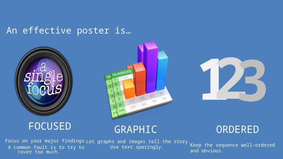
Focus on your major findings.A common fault is to try to cover too
much.
An effective poster is…
Let graphs and images tell the story.Use text sparingly. Keep the sequence well-ordered and
obvious.
FOCUSED
123GRAPHIC ORDERED

Start by designing your layout.Anyone viewing your poster should be able to easily understand the sequence of information.

Layout design.The example show here shows the sequence clearly, because it has been organised into a grid.
The following Sample on Slide 6 is can be used as a template if needed.

Sample Poster Title : font size 20 - 24Authors: font size 16-20
Affiliation: font size 16-20Introduction; font size 16 - 22
Materials and MethodsAdd text, pictures, tables or chartsfont size for tables or text 12-16Pictures resolution 300 dpi
For any section the font size is relative. If inserted text does not fill the current section, then font size must be increased.Also the layout, number of sections and titles could be modified as you desire.
Font size should be minimum 8 points.Use contrasting colors to enhance the readability of poster. Don't use similar colors. (A blue text over a dark blue background)
Export your document as pdf file if possible.
ResultsAdd text
Conclusions
ReferencesAdd text
logo
For example thispicture should have
900 x900 pixels
Add text

This is almost impossible to read.
Tips on design•Choose one font and stick to it. Using a range of different fonts will make your poster difficult to read.
•Choose an easy to read font.
•Use underlining and italics sparingly.
•Light colored text on a dark background will be easier to read on a monitor.
•Remember that those reading your poster could be standing back from it. Once you’ve built yours, stand back from the screen to see how it reads from a distance.
•Anything less than 18pt will be very hard to read from a few feet away.
This font color with background is harder to read than the adjacent example.
This font color and background is easier to read than the adjacent example.
This is almost impossible to miss.
This is 18pt. Use this size or larger.
This Font of 7pt is too small to be read from a distance.