Embed Size (px)
Citation preview

Risograph Printing
everything you need to know about
SAIC
SER
VIC
E BU
REAU
\\\\\\\\\\\\\\\\\\\\\\\\\\\\\\\

What’s Risograph printing?
Similar to screen printing, the Risograph uses single colors to print designs from a master stencil.
Riso sits between screen printing and offset lithography. Using a stencil-based printing process and soy based inks gives riso-prints a result similar to silkscreen with vibrant bright colors. Great for bold designs, posters, comic art, pretty much anything with a graphic quality to it.*
*If you’re looking for photographic quality reproduction, we recommend using our Inkjet or Laser printing services instead.
2-color Riso Prints take 48 hours
For a single sided print
Add 24 hours for each additional color and side
Turnaround times are dependant on drying time between printing each color and side. There are no Rush options for Risograph.
48hours

HOW IT WORKS
The file is sent from a computer to the machine. A master is created for each color by burning a negative image onto a waxed sheet.
This master is then wrapped around a drum and ink is forced through the voids of the master.
The paper runs flat through the machine while the drum rotates at high speed to transfer each image on the paper.
Our machine is an MZ-1090 and has two drums, which allows it to print two colors in a single pass.
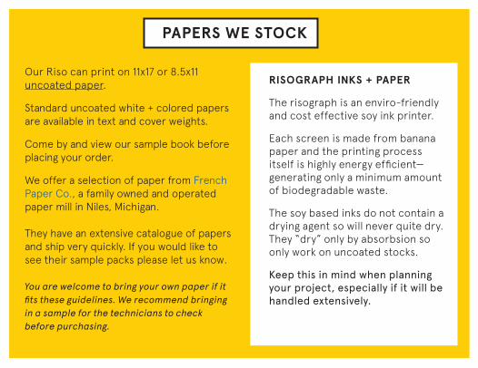
PAPERS WE STOCK
Our Riso can print on 11x17 or 8.5x11 uncoated paper.
Standard uncoated white + colored papers are available in text and cover weights.
Come by and view our sample book before placing your order.
We offer a selection of paper from French Paper Co., a family owned and operated paper mill in Niles, Michigan.
They have an extensive catalogue of papers and ship very quickly. If you would like to see their sample packs please let us know.
You are welcome to bring your own paper if it fits these guidelines. We recommend bringing in a sample for the technicians to check before purchasing.
RISOGRAPH INKS + PAPER
The risograph is an enviro-friendly and cost effective soy ink printer.
Each screen is made from banana paper and the printing process itself is highly energy efficient— generating only a minimum amount of biodegradable waste.
The soy based inks do not contain a drying agent so will never quite dry. They “dry” only by absorbsion so only work on uncoated stocks.
Keep this in mind when planning your project, especially if it will be handled extensively.

MAXIMUM PRINTABLE AREA
The Riso MZ1090 can print 2 colors in one pass on 11x17 and 8.5x11 size paper.
Letter - Printable Area: 7.75 x 10.25 Tabloid -Printable Area: 16.25 x 10.25
For full bleed designs, add a security bleed of at 3/8” around your artwork.
Tabloid 11 x 17in
279.40 x 431.8mm
3/8” / 9.525 mm
3/8” / 9.525 mm
3/8” / 9.525 mm
3/8”
/ 9
.525
mm
Printable Area 16.25in x 10.25in
412.75 x 260.35mm
To save paper and masters, and to keep cost down you can interlock your smaller projects onto 8.5x11 and 11x17 sheets.

PRINTING DOUBLE SIDED + INK PLACEMENT
It is very difficult to achieve a perfectly aligned two sided print. Keep this in mind in your design process when attempting to align front and back.
Slight track marks from paper feeding rollers can also appear, especially when printing more than two layers and areas with heavy inking.
These can easily be rubbed off with an eraser.
The risograph does print homogenous large color areas very well and they can also cause print marks and paper jams.
Place your designs on the bottom of the page if possible.
Do not use 100% density in this area.
Avoid heavy inking in the head of the paper.

The Risograph has limits of accuracy. The overlaps can be adjusted manually in the printing process but misregistration WILL happen. Keep this in mind when designing your work.
REGISTRATION + INACCURACY
Surfaces should overlap under lines.
Otherwise, white gaps may be visible on your artwork.
Line work printed over solid blocks of color will usually look best.
SERVICE BUREAUSERVICE BUREAUText should be only on one layer.

COLORS + OPACITY
We currently have 11 colors. We show you here an approximation of the RGB color and the Pantone reference information.
Risograph ink is translucent, so its final appearance depends on the color of the paper it is printed on and the layering of each ink.
Colors can be overprinted to create new ones. it is possible to blend any combination of tints together to produce color variants.
Black / PMS- Black U Hex #000000
Fluorescent Pink / PMS- 806 U Hex #FF48B0
Bright Red / PMS- 185 U Hex #F15060
Orange / PMS- 021 U Hex #FF6C2F
Yellow/ PMS- Yellow U Hex #FFE800
Lime Green / PMS- 380 U Hex #D4E356
Green / PMS- 354 U Hex #00A75C
Blue / PMS- 3005U Hex #0075BF
Purple / PMS- 275U Hex #5D5580
Metallic Gold / PMS- 872 U Hex #AC936E
White Hex #AC936E
We have an Adobe Swatch file of all the colors available for download on our Resources page.
http://sites.saic.edu/servicebureau/resources/

100% Purple
10% Purple10% Pink
100% Purple100% Pink
100% Pink10% Purple
10% Pink

Your print can start as a hand drawing that is scanned, a vector based illustration in Adobe Illustrator, or a photograph.
When building your file we recommend keeping each element on separate layers. This will help when exporting PDF’s later.
In our example file, we have a smily face that will print as black, and background color that will print as yellow.
FILE SET UP
black.pdf yellow.pdf
Use layers to design for each color!
When this file is submitted we will have 3 files: black.pdf, yellow.pdf and a composite.pdf.

Printedyellow.pdf/composite.pdf
It is possible to make your files using color, but remember simply converting them to grayscale may not work.
If you convert a yellow to grayscale, it ends up looking like a light gray. A small amount of yellow ink will be printed which may be hard to see because yellow ink is already very light.
If you want a bright yellow, those parts of your files should look BLACK when submitted.
Relationship between grays and ink opacity
Grayscale file PrintedColor file
This example shows the relationship between gray values and opacity.
The darker the gray or black, the more ink is printed.

FILE SET UP + EXPORT - PHOTOSHOP
You will need to convert your PS file to grayscale in order to save the yellow and black layers as grayscale pdf’s before exporting.
Mode>Grayscale
Go to File > Export > Layers to Files
Choose where you want these files to be saved. Choose a basic file name prefix.
Choose PDF, JPEG encoding and a Quality of 12 (highest)
Click Run. This will save each of your layers into their own PDF.
You can now name them for submission. ( black.pdf / yellow.pdf )

ILLUSTRATOR - FILE SET UP
In this example, we have a 3 color print. We will end up with 4 files:
One composite, or color image, and one for each separation.
Because risograph ink is slightly translucent, the inks do not always layer as intended.
Light ink colors, such as yellow and lime green, will not show up well when printed directly on top of dark inks such as purple and black.
While color mixing (the purposeful layering of colors to make new ones) works well sometimes you don’t want colors to mix. We will cover overprinting and knockout in the next section which will help you export your files correctly.
You can choose the Pantone colors that coordinate with the colors you would like printed in order to preview what your final print will look like.
These Pantone colors are listed on our website and listed in the COLORS & PAPERS section of this book!

Overprinting is when color is printed over another to create a color mix.
overprint R
G
B
knockoutR
G
B
OVERPRINTING + KNOCKOUT
A Knockout is the opposite of overprinting.
Instead of printing an element in one color on top of another color, the top element is knocked out of the base element so its true color shows.
A knockout removes a portion of the bottom image.
Be sure to have Overprint Preview ON.
To see the overprinting in Adobe Illustrator, select the object and use the Attributes window to select Overprint Fill / Overprint Stroke.

ILLUSTRATOR EXPORT
Choose Adobe PostScript File. This will produce a file we can easily convert to a PDF.File > Print
Change your PPD to Service Bureau Driver.
If you don’t this option, you need to download the drivers from:sites.saic.edu/servicebureau/resources
Under Mode choose “Separations (Host-Based)”
Make sure “Convert All Spot Col-ors to Process” is unchecked.
Click on the small printer icon [ ] to the right, to uncheck the process colors.
Your Pantone colors that correspond to your risograph inks should be the only inks with the icon.
Click Save to create a Postscript file.

COVERTING POSTSCRIPT TO PDF
You should now have a Postscript file of your design. ( It should have .ps at the end. )
To create PDF’s you will now take your PDF and open it in Acrobat Distiller. To do this you can Control Click on the file and choose from the flyout menu Open With> Acrobat Distiller.
Or you can open Acrobat Distiller and go to File >Open
Navigate to where your Postscript file is and click open.
Default Settings: High Quality Print
The file will be processed immediately. You will see a PDF appear with the same name on your computer.
Adobe Distiller will convert the .ps file to a grayscale PDF with all your separations.
It will also knockout all the areas that would normally overprint if you separated the file by yourself.
Acrobat Distiller is available on the Self- Service computers around campus. It is also available through the schools Creative Cloud application program.

blue.pdf red.pdf green.pdf
ILLUSTRATOR PDF
You should now have a 3 page PDF with 3 separations.
To separate these pages into 3 separate files open them in Adobe Acrobat, click on the Page Thumbnail icon and Extract pages function.
Notice how the area behind the blue circle is white on the red and green pages.
This will allow us to see the blue on top of white paper without color mixing.
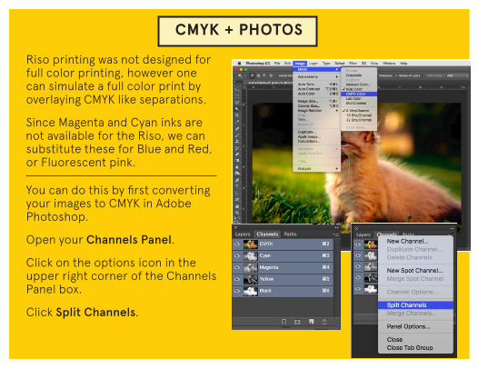
Riso printing was not designed for full color printing, however one can simulate a full color print by overlaying CMYK like separations.
Since Magenta and Cyan inks are not available for the Riso, we can substitute these for Blue and Red, or Fluorescent pink.
CMYK + PHOTOS
You can do this by first converting your images to CMYK in Adobe Photoshop.
Open your Channels Panel.
Click on the options icon in the upper right corner of the Channels Panel box.
Click Split Channels.

Photoshop will split your image into 4 separations automatically.
All you need to do is save the images as separate PDFs for submission.
You may want to adjust your files slightly depending on desired results and colors you have choosed to use in your final work.
cyan
yellow
black
magenta

DIGITAL FILES For each print you submit we require ONE FILE PER COLOR and a Composite.
A composite: a color PDF of what the end result is meant to look like.
(For example, for a 2 color print you would submit 3 files.)
FILE FORMAT We accept PDF. HALFTONES The risograph creates halftones. No need to add them in Photoshop.
RESOLUTION The Risograph machine has a resolution of 600 dpi. Use this resolution for your images. 300 dpi will also work but for thin lines we recommand 600.
FONT Vectorize your font to avoid any problem of pixellisation.Size should not go under 6 pt.
SUBMISSION GUIDELINES
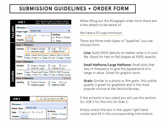
SUBMISSION GUIDELINES + ORDER FORM
When filling out the Risograph order form there are a few details to be aware of.
We have a 10 copy minimum
There are three main types of “qualities” you can choose form:
Line: Solid 100% density no matter what is in your file. Good for text or flat shapes at 100% opacity.
Small Halftone/Large Halftone: Small dots that vary in frequency to give the appearance of a range in value. Great for graphic work.
Grain: Similar to a photo or film grain, this subtle quality is great for gradients and is the most popular choice at the Service Bureau.
If the artwork is two sided you will use the section for JOB 2 for the info for Side 2.
Simply check the box in the upper right hand corner and fill in the corresponding information.
Grain
Grain
Grain


File Set-Up with Illustrator:www.youtube.com/watch?v=JdXvrGMdYcwwww.youtube.com/watch?v=zRONIVnjb0cwww.youtube.com/watch?v=v58h0bVCdVM
Using spot colors in Photoshop:www.youtube.com/watch?v=6eDI4e1i_Vo
Working with halftones:www.the-print-guide.blogspot.com/2009/05/halftone-screen-angles.html
The Risograph Revolution in Chicago and beyond:www.art.newcity.com/2014/06/19/eye-exam-chicagos-risograph-revolution/ www.desktopmag.com.au/features/the-rise-of-the-riso/#.WNJ4EhLyuqA
A few of our Riso friends:Clay Hickson - www.clayhickson.com Tan and Loose Press - www.clayhickson.comPerfectly Acceptable - www.perfectly-acceptable.com Issue Press -www.issue.press
Riso Wiki - wwwstencil.wiki
HELPFUL LINKS + TUTORIALS

Prices -
37 S Wabash room 1111
p: 312 629 9155
e: servicebureau @saic.edu
w: sites.artic.edu/servicebureau
1 Color 2 Colors 3 Colors 4 ColorsPlate Setup .50 1.00 1.50 2.00
Copies 81/2”x11” 11”x17” 81/2”x11” 11”x17” 81/2”x11” 11”x17” 81/2”x11” 11”x17”
Text Weight
10-20 .53 .70 .60 .80 .83 1.10 .94 1.25
21-100 .26 .35 .34 .45 .49 .65 .60 .80
100+ .23 .30 .30 .40 .41 .55 .53 .70
80# Cover
10-20 .64 .85 .71 .95 .94 1.25 1.05 1.40
21-100 .38 .50 .45 .60 .60 .80 .71 .95
100+ .34 .45 .41 .55 .53 .70 .64 .85
Over 80# Cover
10-20 .75 1.00 .83 1.10 1.05 1.40 1.16 1.55
21-100 .49 .65 .56 .75 .71 .95 .83 1.10
100+ .45 .60 .53 .70 .64 .85 .75 1.00
Customer Supplied
10-20 .38 .50 .45 .60 .68 .90 - 1.05
21-100 .11 .15 .19 .25 .34 .45 .45 .60
100+ .08 .10 .15 .20 .26 .35 .38 .50
*minimum 10 per order