Embed Size (px)
Citation preview

September
2012

• 125,000 Homes Sold In 2006. 60,000 Homes Sold in 2010. • SmartNumbers Predicts Normal Market Should Be 80,000 – 85,000 Sales.• Expect To See 75,000 Homes Sold In 2012. Moving Back To Normal.
0
20000
40000
60000
80000
100000
120000
140000
2000 2001 2002 2003 2004 2005 2006 2007 2008 2009 2010 2011 2012 2013
Metro Atlanta Homes Sold

•Average Sales Price Dropped Due To Higher Low End Mix And Lower Overall Home Values
$241$253 $261 $268
$209$189 $190
$176 $178
0
50
100
150
200
250
300
2004 2005 2006 2007 2008 2009 2010 2011 2012
Metro Atlanta Average Sale Price Trend

Listed Inventory Sept 2010 – Sept 2012Residential Detached - Metro Atlanta
• Inventory Levels Down 36.8% from Sept 2011, 51.9% from Sept 2010
0
5000
10000
15000
20000
25000
30000
35000
40000
45000
50000

Bank-Owned Sales Outpacing Incoming Foreclosures.New Foreclosures Lower Than Previous Periods.


•September 2012 – 44% of closings under $100,000. Market Moving Back To More Normal Distribution For Sales Under $100,000.
26,286
10,053
7,0564,621
3,214 2,342 1,710 1,910 954 530 275 348 368 16
2012 - Metro Atlanta Price Distribution

•Average Sales Price Trending Higher In 2012
$150 $153$169
$177$187
$199 $195 $188 $190
0
50
100
150
200
250
Jan Feb Mar Apr May Jun Jul Aug Sept
Metro Atlanta - Average Sale Price Trend

•Moving To A Seller’s Market In 2012
122128
124115
76 74
101 100 99
0
20
40
60
80
100
120
140
Jan Feb Mar Apr May Jun Jul Aug Sept
Metro Atlanta - Continuous Days On Market

•“$ Per Square Feet” Up 23%. Prices Stabilizing And Mix Of Properties Moving Back To Normal.
$64 $65$71 $73
$76$80 $78 $77 $79
0
10
20
30
40
50
60
70
80
90
Jan Feb Mar Apr May Jun Jul Aug Sept
Metro Atlanta - $ Per Square Feet

•“Original List To Sale Price” Up 4.5%. Prices Stabilizing And Mix Of Properties Moving Back To Normal.
88% 88%
89%
90%
91%
92% 92% 92% 92%
0.86
0.87
0.88
0.89
0.9
0.91
0.92
0.93
Jan Feb Mar Apr May Jun Jul Aug Sept
Metro Atlanta - Original List To Sale Price

Trendgraphix & RealValuator Report That PGR Is#1 In Homes Sold - 2009, 2010, 2011 & YTD 2012.

Information Provided By Trendgraphix.
5790
4166 4148 4041 3848
2706
1038
0
1000
2000
3000
4000
5000
6000
7000
PGR HNR MB KW-AP CB SS AFH
YTD Transactions – September 2012 FMLS Counties + Southside

Information Provided By Trendgraphix.
3058
2022 19551840 1779
1187
546
0
500
1000
1500
2000
2500
3000
3500
PGR HNR CB KW AP MB SS AFH
YTD Listing Sales – September 2012FMLS Counties + Southside

Information Provided By Trendgraphix.
Current Listing Inventory – September 2012FMLS Counties + Southside
2149
1690
1303 1239
1001
685 652
0
500
1000
1500
2000
2500
PGR HNR KW-AP CB CB SS AFH

Information Provided By Trendgraphix.
Buyer Sales – September 2012FMLS Counties + Southside
2732
23692201 2144
1893
1519
492
0
500
1000
1500
2000
2500
3000
PGR MB KW AP HNR CB SS AFH


We Now Compete In A Global Economy… What Happens In Other Places Matters!


What The Heck Is QE1 & QE2?
Quantitative Easing!Otherwise Know As Printing Money

Operation TWIST Renewed June 2012
Now We Have QE3 With $40 Billion PurchasesOf Mortgage-Backed Securities Each Month.

August 2012
U.S. Debt Ceiling $16.4 Trillion
$16,000,000,000,000+


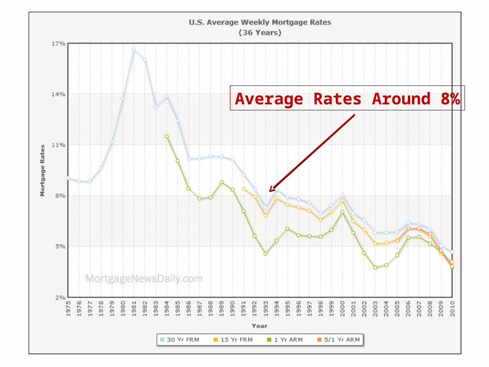
Average Rates Around 8%

4.9 4.9
4.7
4.9
4.4 4.44.3
3.8
4.24.0
3.9
5.0
3.63.5
3.7
4.0 4.0
4.4
4.2
3.83.9 3.83.9
3
3.5
4
4.5
5
5.5
2012 Freddie Mac & Mortgage Bankers Association 30-Year Fixed Rate Forecast – August 2012
2010 – 2013 Quarterly Averages
2010 2011 2012 2013
Freddie MacMBA

Housing Demand
2012 & Beyond
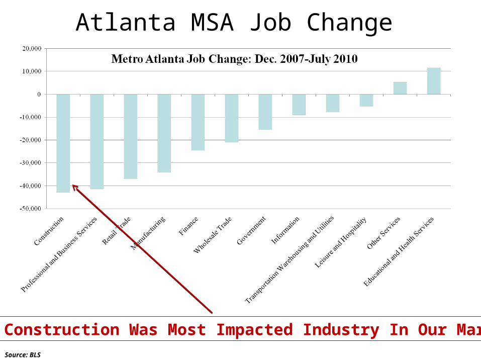
Atlanta MSA Job Change
Source: BLS
Construction Was Most Impacted Industry In Our Market

•Georgia Lost 325,000 Jobs In Last 3 Years. Construction and Banks Were The Largest Categories of Unemployment. •2012 Restarts Positive Job Growth Trend!
-300000
-250000
-200000
-150000
-100000
-50000
0
50000
2009 2010 2011 2012
Georgia Employment Trends(Terry College of Business – University of Georgia)

Long-Term Employment Forecast Growth: 20-County Area: Plan 2040

Businesses And People Are Moving To Metro
Atlanta!

Rustbelt To Sunbelt

Forecast Population Growth20-County Forecast Area

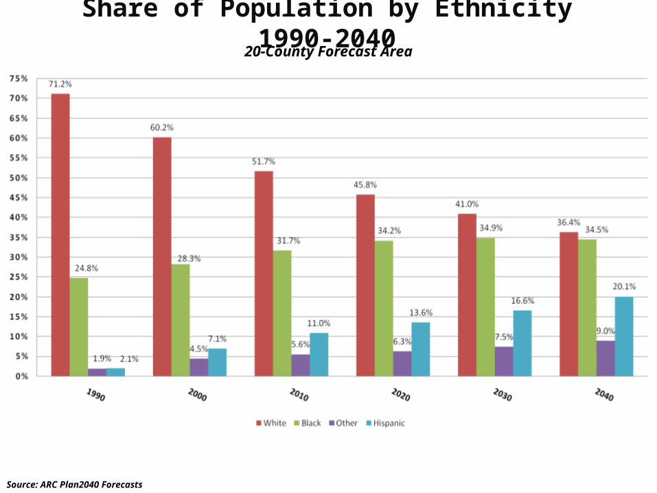
Share of Population by Ethnicity 1990-204020-County Forecast Area
Source: ARC Plan2040 Forecasts

Population Age Dynamics – Top 27 Metros
Source :Census Bureau
Total Population
Share of Population Rank of Share
Under 20 20-64 65+ 25-39 45-59 Under 20 20-64 65+ 25-39 45-59
Dallas 6,144,489 30.5% 61.3% 8.2% 23.8% 19.1% 3 9 25 1 24 Atlanta 5,271,550 29.6% 62.4% 8.1% 23.2% 20.4% 5 6 27 2 19 Phoenix 4,179,427 29.7% 59.0% 11.3% 23.1% 18.0% 4 24 15 3 26 Denver 2,466,591 27.8% 62.7% 9.5% 23.0% 21.6% 11 5 24 4 12 Riverside 4,081,371 32.0% 58.2% 9.8% 22.8% 17.0% 1 27 22 5 27 Houston 5,629,127 31.0% 60.9% 8.1% 22.8% 19.9% 2 10 26 6 21 Portland 2,174,631 26.7% 63.0% 10.4% 22.6% 22.0% 19 4 19 7 7 Seattle 3,309,347 25.6% 64.0% 10.4% 22.0% 22.5% 22 1 20 8 3 Sacramento 2,091,120 27.7% 60.8% 11.5% 21.9% 20.0% 12 13 14 9 20 Washington 5,306,125 27.2% 63.0% 9.7% 21.8% 21.6% 14 3 23 10 11 Los Angeles 12,875,587 29.1% 60.4% 10.6% 21.8% 19.4% 6 17 18 11 23 San Diego 2,974,859 28.2% 60.7% 11.1% 21.7% 19.0% 8 14 16 12 25 San Francisco 4,203,898 24.1% 63.5% 12.4% 21.5% 22.4% 26 2 10 13 4 Orlando 2,032,496 26.8% 60.4% 12.8% 21.3% 19.9% 18 15 8 14 22 Minneapolis 3,208,212 28.0% 62.1% 9.9% 21.3% 22.0% 10 7 21 15 6 Chicago 9,522,879 28.7% 60.4% 10.9% 21.2% 20.5% 7 16 17 16 18 New York 18,815,988 26.2% 60.9% 12.9% 20.6% 20.9% 21 12 6 17 15 Boston 4,482,857 25.3% 62.1% 12.6% 20.4% 21.7% 23 8 9 18 10 Cincinnati 2,134,864 28.0% 60.1% 11.9% 19.8% 21.3% 9 19 13 19 14 Baltimore 2,668,056 26.9% 60.9% 12.1% 19.7% 21.7% 17 11 11 20 9 Detroit 4,467,592 27.6% 60.3% 12.1% 19.2% 22.3% 13 18 12 21 5 Philadelphia 5,827,962 27.2% 59.8% 13.0% 18.9% 21.4% 16 21 5 22 13 St. Louis 2,802,282 27.2% 60.0% 12.8% 18.9% 21.8% 15 20 7 23 8 Miami 5,413,212 25.2% 58.6% 16.2% 18.8% 20.7% 24 26 3 24 17 Tampa 2,723,949 24.2% 58.6% 17.2% 18.7% 20.8% 25 25 1 25 16 Cleveland 2,096,471 26.4% 59.1% 14.6% 17.9% 22.8% 20 23 4 26 2
Pittsburgh 2,355,712 23.6% 59.4% 17.1% 17.1% 23.4% 27 22 2 27 1
Metro Atlanta Has The:
•#2 Population Age 25-39•#5 Population Under 20

•New Household Formation Dropped From 1.1 Mil (2006) To 300,000 (2008)•Future Household Formation Stronger – Then Levels Off. •4 Million Students Per Year Graduate From College For Next 10 Years. Signals Big Increase In Household Formation!
0
200,000
400,000
600,000
800,000
1,000,000
1,200,000
1,400,000
1,600,000
2006 2007 2008 2009 2010 2011 2015 2020 2025
U.S. Household Formation Trends


Chart Shows Index Results January 2010 Through July 2012. The July Index was reported on September 25th.
80
85
90
95
100
105
110
Case-Shiller Index For Metro Atlanta

0
20
40
60
80
100
120
140
Case-Shiller Home Values For Metro Atlanta
• Peak was July 2007. • Current Home Values Remain Below The Normal Trend Line
2007 2010 2011 2012 2013 2014 2015 2020
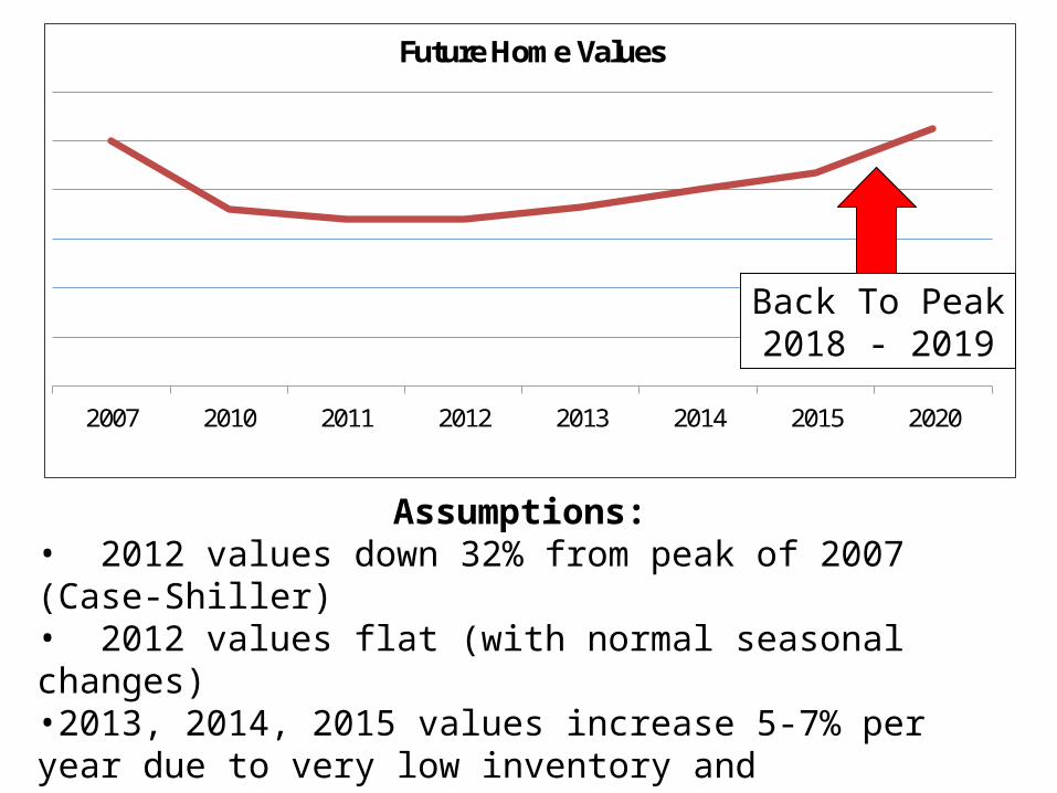
Future Home Values
Assumptions:• 2012 values down 32% from peak of 2007 (Case-Shiller)• 2012 values flat (with normal seasonal changes)•2013, 2014, 2015 values increase 5-7% per year due to very low inventory and foreclosures returning to more normal levels• 2016 and beyond back to normal +4% appreciation• New homes returns to 20,000+ starts by 2017/ 2018
Back To Peak2018 - 2019

Key Indicators To Watch:•The pace of mortgage delinquencies and pre-foreclosures (predict short sales & foreclosures) •The pace of short sales & foreclosures entering the market •The short sale & foreclosure “shadow inventory” waiting to enter the market •The overall supply of “for sale” properties•The mix of new homes, resales, short sales & foreclosures in the inventory and sold transactions•The price mix of sold transactions (when will we see a more normal mix versus the heavy concentration on the lower end of the market) •Rental trends versus buy trends•New home starts•Mortgage rates•Employment trends•Migration trends/ relocation

Assumptions:1.Bought $500,000 in 2007. Home has dropped 32% in value to $340,000. If you waited to sell for 5-7 years, you would recover value to $500,000.2.Desired new home costs $300,000 today but will also rise in value in future.3.Incremental carrying costs of current property are estimated to be $500 / month.4.Incremental maintenance items cost $2000 per year. 5.Mortgage rates are expected to rise to the 6-7% range in future. A $300,000 home with a 15-year mortgage at 4.5% with $60,000 down payment is $1835 per month. If you wait 5-7 years and the property now costs $396,000 and mortgage rates are now 6.5%, the payment would be $3114. That amounts to $1,279 more per month and $230,220 over the next 15 years.
Sell Now/ Buy Now
Wait 5-7 Years Variance
Current Home (1) $340,000 $500,000 + $160,000
New Home (2) $300,000 $396,000 - $96,000
Incremental Carrying Costs (3) $36,000 - $36,000
Incremental Maintenance Costs (4) $12,000 - $12,000
Higher Mortgage Costs (5) $163,440 - $230,220
Cost of Waiting $213,220