Embed Size (px)
DESCRIPTION
Brand book and style guide for my bass company Sector3.
Citation preview


STAY IN THE POCKET
by: michael armstrong

2012 Michael Armstrong
Design by Michael Armstrong
Created for KCAI, Graphic Design
Course: Design Systems
Professor: Michael Kidwell

9.
10.
13.
14.
19.
21.
22.
25.
27.
35.
37.
42.
45.
47.
48.
51.
52.
55.
56.
A Word from Jeff
Essence/Tagline
Mission
Values
Target Audience
Meditative
Level
Outward
Attributes
Building Sector3
Competition
Set Apart
Naming the Pocket
The Logo
Signature
Type
Image and Color
Brandmark
Touchpoints


SECTOR3


JEFF STUMACHER CEO/FOUNDERBig sound, and bigger personality. We at Sector3 know that even with the best equipment, we still haven’t done everything in our power to help you achieve your ideal bass playing experience. We all know what it feels like to get into the groove, and we strive to create the perfect enviroment to help you get into the pocket.
9

STAY IN THE POCKET
BRAND ESSENCE
This is our motto here at Sector3. Whether you’re just starting or you’re a seasoned pro, the pocket is something that every bass player strives for.

11

MISSION

To reconcile the tradition of, in the pocket rhythm, with personality and needs of the individual, we will provide our musicians with superior look and sound that matches their pocket personality.
OUR INTENT
13

We at Sector3 understand that not everyone’s personal pocket is the same, and that it is just as important that we focus on how each individual achieves this.
EVERYONE IS DIFFERENT
BRAND VALUES

15


LET’S PUT DOWN THE GEARAND LOOK AT THE PLAYERS.
17

TARGET AUDIENCE

OUR TARGET DEMOGRAPHIC YOUHaving built our brand on the foundation of knowing how the individual bass player finds his/her pocket, we feel comfortable in knowing that Sector3 is a company for all bass players. When it comes to the pocket, we transcend age, genre, and style.
19


MEDITATIVE.Meditative players experience the pocket much more internally than other players. When they get into the groove, they are in a whole other world.
INTRO1010-CAB
21
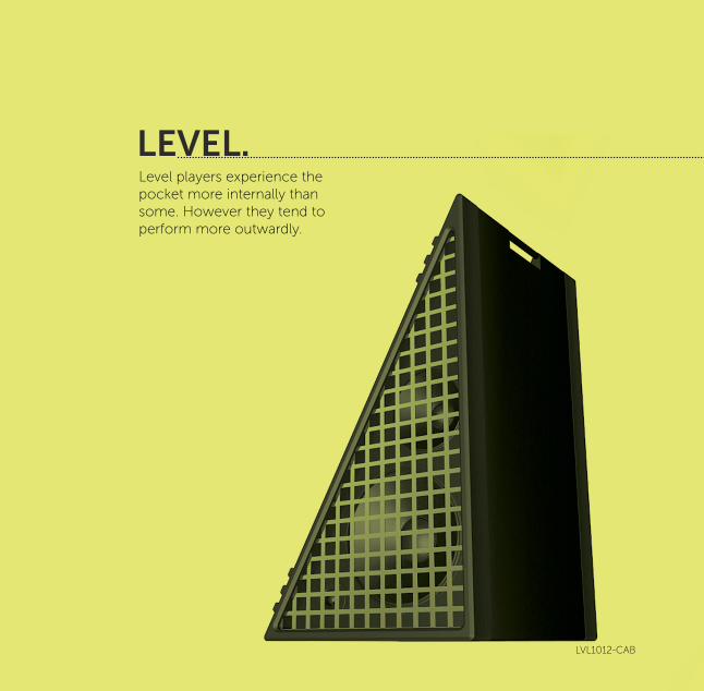
LEVEL.Level players experience the pocket more internally than some. However they tend to perform more outwardly.
LVL1012-CAB

LVL1012-CAB
23


EXTRO1015-CAB
OUTWARD.Outward players typically experience and express the pocket openly and loud.
25

SO WHAT MAKES US SECTOR3?

27

ATTRIBUTES

PERSONALWe want to always keep in the forefront, that all bass players find their pocket in different ways. This should be apparent in our branding and every Sector3 experience.
29

CLASSICHistorically the bass player has been the backbone of every band. We’re going to start acting like it, with pocket rhythm and attitude.

31


SOLIDLow, big, heavy, and punchy. The sound that the bass is known for is embodied within everything we do and every mark we make.
33


BUILDING A BASS PLAYER’S
BASS COMPANY
35


COMPETITIONBefore we take a look at where the Sector3 brand is going, let’s take a look at a couple of key competetors and what they could be doing better. 37


AMPEGAmpeg has had a long and fruitfull history. Their classic look and what could now be considered vintage style has taken them very far, but one crtitique of their design might be that the vintage style only caters to a niche market, and their identity could seem too fragile or shrill for some players to identify with.
39

GENZ BENZGenz Benz is on the other end of the spectrum from Ampeg. They have done well with their sturdy, solid, utilitarian design. They have done so in a way that they could market to anyone. In doing this however, they have lost the opportunity to dissect and deliver on the knowledge of who their product resonates with.

41

SETTING OURSELVES APARTAt Sector3, the personal side of our brand is the most important aspect,. Being able to recognize the needs of the individual and make the experience of playing in the pocket more easily accesible is what set’s us apart from being just a cold, utilitarian company.

43

NAMING THE POCKET

SECTOR3Sector3 the name, is derived from the brand’s three design attributes and values. The Sector represents the “in the pocket” groove that so aptly personifies bass players as individuals and musicians.
One of several definitions for Sector is: “an area or portion that is distinct from others.” This makes the perfect case for the personalization of the brand to the player.
45


THE LOGOThe logo type is very solid and evenly weighted. This resonates as a visual representation of the sound and feel of the bass guitar. Seeing this gives the brand a sense of legitamacy and trustworthiness.
The logo can be either black or white, as with most of the brand’s elements, depending on what contrast is needed.
47

SIGNATUREThe logo as a signature is put into a container, giving it added weight and emphasis. The area around the signature should be free of any other elements by as much as the x-height of the logo type on each side. The exeption being the bottom, when the tagline is present the space at the base of the signature triples.

STAY IN THE POCKET
49


TYPEMuseo Sans 700 is utilized for any primary type, while Museo Sans 100 is used for body copy. The use of this typeface makes for a clean, stable, and unobtrusive addition to the photo and color handling which is the primary focus in most cases.
Being that a majority of the brand focus is dedicated to showcasing the style and identity of bass players, the copy should be supportive of the imagery. The type will never appear in color for this purpose.
51

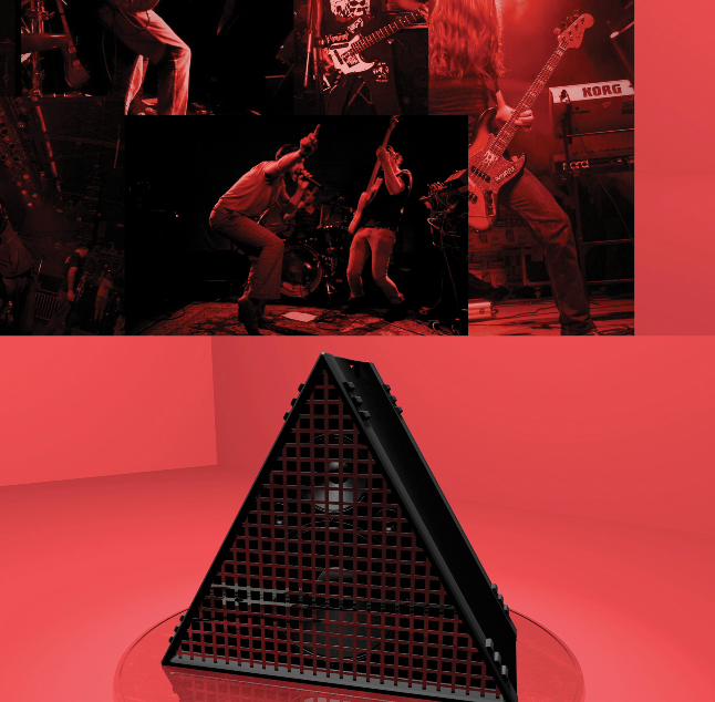
IMAGE AND COLOREach image must be converted to grey scale and then multiplied over by one of four different filters. The blue represents the meditative players. The green represents the level players, and the red represents the Outward players. On any other occasion the filter will be grey.
When a box is placed over an image, whatever is inside that box is a key moment or expression that acts as a clue into the mind of that bass player. The stroke of the box can be made thicker or thinner depending on the type of player. The box can be either white of black, but not in color.

53


BRANDMARKThe Sector3 mark compliments the brand as an extention of both the logo and of the box element used to call attention to key moments in imagery. Alone, it is even more solid looking than the logo type itself. Again, the mark can be used in either black or white, but not in color.
55

TOUCHPOINTSThe following is a set of brand touchpoints for Sector3, meant to be viewed and utilized by customers before and after purchase.

57

BUSINESS CARDSThese cards are to be distributed at music stores where bass equipment is sold. They are cut to match the brand elements, and to be more intriguing when displayed on store counters. Each card has a coloration to match their respective musician.

59

ENVELPOEEach envelope can contain a number of items, such as a CD, a letter, or an invoice.

61

INVOICEThe invoice will be sent in the color matching the customer’s bass style.

63

STATIONERY AND LETTERLetters will be sent after a purchase has been completed. They will also be tailored to be customer appropriate.

65


67


PROMOTIONAL SHIRTSTo be worn by band members, roadies, groupies, fans, and Sector3 representatives.
69


ROAD CASESWhen roadies load out equipment in these Sector3 sponsored road cases, it’ll be sure to cause some chatter amongst techs and band members alike.
71


GROUND DELIVERYIf you request it, Sector3 will deliver your order to your home in a branded Scion xB. Advertising and delivery in one.
73


BILLBOARD CAMPAIGNBass player? Not a bass player? What’s meditative about playing the bass guitar? Well, we’re glad you asked.
75


WEB AND MOBILEEach platform will allow you to access and see your personal sector profile. The mobile app gives you the advantage of having a on-the-go tuner.
77

VIDEO TOUCHPOINTA promotional video for Sector3 which showcases both the product and the attention to the individual’s bass pocket playing styles.

79