Embed Size (px)
Citation preview

1
“Screen” Design and Visualization
Graphical Design
Good GUI design must account for:
• comprehensible mental images– eg: good use of metaphors
• appropriate organization of data, functions, tasks and roles– eg: support a reasonable cognitive model
• quality appearance characteristics– sometimes called the “look” of a UI
• effective interaction sequencing– sometimes called the “feel” of a UI
These ideas are not new… – “Principle of Effective Visual Communication for GUI design”
Marcus article in “Human-computer interaction: toward the year 2000” by Baecker, Grudin, Buxton and Greenberg
– “Designing Visual Interfaces” (1994) - Mullet & Sano, Prentice Hall
Evan Golub / Ben Bederson / Saul Greenberg

2
Components of Visible LanguageLayout
• formats, proportions, and grids
Typography
• typefaces and typesetting
Imagery
• signs, icons, symbols; concrete to abstract
Sequencing
• how the interface unfolds
Visual identity
• unique appearance
Animation
• dynamics of display
Color and Texture
• convey complex information and pictorial reality
scarves: 10.75
hats: 5.43
bold serif fixed
italic sans-serif variable
Evan Golub / Ben Bederson / Saul Greenberg
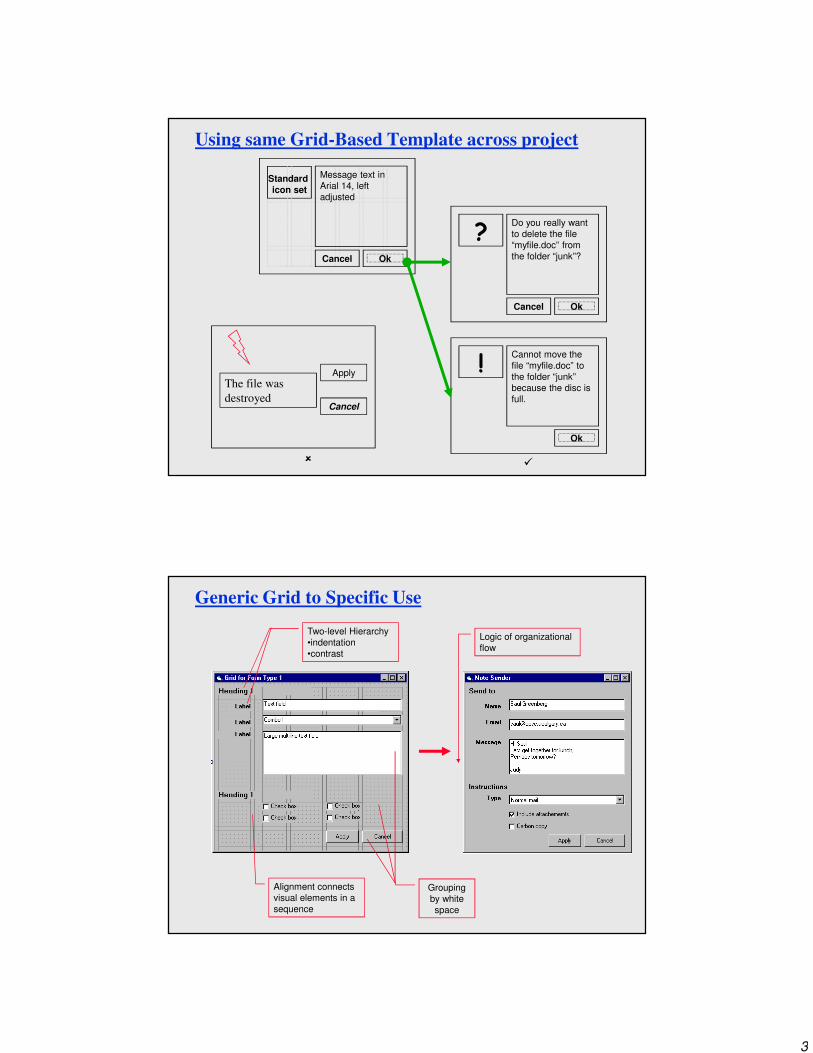
Use of Grids
Horizontal and vertical lines to locate window components
• aligns related components
Organization
• contrast to bring out dominant elements
• grouping of elements by proximity
• show organizational structure
• alignment
Consistency
• location
• format
• repetition
• organizationWindow to
widget
spacing
Widget to
widget
spacing
Cancel Ok
Message text in
Arial 14, left
adjusted
Standard
icon set
Fixed
components
Format of
variable
contents
Evan Golub / Ben Bederson / Saul Greenberg
3
Using same Grid-Based Template across project
Cancel Ok
Message text in
Arial 14, left
adjusted
Standard
icon set
�
Apply
Cancel
The file was
destroyed
Cancel Ok
Do you really want
to delete the file
“myfile.doc” from
the folder “junk”?
?
�
Ok
Cannot move the
file “myfile.doc” to
the folder “junk”
because the disc is
full.
!
Generic Grid to Specific Use
Two-level Hierarchy
•indentation
•contrast
Grouping
by white
space
Alignment connects
visual elements in a
sequence
Logic of organizational
flow
4
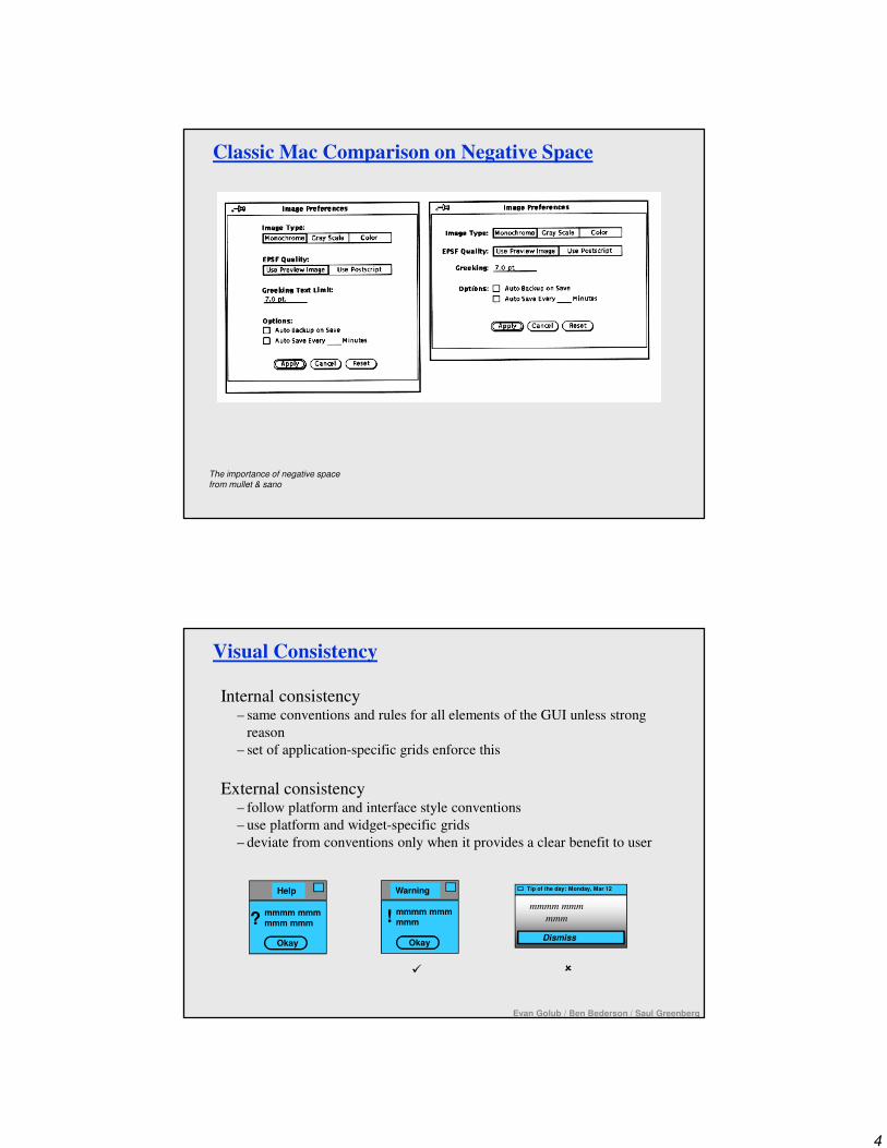
The importance of negative space
from mullet & sano
Classic Mac Comparison on Negative Space
Visual Consistency
Internal consistency– same conventions and rules for all elements of the GUI unless strong
reason
– set of application-specific grids enforce this
External consistency– follow platform and interface style conventions
– use platform and widget-specific grids
– deviate from conventions only when it provides a clear benefit to user
Help
mmmm mmmmmm mmm
Okay
?
Warning
mmmm mmmmmm
Okay
!
�
Tip of the day: Monday, Mar 12
mmmm mmm
mmm
Dismiss
�
Evan Golub / Ben Bederson / Saul Greenberg

5
Relationships between screen elements (Grouping)
Link related elements, disassociate unrelated elements
• proxemic clusters
• white (negative) space
• alignment
• explicit structure
Mmmm:
Mmmm:
Mmmm:
Mmmm:
Mmmm:
☺☺☺☺
Mmmm:
Mmmm:
Mmmm:
Mmmm:
Mmmm:
����
Mmmm:
Mmmm:
Mmmm:
Mmmm:
Mmmm:
Evan Golub / Ben Bederson / Saul Greenberg
����
Using explicit structure as a crutch
from Mullet & Sano
Explicit Structure via Lines can get cluttered
6
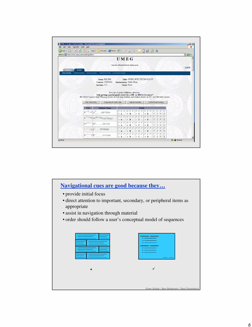
Navigational cues are good because they…
• provide initial focus
• direct attention to important, secondary, or peripheral items as
appropriate
• assist in navigation through material
• order should follow a user’s conceptual model of sequences
��
Evan Golub / Ben Bederson / Saul Greenberg

7
Evan Golub / Ben Bederson / Saul Greenberg
Economy of visual elements
• General philosophy sometimes expressed as “Make simple
things simple, and hard things hard.”
• Try to minimize number of controls
• Include only those controls that are necessary– eliminate, or relegate others to secondary windows
• Minimize clutter/overload (don’t fear multiple windows)– so information is not hidden/obscured
NNNN
MMMM
xxx: ____
xxx: ____
xxx: ____
xxx: ____
xxx: ____
xxx: ____
xxx: ____
xxx: ____
xxx: ____
xxx: ____
xxx: ____
xxx: ____
xxx: ____
xxx: ____
xxx: ____
MMMM
NNNN �
�
Tabs to help Visual Economy
Excellent means for factoring/grouping related items.
However, can be overdone or not taken far enough, so think it out!
Evan Golub / Ben Bederson / Saul Greenberg
8
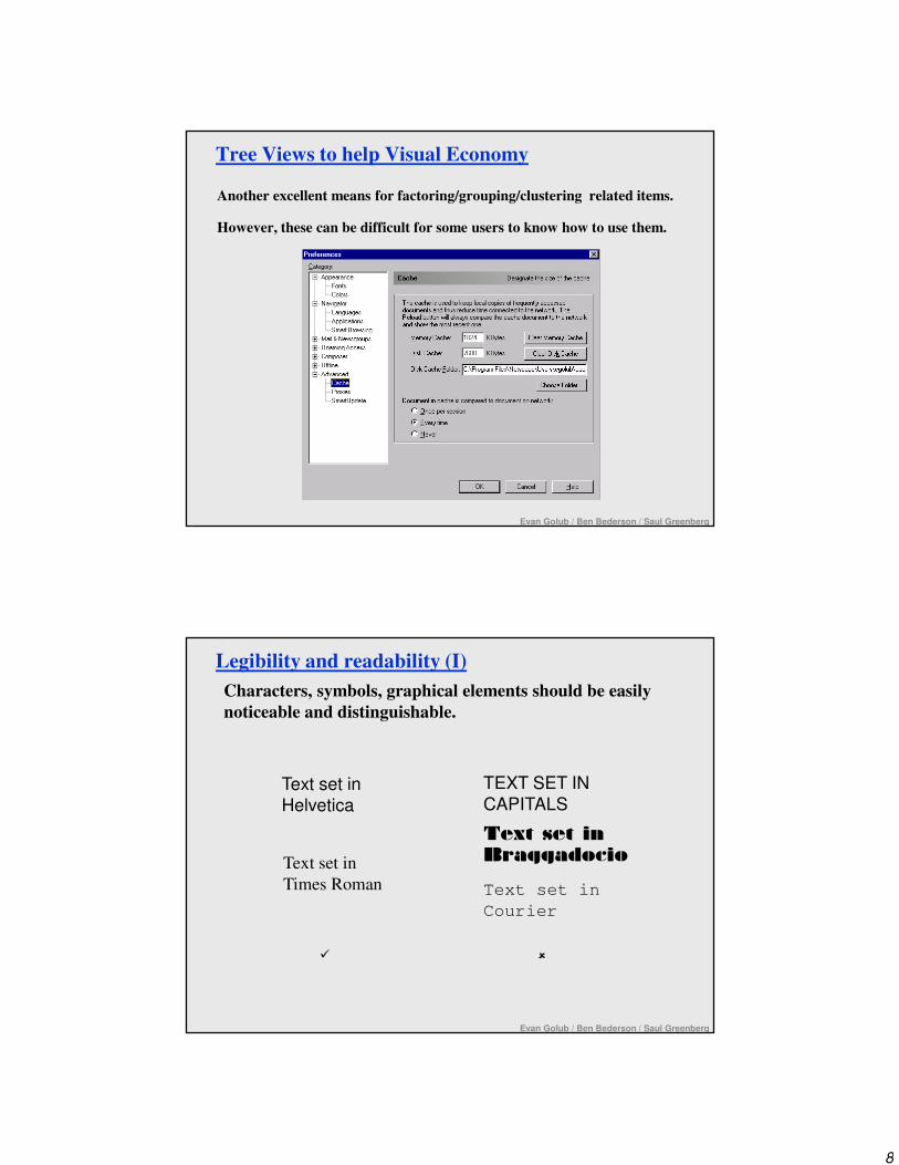
Tree Views to help Visual Economy
Another excellent means for factoring/grouping/clustering related items.
However, these can be difficult for some users to know how to use them.
Evan Golub / Ben Bederson / Saul Greenberg
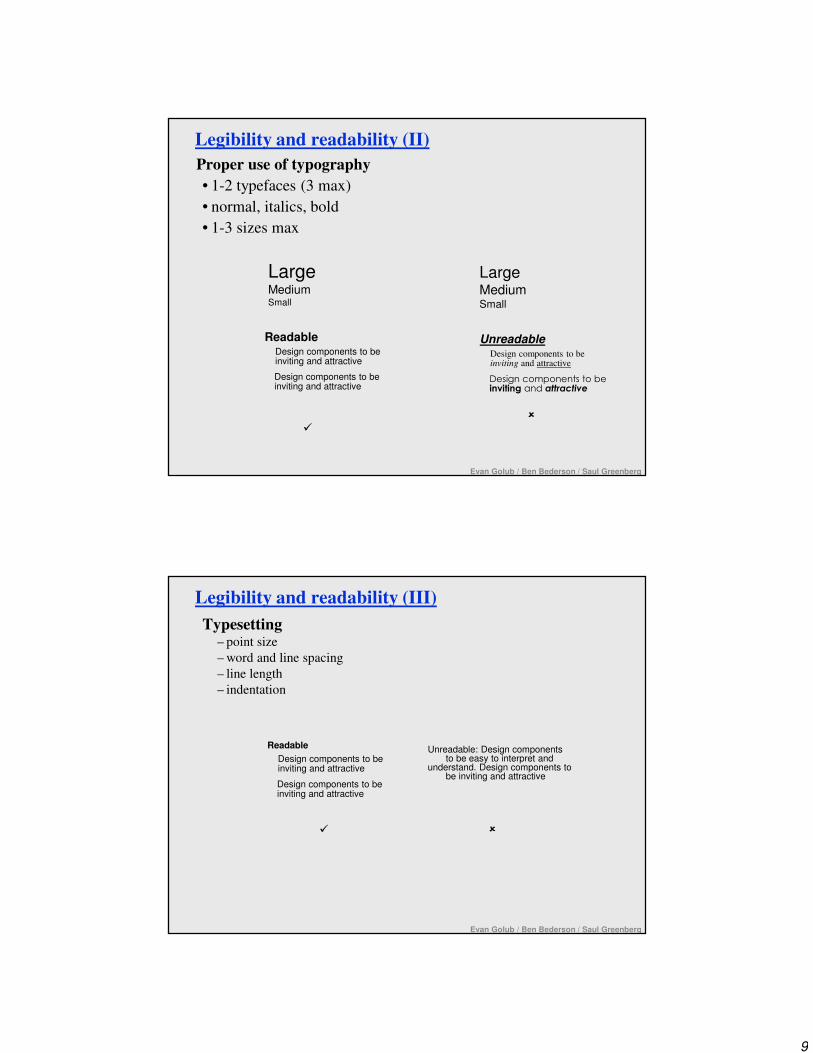
Legibility and readability (I)
Characters, symbols, graphical elements should be easily
noticeable and distinguishable.
Text set in
Braggadocio
Text set in
Helvetica
Text set in
Courier
TEXT SET IN
CAPITALS
� �
Text set in
Times Roman
Evan Golub / Ben Bederson / Saul Greenberg
9
Legibility and readability (II)
Proper use of typography
• 1-2 typefaces (3 max)
• normal, italics, bold
• 1-3 sizes max
LargeMediumSmall
LargeMediumSmall
�
�
Readable
Design components to be inviting and attractive
Design components to be inviting and attractive
Unreadable
Design components to be inviting and attractive
Design components to be inviting and attractive
Evan Golub / Ben Bederson / Saul Greenberg
Legibility and readability (III)
Typesetting– point size
– word and line spacing
– line length
– indentation
Readable
Design components to be inviting and attractive
Design components to be inviting and attractive
� �
Unreadable: Design componentsto be easy to interpret and
understand. Design components tobe inviting and attractive
Evan Golub / Ben Bederson / Saul Greenberg
10
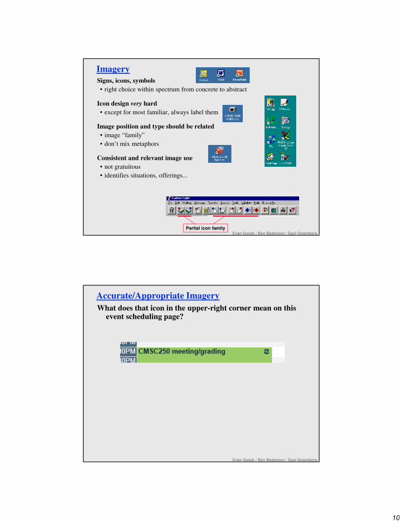
Imagery
Signs, icons, symbols
• right choice within spectrum from concrete to abstract
Icon design very hard
• except for most familiar, always label them
Image position and type should be related
• image “family”
• don’t mix metaphors
Consistent and relevant image use
• not gratuitous
• identifies situations, offerings...
Partial icon familyEvan Golub / Ben Bederson / Saul Greenberg
Accurate/Appropriate Imagery
What does that icon in the upper-right corner mean on this event scheduling page?
Evan Golub / Ben Bederson / Saul Greenberg

11
Visual Identity
Think about the GUI of systems such as the various “generations” of Windows (eg: 3.1/95/XP/7), MacOS (eg: 6/7/8/9/X), NeXT, BeOS, etc. and how easily you could spot them in a visual line-up.
Evan Golub / Ben Bederson / Saul Greenberg
Animation
Animation can take many forms. Some examples are fading transitions such
as the Start Menu animation as sub-menus open, directional effects such as
minimizing in OS X using the genie effect, fisheye effects such as the
magnification option on the MacOS X docking bar, zooming such as in
CounterPoint or KidPad, and “traditional” animation such as Microsoft’s
Clippy (to name a few).
There can be both good and bad consequences. Here are some examples:
• Pro: Could provide more visual cues about a transition
• Pro: Could give sense of locality and/or relationships within data or
documents
• Con: Could make the process slower overall
• Con: Could become “annoying” to the user
Evan Golub / Ben Bederson / Saul Greenberg
12
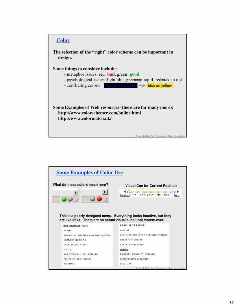
Color
The selection of the “right” color scheme can be important in
design.
Some things to consider include:
- metaphor issues: red=bad, green=good
- psychological issues: light blue-green=tranquil, red=take a risk
- conflicting colors: -vs-
Some Examples of Web resources (there are far many more):
http://www.colorschemer.com/online.html
http://www.colormatch.dk/
dark blue on black blue on yellow
Evan Golub / Ben Bederson / Saul Greenberg
Some Examples of Color Use
Visual Cue for Current Position
This is a poorly designed menu. Everything looks inactive, but they are live links. There are no actual visual cues until mouse-over.
What do these colors mean here?
Evan Golub / Ben Bederson / Saul Greenberg
13
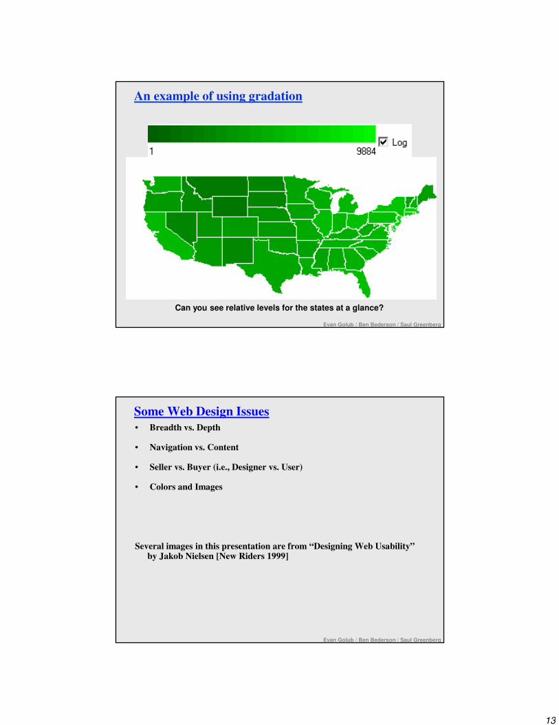
An example of using gradation
Can you see relative levels for the states at a glance?
Evan Golub / Ben Bederson / Saul Greenberg
Evan Golub / Ben Bederson / Saul Greenberg
Some Web Design Issues
• Breadth vs. Depth
• Navigation vs. Content
• Seller vs. Buyer (i.e., Designer vs. User)
• Colors and Images
Several images in this presentation are from “Designing Web Usability” by Jakob Nielsen [New Riders 1999]

14
Evan Golub / Ben Bederson / Saul Greenberg
Breadth vs. Depth
Numerous studies starting in the 1980s showed that when designing menu structures, you should aim for breadth over depth, but not too broad.
Miller’s famous 7±2 study shows that people’s short term memory consistently was limited to about 7 things. The good news is that he also observed that people could “chunk” things, and thus remember more.
Miller, G. A. (1956). The magical number seven plus or minus two: Some limits on our capacity for processing information. Psychology Review.
Sure enough, optimal menu design typically has about 7 chunks of related items.
It is typically different when navigating on the web!
Evan Golub / Ben Bederson / Saul Greenberg
Breadth vs. Depth on the Web (I)
It is possible to create a page that follows the 7±2 model:
http://www.cs.umd.edu/~egolub/real.index.html
Although this is not commonly done because there is not enough information being presented, you can still see the idea in places.
The CS dept main page and Undergraduate page each still make use of this idea in their navigation design.
Google’s “black bar” sticks close to this as well.
Maryland’s old student information web site was close in that it had 7±2 chunks of information, each of which being divided into 7±2 chunks of information. Google’s news.google.com and a number of other news sites take this approach.
In practice, many sites and pages have gone to far broader designs to make it easier to be found by searches and also to support on-page search by users.

15
Evan Golub / Ben Bederson / Saul Greenberg
Breadth vs. Depth on the Web (II)
If you look at desktop software, you’ll also see the 7±2 model appear in things like menu design.
So, what is different on the web?
• Data -vs- Operation/Navigation Links
• Slow download (ie: exploration) times that installed software doesn’t have– this is a minor issue if you have broadband and “lightweight” pages
– this is a more major issue if you have “heavy” pages
– this is often a major issue on mobile devices working on EDGE/3G or even on
4G networks depending on a variety of factors
• A sense of more flexibility in layout
• Search tools for information within a page (if people know about them)
• The web has seen the growth of the concept of a “portal” in many ways
Evan Golub / Ben Bederson / Saul Greenberg
Breadth vs. Depth on the Web (III)
The following study attempted to examine this question carefully:Web Page Design: Implications of Memory, Structure and Scent for
Information Retrieval Web Page Design / Kevin Larson / Mary Czerwinski,
CHI 98, p.25-32.www.acm.org/pubs/articles/proceedings/chi/274644/p25-larson/p25-larson.pdf
They compared 512 items from Encarta encyclopedia in structures of size:
8x8x8 16x32 32x16
Note: They did not have the “slow link” factor so this experiment might not apply to the “mobile web” in general right now.
• Short term memory is only one factor.
• Limiting depth is more important than
increasing breadth.
• Chunking of information is a likely
important factor.

16
Evan Golub / Ben Bederson / Saul Greenberg
Navigation -vs- Content -vs- Advertising
Nobody “wants” to navigate.
Navigation is a necessary evil.
Screen space taken up with explicit navigation typically takes away from actual content.
This early Mapquest example from the late 1990s shows how extreme the imbalance can be…
Let’s see how the 2005 Diamondback site or modern Facebook look…
Evan Golub / Ben Bederson / Saul Greenberg
23.5%
BLANK

17
Evan Golub / Ben Bederson / Saul Greenberg
BLANK!
BLANK!
Evan Golub / Ben Bederson / Saul Greenberg
Seller vs. Buyer (Designer vs. User)
We’re talking about user’s needs, but designers don’t always have the user’s best interests in mind.
More true for web sites than other software where something is typically being sold (a product, a university, a brand, advertising, etc.)
Banner ads are the prototypical example. Users hate them, marketers require them. Designers often are on the user’s side.
The best thing you can do is probably to be aware of these tradeoffs, and be able to make informed decisions.
However, consider the following question – how is Instagram with no profits and no profit model worth A BILLION DOLLARS to Facebook? Is the whole value in the users there?
18
Evan Golub / Ben Bederson / Saul Greenberg
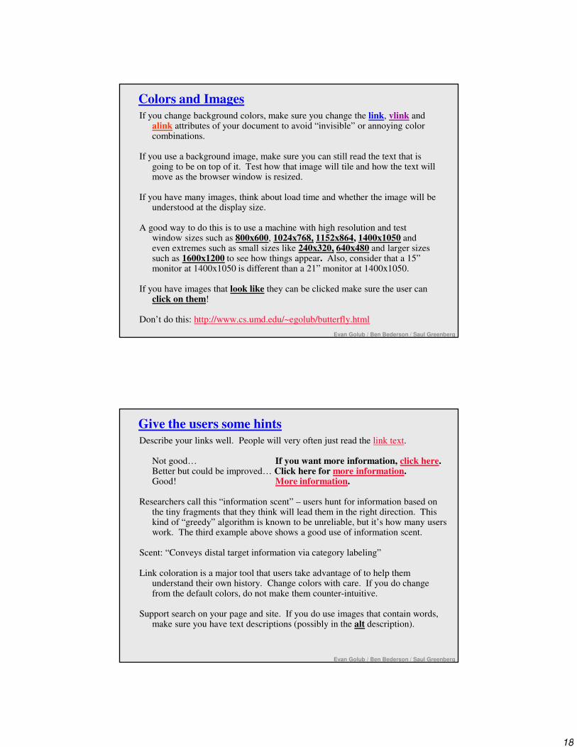
Colors and Images
If you change background colors, make sure you change the link, vlink and alink attributes of your document to avoid “invisible” or annoying color combinations.
If you use a background image, make sure you can still read the text that is going to be on top of it. Test how that image will tile and how the text will move as the browser window is resized.
If you have many images, think about load time and whether the image will be understood at the display size.
A good way to do this is to use a machine with high resolution and test window sizes such as 800x600, 1024x768, 1152x864, 1400x1050 and even extremes such as small sizes like 240x320, 640x480 and larger sizes such as 1600x1200 to see how things appear. Also, consider that a 15” monitor at 1400x1050 is different than a 21” monitor at 1400x1050.
If you have images that look like they can be clicked make sure the user can click on them!
Don’t do this: http://www.cs.umd.edu/~egolub/butterfly.html
Evan Golub / Ben Bederson / Saul Greenberg
Give the users some hints
Describe your links well. People will very often just read the link text.
Not good… If you want more information, click here.Better but could be improved… Click here for more information.Good! More information.
Researchers call this “information scent” – users hunt for information based on the tiny fragments that they think will lead them in the right direction. This kind of “greedy” algorithm is known to be unreliable, but it’s how many users work. The third example above shows a good use of information scent.
Scent: “Conveys distal target information via category labeling”
Link coloration is a major tool that users take advantage of to help them understand their own history. Change colors with care. If you do change from the default colors, do not make them counter-intuitive.
Support search on your page and site. If you do use images that contain words, make sure you have text descriptions (possibly in the alt description).

19
Evan Golub / Ben Bederson / Saul Greenberg
Study Where People Look
http://www.eyetools.com/inpage/research_google_eyetracking_heatmap.htm
Evan Golub / Ben Bederson / Saul Greenberg
Technical Issues
• Download time
• Browser compatibility
• Screen size and resolution
• Separation of meaning from presentation

20
Evan Golub / Ben Bederson / Saul Greenberg
Download Time
People have different resources at home versus at work versus when mobile.
Access rates are a moving target. As recently as 2007 you still had 20% of users who had Internet in the US still having “narrowband” access at home and around 10% of users had that at work.
Broadband has risen a great deal, but individual bandwidth might be throttled or congested. This is a major issue in the wireless world.
Keep these in mind as you place images, videos, applets, etc. on your Web page since the more you place there the longer it will take to load!
One study from 2011 said that the size of videos on web pages (on average) had tripled since 2003!
Evan Golub / Ben Bederson / Saul Greenberg
Browsers and Versions
People historically had tended to upgrade browsers slower with each successive version, and it would often take an operating system upgrade to get a browser upgrade.
However, the current trend of supporting (or even forcing) automatic upgrades and of sites seriously restricting users of old browsers has changed that trend.
21
Evan Golub / Ben Bederson / Saul Greenberg
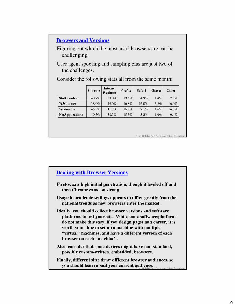
Browsers and Versions
Figuring out which the most-used browsers are can be
challenging.
User agent spoofing and sampling bias are just two of
the challenges.
Consider the following stats all from the same month:
ChromeInternet
ExplorerFirefox Safari Opera Other
StatCounter 48.7% 23.0% 19.6% 4.9% 1.4% 2.3%
W3Counter 38.0% 19.0% 16.8% 16.0% 3.2% 6.0%
Wikimedia 45.9% 11.7% 16.9% 7.1% 1.6% 16.8%
NetApplications 19.3% 58.3% 15.5% 5.2% 1.0% 0.4%
Evan Golub / Ben Bederson / Saul Greenberg
Dealing with Browser Versions
Firefox saw high initial penetration, though it leveled off and
then Chrome came on strong.
Usage in academic settings appears to differ greatly from the
national trends as new browsers enter the market.
Ideally, you should collect browser versions and software
platforms to test your site. While some software/platforms
do not make this easy, if you design pages as a career, it is
worth your time to set up a machine with multiple
“virtual” machines, and have a different version of each
browser on each “machine”.
Also, consider that some devices might have non-standard,
possibly custom-written, embedded, browsers.
Finally, different sites draw different browser audiences, so
you should learn about your current audience.

22
Evan Golub / Ben Bederson / Saul Greenberg
Some historic distribution of monitor resolutions:
netmechanic.com:Screen Resolution 1997 1999 2001≤ 640x480 22% 13% 5%800x600 47% 55% 53%≥ 1024x768 31% 27% 41%
statmarket.com:Screen Resolution 2000 2003≤ 800x600 66% 42%≥ 1024x768 34% 58%
By 2012 things were at a point where 85% of screens of those visiting W3Schools were larger than 1024x768 but as smartphone penetration has soared even if the resolution is higher, the screen size itself might be rather small.
Google has an interesting tool http://analytics.blogspot.com/2012/06/new-feature-conduct-browser-size.html
We also need to consider widescreen monitors that do not have 4:3 aspect ratios as well as (again) smartphones and tablets that typically have smaller screen sizes.
We might also consider who might be the “typical visitor” for a site and attempt to determine their stereotypical screen resolution. We should also consider whether or not users are using their full screen resolution for the browser.
Screen Resolution
Evan Golub / Ben Bederson / Saul Greenberg
W3Schools Stats History
http://www.w3schools.com/browsers/browsers_display.asp

23
Evan Golub / Ben Bederson / Saul Greenberg
Content Formats (I)
• HTML
– Basically the web markup language (currently at HTML 5). Go to
www.w3c.org for current “official” specifications, but realize that
browsers don’t always follow them…– As a designer, you can choose between general font specifications (H1) or
possibly specific ones (Arial 16 point bold). Use general as much as possible.
· Fonts might not be available.
· Text browsers and reader programs and search engines use structural
information.
· Allows for users to be able to control their experience more.
• CSS– Offers possibility of centralized design styles and potential savings in bandwidth.
– Very tied into the HTML5 world.
– Different styles for different readers possible (eg: “Standard” PC versus
smartphone versus tablet, etc.).
Evan Golub / Ben Bederson / Saul Greenberg
Content Formats (II)
• Flash Player– Has become far more common but the lack of it on the iOS platform has shaken
this up quite a bit, with discussion of HTML5 features as a possible replacement.
– Seems to want to update every week or two.
– Flash applications themselves have gotten quite large and processor-intense.
• Javascript, ActiveX– Widely supported, but some users still turn it off for security reasons.
– Multiple versions (eg: Jscript -vs- Javascript -vs- ECMAscript)
• Java– Newer versions are large downloads and keep getting larger…
– Even when installed, there is a startup time for using it.
– Users might turn it off for security or speed issues.
• The other THOUSANDS of plug-ins ☺– Specialized users only

24
Evan Golub / Ben Bederson / Saul Greenberg
Frames
“Just Say No” - If you use them, have a very good reason!
• Navigation gets much harder
• Can’t track URLs as easily
• Gives user less control over resizing
and scrolling
• Older browsers / custom browsers
don’t support frames well
Evan Golub / Ben Bederson / Saul Greenberg
How to Build Web Prototypes?
Use a drawing program – not the web!
Build “wireframes” – the rest is the same as with other software
1
2 3 4
5
6
7
Example Layout Model(1) Logo(2) Local or Site Index w/Links(3) Search Dialog(4) Current date(5) Primary Content(6) Secondary links(7) Last update, copyright info, etc.
Each item should have more information for each item with explanations and justifications.
25
Evan Golub / Ben Bederson / Saul Greenberg
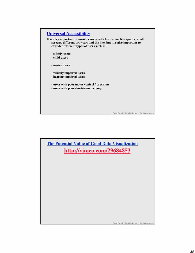
Universal Accessibility
It is very important to consider users with low connection speeds, small screens, different browsers and the like, but it is also important to consider different types of users such as:
- elderly users
- child users
- novice users
- visually impaired users
- hearing impaired users
- users with poor motor control / precision
- users with poor short-term memory
The Potential Value of Good Data Visualization
http://vimeo.com/29684853
Evan Golub / Ben Bederson / Saul Greenberg

26
Beyond Simple Screen Design
What are the characteristics of good representations?
What are the characteristics of good information visualization?
What role do metaphors play?
How can the use of direct manipulation help us?
Good information visualization…
…supports making discoveries.
…supports making decisions.
…supports discovering patterns.
…supports finding relevant information.
…capture essential elements of events.
…deliberately leaves out (or at least mutes) irrelevant data.
…is appropriate to the person viewing the data.
…is appropriate to the task being performed.
With good visualizations people can see trends, clusters, gaps, and outliers.
Use of colors, sizes, shapes, and locations all help with this.

27
How to represent quantity?
# Buffalo
# Adults # Kids
# Buffalo / kids
八八八八, 四四四四
Detailed navigationplus precision
General navigation plus orientation
Where am I? (Geographic Navigation)
28
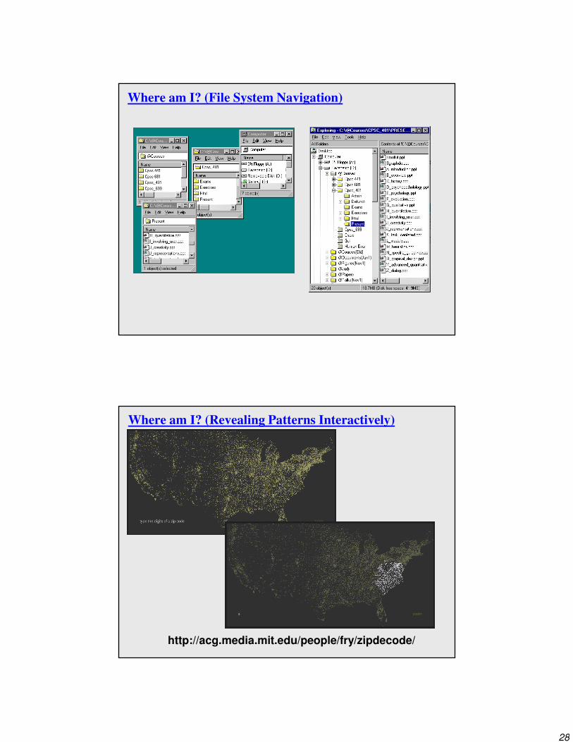
Where am I? (File System Navigation)
Where am I? (Revealing Patterns Interactively)
http://acg.media.mit.edu/people/fry/zipdecode/
29
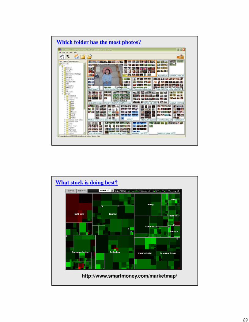
Which folder has the most photos?
What stock is doing best?
http://www.smartmoney.com/marketmap/
30
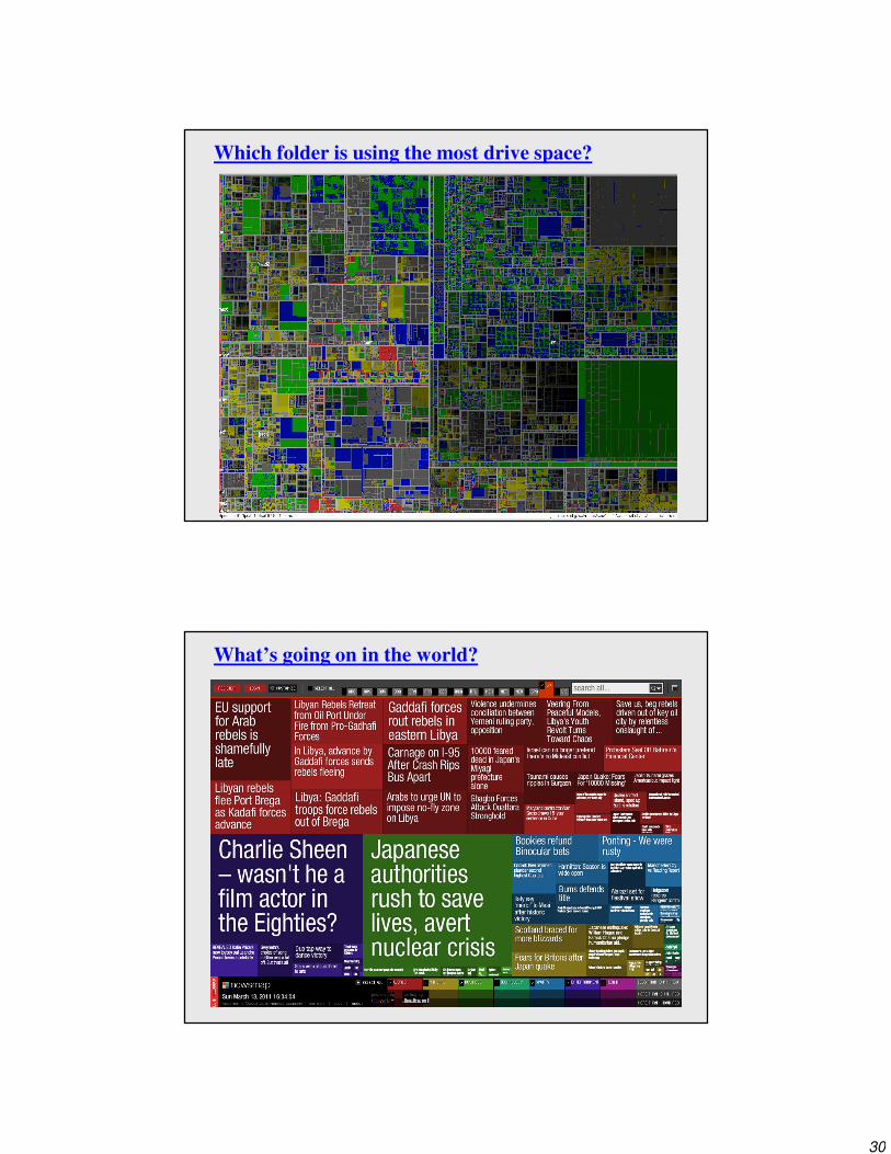
Which folder is using the most drive space?
What’s going on in the world?

31
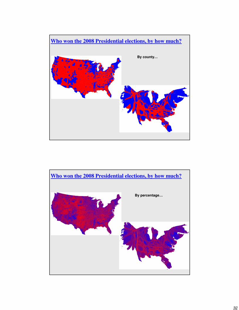
Who won the 2008 Presidential elections, by how much?
Who won the 2008 Presidential elections, by how much?
By state…
32
Who won the 2008 Presidential elections, by how much?
By county…
Who won the 2008 Presidential elections, by how much?
By percentage…
33
Information Visualization
Graphics should reveal the data
• show the data
• not get in the way of the message
• avoid distortion
• present many numbers in a small space
• make large data sets coherent
• encourage comparison between data
• supply both a broad overview and fine detail
• serve a clear purpose
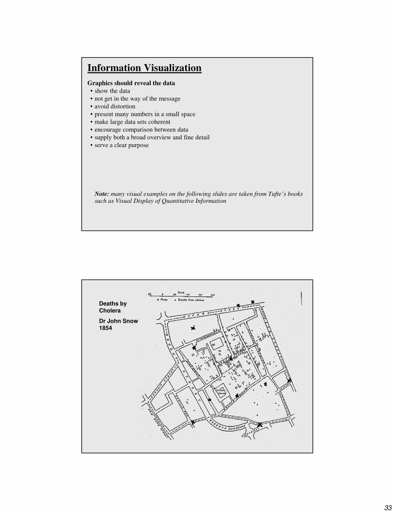
Note: many visual examples on the following slides are taken from Tufte’s books such as Visual Display of Quantitative Information
Deaths by Cholera
Dr John Snow1854

34
Telling a story: Napolean's march to Moscow by Charles Minard (1885)
Six Variables Shown: [1] Size of army, [2,3] Position (long/lat), [4] Direction of movement, [5] Temperature, [6] Time
Not Shown but COULD have been: Mood of the troops with shading? Others? How?
Showing the Right Data: Challenger

35
Interaction
If a picture is worth a thousand words, then an interactive visualization is worth a thousand pictures.....
Metaphors (I)
Pervade excellent interfaces
spreadsheet (actuary sheet)
games (literal world)

36
Metaphors (II)
Control Panels with familiar controls
Name:_______________
Address:_______________
City:_______________
Province:_______________
Postal Code:_______________
Forms
Hierarchical Folders
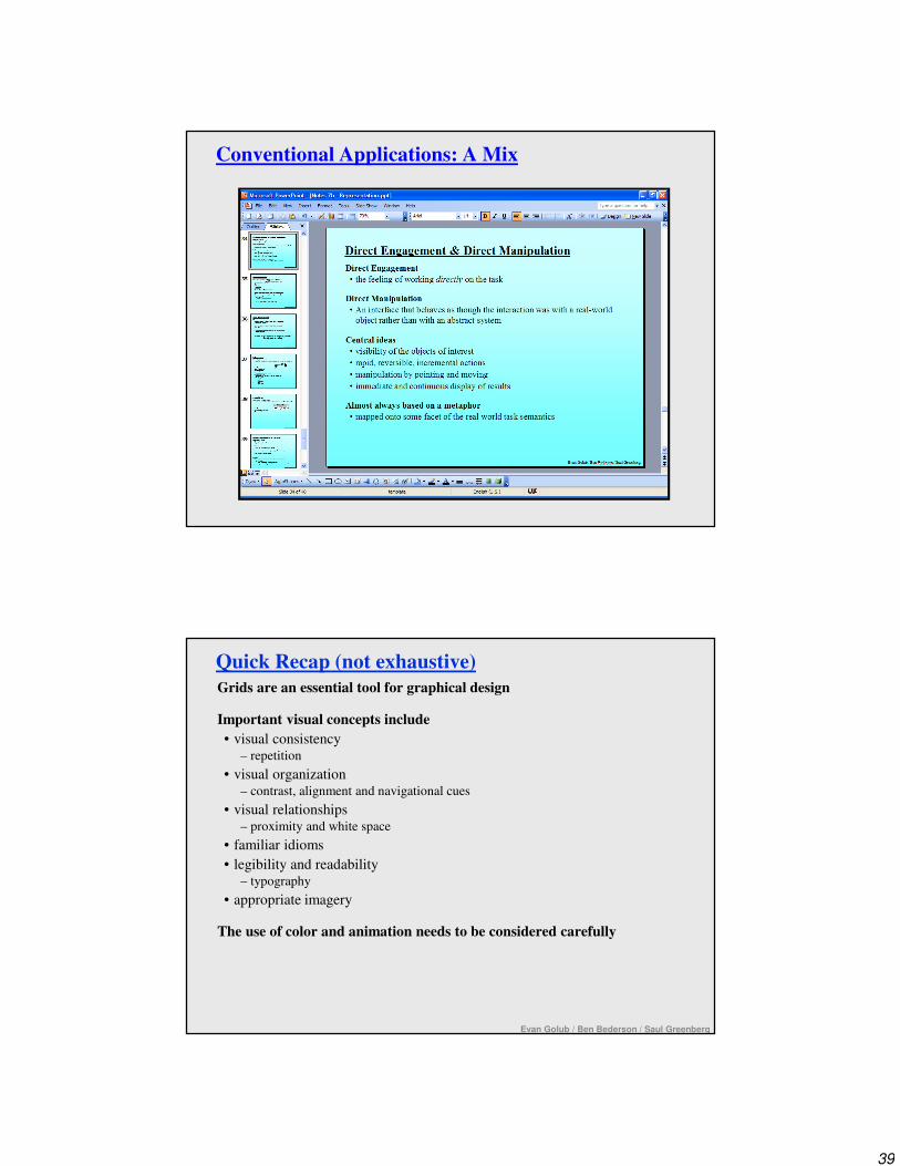
Direct Engagement & Direct Manipulation
Direct Engagement
• the feeling of working directly on the task
Direct Manipulation
• An interface that behaves as though the interaction was with a real-world
object rather than with an abstract system
Central ideas
• visibility of the objects of interest
• rapid, reversible, incremental actions
• manipulation by pointing and moving
• immediate and continuous display of results
Almost always based on a metaphor
• mapped onto some facet of the real world task semantics
37
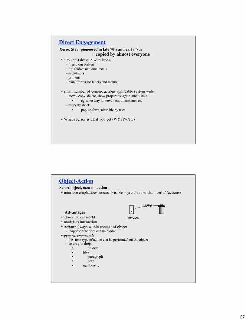
Direct Engagement
Xerox Star: pioneered in late 70’s and early '80s
=copied by almost everyone=
• simulates desktop with icons– in and out baskets
– file folders and documents
– calculators
– printers
– blank forms for letters and memos
• small number of generic actions applicable system wide– move, copy, delete, show properties, again, undo, help
• eg same way to move text, documents, etc
– property sheets
• pop-up form, alterable by user
• What you see is what you get (WYSIWYG)
Object-ActionSelect object, then do action
• interface emphasizes 'nouns' (visible objects) rather than 'verbs' (actions)
Advantages
• closer to real world
• modeless interaction
• actions always within context of object– inappropriate ones can be hidden
• generic commands– the same type of action can be performed on the object– eg drag ‘n drop:
• folders
• files
• paragraphs
• text
• numbers…
my.doc
move
38
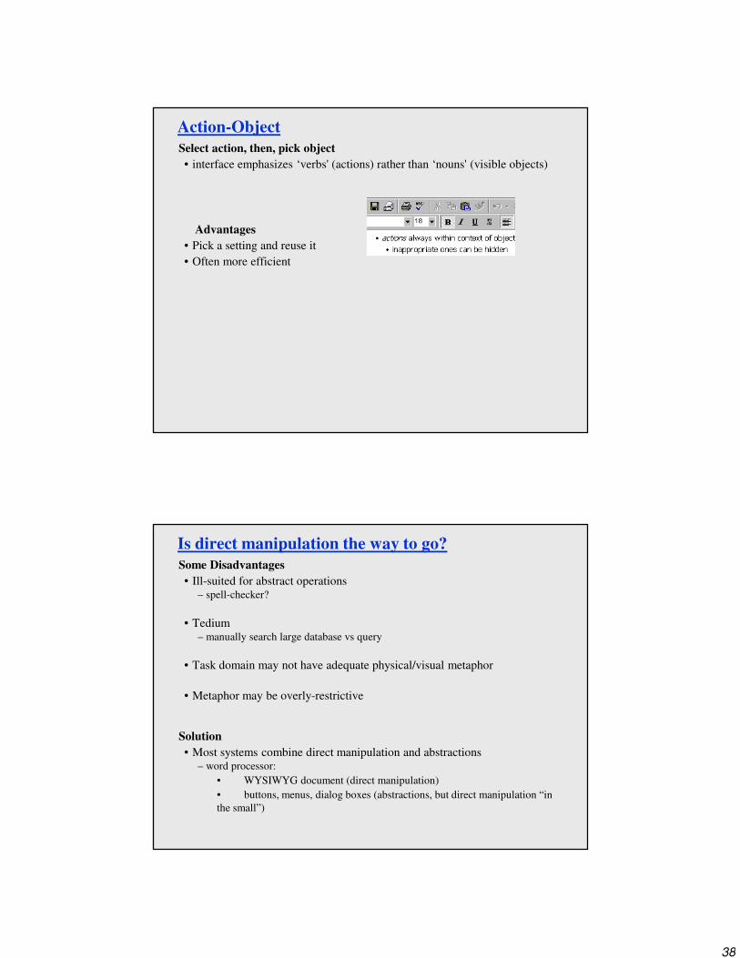
Action-Object
Select action, then, pick object
• interface emphasizes ‘verbs' (actions) rather than ‘nouns' (visible objects)
Advantages
• Pick a setting and reuse it
• Often more efficient
Is direct manipulation the way to go?
Some Disadvantages
• Ill-suited for abstract operations– spell-checker?
• Tedium– manually search large database vs query
• Task domain may not have adequate physical/visual metaphor
• Metaphor may be overly-restrictive
Solution
• Most systems combine direct manipulation and abstractions– word processor:
• WYSIWYG document (direct manipulation)
• buttons, menus, dialog boxes (abstractions, but direct manipulation “in
the small”)
39
Conventional Applications: A Mix
Quick Recap (not exhaustive)
Grids are an essential tool for graphical design
Important visual concepts include
• visual consistency – repetition
• visual organization – contrast, alignment and navigational cues
• visual relationships – proximity and white space
• familiar idioms
• legibility and readability– typography
• appropriate imagery
The use of color and animation needs to be considered carefully
Evan Golub / Ben Bederson / Saul Greenberg

40
Good Representations
• captures essential elements of the event / world
• deliberately leaves out / mutes the irrelevant
• appropriate for the person, their task, and their interpretation
Metaphors
• uses our knowledge of the familiar and concrete to represent abstract concepts
• need not be literal
• has limitations that must be understood
Direct manipulation
• visibility of the objects of interest
• rapid, reversible, incremental actions
• manipulation by pointing and moving
• immediate and continuous display of results
• action-object -versus- object-action
These three components are the foundation of a true Visual Interface
Quick Recap (not exhaustive)
Closing Thoughts...
"If a picture is worth 1000 words, then an interface is worth 1000 pictures."
Keep user tasks and goals in mind.
Encourage exploration but don't overwhelm the users.
Overview, zoom, filter, details on demand.