Embed Size (px)
Citation preview
Scattr: Density Ordering for Progressive Scatter Plots
Andrew LeeDepartment of Computer Science
Biye JiangDepartment of Computer Science
ABSTRACTVisualization is very important for making sense of data. Byusing methods like scatter plots, line charts, and histograms,we can easily show distributions or trends in the data. How-ever, as we are entering the era of big data, the efficiency oflarge scale data visualization raises many challenges, espe-cially for interactive data analysis tasks.
In order to solve parts of those challenges, we present Scattr,a system for creating progressive scatter plots that usesincremental updating to give users approximate but high-quality visualizations with low latency. We use a client-server architecture where the server side uses a quadtree-based density ordering algorithm to divide the data intosmall chunks. By using only the first several chunks (about10% of the data), the client side can provide a nearly identi-cal visualization result to the user. Experiments show thatour system can greatly improve the user experience whendisplaying large scale data in scatter plots.
KeywordsVisualization, Sampling, Big data
1. INTRODUCTIONVisualization has been viewed as an important way to makesense of data. By using methods such as scatter plots, linecharts, and histograms, we can more easily show distribu-tions or trends of the data. Rather than showing the rawdata numbers, the information is aggregated and encoded byvisual elements, and thus can be better understood by theusers. Also, most visualization designs provide interactivefunctions like selecting, brushing and linking, and zoomingin/out to further extend the user’s ability to explore thedataset.
Interactive visualizations are very useful for exploratory dataanalysis and online analytical processing (OLAP). Users caniteratively explore the data based on previous feedback. Thus,
instant feedback is truly important. However, as the quan-tity of data continues to increase rapidly, both challengesand opportunities arise for visualization design.
For large scale data visualizations, scanning the whole datacan take a long time, which users would find intolerable.In order to solve similar challenges for OLAP, people havedeveloped in-memory systems like Spark [13] to leverage thehigh bandwidth of memory. Although such systems can bevery useful to reduce the processing latency from severalhours into several minutes, such latency is still too high forinteractive tasks. Indeed, users typically need sub-second oreven lower latency for interactive applications.
Such low latency is really hard to achieve if we always workon the entire dataset. However, a visualization is actuallya projection from the original data to the 2D screen[11].Since such a projection itself will contain some aggregationand transformation steps which will not preserve all of theoriginal information, it is possible to find alternative pro-jections that preserve similar information. Similar to theidea of lossy data compression, some parts of the data canbe dropped at the cost of little change to the informationconveyed by the visualization.
Thus, we framed the problem as reducing the amount ofdata while preserving its visual appearance under certainkinds of visualization. In our case, we work on the widelyused scatter plot visualization, which maps two dimensionsof the data into the X-Y axes. For scatter plots, one commonobservation is that when the size of the data grows bigger,the overlapping problem becomes more and more serious.This implies that for a fixed size screen and certain datadistributions, increasing the amount of data may not changethe resulting visualization when the data size is already largeenough. As a result, much reductant data exists in thosedense regions.
Based on such observations, our system will divide the wholedata into small chunks, and by rendering the first severalchunks, the user will be able to quickly see some approxi-mate visualization results. By incrementally updating thevisualization when more data chunks are received, more de-tails will shown to the user. However, if we use randomordering to split the data chunks, details for the low-densityregions in the first several chunks will be lost. Therefore, wepresent a quadtree-based algorithm to calculate the order ofthe data points based on data density.
The algorithm is quite like fair scheduling for resource al-location, where data points are competing for the slots ina data chunk. However, our algorithm wants to give themsome order such that points from dense and sparse regionswill be selected fairly. These will ensure that the details ofthe low-density regions will be preserved even if we are usingsmall amount of the data.
We implemented the algorithm on the server side such thatwhen new data is uploaded to server, an order will be com-puted and the data gets split into chunks. When the client-side requests for the data, chunks will be sent one by one.Whenever a chunk is received, the client will update theirvisualization with the fresh data. In order to evaluate ouralgorithm, we use the absolute pixel difference between thecurrent visualization and the final visualization as our met-ric. Details of the experiments will be presented in latersections.
The remainder of this paper is organized as follows: Sec-tion 2 will describe related work about improving perfor-mance for large scale visualizations and OLAP. We presentour quadtree algorithm to obtain density ordering in section3. In section 4, our client-server architecture and the API forour system will be described. Section 5 will provide detailedexperimental results on two real world datasets.
2. RELATED WORK2.1 Fast Interactive Data Processing SystemsMathei et al[13] provides the Spark cluster system whichprovides both in-memory computing and fault-tolerant sup-port. Compared to Hadoop, caching data in memory cangreatly improve performance for iterative/interactive com-puting.
John et al [5, 4] presents BIDMat and BIDMach which pro-cesses large scale data on single node by using the GPU foracceleration. They provide an interface similar to R/Matlabto let users interact with the system. The single node archi-tecture reduces the potential networking latency.
However, no visualization systems have been built uponthose two systems. In fact, they can serve as the backendcomputing server and can be connected to our system in thefuture.
2.2 Statistical Methods in OLAPSampling and dimension reduction techniques have long beenused for data analysis. Sameer et al[1] built BlinkDB uponSpark and Shark[12] to run SQL queries on sampled datasetwhile providing error bounds for the results. Thus, approx-imate answers will be showed to the user with much lowerresponse times. Their work is the most similar one to ours.However, we use a different metric to evaluate the quality.Our work is different in the sampling methods used as well.Their work focuses more on evaluating the variance for ag-gregation queries like means and sums, while ours focusesmore on the data distribution on a 2D screen.
Also, dimension reduction methods like PCA[6], MDS[7] areoften used for data analysis. But all of these methods aretrying to map the data into another linear space while ex-
tracting the key information. The transformation would re-sult in some totally different visualizations and further inter-pretation would be needed. In contrast to their approach,our method will provide nearly identical visualization re-sults.
2.3 Leveraging GPUZhicheng et al[9] presents imMens which would cache thedata inside the GPU texture memory and use WebGL toperform both data aggregation and rendering. Leveragingthe power of GPU computing, their system can quickly re-spond to human actions. However, their system works onthe whole dataset and they aggregate data into small binsto improve performance.
2.4 Progressive JPEGProgressive JPEG[10] is a widely used method to improvethe user experience for viewing internet images. Their ap-proach is to incrementally show the images from low-resolutionto high-resolution as the browser receives more data. Theyencode the images in such a way that the general view of theimages can be showed even if only a little data is received,and the quality will be improved as more data arrives. Thisis similar to our purpose but our system is not sending the re-sult of the visualization (i.e images), but rather sending realdata points that could be used for visualization. Thus, ourapproach can further support actions such as user-definedfiltering and zooming in/out by using the real data points.
3. ALGORITHMOur goal is to create chunks of data in an order such that thefirst chunks well-represent the full data. More specifically,we want to arrange the data such that when the first chunksget plotted onto a scatter plot, the result is visually similarto the result if all the points were plotted.
Many distributions of data have regions that are much denserthan others. Often, these regions form lines and shapes. Avery simple way to create a chunk of data is to randomlysample from the full set. However, the problem with this ap-proach is that it will be very likely that points get “wasted”because they fall into regions that are already saturated withother points, adding little to no visual contribution in theresulting scatter plot. Thus, to achieve our goal, we want tofind a global ordering of points such that points in the denseregions come after those in sparse regions, which we can thenpartition into chunks. We call this density ordering.
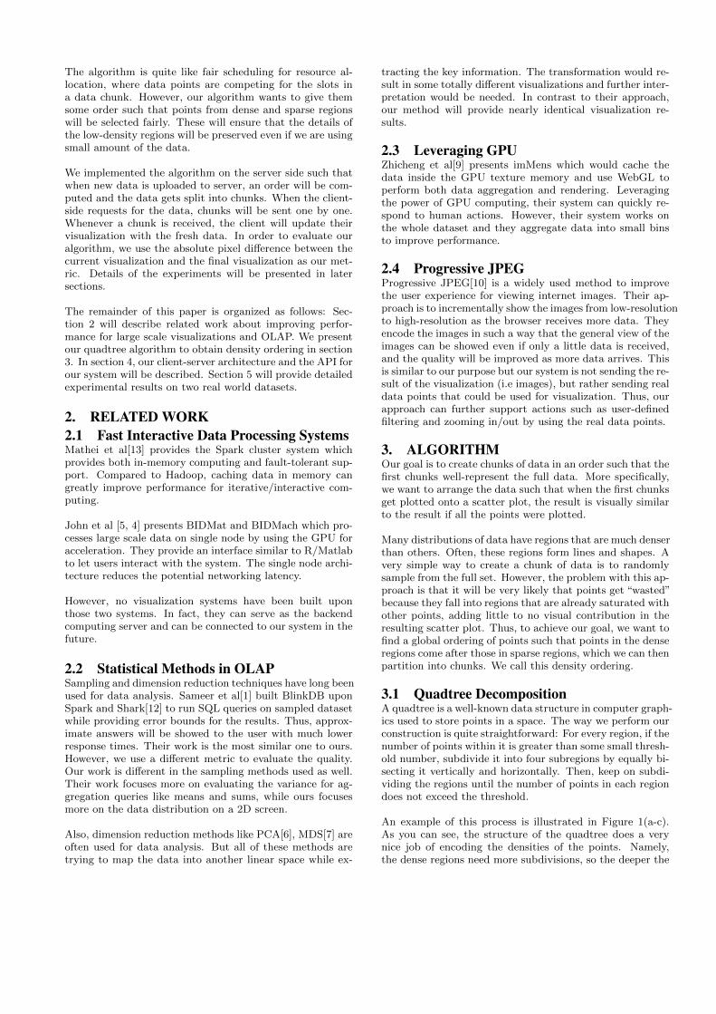
3.1 Quadtree DecompositionA quadtree is a well-known data structure in computer graph-ics used to store points in a space. The way we perform ourconstruction is quite straightforward: For every region, if thenumber of points within it is greater than some small thresh-old number, subdivide it into four subregions by equally bi-secting it vertically and horizontally. Then, keep on subdi-viding the regions until the number of points in each regiondoes not exceed the threshold.
An example of this process is illustrated in Figure 1(a-c).As you can see, the structure of the quadtree does a verynice job of encoding the densities of the points. Namely,the dense regions need more subdivisions, so the deeper the
Figure 1: An example of the density ordering algorithm. Here, we set our quadtree threshold at 2. (a) Theoriginal set of data, with the points labeled as letters. (b) An intermediate result of the quadtree subdivisions.(c) The fully subdivided space. (d) The full quadtree. (e) An example of how the orderings in the fourth layerare interleaved into the third layer. (f) The final interleaving of the sequences, yielding the global densityordering of all of the points.
tree is in some region, the more dense the data is at thatregion. Additionally, in cases where most of the points arerelatively close together, but there exists some distant out-liers, the main region of points will still largely exist as itsown subtree, buffering it from the outliers, which is a niceproperty to have.
3.2 Reconstructing the orderNow that we have a quadtree representing the data points,we need to build an ordering of the points to achieve densityordering. At a high level, we want to build this sequenceinductively.
The assumption is that for each node of the quadtree, each ofits children has generated a sequence of its points in densityorder. From these sequences, we want to combine themsuch that the combined sequence of points is also in densityorder. We generate this sequence by popping of a valuefrom each child’s sequence in round-robin fashion until allpoints are exhausted. In other words, we interleave the childsequences. In doing so, we semi-simultaneously flesh outeach quadrant at the same rate of density, which is whatwe want in a density ordering. The base case is at the leafnodes where the number of points in each of them is withinthe aforementioned threshold. When the number of pointsis that small, we figured that any ordering of those points
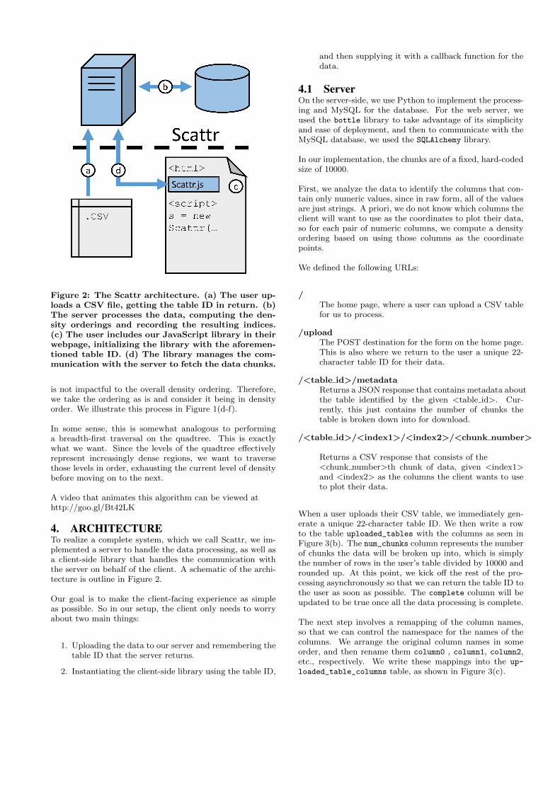
Figure 2: The Scattr architecture. (a) The user up-loads a CSV file, getting the table ID in return. (b)The server processes the data, computing the den-sity orderings and recording the resulting indices.(c) The user includes our JavaScript library in theirwebpage, initializing the library with the aforemen-tioned table ID. (d) The library manages the com-munication with the server to fetch the data chunks.
is not impactful to the overall density ordering. Therefore,we take the ordering as is and consider it being in densityorder. We illustrate this process in Figure 1(d-f).
In some sense, this is somewhat analogous to performinga breadth-first traversal on the quadtree. This is exactlywhat we want. Since the levels of the quadtree effectivelyrepresent increasingly dense regions, we want to traversethose levels in order, exhausting the current level of densitybefore moving on to the next.
A video that animates this algorithm can be viewed athttp://goo.gl/Bt42LK
4. ARCHITECTURETo realize a complete system, which we call Scattr, we im-plemented a server to handle the data processing, as well asa client-side library that handles the communication withthe server on behalf of the client. A schematic of the archi-tecture is outline in Figure 2.
Our goal is to make the client-facing experience as simpleas possible. So in our setup, the client only needs to worryabout two main things:
1. Uploading the data to our server and remembering thetable ID that the server returns.
2. Instantiating the client-side library using the table ID,
and then supplying it with a callback function for thedata.
4.1 ServerOn the server-side, we use Python to implement the process-ing and MySQL for the database. For the web server, weused the bottle library to take advantage of its simplicityand ease of deployment, and then to communicate with theMySQL database, we used the SQLAlchemy library.
In our implementation, the chunks are of a fixed, hard-codedsize of 10000.
First, we analyze the data to identify the columns that con-tain only numeric values, since in raw form, all of the valuesare just strings. A priori, we do not know which columns theclient will want to use as the coordinates to plot their data,so for each pair of numeric columns, we compute a densityordering based on using those columns as the coordinatepoints.
We defined the following URLs:
/The home page, where a user can upload a CSV tablefor us to process.
/uploadThe POST destination for the form on the home page.This is also where we return to the user a unique 22-character table ID for their data.
/<table id>/metadataReturns a JSON response that contains metadata aboutthe table identified by the given <table id>. Cur-rently, this just contains the number of chunks thetable is broken down into for download.
/<table id>/<index1>/<index2>/<chunk number>
Returns a CSV response that consists of the<chunk number>th chunk of data, given <index1>and <index2> as the columns the client wants to useto plot their data.
When a user uploads their CSV table, we immediately gen-erate a unique 22-character table ID. We then write a rowto the table uploaded_tables with the columns as seen inFigure 3(b). The num_chunks column represents the numberof chunks the data will be broken up into, which is simplythe number of rows in the user’s table divided by 10000 androunded up. At this point, we kick off the rest of the pro-cessing asynchronously so that we can return the table ID tothe user as soon as possible. The complete column will beupdated to be true once all the data processing is complete.
The next step involves a remapping of the column names,so that we can control the namespace for the names of thecolumns. We arrange the original column names in someorder, and then rename them column0 , column1, column2,etc., respectively. We write these mappings into the up-
loaded_table_columns table, as shown in Figure 3(c).
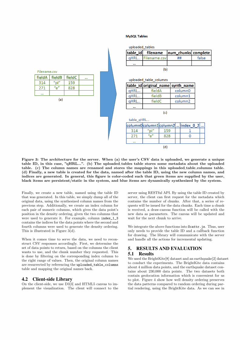
Figure 3: The architecture for the server. When (a) the user’s CSV data is uploaded, we generate a uniquetable ID, in this case, ”qHRL...”. (b) The uploaded tables table stores some metadata about the uploadedtable. (c) The column names are renamed and stores the mappings in this uploaded table columns table.(d) Finally, a new table is created for the data, named after the table ID, using the new column names, andindices are generated. In general, this figure is color-coded such that green items are supplied by the user,black items are persistent/static in the system, and blue items are dynamically synthesized by the system.
Finally, we create a new table, named using the table IDthat was generated. In this table, we simply dump all of theoriginal data, using the synthesized column names from theprevious step. Additionally, we create an index column foreach pair of numeric columns, which gives the data point’sposition in the density ordering, given the two columns thatwere used to generate it. For example, column index_1_3
contains the indices for the data points where the second andfourth columns were used to generate the density ordering.This is illustrated in Figure 3(d).
When it comes time to serve the data, we need to recon-struct CSV responses accordingly. First, we determine theset of data points to return, based on the columns the clientwants to use, and the chunk number they requested. Thisis done by filtering on the corresponding index column tothe right range of values. Then, the original column namesare resurrected by referencing the uploaded_table_columns
table and mapping the original names back.
4.2 Client-side LibraryOn the client-side, we use D3[3] and HTML5 canvas to im-plement the visualization. The client will connect to the
server using RESTful API. By using the table ID created byserver, the client can first request for the metadata whichcontains the number of chunks. After that, a series of re-quests will be issued for the data chunks. Each time a chunkis received, a draw-canvas function will be called with thenew data as parameters. The canvas will be updated andwait for the next chunk to arrive.
We integrate the above functions into Scattr.js. Thus, useronly needs to provide the table ID and a callback functionfor drawing. The library will communicate with the serverand handle all the actions for incremental updating.
5. RESULTS AND EVALUATION5.1 ResultsWe used the BrightKite[8] dataset and an earthquake[2] datasetto conduct the experiments. The BrightKite data containsabout 4 million data points, and the earthquake dataset con-tains about 230,000 data points. The two datasets bothcontain geolocation information which is convenient for usto plot. Figure 4 show how well density ordering preservesthe data patterns compared to random ordering during par-tial rendering, using the BrightKite data. As we can see in

Figure 4(b), using only 10% of the data in density order, wecan achieve an almost identical result compared to the finalresult (Figure 4(d)). However, using random ordering stillloses many details even using 25% of the data (Figure 4(g)).Coverage-wise, most details are preserved very well even inFigure 4(a), where only 2% of the data is plotted.
We created two videos comparing the progression of theplots using density ordering and random ordering. They canbe viewed at http://goo.gl/QMYcgk (the earthquake data)and at http://goo.gl/tZe1rR (the BrightKite data).
5.2 MeasurementTo evaluate the quality of an intermediate result, we decidedto take the absolute pixel difference between it and the fi-nal image as our metric. In other words, at every pixel, wecompare the values, down to the RGB subcomponents, andsum up the total absolute difference in those values. In thesebenchmarks, we render each point as a semi-transparent col-ored circle 6 pixels in diameter, on a white canvas that is3200x1600 pixels large.
First, we generate a image of the final visualization, whereevery point is rendered. This will the image that each inter-mediate plot will be compared against. Then, we find theabsolute pixel difference between that and the original blankcanvas, which we will call the total difference.
For each intermediate plot, we find the absolute pixel differ-ence between it and the final image. Then, the quality forthat plot is computed by taking this difference, dividing itby the total difference, and subtracting this fraction from 1.Another way to express the quality for a given intermediateimage is:
1 − pixel diff(intermediate image, final image)
pixel diff(blank canvas,final image)(1)
5.3 Comparison
Figure 5: Quality curve comparing the quality ofintermediate results for density ordering (blue line)against random ordering (green line), as a functionof points plotted.
An area of interest in Figure 5 is the area above the curveand below the 1 line. This area represents the disparity(the integral of the fractional part of Equation 1) of theintermediate plot from the final plot and how much timeis spent in that state. Naturally, the smaller the area, thebetter the result, since that would correspond to fewer pointsbeing needed to achieve a higher quality.
6. CONCLUSIONBased on the results, it appears that density ordering isindeed doing a good job of ordering the data such that only
early portions are necessary to produce a scatter plot withhigh visual fidelity. It massively outperforms an uninformedordering. Additionally, the complexity of finding the densityordering is about O(n lnn), where n is the number of points,so the performance is pretty respectable.
We believe that density ordering is a promising approachthat can have applications beyond the scatter plots that weimplemented for. The idea of finding an ordering that priori-tizes getting good coverage may be adapted to other forms ofvisualizations as well. Once the problem can be mapped intoa space that groups redundant data close together, our ap-proach will find a suitable ordering for rendering the data.
7. FUTURE WORKOur work has laid out a basic foundation for breaking updata into sorted chunks such that early chunks can supplyvisually representative data. At this time, it is still a rel-atively rudimentary implementation, and we believe thereare many avenues we can pursue to improve it in terms ofits expressibility, performance, quality, and ease of use.
7.1 Filtering DataIn real-world use cases, a client will often like to be ableto filter the data in some way. For example, in a mappingapplication, they may want to limit the data to just the view-able area. Because we already build tables in the databaseand populate it with all of the input data in their respectivecolumns, it is fairly trivial to run the filters over the data.Then, because we have already computed a global ordering,we can simply continue using that order to figure out howto chunk up the filtered data.
7.2 Splitting Up the ProcessingThe density ordering algorithm we developed is a very divide-and-conquer approach, but currently, we employ very littleparallel processing to speed up the process. There are manyways we can split up the processing to balance out the load,perhaps even over multiple machines if given such an envi-ronment. We believe that this area is very rich for explo-ration.
7.3 Variations on Generating the QuadtreesIn our current implementation, when we generate the quadtree,we split a region simply into four equal subregions at thesubdivision step. This leads to some interesting artifacts inthe density ordering where a boxed area seems to fill in morequickly than others. An example of such an artifact can beseen in the Massachusetts region of Figure 4(a).
The way each region get subdivided can be up for modifi-cation. In fact, it does not necessarily have to even be fourcongruent subregions as we have currently implemented. Itcan be subregions that contain distinguishable features, suchas lines and shapes, and the number of them does not needto be four.
7.4 Variable Chunk SizesCurrently, we hard-coded the size of the chunks to be 10000points. This was chosen arbitrarily. In the future, we would
like to figure out a way to select chunk sizes more intelli-gently, possibly taking into consideration things such as thequality each chunk adds to the plot.
7.5 Quality CutoffAs seen in the sample plots, using density ordering, the qual-ity of the plots can converge to almost 100% very quickly,using only a fraction of the data. If it is not important forthe client to absolutely get every single data point, it mightbe beneficial for them to ask the server for only enough datato get to some given level of quality. This can be useful inapplications where the bandwidth is precious. Additionally,for applications such as maps, this can be used to controlthe level of detail to download and render.
Implementation-wise, we can achieve this by adding a pa-rameter to the client-side library, which tells it how muchto load. On the server-side, we can do some additional pro-cessing such as computing the amount each point adds tothe visual quality of the plot. Using this new data, we canfigure out how much data is needed to be sent to the client.
8. REFERENCES[1] Agarwal, S., Mozafari, B., Panda, A., Milner,
H., Madden, S., and Stoica, I. Blinkdb: querieswith bounded errors and bounded response times onvery large data. In Proceedings of the 8th ACMEuropean Conference on Computer Systems (2013),ACM, pp. 29–42.
[2] Benfield, P. U.s. geological survey earthquakedatasets: ftp://hazards.cr.usgs.gov/pde/manuscript/.
[3] Bostock, M., Ogievetsky, V., and Heer, J. D3
data-driven documents. Visualization and ComputerGraphics, IEEE Transactions on 17, 12 (2011),2301–2309.
[4] Canny, J., and Zhao, H. Bidmach: Large-scalelearning with zero memory allocation.
[5] Canny, J., and Zhao, H. Big data analytics withsmall footprint: squaring the cloud. In Proceedings ofthe 19th ACM SIGKDD international conference onKnowledge discovery and data mining (2013), ACM,pp. 95–103.
[6] Jolliffe, I. Principal component analysis. WileyOnline Library, 2005.
[7] Kruskal, J. B. Multidimensional scaling byoptimizing goodness of fit to a nonmetric hypothesis.Psychometrika 29, 1 (1964), 1–27.
[8] Leskovec, J. Brightkite dataset:http://snap.stanford.edu/data/loc-brightkite.html.
[9] Liu, Z., Jiang, B., and Heer, J. immens: Real-timevisual querying of big data. Computer Graphics Forum(Proc. EuroVis) 32 (2013).
[10] Wallace, G. K. The jpeg still picture compressionstandard. Communications of the ACM 34, 4 (1991),30–44.
[11] Wilkinson, L. The grammar of graphics. Springer,2005.
[12] Xin, R., Rosen, J., Zaharia, M., Franklin, M. J.,Shenker, S., and Stoica, I. Shark: Sql and richanalytics at scale. arXiv preprint arXiv:1211.6176(2012).
[13] Zaharia, M., Chowdhury, M., Das, T., Dave, A.,Ma, J., McCauley, M., Franklin, M., Shenker,S., and Stoica, I. Resilient distributed datasets: Afault-tolerant abstraction for in-memory clustercomputing. In Proceedings of the 9th USENIXconference on Networked Systems Design andImplementation (2012), USENIX Association, pp. 2–2.

(a) (e)
(b) (f)
(c) (g)
(d) (h)
Figure 4: Resulting visualization. Using density ordering: (a) 2% plotted, (b) 10% plotted, (c) 25% plotted,and (d) 100% plotted. Using random ordering: (e) 2% plotted, (f) 10% plotted, (g) 25% plotted, and (h)100% plotted.